







Category Archives: Uncategorized
Filters
Shoot 4 Contact Sheet


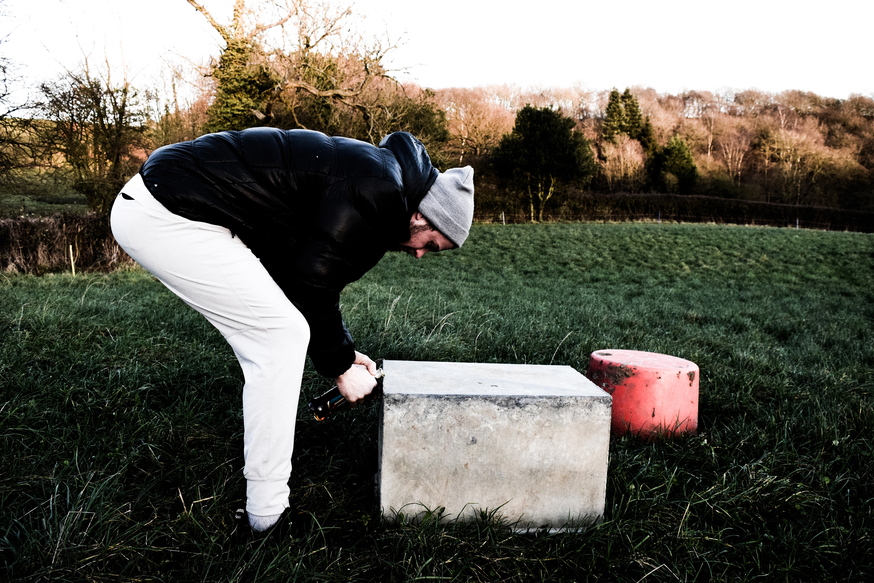
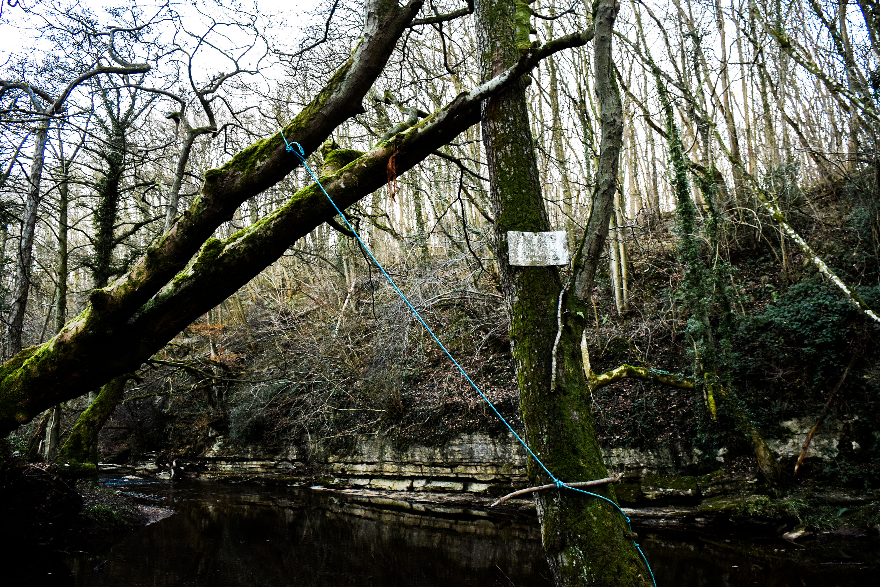
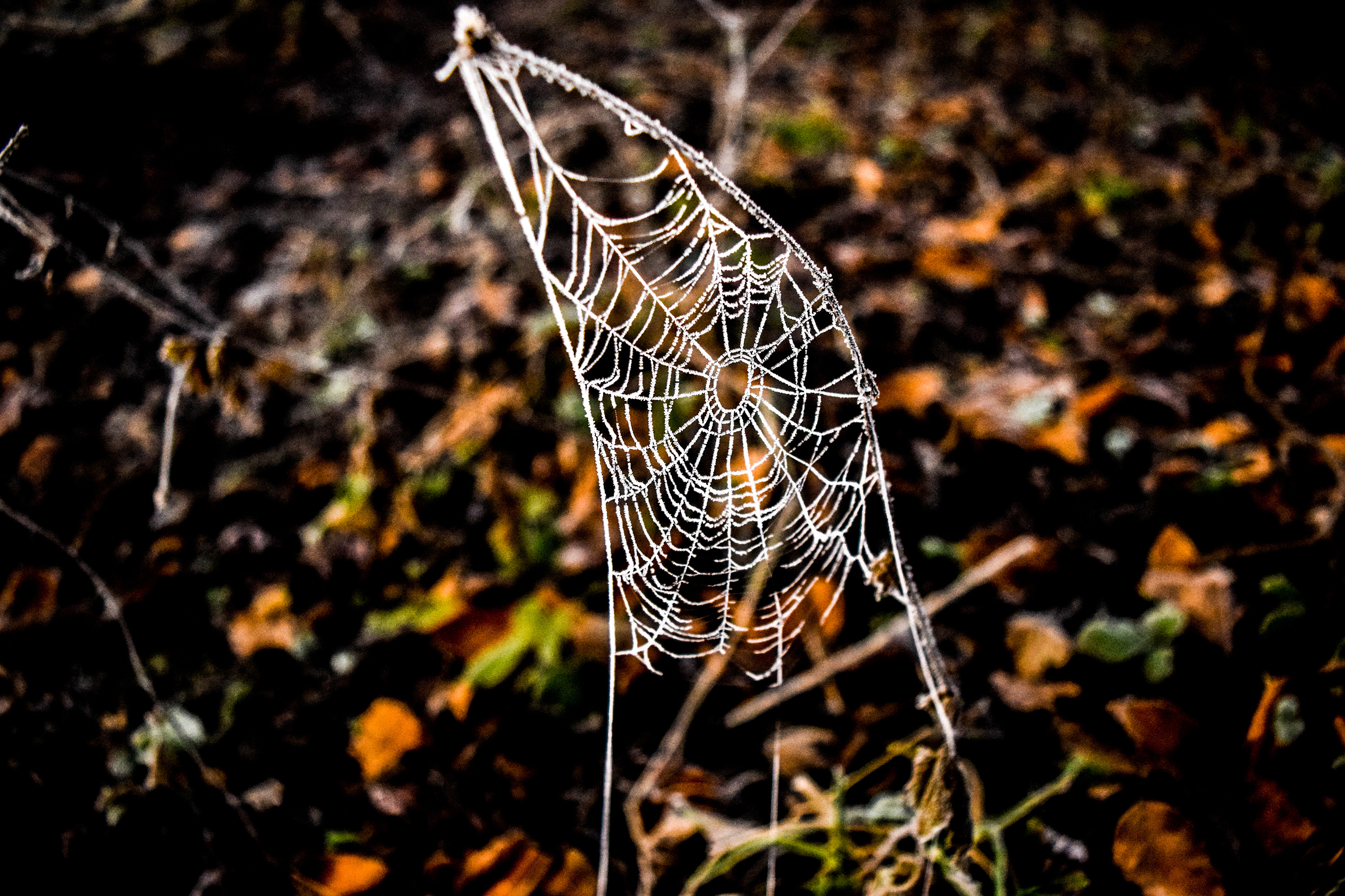
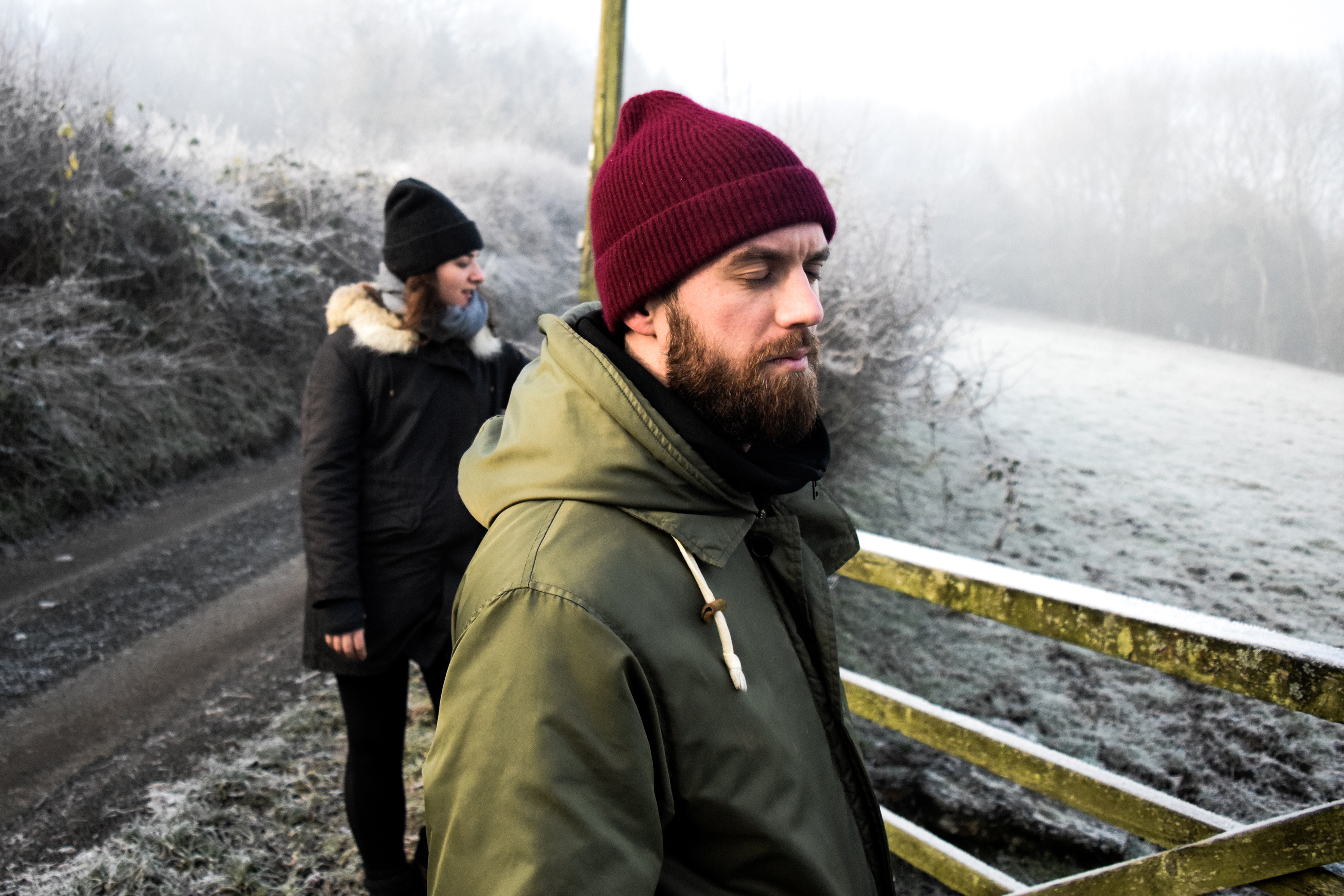
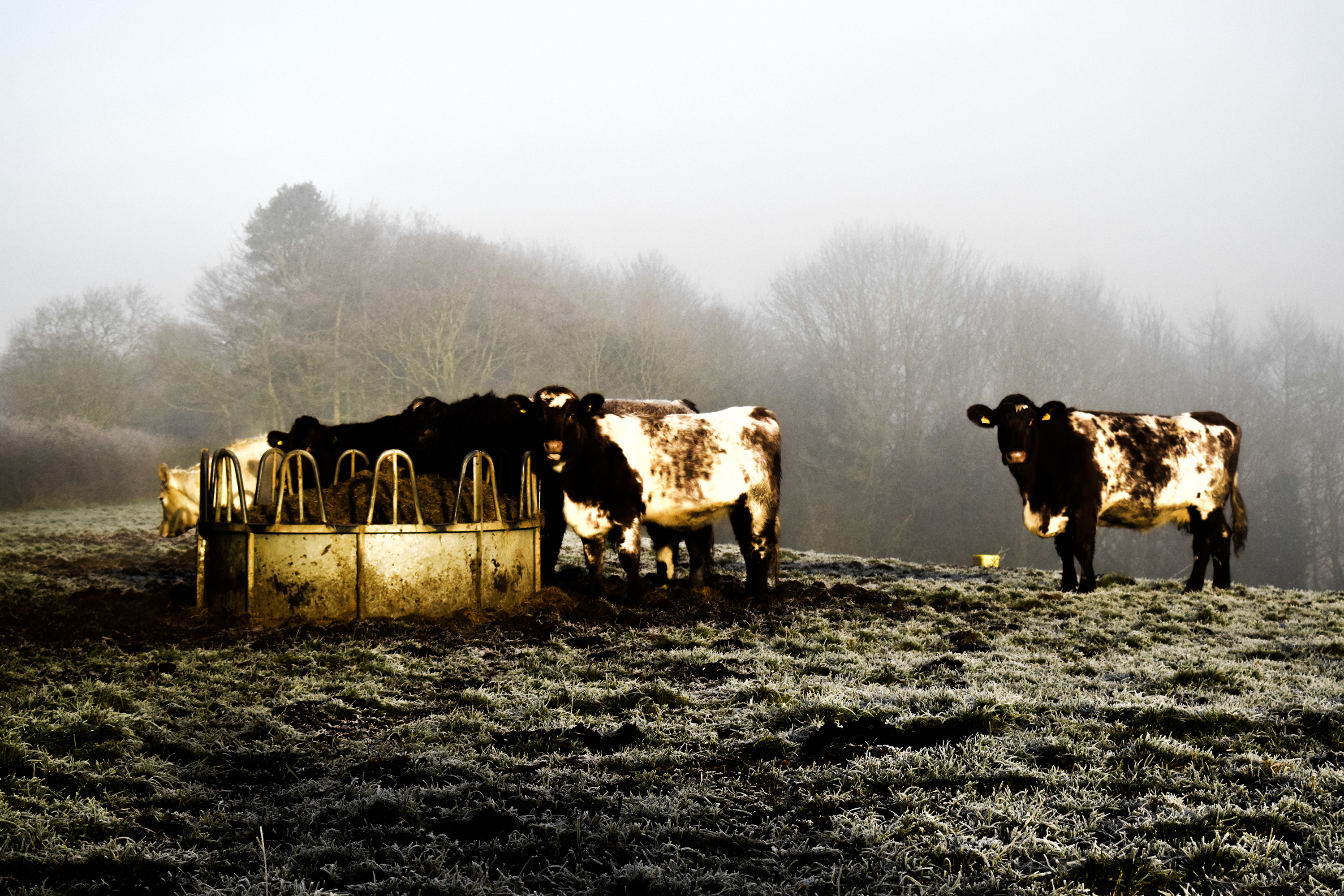
These are the images I took in my weekend in Yorkshire. I managed to take a lot of documentary style and landscape and portrait photos of the natural environment of the area in which my family is from, as well as my family themselves.
Photo-book: Final Layout
Here is a link to my photobook: Changing Landscapes


After experimenting with many different layout designs, above is the final design of my photo-book for this project which I will be using as one of my final outcomes. After researching the work of Robert Adams and Gerry Johnasson’s work (both of which explored social landscapes) I decided to stick to a rather simple and basic design in a similar way to theirs. As my overall project is very visual and I wanted the focus of the book to be on the images, I decided not to add text or captions as this would distract away from the images telling the story which I wanted to communicate. For my title I used the font Courier New as this was a very simple and structured style of text which followed the theme of my book well. The photographs which I used included a range from three of my main shoots (La Collette Shoot 2, Trading Estates Shoot 3 and also my final shoot where I decided to re visit the Trading Estates at night). I decided to use a black and white image as a double page spread for the cover of my book, I think this image was very simple yet effective at communicating the style of my work and what type of photographs the book is going to be based around and consist of. It also allowed me to add a title and my name in, due to the blank white space in the top right hand corner of the image. The general design for the layout of the images inside was: two-images, single images and a double page spread. I tried to follow this pattern throughout giving an equal spread of these layout styles which would then be broken up every few pages by a double page spread, this also enhanced the bold visual style of my outcome. As my images included a range of colour and black and white outcomes, I also had to try to break these up evenly throughout the book so that it displayed a range of my outcomes. The double page spreads consist of three colour images and three black and white images, I also tried to co-ordinate the two images per page by using either two colour or two black and white images which would then be broken up on the next page or so by a different style (black and white or colour). Overall, I am pleased with the outcome of my Photo-book for this project as I think it has been a successful way to display a wide range of my outcomes from the different shoots and areas which I have explored.
Photo-book: Experimentation (Final Outcome)


Shoot 3 Edits
I am very happy with these edits as they show an array of experimentation, focusing on motion and light influenced by the idea of travelling around in cars with friends.
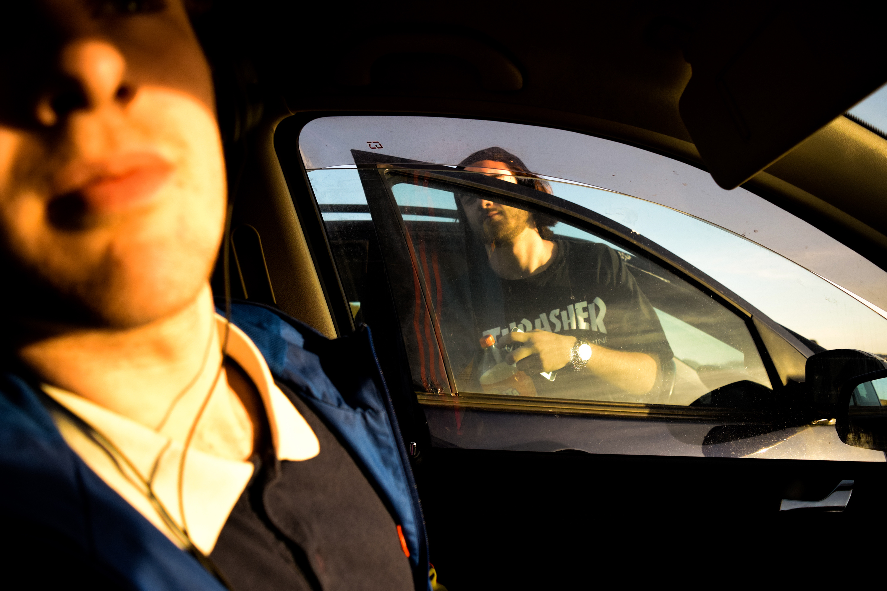
The first couple of images are straight shot, but I edited them to make them brighter, warmer and just overall slightly more cinematic. I also tried to use parts of the car to compose the image, for example in the first photo I used to window of my car to fit around Lucas and the door of the other car, creative corresponding shapes and a nice focus point.

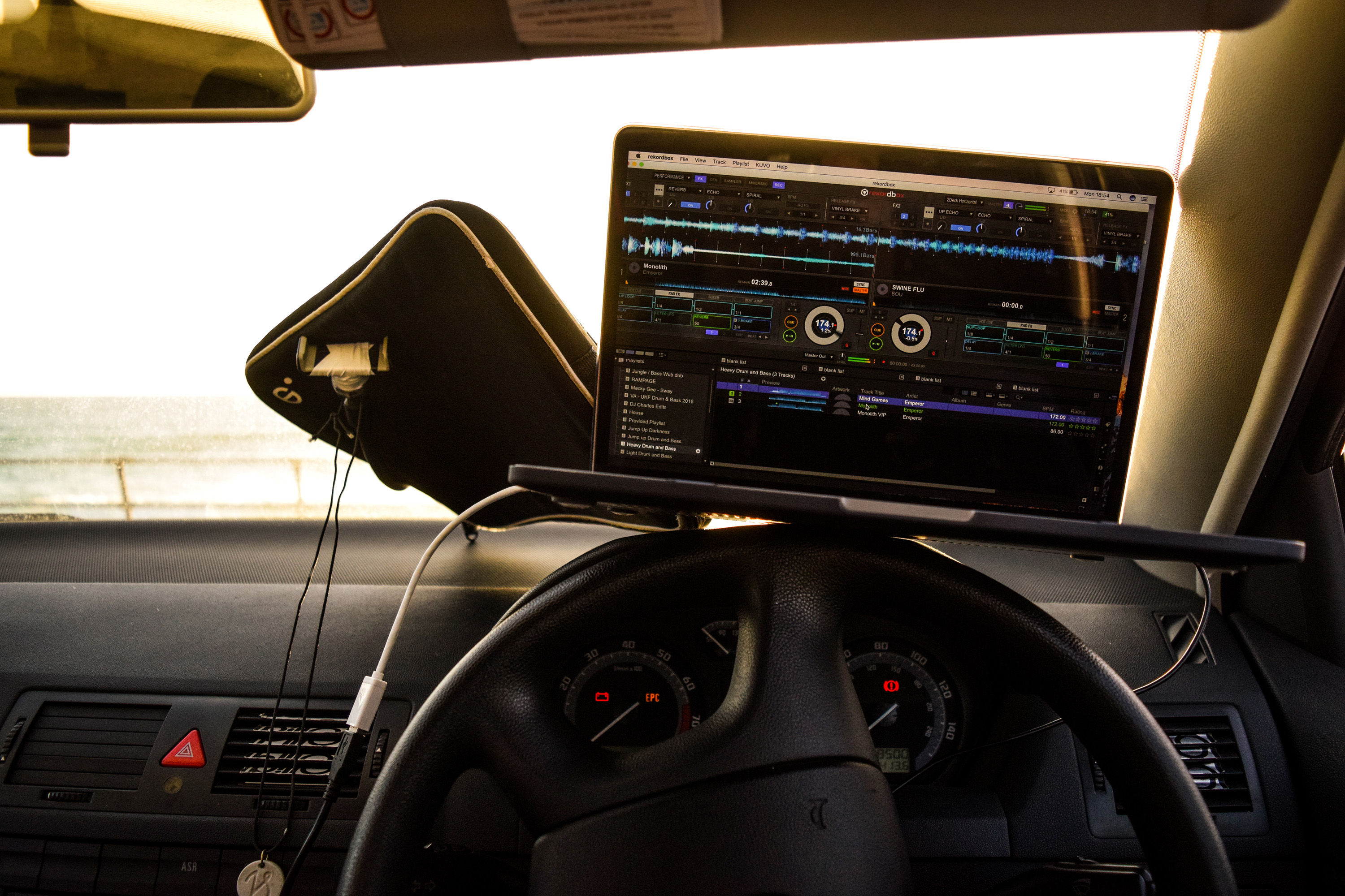
I took the image below to show the environment of my car and how I used it to mix music often. I also edited it to look cinematic in the same way as the previous images.
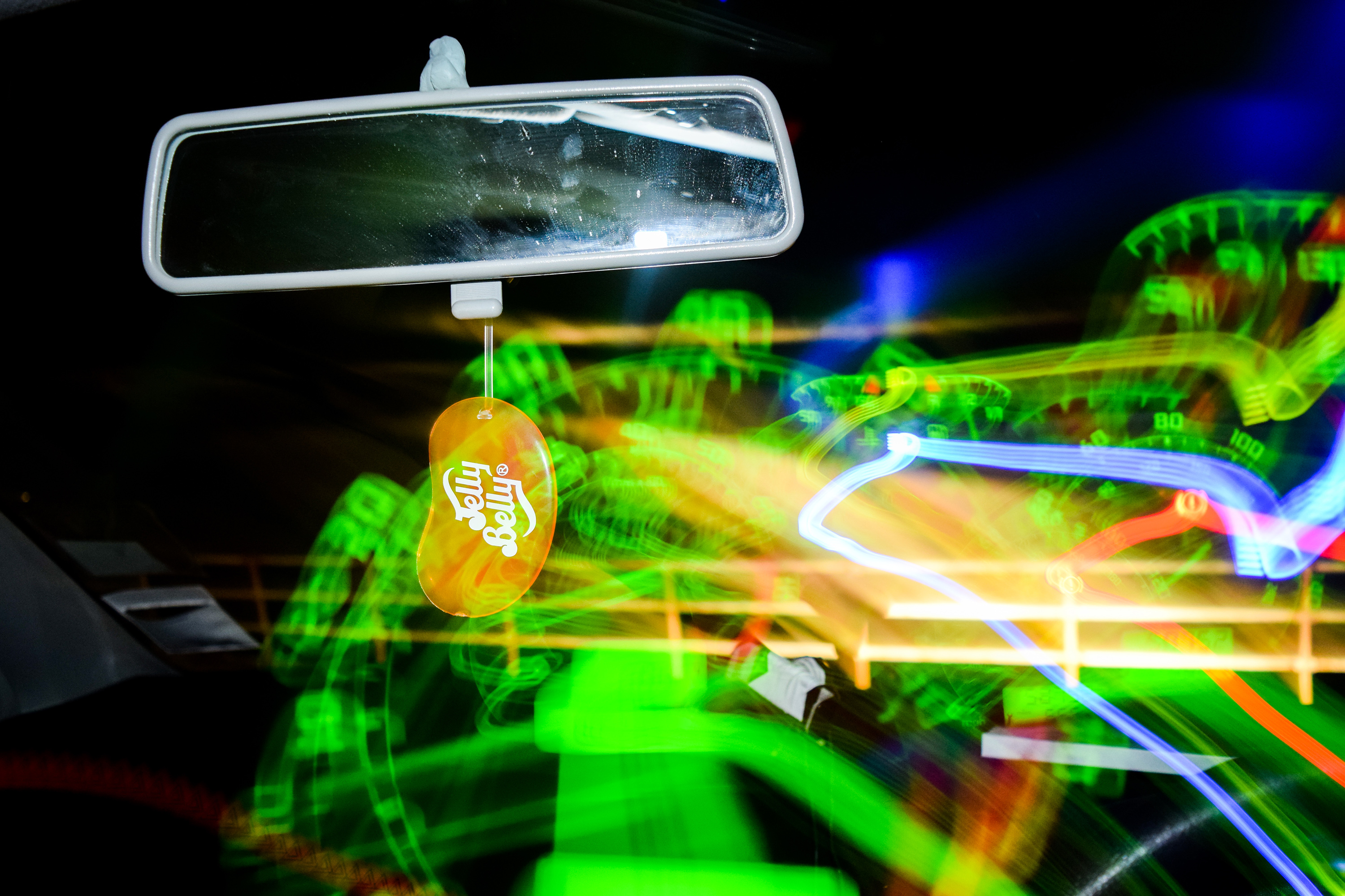
The next two images are my first examples of light painting from the shoot. I like them as they resemble a soft, abstract painting which is really interesting to look at. The sunset in the background created a nice smear of colour, and the sharp shapes made by the movement of my camera over the dashboard create an interesting contrast to the general blurriness.


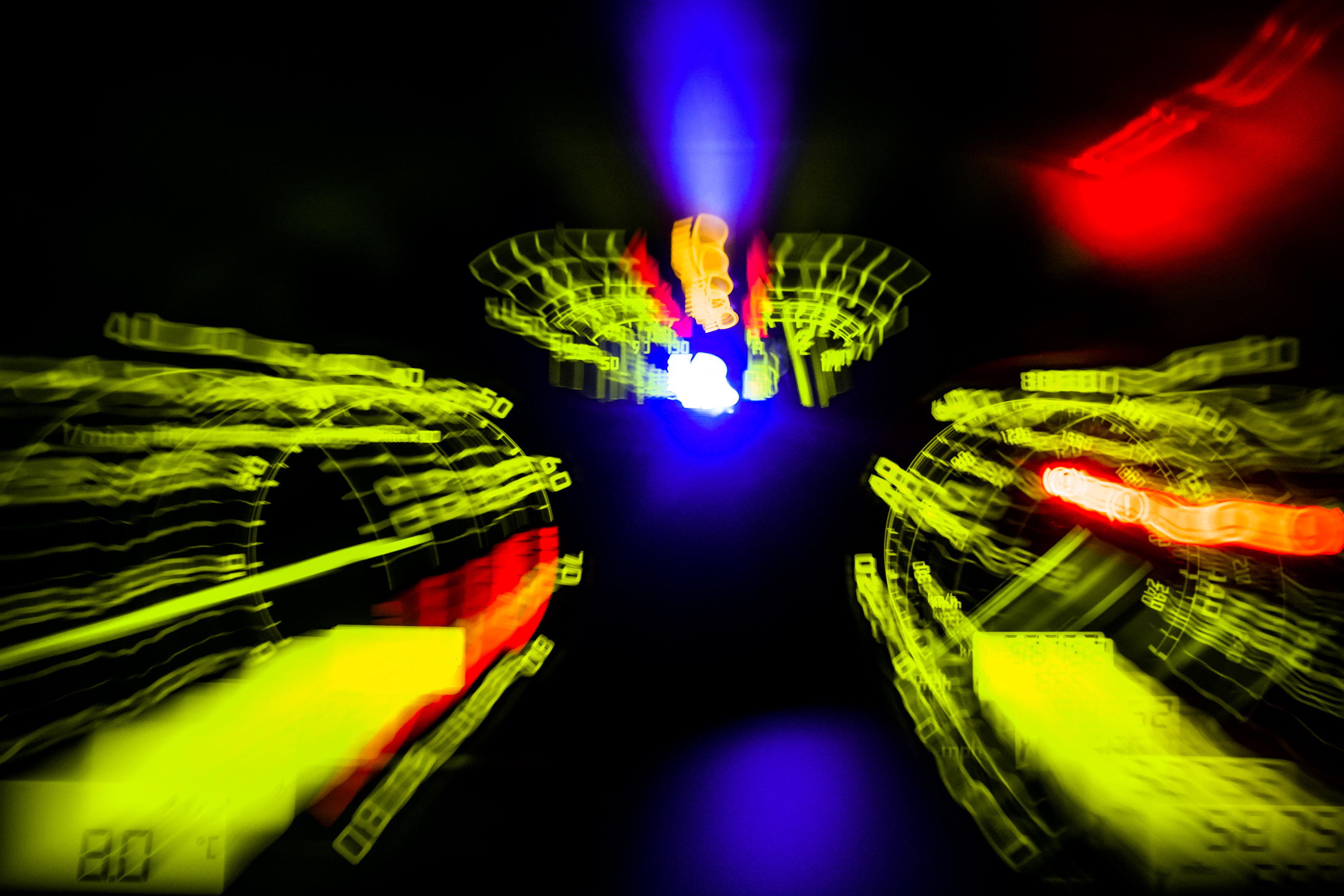
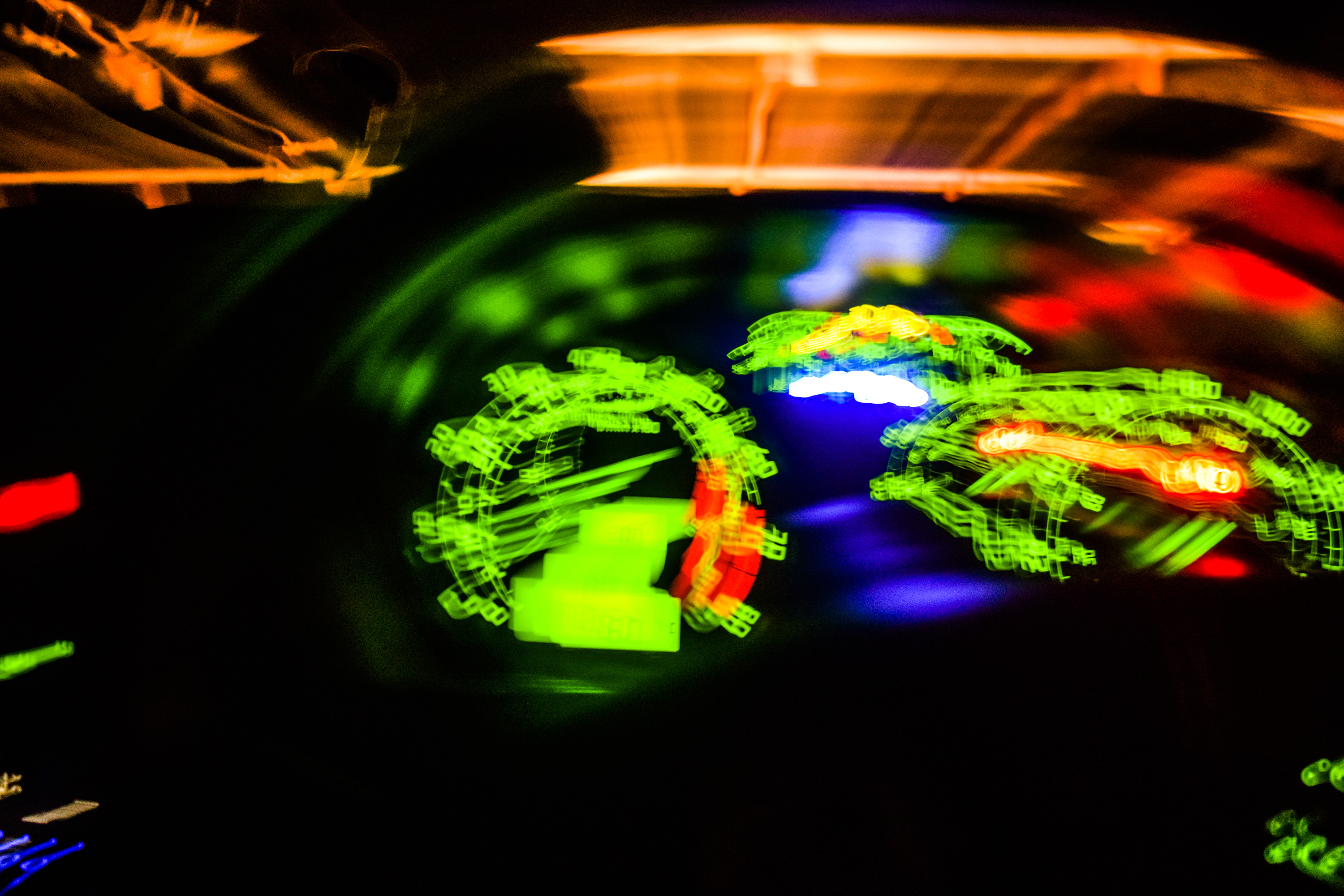
As it got dark I began experimenting with flash along with a slow shutter speed, and found that I could manipulate this to have the following effect. I was able to capture a sharp image with the flash, but due to the lack of light outside I could move my camera over the dashboard in the same shutter opening and draw over the image the flash captured. I began to play around with this a lot from here. I really like the craziness of the next image, and I was able to capture and draw with the speedometer fitting in nicely with the theme of motion and driving around in my car.

I was able to create an almost exploding effect by experimenting with zoom and slow shutter speed. I began the shutter zoomed in on Zacs phone, and whilst the shutter stayed open I zoomed out, expanding the phone outwards.


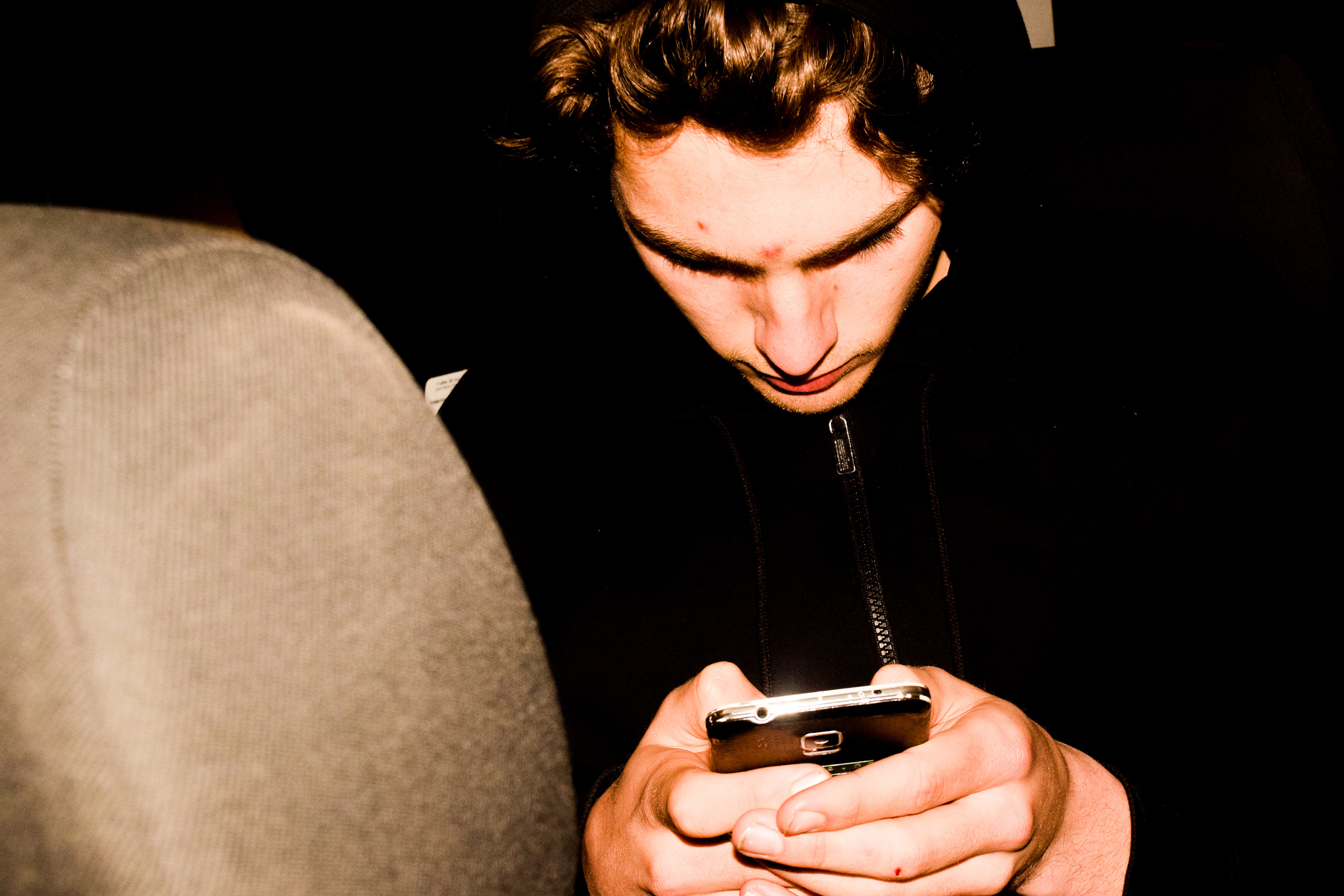
With the next few images, I experimented with the flash and shutter speed again, but this time drawing over Zac. I tried to think about the composition of the images, thinking about where the lights would be on the photos as I was moving my camera, I was able to make some interesting images drawing over and around Zac.


I really like the image below as I was able to draw the light around the curve of Zacs head, almost like a translucent bandanna, whilst keeping the portrait in sharpness.


The following images are some portraits, edited slightly warmer with a higher clarity. This is again to look slightly cinematic, which I furthered with the next image by experimenting with cropping sizes. The bottom of his head was originally cut out of the frame and so I cut down the top to make a more panoramic view of this scene of my friend in his car.



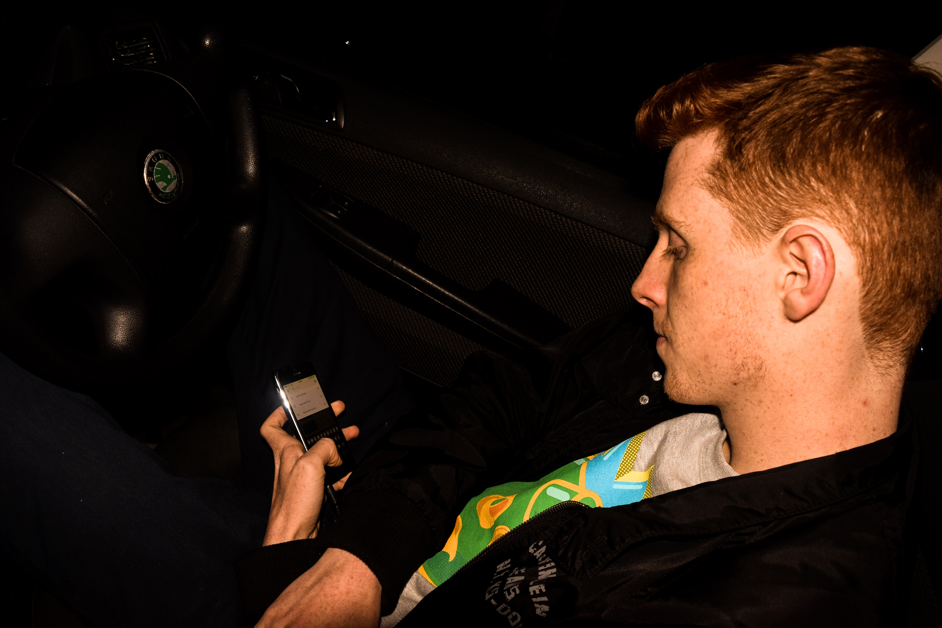
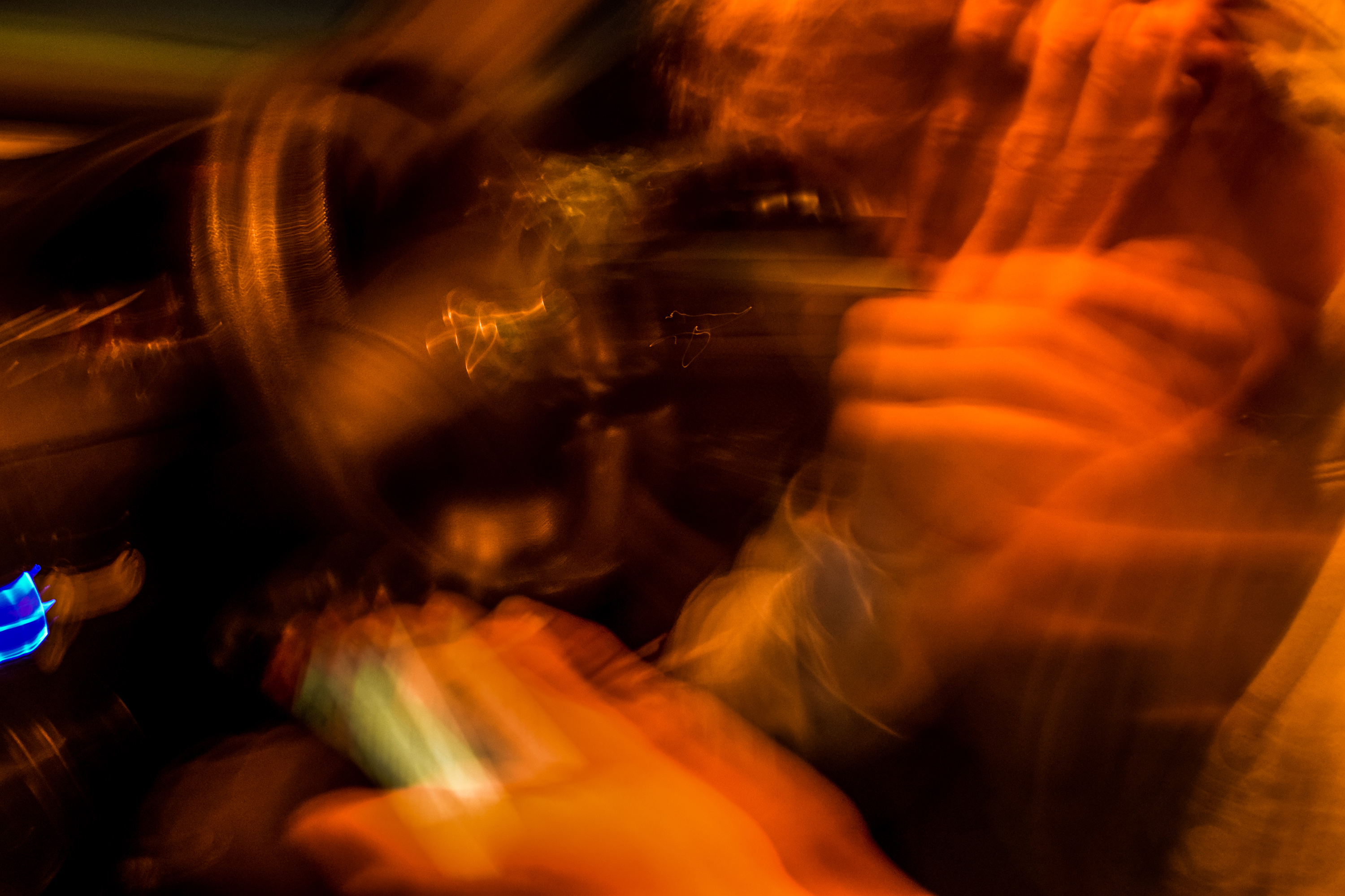
The following photos were made and edited to get really extreme, far more abstract images, more similar to paintings that capture a great amount of motion. The image below is actually a portrait that I have edited heavily. I used a slow shutter and shook my camera diagonally to create this effect. I then edited to colours to make it look a lot warmer, getting different hues of red and orange.

These two images were edited even more heavily, to create more interesting hues. I took the photos of lights in my car, and moved my camera, making repeated shapes from each light, just with different colours. This made a very interesting effect of repetition of these shapes in an extremely abstract way.


The next image is one of my favorites in this painted, mysterious abstract style. It is an image of my radio I made with again, a slow shutter speed and sharp small movements of the camera. The amount of lights on the radio meant that there would be lots and lots of small repetitions with each light, and the overall effect is this amazing flowing cylindrical light shape made up of lots of fading lines with many different blue hues.

These next three images are slightly more clear, but again still very blurry. I focused more on the movements of the person in these pictures rather then shaking my camera too much (although I still did slightly). The outcome of this was an abstract painting-esque image portraying movements of his head and arms all in the singe frame.


These following images show more tradition light painting. Using a phone torch, I got Jasmine to wave it about attempting to draw around the shape of the window in different ways. The outcomes were interesting.


My Final Photographs
As the exam brief was “Environment” i feel like i fulfilled it well. My project revolves around making a home in the environment, reminiscent of childhood dens. When beginning this project i immediately had this idea in my initial brain storm and therefore i feel as if this has allowed me to fully explore this concept. I begin with photographing my dens during the day, then adding in a sinister notion by photographing them at night. I was also able to create a couple of portraits of the people i imagined lived in the dens as i child and explore the impact of slow shutter speed photography suggesting the presence of a person. I feel as if the final consideration of archival diary entries i made about dens adds the final element to my project as it ties it all together to suggest the intentions of building these structures. They link the dens directly to childhood dens, without overtly stating it. My final book contains images from the very beginning of my project and the very end as my ideas progressed. A real turning point was to consider Yury Toroptsov to lead me to create the photographs at night, which was undeniably my best photographs of the project.
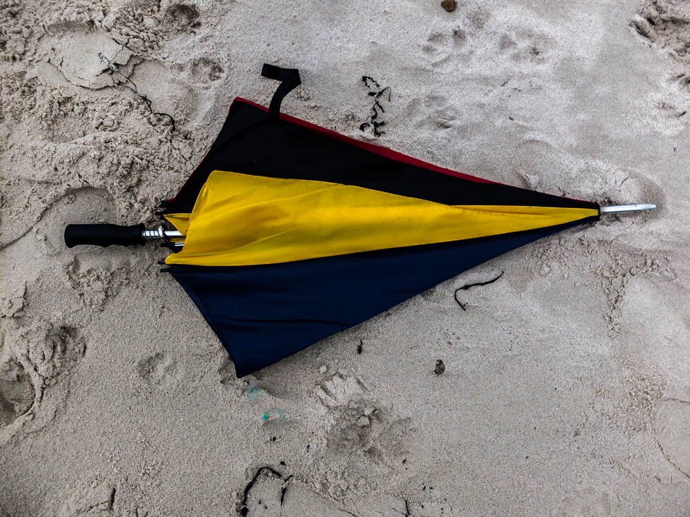
After my experimentation of projecting onto the den i also wanted to print up some of my images like normal to display in window mounts. I choose three main central images to print to have as single images. All of these images are from the night dens as when i photographed my dens the night time version had a lot more of an impact. They work quite well all together as the blackness of the night creates a link between all the images. I choose images from all different dens so as to show the range of materials i used. I choose the woodland den, umbrella den and the garden one with material as each one being made of different material created a more interesting final set of images. 
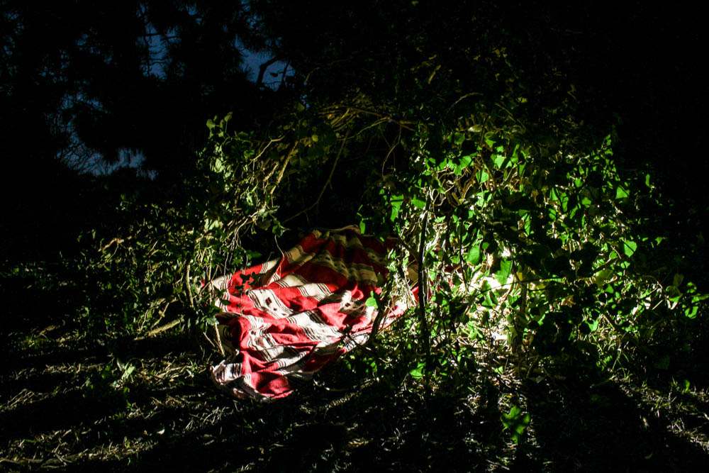
Above is the best photograph that i took of the wood den as a whole radiating light. This image was taken in the blue hours after the sun has set which you can slightly see by the sky in patches through the leaves in the background. With this photo shoot as the photographs were taken underneath the trees, the den being built in the woods, the background is made up of the dark shadows of the trees rather then the sky like my previous shoot. I composed this photograph according to the rule of thirds with the den itself more over to the right side of the frame. I also positioned the light inside the den more to the right side of the frame and so the image is fairly weighted on that side of the composition. This contrasts quite well with having the bright blinding light of the den to the right and then in the sky the patches of light from the blue sky are on the opposite side of the frame, balancing the image. I took the photograph from a slight angle, not photographing the den straight on so you can see directly into the den but more from the side so the inside of the den remains more mysterious. By putting the light within the den you are able to see clearly how the structure of the den is made up of branches and leaves intertwined together and the light then shines through these gaps. The light quite literally radiates out from the points at which it escapes the inside of the den to create an interesting pattern of lines from the center of the den outwards. I think the effect is further emphasized by the light making the leaves it shines through a more vivid green, these bright green then contrasting with the red of the blanket.

The above image plays with the blur of the blankets in the wind. The impression of the photographs is that as the light is behind the blurred blanket, that it is rushing forward towards the camera and has a presence as the light suggests life. The light is intense and shines from directly behind the blanket in a circle. The rest of the image is slightly illuminated, the tree and some plants but the background is an intense black which only exaggerates the whiteness of the blanket further. The blanket is also just blurred enough to suggest a fast pace of movement but without being too fast to become transparent. The image is composed to consider angles, the blanket covering most of the frame but its straight lines being complimented by the straight lines of the tree also. The tree flanked on both sides by different blankets. The image is illuminated so that it included the light shinning onto the plants and also the light shines onto both blankets.
I then choose these two images below as a pair as they are a bit more abstract and i wanted to show the abstraction of the material and how it was layered over each other. These two images also show the imperfections of the den, with gaps in between the material.
The above photographs are more abstract compositions which focus on the point at which material is over-layed. The two colours being various shades of blue complimenting each other. The light in the photographs comes from the top left hand corner to shine directly onto the material. The points at which the light shines onto the material is washed out with colour which shows the harsh intensity of the light. These bright sections of light then contrast with the dark shadows in sections where the blanket has slipped and therefore leads into the inside of the den. Both these contrasting lights and dark’s then make the colours themselves more intense. I quite like the contrasting angles in these photographs alongside the vivid lights and darks as the material runs alongside each other but then has different folds and patterns on them which adds a dynamic to the photographs. They also show the process of the den breaking and then being rebuilt. When considering Goldsworthy’s work this was a key part of his process, to rebuild and continue to re-build until the structure becomes sound. This is as much about the den being created as having a final product as the den comes undone because of the environment, be it wind or the un-ablity to get a blanket to balance. The above photographs focus in on the tiny points of the den which have become to come apart, where holes have developed in the structure. I quite like these photographs in showing the layering of material and the tiny holes giving an insight into the inside of the den. The photographs are composed so that the break in the den is right in the center of the frame. The light in both photographs is intensely bright.
The next two sets of images show more of the process and how the dens are constructed. The set directly below is held together by pegs which shows how the images are put together.
The above photographs are all small details which held together the den. I quite like them as detail shots to go alongside the photographs of the main dens. So often with dens people look at the final structure and don’t consider the process. As these photographs in this section of my project are all about process and how the structure comes together, as much as the final product i think these photographs work really well as part of the series. In particular i like the photograph which suggests the movement and tensions of the material in creating the den. I composed the photograph according to the rule of thirds, the peg which joins the material positioned to the left top corner of the frame. From this point the material billows out at an angle which suggests it is being blown from behind. I quite like how the background is over exposed as the light outside is so bright as it causes the material in the foreground to be more prominent. You can also see to an extent the light shinning through the blanket which adds another dimension to the photograph.
This image below then shows the process of each element of the den coming together to create the structure. It shows how each individual umbrella is an individual which comes together to make a den.
My Book Layout
Finally, after doing artist research and choosing my favorite selection from my shoots, I was able to produce my own book for my project ‘Environments’. After designing my book I definitely knew it was the right way to present my shoots, as it allowed all of my photographs to flow.
Here is a link to my photobook: Nomadic Soul
Thumbnail of book layout;
The reason for print-screening the book in a thumbnail version was because its more visually easy to see why I choose my certain layout. When designing the book I had to think about spreading out the double spread pages, the black and white images, and certain layouts. I had to make sure all images on the page next to each other worked well together. Another important thing when editing is if a page has a similar layout to another one, they have to have the same padding etc, so it looks organised and neat.
Digital version of my book;
I believe the title of the book is very important aspect. Titles should convey not only a sense of the book’s subject, but also a feeling. The title you choose for your photo book sets the tone, hints at the genre or style of book, and draws the reader in. It’s your very first opportunity to “market” your book and make someone want to read it. I finally came up with the name ‘Nomadic Soul’ this was due to the word nomadic meaning living the life of a nomad; wandering, and a soul is an emotional or intellectual energy or intensity, especially as revealed in a work of art or an artistic performance. I found this title was perfect for what I was trying to represent as I wanted to represent a lot of energy and intensity of a traveler.

Unlike the artists such as Juergen Teller, Corinne Day and Theo Gosselin, who’s photo books I decided to analyse I decided to put the title and my name on the first page. This is due to me wanting my first image to be a double page spread, and this wasn’t possible without having a first blank page, so I thought I would just make the most of this page, and immediately tell the reader what I was going to show them in my book. This was due to the title being on the first page working well with the rest of the layout.

It is crucial to use the perfect first image, as it makes or breaks whether the reader is going to carry on reading it or not. The reason for the choice of this image is because the book is representing a journey, and there is no better way to represent this than by a photograph inside a car, which isn’t stationary.


Every 4-6 pages I choose to have a double page spread, as it would break up the smaller images, and is almost like having different chapters in written books. It gives it a stronger structure and shows principal images. The images I’ve chosen for double page spreads also tend to be some of my favorite images, as they have so much detail and interesting aspects to them. The difficult thing about selecting my double page spreads was the fact most of my images had someone featuring in them, and usually tended to be central of the image, which made it difficult for designing the book, as I didn’t want the people to end up being split by the binding of the book.

When selecting two images from different shoots on opposite pages, I would make the images link in a certain way, for example below one can see that the girl on the right page looks as if she’s looking up at the girl on the left page, this is shown again two images below. Therefore I had to think about the composition of the images before putting them in a certain layout.
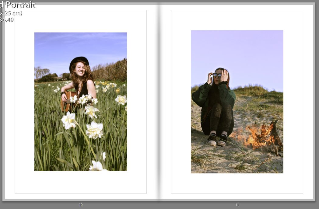


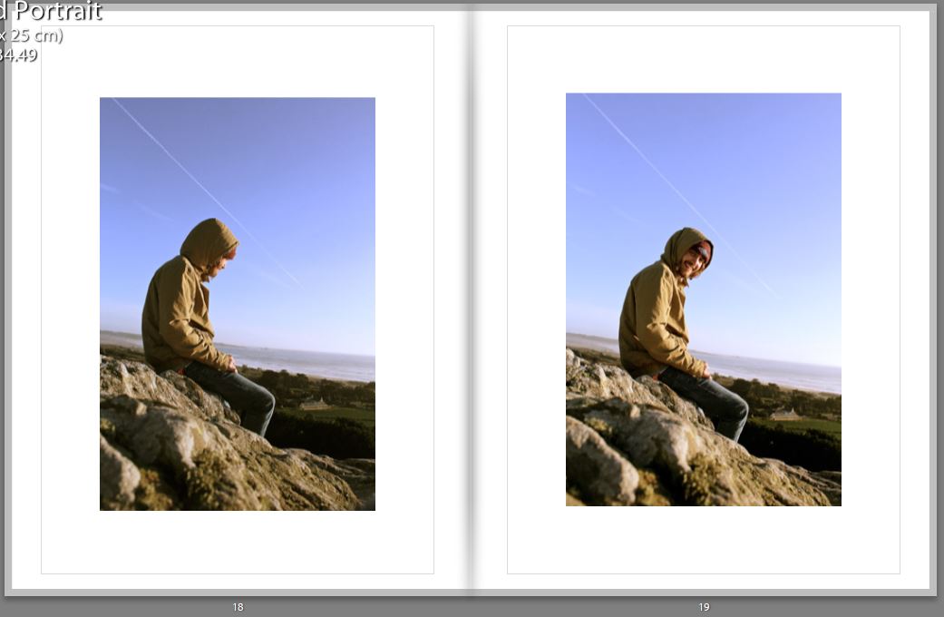

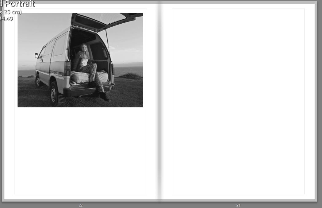
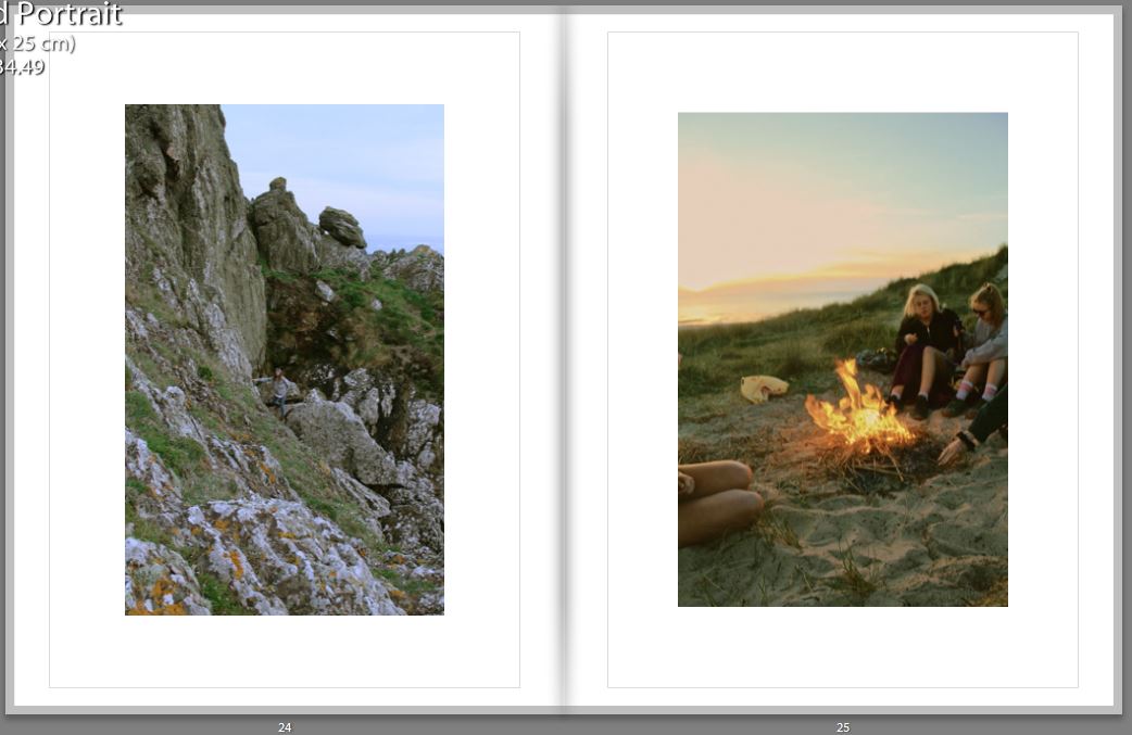


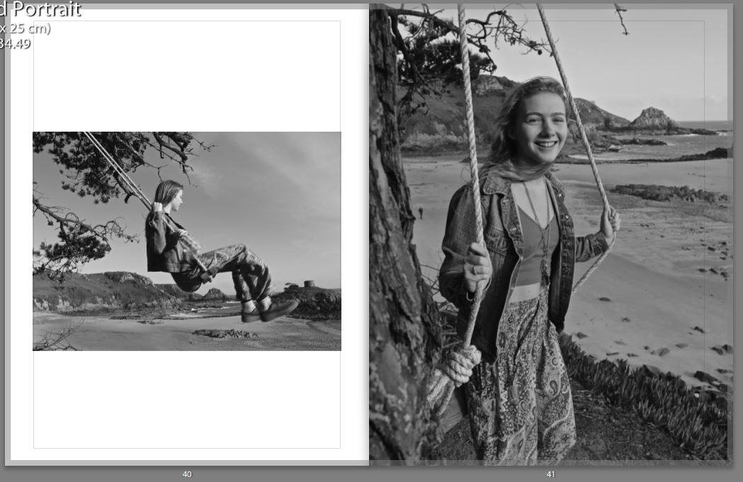

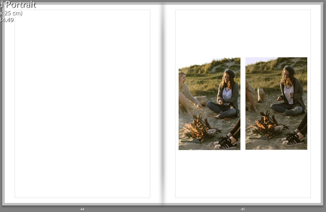
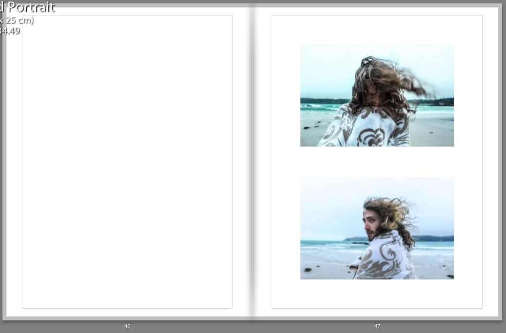


For my final image shown in my book, I choose a similar one to the first image as they both represent the journey. By having this as the last image, it looks as if even though the journey for the reader has finished, the journey for the people featuring in the book hasn’t finished.

How well have I responded to Artist Research
For all my artist reference, I based my shoots on some of my favorite photographs taken by the photographers. Therefore, In this blog post I have wrote and represented visually the similarities and difference, of my work to the artists I researched.
Response to Theo Gosselin;
I personally feel as if Theo was the main artist I was inspired by for this project of ‘Environments’ as I loved his style, locations and adventures I went on to capture photographs like his.
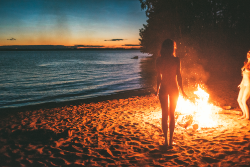
With most of Gosselins shoots I would take the principal idea and then just alter them into my own style. As seen below, the top image is Gosselins and the bottom image is mine, the difference are fairly blatant, as the time of the day we took the photos differs, he took his just after sunset and mine was taken just before, therefore creating different lighting effects on the models. Gosselins photograph also features to girls completely nude, whereas all four of my models are are fully dressed this was due to school restrictions not allowing full nudity in my images. The similarities are there are more vertical objects on the right side of his image and the girl standing up in my image is on the right. Then obviously there’s the fact it’s only females who surround the fire in both images, and both of the fires are on a sandy location, nearby to the sea.

The image above which is taken by Theo Gosselin is similar to mine below because both are featuring blue vans, and both have their door open, allowing the viewer to briefly see the inside. Also, both images are taken in a car park which is located next to an area with a large mass of water, for example in my photograph one can see the sea, and in his it’s either the sea or a lake. The difference between the two images is that he’s made the van be in the mid-ground of the image, whereas mine is located in the foreground of the image.


Response to Juergen Teller;
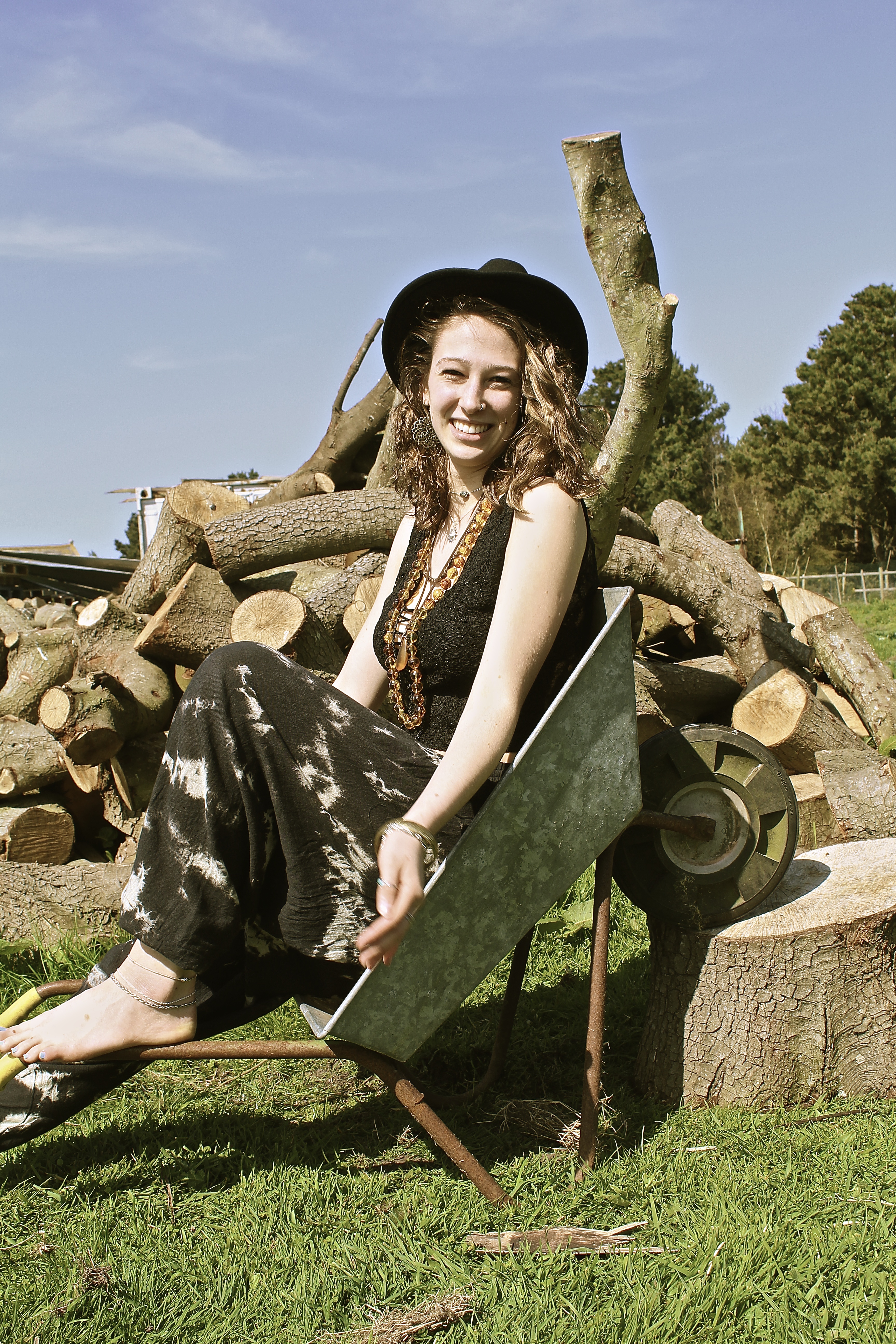
The main difference between the two images below is the persona of the model, Juergen Teller has shot Kate Moss looking moody in the photograph below. Whereas I have captured my model looking happy and smiling. The other significant difference is the fact that his image is horizontal whereas mine is portrait, due to the way the model is posing, Kate Moss is lying in the wheelbarrow whereas my model is sat inside. The similarities are the rustic wheelbarrow used as a prop in the two images, and due to the background of both images one can see that they’re both in natural environments. In both images similar color schemes are used, both using a lot of brown, blue and green, all very natural and pure colors. However Teller creates more vibrant colors in hers by the use of jewelry and the container in the background.

Response to Corinne Day;
The main difference to these photographs is Corinne Day(below) has more negative space in her image than I do, this is due to me contrasting my images more and making there be more definition, therefore creating more detail in the background than Days photograph. Whereas the way she’s taken the image has a high exposure and more sharpness in her image, than to mine. The main similarity is the way the model is positioned, for example they both look a bit shy with their body and are smiling nervously infront of the camera, they’re both titling their heads facing to the left of the image, and use their shoulders both shrugged with a bent left arm. Both of the models are very slim as well, with messy hair, blowing in the wind.


Response to Jacob Sobol;
These two images I find our very similar, as both models are trying to kiss the photographer, therefore conveying the same message and emotions behind the image. Both images are out of focus and taken in black and white and are slightly over exposed, the models both have their eyes slightly closed and hair scrapped back. The main difference is the photograph above by Sobol is taken of a women, whereas mine is taken of a man. Also Sabine, the model for Sobol is looking up at the camera. Whereas in my photograph he’s looking down at the camera. Therefore creating a slightly different composition. In my photograph I feel the model isn’t being as serious as Sabine as he looks like he’s jokingly try to kiss me, whereas Sabine looks more serious. This is perhaps because of the location both images were taken at, Sabine is in a bedroom so it’s more personal whereas me and the man in the photograph were on the beach, where it’s a public place.


Response to Ivan Troyanovsk;
Mine and Troyanovsk photograph are similar yet very different. They are similar in the perspective that the photographer is looking down at the model, and are above the sea, with the coati coming from the right across to the left hand-side. Therefore, they both have a similar composition, they both also have V shape in the rock, almost like the top of a heart on the left of the photograph. The differences are, there are two models in the image of Troyanovsks, with their backs facing the viewer. Whereas in my photograph the modelling is turning facing the camera, and is alone. Another huge difference is the fact the models, in the above image taken by Troyanovsk, are standing on a rock which isn’t as visible as the one my model is standing on. The environments are also different, for example my environment had a lot more rock and the waves were a lot more choppy than the image by Ivan Troyanovsk.
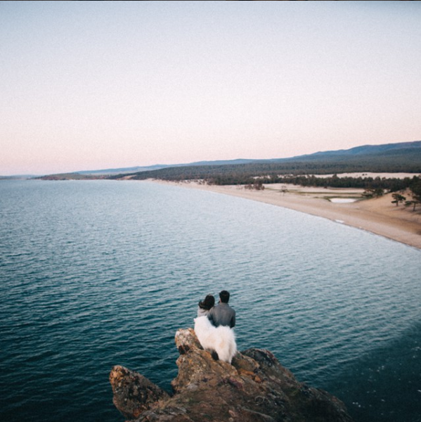

In conclusion, I feel I have responded well to my artist references, as every single shot was somehow influenced by a photographer. Although, no shoots were directly copied, I would take an idea and then alter it to make it my own.
Environment – My Book Layout
Here is a link to my Blurb photo book:
http://www.blurb.co.uk/b/7937421-are-you-even-cool
After the refinement of each of my photo shoots, I came to the realization that I had a large amount of strong images, in which I would have been happy to present as finals. With this in mind, I therefore decided to create a photo book in blurb to present these images more intimately.
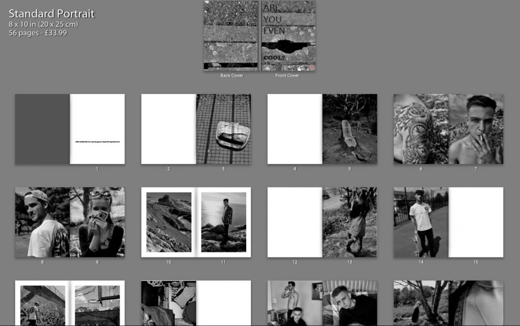
Below shows a thumbnail view of my final book layout. I feel that this thumbnail view gives a stronger perspective of the layout as a whole, in comparison to the individual pages, as it is much clearer to see the overall aesthetic of the book and why I made certain choices with the layout.
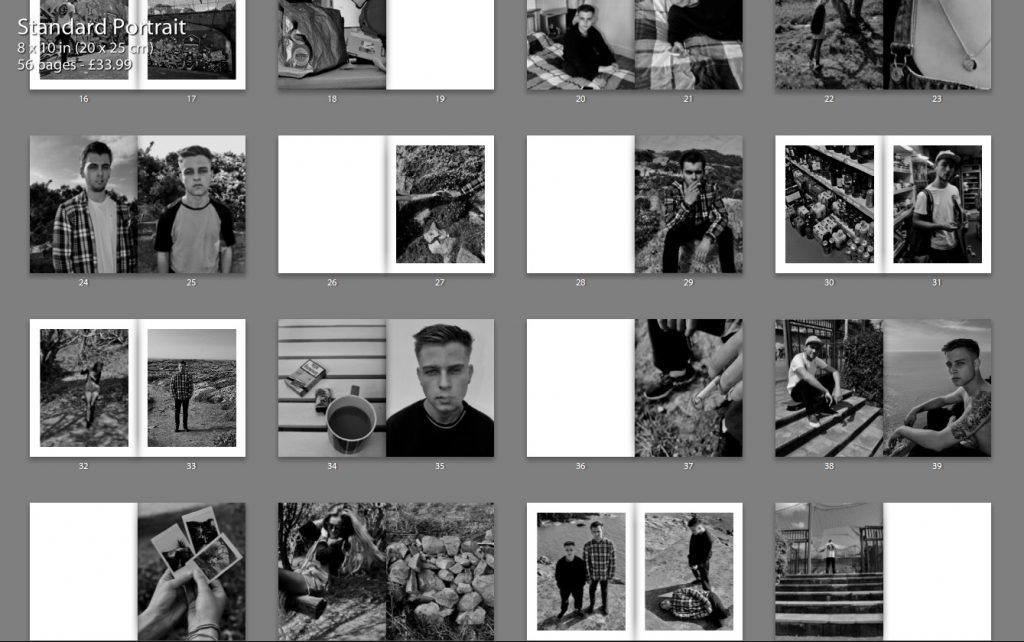
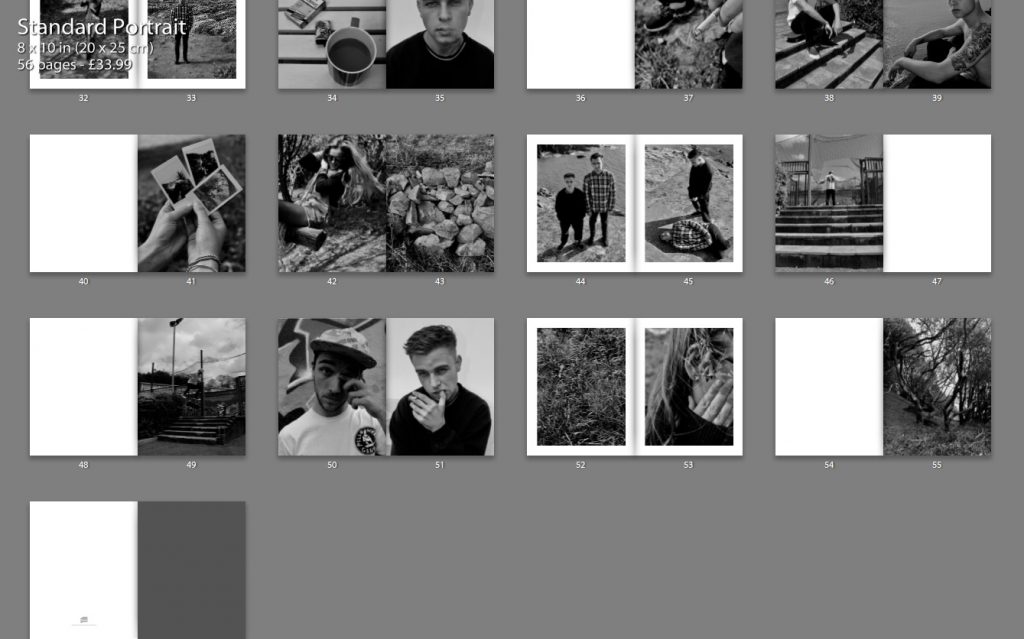
The following print screens, show my book layout as double page spreads, this way we can see images and the specificity layout more closely, as well as how images have been presented effectively.
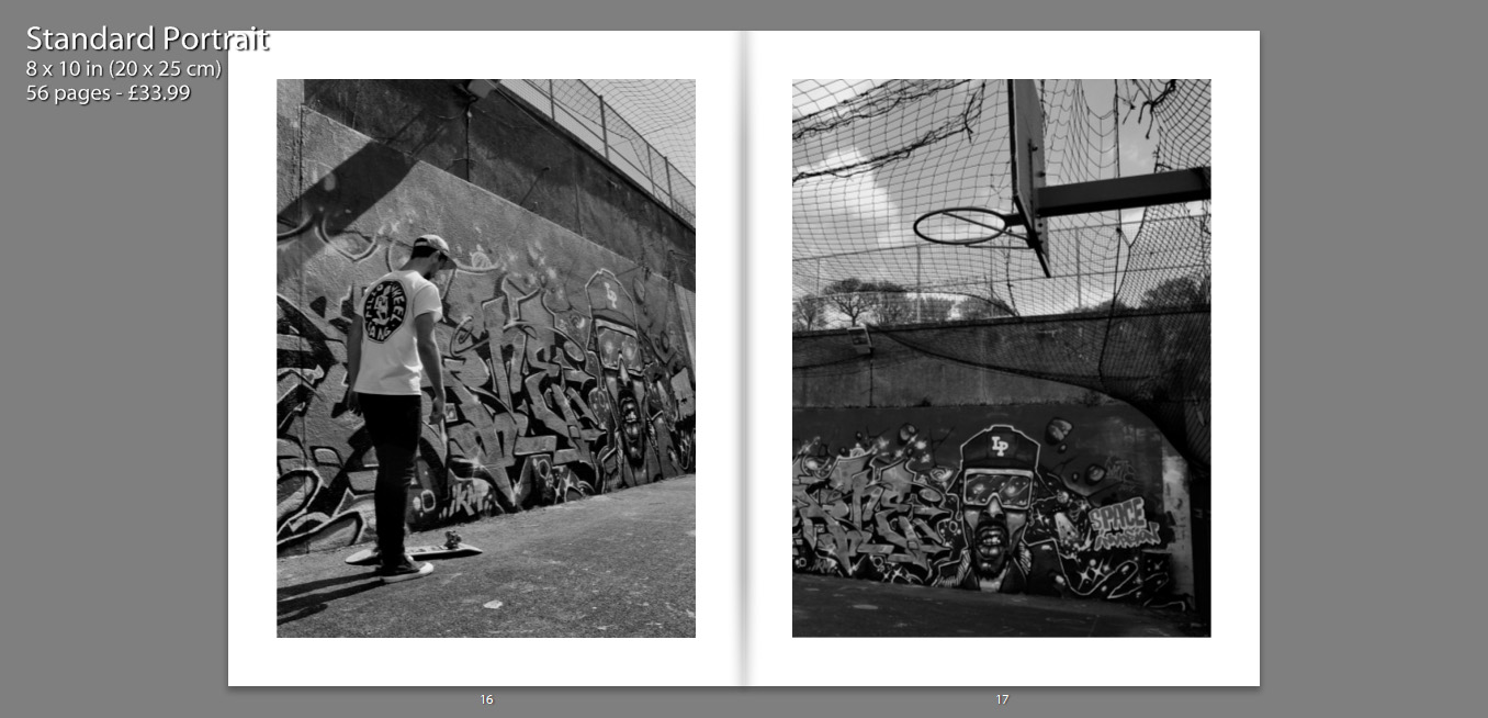
I decided to title my book ‘Are You Even Cool’?’. I titled the book this, as I feel that in a modern day society, especially within the age confinements of an older teen, there are many expectations as to what we should be doing, or looking like in order to fit this idealization of ‘cool’. I feel that my book contains many of these aspects, such as smoking, skating, having a boyfriend/girlfriend, sex, alcohol, drinking coffee and tattoos. I think that this title enables the reader question the book as well as themselves, making them want to open the book and see what is contained. It also creates a more personal title as I am asking the reader a question, it is also as if I am asking the characters in the book the same question.
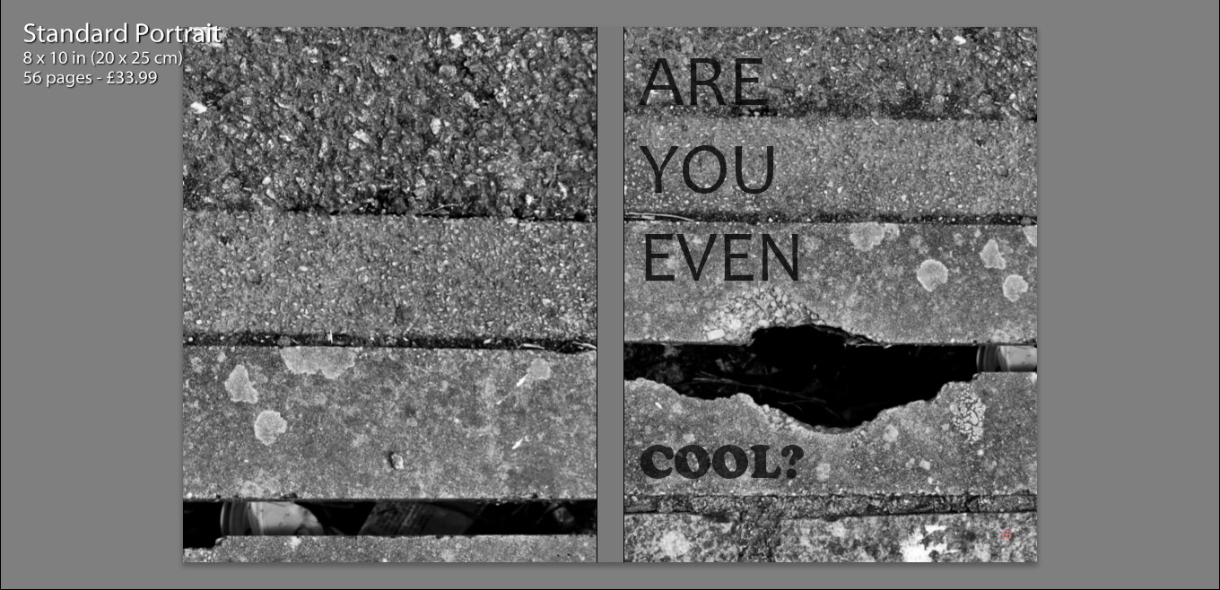
Initially we see my front and back cover, as well as the book title. I chose to use the same image for both the front and back cover, zooming in and aligning them differently, so that they appeared to be two separate photographs. I felt that use of this image was almost a summary of my book. Very gritty and in many ways unpleasant, but as well see a very interesting texture alongside well positioned lines which in some sense convey beauty. So more simply put, my book is a contrast of beauty and ugliness, making it rather controversial.
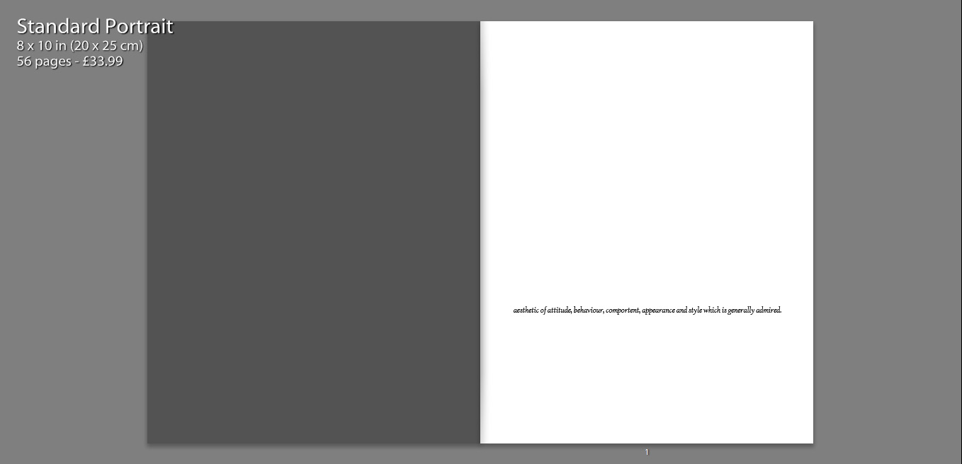
I also include a quote on the first page, how the Urban Dictionary defines the word ‘cool’. I felt that this was relevant as I wanted to include a sense of what the world defined the word as, a ‘style which is generally admired’ is a common theme running through a modern day Jersey. So many children are concerned with living up to social expectations and imitating others and their styles.
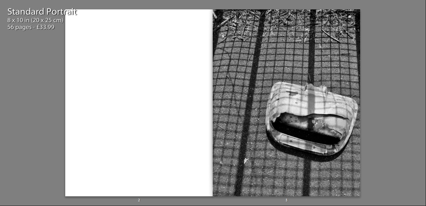
In terms of imagery, within the book we firstly see an image standing alone on a single page. My intentions with this are largely to provoke thought, what is this? What does this mean? Why is this the first photograph?
As well, I feel that an image which appears alone becomes more poetic, as we only focus and analyse this one photograph and it is not particularly related to anything else at the time we view it.
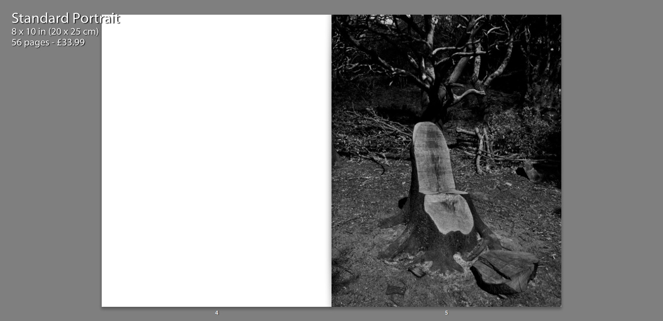
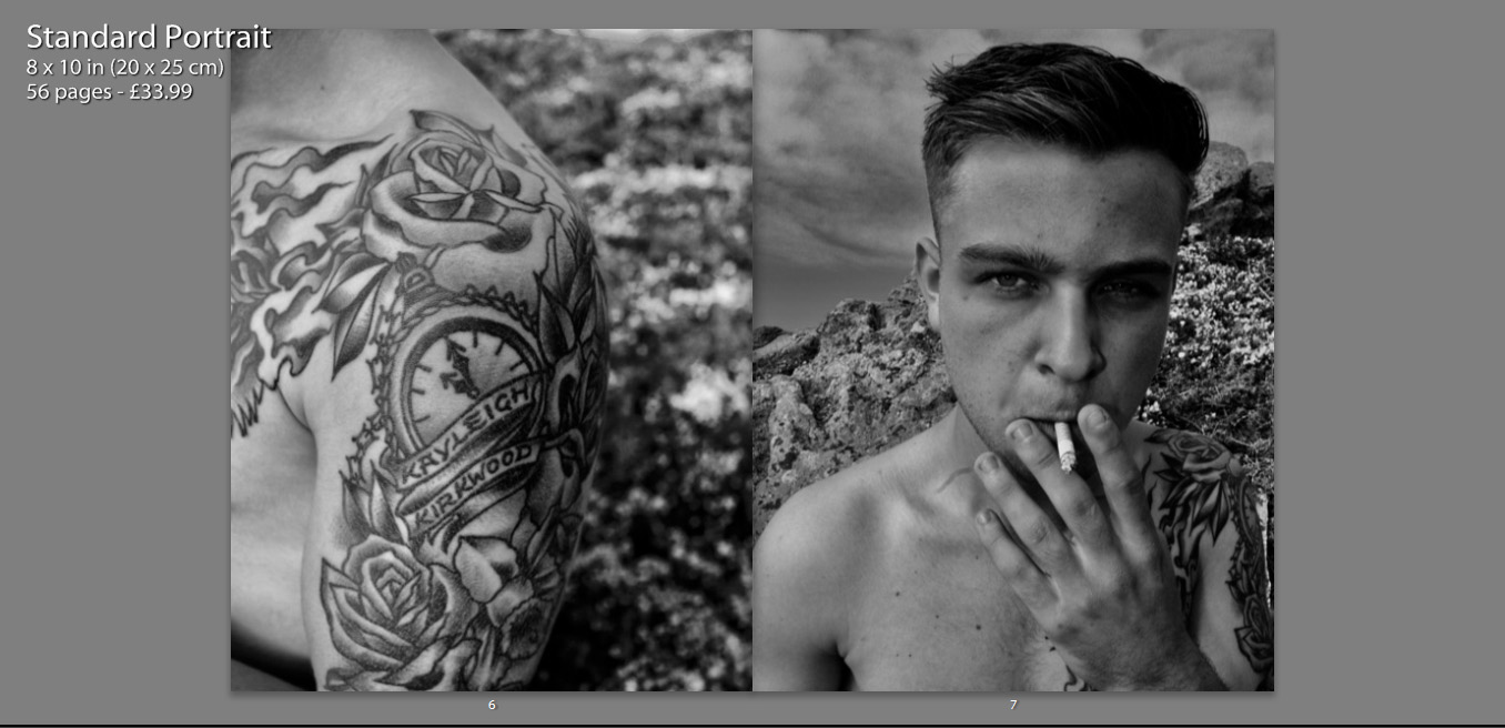
On a large amount of my pages I feature two full page photos on a double spread. These images often juxtapose one another and create meaning, as well as contrast. I chose photos of similar form and aesthetic, which means they fit well together and almost appear to be one photograph.
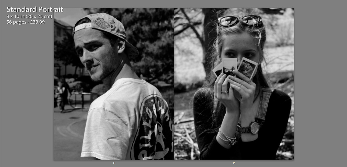
Another way in which I have presented my images, is contrasting other charters within the book on opposing pages. I placed images of similar composition and pose next to one another, which I feel creates a relationship between the two characters as they are shown in a similar perspective.
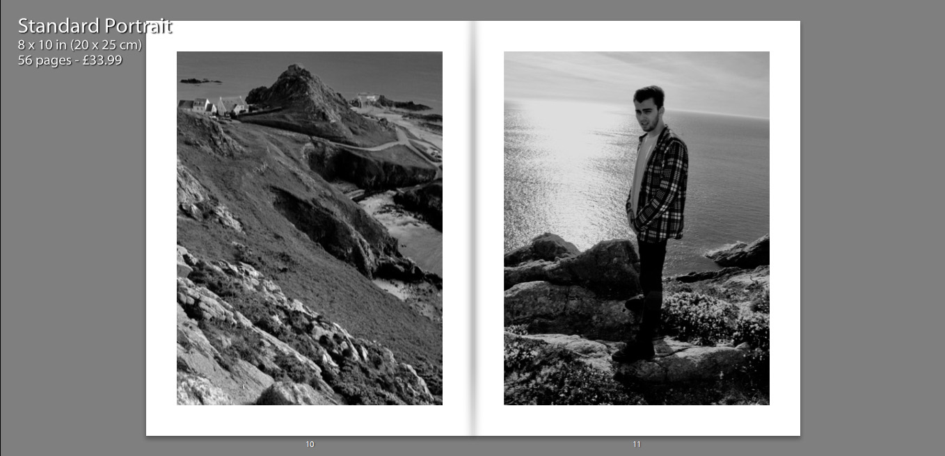
Some images have also been resized, so that they are not full size, as I felt that having a boarder allowed the details of the image to be more dominant. It also condenses the photograph which helps to bring focus to the subject also.
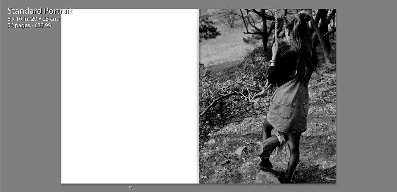
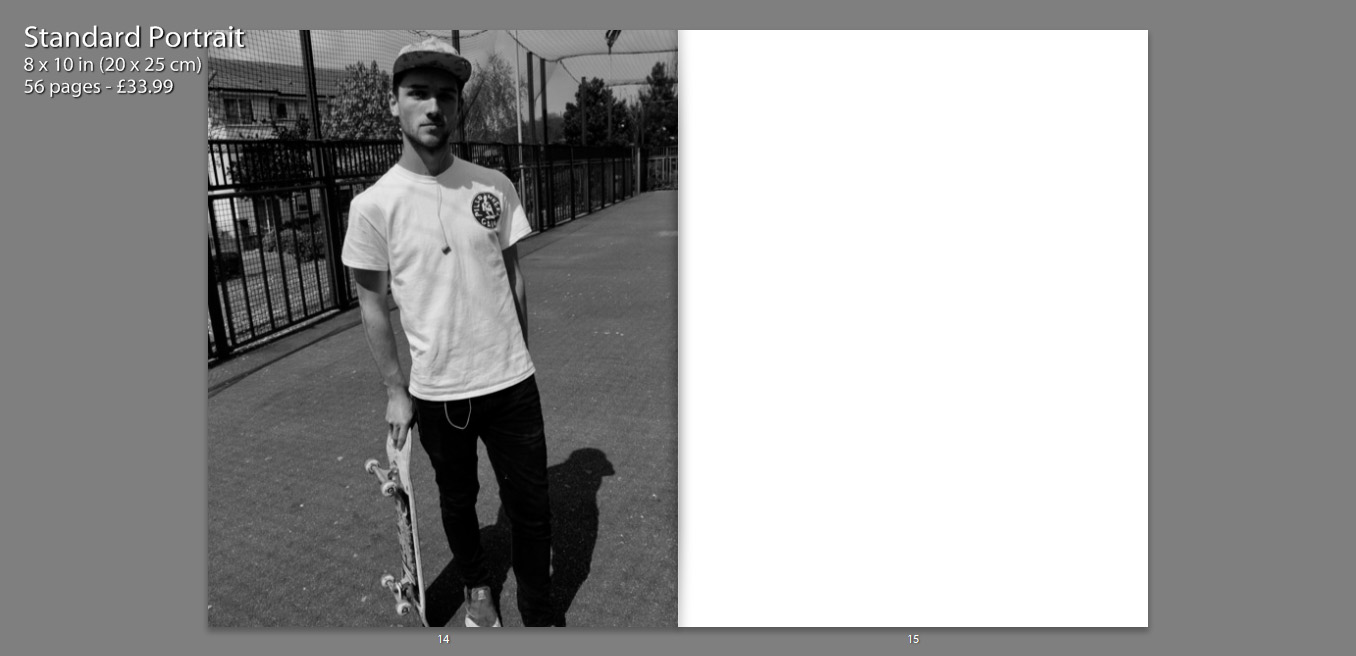
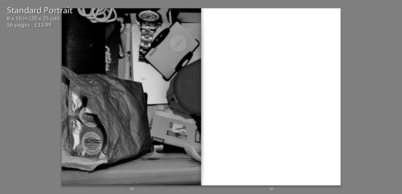
The inclusion of various still life photographs, that appear on their own in the boo, as well as alongside other images, allow the book to become more personal. We are also able to gather a better understanding of the characters and their interests.
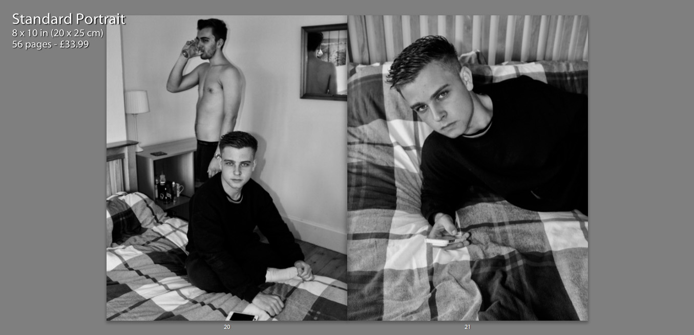
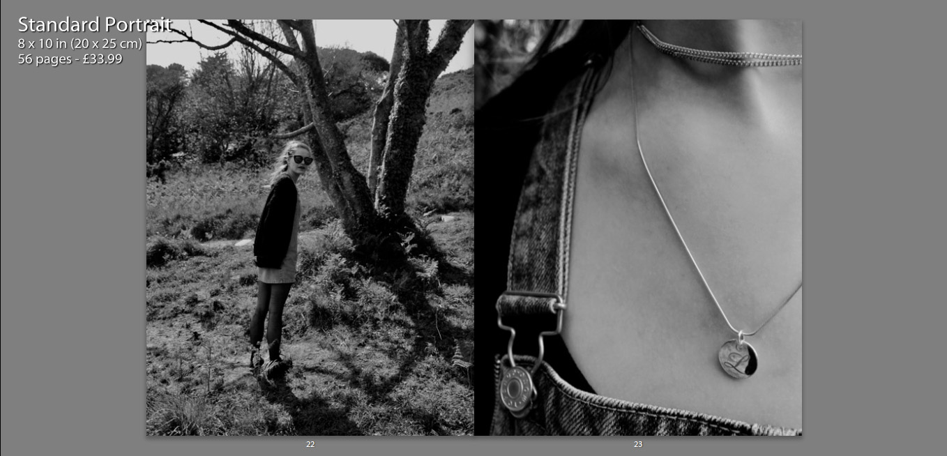
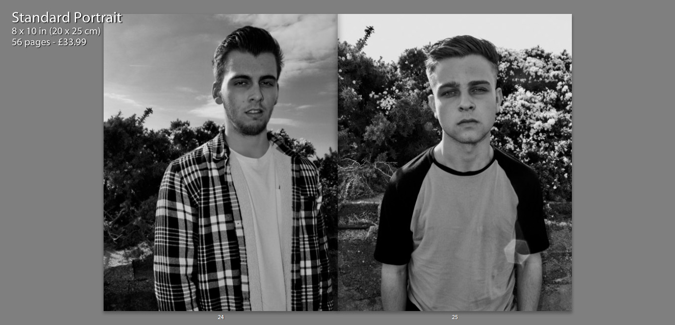
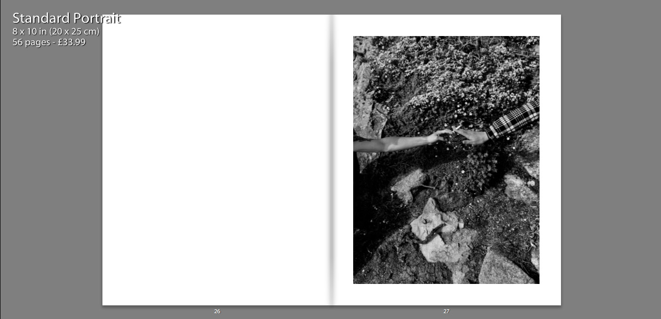
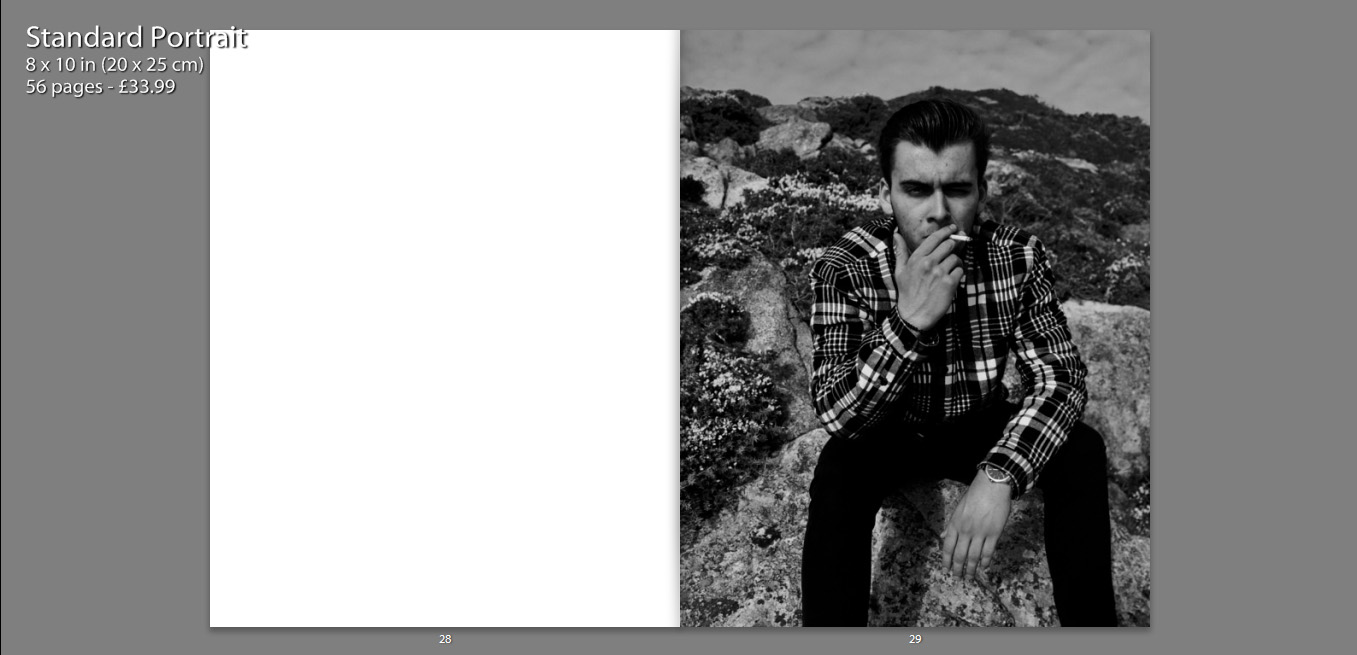
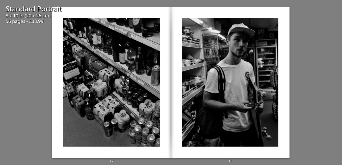
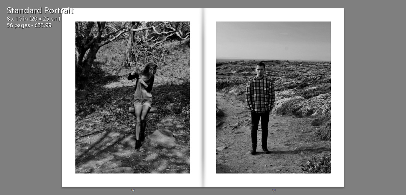
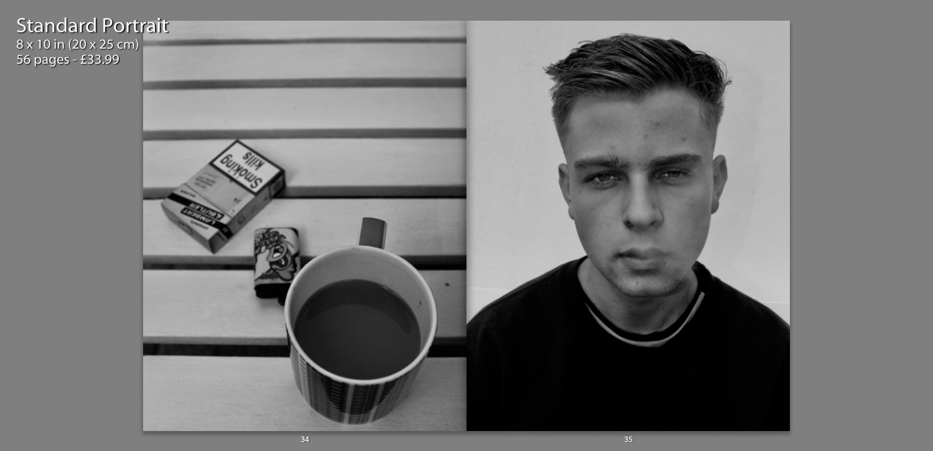
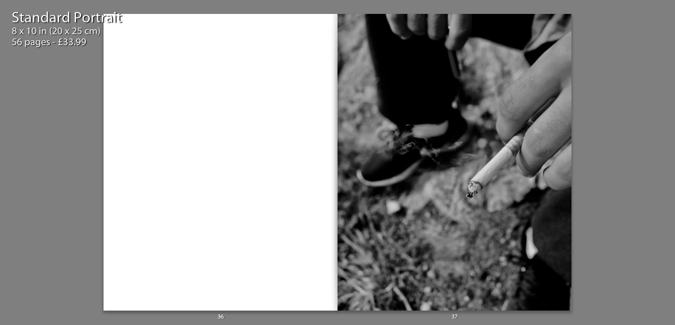
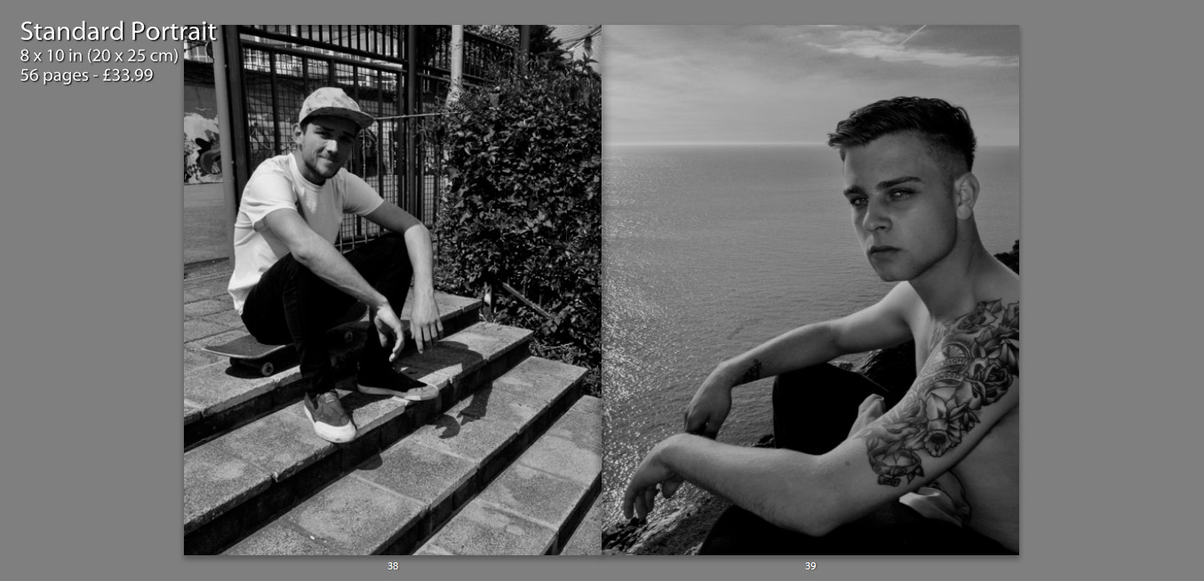
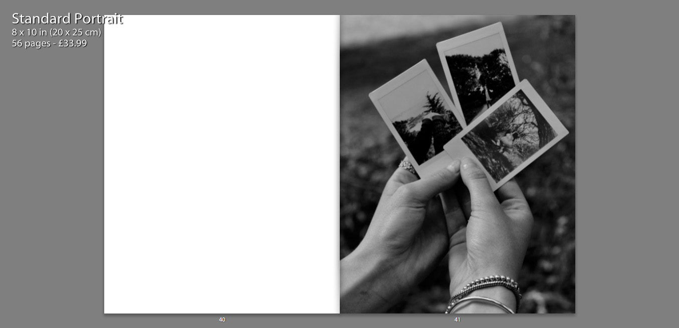
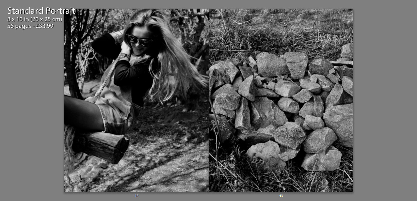
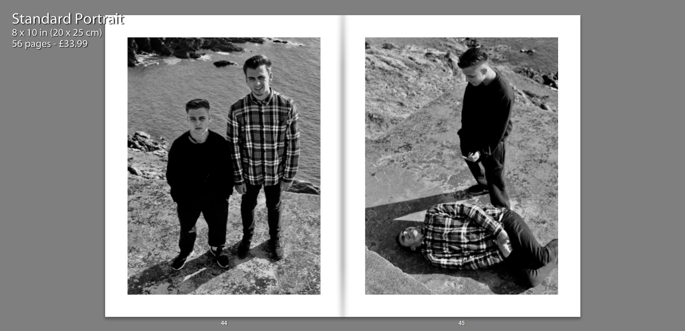
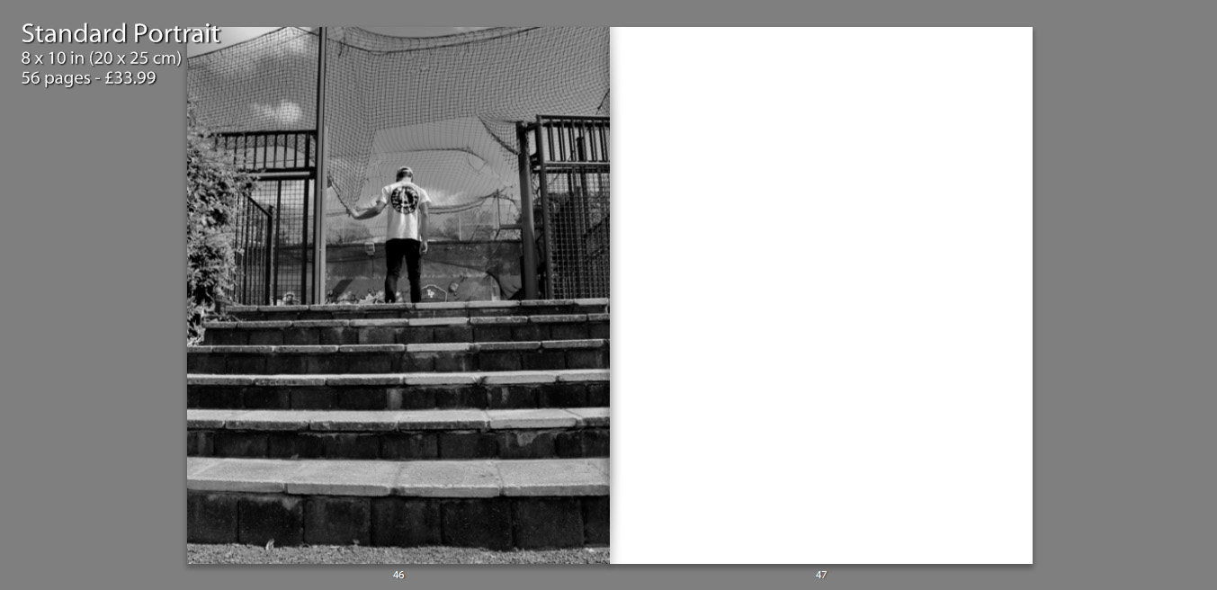
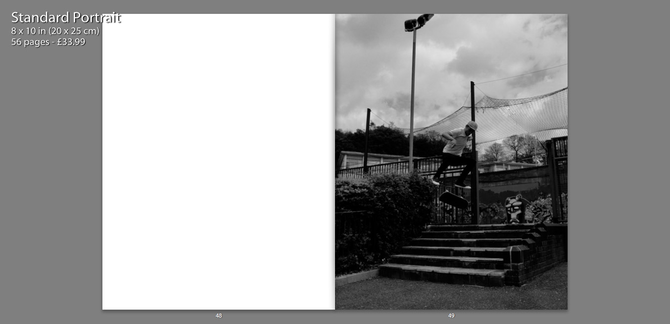
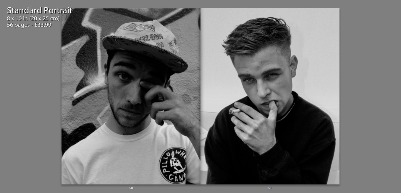
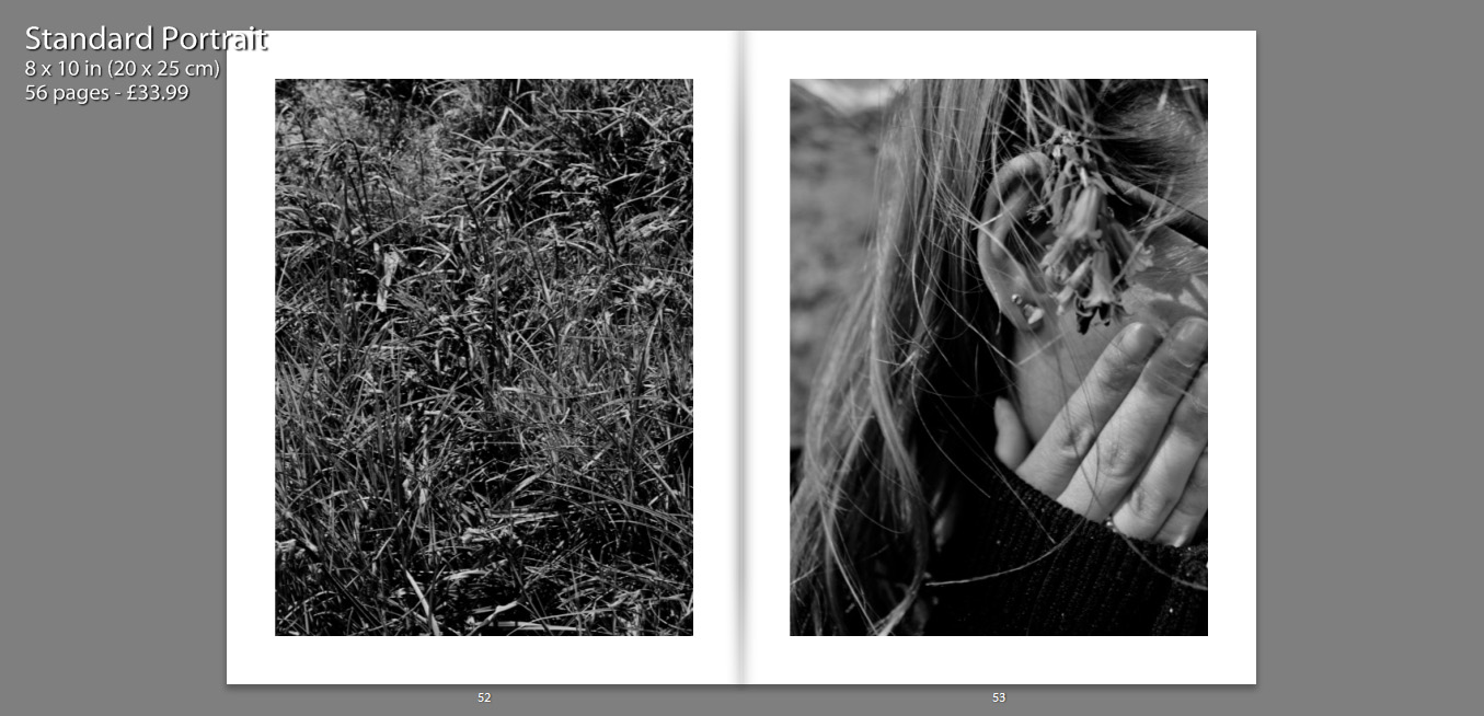
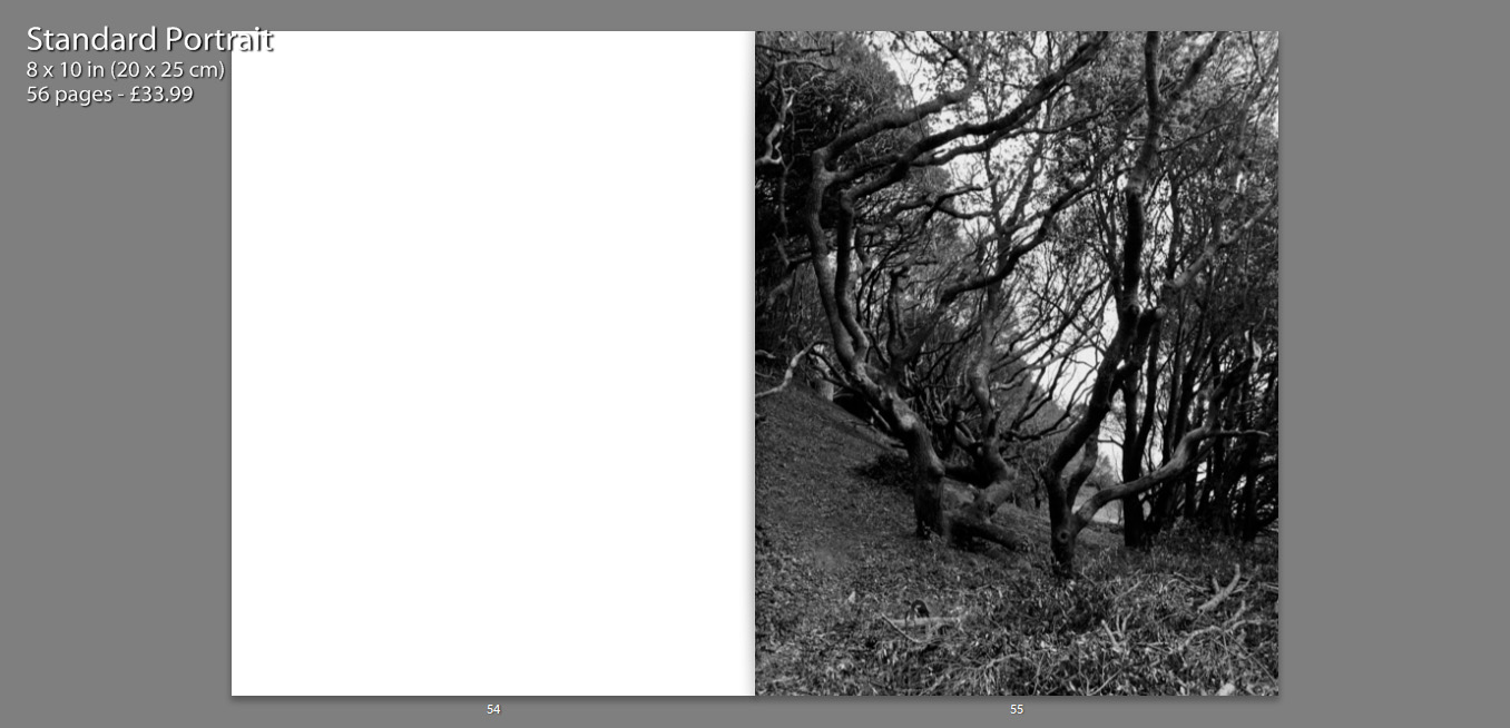
My layout of my book is in simple terms attempting to present images in such a way that they tell a story. Some images stand alongside others, juxtaposing one another, whereas others stand alone so that the viewer can gather some sense of emotion of relationship with the image. This book is a personal insight into the relationships I share with my close friends, as well as a representation of what my life and environment is and once was.
Environment – My Book Idea
As an idea for a photo book, I decided to combine the styles of two artists I had researched, Jacob Sobol and Theo Gosselin. Two books of theirs particularly inspired my own ideas, these were ‘Sabine: A Love Story’ by Sobol and ‘Sans Limites’ by Gosselin.
Sobol’s book, which documents his experiences living within his Greenlandic girlfriend Sabine and her family in 1999, was taken over the course of three years. Sobol’s book records both in photographs and in narratives, his encounters with Sabine and their life on the east coast.
Many of the photographs are very intimate and personal and would may only really contain relevance to the couple themselves. Which is ultimately the aspect of this book that I want to focus on within my own, the personal qualities, that will only be sentimental to myself and the subject.
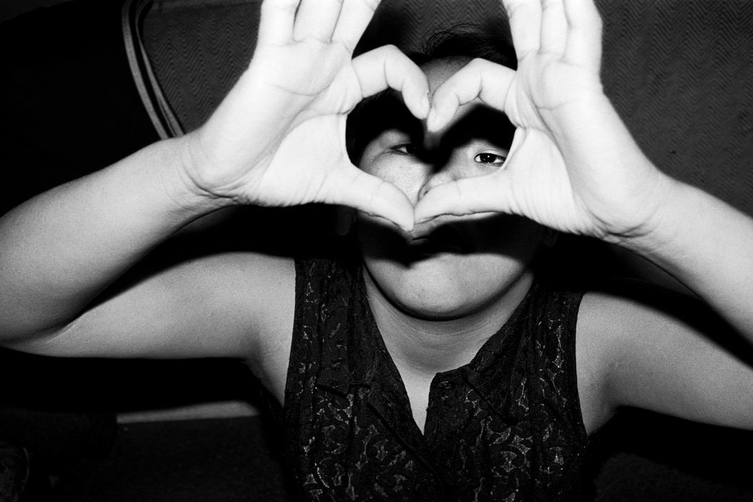
The photographs from Gosselin’s book, were taken on various road trips in the US, Scotland, France and Spain. His images are full of youthful energy which captivate the viewer with stories of freedom love and friendship.
The book reveals his attempt to communicate the actual visual conditions seen at the time of the photographing. This is similar to how I wish to portray the images within my own book. I am showing the viewer a scenario of raw emotion, which is real as it’s exactly how it was at the time.
I am venturing with my closest friends to locations that are full of life and freedom and capturing them as they act in their youthful ways.


