Category Archives: Uncategorized
Filters
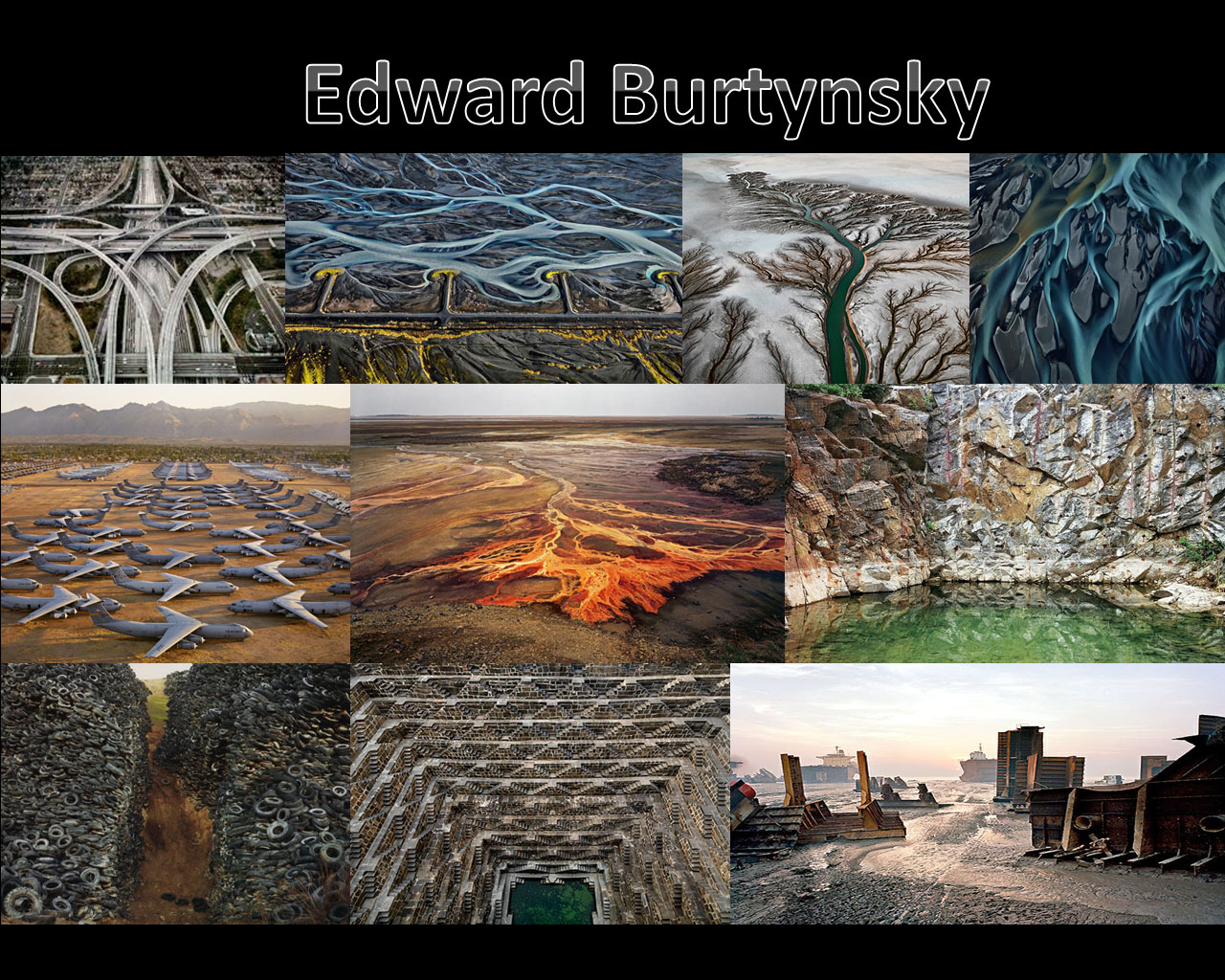
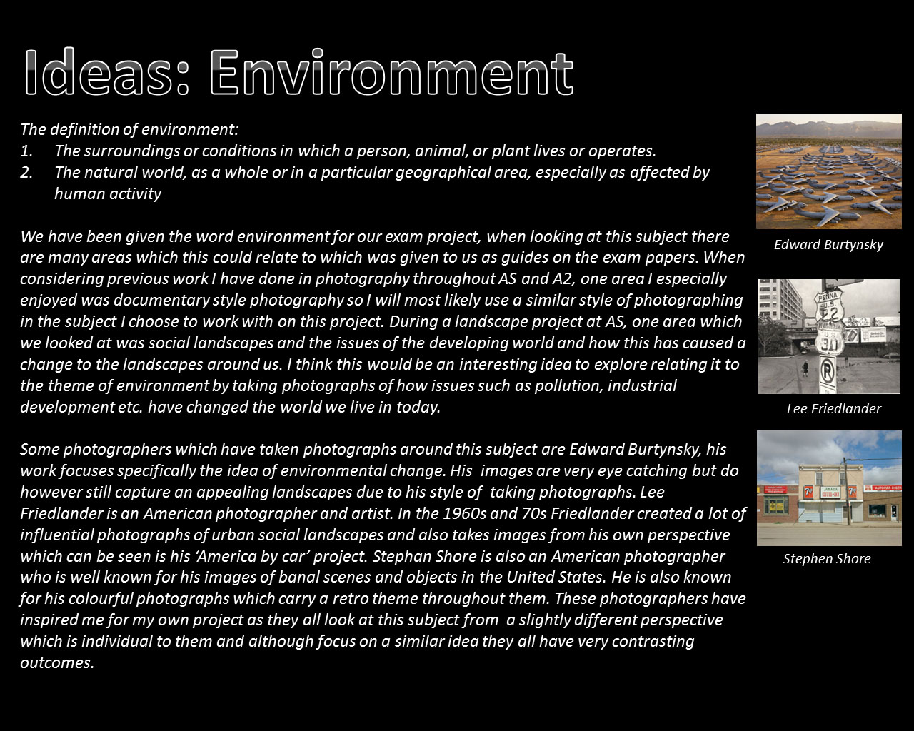
Edward Burtynsky


Starting Point


Ivan Troyanovsky
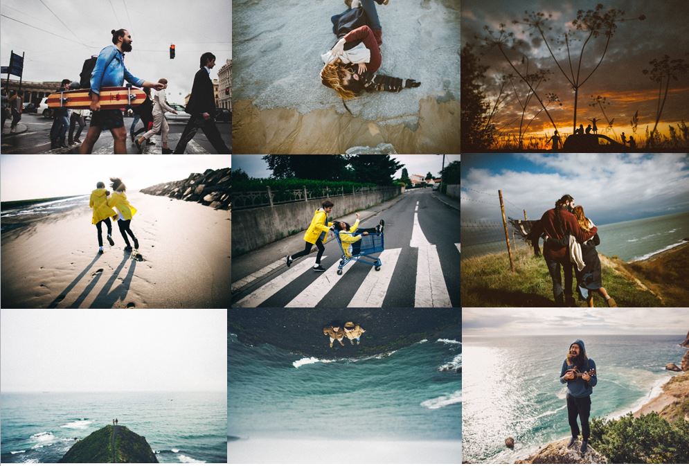
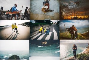
Ivan Troyanovsky is a bit of an unknown artist, however his photographs speak for themselves. He captures his friends and loved ones in exciting environments, capturing events and moments which happen in his life, usually embracing his natural surroundings.
I love this photograph because even though the sea is rough and the weather is bad, the image still maintains a sense of calmness. The photograph is minimalistic and this represents them being isolated, they are segregated from the worries and issues of daily life, hence generating a peaceful, calm aesthetic.

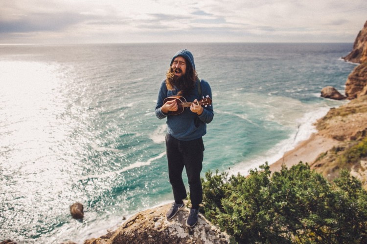
This photograph evokes a happy and carefree atmosphere, as generated by the bright visuals and humorous facial expression upon the face of the subject.
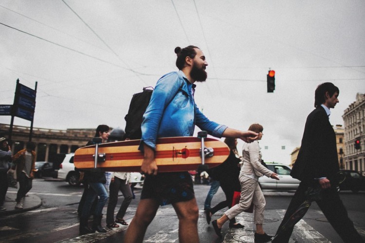
This photograph maintains a strong composition, and places vivid emphasis on the subject in the center. The man pictured in the middle, is obviously intended to be the focal point of this image as demonstrated by the way in which he is a lot more colorful than the remaining photograph. This is meant to represent the fun-spirited, youthful generation in juxtaposition with the industrial and corporate lifestyle which is represented by the monotone, suited figures surrounding him.

Nan Goldin
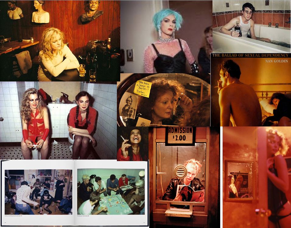
As a teenager in Boston in the 1960s, then in New York starting in the 1970s, Nan Goldin has taken intensely personal, spontaneous, sexual, and transgressive photographs of her family, friends, and lovers. In 1979 she presented her first slideshow in a New York nightclub, and her richly colored, snapshot like photographs were soon heralded as a groundbreaking contribution to fine art photography. The Ballad of Sexual Dependency—the name she gave her ever-evolving show—eventually grew into a forty-five-minute multimedia presentation of more than 700 photographs, accompanied by a musical soundtrack.
This therefore links to my project as I will also be capturing those around me and pushing social boundaries, such as photographing flesh or partying. Literally just capturing the true life of a teenager.
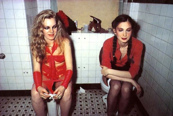
I love this photograph below, as outside of the toilet they probably look like very strong and independent women, due to the bold makeup and courageous outfits. However put them in an all women environment and they make themselves look vulnerable and unattractive. I like the use of flash in this photograph and color scheme of reds and browns, which are colors which compliment each other nicely.
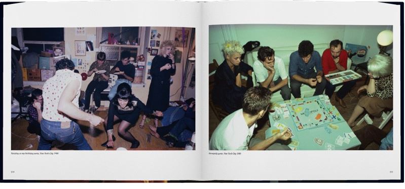
The two sets of photographs work well together as they show perhaps a pre-drinks gathering and also a after party. Or it could just be the same event but just showing the contrasts from before a drink to after a drink. The photographs are well shot as Goldin captures them from slightly a raised perspective, therefore capturing a lot more detail than just a straight on shot.
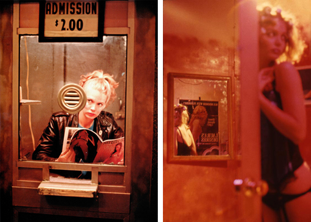
I like the way these photographs have a red tone, creating a sexual and energetic vibe to them.
Corinne Day

Corinne Day (1965) is a British photographer whose influence on the style and perception of photography in the early 1990’s has been immense. As a self taught photographer, Day brought a more hard edged documentary look to fashion image making, in which she often included biographical elements. Day is known for forming long and close relationships with many of her models (most famously Kate Moss), which have resulted in candid and intimate portraits. The most notable of these being the photographs of Moss in the 3rd Summer of Love editorial for the FACE magazine in 1990. Days approach as illustrated within the lifestyle and fashion magazines of the 1990’s, came to be known as grunge and grew into an international style.
In 1993 Day photographed Kate Moss in her own flat for British Vogue. In the context of a fashion magazine the images appear to have a documentary feel about them and when published caused a certain frisson of discomfort.
For the following seven years Day spent much of her personal time taking photographs for her first book, Diary (Kruse Verlag, 2000), an intensely personal visual record of her life and friends. It is bleak but also a tender, poetic and honest chronicle of young lives. Day also continues to take photographs for fashion magazines.
Her style of photography links really well to my project as Day brought a documentary look to fashion image making, in which she often included biographical elements. Which is the same style I’m trying to create for my shoots. Also for my shoots I will represent the close relationships I have with the models I photograph as they are a part of my environment, like Day does.
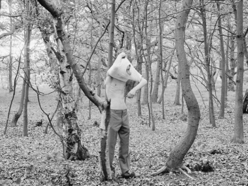
I love the photograph below as it is completely bizarre, it looks as if they have ended up in the woods perhaps after a night out and woke up early morning. I like the soft black and white effect on the photograph as it makes it look like an old faded image.
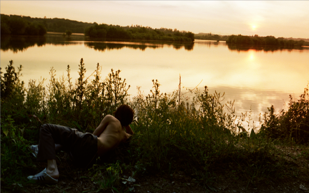
This photograph works well as the photographer has had to work hard to capture the perfect lighting, as normally the person would be a silhouette in the sunset whereas he is seen clearly. The sunlight on the his skin, gives it a soft feeling.
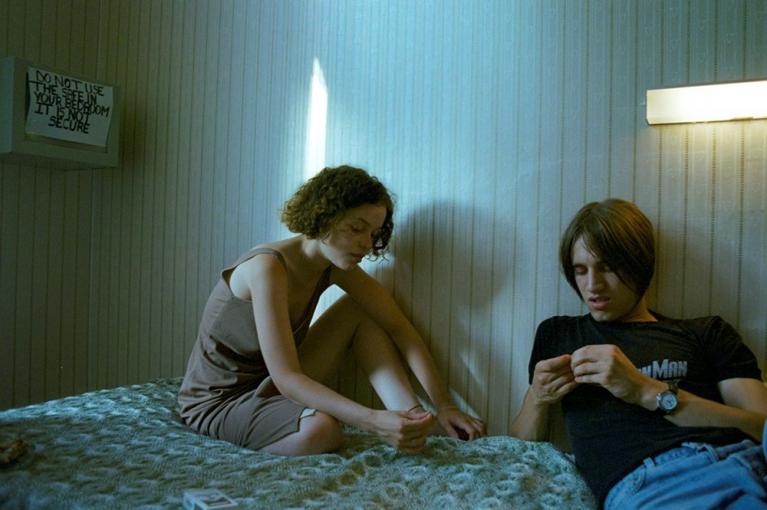
Day uses the natural and artificial lighting to her benefit, by helping the photograph with its structure. This is a perfect example of her combining the styles of documentary and fashion photography together. As she is capturing the literal scenario she is in, however your eyes are immediately drawn to the watch the guy is wearing which is a fashion item, due to it being the second purest white in the photograph.
Jeurgen Teller
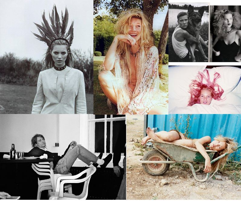
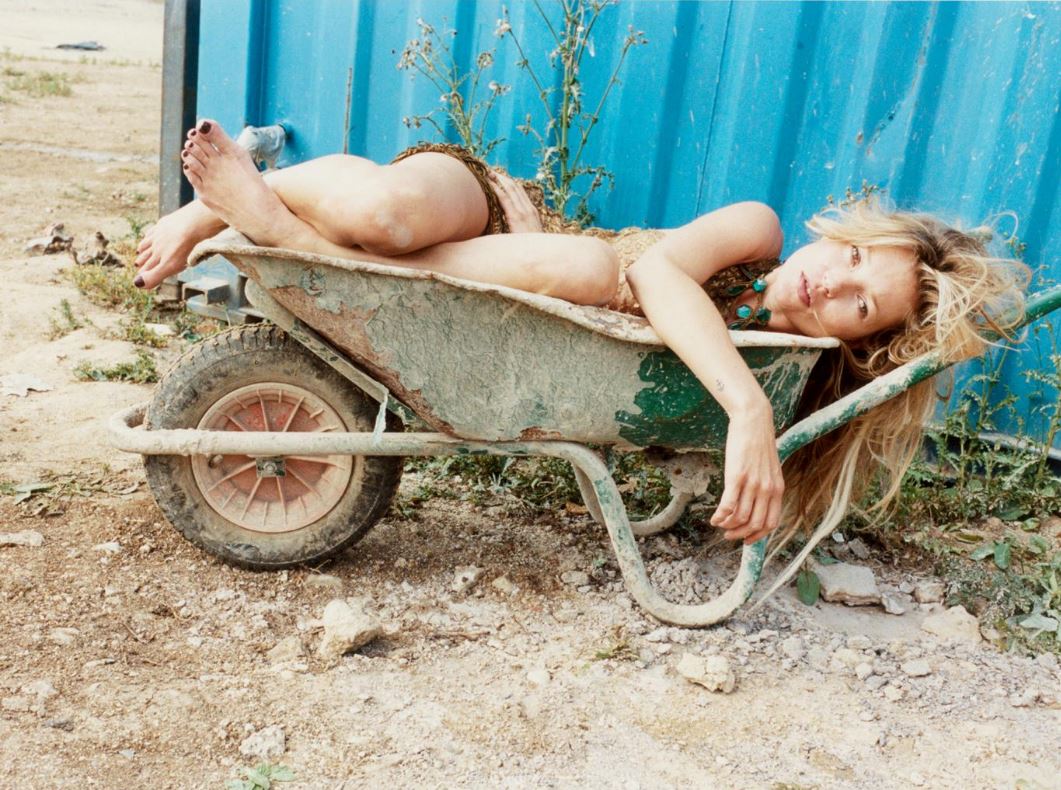
Teller’s work, in books, magazines or exhibitions, is marked by his refusal to separate the commercial fashion pictures and his mostly autobiographical un-commissioned images. He employs a raw, overexposed style and he uses a Contax G2 camera with an onboard flash. He prefers to work in color, and regularly includes himself in his photographs. His fashion photographs have been featured in The Face, Vogue (US, France, England, Italy), Another Magazine, Index, W Magazine, Self Service, Details, Purple, i-D and 032c, among others.
Teller links to my project as his work has a youthful and playful feel to it. This is good for my project, as because I am young myself, my activities and environments I surround myself in are very youthful, therefore my photographs will turn out in a similar style.
I love the fashion aspect to the photographs, how he’s got a blue container and brown rocky floor, therefore the model is wearing brown with a blue necklace. At first glance this looks like a carefree photograph, however when you properly analyse it, one can see that it’s very set up. This will be interesting when trying to do a similar thing whether my photo’s will look to set up or not.
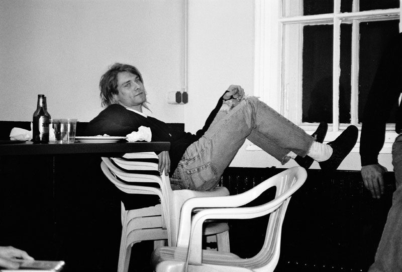
I like the use of the flash in this photograph, to create the contrasts and details. The way the chairs are stacked up and he’s got his feet on the radiator or wall pannel show his lack of respect for the place, and how he feels comfortable enough there to behave like that. I like this because it shows in this environment he feels carefree and as if he doesn’t have to worry.
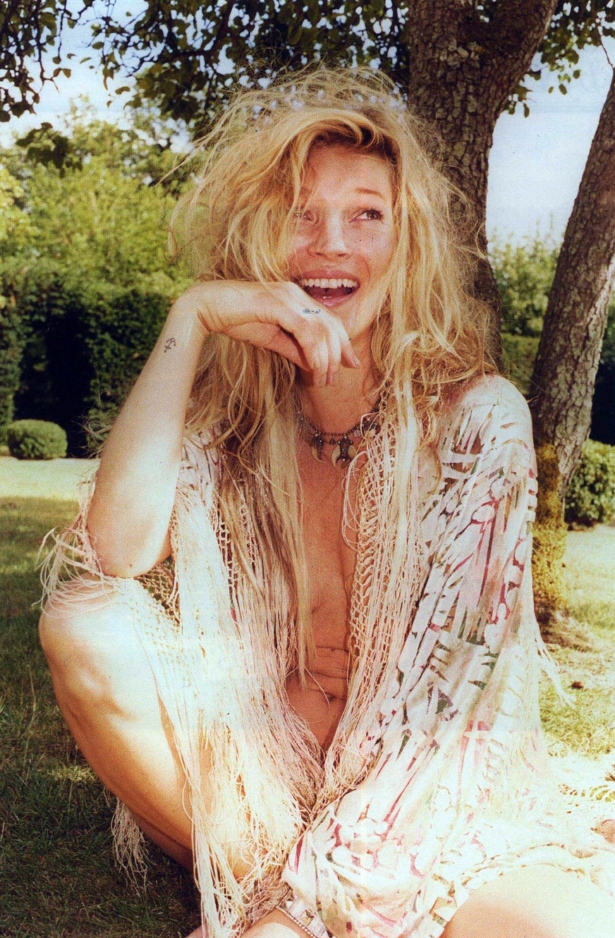
This photograph is beautiful by the use of natural lighting, and the emotion behind the photograph. As one can see she’s laughing and perhaps being playful with the photographer by the way she is nude underneath her cardigan, however it is slightly open therefore being suggestive.

Theo Gosselin
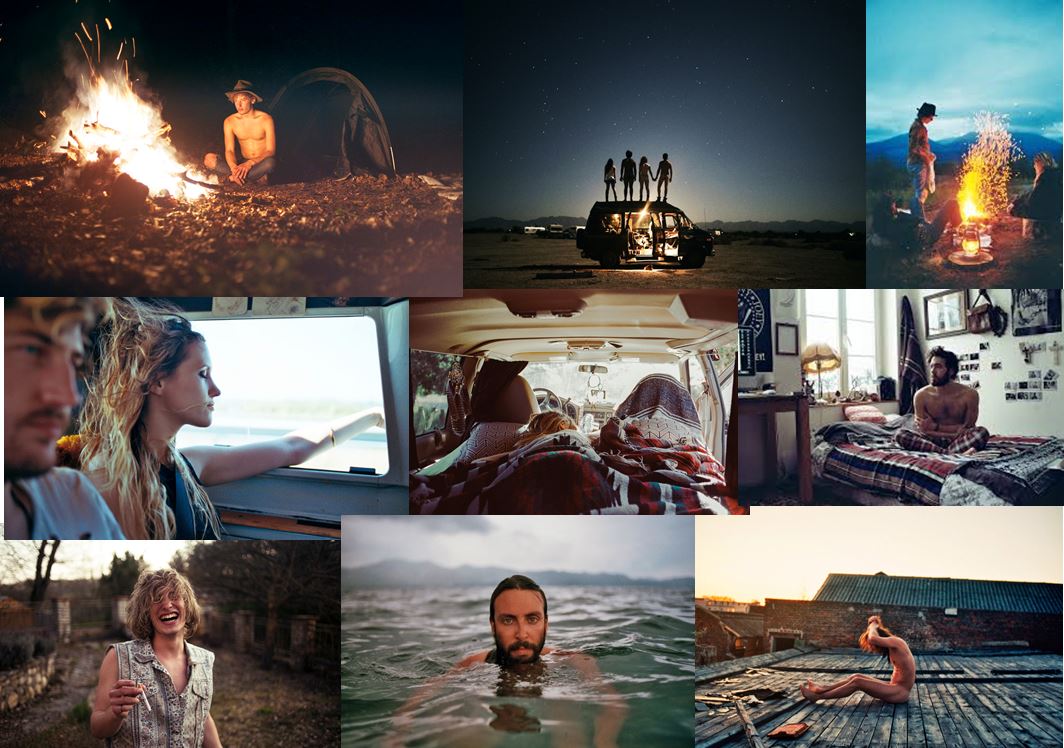
Theo Gosselin is one of my favourite photographers as I love his photobook ‘Sans Limites’. The photographs from this collection were taken on road trips in the US, Scotland, France and Spain, his photos are full of youthful energy and raw emotion, captivating the viewer with stories of freedom, love and friendship.
Sans Limites presents a significant evolution of Gosselin´s long term project;photography sur le motif (“of the object(s) or what the eye actually sees”) and his attempt to communicate the actual visual conditions seen at the time of the photographing.
This links to my own project because he shows love and friendship in places he travels too which is what I aim to do in my photographs. The journies he goes on with the people he cares about and capturing them as if they’re in the moment, showing the environments he surrounds himself in.
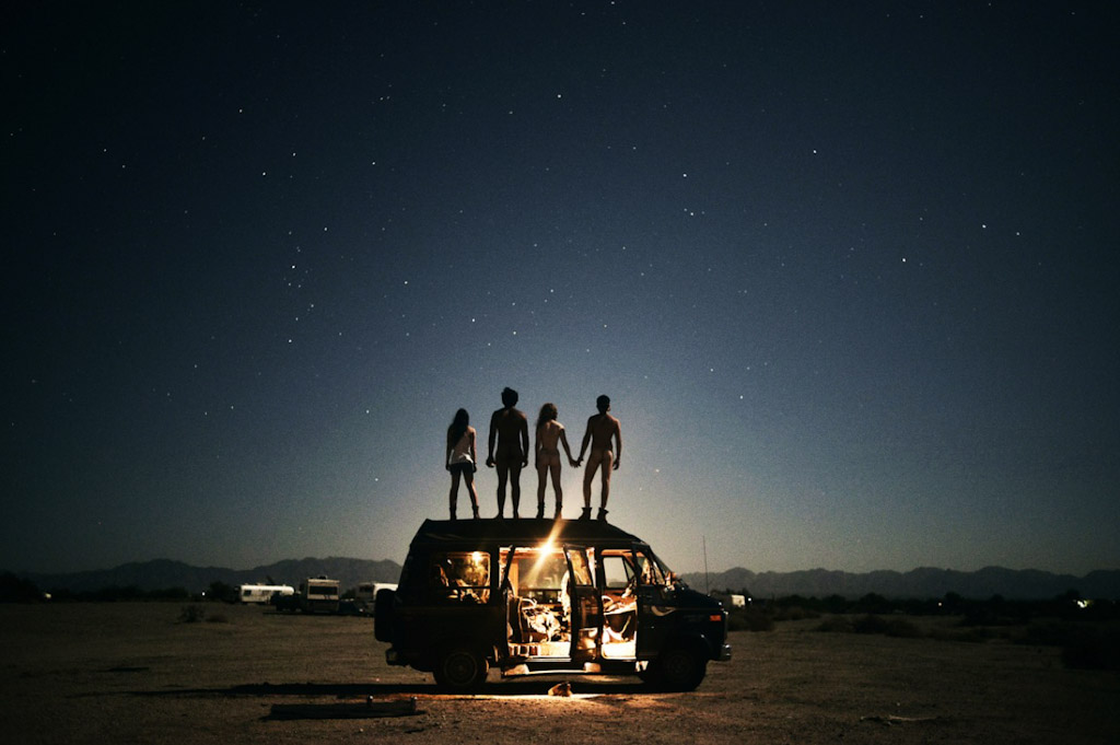
I like the way the photographer uses the light in his photographs, as there is a light inside the van which creates a warmth about the van. I also like the use of natural and artificial lighting combined. His photography skills are also amazing as he captures the stars in great quality he must do this by the use of high exposure or perhaps he edits his photographs after by using HDR in photoshop. This is good because therefore by being inspired by his photographs it allows me to do a lot of editing and use a lot of settings.
The photograph below also stands out to me as the 4 people are being very risky and standing naked ontop of a van, which you probably wouldn’t do if you were surrounded by a lot of people, however they don’t care as they’re alone and our representing their own personal environment when they are with one another.
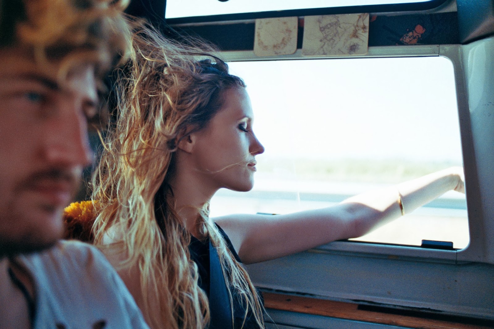
As shown in the photograph below one can see that Gosselin’s photography is deliberately cinematic and reveals his friends in the act of escaping from their regular lives into newly enticing and perilous modes of existence, ever in search of the persistent though elusive idea of freedom. I love the use of natural lighting and depth of field in this photograph, how one really focus’ on the wild hair being blown about, being carefree, and also focus’ on soft lighting on her skin, which adds depth to the photograph.
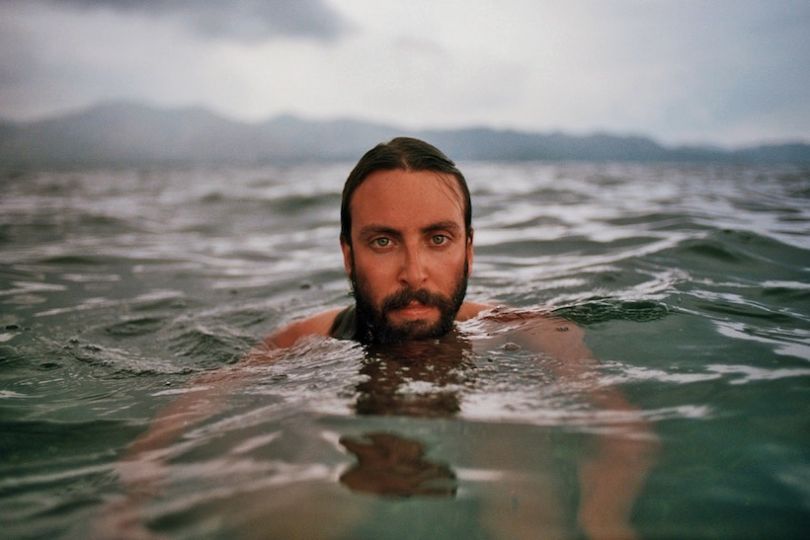
I love the use of colour in this photograph, how the colour of the sea brings out the intensity of his eyes, and how the background has soft lighting, this really brings out the emotions in the photograph.

Jacob Sobol
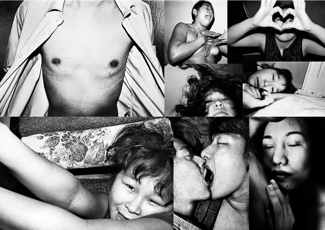
Jacob Aue Sobol’s book reveals a candid account of his intimate relationship with girlfriend Sabine and their life together on the east coast of Greenland. In 1999, Sobol went to live in the settlement of Tiniteqilaaq, Greenland, where he lived the life of a fisherman and hunter with his Greenlandic girlfriend and her family.
Taken over three years Sobol’s book records, in photographs and narratives, his encounter with Sabine and their life on the east coast. This was the starting point of Sobol’s photography and has since in 2012 been declared as a Magnum photographer.
Sobol links with my project as he’s capturing his loved one in the house he was living in and therefore photographing his natural surroundings, as one can see the photographs can be a bit explicit, therefore showing the real side to his life, and capturing his natural enivornment.
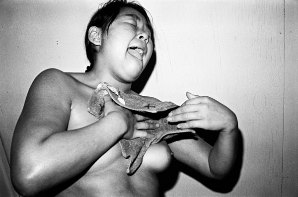
I love the photograph below because it comes across as if she was completely oblivious to the camera, until the bright flash came on and blinded her and therefore reacting the way she did. I think the purpose and meaning behind this photograph is too represent how close and personal the photographer is with the model and to show their relationship by the use of photography. Personally, I think it’s a vert good photograph demonstrating their relationship and by the use of photography techniques, such as the use of artificial lighting(flash) on the pure flesh, which is stunning because it makes more tones and contrasts than if it was taken without the flash, which creates more depth.
This photograph also links to art history, because women who are naked in art and photography are normally sexualized, especially if produced my a male artist. However, this is a very different style, as it’s her partner photographing her, he’s capturing her in a natural light when she’s naked and not posed.
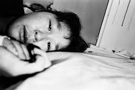
This photograph below has a lot of depth behind it visually and mentally. Mentally, as it is his girlfriend who he’s photographing, and they’re just relaxing in bed doing nothing, however there is a lot of emotion behind her eyes looking at him (Sobol), it makes you feel the emotion behind the photograph and how much they meant to one another as a couple. It shows that they weren’t just a sexual relationship. This works well as the model and the emotion helps the viewer to imagine the atmosphere and the environment at that present time.
The use of depth of field in this photograph works very well, as the focal point is on her facial features, which is the main aspect of the photograph. The cropping technique also shows how close the camera is too the model, and therefore how personal the photographer is with the model, as Sobol is invading her personal space without her being bothered. I find it bizarre that the closeness of the camera to the model is very important for showing the relationship. This photograph doesn’t use the rule of third, however by the way the model is positioned she is in front of the darker wall, and therefore by the use of flash showing the contrasts she stands out and becomes the first thing one notices in the image.
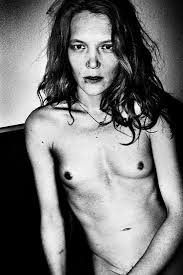
This photograph is not connected to the Sabine project, however it is still a beautiful photograph as again again it looks as if Sobol is capturing the moment and intimacy with the model. The use of the vignette effect allows your eyes to zoom directly into the model and not be distracted by the background. The use of the artificial lighting(the flash) also creates large contrasts emphasizing crucial features of the image, such as the breasts, abdomen area, collar bones, and facial features.
Planning for my first shoot – Garden
I have decided to create my first structure within my garden as it is my most accessible environment. I thought it would be a really good place to start to get back into den making as i could take my time building the structure and not have anyone staring at me in some random environment. It also means that i don’t have to transport my materials anywhere to build the den and so can consider exactly what materials would work best within the environment and the space.
I have decided to build the den in the same area that the dens within my garden were commonly built. I think this is because i know from experience that this area has three tree structures which work well to begin my structure from. The area has actually changed significantly in the last 5 ish years since i was making dens as it is a bit more over grown because my sister and I don’t play in that space anymore. The massive tree we always used to use as a part of our den was also cut down. I still however think it is the best space in my garden for a couple of reasons. Firstly as we haven’t played there loads the overgrown nature of the area would work really well in the photographs to convey a wild jungle like feel. The den will look hidden with in the environment which could be a really interesting photograph to create. Secondly while i do want the environment to convey it is a garden i want to avoid having really man made object obvious within the frame. This particular area can be photographed from angles which show the fence and houses in the background but doesn’t include cars. Depending on how well this shoot goes i might then consider another den in my garden which revolves around a more man made environement.
I have decided for this shoot that i want to choose a day which is sunny so as to experiment with the blankets becoming see-through in the light. I think in my garden is the best place to work out whether the idea of the light through the material is going to work and i can also experiment with using different materials. I also want it to be slightly windy so i can have some movement to my structure. The area i am photographing however has no cover to it and so if its too windy this may become problematic as the structure wont stay up.
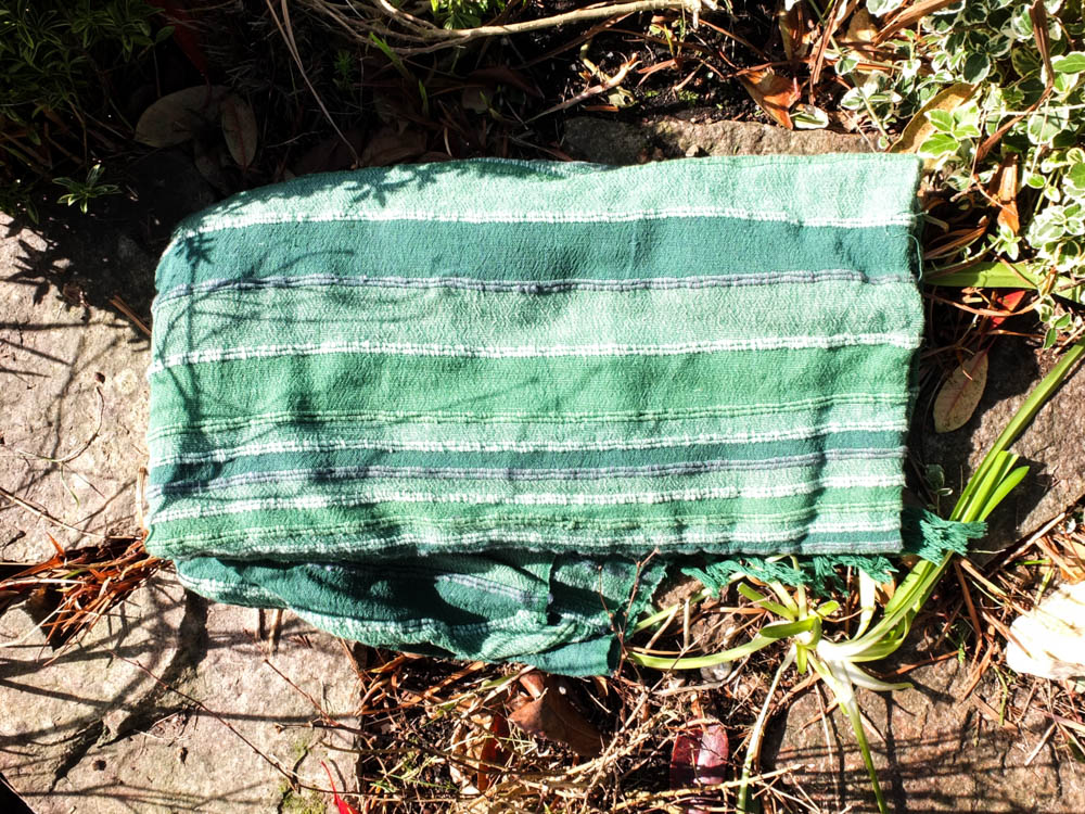
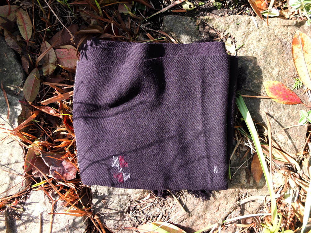
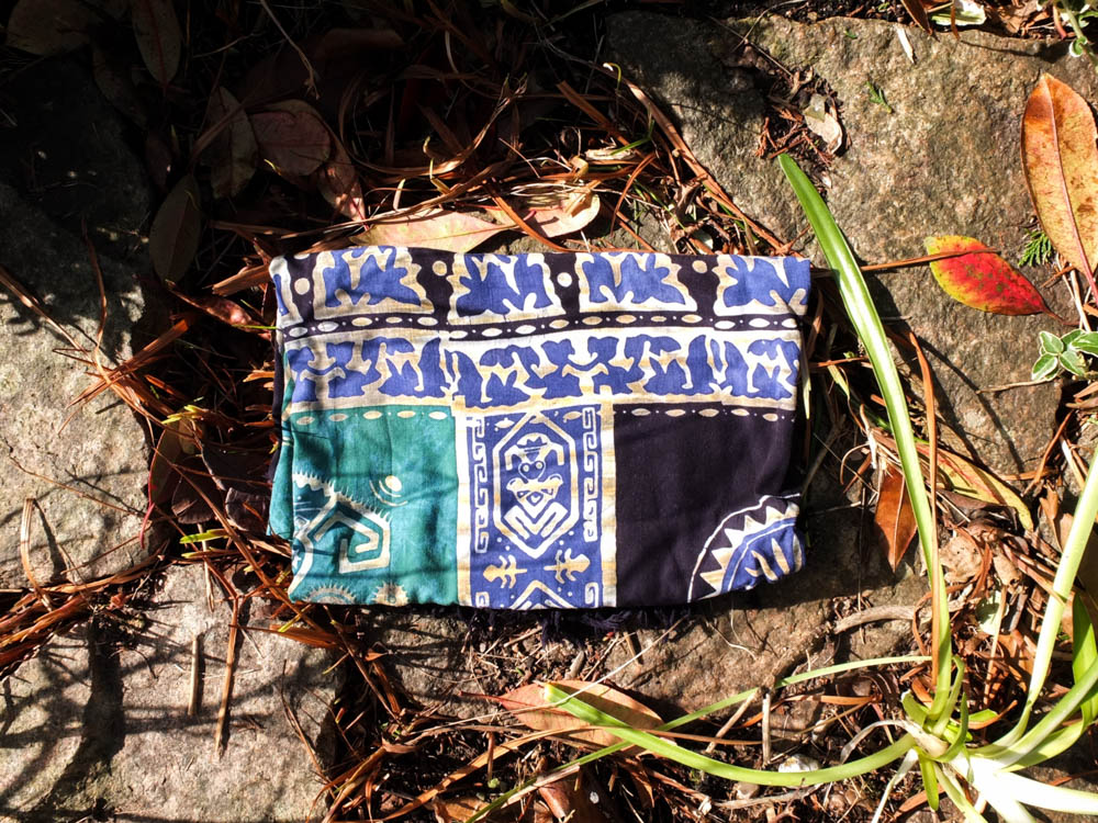
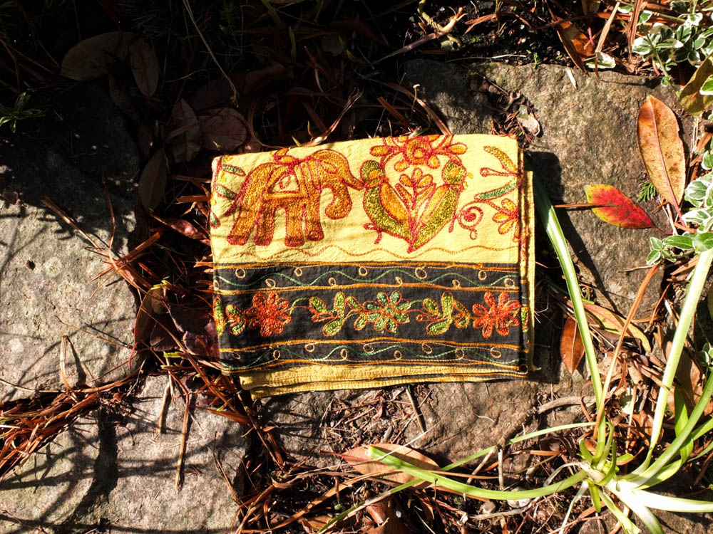
The next thing to consider is exactly which materials i am going to use. I need at least two very large blankets as these are to make up the roof and the back wall. The rest can be of varying sizes and i can patch work them together. Below are the photographs of the materials i’m planning to use. I think 5 blankets is about average for what i used to use to create when i was younger. I’m thinking about the fact that i need to have 4 walls and then a roof. I decided to choose blankets which blended into the environment to an extent. I choose blankets in colours of green and blacks but then also choose a vivid yellow blanket to incorporate. I think having this one really brightly coloured blanket might be quite interesting as wherever it is is going to stand out more vividly. The yellows will also bring out the yellows and oranges from the environment which are still left over from autumn. As well as choosing colours which match the environment the colours also compliment each other. I think this will be my first experimental shoot where i can see whether my ideas really work and come together. I might later do a shoot in which i use all clashing colours of blankets but as the area I’m photographing is overgrown and the den is going to appear like its hiding within the environment i wanted it to blend in.
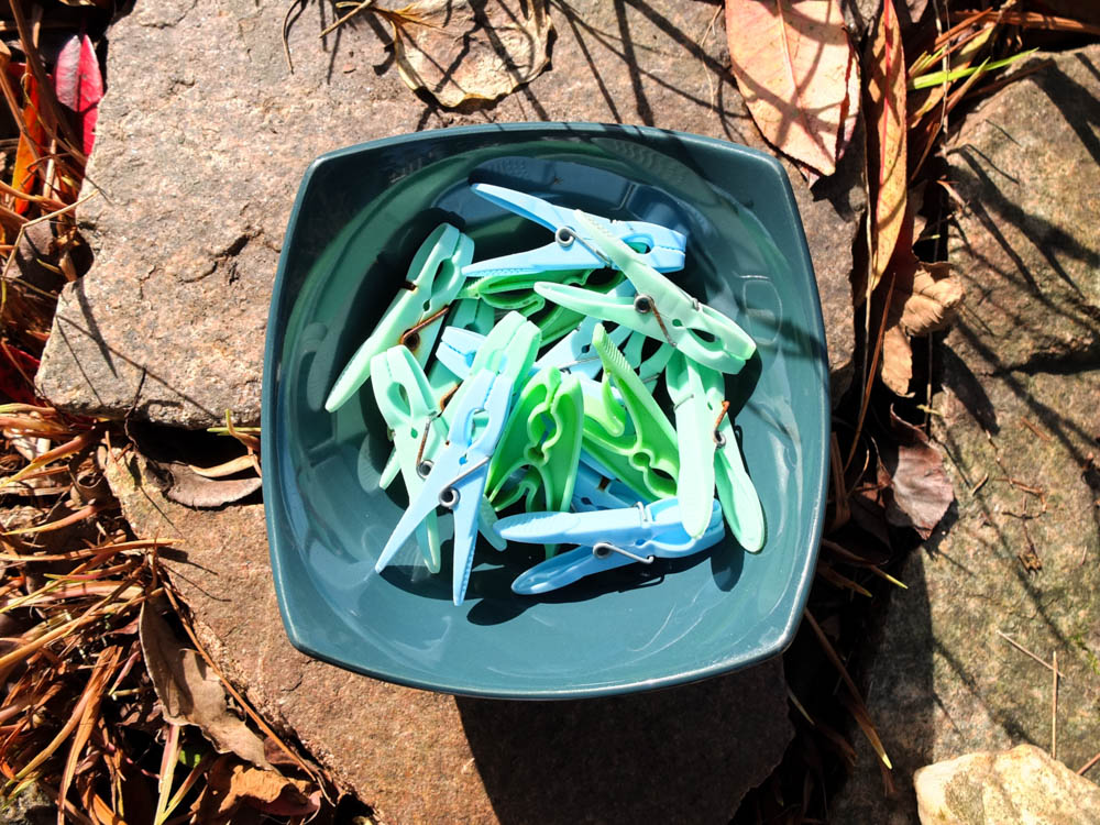
I have also photographed some rope from in the shed and some pegs to hang the washing. Whenever we would create our dens in the garden we would use whatever we could get our hands on in order to create our dens. I therefore simply looked around the garden to consider what was available to hand which i could use to build my dens.
I think this shoot is going to be a lot of experimenting to get back into how to build dens and whether my ideas are going to translate into a good photograph. I think i might end up changing a few elements after this initial shoot but i will need to consider this later.


