Category Archives: Uncategorized
Filters
Sunshine Isle
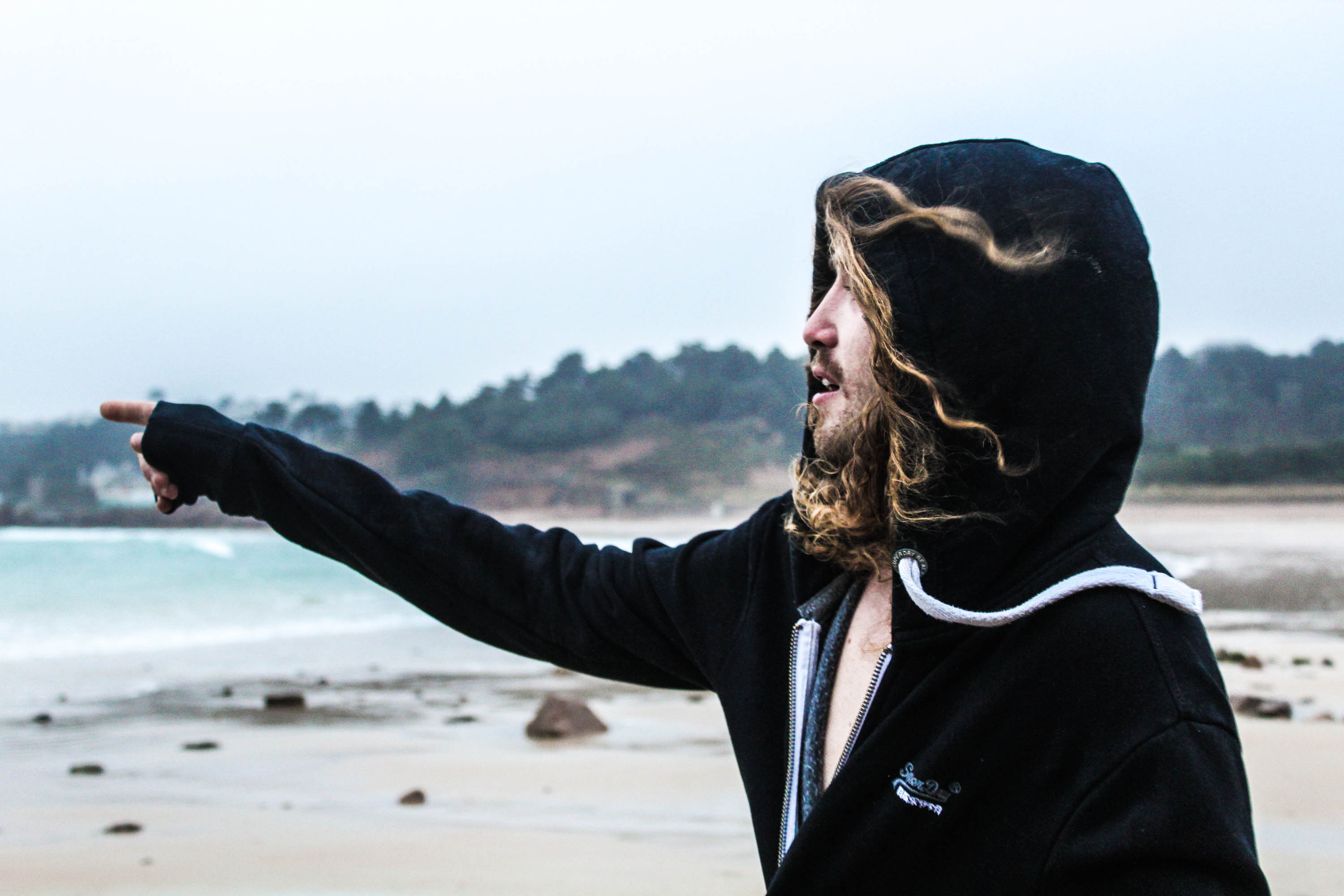
This shoot was inspired by Theo Gosselins photographs of the guy in the sea, the initial idea was to go deep in the sea and go swimming, however this didn’t quite go to plan as it was too cold.
I love this photograph as he’s pointing at the sea, which indicates what he’s about to do, as he’s topless underneath his jumper. This photograph reminds me of Theo Gosselins work as the foreground is very detailed and clear and the background is very out of focus, therefore using the depth of field, by having a wider aperture. For this photograph I purposely used the natural lighting to benefit my photograph, therefore the highlights of his face and hair are lit up nicely.
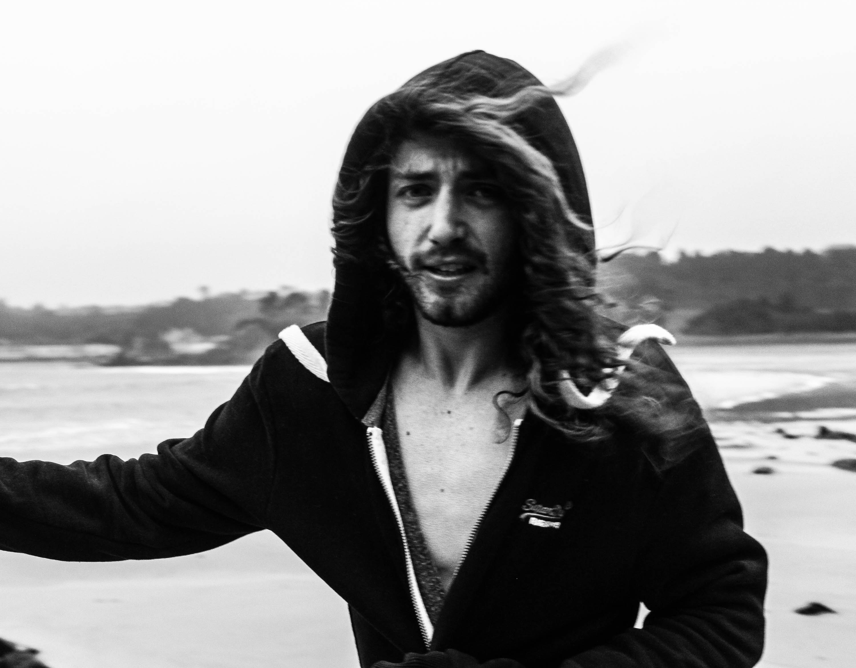
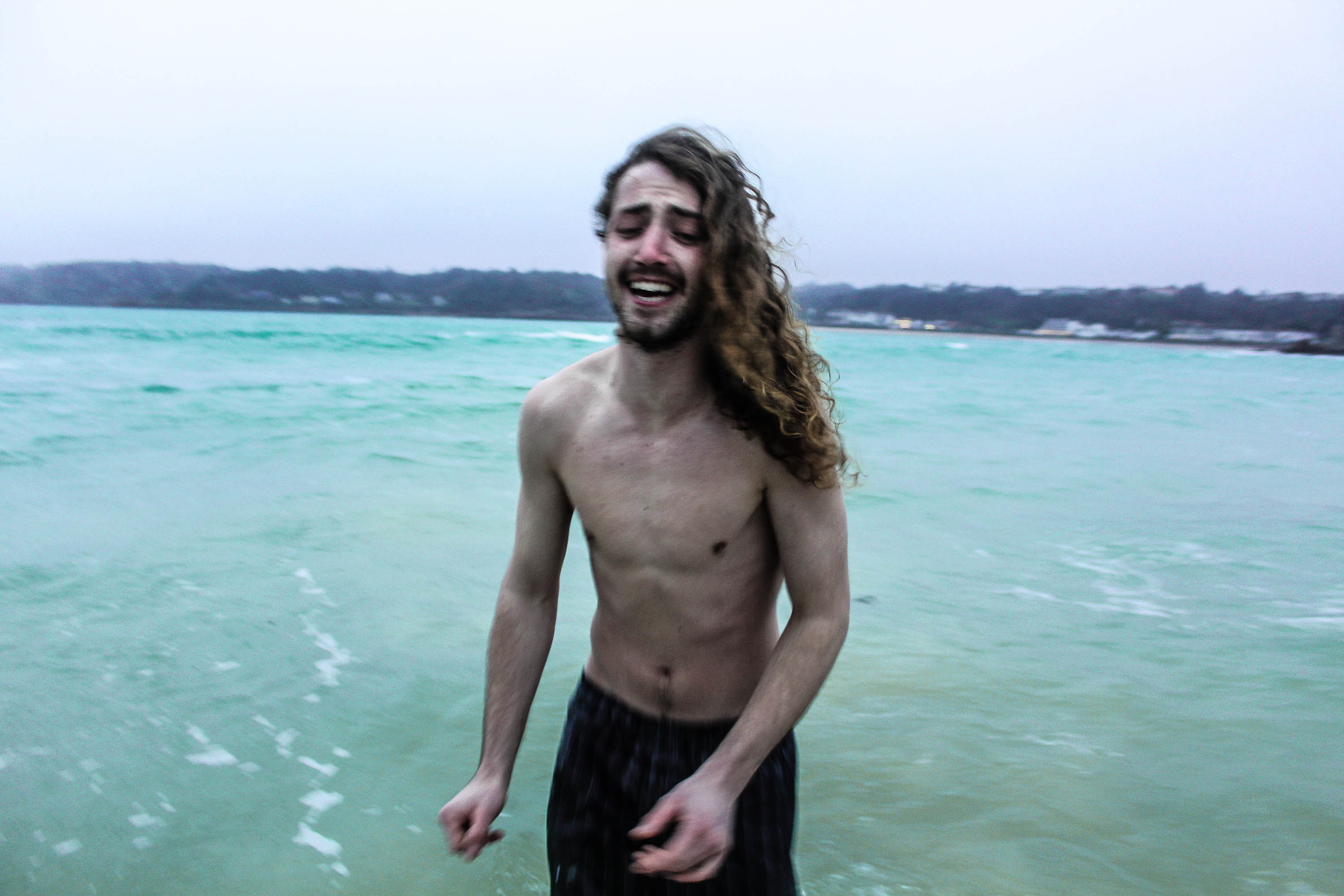
For the photograph below, I edited it in a way where there was a huge contrast, therefore making the skin stand out and the use of his facial expression, which is important for the mood of the photograph. The natural lighting has also created a split lighting effect on the model face which is a technique that produces a sense of drama to a portrait, it is a way to add a unique look and feel to a photograph. The sense of drama displayed in the photograph by the use of split lighting works nicely, as his facial expressions are vert dramatic as well, as if indicating he does not want to go in the sea as it’s too cold. The model is the main aspect of the photograph, as I’ve used the rule of third so he is the center focus. Also the use of the dark clothing makes his flesh stand out more, and makes him stand out more against the over exposed background.
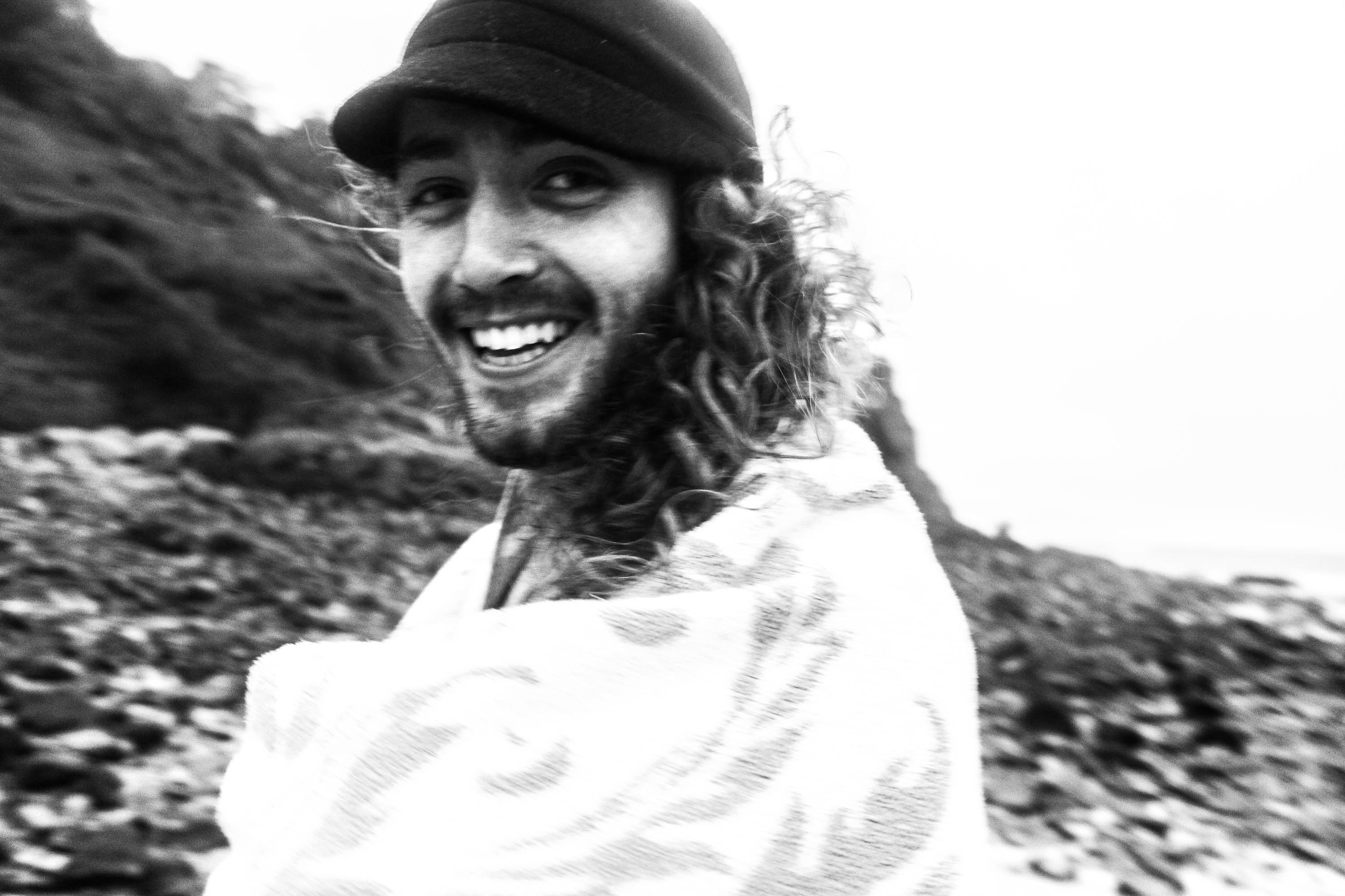
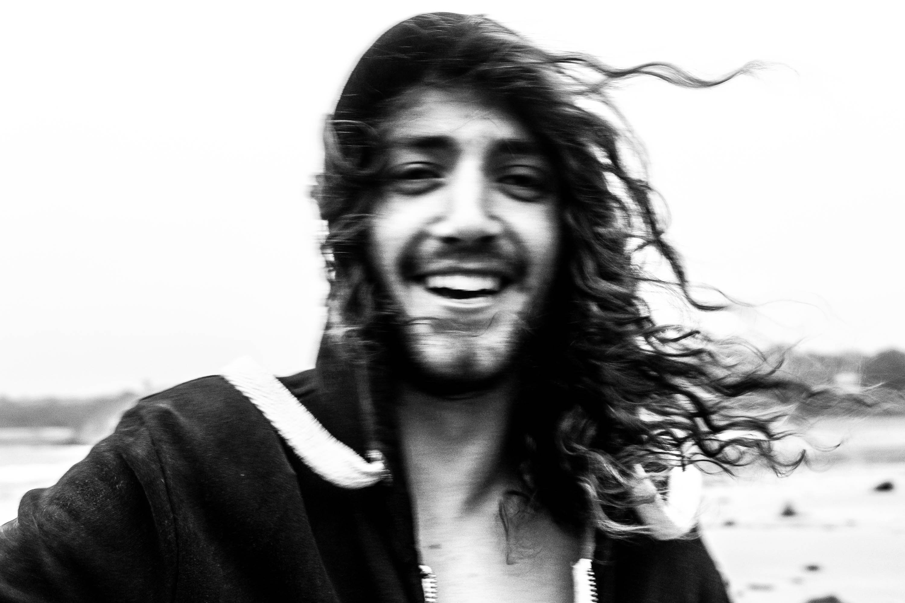
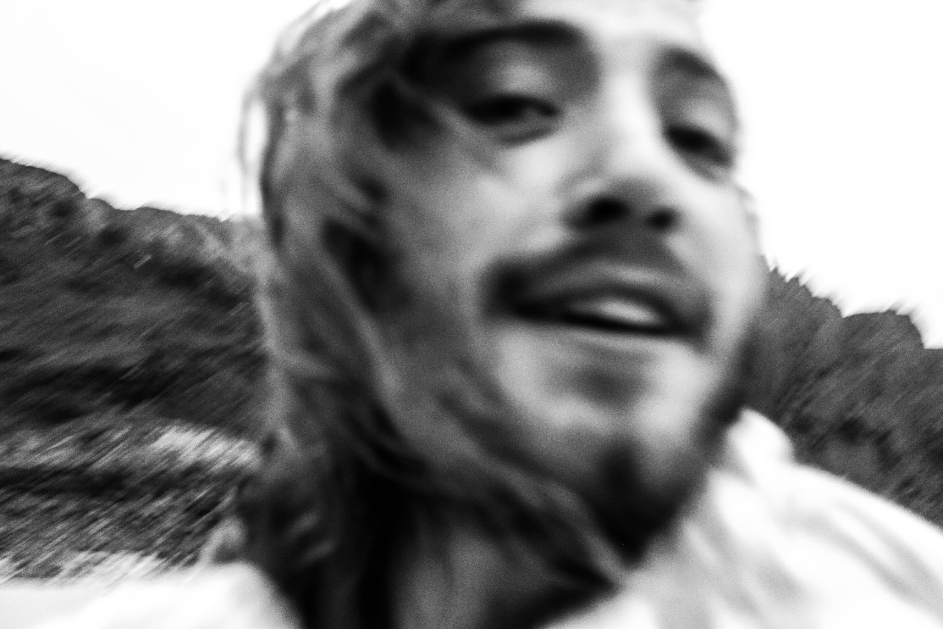
I love this photograph because it really captures the mood, in my chosen environment, how I like to surround myself with positive people, as shown by his facial expressions. This photograph works well as it’s over exposed and in black and white which makes him stand out more and for the viewer not to be distracted by the background. The use of the slight blurred effect represents the movement and energy of the photograph, which wouldn’t be represented in a still image shot. Also the way I have cropped and positioned the camera close to the models face, represents how personal I am with the model, and reflects the emotion behind the photograph.
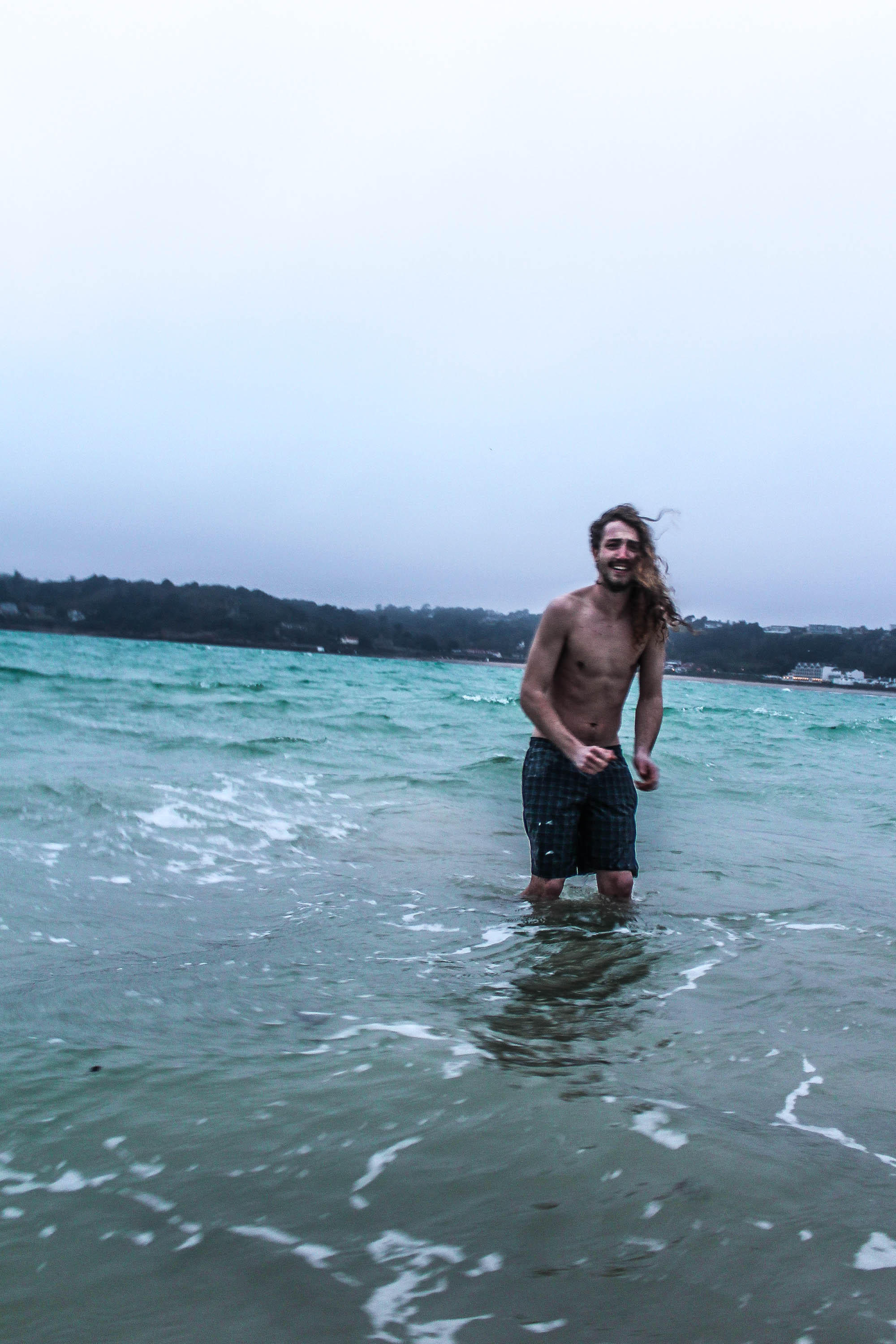
The composition works well in this photograph as the white wash of the water allows his body to stand out against it. Therefore drawing the viewers eyes immediately to the main subject in the photograph, which is him. I also like the movement behind this photograph, how he’s running into the water and the water reflection on the sand shows the movement of the sea, which reflects the energy behind the picture.

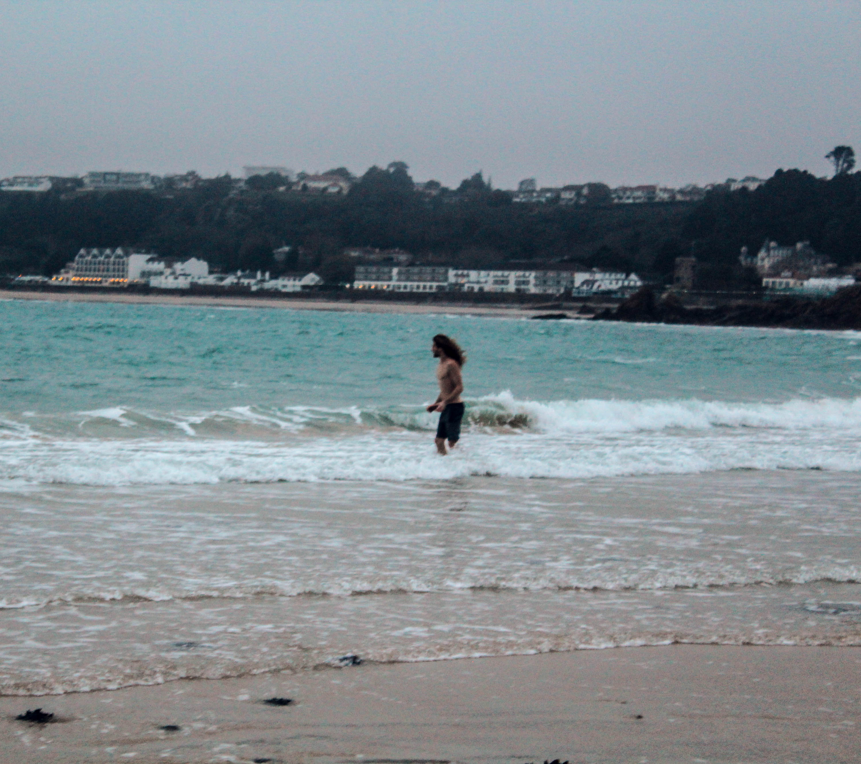
Personally for this photograph I would have preferred if the buildings weren’t in the background as I find they’re a bit distracting and take away from the model in the sea. I also think it makes it not look as adventurous and as remote as i’d of liked it to look, however by taking this photograph it made me try different compositions and angles where the buildings wouldn’t be as distracting.
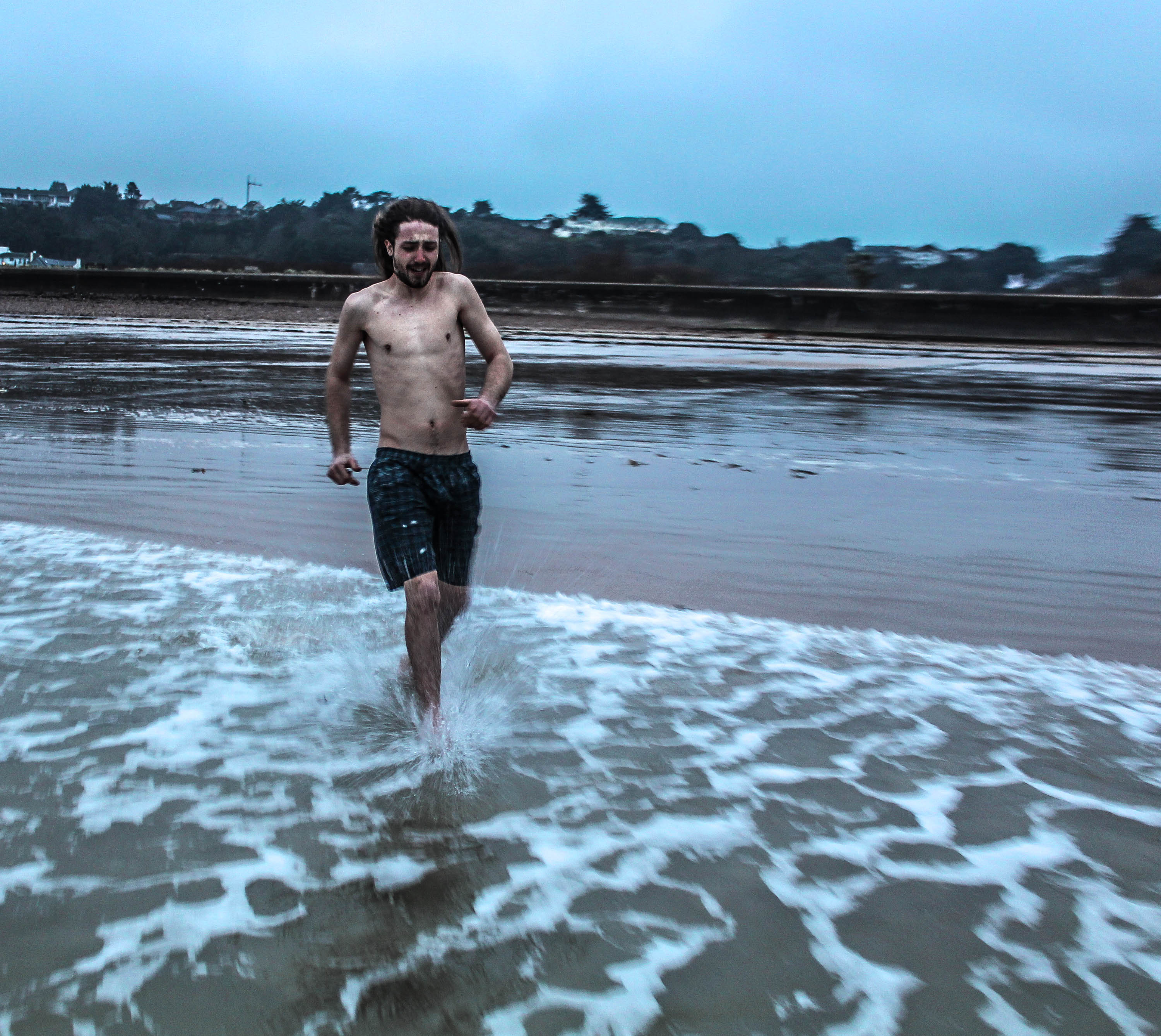
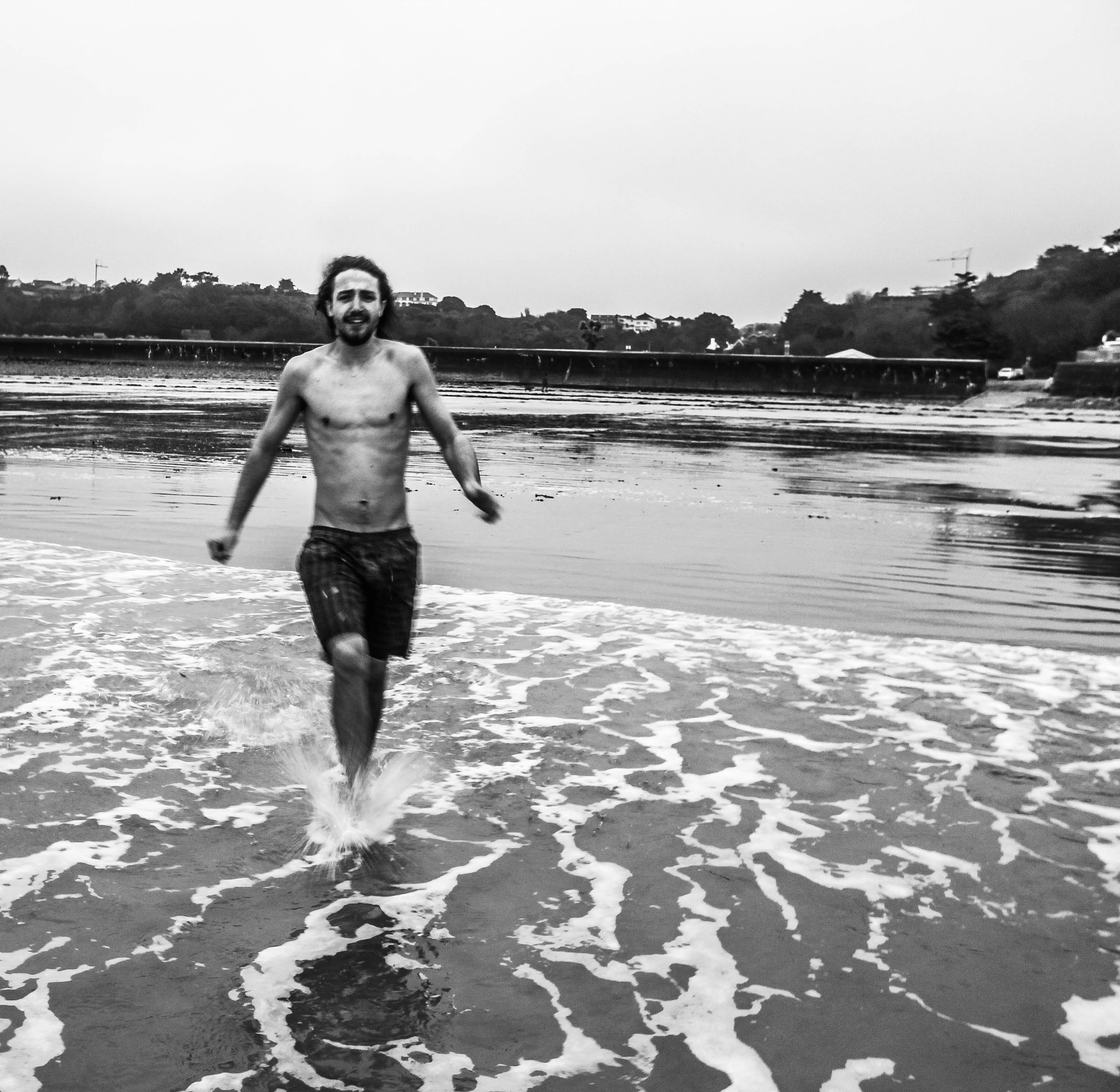
For this photograph I used the rule of third, to make sure he was the focus of the picture. I like the whole body language of the model in this photograph as you can tell he’s extremely cold, which is reflected by the cold surroundings. However he’s still happy, which makes the picture look carefree as he doesn’t care about the consequences as long as it’s fun and exciting, which is what I’m trying to get across with my images as I’m showing my youthful life through the emotions and environments of those around me.
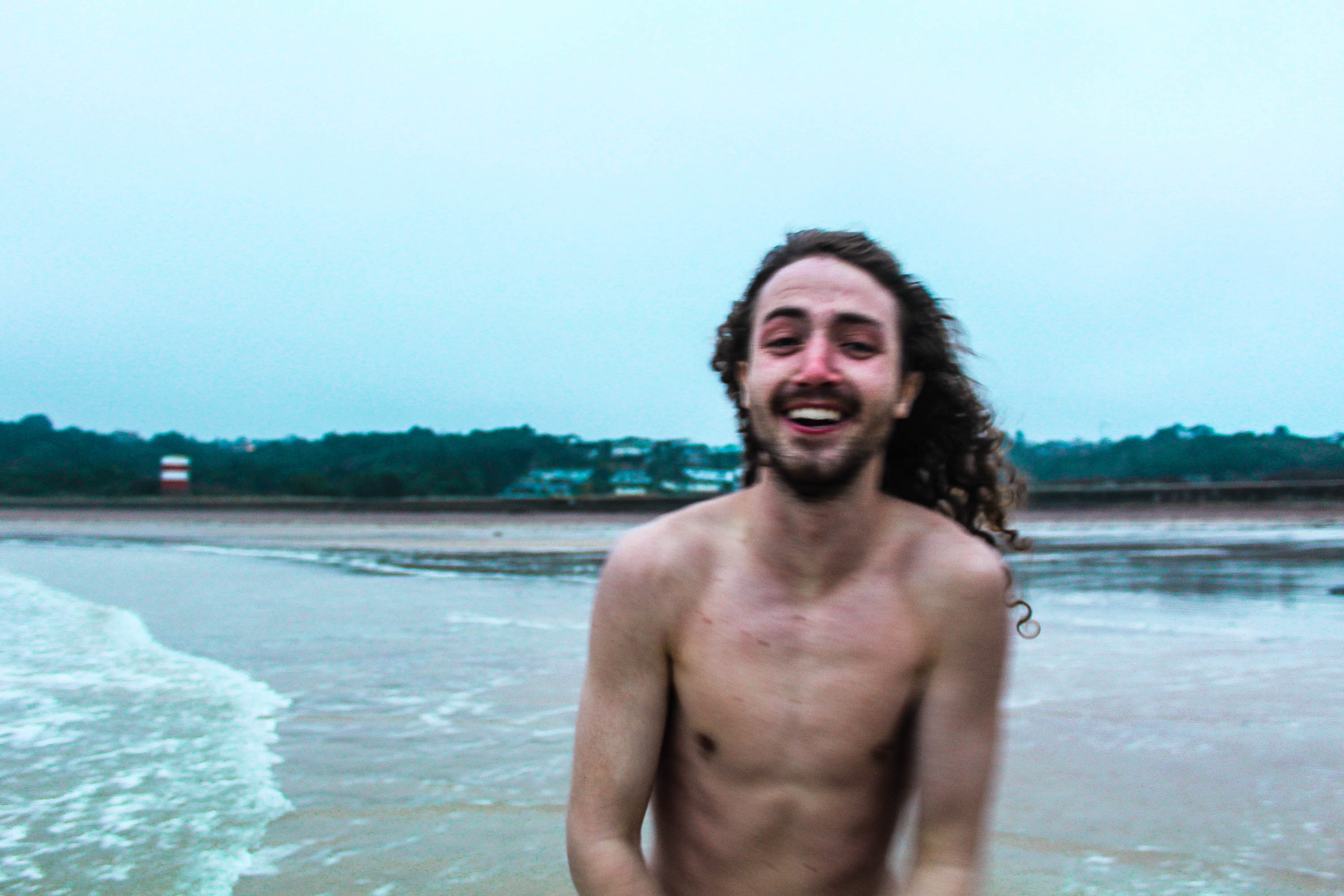
For the image below I wanted to capture the emotional environment I surrounded myself in, so I referred back to the quote;
“When you photograph people in color you photograph their clothes. But when you photograph people in B&W, you photograph their souls.” Ted Grant
This is why I chose to edit this in black and white as it is capturing the souls of the people I like to surround myself in, in my own environment and also the environments I choose to be in.
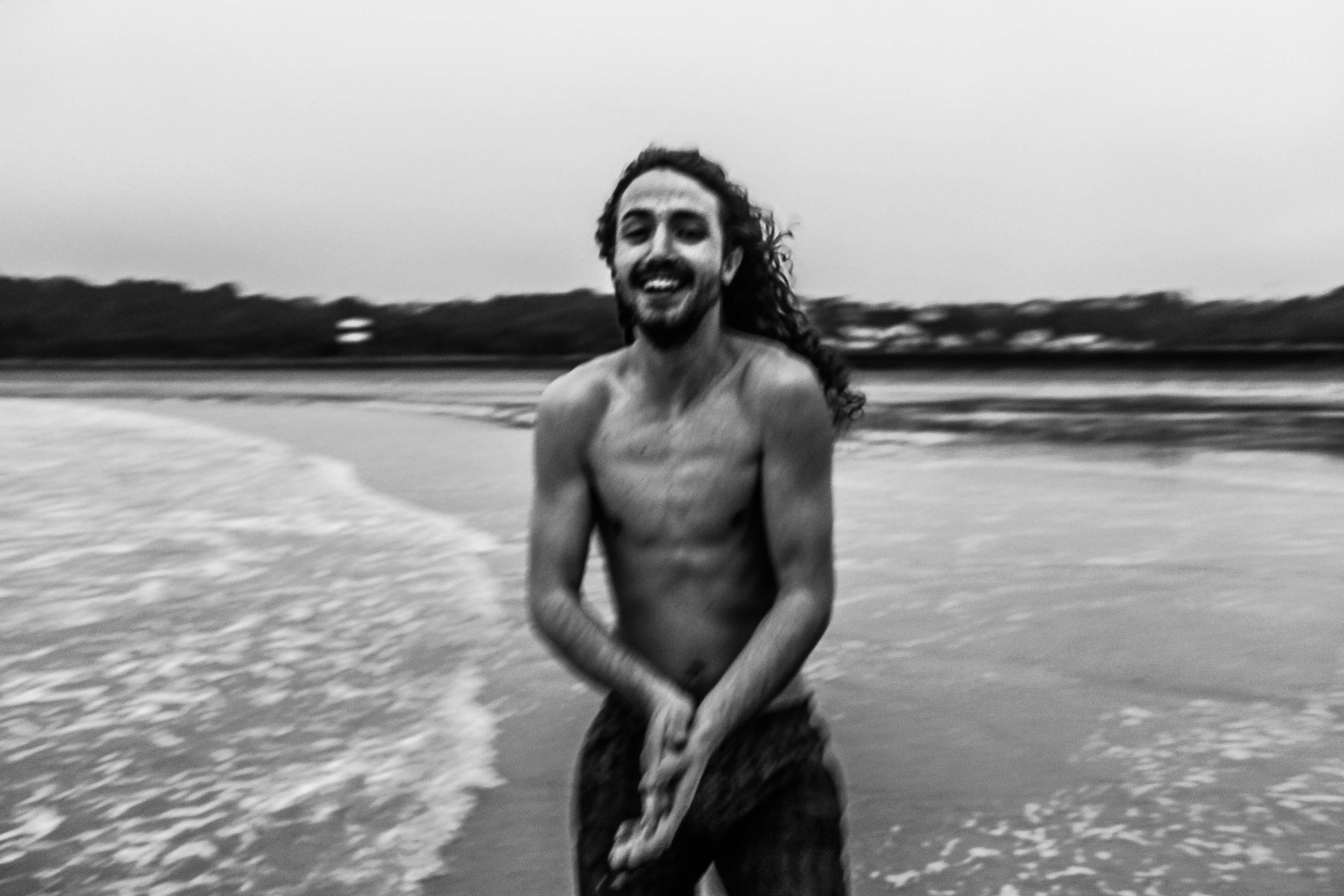
In the pictures below I wanted to keep referring back to Theo Gosselin and the way he uses a lot of blue and brown tones to make it look almost surreal or dream like, so I edited mine exaggerating these tones.
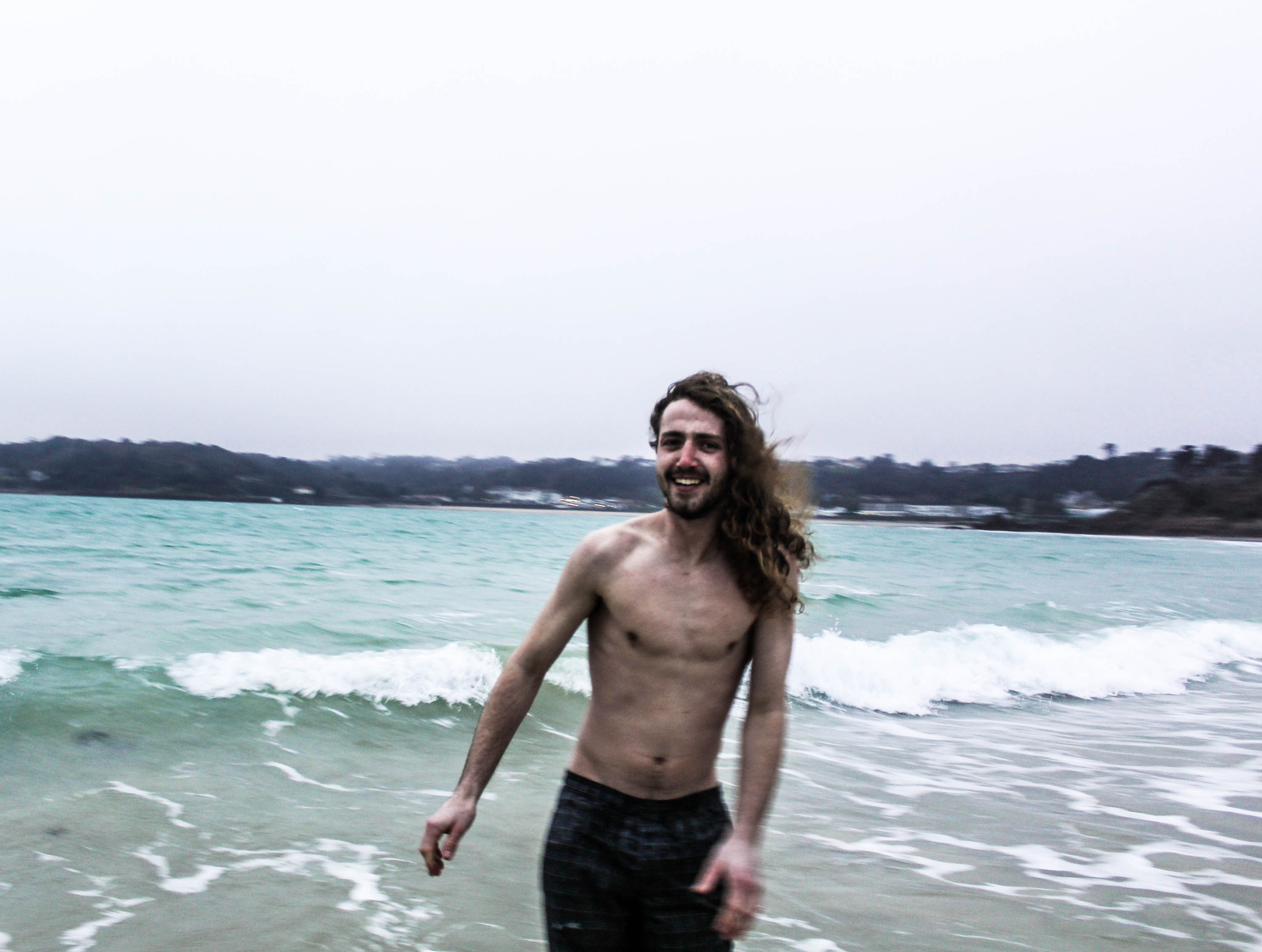
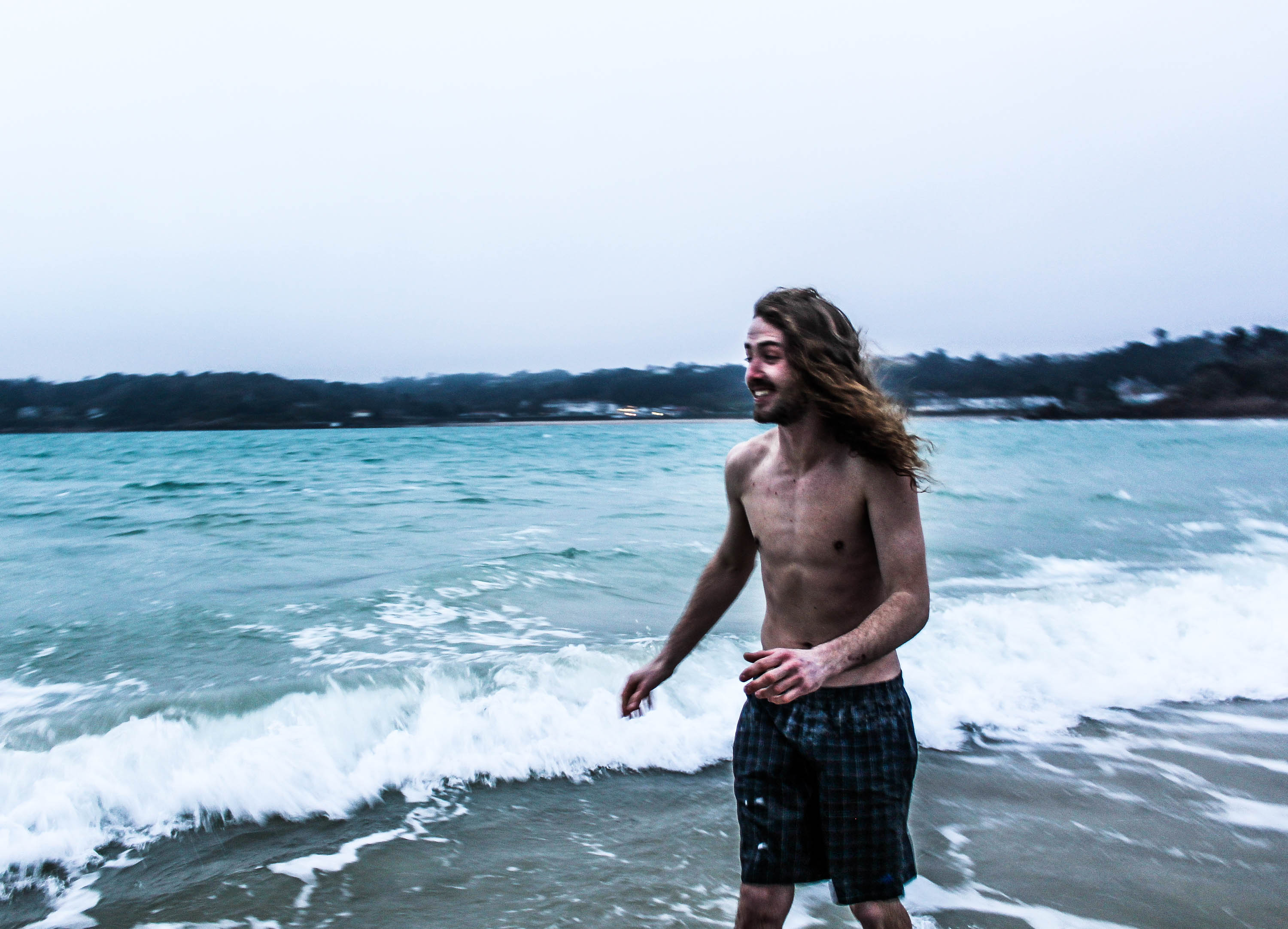
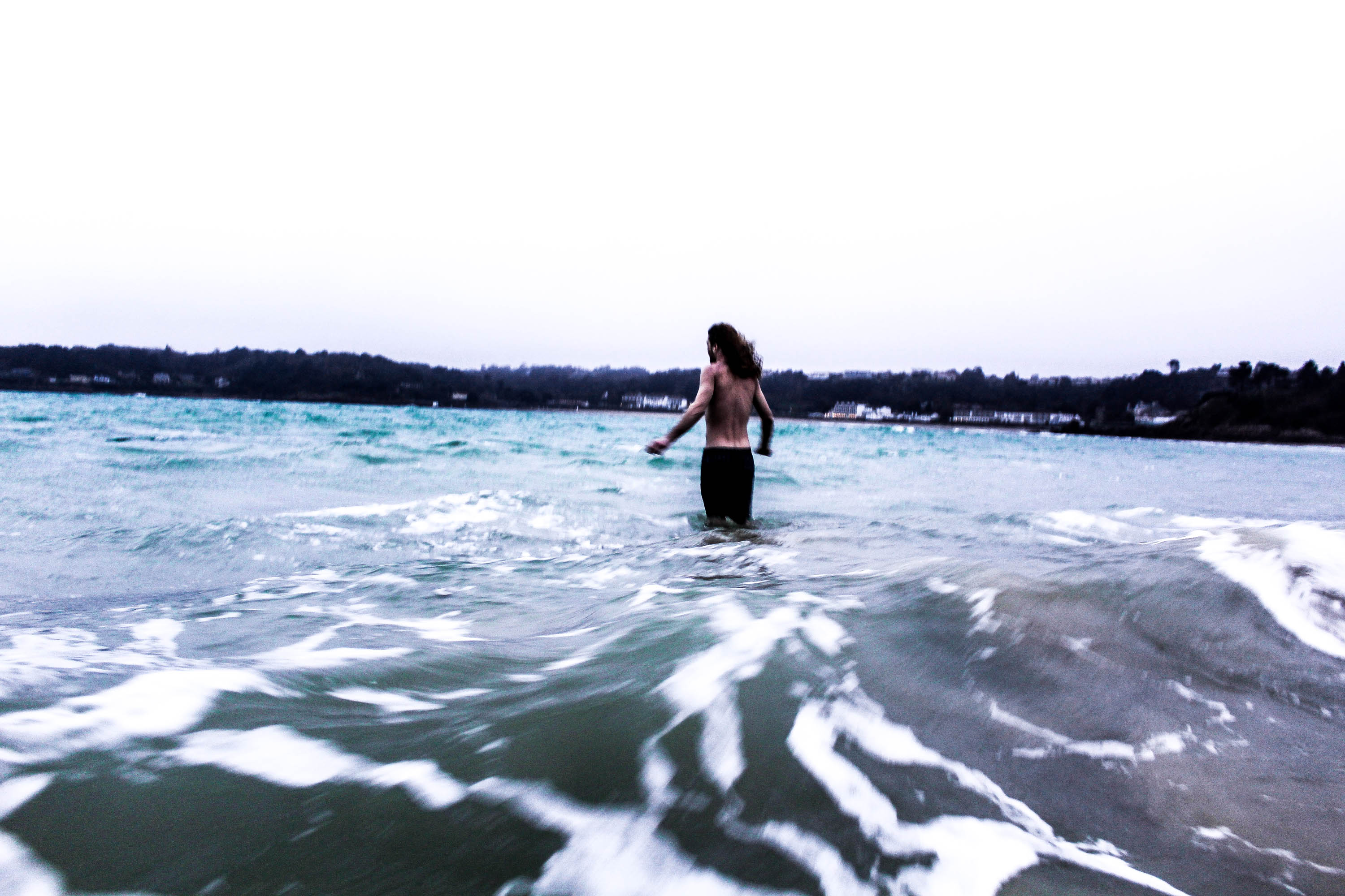
These photos below remind me of Jacob Sobol’s photographs of Sabine, how they’re quite personal and up close. The use of black and white and being over exposed and out of focus, is very similar to the style of Sobols shoots of Sabine, except Sobol uses flash and I chose to appreciate the natural lighting. Referring back to other artists which I’ve analysed I remembered Corinne Days famous quote;
“When a relationship forms between the subject and the photographer, a natural interaction takes place making the images more intimate. ” Corinne Day.
I believe this quote is very true as the model felt as if he was comfortable enough to act like this in front of the camera due to mine and his close relationship, whereas perhaps if he wasn’t as close with me(the photograph) the photographs wouldn’t have had the same amount of intimacy.
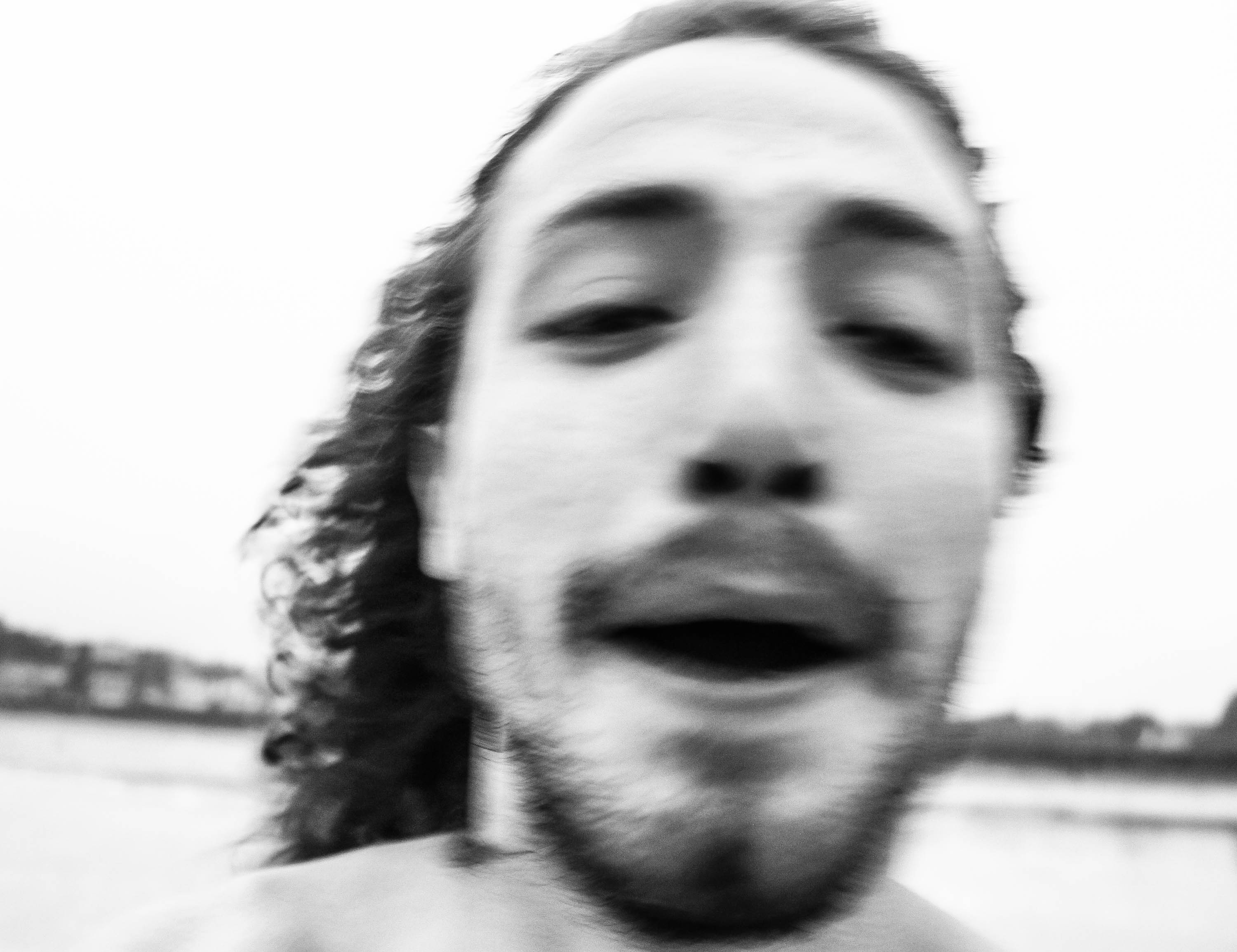
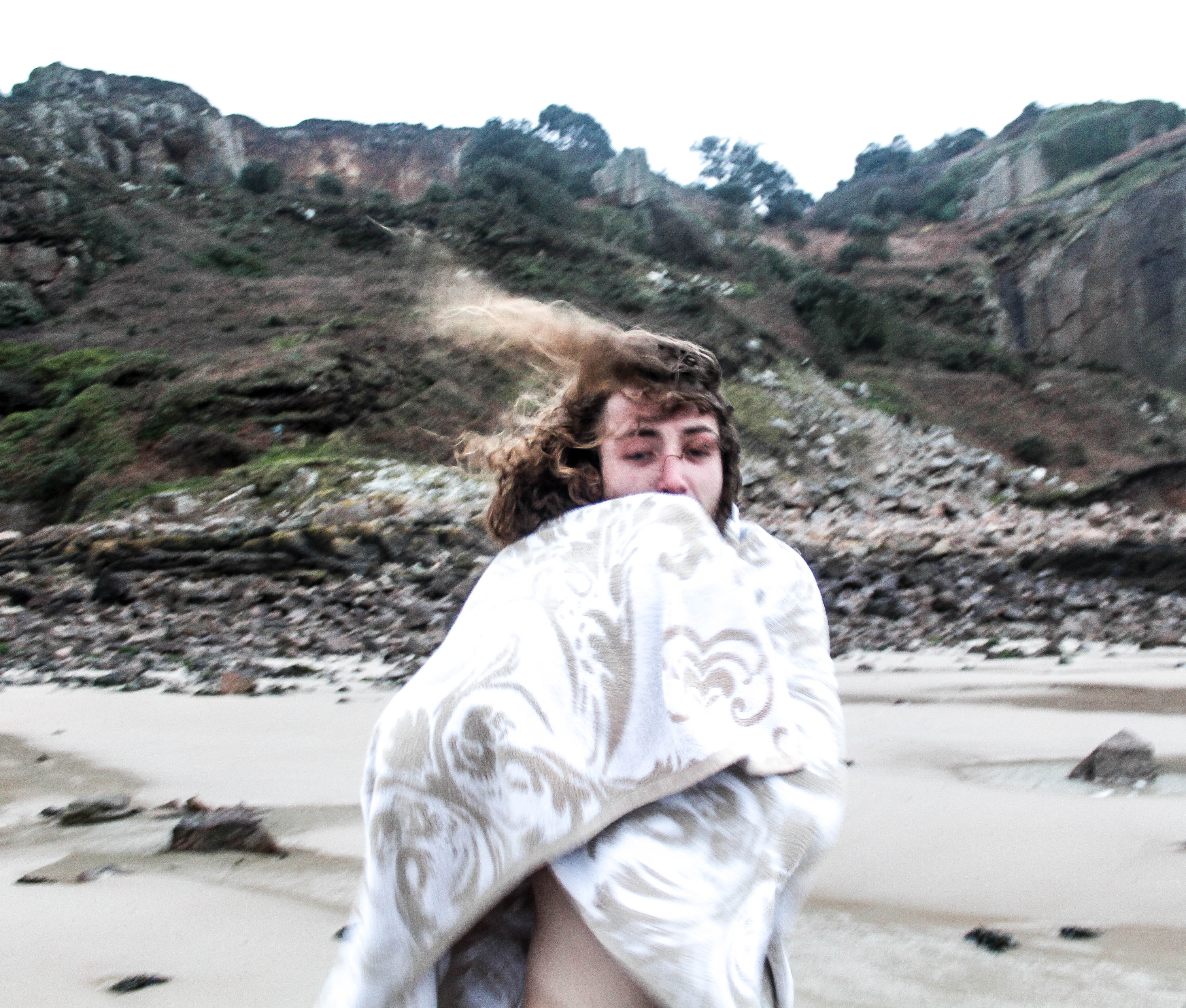
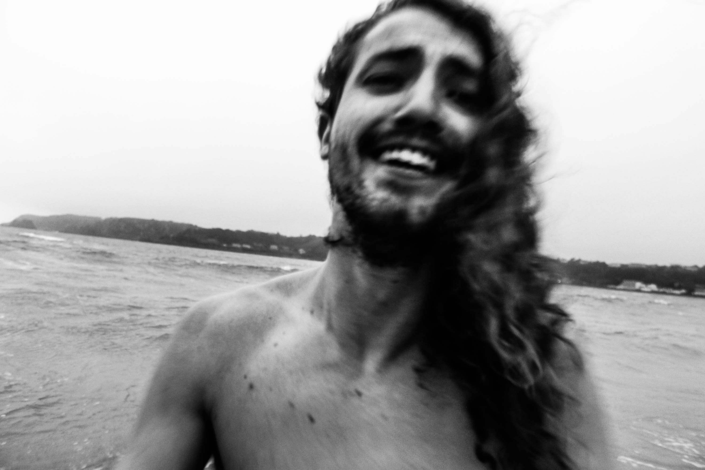
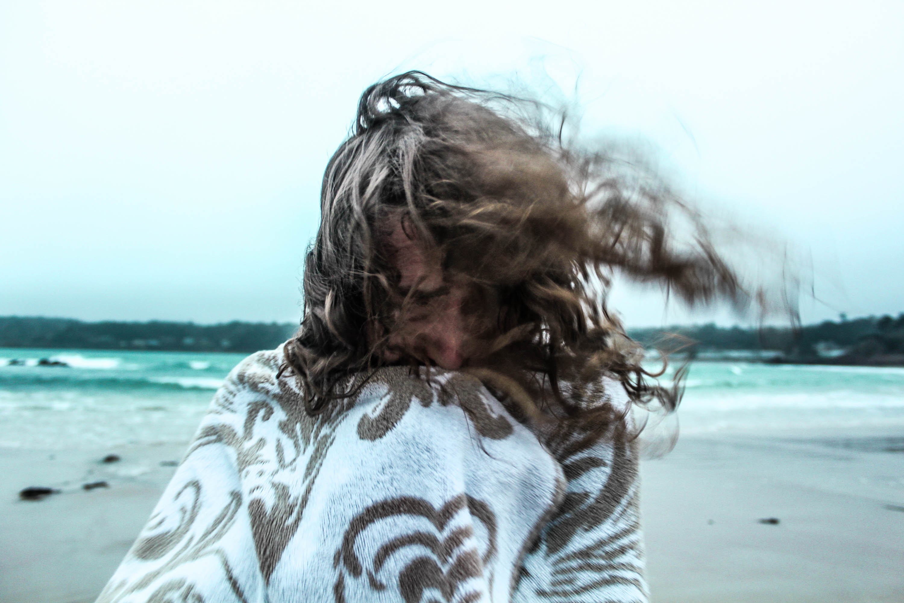
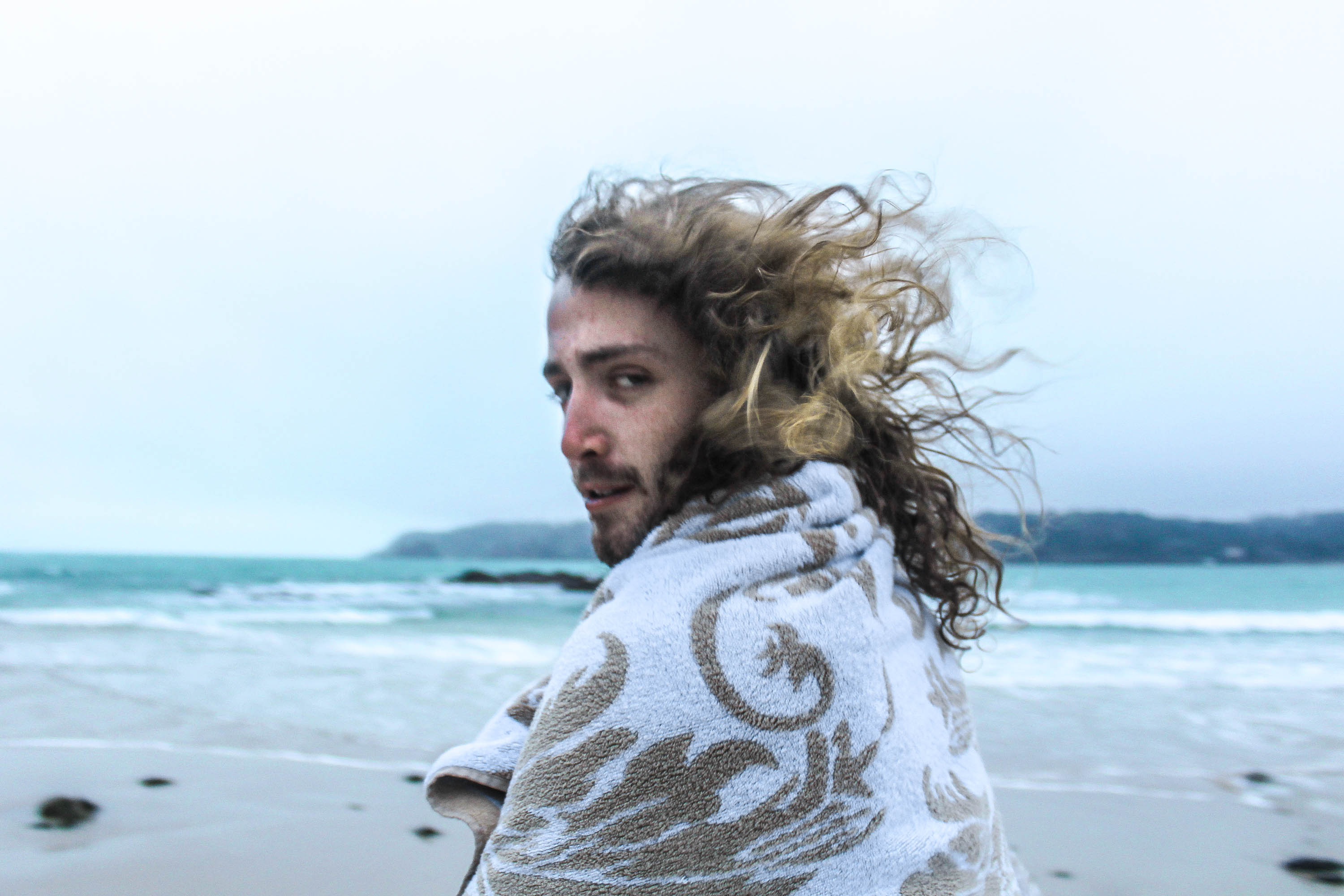
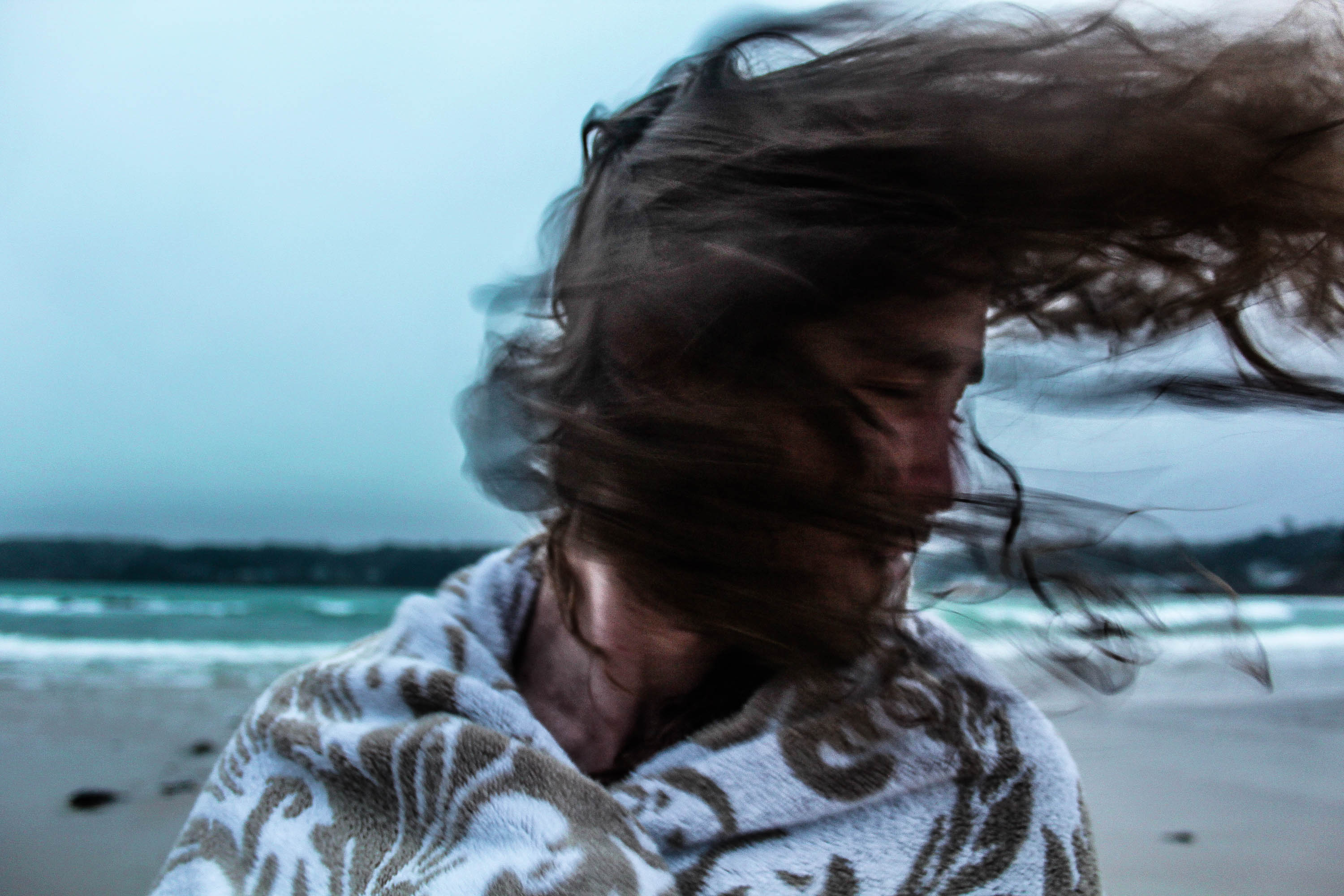
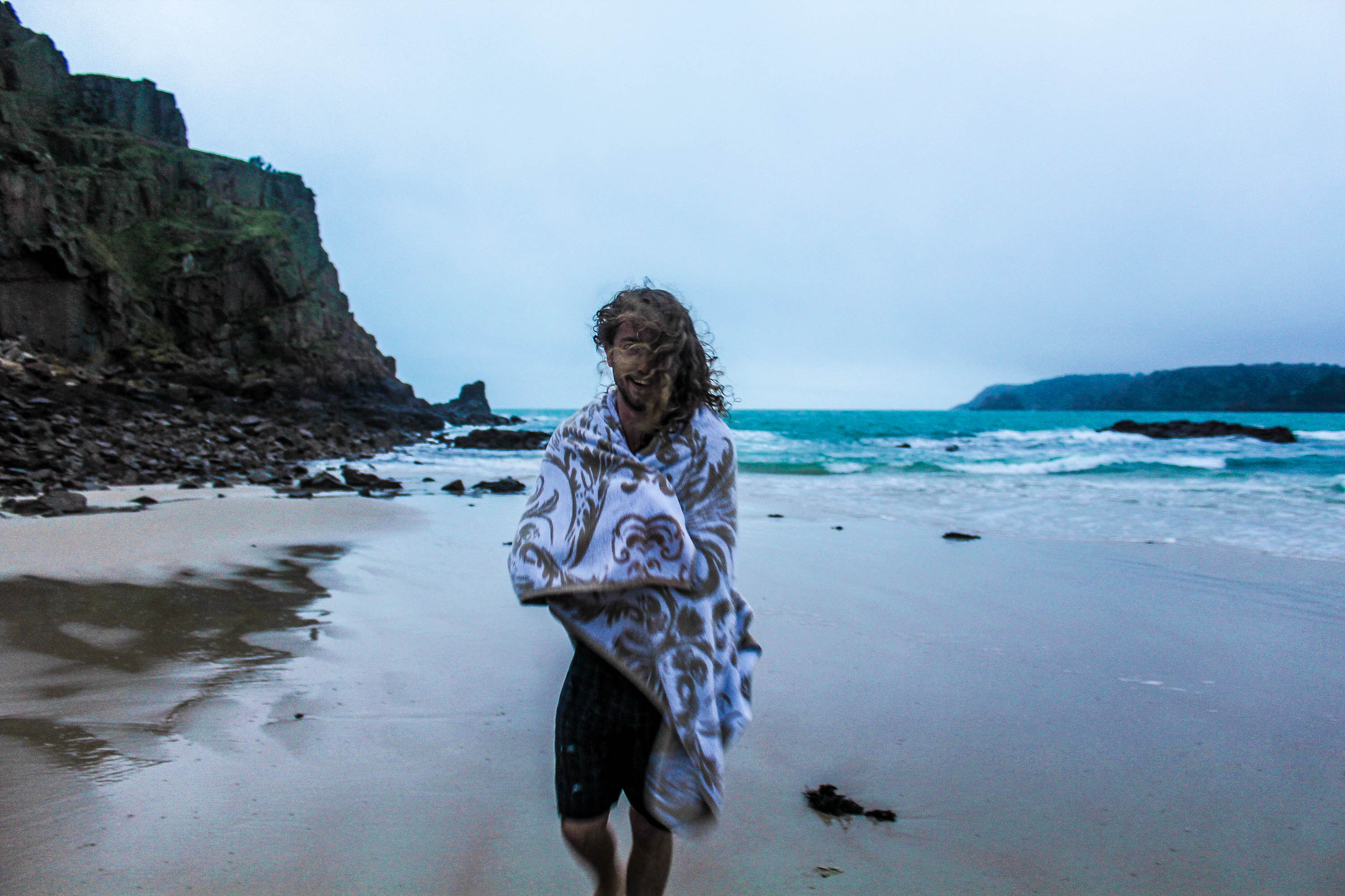
For this shoot I was pleased it was windy this day, as it helped give character to the photographs.
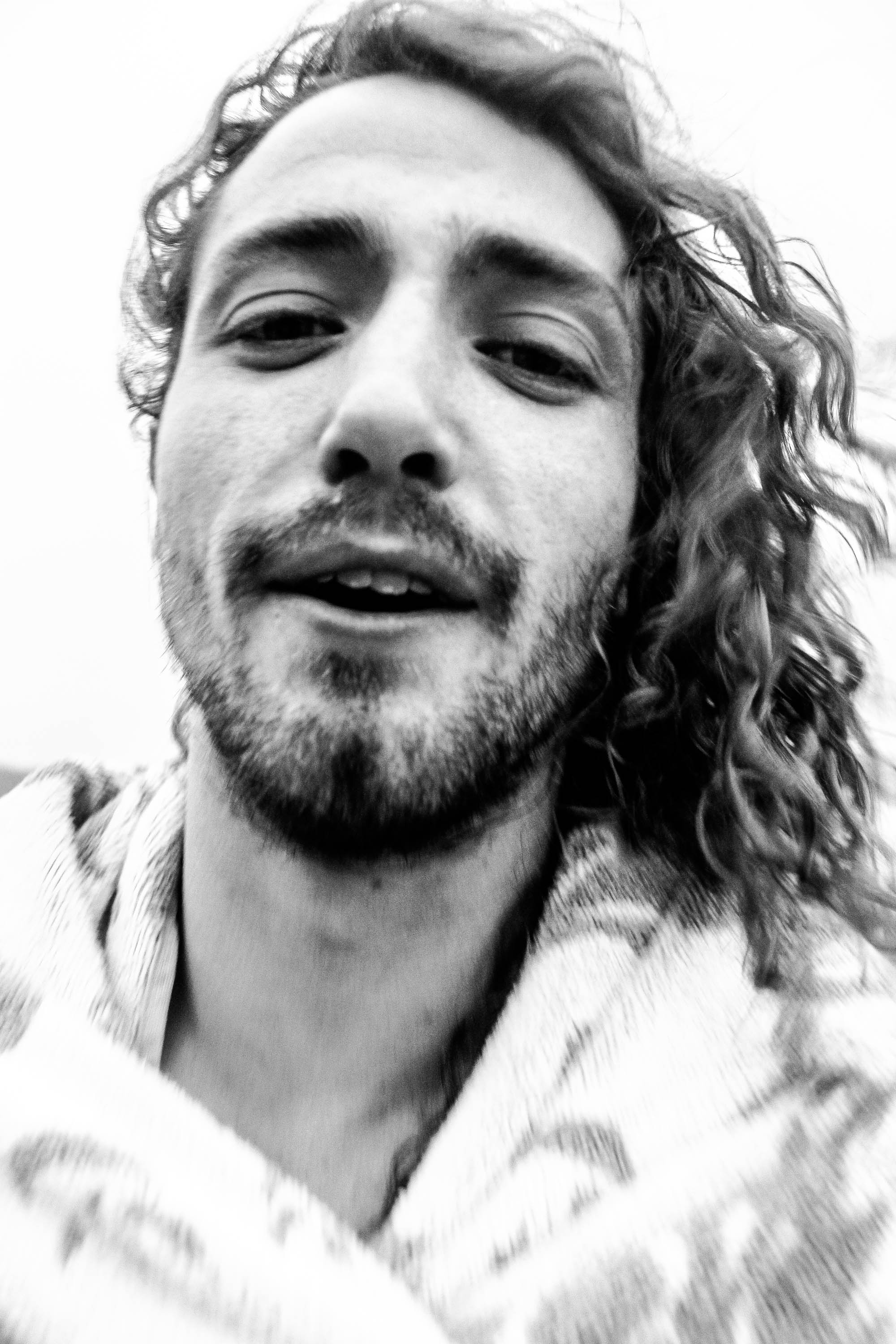
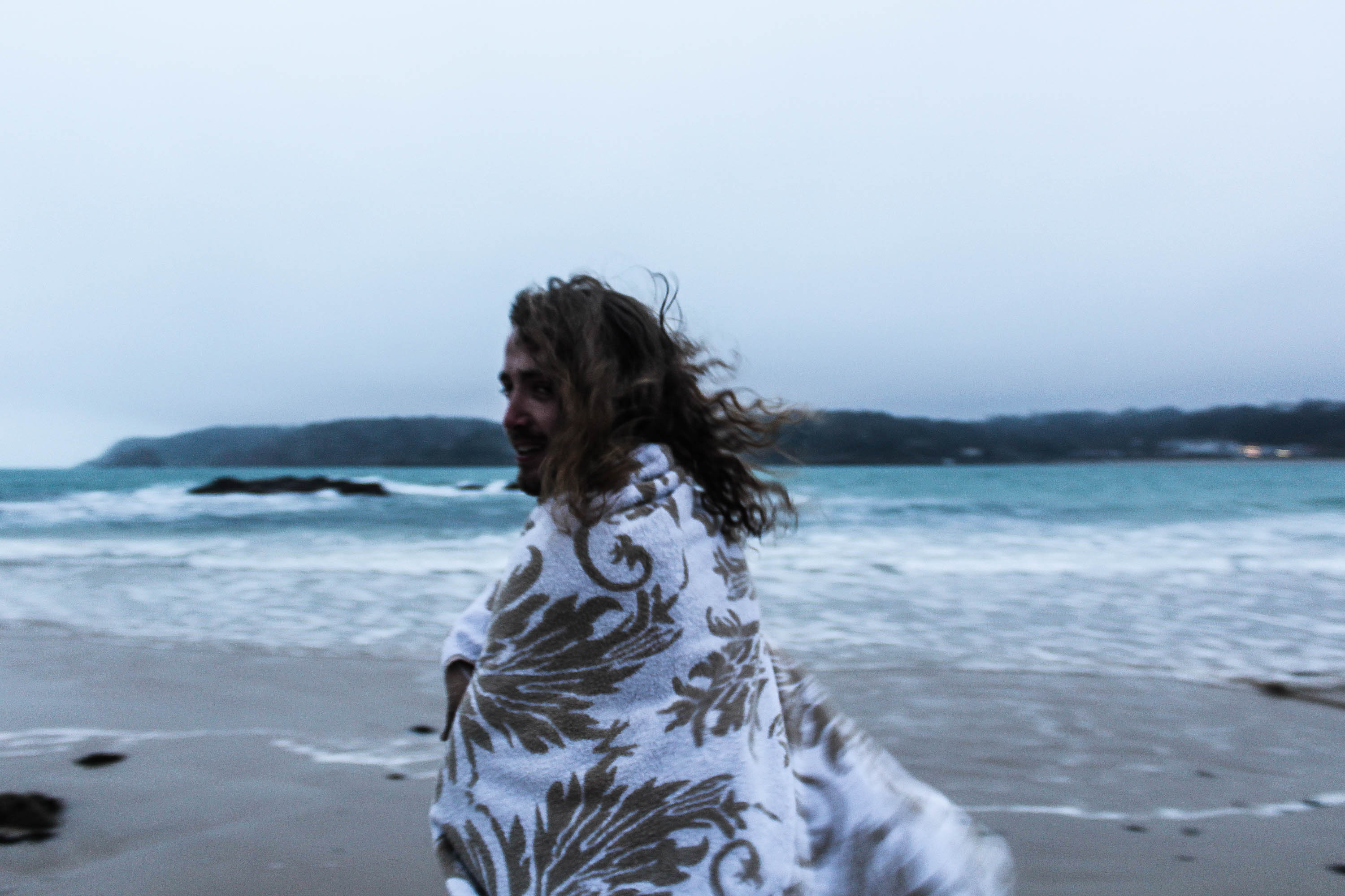
The photograph below is in the style of fashion photography. This is due to the towel being so clear in comparison to the rest of the photograph, it make’s it stand out, and therefore focusing on what he’s wearing.
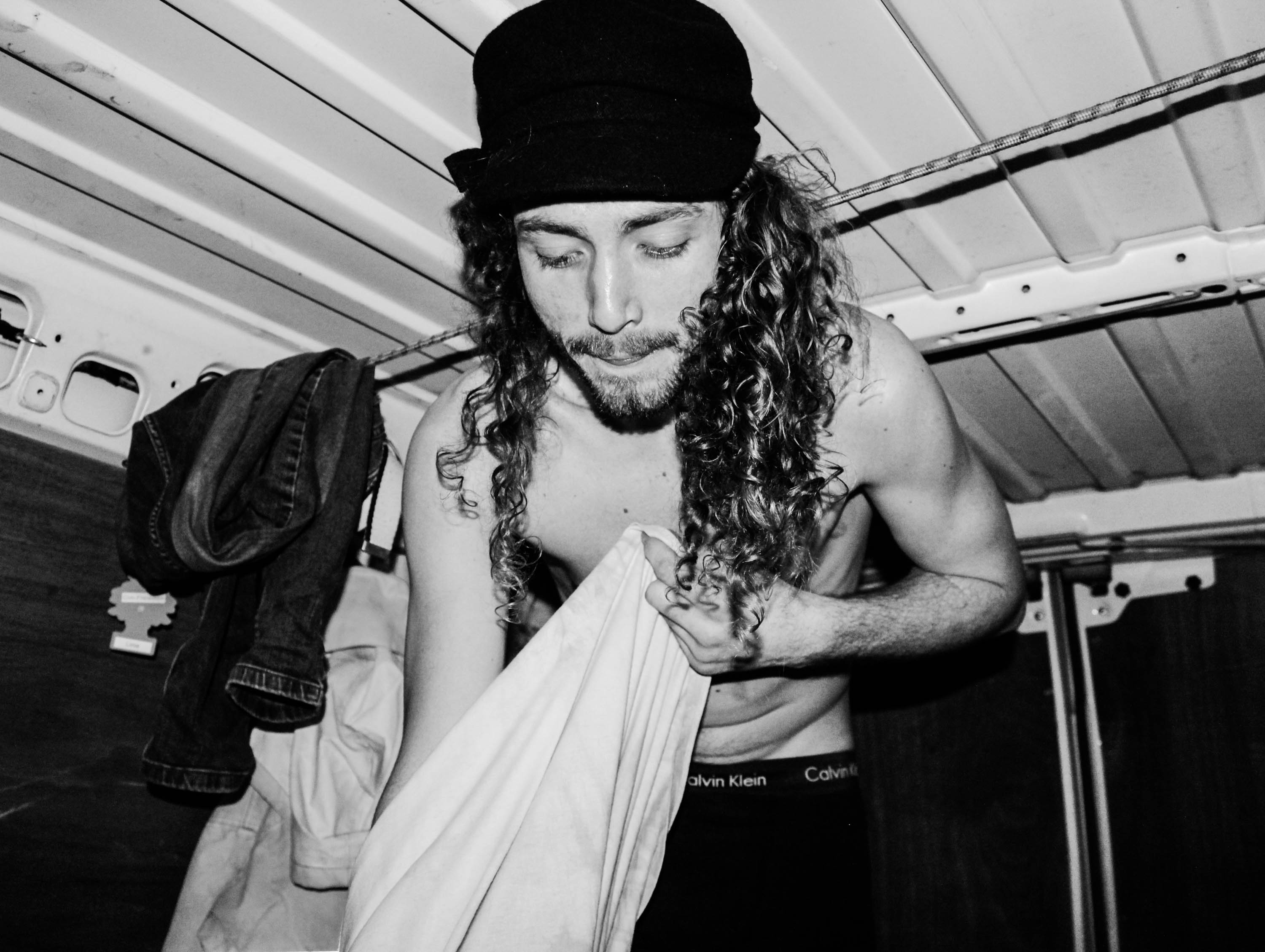
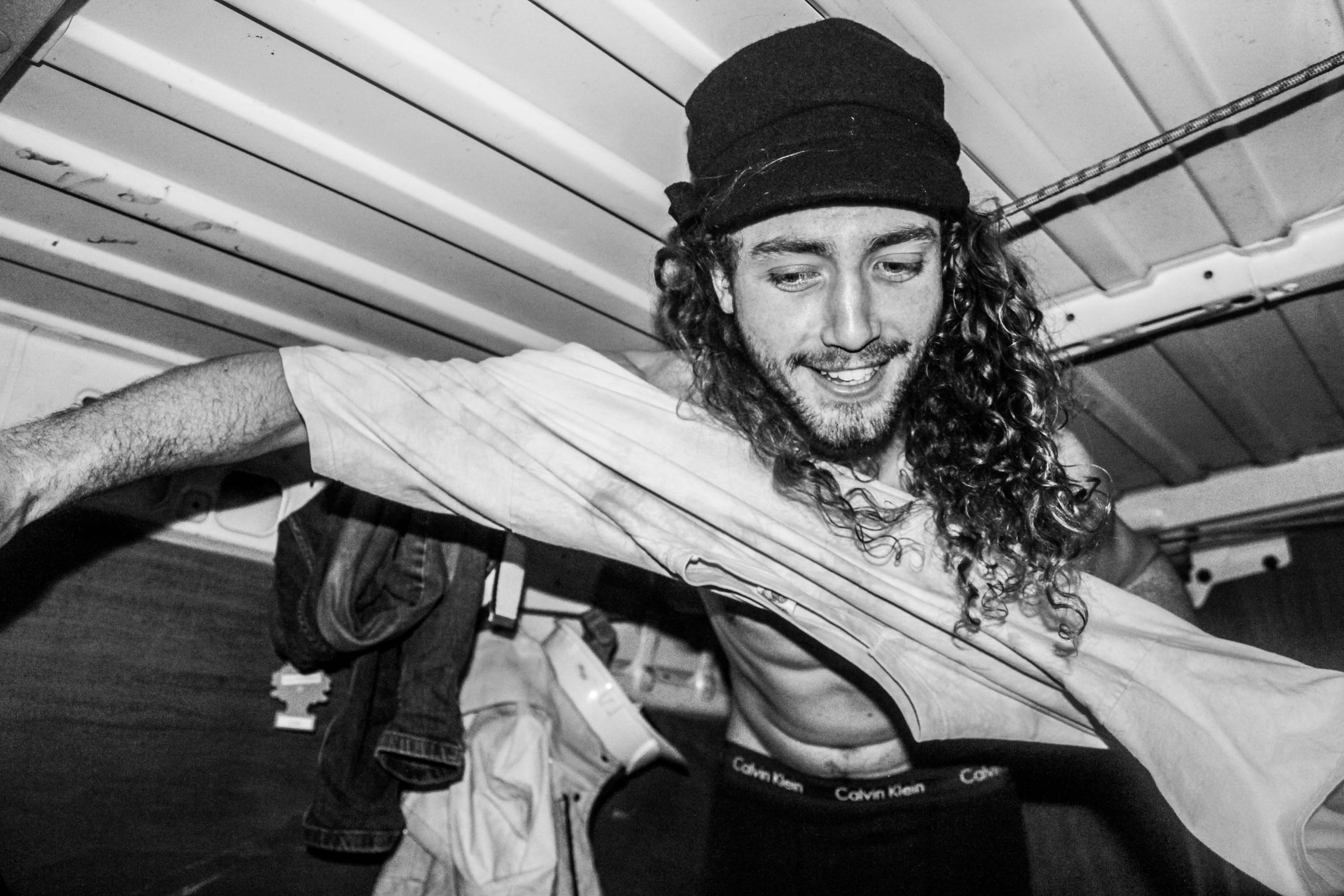
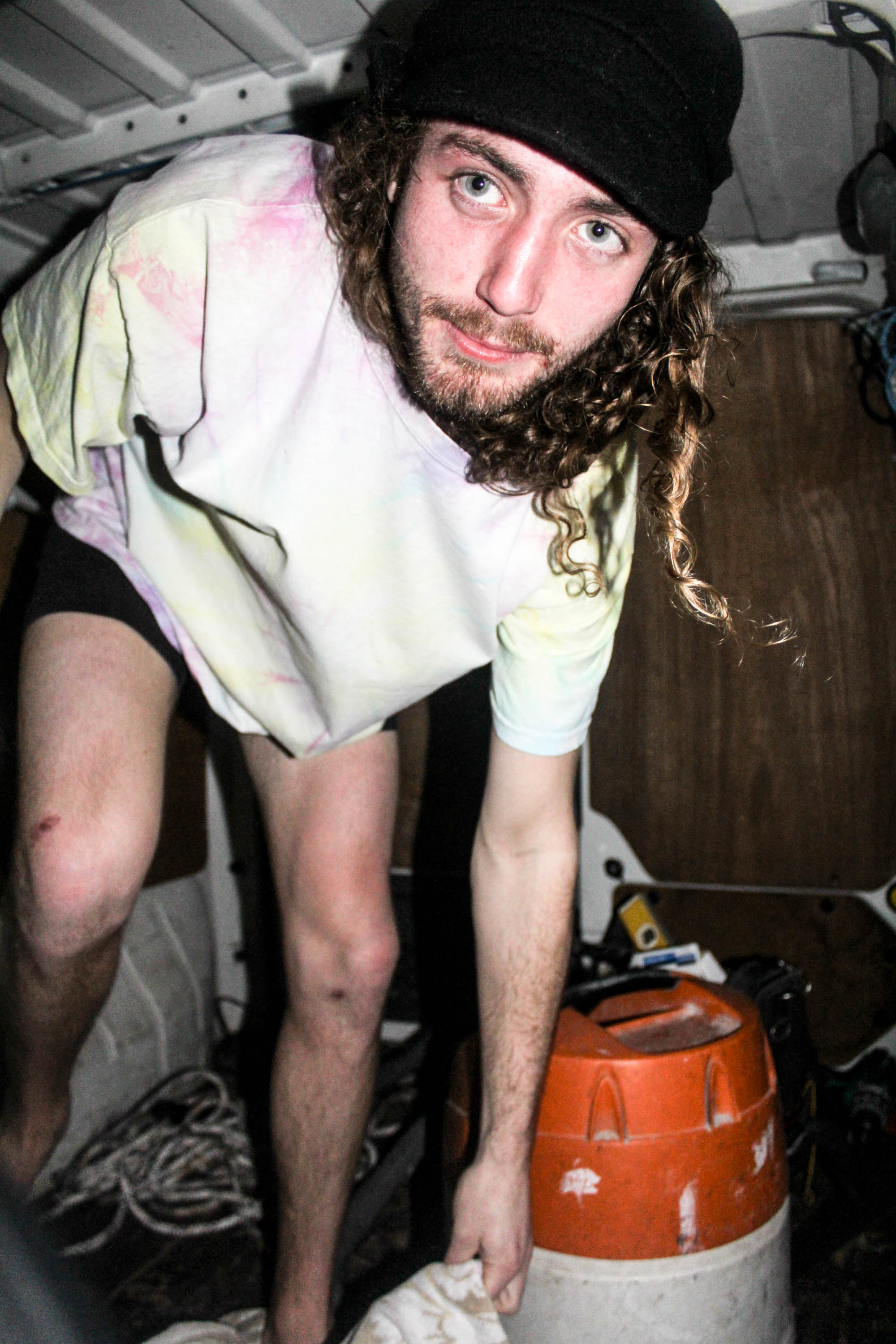
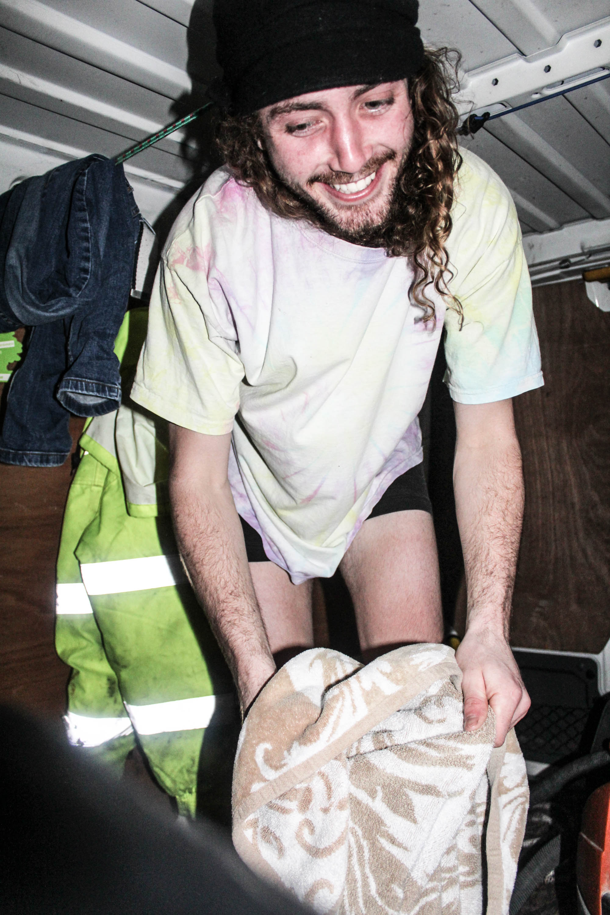
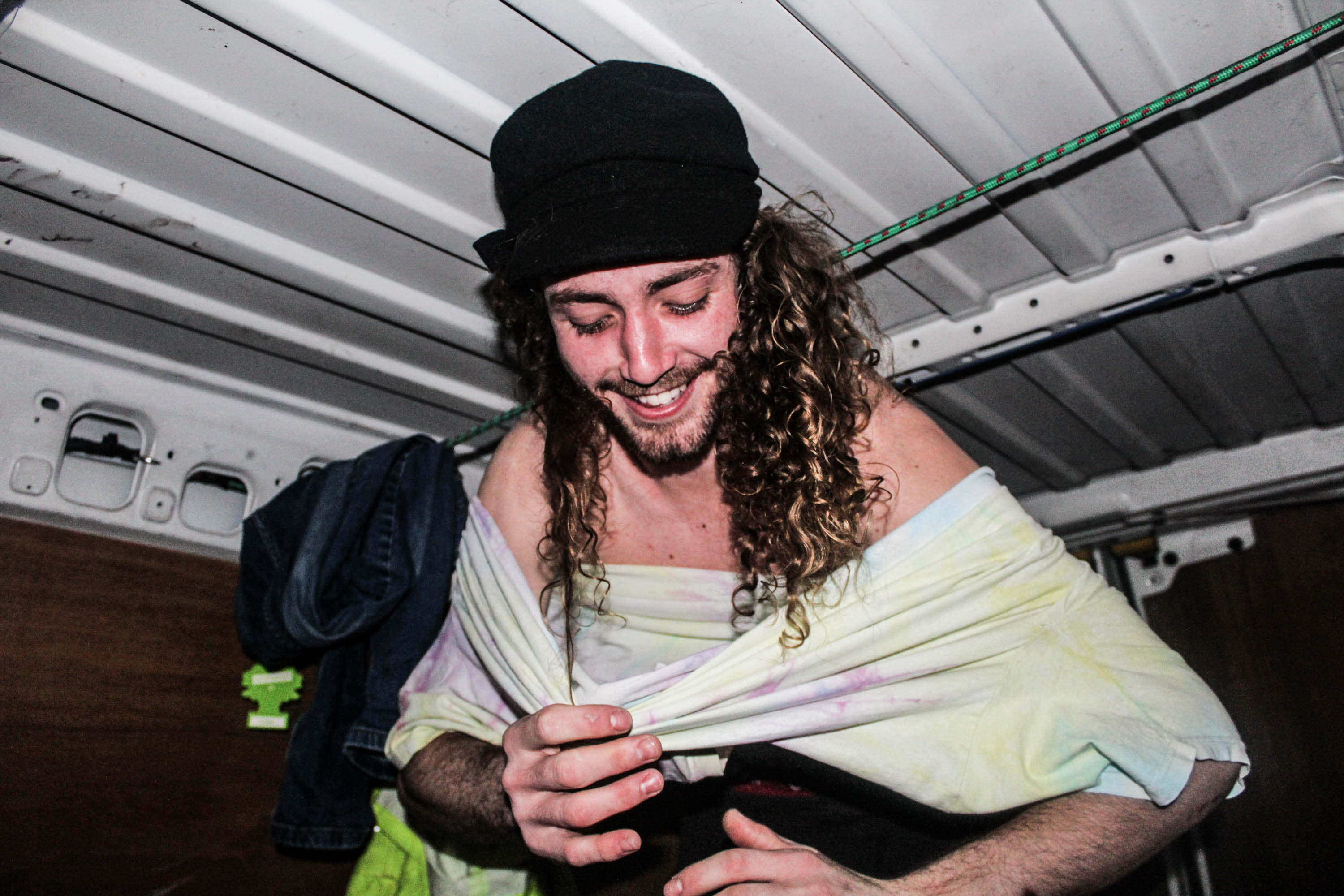
I took these photographs below, as Theo Gosselin represents his life in a van on a road trip, and the model was getting changed in the van so I thought the link with the artist reference corresponded nicely. The images below reminded me of the quote;
“My pictures were always misunderstood as having a sexual theme.” Nan Goldin.
The reason my images below remind me off that quote is because he’s getting changed, therefore linking to nudity, which makes the viewer think sexually. However, I did not shoot these images with the attention of being provocative, they were taken innocently after going for the swim. He was putting the clothes on, not taking them off, therefore I see it differently to having a sexual theme, whereas perhaps the viewer wouldn’t.
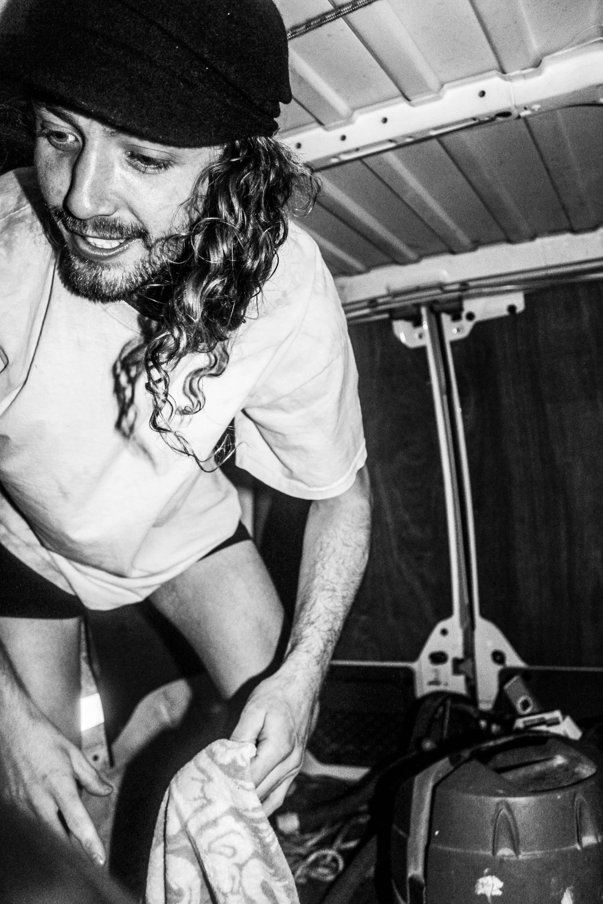
In the photograph below, it was an accident that I left the florescent jacket in the background, however I think it actually works because the viewers eyes are immediately drawn to it and because his legs and boxers are in front of it, it makes you realize straight away that he’s getting changed. Which is what I wanted to be the main subject of the photograph, as it shows how comfortable he is in front of me.
I love these two photographs as a gallery as they’re taken one after the other, going to pick up the towel and then picking it up. These two work well together because as he bends down his eyes are the main subject, and then coming back up it’s his smile,
Environment – Plan One
My first plan for my project, was not to initially start doing my own shoots, but to collect numerous archival photographs of myself as a baby. The reason for including this element of work within my project, is to create a more personal body of work, that is almost like a coming of age. Once I collect enough photographs, I will digitize them and refine them in order to create the impression of an original photograph, that can be fully incorporated within my project.

Environment – Specification
Within my new project of Environment, I wish to ultimately explore the various significant factors within my life. This varies from birth and my early years of life, through to adolescence into the point I am fast approaching now, adulthood.
Of course, I wish to present this through imagery. I am essentially attempting to tell a story, although I do not wish for this to be obvious. I want to explore various significant factors within my life, within the different shoots that I take. For example, significant people within my life or interests.
Within these shoots, my intentions are to photograph in such a way that is raw and real. Capturing true moments in order to really display a real representation of my own life, as well as the people and environment I surround myself within. Me myself, will not be the subject of my images, as I wish to use other people within my life in order to tell my story, for example the way in which one will act in front of me and the camera will help to convey a sense of the relationship I share with the subject.

Garden Den
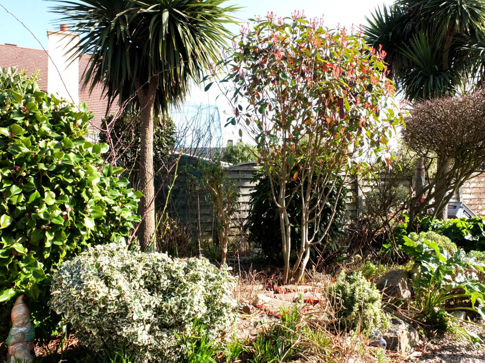
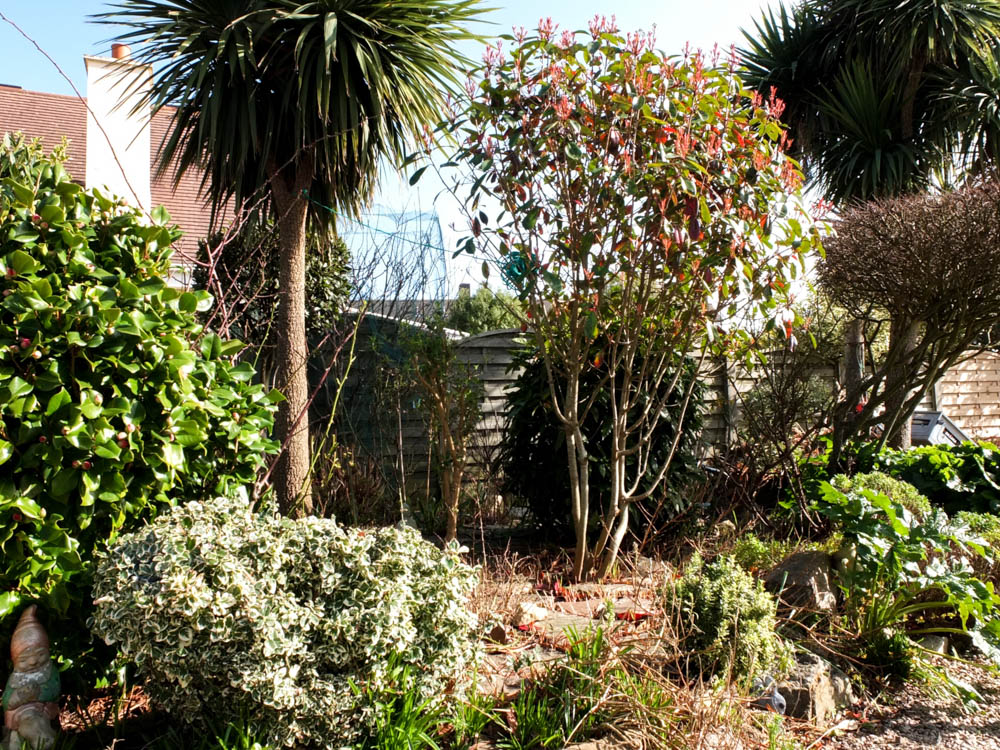
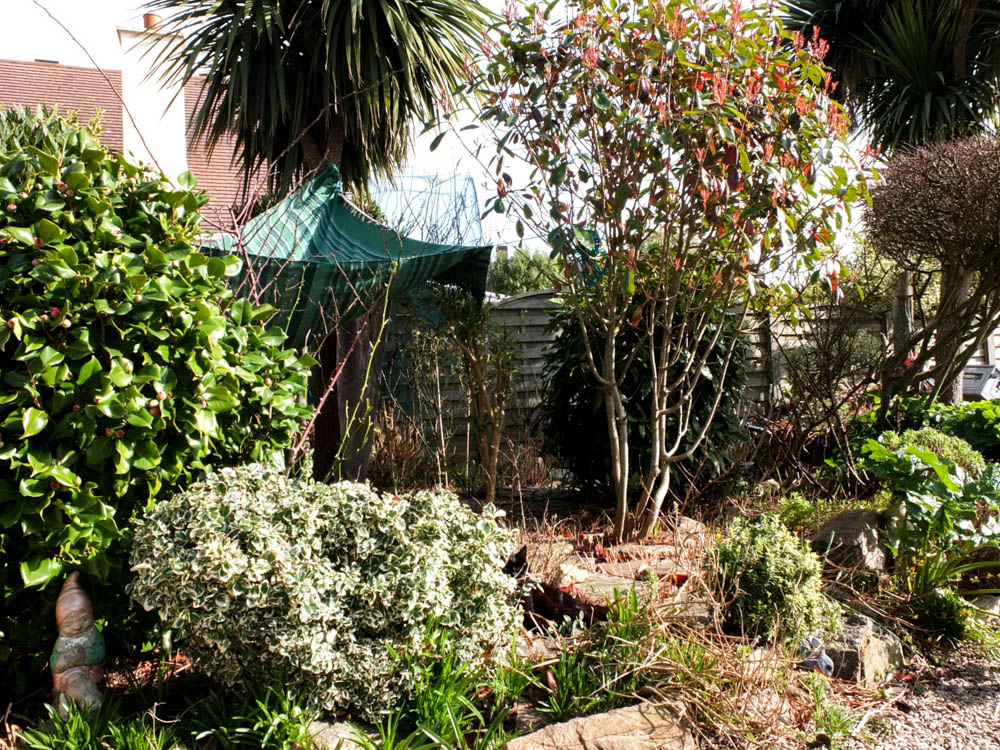
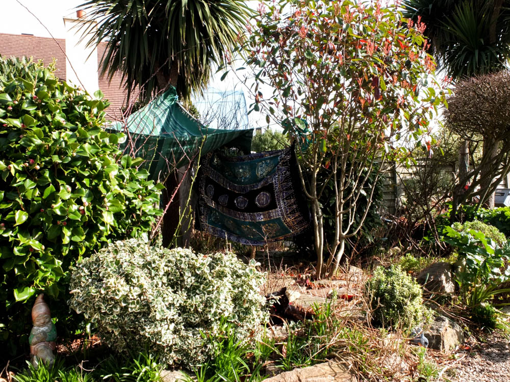
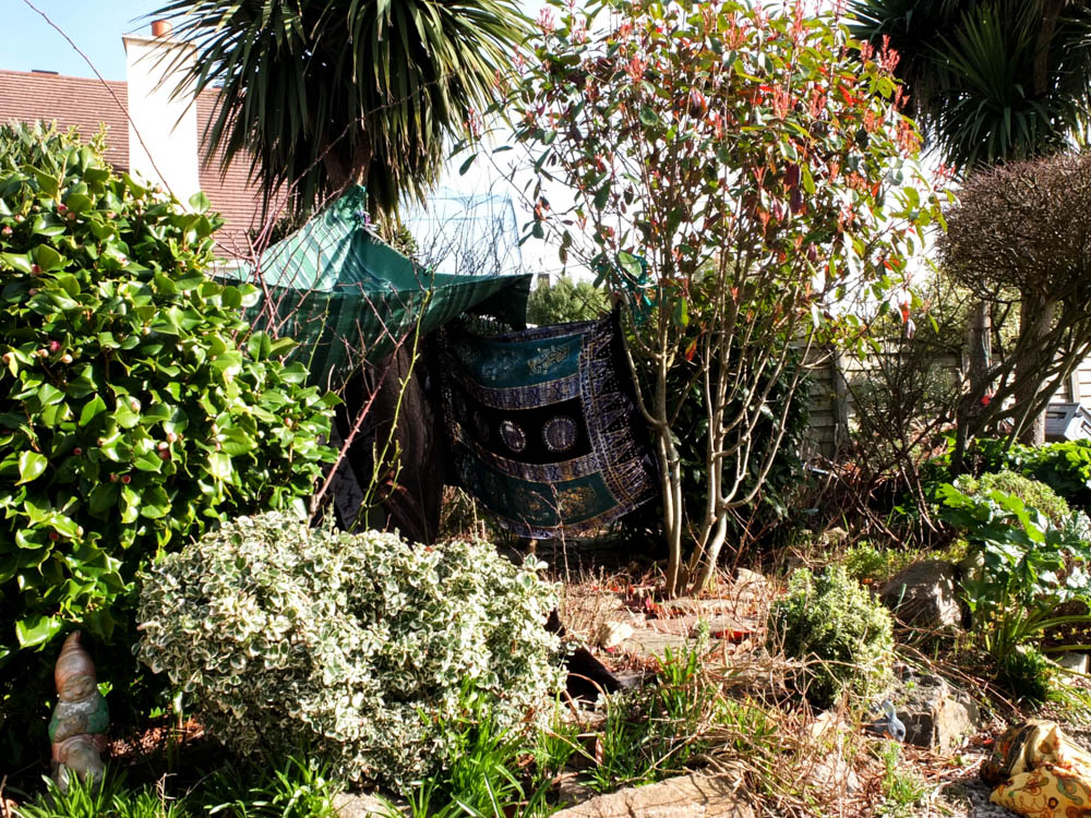
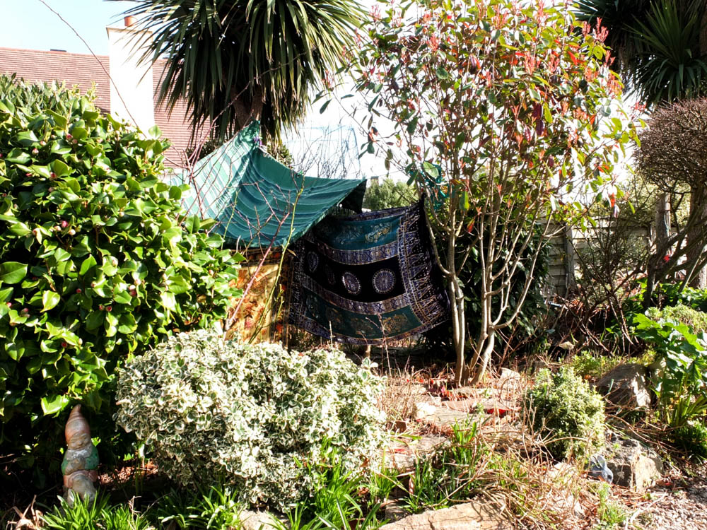
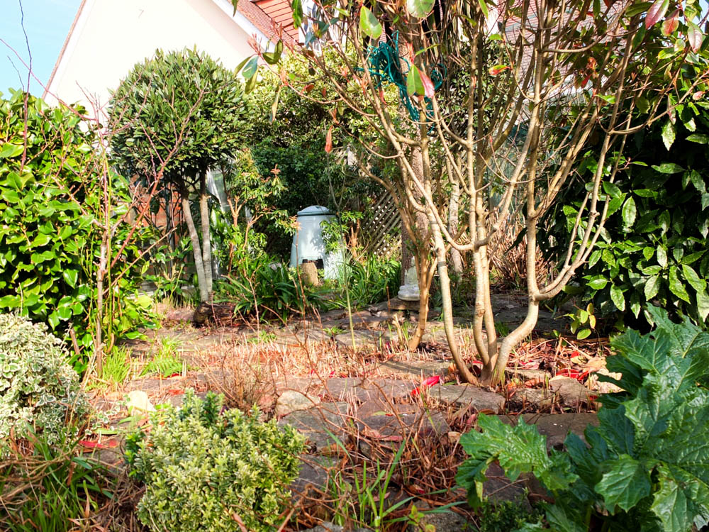
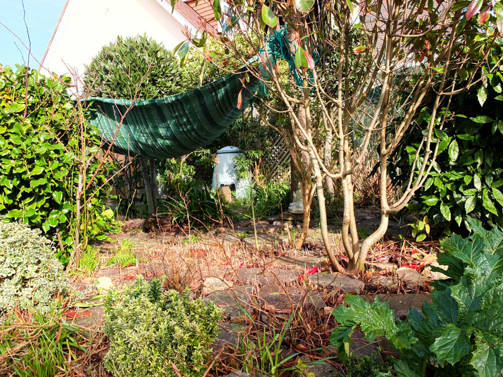
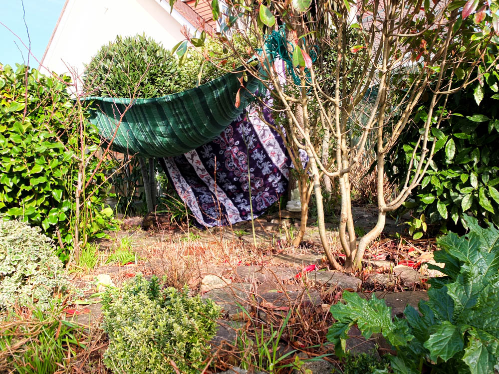
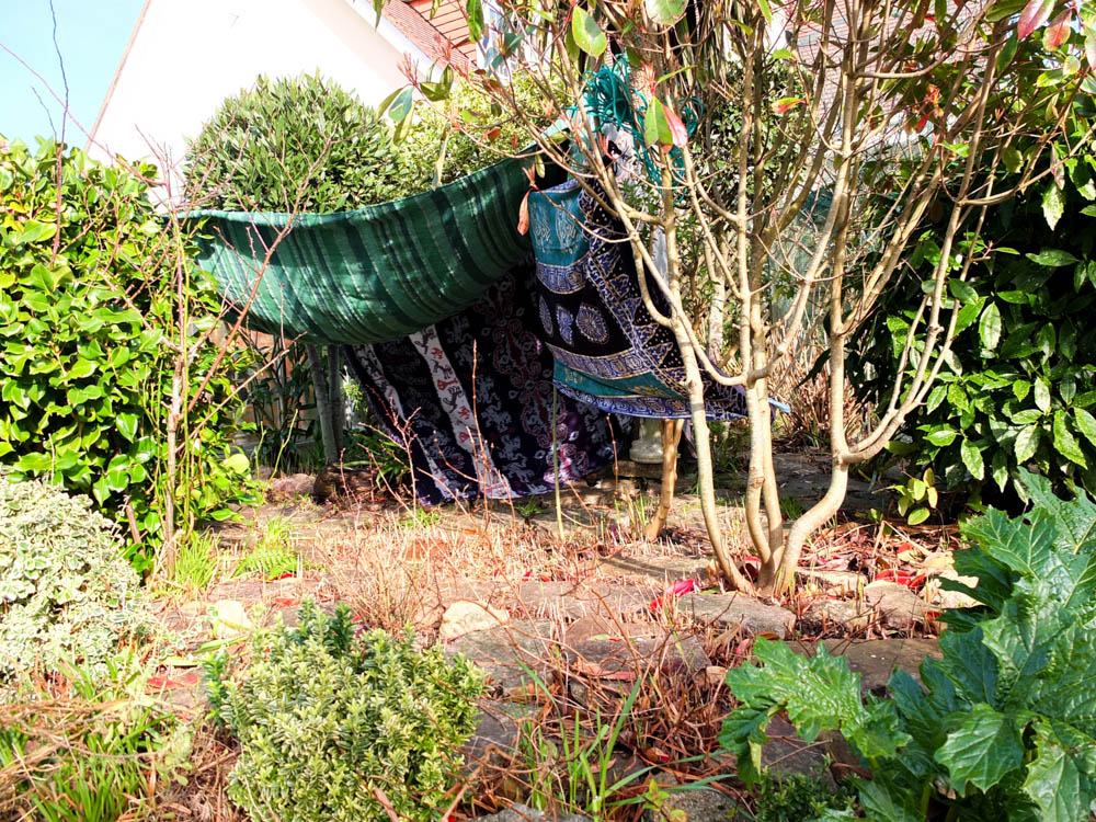
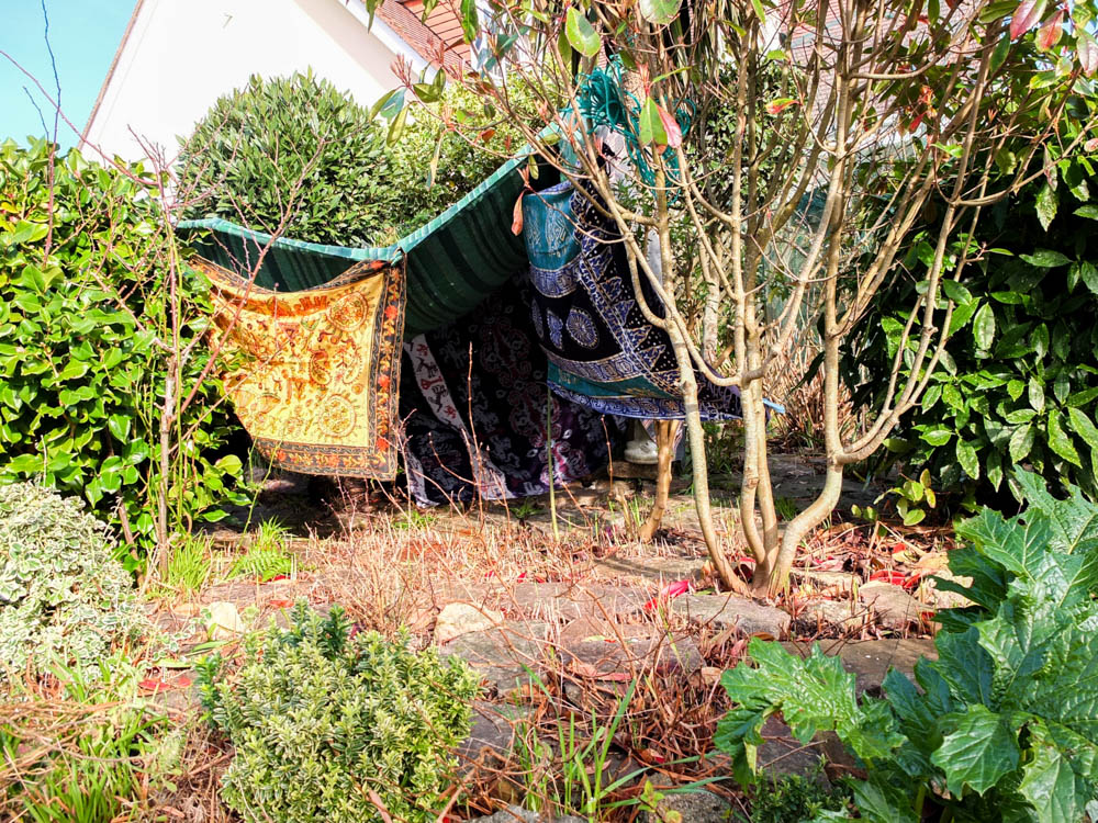
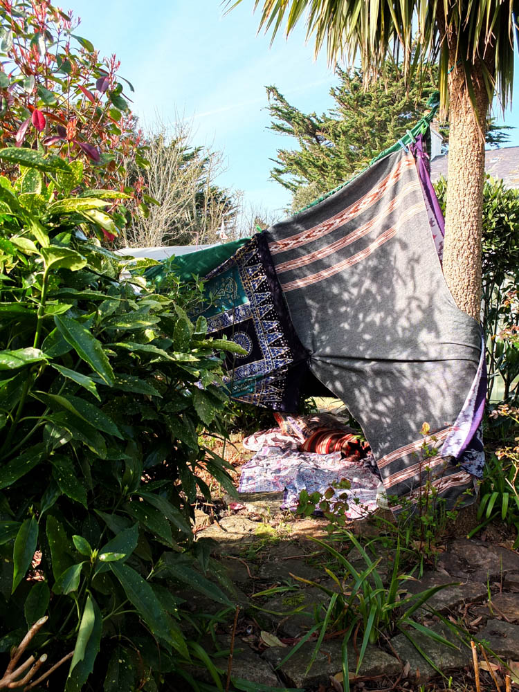
Below are the photographs from my first shoot where i experimented building a den within my garden. Overall i quite like some of my final images and it has made me consider quite a few elements of my dens in order to plan better for my next den project. I did however manage to get the perfect weather as it was sunny but then also slightly windy.
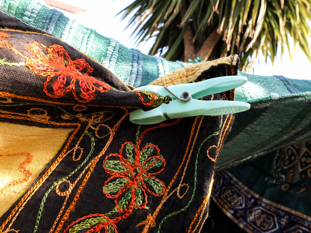
After completing this shoot i have learnt firstly that i need to consider the angle in which i plan to take my process photographs more carefully so as to be able to capture as many elements of the process as possible. I do think this will change depending on the environment as other environments will hide the dens structure less than this first garden environment. I also think it did work really well to have bright colours within the environment as well, the yellow blanket looking the best within the den. I therefore think i’m going to experiment a lot more with using really bright and vivid colours for my dens rather than matching them to the environment. Having a bright sunny day also worked really well within the photographs as the colours of the materials became more intense and created an almost childlike wonder to the den. The close up shots of element’s of the dens also worked really well as a compliment to the process of building the dens. I quite like the focus on these smaller elements of the structure as well as the process photographs of how it all came together.
The first two sets of photographs are the process photographs that i took. I composed the process photographs from two different angles because of the first learning curb that i found when building my den. When i composed the tripod so that i could take photographs which would be a little series, i positioned the camera in such a way that it got the bet composition of the environment as a whole. I didn’t really think about how the den might be hidden too much by elements of the environment which is what i found after doing the first progress photographs. While they do work it is very difficult to see all of the different stages as elements which are added are hidden and therefore you can see little change in the photographs. Therefore as i took the den down i moved the camera and took a second set of shots which considered the den and trying to show how all the elements were added within my composition. The second set of images are face on to the entrance of the den and therefore you can see the walls being added in a lot easier then the other composition.
I do really like the composition of my first progress photographs i just think its a shame you cant really see all the different elements being added in. I composed the frame using the rule of thirds so that the den was more to the left side of the frame. I also composed the distance from the den so that the den was in the background of the frame and therefore it gives more of an impression of the den blending into its surroundings.
While i prefer the first composition better the second set of process photographs give a better sense of the den making process. I composed the camera closer to the den but once again used the rule of thirds to an extent to create the photograph. In these second set of photographs there are more elements in the immediate foreground of the photograph which i think adds a different element to it. In the composition of both photographs included in the framing is the house on the other side of the fence as it gives a garden feel to the photographs. I think the cobble stones also add to creating the environment as i haven’t really included any elements heavily associated with gardens within my composition.

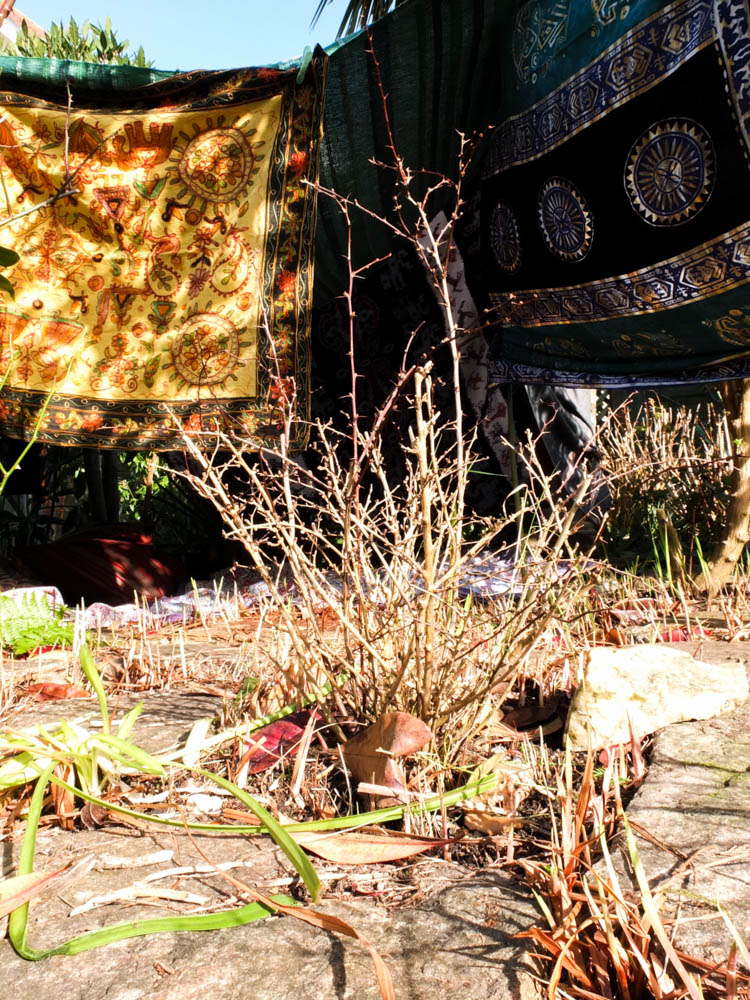
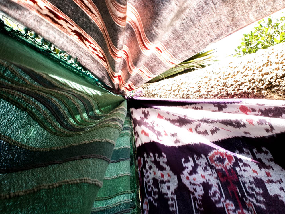
I quite like the composition of the photograph above in giving a general impression of the outside of my den. I took the photograph from below looking up at the den as i wanted to exaggerate the scale and grandeur of the structure. As children when building a den there is always a sense of pride and even awe at what you have created. I felt like by taking the photograph from below i was mimicking both the sight line of a child entering the den as a smaller person then me and also conveying how magical the structure is. I photographed the den from this angle as it is the entrance of the den and you can clearly see the opening. I quite like how the inside of the den is dark and so you can’t see inside completely. I feel like this makes the inside of the den appear more mysterious and therefore creates a snese of intrigue. The inside of the den is the darkest point of the photograph and is in the center of the photograph so the darkness sort of draws you into the den. I also used the really bright yellow blanket at the entrance of the den as i really like how the colours match the leaves. The golden yellow colours of the leaves in the foreground emphasis and bring out further the colours of blankets in the background. I framed the image with the little tree plant right in the center of the photograph as if it is the main subject of the image but then the blankets of the den in the background are what cause the plant to stand out and therefore they become the focus. The colours within the photograph all compliment each together perfectly with the greens, blacks and yellows. The brightest point of the photograph is the middle of the frame in which the light from the sun is hitting the stones. The foreground of the photograph is almost over exposed as the focus of the camera is on the background which is darker. The over exposed foreground works really well with the viewer’s eyes beginning in the foreground and then working back into the background and into the entrance of the den. In this picture you can’t really see the movement of the den but you do get the tension of the material in how its hanging.
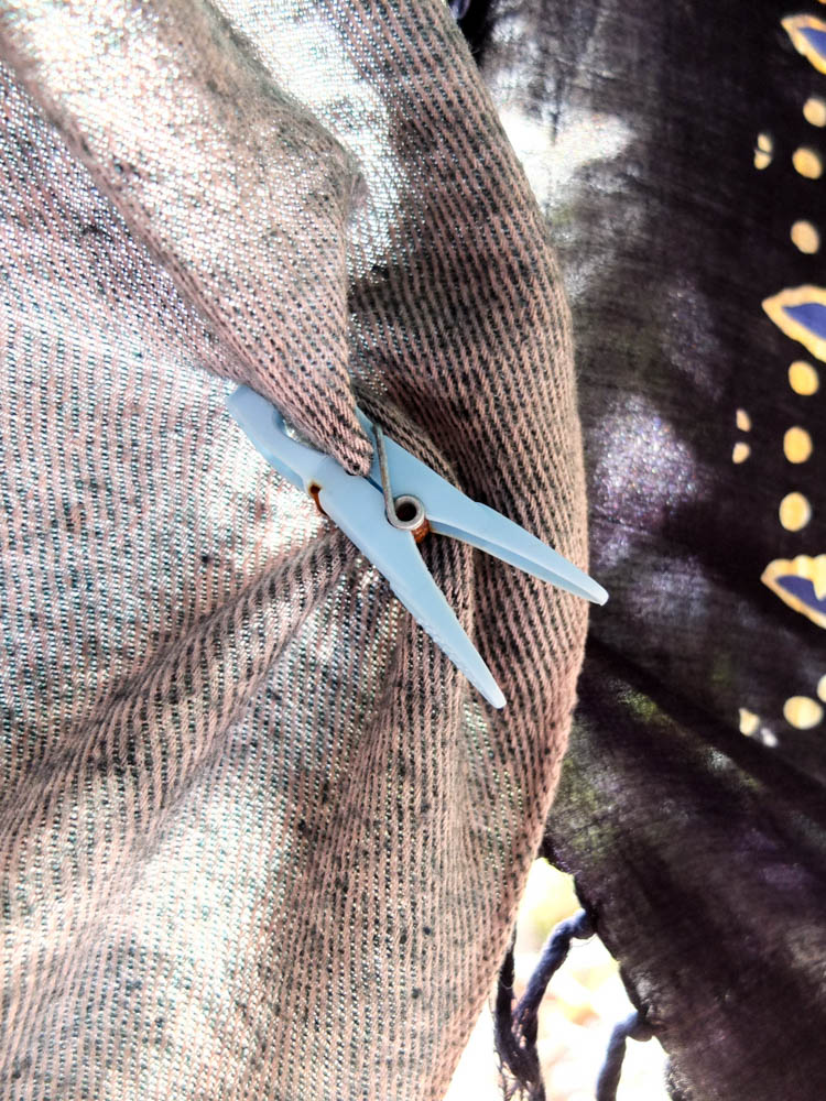
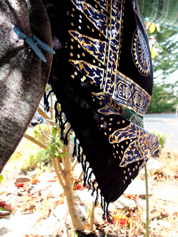
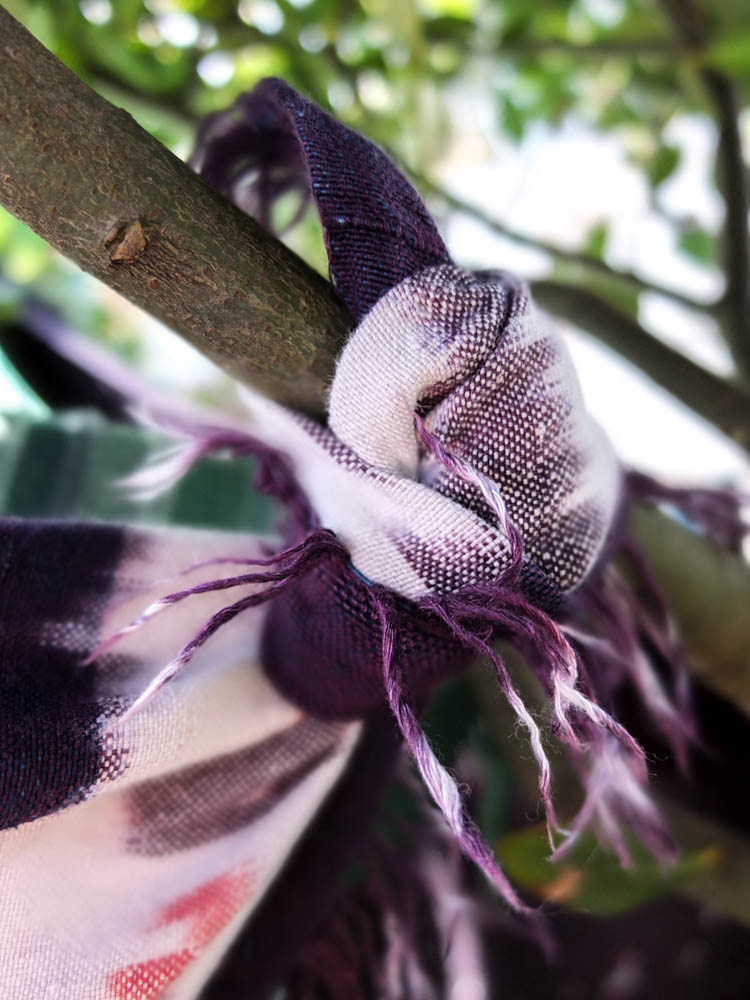
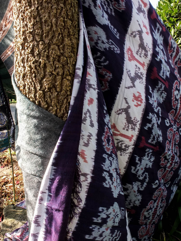
The above photographs are all small details which held together the den. I quite like them as detail shots to go alongside the photographs of the main den. So often with dens people look at the final structure and don’t consider the process. As these photographs in this section of my project are all about process and how the structure comes together, as much as the final product i think these photographs work really well as part of the series. In particular i like the 3rd photograph which suggests the movement and tensions of the material in creating the den. I composed the photograph according to the rule of thirds, the peg which joins the material positioned to the left top corner of the frame. From this point the material billows out at an angle which suggests it is being blown from behind. I quite like how the background is over exposed as the light outside is so bright as it causes the material in the foreground to be more prominent. You can also see to an extent the light shinning through the blanket which adds another dimension to the photograph. Most of the blankets were held up by pegs but i also tied parts of the blankets to trees which is what the last photograph shows. I think the last photograph also works quite well in showing how the structure comes together. I used a very small aperture to blur the background of the photograph to have only the knot itself in focus but the point at which the blanket flowed out the picture as blurry. I quite like the angles within this photograph as you have the angle of the branch going in one direction and then the blanket goes off in another direction but with not such a harsh angle because of the flowing material.
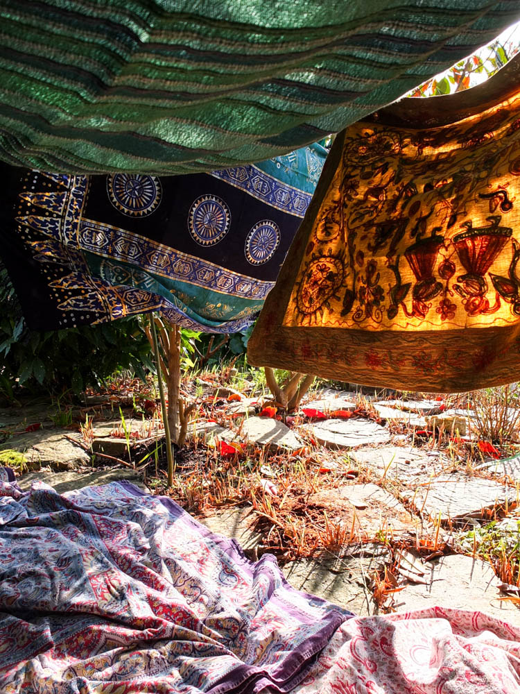
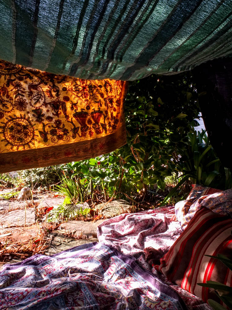
The above and below photographs show the inside of the den looking out. I composed the photographs in this way because i wanted to give an impression of what its like to be inside the den, the whole point of building a den to be inside the space you have created. The light and movement is what makes these pictures really work. The above photograph is composed to look towards the entrance of the den from an angle. The blankets on the floor of the den are in the foreground suggesting that the photographer is in some unseen cosy space further inside the den. I really like how this composition doesn’t remove all the mystery of the inside of the den as you still don’t get to see the entire inside space. I think a big part of the intrigue of these dens is the imagined cosyness and safeness that you feel inside of them. I think this is more an associated feeling rather than a reality you can see in a photograph so i want to keep this element of intrigue. The light in this photograph works really well in creating this magical impression as it shines through the blankets to the inside of the den. The impression of the photograph is that the light is trying to intrude into the space inside the den, both by shining through the materiel and also under it to fall upon the blanket as well. The light shining through the blanket creates an orangy yellow colour which matches the yellows and reds of the leaves on the floor. This works really well in creating a sense of unity of colour throughout the picture as there are these flashes of colour throughout the image. The greens of the blankets then also match the green flashes of colour in the picture throughout as well. The light in the picture is also fairly bright to the point of over exposure in places. The composition of the picture also suggests movement as the blankets are not hanging straight and are instead at odd angles due to the wind. The blankets even cover each other as they blow which give a more snug impression. The picture also has a lot of texture to it as it has the contrast of the soft material with the stones.
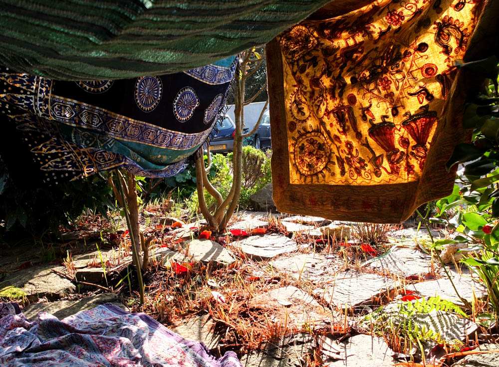
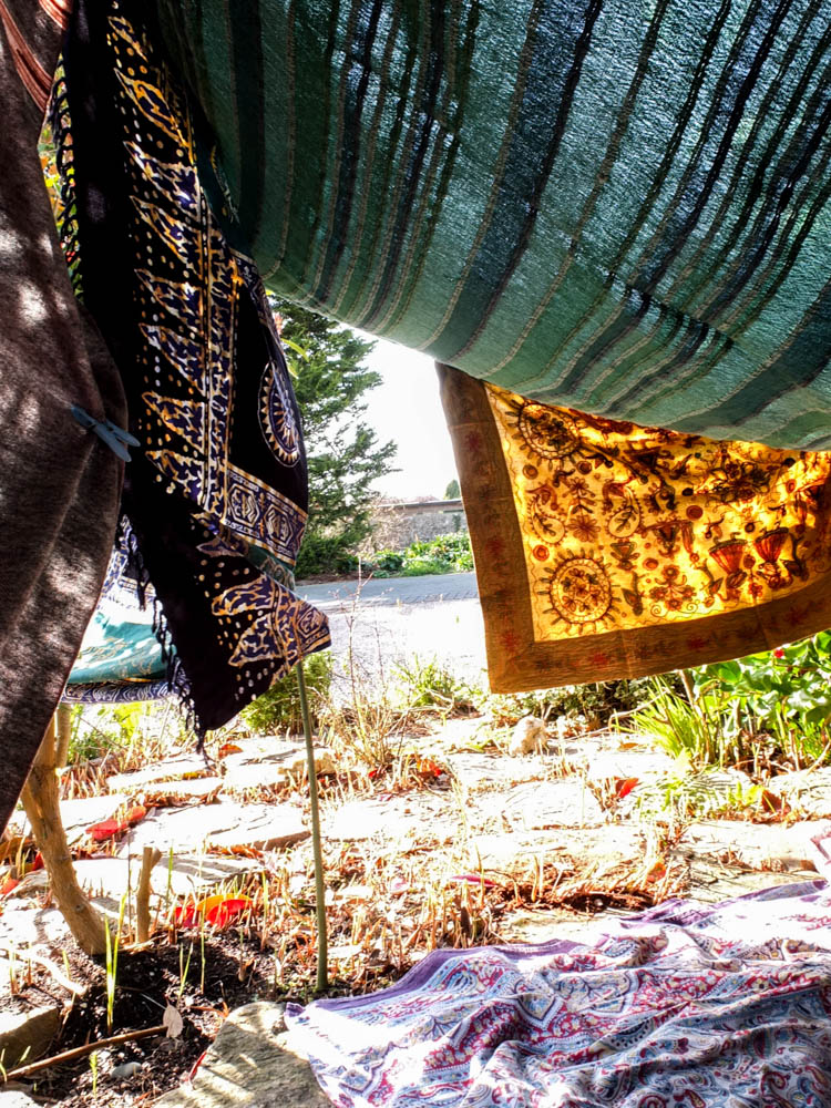
I also really like the above photograph in showing the varying angles of the den. I think the above composition is really interesting as it shows the angles of the material at abstract angles. The main light of the photograph comes from the background. Once again it is an overexposed background as the light is really bright from in the background. The angle of the photograph is really different to my other compositions as it has from the left hand side of the den and therefore gives a slightly different perspective. You can see more clearly through the entrance of the den to the outside space then in my other compositions. The light once again also shines through the material to make it more vivid colours than it normally is. The light is also trying to seep into the den through the entrance which is apparent from the areas of both light and dark shadows. I think the balance of the composition of the material is what works in this picture as the material frames the top half of the photograph through being low hanging and me having photographed the entrance which is obviously created by blankets to either side. The roof of the den billows downward which i like as it suggests the imperfections of dens that not all elements are perfectly structured. I feel like the lower roof also creates a more cosy atmosphere. To the left hand side of the frame there is then the material held together by a peg which you can see is being pulled taught by the gaps and lack of the material matching up perfectly. This creates more interesting shapes as the material is curved where it billows out and the straight sides of the material don’t match up which means the den doesn’t have a rigid feel to it.

Environment – Moodboard
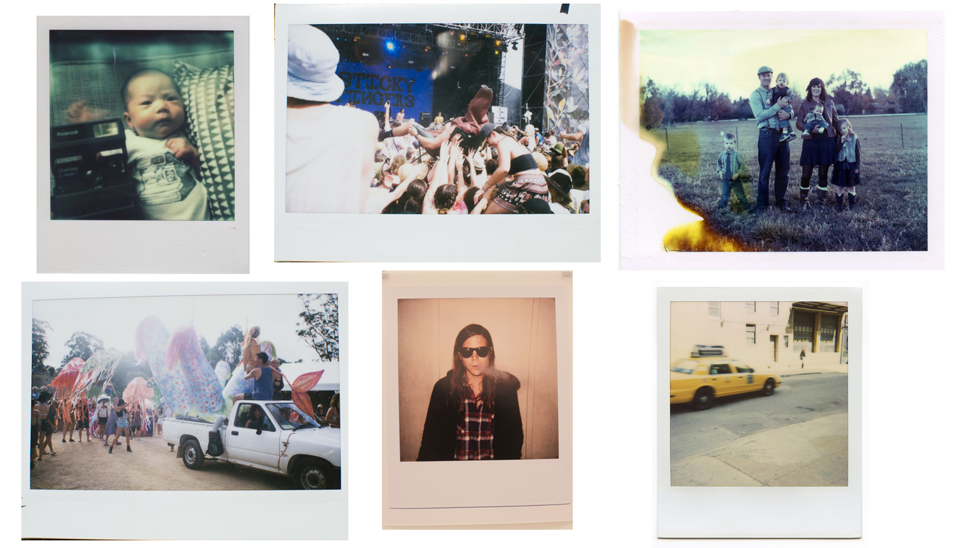
Below documents a moodboard presenting somewhat the style of imagery I wish to create within my project. From the mind map I created I came up with the idea following my journey from birth, through to childhood, adolescence and into adulthood. Attempting to capture how I perceived my environment throughout these various stages until now. This would range from archival imagery, landscape photographs, portraits and various still life images, in order to give an overall impression of a particular moment in time or of a time period within my life.
Overall I am attempting to show how differently I see my world now, in comparison to how I may have in the past.
Lu Guang
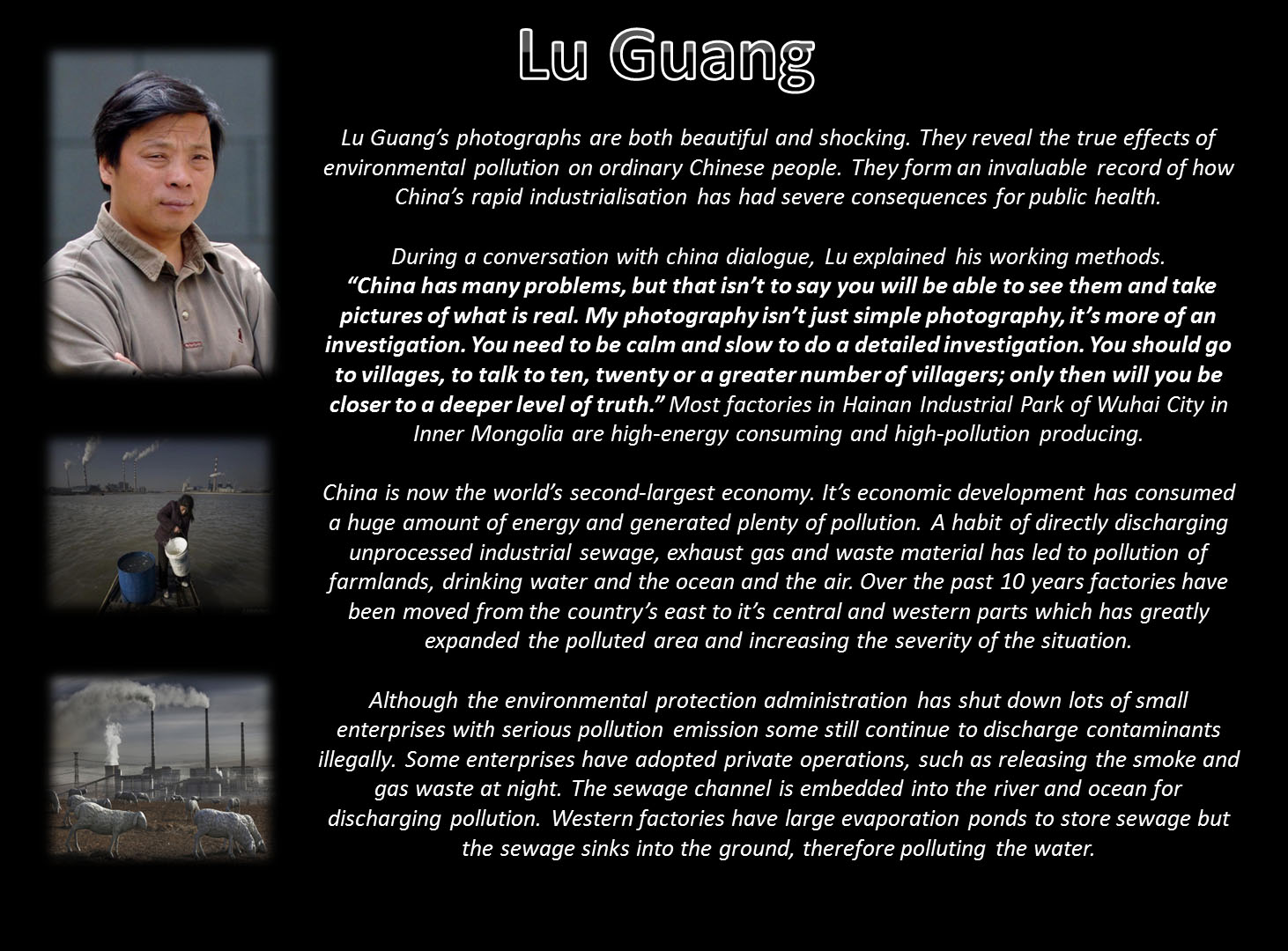
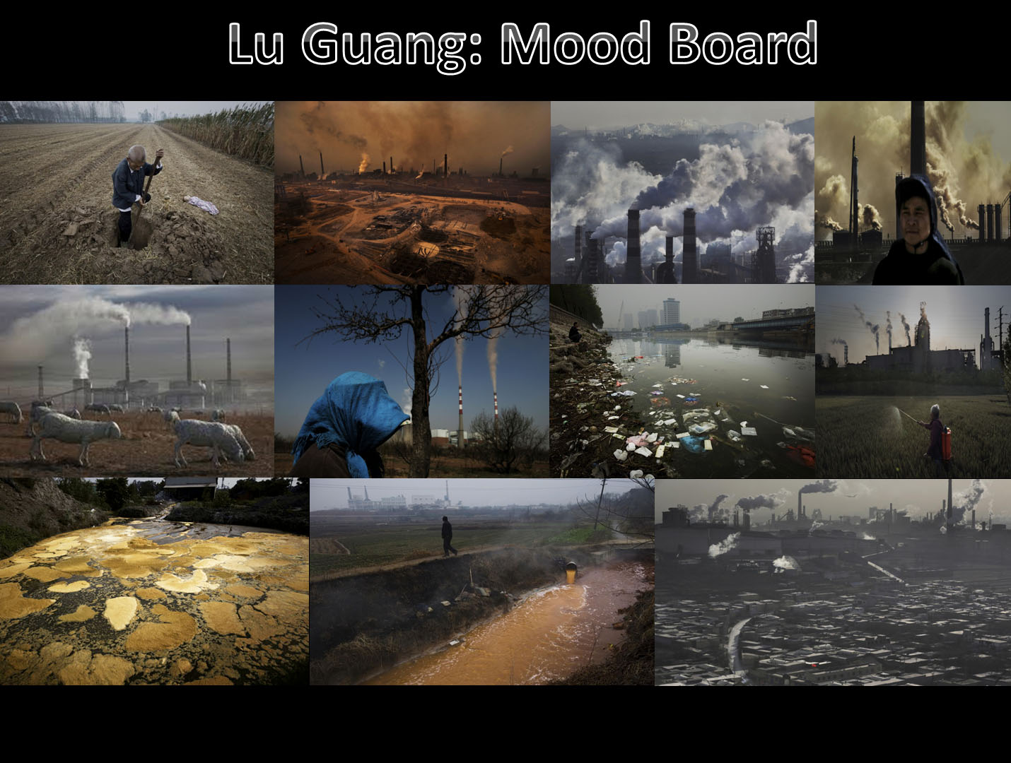
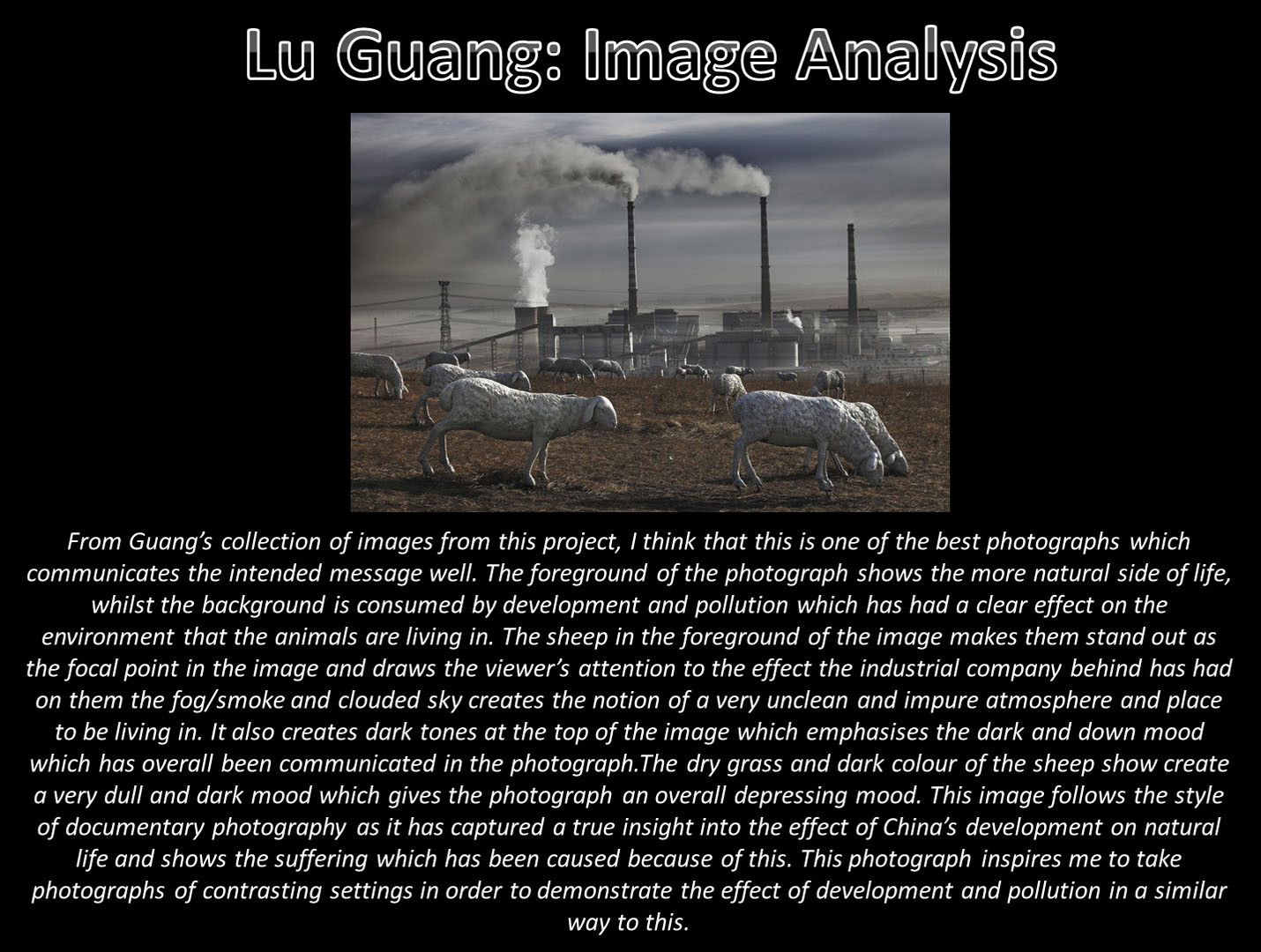
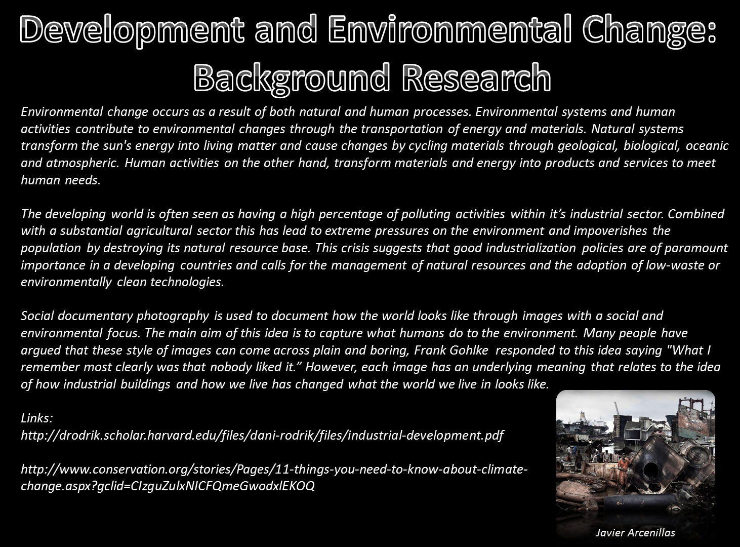
My Idea: Development and Environmental Change

Environment – Initial Ideas
After a class discussion, which then lead to group work, various ideas about the concept of environment were noted down in the form of a mind map. Many ideas were developed and later fed back to the class to provoke some thoughts and initial ideas.
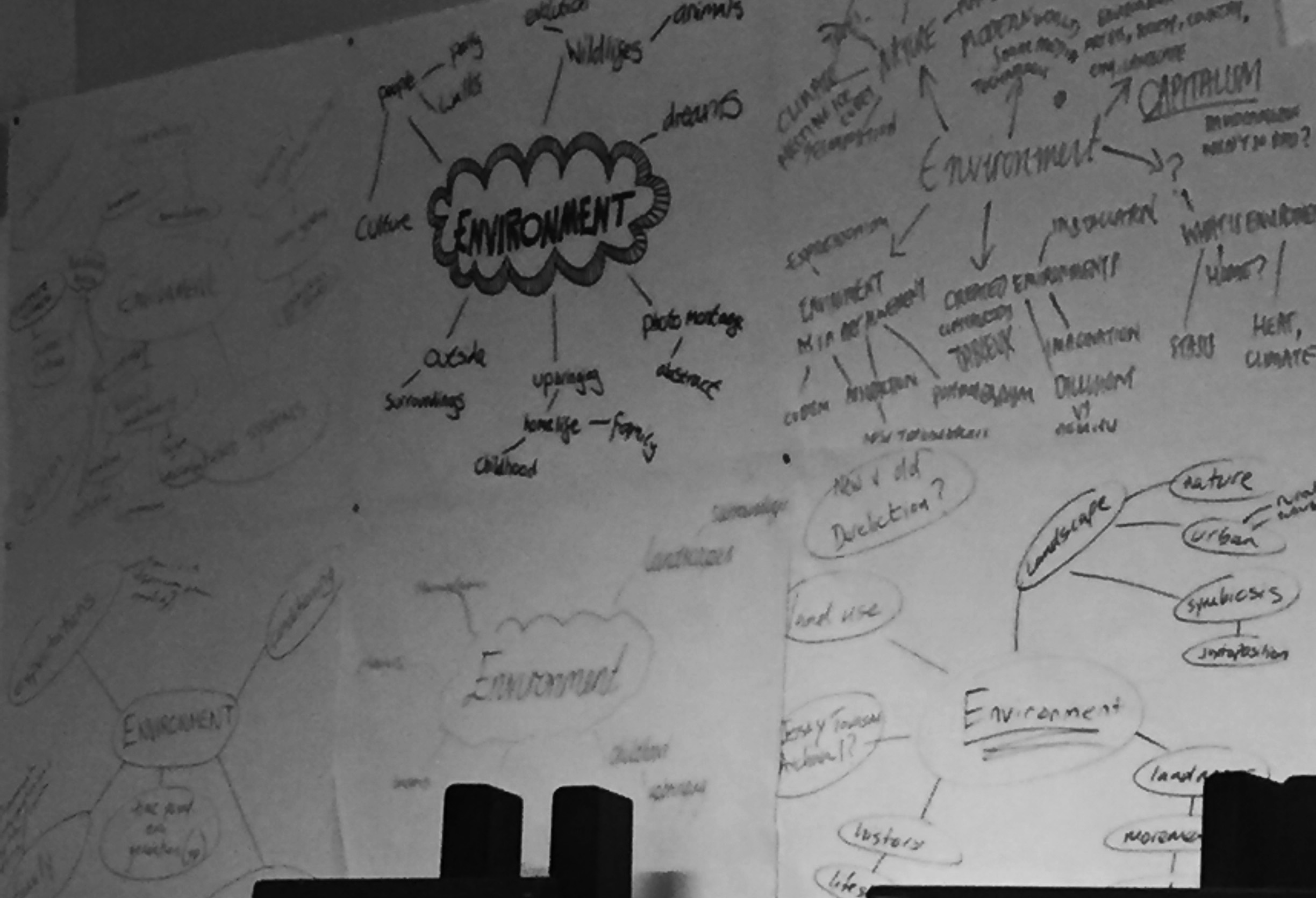
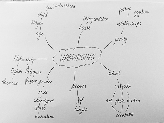
From the feedback I gathered, the one idea that provoked the most thought and inspiration was the idea of childhood and upbringing. This was largely due to the fact that envisioned a timeline of some sort, documenting the change in lifestyle that comes with growing up and the different perceptions we have of our environment as we age. With this idea in mind, I decided to create my own individual mind map to see how I could develop this new idea.
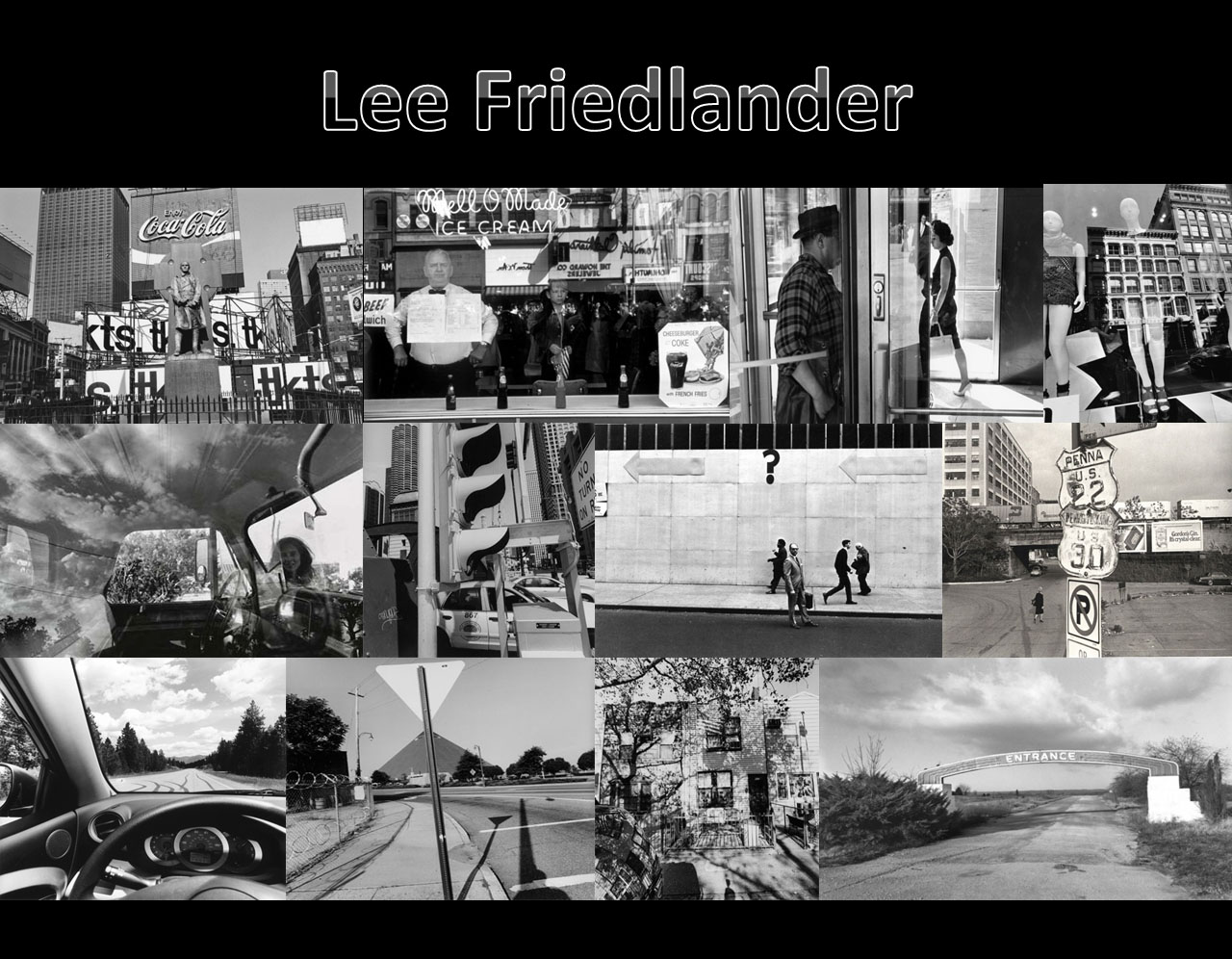
Lee Friedlander
