Category Archives: Uncategorized

Filters

Author:
Category:

Animals buildings dens

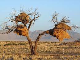
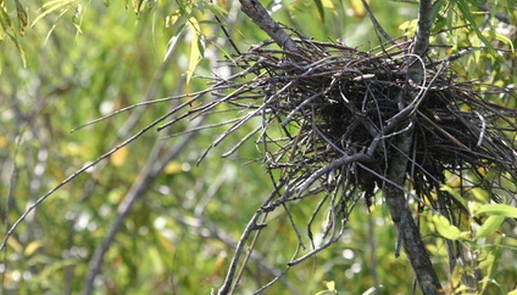
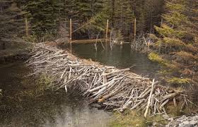
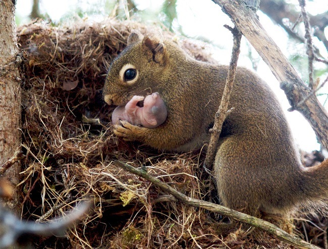
As well as children building dens, animals also build den structures in the environment through they are slightly different. I wanted to also consider these kind of natural dens before building my own natural den. Depending on the animals  the dens completely vary on material and design to suite the individual animals needs. The main different between children’s dens and animals dens are that animals dens need to be more secure and livable, as they act as a primary function as a home. Almost all animals create dens in some form or another as like humans i think dens for them provide an element of safety and particularly when animals are looking after their young they want to have somewhere where they feel like they can protect their children. The dens which appear most similar to the kind of dens that i am going to be building are the extravagant birds nest and dams built by beavers. Other dens built by animals often include holes in the ground which is not the kind of den children normally make. One of the only rules parents give children with den building is normally not to dig holes and climb into them encase they collapse. I want to consider a bit more closely why animals create dens compared to humans and to view how some of the basic structures are really similar. Below are some animals which build dens and what kind of structures they are.

Rabbits – Hollows, they are networks of tunnels underground with “rooms” which different rabbits live in. Rabbit families are often incredibly large which means an extensive network of tunnels.

Birds – Nests, different birds build very different nests depending on climate and other environmental factors. Some nest are simple circles while others have many birds living together and the structure is therefore bigger.

Beaver – Dams, this structure is not intended to be lived in by the beaver itself but the beaver uses a dam to create a better home environment for themselves. By building dams the beavers can raise water levels to create extensive wetlands which they can then live in.


Mice -Burrows, they are very very similar to rabbits apart from their burrows are much smaller.

Spiders- Webs, again this structure is more created by a spider to aid their living rather then to act as a home. It is also more of a structure in general than a den for the animal.

Squirrels -Tree cavities and leaf nests, they generally use the environment around them rather then building a nest from scratch. They simply add to the tree cavity, modifying their environment to make it more suitable.

Meerkats – Burrows, again they are very very similar to rabbits in creating a network of tunnels.

Cathedral Termites – Towers, this is perhaps the most bizarre of all the structures, a tower built up from mud and sand in which millions of insects live inside.

So after consider how different animals make very different dens i wanted to consider why animals make dens and how this then influences the structures of the dens. Animals create structures primarily for three reasons:

  • to create protected habitats, homes.
  • to catch prey and for foraging, traps.
  • for communication between members of the species

The main reasons are the first two, they want to feel safe within their environment. This is why many animals only build dens when they have young as well as they feel the need to protect their young and want to create a space in which they feel they can do this.

In considering the structures being protection from predators, predators are attracted to animal built structures becasue of what the animals are trying to protect, food and offspring. The structures are meant to try and conceal these things from the predators wither by camouflage or by making it difficult to get to.  The camouflage element is what normally causes an animal to use materials from in their immediate environment as they want to blend into these surroundings.

Something i didn’t know about animals structures was how the animals act an engineers, using their structures to control the temperature of their surroundings. In warm environment a den underground will be extremely cool and shelter the animals from the intense glare of the sun. A really interesting example of this is the Oriental Hornet which uses something called a silk cap to trap the heat from the sun during the day and then at night when the temperature begins to drop the silk stores release an electric current to increase the temperature inside the den. Another interesting element which i hadn’t previously considered was how some animals make their own building materials. Some times of larvae cut out shapes from leaves to make the perfect den, rather then just using the leaves as they come and Paper wasps build a paper pulp themselves from their environment by mixing together many different ingredients from their environment.

After considering animal dens i think it has defiantly informed my den project in considering how similar some of the elements of den building are between humans and animals. Both use them as a form of protection and a reassurance of safety. They also both use the material in the environment around them for similar reasons. A den built by children is meant to be a secret, the whole point of it is to be a place away from adults and therefore to camouflage the den within the environment is a key element. This is also true for animals as they need to be protected from predators. I think in creating my dens which i was going to try and blend into the environment  i am going to consider closely the structure of birds nests, but mainly the ones which are large and just look like piles of leaves in the trees.


Organic architecture

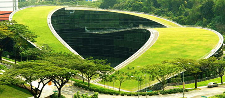
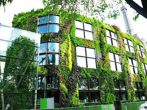
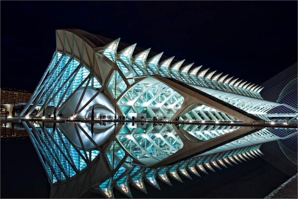
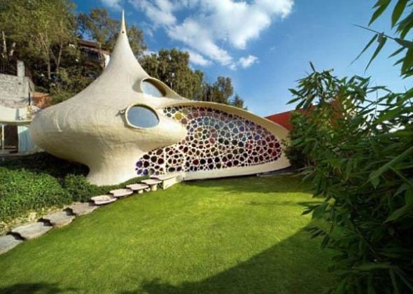
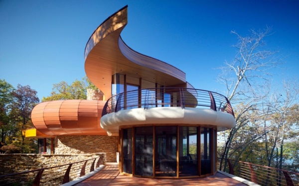
After planing to build a den with in the natural environment, using materials which come from the environment i thought it would be helpful to consider Organic architecture. My den is obviously not going to be a permanent structure like these buildings but i wanted to consider how these building are designed to fit into their environments. Organic architecture can essentially be defined as a philosophy rather than just a type of architecture which creates harmony between the human world and natural world. I think this is a really important idea because den building as i considered with the work of Goldsworthy is a philosophy. Organic architecture importantly understands that the well being of the human psyche would not be nurtured by removing people from the natural world in which they belong. This type of architecture therefore shows how the two can live harmoniously. Organic architecture is more of a way of living than a tangible thing. It involves respecting the properties of surrounding natural materials, understanding the function of the building, and making them work together with the building site in a harmonious way.

Architect David Pearson has created a list of rules towards the design of organic architecture.

 
  • be inspired by nature and be sustainable, healthy, conserving, and diverse.
  • unfold, like an organism, from the seed within.
  • exist in the “continuous present” and “begin again and
  • follow the flows and be flexible and adaptable.
  • satisfy social, physical, and spiritual needs.
  • “grow out of the site” and be unique.
  • celebrate the spirit of youth, play and surprise.
  • express the rhythm of music and the power of dance

What i like most about the principles of Organic Architecture is not just that the building must blend in and work with its natural surrounding but how the building itself is meant to become an organism which grows out from one point into its final design. I think this gives the buildings more of a personality as you consider the building as more than a building, it has character. I think dens are a lot like this to children because the children as so proud of their creation and how each one is completely unique that the children’s love for the dens can be seen when you look at them. A den, like these buildings as they are considered real organisms has character which is translated into their design. Literally every single element of the building is considered in relation to each other, to create a harmony throughout the whole structure. This is meant to signify the symbiotic relationship nature has with all its elements.

The term “Organic Architecture” was defined by David Pearson but made famous by Frank Lloyd Wright who used it to explain his own approach to architecture. He was unsure over the term “organic” because he realized it didn’t entirely define the type of architecture as it isn’t made by animals, it is instead based on a philosophy which is based on the way the natural world works.  Probably the most common misconception is the belief that Organic Architecture is curved and free form. Wright’s buildings are very seldom curved, and are certainly never free form. Where he does use curves, he uses circles, which are obviously governed by a strict geometry. Another common misconception is that Organic Architecture is inherently environmentally sustainable. While being environmentally sustainable is important to Organic architects, it should be integral to all architectural design, Organic or not, and therefore can’t be considered as a defining characteristic. The amazing thing about organic architecture is the completely contrasting designs but how they all follow this same philosophy. Some of them are made of straight lines and others are made of curves, each being born to suit exactly the environment they are in and developing from one point outwards. However, because the intent to create buildings that are at one with their site and that allow for connections to the exterior is a fundamental philosophy shared in all Organic Architecture, there are a few common characteristics.

Geometry

Many people have the misconception that nature is free form but this is not the case. It is predictable and comprehensible. It is governed by rules and patterns, and it is when people understand  these rules that they feel comfortable in their environments. Organic architecture utilizes strong, rational geometry to create a comprehensible building that can be understood as a single entity.

Materials

To establish a connection with the natural environment, natural materials such as stone and wood are commonly utilized in Organic architecture. Large surfaces, or those parts of the building which use artificial looking materials are often given textures or applied with patterns to break up the surface.

Mass

In order to break down the sense of enclosure, Organic architecture often is composed of recognizable, individual masses that due to their arrangement form a shelter. This differs from the typical method of creating architecture by using surfaces or envelopes to form the interior space.

Glass

The way glass is used is a critical part of organic architecture. Glass provides views to the natural environment, but also breaks up the forms of the building. This reduces the building into its individual masses, and breaks the sense of enclosure. This means when glass is used it is deliberately disguised to not distract from the sense of unity.

“So here I stand before you preaching organic architecture: declaring organic architecture to be the modern ideal and the teaching so much needed if we are to see the whole of life, and to now serve the whole of life, holding no ‘traditions’ essential to the great TRADITION. Nor cherishing any preconceived form fixing upon us either past, present or future, but—instead—exalting the simple laws of common sense—or of super-sense if you prefer—determining form by way of the nature of materials…”
— Frank Lloyd Wright, An Organic Architecture, 1939

I wanted to do a little bit of a case study on the work of Frank Lloyd Wright. When he made famous the concept of Organic Architecture it was the extension of the teachings of his mentor Louis Sullivan whose slogan “form follows function” became the mantra of modern architecture. Wright changed this phrase to “form and function are one,” using nature as the best example of this integration. Wright consider this form of architecture not to be a style of imitation, because he did not claim to be building forms which were representative of nature. Instead, organic architecture is a reinterpretation of nature’s principles of how nature grows and evolves to fit its environment.  Wright also considers  Organic architecture an attempt to integrate the spaces into a coherent whole, a marriage between the site and the structure and a union between the context and the structure. Below are just some of the structures which Wright created in his career.

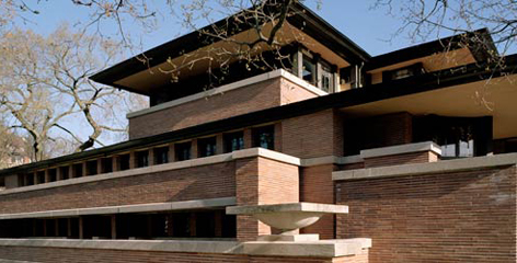
Robie House

Robie House – Frank Lloyd Wright

Robie Residence in Chicago, Illinois was built in 1909. This building is all about emphasizing its mass, the multiple roofs presenting the building to be bigger than it is in reality due to perception. Wright in this design shows his mastery of the Prairie style structure, this revolving around open expanses of space and sparse lack of any trees ect.

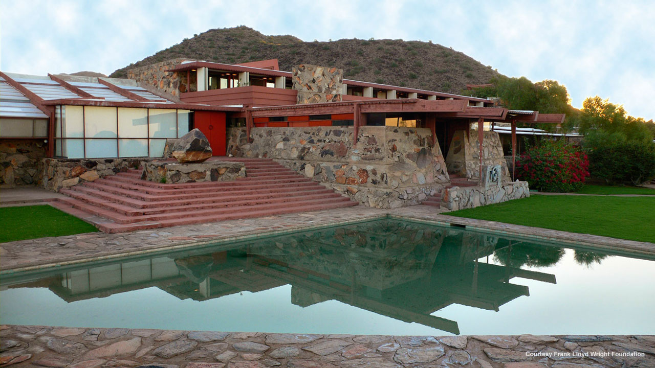
Taliesin West

Taliesin West – Frank Lloyd Wright

Taliesin West, in Scottsdale, AZ, was Wright’s home and studio. Designed for these purposes, the site is still used as a living, working, and educational setting. Dramatic terraces and walkways display the desert and the constantly changing landscape in the form of shifting sandbars. Taliesin West demonstrates Wright’s faculty in joining interior spaces with exterior ones.

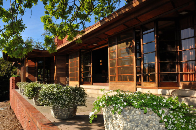
Hanna Residence

Hanna Residence – Frank Lloyd Wright

Hanna-Honeycomb House is located in Palo Alto, CA and was designed in the Usonian style. I find this structure the most interesting as a Usonian style allows the walls of the building to be moved and reconfigured according to the need of space at that particular moment. Therefore this structure is constantly undergoing change. It is referred to as the Honeycomb House because the design uses hexagons instead of octagons as building units, and all the boards and battens use this spacing. The home adjusts to the hill, complementing the landscape.

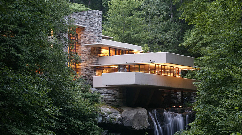
Falling water

Fallingwater – by Frank Lloyd Wright

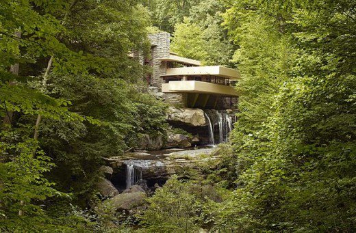
Fallingwater in Bear Run, PA is probably the best known of all of Wright’s designs. Concrete forms hanging precipitously over a waterfall, anchored by natural rock. Rough stone floors and only two paint colors (light Ochre for the concrete and Wright’s signature Cherokee red for the steel) add to the organic feeling. Living at Falling water is living in harmony with the waterfall. The house has suffered greatly from leakage and structural damage. But the Western Pennsylvania Conservancy has tried their best to preserve this house.

 Organic architecture after considering its philosophy and how it translated into a form is very similar to den building. When building a den you start with one main point which then translates into the rest of the design. You begin with looking at the environment and how this environment has elements which will help your structures stability and starting point and then from this point you build. You always starting with one main blanket or a building material that makes the roof. The whole point of dens are always the roofs so you feel enclosed and protected, therefore this is the starting point from which the rest of the den unfolds.  Another key element is how organic architecture is also a lot about time, that there is a continuous present which must be addressed within the work. Dens are like this and also this links to Goldsworthy’s work of how a piece is about the process of creation and that sometimes the piece falls apart. The dens are constantly adapting to the environment as the wind might blow a blanket down so the piece needs to be rebuilt or restructured depending on a new game idea and therefore a new need the den needs to be able to fulfill. This element then again links to organic architecture being created to satisfy need. A den is built to fulfill the social need of children at play but then also the physical need to feel at home and comfortable within the environment. To be unique is also another major element and every den is unique as each one is built to fit the specific environment. Looking at Organic architecture has defiantly informed my project as my dens in a sense are a form of organic architecture. 

History of dens and influence on children

I think that as den building is at the center of my project that it could be quite interesting to consider why people build dens and where it all began. I’m hoping that in considering dens built by people in the past and also the physiological reasons behind children still making them in the present day that it will inform my own den building.

The first people, before the Neolithic’s and also at the beginning of the Neolithic period built dens for survival. Neolithic architecture ranges from the tent to the megalith (an arrangement of large stones) to rock cut architecture including temples, tombs, and dwellings. The structures i’m concerned with are the ones built by the Nomads. The Nomads who had no permanent dwelling and would instead move around depending on weather but most importantly following the food supplies. People in this time period were not tied down to the emotional connections of a place or object, their main and only priority was food which led to survival and so therefore their housing arrangements needed to be able to adapt so that they could move around. This meant that homes either needed to be portable or for new structure to be able to be made very quickly. Resources to build these structures from was also a major issue compared to the modern day as the only tools available were made from natural materials such as bone, antler, hide, stone, wood, grasses, animal fibers, and the use of water. The actual materials were also limited to bones such as mammoth ribs, hide, stone, metal, bark, bamboo, clay and lime plaster. This type of architecture is known as vernacular architecture, which is basically just using the resources around you to suite the local needs of the site. These structures were very often tent like in creation but all we can do is speculate as the whole point of these structures was not to be permanent and therefore we have none to examine. What little we can say about very early construction is mostly conjecture and based on what we know about the way nomadic hunter-gatherers and herdsmen in remote areas build shelters today.

Its ironic that the whole point that i am looking at dens for my project is how they are not permanent and can be built quickly out of anything in any environment but that this is also why there is no evidence of them for me to study in considering how to build my own dens. In history i have previously studied the Native Americans and they are one of the closest example that historians can use today to consider how the first nomad humans would have lived.

The Native Indians were also Nomads like the first people which led them to create the kind of structures we could imagine the first people to have. They were also nomads for the same reason, the herds of buffalo were their food source and therefore they followed them wherever they went all year round. The buffalo to the Native Indians was a sacred animal which they respected significantly as it provided them with their means for survival. We can see how reliant the Native Americans were on the buffalo when we consider how the white people who came to America destroyed the way of life for the Native Americans by killing all the buffalo. The mass killings of buffalo began as a sport for the white people and then eventually became deliberate as they realized how much strain it put on the Native Americans lifestyle. This is what forced the Native Americans to join the colonies as their old way of life had been destroyed.

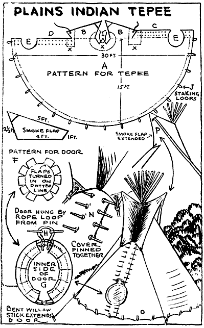
The Native American’s lived in Tipi’s which they are able to carry around with them wherever they went. This is maybe slightly different to the first people as they may not have been able to take materials around with them wherever they went. The Native Americans were only able to do so as they had horses and the tipi structure could be created into a sled which the horses could easily drag behind them. The tipi’s themselves were made of wooden poles which were then covered in buffalo skin to trap in the warmth and create walls. The wooden poles act like some of Andy Goldsworthy’s designs; supporting themselves by each resting on each other to create a pressure in the center that kept the structure standing. The Tipi’s acted as shelter and a home to live in. They protected the Native Americans from the weather, shading them from both the scorching sun and the wind. They could also be put up and down in 15 minutes which was essential for a group of people constantly on the move.

In considering the Native Americans nomadic structure i think that there are things i can consider for my own den building. Using the natural environment seems to be a key focus as dens are built for the specific environment that they are in. They use the resources around them as well as well as the layout of the environment itself influencing how the structure is built. This will be particularity important when i experiment with making a natural den out of branches ect in the woods. 

“The den was often perceived as a place where one could be alone, to sit and ponder or just “do one’s own thing.” It was also a hidden refuge from which one could get up to different kinds of mischief, since one (hopefully) could run back and seek refuge afterwards. It was also described as a good place to tell stories.” – Maria Kylin

In considering why dens were built in the past i think it is important to also consider why they are such a massive part of childhood life in the current age. In the past they acted as a real home, the only means of shelter and protection from the outside environment. As out behavior pattern as human have changed over the years to become creatures of habit that live within one permanent location it is curious to think that den building still remains such a massive part of the culture. Many surveys have in fact been done which ask adults to think of their best childhood memories in which adults weren’t present. 9/10 the answer is building some form of den. I want to consider exactly why this is because it might explain why even at 18 i’m still fascinated with den building and the idea of creating dens for my project is distinctly thrilling. First i’m going to consider an academic essay written by Maria Kylin on den building and its influence on children. She writes adamantly about how dens and the process of den building gives children an independence and helps them grow as people. Adults are often completely excluded from den building, it is a child’s vocation and therefore they are learning to do things by themselves. She also considers how this sense of independence also moves into a sense of being in control. The children have as much power as they want within the den, it is their space away from the prying eyes of adults and therefore they make the rules. This notion of their own space also becomes important as they can influence their surroundings how they like. A den isn’t always a completely newly constructed structure, it can be a hole in a hedge with a few modifications. The significance of the den is that the child has ownership over it. They have found it and made it their own in some form or another. The den comes to signify for the child the boundaries of their own personal space and the rest of the world. Another key element which makes dens so important for children is the secrecy of their locations. Only a few people know the locations of the children’s dens and very rarely adults as the children like to have this sense of owner ship over their dens, the power to decided whether or not they will allow people inside. 

“The sites showed different degrees of “construction,” and the structures had different degrees of permanence. A few of the structures were built with planks and nails (although never with the help of adults), but most were small spaces, corners and hiding places that had been improved or modified in some way.  They had been manipulated to some extent to mark a spatial boundary between the child and the rest of the world” – Maria Kylin


“The children’s perception of the den as a secret place can be compared with Lieberg (1992) who found that “hideouts” were places and settings where teenagers felt they could escape from the control of adults and peers and feel free, uncontrolled and independent. From a spatial perspective, it is interesting that these “hideouts” were mostly found and created in green areas and factors such as the outdoor design and the vegetation played a role when they chose just these places.” – Maria Kylin

Maria Kylin’s Essay 

While reading about why children build dens i also  came across an article by the guardian that while

“New research by academics in the US and Scandinavia is showing both that dens are crucial to children’s development – and that the opportunities for and inclination of children to make them are in danger of disappearing completely.” –  Josie Barnard

Den building was a fundamental part of my childhood and i wouldn’t want to imagine that children would begin to move away from this thrilling and beneficial activity. It is being suggested that the technology age has a massive influence on den building as children spend a lot more time indoors but that also the environment which children are surrounded in no longer has the same potential for dens. It is being suggested that our environment are becoming too sparse and clean cut, not allowing children to be able to discover secret places in hedges and over grown woods as we as humans are striving to control too much of our environment. 

“The book critic Dinah Hall has noted a near-total absence of dens in contemporary children’s literature. “Parents are too paranoid about letting children out of their sight to even be able to bear a den in a work of children’s fiction,” she says. “The most you’re going to get is a lovely, but very tame den, under a table in a Shirley Hughes picture book.” –  Josie Barnard

Adults influences are apparently also effecting children’s den making as parents have less children in the current day and age which means there are both less children to make dens with that children spend a lot of time with and parents are more protective of the children they do have. I think den building is a really key part of childhood, i know i spent my entire childhood building den like structures.

“The den is the child’s sense of self being born,” says David Sobel, a developmental psychologist at Antioch New England graduate school. He has researched dens extensively since the 70s, in Devon, England, and the Caribbean. “In the middle childhood, ages seven to 11, a den is the child’s chance to create a home away from home that is secret, and becomes a manifestation of who they are. The den,” Sobel argues, “is the chrysalis out of which the butterfly is born.” –  Josie Barnard

The guardian article


After considering all this research on den building and its function both in the past and present it has definitely made me more informed on den building as a whole. I think it will inform more my section on considering my friends as children again. It will also cause me to think more about the secrecy of the dens and how i could present that through photographs. 

Umbrella den

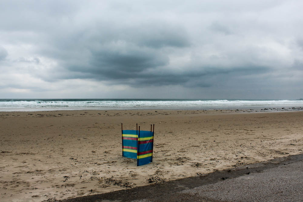
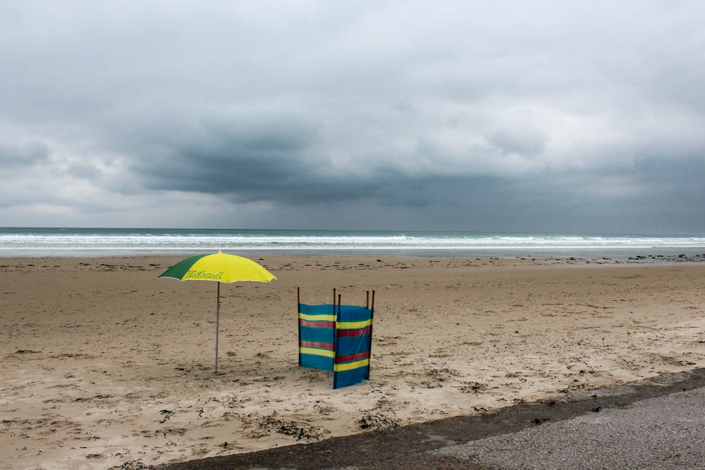
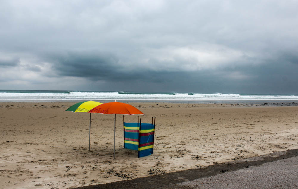
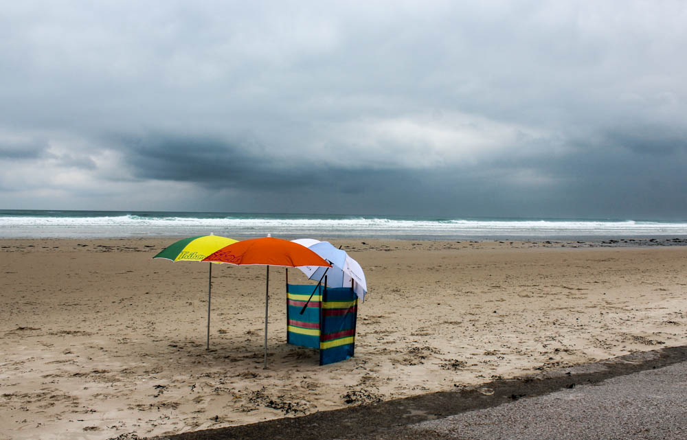
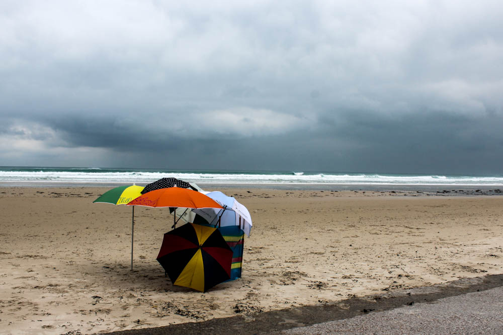
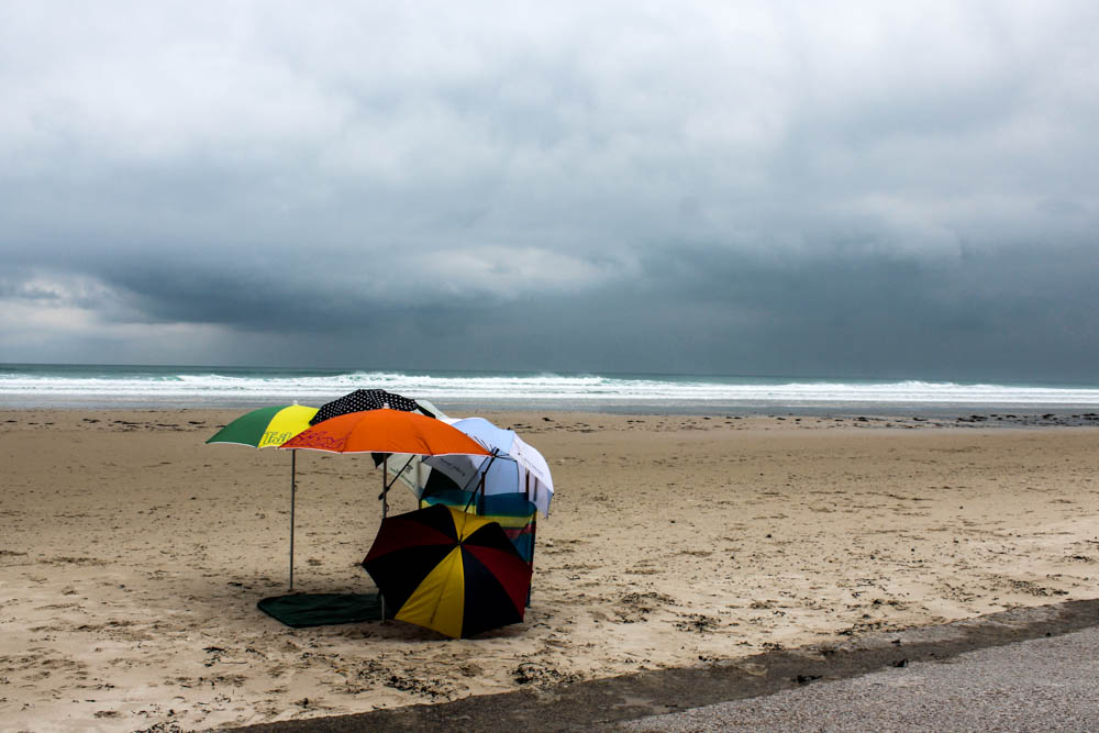
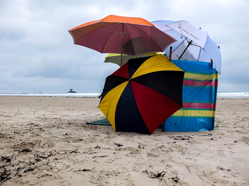
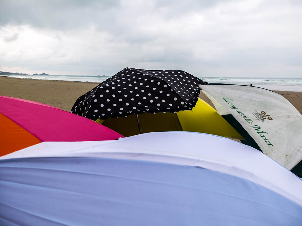
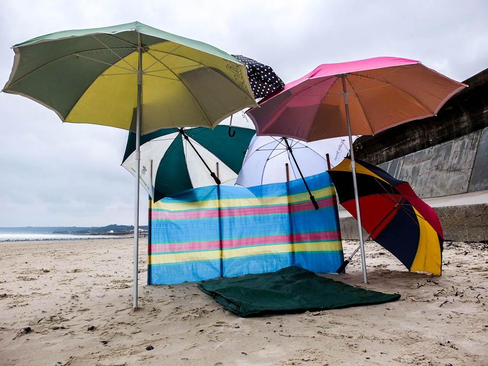
This shoot turned out a lot better than i thought it would considering how specific the weather condidtons had to be to get good photographs. I managed to take the photgraphs on the perfect day when the sky was very cloudy and angry looking, when the sea was fairly high and had waves and there was very minimal wind to keep blowing the umbrellas away.

I composed my den to be in a position where i could capture it against the background of the sea and sky without any other man made objects. I also didn’t really want any stereotypical landmarks of areas of land in my photographs and for the majority of photographs i avoided this. I think my process photographs turned out to be the best ones so far. I think this is partly to do with how obvious it was once each  umbrellas was added but also the landscape. For this den when you added every new element it was really clear exactly what umbrellas had been added and where. This is because they were all such bright colours and also the angle i photographed the den from meant that some umbrellas didn’t obstruct others which was the main problem i had in some of my other progress photographs. The environment itself also didn’t obstruct any elements of the den and actually really enhanced the clarity of the umbrellas. The environment was very minimal making the growing structure more obvious. There are also clear lines in the composition which makes a contrast between the curved forms of the umbrellas clearer. The colours are also very bleak and bland, with no bright light or colours to distract. Overall i really like the final images. I composed the photographs so that the umbrellas were to the left hand side of the frame using the rule of thirds. I also quite like how the dark clouds in the sky move from photograph to photograph so that you get more of an impression that time is passing as each umbrella is added.

I think what i have learnt from this shoot is how effective it is to have a minimal background to make the colours and structures of the den stand out. Also taking photographs from a lower angle works quite well as a perspective.

The above photograph is a closer up version of the den. I remembered how well it worked in my previous beach den to take some of the photographs from below as it reflected a childlike perspective and so i wanted to recreate that here. The light source in this image is in the top right hand corner as the brightest point of the image and this leads your eyes into the structure of the den as the den is composed slightly to the right of the frame. The light also shines directly onto the whitest coloured umbrella which causes it to stand out and also lead you into the other umbrellas. In this image there is a real contrast between the straight line of the horizon and the curves of the umbrellas. The wind break is also made up of straight lines but the umbrellas seem to envelop this within their curves and therefore it doesn’t create a very distinct contrast. The image as a whole isn’t particularly bright, the colours being the most vibrant part of the photograph.

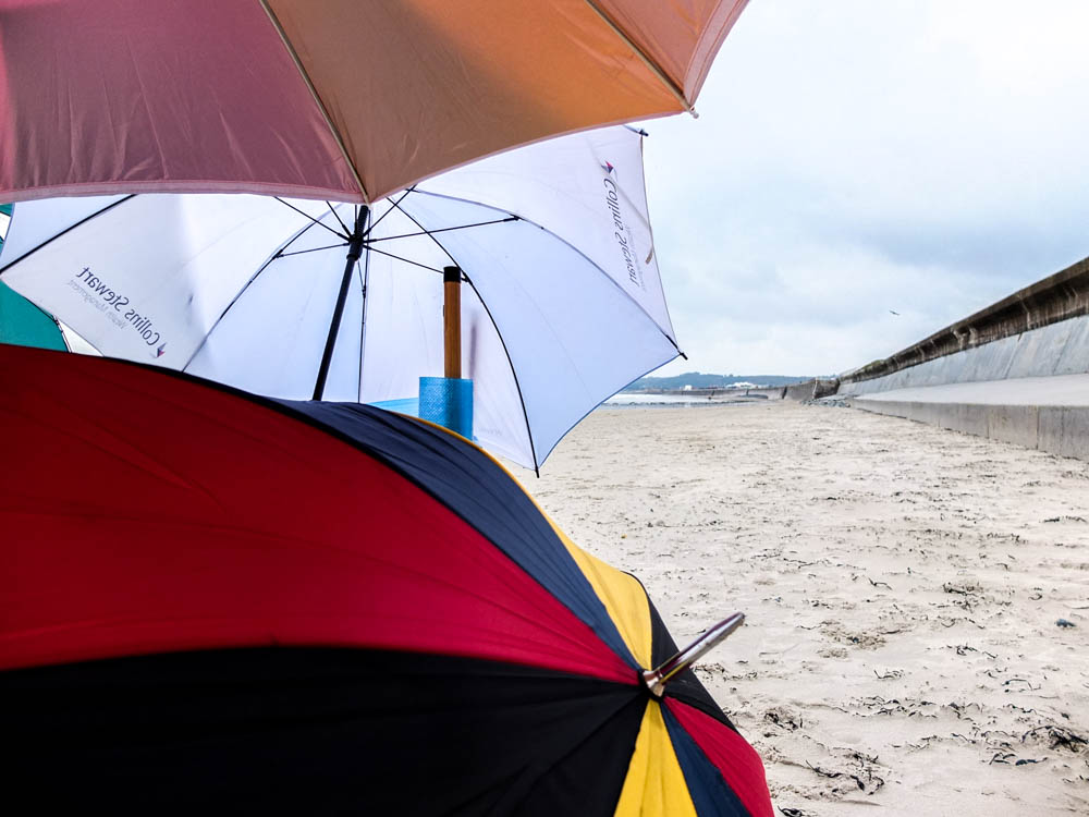
The below image works quite well because of perspective. The angle i have composed the photograph from causes both the lines of the wall and also the lines the the sea to lead backwards into the den which is composed in the center of the frame. These leading lines make your eyes travel to the center point to see where they meet. This perspective of the den also gives an impression of the inside of the den and the shelter that it offers. Although the picture as a whole is fairly dark due to the clouds and therefore lack of bright light source you cans till see the shadows cast by the den which implies the shelter it offers. A problem with this image however is that with this composition it was impossible to include the angry looking sky. The sky which was so dynamic was mainly over the sea and to use the leading lines for this composition i couldn’t include it as well. I also while i do like the impression the leading lines gives, prefer the image with minimal other man made objects. I want the focus to be on the dead itself and while it still is i think the images work best when the environment is more minimal.

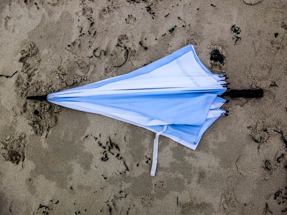
The below photograph once again reflects the process of den building. Some of the umbrellas would fall down or move slightly and another one would fall. Like with Goldsworthy’s practice the den building process involved a lot of rebuilding and re arranging as even though there was little wind there was enough to blow over the occasional umbrella. I composed the below image to have the den right in the center and therefore to emphasis the dens structure. This then emphasizes the imperfection of the umbrella which has rolled away. I should have though more about the composition of the den from this angle as at this angle you can see the most of the distracting elements in the background. There is La Rocco tower and the wall curving off into the background and once again no dynamic looking sky.  The image does still work but i think it would have been more effective to once again have a more minimal background.

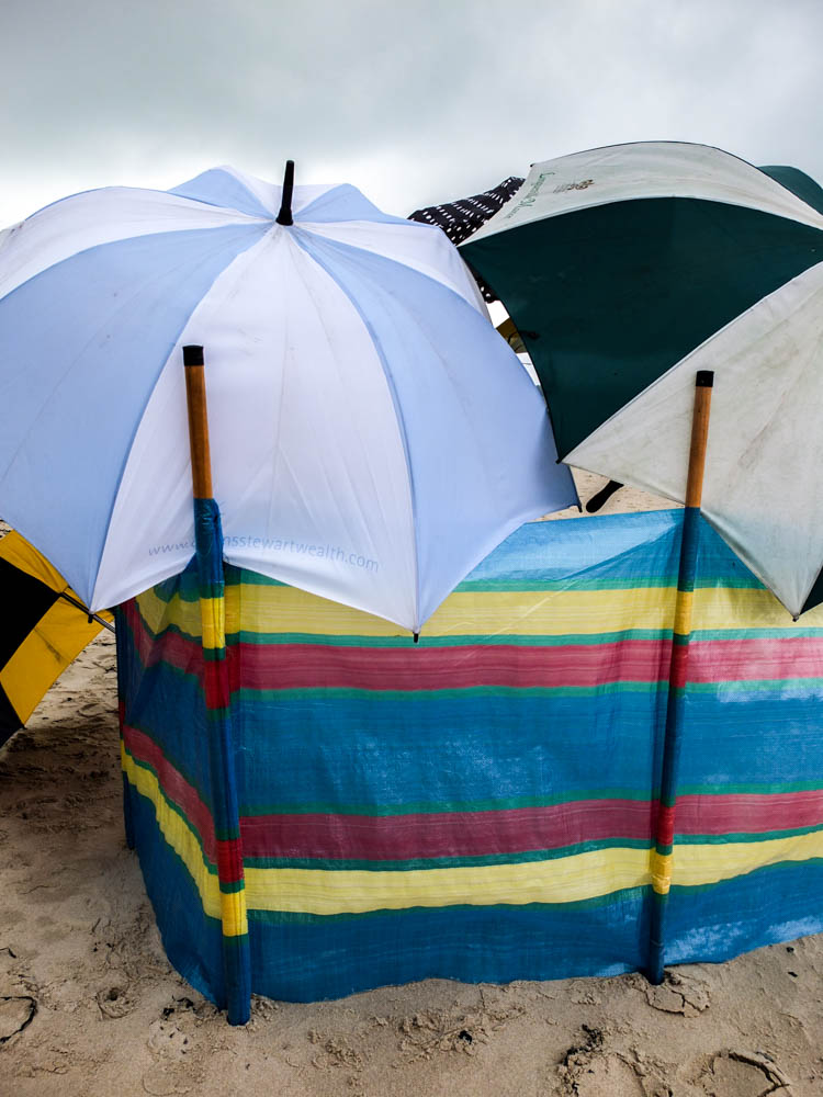
The above and below photographs are more abstract compositions of the dens in order to convey an impression of the process and structure. With the other dens i have taken some close up photographs which show exactly how the den stays together such as the blankets being tied ect. With this structure all the umbrellas were simply balanced on top of each other and so i needed to take some pictures which convey this. The above photograph shows how the umbrellas are leaning on the windbreak which is supporting them.  The umbrellas themselves are then also slightly overlapped which shows how the umbrellas are also leaning on each other to stay up. This image once again also plays with curves and straight lines contrasting, The straight lines of the windbreak and the pattern on it contrasting with the curves of the umbrellas structure and pattern. The lines are composed to be in the center of the frame, the whole image fairly balanced with having one umbrella to each side of the pole. The rest of the environment is fairly minimal which works well, the sky could be slightly more dynamic as in having more other colours rather than just a smokey white but it doesn’t take away from the composition in being too distracting.

The below photograph plays on having the curves of the umbrellas and also the straight lines of the wall. Perspective also plays a big part in this image once again as the line of the wall receding into the distance shows the depth of the image. This image is fairly bright as the sky is very white, as is the wall and the brightest of all the umbrellas is included in the composition. The focus within the image is in the background, the front foreground being blurry slightly. I quite like the abstract composition of having the den only covering the left half of the frame and then being able to see the environment in the rest of the composition.

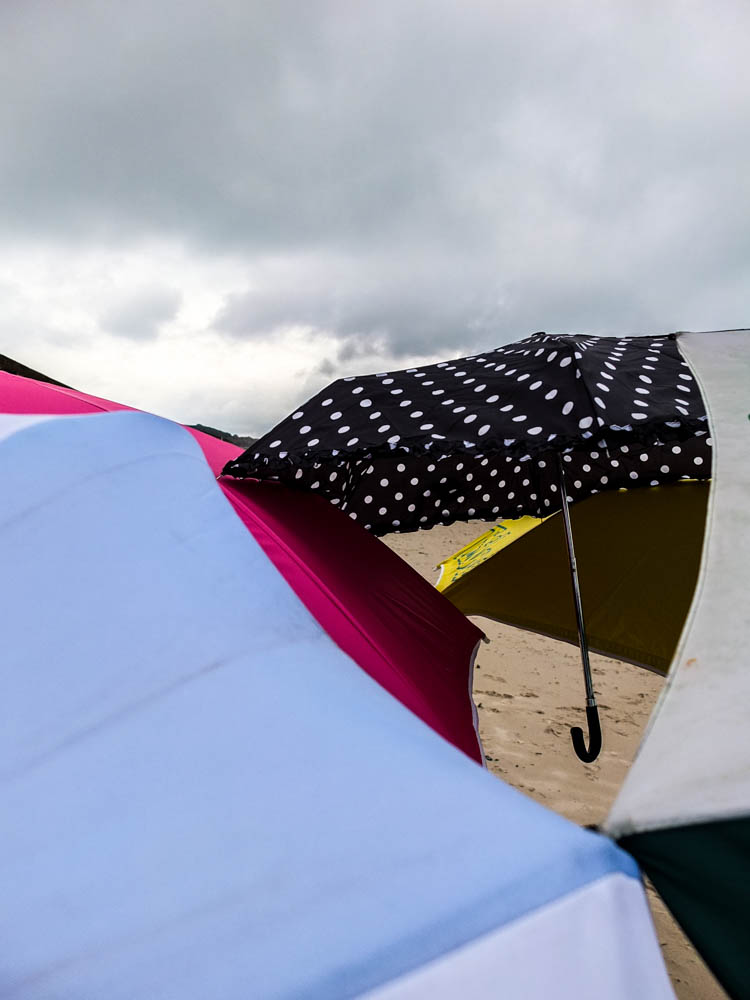
These photographs are also really abstract and convey even further how all the umbrellas are balanced on one another. The sky is fairly angry and i quite like the impression that the umbrellas of the den convey their own landscape. Like in some of the other photographs where the material becomes a part of the landscape i feel like that happens in these images too. The umbrellas come to look like hills of water in creating undulating forms. The different levels and different colours and shapes and sizes suggest that the object are not man made because there appears to be no pattern to them. You can however see the handle of the smallest umbrella which does convey exactly what the material is. In the above image the focus is in the background and actually on the smallest umbrellas, the foreground being blurred to an extent which conveys further how the umbrellas look as it they are apart of the landscape. The composition of the image below conveys even further this idea of the umbrellas becoming the landscape by having the umbrellas taking up the foreground and extending out into the background in various colours.

The above photograph i composed so that there was a narrow depth of field so the foreground was filled with clear umbrellas while the background was a blur. Only the immediate foreground of the umbrellas is in focus and then the windbreak and landscape of the beach is a blur. The minimal landscape can be seen in these photographs and works really well in conveying the contrasting colours of the umbrellas. This photograph probably shows the bright colours of the umbrellas best out of the photographs as i was photographing close enough to the umbrellas themselves to be able to show the colours without the lack of light from the environment effecting the colours and making them appear darker then they actually are. I quite like how in this composition the umbrellas fill the entire frame and almost slice right across the frame. There arrangement creates a triangle to the right hand side of the frame which acts like the rule of thirds to have the point at which all the umbrellas meet as a focal point.

The above photograph is another one which conveys a child like perspective but this time focusing more on the inside of the den and more of a sense of crawling inside it. This photograph more than any of the others shows how the umbrellas become brighter and more transparent when you add light shining through them. The windbreak too had the light source behind it which causes the colours to become a lot brighter. This photograph defiantly has a contrast between the curves and straight lines of the image. From this angle you can see all the spurs of the umbrellas as well as the handles which are all straight lines and also the windbreaks straight lines. The umbrellas then act as curves which bring together the whole structure as they unite all the different elements . I really like the perspective of these images, having them taken from below looking up. When inside the den you are constantly looking up at the roof of the den when its raining to check for leaks in the structure and watch the rain hitting the top of the den.

Below are some more abstract images which explore the concept of looking up.

Umbrella Den plan

This shoot has probably been the hardest to plan for because weather wise i needed a day where there was a really dynamic, angry looking sky as if its just about to rain but without it actually raining and with no wind what so ever. This is because in building dens out of umbrellas with even the smallest amount of wind all the umbrellas would fly away in opposite directions and i would then spend most of my time chasing them across the beach. In constructing the den we always used to simply balance the umbrellas on each other and therefore a lack of wind was an absolute necessity in building my den. The sky was also really important otherwise my beach den wouldn’t look at effective against a white cloudless sky and white sand. This den therefore took a lot of planning just because i needed to be ready to build it at very sort notice when the weather was perfect. I also want a day in which the tide is fairly high so that there isn’t a vast expanse of empty beach and the sea could create an angry/rainy atmosphere as well.

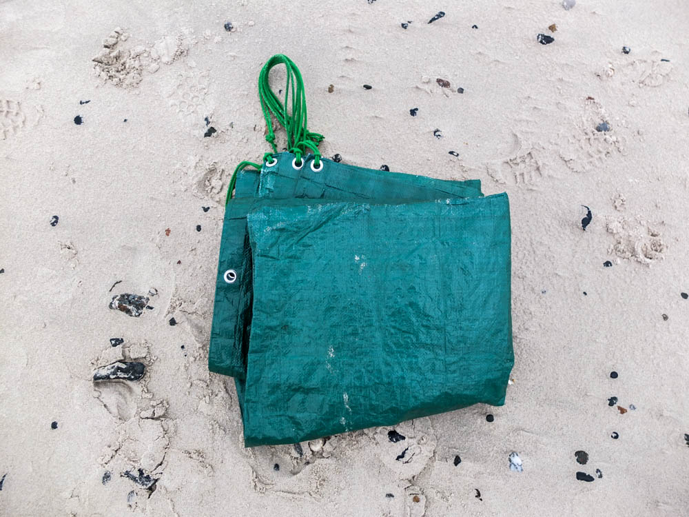
In building this den i am going to use only umbrellas and a windbreak. The wind break is pretty essential because the umbrellas need a strong sturdy structure to be able to lean on so they can then lean on each other. I am planning on using two main umbrellas and then loads of other smaller umbrellas. I have chosen the brightest and most vibrant coloured umbrellas to use in order to have my den stand out vividly in the surroundings. The tarpolan is what we would have had on the floor to sit on in our dens as the sand is wet from both the sea and the rain.  The umbrellas are a variety of sizes to be able to build the den with no gaps, filling all the spaces.

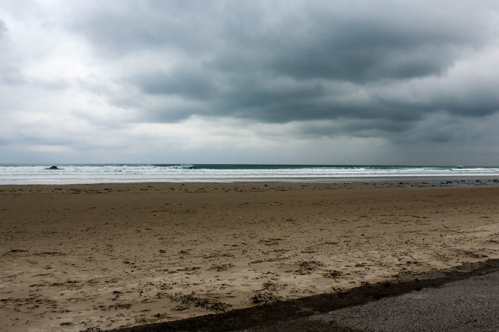
Below is the perfect sky that i need to take my photographs. I have decided to do this shoot down St Ouens beach as we would commonly build dens in this environment. It is also a large expanse of beach which will make the den stand out in the space and also provide an interesting landscape if there is a dynamic sky as the sky takes up most of the frame.

Field den shoot

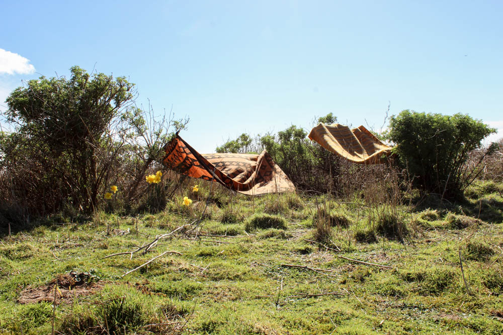
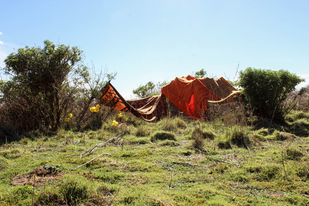
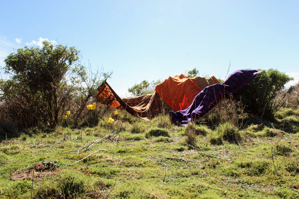
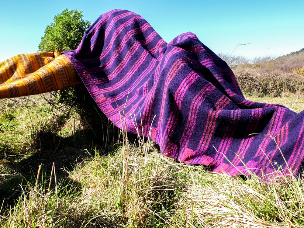
I managed to get the perfect weather to build my den in, i only wish there had been more clouds in the sky. The sunshine was bright and intense in shinning onto the environment and while this structure is very limited compared to the others i have built, that was the intention of it. It was even harder than i first thought to create a den in this location as the bushes were very far apart and the blankets only just big enough to expand across the distance. This created a major problem of creating one large structure which was connected in the middle and therefore i resorted to creating tiny pockets of covered areas. I actually think though on reflection this reflects quite well the types of dens i built in early childhood as these dens were more about the concept of having any kind of small space and then this being imagined into a great castle ect. I think this den works well in conveying how limited a structure can be and yet still a child can take it and transform it into the perfect home for their game in their imagination.

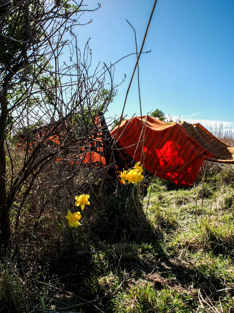
This time i only took one set of process photographs as there was only really one angle to take the pictures from. I wanted to include the vast expanse of the sky and the whole area of the bushes clumped together. I centered the den right in the middle of the composition. I think another advantage to this kind of den is that in the process photographs you can clearly see when each blanket is added into the structure as none of them shield other blankets from view. I did actually as you can see below edit the environment within these photographs. Everywhere, all over the field, except in the small area where i decided to do my photoshoot there were loads and loads of daffodils. I thought they would compliment the colours of the den to have little patches of yellow that were a similar colour to the blankets and therefore i picked some daffodils and staged them within the photograph as if they were growing. Overall the finished structure as a whole doesn’t look really incredible but i think some of the  more abstract photographs i’ve taken of the den work quite well. The process photographs while they do work because you can see all the individual blankets being added aren’t as dynamic as some of the other process photographs juts because the den itself as a final structure isn’t as impressive.

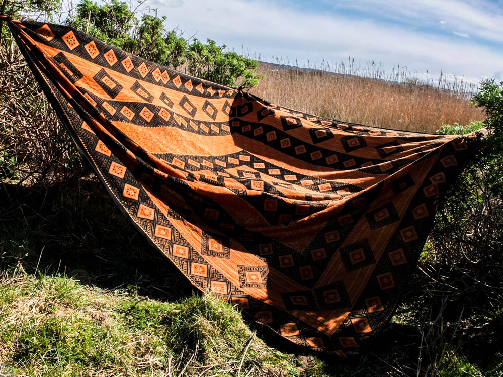
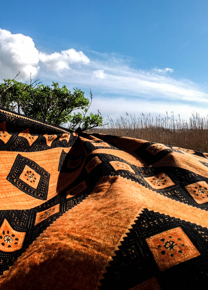
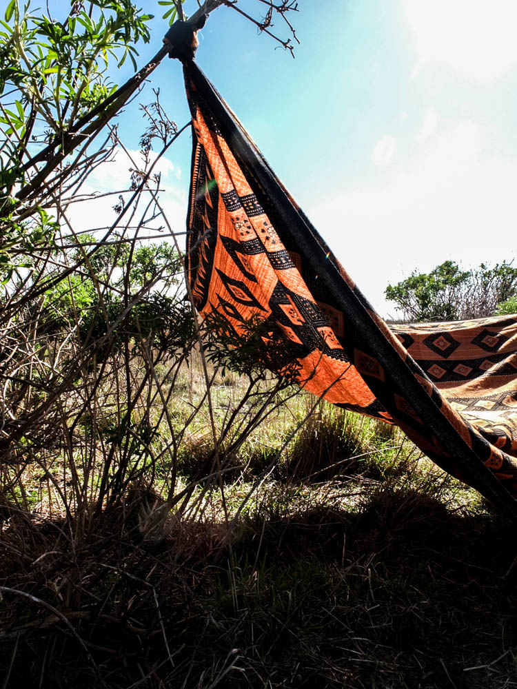
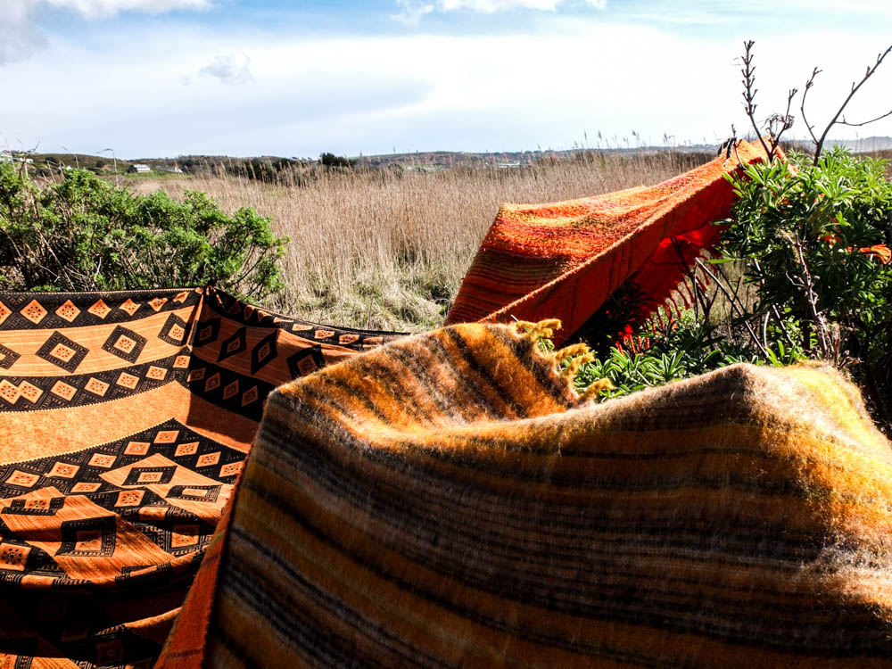
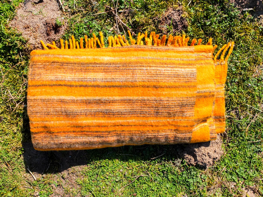
This blanket really went a long way in conveying the African vibe of my den structure. The bright vibrant orange and then the patterns in black just have connotations of being very tribal to me. I really like the composition of these photographs as well. I feel like the contrast between the bright blue sky with fluffy white clouds and then the green and orange is very suggestive of the African plains. When photographing this den i thought very carefully about about making the landscape seem vast through my compositions. The below two images convey this best.

The above two photographs are composed very similarly and give the same effect of the landscape. I composed the photographs so that the blanket created depth in the image by receding off to the point that it is tied onto the tree. In each image i used the rule of thirds to compose this point off to the side, different sides in each image. I personally prefer the first of the two photographs, though the cloud in the second photograph looks more dynamic. In the first image i was able to to capture the movement of the blanket in the wind, this texture adding a sense of life to the photograph which isn’t seen in the second image where the blanket is pulled taught. It is interesting that the texture of the blanket being moved in the wind almost reminds me of the rolling of water. I composed the photograph so that the horizon went straight across the background of the frame. The frame is almost divided so that the photograph  is half sky and half fields. The colours in the photograph are very complimentary with the golden yellows and greens conveying a real sense of an African plain. I quite like how the green is very sparse in the corner rather than in the second image where there is perhaps too much green. The clouds in the sky are incredibly flurry looking and the white streaks of them across the sky suggest both movement and also make the sky appear more intriguing. I think these photographs work so well because of how the material fills almost the whole landscape of the frame.

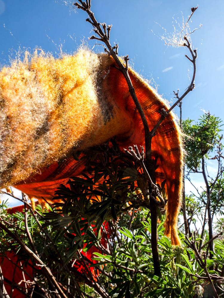
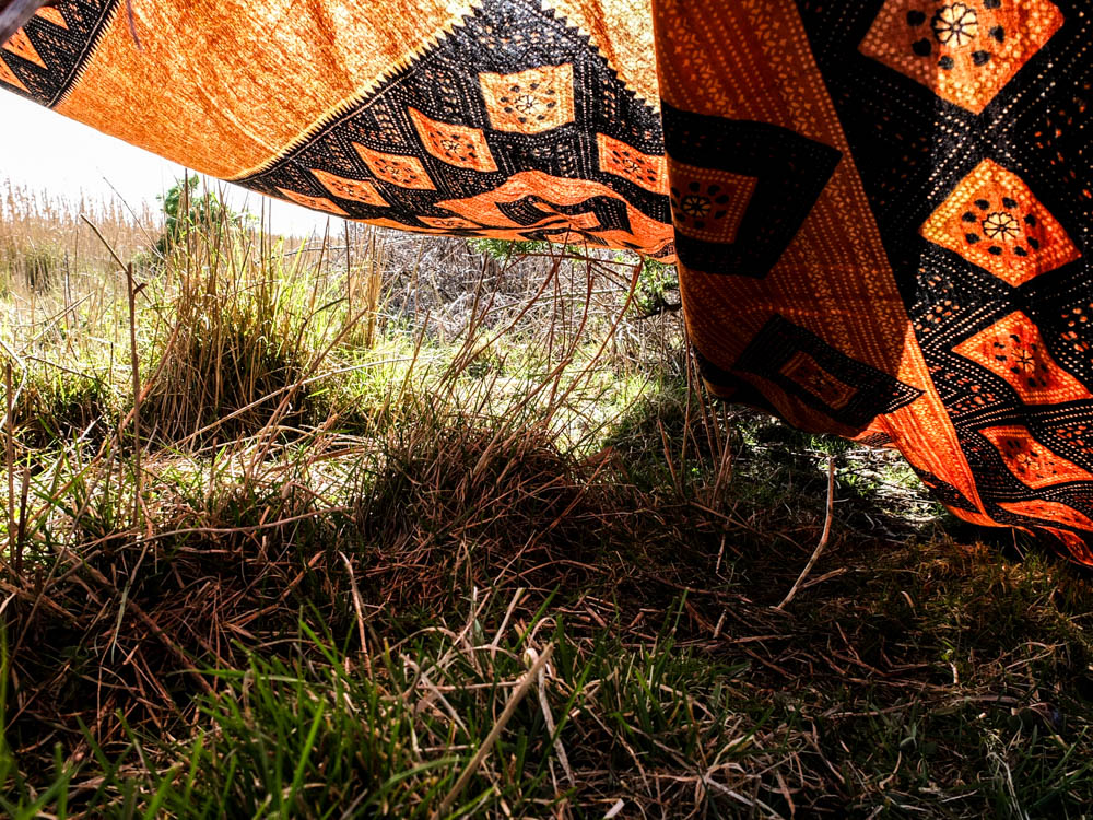
I quite like the above photograph for conveying the expanses of the spaces created by the blankets. This photograph really gives a sense of the spaces the dens create which you can go inside. I think it also conveys why the dens are needed as this photograph gives a real impression of the beating sun. The bright light source comes from the top right hand corner of the frame and is an intense harsh light that shines directly onto the stricture of the den. This photograph is interesting in having such a massive contrast between the light of the sun in the sky and the dark shadows cast by the shade of the den. The sky is almost completely washed of colour the light is so bright and it also washes out some of the colour of the dens material. I think the composition of this photograph also works quite well as the branch the blanket is tied to cuts across the top left hand corner of the frame and the blanket itself then cuts another line across the frame. I quite like how the light has effected the material of the blanket, to have elements of the material see-through as the light shines through it but also elements which are dense and a darker colour. The colour scheme in this image is the same as the others, the greens and the oranges complimenting each other really well. The sky in this images is less interesting as the bright light washes out all the colour and there are a lack of clouds but this bright light also does highlight some other colours.

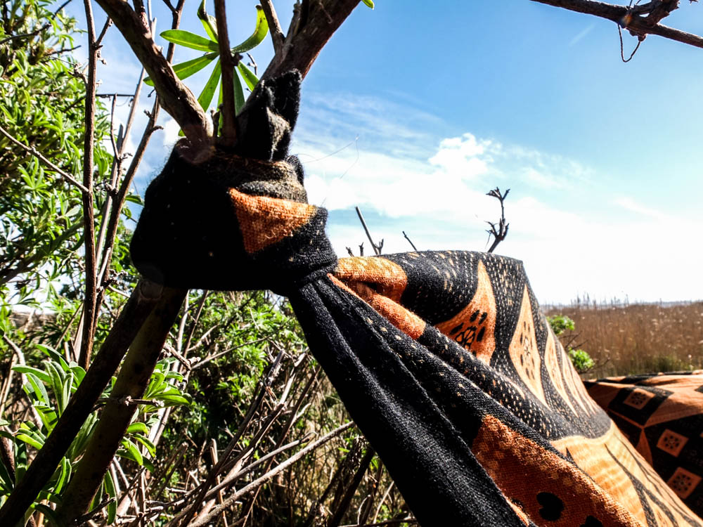
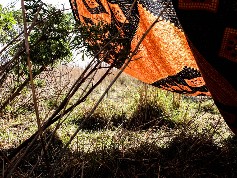
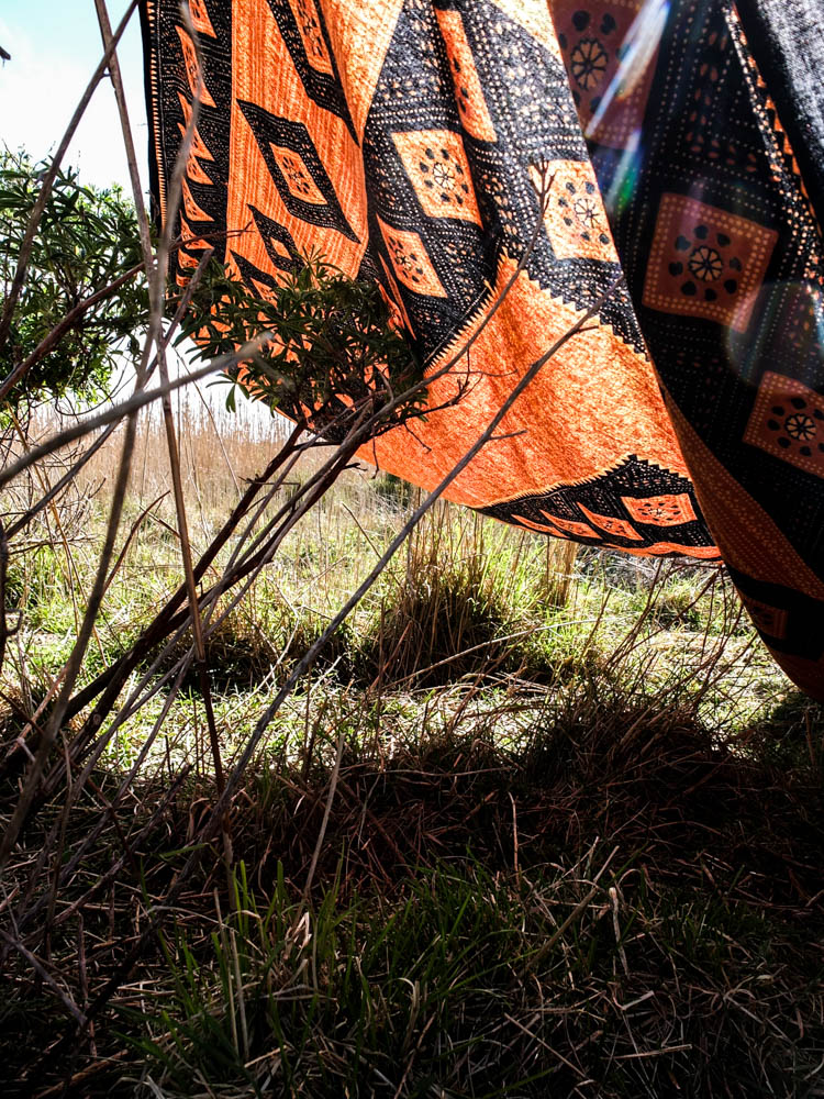
Once again i decided to take some close up shots of how the den was constructed. This den was made up of balancing blankets and also tying them to various branches in order to create my little spaces. I used a narrow depth of field to emphasis the tied material to the branches rather than the surroundings. The second photograph i composed similar to my photographs of the orange and black blanket as a whole as i wanted to convey the horizon of the sky and expanse of the fields. I composed the photograph using the rule of thirds and the angle of the blanket leads into the background of the frame and therefore the background of the image.

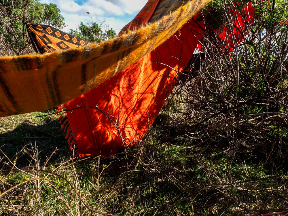
I quite like the above two images as a pair to convey how the material moves and changes. This image is all about angles, the changing angles of the blankets in relation to one another to create an interesting structure. The structure is composed to be in the top left hand corner of the frame, the main light source hitting the blankets in the background rather than the foreground. The angles of the blankets all compliment each other, going off in different directions and all the different shades of yellow and orange also work well together. Once again we have the contrast between the oranges and the greens, this time the contrast being even more evident as the sky only takes up a small portion of the frame. I quite like the dynamic of these photographs.

I quite like the above photograph as another close up photograph to show how the den is constructed. Most of the blankets in this den were simply laid over the various bushes and trees and due to the very minimal wind stayed where they were put. This photograph conveys this and also conveys how, the tread stuck on the branches conveying how the material becomes caught. The light in this photograph comes from the top left hand corner and its harsh light illuminates the individual threads caught on the branch, highlighting them against the blue sky. This is why i composed the photograph slightly from below as it allowed me to have the thread standing out against the sky and therefore not getting lost in the busy texture of the leaves. The brightest point of the image is the sun shining out from behind the leaves. The light also shines directly onto the blanket in the foreground. The areas of shade are those below the blanket and therefore where the blanket casts its shade.

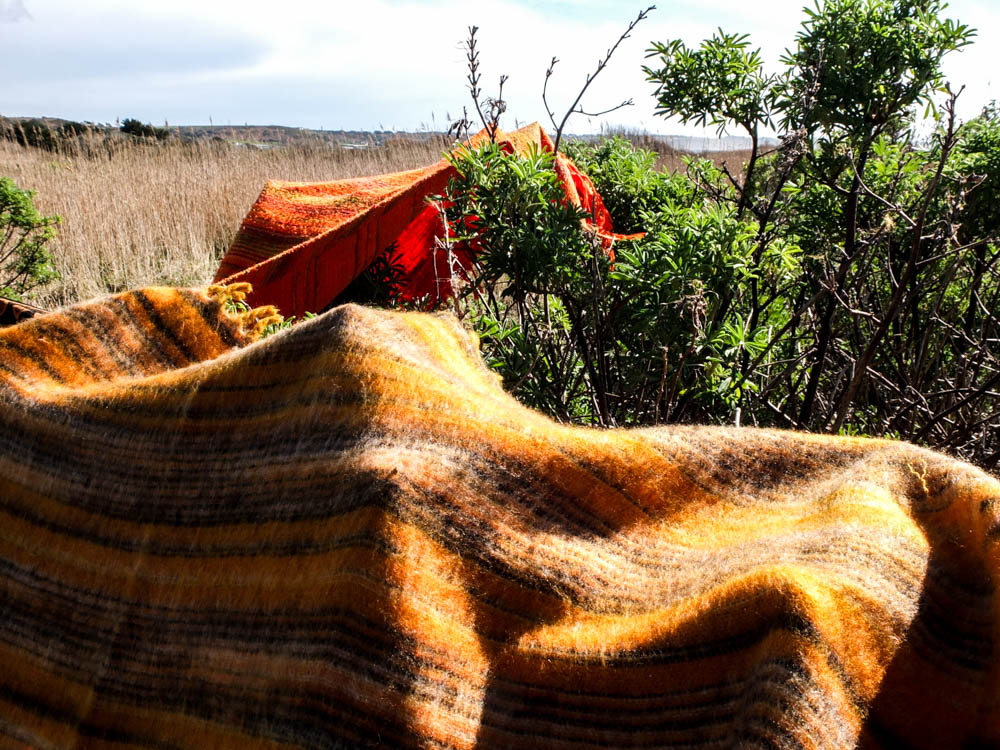
The above and below photographs convey the same impression as  some of the earlier photographs. The blankets themselves almost look as if they are a part of the landscape. In these images they give the impression of rolling hills and mountains of various orange colours. Unfortunately the sky is once again fairly boring as it is made up of blinding white light and very little clouds. The light comes directly from above in these images which casts shadows on the structure which create more depth to the blankets structure. 

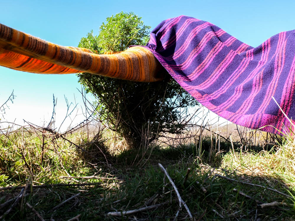
For some reason i really really love the photograph above. It is so simple and yet i think its one of my most effective images. It conveys the spaces created underneath the blankets as very simplistic and yet effective as they offer shade and do create a sense of being enclosed. This photograph is composed so that the little tree is almost in the dead center of the frame. The photograph is then taken from a really low angle which gives the impression that you are just about to enter into the spaces underneath the blankets. The angles of the two blankets go outwards in two different directions, the shadows in the image cast in the foreground. The background is really bright with the brightest point being a line along the horizon of almost blinding white light. The sky is then fairly bright blue. I think the contrast between colours is what works quite well in this image, with the intense blue colour, green, orange and purple all clashing but then also complimenting each other. 

These photographs are like my other photographs that i took of my dens with light shinning through the material. The orange and black blanket worked best in conveying the differing tones of the colour depending on where the light was shinning through the material.


Planning for the Field den

As my den building skills and the complexity of the dens structures changed at the different ages i was when building the dens i wanted to try and make a much simpler version of a den. Looking back through my archive photographs the den i built when i was youngest was literally just a blanket over the trees. When i was really young even this really simple bit of shelter seemed like an entirely new world to play in.

I decided to build the really simple den in my next shoot down La Mielle as i was aware that it is mainly fields and therefore a hard location to create a den in. The areas of La Mielle that we used to play in are the fields filled with blackberries and in these locations there are very few starting points in which you can consider building the den structure off of. I therefore decided that this den design was going to be very different to my other structures, the whole point of the den being just to consider creating a roof and some shade. I wasn’t sure exactly how this was going to translate into the environment until i got there but i just wanted the den to be a lot more simplistic.

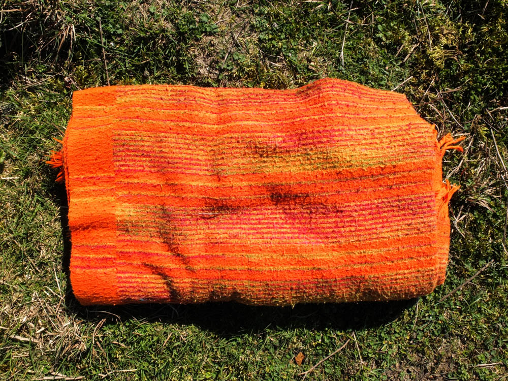
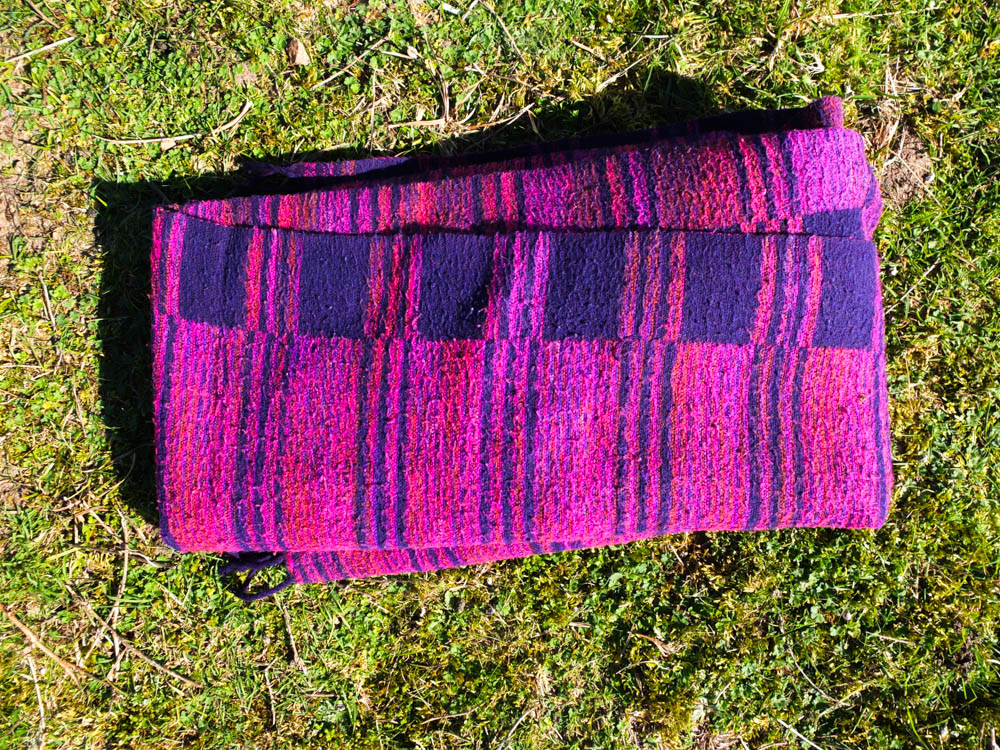
Remembering the environment of the location is very sparse and expansive i decided to theme this den around an African expanse of land. I therefore in my colour scheme chose to use bright orange blankets and a purple blanket. These colours for me are very reflective of an intensely sunny environment and also they all compliment each other. I learnt from my last den that bright colours work really well in making the den stand out in the environment and therefore all these colours are very bright but they also this time compliment the environment as well. The fields at La Mielle contain a lot of golden and green colours, orange and purple both clashing and complimenting these colours. As my colours were so bright i also decided i wanted the weather to reflect this sunny atmosphere that i was creating with my den and therefore i have decided to do this shoot on a really sunny day. I also think that i want the really washed out with light sky, to add to the feeling of being in the african heat. I will therefore plan to take the pictures at 12.00 ish when the sun is highest and their is the most intense amount of light. Hopefully there will be a few clouds the day i choose to go out, just to break up the expanse of the sky a bit but otherwise i am aiming for a washed out. sunny landscape to build my den in. 

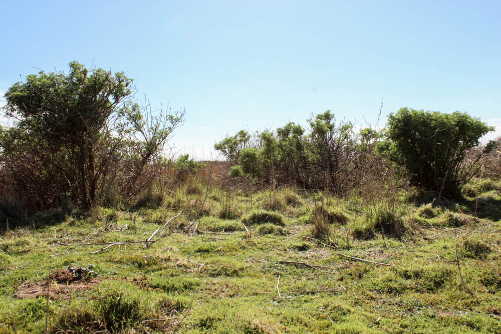
In actually deciding where to build my den i had quite a struggle to find somewhere when i went to scout out the area. La Meille is made up of vast expanses of land and blackberry bushes which are obviously prickly and therefore we wouldn’t have built dens there in the past. There were quite a few locations that i really liked as a background but there was no way that i would be able to build a structure there, even a very simple one. I eventually found a spot in which some bush like trees were fairly closely clumped together and decided this was the location to build my den in. The first picture below gives an impression of the environment as a whole and the second picture is where i have decided to build my den. 

Beach den Shoot

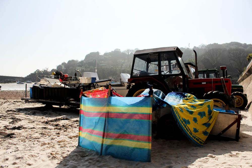
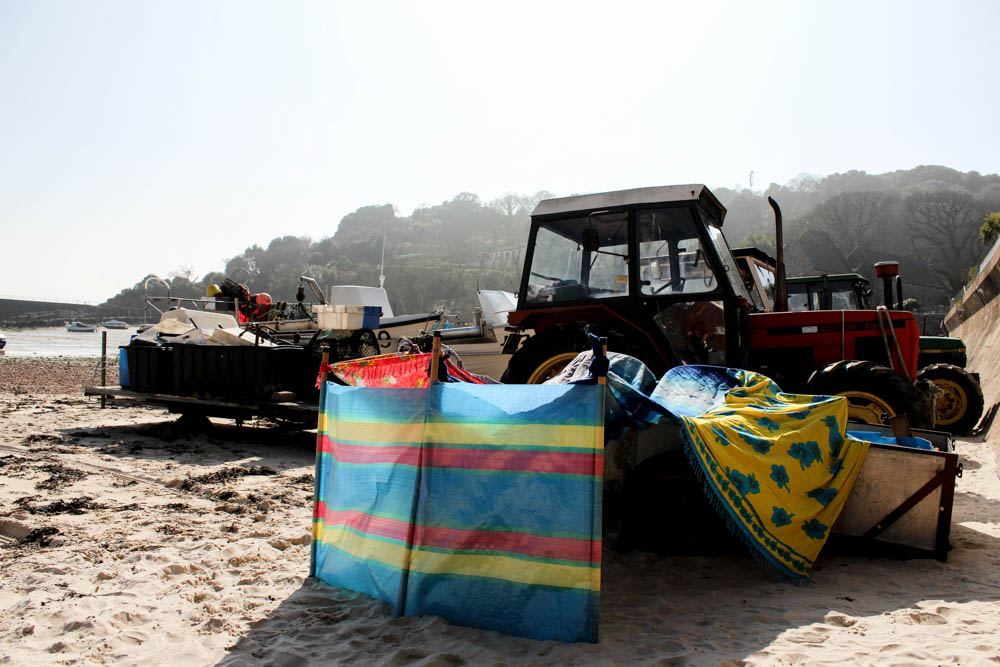
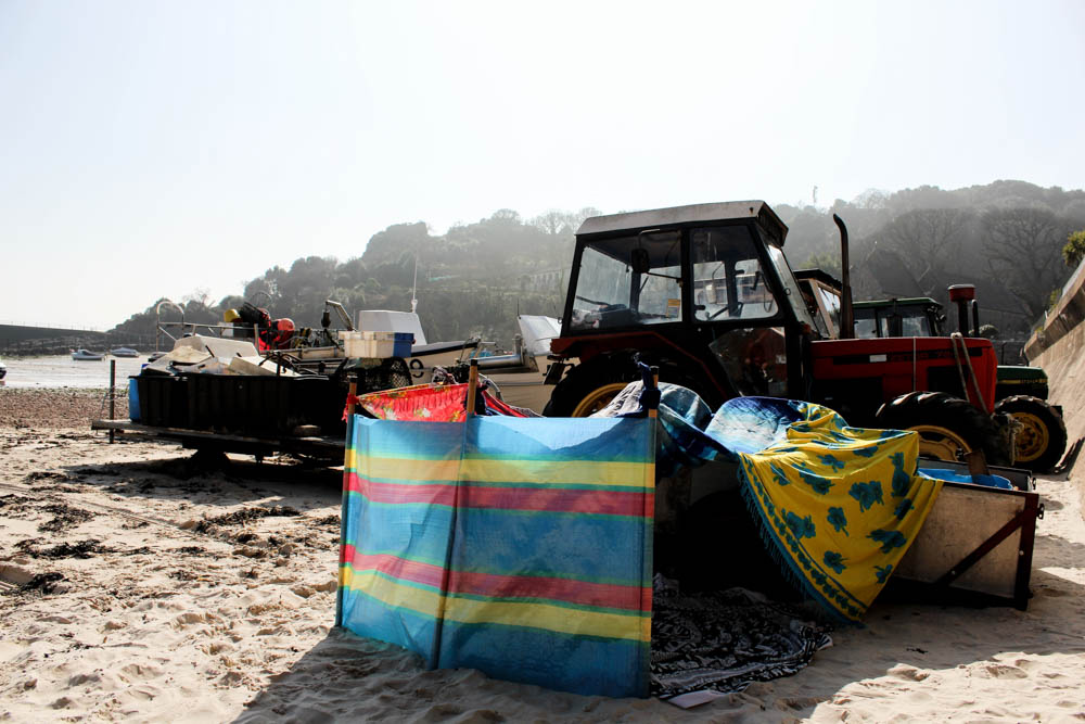
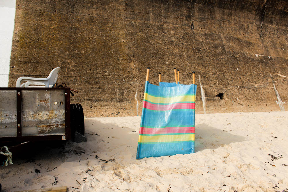
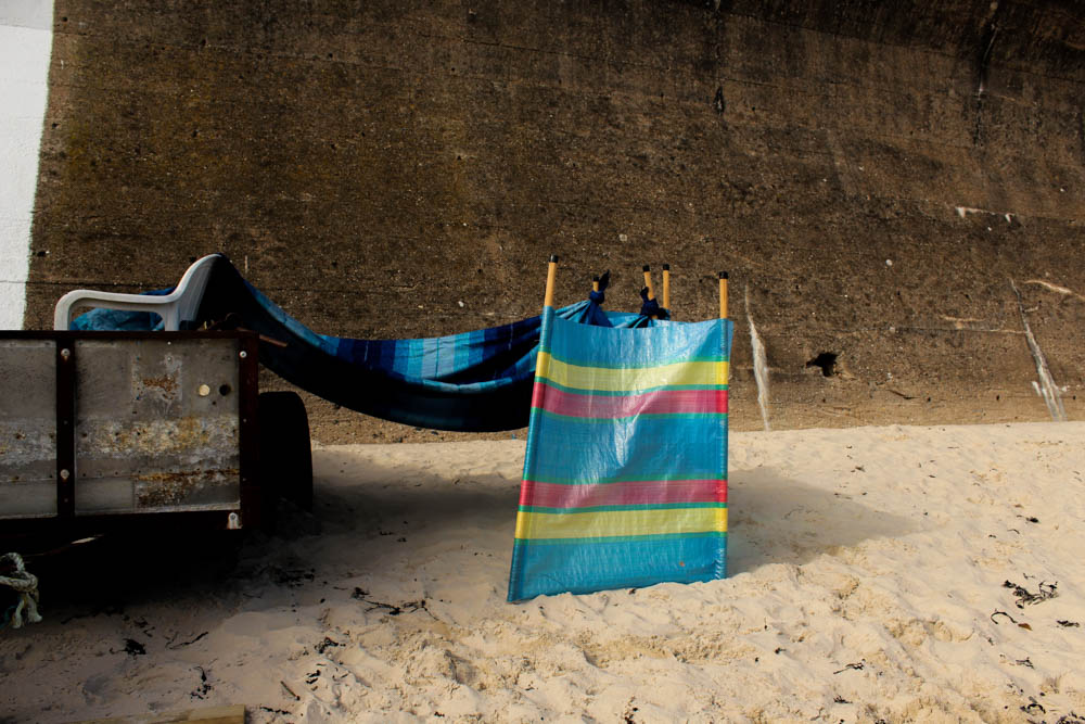
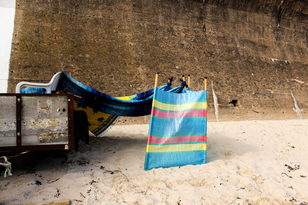
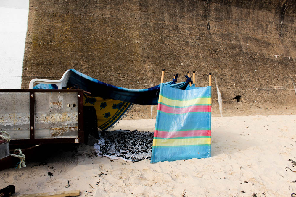
Once again i decided to photograph my process of den building from two different angles. It is quite interesting how when you build a den normally i wouldn’t really think about where the entrance of the den is gonna appear, it would just happen naturally depending on how the den structure comes along. When taking these photographs however it became important to consider that in order to convey as much of the den as possible, having the entrance in the frame conveyed more of a sense that the structure is a den. I also as i have already spoken about choose really bright primary colours to build this den which i think worked really well in standing out against the environment. I think this is something i’m defiantly going to carry on into my next photo shoot, the using of these bright intense colours. I think it works better than trying to get the colours to blend into the environment and it also more suggestive of the bright nature of children. 

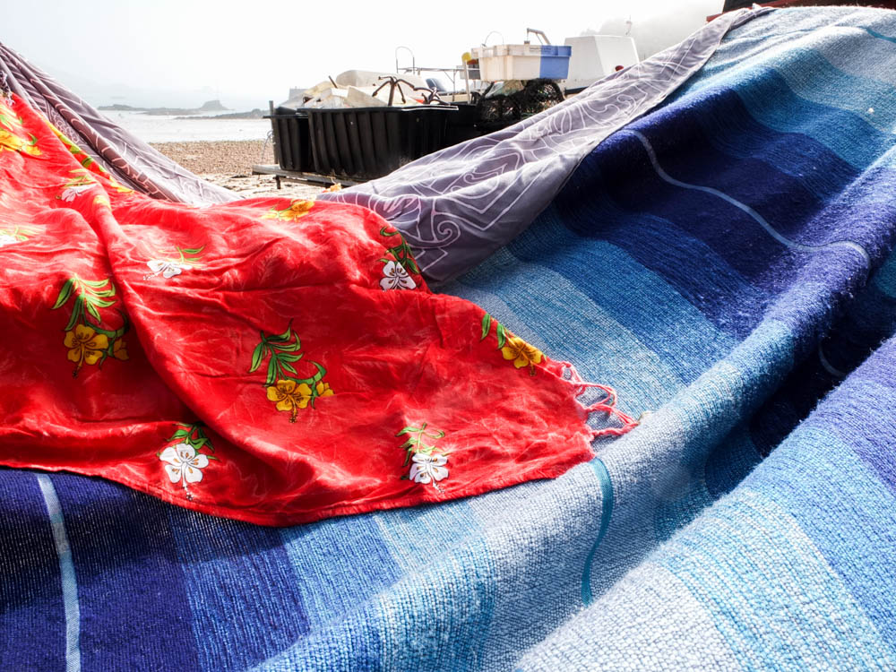
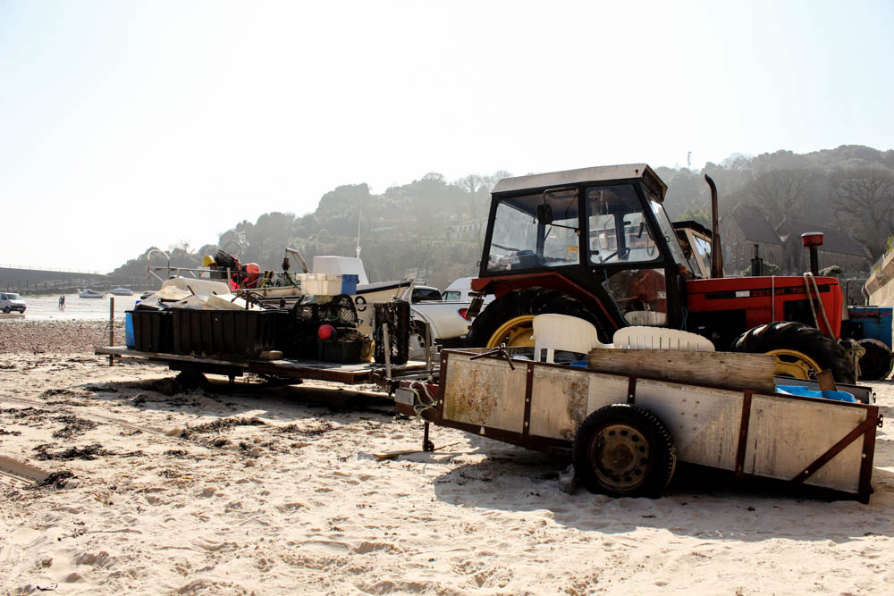
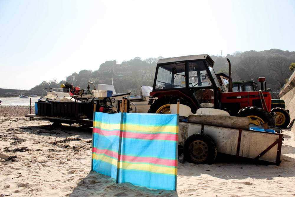
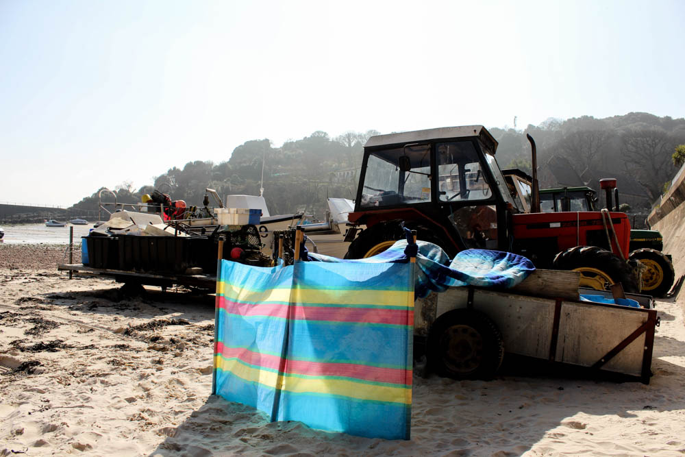
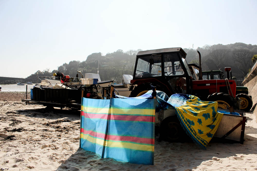
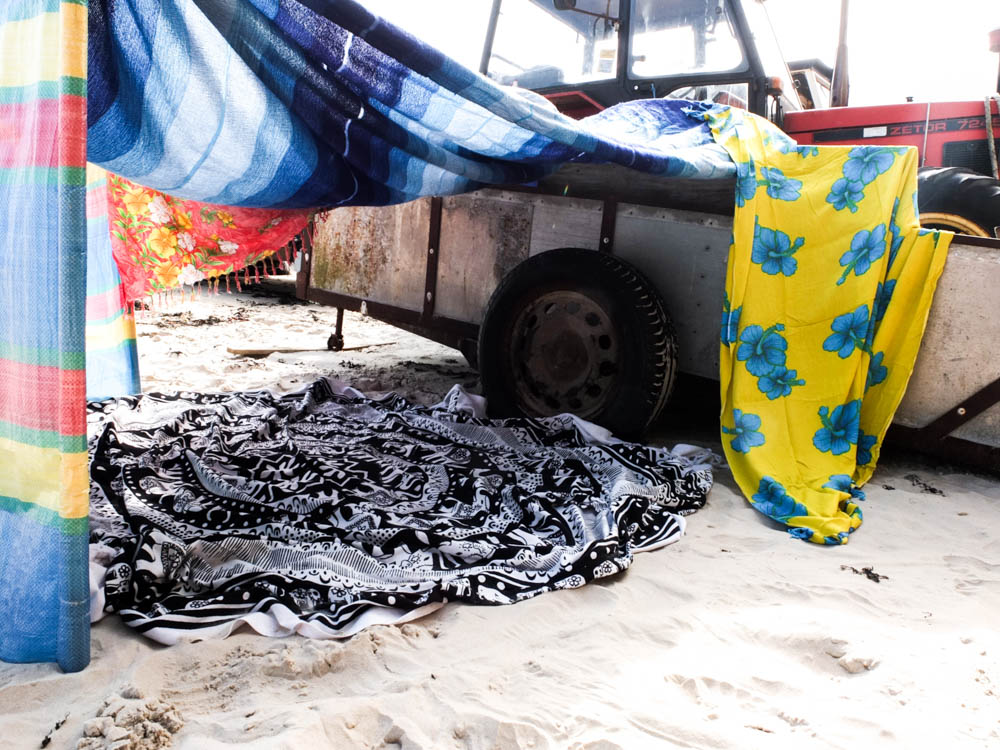
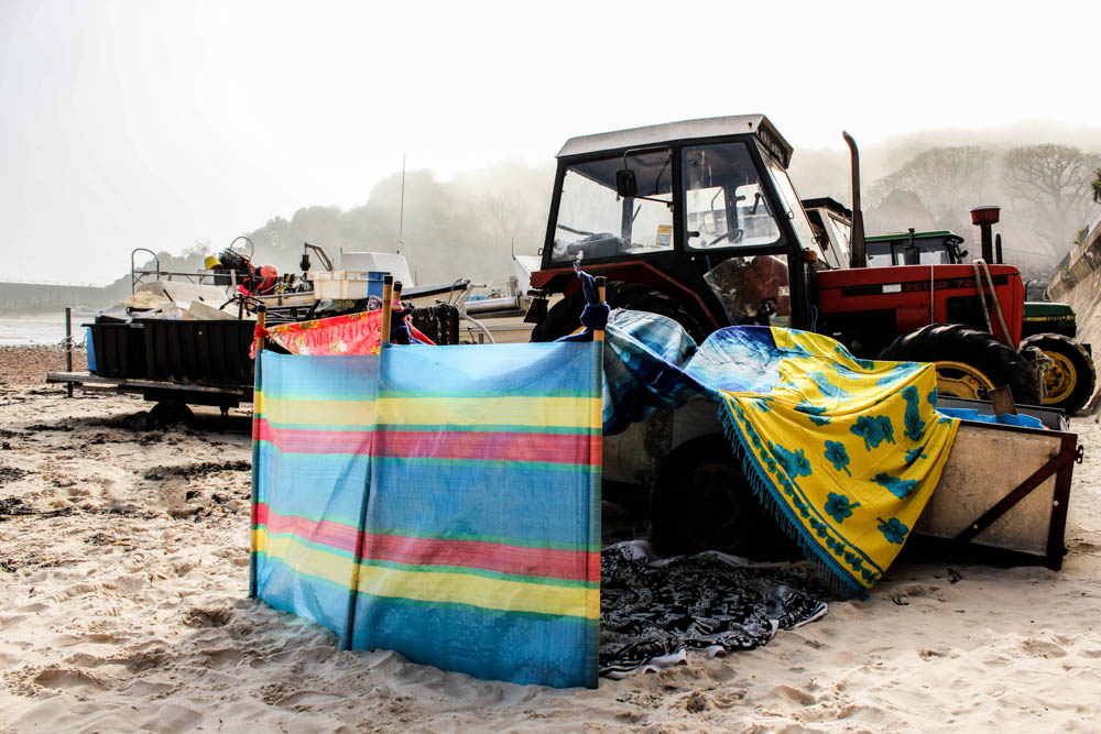
I composed the first set of process photographs so as to include all of the tractor and boats within the composition. This allowed enough of the beach to be seen to convey that it is a beach. You can see in the far background the line of rocks across the beach as well as the pier and far rock structures. I really like this composition as it shows the diversity of the beach by having the beach itself but then also having the lines of trees on the hills. I also quite liked how this composition really shows the impact of the weather on the environment. The foreground is clear and sunny but the background is foggy as the mist is descending down onto the beach. The lack of any bright colours in the environment also works well, with only the red of the tractor. This lack of other bright and distracting colours works well in emphasizing the den against the environment. The beach dens we created were all about being bright and vibrant as those are the colours you associate with summer and sunshine so i really liked how this composition allowed this to be recognized.

I therefore really liked the first set of process photographs. I think they work better then my first garden shoot in conveying how each blanket is added as you can see more clearly the different each element of the den makes. The lighting also stayed the same throughout the photographs which worked really well in creating a sense of unity for the photographs.

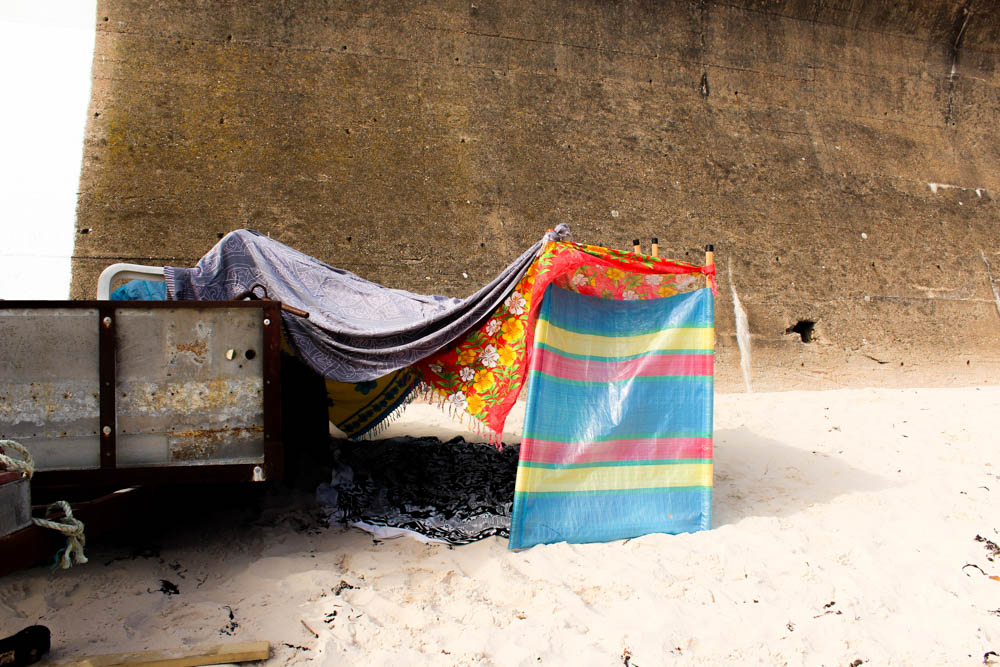
I also quite like the second set of process photographs though they have none of the impact that the first set of images has. The problem with my den building in this location was having this wall in the background that conveys quite a sad impression of the den and almost takes away from the bright colours of the den. I think it just goes to show how the right environment to photograph these dens is really significant as it can completely change the impact that they have.
 

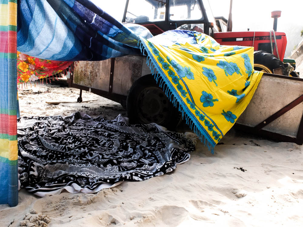
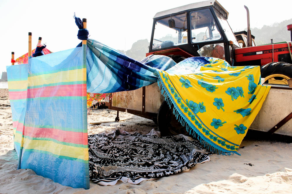
Above and below are the two best photographs that i took of my beach den and they defiantly work so well because of the weather of the environment. Both photographs are very well lit using natural lighting. The lighting however is not intensely bright, harsh lighting. It is instead fairly soft lighting which works really well in illuminating the colours of the den against the environment. In both photographs the rest of the environment, both the fog in the sky and white of the sand causes the dens to stand out vividly within the frame.

The top photograph is composed very similarly to my process photographs, only slightly closer to the den so that you can see inside. In this composition the den is in the center of the frame and the photograph is taken from the same level that the den is built at. The brightest point of the photograph is the sky in which there is the sun behind the fog shining down onto the den. As the sun is directly above the den your eyes begin with this really bright light and then go immediately to the den as the part of the photograph most influenced by the light.

I really like the composition of the below photograph as well to convey more of a childlike sense to the den. This photograph is focused more exclusively on the den itself rather than portraying the whole environment that the den is in. The composition is framed from a lot lower down than the other photograph to be suggestive of a child entering the den at a lower level. The angle of the photograph is also different to give more of a sense of being about to go into the den through the entrance. You are able to look straight through the den at the entrance which gives an impression of the space inside the den which isn’t something you maybe consider as much from the other photographs. The light in this photograph is a lot brighter than the one above, the sky a white blur of fog and light. As the photograph is taken from lower down this causes the bright colours of the den to stand out further against the environment. The light in this image seems to come from above and also the right hand side of the frame as the light is so intense that it reflects directly off the windbreak. This bright intense light shining on the outside of the den then contrasts with the shadows the den itself casts onto the surroundings and shade inside the den. I quite like with this composition how being able to see into the den causes you to be able to see the blanket inside the den.

I cant decide which of these two photographs i prefer as both convey a different impression of the den due to their different compositions.
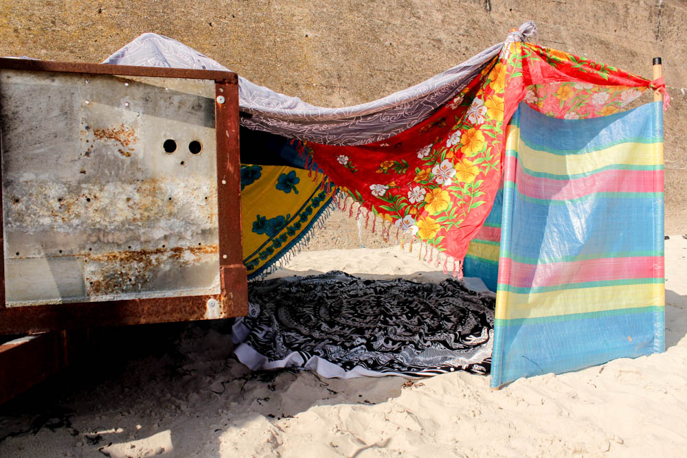
Above is a different angle to the den, a closer up version of my process photographs. It is really interesting to consider this composition of the den in relation to the other composition as they convey completely different impressions. This photograph is composed to look through the other entrance of the den. The same bright colours are used in the material and yet this angle of the den lacks a dynamic that the other photographs composition has. I think it is partly to do with the environment surrounding the den in this composition. In this image the orangy colour of the concrete wall doesn’t really add anything to the photograph or highlight the dens colours like the whiteness of the foggy sky. I feel like in this composition the colours become lost within the space. This composition does show a completely different side to the den but i just don’t think it has any where near the same impact as the other compositions.

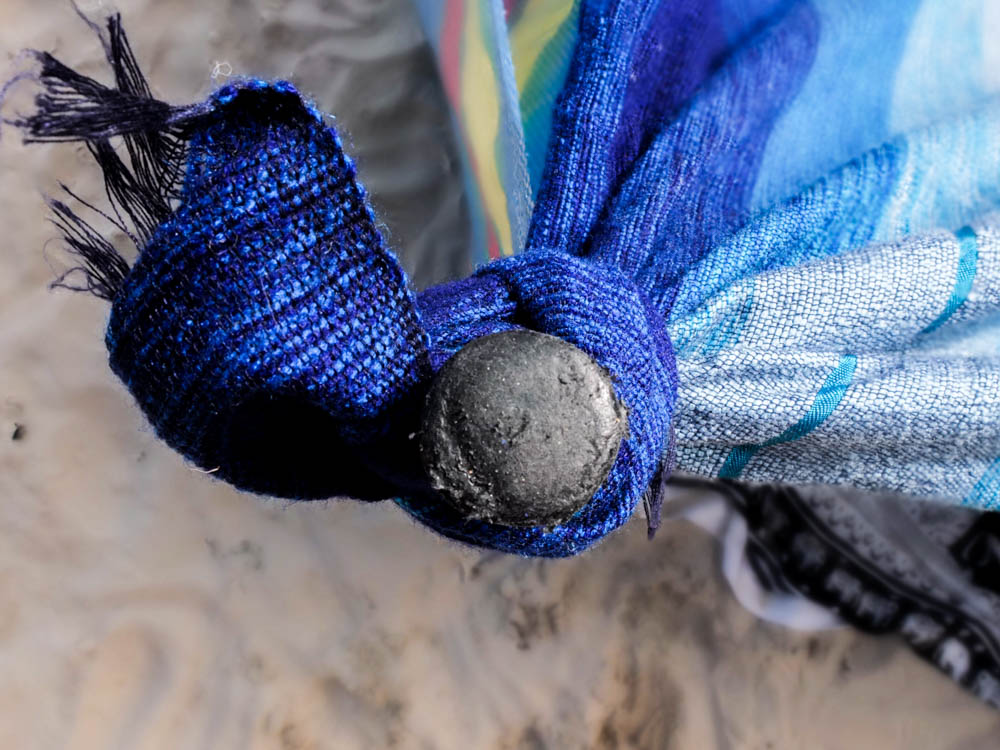
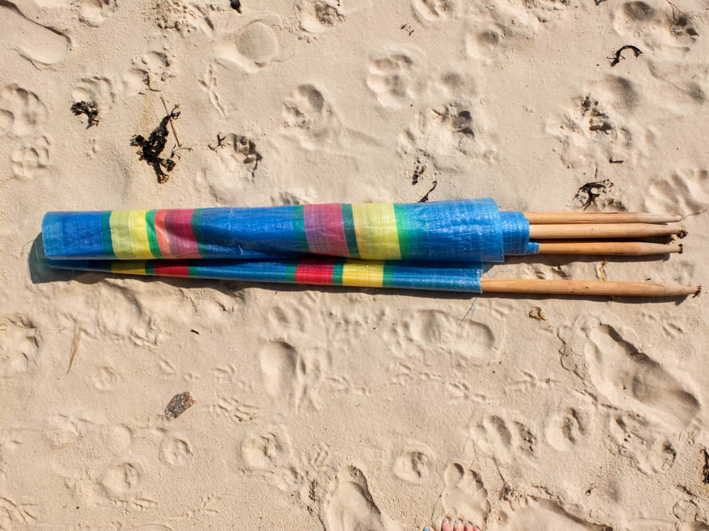
The above and below photographs are some close up photographs to go alongside my process photographs. Like with my previous garden den i wanted some photographs which convey how the den itself is put together and structured. With the beach den there was a lot more tying of material and balancing of blankets as down the beach i wouldn’t have brought in my childhood pegs or any rope. The main structure of the den all revolved around the windbreak acting as a wall to have all the blankets coming off.

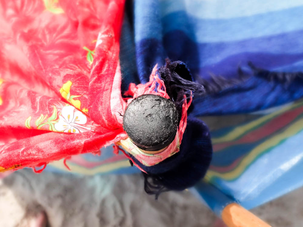
The above photographs were taken looking down on the windbreak as a supporting pole with the blankets and material tied around it and therefore coming off in bright swirls. I composed the photograph to have the pole in the center and the black top of the pole in focus while the rest of the image out of focus. This created quite an interesting impression of the material as a blur of folds going off from the center at different angles. I quite like how in both photographs you can still see the sand and therefore get an impression of the beach . The light source is fairly soft in the first photograph but in the second one the lighting is fairly harsh and comes from the left hand side. I think this could be because red reflects more light as a colour than blue which is what makes the real difference between the  two images

The below images are exactly the same two poles only photographed in a different composition. I composed these images to have the line of the pole in the center of the frame so you can see in these images more clearly how the material is tied to the pole. In both photographs i used a short depth of field so as to blur the background and have the emphasis on the pole and tied material rather then the den structure in the background. In both i  centered the pole right in the center of the frame. Again the first photograph has less light then the second as in the second photograph the light is reflecting off other colours in the background of the frame and also the white in the foreground. I think the first photograph works better as  conveying the material as being tied, as it is a perfectly tied piece of material but the second photograph conveys better the mixture of all the materials and colours of the den.

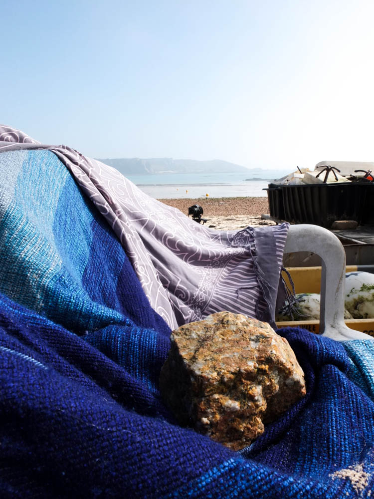
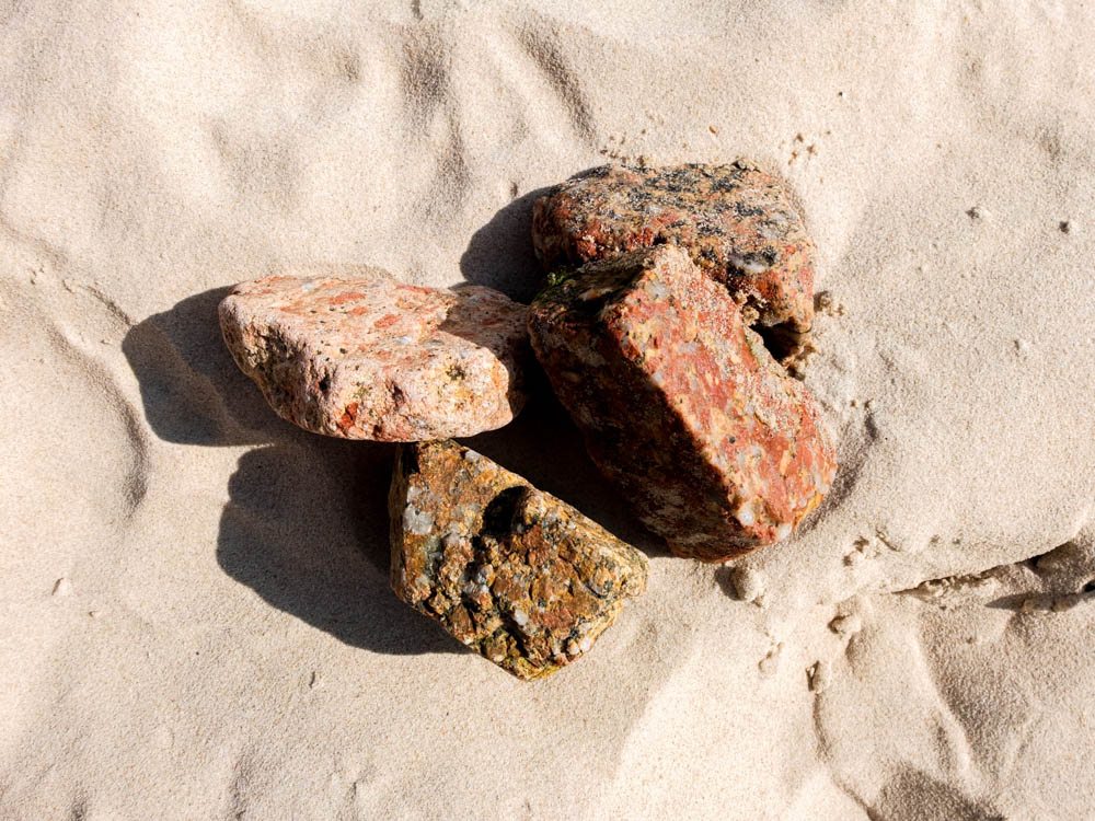
I really like the above and below photographs compostionally. As well as tying material i also used rocks to weight the material down to keep the various walls of the den in place.  The first photograph i think works the best as like the very first picture i took of the entire den, the background of the photograph is intriguing and better emphasizes the den.  The light in the first photograph comes from the right hand side of the frame and is a bright and harsh light. This light directly shines onto the dens furthest point within the frame, washing out the colour from the point of the den that it reaches. I think its quite interesting in this composition how the material of the den in the foreground reflects the sea. The dens materials almost looks like its trying to imitate water with the various shades of blue and the different folds of the material. The background of the den being such an intense white colour/pale blue also contrasts with the blues of the den and makes them stand out more vividly. The entire colour scheme of the photograph seems to revolve around different shades of blue which creates a calming asthetic. The exception is the rock which i composed using the rule of thirds to be in the bottom right hand corner of the frame. By composting the photograph in this way it weights the frame with having this heavy object both weighting the den and weight the material to have a solid presence. I also really like how in the background the curves of the materials and hills compliment each other with the lines of the rocks and sands breaking up all these curves.

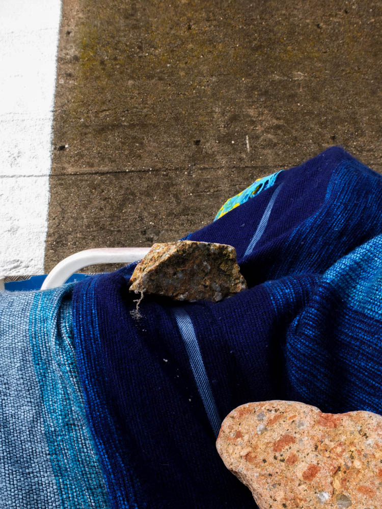
The second photograph follows a similar composition but it less interesting because once again it features the concrete wall rather than the beach in the background. This image is also composed to have one of the rocks in the right hand bottom corner, almost pointing you into the rest of the frame. The brightest point of the image is the white line on the wall which actually takes away from the den. I like the composition of the material but the background doesn’t really work.

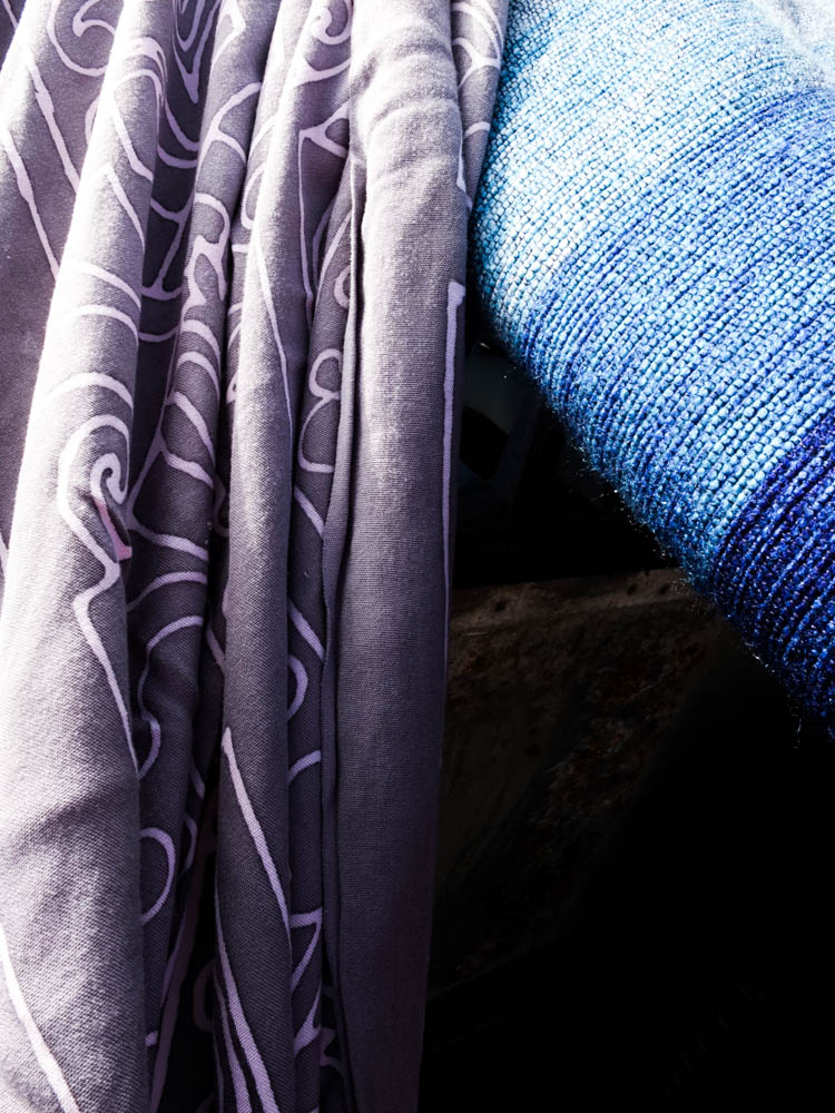
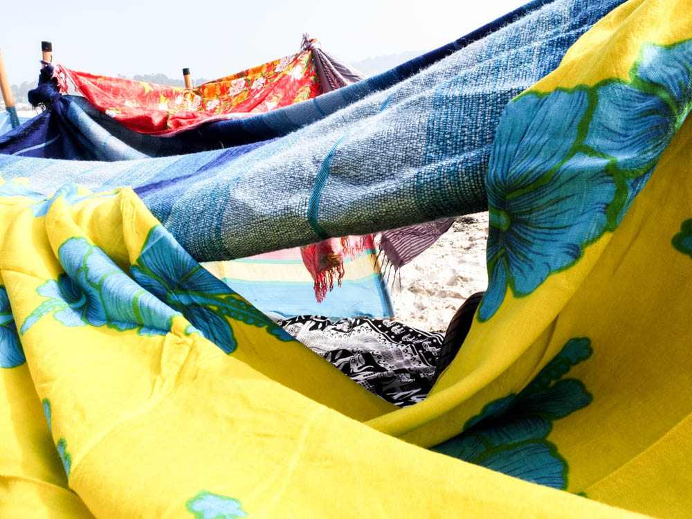
The above photographs are more abstract compositions which focus on the point at which material is over-layed. The two colours being various shades of blue complimenting each other. The light in the photographs comes from the top left hand corner to shine directly onto the material. The points at which the light shines onto the material is washed out with colour which shows the harsh intensity of the light. These bright sections of light then contrast with the dark shadows in sections where the blanket has slipped and therefore leads into the inside of the den. Both these contrasting lights and dark’s then make the colours themselves more intense. I quite like the contrasting angles in these photographs alongside the vivid lights and darks as the material runs alongside each other but then has different folds and patterns on them which adds a dynamic to the photographs.

The below photograph works the same with having these intense lights and darks which bring out the bright colours of the den.
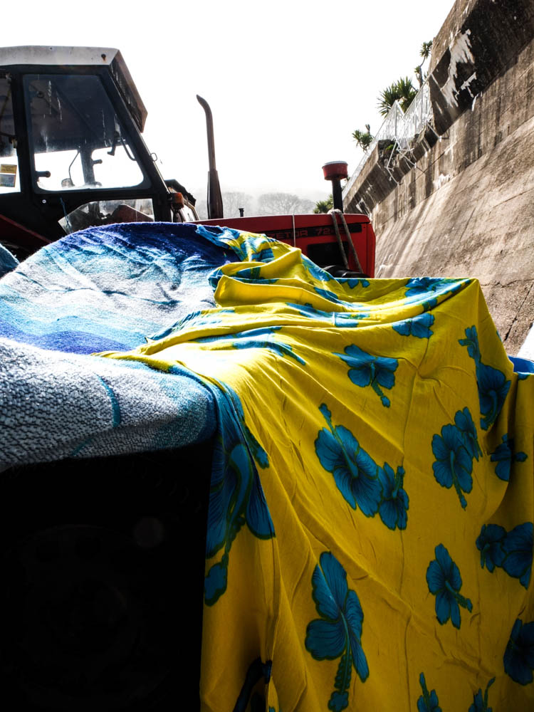
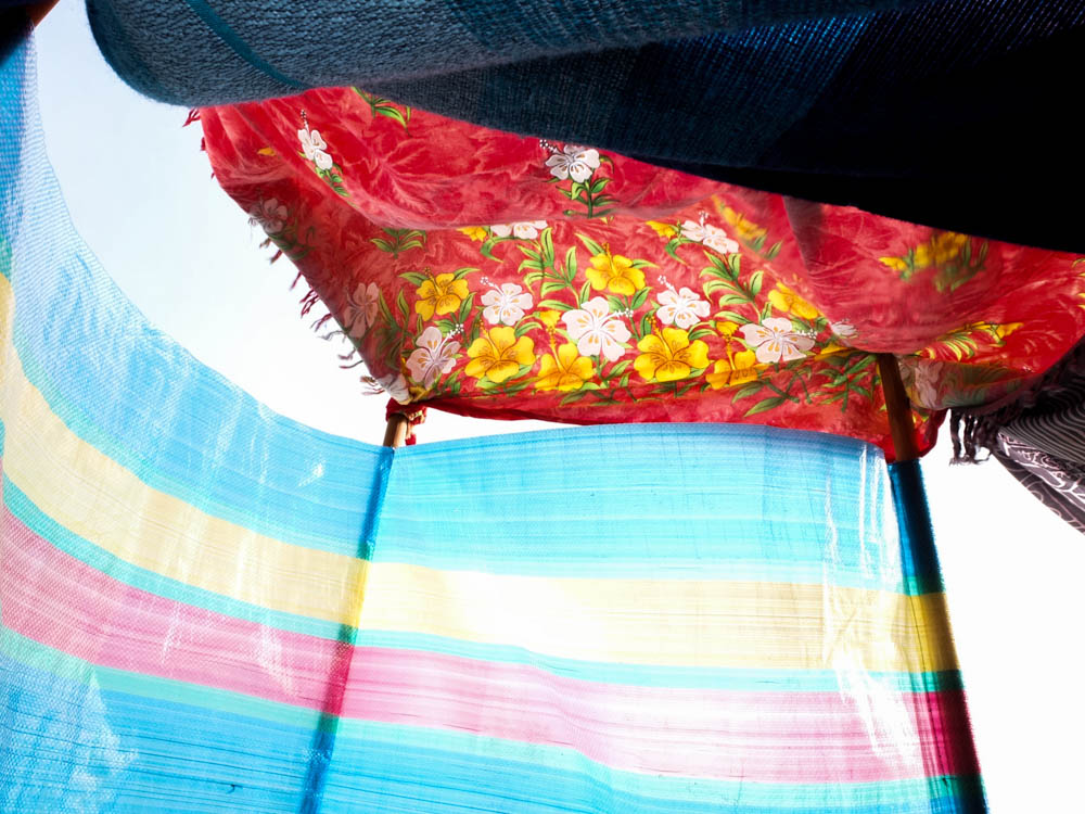
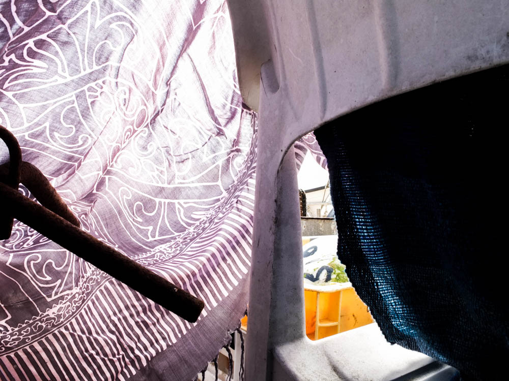
I took a couple of photographs from inside the den as well, wanting to again consider the material as the light shone through it. As the thinnest material the windbreak was the main source of light within the frame. In this photograph the light source is on the other side of the windbreak shinning directly through . The sky is a really bright and intense white from the light which washes out all the colour. I think it is the angles of the above photograph which makes it so interesting as the windbreak curves round in one direction, your eyes beginning with the brightest point behind the windbreak and then moving round, following the curve to then let your eyes travel along the material at the top of the frame. There also appears to be a tension in the photographs in which the material is pulled taught from the windbreak. I think the main thing thing that makes this image work however is the light as it makes the colours appear more intense and vibrant in the environment.
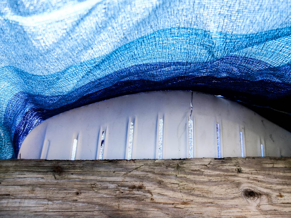
The above and below photographs show the process of the den breaking and then being rebuilt. When considering Goldsworthy’s work this was a key part of his process, to rebuild and continue to re-build until the structure becomes sound. This is as much about the den being created as having a final product as the den comes undone because of the environment, be it wind or the un-ablity to get a blanket to balance. The above photographs focus in on the tiny points of the den which have become to come apart, where holes have developed in the structure. I quite like these photographs in showing the layering of material and the tiny holes giving an insight into the inside of the den. The photographs are composed so that the break in the den is right in the center of the frame. The light in both photographs is intensely bright. 

The below photograph was just a quick set of photographs i decided to take to show how parts of the den could fall down and then be rebuilt. 
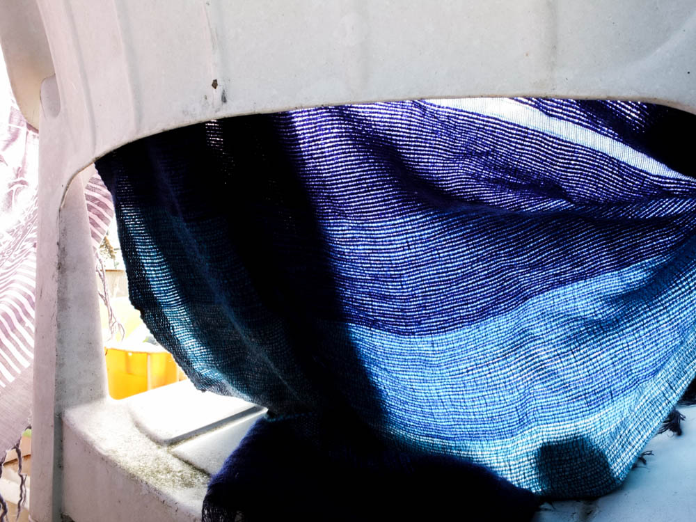
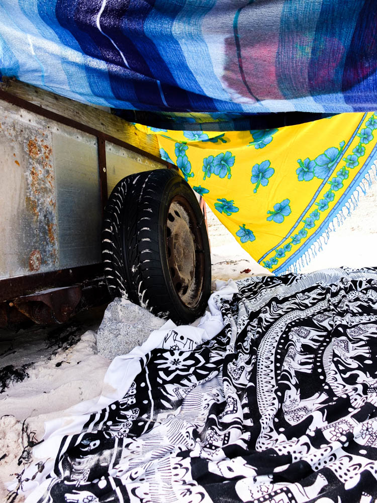
I quite like this last photograph because of the way the colours compliment each other. The bold bright yellows and blues then contrast with the blacks and whites, including the tire and the white of the sand. The image is also composed to use abstract angles, the wheel of the cart at an abstract angle and the blankets as well at jaunty angles. The brightest part of the photograph is the light in the background which is a bright intense light. The whole image is made up of very bright colours, the light shinning directly through the material and intensifying the colours. 


Planing – beach den shoot

My next shoot i decided to create was a beach den as this was the most common den i made as a child. I spent pretty much my entire childhood down the beach building dens so it was really important that i included a beach den within my project. I decided to use St Brelade’s beach as we had a spot up by where the boats are parked that we would always go to. This was key in inspiring our beach dens. The boats and tractor trailers provided a basic structure to began to build our dens coming off the sides of them. Otherwise down other beaches such as St Ouen’s we struggled to have a starting point to build the dens off. I have mentioned previously how important it was in den building to consider the  environment and to find the perfect part of the location where you had a starting point. I thought it was therefore really important to build a den in this location. 

For my beach shoot i didn’t really want to take my photographs on a sterotypical sunny day. I wanted to get a different atmosphere to the photographs rather then just sunshine. The most memorable dens on the beach where the ones when there was weird weather or i used something slightly different to build the dens. As we have been having so much fog recently i thought it could be quite interesting to create a den on a day which was really foggy. It actually turned out that i got the best of both worlds as the day i choose to take the photographs was a sunny day and also very foggy as it rolled in as i was taking the photographs.
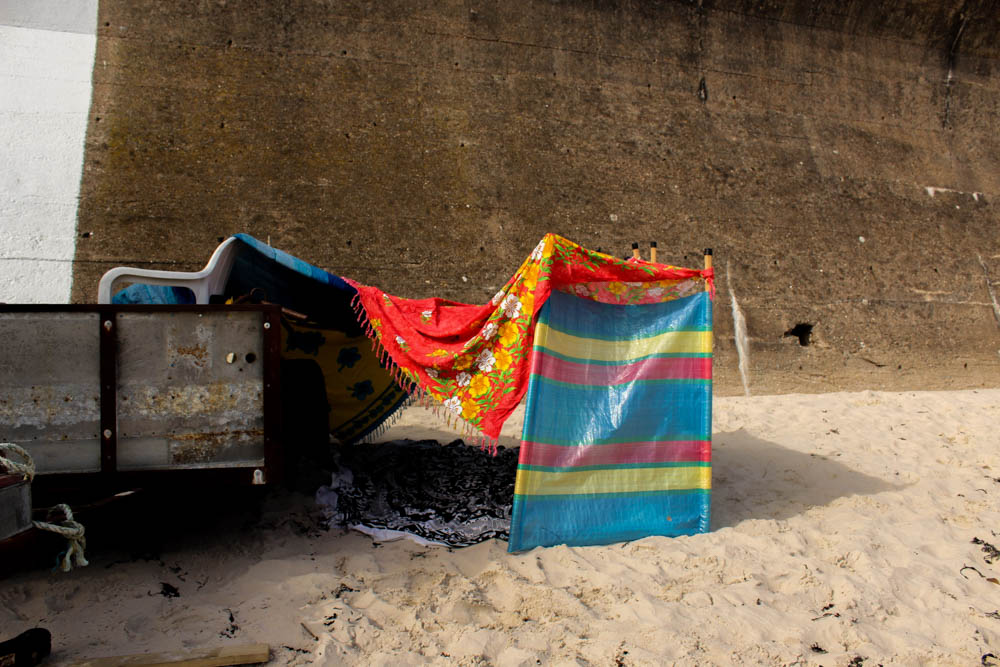
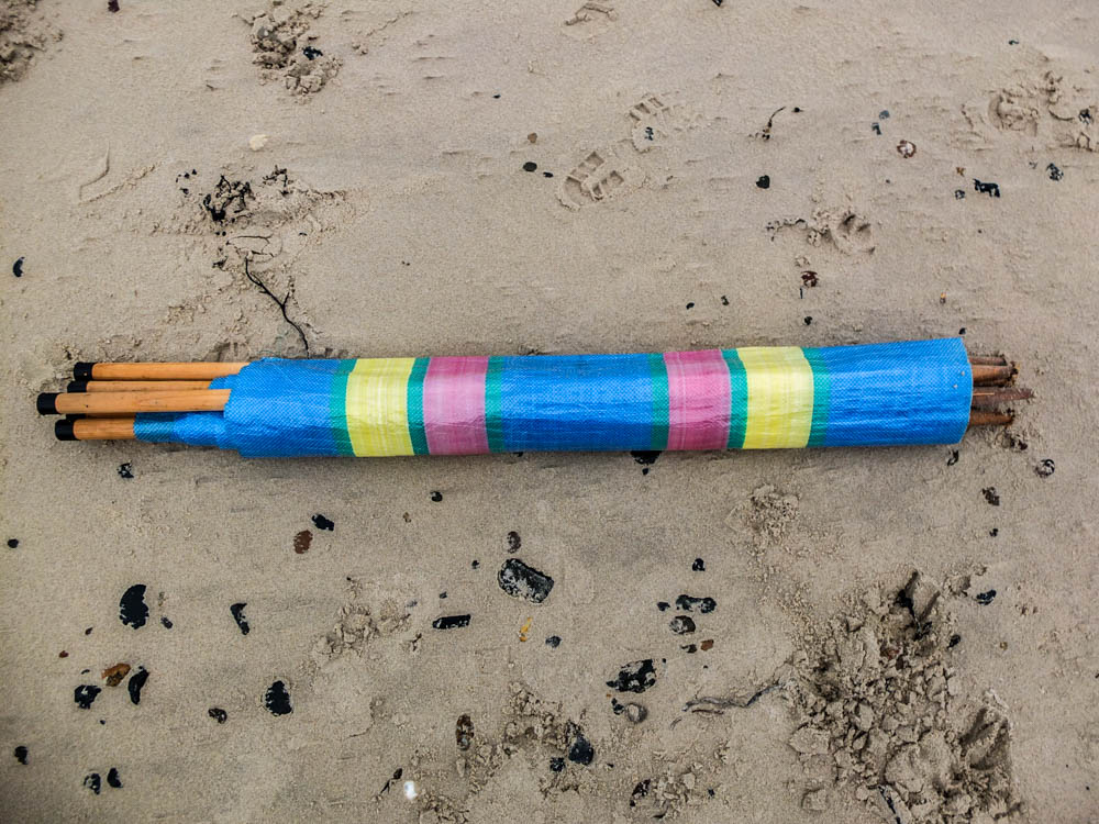
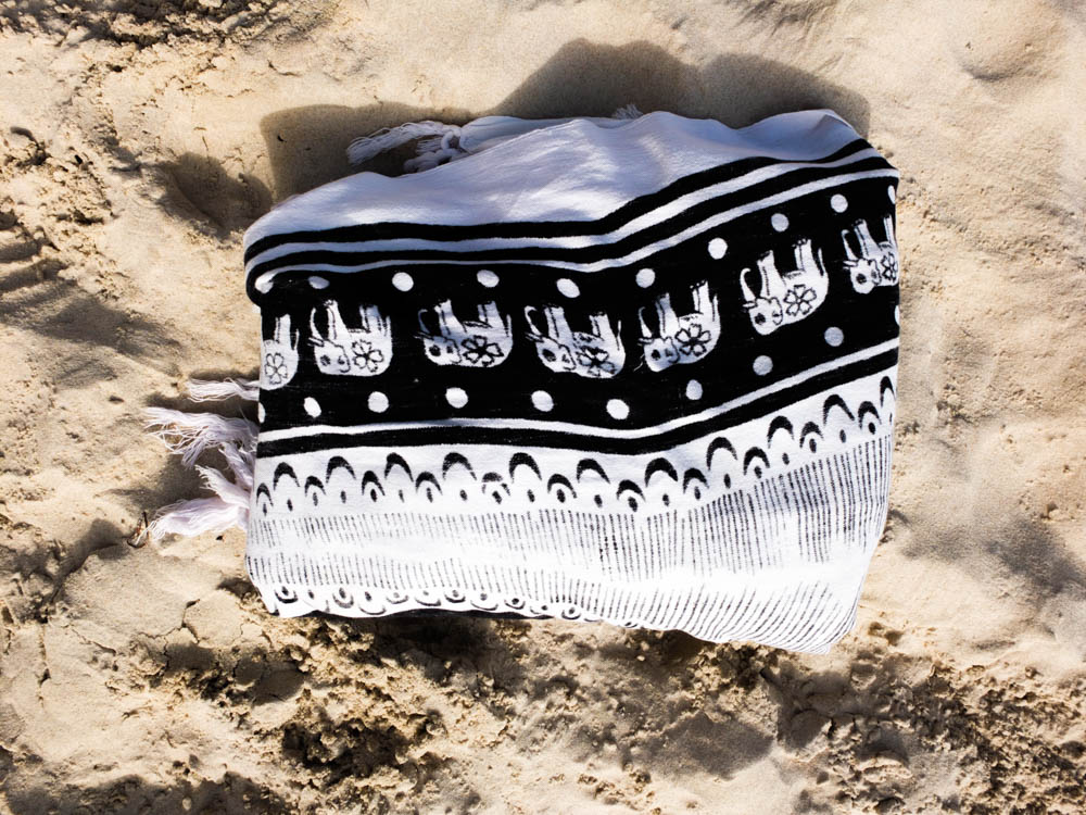
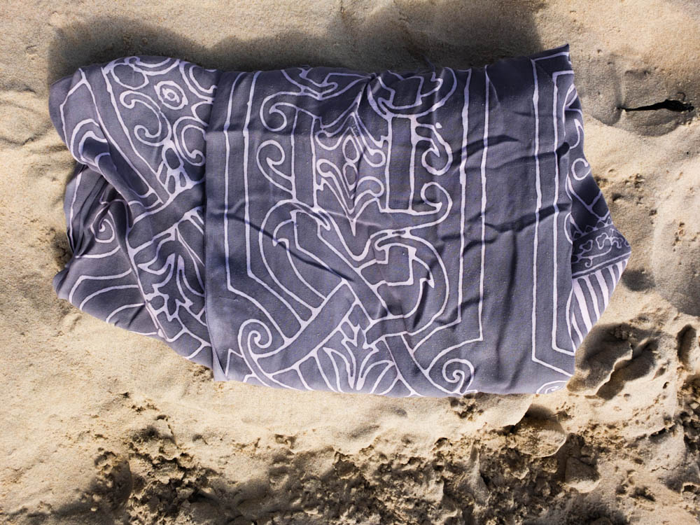
When choosing what materials to use to build my den i wanted to use those that i would have used at the time to build dens. I therefore thinking about the basics of the structure decided to bring a wind brake to act as a wall. Down beaches where we had very limited places to build dens as there was no beginning point to the structure we would always use wind brakes to create walls and then drap material off them. The material i decided to use were sarongs as these were the things i used down the beach as a child to lye on and to dry ourselves after swimming. They were the best blankets to use as they are very light weight and can be folded up small so many could be taken with us down the beach and then used for various things. I have also decided instead of pegs like i used in my garden den i will use rocks to weight down the blankets as they are a material that is readily available down the beach. 

Below is the location in which i have decided to build my den. I wanted to choose a part of the location which conveyed that the den was built down the beach but without the photographs appearing like a sterotypical beach photograph. I therefore decided to take the photograph looking back towards the less extensive side of the beach. I had to take the photograph at the end of the line of tractors and boats in order to have enough room to take the photographs from far enough away from the den. 


Environment – Shoot Two

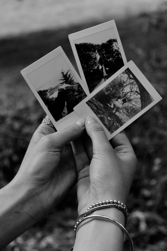
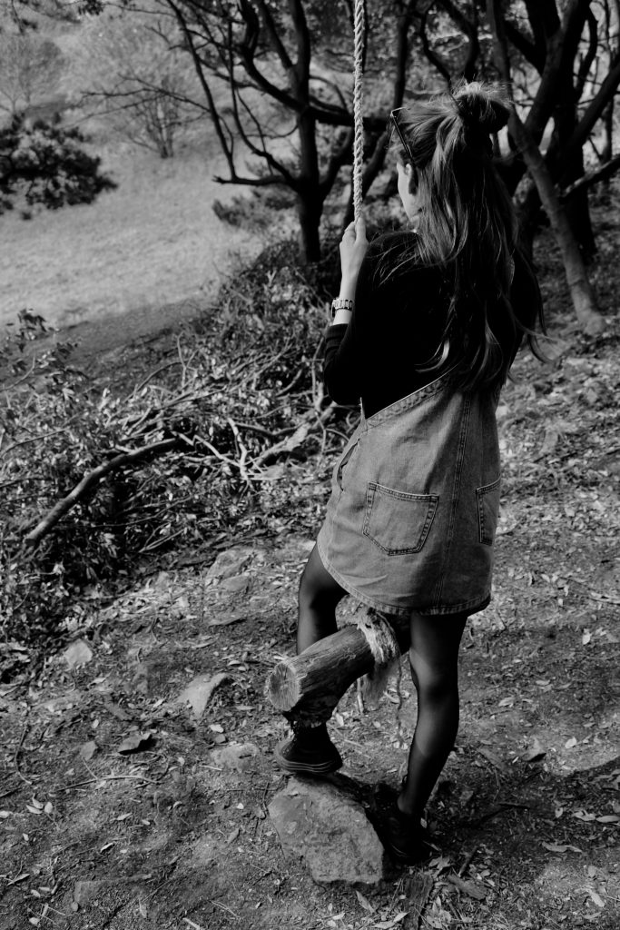
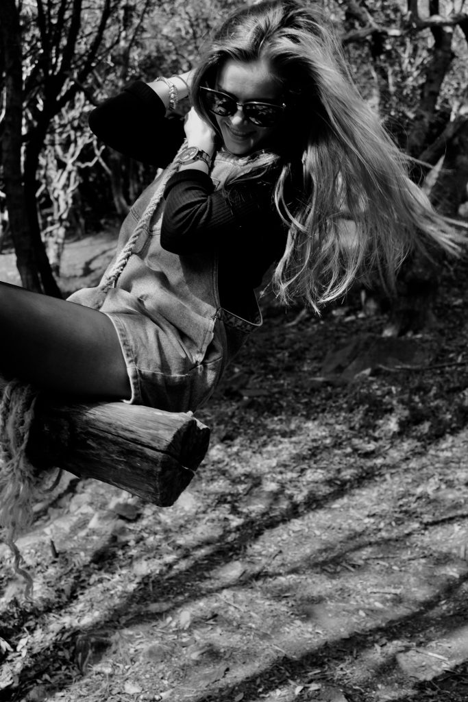
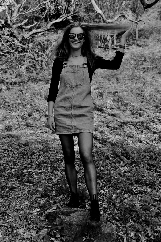
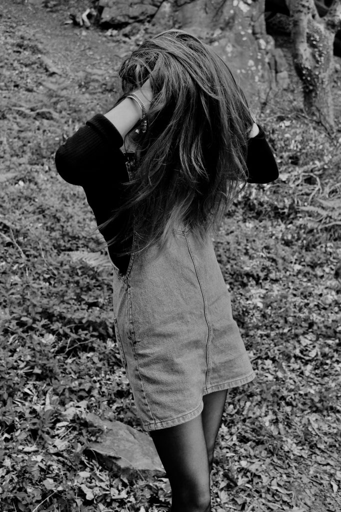
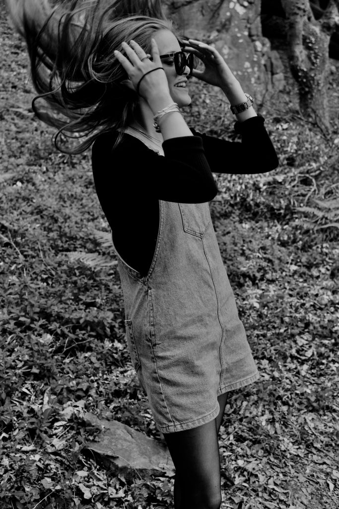
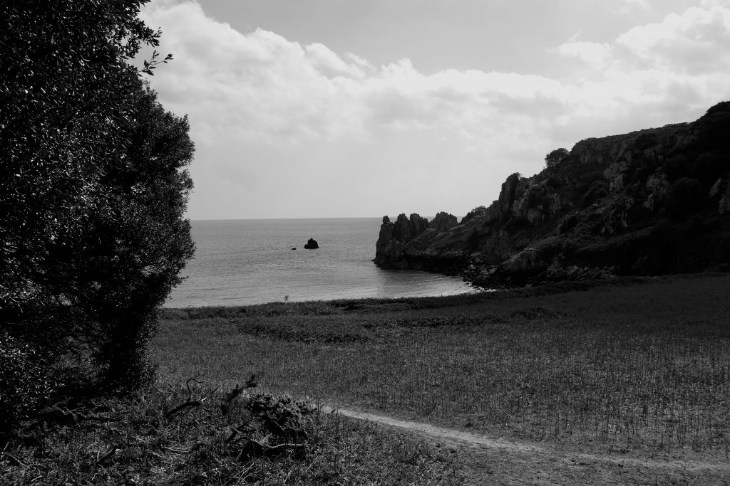
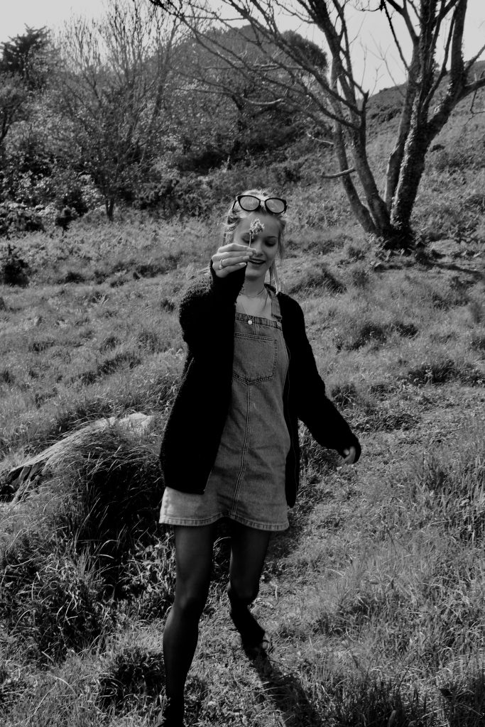
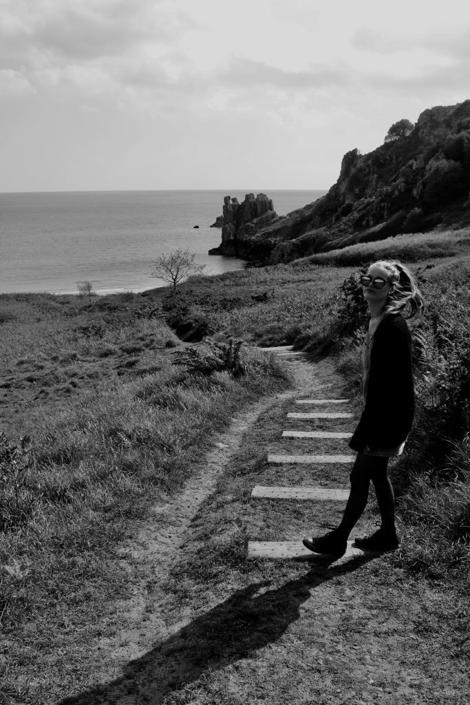
For my second shoot, I photograph my girlfriend, Lizzy. Within this shoot I attempt to capture the relationship we share and my perception of her. I see Lizzy as both very innocent and sensitive, sometimes shy, but can be herself around me.

This can no be entirely represented through the lens of a camera, as people often become embarrassed, or even overact. Despite this, I feel that within this shoot I have captured some sense of both emotion, in terms of feeling comfortable and uncomfortable. We see photographs where her face remains unseen and others where this is not the case. I think this reflects her personality greatly, as often in certain situations she will become reserved, but around me she is able to open up in such a way that is expressive and emotive.

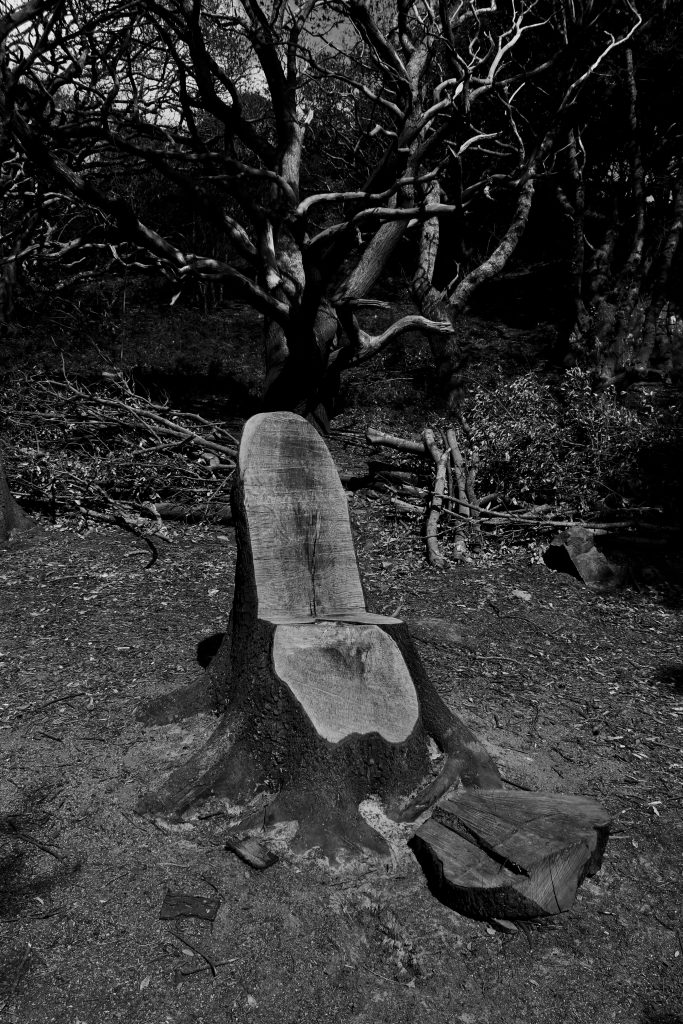
Ultimately in terms of my environment, as well as hers, I am trying to show that wherever we are together, the two of us will feel comfortable in our surroundings.