Category Archives: Uncategorized

Filters

Author:
Category:

Evaluation

Overall, I think my project has been successful as i have successfully contact 3 shoots which perfectly clear and sharp photos. However the first two shoots were of extremely poor quality because of the ISO and i could not tell what was wrong in the images. I have 11 finals which i have mounted on foam board, i wanted to create two window mounts, one with two images in and the other with three. However i did not have enough time which is why that have all been mounted on foam. This is a let down for my project as i think that the images would of looked very nice in window mounts and it would of rounded it off nicely.

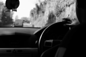
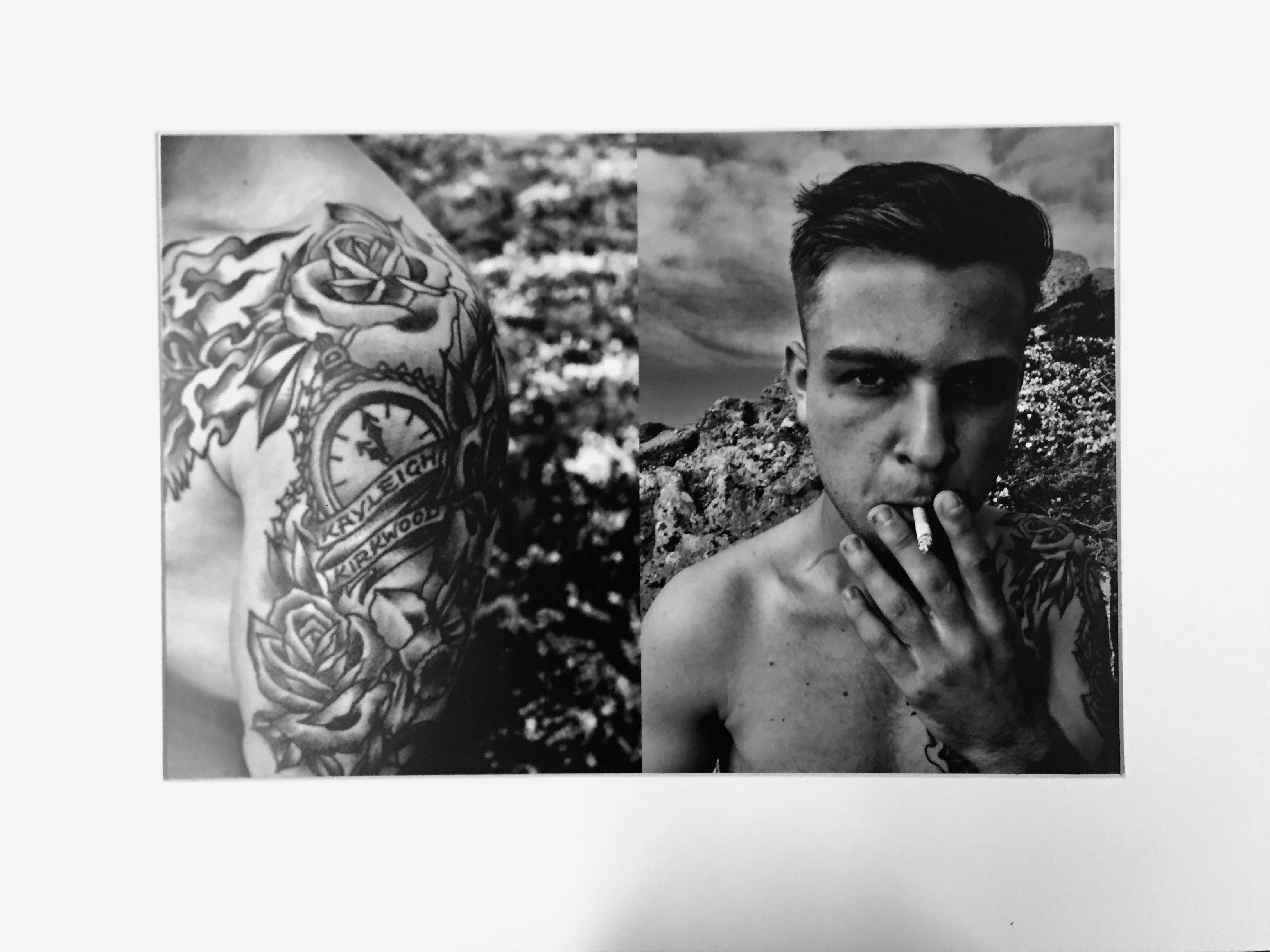
I Have created a 48 page book which is called Our Future, it has a combination of abstract, landscape and portraiture and tableaux in it. I have 5 edited photos which i did on photoshop which was very successful and they turned out really well after being edited in lightroom.

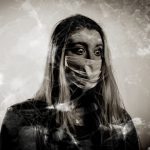
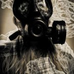
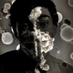
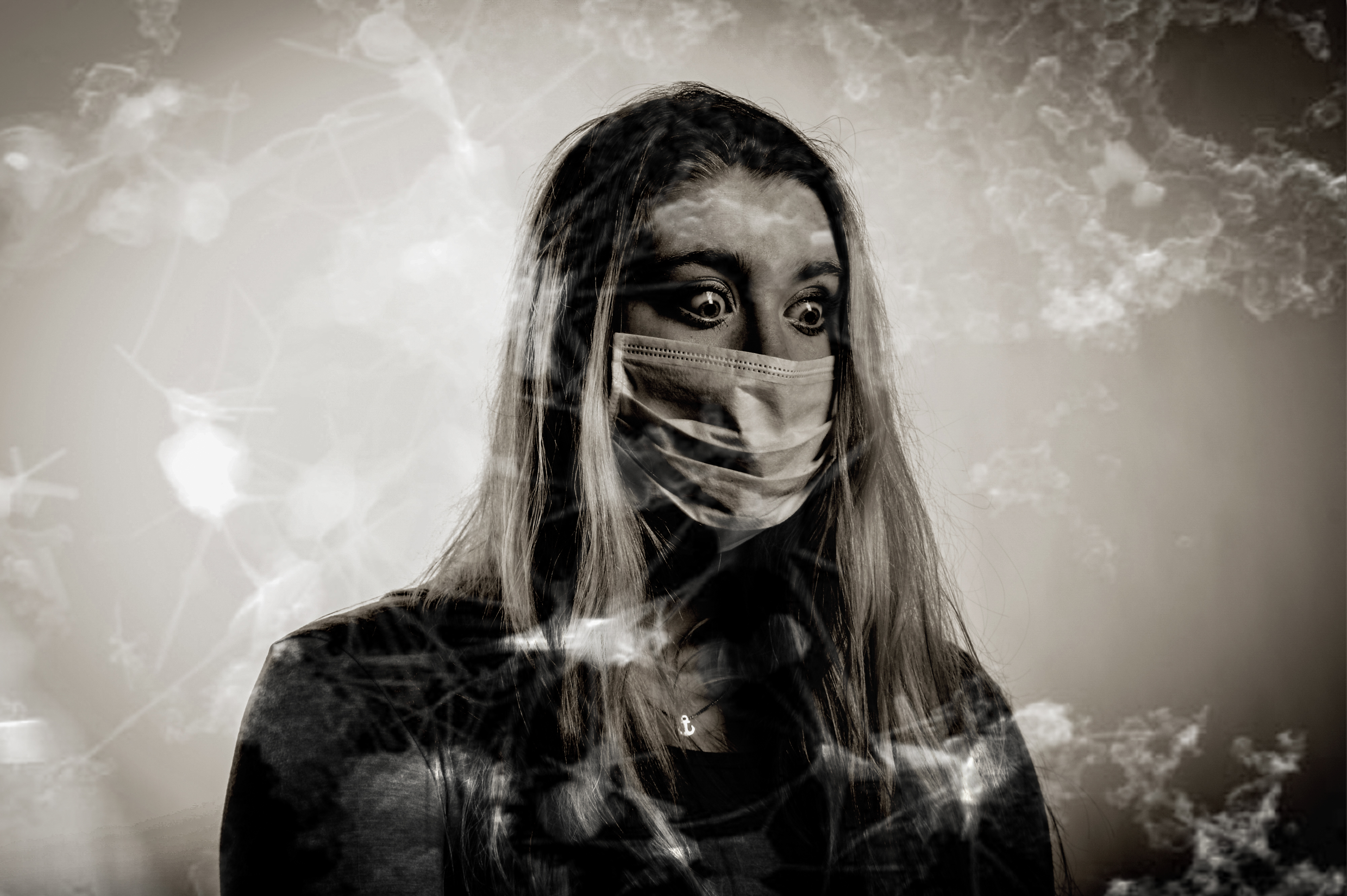
After each portrait image, there was a quote from the official website of WHO and The European Environment Agency.

I have referenced Jon Cazenave who made a book called Ama Lur in which he investigated his homeland in Uruguay with the Basque people. He created a book with abstract images with dark shadows to allow for the viewer to image what the photo may be of. It is a very personal book very similar to mine.

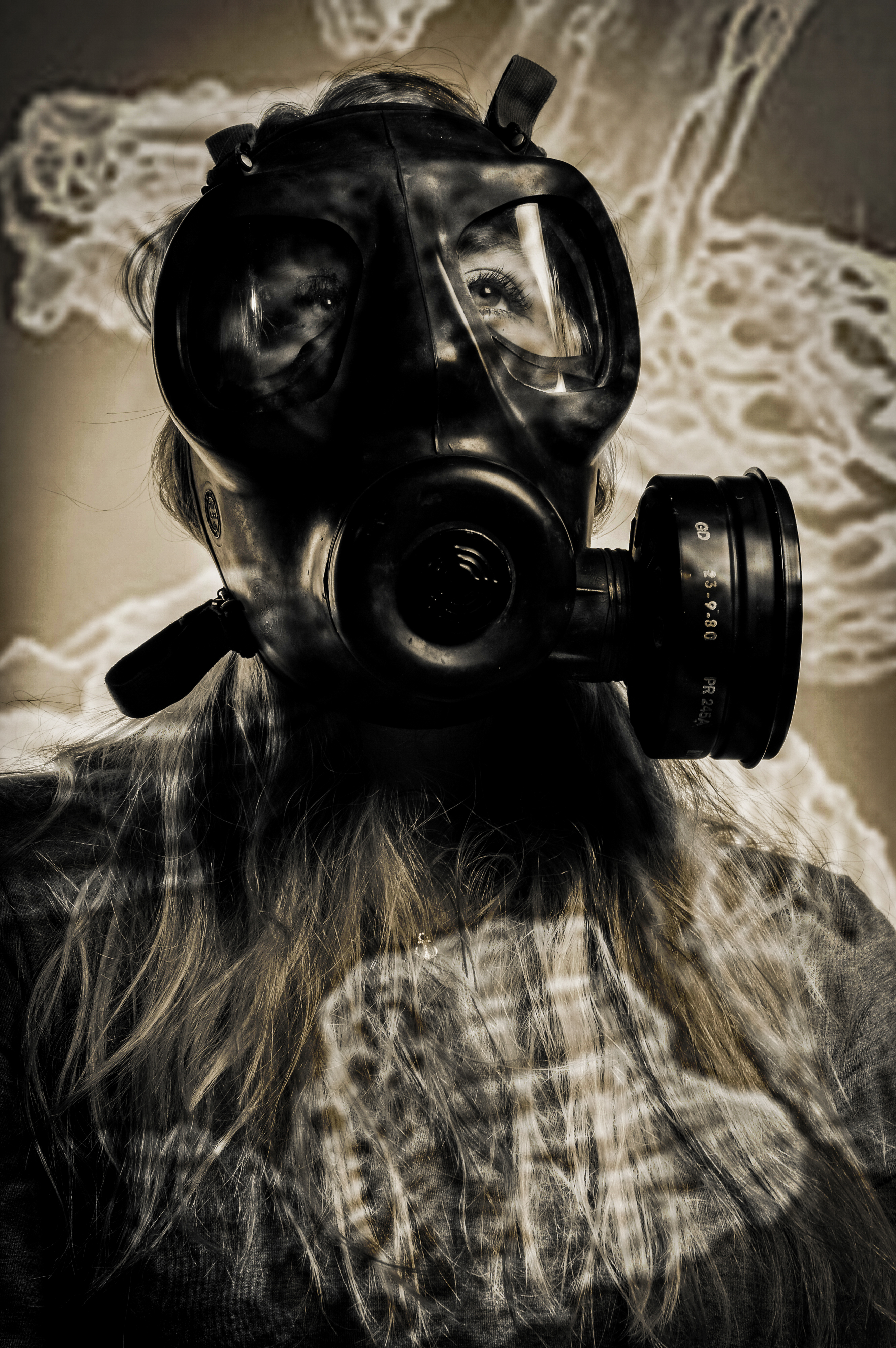
I have also done many different artist references from Lu Guang to Christian Rodriguez. Not many of my artists are professionals but not many would link to my work if i used professionals. All my artists had a link to pollution whether it was E-waste or air pollution with gas mask which is almost identical to my work.

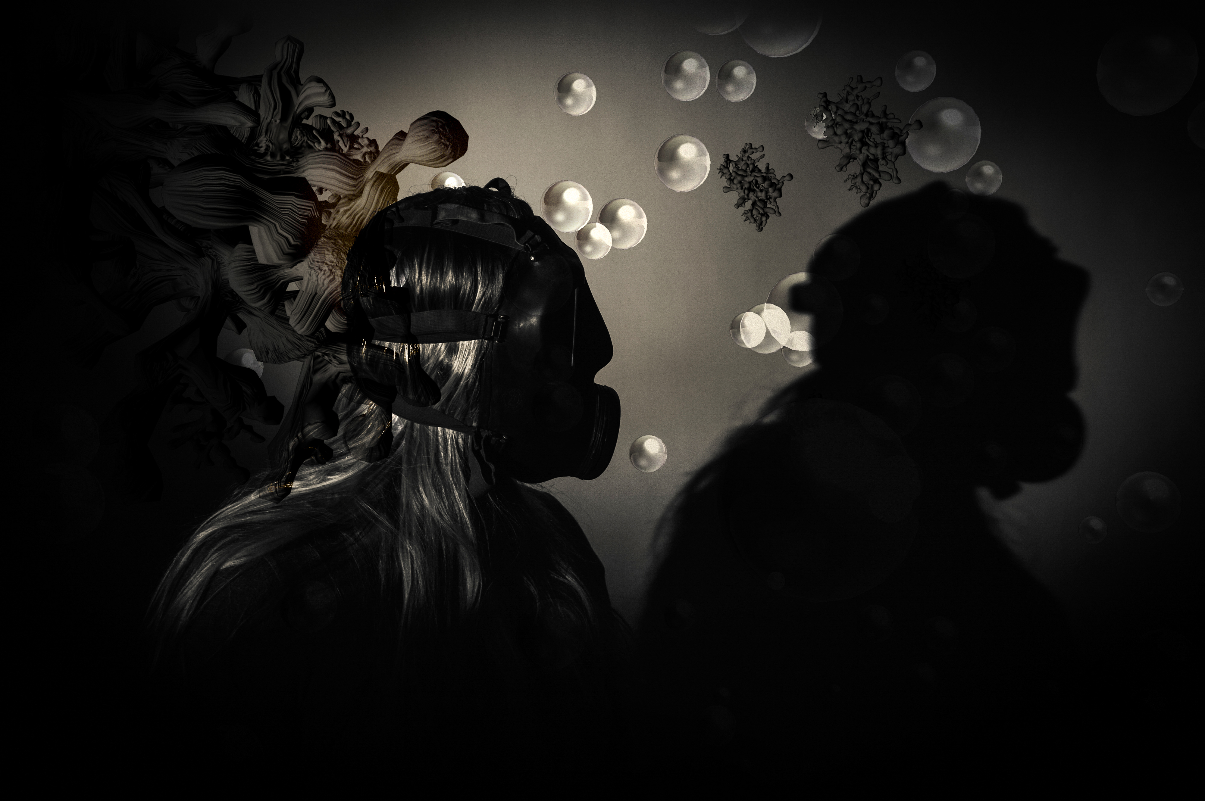
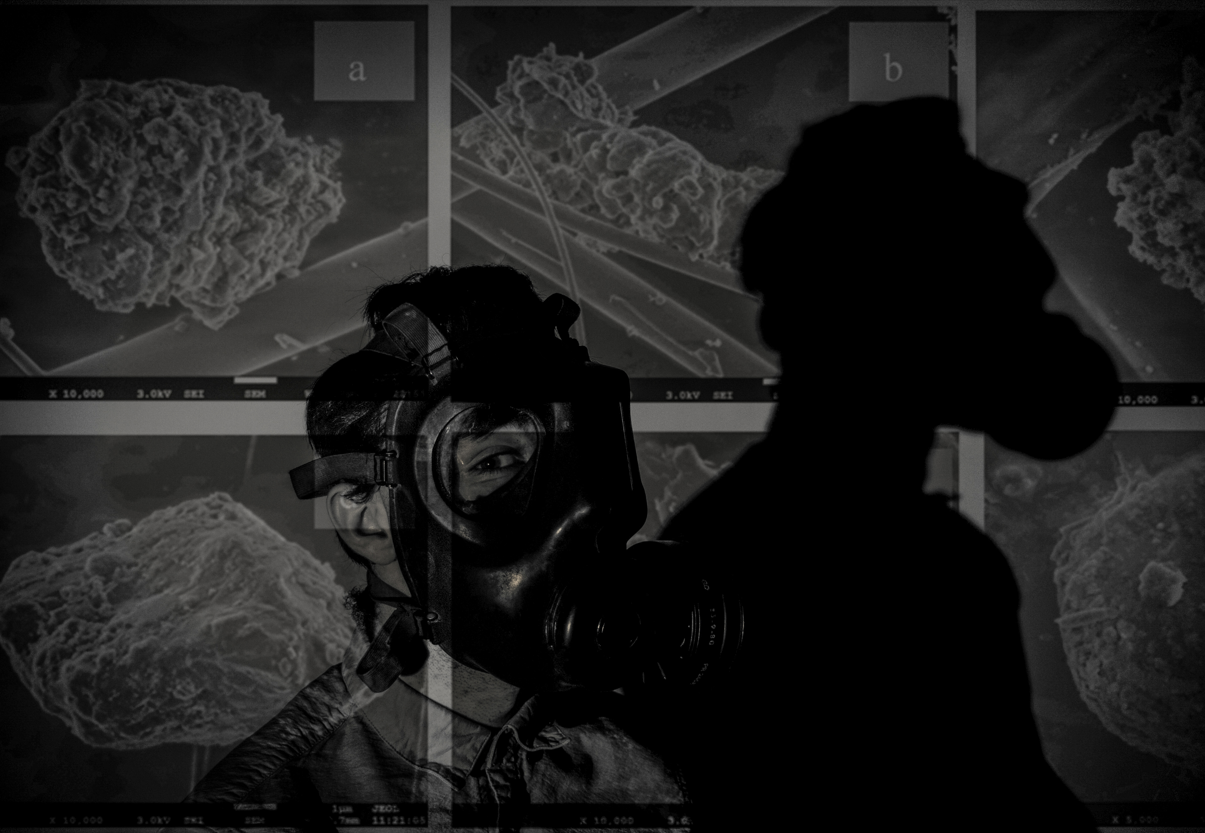
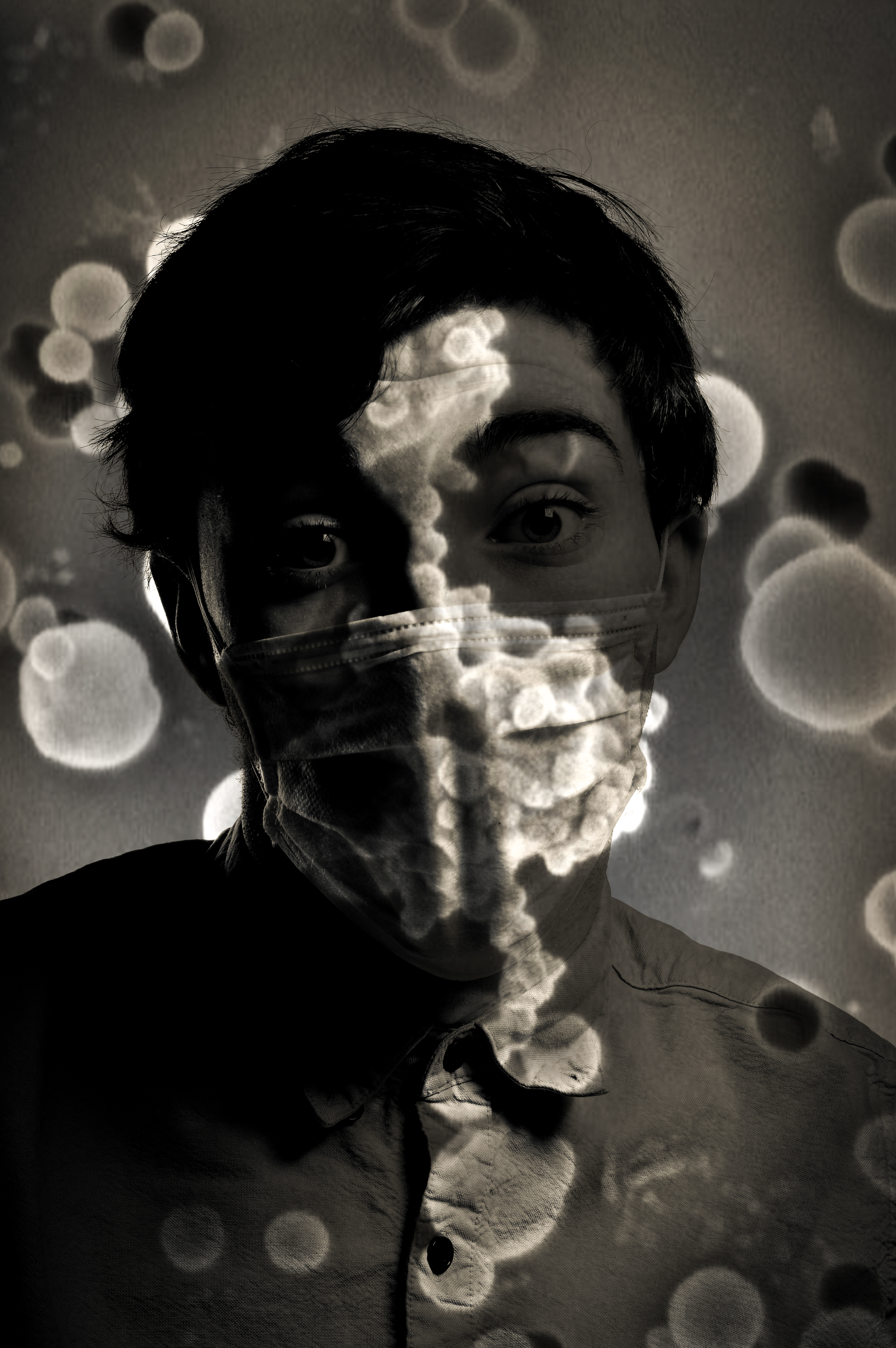
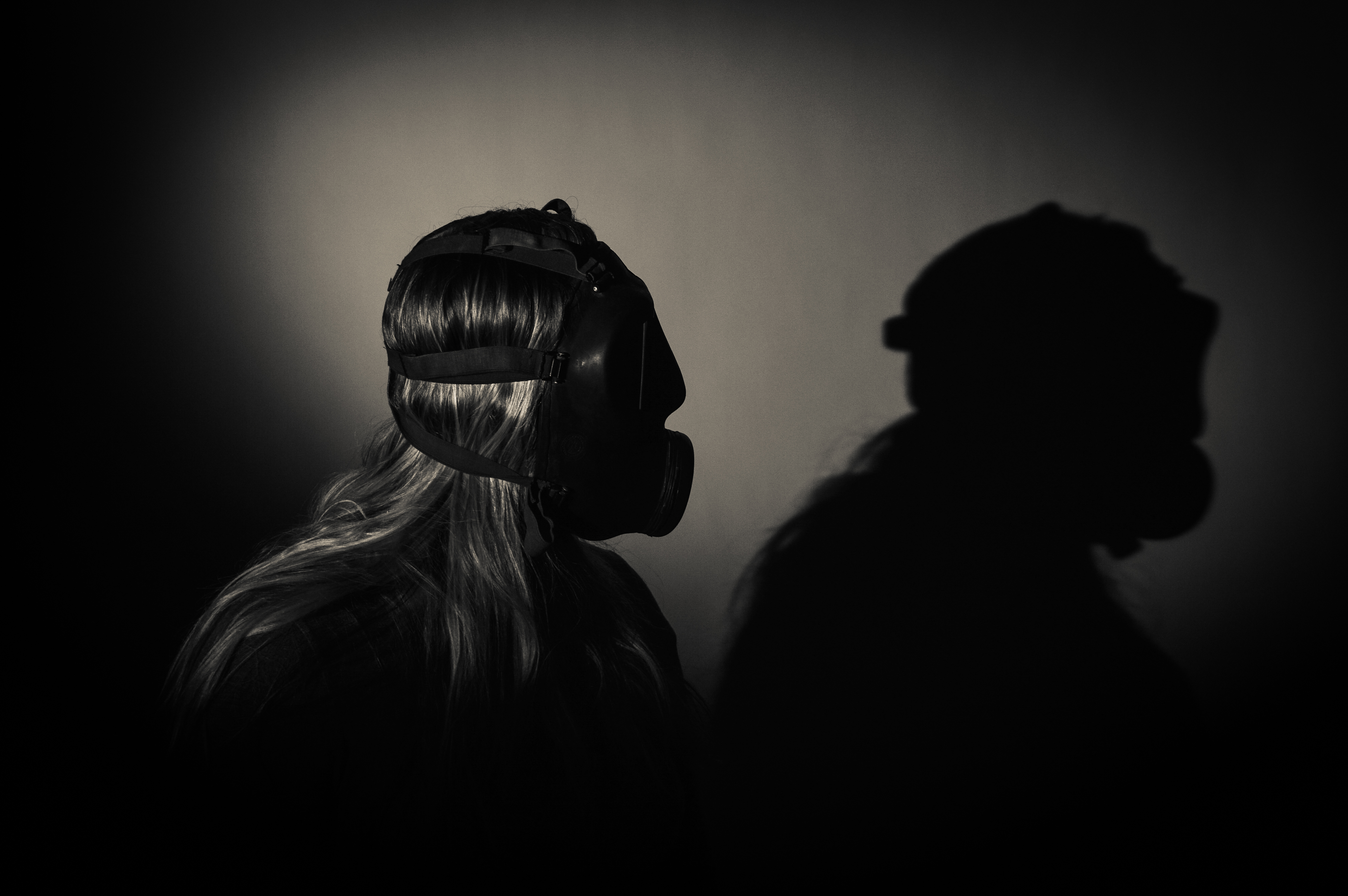
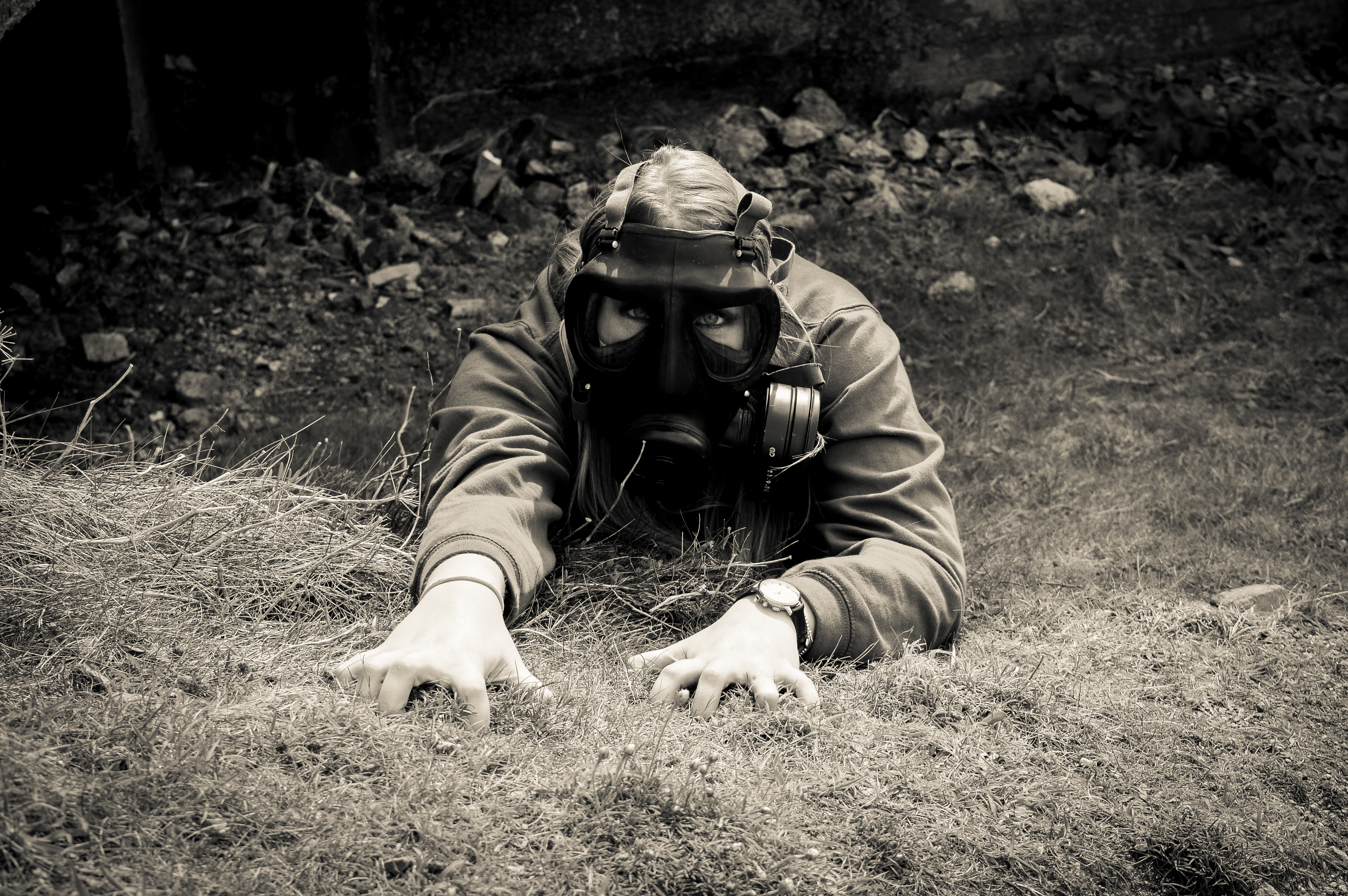
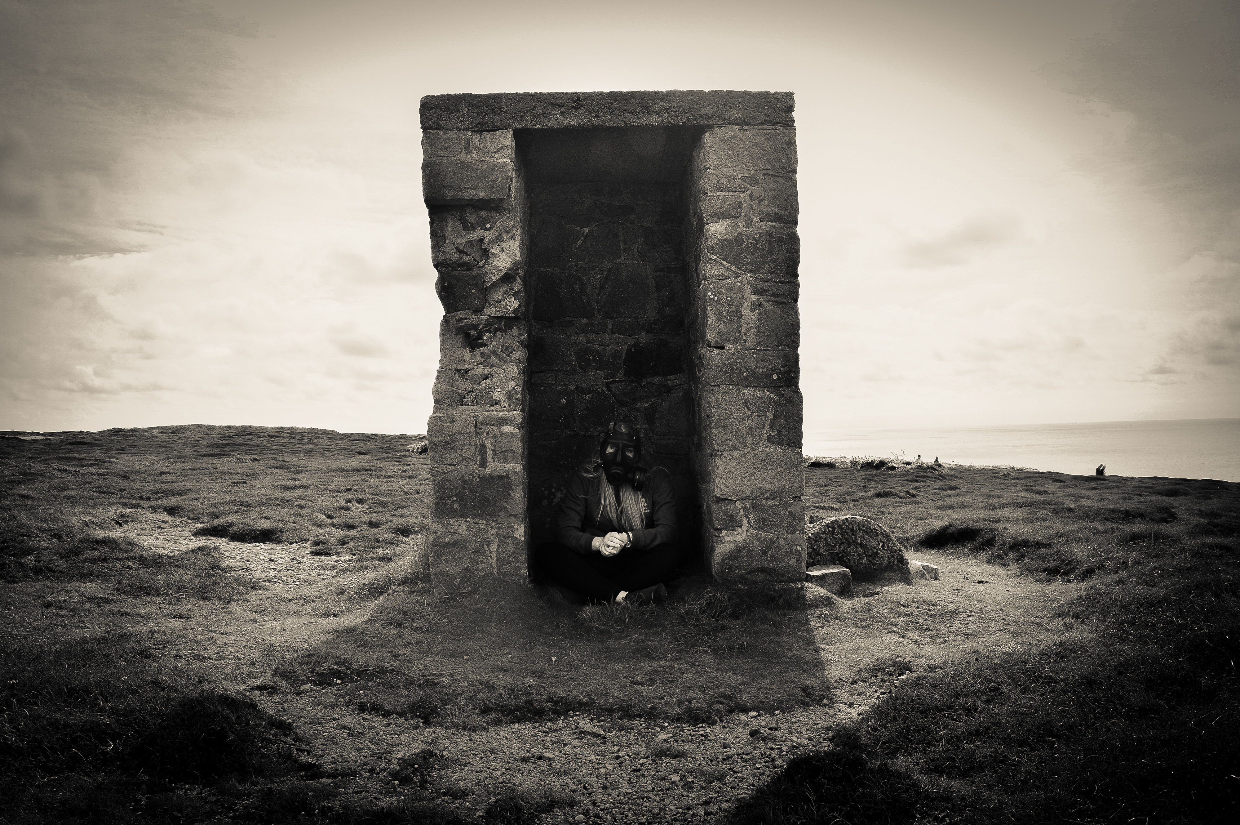
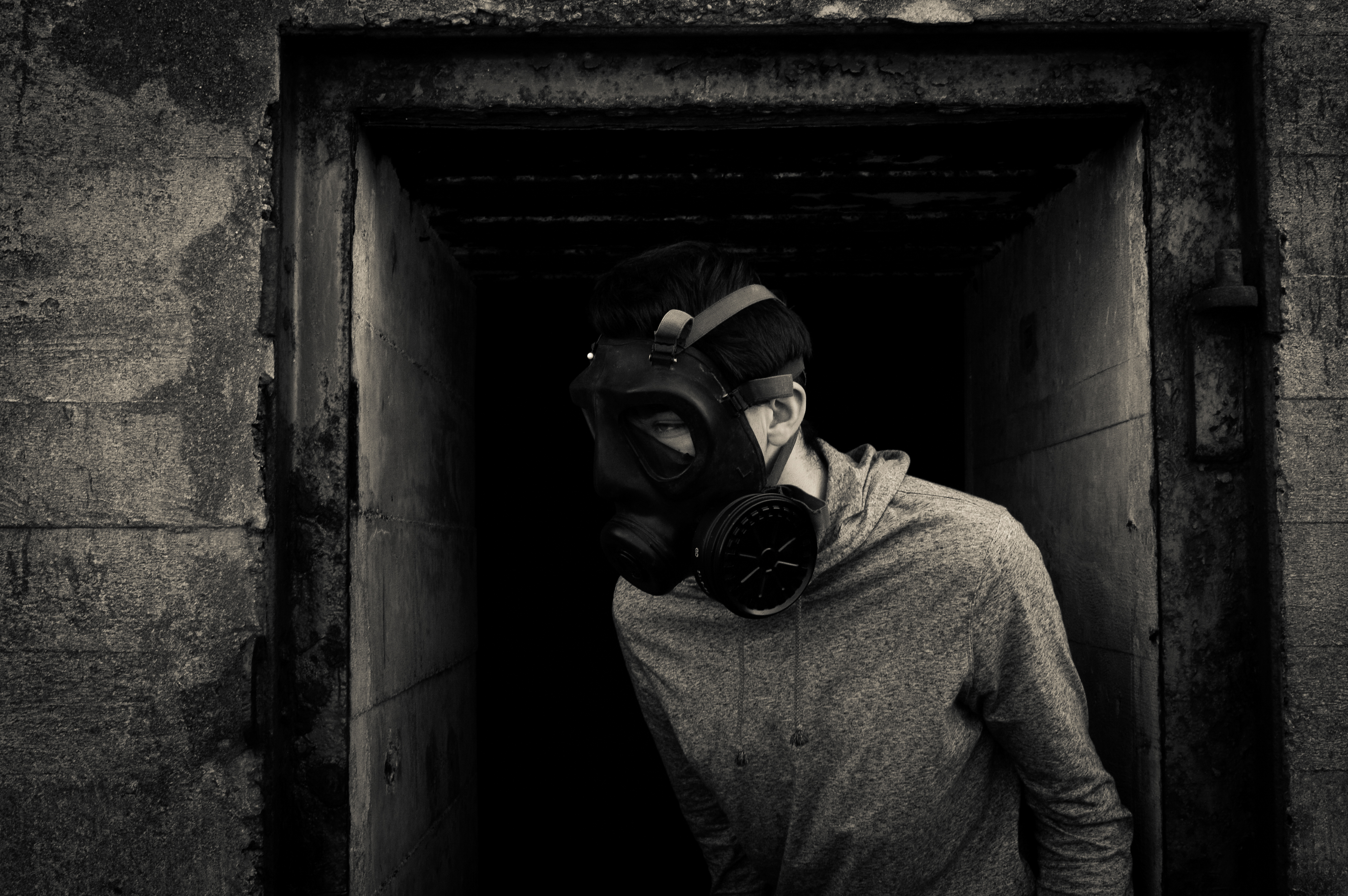
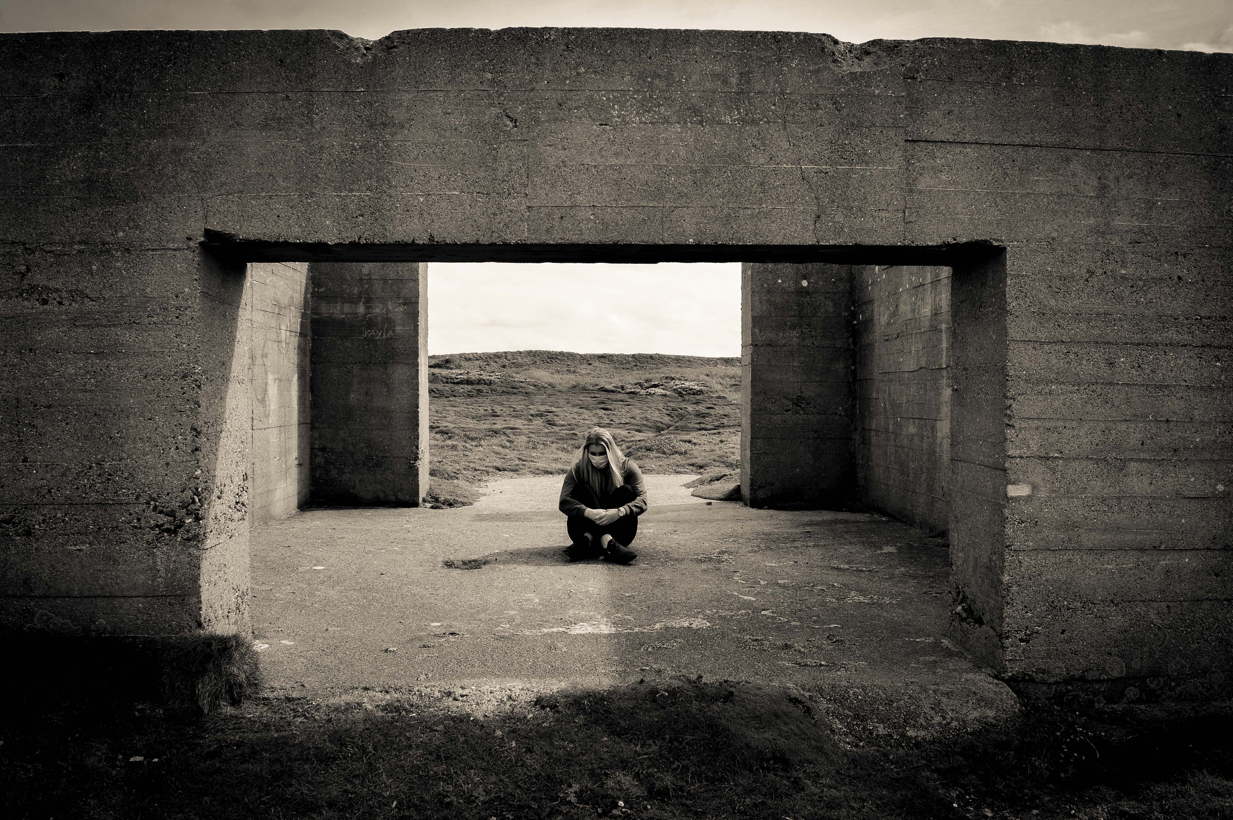
I have also researched the history of the gas mask and air pollution statistics and have added them to my book and onto my blog. My book and project is based on Symbolism, how the gas mask symbolizes war and how it will symbolize future fights and the invisible ones which we will fight such as Air pollution.

Link to my book: http://www.blurb.co.uk/b/7920634-our-future

Evaluation: final prints and presentation

I have now finished my photography exam and below will be the finished outcomes from the shoots that I have completed, using images based around the theme of environment. In evaluation I believe that the story being told by the images is an interesting concept that relates to everyone in the world today. The idea of the subject was to make the images seem mysterious which is a goal that I believe was achieved. To present the images I have used a display of black window mounts, using high quality photographic paper. This is a different way of presenting the images than I first imagined. The reason this happened was because the initial idea broke down after the second photographer needed in London, could not complete the shoots required to make a comparative book between Jersey Images and London.

However I believe the images were of a high quality once printed and I am happy with the presentation, including the window mounts that I completed.  I have decided to print 1 image from shoot one, and 2 images from shoots 2 and 3. Here are the images:

Shoot 1 image:

This image was printed on A3 photographic paper. In my opinion this image is of high quality and presents a mysterious but friendly concept. As you can see the image is surrounded by a black window mount.  This is my favorite image from the shoot (1). The reason I believe this is the strongest image is because the environmental portrait has a strong composition. The natural light causes a blurred reflection of the subject in the water which created the effect of him blending in with the reflections of the trees around him. In the photo the subject is taking an image of the environment around him because he believes it is a particularly sublime location to be in. In a way this image follows the idea of tableaux photography.

Shoot 2:

This is my favorite image from shoot 2. I think this because I like how the image is dead pan with the subject looking directly at the camera. Again the contrast of the flowers to the subjects suit and props makes the image stronger with the black and white filter. I have decided to place the subject further away from the camera to show the size of the field and how he is only a small part of the nature in this moment of time. The second reason I like this image is that the use of landscape shows the separation of the rule of three in a better way. The rule includes the ground, the tree line in the middle of the image and the sky. The subject’s head is just above the tree line which makes the frame more sublime.

This image above shows the window mount that shows both an image from shoot 2 and shoot 3, shoot 2 top and shoot 3 bottom. I have decided to do this to contrast the differences between the two shoots, and how they are similar but with a completely different location and environment. Also these two compositions are very strong images that work well together in the same window mount. Top image: After experimenting on images I have decided that the top image is a great composition as more of the landscape can be seen. I think this image is a strong environmental portrait because it is a close up of the subject which allows us as viewers of the image to again interpret the scale of the nature. Also the image has beautiful natural lighting which allows the contrast of the image and the exposure to work well together. I decided to place this image on the top because of these reasons, it also worked better on the presentation front. Bottom: I have included this image in the same presentation layout because it cross references to one of my artist references being ‘Katrin Koenning & Sarker Protick. The two artists use two images created by one another to present their work and compare the differences and similarities between their outcomes. After experimenting on the shoot I decided to take a closer image of the subject. Putting the subject in the middle of the path was set up in a particular way, as you can see the subject is standing in the only light part of the path. This ensures that he is not absorbed by the other areas of darkness, and he can stand out more. During the shoot I took one image from a further distance and followed up with the same image in a closer shot, this being the closer.

Shoot 3:

In my opinion this was not the best outcome after the print was created. The image is too dark and shows the subject to be slightly lost in the composition. However this is another one of the better images produced in the exam project so I have decided to continue mounting the image for the examiner to look at in person rather than just digital form.

With more time I would like to of completed a artist reference around photographer Alec Soth, who was also a factor I used towards creating my project.


Finals

I have chosen 11 finals to print out as well as my book. I have chosen these because i think they represent my project well and represent my skills as a photographer as well. The first set of finals are my experimentation finals which i created on photoshop using a combination of my studio portraits and photos which i got from google of pollution particles to merge them together. I have chosen 5 of the merges to be my finals as they are a strong point in my project as they show a hidden part of pollution which we cannot see, they show a sinister hidden danger which we do not think about every time we step outside. Overall my images have turned out really well and are very dramatic but they could of been improved by finding better quality images from google as it may make the images pixelated when printed which is something that i hate but it could add something different to my project which i have mentioned before of humanities blurred vision about pollution. Each image has a different meaning and each image of particles is a symbol of something different.

This image was taken in the studio with my model facing slightly to the right as before this i was using a  flash setup. The spotlight was angled so that it only lit her shoulders and her head. I asked my model to turn to the right and partially look at her shadow to represent her acknowledging that she needs to change. Before this image was merged with the particles, it was edited in lightroom with the same filter which i have used for all my photos. Next was merging the image of the particles, i did this by flipped the image horizontally and zooming into to make it like the large particle is looming behind my model and she does not know it. This image of particles symbolizes the looming danger which is in the air which no one notices because it is apparently small but under a microscope they seem very large.

The original photo of my model was taken in the studio using a flash setup in which a flash was facing a white background and another flash was to the right of the model, This created a bright background which lit up the features of my models hair and face. The image of particles which i used on this photo made it a vintage tone but the particles weren’t as visible if it was put into more black and white colour.

This image is very strong mostly because of her eyes as she is showing lots of emotion which is why this image stands out in my book. I put it as a double spread because i think it is worth that and because this image is in landscape. This image has more of a vintage colour than the rest but it i had changed it to the standard black and white filter, the particles would not be as visible.

This image looks like it is being projected with particles but it is actually merged. This image worked really well as a double page spread in my book. However, i slightly wish that the image was not so dark because it does not match the brightness of the other images.

This image is the best because it shows how invisible pollution particles are everywhere. How scary it is that it attaches to our mouth and faces. I like also how the particles are much brighter than the rest of the images which makes everything stand out but the sharpness of the image behind has stayed.

Environment – Evaluation

To conclude my project, I will discuss how well I believe I have fulfilled exam criteria, as well as realising my initial intentions for the project.

Initially, in regards to my exam brief I believe that I sufficiently addressed the task at hand to a respectable standard and to one that I am proud of. Environment is of course a broad topic, but I feel I had narrowed down my thoughts well enough to pinpoint an idea small enough that it became personal to me.

I feel like my photography has vastly improved in comparison to my previous works throughout the course. Not only in technical qualities but also through the art of story telling, being more conceptual and as well conveying more of a message through my imagery in such a way that I haven’t quite been able to in previous projects.

In addition, the initial ideas I set out to explore within my project, I feel I successfully explored in sufficient depth. My intentions were to explore significant aspects within my own personal life, which in turn almost create my environment. Through exploring this theme of environment I have realised that the friends within my life predominantly make up my environment, as no matter where I am, being with them creates and becomes my ideal setting.

The images I have taken and presented show the relationship I share with these individuals in such a way that is almost poetic. They are of course not saying anything verbally, or even specifically acting in an irrational or noticeable way. Yet through their comfort and equally their shyness or awkwardness, a sense of relationship is shown that is almost hard to describe through words. I think the images speak for themselves.

In terms of my artist references and inspirations, my final body of work was heavily influenced by this. All artists that I chose to explore, featured a strong sense of environment within their work, as they all explored their own personal ones. Which is of course what I went on to do myself, fitting into my exam theme. Overall, studying these artists led me to take my exam title ‘environment’ and make it personal.

The styles of each artists has in some way become incorporated within the photographs I have taken. Examples are shown below, where I have attempted to create my own response to certain photographs by each artist, containing similar composition and aesthetic, in my own style.

Ben Gore 

Related image

Jacob Sobol 

Image result for Jacob sobol sabine

Theo Gosselin

My work is summarised and presented most confidently through my final images, where I display a portrait of each character I photographed alongside an image that is juxtaposed. This in many ways creates a more personal image, as firstly the use of a portrait implies a sense of relationship as only a certain type of person would be allowed to photograph a subject so closely or intimately. As well the inclusion of a juxtaposed image suggests understanding of the subject.

An example of one of my final images, mounted and presented as an A3 photograph, is featured above. Firstly, I chose to print my final images as A3, as I was combining two images into one and felt that they needed to be on a large scale in order to fully see the image and my intentions for combining two. Secondly, my choice of a white window mount was to allow for the high contrast within my images to really stand out and become a focal point, I felt that black almost drained my images of this quality.

In terms of the compositions of my final outcomes,  each was created with the same intension, which was to present a portrait with a juxtaposing image that would suggested something about the character.

This would then help to add meaning to the photograph. The concept was ultimately to to present a personal relationship between myself and the subject, which was achieved in the way I photographed these characters so intimately. Symbolising friendship and closeness.

Final print presentation:

All of the images that I have decided to print will be printed on high quality photographic paper and presented using a black window mount technique.

Below are the images that I decided to print, as you can see I did not print every final outcome as time it limited, although with more time I would of liked to do so.

A4:

A3:

A4:

A3:

A4:

A3:

Tableaux photography

I decided to look back on tableaux photography because I believe that the final images from my project use some of the ideas used in tableaux photography, it is also one of my personal inspirations towards photography and why I created the project in the first place.

Tableaux photography is a style of photography where people are staged in a constructed environment and a pictorial narrative is conveyed often through a single image.

Tableaux comes from the french word ‘tableaux vivant’ which directly translated in English means ‘living picture’. Tableaux Vivant was very popular within the Victorian era, the term describes staged groups of artists models often using dramatic costumes, carefully posed, motionless without speaking and theatrically lit, recreating paintings on stage’. In modern day photography we have interpreted tableaux photography as a style of photography where people are staged in a constructed environment, it is when you respond to a painting in the past and turn it into a photograph of your own. Therefore, as  this is how it is interpreted I will be making my own set up images based on a famous painting. Below is an example of Tableaux photography, as you can see, the top image is the image of The raft of Medusa, a very famous image. Tableaux photography has commonly been seen based around this image, also seen in the modern interpretation of the image. The modern image could also be allegorical since it does not convey the same literal meaning, however it has no meaning apart from being a funny but well crafted image.

screen-shot-2016-11-07-at-17-00-05

screen-shot-2016-11-07-at-17-01-06

Allegorical:


Allegorical is when an image has a less literal meaning than what is conveyed as it is only a fantasy of what real life is actually like. The word Allegory has the definition of  ‘a story, poem, or picture that can be interpreted to reveal a hidden meaning, typically a moral or political one.’ An example would be Allegory of Music by Filippino Lippi (between 1475 and 1500). As seen below.

screen-shot-2016-11-07-at-17-04-47

Romanticism:

I have decided to focus on romanticism as one of the isms based around my images from all of the shoots.

Romanticism was a movement in the arts and literature which originated in the late 18th century, emphasizing inspiration, subjectivity, and the primacy of the individual. In most areas romanticism was at its peak in the approximate period from 1800 to 1850. Romanticism can be seen as a rejection of the precepts of order, calm, harmony, balance, idealization, and rationality that typified Classicism in general and late 18th-century Neoclassicism in particular. Among the characteristic attitudes of Romanticism were the following: a deepened appreciation of the beauties of nature; a general exaltation of emotion over reason and of the senses over intellect; a turning in upon the self and a heightened examination of human personality and its moods and mental potentialities

In modern day it is seen that a romanticist image is a beautiful image, however in the 1800s it was seen as a painting with a strong meaning. An example of romanticism back in this age was the painting ‘The raft of the Medusa’. The Raft of the Medusa, oil on canvas by Théodore Géricault, c. 1819; in the Louvre, Paris. 491 × 716 cm.

This painting was created in France by the chief early Romantic painters Baron Antoine Gros, who painted dramatic tableau’s of contemporary incidents of the Napoleonic Wars, and Théodore Géricault, whose depictions of individual heroism and suffering in The Raft of the Medusa and in his portraits of the insane truly inaugurated the movement around 1820. As a whole romanticism was seen as a vast movement that included many mediums to present. This was just one of the most famous paintings created during the movement.


Final Results: Photo-book – Front Cover

Now that my photo books is completed and arranged with text and images, I next need to decide what the front cover will be. After doing this I will be ready to print out my book and present my finished project along with my evaluation. Although I have the option of choosing a fabric cover I think that, for my project, an image wrap will be much better. To do this for my Blurb published book I will simply have it printed straight onto the hard cover, giving my book a professional look. As the front cover gives the viewer an initial impression of the book before even opening it, I am wanting to show something eye-catching and in keeping of my environmental theme. This image will represent my project and set the tone for the rest of the book….

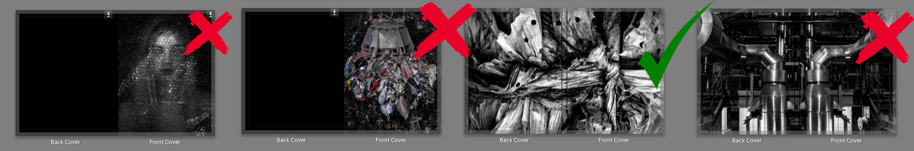
After experimenting with the four front cover examples above I have decided that the textured abstract image of agricultural plastic will be best for representing my book. This is because of its intense beauty as well as it very dark and worrying subject matter. To make  this double page spread work perfectly I have rotated it 180 degrees so that the cross over of plastic is featured on the front page rather than the back.  The reason I think this image is so much better than my other choices presented above is because it is not a straight forward symbolic message and its abstract style will hopefully intrigue my potential viewers.

Gambling theme inspiration: props and attire

The inspiration for the use of my props including cards, blue brothers hat, blacked out glasses, bow tie, tuxedo and casino chips, all came from watching a movie before the start of my project. The movie James Bond – Casino Royale, is of course a successful spy movie based around a single character, however I was more captivated by the stereotypes of what is worn in a casino. During the spy  film, a casino scene becomes the main climax of the movie. The casino scene is what inspired me more than anything else, to create something using this idea of stereotypical gamblers. The props I have used all relate to this scene in the movie, with a few extra additions. The images again are taken in standard colour but edited into  black and white  because it follows the idea that the stereotype  attire for a casino is a black and white outfit, especially for those who are high rollers.


Shoot 3 finals:

My third shoot is based on the same thing as the second shoot, however it will be shot in a different location. The third shoot will take place in St Brelade’s in the woodland area on the left side of the bay. I have decided to take images in this location to create more variety of images for my London connection photographer, this way it is easier to respond to the images that I have taken. The inspiration for the use of my props including cards, blue brothers hat, blacked out glasses, bow tie, tuxedo and casino chips, all came from watching a movie before the start of my project. The movie James Bond – Casino Royale, is of course a successful spy movie based around a single character, however I was more captivated by the stereotypes of what is worn in a casino. During the spy  film, a casino scene becomes the main climax of the movie. The casino scene is what inspired me more than anything else, to create something using this idea of stereotypical gamblers. The props I have used all relate to this scene in the movie, with a few extra additions.

Editing this image I decided that the full composition needed a lower exposure to light to ensure that the subject can be easily seen in the background of the image, I have also used a low exposure to allow the trees and the ground to stand out through the light circles that hit the ground. From the shoot the light is totally natural, the image was taken on an overcast day. When the weather is overcast in my opinion it gives the best light since it will not over rule the rest of the details in the image.

This image used the same composition as the previous image however after experimenting on the shoot I decided to take a closer image of the subject. Nothing has changed otherwise in this particular frame. Putting the subject in the middle of the path was set up in a particular way, as you can see the subject is standing in the only light part of the path. This ensures that he is not absorbed by the other areas of darkness, and he can stand out more. During the shoot I took one image from a further distance and followed up with the same image in a closer shot. 

Walking back through the woodland area to leave, I got lucky with an image of the subject casually walking away from the camera. The shot gives a sense of motion since the subject is clearly walking. Also this image combines nature with natural behavior. giving extra meaning to the shoot. The sky is not visible in this composition again so the frame is completely filled with the surrounding nature.

Other finals: 

This is one of my favorite images from shoot 3. This is because the composition was made using a wide angle lens which allows me to show a more vast area of the woodland. The subject is standing on the edge of an inbuilt bunker from the world war which has been left to grow into the environment. Having the bunker in this image creates the sense of how man has built into the environment and just left the creation as a stain in the natural woodland.