Category Archives: Research

Filters

Author:
Category:

Power of the Sea

Power of the Sea


The sea is an incredibly powerful force. It is often taken for granted that we can co-exist safely with it but this is far from the case. I have already looked at the mysteries and mythology that people think of when it comes to the sea but now I am going to look at the true destructive power of the sea. The sea is one of the most powerful forces on earth, it takes life like it is nothing. Countless lives have been lost to the sea over the years, even with masses of technological advancements in recent years we still cannot protect ourselves from its awesome power sometimes. Although dated one of the best example of this is the Titanic, supposed to be unsinkable the massive loss of life from the tragedy proved that the sea is and always will be king.

Final Farewell

This painting was created after the sinking to commemorate the loss of life. Titled “Final Farewell” is gives a very melancholy notion of the ship sailing off into the sunset, towards better things that would not come, and that in the end the Titanic’s journey would end with 1,503 people perishing on its maiden voyage.  There are not any artistic, photographic works based on the Titanic due to the final resting place of the ship being 3.8km under the water but there are plenty of paintings. Many do not focus on the sea but instead the humanity and the loss of life, as well a fear. Fear is something that I could definitely tap into with my project being based around water.

Another element that ties in with this fear is the sense of randomness of the sea. On the land things can generally be anticipated much better, roads do not usually just breakdown, buildings will not suddenly collapse and for the most part even some of the worst weather can be hidden and protected from. most of the deaths due to bad weather on land are based around water too, floods and tsunamis caused by natural disasters kill more than the rest of the natural disaster itself usually. On the open water this does not apply, the randomness of waves and the sea conditions makes it an incredibly difficult thing to predict. The image above shows some of this, although over dramaticized the different direction of the waves really lend to the notion of randomness and chaos that is going on. The splashes of white from the cresting waves contrasting with the deep, dark water of the troughs makes the painting a very interesting one to look at. This kind of thing can also be captured in photography, a much smaller example of this can be seen in my work from my first shoot.

Today we have the advantage of satellite mapping and forecasts to inform us of the dangers of the sea and what there is lying ahead of us but this is not always enough and cannot always capture and be aware of everything. The photograph above is of a “rogue wave” that crashed over the MS Stolt Surf on  the 4th October 1977. Estimated to have reached a height of at least 22m before crashing over the ship and subsequently causing a mass of damage to the ship that left one of the sailors hospitalised. furniture, port holes, electric cables and lights were damaged with the boat beginning to flood. The ship’s engines were at risk from being broken, but thankfully they managed to keep them running, if not then they would have ended up lateral to the waves and if this had happened then the ship could have easily been split in two and it is unlikely that the crew would have survived. These rogue waves were originally considered mythical n nature but recently have managed to be properly studied, this had confirmed that they do exist, occurring in open water, usually at very substantial depths there is no way to predict when these waves will occur because we have no other knowledge about them. Often linked to disappearances of many ships with unknown reasons for disappearance they are terrifying, for many reasons but mainly for the reason that they are truly random.

Even on land people cannot always be safe from the awesome power of the sea Tsunamis are a real danger to many people who live in these disaster prone areas. One of the countries that is often hit by Tsunamis is Japan, in 2011 the country was it by a Tsunami that caused massive destruction to the county’s coastline. Destroying homes, causing the leak of radioactive material from a nuclear power reactor and killing almost 20,000 people this disaster made headlines around the world for a long time. Again being incredibly difficult to predict there was little warning and because of the devastation caused people did not know how to react. The photographer Paolo Pellegrin was one of the first on site to record the devastation and destruction.

His photographs are a very real look at what happened to the country in the wake of this disaster. His shots are all composed the same way, using a wide angle panoramic style the images show an incredible amount of detail due to a very high contrast. This incredibly high contrast further emphasises the destruction of the area by giving the viewer lots of information to take in, this causes them to look for longer and notice even more details. The apocalyptic levels of destruction being caused by a simple wave is immense, the sea is not something to become complacent of. It has the ability to create the kind of destruction that is seen in these photos, at random and without warning. One of the most powerful elements of these images for me is the boats being beached so far inland, these are boats weighing hundreds of tonnes and they have been ripped from moorings and anchors designed to hold them against everything that nature can throw at them and they have simply been plucked with the ease of plucking a hair and dragged inland by the storm surge. Pellegrin’s images lend themselves to this idea of randomness that the water produces, items are strewn everywhere with no order or care. And yet these people called this place their home, it was their environment and now it is a completely different environment that people can no longer live in.

 

Artists referance-Francesca Woodman

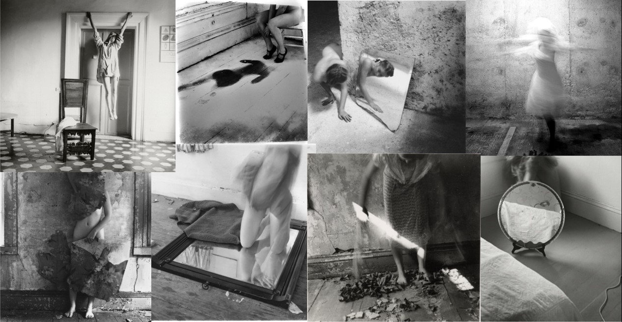
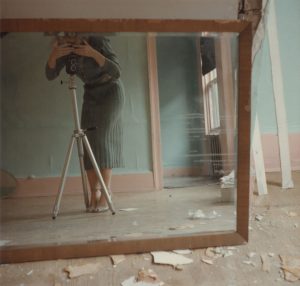
Francesca Woodman was an American photographer who created black and white images often using herself or other young, female models as the subjects.  During her life time her art was not well-known and it was only after her death (she committed suicide at 22) that her work received attention.  She is considered to be a progressive feminine voice in photography and her work explores themes of isolation and self-displacement. Woodman explained to her parents (who were also artists) that she used herself as a model as a matter of “convenience” because she was always available and knew exactly the effect she wanted to produce with an image. The main subject of her work was broadly an exploration of her own body in relation to space.  Her photographs test the boundaries of the body but she rarely revealed her whole body with her face often blurred or masked and parts of her body are hidden behind elements of the environment. This creates an interesting relationship between observation, self-display and mystery. Some critics have interpreted this as an attempt to resist the male gaze with the tendency to camouflage herself. In some images Woodman also most becomes one with her surroundings by blending into the wallpaper or floor so that it becomes difficult to distinguish between the two. By fragmenting her body in this way, hiding behind furniture or using reflective surfaces such as mirrors to conceal herself she dissects the human figure and emphasises isolated body parts. This creates the idea that she is simultaneously there whilst also absent and relates to the idea of disappearance.

Woodman often used long exposure techniques to capture movement within her images and create surrealist compositions . The concealed figures have a mysterious, ghost-like quality . There are also no modern buildings in her work which the critic Elizabeth Gumport describes in this article as crumbling ruins “whose disintegrating forms evoke the wrecks admired by the eighteenth- and nineteenth-century Gothic revivalists often cited as [some of Woodman’s] major influences”. Woodman often photographed herself nude or wearing old-fashioned clothes  such as white petticoats and is typically sited in empty dilapidated rooms containing old furniture. Her photographs look as though they belong in a much earlier time with her choice of costume meaning it is impossible to date the images and the use of old buildings and absence of modern objects create a Gothic appearance.  Woodman was apparently an avid reader of Victorian Gothic fiction such as novels by the Brontes which could be said to be reflected in her work with the idea of spectral female figures, confined to attics. The soft focus and black and white nature of her images is also similar to the style of earlier generations of photography which further emphasises the timelessness of her work. The soft greys that shade her images add to the mysterious tone and show her eye for light, shadow and form.

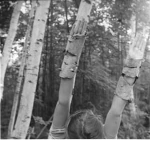
Critics have disagreed about the meaning and purpose of her art with some comparing her to surrealist photographers (with her use of Surrealist motifs such as mirrors, gloves, birds, and bowls) and others hail her as a feminist hero.  Her images are also very personal, lending them an autobiographical quality and therefore interpretation of her work is often based on psychoanalysis in light of her suicide. However her images are also often subtly amusing and contain playful visual jokes such as the example below with her arms covered in bark and mimicking the form of the trees. Family and friends have argued that while many think her work was about death and disappearance, Woodman’s light-heated sense of humour and energy is also apparent in her work. They say that  “Her life wasn’t a series of miseries” and she was fun to be with.

I have researched the work of  Francesca Woodman because her art has inspired many contemporary photographers within the area of performance and self-portraiture. In my own work I am also going to be considering the relationship between myself and different environments and I am going to experiment with a surrealist approach, using long-shutter speeds. I am also intrigued by Woodman’s use of props such as mirrors and this is something I am going to use, potentially within the context of old buildings.

Idris Khan and Stephanie Jung – Photoshop Experimentation

Idris Khan is a London-based artist that was born in the UK in 1978. After completing his Master’s Degree at the Royal College of Art in London in 2004, he has received international recognition for his minimal, yet emotionally powerful photographs, videos and sculptures. His work has been featured in many exhibitions at international venues including the ‘Museum of Contemporary Canadian Art’ , Canada; the ‘Hayward Gallery’, London;and ‘Espace Culturel Louis Vuitton’, Paris. As well as this his work is in the permanent collections of many institutions worldwide such as ‘The Saatchi Collection’ in London and the ‘San Francisco Museum of Modern Art’.

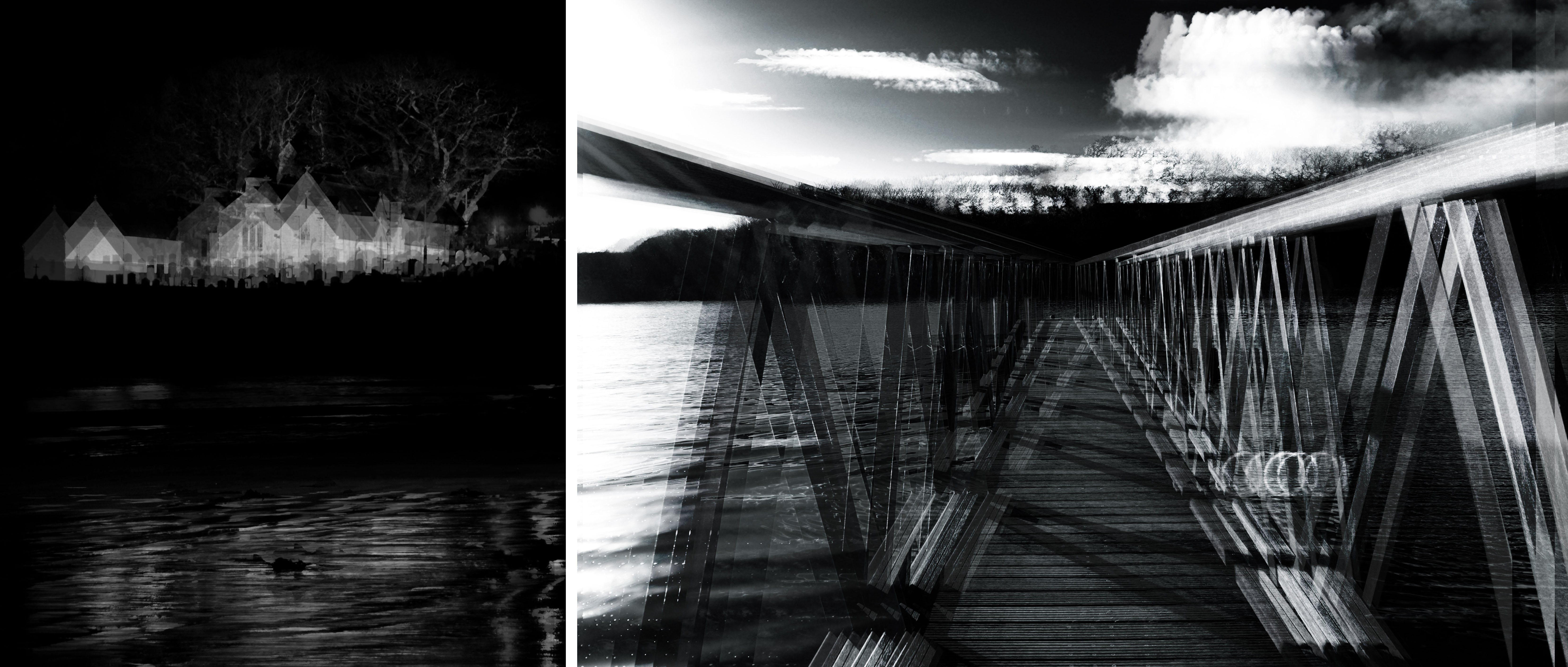
Whilst Khan practices more as an artist than a photographer, he often employs the tools of photo-mechanical reproduction to create his work. In particular we have been asked to explore some of the digitally remastered and powerful photographs he has created, such as the ones presented below. To create these intense abstract pieces he builds up layers of his images digitally, allowing him to meticulously control minute variances in contrast, brightness and opacity. The outcomes of this technique is often a large-scale print with a surface that has a remarkable optical intensity. Below are a few of my favourites from his work on this subject. I chose these portrait photographs over some of his more busy landscape pieces because I love how he has transformed subject matters that are so plain into beautiful and emotive images.


Stephanie Jung is a freelance photographer based in Berlin, Germany. Her interest in this field began at a young age as her father was a very passionate hobby photographer. During her studies in Visual Communications she discovered her passion for experimental photography, finding inspiration in a photographer she met and worked closely with named Sabine Wenzel. Since graduating in 2010 she has been focussing on fine art and portrait photography, travelling to big cities to capture perfectly the vibrant and hectic scene. This fascination with urban life stems back to her small town upbringing, her work shows the beauty in both the calm and busy moments of everyday life in populated areas.

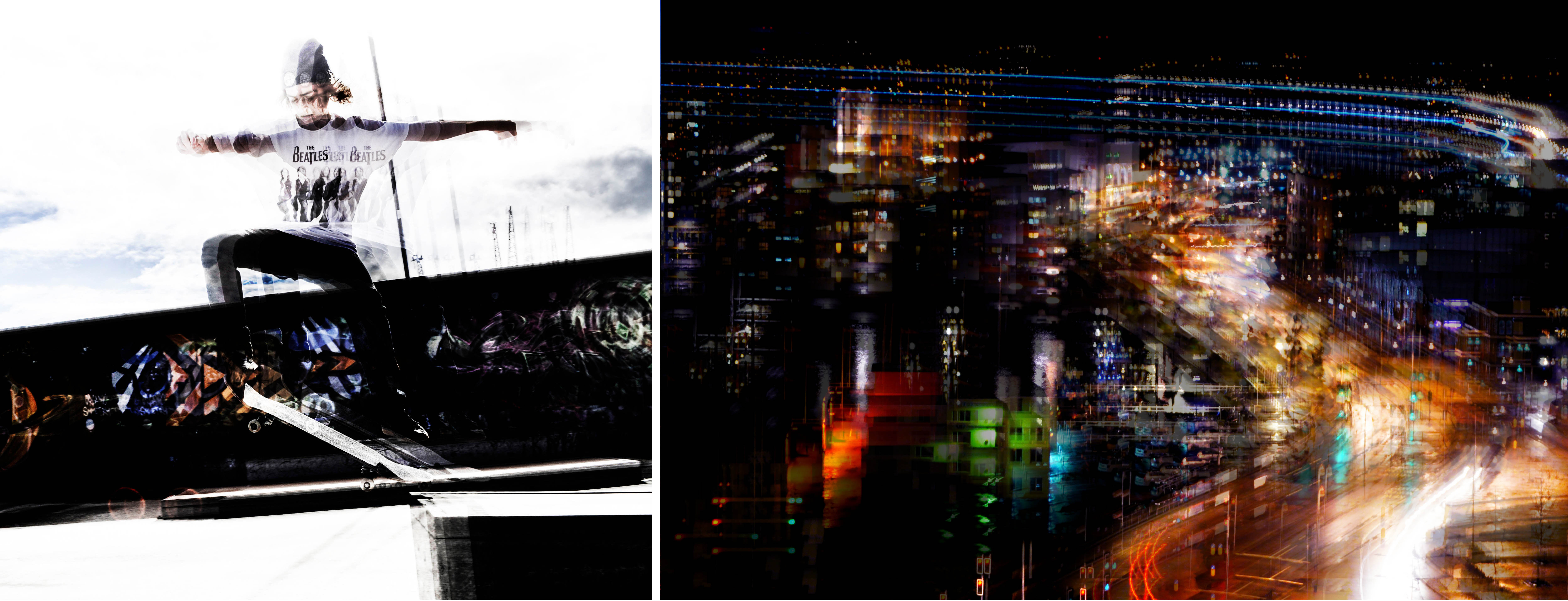
However,  Jung’s work is not just about city life, it’s about time and transitioning, about capturing special moments and getting lost in time. Like Khan’s work above her pieces are very technical and emotive scenes that have been transformed and edited into beautiful works of art during their post production. In an interview about her work Jung quotes  that the “layering is something which became important and almost self-evident to me, as it represents best what I want to show with my work”. Below are some of my favourite examples of her bright and intricate work that truly capture the busyness of the city life. I chose these photographs as examples as I feel they show a good variety of scenes, colours, and emotive qualities. 


To help us experiment with new techniques and make our individual projects more diverse we were asked to do our own quick responses to this style of fine art photography. Our objectives are to show that we can copy, adjust, blur, and blend layers using Adobe Photoshop;  creating a set of images inspired by the artists I have researched briefly above. My results of this ‘in class experiment’ shows newly created versions of a few of my AS final pieces that I thought would work well transformed using this technique. The first two images on the top row are inspired by Stephanie Jung and show movement and time through an everyday town landscape and an environmental portrait. The bottom two resemble the abstract work of Idris Khan depicting a sense of fragmentation and dark contrasted tones…

Documentary: Conservation Photography – Research

Before continuing with my documentary approach to this project, I first wanted to find out more about the applications of this type of photography. ‘Conservation photography’ is defined as the use of the photographic process, within the parameters of photojournalism, to advocate for conservation outcomes. By combining nature photography with a proactive, issue-oriented, approach to documentary photography it can be used for protecting nature and improving the natural environment. Conservation Photography furthers environmental conservation, wildlife conservation, habitat conservation or cultural conservation by expanding public awareness of issues and stimulating positive action.

Throughout its history photography has developed as a powerful medium to empower conservation. Although it was not as widely acknowledged, photography has served this role since the 1860’s. For example, the powerful images of Carleton Watkins were successfully used to stimulate the establishment of Yosemite National Park in 1864. Since then renewed emphasis on photography for conservation arose at the beginning of the 21st century. This was primarily in response to the human-caused environmental crisis, recognising that the global pattern of abolished ecosystems was not sustainable. The modern field of conservation photography was formalised in October 2005 with the founding of the International League of Conservation Photographers by photographer Cristina Mittermeier. Many people agree, conservation photography falls into two broad categories, both of which are equally as valuable:

  1. The snapshot: a quickly framed image of a naturally occurring scene, taken by chance with not too much time or effort. Images will not contain any manipulation or staging and are strongly connected to documentary photography and photojournalism.
  2. The carefully crafted image: a series of skillfully crafted, high-quality images that tell the story in a more powerful way. Images will most likely be at least a little bit staged, as dramatic framing can often increase the photograph’s power and meaning.

Throughout my project, I hope to demonstrate both of these categories of conservation photography and use my images to spread awareness. Below are some stunning images depicting many different types of provocative conservation photography….

Artist Reference – Andrew Mcconnell:

Irish photographer, Andrew McConnell, started his amazing career in 2003 when he decided to concentrate on documentary work, driven by a desire to tell the stories of people and places that remain under-reported in the international media. Among numerous honours, McConnell has won two 1st place prizes at the World Press Photo Awards, 4 National Press Photographers Association awards. His work is widely recognised and has been featured in many publications such as ‘National Geographic‘ and ‘The New York Times‘.

I have chosen to explore him as an artist reference for looking and conservation photography, mainly because of his amazing project, entitled ‘Rubbish Dump 2.0’. Although this project explores many humanitarian issues it also says a lot about modern society and our ever-growing impact on the environment. In this series, Mcconnell uses the second category, mentioned above, to portray a dumping ground for computers and electronic waste from Europe and the US located in Ghana’s capital, Accra. Every month hundreds of tonnes of e-waste end up here as countries in the West attempt to unload their ever-increasing stockpiles of toxic junk. Of the 20 to 50 million tonnes of electronics discarded each year 70% will end up in poor nations, and in the EU alone 6.6 million tonnes of e-waste are unaccounted for every year. The disposal of electronic goods in the West is a costly affair and must be done in an environmentally responsible manner, however in places like Ghana there are no such regulations and as such toxic metals like lead, beryllium, cadmium and mercury are continuously being released causing untold damage to human health and the environment…

Environment – Travel Photography History

Travel Photography


I wanted to investigate Travel Photography in depth, researching its foundations and history. Doing this will provide me with an insight into the original purpose of the genre and the reason and artists behind its creation. Travel photography is a genre of photography that may involve the documentation of an area’s landscape, people, cultures, customs and history. The Photographic Society of America defines a travel photo as an image that expresses the feeling of a time and place, portrays a land, its people, or a culture in its natural state, and has no geographical limitations. As travel has become more accessible, the genre is opening up more to amateurs and professionals alike. As a result, this category of Photography is much more crowded in Modern art society. Nevertheless The appeal of photography was as obvious to travellers in the 19th century as it is today. Photography made its earliest steps as a medium when in 1839 Louis Jacques Daguerre introduced a photographic process called the Daguerrotype. The first owners photographed their local area within Paris like the Notre Dame Cathedral, the river Seine and le Pont Neuf. However using a Daguerrotupe was a complicated process that required a lot of equipments and chemicals such as amalgam or alloy, of mercury and silver. It would be very difficult to transport the camera and equipment around long distances and the travelling photographer had to carry with him a portable darkroom including enough chemical to have a mini laboratory. As a result, Travel Photography was very rare at the time. 

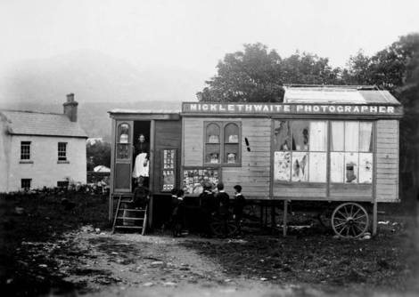
A portable darkroom in 19th century Ireland.

In 1851, Frederick Scott Archer invented the collodion process which became a standard photographic process until 1880. This new process reduced the exposure time to only 2 second , compared to the daguerrotype and colotype. However this did not help many travel photographers in their task as the equipment was still incredibly difficult to transport. In the 1850s the standard photographer outfit was the large sized camera, tripod, glass plates, plate holders, a tent like portable darkroom,chemicals, tanks, and water containers.Photographers carted their equipment around the world. In the mid 1800s, pictures taken for scientific purposes were of great interest to people in general and with the help of the collodion process reproduction of photographs became convenient. With the invention of the printing press, photography became commercialized as the demand due to tourism increased. However, this new era of photography was not accepted well by the purists who debated that commercialization had spoiled the craft. By the end of the 19th century tourists could take their own pictures. In 1888, George Eastman, the founder of Kodak invented a camera using a roll of film.he camera came loaded with a 100 exposure film and a memorandum book that had to be filled in to keep count of the photos. When the film was finished the camera was posted back to the factory. The camera was written with the films and loaded with a fresh film. In the first year Eastman sold 13000 cameras. Kodak had made photography accessible by millions of people across the world.  Photography had become a mass medium and tourists were traveling with small and easy to use camera.

Du Camp and Flaubert


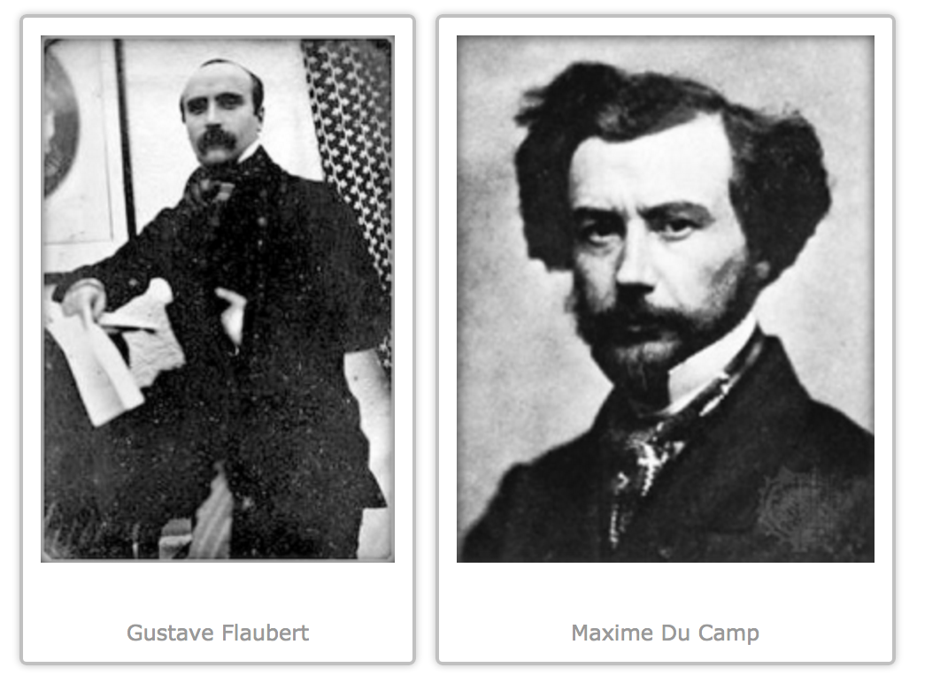
Flaubert in Egypt is a book composed of excerpts from the journals of two young Frenchmen, Gustave Flaubert and his rich Parisian friend Maxime Du Camp. Flaubert, in 1849, had dropped out of college and was at loose ends. Du Camp suggested that they go and photograph the monuments of the “Orient.” Flaubert jumped at the opportunity, and that autumn the two hopped aboard a ship bound for Alexandria, Egypt. Travel as we know it did not exist in the early 19th century. Only the very rich, mostly aristocrats, could afford the time or money for a visit round Europe. Most people had no idea of what the world looked like because, before photography, travel books featured only line drawings at best.Du Camp had studied photography, and for the trip took along his wooden Calotype camera, a tripod and jugs of chemicals. Invented by Henry Fox Talbot, Calotype photography was never very popular because Talbot strictly licensed his patented process. The fees he charged made it less attractive than the free public domain Daguerre process. But Du Camp smartly realized the advantage of the Calotype for travel. His camera was relatively small and easy to carry around. It used ordinary, readily available, high-quality writing paper as the media for its negatives. The writing paper itself could be partially sensitized in a hotel room or even a tent, and once dried, be conveniently stored and carried around until needed. The big drawback was that while the Daguerreotype is incredibly detailed, a Calotype print is much softer because the print is made from a paper negative. However, by shooting paper negatives, Du Camp could make any number of contact prints from them upon his return to Paris. By comparison, the Daguerreotype was a singular photograph from which no copies could be made. Du Camp was planning ahead to produce multiple copies of his travel albums.

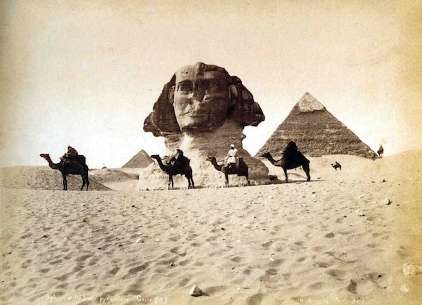
Du Camp and Flaubert traveled through North Africa, Egypt and the Middle East, taking photos and keeping detailed diaries. It was a landscape as dangerous and chaotic as it is today. They had to fight off bandits and the occasional anti-government rebels who fought from camelback. Naturally enough, their exploits also involved dangerous liaisons with native women, belly dancers and prostitutes, and the consumption of quantities of alcohol and exotic drugs. Despite these distractions, the men stayed focused on their mission, producing hundreds of photographs that captured, for the first time, some of the great manmade wonders of the ancient world such as the pyramids, the statues at Aswan, the Sphinx and more.

Arriving at a site, the work of making photographs would begin. Flaubert apparently would do his best to avoid actual work, letting the porters put up the darkroom tent, while Du Camp would scout out locations. After placing the camera on a wooden tripod, Du Camp would duck under a black drape so he could frame and focus his image on the groundglass.Then he would go into his mostly light-tight darkroom tent and brush the sensitized side of the writing paper with a solution of gallo nitrate of silver — a mixture of silver nitrate, acetic acid and gallic acid. This was an accelerator that increased the paper’s sensitivity to light. After blotting the paper dry and placing it in a light tight holder, he would go back and load it into his camera. Now came the trickiest part of 19th century photography. Exposure was learned strictly by trial and error. Once he found the right exposure time, Du Camp would remove the holder’s light slide and take the lens cap off. Using his pocket watch, he would time the exposure and then replace the cap. Exposure complete, he would return to the darkroom tent to develop the negative. This required brushing the paper with gallo nitrate again while gently warming it over a hot pot. This produced a visible silver image that was fixed with hypo, the same hyposulphite of soda modern film development uses. This dissolved the unexposed silver iodide, which was then washed away, leaving a pure silver image on the paper.

The prints were mounted on heavy paper, and then bound in albums that Du Camp sold in 1852 under the title “Egypte, Nubie, Palestine, Syrie.”This was arguably the world’s first travel photography book and the images amazed the public. It made Du Camp famous almost overnight. Hearing and researching this story has been really insightful and enlightening in my investigation on travel photography. It makes you realise how much photography has developed and how lucky we are today. Today’s snapshooters have no idea how hard it once was to photograph the world, something they can do now so easily with just the press of a button.


Documentary: Plastic Pollution – Planning

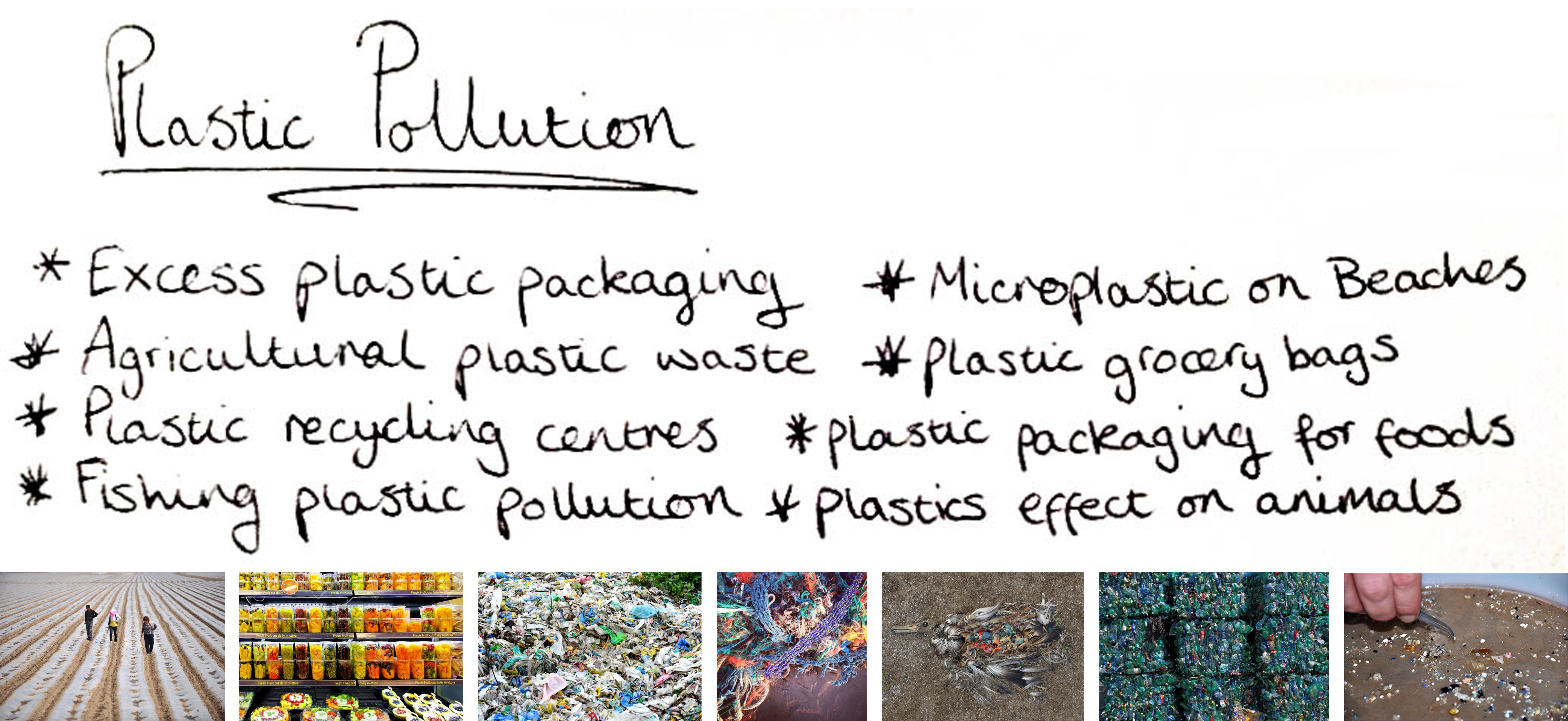
After fully exploring representing the problem of plastic pollution, using symbolic studio techniques, I next wanted to move on to showing this issue in a documentary style. As I mentioned in my plastic studio planning, I am aiming explore this topic from a photo-journalistic point of view, showing plastics effect on our island. Because plastic is used for near enough everything these days I have chosen to pin point my work to one specific plastic pollution type. Below I have made a list and contact sheet depicting a number of plastic pollution topics I could look into for my next shoot…When thinking about our island and the ways in which I could capture all of these subjects that I have listed above, one topic for me really stood out. Because I will be looking at a mixture of pollution materials when documenting things such as beaches and landfills later in my project. Subjects like plastic packaging, grocery bags, fishing plastic and micro-plastics are all things I can show together where they are found. So in conclusion I will be concentrating on agricultural plastic waste because it is so common to see on our islands as well as being a massive contributor to global plastic waste.
The reason ‘plasticulture’ is so prominent in Jersey is because of our famous Jersey Royal potatoes. Our export of this crop accounts for around 70% of agricultural turnover, 99% of which is shipped to the United Kingdom. The term plasticulture refers to the practice of using plastic materials in agricultural applications. Unfortunately this method is used for Jersey’s potatoes to produce earlier harvesting, improved quality and larger marketable yields. Polyethylene is the plastic film used by the majority of growers because of its affordability, flexibility and easy manufacturing. I think this topic is a fantastic example of plastic pollution on our island because of huge amount of this material spread over large areas (representing our problem with over using this material in every sense). Polyethylene is the most common plastic, we produce around 80 million tonnes per year, its primary use is in packaging (plastic bags, plastic films, containers including bottles, etc.). Agricultural films are one of the largest contributors to the billions of pounds of plastics that are discarded by farms across the globe each year.

To record this problem, using straight photography techniques, I will have to travel around the rural areas of Jersey looking for examples of ‘plasticulture’ and the waste it leaves behind. To do this I will begin by simply walking around the fields in St Martin and Gorey, as I have already spotted quite a few examples in my day-to-day travels. All I will need to complete this shoot is my camera and natural light from the sun, it will be interesting to see how much of this plastic waste I can find (supporting my point of this being a massive plastic pollution issue). My goal for this shoot is to dive into documentary photography and explore the truth about my chosen topic in-depth without manipulation. When researching this farming technique for images to inspire me, I was very surprised to find that there where hardly any examples of using plastic the way Jersey farmers do. The images below show narrow lines of plastic spread out across fields whereas, from what I have seen on the island so far, we truly cover our fields from top to bottom in this lightweight plastic film. 

Anna Di Prospero

// A N N A   D I   P R O S P E R O //

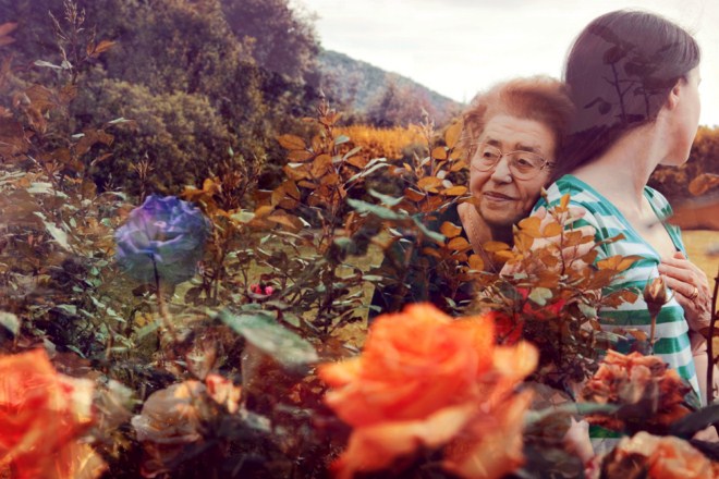
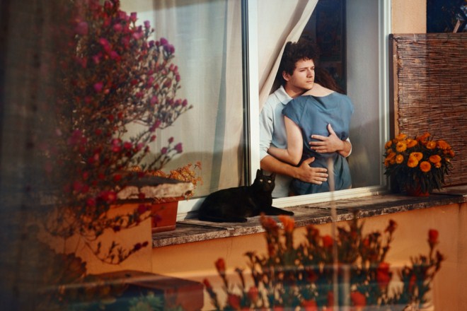
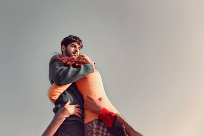
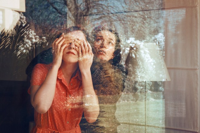
Anna di Prospero is an Italian photographer who has been working on a self-portrait series called With You, where she appears alongside family members and friends. i like that even though it’s a self-portrait series she isn’t necessarily the star of the images – but the focus if rather about her relationship with these important people in her life. however you may interpret it, the images themselves are absolutely beautiful – with an amazing rich colour palette that runs through the entire series.”

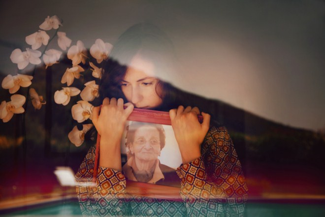
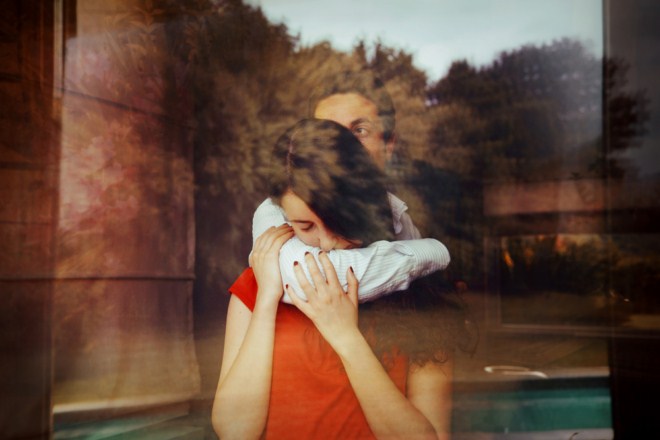
Anna’s images pair rich landscapes with intimate portraits in a bid to form both aesthetically pleasing and contextually thoughtful images. Many of her images make use of the double exposure technique which combines multiple layers of photos to create a final composition. Often this process makes use of landscapes and textures overlaid with forms and figures as seen below in Anna’s own work.

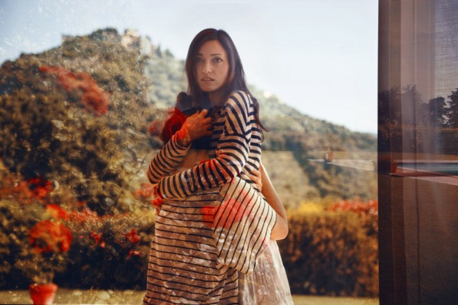
Much of her work is shot though a window such as the above creating a seemingly natural double exposure which makes use of reflections occurring within the image. This photographic technique and style creates a double image within a single frame where two photos can be seen together rather than separately. The landscape above shows an urban garden and swimming poor reflected onto herself and her family member. Perhaps by linking each part of her family to a particular area or setting an emotional link is created between person and place. 

Other examples of Anna’s work feature what could be seen as ordinary double exposure techniques such as digitally – or manually – layering two images over each other with a difference in opacity rather than relying on natural reflections and lighting. In the two photos above, flowers have been overlaid across the figures forming unusual compositions. The muted colour palette in Anna’s work helps to carry her aesthetic and supports her overall theme of identity and confusion within the midst of reality. Using her family as models within each of her tableau images, Anna finds herself in the people who mean the most to her.

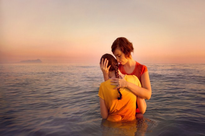
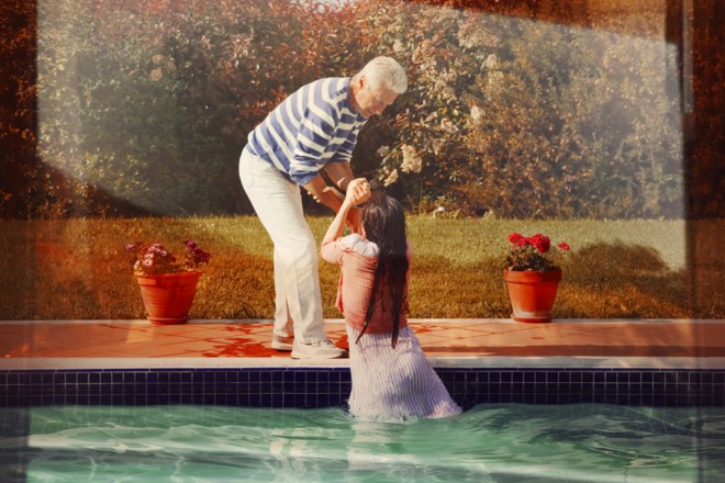
Water plays an important role in many of Anna’s images representing a different reality which she tends to be being pulled out of or falling into. The second image here has a strong symbolic reference of the help and support given to her by her family and friends who literally pull her out of the deep water she is trying to escape from.

Itamar Freed

// I T A M A R   F R E E D //

Born in 1987 in Manhattan, Itamar Freed studied at the Bezalel Academy of Arts and Design where he received his B.F.A in 2012. His work has since taken him to London where he is now studying at the Royal College of Arts on the photography program. Freed’s work conjoins reality with the artificial. Staged figures create unusual scenes often with an uncomfortable tension lying behind them. There are three main regions of his photographic work taking him from New York in America to London for his studies and the Israeli wilderness where his home studio lies. Freed’s photographic aesthetic takes much of its style from the techniques of historical painters which draws parallels from his photographs to traditional paintings within art history. His use of colour, natural light and composition blur borders between dreams and reality with open compositions. There is often more than one focus point within each image drawing the eye of the observer to  range of areas within the compositions.

“Freed’s photographic ambience exists as if in a threshold zone, beyond the bounds of specific time and place. Using the photography medium to preserve, to freeze, to grasp life and seize time.”

“My photographic work draws upon a return to the classic paintings of Art History. Through the use of color, natural illumination at its extremes, open composition and multiple vanishing points that simultaneously draw the observer’s eye to different focal points of various events, the borders between dream and wakening are blurred.”

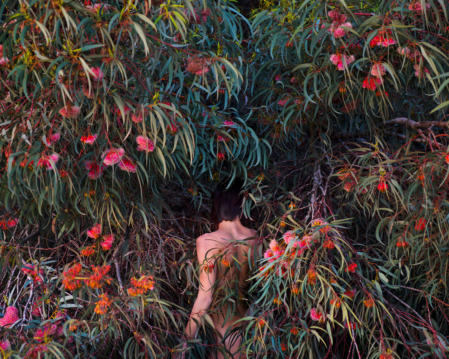
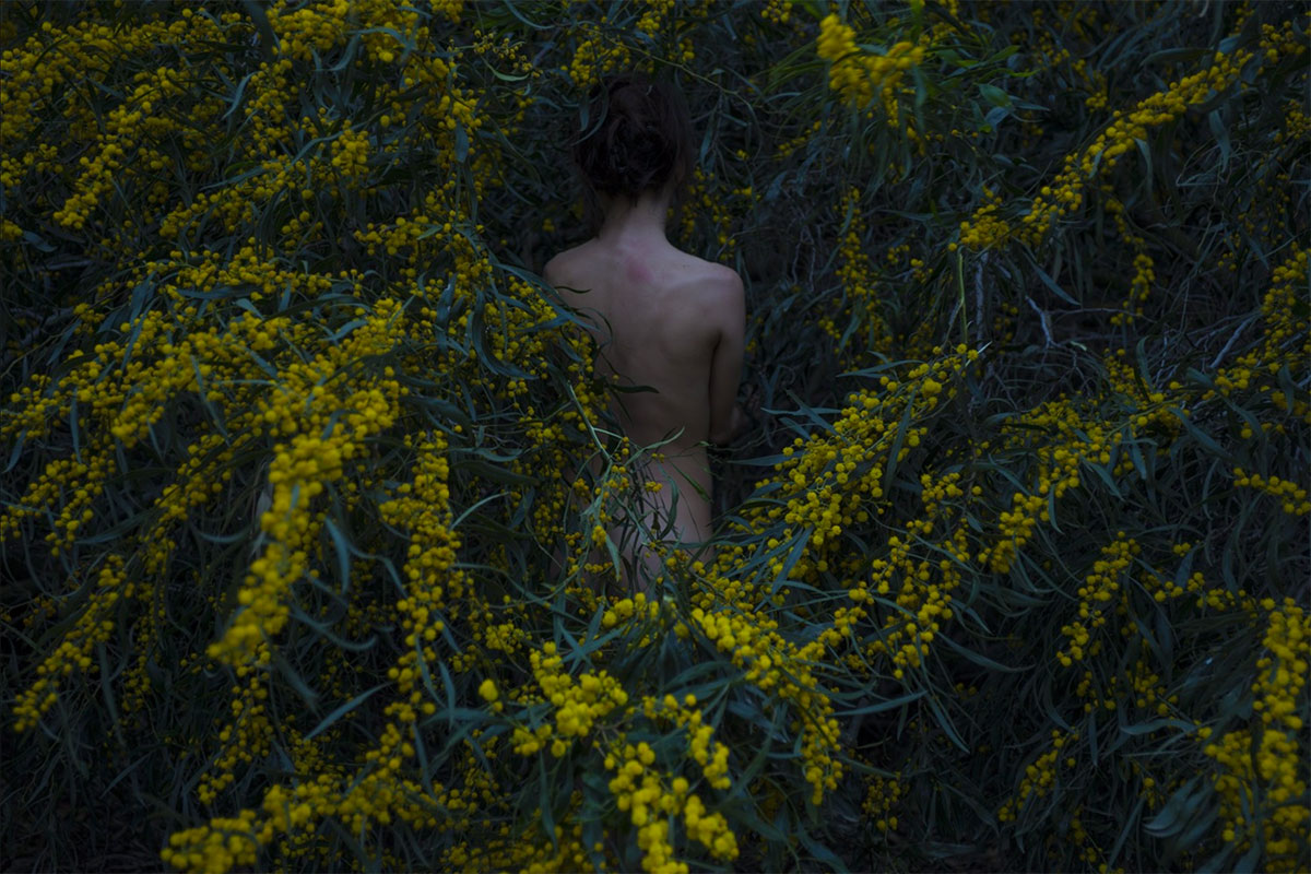
The image below has a number of focal points within its unusual composition. The woman marks a clear part of the photo and creates her own line of sight following the curvature of her body across each of her limbs. There is a sense of fragility about her with a strong sense of vulnerability at her exposed state. Her head starts in a mess of tangled grass and branches but following along her body you arrive at her feet which are immersed in red and orange flowers. There is something to be said about the inclusion of this section of colour, red itself has multiple symbolic readings from lust and passion to danger and poison.  The bird in the background also creates a focal point along with a series of questions. Why is it there? What point is the artist trying to make with its inclusion? The background fades from a  dark, almost blackened tone in the background to a lighter mix of greens and browns in the foreground. This image interested me in particular because of its strange combination of focal points within the strange composition. The collective metaphors and symbolism in the image add a mixture of emotions which support this image and its meaning. 

Hamish Fulton

A huge part of my project is travelling and finding interesting subject matter that inspired me to photograph around Jersey so I wanted to explore a similar artist who’s work is based on travel ad the narrative evoked from this. Hamish Fulton is a British artist and photographer from London who’s photography is inspired by the long walks and treks he has done all over the world, he often does about 30 to 50 miles every day with his camera. Another key part of his work is the use of typography over his photographs who emphasize how he felt and what his experience was while he took the photograph.

His work and use of text over images shows its own sense of aesthetic with its fairly distinctive and easy to read font which boldly expresses the visual elements but in  a more forward way. Much of his work is highly conceptual which often refers to how people view nature and how people connect with their surroundings.

His work also pays close attention to the key theme of ‘journeys’ which I think is an important part of transformations and focuses closely on the idea that ‘life is about the journey, not the destination’.  Hamish Fulton has also made the composition more interesting with the use of text to evoke a more aesthetically pleasing photograph.

A huge part of his work is how it is presented, he has done a variety of exhibitions but most importantly are his books and published work. I personally think his work works very well in a book format especially with the use of simple text and imagery. His work mixed with the use of landscape to portray a sense of connection and journey have inspired me to use text and words over some of my own work to emphasize a sense of meaning.

His work is very focused on the environment and how he fits into this and its influence on him. In comparison to my project, the juxtaposition comes from the effects of him in this environment, this contrast between man and his surroundings and how they change and influence each other. I plan on incorporating how he combines words into his work and how they elevate and add meaning into his work as well as giving context to his photos. I plan on directly responding to his work by creating a selection of text and work based photographs using pictures from my photo-shoots. I also plan on using it in the book I plan on creating featuring my work. This will involve using Photoshop to add text as well as use layers where necessary.

Clare Rae – Artist Analysis

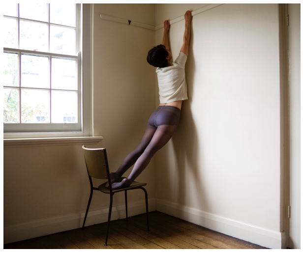
Clare Rae is best known for her self portraiture  where she uses her body to create intruiging environmental portraits. The above image is from her collection  from 2010 entitled “Testing” where she manipulates her body into different shapes, often hanging off things or performing a feat or strength and flexibility such as the “bridge” pose and holding her body horizontally in a straight line on a chair. The above image is part of a period a Rae’s work where she was exploring the concept of partial nudity with the use of translucent nylon tights. I find the figure holding onto the rail on the wall rather intruiging because it raises the question of some kind of allegory. Is the subject reaching for, reliant on or desperately trying to hang onto something. Another interesting thing about this particular portrait is that it subverts the presentation of women in art. Although the body is in a way accentuated through the pose and the tights can arguably be a garment with sexual connotations, the use of the white t-shirt short hair cut create a gender neutral feel to the image.

Technically Rae’s photographs are very interesting. Above I have separated an image from the “Testing” collection into nine sections, you can see how the image has been composed with the rule of thirds in mind. The figure is clearly placed in the centre three vertical thirds. The window, which acts as the light source for the image is placed in the upper two thirds on the left hand side. The creates a nice curve in the composition that helps the eye to move around the image. The shadow of the figure on the wall also creates a triangle shape between the actual legs of the figure and the shadow cast on the wall. The two converging lines in the top centre third of the image created by the rail the figure is holding onto  and the skirting board in the bottom centre third also creates a sense of depth. The use of light and dark in the image is also interesting, Rae mentioned at the talk I attended that in these image she almost always uses natural light from windows as opposed to any form of studio lighting. the natural light from the window also creates a shadow on the wall that it is coming from, creating a darker “L” shape in the composition, allowing for the lighter areas of the image to be the window and the wall on the right side of the image.

The above image is a work from part of Rae’s undergraduate degree in 2007 entitled “Desire and the other” this collection was were Rae first started to use her own body within environments that she had lived in or that had some importance to her, Rae stated in the talk that I attended that at this point she preferred to speak for herself rather than for womankind. These images, in my opinion are quite passive as most photos involve the figure lying on the floor or being partially concealed. Although someone who is familiar with Rae’s work will know that all of the images feature herself as the model, the images from the “Desire and the other” have a sense of anonymity as the face is always obstructed by hair or clothing or simply cropped out. This anonymity could also however, be interpreted as objectification as the body depicted in the image is not given a face or identity. The image above also has a sexual suggestive nature as the jumper of the subject is pulled over the head of the subject, which in turn would expose the subjects breasts or undergarments, however the chest of the subject is obstructed by what appears to be a sofa in the bottom right of the image. The figure also has their hands held above their head, making no attempt to pull the clothing back down to maintain modesty but also appearing as if the jumper was not pulled into its position by the subject. I feel that the image suggests both a sense of submission and passivity and well as some kind of provocative feel which I believe is a fair assumption due to the word “desire” being used in the title as it has very strong sexual connotations.

Similarly to the photograph from Rae’s “Testing” collection, this image has the figure placed in the centre thirds of the image, however in this example the figure is placed horizontally as oboes to vertically. The image is also separated horizontally in terms of light and dark, although not completely evenly, as seen in the gridded image above, into three sections. One being the light section in the top horizontal third provided by the daylight coming through the window, another being the dark middle third containing the dark wall under the window and the third being the light wooden floor in the bottom third of the image, which is reflecting the light from said window. The composition of the image is not this simple however, another point of interest is the vertical third on the right side of the image which contains the sofa which obstructs both the chest of the figure and the window. The arm of the sofa which blocks the light from the window is incredibly dark as it is placed directly against it. The cushions of the sofa do reflect some of the light from the window despite not being very reflective. The use of natural light from above lights the figure in quite a romantic way, interesting shadows are caused by the folds in the fabric.