Category Archives: Research

Filters

Author:
Category:

Environment – Artist Reference 2 – Michael Craig Martin

Sir Michael Craig-Martin is an Irish-British contemporary conceptual artist and painter. His early work drew together a variety of objects and materials and questioned the nature of art and representation. In the late 1970s he began to make line drawings of ordinary objects, creating over the years an ever-expanding vocabulary of images which form the foundation of his work to this day. His more recent work, which includes painting, printmaking, installations projections and drawing, continues to depict common place objects. During the 1990s the focus of his work shifted decisively to painting, with the same range of boldly outlined motifs and vivid color schemes applied both to works on canvas, and to increasingly complex installations of wall paintings. This is a visual style that I would love to apply to my own photography.  I think that Martin provides a possible link between both traditional art and photography, uniting the two mediums. This is perfect for me, given my passion for drawing and taking photographs. By undertaking this project, not only can I link two of my school subjects ( Art and Photography) but I can produce work with enjoyment. I love drawing and taking Photographs so merging the process together should be a fun challenge.

Below I have included a collection of Martin’s work for analysis. I truly love this work and I think it is something that I am passionate enough about, to pursue for my project. This is assuming I incorporate a sense of individuality upon the idea and find a way to apply it to travel photography and environment.

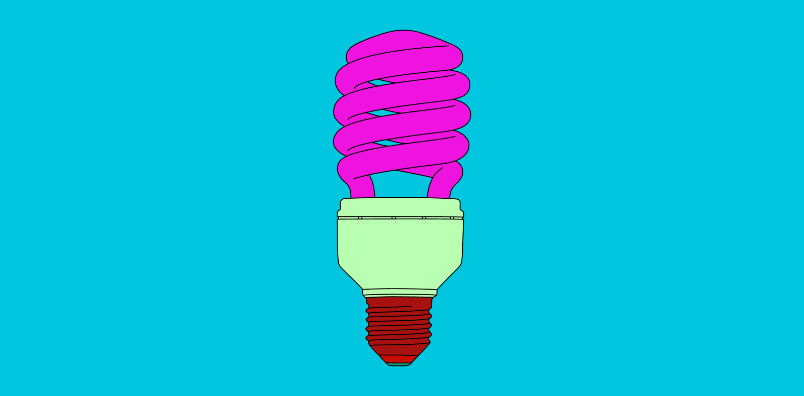
As demonstrated in the artwork above, Martin is very intelligent in the way he creates his imagery. Martin creates brightly coloured and minimally drawn paintings of everyday objects. There is nothing special or interesting about the objects that Martin selects to study. They are mundane, regular items that we frequently encounter in everyday life, but never pay attention to. It is therefore quite, thought-provoking and intriguing when you begin to produce huge exhibitions focusing on them. Its triggers questions surrounding what makes real art. I really like the minimalistic visual style employed by Martin as well. He creates simple line drawings with no shading, indicating shape and form. He then incorporates an array of vivid and powerful colour tones throughout the piece that frequently clash with one another. This works effectively as we begin to question our familiarity with these everyday objects. Michael Craig Martin uses bold colours and lines to enhance his work, he also adds bold backgrounds that complement his art. As demonstrated above, he frequently places the object right in the middle of the picture to create a strong sense that nothing is more important than the other.

Applying to my Project

So they question is, how does this work apply to my photography? Inspired by the work of Martin, I would like to create my own digital illustrations that merge and combine with my photographs. Picture one of Martin’s individual object pieces, except the coloured background has been replaced with a photograph. This develops some concepts and imagery that has potential to look good. But we are left questioning the relevance between photograph and drawing. A drawing of a lightbulb upon an image of field looks confusing, random and out of place. This where my own individual thinking and style will be forced into action. Although I would to still like to maintain Martin’s ‘everyday’ way of thinking within my project, I would like to organise these objects so that they work in co-operation with the photographs. Although Martin’s digital illustration was the initial stem of inspiration for this concept, upon further research, I discovered some of his sculpture work that comes close to demonstrating my visual plan. I have included some images of this above. 

These images are all taken from Michael Craig Martins exhibition at Chatsworth. This is a major display of contemporary sculpture in the garden with new works made specifically for this exhibition. Installed in the Gardens of the Chatsworth house, home of the Duke and Duchess of Devonshire, Martin created twelve heavy, steel ‘line drawing’ sculptures including vibrant umbrellas, huge garden implements and a giant pink shoe. While the objects themselves may be ordinary, their form and scale are anything but. When captured on camera, the resulting image represents something similar to my intentions with this project. The main difference is that, I will not be erecting any sculptures, but digitally drawing these objects upon my travel photography. This will experimental and largely improvisational as I select objects that I feel would be appropriate to the landscape and environment. With digital drawing, I also have a lot less restrictions than Martin did with his sculptures, meaning I can test out unusual visual effects and compositions. This idea provides me with the opportunity to provide messages and thoughts surrounding the cities I am visiting. For example, in Rome, I can illustrate Roman gladiators over a photograph of the Colosseum, as if to impose history and heritage over modern day imagery. Although Martin’s work has served as excellent inspiration for me, I am certain now that my work will be very different. Whilst I love Martins exhibition at Chatsworth, his sculptures a very random and pitch little relevance to the environment present. My work will be a lot more focused and directed, paying attention to the landscape and working off of these visual cues. 

Contact Sheets

Contact Sheets


Sometimes called “contact prints” contact sheets were used much more frequently in the past world of photography than they are today. A contact sheet is a single piece of paper that is used to show all of the images from a roll of film or for single large format images. For 35mm and 120 film the developed negatives are placed on photographic paper and are then exposed onto the paper. This leaves a trace on the paper of the whole of the negatives, chraceristicaly leaving the sprocket holes and film data on the image also.

Contact sheets were a way for a photographer to be able to view all of his/her images in one place and be able to make easier comparisons between individual frames. Often using pens they would annotate, circle and frame certain images to denote if they are still useful or not, this is similar to how photographers do this today with digital images. When using Adobe Bridge or Lightroom you can go through your images and separate out the ones that you do want and don’t want using colours or numbers, by colour coding using different pens on a contact sheet the images you can do this also. Each photographer had their own method of doing this, come used an X to mark out images, others would put borders around images in different colours to denote different meanings, and some would circle specific frames.

This contact sheet above is of Marilyn Monroe, the flow of the images shows the method of the photo shoot. After processing and creating a contact sheet Marilyn herself has gone through the images, presumably with the photographer Bert Stern, and she herself has crossed out the images which she does not like. There are several contact sheets similar to this with her starring in them that she has also marked. The contact sheet below is another of these. This one is composed of a series of medium format negatives of the star, probably wanting to protect her personal image she has crossed out all of the 11 images, the publication of this image defeats the purpose of her crossing out the frames in the first place but that is beside the point, the fact that the contact sheet gives you a view into the mind of the photographer (or in this case the model) is very interesting. Normally the only image we see from a photoshoot is the one final image, but with this we really get to see the process of the photographer, we get to understand why they chose that one specific image to share over the others that they had available.

One of the most interesting things about a contact sheet is often why a particular image is chosen and why others were rejected. In the youtube video above Elliot Erwitt talks about his feelings towards contact sheets. He starts off by stating that a photographer should never show the world his contact sheets. This is not something that I agree with, I feel that sometimes the context behind why a photographer took certain photos to be one of the most interesting parts of the image. An example of this is “The Magnificent 11” by Robert Capa.

This set of 9 images from the D-Day landings were taken by Capa when he landed with the second wave of assaulters on Omaha Beach. There were meant to be three rolls of images that he sent back but instead these are the only images to exist (frame 9 is published in many different places but the negative itself is missing). There are different theories as to how these other images were destroyed but that is not particularly important, however they were lost it is a great shame that they were. This contact sheet shows the surviving negatives and although small shows a really incredible insight into his short time on the beach. This is why having contact sheets is so important, if only the published images were shown then we would not see some of the other frames, the smokey, shaky, out of focus images that show Capa’s own fear.

This video above is similar to the first one but shows the works of William Klein instead. One of the specific points in the video (6:03) he talks about taking photos of a shop window, a person approaches the window and stands there “it’s a photograph” then the person starts pulling faces and it’s ruined. This ability to capture “the decisive moment” is often not thought about enough, because today we can snap away at crazy speeds we capture every moment and look back later, with film this was harder and so seeing how this perfect moment was captured is often very important. Klein also talks about the amount of time of a photographer’s work that is seen.

“The picture is taken at 1/125 of a second. What do you know of a photographer’s work? A hundred pictures? Let’s say 125. That comes out to one second. Let’s say, more like 250 photographs? That would be a rather large body of work. And that would come out to two seconds. The life of a photographer — even of a great photographer, as they say — two seconds.”

he mentions this because although the work of photographers takes a lot of time to set up in the end often is is only a second or so of their work that we really see. This makes being able to expand upon these single images so important, understanding an image takes more than simply seeing it. Thought has to be given to the background of the image and why we are seeing it over the other images that were likely taken at the same time.

This link was really useful for me in looking at how photographers mark their contact sheets. the hand written nature of the marks on the images really lends a touch of personality to the images. Not only has the photographer taken the image they are leaving this personal mark on them. The different colours work really well against the black and white images, they highlight different elements of the sheet to be looked at closer. Sometimes even making notes on the image or highlighting areas of the images for post processing.

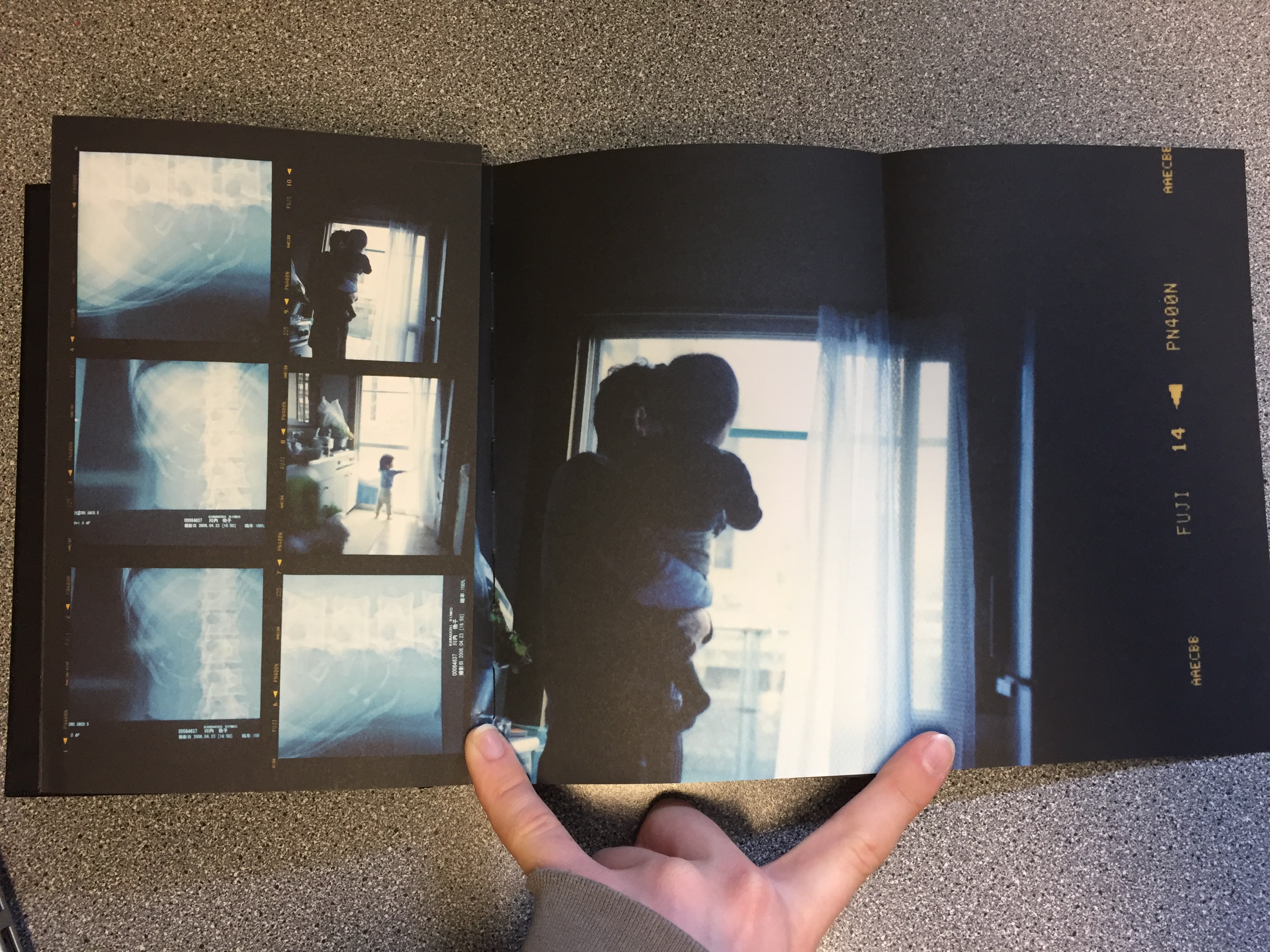
The book Sheets by Rinko Kawauchi is another example of this artistic use of contact sheets. Although the images  are not in the traditional contact sheet style they do show the progression of work that has happened throughout the life and work of Kawauchi. With folding out pages with larger images it is almost the same kind of thing as writing on the images. Attention is drawn to the photographer’s favourite images, and the other images are still there to give context to the best images. The book is fantastic because it not only shows the work of her for one project but it shows most of her work over her lifetime. Although more of an artistic book it is still a fantastic thing to behold. This link goes to the page for her book and this one to another page that shows some more of the pages.

Because I am using film for my project I could possibly look at making a contact sheet from the negatives and blowing it up or I could use larger printed images and make a background for them. By drawing on the images using different coloured pens I can create different effects, drawing attention to the different images and annotating them. Alternatively I could look at using the colours to complement the colours of the images, I have looked at the work of Klein briefly and will do in more depth but specifically his contact sheets project. He uses coloured paint on blown up negatives to create art pieces, the paint is not usually denouncing images but just to act almost as a frame for the real images.

This link also shows some other examples of famous contact sheets.

Pieter Hugo – Artist Reference

Pieter Hugo is a white Johannesburg born South African photographer. One of his first bodies of work entitled “Looking Aside” Produced in 2006 consisted of a series of studio portraits of people with striking appearance that cause people to avert their gaze for various reasons. This often included people with albinism, birthmarks or visible signs of blindness.  Hugo described his subjects as people who  “whose appearance makes us look aside” these portraits are conducted in a formal studio setting, they are simply composed, similar to a passport photo. The lighting (in the first three images below) is not particularly harsh or soft, but somewhere in between. I think these images have been seen as controversial because there is a question as to whether or not Hugo exploited these people who may be self conscious about their conditions for the purpose of producing intriguing photographs. His photographs could also however, be considered empowering because he photographs his subjects in a way that makes them appear unconventionally beautiful as well as bringing light to people who have conditions that affect their outward appearance.


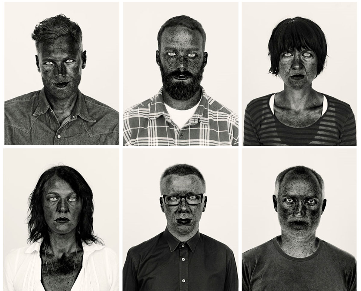
The collection of photos of Hugo’s was his image series which was made into a photo book entitled “There’s a place in hell for me and my friends” (images from which are pictured in a 2×3 grid below) This photo series of black and white photos are highly contrasted and the colour channels within the black and white filters have been digitally altered. This exaggerates the melanin  in the complexion of his subjects, making their freckles and imperfections more visible and act as a stylistic feature of the portrait. Many critics have described this form of photo manipulation as opposing response to their heavily airbrushed images of people in the media. The subjects within this project are of a variety of different races and ethnicities although the colour of their skin does not seem to vary too much when the same manipulation process is applied to the portraits, perhaps suggesting that the colour of human’s skin is really not that different in terms of the biological makeup. Aaron Schuman stated in response to this photo series that “although at first glance we may look ‘black’ or ‘white’, the components that remain ‘active’ beneath the surface consist of a much broader spectrum. What superficially appears to divide us is in fact something that we all share, and like these photographs, we are not merely black and white – we are red, yellow, brown, and so on; we are all, in fact, coloured.”

The image above is Pieter Hugo’s self portrait which was included as part of his “There’s a place in hell for me and my friends” collection. This photograph is incredibly striking due to it’s high contrast and despite its very simple composition. All of the portraits from the previously stated collection were cropped in the same way, a simple head and shoulder shot, similar to a passport photo. I feel that this was a creative decision to draw attention to the face of the sitter, this is also supported by the incredibly plain background. In the image above the background is a very light grey colour, the whites of the eyes and the white of the shirt are much brighter than the background and this helps to bring the figure forward. The most striking element of the image is the contrast between the eyes (both the white and the very pale irises) and the skin. The skin is given a very interesting texture as the way that the photo is manipulated brings all the ares of pigmentation to attention. The texture of the beard is also very interesting as the fewer lighter coloured (perhaps grey) hairs stand out against the rest of the darker hairs.

I was drawn to Hugo’s work because of the dramatic, intense and captivating nature of his portraits in his “There’s a place in hell for me and my friends”. I also liked the fact that Hugo does not worry about flattering his sitters in this series and he also includes himself in his work. I want to take inspiration from his high contrast portraits as I feel that my angry feminist photos would work well with the intensity of this style of photo manipulation.

Brett Cole

Website: http://www.brettcolephotography.com/?search=air+pollution

Brett Cole is an American Photographer who does Social work in India and focuses on Social and Environmental issues in India.

He is dedicated to helping people, nature and animals by raising awareness through his work in photography. He has made of 15,000 photographs during his time working in India and has completed many projects on Snow, Air Pollution and on Conservation.

Brett Cole’s project on Air Pollution focuses on Smog primarily as it is something that damages the health of many people in India and China as well. It has caused problems with breathing and can cause fatal asthma attacks. His photos are not the most interesting and well composed but they do put across an important message to the world and show the reality of living in India which in some places is as polluted as China. The media often ignores pollution when it comes to India and China because  they know they are the worst affected and do not want to make the world aware of the problems that the developed world is causing. India and China are the worlds dumping grounds yet they made us products which we could not live without such as spices, food and technology. Photographer wouldn’t have a job if it wasn’t for the Japanese and Chinese inventing new cameras and Apple is based in China yet we still decide to not help them and let them swim in polluted waters, have E-waste pilled as high as mountains and let smog take over the sky and make it difficult to breathe. Personally, i find Brett Cole’s work interesting but it does live up to the standards of a professional photographer which i think he is not well known and he focuses more on raising awareness rather than the composition of his images.

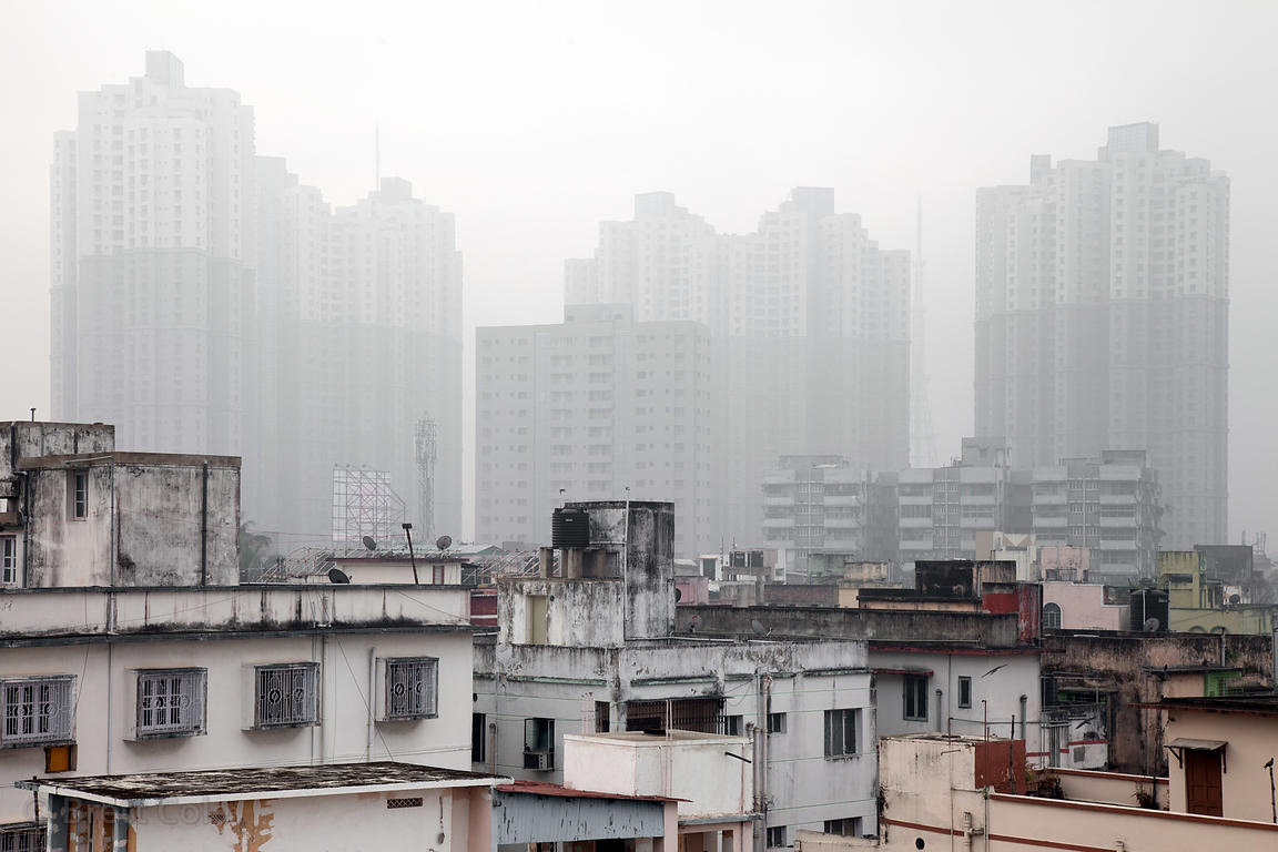
Air pollution over the tallest buildings in Kolkata, India – the 35-story apartment complex near South City Malls.

This is one of my favourite photos because it shows how smog can completely take over a city and make it vanish into thin air. The lower houses aren’t as affected by it but the high rise buildings are completely surrounded by Smog. People usually have to keep windows shut down Smog periods for their own health and this makes it difficult to live due to the high temperatures soaring during summer. This photo almost seems like an image which has been superimposed as they do not look like that are part of the same village because there is a juxtaposition between poverty and riches, poor housing to tall 35 story buildings. With this image, your eyes are first drawn to the buildings which are clear of the smog as they stand out but then your eyes drift towards the buildings which are partially hidden by the smog. It is a very interesting images with two different lives and weather split in half.

Lu Guang

His https://www.worldpressphoto.org/collection/photo/2015/long-term-projects/lu-guang

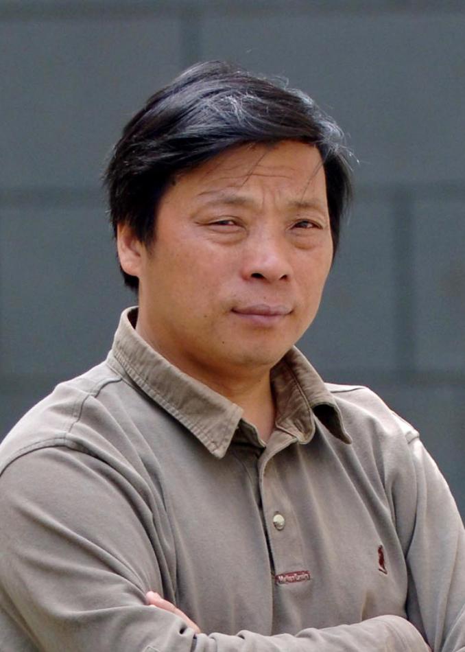
Lu Guang is a Chinese photojournalist who focuses on social, environmental and economic issues. His covers a wide range of consequences which are due to China’s rapid industrialization. He is not a well known photographer and does not have his own website but is credited on World Press Photo as he has won some awards. His work has also been published in the National Geographic which he has received a grant from.
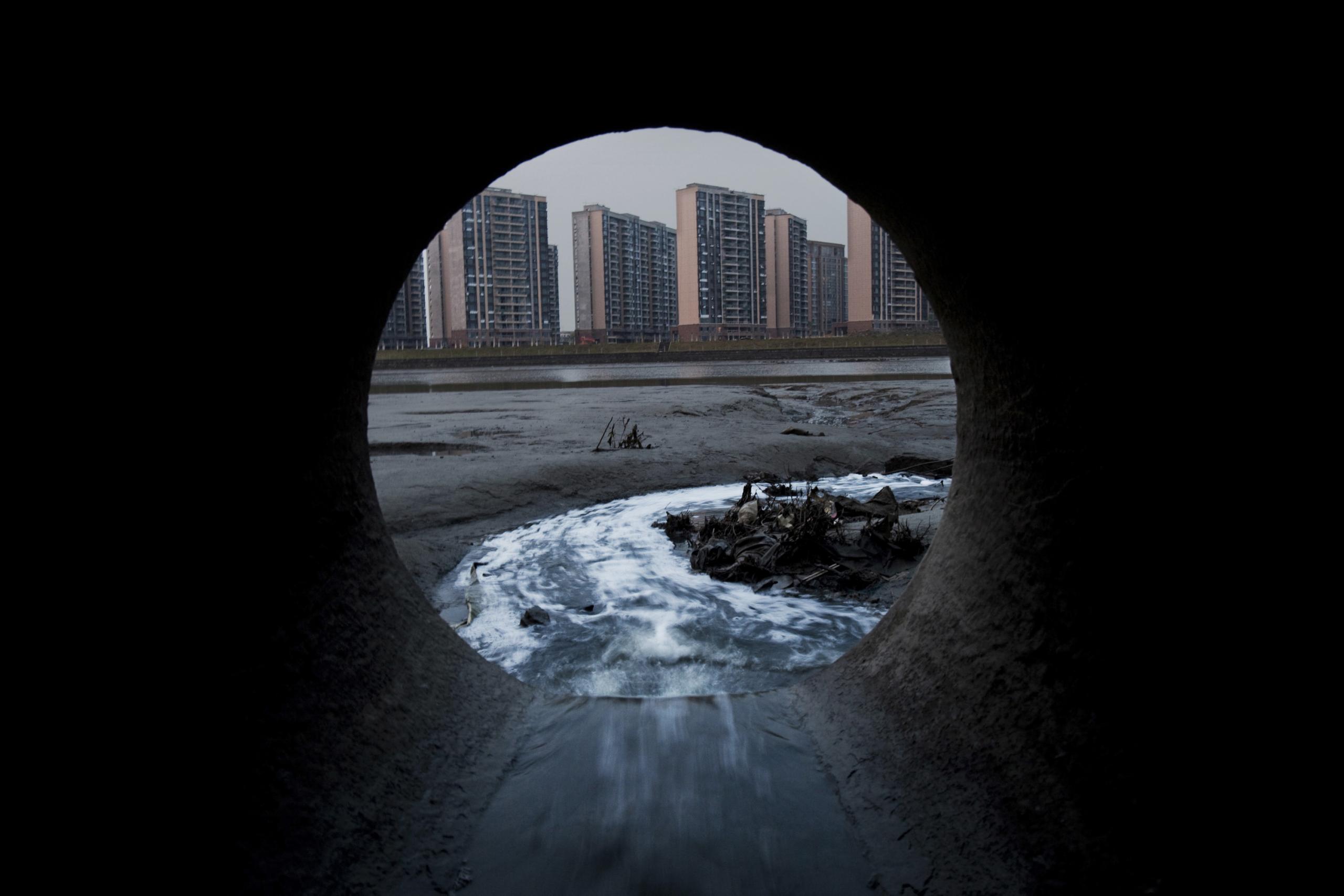
His work takes a very unique perspective on documentary photography as he combines it with abstract in my opinion to create thought provoking and intriguing images which reveal the truth about pollution in China, which the world has no clue about as the media will never cover the devastation which we have caused. I very much like his work as his images could be seen as controversial because they reveal things which the rest of the world is not meant to know because it reveals the true extent to which pollution has taken over the world and soon all countries will be like China, if we do not do anything about it now. His images are very well composed and thought out, Lu has taken the time to find and photograph the perfect spots which pollution is taking place and almost make them seem beautiful in a sense due to the angles and camera setting which he uses to create his images.

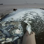
This is my favourite image which he as taken because he has managed to make a sewage pipe look beautiful and make the photo unique and interesting to the viewer. This image combines documentary and abstract photography because of the unusual place that this photo was taken. Lu Guang uses the pipe to create a frame around the buildings in the city and make your eyes focus on the center of the image. He has also used a slower shutter speed as the water flowing out of the pipe is blurry which adds to the effect of the image. However, even thought he has managed to create a beautiful image, there are signs of pollution such as they grey sky which is caused by Smog which is the result of high pollution levels in China, we can also see that the beach is also black with oil and soot coming from boats and particles of pollution settling down on the ground. This image makes you wonder why they would need such a large sewage pipe and how much is pumped out of it a day onto the beaches and into the sea which is transported to other parts of the world by the current. Many people think that the levels of pollution in China will stay there but eventually, it will make it’s way to Europe, America and Canada. This image is very intriguing and is thought provoking as the viewer will most likely create ideas in their head from the image such as what is was like in the pipe, how tall the pipe is for Lu Guang to fit in it and what it would look like filled to the brim with water and it gushing out onto the beaches.
Sean Gallagher

His website: http://gallagher-photo.com

Sean Gallagher is a British photographer and filmmaker who has been based in Asia for over a decade.

Sean often spends months in the field documenting the worlds most important environmental, social and cultural issues for some of the world’s leading news outlets.

He creates photographic, video and multimedia projects which often highlights people’s stories from communities which have/are affect by these issues such as desertification, pollution, species extinction and climate change.

He has done environmental projects in China, India, Indonesia, Mongolia and Sri Lanka. His projects include:

  • Saving Mongolia’s Wild Horses
  • Drought in India
  • Beijing – The Masked City
  • India’s Rising Tide of E-Waste
  • Tainted Waters: Pollution in Jakanta
  • Lockdown – Inside China’s Zoos
Saving Mongolia’s Wild Horses:

The przewalski horse was once on the brink of extinction but in bouncing back thanks to the work of conservationists and scientists who have reintroduced the species. The world is currently experiencing a new age of extinction which is the 6th to occur throughout global history.

Sean Gallagher wants to raise awareness of the small but extremely important environmental issues and successes which the news does not talk about as it does not involve terrorism. His photographs aren’t the best composed but they have a strong meaning behind them which makes them unique in many different ways. He does have images in the collection which are well composed and thought out but it is very difficult to photograph animals which are often scared of people. Sean Gallagher takes very good landscape photographs in my opinion as the white snow contrasts with the brown horses and the blue sky.

Drought In India:

In the summer of 2016, some parts of India experienced record breaking droughts which was the result of consecutively failed monsoons.

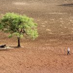
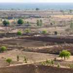
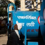
Global temperature records have been record in each month of 2016 and India has its highest recorded temperature of 51C. This is something the news doesn’t tend to cover as India is considered an undeveloped country and is not worth covering unless it has been destroyed by an environmental disaster. This is why i like Sean Gallagher as he covers stories which are important as they raises awareness of what we are doing to the planet. His photographs are very shocking and thought provoking which makes them important and unique. They show the world what global warming is causing in the most dramatic fashion using documentary photography. I think the most shocking photo of this gallery is the one of the landscape in which only trees are visible and the ground is a dark brown and cracked.

The Masked City:

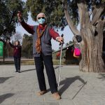
“I’m really scared of the pollution”, says Mrs. Zhang, a 62-year old retiree who has just finished her morning exercises in Beijing’s Ditan park

This project of his relates almost identically to mine in which he is photographing people in masks they have to wear due to the high levels of pollution. I am photography people in beautiful, natural environments with a mouth mask and a gas mask to show that the pollution levels are rising around the world. His photographs are very striking as they are environmental portraits but they have an element of formal portraiture within them. I think they are very well composed and show the true life of people in China and how their life has been restricted by the levels of pollution. I think it is really shocking that he has a photograph of an innocent child wearing a mask to protect them, i think this is sad because they do not have a normal childhood like children in other parts of the world do. They are restricted to what they can do because of health risks, i think this is really sad and the world should make an effort to help heal the planet so the children of the future can have a normal life.

India’s Rising Tide of E-Waste:

By 2017, all of that year’s end-of-life refrigerators, TVs, mobile phones, computers, monitors, e-toys and other products with a battery or electrical cord worldwide could fill a line of 40-ton trucks end-to-end on a highway straddling three quarters of the Equator.United Nations’ Solving the E-Waste Problem (StEP) Initiative

I think these photos are more thought provoking rather than shocking as the world knows that electrical waste just ends up somewhere in the world as it’s not biodegradable. Sean Gallagher has composed these photos very well and has documented the life which people in India live very well as some of these photos are very intimate and show the reality of life for children who live around E-Waste. His portraits of young children are very powerful and well composed within the environment. His photos show that India is the dumping ground for the developed worlds rubbish and no one seems to care they are are living in filth and there are dangers around them all the time, like for example, the young children stepping on either glass or plastic.

Tainted Waters: Pollution in Jakarta:

Jakarta is the Indonesian Capital and the first impression should be the electric culture and the diversity of Indonesian people but it was not. The smell was: “400,000 liters of waste are dumped into the capital’s rivers and canals every day.”

It seems that we do not care about the undeveloped and minority countries of the world and use them are our dumping countries but the news would never cover this. This is why Sean Gallagher photographs these issues because he wants to bring to light what is hidden from our view by the media and how we need to change our ways and now. These photographs are more abstract photography than documentary photography but however is shows clearly the level of pollution in the river which we would not see from afar. I think these are some of his most interesting photos which he as taken because they do not follow his usual pattern of documentary photography. He gives us a different outlook on pollution than ordinary photographers.

Lockdown – Inside China’s Zoos:

Hidden away in the second tier cities of China, are a plethora of smaller unknown zoo which do not have the capacity to provide the proper care and environments for these animals.

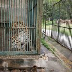
For me, this is the most shocking of his projects mostly because i feel very strongly about Zoos in the sense that if they are not there to help save animals from extinction then they should not exist. These images show what no one knows, what no one cares about and how no one is trying to help these animals. His photographs are not well composed but i think that is the idea because he did not want to show the zoo through pretty, well composed images because that defeats the point of this project. For example, he has a blurry image of an elephant but it works well with the project as it shows the desperation and mayhem which occurs in these zoos. Many of these animals will have not known a life outside of the bars which they are confined too and will most likely never know what freedom feels life. I personally wish i had the money and ability to close down these zoos and give the animals a proper life which they deserve.

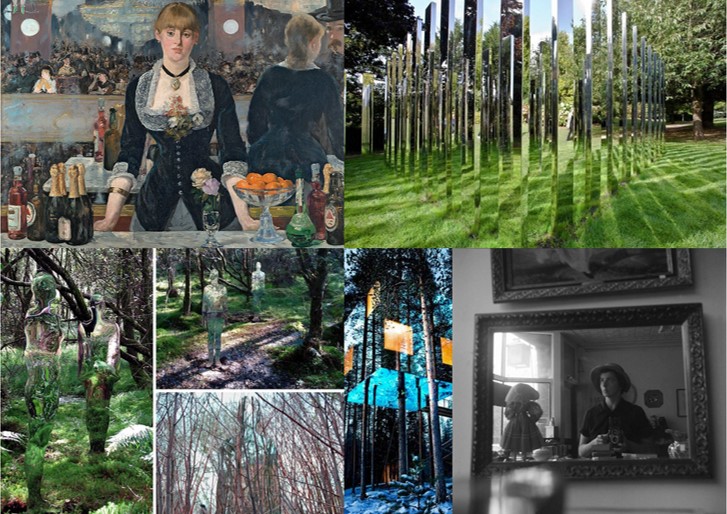
Mirror/reflection Research

I have been experimenting with the use of a mirror in relation to environment and performance. I have also seen how they have been used by artists such as Francesca Woodman, Claude Cahun and Clare Rae as well as many others who have utilised reflections.  Psychologically mirrors attract viewers attention because they reflect the “another us” and gives the impression of having a “perfect” twin.  I have done some more research about the symbolism of mirrors in culture focusing on art, literature and mythology.

Physically mirrors reflect light and the surrounding environment which has connotations of illumination and truth. Mirrors have often been compared to the human mind with the Greek root for Plato’s word idea ‘eidos’ literally meaning not just ‘image’ or ‘likeness’ but an image reflected in water or mirror. Mirrors in art suggest that the viewers should turn inwards to gain self-knowledge rather than outwards to the natural world.

Reflections are central devices in some of the great European paintings. A famous example is Jan van Eyck’s Wedding Portrait of Giovanni Arnolfini from 1434. Here, the mirror is situated centrally in the painting, directly above the clasped hands of the wedding couple. The mirror has a slightly curved form that not only reflects the objects in the room, but things happening beyond the picture’s frame, as well. The mirror shows a clear view of the couple’s back and  two witnesses standing in an open door frame. It presents something that would be occurring where the viewer is ‘standing’ and therefore they assume the position of witnesses. The mirror removes the gap between the pictorial space and the viewers space and makes them appear part of the story. 

This painting is  likely to have influenced Las Meninas by Diego Velázquez from the year 1656. This shows a large room in the Royal Alcazar of Madrid during the reign of King Philip IV of Spain. The Infanta Margarita is in the middle of the picture surrounded by her entourage. Above her head on the back wall of the room, is a mirror, although opinions vary on this and some people think it could actually be another painting . The artist himself is standing on the left side of the painting at his canvas and the painted surface is facing away from the viewer. The mirror could be reflecting two figures standing outside the picture’s borders. This would be King Philip V. and his wife Marianne, at whose court Velázquez was employed as a painter. If the royal couple are standing in front of the mirror, then they must be standing where the viewer is so that the viewer becomes part of the painting in a similar way to in that of Jan van Eyck’s Wedding Portrait. The interplay between observation and ”being observed” is caused.  The king and queen are supposedly “outside” the painting, yet their reflection in the back wall mirror also places them “inside” the pictorial space. 

The Rokeby Venus by Diego Velázquez  depicts the goddess Venus   lying on a bed and looking into a mirror. She is often thought to be looking at herself in the mirror however this is physically impossible since viewers can see her face reflected in their direction. This is known as the ‘Venus effect’ which is also seen in film when an actor will be shown  apparently looking at themselves in the mirror. What viewers see is different from what the actor sees, because the camera is not right behind the actor, but the position of the person is normally chosen so that their image is correctly framed in the mirror for the camera.

Mirrors were significant for the development of self-portraiture in painting and were also used for this purpose in the early days of photography . For example the photograph below is from the Edwardian period and shows an unidentified women  using her dresser mirror and a box camera to take a self-portrait.

Vivian Mainer is also well-known for her street photography from the 20th century and many of her photographs are self-portraits which were taken on the street using the reflections of windows in buildings.

I also came across the use of mirrors when researching Earth Art as an approach to the theme of ‘Environment’ for example by Robert Smithson. He critiqued art history’s ability to create static objects and remove them from the real world  context to museums  or galleries. His project ‘Yucatan Mirror Displacements’involved arranging mirrors in various landscapes. The mirrors reflected and refracted the surrounding environs, displacing the solidity of the landscape and shattering its forms’.  The purpose was to contemplate the moment with the mirror recording the passage of time and the photograph suspending time.

Smithson also created sculptures using mirrors such as the example below. He thought that taking natural materials out of their original contexts abstracted them and in this example coral has been arranged with mirrors so that it is multiplied and fragmented in the reflections. These reflections change in relation to the position of the viewer, so no two people experience it in precisely the same way.

Mirrors have also been significant symbols in literature. For example “The Lady of Shalott”, by Alfred, Lord Tennyson was a poem that inspired many artists. I came across this when studying the  Pre-Raphaelite movement for an earlier project featuring some contemporary responses to this style of art.  The poem is about a woman who is condemned to watch the world indirectly through a mirror that shows to her the changing scenes of Camelot. The reflected images are described as “shadows of the world”. If she does look at the world directly she will be cursed. One day the Lady sees the reflection of a man Sir Lancelot and breaks the rule and looks out of the window. The mirror cracks and she realises the curse has come true and she escapes the tower she has been living in and gets in a boat but dies before reaching the town. This representation of women has been viewed by some in the context of changing women’s roles in the 1880s and 1890s and it has been suggested that this served as a warning of imminent death to women who stepped from their restricted roles and explored their desires. William Holman Hunt has depicted the moment when the Lady turns to see Lancelot in his painting and some of Waterhouse’s most famous paintings were based on scenes from this poem. I think it is interesting to consider these connections between art and literature because in my own work I am considering combining by images with writing for the final presentations.

The Picture of Dorian Gray, by Oscar Wilde is another famous example of literature with the theme of a mirror. The character Dorian takes a mirror up to the locked room containing his portrait and compares his reflection with his painted portrait which ages instead of himself. When he realises the person he has become, he smashed the mirror “He loathed his own beauty, and flinging the mirror on the floor, crushed it into silver splinters beneath his heel”.

In the poem “Mirror”, by Sylvia Plath the object is described as uncanny. “I am silver and exact. I have no preconceptions. / Whatever I see I swallow immediately / Just as it is, unmisted by love or dislike”. The poem describes the life of a young woman growing older as she looks into her mirror.  The poem could span years or alternatively the women could be seeing a reflection of her future self. It appears that she wants to discover who she is by looking into it.

Stories about mirrors are also common in mythology and folklore with the well-known example being that if you break a mirror you will have seven years bad luck. This superstition dates back to the Romans, who believed that life renewed itself every seven years, and that breaking a mirror would damage the soul it was reflecting at the time for that duration. Many cultures believed mirrors reflected the ‘shadow soul,’ and could show the true nature of the person being reflected. This  contributed to the legends about vampires having no reflections as they are said to have no souls to reflect. Ancient Chinese believed that mirrors frightened away evil spirits who were scared by their own appearance. In Greek mythology there is a man named Narcissus who falls in love with his own reflection in a pool of water and unable to leave the beauty of his reflection loses the will to live. Narcissus is the origin of the term narcissism (a fixation with oneself and one’s physical appearance and/or public perception).This myth has inspired several artists as well with the most well known example by Caravaggio who painted a young man admiring his reflection in the water. Other artists who have explored this myth include Dali and Waterhouse.


3rd Photo Shoot (Planning)

Destroying Negatives, Shoot Plan


After doing some research into different was that people have of destroying negatives to create new artwork I have decided to do this for a shoot (I don’t think “shoot” is the right word but I’m going to use it). I’m going to start off by taking a roll of film and shooting all of the images on it of the coast and possibly reservoirs and other water sources (the images will more likely be of the sea because that is the main focus of my project), and then I plan on getting the roll of negatives developed before using water to destroy, corrode or otherwise alter the negatives. By using different water sources and looking at and comparing the different ways that the images are distorted I can show how water is not all the same.

Fungus Damaged Film Slide

I have two plans for how I am going to go about this. The first is going to be involving the negatives from the roll that I will have taken, the second is going to be done using printed images that I have already taken on my digital camera. I am going to collect the water from 6 different sources for the project (about a buckets worth for each), some of the locations will produce different types of water and others will produce similar types of water. Despite this I am still looking forward to seeing the different results, the locations that I am going to source the water from are listed below:

  1. Queen’s Valley Reservoir
  2. Sea water from long beach
  3. La Rosière Desalination Plant
  4. Stream in St. Catherine’s woods
  5. Pool water
  6. Tap water from my home

Once I have collected the water I am going to bring it back to my house, once here a small amount of each sample is going to be poured into a tray that I have borrowed from the school’s science department, these are what will hold the printed images, I will use some blue tack to hold the images under the water and I will be keeping an eye on them to determine how long they should be kept in there for. I am expecting the images to run but I am not sure on specifically what will happen, this again lends to the uncertainness and ideas of the unknown and random that I am looking for in my project.

The trays that I borrowed/stole from the science department

The negatives are going to be done slightly different and will require more time and thought given to them. I have looked into the different ways to use water to edit negatives, and for the most part, simply submerging the negatives in the water will likely not do much due to the fact that negatives need water to be developed. The main cause of water damage to negatives is from fungus/mould that grows on the negatives and eats into the gelatin layer thereby destroying the image. This will make the process more involved because it will involve me removing the negatives from the water and drying them out before submerging them again. To involve the environment more I am going to also take pieces of the environment like sand or dirt, leaves and seaweed to keep in the buckets also.

To help me get the best out of this process I have been doing a lot of research online into water damaged film. Almost all of the results that came back were about how to recover film from water damage and cleaning them up afterwards. With this in mind however I will try and employ the opposite techniques to what they suggest, so this means that I will need to let the film dry to induce growth of fungus on the film and when they are drying I will not have them free floating, I will let them dry face down and curled up to induce distortion on the images. To try and understand a little more about the process of doing this I emailed someone who used to be a specialist in film restoration to see what he could tell me about this. the first thing Mick (I didn’t get his full name) told me was that:

“it’s not actually water that damages film, film is born and bred in water during processing, the issue is bacteria that will start to colonise the film once it is wet and remains wet for some time and these are responsible for the effect that is called water damage.”

He then suggested

“leaving some negatives (colour film may work better as the silver ions in B&W film are highly toxic to bacteria) in a bowl of pond water (no chlorine etc added that will impinge on the rate of growth) somewhere not too light (but it needn’t be dark) for a while.”

He could not give me specific time frames but he said anything from a few days to a week depending on where the images are stored. He also gave me one final piece of advice for possible health issues that I may encounter;

“careful, you are dealing with a potential biological hazard (known moulds on film include aspergillus fumigatus – Google it).”

Taking all of the information that I have gathered into account I have come up with a plan for how I am going to create this part of the project.

  • The first step will be to take the exposures on an appropriate roll of film, as Mick suggested I will not be using black and white film, from here I have chosen to use a roll of Fuji Superia 200 that expired last year. I chose this roll over some of the others that I have have for the main reason that it was the cheapest, because it was a little expired I got it at half price and it is not that expired so the images will turn out fine I’m sure. And as long as it is bright when I decide to shoot then I can use that film.
  • To take the exposures I will load up one of my cameras and will travel around the different waterways in Jersey (depending on time constraints I may have to just stick to photographs of the coast).
  • Once I have taken all of the exposures I will need to get the film developed, get the negatives back and cut them up into 6 sets of 6 or individually divided into 6 groups.
  • Then I need to collect the water from all of the different sources, bring them home, and submerge the negatives under the water.
  • After about an hour I will take them out and suspend them just above the water, making sure to splash them every 12 hours or so to make sure that they don’t completely dry out.
  • Other than this there is not much I can do except for handling the negatives roughly but while still wearing gloves and letting the gelatine surfaces stick to each other. Possibly touching the wet gelatine layers will distort the images but I’m not too sure.

To help me with this process I have got some negatives off a friend, these were almost all completely exposed and so are perfectly blank, this will allow me to see if there could be any changes that I might not be able to see on frames with images on them.


Bernhard and Hilla Becher – Topography inspiration

Before heading out to La Collette’s Energy from Waste facility to be escorted around I fist wanted to gather some inspiration for the kind of photography I am expecting to capture. Since the building is covered in windows I can observe that most of what I will be seeing will be complicated machinery and an extensive series of pipes. This kind of structure, along with my aim to show this facility from an intriguing yet still documentary standpoint, means that my next shoot will be focusing on using topographic photography techniques. Because of this, I have decided to look at the amazing photographers Bernhard and Hilla Bercher for their intriguing examples of capturing the beauty of industrial landscapes…

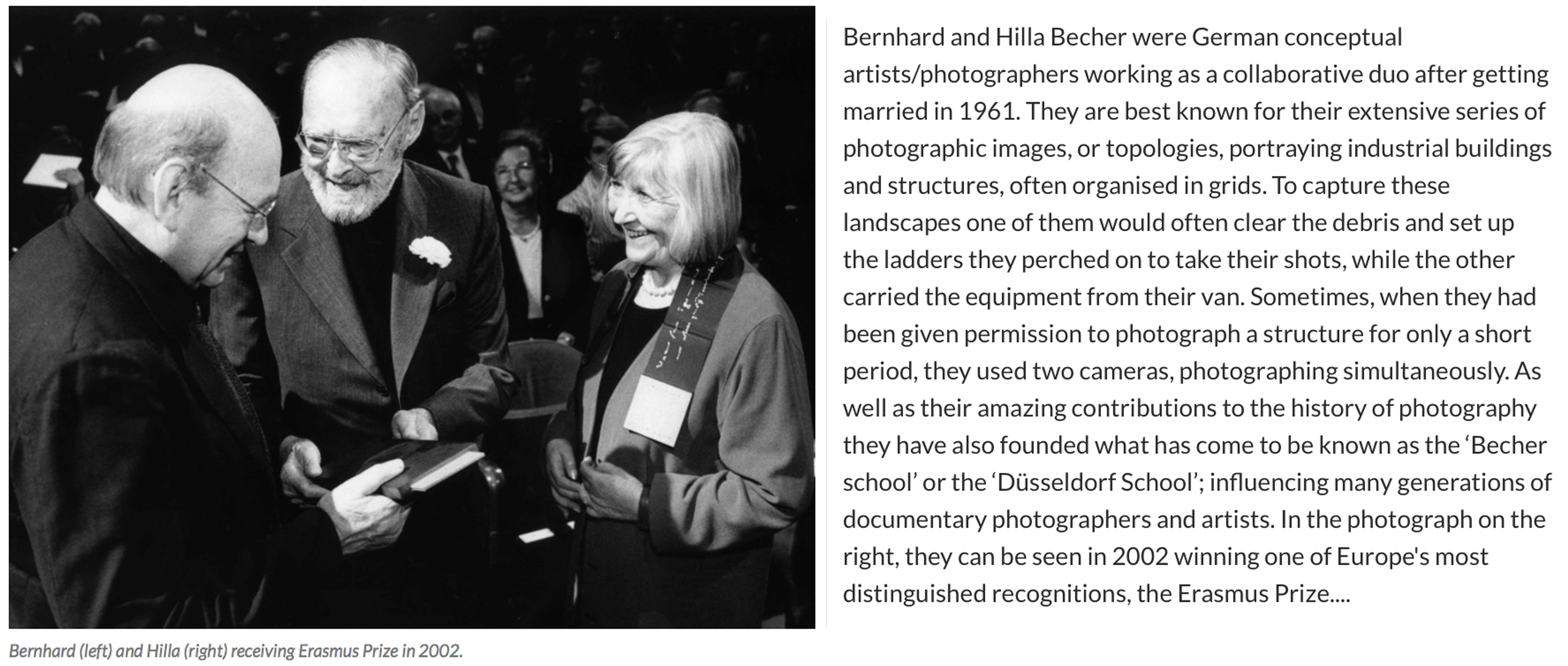
For over 40 years the pair used an 8×10 large-format camera to capture the architecture of industrialisation: water towers, coal bunkers, blast furnaces, gas tanks and factory facades. They did so in an obsessively formalist way that defined their own unique style and made them one of the most dominant influences in contemporary European photography and art. In the early years, with a young son in tow, they travelled across Europe and later the US for weeks at a time in a Volkswagen camper van, cooking and eating by the roadside. When asked in a recent interview why they only photographed industrial structures, Hilla replied: “Because they are honest. They are functional, and they reflect what they do – that is what we liked. A person always is what he or she wants to be, never what he or she is.” For Bernhard, the process of photographing and therefore fixing these brutalist structures forever was rooted in his love of the landscape he grew up in as a child. The huge buildings that dominated and defined his childhood in the Ruhr began to disappear rapidly in Germany’s postwar economic period, and he rightly sensed they would disappear elsewhere – across Europe, Britain and America. I have chosen this amazing couple as an inspiration for my next shoot at the ‘Energy from Waste’ facility because I absolutely love the simple yet fascinating way they have captured these artificial contraptions…
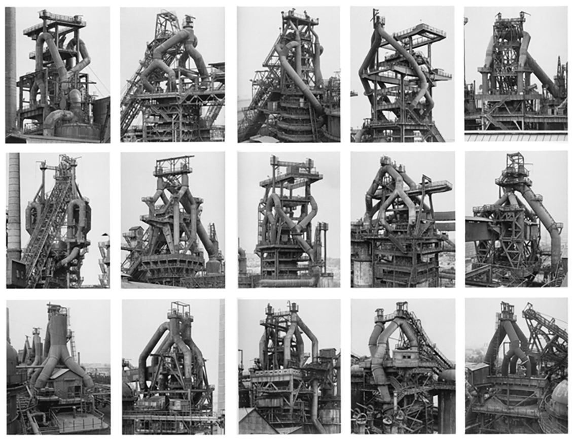
The Bechers were, first and foremost, formalists. “We want to offer the audience a point of view to understand and compare the different structures,” they once said. “Through photography, we try to arrange these shapes and render them comparable. To do so, the objects must be isolated from their context and freed from all association.” Much like the majority of the Becher’s work, this collection above depicts many different blast furnaces in different compositions, all printed in black and white and arranged in grids that emphasised their resemblance – what Hilla once called their “universality”. The meaning behind these images is to create straightforward historical documents of these vanishing industrial structures as well as beautiful topographic images. Although I will not be seeing this type of arrangement when visiting La Collette, I will be taking inspiration from the intricate way they have captured the angles and compositions from in between the pipes and framework.
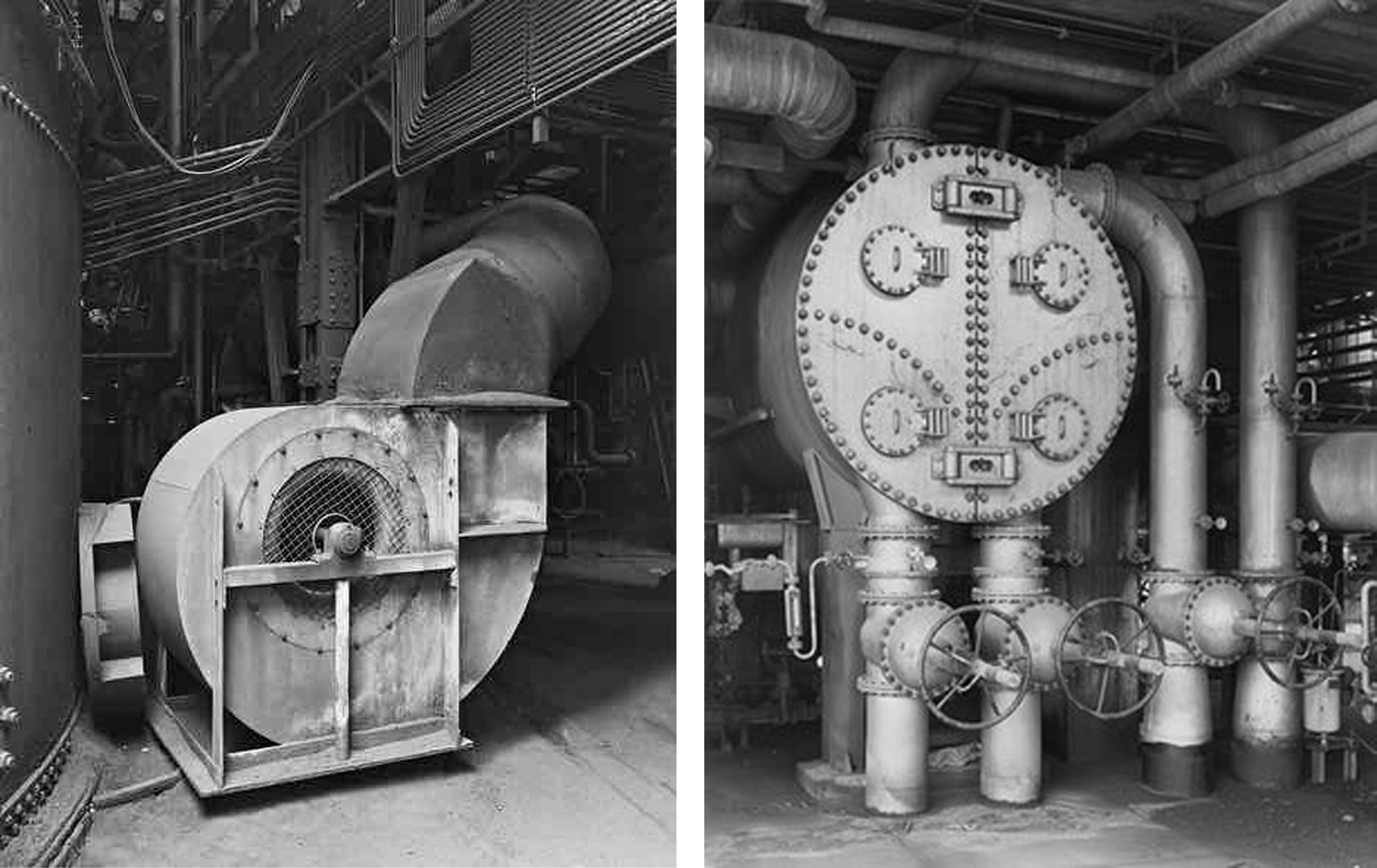
As well as looking at the Bechers grid style outcomes I will also be taking a lot of inspiration from some of their more simple, close up work. The two photographs on the top row of the contact sheet above show detail captured from a Petrochemical Plant in 1983, Wesseling, Germany. These images depict some of the scenes I expect to find for my next shoot in the ‘Energy from Waste’ facility and I love their dynamic and structural composition. Below them, I have added three more industrial landscapes captured by the famous couple that was originally part of a much larger grid. These images depict old Stonework and Lime Kilns strategically captured against their environments. Alongside her late husband, Hilla saw structures that others might have dismissed as ugly, even threatening, and made them unforgettable.

Documentary: Jersey Waste Disposal – Planning

After completing my previous research and shoots looking at the different variety’s of waste pollution and where it’s found, I next wanted to explore what ultimately happens to it once it is thrown away. To combat the problem of the growing amount waste production, there are numerous solid waste facilities worldwide, including landfills, incinerators, and a growing number of transfer stations.  Many of the older facilities run by municipalities have been closed down because of environmental concerns, paving the way for the waste industry to market their “state-of-the-art” management and facilities. Luckily this is the case with our island and my next documentary shoot will be concentrated on how Jersey deals with its household and commercial waste. I want to show this topic in order to give my viewers an idea of what happens with their everyday waste, even when they dispose of it ‘properly’. To do this I will have to visit La Colette and explore their recycling and waste to energy facilities.

As well as looking the new recycling centre at La Collette that has recently replaced Bellozanne, I am really interested to find out more about what happens to the waste that does not get separated. The common household and commercial waste that is not recycled is sent to the La Collette Energy from Waste Facility. This facility replaces an old incinerator and provides the Channel Island with a reliable means of waste disposal for the next 25 years. It will also be able to produce 10MW of power, equivalent to 7 – 8% of the island’s electricity usage. Reused and recycled items have also been used in the site’s construction, for example, the building takes its shape from the steel frame saved from the demolition of the Jersey Potteries building in Gorey. The waste to energy facility is located next to the existing Jersey power station enabling the EfW plant to share the chimney, cooling water and other auxiliary services, minimising the environmental impact of the development. The way that this site works, in basic terms, is it burns rubbish and uses the heat from the fire to generate steam which is then used to drive a turbine, generating electricity. In order to really explore this part of our islands waste disposal, I wrote to the department of infrastructure in the hopes they would give me some information about the smoke that is generated from the burning of the waste. Amazingly they do not actually produce any smoke and even offered for me to be escorted around the site on the condition that I later give them my photographic results. Below is a copy of the reply I received from the manager of the energy from waste facility, Ian Williams…Since receiving the email above I have been in contact with the ‘Energy from Waste’ facility and have arranged to meet with them on Thursday the 20th of April at 10:45 am. My plan of action for this shoot is to record the site from an insider’s perspective using topography and documentary photography techniques. Whilst there I will be taking as many images as possible, attempting to capture some interesting compositions and angles to draw in my viewer’s attention. All I will need to complete this shoot is my camera and the safety equipment that will be provided upon arrival. My goal for this opportunity is to truthfully present what happens to Jersey’s un-recycled waste, as well as the elements that go into the transforming it into energy.

As well as this guided tour I am also planning to take a trip to the recycling centre to demonstrate the new amazing and easy to use facility we now have at La Collette. Although I am coming at these next few shoots from a documentary perspective, I predict I will also be including some abstract images to emphasise my message. Below is a contact sheet depicting some photographs I have found of each of these departments. One the top row are some of the things I can expect to see at the energy to waste facility and on the bottom row the recycling centre…