Category Archives: Research

Filters

Author:
Category:

Jon Cazenave: Ama Lur

Website: http://www.dalpine.com/en/book/ama-lur

In 2001, He received a B.A. in Economic Sciences from the University of Deusto. In 2006, after working for 5 years in the finance world, he decided to move to Barcelona to study photography.

He began working in documentary photography so that he could capture and depict the contemporary world and completed his studies with Pep Bonet, Christopher Anderson and Paolo Pellegrin, after having been selected to participate in the first Magnum Workshop taking place in Oslo.

Since then, he has been working on a long-term research project called GALERNA. This work focuses on the idiosyncrasy and aesthetics of the Basque Country with an anthropological perspective.

This book is the closing chapter of an 8 year project by Jon Cazenave, he has compiled a book of the Basque people’s idiosyncrasy and their aesthetics, to unravel his home’s political intricacy from an anthropological perspective.
I have chosen this book as part of my inspiration for my book because i like the very dark black and whites in the book which i partially want to recreate in my book as all my images have a standard black and white filter as i think it is very dramatic and my project is very important and dramatic.

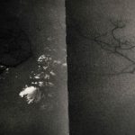
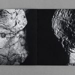
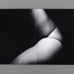
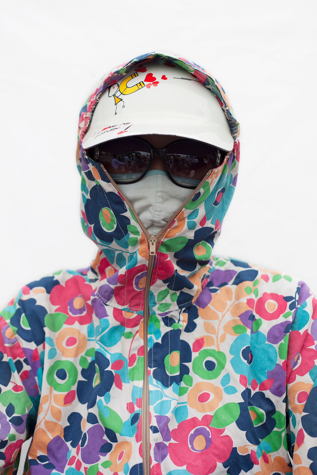
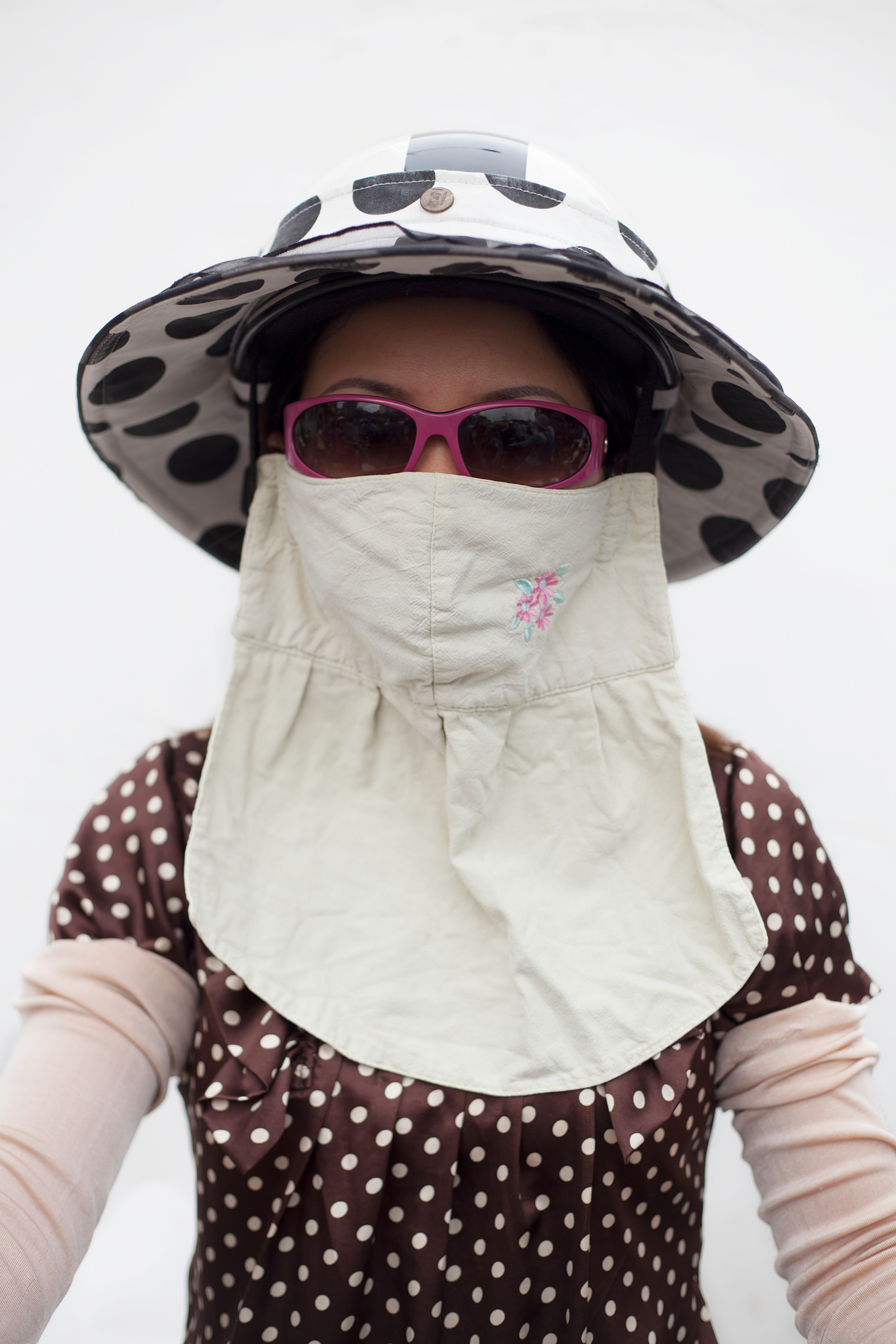
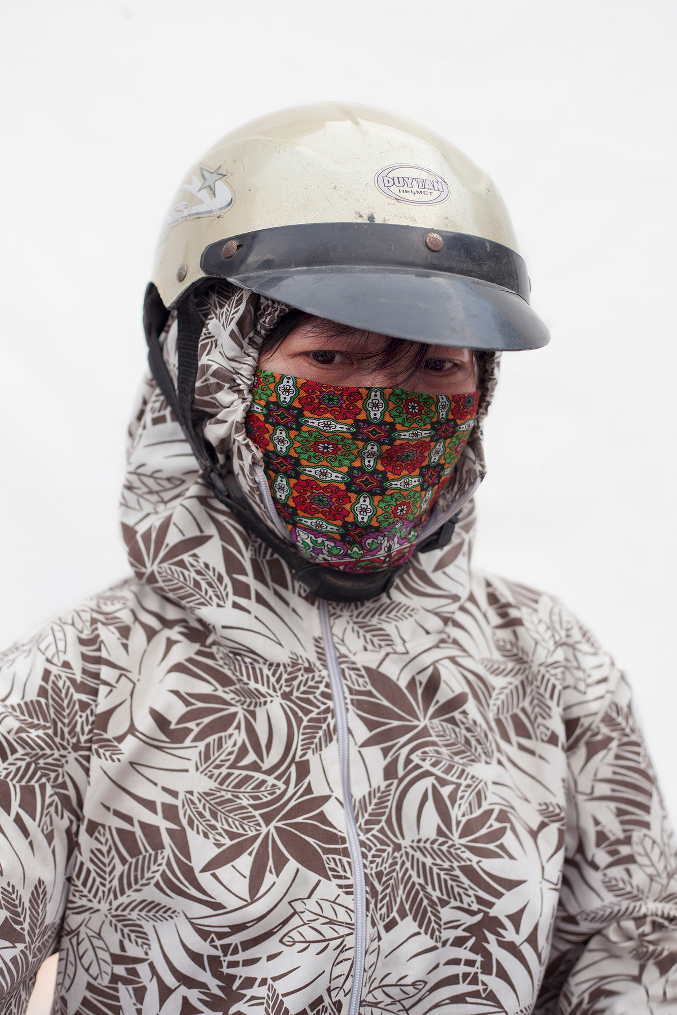
His work is very unusual and i would consider it abstract photography but his work is very ambiguous if you have not read the description of the book which is similar to mine as my project could be mistaken for a project on war. His book is in a portrait orientation which is completely covered with images/black paper. The edges of the book are a grey colour and the seem of the book appears to be covered with glue. It is a soft cover book as the cover is an image. Every single image is a double page spread.

The whole book is on black paper with the images on top, all the images are double spread and go from edge to edge. In my book i will have double page spreads splitting up the portrait orientated images as otherwise it will look too clustered. The double page spread will be black and white and many will have high contrast and dark shadows to make the images look much darker to show how worrying and dramatic my project is.

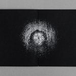
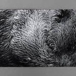
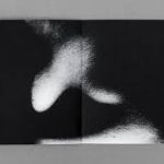
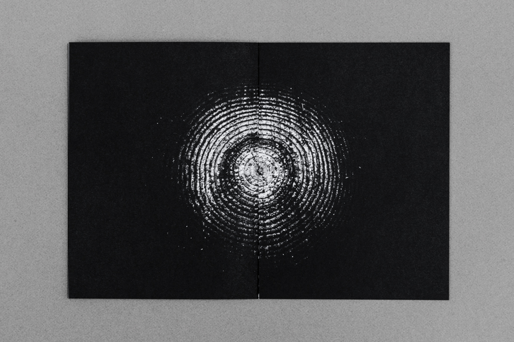
His work only shows parts of an image which leaves it up to the mind of the viewer to make up the rest or what could the image be apart of. Some of his work is much clearer than this one which is very ambiguous.

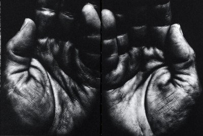
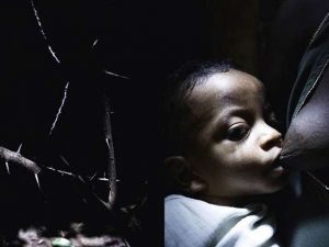
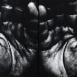
This image which is back of his book is much less ambiguous than just simply the patterns which are on some of the pages. However each image has a symbolic meaning to him personally as his work is exploring his homeland which is why all the images are symbolizing his home land. The hands could represent those of his family members or just people from the community. His work is very intimate and he has some up close images of body parts which can be ambiguous as the viewer does not always know what they are of.

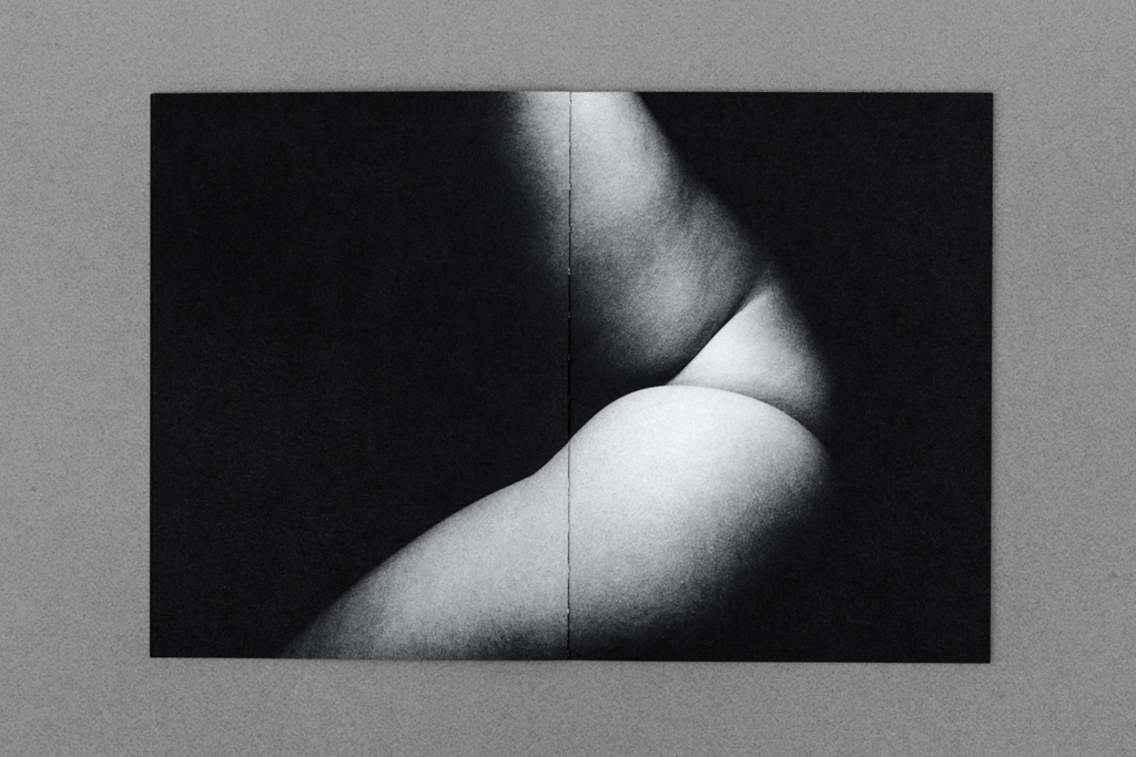
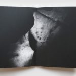
I think this image is of an arm but i am not quite sure, i do not like images which i cannot clearly make out what they are. For many photographers it will add tension into their work but i do not like this as i do not like the uncertainty.

Personally i find this book not very good because you do not understand what it is about without reading the description. There is no explanation about why the book was made or what it is about within the book.  Also there is no name or date on it and the cover does not give any clue to what the book might be about. I like books which have a title which gives you a clue of what it may be about or if not the images will tell the viewer what it is about.

For my book, i will make sure that the meaning and concept behind it is clear through the use of quotes from external sources, i will make sure my book has my name and title very clearly written on it.


Christian Rodriguez

His work: https://www.lensculture.com/articles/christian-rodriguez-motobaik#slideshow

Christian Rodriguez investigates themes related to gender and identity by working with communities all over the world. His work has been published in The National Geographic, The New York Times, The Guardian and The New Yorker.

Motobaik is a term which refers to scooters in Vietnam, he has done a projected exploring Vietnamese women who wear specially designed fashionable motorbike jackets which almost cover their faces and hands when they ride. This relates to my project as i am exploring mouth masks and gas masks which cover my models face.

This project is similar to mine as the jackets cover their faces which is similar to what my mouth mask ans gas mask do. The women do this because they want to avoid the pollution caused by so many motorbikes and they also use it a sun protection. They do this because of beauty standards in Vietnam, having paler skin shows a higher socioeconomic status because it shows that you work in a place with no sun exposure. His photos are a mixture of formal portraiture as well as environmental portraiture, there seems to be a standard pattern for designer jacket with floral/colourful patterns being the primary design. All of his photos have a standard and consistent composition which is the same for each photograph.

This portrait is fairly formal as there is nothing in the background to distract the eye from the women in the centre of the image, also by having a completely grey background could represent the smoke and pollution caused by the 37 million motorbikes travelling at rush hour. The floral coat stands out from the image which is what attracts the eye to begin with, this directs our vision to the full covered face on the women so that no smoke or sun can get through. The mask underneath is used for the pollution and this creates different depths to the image as the coat is on top and is what we see first then the cloth mask is what we see next. The glasses keep the anonymity of the women which makes the viewer wonder what she looks like and what kind of emotion she is showing underneath the glasses, mask and coat. The coat which the women is wearing is to protect her from the sun but it does not match her floral jacket but it blends in with the pale grey background which is why it is not noticed straight away. Within the image, there are four different types of what as there is the grey/white of thr background, the bright white of the cap, beige/white of the jacket and the dirty white of the mask. These all work together to create a consistent composition of the image. This image has no hidden meaning as Christian Rodriguez project of Motobaik is very clear and the description is clear.

This portrait differs from the others as the women is not wearing a jacket but she is wearing a bib like cloth mouth mask to protect her against the pollution, she is also wearing sunglasses and a hat to protect her against the sun so that her skin does not tan more as otherwise it will symbolize a low socioeconomic status. Like the other images, the background is a grey/white which for me symbolizes the pollution in the air during rush hour which is caused by motorbikes and cars. The different patterns of her outfit clash which does not make for perfect composition however as this is an environmental portrait, Rodriguez does not have control over what they wear when he photographs them. There seems to be a trend with the women he chooses to photograph as they are all wearing bold patterns and it is not clear that all women wear patterns like this but it seems to be a sign of being of a higher socioeconomic status because they can afford face masks, hats, glasses and jackets etc.. This image has the same composition as all the other images when it comes to the women’s faces in the sense that almost all the women preserve their identity with sunglasses or a low hat and Rodriguez respects this and does not ask for the glasses to be removed as they also protect their eyes against the smoke and sun. This is the only women out of my gallery to be wearing a different form of hot to a cap or a helmet, this could potentially be because she is not wearing a jacket for the cap to stay on or because she does not like it.

This is the only women out of my gallery of images which who has not covered her identity/eyes with sunglasses or hats. Also her jacket is not as colourful as the other women and she matches with the colours of the women above. Rodriguez has kept the same consistent grey/white background which could represent pollution. This women is the only one who is wearing a colorful mouth mask which is interesting because her jacket is lacking in colour which is why the viewers eyes are attracted to the colourful mouth mask which is protecting her from pollution. She is also wearing a helmet which is similar to a cap as it protects her eyes from the sun which is potentially why she is not using sunglasses. The mouth mask is the only colour in the whole image which is why it stands out so dramatically and makes the image much more interesting than the rest as she does not fit with all the women yet and the same time she does. The eyes of the women show lots of emotion almost sadness but we do not know, possibly because she has to wear all of this just to fit in with beauty standards in Vietnam and protect herself against the high levels of pollution during rush hour.

Further Reading – Helena Reckitt and Peggy Phelan – Art and Feminism

Art and photography are creative mediums that I have always been passionate about and feminism is a topic that I am incredibly interested in as a self identified feminist. As a result of these interests I received a number of books for Christmas last year, including “The Art of Reflection” which is about how female artist have presented their bodies in self portraiture and “Art and Feminism” which is an incredibly interesting book that encompasses many topics surrounding the link between feminism and art, with many honourable mentions of influential feminist artist and different critics insights on how their work, often particular pieces link in with feminism.

The book includes essays, quotations and various texts from a number of female  artists, art critics and feminist scholars. The preface and editing of the book was completed by Helena Reckitt, a feminist curator and researcher and the survey was written by the incredibly influential feminist scholar and former chair of New York University’s Department of Performance Studies.

The pre-face of the book was written by Helena Reckitt, even in those first initial pages some very interesting and thought provoking thoughts are made. Reckitt writes that “the trap of heroine worship,” is that “the achievements of women are uncritically celebrated in an understandable but counterproductive effort to compensate for year of neglect.” I think that this statement in certain circumstances is correct. A lot of women who are in male dominated professions such as doctors or scientists are often celebrated for simply choosing to take their chosen career path. I think that such achievements are commendable as girls and young women are often discouraged from choosing to study certain subjects or take certain jobs. However, when this celebration, or “worship” as Reckitt suggests, takes away from their actually achievements within their field (when compared to men as well as women) this  “worship” can be harmful. For example if a public speaker who made an  well planned, well presented, thought provoking speech on a serious topic was not a native English speaker and all anybody could talk was how well they spoke English, it devalues the content of the speech. On the other hand, however, this statement is untrue, in the art world self identified feminist artist’s (or occasionally simply female artists’) work is looked at incredibly critically. Critics and viewers alike automatically search for some kind of feminist reading or political subtext within artworks.

Peggy Phelan (left), Helena Reckitt (right)

Reckitt also goes on to say later in the pre-face that stems from the same idea that some female artist find “the feminist label restrictive, threatening to overshadow other elements of their work.” Louise Bourgeois, one of the most influential feminist artist of  the 20th Century has in the past denied being a feminist, this may be because she feels that if she labels herself and thus, her work as feminist it may diminish the many other strong themes in her work. Other female artist of colour, have in the past and present denied being “feminist artist” because they feel that the feminism movement for the greater part of history has been about the rights and freedom of middle class white women with a complete disregard for the rights of women of colour. I think that this is a fair point, if you feel that your rights have been ignored and you relate this discrimination to a particular label, you are completely within your right to not identify with the movement. However, I feel that within the current movement of third wave feminism, the importance of inclusion for all women, including women of the LGBT community and women from all races and cultural backgrounds is growing.

Peggy Phelan states later in the survey that “Writing about art has traditionally been concerned with that which is interior to the frame, whereas feminism has focused primarily on what lies outside he frame of patriarchal logic, representation, history and justice.” I believe that this is a very intriguing analogy as it raises questions as to whether or not feminist art is appreciated enough for its aesthetic nature and perhaps too much for its social and political allegory. At the same time, it suggests that the social and political nature of artworks that are not typically considered feminist have traditionally not been looked at as critically as maybe they should have been at the time of production. Many non- feminist artworks from history are now looked at through a critical lens, although critics views are now in retrospective and cannot reflect on current events of the time. The critical viewpoint that Phelan describes suggests taking a step when critically analyzing art, viewing it within it’s social, political and historical context.

I found this book very interesting, but at times difficult to read, I often had to take a break and allow myself to process the essays and make connections before continuing. I also found myself having to read over things again to understand them better. I was very glad that I was gifted this book as opposed to borrowing from a library as I was able to highlight certain quotes and passages that I found interesting or didn’t completely understand as well as marking pages that contained artwork that I was inspired by or found particularly intriguing.


Post as a performance?

// P E R F O R M A N C E   A R T  |  F L U X U S //

Fluxus is an international group of musicians, artists, designers, poets and creators who shaped themselves in the 1960s and 70s. Describer by art critic Harry Ruhé as “the most radical and experimental art movement of the sixties”, it is known for its experimental nature and ability to expand and evolve. Generating a variety of new art forms that were created by Fluxus artists such as intermedia, concept art and video art this movement gave way to a whole wave of new art forms. Three main continents were involved in this dramatic and historic movement; Asia, Europe and North America. “Performance events” were a large part of this artistic movement and lead on to a series of pieces created world wide which eventually became time-based design. The main notion is that one should embark on an artwork without a conception of its final form. There must always be a relationship between the audience and artist ad the finished product is only a snapshot of the entire process of creation. This process of creation was valued highly over the finished product itself. It was actually George Maciunas, a co-founder of this fluid movement, who eventually coined the name Fluxus in 1961 to title a proposed magazine. Meanwhile Marcel Duchamp, a french artist, was a large influence for this movement focusing mainly on the ‘readymades’ he created.

These ‘readymades’ created by Marcel Duchamp were ordinarily manufactured objects that were selected and then modified by the artist. He self-labeled the process “retinal art”. By choosing a object, or selection of such pieces, repositioning, titling and signing the piece; it became art.

Above: Ray Johnson setting up a moticos installation, autumn 1955 and Suzi Gablik surrounded by the same pieces.

Ray Johnson’s early performance art was created through interactive installations which could then be represented through photography. Above is one of these first performances which took place in the autumn of 1955 and featured a variety of his moticos pieces in a street installation.

Many experimental artists of the 60s took part in the Fluxus movement either through the creation of their own art or through their participation in other’s performance pieces. Examples of artists who joined into with these Fluxus activities inclue: Joseph Beuys, George Brecht, Robert Filliou, Al Hansen, Dick Higgins, Bengt af Klintberg, Alison Knowles, Addi Køpcke, Yoko Ono, Nam June Paik, Daniel Spoerri, and Wolf Vostell.

The varied nature of the Fluxus movement involved a community of friends who would work and create together and maintain the movement as an idea. There were many different ideas about art and its role within society however which caused some debate. One co-founder actually proposed a manifesto for the way Fluxus was defined but none of the other artists agreed with it leaving the part in a varied and undefined state. Many artists didn’t even consider Fluxus to be a movement at all so instead it became a loose but robust community which earned  a name for itself through experimentation.

Mail Art

// R A Y   J O H N S O N //

Looking into the theme of ‘Mail Art’ and its place in historic and modern creative movements, the name Ray Johnson was a quick one to appear. the twentieth century artist was popular following his activity as part of the downtown art scene in New York in the early 1950s. Johnson painted geometric and abstract images heavily influenced by his previous professor, Josef Albers. The crucial thing about Johnson’s work was not just how he created it but later his destruction of the same pieces. Most of his pieces were destroyed in his personal process of creating collages which resued this original artwork. In 1954, these small-scale collages were labeled as “moticos” and featured irregular shapes and images from popular culture. Some of these celebrity influences included Elvis Presley and Shirley Temple as well as regular department store models. Much of Johnson’s work in this area anticipated Andy Warhol’s pop imagery which started to appear in 1960. Despite artistic similarities, Johnson’s approach to work and fame was drastically opposed to Warhol’s and he was known for dodging it being labeled as “the most famous unkown artist” by Grace Glueck in the New York Times (1965). His deliberate elusiveness was a popular debate and added to the interest of his character. 

Much of Johnson’s work started a modern understanding of performance art such as his tendency to share his moticos around New York with strangers in the streets, train stations and cafes. These performances were even sometimes self recorded in order to collect public reactions to his work and each intricate creation. Much of the work used in these sessions of self publication were later supposedly burned.

Jonson reused his moticos by cutting them up and creating new tiny compositions with them which could then be inked on, painted and sanded to create new pieces of work. These new collages were extremely complex and had an underlying emphasis on structure repetition and semi-geometric forms and shapes. Johnson can easily be seen as an early instigator of performance art acting in other’s pieces and creating his own such as the staging, “Funeral Music for Elvis Presley”. 

“In his typically self-deprecating way, Johnson would say that he did not make Pop Art, he made “Chop Art”.”

In 1995, Johnson was witness dressed in black as he dived off a bridge in sag Harbour, Long Island before backstroking out to see. This suicide was heavily speculated and many aspects of his death seemed calculated such as the repetition of the number 13. The date of his death, the 13th January; his age at the time (67, 6+7=13) and the number of the motel he had checked into earlier that day, 247 (2+4+7+13).

“There was much speculation amongst critics, scholars, admirers, and law-enforcement officials about a “last performance” aspect of Johnson’s drowning. After his death, hundreds of collages were found carefully arranged in his Long Island home.”

Ray Johnson is still considered one of the major artistic innovators of the second-half of the 20th century within the critical community but his work remains mainly unknown and heavily under-appreciated by the general public. Some of his relevant pieces are selected below and will be used as starting points for further experimentation with my postcard images.

Working from these ideas, I intend to print a selection of my post card images and effectively graffiti them with block colours and shapes in a similar style to Ray Johnson’s work above. To do this, I will print them on standard 80gsm paper and use ink pens to illustrate them with words and text. I printed four of the postcard images onto sheets of paper with a white border which allowed me to work slightly around the image as well as directly onto it. I also printed all eight of my stamp experience to work with as a test influenced by this artist. I started by drawing rough doodle-like images directly from Ray Johnson’s work onto a plain sheet of paper before starting on the images. The sayings, words and illustrations used are all heavily influenced – if not directly lifted (such as the legs below) from Ray’s own postcard projects as part of his Mail Art series.
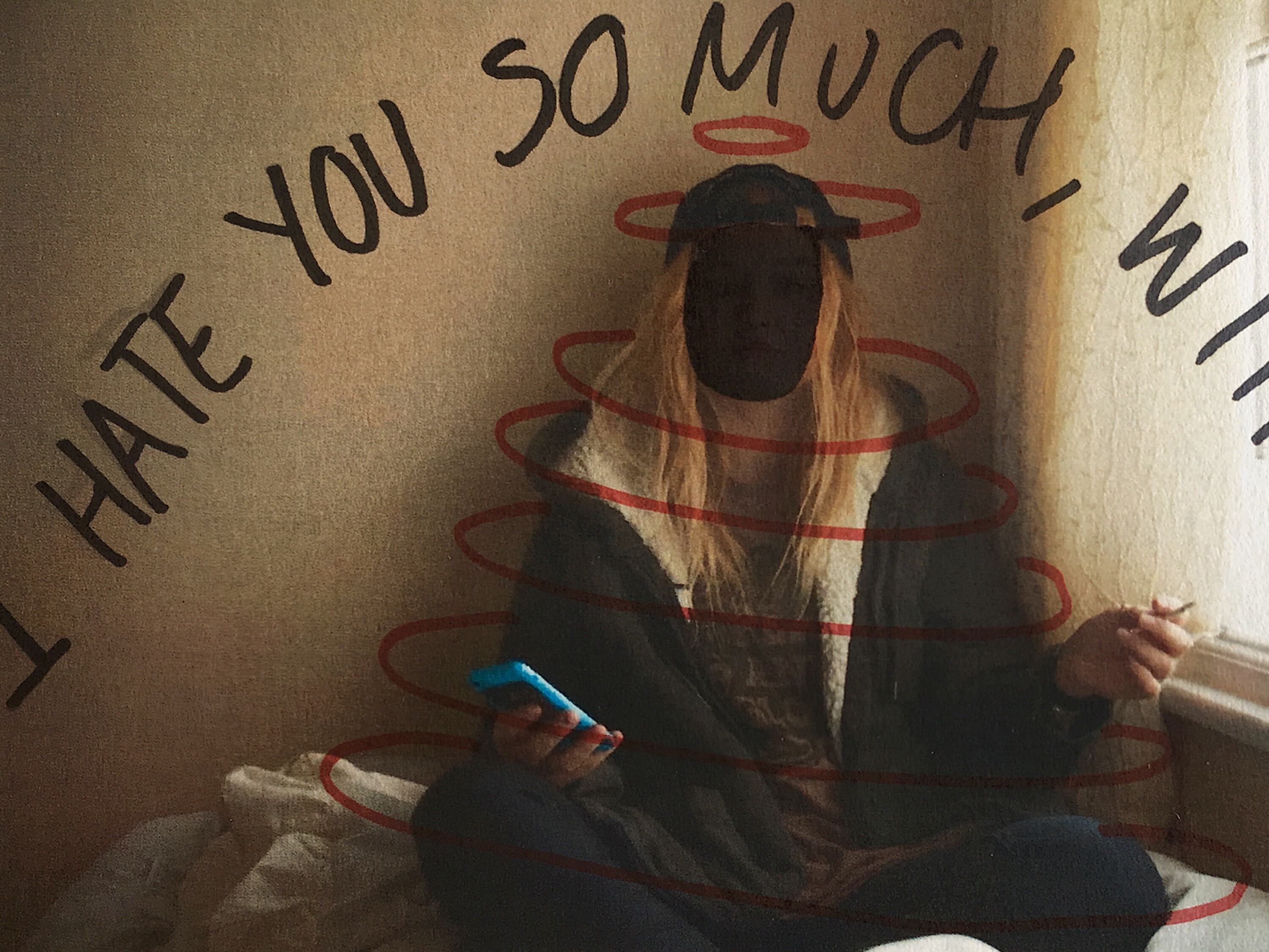
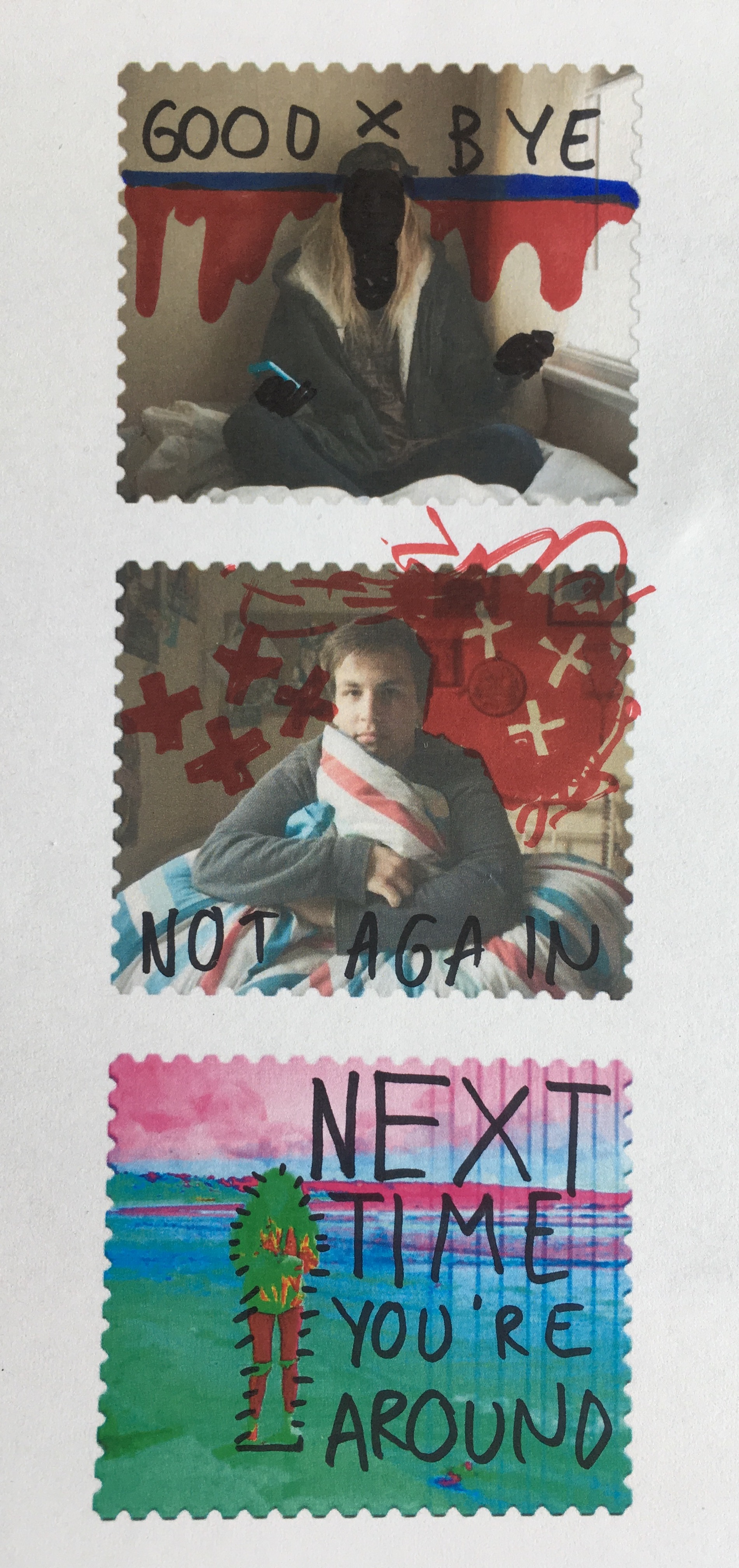
Below are a series of small tests on my own images. They were printed out on a normal copy printer so are not a high quality and were manually deformed with pens and ink markers. 

I also used this experimentation technique on some of the stamps I created in photoshop after they were printed out. Again, they have been manually manipulated rather than digitally and feature a mixture of original ideas and influenced doodles for Johnson’s own project work.


Methods of Presentation – Research

For my next step in moving towards finalising this exam project, I have researched a few of the ways I am planning to display my work. As I have explained and presented in my last post, I will be using a large number of my favourite outcomes from this project to enlarge and exhibit as well as include in a potential photo-book. Below is an introductory look at some techniques that I have previously attempted in my past projects as well as a few new styles I intend to experiment with. The first contact sheet below depicts a look at different styles of window mounts as well as photo collections and picture stories…

By mounting my chosen photographs and framing them with the available materials l am able to explore many different display options to enhance the overall look of the project. Using a well-designed combination of frames, mounting, and card mats I can form an important part of the visual expression displayed throughout my images, separating them from their surroundings and giving them more visual weight. One of the main mounting and framing techniques I will be using for my display will be window mounting; cutting out the centre of my material and using the frame that’s left to stick over the top of my uncropped photographs. This type of mountings is usually cut with a bevelled edge and because it covers the edges of each piece, window mounts can also be useful for cropping or levelling images. As well as this I will also be using this technique to explore the idea of combining my final images using triptych/ diptych displays. Diptychs and triptychs are a brilliant tool for photographic storytelling, by presenting two or three images from the same session or completely different scenes they are amazing for showing opposition as well as contrasting ideas.  The top row of the contact sheet below displays some examples of window mounting and the various techniques and styles in which it can be done…Apart from window mounting I will also be potentially creating a Picture Storyboard to present some of my larger collections such as my shoot from the La Collette ‘Energy from Waste’ facility. The definition of a picture story put simply is a visual representation of something produced on one surface in a creative medium. What I like most about this method is no picture story can ever be the same, even if the subject and photographs are identical. The way you deign your story and lay it out can give the overall outcome a very different look, showing individual styles in each version. On the bottom row of the contact sheet above I have added some examples of varied picture story layouts including one I made in Photoshop.

To get more ideas about the different compositions of photo books my next step was to find three personal inspirations that are presented on the publishing website I will be using, Blurb. Below are three very different examples presented and captioned in a contact sheet to clearly view their layouts. On the top row is an example that was put together by Mark Roberts, called ‘PDML Photo Annual 2017’, which presents a simple and classic photo book style.  The book is a Standard 10×8 inch landscape size and consists of 108 Pages. The layout is a common arrangement of each photograph taking up a single page with a white border and a blank page left between. Although I like this classic technique I am sure I will be wanting to do something a more creative for my end result to emphasise my images as well as my message.The next photo book, displayed in the middle row, is an interesting piece called ‘We The People’ by Daniel Levin which explores protests taking place in America. This book is only 50 pages long and is a nice 13×11 inch landscape size. I like the variety of layouts in this example including, however, I am mostly researching it for its straightforward set out of the title, second title, and then preface. Lastly is my favourite inspiration for my own photo book displayed out of the three below. This book by Michael Farnworth, simply named ‘Photographs by Michael Farnworth’ is a standard 10×8 inches landscape size and consists of a short 30 pages. The book portrays the author’s “first book of photographs” depicting the beautiful landscapes of Hampstead Heath. The inspiration I can take from this book is the beautiful way he presents multiple images on the same page, combines contrasting/complimenting images, and presents full-page bleeds…

Environment – Artist Reference 3 – Caroline Grohs

Illustrator and designer Caroline Grohs was born in Düsseldorf, Germany. She grew up in a small town near Düsseldorf where her parents still live today. At the age of 19, she began her studies in Düsseldorf but a year later she moved out of her parents’ home and spent a year studying in Hamburg. Her mother is a graphic designer, so was introduced to graphic design, art and photography at an early age. I have selected Grohs as inspiration for my further work, her illustrative line work being being synonymous with the visuals I am creating. Her drawing work is largely geometric and polygonal, creating a contemporary and modern design that works effectively for the commercial nature of the art.  Grohs talks about this, stating that her favorite subjects and priorities were Corporate Design, Editorial and Illustration. This is evident through her corporate design project for a ballet/theater.This project is named Motion Theater. Grohs talks about the process of this project below: 

“After defining the brief for myself, I searched for inspiring photos and was fascinated by a photos from John Davis and other similar photographers. Their photos of dancers were just focused on the dancer with a clear background. I loved them. They were perfect to show how my concept should work. Then I tried to create a logo for the Motion Theater. A symbol combining the features of this theater – especially the focus on the main dancer – and the movement of dance. I drew many sketches and finally created this kind of “screening”, which has been adapted in different ways to represent the different figures and moves. The logo resulted from these sketches. The posters intertwine the dancers movements and their connections to the theater, so that it appears to be “in motion” at all times. The “floating” typography also expresses dance as movement in space. I love this kind of typography because it is a strong and clear statement, especially for this modern part of my theater.”


Grohs’s work on Motion Theatres can be seen above. She has essentially created these advertising posters for a ballet event, employing both her photographic and illustrative skills in order to generate a professional, corporate piece. We can identify the significant use of typography, as discussed by Grohs previously. She has employed a narrow, sans-serif, bold font for the important text that must be seen by the viewer. In addition to this, a collection of colours have been used to segregate components of text. We see the inclusion of a pale orange and turquoise that successfully organise the text without overpowering the primary image or main headline. These photographs themselves are very minimalist and simple. Taken within a studio environment, all emphasis is on the dancer. With a complex background, these images would be way too crowded. There would be too many clashing components such as the text, illustration background and subject. This is something to remember when I produce my work. The illustrations themselves are thin, white-line drawings. Polygonal shapes are being created to replicate the form and silhouette of the dancer. These geometric lines all originate from the word ‘Motion Theatre’ almost like they are being projected upon the dancer. It creates an interesting visual effect, looking as if the subjects are being consumed or protected by these transparent shells. I really like this project and it provides me with a number of different ideas that I can employ going into my exam. The work of Grohs has enlightened me regarding the use of typography and how this can assist in conveying a message within my work. Furthermore, Grohs work demonstrates the effectiveness of subtle line work. Her mark making is thin and reclusive. It is not in your face or dominating the composition. It shows how sometimes simplicity, and allowing the image to breathe and show its positive visuals can be a successful decision.

Gillian Wearing – Artist Reference

Gillian Wearing is a British artist and photographer who was part of the Young British Artist movement. She produced groundbreaking work at a similar time to artists such as Tracey Emin and Damien Hirst and won the turner prize in 1997. I was draw to Wearing’s work because her use of masks and the concept of masquerade ties in with the work that I have produced in this project. The above photograph is entitled “Self-portrait at 17 years old” Wearing is wearing a wax mask and wig to try an recreate a photograph taken of herself taken 23 years before (as this portrait was made in 2003, whereas the photo is was based on was taken in 1980 when wearing was 17) When discussing this portrait Wearing stated that she remembers being  “very self-conscious” when the original image was produced ” but also very aware of my image.” Wearing goes onto say that she remembers posing for the photo, dropped her shoulders to make her neck appear longer, opening her eyes to make them appear bigger. When creating my self portraits I was also self conscious, I was very aware of how I was posed and the facial expression I was making. As stated in my previous posts, I find some shoots easier to pose for than others because what I do in front of the camera is a performance and sometimes I find it challenging to get into character. In my course work project I struggled to get into my 1960’s supermodel character and after looking at the photos I decided to do a re-shoot because I wasn’t accurately conveying the character.

Above are two images from one of Wearing’s projects where she cast the face of supermodel Lily Cole and made several wax masks of her face. She then produced studio portraits of Cole wearing the mask of her own face as well as posing as photographing herself wearing the same masks. When looking at the two images above it is incredible how different Cole and Wearing look despite having the same “face”, it really shows how the eyes, hair and costume can completely change the appearance of a subject. In the portrait above on the right, Cole’s already doll like appearance is accentuated by the lace blouse and perfectly curled hair. The mask, although of her own face, gives a porcelain doll effect and due to the cut out eye holes her eyes appear sunken into the head, not much unlike a real doll with glass eyes. Wearing appears rather child-like with Cole’s face, as Lily Cole is an impressive 5″10, her face looks too large on Wearing’s small frame, giving her the appearance of a child. The hairline of the wig that she is wearing also makes the face appear small and round. It is also quite apparent in the portrait that Wearing has a warmer and darker skin tone to Cole and the flesh that is shown through the cut out eye holes draws attention to the eyes. Many of Wearing projects have involved masks and all of them feature similar eye holes that allow some of Wearing’s identity to show through.

Another one of Gillian Wearing’s projects that I found particularly interesting was her photograph series entitled “Signs that Say What You Want Them To Say and Not Signs that Say What Someone Else Wants You To Say” Which was produced in the years 1992-1993. This series of portraits depicts people Wearing encountered in South London, she would stop various people and request that they write in black pen on a large white piece of paper, what they wanted to say and not what other people wanted them to say. Some of the portraits produced in this project where incredibly powerful, my favorite portrait is the one in the top left hand corner of the grid above. I love the honest and raw nature of the statement and how this man that Wearing encountered was secure enough in his masculinity to admit that he was sensitive and insecure. I think these sign were probably very liberating and very empowering and i think that everyone can probably relate to at least one sign within this photographic series.

I want to take inspiration from Wearing’s work by including text in my images. I so however, want to carefully consider the words I select and think about how they relate to the image, myself and the wider world of western society and feminism. The words of Wearing’s ” Signs that Say What You Want Them To Say and Not Signs that Say What Someone Else Wants You To Say” are powerful and I want to make also want to make a statement with my images.


Cyril Costilhes – Grand Circle Diego Book Research

Cyril Costilhes has a very unique relationship to Diego Suarez, the location where he shot his dark photoseries, ‘Grand Circle Diego’. A little over 10 years ago, his father moved there to run a casino, but was returned to France after a tragic motorcycle accident that caused him front lobe dementia, placing him in a coma. Costilhes saw his father’s move as an attempt to start fresh, lured by the beauty of the young women and environment. To Costilhes, his father’s aspirations were an illusion, and one shared by many white western men in a similar position. The reality of Diego Suarez is one of desperation, where people of privilege go to seek asylum in a false paradise, and the inhabitants seek salvation through the refugees of reality.

Since the book is about him revisiting an old environment of his I thought it would be an interesting link to my project based on my personal environments. I want to focus on how Cyril had put these images together in a way that creates a narrative.

When I search for images of Diego Suarez on google, I come across an idyllic seaside town.

This is a strong contrast to the images produced by Costilhes. His experience of the town is of his father, and he travelled there to resolve the ghosts that still hang over him as his father remains in a coma. The story of his father is of somewhat a dark irony; he left France after a failed marriage to look for a new life in what was seemingly a paradise of freedom. This elusive idea of a new perfect life in this paradise was supported by how free and beautiful the place looked, however it sadly ended up in a helmet-less motorbike accident due to a hole in the road.

The photoseries is compiled as a book, and Costilhes writes about his time spent in Diego Suarez. He imagines the moments leading up to his father’s crash:

“What was his last clear, clean thought right before the crash?! Was he daydreaming about the girl he was going to f^*k next, `daydreaming about his new house on the beach of Ramena, or about the money he was going to make by reselling that ambitious hotel in construction, about what he was going to do next, living in a paradise until the grandiose ending.”

His writing at the end of the book is very striking, describing the moments around his fathers crash, as well as the moment arriving back at the village in Madagascar since he left 11 years prior. He talks about the false paradise that Diego is, luring men in who want ‘fresh starts’ from their possibly miserable lives. Despite the beautiful women and beaches, Cyril saw through it as a Dystopia rather then a Utopia. He describes how people are losing their minds over the availability of power and freedom, and how their is a dense sense of colonialism spread by the western men looking for a paradise.

These are some other quotes from the book, written on the day he arrived back in Diego Suarez.

He describes how the place has not changed at all from what he remembers… Describing himself as a walking piece of meat ready to be salvaged upon by the local people.

“same bars, recycled bodies. I’m a walking piece of fresh meat. Nothing has changed.”

“I sometimes fantasize about ending it for my father. It would be a relief for everybody. I have this crazy idea of transforming this suffocating situation into something positive, something that would give sense to all this. Turn the ugly into beautiful.

First night in Diego, having a drink at La Vahinee bar, a beautiful girl sits at my table, looks straight in the eyes.

“J’aime la bite.” “

This is particularly striking as he is talking about killing his own father, however we can tell it has been said out of desperation and sympathy as he is wanting to end his suffering. This makes it such a powerful part of the text as it proves the reality of the pain his father, his family and himself have all been going through watching the man completely locked up in his body, resulting in this incredible set of dark, disturbing and mysterious images.


Here are some reviews I have found whilst researching that in my opinion reflect the atmosphere and emotion of the book strongly:

  • “Grand Circle Diego is a dark exploration of the photographer’s ghosts, and it powerfully captures Costilhes’ quest to reconnect with his father. Through its lavish printing, elemental design, and careful editing, the book creates the ambiance of very personal catharsis, leaving most of its mysteries unrevealed.” – Olga Yatskevich on Collectors’ daily
  • “Cyril confronted the demons, the grudges and probably the rage that town brought into his life. Nothing remains of the idyllic allure of Diego Suarez in his suffocating photographs – the images are extremely dark, baffling and often times even repulsive. Despite Cyril’s initial intention was to make a project of documentary nature, the work soon changed into a deeply subjective, visceral experience, a descent into the photographer’s innermost feelings, a coming to terms with a ten year-long trauma.” – Fotografia magazine
  • “Buried beneath its wild undergrowth and savage natural beauty, the Madagascan town of Diego Suarez hides many secrets. In 2003, whilst riding his motorbike home from Le Grand Circle Diego casino one evening, Cyril Costilhes’ father was involved in an accident that left him crippled with front lobe dementia. As a result, just over 10 years later, Costilhes has returned to shoot the mysteries of the land that snared his father’s sanity. The French photographer recorded his findings in his new book the Grand Circle Diego – and the results are dark, twisted and startling.” – Dominique Sisley on DAZED

Cyril has taken the paradise-esque vision and flipped it upside down as an evocative result of the haunting memories of his fathers life ruining accident. As a result he created a striking representation of the place focusing on the more  features of life there such as the mysterious looking people looking fearful and isolated, abandoned buildings, abstract images of flesh and vegetation along with the many other disturbingly interesting photographs within. Below you can see a selection of images that I have made, all of some of my personal environments (places I feel safe, comfortable, familiar with) that I feel link with Cyril’s work. I have more frequently tried making my images contrast’ stronger to produce darker blacks and lighter highlights, similar to Cyril’s style of images.

Barbara Kruger – Artist Reference

Barbara Kruger is a female american artist who is best known for her visual art featuring magazine clipping style art where striking text is layered over images. Most of Kruger’s work consists of monochrome images with black and white or red text. Her work tackles subjects such as capitalism, consumerism and feminism.

Kruger’s pro-choice commissioned billboard for the Wexner Centre for the Arts next to a pro-life billboard erected just 12 hours after.

One of her most famous images was used as a poster for the 1989 women’s march in protest of legal and safe abortion. The image (pictured below) features a split photograph of a woman’s face, one side being a black and white version and the other the negative of, one can only assume, the same photo. There are three red rectangles that separate the image, one and the very top, one and the bottom and a smaller one in the centre. The rectangles have white, slightly italic text played over the top reading “Your body is a battleground”  The same slogan was used for a commissioned billboard for Wexner Centre for the Arts (pictured above), 12 hours after the pro- choice billboard was erected an opposing pro-life billboard was placed directly next to it, depicting an 8 week old foetus. Although Kruger’s work supports feminist ideals and Kruger personally identifies as a feminist, her work also deals with superficiality which ties in with the theme of consumerism and how women are presented and choose to be presented in the media.

The image on the left featuring the phrase “Adorn your prison” particularly spoke to me as someone who enjoys makeup and getting dressed up from time to time. The combination of the text and image is a little different from most of Kruger’s work, the word “adorn” appears in it’s own rectangle and the words “your” and prison” appear in the same incredibly long rectangle that spreads across the entire width of the image, the spacing between the words is notably large which gives as disjunct feeling to the reader. The disjunct feeling is also mirror in the bottom heavy nature of the image with the there being no red or text in the top half of the image. The piece also has a strong sense of intrigue, this is provided by the use of the mirror as the back of the subject’s head, as well as her reflection. My interpretation of the phrase “adorn your prison” is that women are seen as objects and they are seen this way because of their sexual bodies, they cannot escape their own bodies so they may as well make the most of it and put some makeup on. Give the people what they want.

I want to take inspiration from Kruger’s work by adding text to my images to give them another dimension and a wider sense of interest. I also think that the addition of text will help my images more overtly tie in with the idea of feminism and self reflection.