The images below show my last planned shoot for this project, taken at the newly opened La Collette Recycling centre. These images are a follow-up to my last shoot depicting where Jersey’s household waste is taken and what happens to our un-separated rubbish. The new La Collette recycling centre opened on Monday the 16th of January this year and replaces the old household recycling centre at that was located at Bellozanne. Here you can bring household waste and recycling as well as donate anything and everything that could be reused by someone else. Below I have added the long list of the types of waste that can be recycled instead of burned at the La Collette facility…
After completing my previous research and shoots looking at the different varieties of waste pollution, where it’s found, and where it ends up. My last shoot for this project, presented below, portrays the options we have on our island and how easy it is to make a small difference in our lives and use it. Although I was planning on simply taking a documentary look at Jersey’s new and improved facility there were also a lot of beautiful and abstract features which I couldn’t help but present below. When completing this shoot I had to come back on two different occasions due to the workers there being instructed not to allow any unauthorised publicity or photographs. On my second visit, I was instructed of some safety features, giving a high visibility vest and asked to sign in and out in order to be allowed to continue. Apart from this slight set back all I needed to complete this shoot was my camera the location, as it is usually found, and natural light from the sun. The location is key in this shoot as my goal for these images is to simply spread awareness about this new facility and hopefully encourage my viewers to use it. Below are some of my original unedited photographs displayed in a contact sheet… To chose between these photographs and produce my final outcomes, I was particularly interested in having a mixture of dynamic straight photography as well as abstract photography to intrigue my viewers. When editing the landscape documentary photographs I experimented with the highlighting to really emphasise the dramatic sky. With the more abstract pieces, however, I concentrated on really bringing out the vibrant colours and brilliant texture. Unlike with most of my previous shoots, I have decided to keep all of my finals in colour. This is because, unlike my previous shoots, these images attempt to show something good and hopeful towards the environment. Below are my final chosen and edited 6 outcomes for this last shoot in my environmental project…
 This first piece above was created by stitching three separate photographs together to make one easy to read piece. I have put them together because the ‘reduce, reuse, recycle’ sign featured at the Recycling centre is situated all in one long, hard to capture horizontal line. I love the effect of this sign that has been created using recycled items and kids toys to create a textured, colourful and inspiring outcome. The meaning behind this photograph is obvious as I am simply getting across this clear message from a straight forward perspective. The final result of this, I believe, emphasises the written message and brings out the beautiful and striking details.
 These next two outcomes are my more abstracted results featuring some beautiful and inspiring artwork I captured when visiting the location. The meaning behind these two photographs is to intrigue the viewer about the recycling centre itself as well as spread the message of its importance. The first outcome on the left depicts a beautifully crafted recycling symbol made from a vast amount of green and red discarded children’s toys. I love the depth and contrast between the tiny objects as well as the vibrancy and texture of the whole piece. Next is a more abstract piece featuring the side and rooftop of the decorated facility building along with part of a growing tree. I love the strange symbolism in this piece and I like how, without context, the audience is forced to come to their own conclusions.
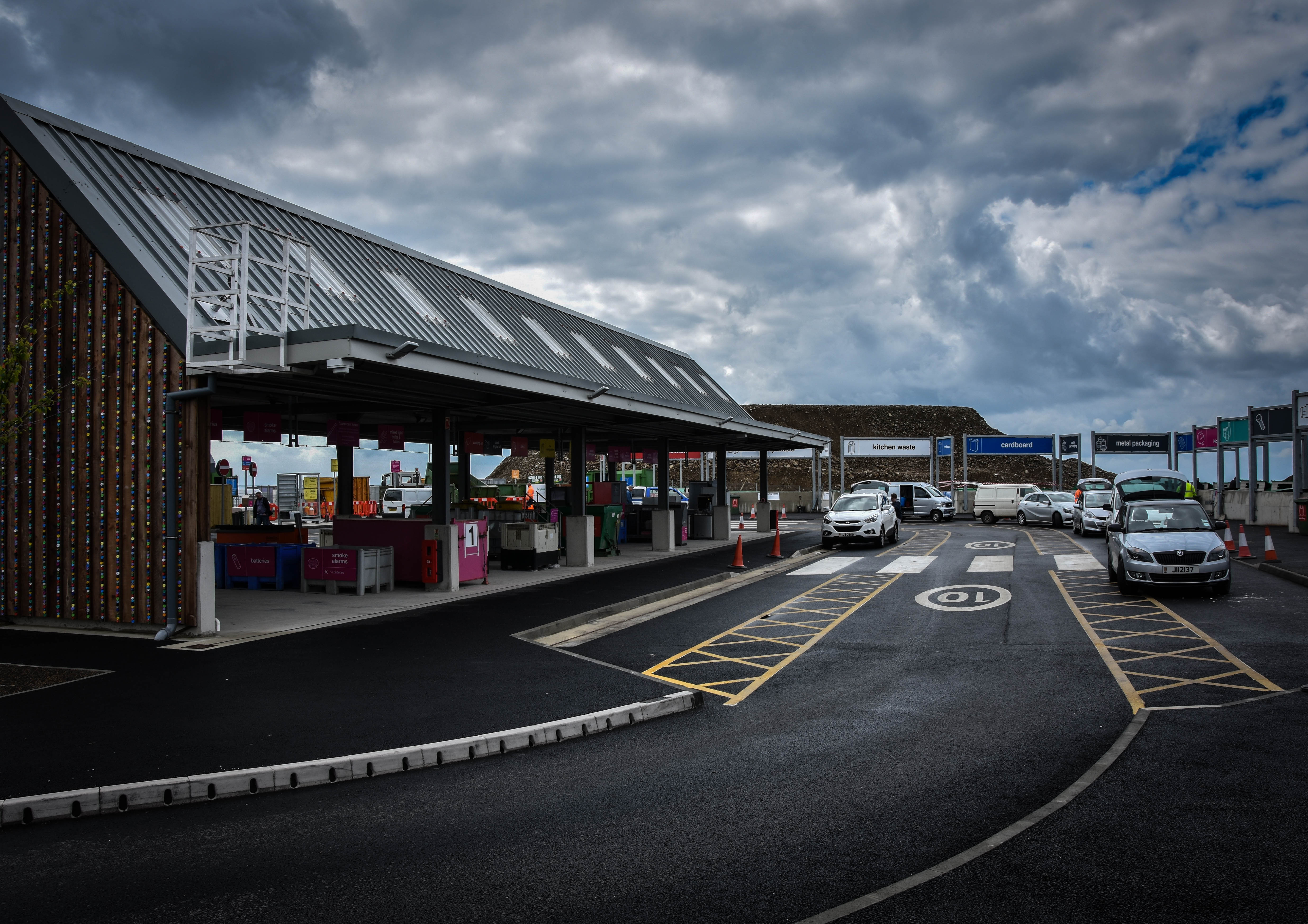 For this next documentary look at Jersey’s new and improved recycling facility, I have attempted to capture the location featuring as many important aspects as possible. My outcome above portrays the main recycling building on the left, the elegant car system running around the facility and a few of the many many drop-off points for waste that continues all the way around. The meaning behind this image is to show how the recycling centre now works and how effortless it is to drive around and dispose of our pollution safely. I have chosen this image as a final as I love the angled perspective of the facility and the dramatic overtones created with the contrast of the sky.
Lastly are two more of my documentary outcomes depicting the main features of the new recycling centre; the variety of different drop-off points. The meaning behind these photographs is simple as, like with the outcome above, I am trying to show the extent as to which they have improved Jersey’s recycling facility and made it as easy as possible for the public to use. The first image on the left depicts the electricals, mixed glass, metals and bulky waste containers with two members of staff in high-visibility jackets who are happy to help. Next, the image on the right depicts the same signs and more along with a member of the public discarding something into the bulky waste container. I like the perspective of the drop-off points in this picture and the contrast of the facility against the dramatic yet natural sky. 


 To chose between these photographs and produce my final outcomes, I was particularly interested in having a mixture of dynamic straight photography as well as abstract photography to intrigue my viewers. When editing the landscape documentary photographs I experimented with the highlighting to really emphasise the dramatic sky. With the more abstract pieces, however, I concentrated on really bringing out the vibrant colours and brilliant texture. Unlike with most of my previous shoots, I have decided to keep all of my finals in colour. This is because, unlike my previous shoots, these images attempt to show something good and hopeful towards the environment. Below are my final chosen and edited 6 outcomes for this last shoot in my environmental project…
 This first piece above was created by stitching three separate photographs together to make one easy to read piece. I have put them together because the ‘reduce, reuse, recycle’ sign featured at the Recycling centre is situated all in one long, hard to capture horizontal line. I love the effect of this sign that has been created using recycled items and kids toys to create a textured, colourful and inspiring outcome. The meaning behind this photograph is obvious as I am simply getting across this clear message from a straight forward perspective. The final result of this, I believe, emphasises the written message and brings out the beautiful and striking details.
 These next two outcomes are my more abstracted results featuring some beautiful and inspiring artwork I captured when visiting the location. The meaning behind these two photographs is to intrigue the viewer about the recycling centre itself as well as spread the message of its importance. The first outcome on the left depicts a beautifully crafted recycling symbol made from a vast amount of green and red discarded children’s toys. I love the depth and contrast between the tiny objects as well as the vibrancy and texture of the whole piece. Next is a more abstract piece featuring the side and rooftop of the decorated facility building along with part of a growing tree. I love the strange symbolism in this piece and I like how, without context, the audience is forced to come to their own conclusions.
 For this next documentary look at Jersey’s new and improved recycling facility, I have attempted to capture the location featuring as many important aspects as possible. My outcome above portrays the main recycling building on the left, the elegant car system running around the facility and a few of the many many drop-off points for waste that continues all the way around. The meaning behind this image is to show how the recycling centre now works and how effortless it is to drive around and dispose of our pollution safely. I have chosen this image as a final as I love the angled perspective of the facility and the dramatic overtones created with the contrast of the sky.




 Because of my original plan to take as many photographs as possible of every aspect I was shown, the contact sheet above only shows 47 out of the 500+ images I took during my visit. To narrow down my outcomes from this selection above was quite difficult as I really liked many of the angles and compositions that I managed to capture. Below are the 14 images I have chosen as my final outcomes, although I won’t be using every image in my end result, I wanted to include them in this post for future reference to my efforts. As well as this, as requested by the manager of the energy from waste facility, Ian Williams, I have edited and saved about 16 more images to send to the department for unknown reasons. This shoot, much like my previous documentary shoots, shows a mixture of colour and black and white photographs depending on their style. Below I have displayed my final 14 outcomes along with four other images presented at the bottom that helps me to tell this documentary narrative…
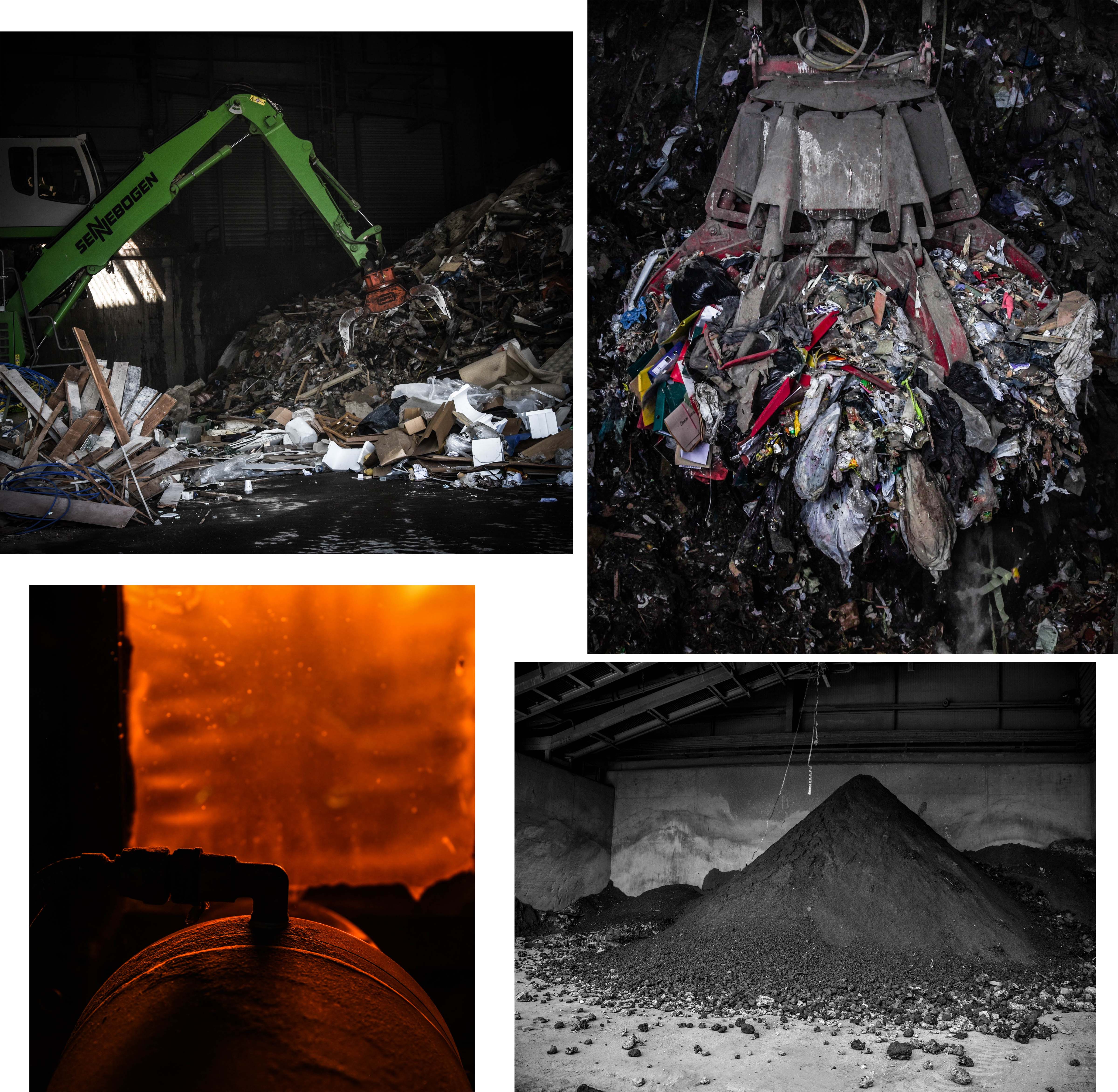 This first group of my final outcomes above depicts the waste before transformation, the burning of the waste, and the ashy result of the process. The first two images on the top row depict the difference between the amount of household and commercial waste produced on our Island. The image on the left presents an average sized machine transporting commercial rubbish from one spot to another whereas the image on the right shows a gigantic claw machine, capable of moving up to 3 tonnes of household waste. For use in my project, I love the photograph on the right because of it dramatic intensity as well as its ability to give my viewers an idea of how much we produce. This image is one of my favourites overall and was taken through one of the ‘rubbish shoots’ after the operator kindly positioned the claw for me. The two pieces on the bottom row can show what could be seen of the burning process alongside with the final outcome of this waste. I love the orange glow and intriguing composition/aperture of the image on the right whereas the one on the left shows an important part of what happens to Jersey’s un-recycled waste. – this ash is actually re-purposed to be used in Jersey and England to create buildings and roads.
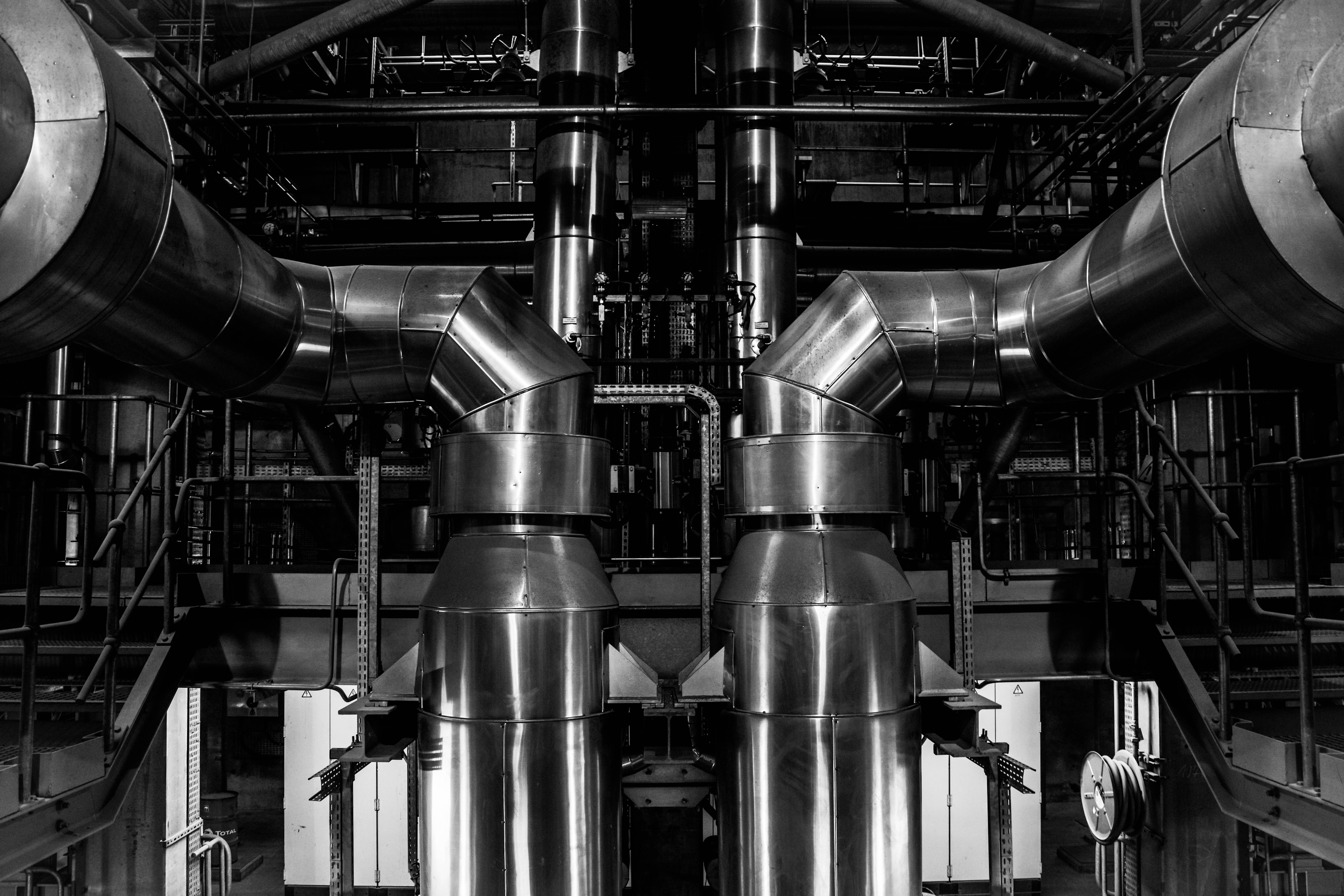 This next image is one of my favourite topographic style outcomes which was taken from inside the ‘Energy from Waste’ facility during my tour. This image depicts two massive pipes coming up from a lower floor and curling around the edge of my composition. I love the perfect symmetry I have captured in this piece and the topographic/straightforward style it was taken in. The reason I have decided to edit this image in black and white is to emphasise it dynamic features as well as resemble the many blast furnaces captured by my inspirations Bernhard and Hilla Becher. The meaning behind this image is to show a specific section of the massive machinery that combined, works to process the safe disposal of our island’s waste and turn it to clean energy.
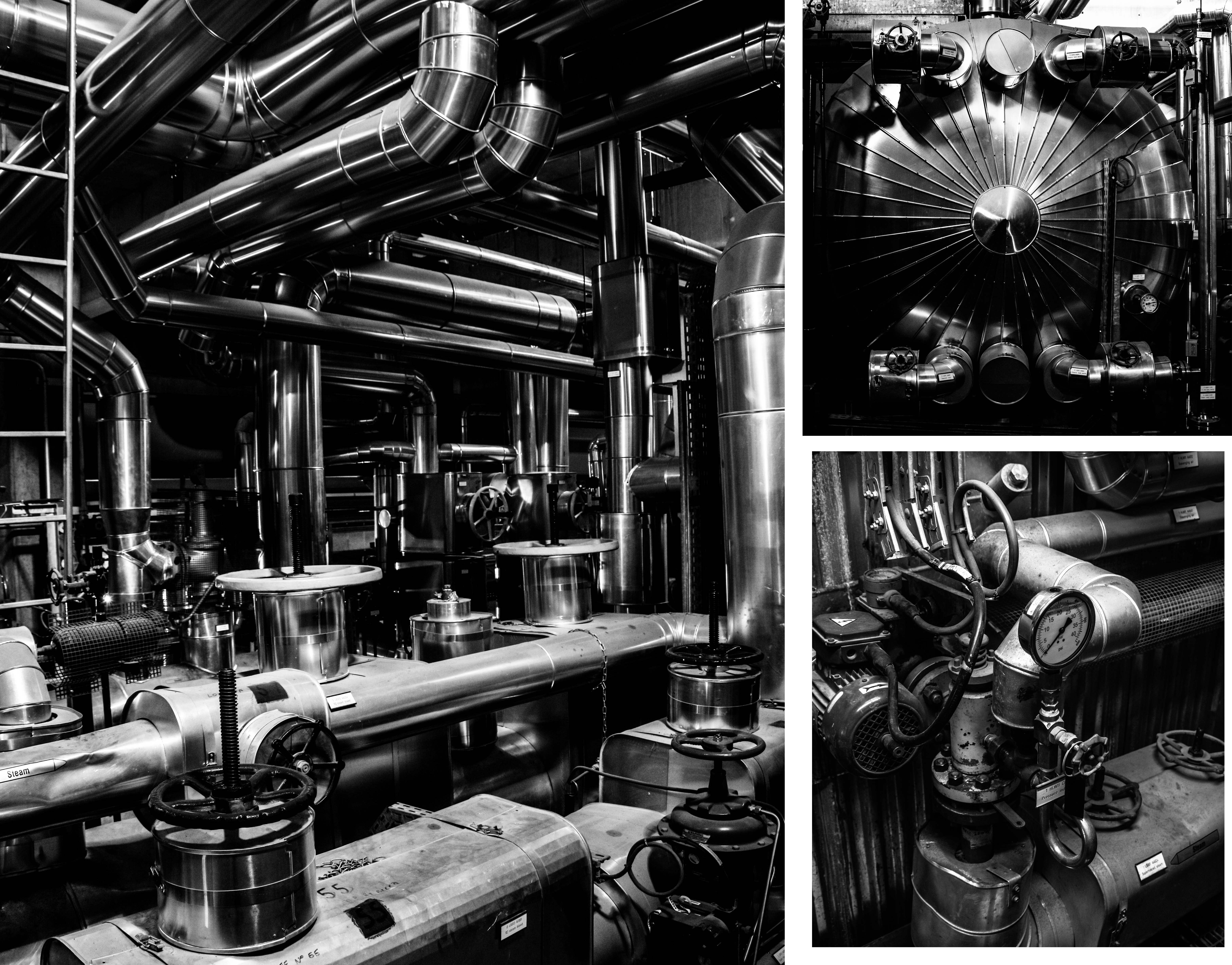
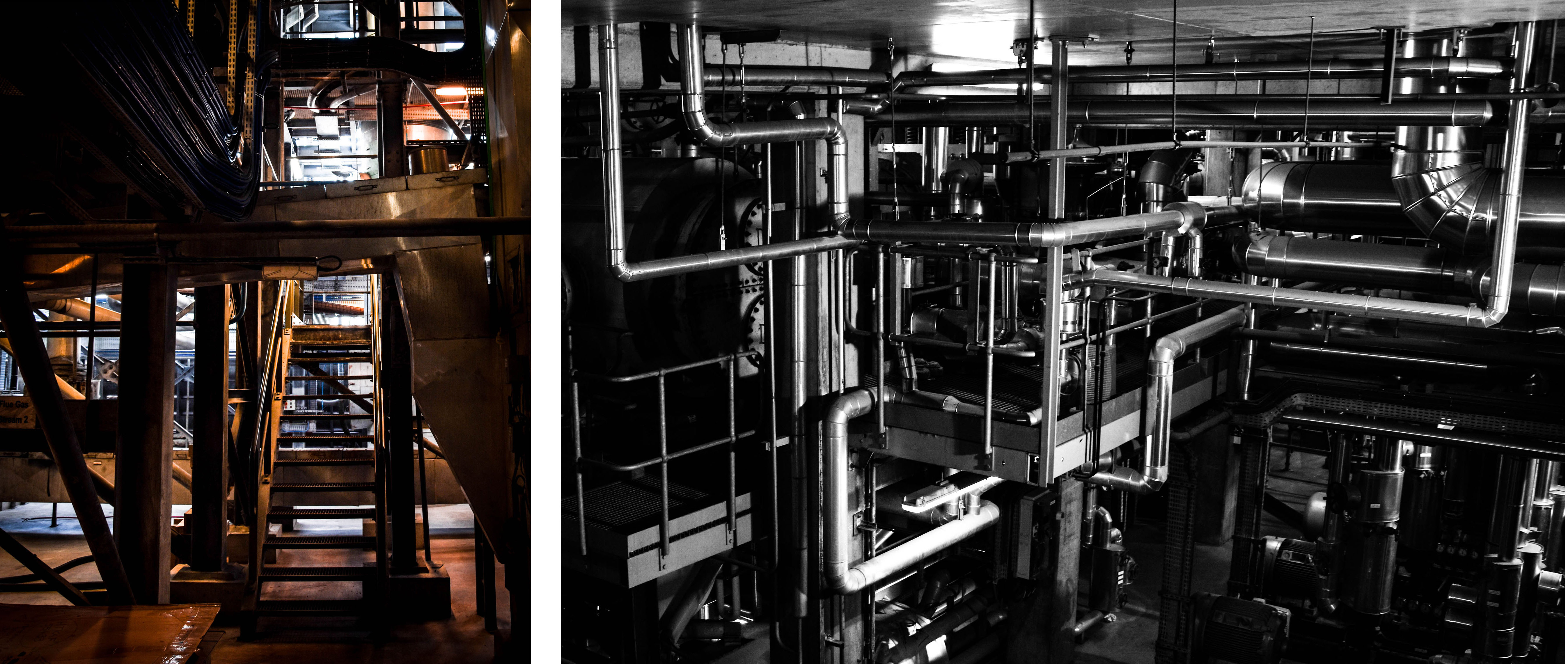 These next group of final outcomes from my shoot show more specific details from inside the ‘Energy from Waste’ facility. The meaning behind these images, along with the final outcome above, is to show exactly how much work and complicated technology goes into this process. These images can give an idea of just how difficult it is to cleanly produce only 7% of our island’s energy at the same time as disposing of our waste. The first and largest image on the top left is my favourite from this and depicts a scene through the building completely filled with pipes and machinery. I love the high contrast and dramatic overtones of this image and I think the intricacy of the pipe work really helps prove my point. The next two images on the right of this piece depict a few close-up detailed shots of specific parts of this extensive setup. I love the simplicity of these images as I feel they share a very strong topographic style. Lastly, the two photographs on the bottom row depict some amazing shadows and angels looking through the facility as well as more intricate pipe work hanging down from the ceiling.
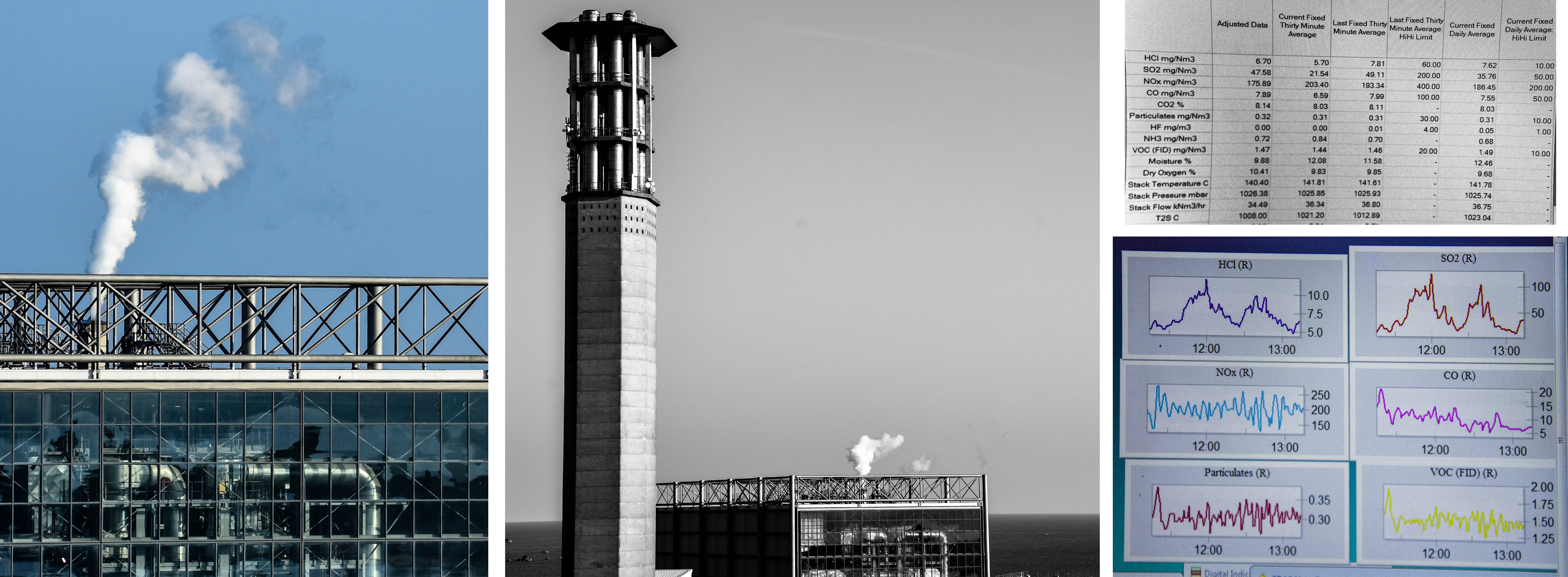
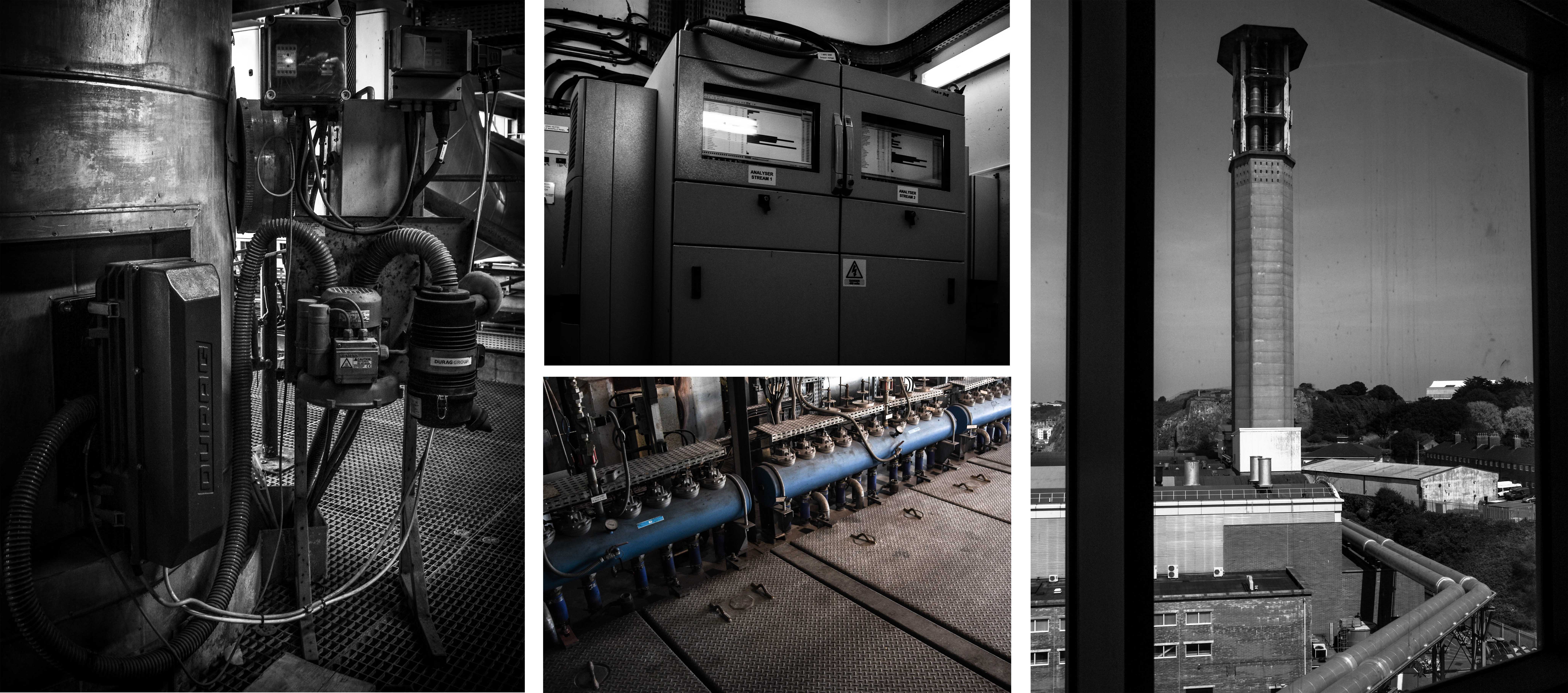 Next are some important outcomes depicting a few of the elements that go into the purification of the smoke produced from burning the rubbish. According to CSBC, the La Colette ‘Energy to Waste’ facility meets the highest air quality standards in the whole of Europe. If their emission levels are outside of the licensed limits the plant is shut down and any underlying problem is rectified before the plant is started up again. The fist three images on the left depict some features that help keep track and purify the smoke before it is released. First is the point where samples are taken for testing, next on the top is a monitor for viewing the levels of each element and finally, the bottom image shows a very small part of the machine that acts as a filter. Lastly, on the right of this contact sheet is the view from outside the window looking up at the JEC chimney and the pipes that connect the two facilities.