Category Archives: Recording

Filters

Author:
Category:

Studio

I did a studio shoot so that i could merge pollution particles with them as i wanted to keep the landscape portraits natural. The shoot went really well and i used a flash set up in which the key light was facing slightly to the right of my model and the background light faced a white background so that it would light up the back when the photo was taken. The allowed for the model to have light all around her instead of just on one side. I also experimented with using one small spotlight to create very dark shadows to add a bit of variety to my shoot.

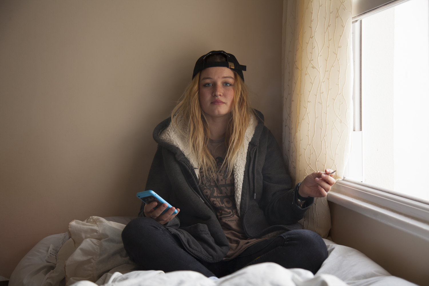
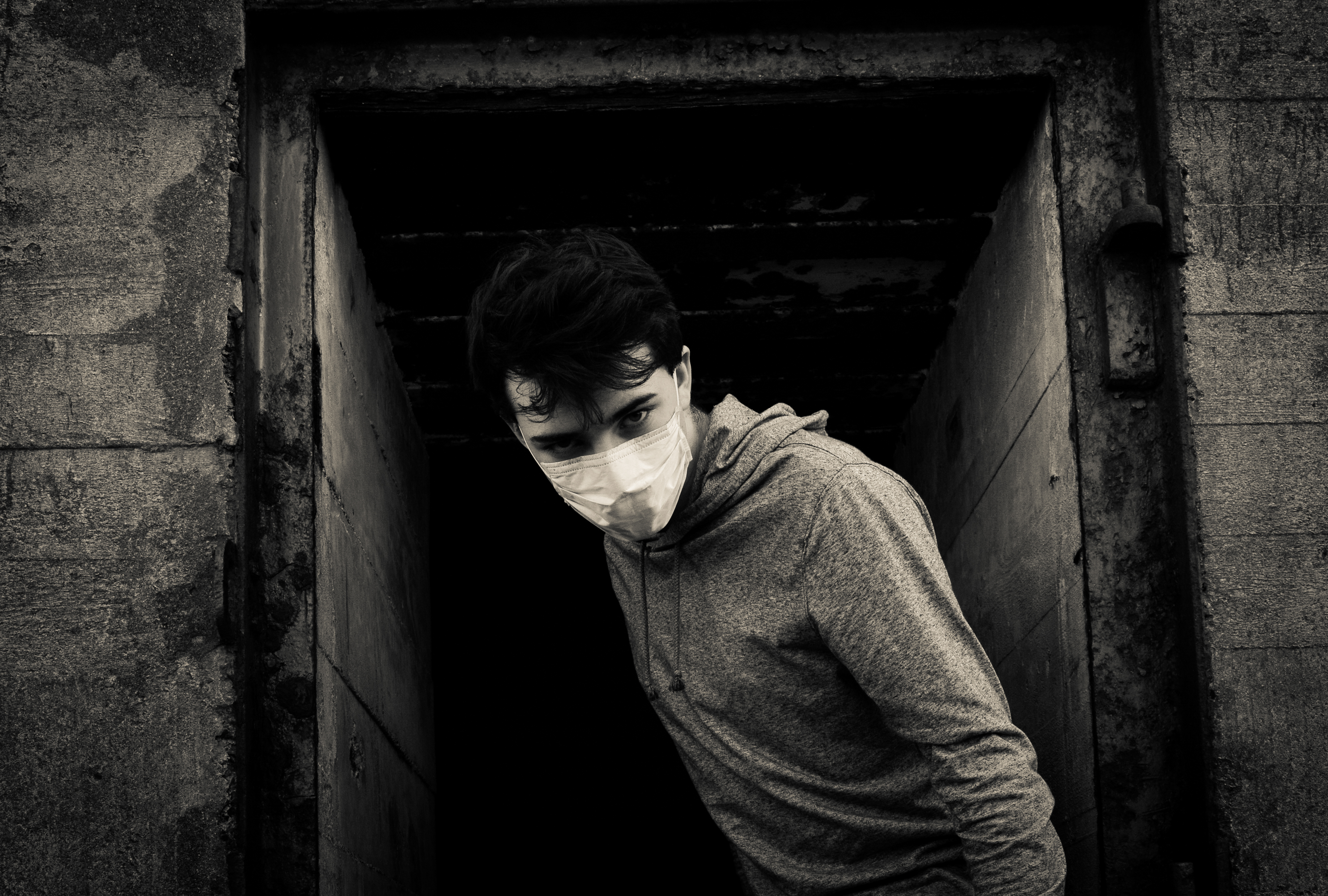
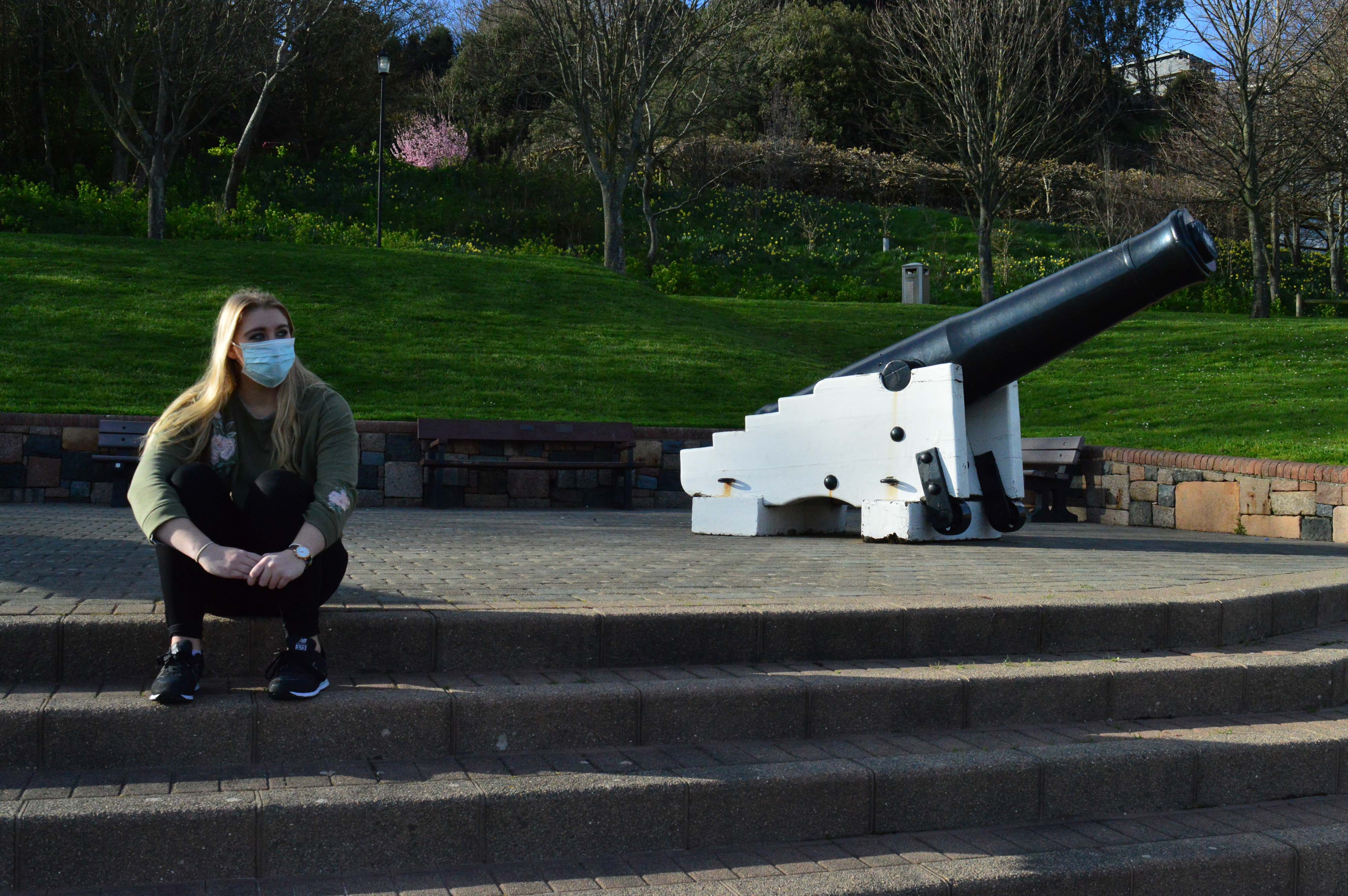
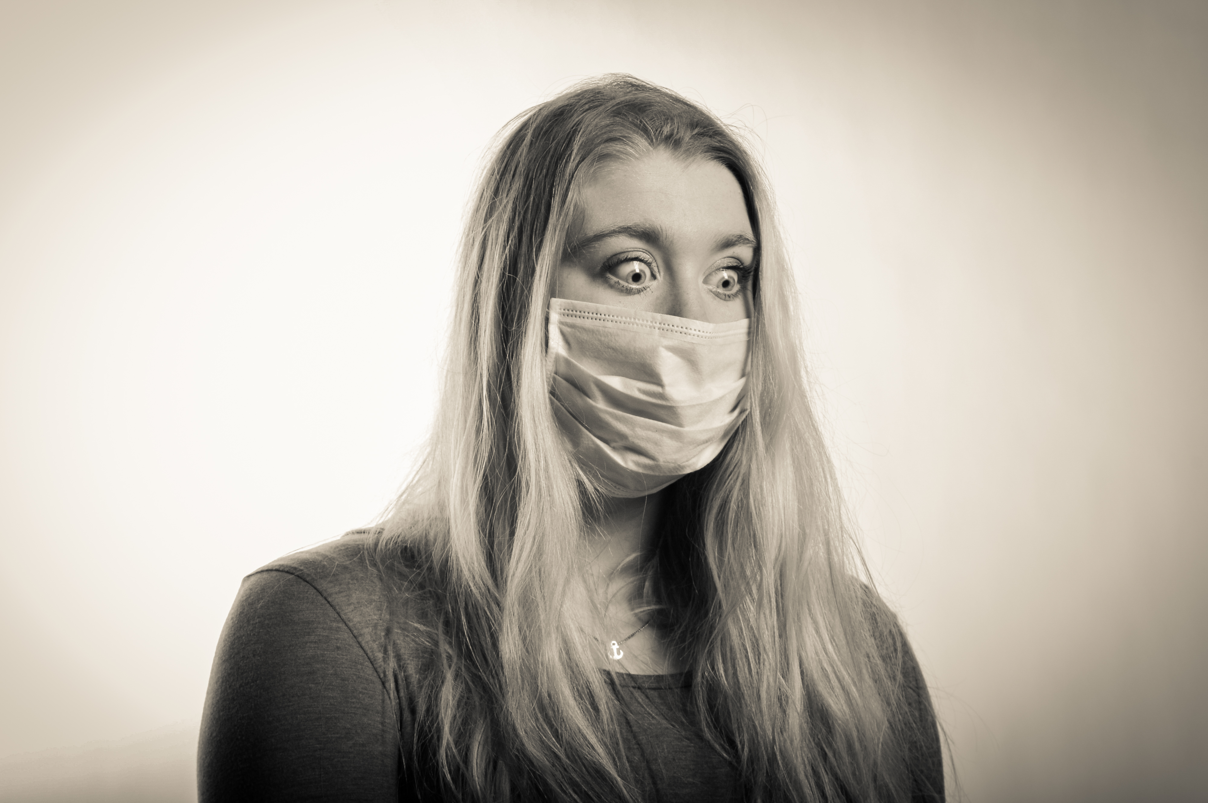
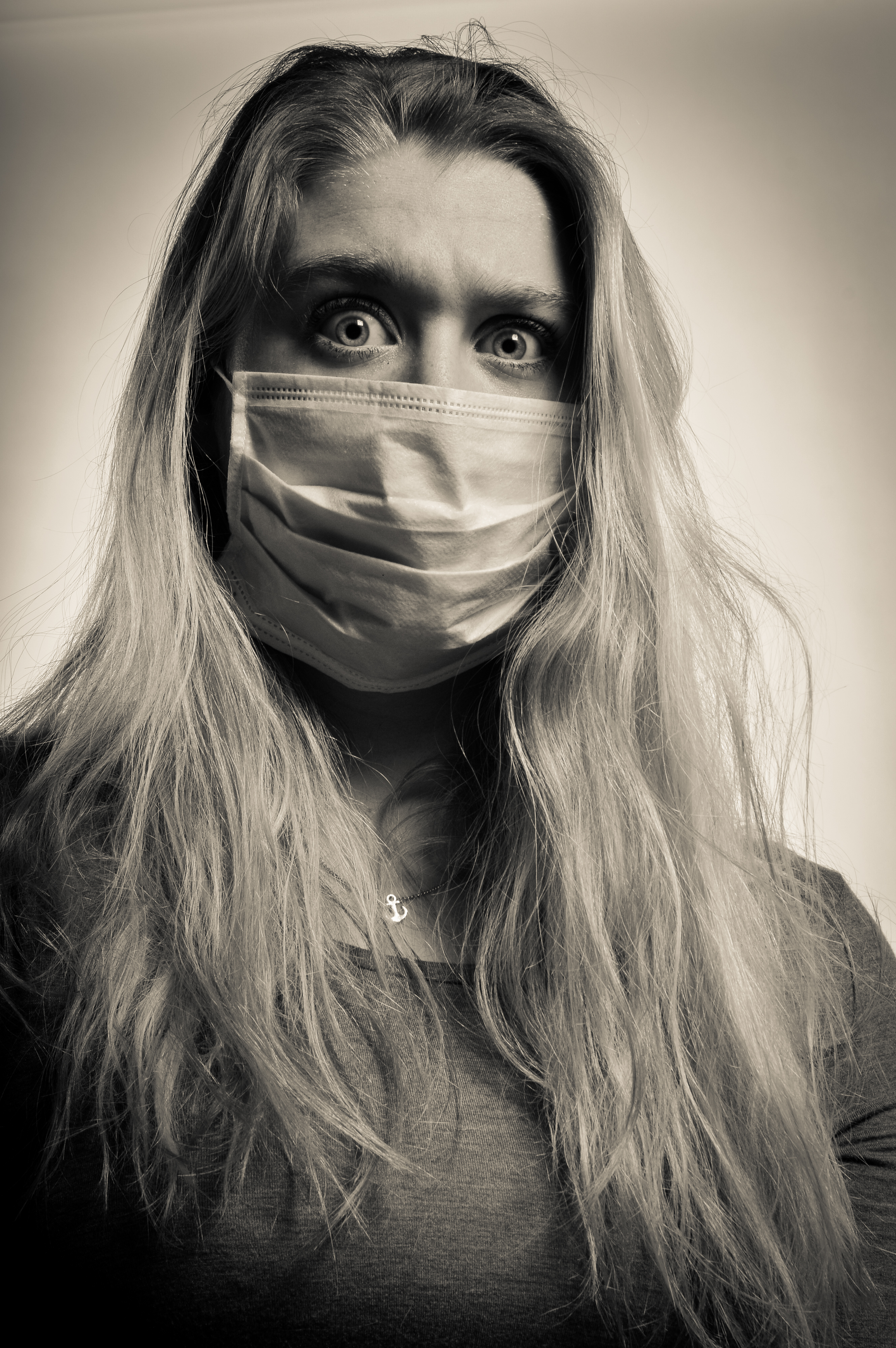
The first few photos were of my female model with the mouth mask on, i made sure that her eyes stood out and she had strong facial expressions as these are key to the success of my shoot. Her eyes represent so many emotions such as panic, fear and anger. I think these photos are really successful as they are clear and sharp, my models hair falls well on her face creating nice shadows and the images are nice and bright which will work well with photo shopping the pollution particles on top of.

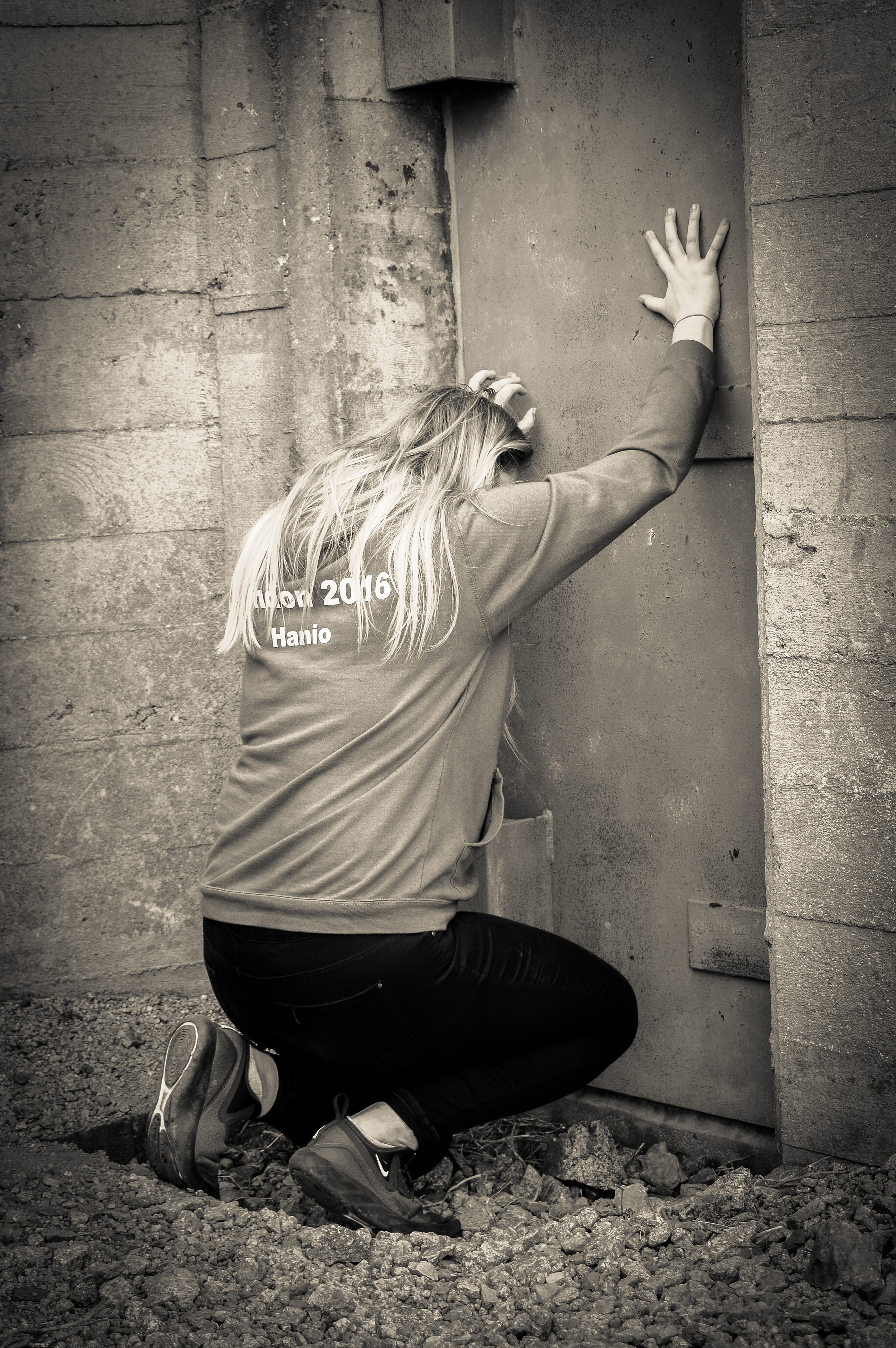
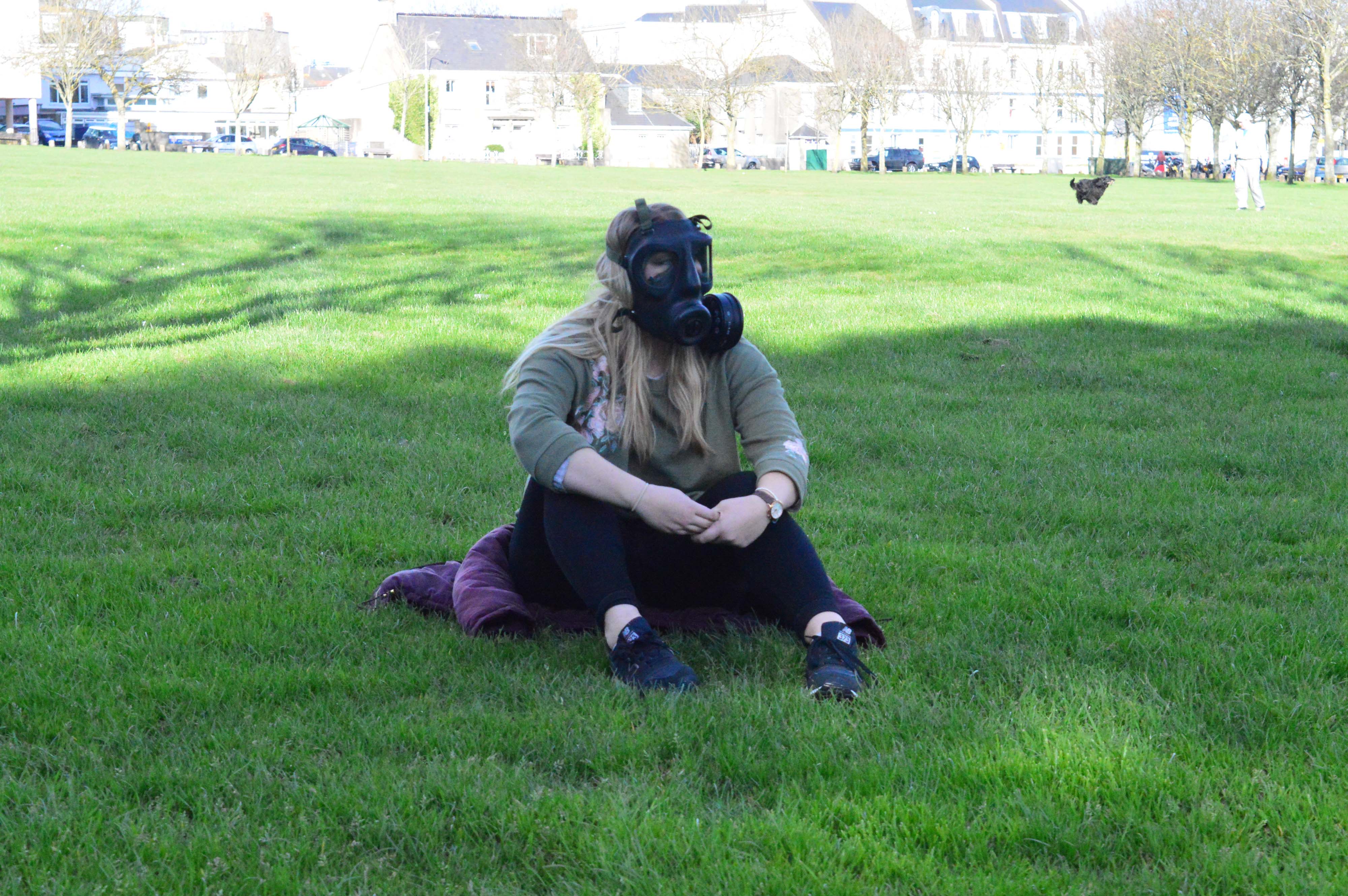
The next set of photos were taken with my female model wearing the gas mask and this is where her eyes are key as they are the only thing visible when the gas mask is on. The gas mask is much more difficult to photograph but her eyes and her poses actually worked very well and produced very good images. The best image out of the gas mask set in the last one because it is a very powerful image because it is so clear and sharp and her eyes can be perfectly seen and they are wide and full of emotion. I will definitely use this one in my book but i may use it also to photoshop the pollution particles onto as it is such a strong image. The gas mask works really well in the studio as all the details on it can be seen and her eyes are so sharp through the windows of the mask. I did not get this kind of crisp and clear image when photographing in the environment but i wish i did as my project would of been much better.

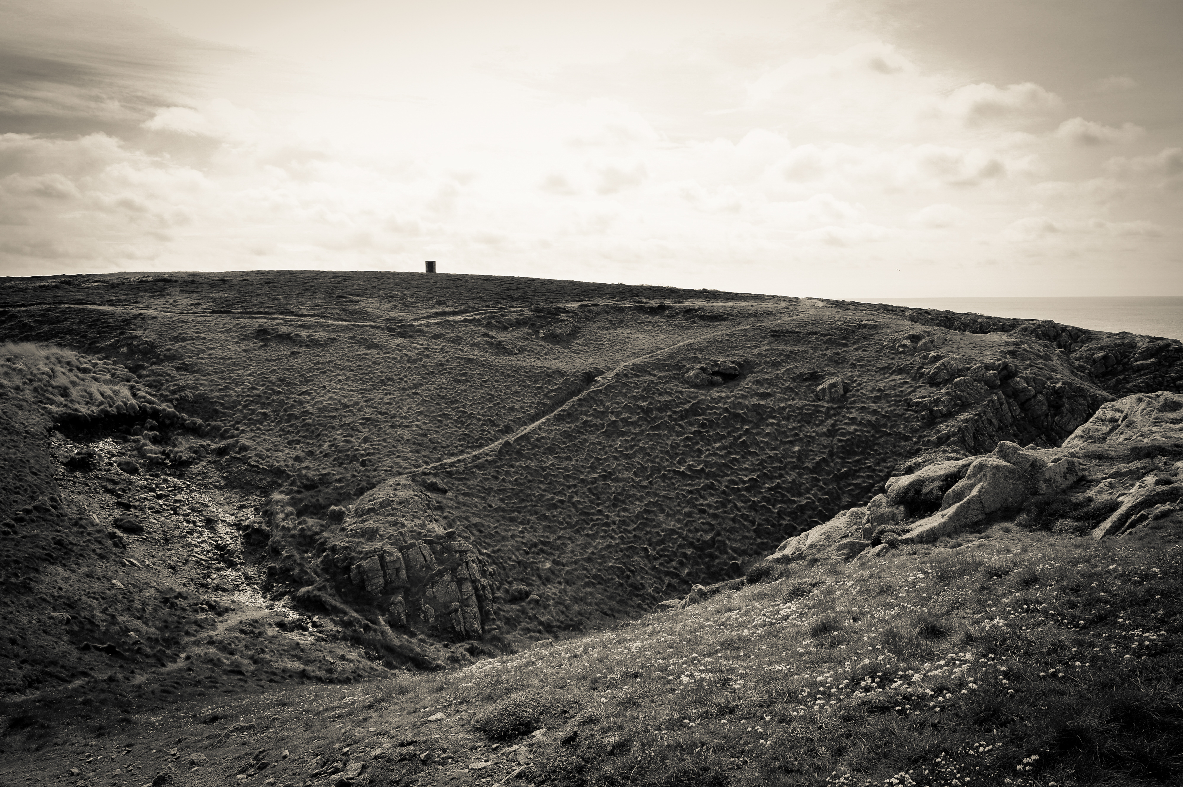
After these photos i wanted to try experiment with the spotlight as i noticed it create a big dark shadow of my model which i wanted to photograph. I had to adjust the settings on my camera but this did not take long and some really interesting photos were made. Her poses played the main part in making these photos work and she did really well. The shadow of my model represents death because pollution will kill many people and will carry on to do so if we do not change. It could also represent former people looking down on us to try persuade us to help reduce the pollution around the world. These images are really powerful because of how dark they are and how the spotlight has made my models hair shine and we can only see her shoulders in the light which adds tension as we do not know what is hidden in the dark areas of the image.

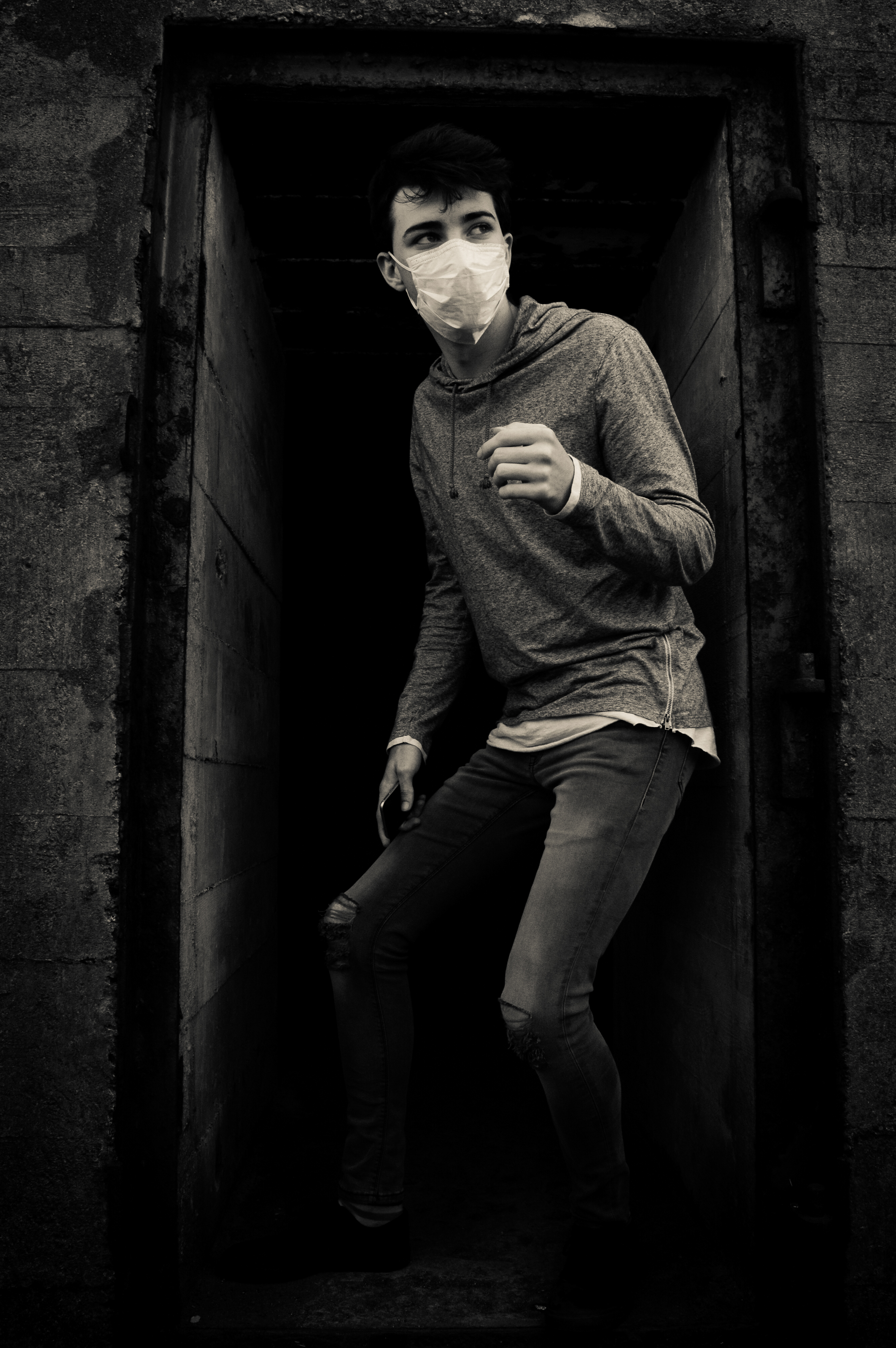
I then photographed my male model who is much stronger with body language but he did very well with facial expressions as well. His photos are very emotional and you can clearly see different emotions in his face. I experimented with photographing his face up close to create dramatic images for my book and to edit later on, this worked really well as i managed to get all the up close images in sharp focus. My male model is very good with his eyes and they also show lots of emotion just like my female models eyes. The close ups of his face are the most powerful as they allow the viewer to feel connected with the model and see what they are feeling through their eyes. I will most likely use these to photo shop the pollution particles on because they are clear and i think they will work well in my book. I also think that i want to use the close up in my book on it’s own as it is a very powerful image simply on its own.

I then photographed my male model in the gas mask. These images weren’t as successful as the photos with the mouth mask but the close up and body shot looked good and i could potentially use them to merge with the pollution particles. His facial expressions did not come through as much in the gas mask as he isn’t as good with facial expressions as my female model as he does not have as strong and bold eyes. The gas mask photos aren’t are strong and powerful as my female models which is mostly why i will only use them to photoshop onto because they are not powerful to use on their own. These studios photos do not have hidden symbolism like the environmental portraits which i have done as i did these to add a different type of photography to make project and so i could use them to experiment with and add abstract photography to my project.

Finally i used the spotlight to create dramatic shadows which could represent death due to pollution and i think these types of images will work really well on their own in my book or merged with pollution particles as there is the potential for them to be really bold and dramatic and for them to stand out from the book. My male model did much better on the shadow part of the shoot as his body language is so strong which allowed my shoot to have a variety of images in instead of just simple portraits with the gas mask on. These images have the same symbolism as my female models shadow photos but his body language shows suffering and extreme panic compared to hers which are much more formal and tame. This is why i like these photos because they are extreme and interesting. I think these photos could potentially work on their own but i think they would look much better with pollution particles on top because that would make them much stronger than simply on their own. His eye is really powerful in the first image because it is the only one we can see and for some people they will be able to see emotion in it and as we can only see one, it adds tension to the image and anonymity as we cannot see the rest of him.

Final Results: Photo-book – Extra Material

In order to properly introduce and give context to each pollution issue that I am visually portraying, I will be adding in multiple facts, as well as a few inspiring quotes. The facts I will be adding will be straightforward statements, taken from my previous research on the blog, and will be put beside the images to give context to each topic. Instead of adding a preface to explain what my book is about, I have decided to use a title page and really powerful quote from legendary explorer Robert Swan. By doing this I hope to introduce my book without giving too much away about the context as well as get across the inspiring message about our environment. Below is a list of each fact and quote in the order I intend to present them throughout my photo book…

  • Second title page –  Pollution In the Channel Islands
  • Introductory quote “The greatest threat to our planet is the belief that someone else will save it.” – Robert Swan
  • ‘Cigarette waste’ context – Every year over 4.5 trillion cigarettes are littered worldwide, each one taking anywhere from two to twenty-five years to biodegrade.’
  • ‘As well as leaching cadmium, lead and arsenic into our environment, discarded cigarette butts pose a significant threat to our environment in terms of fire. Every year, forest fires ravage vast areas, killing off wildlife and vegetation that take years to return.’
  • ‘Plastic pollution’ context – ‘Modern life is unthinkable without plastic and the pure fact it is low-cost, light weight and durable makes it very hard to dispose of.’
  • ‘The term plasticulture refers to the practice of using plastic materials in agricultural applications. Unfortunately this method is used for Jersey’s famous potatoes, 99% of which are exported to the UK.’
  • ‘Agricultural films are one of the largest contributors to the billions of pounds of plastics that are improperly discarded by farming industries across the globe each year. ‘
  • ‘With the exception of the small amount that has been incinerated, every piece of plastic that was ever made still exists in some shape or form.’
  • ‘Ocean pollution’ context – ‘The litter that is swamping our oceans kills wildlife, looks disgusting and is a hazard to our health. – Fishing ropes and netting are a huge problem for our eco-system as, not only does it take at least 600 years for them to degrade, more than 260 animal species worldwide have suffered and died from being entangled in or consuming the material.’
  • ‘Each year, National Geographic estimated that we dump over eight million metric tons of plastic waste into the oceans.’
  • ‘Energy from waste’ context –‘All common household waste in Jersey that is not recycled is sent to the La Collette Energy from Waste Facility. This facility provides the Channel Island with a reliable means of waste disposal for the next 25 years as well as being able to produce 10MW of power, equivalent to 7 – 8% of the island’s electricity usage.’
  • ‘To create energy at the same time as disposing of our waste, the facility burns rubbish and uses the heat from the fire to generate steam which is then used to drive a turbine, generating electricity.’
  • ‘The plant is constantly monitored to ensure it operates in accordance with the licence and EU air quality standards.’
  • Ending quote – “It is the greatest of all mistakes to do nothing because you can only do little – do what you can.” – Sydney Smith

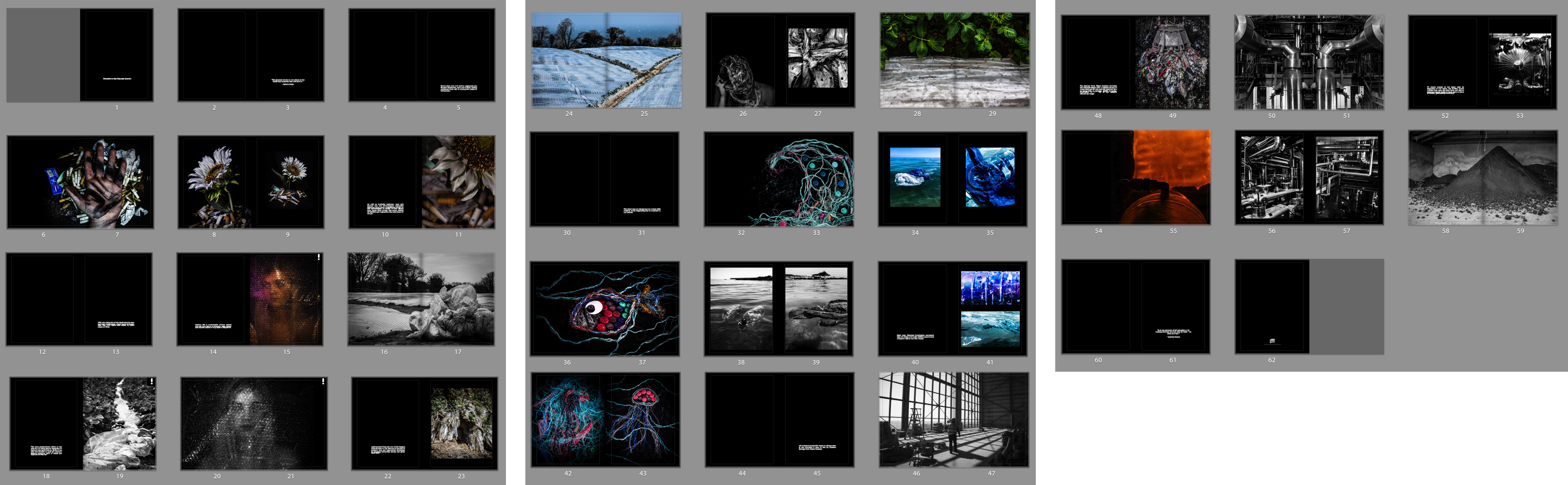
Above is a contact sheet depicting how I am going to arrange my title, quotes and facts with in my photo book. I love the idea of having two blank pages with a straight forward fact between each topic as this really adds to the structure of my journey and leaves a clean space between the different issues. When placing my text I decided to keep it small and towards the bottom of the page as to not take away the emphases of my photographs. As well as this, the reason I have decided to add in two quotes, one as an introduction and one as an ending, is because they really bring to light the meaning and message of my project.

Analog combination of images and text

After manually tearing the images I had printed out early I decided to take the experimentation further and continue with an analog approach. I was able to use these prints for experimentation because I forgot to edit out the hand of the blonde side of the photo and the image looked rather strange with only a small portion of the hand from each photo, luckily I was able to use the letters and words in my experimentation to mainly obscure it from view. I have previously experimented with overlaying text on photoshop but know I want to experiment with cutting out letter and sticking them individually onto the prints. I attached the ripped photographs together by pray mounting them onto a piece of card. I used microsoft word to create the black and white letters, I created individual text boxes that I coloured as appropriate. I then made two copies of the alternating black and white letter and one copy of with each word having the same colour for all their letters. I  printed out the letters and cut them out and played around with how I wanted to display them on the prints. When sticking the individual letters onto the prints I ruined my first set of letters in my first attempt. When n i placed the letters face down onto some newspaper when spraying them with spray mount the pressure of the spray caused them to fly everywhere and got the wrong side of many of the sticky. I was able to solve this issue by using a rolled piece of masking tape. One side of the tape stuck to the newspaper and the other held the printed side of the letters still while I sprayed them.

For the above image I used black and white alternating letter and contrasting backgrounds for the words “beauty and “bitch” and block backgrounds and letters of the same colour for the words “and” and “the”. As previously stated, I wanted to try and hide the hand in this print as it is a little distracting as at first glance it appears to be a hand that works with both images but it is distorted in a way that is a little disturbing. I placed the words “and” and “the” in the centre of the image and the join, as if the two words are holding the images together, similarly to how the two words hold the phrase together. I then placed the letters for “beauty” and “bitch” is a disjointed stylistic way.

As this image combines each of the stereotypes separately and they are presented individually I decided to experiment with printing out the letters of the words in the same colours, although I still wanted a sense of alternating between white and black (because I think it works well with the alternating pink and blue of the outfits and backgrounds) so I made the text in the following colours “beauty” on white, “and” on black, “the” on white, “bitch” on black. I decided to make the background of beauty white because of the positive connotations of the colour and the word “beauty” and vice vera for the black background of the word “bitch”. Unlike the previous image I decided to place the words on opposite sides of the image rather than making them overlap, to give a greater sense of division.

I also had an already digitally combined print of the two sides, but similarly to the other images, it had the hand that was strange looking and distracting. Luckily I was able to completely cover it up in this version. For this image I took inspiration from Barbara Kruger’s work and used block backgrounds for full words rather than more ransom note inspired individual letters. I placed the words in such a way over the join of the image so it appears that the words are holding the two sides together.


Fourth Shoot

This shoot was very successful, it was done at Gronez with only my female model. it was a sunny/cloudy day which made it good to photograph in however there were lots of tourists which made it difficult to photograph. The photos were all clear and i also took many landscape which could potentially be added to my book.

The first place i photographed was in a ruin as i think the walls could have a symbolic means such as no structure can protect us from the air. The sun was behind my model and it was partially hazy. These images combine a landscape image with a portrait image and it works really well to create a powerful and meaningful image. The best image out of these two is the first because my model is looking away from the camera which makes it much more dramatic and anonymous but however you can still see my models eyes which is what makes the image so powerful. I am unsure of what these images symbolize but i think they could represent being on the edge of a steep drop such as the steep downfall of humanity due to the population growing and the air slowly suffocating us and our future children. Does the world really want their children to live their life in a gas mask?

I then photographed in the arch but it was extremely difficult due to tourists and i did not notice that one of them had placed their bags in the way of my photos which is why i will not be using any of them in my book. Also my model did not pose very well and these photos relied very much on body language and she is not very good at that.I wish these images had turned out how i had planned as the arch would of created a perfect frame and representing the framing of the pollution problem in the eyes of the world. Showing them one of the biggest problems in the world which is above war because without air and a world to live on, war wouldn’t even take place. I also thing that the images did not work because of the angles which i photographed them at because i think i needed to be higher to create more of a sense of looking down on my model to symbolize loss of power.

The next area i went to was in between the ruins of the castle in which i made my model sit down and i laid on the grounds and photographed her from different angles whilst using the walls to my advance. These are my favourites images because they are more unusual than the others because i chose to do different angles to create more interesting images and symbolize that no building could protect you against the air because most buildings won’t survive a bomb. The second image is very string because we cannot see her body which creates tension within the image and makes it very ambiguous which allows the viewer to create ideas in their head about what these images mean and what my model looks life behind the wall. I think what makes these images really powerful is that they are in black and white as it makes them much more powerful and they catch the eye much more than when in colour.


On the way to different areas, i photographed the landscape to use a fillers in my book and so that the book is not completely full of portraits as this would be boring. I thought that the landscapes were originally poor quality as they looked boring but when turned into black and white they looked much better and more interesting. They are very natural and it is completely untouched land which is why they are very bare as it is completely natural landscape. My landscapes have no hidden symbolism as i simply made them to add to my book are splitters to make my book more interesting and not so clustered with portraits.

The next photos were taken in ruins of most likely bunkers of some sort and they worked really well to create a frame round my model. This makes the eyes focus on the model rather than the background. It also makes the image very dramatic specially in the light is coming from behind the model this is something which is considered wrong in portraiture but i used it to my advance to create a unique image. These images symbolize taking cover and hiding away from the world, trying to escape what is truly going on but the buildings only half cover my model to represent the idea that no building can protect you and soon enough the air will get to you. The second image has split lighting as the my model is half in the shade created b the sun and in the light of the sun. This symbolizes that the mouth mask can only protect you for so long before the air gets to you. The first images lighting represents the incoming storm, an afraid child hiding under their bed because of lighting but they will soon be doing this with a gas mask. The image looks almost like something which would be seen in a dream with the bright light behind it and the dark shadows which the light is casting on my model and on the ground.

The next few photographs were taken on a bank on the way down to a view tower. I asked my model to act as if she was reaching for the gas mask to imitate her struggling to breath so she needs the gas mask. The surprisingly worked well as she had good body language and her eyes made the photos perfect because they were so wide and visible. These are the best photos of the shoot. The first image symbolizes reach for something more powerful to protect her against the air because the mouth mask does not work anymore. It symbolizes desperation and panic specially in the second image as her eyes are so powerful and they are the main reason the image is so powerful. Her eyes show lots of emotion mostly panic and fear which works perfectly for my project. These images are still ambiguous because they could be seen as my model reaching for the gas mask to protect her against poisonous gas which someone has thrown into the trenches but this could link to air pollution being a form of poisonous gas which slowly kills her. The black and white makes them much more powerful as they catch the eye much more and makes the light in certain areas stand out much more and the shadows darker creating tension in the areas which we cannot see what is there.

After this i used the door to the tower and i made my model act as if she needed to get inside so as if she was banging on the door and clawing at it for someone to let her in because of the toxic air. Yet the building would not save her. These images did not appear great when in colour as they look very forced and they were very dull however when turned into black and white, they looked much better. I would like to use these images in my book as they could look powerful with a quote next to them as these images are more ambiguous, specially the first one as we cannot see her face. It creates tension as the viewers will create an idea in their head to what my model looks like  which makes the image much more interesting. However i do wish that she has used more body language and showed much more panic to represent the desperation to get inside as she believes that it will save her specially as she does not have a gas mask in the firs image. Her eyes are so important in these types of images as they allow the viewer to feel connected with the model and feel what she is feeling as she is able to portray it in her eyes instead of body language.

Finally i used a real bunker to photography my model looking out from the bunker as it has crumbled towards the edge of the cliff which made it seem like a window. These images worked really well but my model posed more like she was in a fashion shoot rather than a shoot about pollution which ruined it slightly but they look good in black and white. These images symbolize that again no building can protect you against the air specially if they can be taken down by war as the air is more powerful. The air is the most powerful thing in the world, everything in the world relies on it so if we do not fix it, we will fall victim like the 3 million people of 2012. My models pose could of been much better but she does look very sad which works really well as it represents loss of hope and faith in humanity to fix what they have done wrong. 1 million people cannot fix the world when there is 7.5 billion people in the world. Over 4 billion people will need to help change the world otherwise it will just keep going down hill.

Barbara Kruger Digital Response

I was inspired by the work of Barbara Kruger and how she uses text to make her images stronger and make a statement. After experimenting with the addition of simple text to my images using Photoshop I decided I wanted to develop this idea further by using boxed text, similar to Barbara Kruger. I was inspired by Kruger’s images featuring pop culture icons and a phrase that ran as follows “not —– enough”, these images can be seen in the header of this blog post. I wanted to experiment with the use of both monochrome and her signature cherry red.

I chose to use my blonde and beauty queen images because I felt that these were the most timeless of my stereotypes. I experimented with making my blonde photo black and white, I adjusted the colour channels to create some contrast between the figure and the background. I tried using black and white blocks behind the text as well as the red. I also created a colour version with monochrome text, which I didn’t feel was as dramatic as the black and white and red versions. My favourite of the four images above is the black and white image with the white and red text. I selected the phrase “not pretty enough, not skinny enough, not blind enough” because of the reference to Barbara Kruger’s work as well as trying in nicely with the blonde stereotype and the standards that women are held to.

I took inspiration from another iconic Kruger piece, that being a monochrome portrait of a young (around 6 years old) American child beauty pageant winner, accompanied by the line “I don’t want to grow ugly” clearly a disturbing spin on the phrase “grow old”. The original piece draws attention to the superficial nature of beauty pageants and the effects it may have on such young competitors. My image, featuring the phrase ” She had opinions, we didn’t care as long as she smiled” is suggestive of how the public speaking nature of being a beauty pageant winner, and thus an ambassador for the region, is often overlooked or simply ignored with the superficial beauty portion of the competition receiving the most publicity. I personally believe that I was selected as Miss Saint Helier 2017 because I was the strongest speaker out of all of the competitors for the role. However, other than the competition I haven’t had a chance to do any public speaking in my role as Miss Saint Helier, so perhaps the competition was more superficial and based on appearances then I was initially lead to believe.

I also developed my “Beauty and the Bitch” image with a different font and style, more similar to the work of Kruger. I feel that this works really well with the image and the label style rectangles that the text sit on helps the words to stand out, I feel that this is really important as the words I have chosen are powerful. I want the viewer of the image to read the words accompanying the image and think about which side of the photo is the beauty, and which is the bitch. I have included both the colour and the black and white version of the image because I was unsure which of these I preferred.


Designing

// P O S T C A R D S    P A R T   T W O//

To present the final pieces for this project I am creating a series of postcards from my images shot of different characters around the island in response to a series of questions asked to them beforehand. The aim of this project was to create something each person can take away with them as they leave home – something creeping towards everyone i’ve photographed for this series. There are many elements of homesickness which can affect those moving away and I particularly wanted to zone in on the idea of home and places that will be missed. To visualise this, I went on a journey with each model driving around to locations of importance and significance to them, shooting as we went. This narrative timeline then resulted in a series of final images showing each person in their physical home as well as their interactions with areas they will miss when they have to leave. The sections of this project will be presented in various ways. A selection of stylized portraits will be made into prints which can be mounted, and a more extensive collection will become postcards with messages written on the reverse. These postcards can then also be made into a kind of hand made photobook using some of the handmade book stitching methods and techniques as well as a laperello design. The front of each card will be created with an image from the selection below which will be A6 in size. The next section of design for this project is to create the backing of the postcards which will be fabricated on Photoshop.

To start designing the reverse side of the postcards, research was carried out into existing designs and their formats. Below is a selection of five examples found on illustration sites, template websites and tourism sites. From these, I started to build my own collection of ideas working on aesthetics and practicality twinned together. 

The first thing to do in photoshop was work out a basic format for the card. This included a dividing line and three rows for an address to be written in. The colours are neutral and overall relatively blank. The important design elements will be the text added and the stamps which I experimented with below.

These postage stamps were downloaded from freepik and worked as background additions to the cards. When adding my own stamps, these could then become ‘standard’ looking images to fill the background as I layered up the graphic stamps made previously.This is the first basic example I created in photoshop. The layers are simple but included to show the process. I used a magic wand selection tool to isolate and duplicate the ‘Thailand’ stamp from the set above and lay it flat on the piece as a background. Over the top of this, I digitally placed one of my own graphic stamps made in photoshop. This was rotated on a slight angle to give a manual feel to the piece removing small elements of standardisation and generic formatting. The text on the left hand side, ‘Hello!’ is an idea that came from a previous piece of research into postcard design which can be viewed here [X
The picture I looked at in particular was this set of graphic postcards which use a simple generic text starting point of ‘Hello!’ in printed letters. For my postcards, the rest of the text will likely be hand written making the printed letters important in their contrast with the rest of the backing. In the address line, the plan is to include the model’s name and where it is they are leaving for (the name of the university / travel location). The font is called ‘Art Brewery’ but I may change this later on depending on styles and developments I make.

Experimenting with texts, fonts and colouring I created a second template shown below. This was then experimented on and developed further with various shapes, colours and the inclusion of images. The stamps will be separately printed on appropriate paper and manually applied for the final versions though here they are digital as an example of presentation.Above is the blank basic template for this second design. It uses the same phrase, ‘Hello!’, but a new crisper font which is clearer to read. Below I added a border and slight drop shadow between the two layers so I could add an element of colour to the design. The grey outline is the photoshop background and not part of the design. For the second postcard below, I added an image of plants – taken outside Maya’s house – instead of  colour which created a textured feel. I did experiment with various colours of text and lines but most of the time it looked childish and inappropriate so the black details were chosen as a final look.

This example mock up was made with a green border, drop shadow and black text. The stamp used features Maya and was also designed previously in photoshop. The ‘Madrid’ stamp was lifted and modified from the freepik contact sheet above and added at a 75% transparency so you can see the layered effect of the images. The address section is on the opposite side in this example to a ‘traditional’ postcard but arguably fills the space in a more graphic and aesthetic layout. This design gives space on the printed piece for the same information specified before as well as a hand written message by those featuring in the images. The next step of development for the postcard section of my design will be to finalize the stamps to be printed, fonts and colours to be used and the variations which will be backed with the A6 images.

Third Shoot

This shoot is definitely my favourite out of the past shoots i have done as i fixed the ISO which meant none of the photos which i took were pixelated. During this shoot i also took landscapes which i could use in my book to separate the portraits. I am not the most skilled at taking landscapes as i never know what looks good and what does not. The landscapes at Noimont are very natural and untouched by modern buildings and technology, this makes me very plain landscapes which i thought didn’t look especially amazing in colour but they look very powerful in black and white specially if combined with other powerful portraits which i have created both in the studio and in the environment. I think what is powerful about these images when in black and white is that the horizon almost merges with the sea level creating a never ending path. Also each image has a different sense of depth due to the angle i have taken it at, as the first landscape has many different depths from the wall up close in the corner to the rocks at the bottom far away from the lens. These landscapes symbolize uncontaminated nature, parts of the world which we have not ruined and destroyed to create new buildings for people to work or live in.

I did a shoot on the big gun at Noimont point and the images turned out really well but the sun was very bright which made it difficult to photograph my model without the photos coming out to bright. My male model is very good with body language which is why i think these photos worked really well, as he did what i said but he also added in poses and movements of his own which added variety and a different perspective to my images. These images look very sinister in the sense that it links to the battle fought at Noimont and the lives which were lost there. The mask symbolize the battles which have been fought in the world, the wars which we will fight and the invisible wars which not everyone knows about like pollution. I chose these images to be potentially part of my book as i think they are powerful, they look like a moment in time which has been stopped such as my model trying to get up off the gun, that symbolizes the wars which we will continue to fight no matter what the set backs are, we will continue to fight. However the image of my model reaching out towards the camera symbolizes the need for help, the need for more people to join the fight, the war against pollution. I could see this image being used as a propaganda poster to join the army in WW1. The last image of my model simply sitting on the gun symbolizes the loss of hope, the loss of faith in humanity. It symbolizes giving up  as he is slouching with his hands just resting, there’s no sign of a fighting spirit like the other photos. Each image symbolizes something different in my project, they all have different meanings which will come together to link to my theme of pollution. The gas mask is the biggest symbol in my project and in each image it can represent a different struggle.

After this shoot i moved to the bunkers which were open, i decided to photograph my model in the entrance to the armory rooms as it was too dark inside. I did not change the settings on my camera which meant the photos came out dramatic and sharp, it also helped that the sun was not shining directly onto my model or me so it was much easier to photograph and the photos came out dark which added a lot of suspense. These images have a direct link to the war fought in jersey and the wars fought all around the world. All of these images symbolize that no bunker, one of the strongest structures in the world can protect us from pollution, No matter where we hide we will need air to breath and it won’t always be clean. The strongest image of these three is the second image as his eyes are very strong in the image and show a lot of emotion primarily anger but many different people will interpret his emotion differently which makes the image very ambiguous. These image do not directly link to pollution but they symbolize a war, a fight which not many people know about such as most of the people in the world have no clue that Jersey exists just like the war against Pollution. The black and white makes these images really strong, powerful and dramatic, the images need to be like this otherwise they would not stand out and their symbolism would not be so powerful. If i put these images in my book, i will make sure to put text to them to give the viewer an idea of what they could symbolize but leave the rest up to them to image and create an image in their head.

The next part of the shoot was done next to a memorial for navy soldiers who died off the coats of Noimont. This didn’t work out as well as planned as the images look too planned and bland which isn’t what i wanted for my project. This is why they are not in black and white as i do not plan on using them in my book. These images were the least successful of my shoot because they look extremely staged and my model looks to stiff as he is sat very straight against the bench which i think was the wrong pose as it needs to seem more natural or dramatic like the images above. I also feel like the link to war is too direct in these images and does not leave any room for the imagination and the images are very unambiguous which does not fit with the theme of my project. All my images will be ambiguous until fitted into the book then they will become much clearer but still leave room for the imagination of the viewers.

The next part of my shoot was also done on a bench but it was much more successful as it included much more landscape such as the bunkers in the background. The photos appear to be much more natural looking than the ones above which is why i have changed them into black and white as i want to use them in my book. I think these images turned out really well as they are strong in black and white creating a very dramatic image. These images are fairly ambiguous on their own but hopefully they will make more sense if they are placed in my book. The most powerful image out of these two is the second one because of the low angle making my model seem powerful, the image is very strong because we can only see a limited amount of the landscape which adds tension to the image as the viewer will make up what the rest of the landscape will look like. These images symbolize the calm before the storm, the laid back approach that the world is taking to pollution as they do not see it as a serious issue like the war in Afghanistan. They represent the landscape which we have only altered so we can view it, the landscape that we haven’t not destroyed for the “benefit” of Jersey.

For the next part of this shoot i found some metal bars sticking out the wall which was mostly likely used as steps at one time but i thought these would create interesting photos of my model hanging from them and climbing them. The photos turned out really well but the sun was shinning on part of the wall by the bunker which partially ruined the photo as the composition did not look right as the light did not match how dark the area was. These images are a combination of Abstract, tableaux and landscape photography. They are my favourites of my shoot but they could of been greatly improved if the light in the background was not there as this ruins the consistency of the composition of the images. However, in the first image the light works well as a model is in a pose which replicates the angle of the light which makes it much more interesting but the other two images would be much more powerful if the light was not visible, i tried to work around it by photographing my model up close but it did not work. All these images have the same meaning of clinging onto the hope that the world will change, the world will heal itself if we help it like a toddler learning to walk, they simply need help to start with. The pegs in the wall represent the ladder which we need to climb to help the world, the steps are broken, twisted and rusted because the journey will not be easy to fixing the world just like how the war wasn’t easy yet we still managed to do it, so what’s different not?

The last part of my shoot was done underneath a ramp which was most likely used to push the gun up, the light was not shinning directly on my model or me which meant the photos came out fairly dark and sharp which works really well for this project as it is all about how pollution is affecting the world. My model crouched down in front of an opening which i am not sure what it was used for but it worked well to frame my model in the center of the image. The images are very simple but they are lots of meaning behind them in the sense that no amount of hiding behind walls and instead caves will protect you from pollution. No mask will protect you and eventually there will be a memorial with your name on it. Pollution killed 3 million people in 2012, those numbers will only rise with the more cars and buses we put on the roads, the more forests we destroy who suck up all our carbon dioxide and buildings more buildings so that the population which keeps growing will have space to live but actually most of them won’t be able to afford it so the building will be for let for months or years.

Shoot Two

This shoot was much more successful than the last as i am able to draw finals from this shoot however i did not adjust the ISO which means that nearly all of the images will be pixelated but not to the extent of the images before. This shoot was done in St Catherine’s with two models. My first model was wearing a bright purple jumper with black jeans and my second mode was wearing a red checkered shirt with black jeans. However, after this shoot i decided that all my images from this point will be put into a consistent black and white filter which is very bright and reduced the pixelation in the images.

My male model was very good with body language and produced very powerful images which made my project much more dramatic which has worked really well. The first few images i took were very normal but i used an opening in the trees which created a frame for these photos. I wanted to experiment with this shoot to make it more interesting than the last and give me something to use in my photobook.

This photo is really interesting as it looks like he is suffering which is create symbolism for the levels of pollution which are rising. Pollution can cause many different breathing problems as this could symbolize the suffering asthmatics go through because of pollution as they are the worst affected. The trees have create a frame for my model which draws your attention to him and the fact that his pose is unusual means that it sticks out from the forest. The black and white works really well for this image as it makes it very dramatic and interesting, this is why i have chosen to make this the consistent filter on all the images i am going to take as it will make the layout of my book much more consistent and using black and white makes it much more serious than in colour.

This pose is very sinister as it almost seems possessed which is why i like this image because it is interesting and even though he partially blends into the background, he is still very obvious and your eyes are drawn onto him. This image does not have any hidden symbols but it is a very dramatic but simple images and it works. His hands are the one part of him which stick out the most and i think this is what first draws your eyes to him but then the focus moves towards the gas mask then the image as a whole.

This image is very interesting because the model chose to crouch down and it’s a very anonymous photo as we cannot really see his eyes so the image has tension as the viewer cannot tell who is underneath. The crouching pose could symbolize a child having to wear the gas mask, it symbolizes vulnerability. Many humans think they are invincible until something so “small” as pollution damages them. We will never see pollution as a problem until it becomes a law that a child has to carry a gas mask to protect them from the toxins in the air. Children have the ability to influence adults and soon as they are affected the world will change.

One image which i took which i like very much, is of my male model behind a tree which a branch covering his eyes. It creates a lot of tension in the image and makes it interesting as the viewers do not know what kind of emotion he is feeling as we can often tell by our eyes.

My model blends in with the background yet you can still very much distinguish him. The fact that his face is covered by the mask and that the branch hides his identity creating tension as the viewer will create an image of the model in their head of what he looks like which makes the photo much more interesting. This image represents that we are part of nature and that we are entangled in our ways and we cannot get out of them so we just keep destroying the world to make way for new people. This photo is one of my favorites because it is a form of abstract photography, within tableaux photography within nature photography. The black and white makes the image very strong and powerful and it represents my project of Our Future really well.

This is my female model who has very strong eyes which is why i have used her for this project as in the gas mask, the eyes are the only think visible which is why they need to be powerful. I used the hanging vines to create a frame for my model. This image has no hidden symbolism but it is an interesting image. Her eyes are very powerful as the white of her eyes  stands out due to the black and white filter, it is not one of my favourites but her crouching could represent trying to hide away from the pollution problems but because she is wearing a mask it means she can’t escape.

As i had two models available i wanted to try create some double images of them both in mouth masks as i though they would be powerful and interesting and a different form of portraiture.

In this image, you can clearly see the strong points of each model such as the male is good at body language as he is drooping down and look very drained whereas the female model is very stiff but her eyes are much more dramatic and show a lot of emotion, she looks scared. This image has no symbol but it is very powerful is showing how two types of people will cope with the rise of pollution. It represents togetherness and that this is something that we can change together. One person cannot change the pollution levels of the world but many people can. The composition of this image is fairly good as the focus is very much on the two models as they are in the center of the image which is where the eyes focus. This is a combination of Tableaux and portraiture, it combines both more than the others as i directed the models wear to sit and whether to face me or not. The poses they did i left up to them to make the photo seem less forced and it worked really well as the male model is much more dramatic compared to the female one which allows for an equal balance of both bold eyes and dramatic body language.

I attempted to photograph my male model in a semi cave to create dramatic photos, it worked very well as when you first look at the photo you can only see his head which adds for a lot of tension and drama.

This photo is a lot different from the others as it is very dramatic and the background isn’t visible which adds a lot of tension as the viewer will not know what is behind him. This allows imagination to take hold and makes the photo ambiguous. His pose also makes the photo really interesting as his body language isn’t stiff and he looks drained almost posed which works well for my project. The toxins of the pollution are hurting him, the darkness behind him represents the end. The light on him represents hope but the darkness is taking over, the hope is diminishing. The fact that the light is primarily on his skin draws the eyes towards him which is what i wanted from my images as my models are the main focus of this project. They represent Humanity. They represent Our Future. They represent Our Children’s Future. They represent the Loss Of Hope. This is one of my favourite images of this shoot and i will most likely use it in my book.

As i was in a forest, i wanted to use the branches and trees as much as possible to create frames around my models so that the viewer would focus on the model. I think this image has the best frame as the trees joined together to make a complete frame and it worked really well.

This image is very sinister as he looks possessed and looks like he is stalking someone. That someone is us, he is a reminded of what we are doing, he is warning people of what could happen if they do not protect the planet. Soldiers did not die to protect this earth and us for us to destroy it again. The trees worked really well to frame my model and it really makes the eye focus on him and what he could represent. Many of these images are ambiguous as they could mean lots of different things to different people but the main point of it is pollution as that is not ambiguous. One thing which is very powerful about this image is that we cannot see his eyes. this is very powerful as it hides his identity and makes the viewer create an idea of what he could look like. Some people would see him with scars all over his faces and others may see him as smiling.

Overall, this was a successful shoot as i am planning on using many of the images i have created from this shoot in my book as they have lots of hidden means and they are interesting images to look at. I tried very hard to think of composition and i think i did really well with framing my models using trees and it has allowed for some interesting and unique images to be made. I think the only thing i would improve is that the ISO was still set on 6400 maximum sensitivity which has made them pixelated but it is not majorly noticeable like the images from the first shoot but the black and white helps to reduce this as well. Another thing which i would of changed is command my female model more as her body language was quite poor is many photos and i think it let some of them down like this image:

As you can see, my female model did not pose very well which partially ruined the photo and i wished i had told her what to stand instead of let her choose as it really did not work for these sets of images. This image is not in black and white as i do not intend of using it for my book because of the poor composition and it is also more pixelated than the others.

Photoshop Skills

// S T AM P   D E S I G N //

To finish my post card creations I wanted to create a series of stamps using the home shoot images which can be added to the back of the outdoor images after they’re printed as the card sets. To do this, I worked in Adobe Photoshop to create a series of stamps based around a free template I found online. The original image of a blank postage stamp is shown below and comes from ‘backgroundsy’ which is a shutter-stock style site where vector images can be downloaded. I filtered through a number of these template blanks to find a design which would be suitable for what I was looking to create. I selected the image on the right hand side below as i was happiest with the edging format. Loading this into photoshop, I added my own images as a second layer on top of the original template. These were scaled to size and adjusted to fit the frame. The next step was to create a clipping mask and mask the images to the shape layer forming the stamp image.

The stamps I created using the process above in photoshop had sections of pure white which didn’t show up clearly against the background on this blog. To add clarity, I added an artificial drop shadow – again in Photoshop – which will not be printed with the final image and is purely for presentation purposes. The plan for these stamps is to have them printed on sticky-back paper (likely 85gsm) and attach them manually to the back of my cards rather than having them printed as part of the designs. This manual method will produce a hand-made finish to the final piece which should still look professional if printed correctly. I will have the stamp series printed privately as I need full control over the weight and finish of the paper and prints. Below are the first two stamps I designed which feature full frame images taken from the home shoots. Though plain, they are effective but overall very basic. To expand and develop on this idea, I intend to experiment with a series of images from across all shoots to create a selection of alternative ideas which may focus more on abstraction.

Working with images from the shoots that explored subjects further than a typical front-facing portrait, the next step was to experiment with a series of stamps that utilised my knowledge of both photoshop and graphic design. The first of these experiments was a simple double exposure image featuring photos from both the home and external environments. I focused on a closer portrait for the base image and overlaid a photo of the landscape the model chose which happened to feature a vertically focused display of trees with some elements of water in the background. Rather than using a dodge tool, I used a simple eraser and blending sliders to have complete control over the format of the images and the way they connected together. This process used fewer layers and resulted in a double-exposed final stamp image. Below is also a slide showing my photoshop layout complete with the layers used in this section of the project. 

Linking to some of the more abstract orientated stamps I researched as part of the inspiration for this project section, the stamp below was created by layering several images over each other in a block-colour format. The image in the background needed to be relatively calm with a central focus which in this case is Maya. On the left and right of her are two more abstract photos which feature small sections of landscapes we crossed through on the journey to create the final images. The plants were taken outside her house which she identified as not being a physical home for her in any sense other than the place she sleeps. On the right of the image is a small section of sky which fades out towards the bottom of the stamp. This image actually shows Maya too up at St Ouens bay but for this experiment I cropped it to show just the blues of the sky.The next experiment was a simple image rotation technique which runs back to the work we completed earlier in the year on Idris Khan and the double exposure methods which rely on multiplying images. Further research on this experimentation can be found here in a previous post, “Multiply“. The method is simple but worked well with the relatively plain portraits I shot of Jack against a natural, green background. The second layer image is actually a different photo but is almost identical other than slight changes in the facial expression. Though still relatively simplistic, this image is arguably one of the more successful as the uncluttered design draws the eye but won’t distract from the rest of the piece.Going a bit mad with design ideas now, I created a bizzare and colourful stamp using a base image from Emily’s shoot on the beach. The slide below shows the original image, though adjusted and faded slightly, clipped to the stamp design but otherwise natural.
Using a variety of photoshop options such as posterise, colourise, colour burn, dodge, full saturation and other editing methods – I created  the alien looking landscape below. The image features rich colours that draw out tiny details with the mad colourings (such as seaweed in the bottom right). Though odd looking, there is something pleasing about the unnatural edits of this image and the way they are presented here. Taking this further, I blended a selection of stock images and patters to create further distortions in the image. Below are a selection of slides from photoshop showing the layers used for this part of the project as well as the blended stock images used . 

The final outcome has an off-world feel and is more science fiction than anything natural or human. The colours are unsettling and focus heavily on saturation, hue and contrast to form the final image. The next step of experimentation here will focus on possible additions to the postcard backs such as letter stamps, wording and placements. Another possible addition could be layering the stamps as if each image had ben posted more than once? Just something to think about and possibly explore later on in the project.

First Shoot

This shoot was conducted in St Helier, in the area of Le Frigate and People’s Park. This shoot was unsuccessful as the ISO Sensitivity was on 6400 which meant all the photos which i took, which was over 200 turned out to be pixelated.

This shoot was done in direct sunlight as it was a clear sunny day which made it very difficult to get the photos to be quite dark which is what i was aiming for. The sun also made it difficult to find areas to photograph in without strange light patterns, this was very frustrating as it was my first shoot and i wanted to get it right for the next shoots. As you can see, these photos are pixelated and the light on the grass ruins the composition of the image:

The light is the background created a split in the image and the composition of the image is completely wrong. My idea for these images was to use the trees on either side of my model which you cannot see as a frame. However when i started photographing, the trees were to far apart and the light behind my model ruined each image as well as the fact that they are pixelated. I was very cautious to not photograph with the light behind my model but this did not work in this situation as the light was coming from the side. Also these images in general are bland and boring, they aren’t adventurous or interesting. I wanted to create images which are ordinary but with a hint of unusual to them as that will make my project much more interesting. However, i discovered that i wanted to do this after this shoot as i realized how boring they were.

The outfit of my model was completely wrong as she was wearing green and there was green is many of my photos which meant she blended in a lot. For this shoot, i did not think about my model’s appearance because i have never had to but i realized when doing this shoot that it is really important even down to the finest details of makeup.

The first images i took on this shoot were in between some bushes which created a fairly nice light pattern, however the light was far too bright which meant i played with the settings and got them completely wrong and i did not notice. These photos are very dull as i wanted to try reduce the brightness but that also reduced the colour, it also did not help that my model was wearing a green jumper.

These images are very dull and the pose of my model is very poor as she is hunched over which makes the photos very poor. These are my least favourite images as i think they were rushed as i did not want to take to long. The bush was not high enough so it cut off half way which meant that the image was split which ruined the composition of the image. The light patterned which the bushes created was only visible on half of her body which also ruined the image. The images may not seem pixelated from afar but when zoomed in, it is very clear that they are which isn’t good for printing the images which is why i won’t be using any of the images from this shoot in my book.

The images i do like and wish that weren’t pixelated were taken near the guns of People’s Park, i think this had create symbolism of war and the fight against pollution. The soldiers fought a completely different war to the one we are fighting today, yet somehow, this fight could end up being much more deadly than WW1/2.

The only problem i have with these images is that there is a bush which is pink in the background which is really frustrating as it ruins the composition and consistency of the images. It draws your attention away from the main focus of the image which is my model in either a mouth mask or full face gas mask. These images symbolize a hidden war which normal people wouldn’t see unless they read the pollution levels of the world and how E-waste and lots of rubbish is building up over the world and we cannot get rid of it quickly enough. The ocean floors are lined with rubbish but only the fish and deep sea divers know as the news wouldn’t cover this sort of “boring” news. The steps up to the guns represent the climb of pollution, my model is sat at the top because the pollution is at it’s highest and it’s a losing battle as not enough people are fighting this war as their lives are “too busy”.

This image represents a combination of nature and man made structures. It represents how humanity is over taking the earth’s natural environment and contaminating it with pollution.

My model sitting on a high rock and me shooting from a lower angle represents the power humans have over nature and how we can control what happens to it but yet we are destroying it with our cars and buildings and we do not care. Yet we will adopt a leopard for 3 pounds a month but won’t cycle or take the bus to work to reduce their carbon footprint. We humans sit on our high horse, thinking we’ve concurred the world and we are at the peak of technology but animals are disappearing, so are trees and so it our oxygen, yet we can’t tell cause we are sat so high on our horse that we can’t even see the ground, mostly because it’s covered in tarmac to make roads for NEW CARS! Even though this images represents a lot, the composition of it is very poor mostly because of the pixelation. I think if this image was not pixelated, i may of used it in my photobook as it has high symbolism and could represent a lot to many people.

I did a set of images on Victoria Avenue and they were very poor mostly because my model partially blends into the sea wall and also her pose does not work well, i should of told her to do a certain pose but i let her choose which i think ruined the images as the pose does not represent the severity and seriousness of pollution and how high the risk of wearing a gas mask is for parts of the world like China.

These photos are just so boring and dull, they have no symbolism and i am not sure why i photographed on the beach, mostly because people think that it is a beautiful place but it was not. The sand was dull, the sun was too bright for my model, her clothes were dull and do not stand out and the rocks are scattered everywhere ruining the composition. These are the worst composed out of all my photos, i tried different angles and i used different distances away from the model and i also used a tripod, yet the images are poor. I would never use these images in my book and in some of them it is very clear that they are pixelated. I could of seen the pixelation working for my project to represent the blurred vision of most of the people in the world but the images would of have to have met up to the standard and meaning of that symbol. None of these photos do.

Overall, this shoot was very poor mostly because i did not notice that my ISO sensitivity was on 6400 which caused the pixelation and also that my model wearing the completely wrong clothing and her makeup was all wrong but i did not consider this before i did the shoot. However, some of the images like the ones with the guns and the one on the rocks have high symbolism but i would prefer them to be clear as they would work better for my project as i do not like any photos being blurry. Next time i do a shoot, i will make sure that my model is wearing appropriate clothing such as a bright jumper and i also want her to have dark makeup to bring out her blue eyes as they are very powerful.

I am also planning on using a second model as she is not very good with posing but her eyes are so bold and they could add a lot of drama and tension to the images. My second model, will be much better at posing and will add much needed body language to the images to create a variety of different perspective and ideas to my project. However, i am going to pay attention to my ISO settings and male sure that my models are wearing appropriate clothing.