To create the images presented below I went to three different beaches, picking up and photographing the pollution present on each one. To chose my locations for these shoots I began by visiting some of Jersey’s popular beaches to determine wich will be the best to get across my message. Although popular places like St Ouen were the most obvious choice, I decided to look at much smaller beaches, portraying how such a confined area can demonstrate so much waste. The locations of my results below include a small beach near Faldouet, Gorey beach and Bouley Bay. To capture my message about the scale of common beach pollution the idea of cleaning the beach and presenting what I find, collected together in one powerful photograph, has really worked well. By doing this I make the problem impossible to ignore and inherently obvious to the viewer. To complete this shoot all I needed was my camera, some trash bags, gloves and natural light from the sun. It was really interesting to see how much of this waste I found to support my point of this being a massive and overlooked pollution issue. Below is a small collection of some of my unedited images… To chose between these photographs, and produce a final collection, I was looking for a few certain aspects. To cut my shoot of around 50 images from each beach to these 7 originals above I was mainly concentrating on the quality of light and the perspective of my subject matter. My final results below show the photographs that most highlighted the subject matter, making it appear bigger against the location, and in result making my message more obvious. When editing these photographs the first things I did was crop them to make the pollution the first thing you notice. After that, I decided to keep all my results in colour because of the high contrast between the man-made objects against the colours of the natural locations…
 The first two finals above are depictions of the result of my beach clean ups on two separate beaches. The image on the left depicts a mixture public waste and fishing pollution with rocks and the sea in the background at a small quiet beach near Faldoeut. To create this image, as with the other outcomes as well, I simply walked to the length of my chosen beach and clustered together everything I could find. The meaning behind this image is mostly based on the huge green fishing net trapping everything it comes in contact with. This is a perfect example of the problem of fishing waste on marine life and the amount of it that is found in the sea. I like the dark overtones of this image along with the interesting composition and arrangement of items. The next photograph on the right is my least favourite outcome from this shoot, however, I still chose to include it in my blog as it clearly shows what was found on a well-known and recognisable beach, Gorey. I will not be featuring it in my final outcomes for this project as the subject matter of what I found is not very interesting.
 These next two photographs are more abstracted examples of the pollution found on two separate beaches. The first image on the left was inspired by the amazing layering techniques used by Idris Khan and Stephanie Jung. Although their work usually revolves around much bigger landscapes I like the effect this technique has on my close up shot, and it abstracts the image and hopefully intrigues the viewer. By doing this, I hope this photograph may help spread awareness in a more light-hearted and artistic way. The next image on the right shows a straightforward closeup of the many strands of discarded rope found at Bouley Bay. I chose this photograph as a second final, as although it is similar to the one on the right, it can emphasise the problem of fishing waste in much more un-manipulated and realistic way. I like the dark contrasts between the many colours of the rope and the shadows in between as it really makes the subject matter stand out and look very dramatic.
 These last two photographs are from, what I consider to be, my most successful beach clean, completed at Bouley Bay. When putting together everything that I found I decided to loosely arrange it in categories of waste. By giving this rubbish pile some structure it allows the viewer to really easy to see and pick out nearly every single object that was there. The first image on the left is the classic scene of Bouley Bay with the interesting rock formation and tree behind my subject matter. I like the meaning behind this image as it is very clear to see, from this low angle perspective, the massive amount of waste on such a tiny little beach. I also love the composition of this subject matter, making it seem larger and emphasising its dramatic effect. The last photograph one the right is the same arrangement but taken from the other side. I like the context the Pier in the background gives this image, as it can tell us why this beach is often used and why it may have so much pollution. Overall I think these are the best images from this shoot because of the location, arranged subject matter and quality of light.



 When choosing my final outcomes below I found that it was very hard to narrow them down. This is because of the many different scenes and subjects shown above that, for me, are all important for documenting this massive pollution issue in Jersey. Therefore I have ended up with my eight final edited outcomes below that I will choose from when putting together my final piece. When editing these outcomes I decided to include a mixture of colour / black and white outcomes to produce a vibrant and dramatic variety. This kind of plastic was really interesting to capture as the texture and light contrast was easily emphasised in post production. Below are my final eight results which I will choose from when creating my final piece…
 The first two images above are vibrant and abstract pieces documenting this issue from up-close. The first photograph on the left shows the contrast between the green leafs from a potato plant and the bright shine of the plastic used to grow it. I love the simple composition of this piece as, the fact the plastic takes up the majority of the scene, represents just how much is needed to grow these important plants. The meaning behind this photograph is to give a close up view of this type of plastic paired with the product it helps create. Overall I really like the dark tone and abstract composition of this image as well as the obvious symbolism (created by the vibrant leaves hovering over the bleak plastic) showing my previous idea of ‘man vs nature’. The photograph on the right however has a much more simple point. Here I have captured three sheets of plastic with the thin dirt lines running in-between. By depicting this in such a simple yet intriguing way I was aiming to give a quick insight into where this plastic waste is coming from and how it is used. Although this is a very simple image, without context, this mixture of dark and shimmering light could be seen as very abstract. I love the different textures, reflections and depths that can be seen on these ugly sheets of plastic, emphasised during post production in Lightroom.
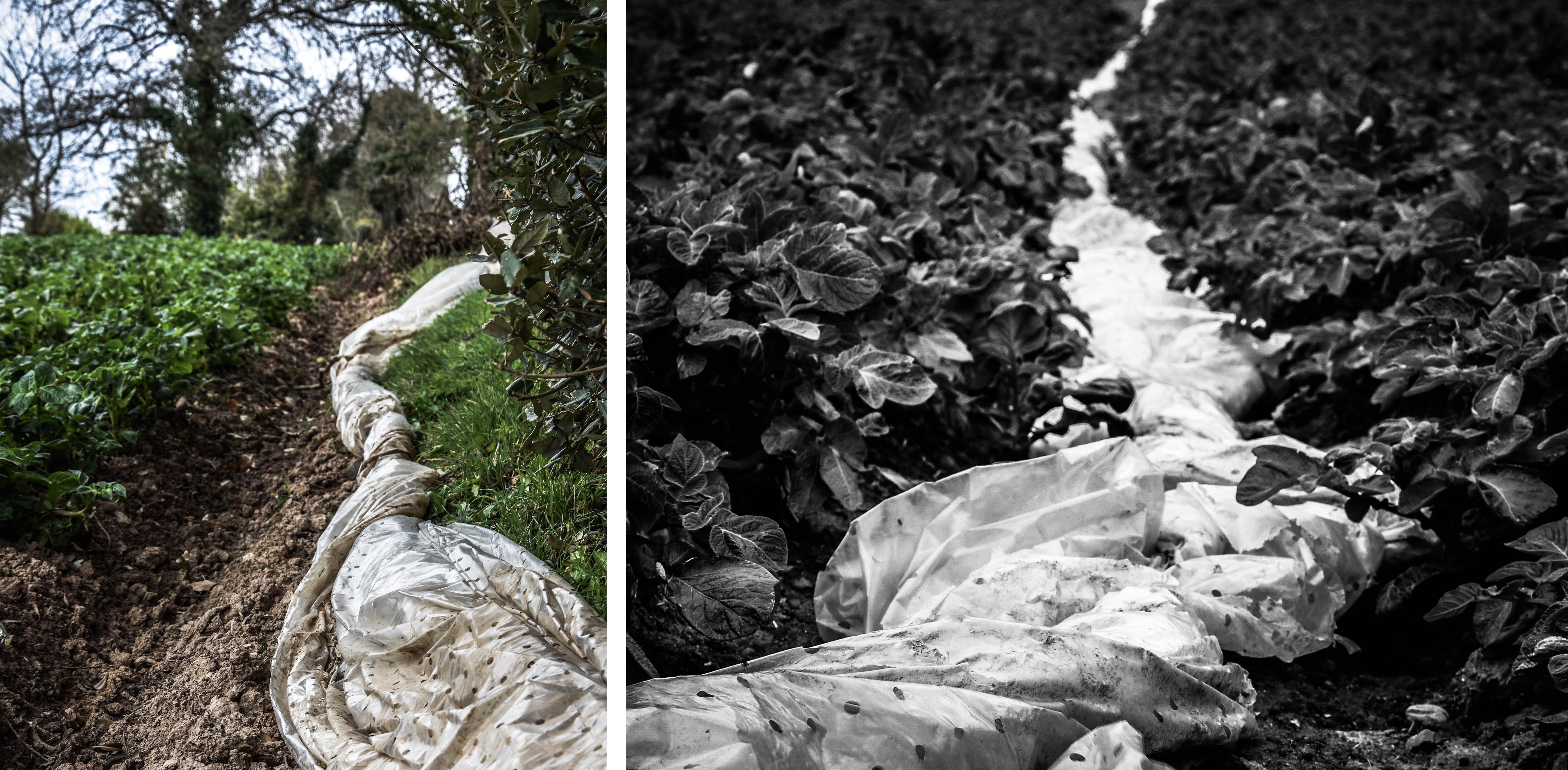 The two final outcomes on the top row of the contact sheet above depict the material, after is has been used, but before it is thrown away. The photograph on the left is a portrait shot of the plastic, bunched up, and shoved to the side of a potato field. I like this image for emphasising my point because it is clear that the plastic has been used for a short while then pushed aside before being binned. I love the vibrant and natural colours of this image contrasting the white plastic as well as its interesting composition. The photograph on the right is a very similar piece depicting the plastic bunched up between two rows of potato plants. I like the composition of this as there is a really good sense of perspective to show just how big of a problem plasticulture is. The meaning of this documentary image is obviously to depict the nature of this topic as well as being a good symbol for excess plastic waste. Overall I love the dark tone of this image along with its interesting depth of field. The fact I have made it black and white also increases the dramatic shadows in the plants and highlights the subject matter.
 The first photograph depicted above on the left is a close up abstract shot of the plastic sheeting all tied together, ready for disposal. To create this abstract look I have shown the most textured spot that the plastic was tied around itself, in a simple square composition. The meaning behind this image is quite strong as this is the perfect depiction of this type of large-scale plastic going to waste. To make this subject matter more interesting in post production I changed it to black and white and increased things like the clarity, contrast, shadows and highlights. Overall I think this is a very successful photograph that would pair nicely with my presentations of plastic waste previously done in the studio. The next image on the right shows this same waste plastic but with its composition and surroundings as well. I was very happy to find this scene as it perfectly represents what I am trying to say about plasticulture. The white plains of plastic in the background emphasis the dramatic impact of the subject matter and states where it has come from. In the context of documentary photography I think this photograph works very well for portraying my meaning of this subject as well as not being staged at all.
 Lastly are two of my favourite images from this documentary shoot. I like how these images go together as the second scene, shown in the image on the right, was found right behind the tree line of the first scene. The photograph on the left depicts the texture of the plastic, being caught in the wind, with trees and the sea in the background. The meaning behind this image is to give a clear idea of how this plastic is used and just how much is plastered over Jersey fields every year. The trees and the sea as the background, along with this images vibrant colours, give the viewer a false sense of beauty for this scene. This is why it is important that it is paired with the image on the left, depicting exactly why this scene is corrupt. This photograph depicts an area in the cliff face I found when walking on the beach directly behind the previously mentioned field. Here you can see the horrible consequences of farming industries using plasticulture, as plastic pours out from under the shrubbery, partially ripped away by the sea. The meaning of this image is to show that our actions have horrible environmental consequences as well as that this material will never just disappear.
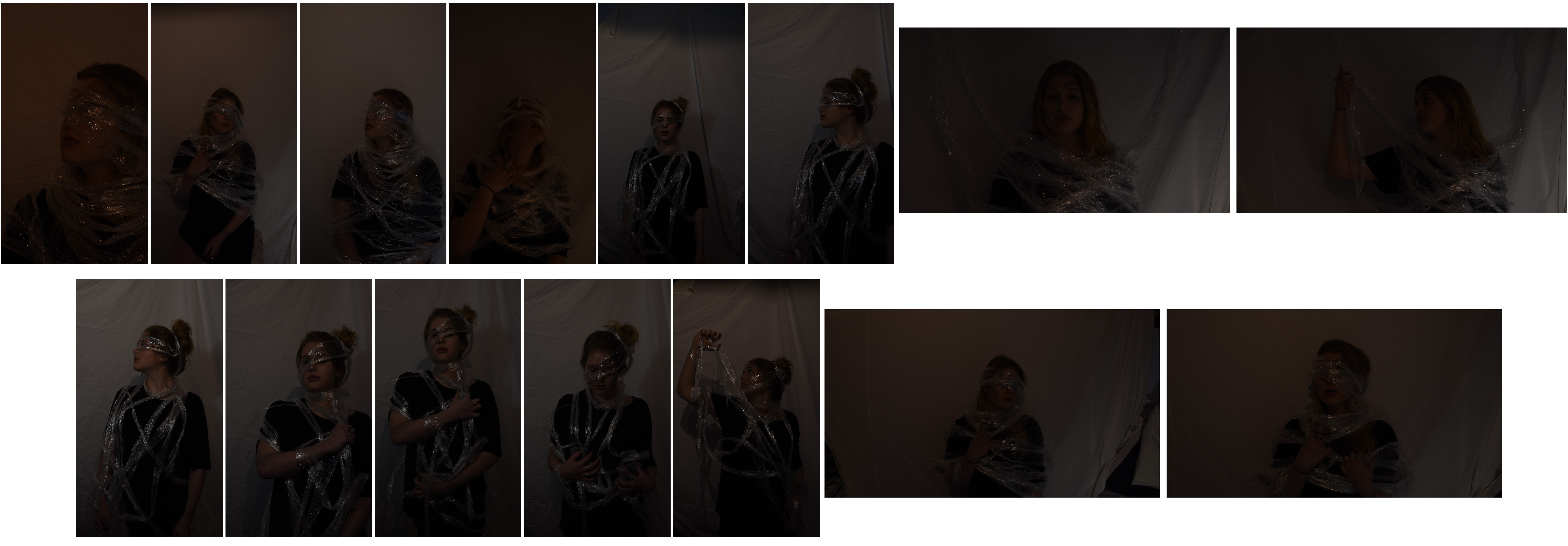
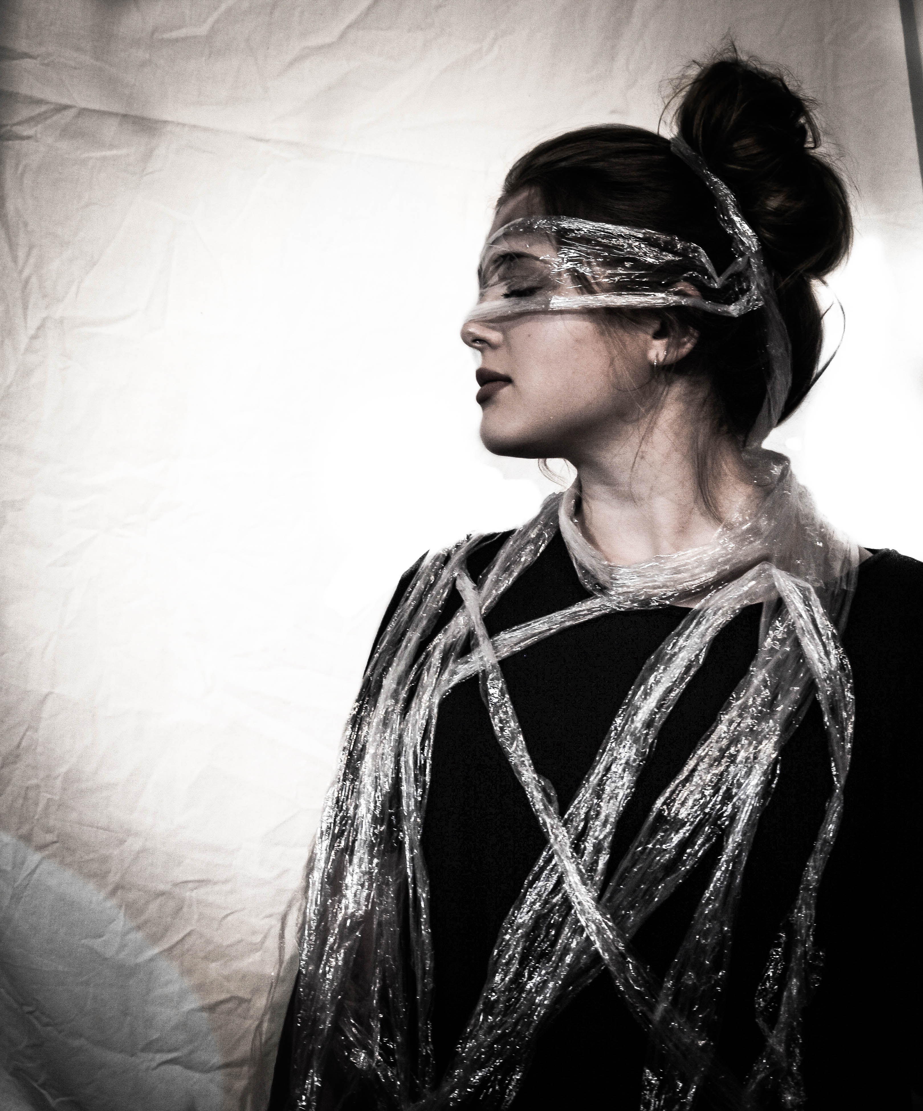 The first image displayed full and in colour above is a side portrait, half boy shot, depicting the model carefully drapped in a plastic material. To create this look I used an interesting arrangement of cellophane and painted small purple smudges on my model for a bit of extra detail. The meaning behind this photograph is similar to one I explored in my last self portraiture shoot. The head facing away and closed eyes covered by plastic represents our failure to see what is literally right in front of our eyes. I like this clear metaphor I have created with the material along with the stern expression and strong jaw line of my model. The artificial lighting in this picture, as well as my alterations made in post production, has created some very interesting shadows and highlights. I really like the spot light effect I have added to all three of my outcomes as, for me, it symbolises how I am trying to ‘shine light’ on this grim subject. Overall I have chosen this image as my best result from this shoot because of its interesting composition, lighting and soft colour tones.
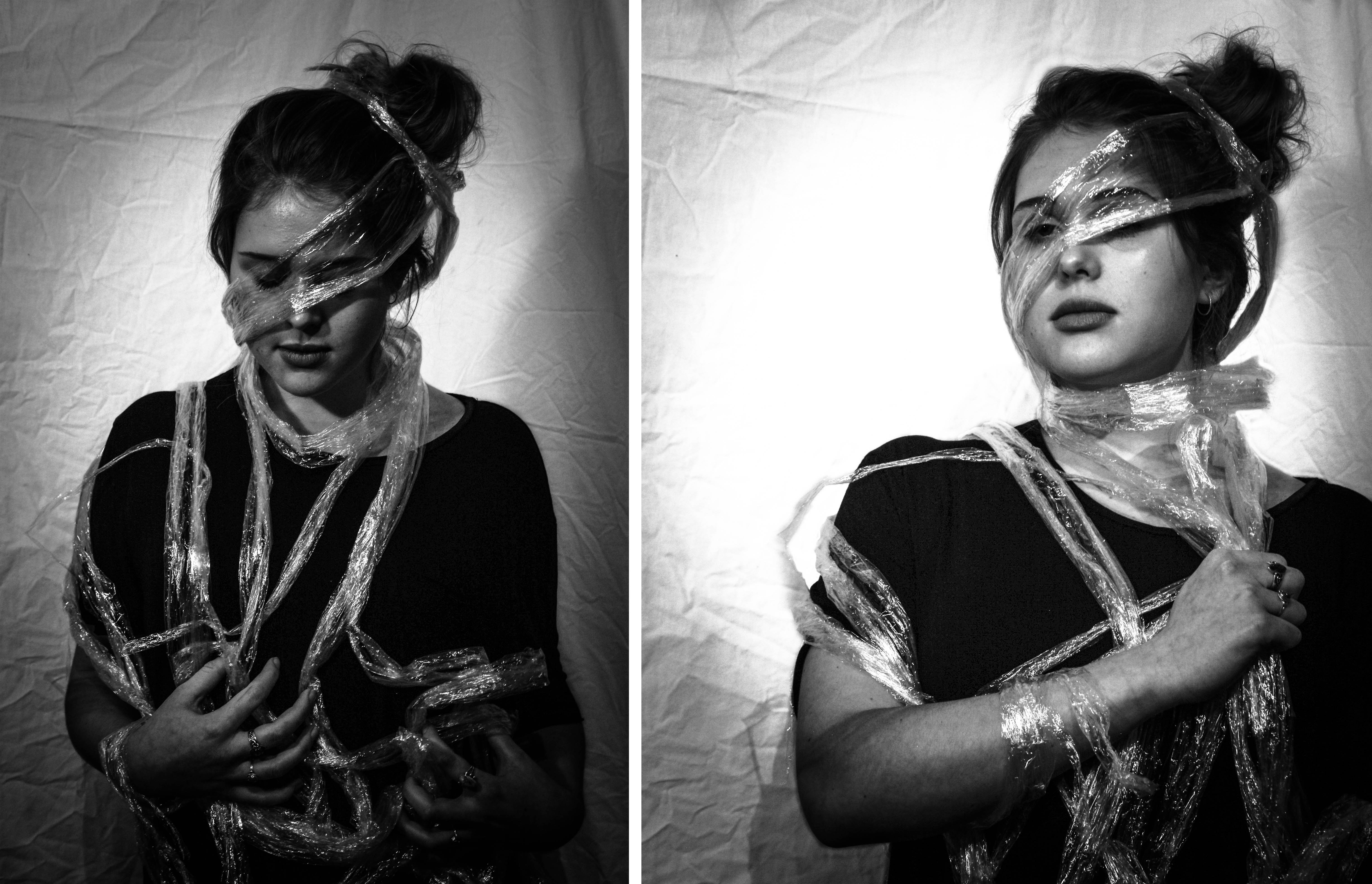 The next two black and white finals shown above are some of my other successful outcomes from this shoot, depicting the same material, but different poses and symbolic messages. The first photograph on the left shows the model standing straight, looking down at what she is wrapped in, with a simple composition. The message I was trying to get across with this pose was ‘having a look at what man-kind has created’. I like the modest look this composition has along with the dark contrast of the material and her hands. The plastic covering the models eyes also gives the image an abstract and almost fashion photography look. Lastly the image on the right shows the model gripping the plastic that is wrapped tightly around her neck. This obvious symbolism is to show my message through ideas of being trapped and suffocation, ultimately telling the story of the effect it has on animals and marine life. I chose this simple composition because it resembles a previously analysed portrait taken by my inspiration Matthew Lyn.


 When selecting my final outcomes out of the images above I wanted to make sure that I included a varied selection so that I can get across my symbolic point clearly. Below I have chosen four photographs (out of the 6 images above) that each show something quite different, whether it be the tone created by lighting , type of plastic material, or pose. When it came to editing these photographs the first thing I did to all of them was increase the exposure and play with the contrast. After this I judged each photograph individually and went through my normal editing routine of changing things like temperature, clarity, saturation, highlights and shadows. The reason I have included a mixture of colour and black and white outcomes is to tie into my first studio section, showing the common pollution issue of cigarette waste. Below are my final outcomes…
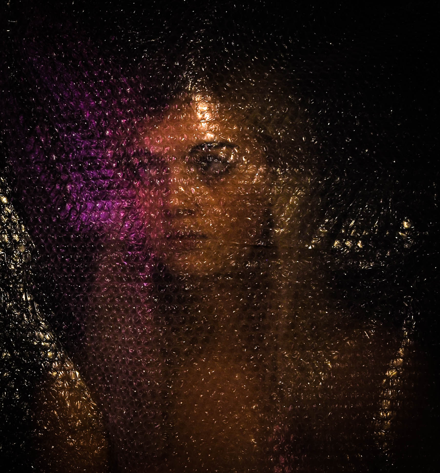 This first photograph is one of my favorites from this shoot, mostly because of the straightforward yet distorted composition and interesting light. To create this self portraiture piece I used a shutter button (to take the images), a black sheet as the background and a large piece of bubble wrapped that I have kept since last ordering something online. I like this piece as the colours and interesting light techniques shinning off the bubble wrap, reminds me of the beautiful plastic fashion photography done by Matthew Lyn. The symbolic meaning behind this image is not only to emphasis our connection to this global problem, but also to show our ignorance and how we do not allow ourselves to be affected by its gravity. This is represented by the fact I am looking away from the plastic that is right in front of my face, as well as my concentration on the pretty pink light that is being emitted from the side. As well as this, even though this shoot was purely symbolic and not documentary, I have managed to reuse a huge example of real plastic waste.
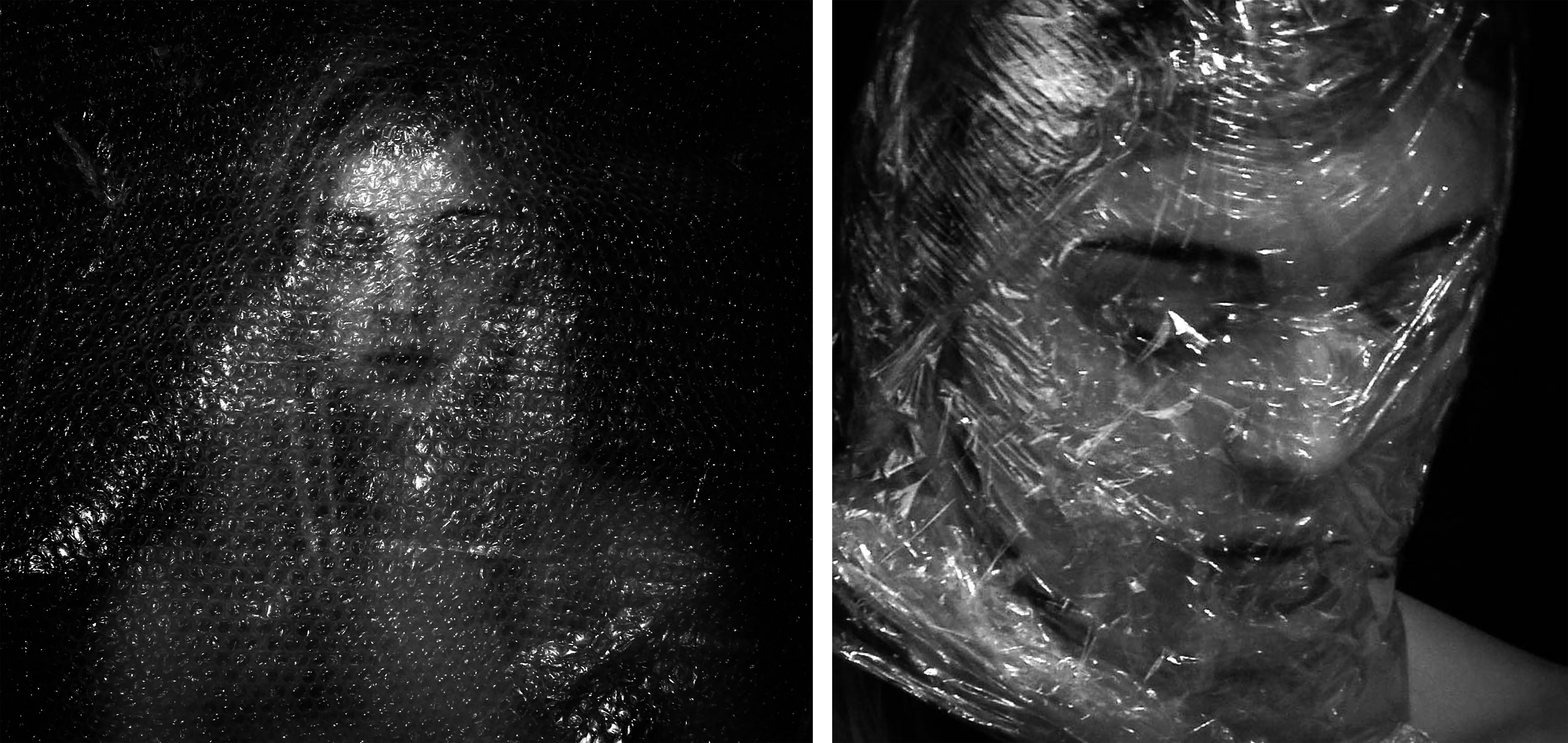 Here are two final outcomes that in my opinion, are not as meaningful as the larger ones above and below. The image on the left shows my second favorite from the bubble wrap shoot, made by simply taping the plastic above me and sitting underneath. The visual elements in this piece are a straight forward self-portrait, emphasised by dark edges and distorted by plastic. The meaning behind this photograph is linked very closely to the photograph above, showing our connection to this issue. Although the straight ahead look takes away from the representation, I do like this image for is black and white dramatic impact. The image on the right however is very different, showing one of my experimentations using cellophane instead of bubble wrap. To create this look I carefully wrapped the material around my head (making sure to create air holes as I went round) until it started to make interesting creases for the artificial light to bounce off. The meaning behind this photograph is very much to do with representing the way plastic kills animals and marine life. However the way I have wrapped myself in plastic also symbolises the way we do this the pretty much everything else. I like the clear message I can get across with this image however, in my opinion, its is not as good as the larger version I have presented below.
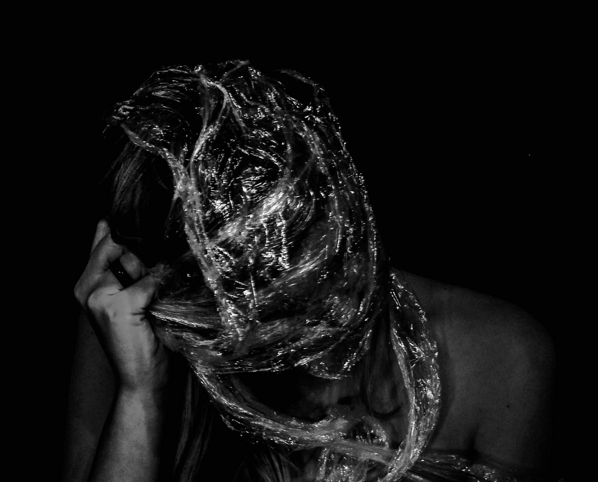 Lastly is my other favourite final edited outcome from this self portraiture shoot. This photograph depicts a very strong symbolic message using self portraiture, a home-made studio and cellophane. To create the plastic wrap look I bunched the cellophane together, making more of a textured surface for the light the reflect off, and tightly wrapped it around my head until I could pretty much no longer see. The reason I have decided to have bare shoulders in these images is because, after trying multiple tops, clothing was really taking away from the representation and making the photographs a lot less dramatic. For me, the symbolism behind this photograph in particular is very strong because of the composition, material and pose. Here I am representing not only the way plastic kills animals and marine life, but also the struggle these creatures endure. This is much clearer in this image, than it was in my last outcome, because of my visible struggle to break free, paired with the dramatic impact created by very dark contrast and 0% saturation.
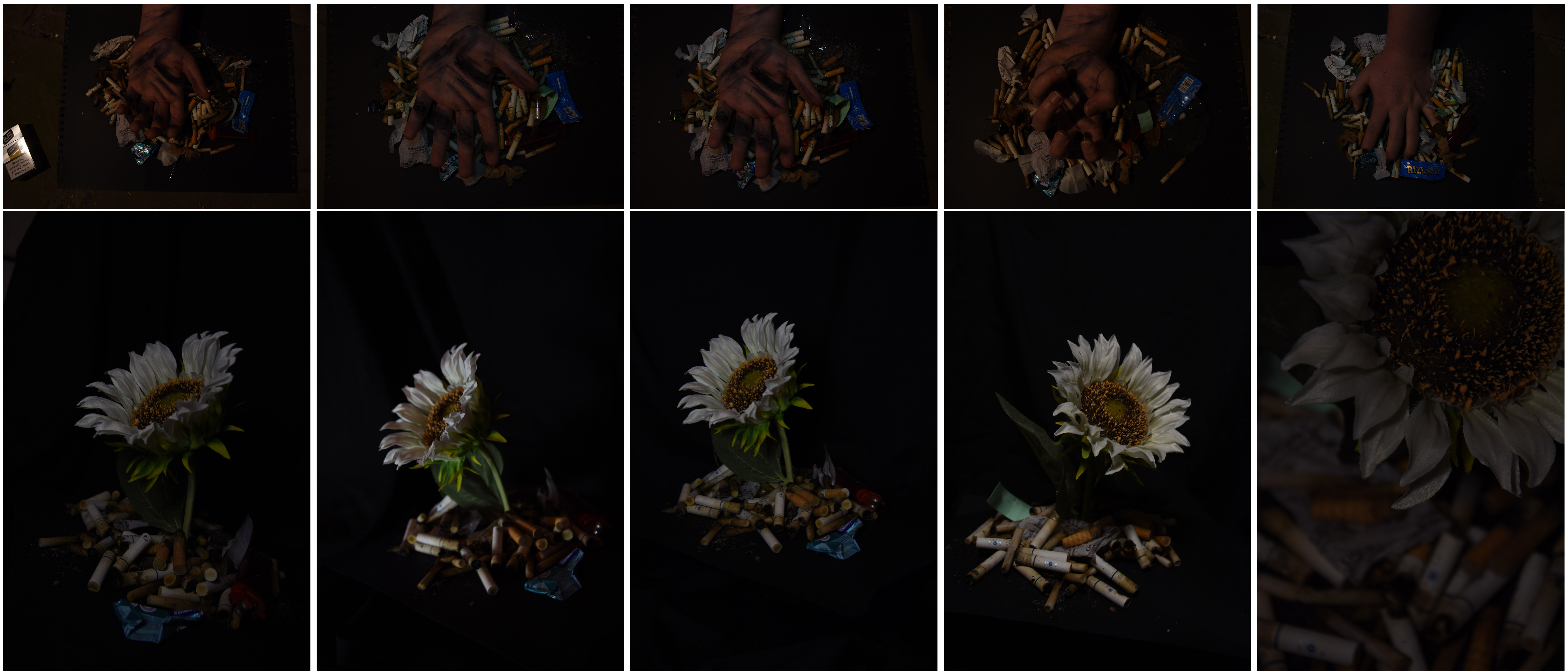 To really capture these scenes in a very dark, emotive and contrasted way, I took these photographs using a low shutter speed on the aperture setting of my camera. When choosing my final outcomes out of these 10 raw images above, I was looking for a simple composition with sharp definition and interesting lighting. The first thing I have done to edit my final outcomes is bring the level of the exposure, highlighting, contrast, and shadows up. By doing this my outcomes have become bright and dramatic pieces that, I think, really emphasis this pollution issue prominent on our Island. Below is a mixture of colour and black and white results, although I will not be using all of them for final pieces to represent my project, I really like the range of compositions and mixture of harsh and soft lighting…
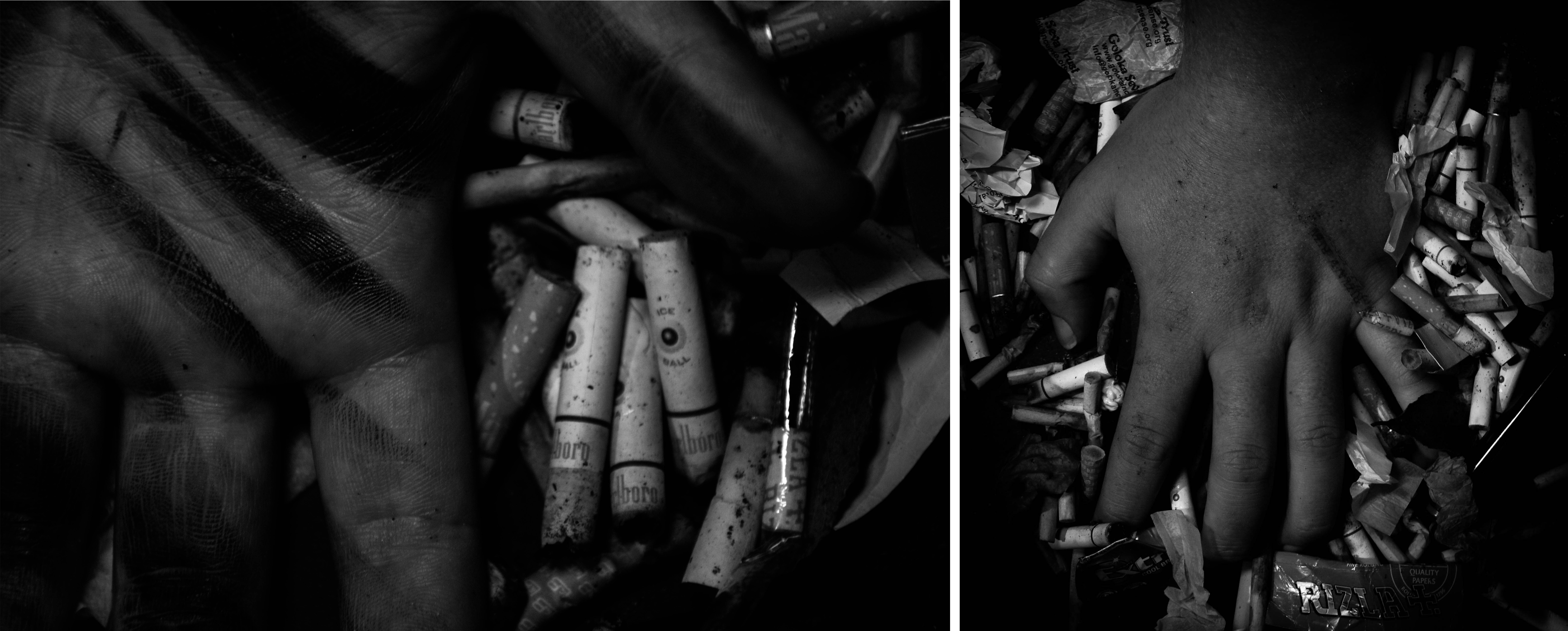
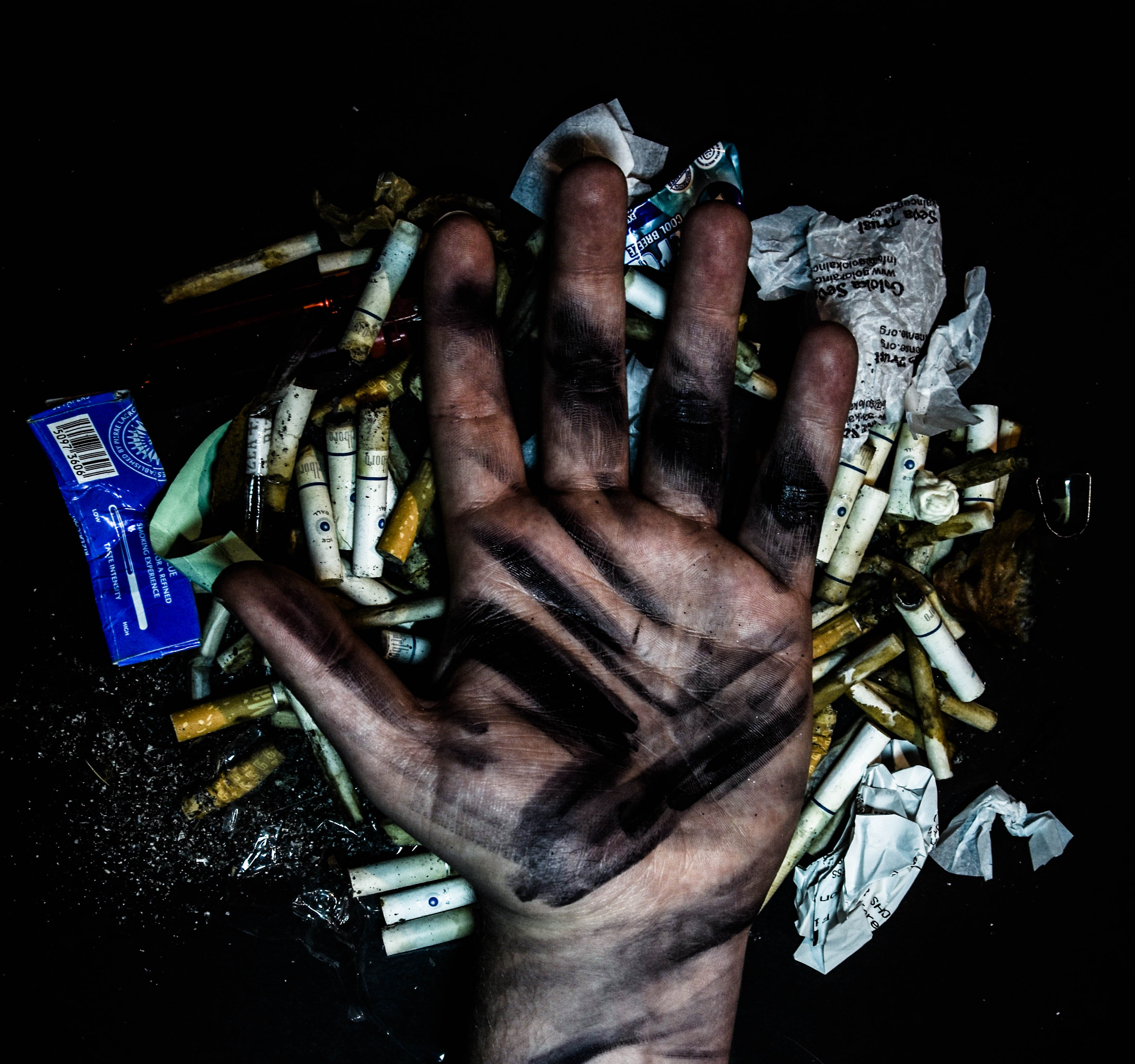 This photograph above depicts a straightforward composition of my models hand resting on black paper and surrounded by smoking waste. Because of my inspiration this shoot resembles the work of Gregg Segal as a representation of people compared to the waste they produce. Although, instead of full body portraits, I have used a hand as symbol of our species because it is what sets us apart and allows use to damage the environment in this way. To emphasis the scale of this problem I am representing, I have covered the hand in a black oily looking substance, showcasing our problem with mass production. To create these greasy marks I have used acrylic paints layered thickly and heavily in quick brushstrokes and captured the image whilst the paint is still wet. Overall I love this photograph’s appearance and feel it is the most successful for portraying this issue out of both of these two shoots. Aswell as this, this image is my favourite for its composition, contrast and striking / dramatic tone.
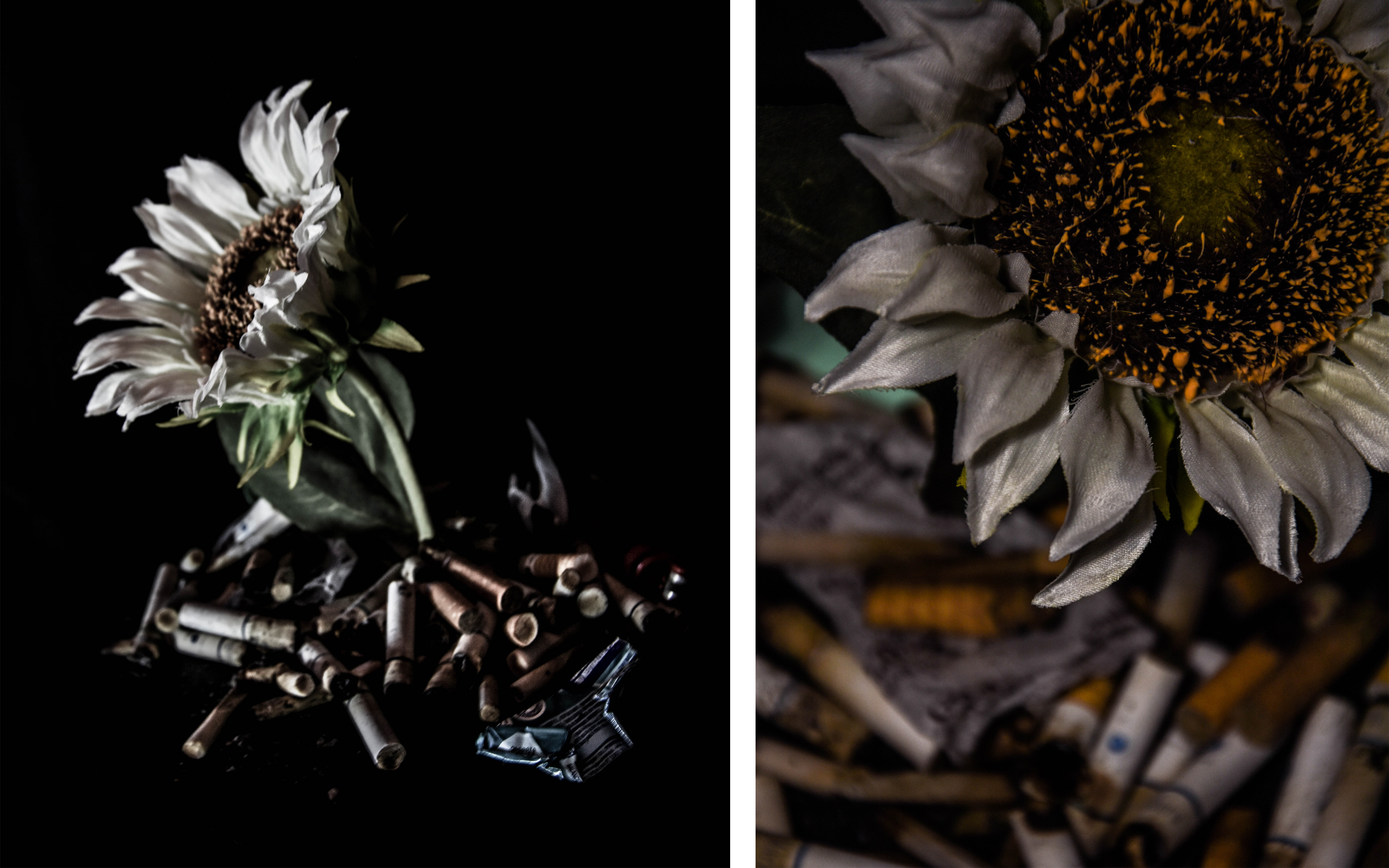 Above is two of my colour results from the second shoot, made using a home-made studio, fake flower, artificial soft lighting and smoking waste. The image on the left is a full view of the scene I have created using very soft studio lighting. I love this effect the light source has as it represents the flower reaching towards, trying to survive. The reason I chose this image as one of my outcomes is because of the interesting focus and depth of field it shows. The image on this right however is a more abstract closeup version, and also one of my favourites from these two shoots. The reason I think this image works so well is the matching organgey / yellow colours displayed in both the cigarettes and the pollen of the flower. I also really like this closeup portrait composition with the darkly contrasted flower in the foreground and the pollution issue slightly burly behind. This depth of field for me represents the impact this problem has on natural things and our ability to ignore them, or in other terms, blur them out.
 Lastly is my favourite outcome from my second shoot depicting a simple black and white shot of the flower circled with this poisonous, but common pollution. The reason I chose this result over the others is its strikingly clear symbolic and straight forward composition. To make it as though the flower was growing of the ‘studio’ floor I cut a slit into the black paper and positioned the flower in the very middle. After this, in post production, to match the paper with the black fabric background I raised the darkness and shadows levels. I love the strong symbolism of this issue’s connection with nature and feel as if visual representation is sometimes the best way to present it. Again, like in my outcome above this, the flower is illuminated with soft artificial light representing it reaching towards the sun attempting to survive. The reason this image is in black and white is because it really increases its simple message and dramatic impact. I love the contrast between the brightness of the natural flower compared to the bleak background and grey pollution below.