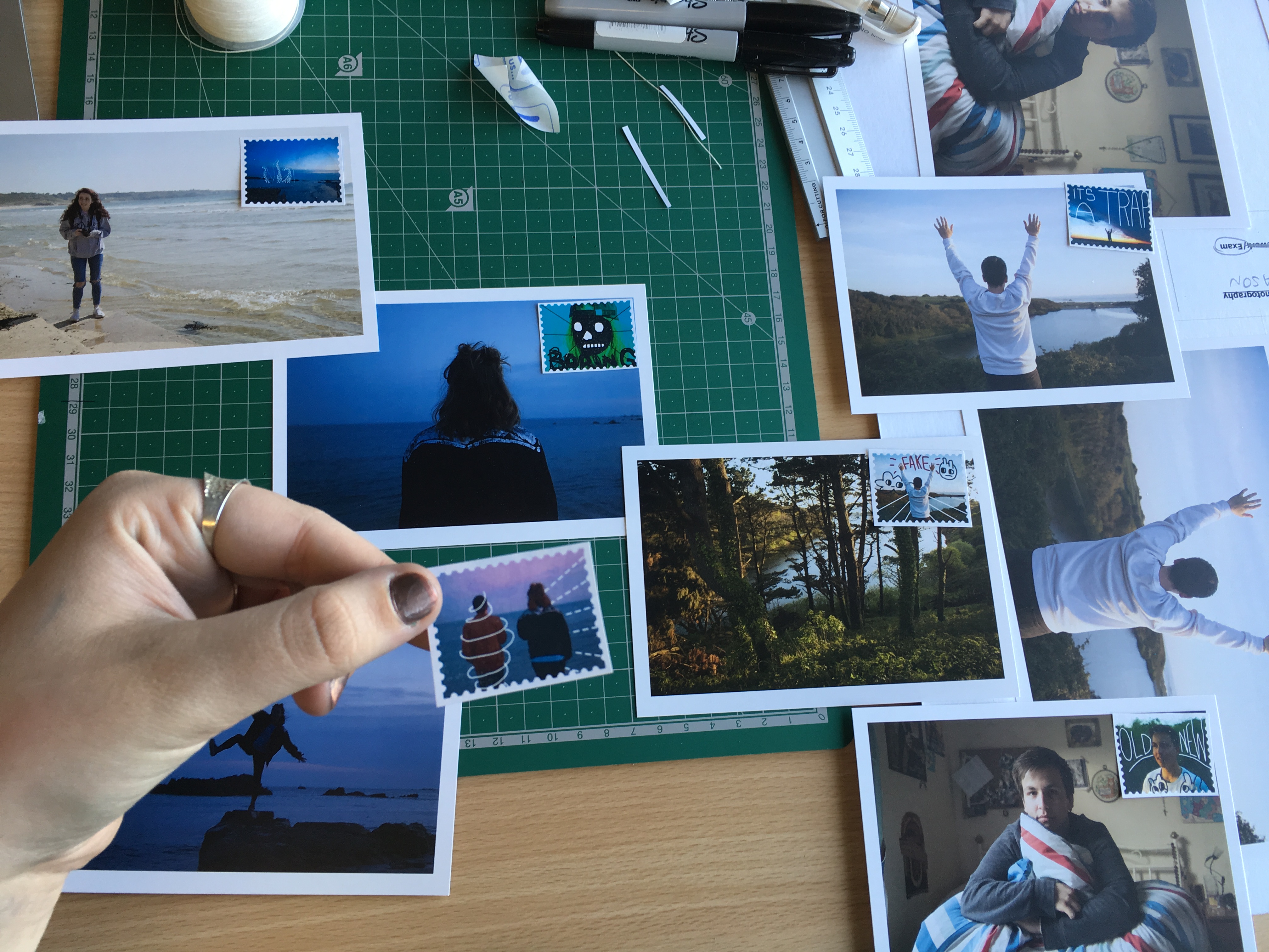
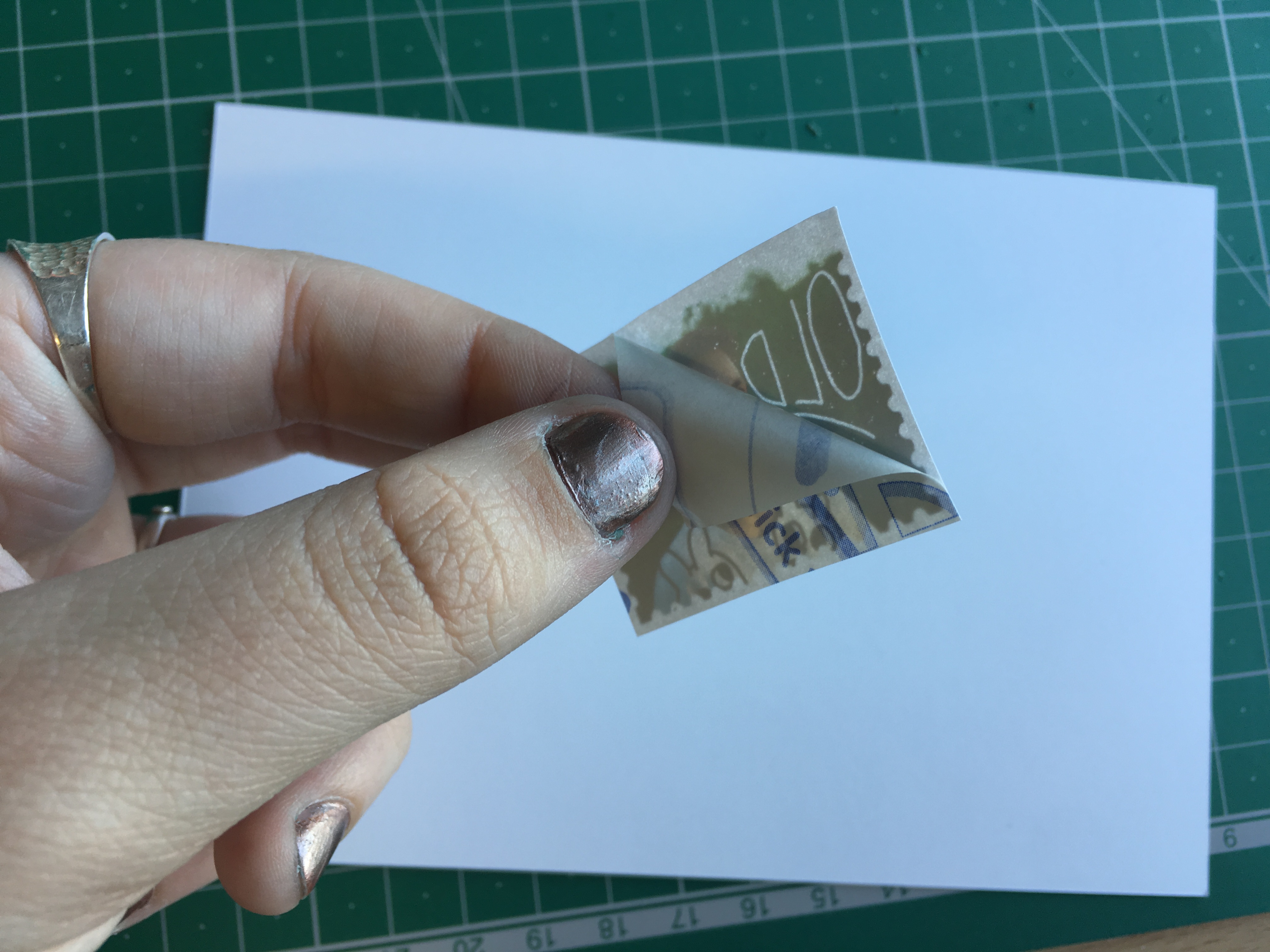
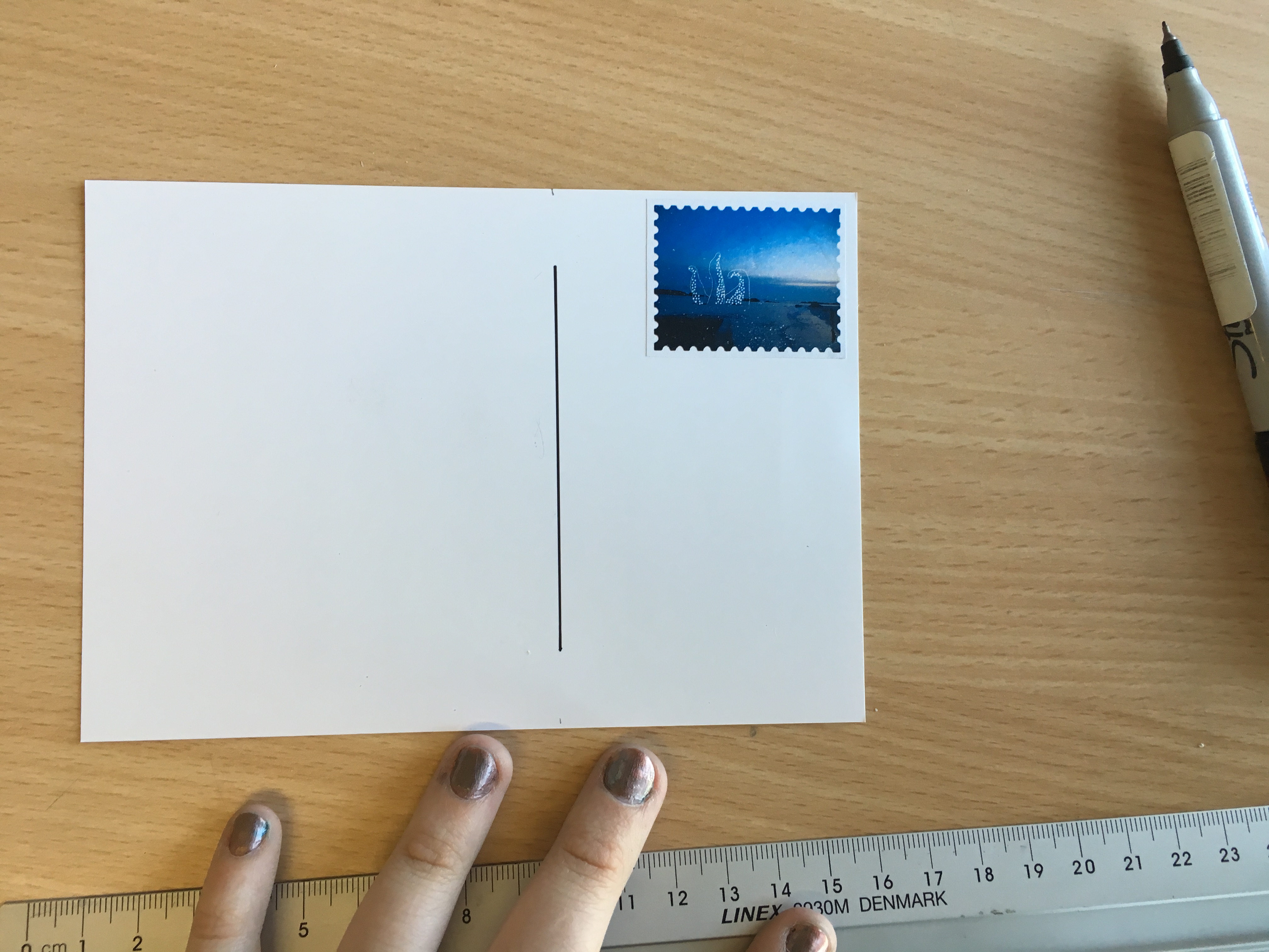
In this post, I am going to be looking at and evaluating my final outcomes for this project. I think that my work fulfils the exam brief of’ Environment’ innovating upon the word in order to create something original and unique. My work for this exam is entirely focused upon my travels around the Mediterranean and the different environments I visited. There is a specific emphasis on location which is reflected through the photography produced throughout my project. I was very motivated in ensuring that the individual styles and personalities of each city was accurately portrayed through the work so that we, as an audience, are forced to study and investigate the environment showcased. This project has undergone a series of transformations before finding its final balance and identity. The project originally started at a direct narrative surrounding tourism and disposable cameras. I was certain that I would be studying tourism history and that disposable cameras would be the primary focus of the whole project, due to their popularity in the 90’s and presence within my childhood. Nevertheless, I soon found the concept uninspired and began to look into illustration and digital drawing. I discovered that this would be an excellent way to weave a narrative or message into the environments present from my holidays. Nevertheless, I could not predict the satirical, comedic tone that came to fruition as I began producing some work. The resulting visuals are truly interesting, and quite successful in my mind. We see these goofy, almost childish drawings merging with typical tourist images, generating a very unique aesthetic. I am very happy with the project.
If I was to try and describe my project, I have received the theme of ‘Environment’ and manually manipulated these European environments in a comedic, humorous fashion, almost mocking the serious perspective we are expected to hold. My project is about poking fun and demoting large scale tourism, using visual sarcasm to parody these locations. I have tried to integrate modern culture and the lifestyles of me and my friends in order to evoke a more personal message.
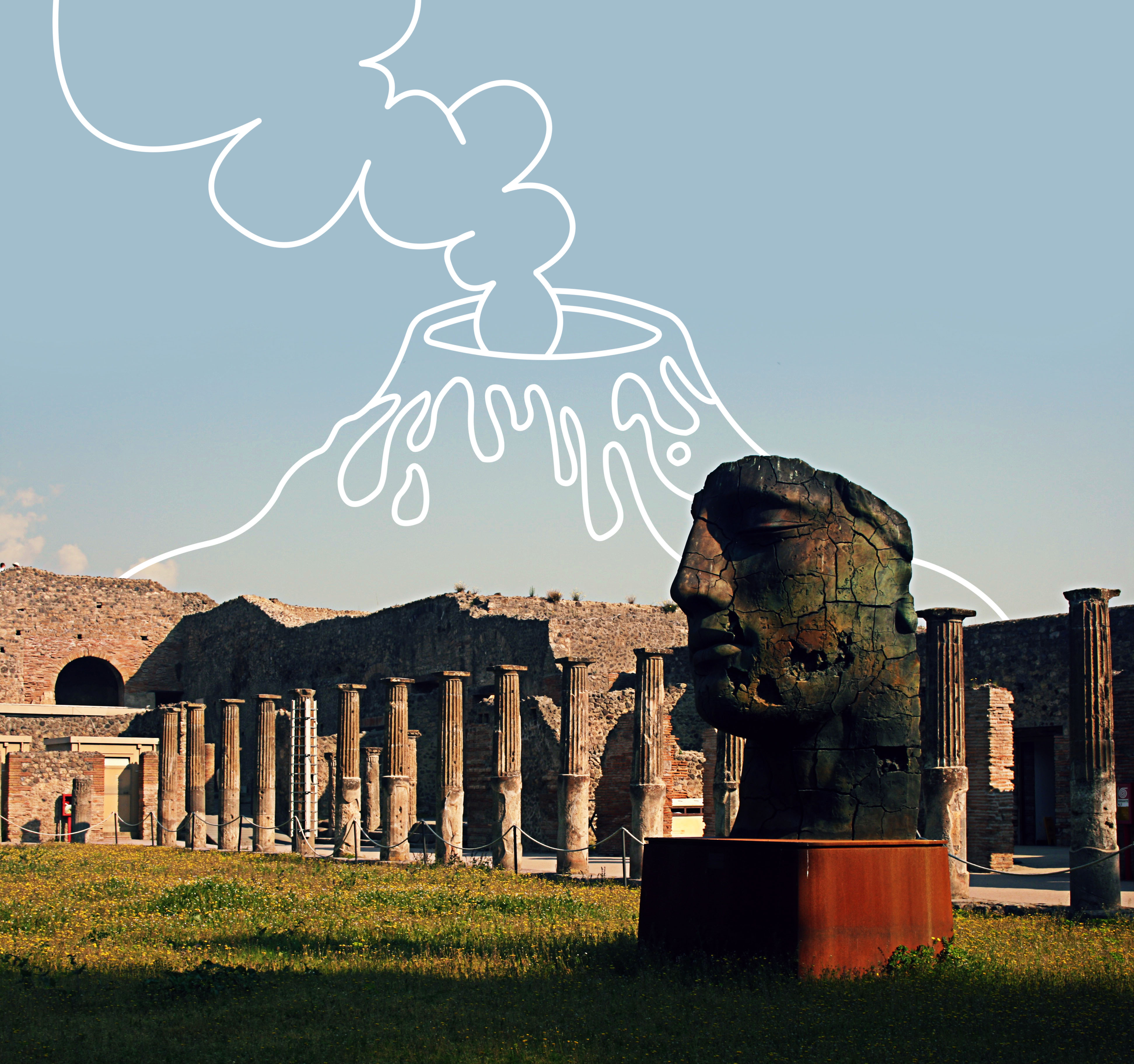
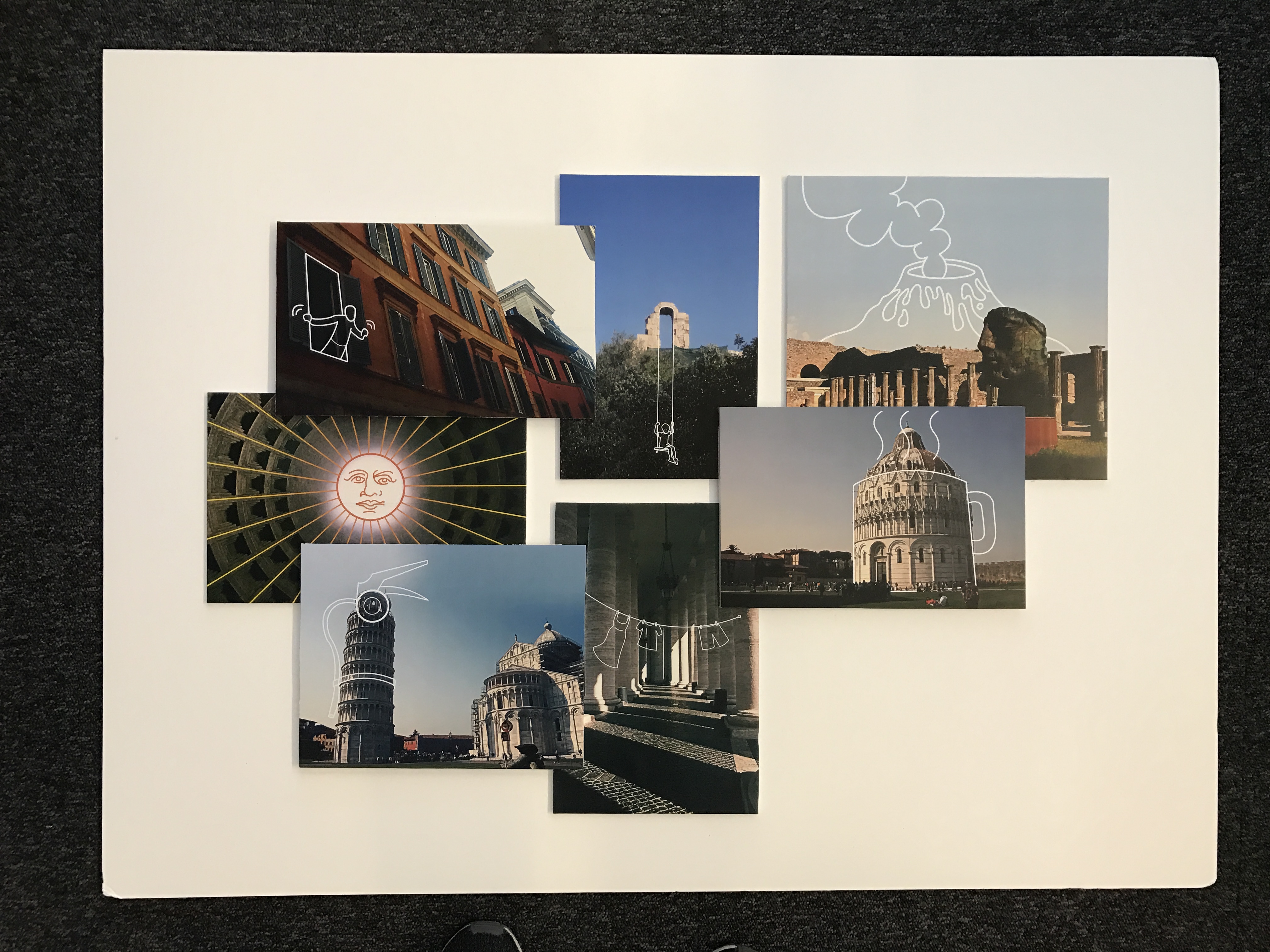
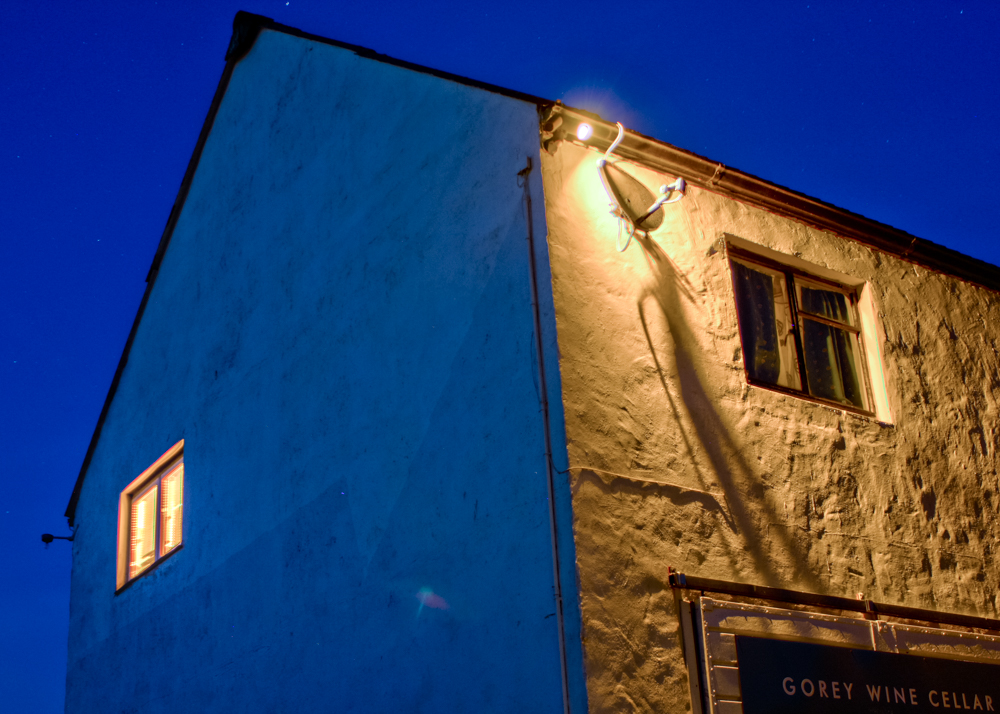
This piece is very important, as it is the first response I created for this project. It set the tone for the remaining project, which I think has worked successfully. This is the only response that I took from my shoot in Pompeii, Italy. Pompeii, along with Herculaneum and many villas in the surrounding area, was mostly destroyed and buried under volcanic ash in the eruption of Mount Vesuvius in 79 AD. This was a fantastic location to visit, and provided me with lots of photographic opportunities that I did not expect. This photograph was taken within the Quadriportico dei Teatri, also known as the Barracks of the Gladiators. This part of the city was initially used for the audience to stroll and converse during intervals between acts and later as a barracks for gladiators. The portico of the Theater was built in the early first century BC, as a recreational area or shelter from the rain for the spectators within the Great and small theatres. Nevertheless, after an Earthquake, it was completely renovated and expanded, changing its function into a school for gladiators. I like the shot I have taken here as there is an appealing palette of colours and interesting lighting composition. The photograph features a warm set of colours, the greens and oranges of the field and blue of the sky creating a summery, positive atmosphere. The large head statue within the foreground, incorporates some interesting textures, as generating from the rusty, cracked metal. I like how we only see one side of the statues face as this produces a sense of mystery and intrigue. In addition to this, some vivid shadows are being casted from the sunlight as we see one surface of the ruin in the background masked in darkness. Nevertheless, a contrast is made as the highlight of the sky and pillars work nicely in juxtaposition with the shadows. These pillars are a pivotal component of the photograph working extremely effectively to generate a sense of perspective. The pillars start in the foreground and as they follow the natural flow of the courtyard they lead the eye of the viewer towards to the background. Instinctively, our eyes follow the positioning of the pillars and directing us towards the arch in the background and eventually the sky. This left a perfect spot to add an illustration. I thought about Pompeii history and how the city was almost destroyed from the eruption of Mount Vesuvius. This led me into drawing a cartoonish volcano in the background, allowing us to visualise, in a funny kind of way, what happened on that very day. This photograph stands out from the rest in that I am actually telling history through the illustrations.


These next two photographs come from my visit to Pisa, Italy. As shown, I have tried to incorporate imagery, from an everyday lifestyle. I wanted to continue this comedic visual style and have hence demoted these significant and historic sites into regular, boring objects. There is a sense of irony surrounding this, which is great as it triggers discussion regarding your work. For example, I have transformed the Tower of Pisa, one of the architectural wonders of the world into a fire extinguisher. I like the cheeky, almost controversial nature of the transformation as it forces the audience to think. In the second image I have captured The Baptistery of St. John. Construction started in 1152 to replace an older baptistery, and when it was completed in 1363, it became the second building, in chronological order, in the Square of Miracles. The building is the largest baptistery in Italy and an example of the transition from the Romanesque style to the Gothic style. The lower section is in the Romanesque style, with rounded arches, while the upper sections are in the Gothic style, with pointed arches. The Baptistery is constructed of marble, as is common in Italian architecture. I found this baptistery really beautiful and am happy with the photo I have taken of it. There is an attractive sense of light and dark as we the find details of the architecture pop into the foreground. I really like how the light source is coming from the left side and it consequently casts one side of the baptistery in light and the other in darkness. The sky works in cooperation with the image here as an absence of clouds and colourful blue tone makes the building more prominent within the landscape. Here, I identified the curvature and shape of the baptistery and turned it into a mug of hot tea. Again, this is a very boring, ordinary object that we see frequently and pay little attention to. I was inspired by Michael Craig Martin in the incorporation of mundane objects like these.


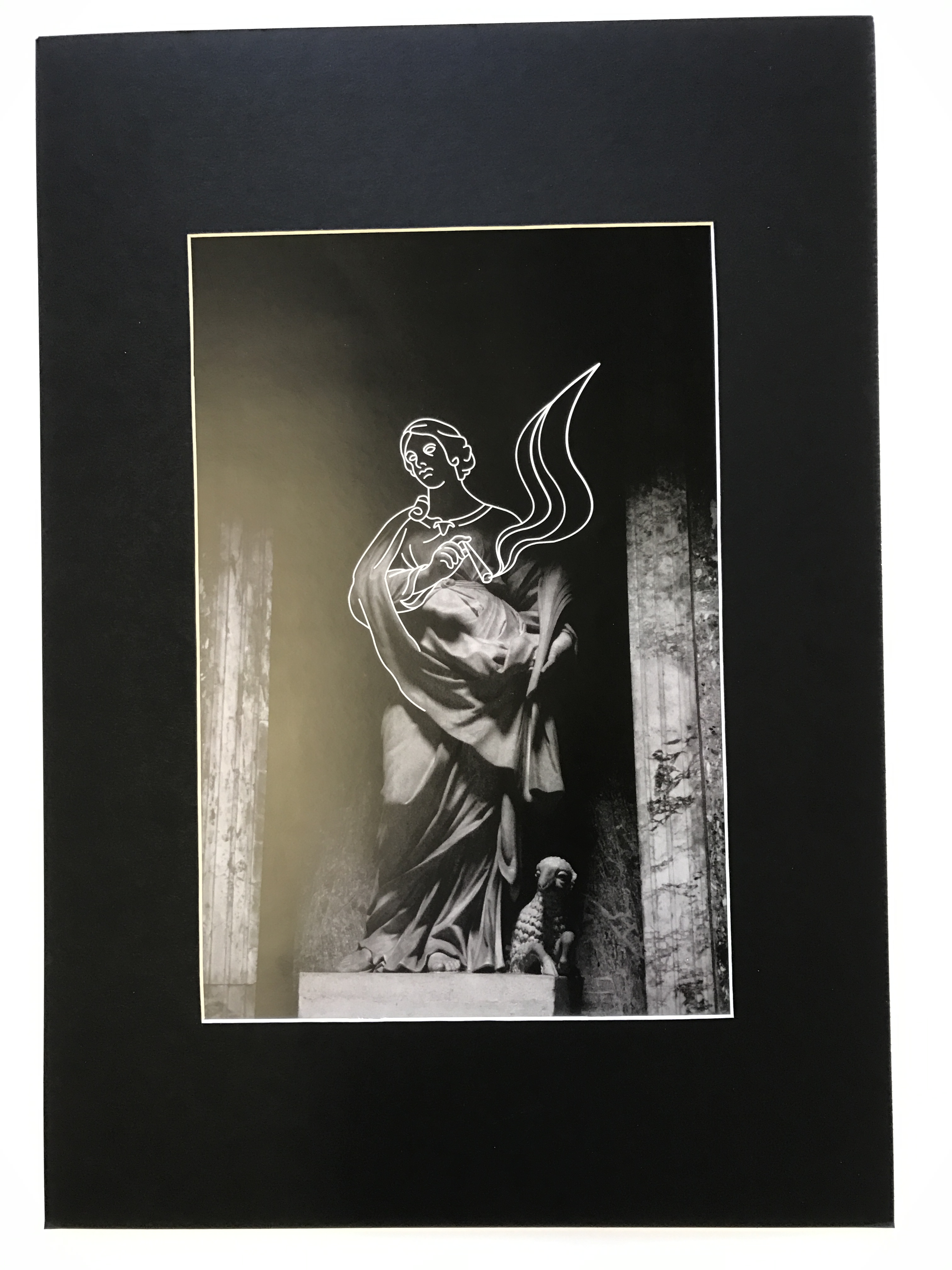
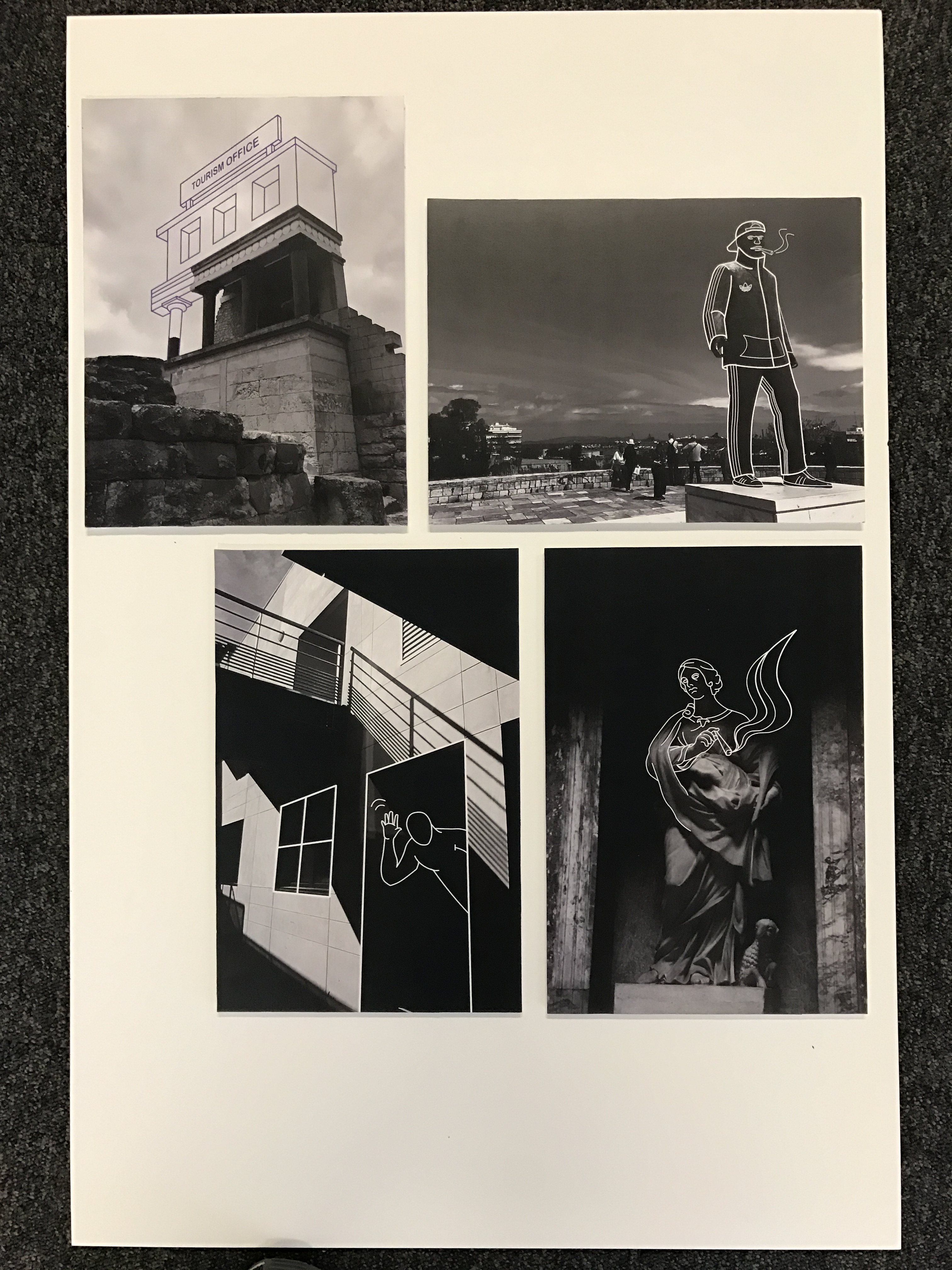
In these three images, I have tried my best to try and incorporate contemporary and modern culture, illustrating key components of the society I am invested in. This involves visual cues associated with teenage and student lifestyle. This can be seen within the first photograph, which is probably my favourite image from the whole project. This photo depicts the statue of St Agnes within The Pantheon in Rome. I like the way the lighting submerges the statues top half in shadow and the way in which the smooth, folds within the cloth of the gown has been highlighted by the soft light. With the top half of the statue shrouded in darkness, the opportunity to use crisp white-line drawing was available. I began to fill in where the details of the statue start to disappear around the waistline, working upwards towards the head. At this point I noticed the gesture of the subjects right hand, which visually looks like she is grasping a small, thin object. Yet on the statue, no object is present within her fingers. As a result, I identified the opportunity to implement a joint/spliff. This is something largely present and associated with teen culture, as drugs are consistently an active force within the life of a student. Visually, I think this creates a very striking juxtaposition, following the irony that I have been enforces so far. We see a historical piece of art within an extremely catholic building. This is an environment where a joint could not feel any more unnatural. There is a powerful contrast of ideologies and lifestyles. I continued this theme of teenage culture with the next photo, where in which I have photographed my sisters phone capturing my reflection in the front-camera. The image itself is not very interesting, but I thought I could create something unusual with additional illustrations. The phone surface presents me with a canvas that is in direct view of the audience. With this in mind, I decided to outline my silhouette within the phone screen which creates quite a cool, stylistic effect. In the final image of this set, I have produced an aesthetic that is synonymous with the photograph of St Agnes. I have decorated this statue within the city of Heraklion, Greece with a very urban and modern set of clothing. Inspired by the outfits of teenagers and students I know, I have equipped this statue with an Adidas tracksuit and cap. This evokes a youthful visual message that clashes with the heritage and history associated with statues.


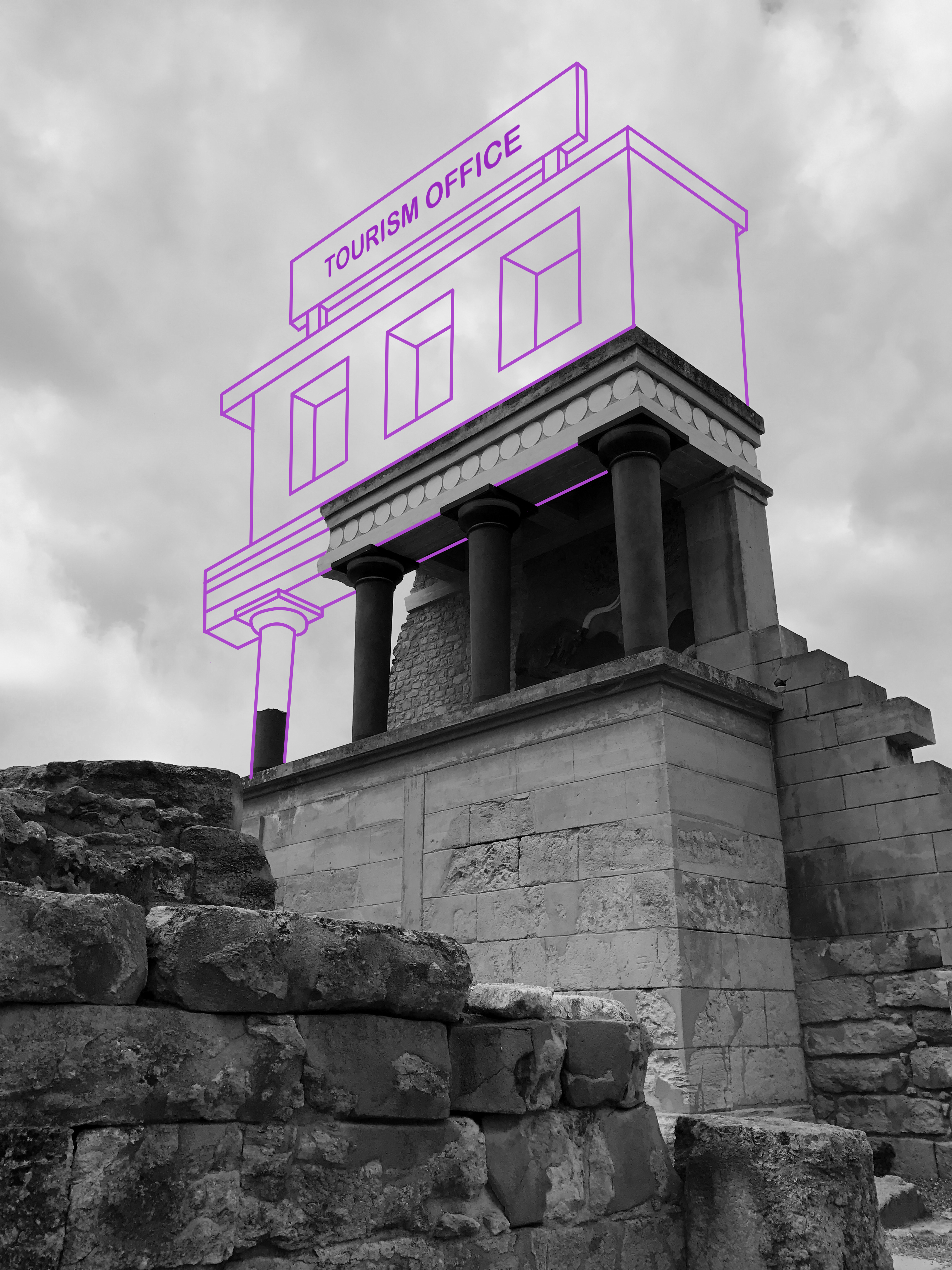
In these three photographs, I have payed specific attention to the environment and architectural clues provided. I have tried to weave my illustrations within the photographs so that they feel natural and organic. The first photo was taken in Athens. the capital of Greece. I captured an old, stone archway in the distance, peaking over the shrubbery and tree-line. I was quite interested in the crisp arch shape that had been created, intrigued by its position in the center of the composition. I saw the opportunity to include two parallel, vertical running lines that I eventually transformed into a tree-swing. I like the resulting outcome as we again see this juxtaposition of age. Youth and childhood is being pitched against maturity and age. The next photo was captures the Colonnades that enclose St. Peters Square. The colonnades define the piazza. I like this image, the lighting working very effectively to create a domino-like effect. We see the large, marble columns spiral around the corner out of sight which leads the eye throughout the composition of the photo. There is a great balance of light and dark here, splitting the image into separate segments. Furthermore, another beautiful lighting display is presented on the clean brick floor as a zebra-crossing effect is created. The shadow of each pillar generates a striped pattern which is quite intriguing. Here, I integrated a clothing line, again following this concept of mundane and regularity. I like its natural integration within the composition as the line crosses across the pathway to connect to the pillars. The final photo of this set was taken in Knossos, Greece. I have tried to reconstruct this destroyed, ancient temple filling in where the structure has collapsed. In addition to this, I have improvised upon the upper layers, creating a floor of my own and a large sign upon the roof that reads ‘Tourism Office’. I thought this was a witty way of enforcing this theme of visual satire, almost mocking this ancient city and essentially labelling it as just a tourist attraction.
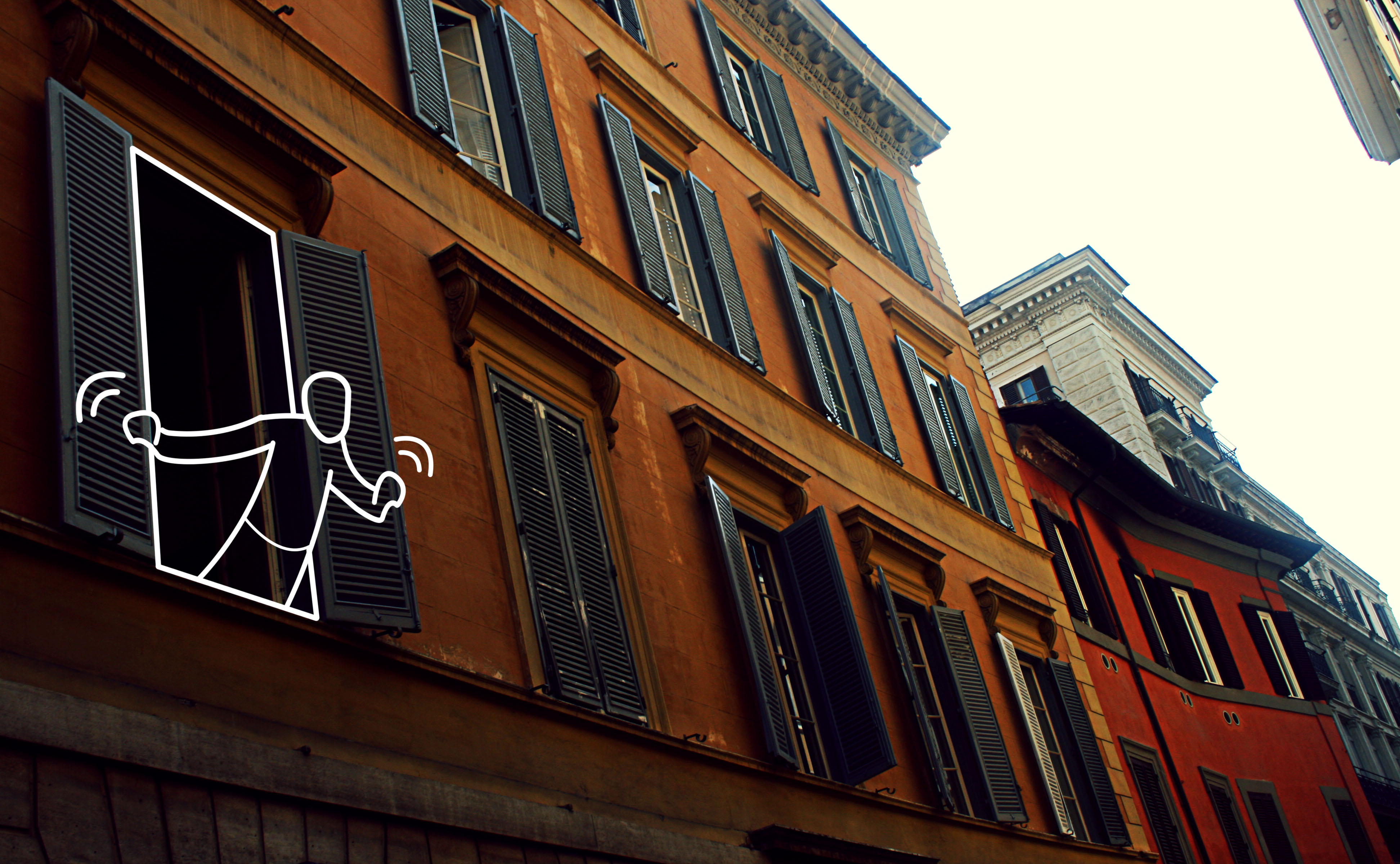


These three photographs all possess specific emphasis on lighting, hence working well as a set. Moving away from monuments, churches and ruins, for the first two photographs I have directed my attention towards ordinary streets and alleys. I wanted to capture average lifestyle as oppose to the landmarks and tourist attractions that we are accustomed to viewing in these popular cities. The first photo was taken in Rome and features an appealing colour palette, the oranges and cream-painted walls evoking a warm and European ambience. We get a summery feel from this image which I like. In the first photo, the uniform, organised layout of windows creates a sense of satisfaction, as we see the blinders, open and closed, line the walls of the street. I like the texture of the wall, the paint beginning to fade and crack suggesting a sense of imperfection. I thought that the first photo would provide a fantastic opportunity to draw something within the open window in the foreground. Perhaps a resident within the room or a romantic balcony interaction. I decided to pursue this and am quite happy with the final result. The seconf photograph is probably my favourite from the Monaco collection due to the lighting. The shadows being casted are uniform and organised as correlated with the architecture of the building. The railing at the top of the image creates a crisp, lined shadow that disperses down to the bottom of the composition. I like the blocky, box form of the photograph as almost all shapes are made from sharp connecting lines. For this image, I transformed it into black and white in order to ensure focus on lighting rather than colour. Additionally, I drew someone peeping out of the door in the foreground. I thought it would be interesting to transform this cold, industrial building into a home. The final image of this set was taken within the Pantheon in Rome. The highlight of the site is the hole in the center of the domed ceiling, otherwise known as an oculus. This was an engineering gem of the Roman world. No oculus had even dared come close in size to the one in the Pantheon. It is still lined with the original Roman bronze and is the main source of light for the whole building. This was one of my favourite sites within the city and I wanted to include this magnificent oculus within my project. I have stood directly below the hole in the ceiling and pointed my camera upwards, capturing the leaking light. The resulting image was quite abstract and I decided to illustrate the face of a sun upon the hole of light. Furthermore, I drew shines of light emitted by the sun, that were uniform with the inner architecture of the dome. I like this photo as it is very different from the remaining portfolio.


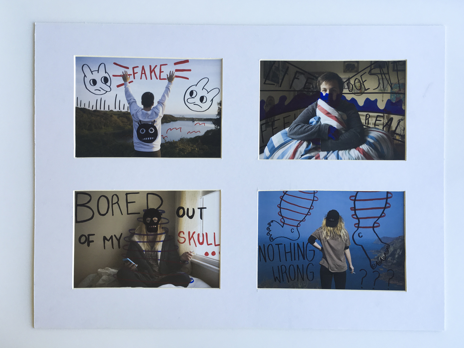
These final three photographs are all portraits, hence their grouping together. In these images, I tried to create something different that stood out from the remaining photos. These images are intended to retain the youthful, fun and cool vibe that is popular within student art and illustration. As a consequence, you can identify the clear use of powerful and vibrant colours that pop away from the surrounding environment. In the first photo, I have decorated the glasses of my sister with a series of parallel, thin lines that sit upon the lens. I selected a gradient of yellow and purple to evoke this cheerful, holiday-esque colour palette. The youthful, free-spirited visuals are supported by the facial expression of the subject who is sticking her tongue out at the viewer. This enforces a sense of casual, easy-going informality. Similar styles are conjured in the following two images as the black and white works as an effective backdrop to these colourful illustrations. The subject holds up the hand gesture for ‘peace’ invoking thoughts of the hippy movement and love. This is fortified by the choice of colours, a sequence of rainbow that transpires across the image. We of course associate rainbows with equality, LGBT and freedom.


 As the book progresses the images appear to get darker, evoking a more eerie narrative, making the viewer question he mental state of the character.
 the images then progressively get lighter, suggesting the return of day, the book follows a fairly chronological narrative. the first image below I used a portrait photo of Ryan in his bed which is an important part in evoking the enigma that the character could have possibly been dreaming.
 I wanted to finish the book with a closeup and picked a high contrast photograph. the book then finished with the quote ‘Carpe Noctem’, adding mystery to the viewer.


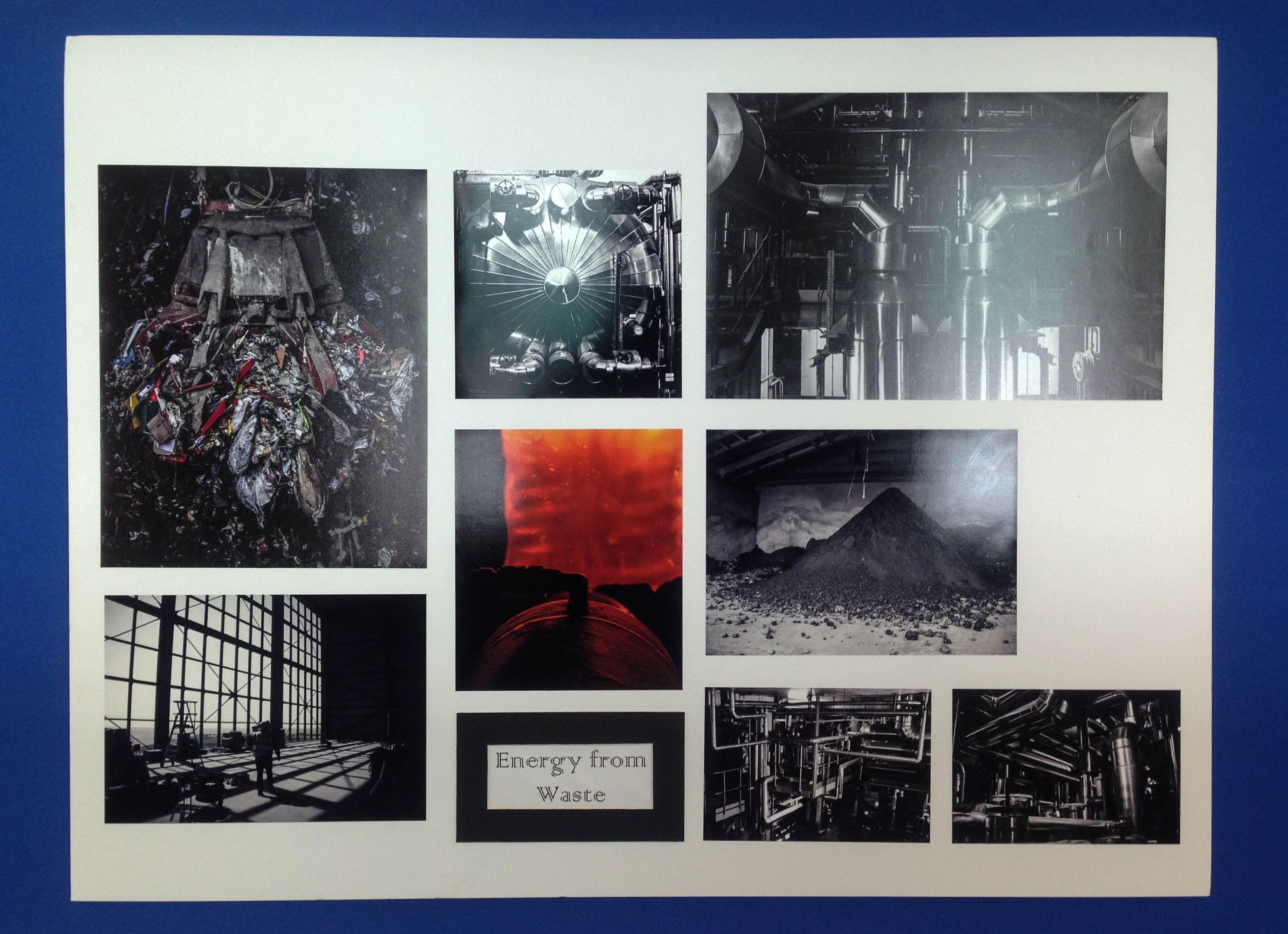
 Above I have added a few images depicting my finished final presentations of my favourite outcomes from this project. I love my use of window mounts, story boards, triptychs and diptychs to present my work and feel as my outcomes really extenuate the meaning behind my project. What I think makes this collection so successful is that each set of images displays a different message and is presented using a different type of photographic practice. This variety has produced a really interesting and intriguing project, with something that hopefully every one can emotionally respond to. My favourite outcomes above are my large collection of waste to energy images because of the precise way I managed to fit each one together in a story board. As well as this I also really like my documentary plastic pollution outcomes on the bottom left as the double window mount technique has produced very professional and clean looking outcomes.
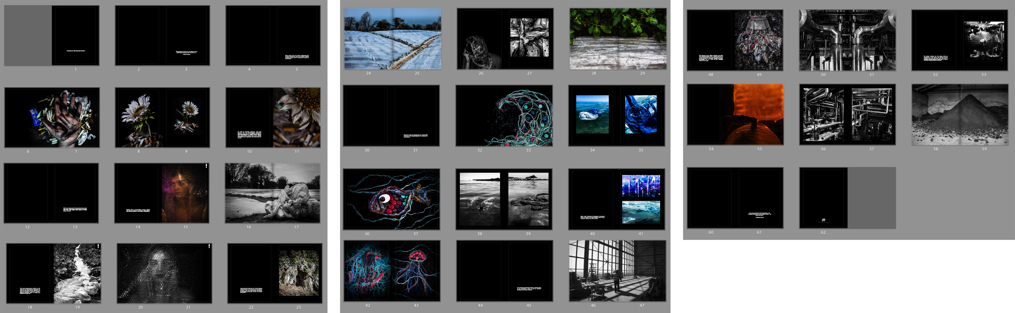
 Lastly I have presented my final photo book layout as an online link and contact sheet above whilst I wait for the physical copy to come down in the post. The reason I decided to create a book as well as many final prints is because I think it is a really nice way to bring all my outcomes together, showing my journey as well as thoroughly getting across some environmental awareness. I love the layout I have created above as I have really showed how each shoot works together, getting across the same message in different ways. The facts that I have gathered from my previous research throughout this project give some amazing context to my images as well as emphsising there meaning and the harsh truth of our environmental impact.


 Above is a contact sheet depicting how I am going to arrange my title, quotes and facts with in my photo book. I love the idea of having two blank pages with a straight forward fact between each topic as this really adds to the structure of my journey and leaves a clean space between the different issues. When placing my text I decided to keep it small and towards the bottom of the page as to not take away the emphases of my photographs. As well as this, the reason I have decided to add in two quotes, one as an introduction and one as an ending, is because they really bring to light the meaning and message of my project.


 I am going to present the following two images in A4, displayed in a Typtic window mount. I am presenting these together because I like the combination of a close-up portrait shot and more of a landscape photograph. I chose the first picture because I like the effect of the raindrops on the mirror and I think the position I chose also works well because the fact that I’m crouching down means I’m inside the mirror and have fitted myself to it. The dark background is also effective because it contrasts with the white of my shirt and the mirror frame. I chose the second image because I like how small the human figure seems compared to the environment and the dramatic nature of the cliffs.


