Category Archives: Planning

Filters

Author:
Category:

Contrasting portraits – Shoes and Legs – Planning


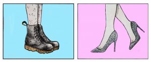
I want to create a diptych image with a contrasting set of lower legs and feet wearing different shoes. One pair with hyper-feminine connotations, sparkly silver, Cinderella style heels  on a pink background and the other with contrasting masculine connotations, black docs martens on a blue background. Another key feature of the contrasting portraits is presence of and lack of leg hair. The act of shaving leg hair is something that is considering feminine and is expected of women in our society. I have chosen to continue growing out the hair on my legs for the purpose of the masculine shoot before I will have to shave them for the feminine counterpart of the diptych. I would also like to maybe experiment with creating a portrait where i have only removed the hair on one leg to get another sense of contrast. I’m not sure if this image will be particularly successful but i think it will be worth trying.

Above is a fine liner drawing which I then altered in Photoshop of what I want to aim for when creating the feminine counterpart of my diptych. In my hyper-feminine image I want to give a sense of femininity through the use of the colour pink, feminine foot wear and a more feminine pose, the typical “popped toe” I also want my pairs of feet to be facing each other to create a sense of symmetry and contrast, although i also plan to experiment with different angles and will see which works best later on. For this image I plan to use my pink backdrop which I unfortunately ordered in the wrong size, but for a more close up image I hope that this will not be a problem.

Above is a fine liner drawing which I then altered in Photoshop of what I want to aim for when creating the more masculine counterpart of my diptych. I plan to establish a sense of masculinity by not polishing my boots for a few days before the shoot to ensure that they have a few scuffs and scrapes, the “worn” look will connotes masculinity because the wearer has clearly been wearing them regularly in not so clean environments. As previously stated, I also want to include leg hair in this image to go against the expectation that women should have to remove their body hair. I also plan to use my blue backdrop for this image, but it unfortunately was shipped to me folded up rather than rolled so I will need to find a way to iron vinyl without it melting.

The Plan

// S P E C I F I C A T I O N //

“Write a specification with 2-3 ideas about what you are planning to do. Produce at least 2-3 blog posts that illustrate your thinking and understanding. Use pictures and annotation”

ONE

The first path I have investigated plays with the idea of techniques within photography and the way digital manipulation can advance images. Taking words from my post ‘Stereoscopic’, I explored the idea of multiple exposure images as a way to ultimately explore and expand on the idea of environment.

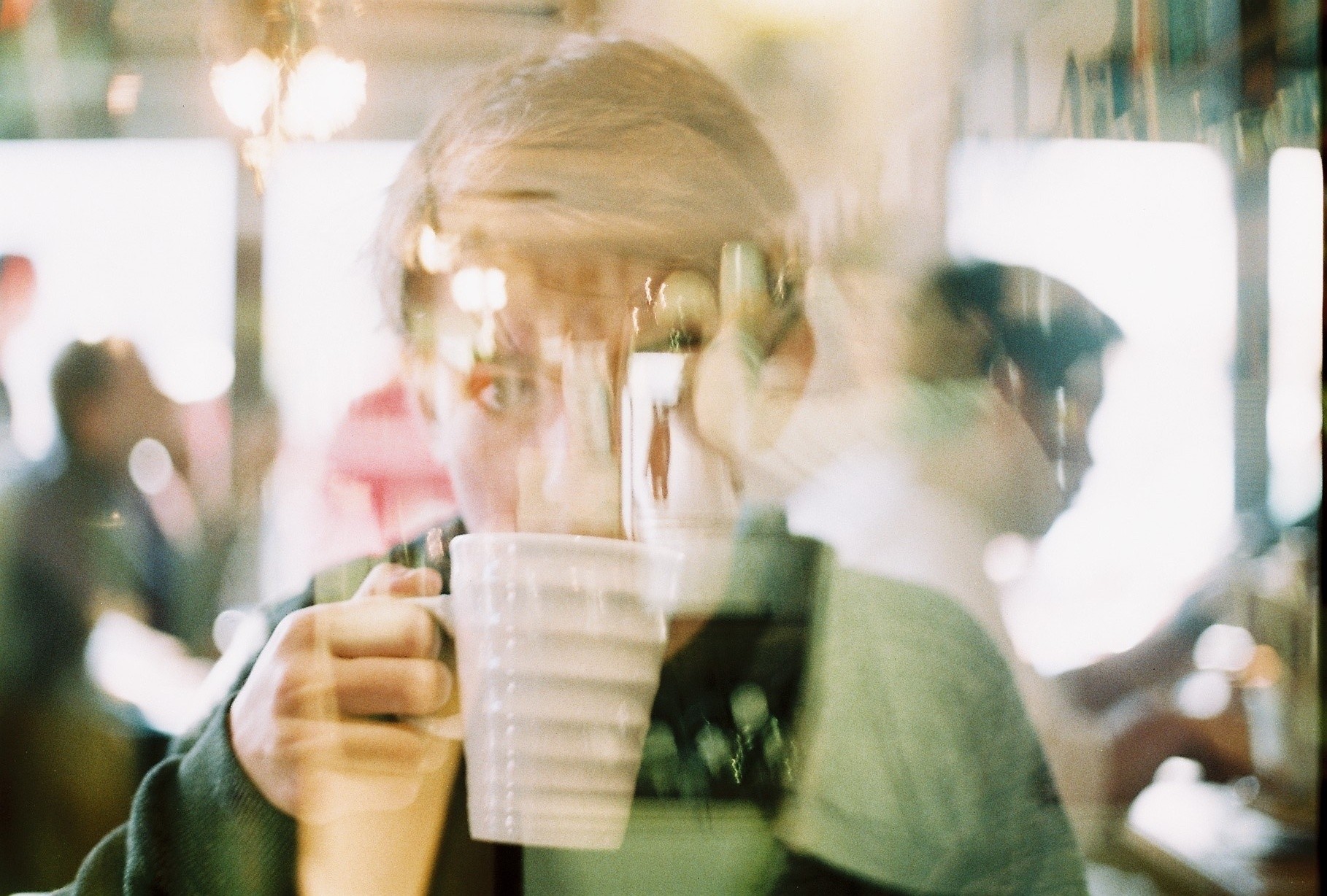
Double exposure photography is an area which aesthetically interests me. The process of combining multiple images to create a final photo – often with colour and contrast variations – can not only be used aesthetically but also symbolically. Tying this to the theme of environment (and possibly portraiture?) could produce some graphically interesting outcomes where people can be merged with their personal landscapes. Working on this idea can involve both
digital and analogue images which I intend to take advantage of in this project. 

So this pathway would involve a set of double exposure images tying people to particular environments of significance for them, perhaps showing how the environment ultimately affects the human form and body.

TWO

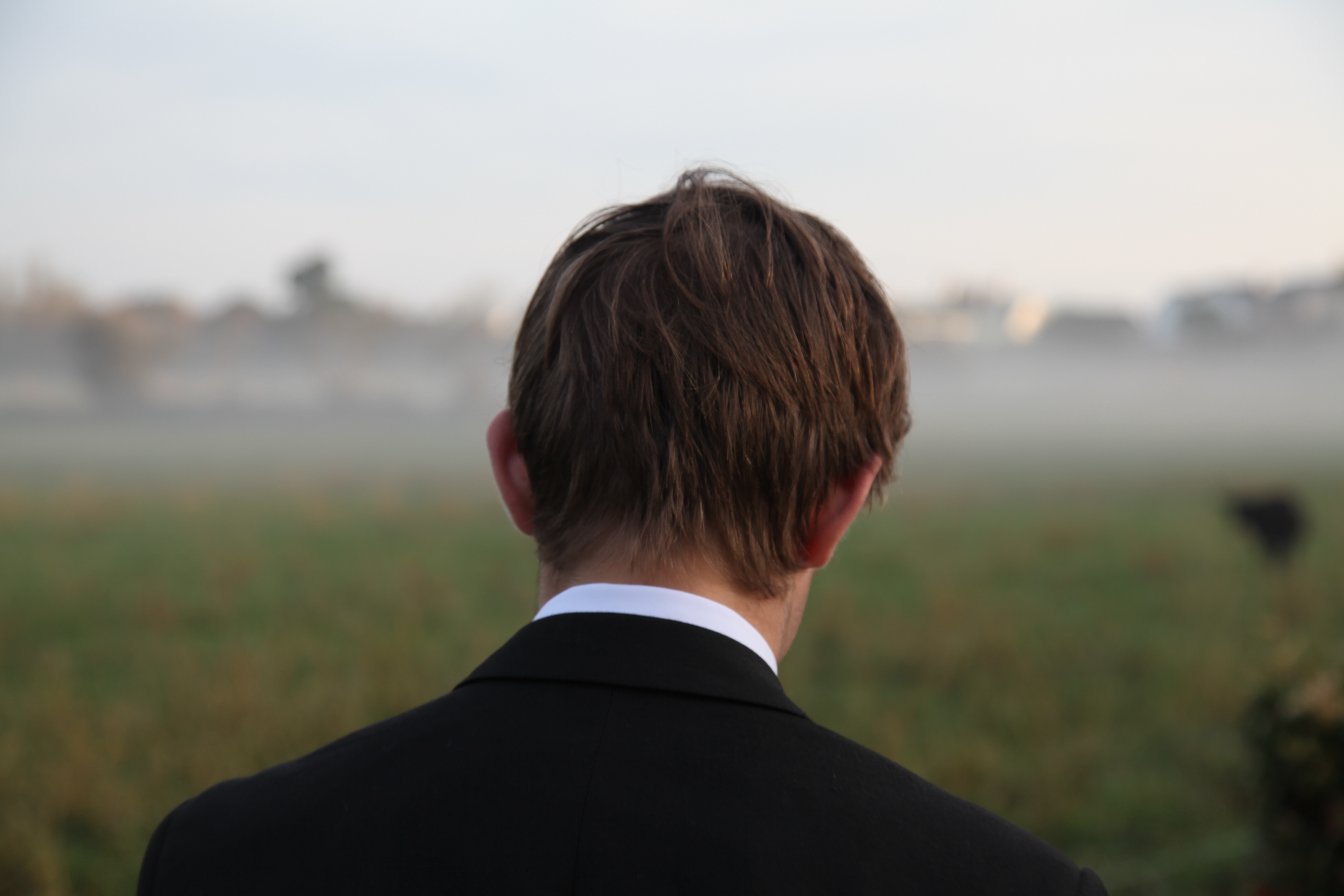
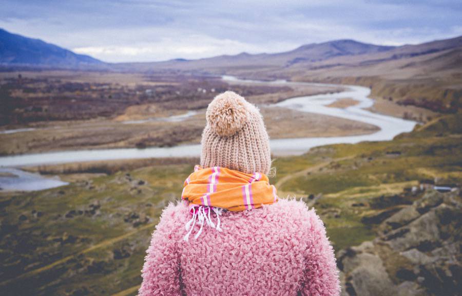
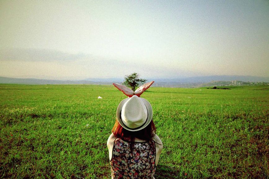
The second idea I could follow and develop further is the thought of mental effects of the environment on people – in particular playing to the idea of loss and homesickness. With so many of my peer group on the edge of moving away for university – or being on the other end of the spectrum as the ones who will be left behind – this is perhaps a more unique briefing to follow. For this idea, as explored in my previous post ‘ Run Away’, I would look to shoot a series of portraits featuring a set of characters in two locations. The first would be their home setting, most likely in a bedroom or somewhere of significance to them within the house. The second portrait will feature the same person in an environment of their choice. The point of this will be to show a particular area or landscape they will miss when they leave – most of them to university in a few months time. The images for this project will feature a mixture of front facing images and backwards portraits such as the one below which will highlight the environment chosen by the subject.

The point of both of these idea concepts is to design a project that will allow me to explore environment within a field of portraiture. One is probably more studio focused with the second idea taking me to a variety of locations which is why ultimately I have chosen to focus on this project. To start this idea, I intend to shoot one of the sets planned out in my previous blog posts as a way to test the stability of the project. This will involve a single character with photos centred around their personal fears related to leaving home. 


Specification for third shoot

My third shoot will be in St Catherine’s woods and possibly the Sand Dunes if their is enough time before the sun sets. This shoot will be on Friday 24th March.

My previous shoot was unsuccessful as my practice with shutter speed and aperture in my practice shoot did not help me because all the photos which i took on that shoot are grainy. This is really disappointing as the photos do look good from afar but they appear grainy if printed or zoomed in. I will most likely redo the scenes which i think looked the best which will be in the hedges and on the rocks.

St Catherine’s Woods plan:
  • My first idea was to photograph my model’s reflection in the lake of St Catherine’s with the mouth mask and the gas mask.
  • My second was to create a juxtaposition of innocent and sinister using the swing which is in the woods.
  • I am going to make sure that my ISO is not set on auto and i will make sure my shutter speed is not incredibly high as i do not need it to be like that.
  • I will use the trees to create interesting light patterns and shadows which they can sit under.
  • I want to create a juxtaposition between the beauty of the woods and how we associate them with clean air and how my gas mask is how we will breath in 100 years time.
  • I need to be careful to not choose areas in which the light is dark as i want to make the most of the natural light coming through the trees. If the light is too dark, the mask will not stand out as much as i want it too.
  • The clothes they are wearing will be normal as i do not want to dress them up but for future reference, i will ask them to wear the same outfit for the rest of the shoots to keep a consistent look throughout.
  • I think with this shoot i will create a couple of image sets in which i have both models in the shot but only wearing a mouth masks. I also want to try create a contrast image between both models, where one is wearing a gas mask and the other a mouth mask.
  • I only have one gas mask so i can only photograph one model at a time in it
  • I want to try incorporate open spaces and water into my photos as they will make them interesting and will create different appearances in my photos.


Symbolism: Plastic pollution – Planning

My next two shoots were inspired by my previous outcomes; using staged scenes and studio techniques to portray common pollution issues. These shoots will be a continuation of my symbolic style showing one of the most problematic issues that everyone in modern society unfortunately contributes to. This is the issue of common plastic waste. As well as these shoots, later in this project, I will explore this topic from a photo-journalistic point of view, showing plastics effect on our island…

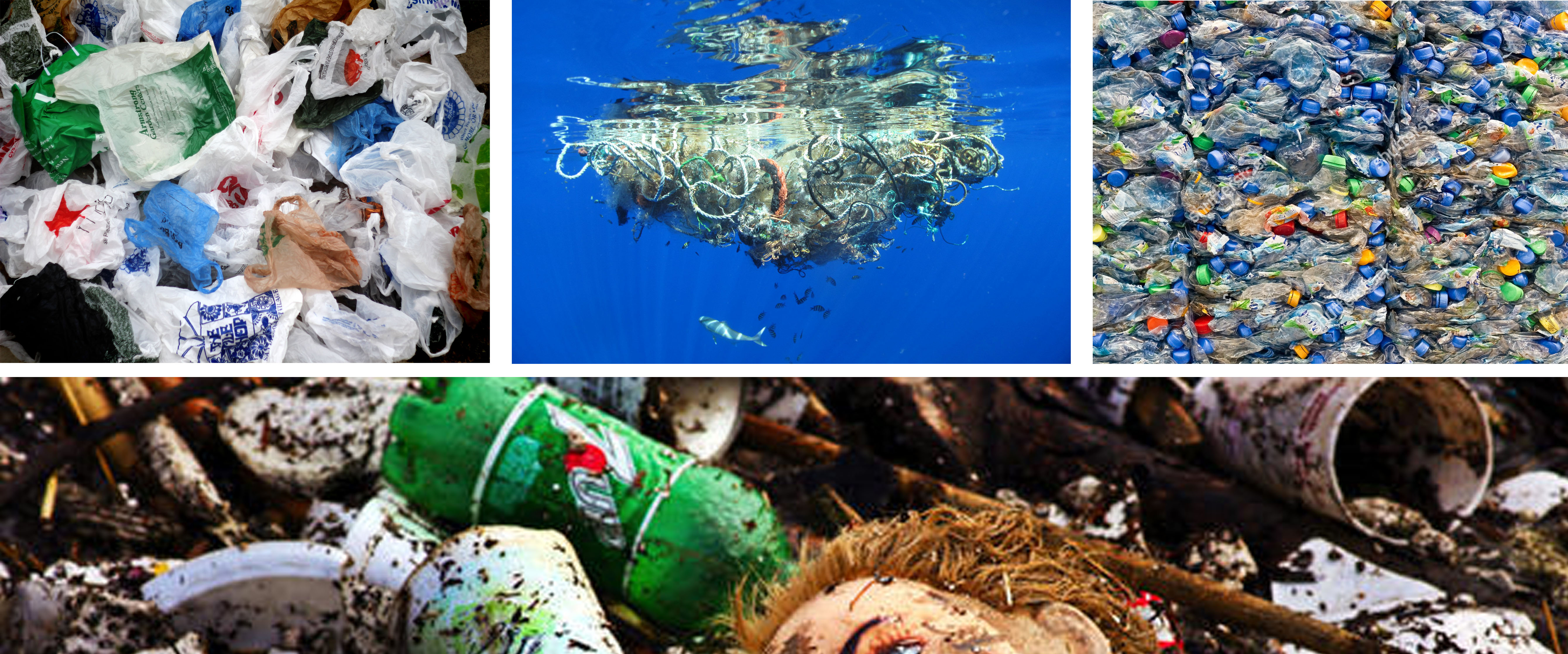
The reason I want to show the problem of plastic in a strong and symbolic way is because of the devastation it causes to marine life, animals and the environment. Modern life is unthinkable without plastic and the pure fact it is low-cost, light weight and durable makes it very hard to dispose of. In the EU, instead of recycling all our plastic waste, we send a third of it straight to landfill. To make things worse, millions of tonnes of this waste end up in the oceans. Birds, turtles and sea-life get tangled in plastic bags and abandoned fishing equipment, or they die from eating plastic debris. Over time, larger pieces of plastic break down into tiny particles called micro-plastic, which can form a poisonous plastic liquid residing in our oceans. These particles can soak up chemical additives and when they are eaten by fish they enter the food chain poisoning and harming countless different species.  National Geographic estimated that globally we dump over eight million metric tons of our plastic waste into the oceans each year. This rubbish accumulates in 5 ‘ocean garbage patches’, the largest one being situated between Hawaii and California. Hopefully in my next two shoots, by using studio techniques and symbolism, I will be able to get across the gravity of this global pollution problem. Below are some images depicting what this waste looks like, as well as a few different types of plastic that accumulates into big problems. 

My plan of action for these two shoots is to use models, with different types of plastic, in a home-studio made of black fabric and an LED light. In this ‘studio’ I will be using female model’s to create striking and emotive portraits with the subject matter, plastic. The first shoot will be self portraits showing only headshots distorted by the material. To create this fragmented look I am hoping for, I will be experimenting with a few different types of plastic, including bubble wrap, cellophane and clear plastic waste. For my second shoot however, I want to use a female volunteer to create full body portraits with this waste. The aim of these shoots is to show a heavily symbolic message about our connection to this global problem. As well as this the plastic directly effecting the models will represent the worlds ‘suffocation’ from this material and the damage it’s doing to the environment and therefore man-kind. The images I am hoping to capture will be dark and emotive pieces with a clear message and eye-catching beauty. Below I have added four photographs depicting the kinds of portraits I hope to create. I love the idea of wrapping the model in plastic, as it shows clear symbolism for the way we do this to everything else, as well as the fragmented view the plastic creates…

Jersey Archive

As my project involves using a gas mask, i think it will be beneficial to include a few elements of Archival Material from Jersey Archive to incorporate into my project.

When i search the word gas masks, only 7 items come up and but 2 of them are closed until 2100.

I will be looking at the 5 archival files which i am able to access during the Easter holidays and i will photograph them or pay for copies to be printed so that i can photograph them myself.

I search Air Pollution in the Jersey Archive Catalogue and 8 items came up and all of them are restricted access.


This means i will only need to spend an hour or so at the Jersey Archive, so i will be most likely do it on Thursday 30th March from 2-3pm.

I will take my camera to photograph the files so that they are clear and the quality looks similar to my portraits.

This trip will most likely cost £10 plus £1 for each photocopy of an images i need.

Specification Second Shoot

This shoot will be a real one which will be done outside on Wednesday 22nd March. I will be using the same model as i did for my practice shoot

First Location (People’s Park):
  • I have chosen this place for my first official shoot as it will be easy to work with, there’s lots of colours and many different locations within the park.
  • There is a chance of a few rain showers during the time i will be photographing but i may use this to my advantage and use it as Acid Rain and use umbrella’s to create dramatic photographs.
  • I will be using a tripod and most likely a self-timer due to the slow shutter speed i will be using and so then my images will be very clear. This means that this shoot will not be very big as i will be very critical and slow when taking these photographs.
  • My model will be wearing her day to day clothes as i want the photos to look like normal photos but then get more sinister but still have an element of normality.
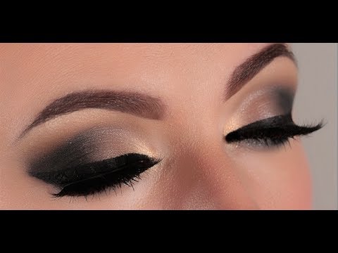
  • Her makeup will be quite dark as i think this will work to create a dramatic look specially when i can only see her eyes when she is wearing the mouth mask.

Second Location (Victoria Avenue Beach) if enough time:
  • My model will most likely be suited on rocks or near the sea wall or maybe just simply walking along the beach.
  • If it is raining i will be using umbrella’s to create dramatic photos specially when they are in black and white with the gas masks.
  • My model will still be wearing the clothes in which i photographed her in before in the park.
  • She will also be wearing the same eye makeup.
  • As i am on the beach, i would like to be able to capture waves in my shots so i may have to adjust my settings and use a faster shutter speed to be able to capture them clearly and using a tripod may not be an option.
  • I got this inspiration from a couple of photographed i took back in AS when doing my landscape topic.


Leaving Home

// R U N   A W A Y //

From the research on film photography, specific artists and cinematic photography; there is a particular style and quality to the images I would like to go onto produce myself. Starting with the photo below which features my brother on an especially unusual morning, the plan is to analyse the fears associated with leaving home. Assigning context to this image rather than finding it from the photo itself – there is an aesthetic quality visible which I would like to reproduce. The back of the head is not typically considered a ‘good’ image. In terms of portraiture it is more commonly seen as the easy way out to photograph from behind but for this project I think it could be a useful way to show the absence of a person. More specifically perhaps, it could be paired with a front facing portrait shot dead on to give two views of someone – potentially in the same location? The image below works well for many reasons despite the backwards angle. The lighting creates a strong image with soft shades highlighting sections of the neck and hair. With the aperture set to 4, the background is faded out allowing for a centre focus without distractions. The surrounding area is actually a field with houses in the distance being blurred out. The oncoming fog forms a barrier and cross over section between the light sky and the pale grass which connects the composition.

Following on from this analysis of my own image above, these are two untitled images sourced online though irritatingly without any links or credit it seems. The photos above have a similar composition to my own image but have a higher focus on the background which is something I will need to consider in my own experiments. In terms of a specification – I would like to do some individual shoots 1:1 with people and photograph them in different environments that reflect their fears of moving away. Perhaps this could be done as a way to highlight a person’s favourite area and the places they will miss the most from the island? I might also pair this with an image shot at each character’s home – I’m thinking in their rooms? – with the space that they probably spend the most time. So overall, the idea is to shoot four images for each person – two inside and two outside. Each set of images will have a face on portrait and a backwards one which will focus on the environment of the area. The thought process from the internal ones is to produce a set of well lit images showing people in the spaces that mean home to them. Contrasting these with the environmental portraits, the series will show people in their ‘home’ environments followed by the places they will miss the most when they leave home. Hopefully this will place an emphasis on the environments of Jersey that are often overlooked and forgotten whilst simultaneously showing the internal fears and anxieties of teenagers leaving their homes from the first time.

Write a Specification

Assessment Objectives A2 Photography: (Edexcel)

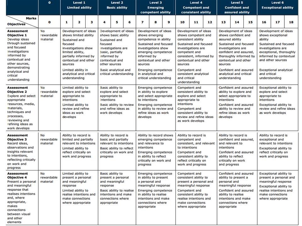
AO1 – Develop your ideas through sustained and focused investigations informed by contextual and other sources, demonstrating analytical and critical understanding.

To achieve an A or A*-grade you must demonstrate an Exceptional ability (Level 6) through sustained and focused investigations achieving 16-18 marks out of 18.

Get yourself familiar with the assessment grid here:

To develop your ideas further from initial research of mind-maps and mood-boards on the theme ENVIRONMENT you need to be looking at the work of others (artists, photographers, filmmakers, writers, theoreticians, historians etc) and write a specification with 2-3 unique ideas that you want to explore furthe

Follow these steps to success!

Write a specification with 2-3 ideas about what you are planning to do. Produce at least 2-3 blog posts that illustrate your thinking and understanding. Use pictures and annotation.

  1. Write a paragraph of each idea and provide as much information as possible on how your ideas interpret the theme of ENVIRONMENT
  2. Illustrate each idea with images to provide visual context
  3. Produce a detailed plan of 2-3 shoots for each idea that you are intending to do;  how, who, when, where and why?
  4. If appropriate, think about locations, lighting and choose a setting or landscape that suits your idea. Take recce shots or experiment with different camera skills/techniques before principal shooting.  If appropriate, think about how to convey an emotion, expression or attitude and the colour palette, tone, mood and texture of your pictures. Consider mise-en-scène – deliberate use of clothing, posture, choice of subject objects, props, accessories, settings (people/ portraits etc.)

Environment – First Ideas

Definitions:
  1. The surroundings or conditions in which a person, animal, or plant lives or operates.
  2. The natural world, as a whole or in a particular geographical area, especially as affected by human activity.
After reviewing the title I started to come up with some initial ideas that I could incorporate into my exam. I began by noting down the first things that came to my mind when thinking about the title.
  • Isolating something man made in nature / visa versa – it could be interesting to look at the way we can change the atmosphere of an environment by placing a foreign object in it (e.g. a shopping cart in a forest)
  • Personal environments – it would be intriguing to create a project based on looking at my own or other people’s personal environments (where they feel safe / where they spend a lot of their time / where they perform their favourite hobbies ect).
  • Manipulating images of environments to totally change how we perceive them – editing and manipulating images to change the general atmosphere of an environment could be interesting (e.g taking a picture of a playground, putting it in monochrome, blurring it to give a ghostly feel to the photo).

Photography style ideas:

  • Using photography as a medium – some photographers these days now use photography in a sculptural sense (making installations with printed photographs).
  • Documentary photography – allows to give a truthful, honest image on an environment.
  • Abstract – that way we photograph something can completely change to atmosphere generally linked to a certain environment (focusing on a very small area of an environment to produce a creative representation of it).

Some photographers I could look at, relating to my initial ideas –Idris Khan, Stephanie Jung, Brno Del Zou.

‘ENVIRONMENT’ – Final Piece – Initial Idea

After exploring a few ideas, to begin with, whilst starting my project, I next wanted to plan a few different ways that I could end up presenting my outcomes as a final design. As I mentioned in my last post  I would like to think of my project as a potential documentary e-book. However as I have not started yet, and am not sure how many outcomes I will be able to produce in the short amount of time given, I also want to prepare a few different ideas. The specification for this exam project is to simply produce a final selection of inspired and beautiful photographs based on our own ideas. Because my images will explore the theme of environmental awareness using a  mixture of abstract, staged and straight photography techniques I need to think of how they will work together. If I decide not to go forward with my e-book idea I will most likely be using one of the presenting techniques demonstrated below…

Depicted above is a quick diagram made in Photoshop, using many different layers, showing how I might set up my final pieces as two separate but equally as important designs. I created this simple example to show how (depending on how my images work together) it might be best to split them up into symbolism and documentary/studio and location photographs and present them as two different projects, done on the same environmental awareness subject. To create this kind of presentation I will print of my finals as a mixture of A3, A4 and A5 pieces and spray mount them onto two separate large white boards.

As well as this I really like the idea of presenting contrasted images together in pairs like in the photographer’s examples I have presented below. This technique was amazingly put to use by artist and filmmaker Luke Fowler’s who has created a series of half-frame photographs recently published in his book called ‘Two-Frame Films’.  With this Fowler explores the relationship between two juxtaposed images with naturally created diptychs that oddly work very well together. Although his images are completely different and portray non-related subjects, there is always something connecting each photograph that makes them really compliment and emphasise each other. I really like this technique and think that it may be something I explore when trying to put together a mixture of my studio and on location finals. As Well as Luke Fowler’s, on the second row of the contact sheet below, is a few more examples of this diptych presentation skillfully put together by Photographer Mike Terry. I love the way Terry has grouped his interesting photographs as some appear to be two closely related frames from the same event and others are simply united by the quality of light, subjects, colours or moods…