
In order to properly introduce and give context to each pollution issue that I am visually portraying, I will be adding in multiple facts, as well as a few inspiring quotes. The facts I will be adding will be straightforward statements, taken from my previous research on the blog, and will be put beside the images to give context to each topic. Instead of adding a preface to explain what my book is about, I have decided to use a title page and really powerful quote from legendary explorer Robert Swan. By doing this I hope to introduce my book without giving too much away about the context as well as get across the inspiring message about our environment. Below is a list of each fact and quote in the order I intend to present them throughout my photo book…
- Second title page – Pollution In the Channel Islands
- Introductory quote – “The greatest threat to our planet is the belief that someone else will save it.” – Robert Swan
- ‘Cigarette waste’ context – ‘Every year over 4.5 trillion cigarettes are littered worldwide, each one taking anywhere from two to twenty-five years to biodegrade.’
- ‘As well as leaching cadmium, lead and arsenic into our environment, discarded cigarette butts pose a significant threat to our environment in terms of fire. Every year, forest fires ravage vast areas, killing off wildlife and vegetation that take years to return.’
- ‘Plastic pollution’ context – ‘Modern life is unthinkable without plastic and the pure fact it is low-cost, light weight and durable makes it very hard to dispose of.’
- ‘The term plasticulture refers to the practice of using plastic materials in agricultural applications. Unfortunately this method is used for Jersey’s famous potatoes, 99% of which are exported to the UK.’
- ‘Agricultural films are one of the largest contributors to the billions of pounds of plastics that are improperly discarded by farming industries across the globe each year. ‘
- ‘With the exception of the small amount that has been incinerated, every piece of plastic that was ever made still exists in some shape or form.’
- ‘Ocean pollution’ context – ‘The litter that is swamping our oceans kills wildlife, looks disgusting and is a hazard to our health. – Fishing ropes and netting are a huge problem for our eco-system as, not only does it take at least 600 years for them to degrade, more than 260 animal species worldwide have suffered and died from being entangled in or consuming the material.’
- ‘Each year, National Geographic estimated that we dump over eight million metric tons of plastic waste into the oceans.’
- ‘Energy from waste’ context –‘All common household waste in Jersey that is not recycled is sent to the La Collette Energy from Waste Facility. This facility provides the Channel Island with a reliable means of waste disposal for the next 25 years as well as being able to produce 10MW of power, equivalent to 7 – 8% of the island’s electricity usage.’
- ‘To create energy at the same time as disposing of our waste, the facility burns rubbish and uses the heat from the fire to generate steam which is then used to drive a turbine, generating electricity.’
- ‘The plant is constantly monitored to ensure it operates in accordance with the licence and EU air quality standards.’
- Ending quote – “It is the greatest of all mistakes to do nothing because you can only do little – do what you can.” – Sydney Smith
 Above is a contact sheet depicting how I am going to arrange my title, quotes and facts with in my photo book. I love the idea of having two blank pages with a straight forward fact between each topic as this really adds to the structure of my journey and leaves a clean space between the different issues. When placing my text I decided to keep it small and towards the bottom of the page as to not take away the emphases of my photographs. As well as this, the reason I have decided to add in two quotes, one as an introduction and one as an ending, is because they really bring to light the meaning and message of my project.
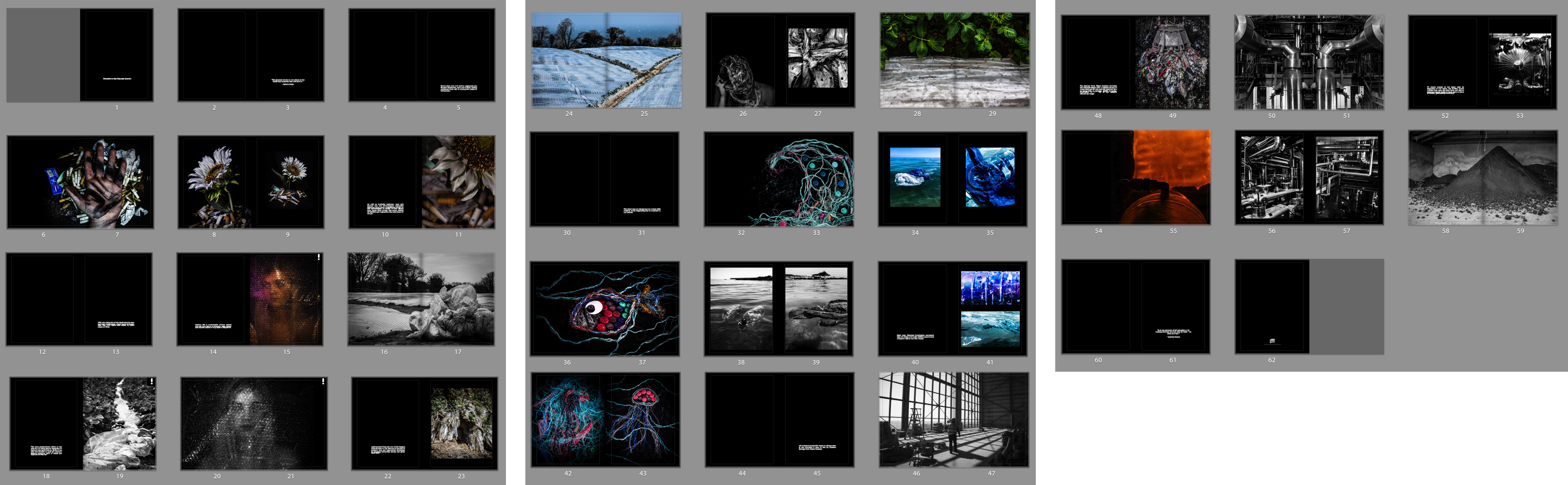
 The design above shows all of the pages I plan to have featured in my end result. The only definite change I will be making to this layout is to remove my single beach clean-up image, bringing my book down from 60 pages to 58. As well as this, I will be adding in subheadings, messages and facts to the blanks pages and at the start of the book; a second title page and a preface/quote. Although I have mixed up and joined together a lot of my shoots, my book will still be presenting four different sections looking at cigarette waste, plastic pollution, ocean pollution and Jersey’s waste disposal. My first decision for the design of my book was to make all the pages black, emphasising my more symbolic photographs and giving the book an overall dramatic tone. For the layout I have decided to show my journey through exploring the Islands pollution by presenting my themes in the order I completed them. The first and shortest section introduces the dark tone that is displayed throughout my book whilst only showing one style of studio photography. The next two plastic and ocean pollution sections, however, depict an array of symbolic, documentary and abstract images that, together, really do emphasise their meanings. Lastly is my Jersey waste disposal shoot which, like the first section, only shows one type of photography to tell the story. I love the variety of double page spreads, full bleeds, and mirroring techniques I have used throughout this layout and feel as if this book will be an informative and inspiring part of my final pieces.
 My first symbolism presentation above depicts the problem of cigarette waste and represents the message of ‘man vs nature’. These computer generated displays depict how I am intending to display my results in a classic black diptych window mount. Because of the dramatic black background of these pieces, I will be requesting they are printed off size A4 so that they can appear on gloss paper. Although I am fond of my symbolism piece using a human hand as the subject matter, I have found that the more simple mirroring effect of the two flower images looks much more dramatic and stylish. To create this display above I actually had to go back and re-edit these two images in order for both to appear in colour with the same tone and lighting effect. To make the window mount simulation above I used a very thin frame of white background before the black to create the illusion of the black frame having a bevelled edge.
 For my next pieces presenting my creative ocean pollution symbolism finals, I will be presenting two sets of diptych images backed onto large white foam boards. Because these will all be A3 prints I originally thought about backing them onto foam board and simply displaying them as four separate pieces. However, because the images are quite similar in colour and subject matter I decided that they are best off displayed together in the hopes that they will compliment one other. I particularly like the two examples on the left together because they are a simple/abstract version of the same jellyfish-like creature. As well as this the fish and wave outcomes also work well together as it is an obvious symbol of ‘under the sea’. To re-create the Photoshop examples I have displayed above I will be first backing them onto black foam board separately (giving them more visual weight) to then arrange them side by side.
 Lastly, for my surreal and abstract outcomes above, taken during my documentary ocean pollution shoot, I have decided to put together my most complicated window mount so far. This presentation will be paired up with my black and white documentary outcomes depicting the pollution I used to create these images. As with those outcomes, these were taken on an iPhone and therefore will also have to be printed off on A5 and A4 gloss paper. The reason I am unsure whether I will be using the five image window mount on the left or the smaller one with four is because I first want to judge the quality of the top abstract piece to see if its good enough to display. When recreating one of these examples I will most likely crop the A5 pieces to the same size in order for them to appear more professional. To create this complicated window mount will take a lot of planning, however, when finished, the end result will accentuate my photographs and present a visually stimulating collection.
 This collection of computer generated displays above depicts how I am intending to display my results on the problem of ‘plasticulture’ in Jersey. For these pieces, I am planning on creating my most difficult presentations to emphasise my A3 images using a double window mounting and diptych technique. To do this I will first be creating a white window mount for all three of my pieces and then a larger black window-mount to go on top. The reason I have separated my outcomes into two pieces is because the black and white abstract image is very dark and dramatic compared and looks much better as a single display. As well as this I have chosen to create a diptych because the two colour images work together to tell a frightening story about where this plastic ends up. Because the two documentary images are not the same size, after testing it out, I have decided they look much better as a vertical display with one on top of the other.
 The next design above shows how I am planning to lay out and put together my many final outcomes taken to explore the methods of Jersey’s common waste disposal. To do this I will be using my previously researched picture story technique, my 6 – 8 professionally printed photographs, and two pieces of large white foam board. The reason I will need two pieces of foam board is to separately mount each photograph, giving them a lot more visual weight and emphasis, before sticking them all down together as a final collection. As I am unsure how big of a board I will be able to use I will be printing two extra A5 images as well as an A3 and A4 version of the same piece. This is so that when it comes to actually laying these out, in the set sizes that they are produced, I will be able to make my best judgments on the day. This piece will be my largest presentation for my project as I love the overall tone of the shoot and the fact it is an insider’s view on where all of Jersey’s pollution ends up.
 Lastly, for my documentary final outcome presentations, I will be showing a much smaller display of A5 images that will later pair up with the abstract finals from the same shoot. These two photographs depicting ocean pollution will be made as a simple black window mount presenting a diptych technique. Although I could possibly crop them down (using the frame) to exactly the same dimensions, I feel as though they would work better as a vertical presentation rather than as the crossed out horizontal one I have displayed above. This is mainly because of the lengthy way I have presented the surreal versions from this shoot in my next post as well as it mirroring my plastic documentary diptych above. The reason I am printing these images so small is because they were originally taken using an iPhone and an underwater phone case and therefore are not the highest of quality.
 Apart from window mounting I will also be potentially creating a Picture Storyboard to present some of my larger collections such as my shoot from the La Collette ‘Energy from Waste’ facility. The definition of a picture story put simply is a visual representation of something produced on one surface in a creative medium. What I like most about this method is no picture story can ever be the same, even if the subject and photographs are identical. The way you deign your story and lay it out can give the overall outcome a very different look, showing individual styles in each version. On the bottom row of the contact sheet above I have added some examples of varied picture story layouts including one I made in Photoshop.

 By viewing my best images from all 10 shoots together in this contact sheet above I can start to get an idea of what my potential photo-book may look like. As well as this I am now able to see how many of each symbolic, abstract and documentary photographs I have comparatively and how each section could possibly work together or be separated. Overall I am quite pleased with the variety of techniques I have managed to portray within one project as well as the quality and symbolic strength of my final images. Below are my favourite 25 photographs that may well be presented as prints, split up into 3 sections and evaluated…
 The seven images depicted above are my favourite final outcomes taken from three out of five of my completed symbolic shoots. The reason I have chosen the least outcomes from my symbolism shoots is because I had to create each scene instead of just picking them out of the environment around me. After comparing all my outcomes I have decided against including any of my ‘plastic symbolism portraiture’ for printing and presentation simply because the symbolism isn’t as strong. As well as this I much prefer the successful and more surreal symbolic images above that depict my carefully crafted use of props and a lot of thought behind their message. For my first representation portraying the issue of smoking waste (presented on the top row) I have chosen two of my ‘man vs nature’ photographs and one ‘connecting mankind to this problem’. I have chosen these images one, for their clear message to the audience and two, for my soft lighting techniques and dramatic studio effect. On the bottom row are my four different symbolic representations of ocean pollution crafted from waste I sourced from Jersey’s coastline. I love the emphasised meaning behind these carefully created photographs and think their vibrant and intriguing subject matter will contribute nicely to my overall project.

 Next are my nine favourite abstract outcomes that were all taken simply as the opportunity arose during four out of five of my documentary shoots. Although I have also created a few abstract photographs in my cut out sections (depicting my beach cleans and the recycling centre) they are nowhere near as vibrant and interesting as the ones I have presented above. The first three chosen outcomes of the top row depict a few close-up detailed shots of specific parts of Jersey’s extensive ‘Energy to Waste’ setup. The reason I am keen to present them is I love the simplicity of these images as I feel they display a very strong and beautiful topographic style. The next two abstract pieces below show my vibrant and textured results documenting the issue of agricultural waste in Jersey from up-close. Although abstract, the meaning behind these images is dramatic and they perfectly depict a type of large-scale plastic going to waste – directly related to where we live. Lastly, on the bottom row, I have chosen to add my abstract pieces that portray something with devastating repercussions in a beautiful way, thus potentially intriguing my viewers and subtly informing them of the reality of ocean pollution.

 Lastly, depicted above are my very important documentary images cut down to eight photographs from three out of five of my original shoots. As with my abstraction outcomes, I have decided to exclude my sections presenting my three beach cleans and my visit to La Collette Recycling Centre. This is because although they have a lot of educational value they would not intrigue my viewers when printed out and presented on their own. My first chosen finals on the top row can portray how much agricultural plastic is used in the potato farming industry, plastered over Jersey fields every year. The reason I have chosen these images as final prints is the obvious connection of this issue to our island as well as the beautiful way they work together to tell the story. The next row depicts a clear view of the waste I found on Faldouet beach that would later be washed into the sea at high tide. Finally, the bottom row of this contact sheet depicts three finals portraying the narrative of what ends up happening to Jersey’s un-recycled waste. The reason I have chosen these images is one, because of the contrasting natural light and shadows and two, their dramatic intensity and ability to give my viewers an idea of how much we produce.
 Next in the two rows above are my outcomes from my documentary style shoots depicting plastic pollution and beach pollution. The meaning behind my plastic agricultural shoot is to represent the darker side of Jersey’s most famous product as well as a pollution issue that is directly related to where we live. For the second shoot on beach pollution, my aim was to show the scale of common beach pollution using what I found collected together in one powerful photograph. Although very educational, because of the not so appealing subject matter, I will most likely not be using the photographs for final prints. Apart from a few of the more dynamic scenes I have presented above, I will be choosing from these documentary images mainly based on their relevance to the message.
 Lastly, the final sections of my project above portray the different methods of disposing of common household waste in Jersey. The first and most extensive shoot in my project, featured on the top 2 rows, depicts my visit to our ‘Energy from Waste’ facility that deals with all common un-separated waste. I will most likely be featuring many of these photographs as this insider’s view of the plant produced a lot of intriguing and educational images. The bottom row however, depicts the new La Collette Recycling Centre and is aimed to inform my viewers on its importance and how easy is has now been made for us. As both shoots are very relevant to the of this project (because they show exactly what happens to the waste we don’t recycle and how easy it is) I have decided many of these abstract/documentary images will be used in my final presentation.