Category Archives: Inspiration

Filters

Author:
Category:

Artist Reference – William Klein

Artist Reference – William Klein


William Klein is a photographer whose work has spanned decades. He has worked with many different subjects and has captured all different kinds of scenes from photojournalism to fashion and even some street photography. Due to the time that he was working in he shot almost all black and white and on film. Recently he has taken a look back at some of his most famous images and the contact sheets that go with them, he has then painted over the image, similarly to how people would mark contact sheets to identify good images and poor images, there is not much reasoning behind way he has done this further than:

“The idea for the colour and graphics comes from the red lines
photographers put around their choices on a contact sheet.”

The massive size of these images once blow up makes them really impressive and striking, the contrasting colours really help to accentuate and frame the images and makes them really standout. I really like this idea and I think that I am going to employ this for the presentation of my final project.

William Klein : “Painted Contact Sheets” Series

https://petapixel.com/2011/08/31/the-stories-behind-photographer-william-kleins-contact-sheets/

Don’t just take, make

Inspirations for development of combined images


I decided to develop my idea of combining images and text together by experimenting with an analog as opposed to a digital approach. I was inspired by the aesthetic nature of  Barbara Kruger’s work and how the importance of symmetry and balance is replaced with expressive angles for the text. Sometimes the unbalanced and disjunct nature of her work actually makes it more interesting to look at. I was also inspired by stereotypical ransom notes, similar to ones seen in movies and tv, that include letters cut out of magazines, each letter is a different colour and font, this makes the process of reading the text very disjointed and fragmented.

As seen above, the burn book from the film “Mean Girls” which I have referred to on multiple occasions during the course of this project, takes inspiration from the cinematic ransom notes I described. The burn book is a scrapbook created by the Regina George, the popular antagonist and her “plastic” followers, Karen Smith and Gretchen Weiners. The burn book was a single pace where each of the girl would write down their completely uncensored (and often exaggerated or untrue) opinions of various students and teachers at their high school. The book was kept safe at Regina’s house and was intended to never see the light of day. At the climax of the film the burn book pages are photocopied and hung up all over the school, which leads to scenes of absolute chaos. This leads to a workshop lead by the school where all of the girls are made to confess to all of their catty and bitchiness.  This leads to the scene ( screen capped above) where the token art student, feminist character Janis sarcastically admits to having a “big lesbian crush” on Regina, exposing the fact that all of the lies and rumours written in the burn book stem from Regina’s self obsession and her own insecurities.

I also want to take inspiration from movie posters that feature what appear to manually ripped, contrasting images that are combined to create something intriguing, like the poster above for the iconic Stanley Kubrick movie, “The Shining” and the layered ripped poster for “Eternal Sunshine of the Spotless Mind”. I included the poster for Jim Carrey’s “Me, Myself and Irene” in my mini mood board above because the split of the face representing a multiple personality disorder fit into the conceptual  nature of how I want to combine my two contrasting images of the angry feminist and the blonde (pictured above) .I feel that combining similar stereotypes from my project (Janis and Regina can be seen in my initial mood boards above from my angry feminist and blonde stereotypes) with a words inspired by both ransom notes and the burn book would be an interesting development for my project.


Barbara Kruger Digital Response

I was inspired by the work of Barbara Kruger and how she uses text to make her images stronger and make a statement. After experimenting with the addition of simple text to my images using Photoshop I decided I wanted to develop this idea further by using boxed text, similar to Barbara Kruger. I was inspired by Kruger’s images featuring pop culture icons and a phrase that ran as follows “not —– enough”, these images can be seen in the header of this blog post. I wanted to experiment with the use of both monochrome and her signature cherry red.

I chose to use my blonde and beauty queen images because I felt that these were the most timeless of my stereotypes. I experimented with making my blonde photo black and white, I adjusted the colour channels to create some contrast between the figure and the background. I tried using black and white blocks behind the text as well as the red. I also created a colour version with monochrome text, which I didn’t feel was as dramatic as the black and white and red versions. My favourite of the four images above is the black and white image with the white and red text. I selected the phrase “not pretty enough, not skinny enough, not blind enough” because of the reference to Barbara Kruger’s work as well as trying in nicely with the blonde stereotype and the standards that women are held to.

I took inspiration from another iconic Kruger piece, that being a monochrome portrait of a young (around 6 years old) American child beauty pageant winner, accompanied by the line “I don’t want to grow ugly” clearly a disturbing spin on the phrase “grow old”. The original piece draws attention to the superficial nature of beauty pageants and the effects it may have on such young competitors. My image, featuring the phrase ” She had opinions, we didn’t care as long as she smiled” is suggestive of how the public speaking nature of being a beauty pageant winner, and thus an ambassador for the region, is often overlooked or simply ignored with the superficial beauty portion of the competition receiving the most publicity. I personally believe that I was selected as Miss Saint Helier 2017 because I was the strongest speaker out of all of the competitors for the role. However, other than the competition I haven’t had a chance to do any public speaking in my role as Miss Saint Helier, so perhaps the competition was more superficial and based on appearances then I was initially lead to believe.

I also developed my “Beauty and the Bitch” image with a different font and style, more similar to the work of Kruger. I feel that this works really well with the image and the label style rectangles that the text sit on helps the words to stand out, I feel that this is really important as the words I have chosen are powerful. I want the viewer of the image to read the words accompanying the image and think about which side of the photo is the beauty, and which is the bitch. I have included both the colour and the black and white version of the image because I was unsure which of these I preferred.


Environment – Artist Reference 3 – Caroline Grohs

Illustrator and designer Caroline Grohs was born in Düsseldorf, Germany. She grew up in a small town near Düsseldorf where her parents still live today. At the age of 19, she began her studies in Düsseldorf but a year later she moved out of her parents’ home and spent a year studying in Hamburg. Her mother is a graphic designer, so was introduced to graphic design, art and photography at an early age. I have selected Grohs as inspiration for my further work, her illustrative line work being being synonymous with the visuals I am creating. Her drawing work is largely geometric and polygonal, creating a contemporary and modern design that works effectively for the commercial nature of the art.  Grohs talks about this, stating that her favorite subjects and priorities were Corporate Design, Editorial and Illustration. This is evident through her corporate design project for a ballet/theater.This project is named Motion Theater. Grohs talks about the process of this project below: 

“After defining the brief for myself, I searched for inspiring photos and was fascinated by a photos from John Davis and other similar photographers. Their photos of dancers were just focused on the dancer with a clear background. I loved them. They were perfect to show how my concept should work. Then I tried to create a logo for the Motion Theater. A symbol combining the features of this theater – especially the focus on the main dancer – and the movement of dance. I drew many sketches and finally created this kind of “screening”, which has been adapted in different ways to represent the different figures and moves. The logo resulted from these sketches. The posters intertwine the dancers movements and their connections to the theater, so that it appears to be “in motion” at all times. The “floating” typography also expresses dance as movement in space. I love this kind of typography because it is a strong and clear statement, especially for this modern part of my theater.”


Grohs’s work on Motion Theatres can be seen above. She has essentially created these advertising posters for a ballet event, employing both her photographic and illustrative skills in order to generate a professional, corporate piece. We can identify the significant use of typography, as discussed by Grohs previously. She has employed a narrow, sans-serif, bold font for the important text that must be seen by the viewer. In addition to this, a collection of colours have been used to segregate components of text. We see the inclusion of a pale orange and turquoise that successfully organise the text without overpowering the primary image or main headline. These photographs themselves are very minimalist and simple. Taken within a studio environment, all emphasis is on the dancer. With a complex background, these images would be way too crowded. There would be too many clashing components such as the text, illustration background and subject. This is something to remember when I produce my work. The illustrations themselves are thin, white-line drawings. Polygonal shapes are being created to replicate the form and silhouette of the dancer. These geometric lines all originate from the word ‘Motion Theatre’ almost like they are being projected upon the dancer. It creates an interesting visual effect, looking as if the subjects are being consumed or protected by these transparent shells. I really like this project and it provides me with a number of different ideas that I can employ going into my exam. The work of Grohs has enlightened me regarding the use of typography and how this can assist in conveying a message within my work. Furthermore, Grohs work demonstrates the effectiveness of subtle line work. Her mark making is thin and reclusive. It is not in your face or dominating the composition. It shows how sometimes simplicity, and allowing the image to breathe and show its positive visuals can be a successful decision.

Gillian Wearing – Artist Reference

Gillian Wearing is a British artist and photographer who was part of the Young British Artist movement. She produced groundbreaking work at a similar time to artists such as Tracey Emin and Damien Hirst and won the turner prize in 1997. I was draw to Wearing’s work because her use of masks and the concept of masquerade ties in with the work that I have produced in this project. The above photograph is entitled “Self-portrait at 17 years old” Wearing is wearing a wax mask and wig to try an recreate a photograph taken of herself taken 23 years before (as this portrait was made in 2003, whereas the photo is was based on was taken in 1980 when wearing was 17) When discussing this portrait Wearing stated that she remembers being  “very self-conscious” when the original image was produced ” but also very aware of my image.” Wearing goes onto say that she remembers posing for the photo, dropped her shoulders to make her neck appear longer, opening her eyes to make them appear bigger. When creating my self portraits I was also self conscious, I was very aware of how I was posed and the facial expression I was making. As stated in my previous posts, I find some shoots easier to pose for than others because what I do in front of the camera is a performance and sometimes I find it challenging to get into character. In my course work project I struggled to get into my 1960’s supermodel character and after looking at the photos I decided to do a re-shoot because I wasn’t accurately conveying the character.

Above are two images from one of Wearing’s projects where she cast the face of supermodel Lily Cole and made several wax masks of her face. She then produced studio portraits of Cole wearing the mask of her own face as well as posing as photographing herself wearing the same masks. When looking at the two images above it is incredible how different Cole and Wearing look despite having the same “face”, it really shows how the eyes, hair and costume can completely change the appearance of a subject. In the portrait above on the right, Cole’s already doll like appearance is accentuated by the lace blouse and perfectly curled hair. The mask, although of her own face, gives a porcelain doll effect and due to the cut out eye holes her eyes appear sunken into the head, not much unlike a real doll with glass eyes. Wearing appears rather child-like with Cole’s face, as Lily Cole is an impressive 5″10, her face looks too large on Wearing’s small frame, giving her the appearance of a child. The hairline of the wig that she is wearing also makes the face appear small and round. It is also quite apparent in the portrait that Wearing has a warmer and darker skin tone to Cole and the flesh that is shown through the cut out eye holes draws attention to the eyes. Many of Wearing projects have involved masks and all of them feature similar eye holes that allow some of Wearing’s identity to show through.

Another one of Gillian Wearing’s projects that I found particularly interesting was her photograph series entitled “Signs that Say What You Want Them To Say and Not Signs that Say What Someone Else Wants You To Say” Which was produced in the years 1992-1993. This series of portraits depicts people Wearing encountered in South London, she would stop various people and request that they write in black pen on a large white piece of paper, what they wanted to say and not what other people wanted them to say. Some of the portraits produced in this project where incredibly powerful, my favorite portrait is the one in the top left hand corner of the grid above. I love the honest and raw nature of the statement and how this man that Wearing encountered was secure enough in his masculinity to admit that he was sensitive and insecure. I think these sign were probably very liberating and very empowering and i think that everyone can probably relate to at least one sign within this photographic series.

I want to take inspiration from Wearing’s work by including text in my images. I so however, want to carefully consider the words I select and think about how they relate to the image, myself and the wider world of western society and feminism. The words of Wearing’s ” Signs that Say What You Want Them To Say and Not Signs that Say What Someone Else Wants You To Say” are powerful and I want to make also want to make a statement with my images.


Barbara Kruger – Artist Reference

Barbara Kruger is a female american artist who is best known for her visual art featuring magazine clipping style art where striking text is layered over images. Most of Kruger’s work consists of monochrome images with black and white or red text. Her work tackles subjects such as capitalism, consumerism and feminism.

Kruger’s pro-choice commissioned billboard for the Wexner Centre for the Arts next to a pro-life billboard erected just 12 hours after.

One of her most famous images was used as a poster for the 1989 women’s march in protest of legal and safe abortion. The image (pictured below) features a split photograph of a woman’s face, one side being a black and white version and the other the negative of, one can only assume, the same photo. There are three red rectangles that separate the image, one and the very top, one and the bottom and a smaller one in the centre. The rectangles have white, slightly italic text played over the top reading “Your body is a battleground”  The same slogan was used for a commissioned billboard for Wexner Centre for the Arts (pictured above), 12 hours after the pro- choice billboard was erected an opposing pro-life billboard was placed directly next to it, depicting an 8 week old foetus. Although Kruger’s work supports feminist ideals and Kruger personally identifies as a feminist, her work also deals with superficiality which ties in with the theme of consumerism and how women are presented and choose to be presented in the media.

The image on the left featuring the phrase “Adorn your prison” particularly spoke to me as someone who enjoys makeup and getting dressed up from time to time. The combination of the text and image is a little different from most of Kruger’s work, the word “adorn” appears in it’s own rectangle and the words “your” and prison” appear in the same incredibly long rectangle that spreads across the entire width of the image, the spacing between the words is notably large which gives as disjunct feeling to the reader. The disjunct feeling is also mirror in the bottom heavy nature of the image with the there being no red or text in the top half of the image. The piece also has a strong sense of intrigue, this is provided by the use of the mirror as the back of the subject’s head, as well as her reflection. My interpretation of the phrase “adorn your prison” is that women are seen as objects and they are seen this way because of their sexual bodies, they cannot escape their own bodies so they may as well make the most of it and put some makeup on. Give the people what they want.

I want to take inspiration from Kruger’s work by adding text to my images to give them another dimension and a wider sense of interest. I also think that the addition of text will help my images more overtly tie in with the idea of feminism and self reflection.

Handmade Book Planning

I have decided to make a small handmade book as an additional final outcome for this project. Ideally I’d like to make the book myself using the skills I have learnt from the book-binding workshops that I have attended but due to the limited amount of time I don’t think this will be a possibility. Alternatively I will buy a book to work with so that I can spend more time on presenting the images within it. The content of the book is going to focus on my portraiture and performance photographs. I chose to make a handmade book rather than a Blurb book because I wanted to have more freedom to explore different design techniques, for example I am planning on incorporating some small mirrors and reflective material to further explore the idea of reflections. This way the book will also be more personal and is partly inspired by my research into Duane Michals and the way he presents his series of images and combines them with handwritten notes to create a new layer of meaning. I am also planning to include some handwritten notes such as lines of poetry which will add interest and create questions for the viewer to think about. I have created a mood-board of ideas for the presentation of this book, taking inspiration from the style of photo-albums and simple scrap-books.

I have also looked briefly into the work of professional photographers who have created handmade photo-books which relate to the theme of ‘Environment’.  For example I looked at the photography of Jean Pagliuso who is an American photographer who explores places of ritual and endangered environments. She realised that she wanted to share more from the ancient religious landmarks that she was photographing other than conventional black-and-white prints. She began experimenting with the alternative printing processes, “I wanted to make my images look like ‘rubbings’ made from stone carvings,” she said. “Like the kits they sell to transfer rock etchings onto paper”. She developed a method of printing the images on rice paper, by coating it with silver gelatin and laying it on an aluminium plate to dry.  She first presented her images this way in an exhibition and then published them in book form using the same technique. She said “I went to a book designer,but traditional bookmaking didn’t seem to be the right approach. I wanted the book to reflect the amazing hands-on work required to make one of these prints. I also wanted to use the same paper for the book pages that I used in the darkroom”. She has also explained that it is difficult to set a price for a handmade book and “Any photographer considering a handmade book project should have a higher purpose in mind than just money”.

I also looked at Martin Parr’s limited edition version of ‘Life’s a beach’. This project explores the British tradition of photography by the seaside. Parr has been photographing this subject for many decades, documenting all aspects of the tradition often in a satirical way. It includes photographs of people from other places in the world on the beach to explore cultural differences and similarities. The book has a cardboard slipcase and the appearance of an old-fashioned photo album. Each image is placed under photo corner slits and hand-labelled with the location. Between each page is a tissue sheet protecting the images.

Lastly I was inspired by Irene Imfeld’s books inspired by Earth. She is a  graphic artist who studied photography in college. Her landscape and nature-based photographs draw on aesthetic traditions from realism to minimalism and her work is personal and spiritual. She says “I’ve always been inspired by landscapes—painting and photography”. Imfeld picked up bookmaking skills while working in the publishing industry and by attending workshops. “I make my books from scratch,” she says, “The covers of Landscape Fragments are wood, cut out of hardwood and finished by a furniture maker. I simply glued a thick piece of museum board on the inside to keep the wood away from the prints.” The 24 triptych images are printed on individual pieces of paper and they are not bound together, but stacked between the covers in the style of a Tibetan book.

Contact Sheets

Contact Sheets


Sometimes called “contact prints” contact sheets were used much more frequently in the past world of photography than they are today. A contact sheet is a single piece of paper that is used to show all of the images from a roll of film or for single large format images. For 35mm and 120 film the developed negatives are placed on photographic paper and are then exposed onto the paper. This leaves a trace on the paper of the whole of the negatives, chraceristicaly leaving the sprocket holes and film data on the image also.

Contact sheets were a way for a photographer to be able to view all of his/her images in one place and be able to make easier comparisons between individual frames. Often using pens they would annotate, circle and frame certain images to denote if they are still useful or not, this is similar to how photographers do this today with digital images. When using Adobe Bridge or Lightroom you can go through your images and separate out the ones that you do want and don’t want using colours or numbers, by colour coding using different pens on a contact sheet the images you can do this also. Each photographer had their own method of doing this, come used an X to mark out images, others would put borders around images in different colours to denote different meanings, and some would circle specific frames.

This contact sheet above is of Marilyn Monroe, the flow of the images shows the method of the photo shoot. After processing and creating a contact sheet Marilyn herself has gone through the images, presumably with the photographer Bert Stern, and she herself has crossed out the images which she does not like. There are several contact sheets similar to this with her starring in them that she has also marked. The contact sheet below is another of these. This one is composed of a series of medium format negatives of the star, probably wanting to protect her personal image she has crossed out all of the 11 images, the publication of this image defeats the purpose of her crossing out the frames in the first place but that is beside the point, the fact that the contact sheet gives you a view into the mind of the photographer (or in this case the model) is very interesting. Normally the only image we see from a photoshoot is the one final image, but with this we really get to see the process of the photographer, we get to understand why they chose that one specific image to share over the others that they had available.

One of the most interesting things about a contact sheet is often why a particular image is chosen and why others were rejected. In the youtube video above Elliot Erwitt talks about his feelings towards contact sheets. He starts off by stating that a photographer should never show the world his contact sheets. This is not something that I agree with, I feel that sometimes the context behind why a photographer took certain photos to be one of the most interesting parts of the image. An example of this is “The Magnificent 11” by Robert Capa.

This set of 9 images from the D-Day landings were taken by Capa when he landed with the second wave of assaulters on Omaha Beach. There were meant to be three rolls of images that he sent back but instead these are the only images to exist (frame 9 is published in many different places but the negative itself is missing). There are different theories as to how these other images were destroyed but that is not particularly important, however they were lost it is a great shame that they were. This contact sheet shows the surviving negatives and although small shows a really incredible insight into his short time on the beach. This is why having contact sheets is so important, if only the published images were shown then we would not see some of the other frames, the smokey, shaky, out of focus images that show Capa’s own fear.

This video above is similar to the first one but shows the works of William Klein instead. One of the specific points in the video (6:03) he talks about taking photos of a shop window, a person approaches the window and stands there “it’s a photograph” then the person starts pulling faces and it’s ruined. This ability to capture “the decisive moment” is often not thought about enough, because today we can snap away at crazy speeds we capture every moment and look back later, with film this was harder and so seeing how this perfect moment was captured is often very important. Klein also talks about the amount of time of a photographer’s work that is seen.

“The picture is taken at 1/125 of a second. What do you know of a photographer’s work? A hundred pictures? Let’s say 125. That comes out to one second. Let’s say, more like 250 photographs? That would be a rather large body of work. And that would come out to two seconds. The life of a photographer — even of a great photographer, as they say — two seconds.”

he mentions this because although the work of photographers takes a lot of time to set up in the end often is is only a second or so of their work that we really see. This makes being able to expand upon these single images so important, understanding an image takes more than simply seeing it. Thought has to be given to the background of the image and why we are seeing it over the other images that were likely taken at the same time.

This link was really useful for me in looking at how photographers mark their contact sheets. the hand written nature of the marks on the images really lends a touch of personality to the images. Not only has the photographer taken the image they are leaving this personal mark on them. The different colours work really well against the black and white images, they highlight different elements of the sheet to be looked at closer. Sometimes even making notes on the image or highlighting areas of the images for post processing.

The book Sheets by Rinko Kawauchi is another example of this artistic use of contact sheets. Although the images  are not in the traditional contact sheet style they do show the progression of work that has happened throughout the life and work of Kawauchi. With folding out pages with larger images it is almost the same kind of thing as writing on the images. Attention is drawn to the photographer’s favourite images, and the other images are still there to give context to the best images. The book is fantastic because it not only shows the work of her for one project but it shows most of her work over her lifetime. Although more of an artistic book it is still a fantastic thing to behold. This link goes to the page for her book and this one to another page that shows some more of the pages.

Because I am using film for my project I could possibly look at making a contact sheet from the negatives and blowing it up or I could use larger printed images and make a background for them. By drawing on the images using different coloured pens I can create different effects, drawing attention to the different images and annotating them. Alternatively I could look at using the colours to complement the colours of the images, I have looked at the work of Klein briefly and will do in more depth but specifically his contact sheets project. He uses coloured paint on blown up negatives to create art pieces, the paint is not usually denouncing images but just to act almost as a frame for the real images.

This link also shows some other examples of famous contact sheets.

Pieter Hugo – Artist Reference

Pieter Hugo is a white Johannesburg born South African photographer. One of his first bodies of work entitled “Looking Aside” Produced in 2006 consisted of a series of studio portraits of people with striking appearance that cause people to avert their gaze for various reasons. This often included people with albinism, birthmarks or visible signs of blindness.  Hugo described his subjects as people who  “whose appearance makes us look aside” these portraits are conducted in a formal studio setting, they are simply composed, similar to a passport photo. The lighting (in the first three images below) is not particularly harsh or soft, but somewhere in between. I think these images have been seen as controversial because there is a question as to whether or not Hugo exploited these people who may be self conscious about their conditions for the purpose of producing intriguing photographs. His photographs could also however, be considered empowering because he photographs his subjects in a way that makes them appear unconventionally beautiful as well as bringing light to people who have conditions that affect their outward appearance.


The collection of photos of Hugo’s was his image series which was made into a photo book entitled “There’s a place in hell for me and my friends” (images from which are pictured in a 2×3 grid below) This photo series of black and white photos are highly contrasted and the colour channels within the black and white filters have been digitally altered. This exaggerates the melanin  in the complexion of his subjects, making their freckles and imperfections more visible and act as a stylistic feature of the portrait. Many critics have described this form of photo manipulation as opposing response to their heavily airbrushed images of people in the media. The subjects within this project are of a variety of different races and ethnicities although the colour of their skin does not seem to vary too much when the same manipulation process is applied to the portraits, perhaps suggesting that the colour of human’s skin is really not that different in terms of the biological makeup. Aaron Schuman stated in response to this photo series that “although at first glance we may look ‘black’ or ‘white’, the components that remain ‘active’ beneath the surface consist of a much broader spectrum. What superficially appears to divide us is in fact something that we all share, and like these photographs, we are not merely black and white – we are red, yellow, brown, and so on; we are all, in fact, coloured.”

The image above is Pieter Hugo’s self portrait which was included as part of his “There’s a place in hell for me and my friends” collection. This photograph is incredibly striking due to it’s high contrast and despite its very simple composition. All of the portraits from the previously stated collection were cropped in the same way, a simple head and shoulder shot, similar to a passport photo. I feel that this was a creative decision to draw attention to the face of the sitter, this is also supported by the incredibly plain background. In the image above the background is a very light grey colour, the whites of the eyes and the white of the shirt are much brighter than the background and this helps to bring the figure forward. The most striking element of the image is the contrast between the eyes (both the white and the very pale irises) and the skin. The skin is given a very interesting texture as the way that the photo is manipulated brings all the ares of pigmentation to attention. The texture of the beard is also very interesting as the fewer lighter coloured (perhaps grey) hairs stand out against the rest of the darker hairs.

I was drawn to Hugo’s work because of the dramatic, intense and captivating nature of his portraits in his “There’s a place in hell for me and my friends”. I also liked the fact that Hugo does not worry about flattering his sitters in this series and he also includes himself in his work. I want to take inspiration from his high contrast portraits as I feel that my angry feminist photos would work well with the intensity of this style of photo manipulation.

Manipulation of Film Negatives

“Breaking” Film Negatives


Going on from looking at using film I have looked into different ways that you can distort film negatives. By distorting the negatives and rescanning/printing them you can get some incredible results that are completely unpredictable. I have looked at a lot of different ways of distorting and destroying negatives. One source that I looked at first was this article. It talks about many different ways of distorting the images that are stored on a strip of negatives and how they can have different effects. One of the more abstract results that they show are by the artist Phillip Stearns.

He creates his pieces in an unusual way that even different to the other artists that manipulate film. Instead of taking images on the film (Fujifilm FP-100C Color Instant Film) and then messing with the negatives, or messing with the film and then taking the images, he simply messes around with the film and then those negatives are the final pieces.

The video above shows him using some of his techniques. He uses many, many different ways to edit the negatives, including different chemicals, high voltage electricity and even common house salt but in the video we only see him using 15,000 volt electricity and comoun bleach. He never knows what the images will look like until he opens the negatives and sees the final result, this sense of the unknown and anticipation is what I want to achieve with my project, due to these both being properties of water. Stearns talks about why he has chosen this as a project that he pursued on his blog here. He says that

“I was struck by the similarities between the layering of materials in the film and the layering of cells in the [retina]… the similarities were striking.”

He goes on to talk about how the camera is the extension of the eye and looking more into the links between the images that he is creating and the different things that are going on in the human eye. Stearns mentions that with digital photography there has been a loss of connection between the eye and photography and so he is almost creating these images that bring back that link between the eye and photography. To link further to this he says:

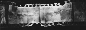
“I find it curious and exhilarating that the impressions left behind after developing these extreme exposures so perfectly resemble networks of blood vessels in the retina.”

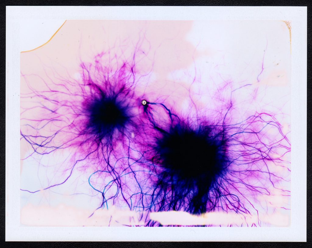
The two images above demonstrate this visual relationship between his creations and the physiological structure of the retina. They both have these large spots of darkness, in the retina these are the optical nerves or the Fovea centralis, and in the artwork they are the epicenter from where the electrical current touches down on the film.  The “veins” that come out from here also look very similar to each other and really lend to this connection between the eye and his artwork.

A similar idea but more connected with my project is “Fox River Derivatives” by Peter Hoffman. In this series of photographs Hoffman traveled along Fox River in Illinois with a medium format camera taking images of the river and it’s immediate surroundings, he then takes the negatives from this and sprays them with gasoline before throwing a match into the pile of images and gasoline and dousing them with water before they are completely destroyed.  He talks about his motivation for the project being that

“our consumption habits—specifically dealing with precious natural resources—are out of control and unsustainable.”

He talks about how the next generation will not get to see what we get to see and so to highlight this he did not just want to make photographs of the river, he wanted to have an element of destructive chance being applied to his images.

“I wanted to transfer that feeling I had, which was maybe something like a sense of powerlessness or dread, to the image making process. I wanted to lose control, having the resulting work border on ceasing to exist in any recognizable form.”

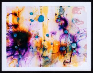
The surreal bubbly effects, often obscuring other parts of the image show the rapidly disappearing natural landscapes that are almost hiding behind the destruction. By using gasoline he is using one of these natural resources that we are using up and exhausting to destroy the natural landscapes he is showing the volatility of the environment, and the randomness with which it is disappearing.

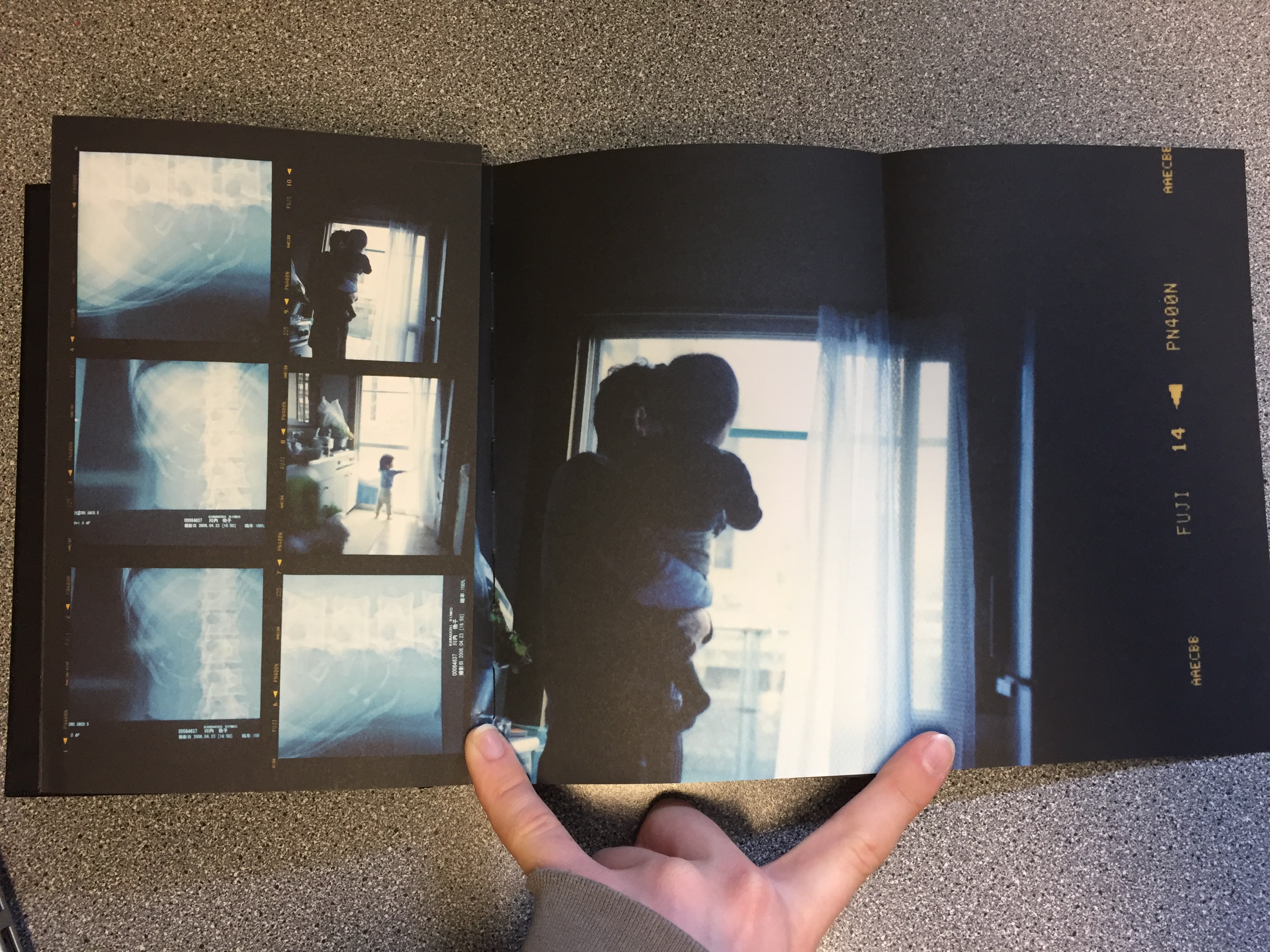
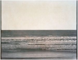
But out of all of the different examples of what other artists have done this kind of film manipulation the one that I connect with the most is the work of Matthew Brandt. He has made lots of different bodies of work and there are several of them that are relevant to my project. The first is titled “Waterbodies,” in this series he takes a number of images of different bodies of water, often oceans, and collects water from them.  He then uses that water as part of the development process to create the final images.

He has not produced many images via this process but it is very interesting to see what the images have turned out like. This concept of using parts of the environment to create these images is a very interesting idea to me and even though they are not the most visually impressive the concept behind their production is really fun and suited well to my project. I looked for the conceptual reasoning for why Brandit did this particular project but could not come up with anything in particular. My interpretation of it though is that to create something then you need inspiration and resources. He already had the inspiration for these images but for the resources he decided not to use the standard salted water for the development process, instead allowing the environment to leave even more of its mark on the images. A truly personalised image that is perfectly customised for the environment.

While he was taking the exposures of this project he came across the idea to do another project, Lakes and Reservoirs. This body of work does not involve using the water to create the images, instead it involves using the water from the environment to destroy the images. Finding out the reasoning behind this project was not what I expected ether and may explain the lack of information about the previous project. In an interview with Brandit for Dazed Magazine the article states that:

“The creative process of his latest series  shows that he clearly understands the art in photography, although Brandt himself insists it is merely a representation of what he sees in front of him.”

Later on he talks about the hiking and climbing that he needed to do to be able to take the images that he used. and how even though the images were being taken to be destroyed he still spent the time to get into good position and to properly compose the images.

“For these ‘shots’, I was looking for the most calendaresque view I could find. A view and composition that was the most encompassing to visually represent that lake and/or reservoir… to me, I enjoy the perversity in subverting all this photographic labor by later degrading it with the lake water.”

This is definitely something that I am going to look into for my project. There are a lot of different water sources around Jersey and it would be interesting to see the difference in effect that this could have on the images. I will be updating about my process of altering the negatives in another blog post.

More links to pages that I found interesting: