Category Archives: Exploring

Filters

Author:
Category:

Theme 1: Water

Water


Based on my first shoot I have identified a theme that I am considering pursuing further. Water. Water is something that is an integral part of all environments, civisialiations are based around water, in the desert the only places that permanent communities are set up are are near to water. 40% of humanity live near a coast line [1] and throughout the rest of the population they almost all live near to some source of water. Human beings need water to be able to survive and so it is an essential piece of our environment. Living on a small island as I do my life is also more connected to the water than most people would be, I have spent my whole life around the sea, I feel lost if I am too far away from the coast. The world and places that I have visited seem incredibly far away and distant from other civilization unless they are near to the coast. It is incredibly difficult to explain but I feel isolated and alone if I am a distance from the coast, even if there are people all around me I feel like the community (village, town, ect…) are isolated and alone, unless the are near to the sea. There is a great degree of comfort that I gain from being near to the sea, this is probably linked to my family history, my Grandfather on my mother’s side was a fisherman and his father before him, all the way back for a long time. My mother also had these close links to the sea and drove me to this with a lot of my childhood being spent at the beach and out on the water.

There are many photographers that have used water as a part of their work. Although usually not the main feature there are some like Tanja Deman whose work has the water as a highly integral part of it. Her project titled “Saltwater” looks at the underwater environment is a kind of activism in response to the threat of oil companies wanting to start drilling in this coastal area. This would have been terrible for the environment due to possible oil spills and other contamination from the general process of creating these rigs and housing the crews. Her works usually have some focus on structures; buildings and natural structures and how humans interact with them. A particular connection is felt between her and the sea, in an interview with Süeddeutsche Magazine Deman talks about how closely connected she is with the water, she says that

“the sea has become part of my personality”

and talks about how the people who have lived in the same place as her for over 1700 years have their whole lives based around the sea; fishing and tourism being the main industries in the area make the connection between these people and the sea one of the most powerful connections. This is something that I was trying to go for with the first shoot that I did but it did not properly work out that way, it was difficult to show that kind of raw connection between people and the sea without taking images over a much longer time frame. This kind of time frame is not available to me for this project so I’m going to have to look at another way to explore the water.

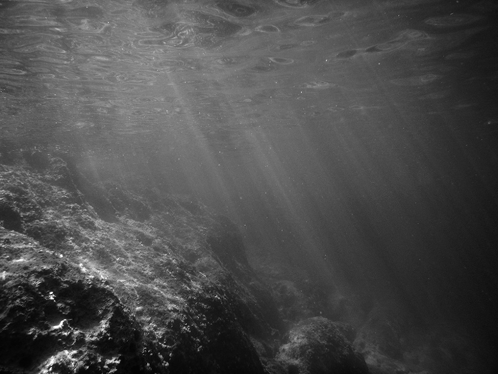
Instead I’m going to look at trying some more abstract methods and concepts for representing water as an environment. Looking into the use of colour under the water would be a good way to study this.

  1. http://sedac.ciesin.columbia.edu/es/papers/Coastal_Zone_Pop_Method.pdf

Clare Rae – Artist Response

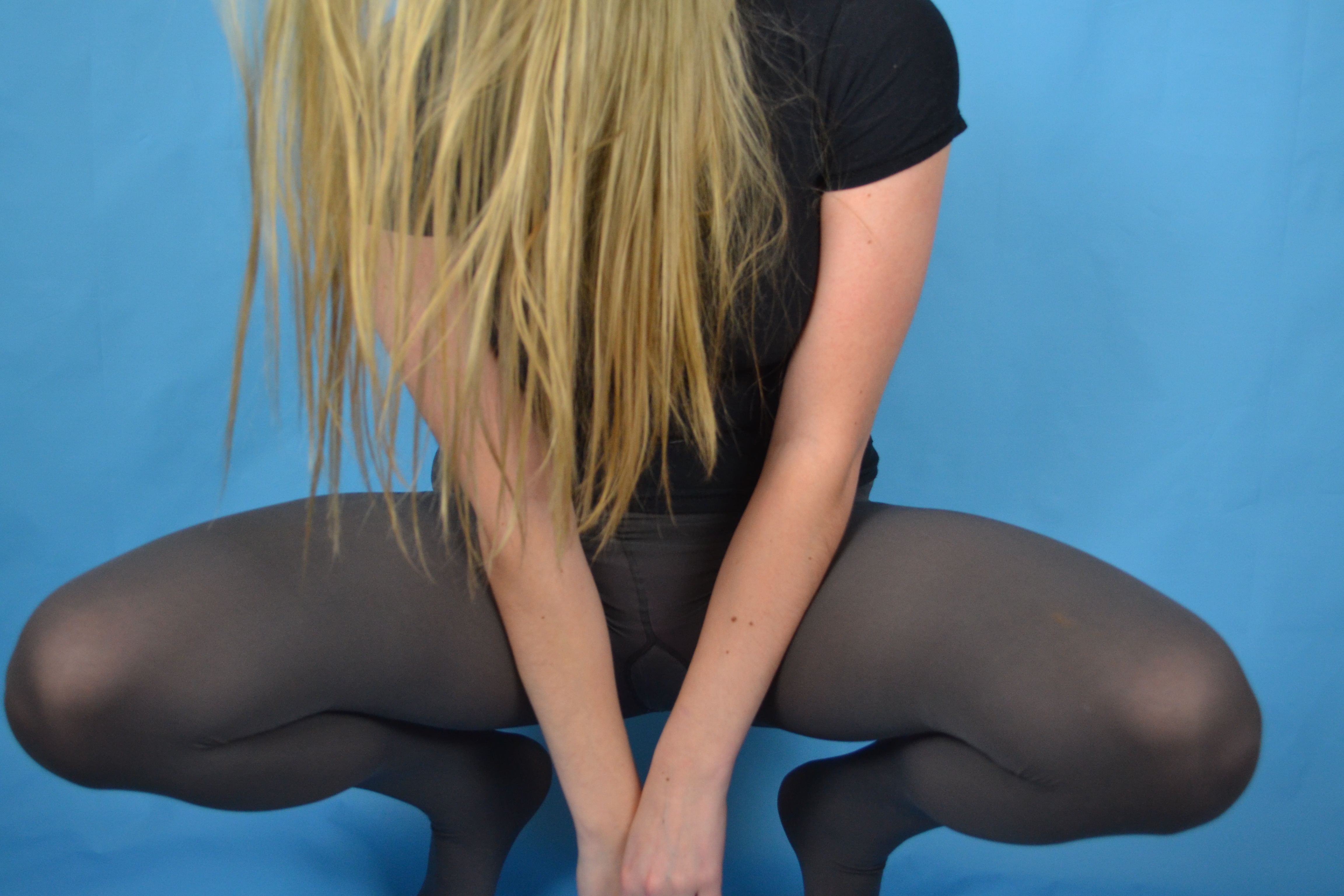
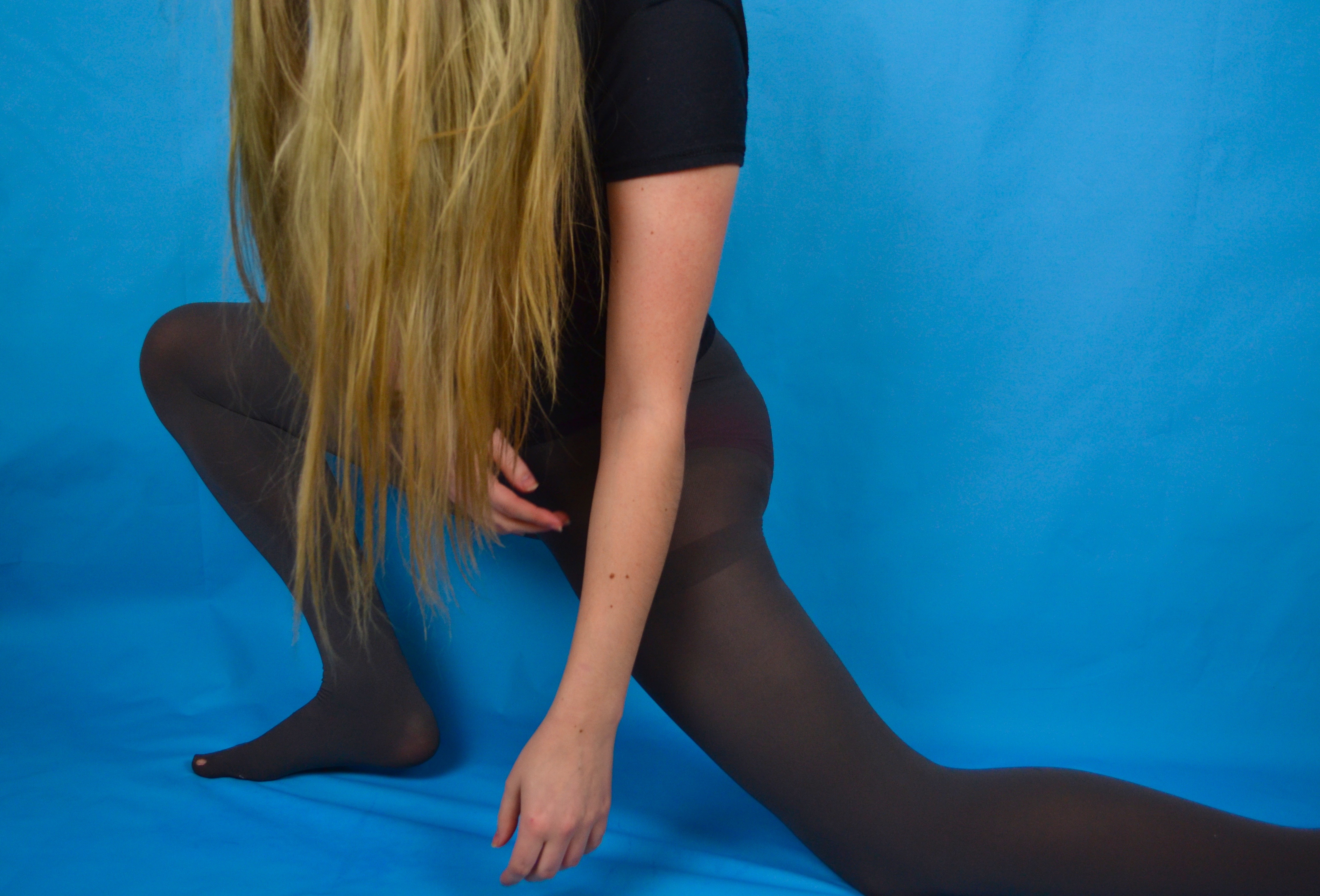
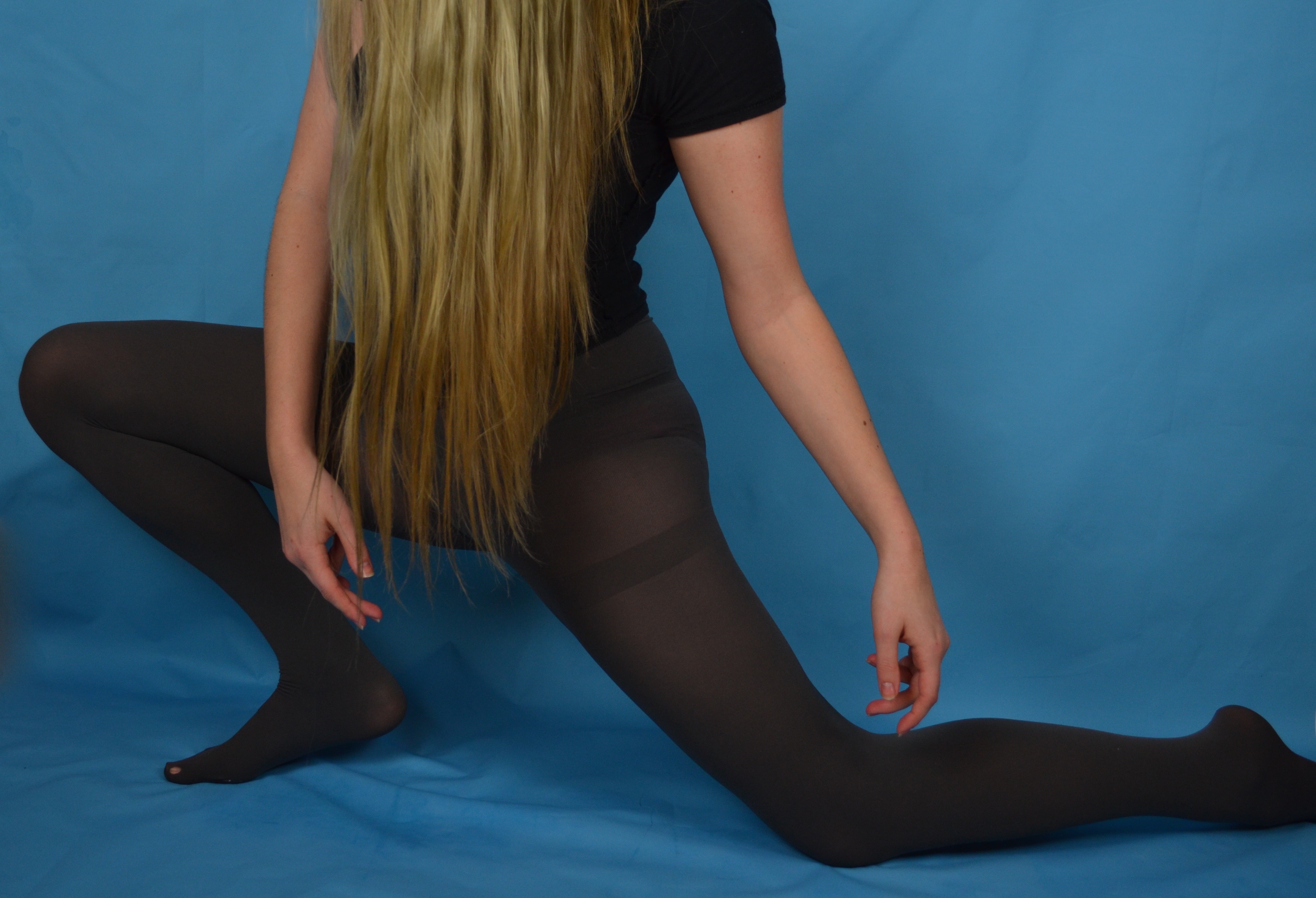
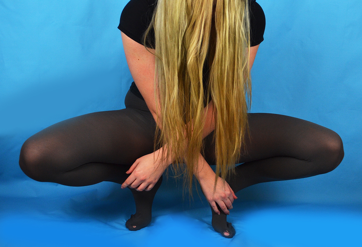
In response to Claire Rae’s work I produced some simple portraits using the blue background I had set up for another shoot. I chose to wear a plain black short sleeved t-shirt and some grey tights, both a nod to Rae’s use of costume in her photography. I also took inspiration from Rae’s workday covering my face with my hair, although I found that the silhouette and overall effect was quite different with my long hair compared to Rae’s short black bob. I experimented with  a few similar poses that involved my being close to the ground so I could tilt my head forward easily to conceal my face with my hair. Posing in the way I wanted in the short time it took my to press the shutter and get into position proved quite challenging and in the rush I often didn’t get into the frame in time or in the incorrect place. The grid of images above where the only ones that were potentially salvageable as outcomes.

I selected this image as an outcome because I found the composition of the figure within the frame was rather successful. There is a good session of a diagonal line created by my thigh as well as a string triangular shape reinforced by my arms and my legs and the base. I altered this image by enhancing the brightness, contrast and colour saturation as well as the levels. I also edited out the hole in my tights as I felt it was an unnecessary distraction and softened some of the creases in the backdrop where the vinyl has buckled slightly under my weight being placed mainly on the ball of my foot.

This pose is at first glance similar to the previous but I decided to place my weight on my whole foot as opposed to the ball to avoid the buckling I experienced with the previous pose. I also experimented with extending my arms and placing them in a way that mirror the corresponding legs. The left arm is folded similar to the leg and the right arm is extended in a dancerly fashion mirroring the extended leg underneath it. My body is also angled away from the camera which creates some interesting negative space created between my arms and the curve of my torso and thigh.

I selected this image as an outcome because I feel that I created a completely different shape with my body compared to the other photos. My body is much more compact as I am crouching down with  my weight placed on the balls of my feet (mainly because I cannot crouch with the weight placed on my whole foot so I had soften some of the buckling created as a result of this on Photoshop) I also like the seemingly symmetrical nature of the composition at first glance but on closer inspection one hand is closer to the floor than the other and my body is leaning lightly to the right. I also like the column of black created by a parting between strands of hair, which is also a little off centre.


How to Explore and Record

Over Easter it is paramount that you make your principal images needed to produce final outcomes.

When you are photographing and responding to ideas and artist reference you are both exploring and recording. The two go hand in hand. If yo do it well and enough you should be able to achieve 50% of your overall marks!

In the PLANNER for A2 EXAMINATIONS 2017 Hautlieu ENVIRONMENT I have highlighted the importance of a sustained investigation.

Each week you are required to make a photographic response (still-images and/or moving image) that relates to the research and work that you explored in that week. Sustained investigations means taking a lot of time and effort to produce the best you can possibly do – reviewing, modifying and refining your idea and taking more pictures to build up a strong body of work with a clear sense of purpose and direction

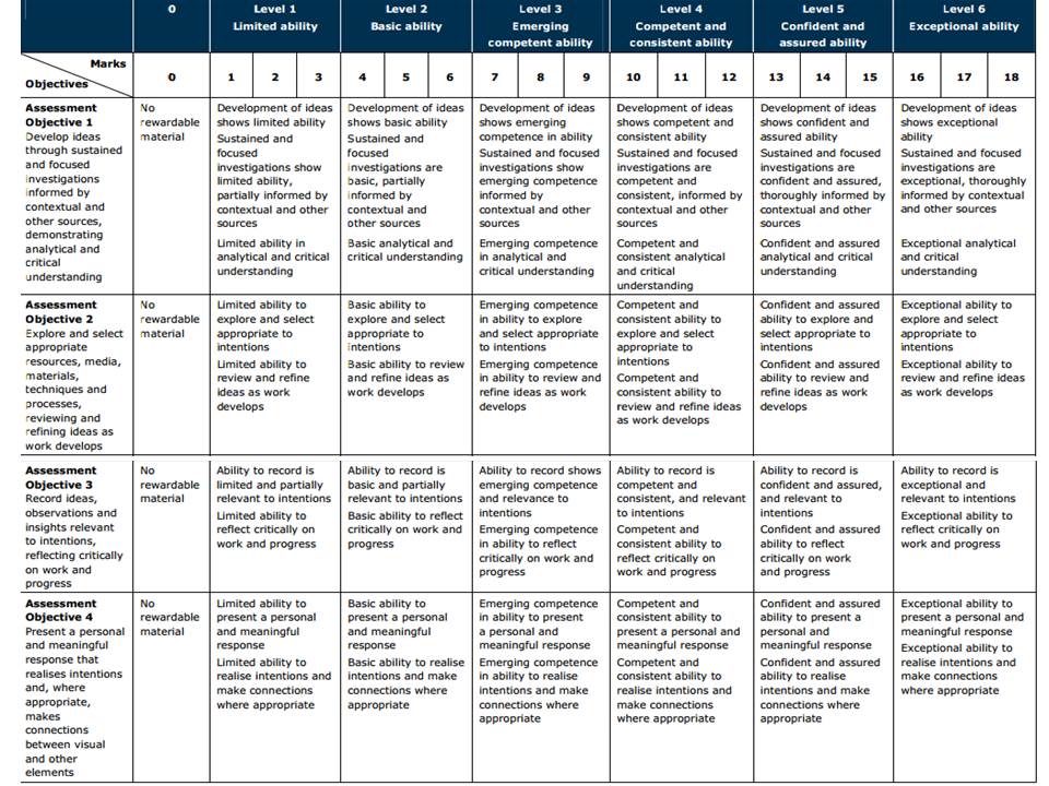
Get yourself familiar with the assessment grid here:

AO2 – Explore and select appropriate resources, media, materials, techniques and processes, reviewing and refining their ideas as work develops.

AO3 – Record ideas, observations and insights relevant to intentions, reflecting critically on work and progress.

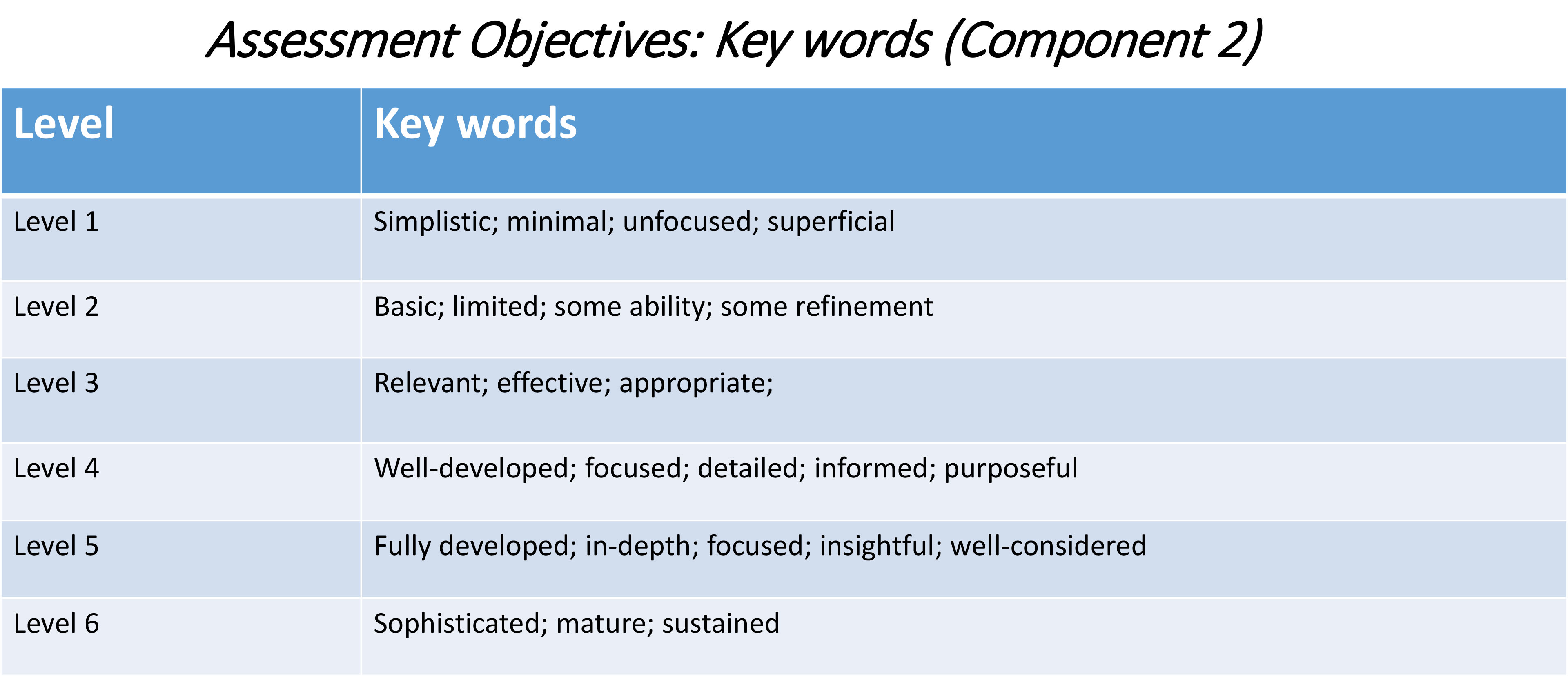
To achieve an A or A*-grade you must demonstrate an Exceptional ability (Level 6) through sustained and focused investigations achieving 16-18 marks out of 18 in each assessment objective

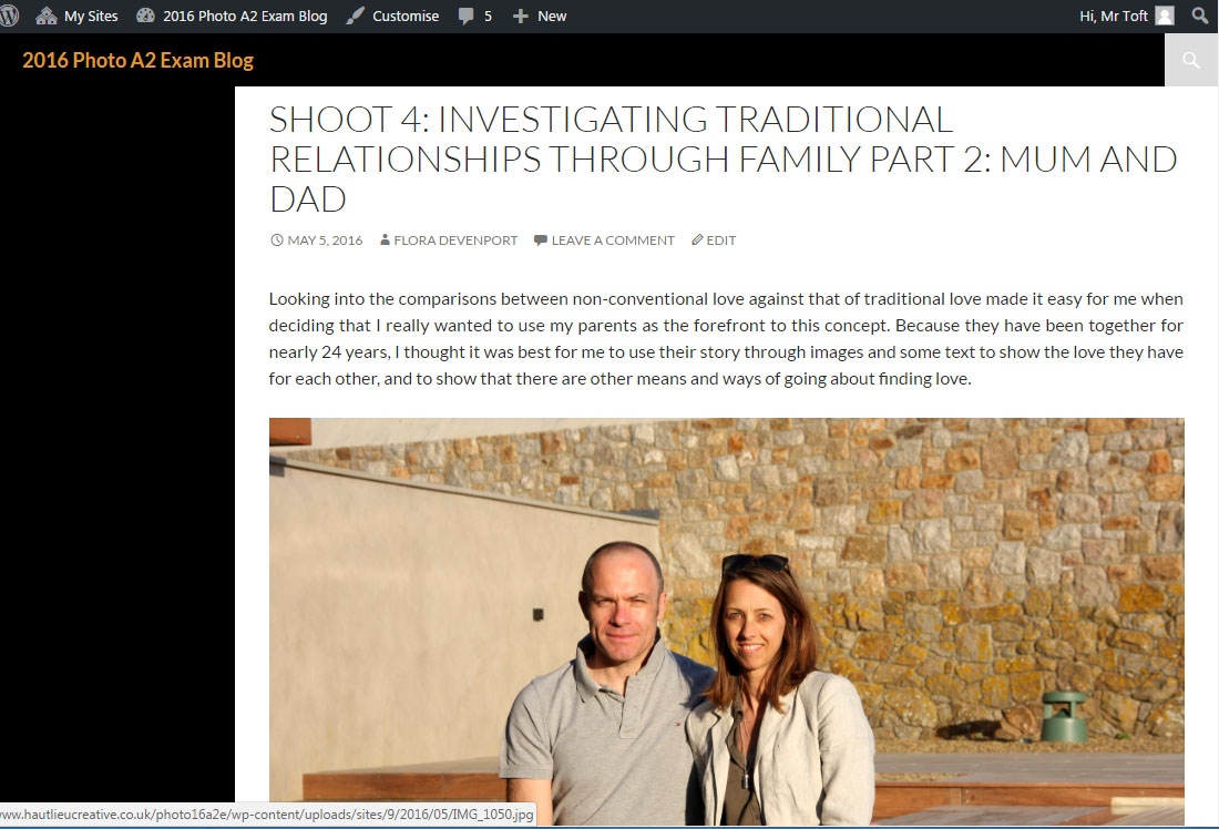
Lets have a look at previous student, Flora Devenport and her exam work and assess it according to the Assessment Objectives A2 Photography: (Edexcel.) Think about what level the student is working at.

What you are looking for when assessing A02 (Explore) and A03 (Record):

How well have ideas developed?
Are ideas explored and selective appropriate to intentions?
Are they sustained and focused?
Are they reviewed and refined?
How many responses/ shoots?

Command of camera skills/ photographic techniques and processes
Understanding of composition/ considering quality of light
What are the overall quality of the images?
How do they respond to research?
How do they relate to artists references?
How do the interpret exam theme of Environment?

Homework: Based on the evidence of your blog, what level are you working at? Produce a blog post where you reflect on your own progress. Provide targets that you can achieve over Easter and that can improve your work. Upload by Fri 31 March

Classwork: To develop your ideas further from research and analysis of artists references and other inspirations  on the theme ENVIRONMENT you now must be planning a number of photographic responses (at least 3 shoots per idea.)

Follow these steps to success!

  1. Produce a detailed plan of 3 shoots for each idea in your specification that you are intending to do;  how, who, when, where and why?
  2. Think about lighting, are you going to shoot outside in natural light or inside using studio lights? Maybe shoot both inside and outside to make informed choices and experimentation. Remember to try out a variety of shot sizes and angles, pay attention to composition, focussing, scale, perspective, rule of 1/3rds, foreground/ background and creative control of aperture (depth of field) and shutter speed (movement). If appropriate, think about how to convey an emotion, expression or attitude and the colour palette, tone, mood and texture of your pictures. Consider mise-en-scène (everything in the frame) – e.g. in portraiture deliberate use of clothing, posture, choice of subject objects, props, accessories, settings. Make a selection of the best 15- 20 images for further experimentation. Produce 2-3 blog posts from each shoot and analyse and evaluate your photos through annotation showing understanding of basic visual language using specialist terminology.
  3. It is essential that you complete your principal shooting over Easter and return on Tue 18 April with a few hundred images ready for further post-production and editing.
  4. Upload blog post with above planning by Fri 31 March


Theme 3: Miniature Scenes

Miniature Scenes


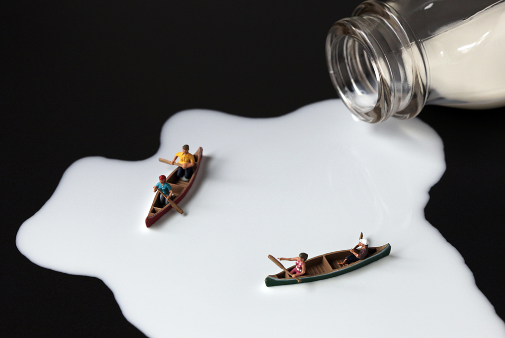
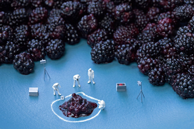
One of my first ideas that I have held on to for a long time is to create scenes by arranging small figures into their own Tableaux style scenes.

The surreal scenes often use some regular sized object to have the figures interact with. The example above shows one of these concepts. It is an interesting way to create Tableaux images and means that the artist must think about how to represent this environment, and to create it. Unless the artist has the ability to create their own figures they will also be limited by the different positions of the figures that you can use, there is a real need to plan ahead with the shoots. I like the interpretation of environment in these images, looking at full sized scenes and interpreting them in miniature is a really interesting concept. The images can have different meanings and connotations, and can be used to express certain feelings and have underlying tones, often though they are just a bit of fun.

Generally shot with a shallow depth of field there are few main elements, and several extra elements that support the scene. In the two images above the regular sized objects are not in singular, this makes it easier to understand the comparative size of the objects and figures. The surrealism of the images is expressed due to the difference in size between the objects and figures, the idea of being shrunk down to a miniature size, but still carrying on with normal ife is very interesting . I do not know if I will pursue this but the concept is still  interesting and if I do not carry on with the water concept then this is something that I could carry on with, however it could be challenging because of the lack of context and amount that I could do.