I decided to develop my idea of combining images and text together by experimenting with an analog as opposed to a digital approach. I was inspired by the aesthetic nature of Barbara Kruger’s work and how the importance of symmetry and balance is replaced with expressive angles for the text. Sometimes the unbalanced and disjunct nature of her work actually makes it more interesting to look at. I was also inspired by stereotypical ransom notes, similar to ones seen in movies and tv, that include letters cut out of magazines, each letter is a different colour and font, this makes the process of reading the text very disjointed and fragmented.
As seen above, the burn book from the film “Mean Girls” which I have referred to on multiple occasions during the course of this project, takes inspiration from the cinematic ransom notes I described. The burn book is a scrapbook created by the Regina George, the popular antagonist and her “plastic” followers, Karen Smith and Gretchen Weiners. The burn book was a single pace where each of the girl would write down their completely uncensored (and often exaggerated or untrue) opinions of various students and teachers at their high school. The book was kept safe at Regina’s house and was intended to never see the light of day. At the climax of the film the burn book pages are photocopied and hung up all over the school, which leads to scenes of absolute chaos. This leads to a workshop lead by the school where all of the girls are made to confess to all of their catty and bitchiness. This leads to the scene ( screen capped above) where the token art student, feminist character Janis sarcastically admits to having a “big lesbian crush” on Regina, exposing the fact that all of the lies and rumours written in the burn book stem from Regina’s self obsession and her own insecurities.
I also want to take inspiration from movie posters that feature what appear to manually ripped, contrasting images that are combined to create something intriguing, like the poster above for the iconic Stanley Kubrick movie, “The Shining” and the layered ripped poster for “Eternal Sunshine of the Spotless Mind”. I included the poster for Jim Carrey’s “Me, Myself and Irene” in my mini mood board above because the split of the face representing a multiple personality disorder fit into the conceptual nature of how I want to combine my two contrasting images of the angry feminist and the blonde (pictured above) .I feel that combining similar stereotypes from my project (Janis and Regina can be seen in my initial mood boards above from my angry feminist and blonde stereotypes) with a words inspired by both ransom notes and the burn book would be an interesting development for my project.
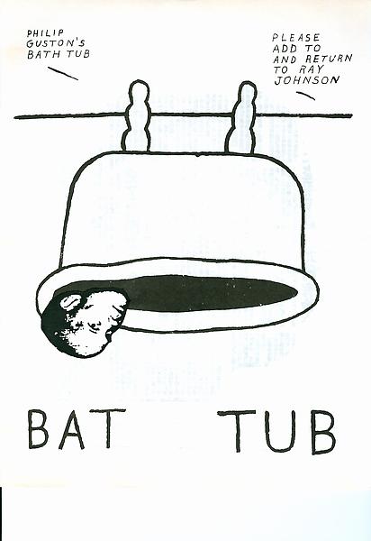
Looking into the theme of ‘Mail Art’ and its place in historic and modern creative movements, the name Ray Johnson was a quick one to appear. the twentieth century artist was popular following his activity as part of the downtown art scene in New York in the early 1950s. Johnson painted geometric and abstract images heavily influenced by his previous professor, Josef Albers. The crucial thing about Johnson’s work was not just how he created it but later his destruction of the same pieces. Most of his pieces were destroyed in his personal process of creating collages which resued this original artwork. In 1954, these small-scale collages were labeled as “moticos” and featured irregular shapes and images from popular culture. Some of these celebrity influences included Elvis Presley and Shirley Temple as well as regular department store models. Much of Johnson’s work in this area anticipated Andy Warhol’s pop imagery which started to appear in 1960. Despite artistic similarities, Johnson’s approach to work and fame was drastically opposed to Warhol’s and he was known for dodging it being labeled as “the most famous unkown artist” by Grace Glueck in the New York Times (1965). His deliberate elusiveness was a popular debate and added to the interest of his character.
Much of Johnson’s work started a modern understanding of performance art such as his tendency to share his moticos around New York with strangers in the streets, train stations and cafes. These performances were even sometimes self recorded in order to collect public reactions to his work and each intricate creation. Much of the work used in these sessions of self publication were later supposedly burned.
Jonson reused his moticos by cutting them up and creating new tiny compositions with them which could then be inked on, painted and sanded to create new pieces of work. These new collages were extremely complex and had an underlying emphasis on structure repetition and semi-geometric forms and shapes. Johnson can easily be seen as an early instigator of performance art acting in other’s pieces and creating his own such as the staging, “Funeral Music for Elvis Presley”.
“In his typically self-deprecating way, Johnson would say that he did not make Pop Art, he made “Chop Art”.”
In 1995, Johnson was witness dressed in black as he dived off a bridge in sag Harbour, Long Island before backstroking out to see. This suicide was heavily speculated and many aspects of his death seemed calculated such as the repetition of the number 13. The date of his death, the 13th January; his age at the time (67, 6+7=13) and the number of the motel he had checked into earlier that day, 247 (2+4+7+13).
“There was much speculation amongst critics, scholars, admirers, and law-enforcement officials about a “last performance” aspect of Johnson’s drowning. After his death, hundreds of collages were found carefully arranged in his Long Island home.”
Ray Johnson is still considered one of the major artistic innovators of the second-half of the 20th century within the critical community but his work remains mainly unknown and heavily under-appreciated by the general public. Some of his relevant pieces are selected below and will be used as starting points for further experimentation with my postcard images.
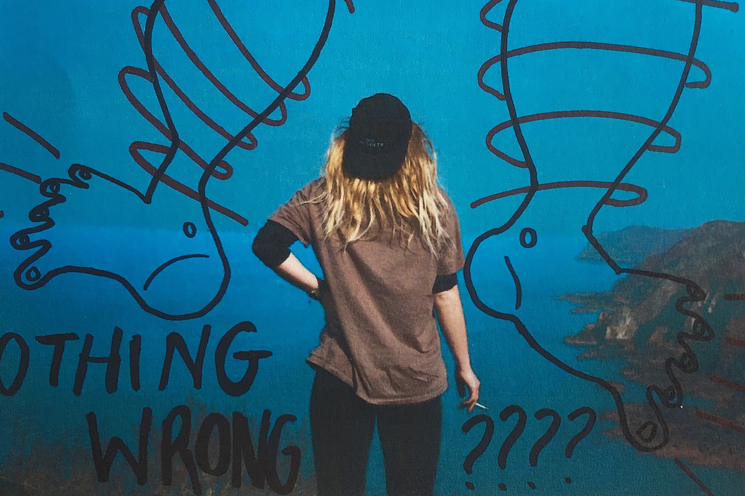
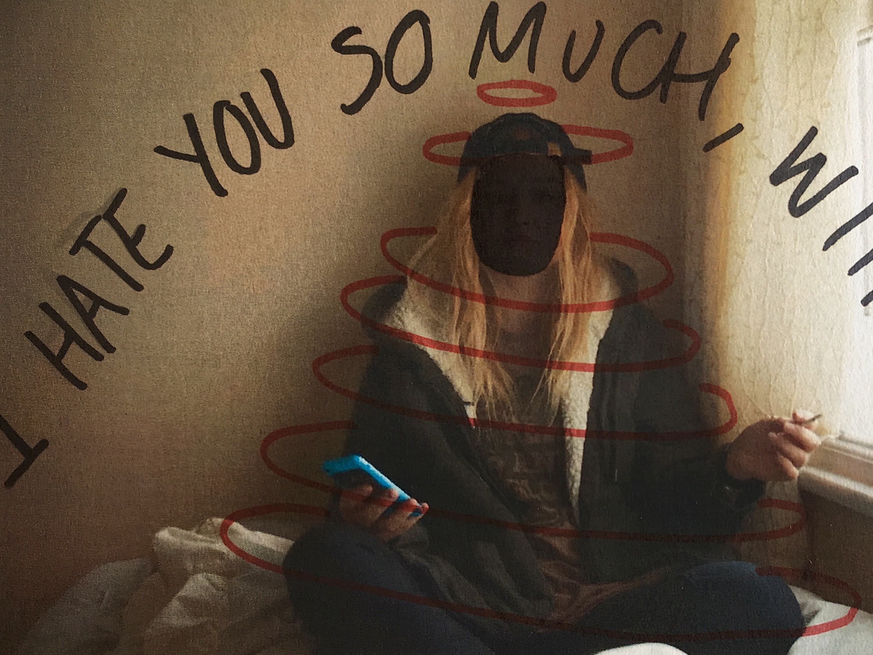
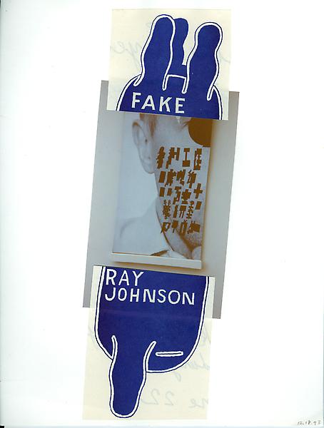
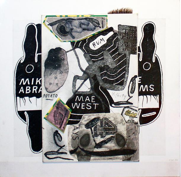
Working from these ideas, I intend to print a selection of my post card images and effectively graffiti them with block colours and shapes in a similar style to Ray Johnson’s work above. To do this, I will print them on standard 80gsm paper and use ink pens to illustrate them with words and text. I printed four of the postcard images onto sheets of paper with a white border which allowed me to work slightly around the image as well as directly onto it. I also printed all eight of my stamp experience to work with as a test influenced by this artist. I started by drawing rough doodle-like images directly from Ray Johnson’s work onto a plain sheet of paper before starting on the images. The sayings, words and illustrations used are all heavily influenced – if not directly lifted (such as the legs below) from Ray’s own postcard projects as part of his Mail Art series.Below are a series of small tests on my own images. They were printed out on a normal copy printer so are not a high quality and were manually deformed with pens and ink markers.
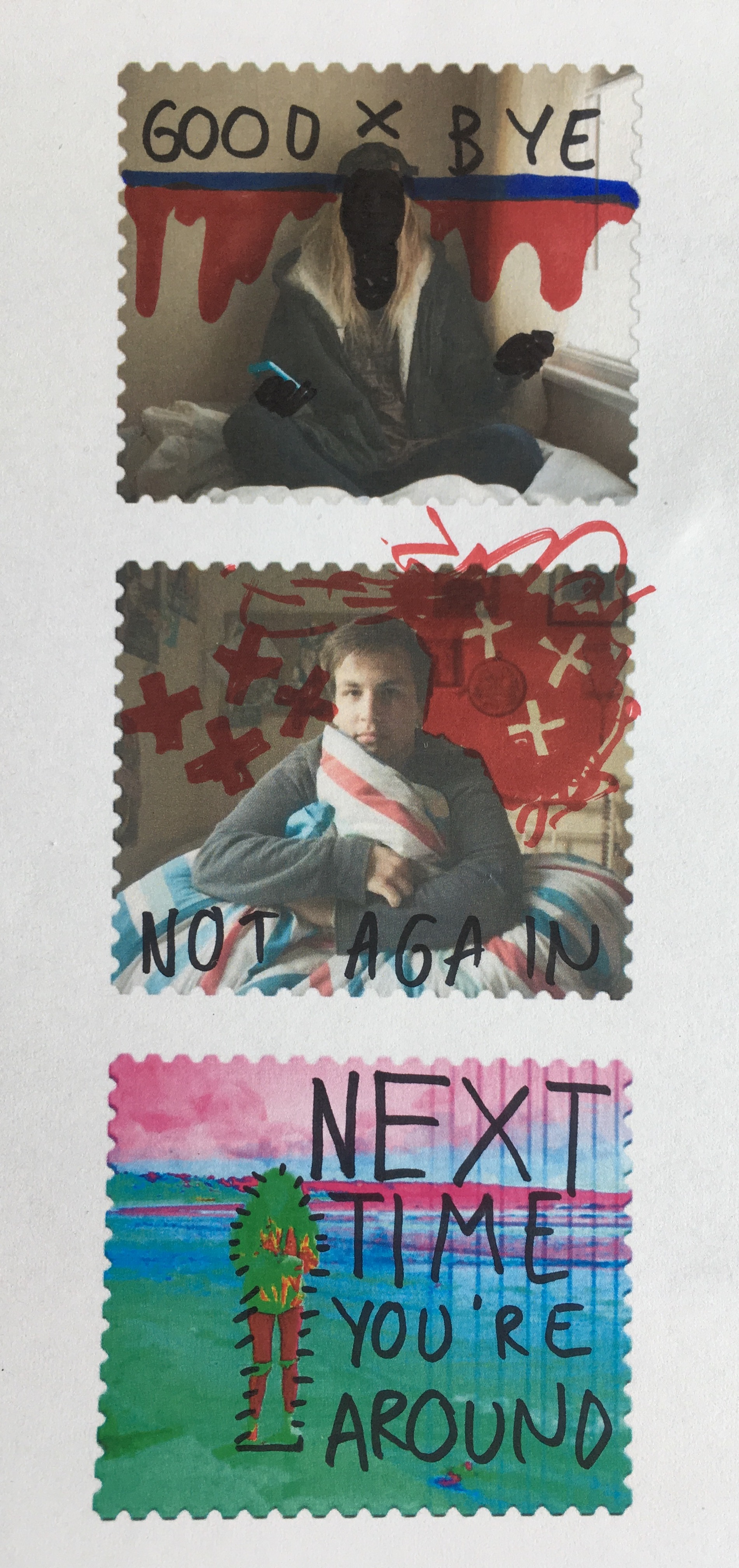
I also used this experimentation technique on some of the stamps I created in photoshop after they were printed out. Again, they have been manually manipulated rather than digitally and feature a mixture of original ideas and influenced doodles for Johnson’s own project work.
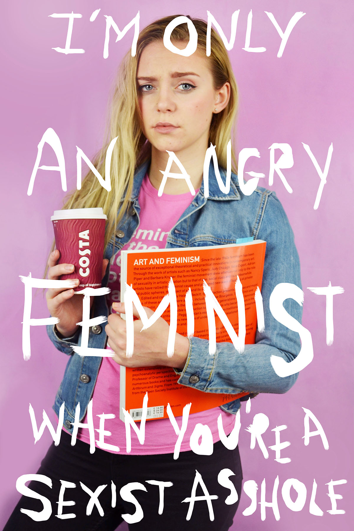
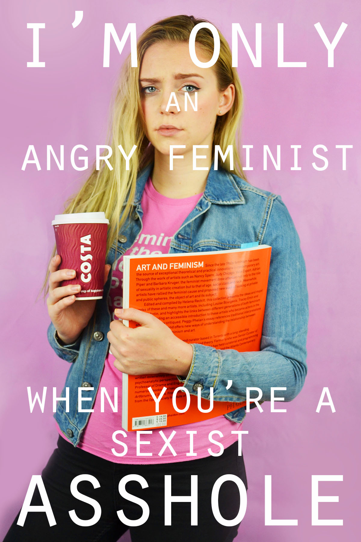
I experimented with handwritten and typed text for this image. To get the uneven lines of the handwritten text I used the 48 brush tool which has long angled bristles that are sensitive to how much pressure is applied and adjusts the thickness of the brush stroke as appropriate. For the typed text I selected simple font which I added over the top of the image in varying sizes. I chose to use the phrade “I’m only an angry feminist when you’re a sexist asshole” because it appeared on a poster on my initial angry feminist mood board. I also though that the phrase was sassy and fit with pose ad expression of the figure in the image.
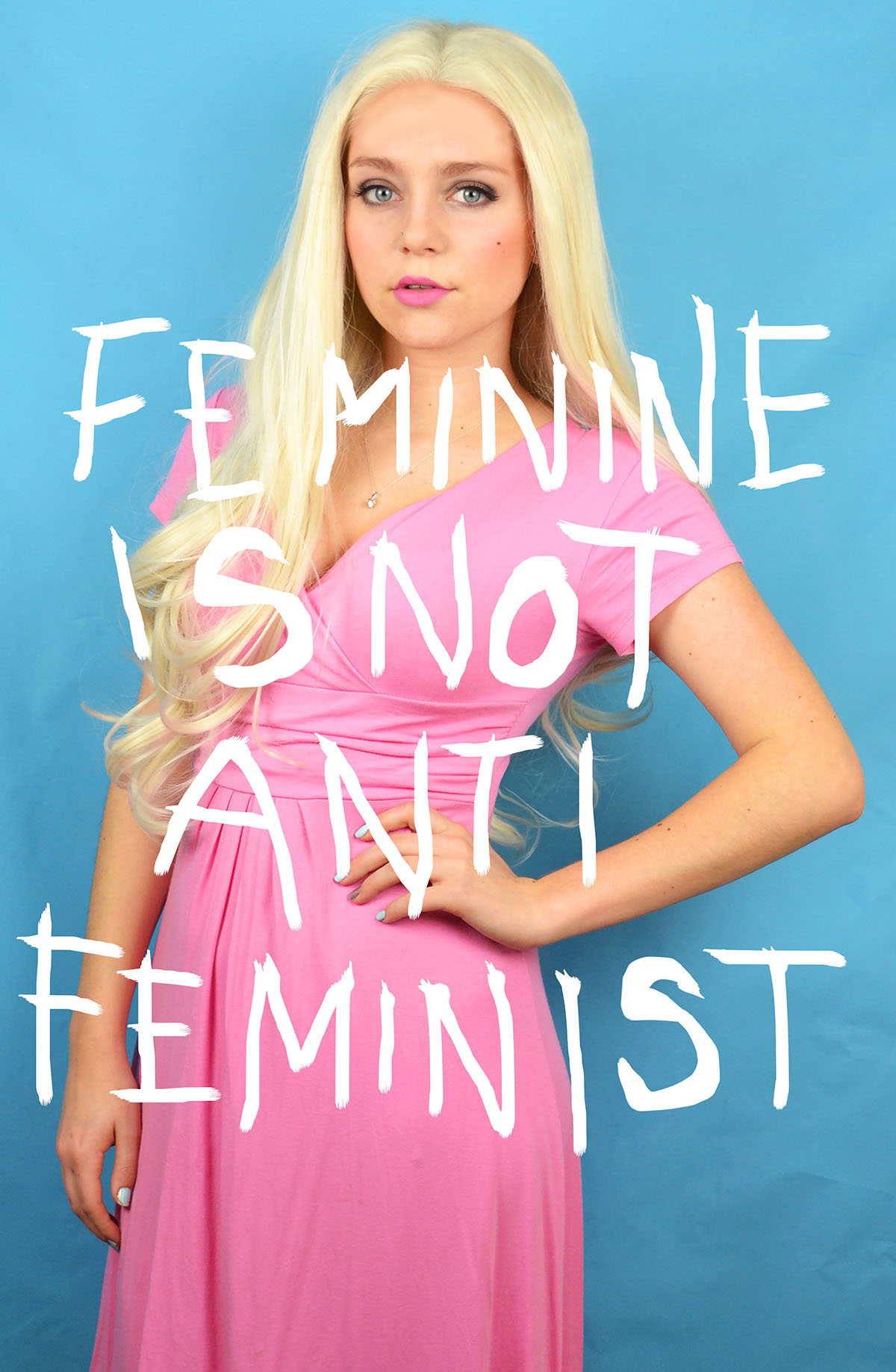
For this image I also experimented with handwritten and typed text. As previously stated for the handwritten text I used the 48 brush tool, when using the computer mouse to write the letter I chose to write in block capitals as they are mainly composed of straight lines, these were more effective and easier to write. This can be seen by the strange appearance of the more rounded letters such as o and s. I think that the typed text works better for this image, the somewhat balanced nature of the word “feminine” and “feminist” at the top and bottom of the image makes the overall image visually pleasing. I chose the phrase “Feminine is not anti-feminist” because it is something that I feel very strongly about. Just because a woman dress in a traditionally feminine way and subscribes to particular female gender roles does not make her any less of a feminist or an empowered and free woman.
I also wanted to reference the idea of a 00’s high school it girl so I decided to include a sassy, bitchy comment. I chose the phrase “At least it’s only my hair that’s fake, bogus bitch” because of the snappy alliteration of the phrase “bogus bitch” but also because the fact that a woman decides to colour her hair does not reflect her personality or whether or not she is a genuine person.
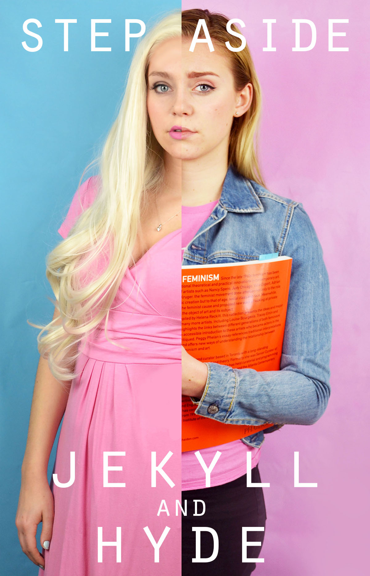
I had fun experimenting with different words to place on top of this image. Before adding words to this image I edited out the finger of the blonde image because In felt that they were distracting as they were right in the centre of the image. I removed them by using the colour picker tool and the airbrush brush tool to paint over the top, I achieved a crisp edge at the divide by using the flat edge brush tool and holding down shift in order to paint a completely straight line. I knew that when choosing a phrase to accompany the image in wanted to draw attention to the split personality feel of the image. I experimented with the phrase “Step aside Jekyll and Hyde” as a reference to the book and film “Strange Case of Dr Jekyll and Mr Hyde” which is about a man with a alter ego. I also tried the phrase “Beauty and the Bitch” as an obvious reference to the fairy tale “Beauty and the Beast” with the word “beauty” having positive connotation and “beast” having negative connotations which is replaced with the word “bitch” which has similar connotations. Another interesting thing about this phrase is that the viewer is able to decide which side of the image is the “beauty” and which is the “beast” as both sides of the image could arguably be both.
I also experimented with coloured images and white text as well as monochrome images with coloured text. I struggles with the balancing of the text within the first image but I knew that I wanted the words “polite” and “violence” to be in the largest font size and I felt that these were the most significant. I managed to balance the text more successfully in the second without having to obstruct the face. I also made the decision to edit out the painted words on the torso in the second colour image because I felt that they would distract from the over layed text. I edited out the original words by using the spot healing tool and then the blur tool to try and smooth out the skin.
In this image I experimented with two different phrases “Vegetarian martyr with the leather Doc Martens” and “Her worst critic and yet her best advocate” I chose the first phrase because I felt that it tied in well with the art student stereotype but also a satirical stab at myself and my own values as I am both a strict vegetarian and an owner of leather shoes. I chose the second phrase because, again, it ties in with the art student stereotypes but it is also very personal to me and I can be both overly critical and overly confident about my own work.
I tried adding words to this image and although I like the words I selected i don’t feel that the aesthetic nature of the texts adds anything to the image. I actually feel that the texts causes the image to lose some of its intensity and drama. My thinking behind the words is an extension of the phrase used on one of the previous images. It is a little satirical and in my personal opinion, humorous. However, I don’t think that the text works visually with the image.
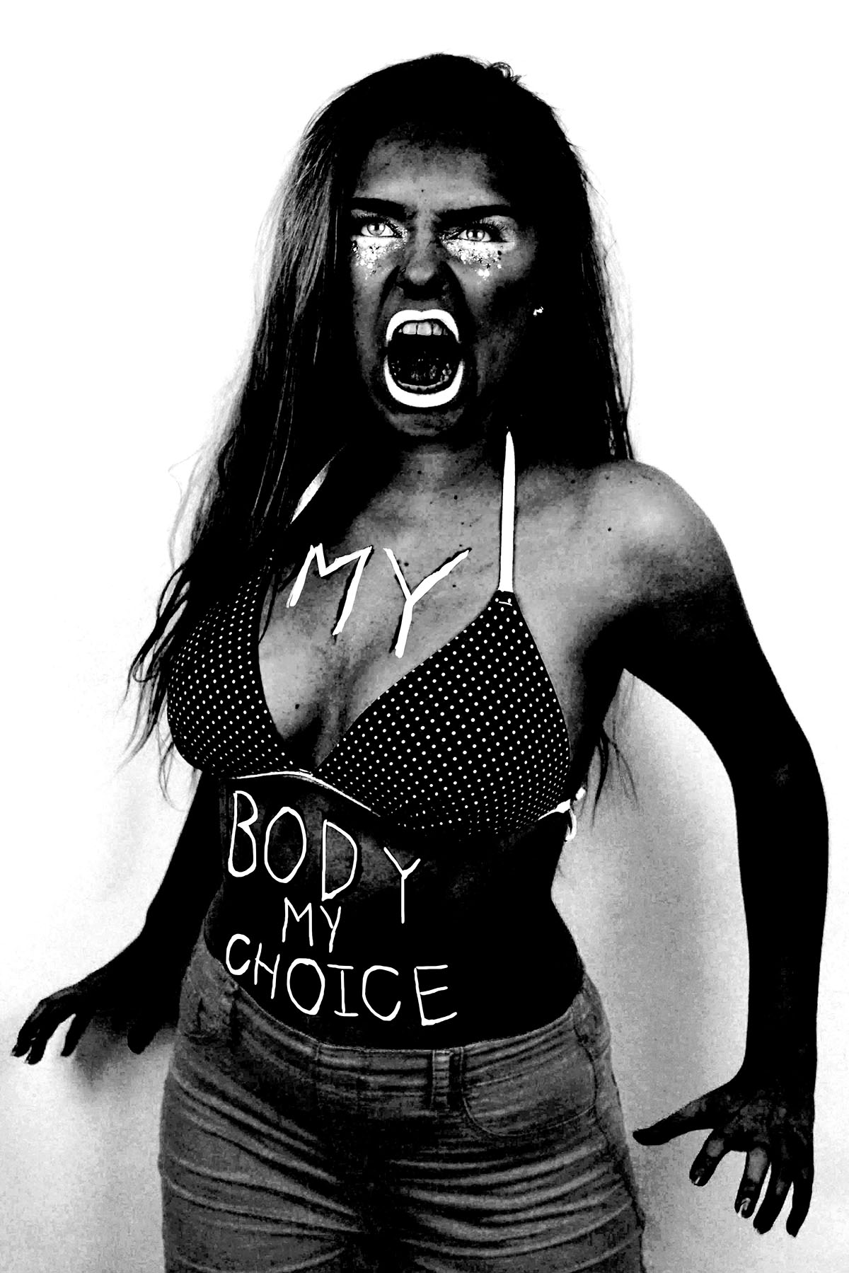
Here are three images (and their originals) from my angry feminist activist photo shoot that I manipulated in way that was inspired by the photo series “There’s a place in hell for me and my friends” by Pieter Hugo. I created these images by placing a black and white filter over the images and adjusted the colour channels. I made the reds much darker, which made the red tones in my skin appear darker and more intense. I slightly adjusted the yellows to be darker to make the yellow tones in my skin darker, I didn’t make them as dark as the reds because i still wanted the high points of my face to be light to get a sense of depth and contrast. I didn’t adjust the greens because it didn’t make any different to the image due to the lack of green tones in the raw images. I made the cyan’s much lighter to make the background of the image white, which created a dramatic outline and sense of contrast to the figure. I also increased the brightness of the blues and magentas to make the pink makeup under the eyes, the straps of the bikini top and the lipstick white to make the eyes and the mouth, thus the facial expression more intense. The white straps of the bikini top also draw the eye up towards the face.
I also experimented with painting over the writing on the raw photo with white, as most of the text was lost when the yellow and red tones of the skin were darkened. I initially used the regular brush tool to write over the top of the text but for some reason, the airbrush edges didn’t look right. I then used the brush tool with the solid edges but I couldn’t get the flow of the accuracy needed to make the text look right. I then tired using the 48 brush which is an angled brush with long flexible bristles that are sensitive to how much pressure is applied in the stroke. This tool helped me get the rough, uneven lines I was aiming for.
I then experimented with combining the images together, to create a small group of angry feminists. I think these images are strong as when the images are displayed together there is a primal sense of anger and intensity. The combination of the different stances and expressions make it appear as it they are ready to attack. I combined these images by using the lasso tool and dragging each figure onto the same canvas, I used the lasso tool as opposed to the quick selection tool as I wanted to make the figures relatively close together and I didn’t want the white edges of the original images to overlap. I made two version of all three images together, I also experimented with cropping the images to focus on the faces, I had to move the images closer together so that their bodies overlapped to create the intensity needed for the cropped image.
I then used the same 48 angled brush tool that I used to paint over the text in white in one of the images over to add some text to the cropped image of just the faces. I tried to make the writing both raw and rough, as if written with a sense of anger as well as legible, which is why I decided to use block capitals like the text written on the torso of the original photographs. I then used the lasso tool to more the words and sometimes individual letters into place as the white background allowed me to do this easily. I then decided to try adding some texture to the image to give it a different effect that connoted ideas of violence and anger. I experimented with a scratched texture that I blended with the image on photo shop.
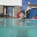
This shoot did not turn out like I wanted it to or how I expected it to. The results are interesting and although they do show the colours that I was expecting the makeup/facepaint that I used on the model could not be seen very well and so that aspect of the shoot did not turn out too well. The images are also not all of a fantastic quality, I had hoped that the water would be clear but the pool cover had been left off for a long time so there was a lot of drt in the water. I also encountered the issue that the water was way too cold for me or the model to be able to stay in the water for more that a few minutes even though it was incredibly sunny.
I would have preferred to have organised this shoot at a different time of day as well as midday but due to time constraints for the pool owner and my model this could not be helped. This did help however because although the light was not fantastic for shooting above the water I really needed the very bright and direct sunshine for the underwater photographs. Because this was one of the first attempts to use the case for my digital camera under water I was not very experienced in using it, I needed to borrow some small dumbbells to weigh the case down so it could sink with me, because of this it was difficult to handle under the water and even more difficult to handle above the water and some of the settings were difficult to use in addition to keeping the lens cover from creating dark corners.
The colours that make up the images are quite nice, they really help to create the kind of effect that I was looking for but I would have prefered for them to have more structure to them. The all felt kind of flat and uninteresting. I tried to get a variation of different shots due to the low quality of the images but all it did was confuse the results of the shoot, there was no linear storyline to the images, again partly due to not being able to stay in the water for too long. despite my dissatisfaction with the shoot I still took the images in the contact sheet above and edited them all to see if I could get some better results from them.
1
2
3
4
5
6
7
8
9
10
11
12
13
14
15
16
17
18
19
20
This is the result of the editing. I only passed them through Lightroom quicky with some small exposure changes, clarity adjustments and on a few I changed specific areas. There was not much that I could do with these images other than this in Lightroom, but I have attempted editing them in Photoshop to see if I can get any different results from some more abstract editing. This experimentation is going to be shown in the next blog post.
Having confirmed a plan in producing photographic responses to my travels throughout the Mediterranean, I wanted to investigate some methods in making this kind of photography more original unique. As discovered in my previous blog post, the genre of Travel Photography is now very crowded due to its accessibility and ease of involvement. There is little originality in documenting the landscapes and atmospheres of foreign locations as it can essentially be done by anyone. Consequently, I may have to indulge in some peculiar methods in order to make my work more personal and distinctive. With this plan in mind, I began looking at the work of Carlos Spottorno. Carlos Spottorno is a Spanish documentary and Travel photographer with an artistic background who has focused his main personal projects on subjects related to power shifts, economy, and social issues that shape the real world. Born in Budapest in 1971, Spottorno has travelled all across the globe, generating editorial, commercial and personal projects that possess some fork of message or deeper meaning.
One of his projects called “The PIGS” bears some visual resemblance to the work I am producing due the synonymous European environments explored. For this project, Spottorno intended to capture Portugal, Italy, Greece and Spain through the eyes of the economists. PIGS is a term coined by the business and financial press as a way to refer to Portugal, Italy, Greece and Spain during their current financial plight. These countries are all united in facing vast loss in historical prominence and are hence grouped together under this banner. What started as a pejorative label used by neoconservatives, mainly from English speaking countries, was eventually taken up for some time without any qualms by the media. Excessively high levels of public and private debt, government deficits, a property bubble and very disappointing political and economic policies, have put the PIGS in the crosshairs. It is alleged that the PIGS won’t be able to bear the pressure of sharing a common currency with their stronger European brethren. Spottorno states:
“I have often asked myself how, after so many centuries of splendor, could these countries have come to their current destitute state. What happened to Greece, the cradle of Western Civilization? What became of Italy, heir to the Roman Empire and endowed with one of the richest artistic heritages in the world? What went wrong with Portugal, the first global naval power in history? At what point did Spain and its empire, on which the sun never set, see the onset of their decline? I believe the root-cause of our countries’ current sorry state of affairs is to be found in the distant past. Issues that for many centuries piled up on our doorsteps are now rearing their heads and plain to see.”
Spottorno continues, arguing that the PIGS view themselves, rightly, as the architects, and as the stem cells from which the idea of Europe developed. Southern Europe resists admitting its loss of political stature in the global political arena, seeing itself as the wellspring of Western Civilization. Spottorno sees The PIGS as old, cynical and individualistic countries. I think this is a really interesting concept, and I something that I have frequently thought about in the past. Its quite staggering how these countries were formerly, some of the most powerful and dominant forces on the planet and now are simple, weak shadows of these former identities. I think that Spottorno had an excellent lead for a photographic project here, due to the passion he had behind the project. He attempts to illustrate the stereotypes brought up by the term PIGS. In other words, what we would see if we were to translate into images the articles we read in the financial press. He intends to present how he imagines economists perceiving these countries. The result is a collection of clichés, some true and incomplete. The same way a travel guide carefully avoids anything seemingly unattractive, this book shows much of what we find embarrassing, oftentimes rightly, and at times unfairly. What stands out the most is the glaring absence in these images of all that is positive, beautiful and promising in these countries.
In this photograph, we see a young gipsy holding his horse after cleaning it. In some parts of Portugal, like in other european countries it is still possible to see working horses in urban context. Nomad gipsies settlements are in the middle of town, generating sometimes troubles between them and the other people living in the areas. They are accused of being dirty and chaotic, besides dealing with drugs and crime. This is a clear highlight of the plight endured by Portugal and he transformation experienced through history. I like this photograph a lot, a powerful composition evoking a lot of emotion. The boy and the horse are stood central dominating the frame and drawing the attention of the viewer. Nevertheless, in the background, we see the urban landscape, a white blocky building providing the context and message. The building features an interesting lighting setup as certain faces are shrouded in complete shadows and others in complete light. A nice contrast is created that doesn’t distract from the subject and his horse but ensures our eyes naturally meet this component.Carboneras, Almería: hotel “El Algarrobico” was built in a protected Natural Park with the complicity of local authorities. Popular activism and the pressure made by Greenpeace stopped the project, although after a decade of legal activity it has not yet been demolished. Nevertheless, It’s interesting, though, that many locals would like the hotel to start operating, and revitalize the poor local economy. This photograph is really interesting as we see a lot of opposition and clashing of certain messages. Typically we associate tourism with lush landscapes, clean architecture and bright, vivid colours. However, within this photograph this idea of tourism which is ushered in by the family sat upon the beach, is conflicted by the surrounding landscape. This abandoned hotel that still remains to be demolished is just sitting there, whilst the dingy colours of the surrounding environment produces quite a depressing tone. We truly see the repercussions of this failing economy and stereotypes surrounding Spain have been challenged.
The photographs within the PIGS project represent, visually, my initial intentions for this study. The photographs concentrate primarily on the landscape and significance of the local environment which is what I wished to do as well. They occasionally feature a subject within the foreground who can provide context and intrigue surrounding the narrative. Nevertheless, my travels around the Mediterranean do not possess the same kind of depth and meaning that Spottorno has here. The reason why the PIGS project is so successful is due to the direct, concentrated proposition organised by Spottorno. He has discovered something that he is passionate about and ensured absolute focus upon this for his photographs. On the other hand, this kind of depth or internal meaning is absence from my work, meaning minimal focus would be achieved on my shoots. This is why I would like to find something more unusual for my work, and fortunately Spottorno has another project that I would like to reference.
LA GRIETA / THE CRACK
In December 2013 reporter Guillermo Abril and Spottorno received from the assignment of preparing a series of stories about the European Union’s external borders. THE CRACK is Spottorno’s field journal as he followed the border from Africa to the Arctic with the aim of identifying the causes and consequences of Europe’s identity crisis. Halfway between a photobook book and a graphic novel, in as much as it uses narrative elements of the latter, the end result is not a story based on actual events: these are actual events. At the time the media’s coverage was focused on the migration flows in Melilla and the Southern Mediterranean. The great migrant exodus in the Balkans, and the attacks in Paris and Nice were still a long ways in the future. The war in Ukraine seemed to have stabilized, and the United Kingdom hadn’t yet voted to leave European Union. These and many other events would take place over the course of time it took them to cover their assignment, which took them all the way from Melilla to the Arctic. After three years working on the story, several covers, dozens of pages in magazines, and a World Press Photo, the authors set out to convey, with the 25,000 photographs and 15 notebooks they had compiled, the story of what is happening on the European Union’s borders, making use of an innovative narrative form.
This project is a perfect example of how to present Travel Photography in an innovative and original way in order to separate it from the crowded genre and boring photographs. Spottorno has borrowed the aesthetic of comic-book art presenting his images upon paneled pages with a typical comic-book filter employed onto the images. The pages feature speech bubbles and narration boxes, just like a comic book would, enabling a narrative to be told. The idea is very imaginative and a good representative of the originality I intend to capture for my travel photography. By presenting the images in this way, Spottorno is provided his travels around the globe with a story and sense of progression. The portfolio becomes more than just images, and Spottorno has created a professional and sophisticated final product. This is something that I would like to replicate for my Environmental project, essentially utilizing the travel photograph as a backdrop for something greater and more creative. Whilst the visuals of the PIGS project can still be echoed, I would like to incorporate an individual style through the editing stage, perhaps taking advantage of my artistic abilities as I have done in the past. The next stage is to try and think of an concept i manipulating my shoots that is original and individually relevant.
Since the beginning of human civilization we have always had an innate sense of fear surrounding the sea and what it contains. 71% of the earth’s surface is covered in water and so it is has the potential to home so much life, much of which we still do not know about. With a maximum depth of 11km finding all of the different species that call it home is not something that is possible, even with today’s technology we cannot catalogue all of the different species as we would like to. There are species that exist in the oceans that we will likely never come into contact with, there is simply so much space that we would never be able to see it all. If this is true today it understandable why our ancestors had tales of the Kraken taking down ships and giant sharks swallowing people whole.
This sense of mystery and the unknown really lends itself to the subject of environment because even with this fear of the unknown people still made the sea and water their environments. Fishermen and women as well as merchants and explorers use the water to travel around and made a living out of traveling on the water. This often leads to stories about the disappearance of ships under relatively regular circumstances being labelled as mysterious or linked to higher powers or mythical creatures. Even from the days of the Ancient Roman Empire through to more recent times these stories have existed, and have only been exaggerated by sightings of giant squid and unexplained disappearances. These kind of disappearances capture the imagination of the public and artists alike.
Often artists will try and show these events and the mystery and fear that surrounds them, found on old maps these images are not very descriptive but still give a sense of mystery that these creatures can just appear out of nowhere and will attack ships. The water and the sea are their environment and we are intruders in their homes and they do not like it. This sense of the unknown is something that I could look into for my project, I have always been fascinated by mysterious disappearances of ships and people at sea. One of my favourite stories as a child was that of the Mary Celeste, possibly the most famous example of disappearances at sea. It captured my imagination and started my love and fear of disappearances at sea (although I love the sea one of my greatest fears is being stranded at sea out of the sight of land).
The main story can be read about the ship herebut as it is an insanely well known story only some of the details may be new. The fact that the ship disappeared along with its crew in the first place is not that remarkable in the first place, although unexpected it was not an impossibility, but what is so confusing is that the ship was found intact without a soul aboard, looking as if the crew and Captain’s family had just got up one morning and had all just jumped overboard leaving everything behind aside from a single lifeboat. Many different theories exist as to what happened to cause this but no one will ever truly know so theories will stay as just that, theories.
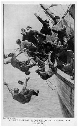
“Without a shadow of warning we found ourselves in the water.”
This hasn’t stopped people from creating art based on what they think could have happened. The sketch above shows one of these theories, it is based on a theory that all of the people on board the ship were on a part of the deck that then collapsed (this website talks about this particular event). There is no real evidence to support this theory but it was popular at the time, the image captures the suddenness and fear with which the crew must have left the ship. Ether through an accident like what the image above depicts but alternatively if they voluntarily left the ship through their own devices but without physically being forced.
Click on this image to go to the artist’s page
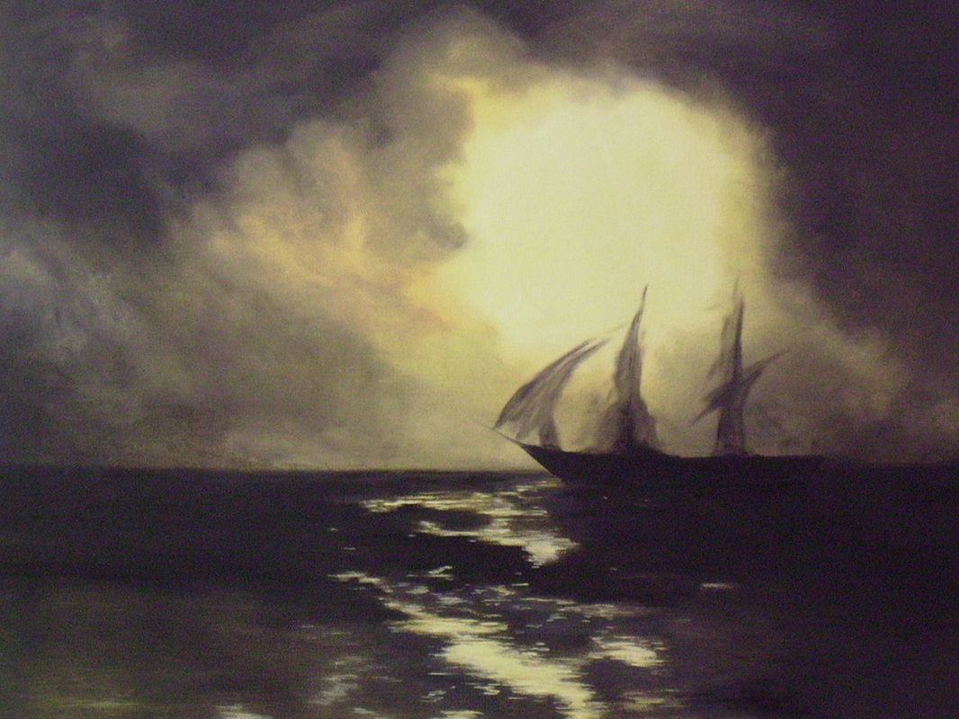
This idea of it being a ghost ship is a romantic notion that has gained a lot of association with the ship. The modern painting above really associate this with the ship. The ship is seen just as a silhouette on the water, non-solid it seems to shift in front of your eyes making this seem like a real, ghostly apparition.
Ultimately all of these different pieces of artwork (not just about the Mary Celeste) are driven by a fear of death. Humans are built and coded to survive. The header image shows this very well, the chaos of this attack shows the human resolve to survive that drives us all every day. The man lifting his axe to this creature really shows the heroism of these people and ultimately that the people who work on the sea are often the ones who will have to work the hardest just to stay alive when things go wrong. Out at sea there is no help other than yourself or if you’re lucky enough your fleet, this has even transferred over to the modern day. In the middle of a long ocean voyage for members of the merchant navy on cargo container ships there are often only very basic medical facilities. this can mean that in a major medical emergency like heart attack or ruptured spleen there is often nothing that can be done. The isolation of the sea like this is not something that I could easily represent but I could try. Without being in one of these environments I could not truly represent this kind of mystery of isolation but I could look at doing something surrounding unexplained sea creatures and other mythological creatures and experiences.
In the end it may be scary to imagine what still lies out there in the oceans, undiscovered and undisturbed. But even the creatures that we know about can be pretty terrifying too.
While spending some time just browsing YouTube I came across a video that caught my attention and I thought that it would be very helpful to my photography work. It is by a photographer called Ted Forbes, he produces lots of very informative YouTube videos about photography and watching this video really made me look back on my own work and think about what worked, what didn’t and why.
In my previous photography work something that I have neglected to give enough thought to is the colours of my photography, this is not so much based on ignoring the bright, vibrancy of the colours that I have taken photos of but instead the matching of the colours in the image and how they work with/against each other to make it. I’m slightly ashamed to admit it but as I now look back on my previous work this is not something that I have even properly considered before. As I do look back to some of my favourite work of mine I do start to notice this connection of colours that I did not plan most of the time but which did, for the most part, work.
This is one of my favourite images that I produced from my AS work. Although now, with a more critical eye I can pick out a lot of issues and negatives to it, it still works well to elaborate my point. The colour pallet used in this image is a very simple one; black, whites and reds. But as was touched on in the video sometimes the best photos do not have the brightest, or most vibrant colours. The image above works because of this, there is an almost monochrome effect to the image with the colours of the red from the guitar just bringing interest to the image. The reds are not even bright or vibrant, they are relatively plain but complemented with the rest of the colours in the image this works very well.
Using the Colour tool that he suggested I decided to look at the colour pallet of one of the images that I took when I went out diving. More specifically I looked at the water (and sky) in the image. I selected the 5 main colours that make up the water in this image and how they flowed between one another. Being relatively dull colours they do not leap out at you on their own let alone inside the image with each other. They do however mix very well together, by looking just at the water in the image you can see this well. The reflections and shadows of the rocks and the reflection of the blank white sky (that’s how it looked to the naked eye too) are all mixed together by the waves in this image giving a real mix of these very similar colours that the film (Kodak Ultra Max 400) captured very well.
Photographer: Brooks Sterling
The way that waves have the ability to mix colours so well, blending with reflections and waves really makes it an interesting subject to shoot. Even when shot in black and white there is still a great degree of interest shown to the images. The way that the light bounces off the water in all different directions due to the smallest, most unpredictable ripples and from random positions means that water is something that always has some higher degree of interest to it than a plain sky or uninteresting background, sometimes making the water in an image more impressive than the intended subject.
Photographer: Roni Horn [1999]For some like Roni Horn the water is the subject and the colors are very important. The at first seemingly dull images just need to be looked at for longer. When each square inch of the image is looked over with care as intended more springs out than expected. The outline of something being reflected in the image above is apparent but what the object is, is cast into doubt. This particular piece of reflection stands out because it is not following on the trend of the colour palette of the rest of the image. The colour palette that I have done below for the image shows the regular colour palette of the very dark blues and black being contrasted by this very bright white with a tinge of blue to it. It really stands out and draws attention to the specific part of the reflection. This can also be seen in the right of the image but as it is a much darker shade of with (grey) it fits in with the image much better than the very bright white.
These techniques have inspired me to do a shoot based around this and incorporating water into it. I will detail the plan for this shoot in another blog post.
Water is the building block of life, it is essential to the survival of all life on earth. All living organisms are made up of water in their cells, this water allows them to hold shape, allows chemical reactions to occur and in the makes up about 70% of mammal’s and 80% of fish’s body mass. Because of its importance it is something that has been intensely studied. Much of the information on this page is not that relevant to artistic work but I will list off some specific points about water and its properties and will look at a few in-depth.
Modern measurements are based on water: 1 cubic meter of water weighs 1 tonne, 1 liter of water weighs one kilogram, 1cm³ of water weighs 1 gram, the boiling point of water is 100°C, its melting point 0°C and it takes 1 calorie being burnt to raise the temperature of a liter of water by 1°C.
71% of the earth’s surface is water and 95.5% of that is salt water.
It is the largest single environment on earth and contains all of the top 10 largest animals alive today.
Each molecule is made up of three atoms. Hydrogen is the most abundant atom in the universe and the third is Oxygen.
“Light entering or exiting a water surface is bent byrefraction. Theindex of refractionfor water is 4/3, implying that light travels 3/4 as fast in water as it does in vacuum.”[1]
Water takes a lot of energy to go from a liquid state into a gaseous state. This is called having a high latent heat of vaporization. This keeps water at much the same temperature all of the time and means that it is a stable habitat for organisms like fish, plankton and some mammals.
For all animals that have lungs it is important for them to have moisture on the inside of their lungs otherwise they would not be able to take in Oxygen. Oxygen from the air has to be dissolved into a very thin layer of water coating the inside of lungs so that the Oxygen can get into the bloodstream.
Excess water intake can kill someone. About 6 liters taken in quickly can kill an adult male. Water intoxication as it is known causes cells in the brain to swell and burst, often being fatal if it has got this bad.
Drowning is incredibly easy and needs a terrifyingly small amount of water. As a lifeguard my self this is something that I am incredibly aware of, we need water to survive but it can also kill us so easily.
Refraction is something that could be very useful for my project. There are an immense number of different ways that you can use refraction of water artistically. The image above shows one of these examples, refraction of the light that is reflected of the background has passed through the water and because of the double curve of the glasses and the water the images have been flipped and all three are different due to the relative angle of the viewer to the background and the glass. This is really interesting and something that I could look at in more detail.
One of the typical uses of refraction in photography is to show a clear image that cannot be seen in the background. The example above shows this really well. The background cannot be seen clearly, it is simply a yellow blob. But when you look at the droplet of water that is in focus the background is now visible. Brought forward and flipped the spherical shape has created this new version of the flower, almost trapping inside this droplet of water and seemingly preserving it. The bonds that hold water together are called hydrogen bonds and from between the hydrogen atoms, these bonds are not very strong but when in a body of water so many of these bonds form that they become a relatively strong bond, this is what creates surface tension and holds water molecules together to form droplets like the ones above. This allows for these kind of photographs to be taken.
One other use of refraction is in this kind of photography. Half-and-half photographs in water show this effect very clearly, the distorted effect of the light entering at different speed and angle make the two halves of this duck look like they are separated, alternatively the bottom half of the image looks like it is bigger or closer than the other part, I see quite a few different artistic uses of this, it can give some really surreal effects.
This idea is something that came to me from a video that I saw on youtube. In the video a group leave a disposable camera in public areas with a note that says to take a photograph with it. The video is from 2011 but still has the same connotations as it did then.
Although it is not the specific intention of the people who did this they are giving an unusual look at the environment. The camera that the people are using is the same. The location that the photos are taken in is the same. The only real difference is the person who frames up and takes the photograph, it shows how different people all see the world differently. This concept is something that I am keen to investigate further. I would not need to copy the project but I likely would end up doing that for one of the shoots. Other than that I could give people in the same family a camera and have them take a set number of exposures each. This would give an interesting insight into the different way that family members would see their family and home environment. Similarly, looking at different people in certain clubs and social groups could be interesting, I could use the rowing club members for this, using my own photographs and images that they would take could give an impression of the club from many different angles and personalities. Again looking at how individual personalities interpret the same environment.
An interesting possible development on this same vein would be to compare photographs taken by someone who is considered an “insider” of a certain group and someone who is an “outsider” of that same group. This would probably work best by using ether two photography students to compare or two non-photographers so that the images do not differ too much in quality of framing, lighting ect…


 Below are a series of small tests on my own images. They were printed out on a normal copy printer so are not a high quality and were manually deformed with pens and ink markers.