Category Archives: Experimentation

Filters

Author:
Category:

Photoshop Task 2

Photoshop Task 2


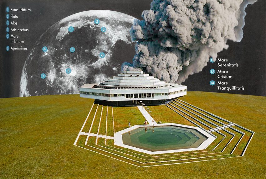
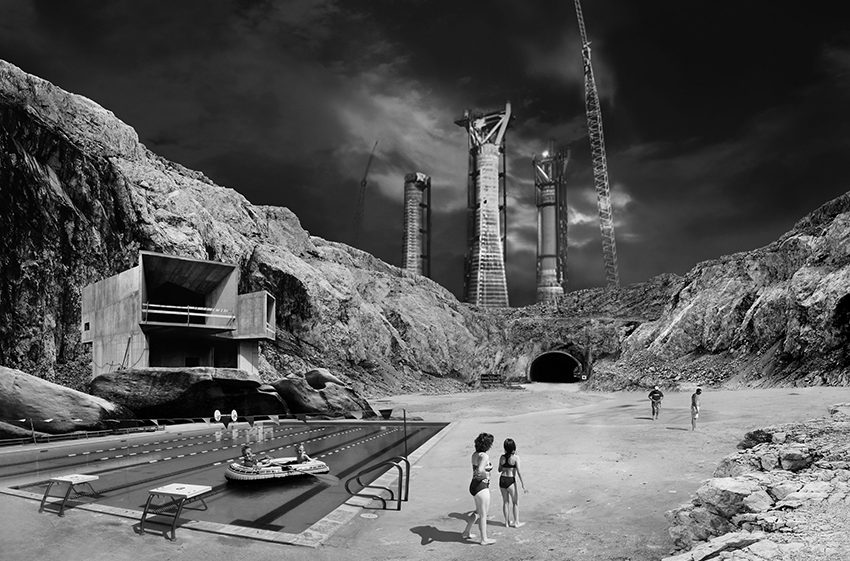
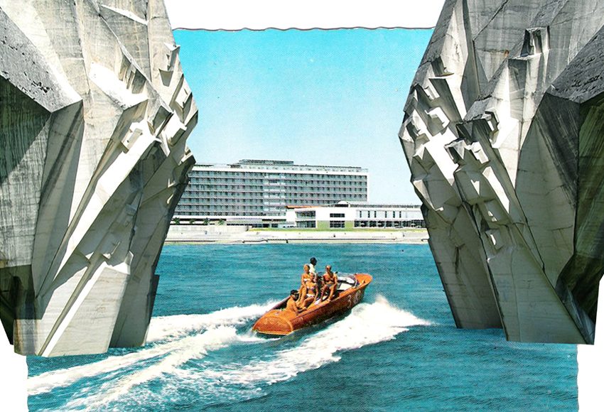
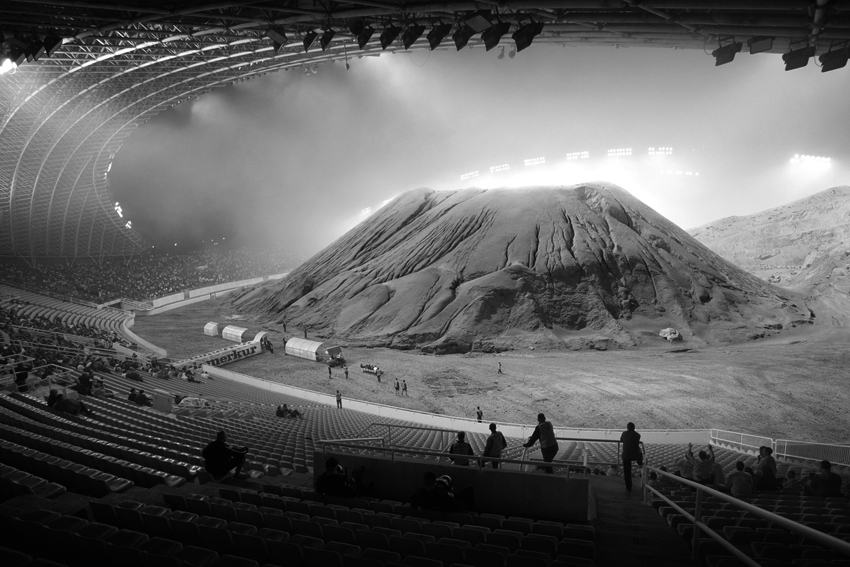
The second Photoshop task that we have been set is to create a collage by using different image layers to create a whole new image. There are countless artists who have done this but the one that we looked at was Tanja Deman. Her images are collections of several different images, compiled together to form these surrealist images of out of this world scenes. Some of Her photos are black and white and this adds to the sense of mystery and intrigue in these images. High contrast allows the images to be easily seen, the different elements are easily identifiable which is important for these images, all of the different layers have been placed there for a reason and so Deman wants to make sure that they are very visible and identifiable. Her images are a mix between the look of a perfectly Photoshopped image with perfect blending or looking more like a collage made by hand. For these ones colour is used, they are often bright which really makes them stand out and catch the eye of the viewer.

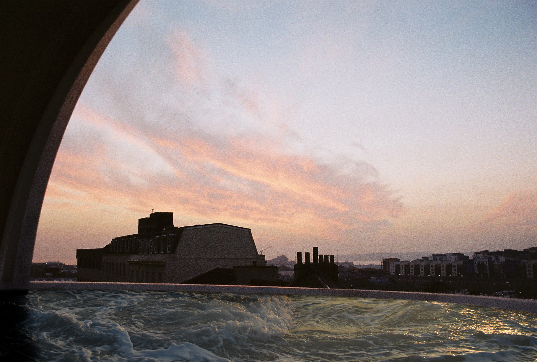
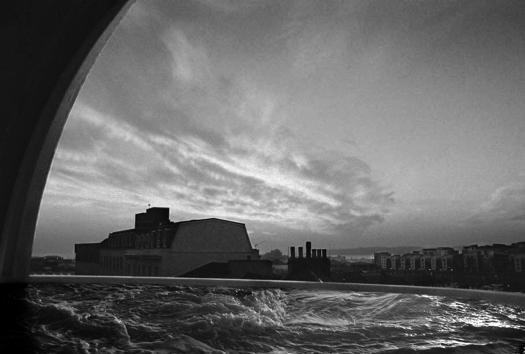
My own interpretation of this image was a very simple one to test my own skills if nothing else. I decided to start with an image that I had taken of the same window that I used for my previous photoshop task (this photo was also 35mm film). And attempted to layer a photo some water over the flat glass of the window to make it look like a small pool inside of a window.
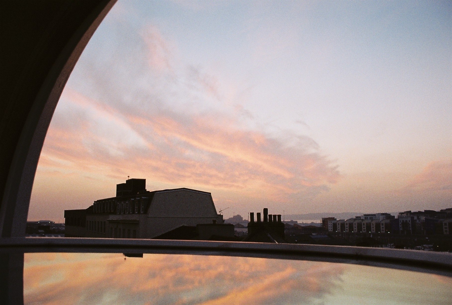
Original Image

The first attempt that I made at creating this is shown below, the photograph of the sea is shown below, I just used simple layer masking to add the  water into the image and then changed the opacity to allow some of the colours from the sunset to pronounce through. This worked but not very well, the waves don’t fit very well into the scene, there was a shadow from the building that ended up on the waves. Because  of this I am going to attempt another version of this, using the same base and layer image
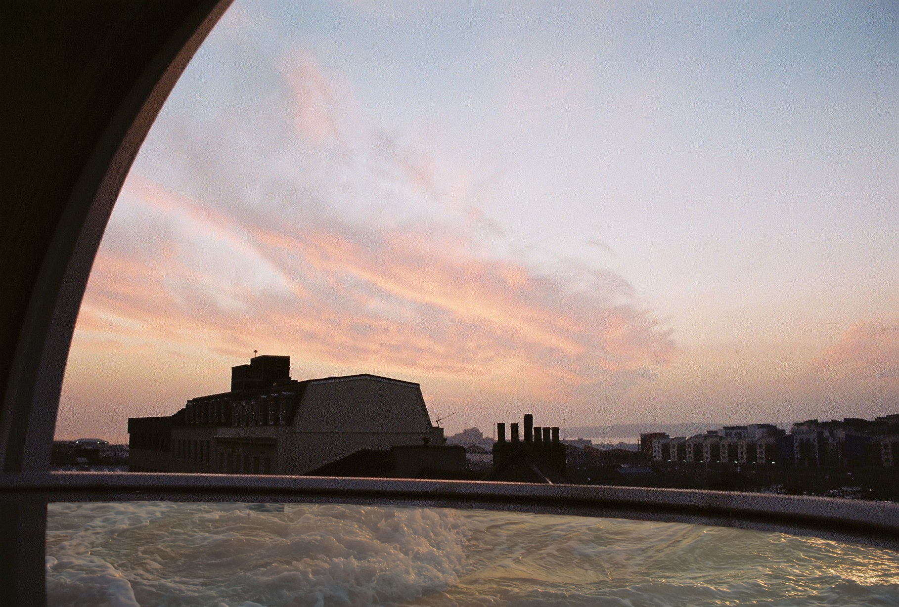
First Attempt

My next experiment in this task was made slightly differently, I raised the edge of the water to remove the black layer, I also tried to make it a smoother transition. I also chose not to fade through the reflection colour, leaving it as it naturally was, as there was already a tint to the water. I prefer this because the water look more like it is three dimensional, this was made more obvious by me using a different part of the underlying image with more going on in it. The shadow on the bottom left of the image was put in my me using the burn tool, it just added more of a frame to the image, and follows along with the shape of the window. This is one feature of the  final photograph that I really like despite how small of a feature it is, it just adds some blending to the waves to help them link into the rest of the photograph. My favourite final image is definitely the black and white one though. I decided to try wit the black and white image because it is one of the methods that Deman uses for her images.  I also added additional contrast layer masks to the image to bring out the sky, buildings and water separately. This really helped to make the sky stand out a lot as it has these impressive streaks from the clouds through it that are accentuated by the grain of the film.
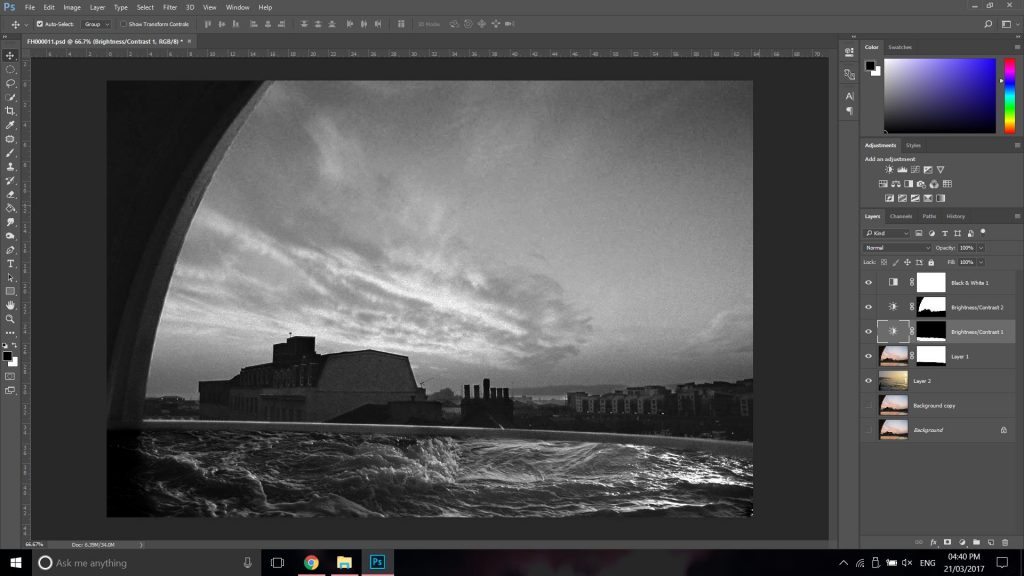
This screenshot above shows the set up at the end of the process, you can see on the right-hand side the different layers that I had on for this photograph.  It was a relatively simple set up but worked very well in the end for the final result. I do like this collage method and the slightly abstract nature of the photographs that it produces.

Photoshoot 1 further experimentation

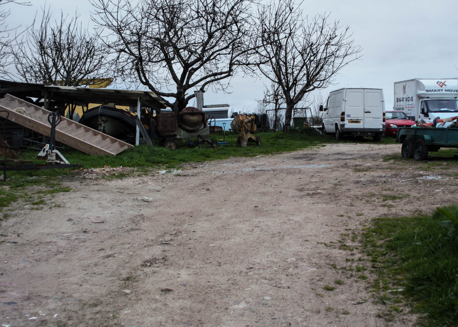
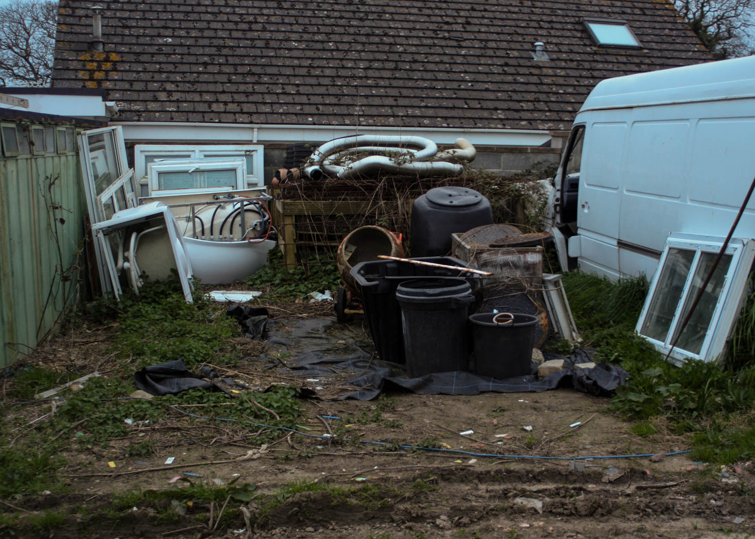
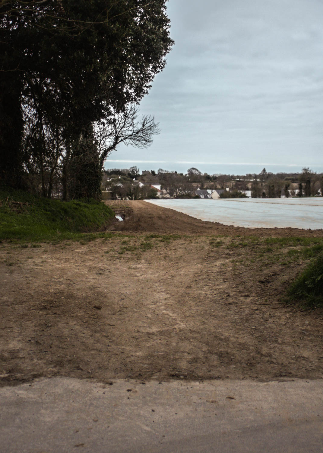
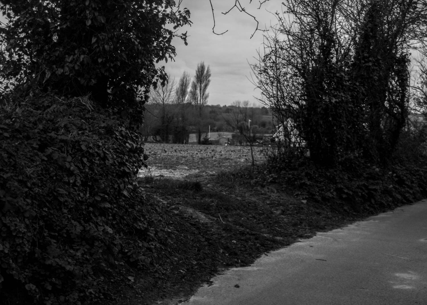
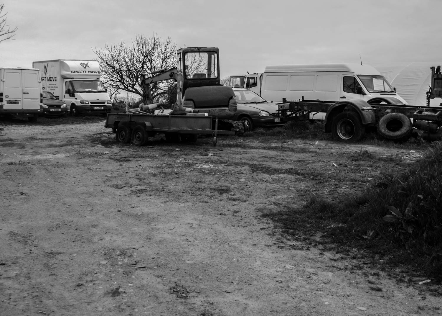
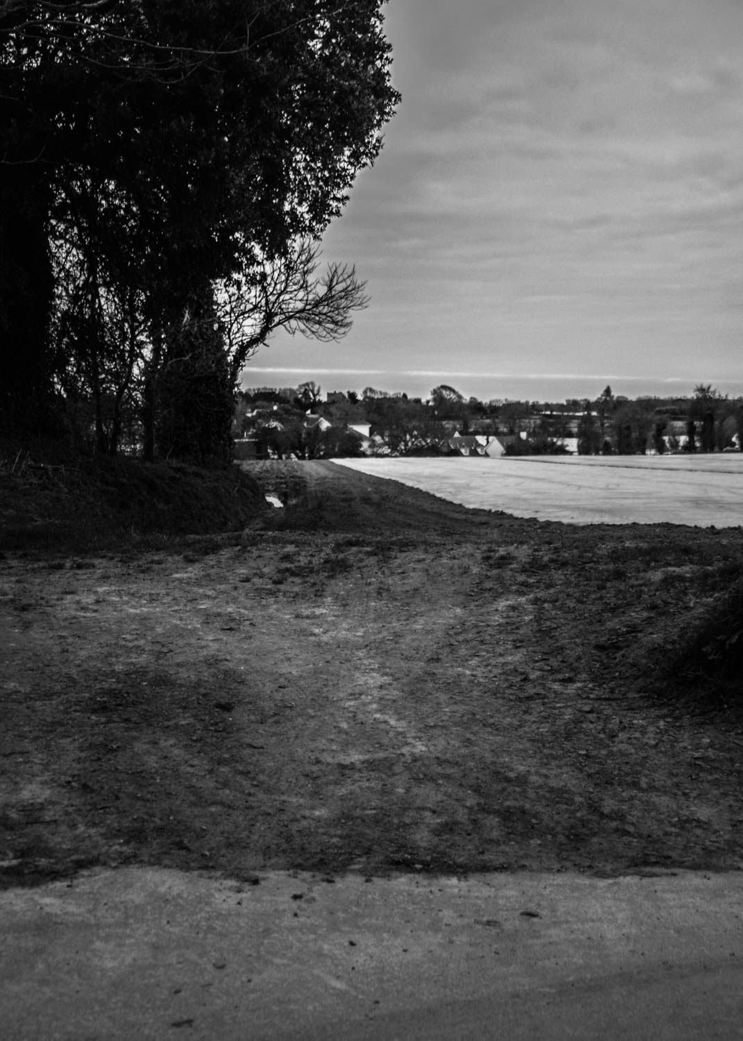
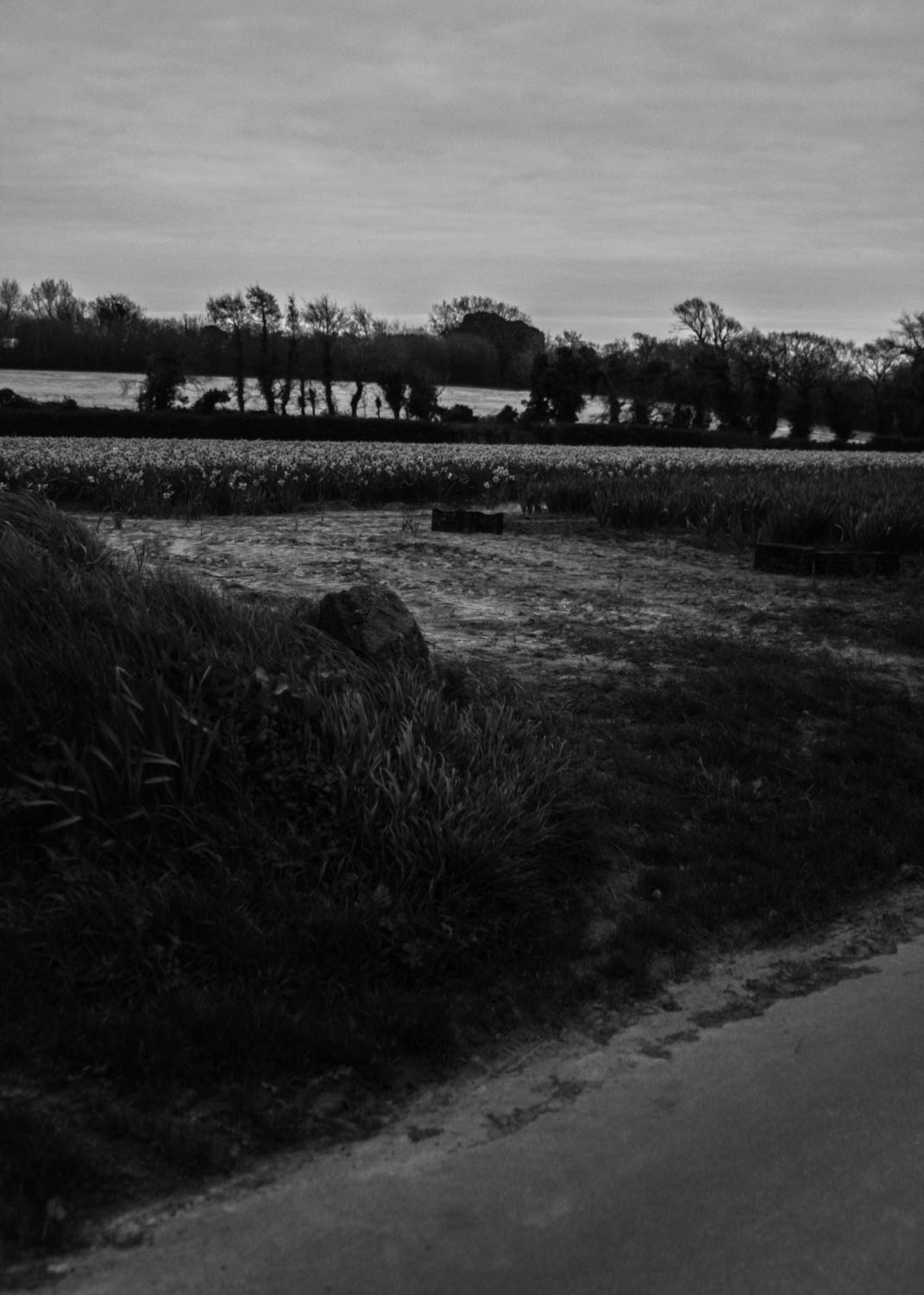
After looking more closely at the work of Richard Misrach I wanted to change the ratio of my images into something more square so I picked 5×7. I wanted to make all of them the same ratio to give them more continuity as a large series. I also feel this worked for the photographs composition. In the original edits I wanted to bring down the highlight levels which gave the shy a darker appearance, I did this to add depth and make the photographs appear more realistic as the light grey overcast sky made the photograph appear more flat, darkening gave them more life. Looking back on many of these I have made them too dark and over saturated, making them look unnatural, I increased the highlight levels in the sky and decreased the saturation levels to make them more natural.
I also made black and white images. I made the images dark to give a sense of what the light was like during the time. This gives them a whole new eerie sense of ambiance. This also leaves more emphasis on the variety of textures created in the land such as the tire tracks in the mud as well as the overcast sky. This also gave the photographs a new sense of life as the images appeared flattened by the darker overcast sky. This gives the photographs more of a narrative with the dark tones.

Analogue

// 35 M M //

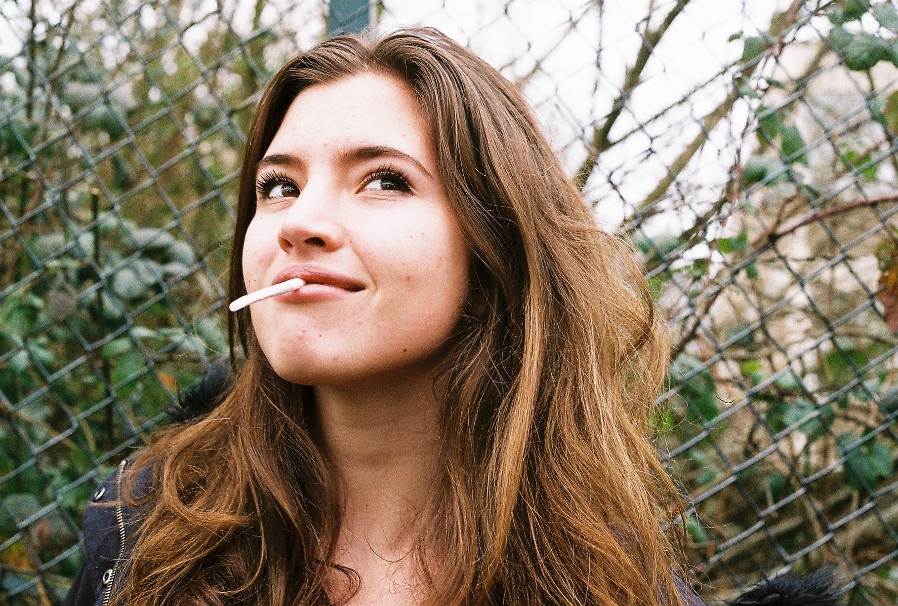
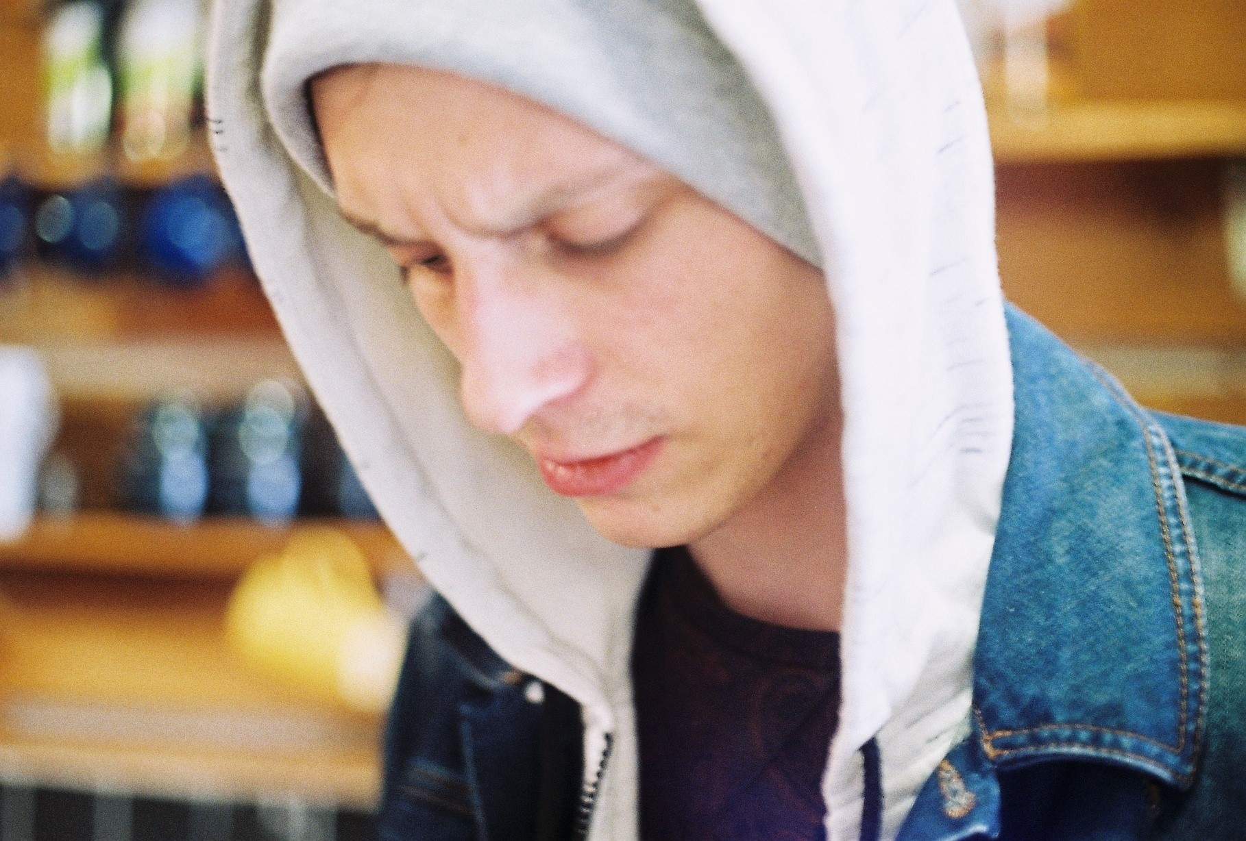
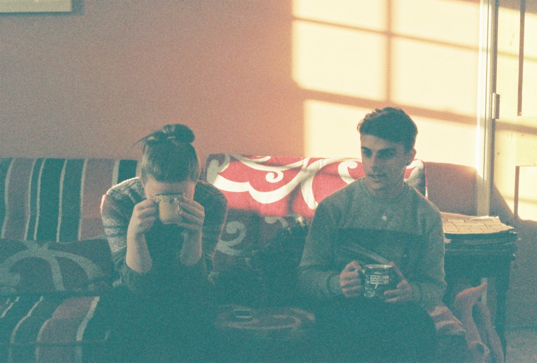
Film photography is an area I have been experimenting with for a while now and I am keen to make use of my own film cameras within this project. Producing perhaps a mixture of digital and analogue images for the final presentation. After purchasing a Moonasi design La Sardina camera just over two years ago now, I began my ongoing obsession with film and the cinematic qualities of analogue images. This first camera was relatively simple in design and in terms of manual control options were fairly limited. While the lack of options initially proved frustrating, the simplicity came to be something I loved. Once I had accepted that my focus would never be quite right (with no preview available) and that any hope of shutter speed had fallen away, I focused on the things I could enjoy about the camera. In reality, without having to worry about excessive controls, framing became much more important to me. The grainy texture is something I have fallen head over heals for and light leaks are an area I am interested to explore.
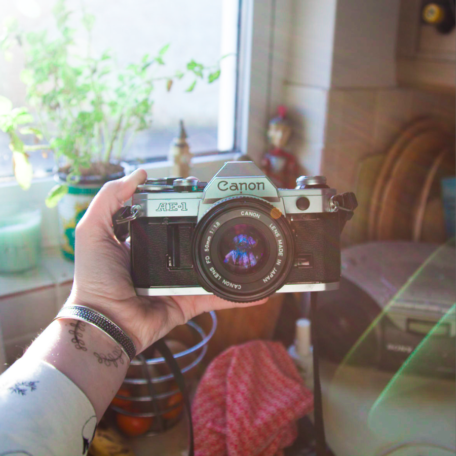
Following my love of the La Sardina camera, I purchased a Canon AE-1 which after a little fixing has produced some interesting shots. This time I made sure to check for fully manual controls ensuring I could practice using every feature available. The control on this camera is truly fantastic, once setting the ISO to match that of the film (I typically use ISO 200) the aperture, focus and shutter speed can be adjusted accordingly. The focus is controlled visually in some respects with a split image being lined up in the middle of the viewfinder to show the focal distance.

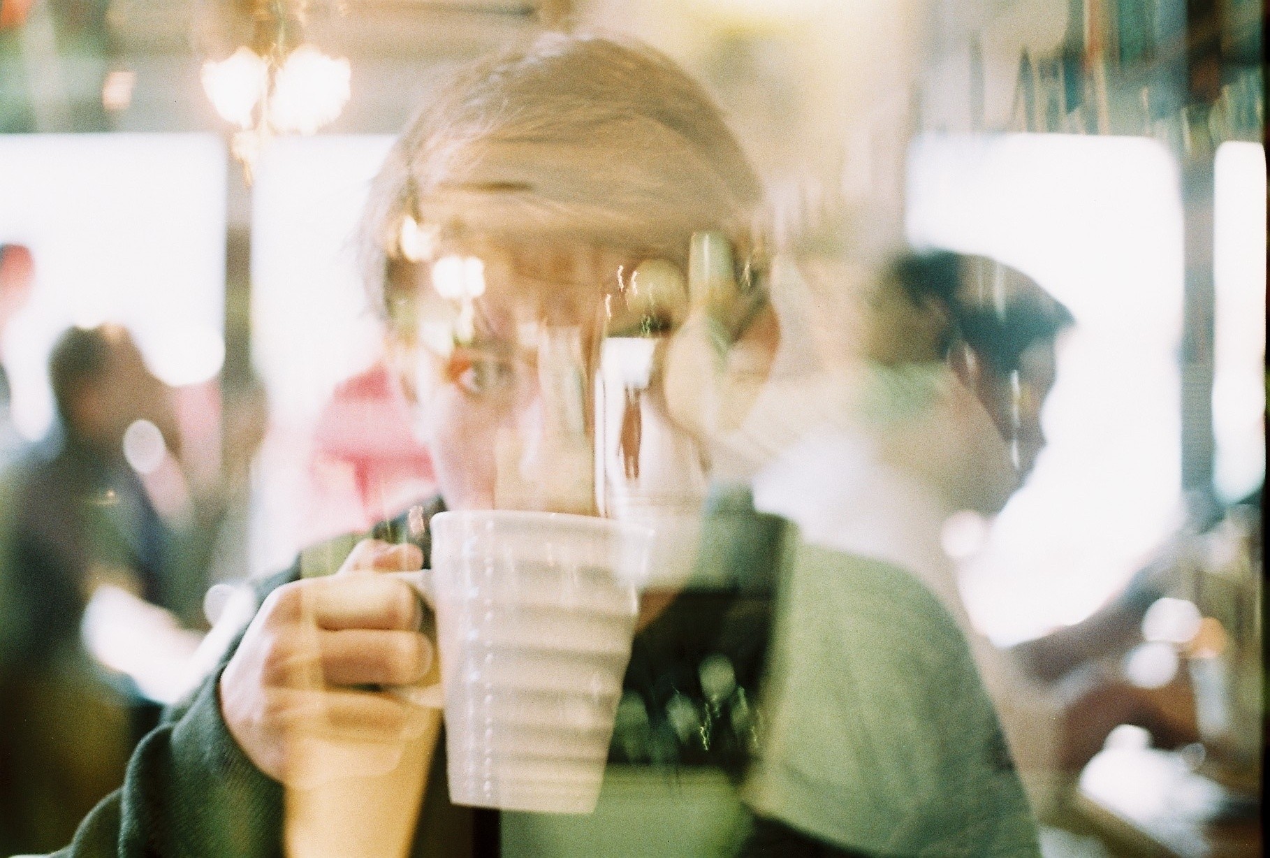
With these two cameras available for me to use, plus my digital Canon 5D mark II, I think it could be interesting to create a project which uses images from the different methods of photography. Looking at the research I have already completed for this project – on double exposures and ‘Talking to the Ants’ – there are some clear directions I would like to now follow. Below is a double exposure of my brother shot on the AE-1 as an experiment to see how the process worked on this camera.

Fynn ft. Ollie making coffee

The project ‘Talking to the Ants’ has inspired me to try out a series of natural portraits and perhaps make use of Stephan Gill’s unusual abstract techniques (such as creating compositions inside the lens). His method involves collecting things found at each site and placing them inside the camera lens. This is not something I am keen to do with my Canon AE-1 however my La Sardina camera is a little more hard wearing and could be more suitable. Ideally, I think I would like to focus this project on something relevant to my age group right now. After speaking to my tutors, the idea we seem to have focused on is a set of stylised portraits about leaving home. One thought on this is to make a set of images reflecting the fear and anxieties behind this process of moving away. I will explore this more in a project blog post as I’ve become a little side tracked from the intiial point here. So yes – film photography. Wonderful way to stay poor. 

Practice Shoot

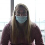
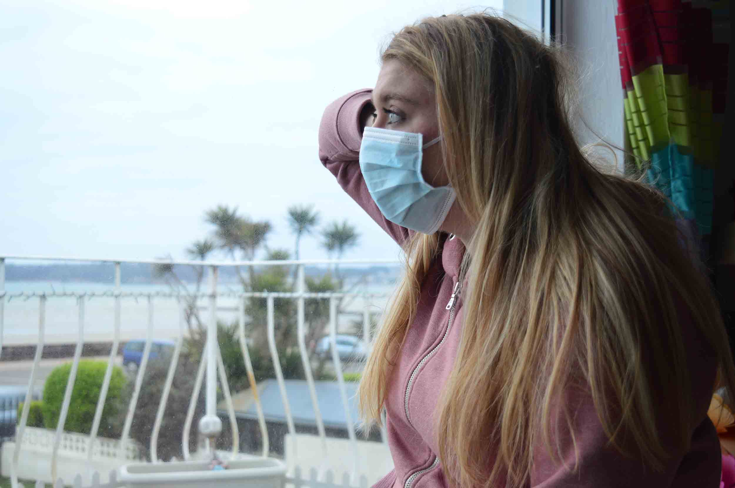
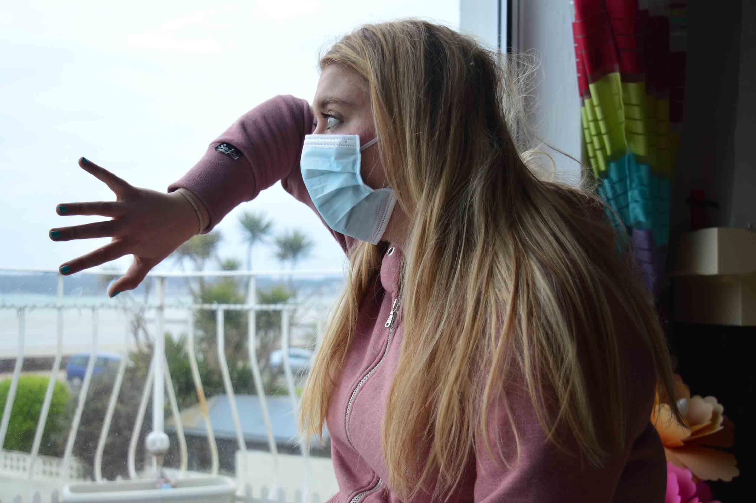
My exam is based on the high levels of pollution in China in which on a daily basis, have to wear mouth masks to help filter the toxic air. I have taken this to the extreme in which i will be creating multiple sequences of photos which the first photo will be my model happy in a beautiful environment, the second photo will be my model wearing a mouth mask and the third will be my model wearing a gas mask in a beautiful environment. The photos will slowly get darker and the last image will be a dark black and white photo to create drama.

I did a specification for my shoot previously in which i stated that i will do this shoot on Victoria Avenue beach and People’s Park. However due to weather conditions i was unable to do so which is why i did a practice shoot indoors using all the equipment necessary. I took some photos free hand, using a tripod and i used a timer due to the slow shutter speed i was using for most of my images.

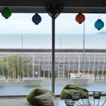
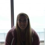
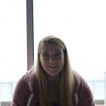
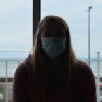
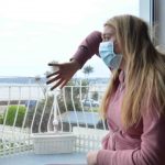
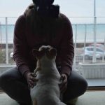
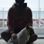
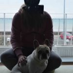
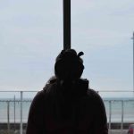
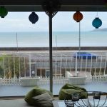
This shoot was mainly for me to practice with Aperture and Shutter speed as i am not very skilled with them. I chose to photograph against the light as it is more difficult so required work with Aperture and shutter speed. Also i could not photograph in any other place as i had furniture and it is dark in the rest of my house so i was limited to what i could do. However, i do understand that they are not well composed and i will not be using these in my project, they were simply for me to get to grips with photographing with the mouth mask and gas mask. The pole in the middle of the window was difficult to work around but i was not concentrating this as i wanted to create a sharp and crisp image before i start thinking about composition.

All of these images are experimentation as i have many of the same image so that i could see what it would look like with different apertures and shutter speeds. This is also why i practiced using a tripod and self-timer.

These are the beginning images of my experimentation:

As you can clearly see, i was experimenting with aperture and shutter speed to see what i would need to do. This is also when i started using a Tripod because i was reducing the shutter speed and need to keep the camera still and level. I did this so that when i am outside, i will not spend a long time setting up as i now understand aperture and shutter.

Mouth Mask experiments:

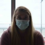
As you can see, i was experimenting with both aperture and shutter speed as i was still using a tripod. I wanted to understand how they both worked so that my model did not have to spend very long in this mask as it is not the most comfortable thing to wear and it does restrict breathing slightly. So i had a limited amount of time as the light was fading and i did not want her to be in the mask for a long period of time. After this series of experiments, i will be able to set up my camera with the correct settings for a sharp and crisp image for my official shoots on Friday 24th March. I also tried adjusting the ISO but this made the image much darker so i left it on 100.

Experiments with self-timer:

Many of these photos are blurry as i could not get the self-timer to get a focused image but the last three in this gallery are clear and they are sharp and vivid which is what i want when i go to my official shoots later in the week and next week.

The Sharp Photos:

Gas Mask experimentation:

With the gas mask, i have a maximum of 20 minutes otherwise there is a risk my model could faint due to lack of oxygen. This is why i did not do these very well as i was rushing as i did not want to put her safety at risk also it is uncomfortable to wear. The light was fading at this point and i could not get the aperture right but this allowed me to understand that if the light is dark, then the mask will be very difficult to work with, but this means that i know to photograph the gas mask first if the light is fading. I understand that it did not help that the light was behind her but it has helped me learn what not to do when doing these portraits. During these i was still using the tripod and self-timer which is why many of them are blurry and it did not help that my dog kept moving and entering the picture.

Summary:
  • I have learnt how aperture and shutter speed work and i am much better at setting up quickly
  • I understand that the light must not be behind the model as it makes a silhouette
  • I now know i will be using a tripod and most likely a self-timer to take the images
  • I cannot photograph the gas mask in fading light as it makes her eyes much darker and almost invisible
  • The mouth mask is easiest to photograph and i will have to find more interesting poses for the model when she is not wearing any sort of mask,


Experiment with Photoshop

Idris Khan: http://www.saatchigallery.com/artists/idris_khan.htm

It is hard to avoid the aspect of time when producing what ones sees as o photograph… my images are something that is not a frozen moment, but an image made up of many moments and that is created over time rather than taken.

He is a British artist who is based in London. His works draws from a diverse range of cultural sources such as art, music and history and he creates densely layered imagery. His work is both abstract, figurative and addresses narratives of history, cumulative experience and metaphysical collapse of time into single moments.

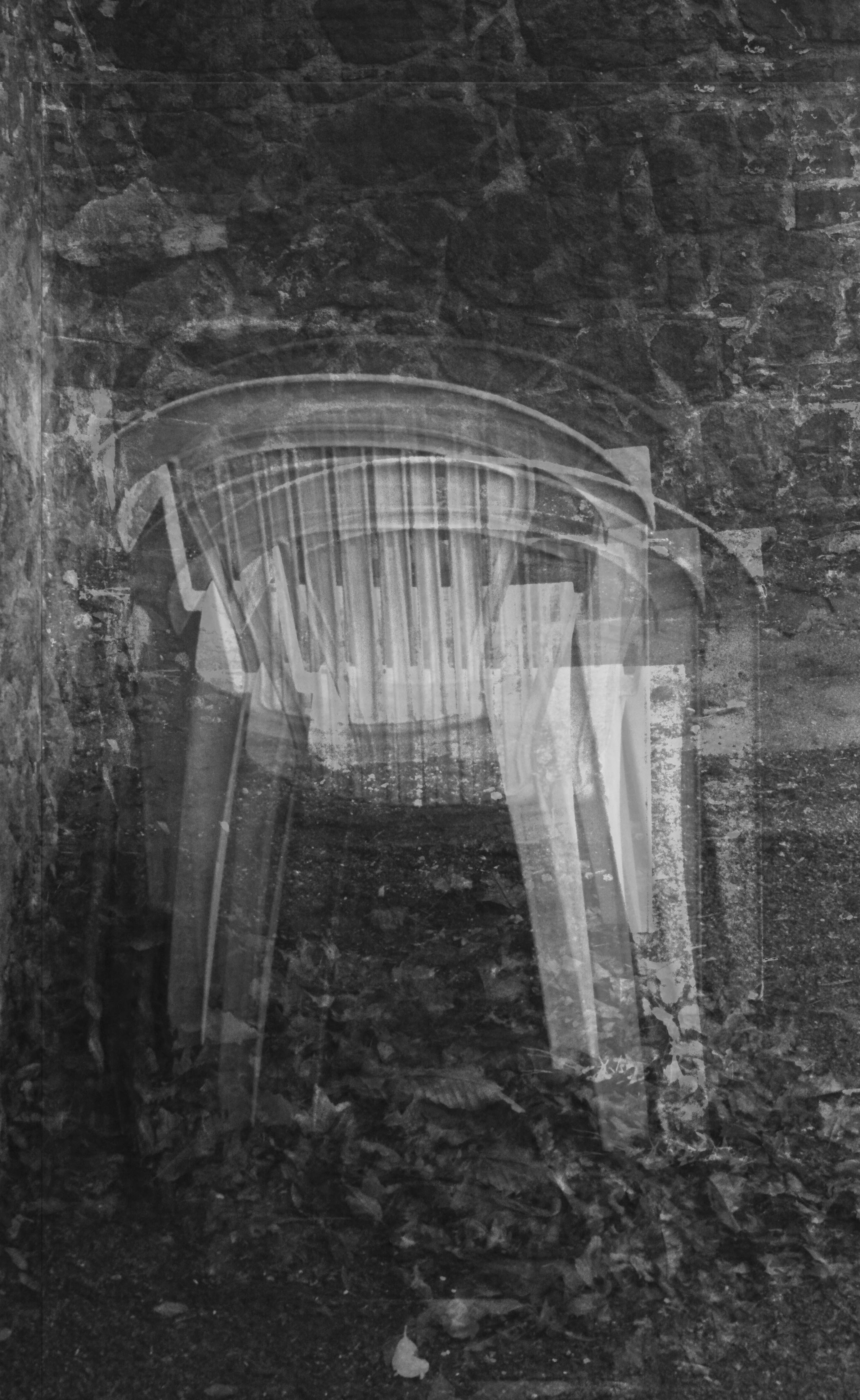
I have done an experiment to replicate his work using images from my previous project for A2. I chose a simple image of a chair and layered it 10 times and blended the image as well. It is not as densely packed as Idris Khan’s work however it is what an image of his would look like before completion.


Tanja Deman: http://www.tanja-deman.com/

She is a Croatian artist, her work is inspired by her interest in the perception of space, physical and emotional connection to a place and her relationship to nature.

She works by incorporating photography, collage, video and public art to create evocative meditations on urban space and landscape.

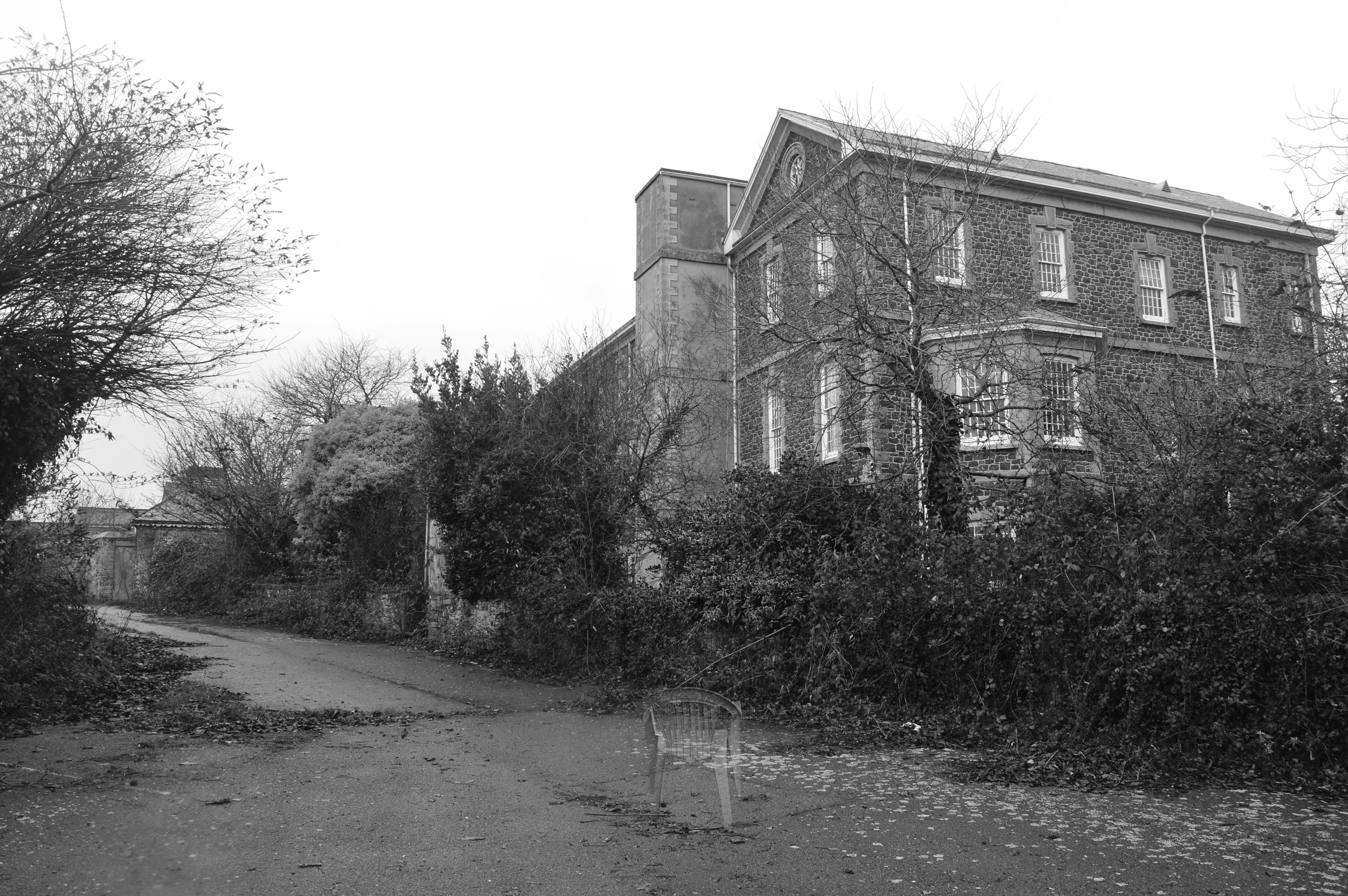
I have done an experiment using inspiration from Tanja Deman who photo shops different environments together. My experiment was based on the photos from my personal study on the Jersey Lunatic Asylum. I used a photo of the back of the building and a photo of a single chair.  I did this using layers, blending and the paint tool, i also adjusted the opacity to make it seem like a ghost chair.


1st Photo Shoot (Planning)

Planning First Photo Shoot


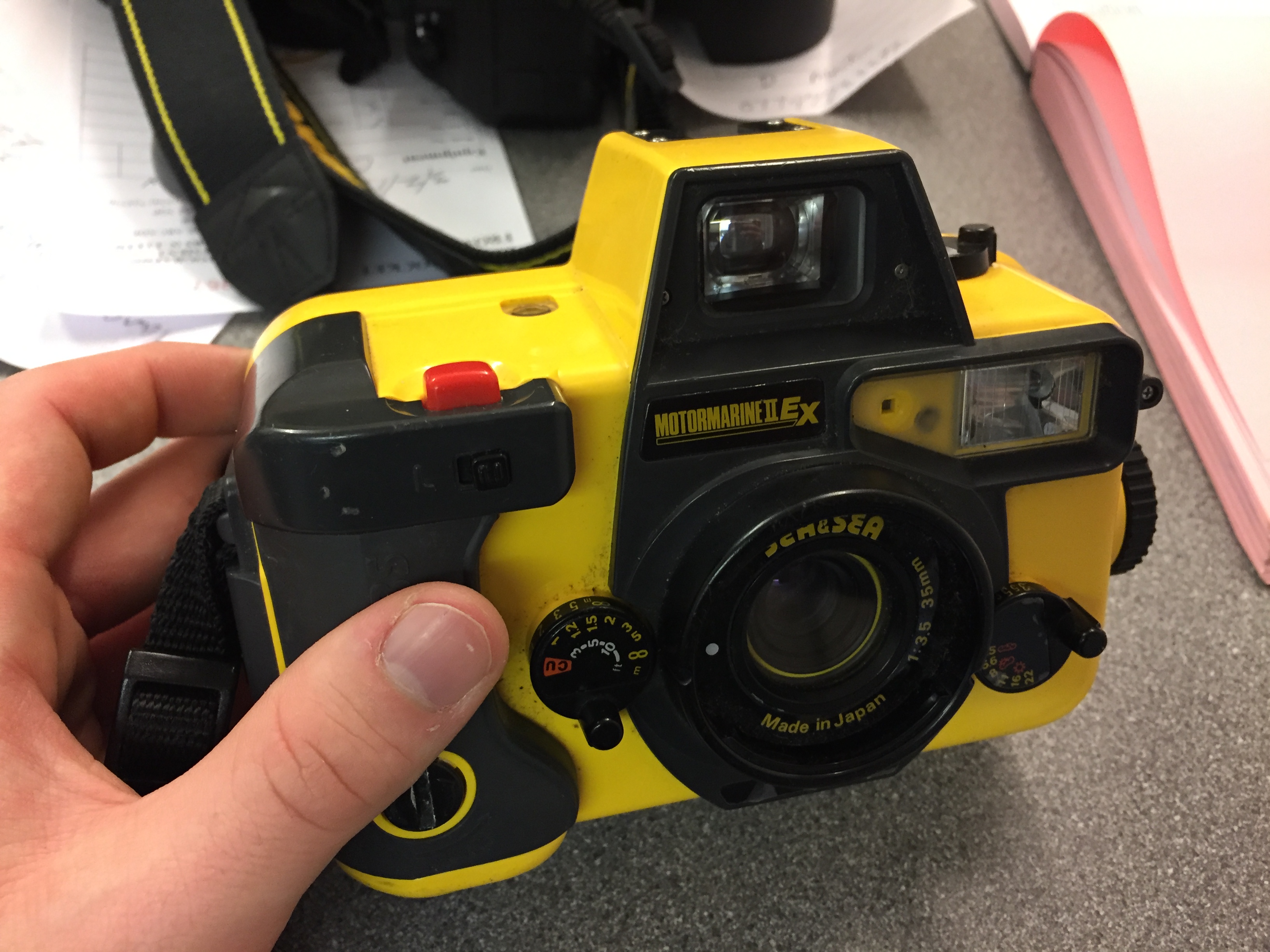
My first photoshoot will be a simple one to start off with, based simply on environmental portraits. On Saturday I am planning to meet my friend Jacob Smith, an accomplished surfer and free diver, at the beach so that I can take photos of him in his environment. I was originally planning on taking photos of him in the water as he is surfing but this weekend the winds will be too high for him to be able to surf. We may instead be able to try some free diving but I am not sure how this will turn out in underwater photographs because I am not confident with underwater photography. For on land photographs I will be using my Nikon D5200 but as this is not waterproof so I will not be taking it into the water with me. Instead I will be taking my MotorMarine II EX by Sea&Sea.

This is a 35mm film camera that I got for free and had repaired. I have had very little experience with using this camera but I have shot film before so I know what to expect from the limitations of film. Even if all of the photographs that I take with this camera turn out bady I should still have photographs that I will take back on land with my digital camera to use. In the water I am planning to be using ISO 400 film or ISO 200 depending on the lighting that day. If it is overcast or there is not direct sunlight then I will use the 400 but if there is direct sunlight then I will use the 200. For the photos above the water/on dry land I will be trying to emulate the work of Anthony Kurtz that I looked at for my environmental portraiture moodboard. His photographs are not overly set up like Bielaski and Sander’s work, the more natural feel to them is a method that I prefer. However for the photographs just above the water’s surface then I will be trying to emulate the work of Brooks Sterling. He  is a lifestyle photographer and art director living in southern California. His work is mostly centered around surfer/skater culture in Southern California and he uses a mix of film and digital. I spoke to him recently and he gave me some tips for shooting in the surf like this so hopefully I will be able to get some nice photos. Link to his website and Instagram.

As a backup for this, I am also planning to go out with some of my other friends into some environments that they are not used to. This will give me a chance to photograph people discovering new environments which is often hard to do in Jersey because it is so small. But we have previously found somewhere that we did not know existed and are going to be going back there to have a proper look around. It is in St. Aubins and is near to the beach, on the south coast like this the lighting should be very good and as I have no idea what the place looks like myself the photos will be a reaction of me experiencing this new environment too.

Photoshop Experiment and Response to Idris Kahn amd Stephanie Jung

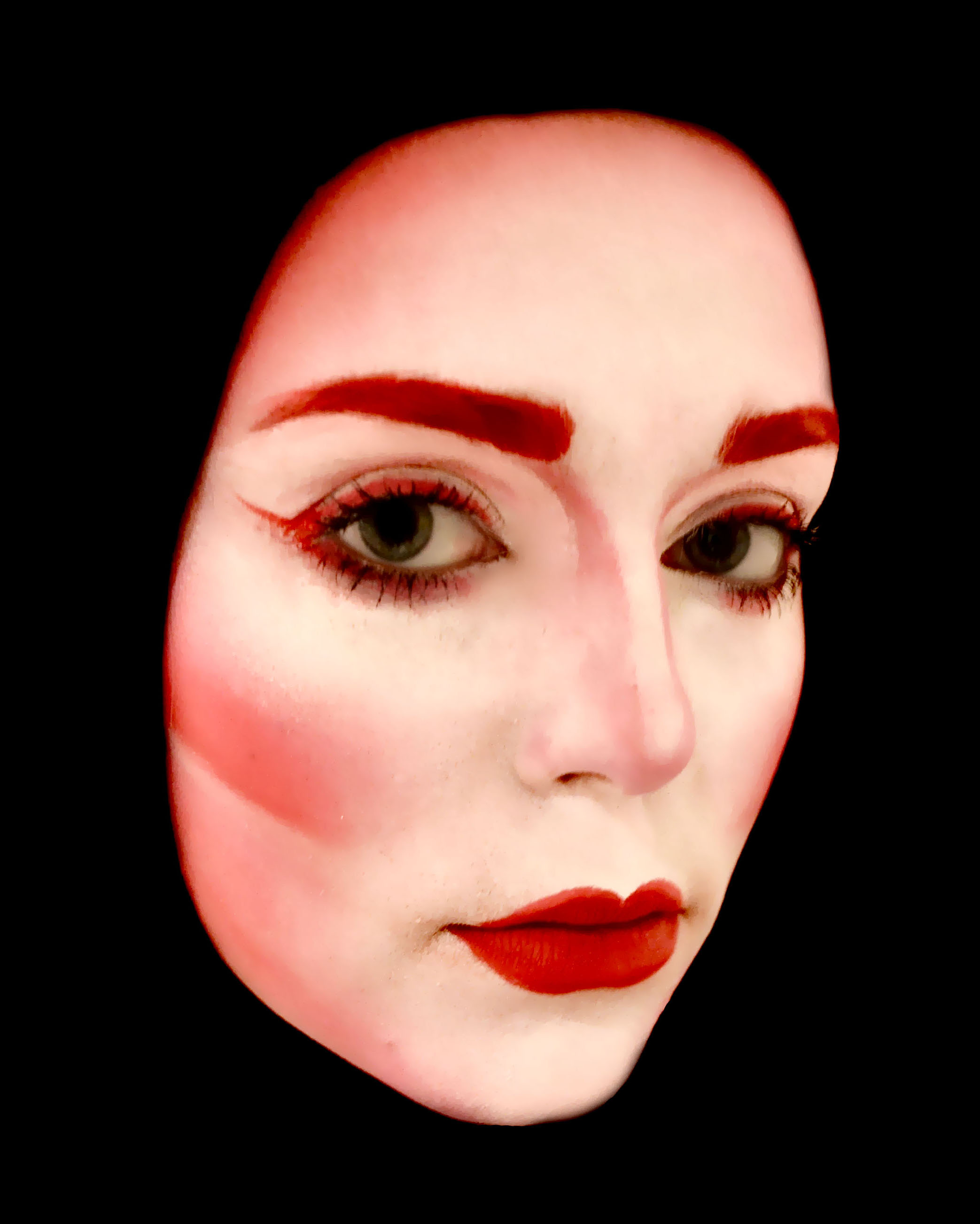
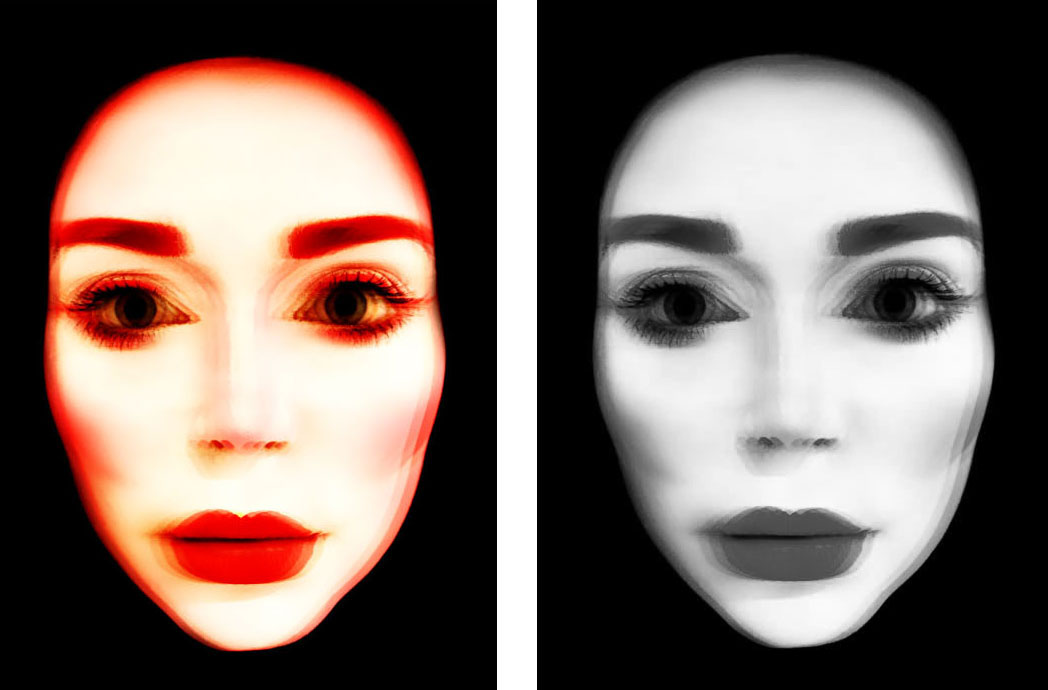
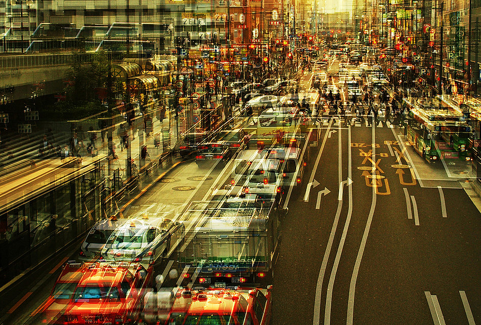
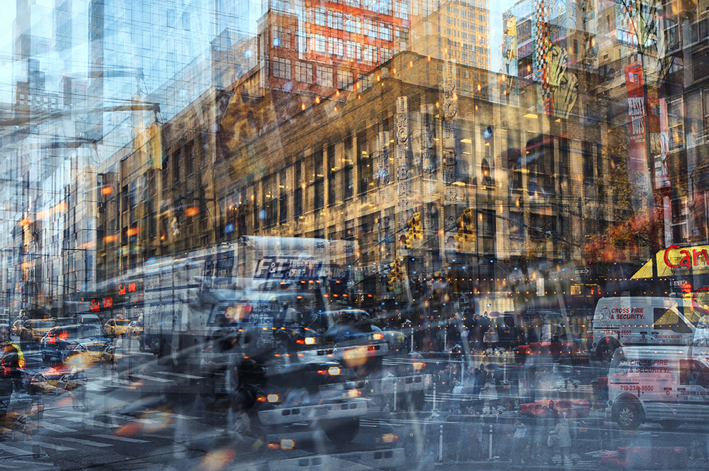
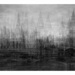
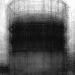
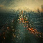
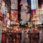
I was given a task to create manipulate and image using Photoshop while taking inspiration from the work of Idris Kahn (Image above on left) and Stephanie Jung (Image above on right) These images are created using Photoshop or a similar photo editing software where the same image is duplicated an layered on top of its self multiple times to create a dream like sense of movement and fluidity.

ORIGINAL IMAGES 

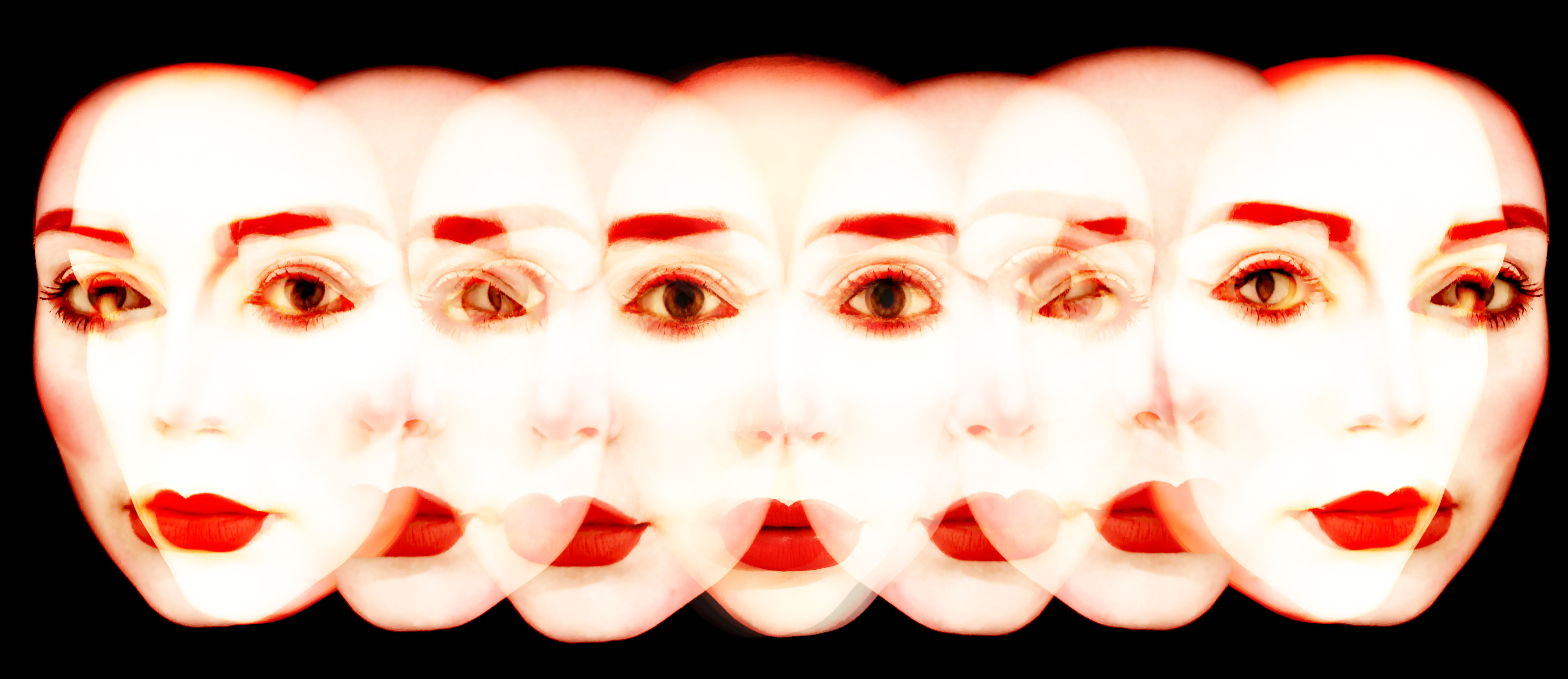
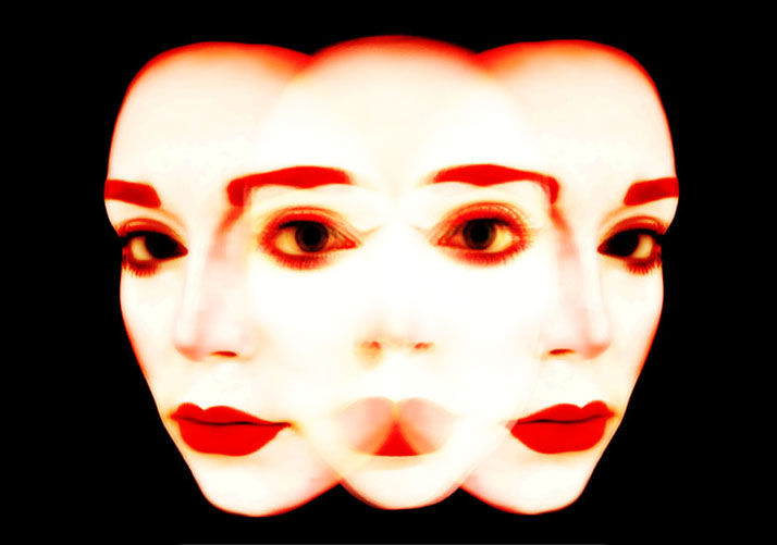
Above are the original images that I used during this experiment. These were final images for my AS exam last year and were previously presented as as series of 5 images with the second 2 image flipped on the other side to create a turning effect. For the outcomes of this experiment I used the first image several times to create a single blurred face and the turned heads both in the format above and flipped to created a more developed feel of turning motion.

PROCESSES 

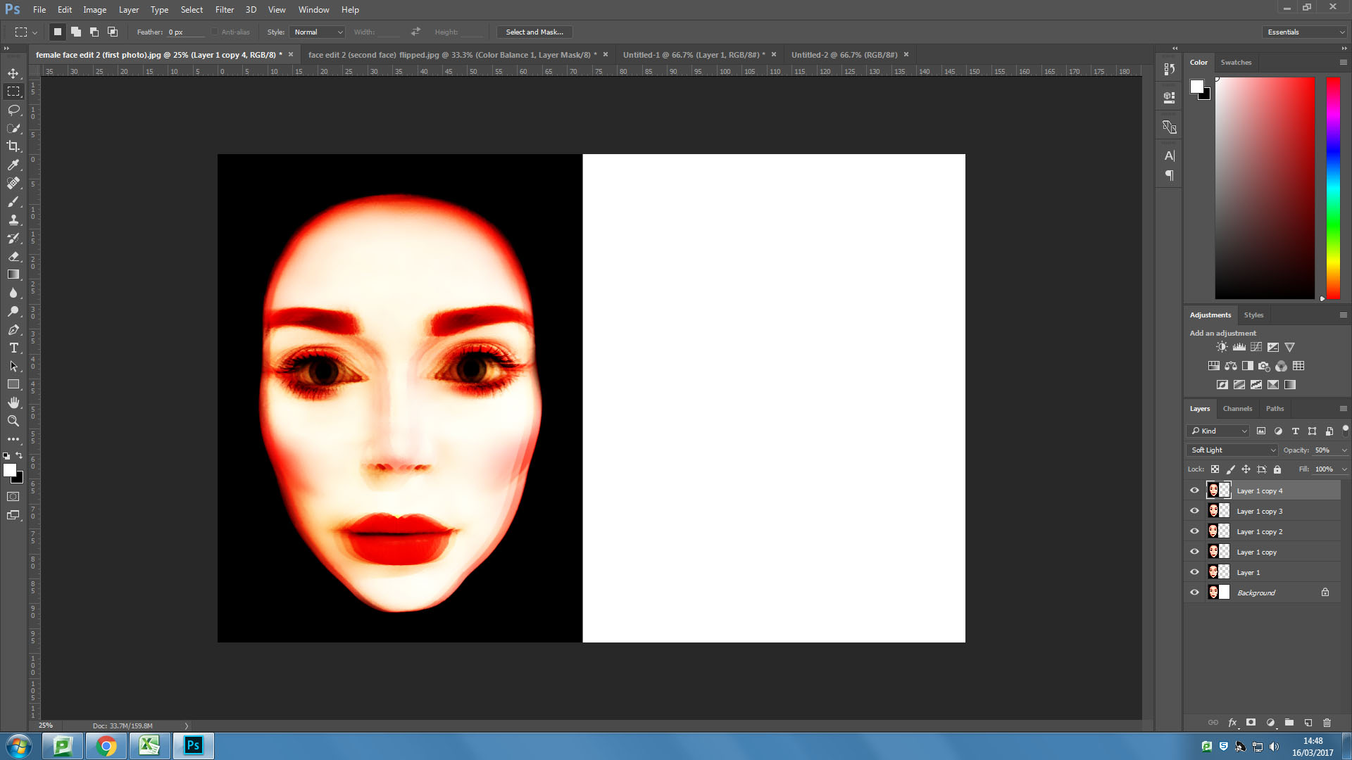
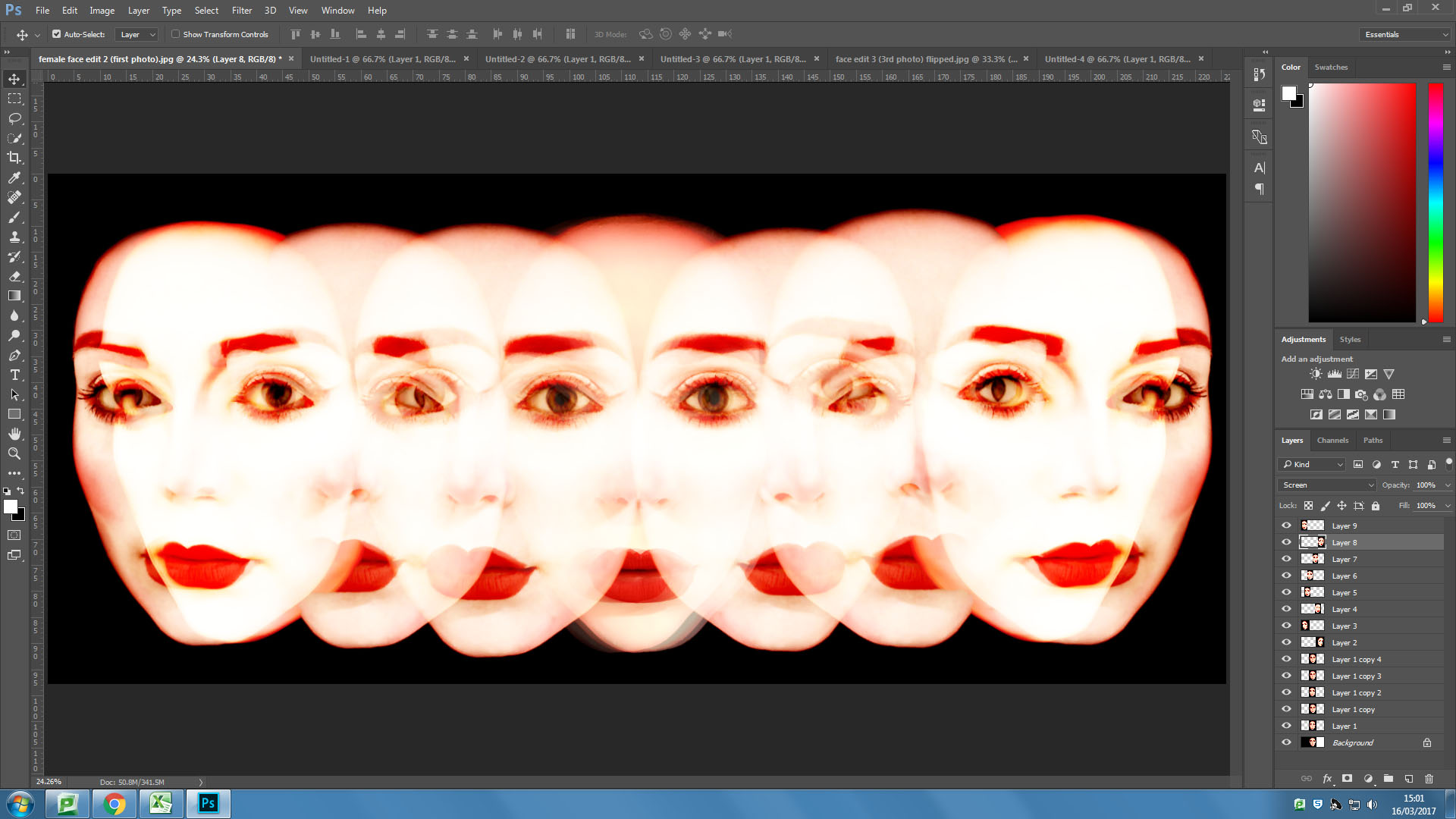
I first overlayed my front facing image six times using the “overlaying” blending filter on Photoshop.

I then tried a similar process with one of the angled faces, this one I overlayed five times, also using the “overlay” blending filter on Photoshop.

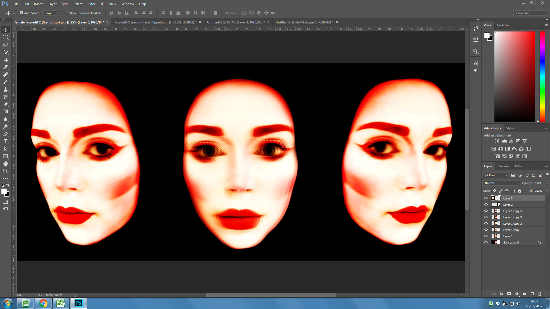
I then pasted the overlayed angled face onto the same background as the front facing face. I then flipped the image and pasted another on the other side of the forward facing face.


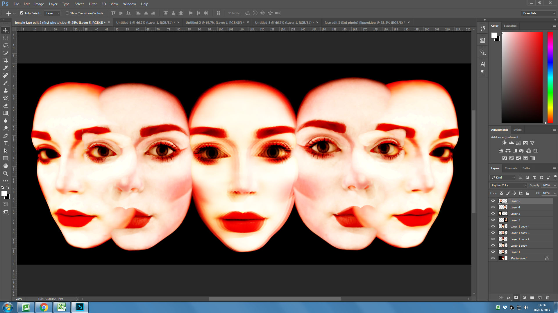
I then took the mid angle face and pasted it in it’s original format and flipped either side of the forward facing face in the centre and blending the additional faces into the image using the “screen” blending filter.

I then added some more faces over the top of the image using the “screen” blending filter and experimenting with the opacity.

OUTCOMES 

An Experiment

// M U L T I P L Y //

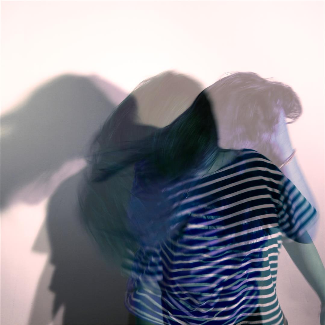
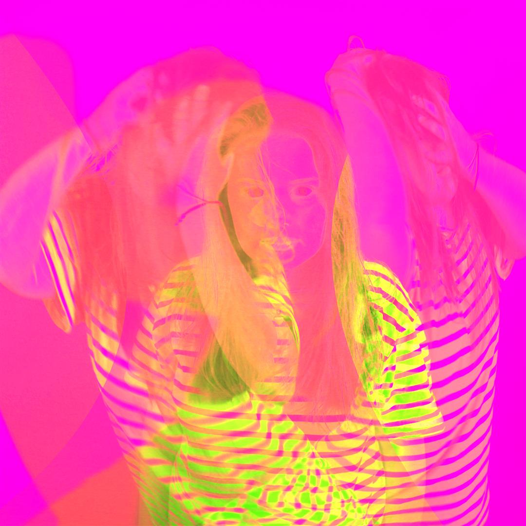
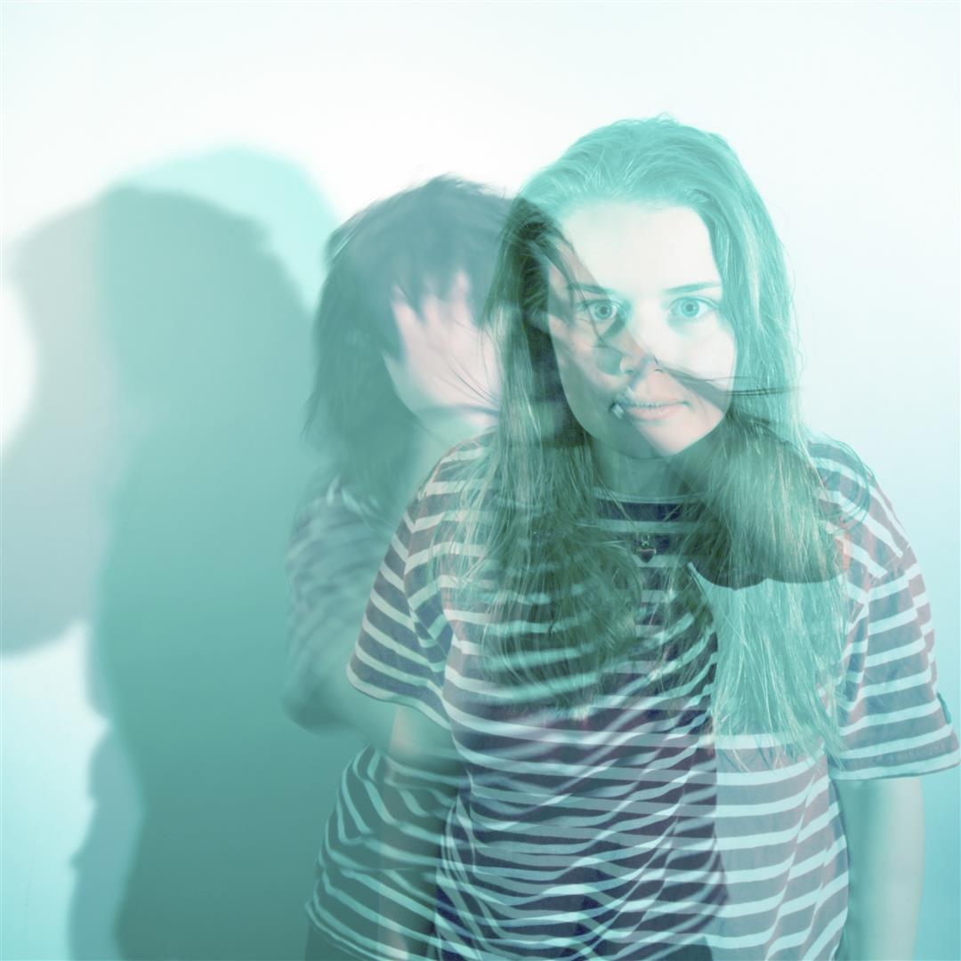
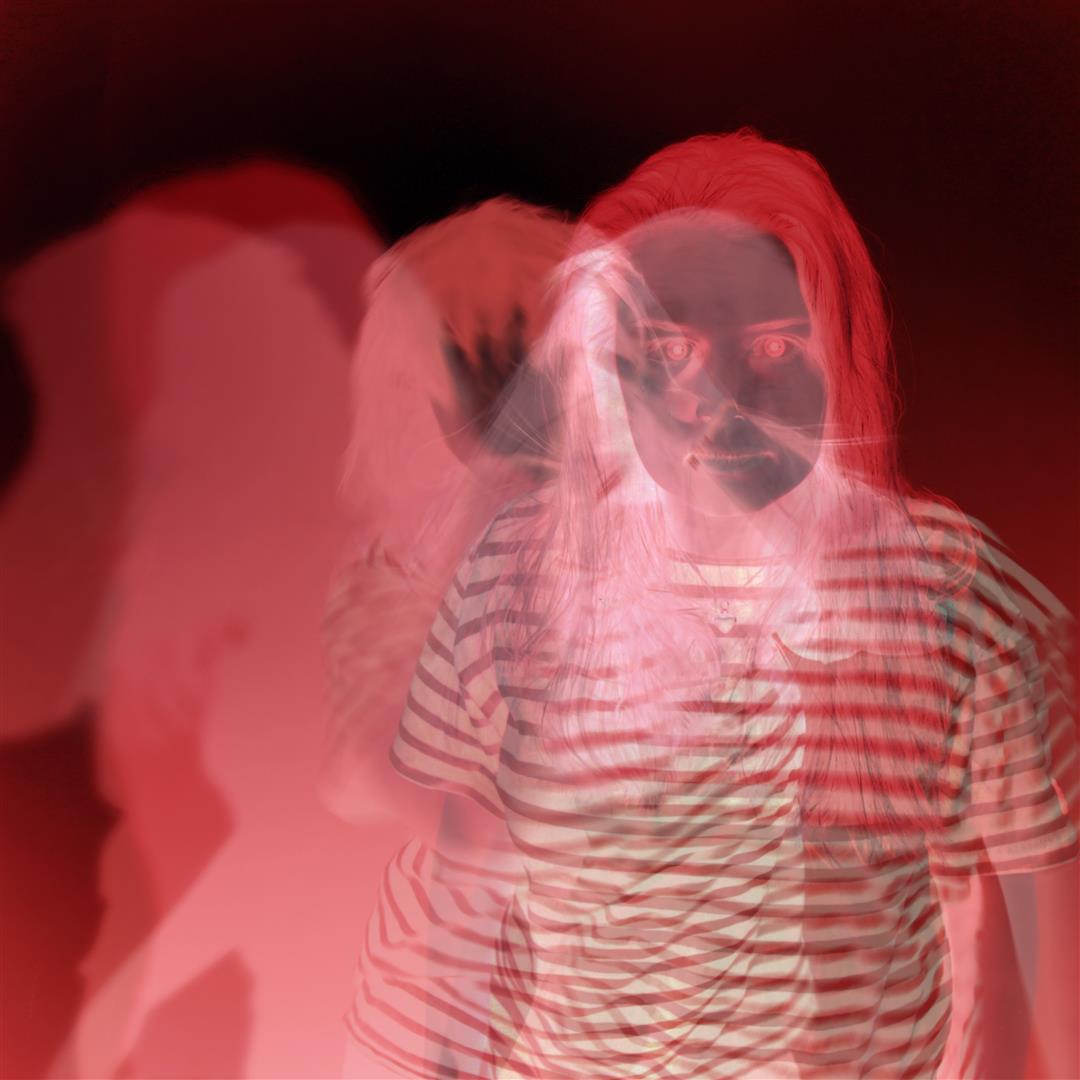
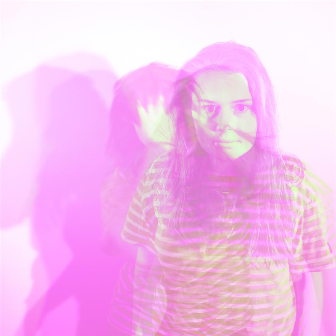
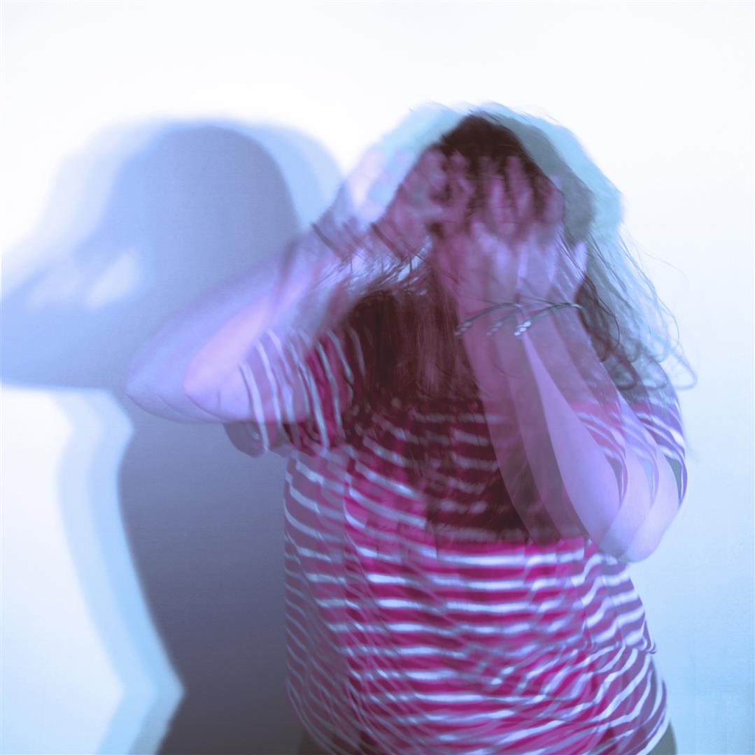
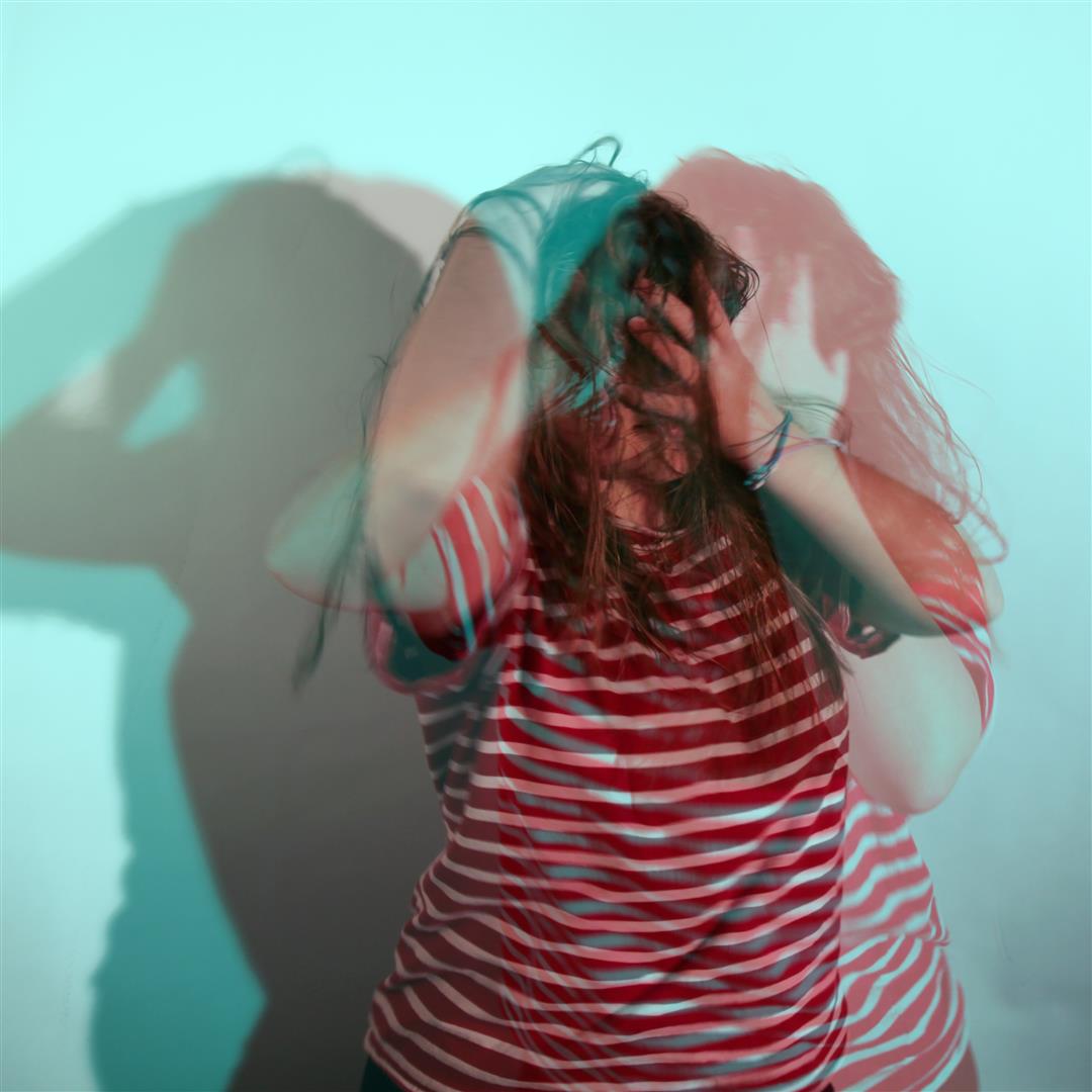
As part of a class photoshop recap session we were asked to create a series of test images to prove our photoshop skills and abilities using original photos from our previous projects and shoots. The point of this was to ensure we were confident using basic abstract editing techniques such as duplicating layers, adjusting opacity settings etc. For my images I also pre edited the images in camera RAW – in particular using the colour curve graphs – to create some more exaggerated results. These link to my previous post, ‘STEREOSCOPIC’, where I mention a potential project looking at stylized portraits which include a 3D editing technique making use of multiple layers and duplication.

The though process behind this was to engage our own projects with abstract artists such as Idris Khan and Stephanie Jung who use layering techniques in their own work. Jung as an example creates ‘double exposure’ style pieces using layered images of cityscapes – mainly New York  – which works well to capture and visualise the sense of pace and movement from the environment.

Now for my own experiments.

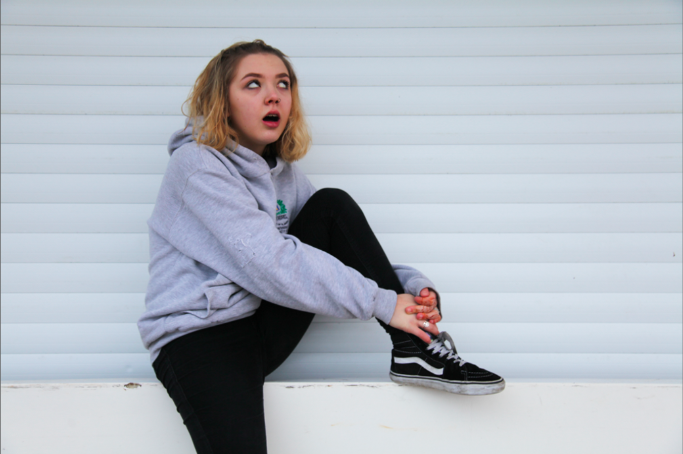
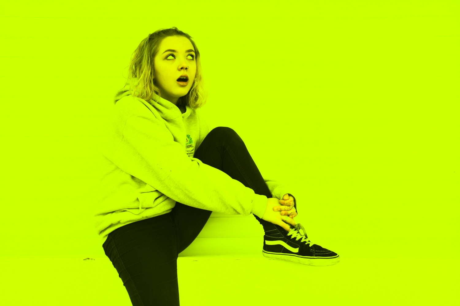
The original image features my friend Hope who tends to pop up in a lot of my previous project work. Here she is looking sarcastic on a wall wearing clothes that probably aren’t hers.

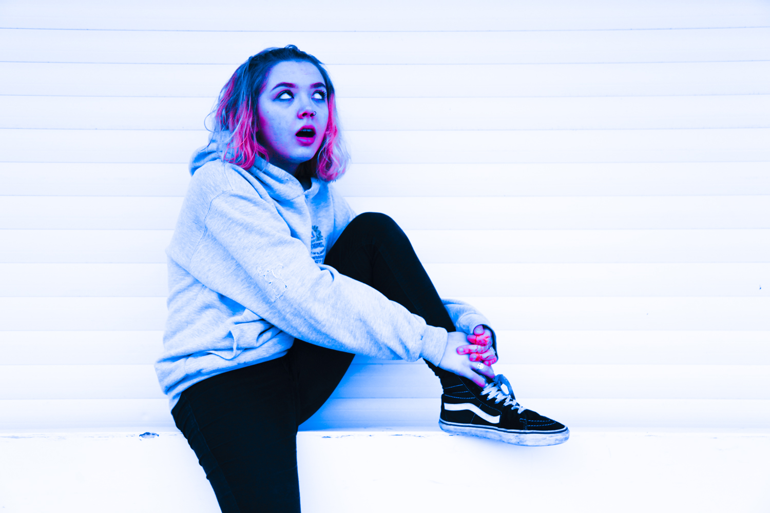
I duplicated this image three times in camera raw and edited each of them as individual pieces to ensure totally different contrast levels and colour compositions.

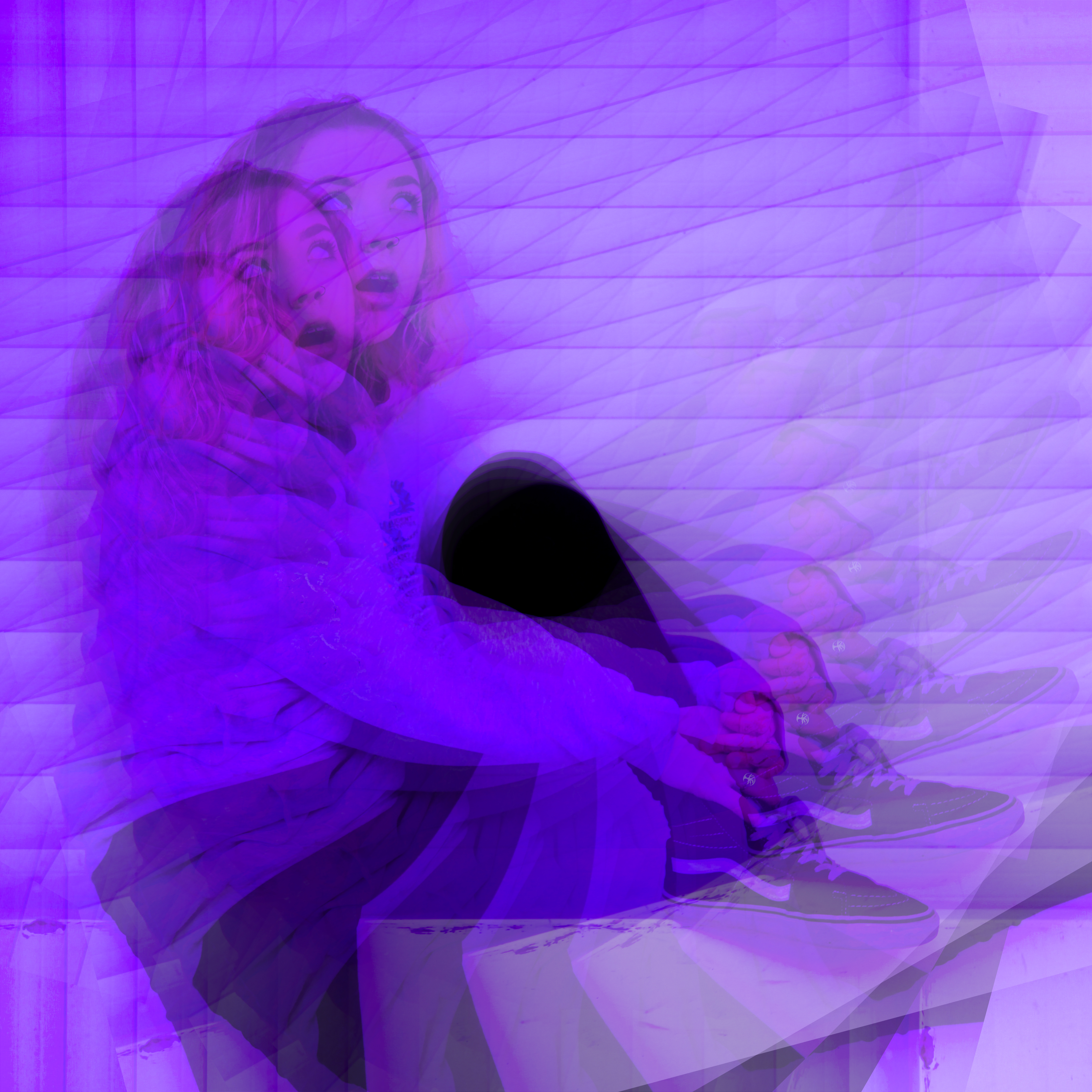
From these photos, I opened photoshop and created three different experiments. This first one is the same image, duplicated on itself using the layering technique with a 35% transparency level. Each photo is rotated by 15% to mirror her own spiralling journey into the purple world of depression.

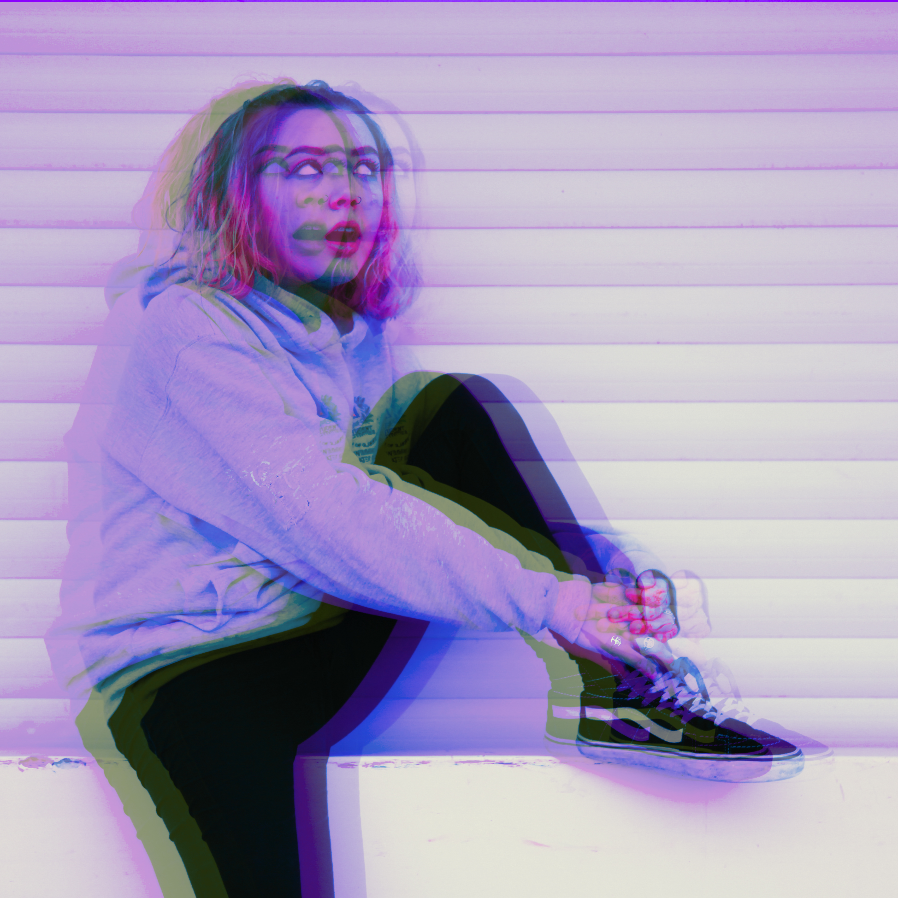
The next is a double duplication with the image mirrored so she can be sarcastic at herself for a change.

This one is all the images together and also has a darken effect on the bottom layer. Blurring techniques were used to alter the method of blending. This image is messy and chaotic; much like Hope.

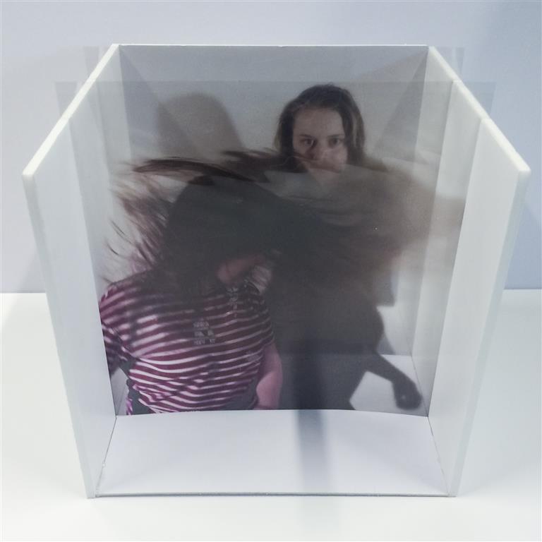
Another area we were asked to investigate is the possibility of layering these images manually – for example on glass or plastic. Entertainingly this was actually my chosen project almost a year ago now for my AS Exam where I made a photo box which would allow images to be inserted after being printed on acetate. The idea behind this presentation was to make an object that could be altered and changed to create different compositions. The original project and posts can be viewed here [X]

This is the final photobox with the manual compositions showing layering. below is a selection of digital experiments I produced to test the portraits I then printed for this project featuring my friend Charlotte flicking her hair about a lot.

Hopefully this proves that I can use photoshop at this level.


(thanks to Hope and Charlotte)

IDRIS KHAN / STEPHANIE JUNG – EXPERIMENTATION

The highly experimental work of Ibris Khan and Stephanie Jung uses overlaying techniques to add a strong energy into their work. The strong use of texture give both artists work a very crowded effect. Their work evokes a very intense form of energy. The huge amount of layers creates a very provocative sense of texture. I have used my own photos to recreate something in the style of their work.

I took a photograph from my AS exam coursework that fitted with the theme of environment, it also incorporates the contrast of man made with natural. The above first image is me working in Photoshop. I first duplicated the layers and re positioned them slightly. over each other. I then brought down the opacity of each photograph. This created this blurred effect. I found I needed to make the above layers opacity lower to let layers underneath show through.

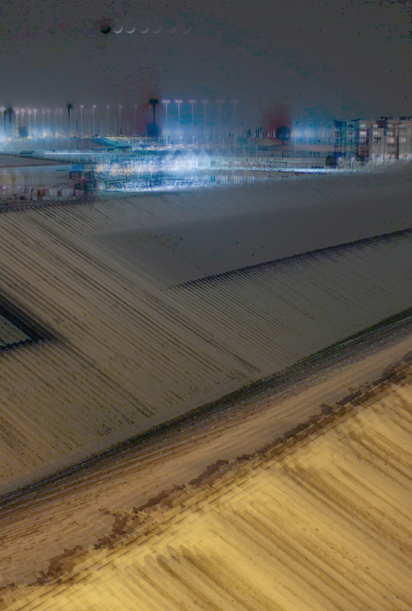
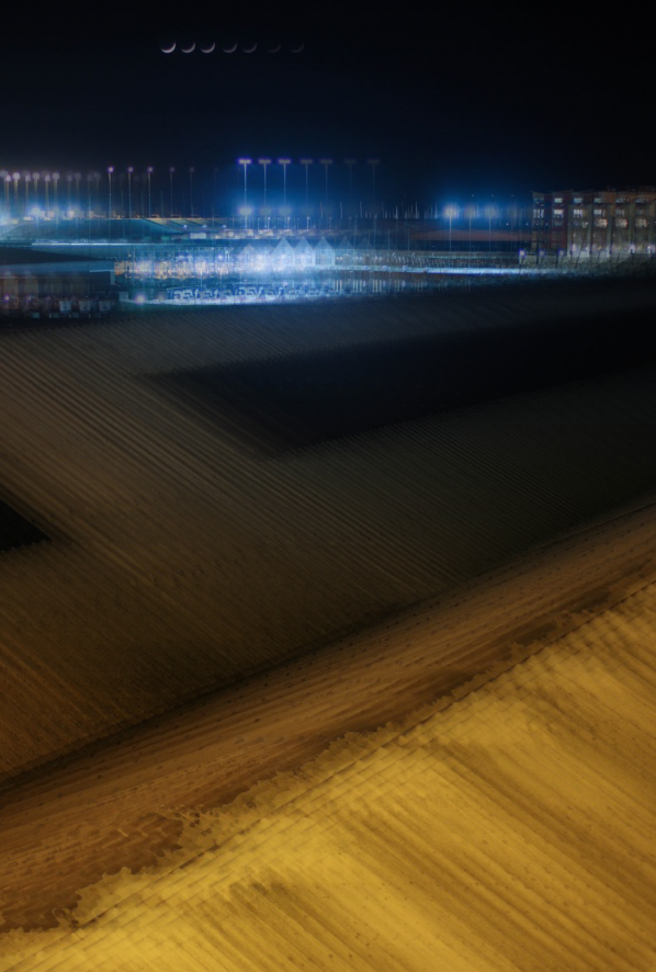
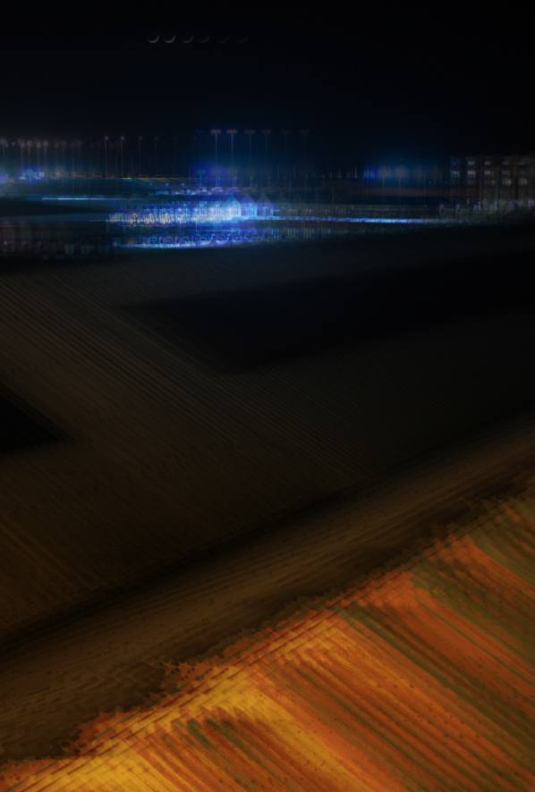
After this is found another image from my AS coursework featuring a long exposure of town overlooking buildings. I started by duplicating the layers and repeating the process for the second. I then cropped the image to hide areas that weren’t covered by another layer. I then changed the layer options such as to ‘subtract’ or ‘overlay’. I made different variations using the layer modes available to give different effects. I also changed the opacity of different layers to make others show through more. For the first one featured below I used the divide feature which created a grey feature over the top of the layer. Colour burn on the last photograph created a very rich red colour as well as darkening the photograph. Underneath these three images is where I used a variation of changed layer modes but in particular exclusion to create an intriguing textured effect. This is probably my favourite out of the selection for its subtle variety of colour in the background and unusually texture from the roofing in the foreground. It is also a lot more disjointed and out of rhythm compared to the first few for example how the moon in the first three all follow one after another and in the last one there is a lot more energy and sense of disruption instead of the neatness of the first few.


Images Inspired by Idris Khan (Photoshop Task 1)

Photoshop Task 1


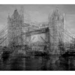
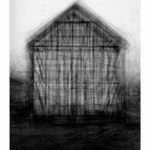
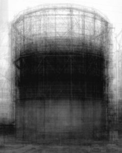
We were set the task of creating an image inspired by Idris Khan’s work with layering and shifting photographs. He does this by taking multiple images of a single object at slightly different positions and then layering them in Photoshop to create these abstract scenes of seemingly inanimate objects. Often photographing industrial buildings like oil or natural gas containers with wire frames when shifted they have a ghost like appearance to them. Incredibly dramatic they explore the environment in the abstract and unusual. it is an odd method but it works well and creates interest within the images that really helps to get viewers to look more in-depth at the images to try to work out what is gong on.

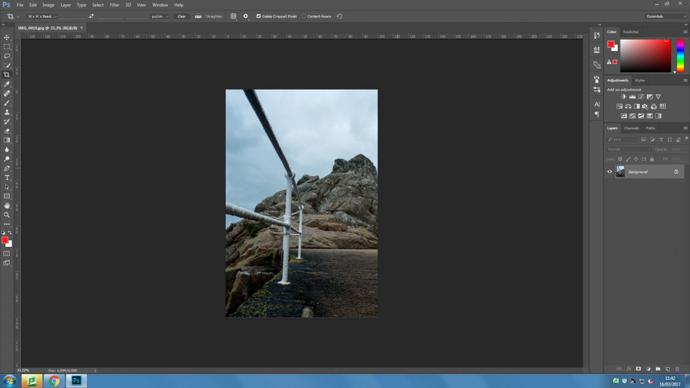
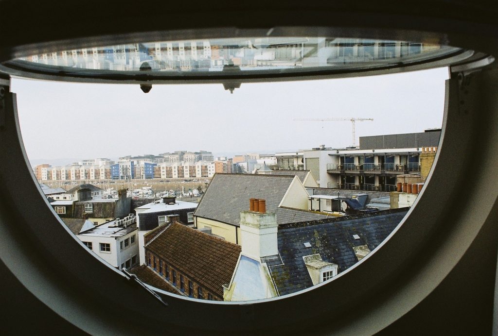
To try and emulate this to make my own image like this I used a digital technique that produces similar results and only requires one photograph to be taken. The method involves:

  1. Opening the selected image in Photoshop. For my attempt I used a photograph that I had taken on 35mm film so the quality is not too great.
  2. Copying the image a number of times. For my attempt I used 10 additional image layers and a black and white layer later.
  3. Once all of the layers are in, each one should be shifted slightly.
  4. Now different blending options can be used to change the visibility of the different layers. For me this mostly involved changing the opacity but some of the images were brightened and I even made some not visible at all because I did not think that they added anything to the image.
  5. I then changed the position of some layers individually to give the image a more “shifted” look.
  6. the last process that I used was to crop the image so that there was a solid edge around the image.

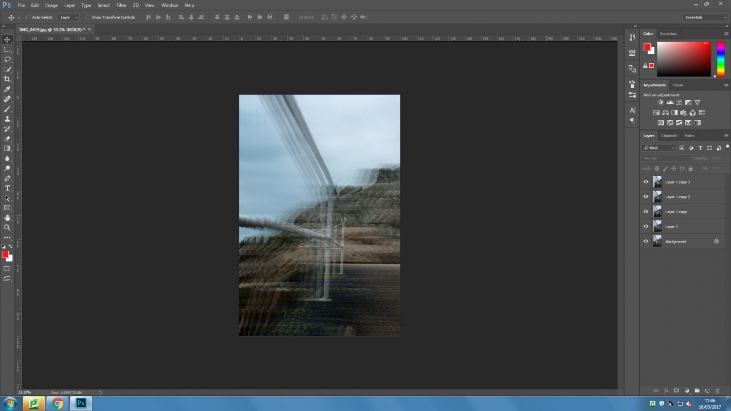
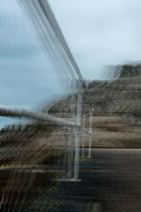
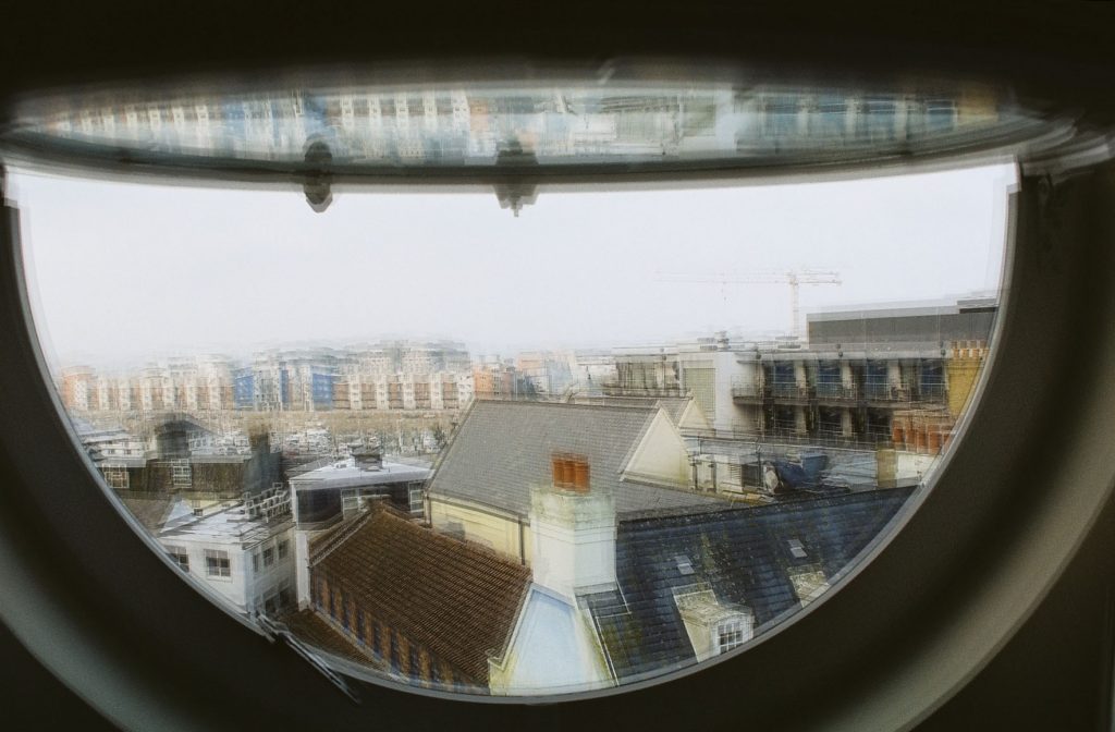
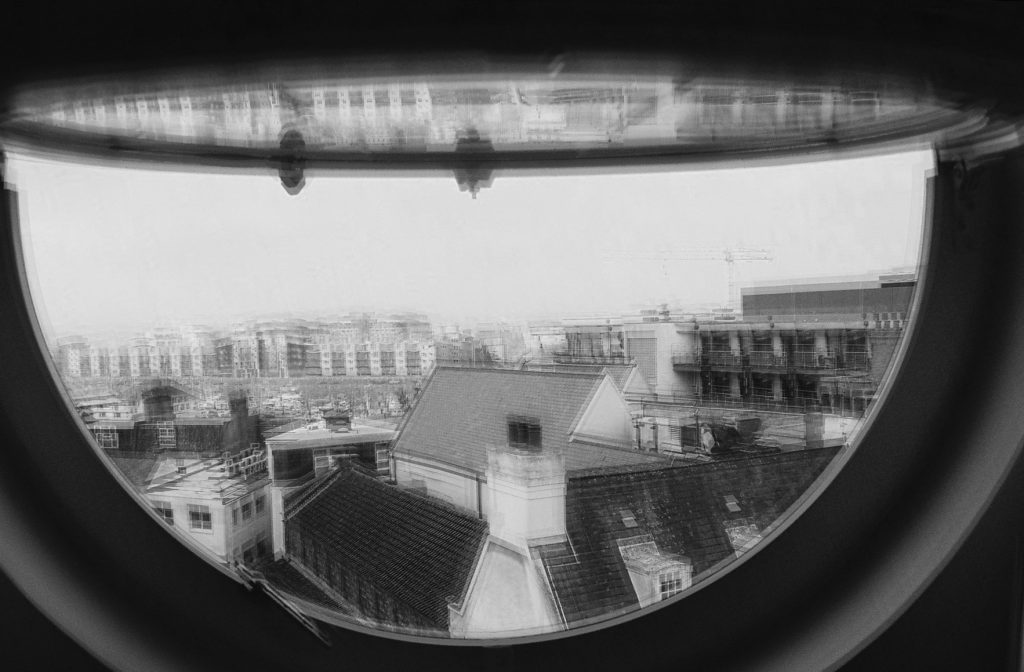
The first edit was the result of following that list of processes, it has the obvious shifting that has been done to it and the different angles also really help to give this its shaken effect. The second edit was done to try to better emulate Khan’s work, I simply added a black and white layer to the image, again in Photoshop. This gave the image a much more desirable look to it, it feels more gothic and more reminiscent of Khan’s work. Although it does not have the same feel because it does not have a framework to shift around it certainly looks similar and has the same general feel to it.

This screen shot shows the different layers and how I went through and adjusted them all individually. In this you can see the B&W layer that has not been set visible until I had the image looking good first. Although the images does not have too much distortion or ghosting to it and so is still more visible than Khan’s work I still like the way that it turned out quite a lot.