Category Archives: Experimentation

Filters

Author:
Category:

Art Student shoot 1- Editing

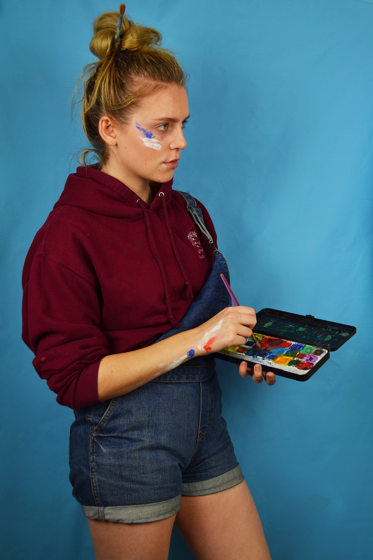
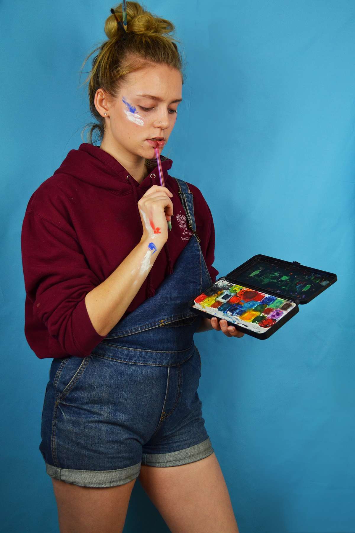
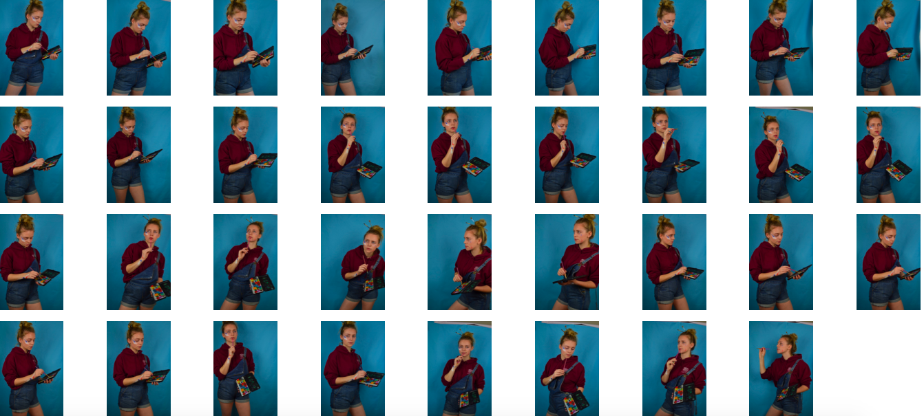
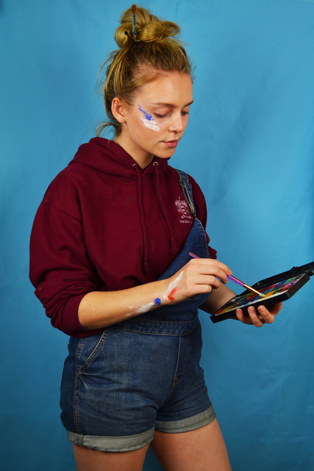
Above is the initial contact shoot from my first art student shoot. I made the decision before conducting the shoot to only use my blue backdrop because I felt that the maroon colour of my hoodie would clash with the pink background. I also felt that the masculine connotations of the colour blue would work better with my scruffy artist look. I also decided to wear no makeup for this shoot despite including an image of dark lipstick in my mood board because I felt that this was more realistic as I don’t really wear makeup on the days when I am home just doing art. I experimented in the shoot with different poses although they are relative predicable and similar, I am assessing a hypothetic piece of art, mixing paint and miming making brush strokes.

I shortlisted these images for my scruffy art student shoot because I felt that these three images depicted three different moments and feelings I experience when painting or working on a piece of art. The first image depicts a sense of contentment and flow, I sometimes experience this when I really get into the flow of a piece, although this doesn’t happen very often. The second image depicts a sense of concentration which is definitely something I experience often, when working at home my family often make fun of my frowning concentration face. The last image depicts a moment of pause where I appear to be considering what colour to use of what action to take next, this image really shows of the colours in my water colour palette nicely. In the editing process I cropped the images as a appropriate and adjusted the brightness, contrast and levels. I also used the spot healing tool to remove a large blemish on my chin.

Beauty Queen – Editing

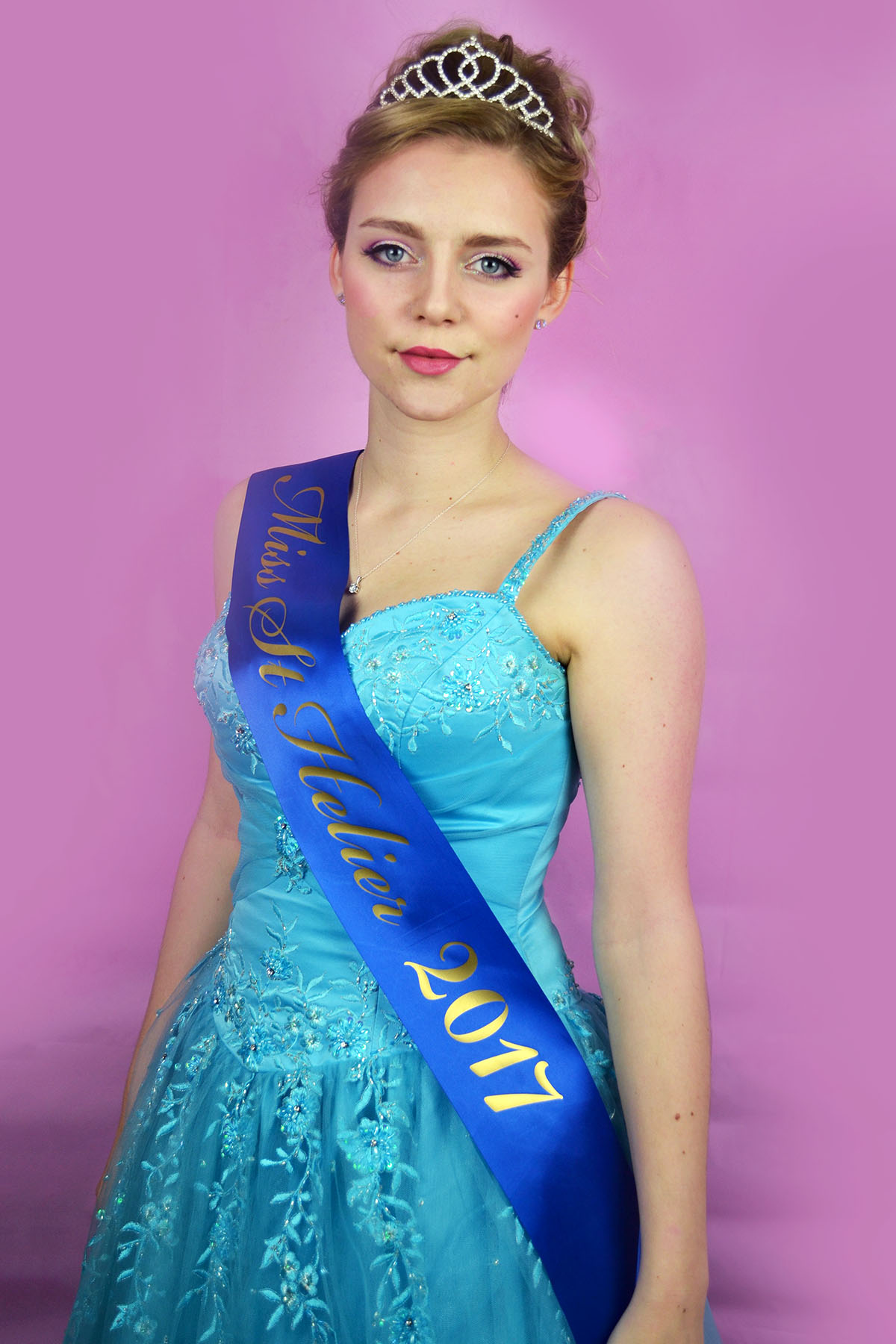
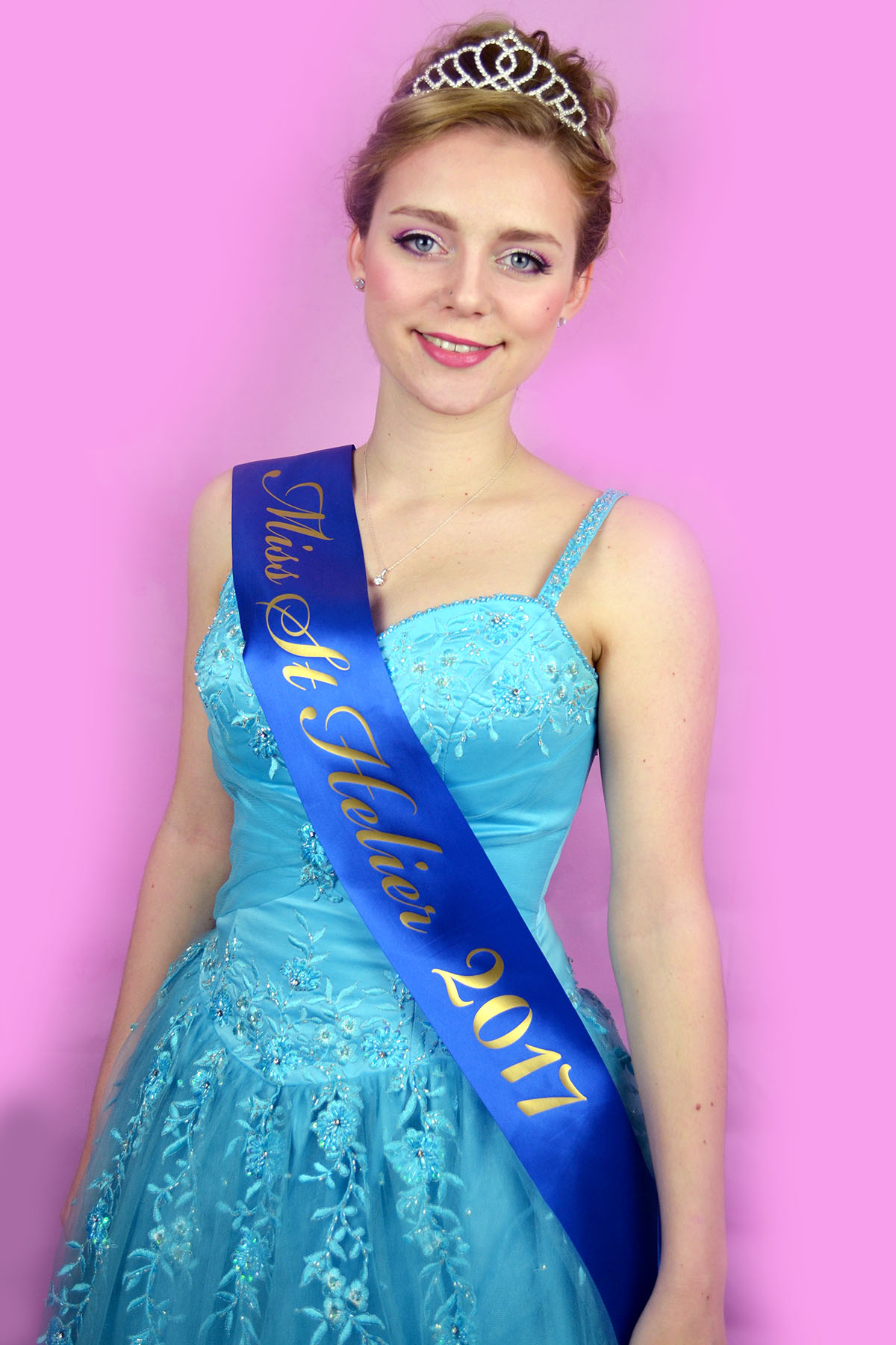
Above is the contact sheet from my beauty queen photoshoot. I experimented with different poses and expressions although they were all rather similar so it would fit with the format of an official title holder photoshoot that I discussed in my planning post for this shoot. The hand on hips poses with the big smile were an attempt to capture the all-american beauty queen persona but the images just came out looking silly and pantomimic so I decided not to use them, after all the project was about trying to capture a slightly exaggerated version of myself rather than someone else altogether. I found the process of this shoot really enjoyable although walking to and from the camera to check the images as set off the shutter in a full length ballgown with many petticoats proved both difficult and time consuming.

Here are my shortlisted photos from this shoot. I selected these images because they both capture a flattering, exaggerated version of me without being garish or pantomimic. I edited these photos by cropping them in a way that framed the figure nicely as well as showing off the volume of the skirt an my full title printed on the sash. I also increased the contrast, brightness, colour saturation and levels. I used the spit healing tool to remove any blemishes as my skin was not very good on the day that I conducted this shoot. I smoothed out the back drop as there were still some wrinkles even after attempting to iron the vinyl. I personally think that I will use the image on the right because I felt that it is both flattering, serious and dignified which was something I wanted to capture in this portrait.


Reflection shoot outcomes

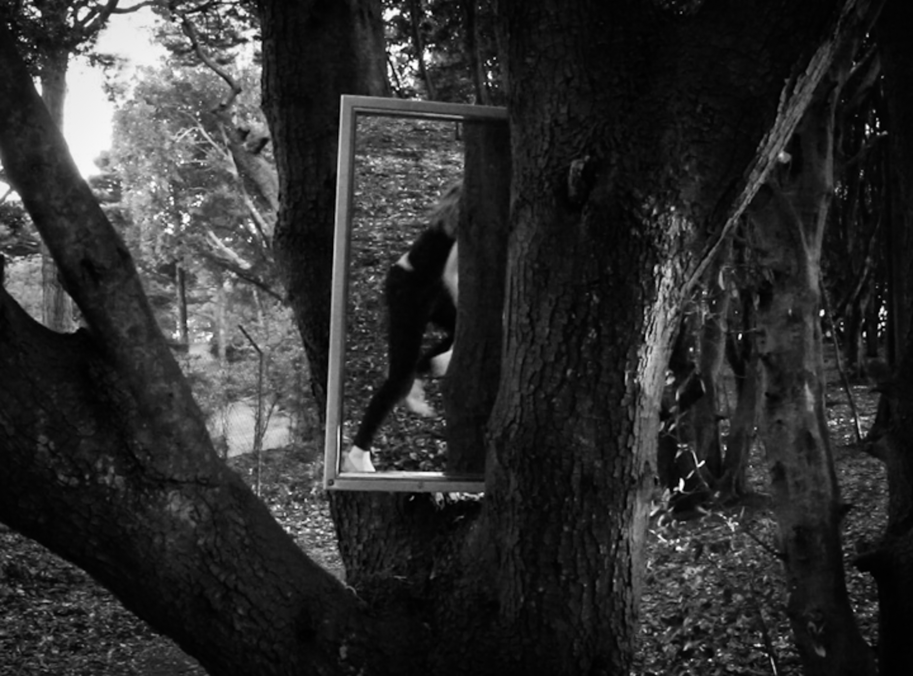
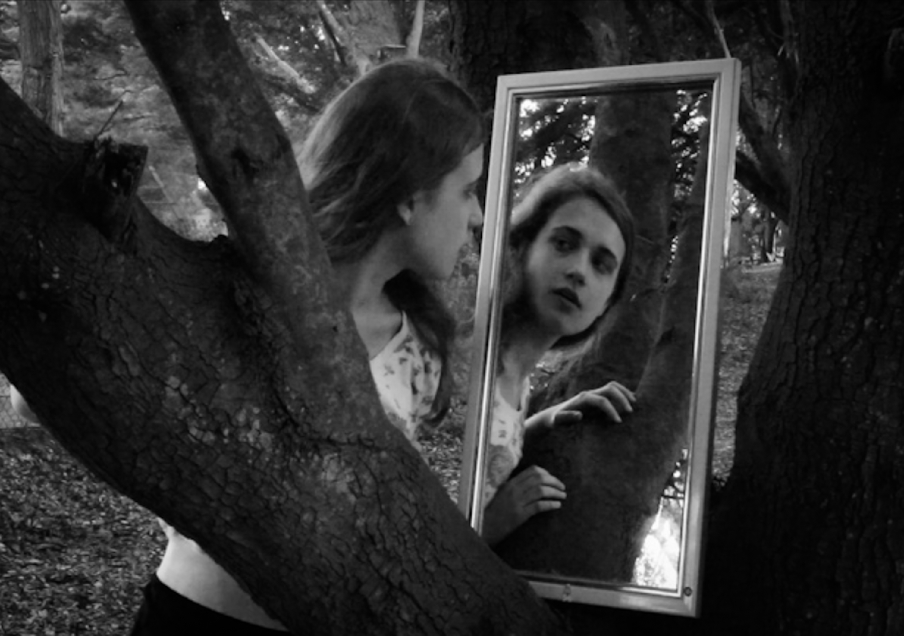
In my previous shoots exploring performance and mirrors I used myself as the subject . These images however are selected from a series of shoots I did with my sister as the model.  I think this idea could be interesting to explore further in reference to artists such as Claude Cahun and the creative collaboration with her half sister. I found these shoots easier than using myself because I was able to focus more on composing the shots especially when using the mirror because It was difficult to position  myself and the camera in order to get the reflections and angles that I wanted as well as ensuring everything was in focus. In some images I considered previous studies I have done with my sister based around classical painting and pre-raphaelite compositions. I also experimented with using a mirror on its own to reveal different sections of environments and I also photographed my sister alone interacting with the landscape for example blending in with the trees. I employed similar basic editing techniques such as cropping, black and white, colour correction and vignetting when adjusting this set of edits.


Angry Feminst Shoot 2 – Editing

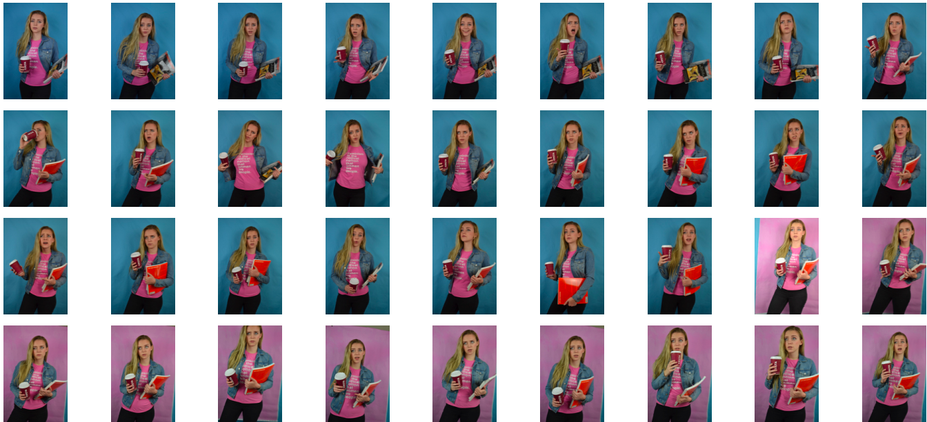
Above is the contact sheet from my second angry feminist shoot. As you can see, similarly to the previous shoot I experimented with both blue and pink backdrops. And again, similarly to the previous shoot I decided to use the pink backdrop because this element of the feminist stereotype is slightly more “lady-like” and socially acceptable than the previous and the pink background connotes this. I used two of my favourite books on feminism, “Art and Feminism” and “The Art of Reflection” I also wore my graphic tee which has the quote “Feminism is the radical notion that women are people.” printed on it. I also used a empty costa cup to achieve a sort of college student hipster vibe.

I experimented with different facial expression and poses to give an sense of “being done with your misogynistic bull” vibe. I tried many over the top, “in the middle of a heated debate” looks but I felt that some of the more subtle aloof eyeballs or disapproving side glances were more effective and less pantomimic.  Bellow are the two image I shortlisted for final from this shoot. I selected the image on the right because I felt that the raised eyebrow and 3/4 angle of the face gave a sense of being knowledgable and aloof. I selected the image on the right because the expression paired with the titled head gives a reasonable air of being annoyed and frustrated without being over the top.

I edited these photo by cropping them as appropriate, at the top of the thigh to match with my previous outcomes. I increased the brightness and contrast as well as the colour saturation. I used the brush tool on photoshop to get rid of some distracting blemishes as my skin was not very clear on the day of the shoot. I slightly smoothed out the background, similarly to the editing process of the first feminist shoot.
Angry Feminist Shoot 1 – Editing

Above are the contact sheets from my first angry feminist shoot. In this shoot I took inspiration from the topless protests by the radical feminist group, Femen. I did some dramatic makeup, back combed my hair and painted the words “My body, my choice over my chest and torso. I experimented with using both pink and blue backgrounds, I made the decision to use the images with the blue background because of the masculine connotations of blue and to protest in such a way is not considered particularly lady-like.

I experimented with using the jacket but I felt that did not work with the “shocking” sense of “nudity” (I made the decision to wear a bikini top as an authentic recreation of the Femen protests may not be appropriate for a school project) I also experimented with various poses including fight or flight like stances and the typical fisted hand above the head. I most of the images I included an angry screaming or shouting expression as this is seen in most of the press photos from Femen demonstrations and protests.

I selected these images as my shortlist because I felt that the battle stance captured the sense of desperation and not too over the top warrior feel. I edited these photos by cropping them to frame the figure around the tops of the thighs. I also increased the brightness and contrast, adjusted the levels and slightly smoothed out the backdrop as their were still some creases that I could not fix with iron without melting the vinyl.

A Little Paint

// E X P E R I M E N T I N G //

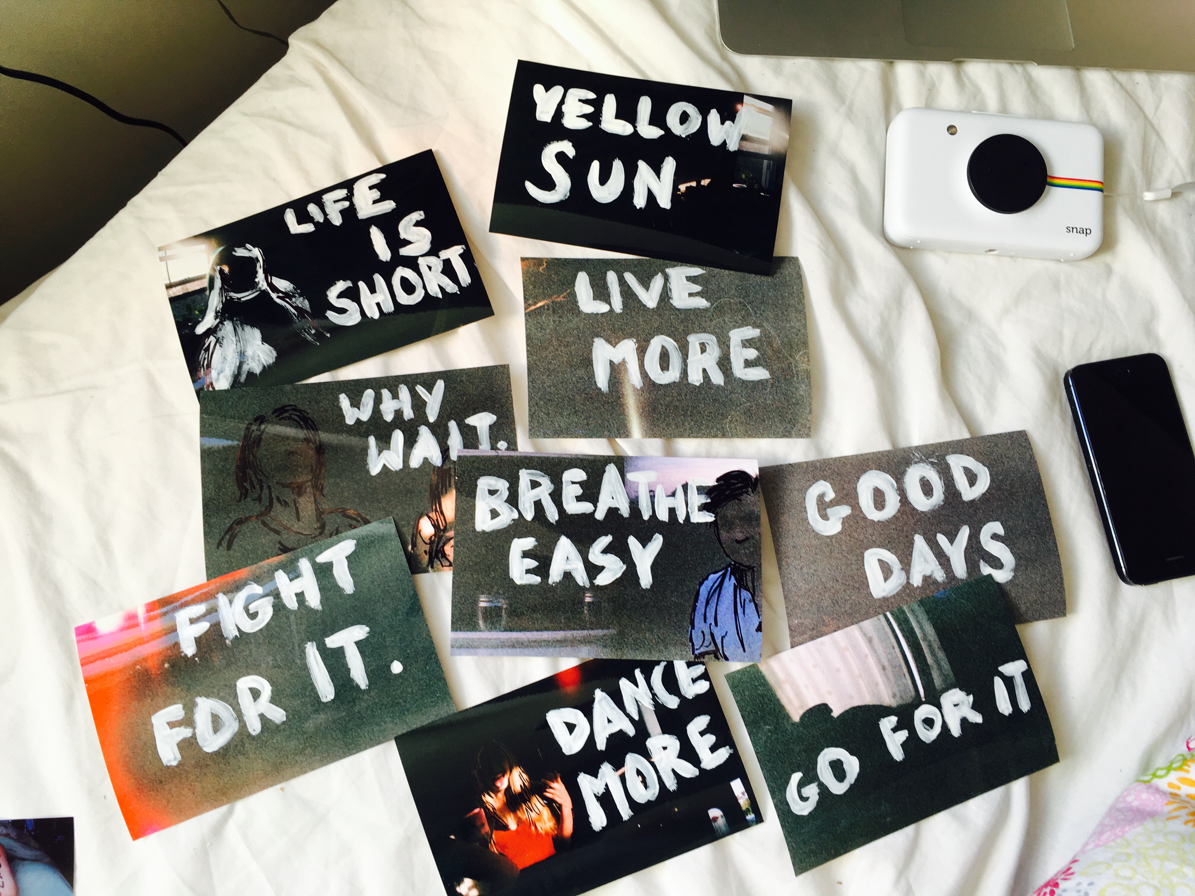
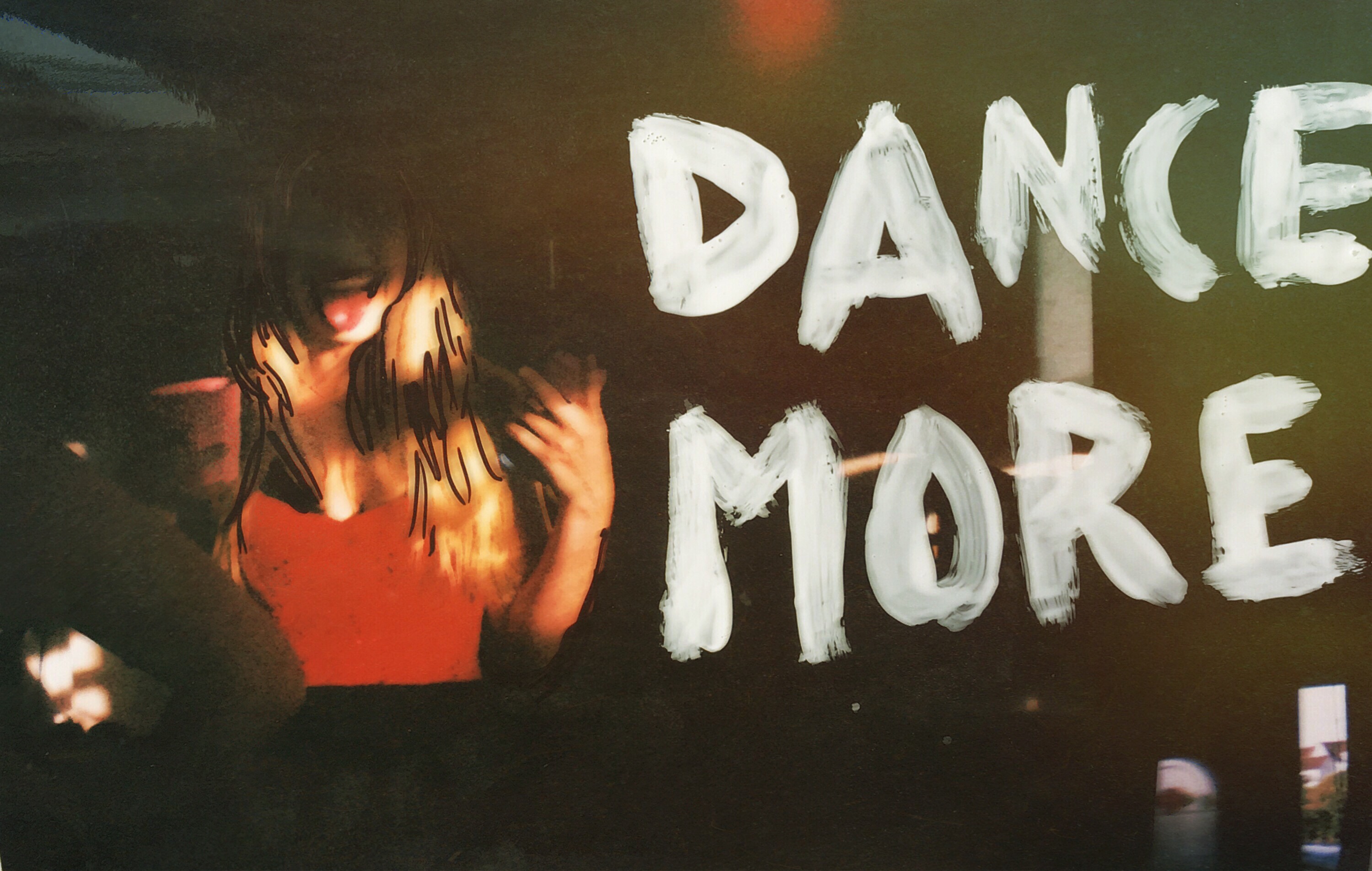
The images used for the postcards are taken of individual characters in environments of their choosing which mirrors the words they write about the place which will ultimately be added to the back of the piece. After getting back a set of disappointing negatives, I experimented with painting and drawing over the prints as a way to enhance the images and make at least something out of them. Though most of these are just for fun, one image came up particularly well and made me consider the possibility of using a handmade technique to edit images that I would receive back on the last day of the exam. 

This image was successful with the colourings of the film, the dark sections of the image and the bright colours that contrasted this darkness with their vivid shades. The words painted on were taken from popular phrases said by people within a lot of the images relating to the situation. The reason for the failure of these images was the previous exposure of the film which resulted in images already being overexposed before the film was used. This happened when removing the film from its source – an expired 27 exposure chuck away camera. To release the film, we covered the lens with electrical tape, wound the film into its canister and broke open the surrounding container. This roll unfortunately was overexposed as the tape was not applied and then added as a panic last minute resulting in a lot of overexposed film.

Blonde Shoot 2 – Editing

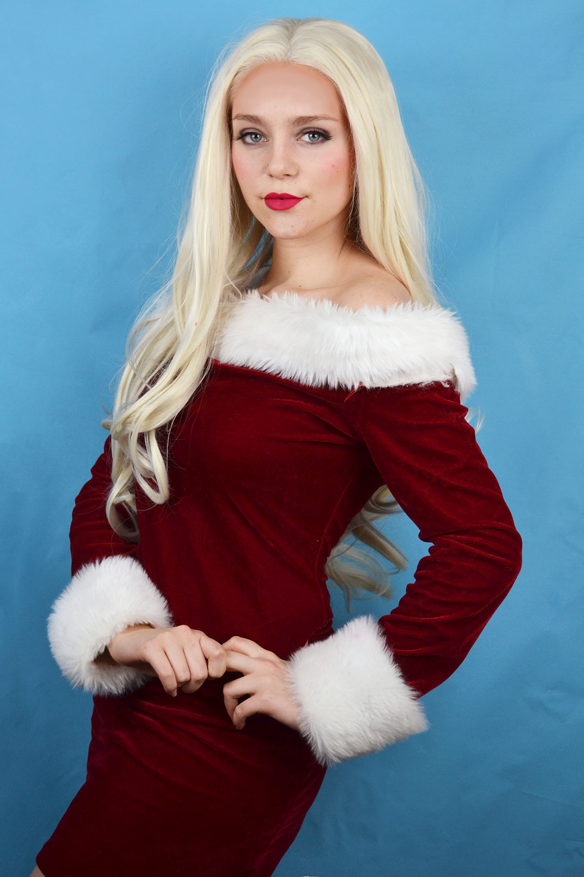
Above is the contact sheet from my second blonde shoot. This shoot was heavily inspired by the character of Regina George from the 2002 film “Mean Girls” I was inspired by a scene where they perform a raunchy dance routine(completely inappropriate for a school situation) to the popular Christmas song “jingle bell rock”. Surprisingly I already had this Christmas costume from the Christmas of 2015. Due to the off the shoulder nature of the dress and the strange fit i found it hard to pose in a way that was flattering. Similarly to the previous blonde shoot I was rather uncomfortable posing for this shoot as I felt that the character I was trying to create was not me at all. I made the creative decision to use a blue background for these photos as the red of the dress clashed with the pink background.

These are the shortlisted images from the shoot that I decided to edit. I selected these images because they captured the playful flirty nature of Regina George’s character as well as the stereotype of the “dumb blonde”. to edit thee images I increased the brightness, contrast and colour saturation to make the red of the dress slightly more vibrant. I smoothed out the complexion by removing any distracting blemishes, I also cinched in the waist slightly in the centre photo, although it does look a little strange. Similarly to the previous shoot I had to edit out the lace of the wig by using a combination of the spot healing tool and the airbrush, selecting various toned from else where on the forehead. Although I am happy with how the images came out I don’t think that i will be using these photos as final outcomes because I feel that the stereotype is very reliant on people having seen the film “Mean Girls”. However the shoot was fun to conduct and it was a good from of experimentation.


Blonde shoot 1 – Editing

Above is the contact shoot from my first blonde shoot. This character was based on the stereotypical all american high school “it” girl as well as public figures such as Paris Hilton and Nicole Richie. I experimented with different poses that exuded confidence, sass and glamour. I actually struggled with the posing for this shoot as I felt so far removed from this stereotype as I felt that I did not conform to the personality connoted through my appearance. This outfit was something that I wore frequently to work and once to a garden party when I had blonde hair, however I felt very strange re-visiting a look that I only distanced myself from a few months ago. Before conducting the shoot I decided that I wanted to use a clue background despite the masculine connotations because my pink dress was lost against the pink backdrop.

Above are the 3 shortlisted images from this shoot. I selected these because they have a sense of glamour to them, some of the more exaggerated poses looked a little pantomimic and ridiculous. The editing process for these images was slightly more extensive than previous shoots because (as you may be able to see from the raw photos in the contact sheet above) I did not glue the lace of the wig onto my forehead, which would be the proper way to wear this theatrical wig. I decided against gluing the lace of the wig down because during my research online, spirit gum was the best option, however I only had liquid latex to hand and I knew that I would only be wearing the wig fro a couple of hours and wouldn’t be taking part in any vigorous motion that would case the wig to slip off. I had to edit out the unsightly lace using a combination of the spot healing tool as well as the airbrush. I also increased the brightness, contrast, levels and colour saturation. I used the liquefy filter to smooth out the crinkles of the dress around the waist and cinch it in to create a more pleasing hourglass shape. I also slightly smoothed out the background and used the spot healing tool to get rid of any distracting blemishes.


Performance Shoot outcomes

Below is a set of outcomes from some initial experiments I have done based around portraiture and performance. I tried a number of different approaches to this and I tried to incorporate a mirror into these to explore how it might work as a prop. I  used myself as the subject in the images in reference to the artists that have inspired and influenced this part of my project. Overall I took around 1,500 images and in Light-room I edited them down to this selection and made adjustments to the contrast, brightness and saturation. I cropped the images and experimented with black and white and sometimes added a slight vignette. The aim of these shoots was to explore the relationship of the human body to the environment with a focus on natural, outdoor locations. In order to develop this idea further I am considering exploring similar ideas in relation to interior spaces. The process was fairly spontaneous and unplanned although I had some ideas for the use of mirrors and reflections but I wanted to capture this exploratory nature to some of the images by photographing in locations that I was unfamiliar with.

These images were my first attempt at using myself as the subject and I initially approached this by setting up the camera and filming while I interacted with the space and experimented with different compositions. This allowed for more freedom and I didn’t have do keep returning to the camera because film involves around thirty frames a second. I then saved still images from the video after importing the footage into Adobe Premier in order to have the stills in a high resolution (rather than taking screen shots) . From here I imported them into Light-room and edited them. The problem with this is that the motion blur is captured in each frame which means if you view these images enlarged the movement is very obvious and while I think this can be quite effective i’m not sure if it was the desired effect. I now know that if I adjusted the frame rate I could probably have more control over this.

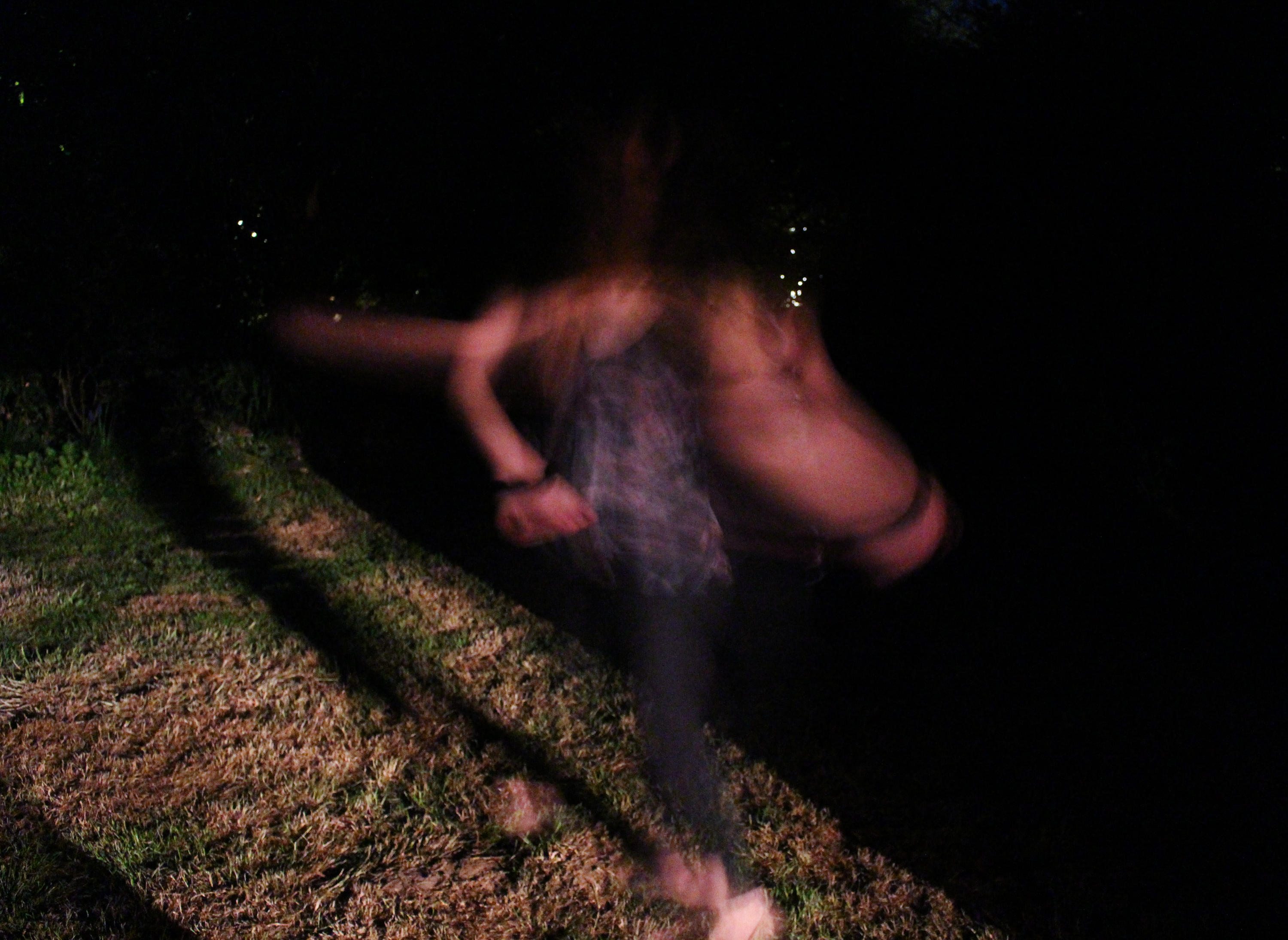
I also did a brief experiment photographing at night based around the idea of exploring movement through long-shutter speeds. I have seen this can be quite effective and it is something I have not tried before but I wasn’t especially pleased with the outcomes. I think they could have been better if I had introduced more artificial light and executed them in a technically more accurate way. The idea was to have a shadowy, mysterious tone to the images  with the human figure (myself) standing out against the black background.

In these images I photographed myself using a tripod and set timers. I explored the use of slow-shutter speeds as well as the use of a mirror and shadows. I think the use of shadows is something I could potentially explore further.

I have several ideas about how to develop this concept of performance and environment. This work was influenced largely by my research into performance photographers but could also have some connections to other areas I have researched such as Earth art in that it considers the human connection to natural landscapes and is ephemeral. I think that I am going to focus my project around this idea more specifically than in my initial planning where I specified some more varied approaches such as s focusing on objects left by humans within environments to show their presence. I think it will be more effective to focus on one area and explore this in more depth.

TODD HIDO/HAMISH FULTON INSPIRED EXPERIMENTATION

I created more images with the second photo shoot featuring Ryan. I found the composition and minimal features would be useful to use with text. The dark tones would also make the font stand out more. I used the font Perpetua Titling MT Bold because of its classic style. I started by using a small text over the image to create a more subtle impression. I liked the classical style it evoked. I picked a simple phrase with small words that evoked the notion of being nocturnal and night life. I wanted it to be simple yet full of impact.

I then tried using a larger font that would take up a large amount of space on the image. I positioned it so the mirror and reflection was still visible. I made two, the first where the text was in the centre and the second where the image is placed to the right.

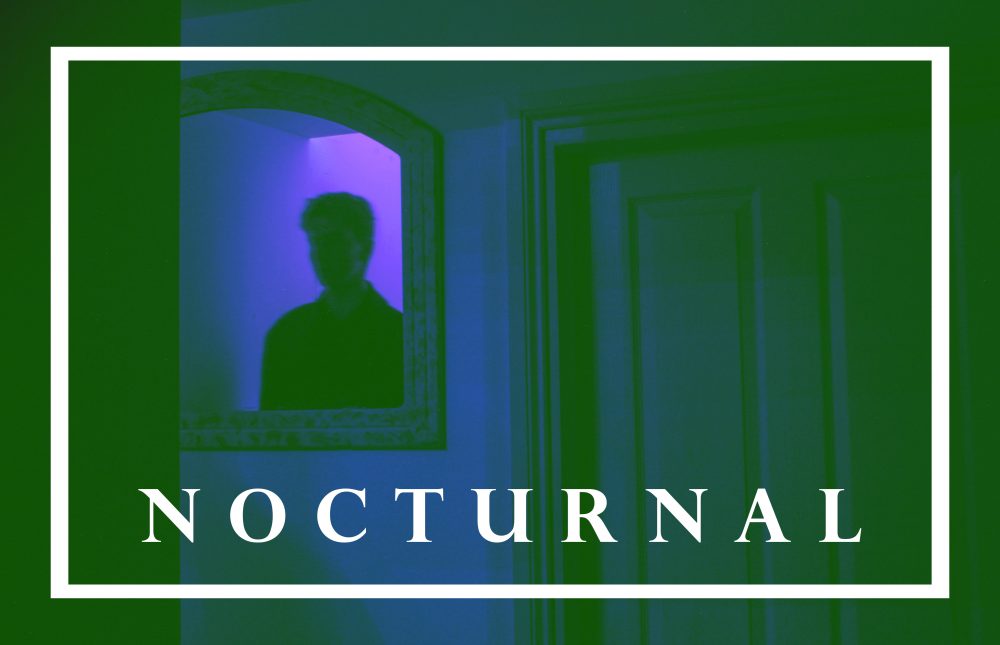
I then returned to the word nocturnal which I had used in previous images. I then used borders to add with the text. I then moved onto using filters using the colour layer feature. The second one was not just a single colour but a mix of pinks and oranges, creating a warm, dreamy ambiance.

The above image was created with the bright green layer set to luminosity creating the grey tones. I also used the previous pink layer from before to give it the warm tones. I wanted to pick words that would evoke the sense of ambiguity but still create a feeling of narrative. I plan on exploring more images using text and other graphic design features in my work.