Category Archives: Experimentation

Filters

Author:
Category:

Environment – New Idea – Digital Illustration Experimentation

Now that I have completed my travels and have collected my images, I am tasked with creating some original final images. On this post, I am going to be documenting and experimenting with an idea I had whilst on my travels. As discussed in a previous post, I felt the urge to incorporate some external art within my photography, in order to avoid generic tourist responses.The genre of Travel Photography is now very crowded due to its accessibility and ease of involvement and there is little originality in documenting the landscapes and atmospheres of foreign locations as it can essentially be done by anyone. I left on my vacation having looked at Carlos Spottorno,  planting concepts in my head surrounding illustration, but no solid ideas that could be experimented with. Nevertheless, I began investigating contemporary illustration given that this is my chosen course at my future university. I looked at the work of Michael Craig Martin, studying crisp, clean line work and if I could perhaps implement this within my work. After experimenting in Photoshop, I finally found an idea that has the potential to produce distinctive results. Here, I will be outlining the process of creation and my thoughts on the prospects of the concept. 

I start by selecting an image that is very open for further adjustment and reconstruction. I wanted something basic and simple in order to avoid complex compositions that will crowd the photographs. This photograph that I took in Knossos, Greece seemed appropriate. A large portion of the image is cloudy sky, which provides a blank canvas for digital drawing. In addition to this, I was attracted to the way in which that the building is partially destroyed, which will enable me to reconstruct the structure that is missing. I am essentially re-building this ancient temple in the way that I please. Its important to note the way this all links back to the exam brief of ‘environment’. In this case, I am manually manipulating this landscape, adapting and changing the environment into something different. The first thing I do, is import the image into Photoshop and make it black and white. For the piece I am planning, the linework created is going to be colourful. With a desaturated background, these colours will be perceived a lot more vividly, popping into the foreground. With a blue-grey sky, the tones begin to combine and merge together which ruins the crisp, clean aesthetic I am searching for. I turn the contrast up a bit, ensuring some dark shadows that will serve as effective backdrop.

With the image prepped, I now select the Pen tool. The Pen is an excellent tool that allows me to draw lines in a very controlled and manual manner. The key feature of the Pen is its adaptability. Click once to add a single point and create an angle to the next, or alternatively click, hold and drag to create a curve. It enables me to create any shape I want, straight or rounded. In addition to this, every point is completely editable after you’ve finished the shape, and you can add new points if you want to add an extra curve into the shape. This means I can come back to my illustrations at any point and make further adjustments to improve the piece. In the image above, you can see that I have started reconstructing the base of the building, drawing in the collapsed pillar and first floor. On the top tool bar, you can also spot an array of options that are available regarding the visuals of the lines being created. For example, I can change the weight of the line for thicker strokes and manually select a colour of my choice. For this piece, I have selected a mid-tonal purple. It works effectively due to its ability to stand out upon both shadows and highlights.
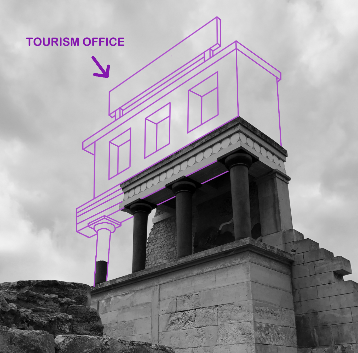
With the building complete, I decided to implement a large sign upon the roof. Currently, the illustration lacks personality and individuality. I would like to incorporate a sense of fun within the piece in order to rectify the bland visuals. As you can see above, I wanted to create a sign that labels the building as ‘ Tourism Office’. I thought this was a witty way of enforcing a theme of visual satire, almost mocking this ancient city and essentially labelling it as just a tourist attraction. It forces the audience to think which creates discussion. Nonetheless, I cannot simply rotate the text and slot it within the sign margins. The piece sustains a sense of perspective, as the construction gets smaller as it moves further away from the audience. Consequently, the text must share the same qualities. I select a font that enforces this fun, satirical attitude as suggested by the rounded edges and capital letters. In order to make proportional adjustments to this piece of text, I must convert it into a pixels as oppose to a text layer. With this complete, all I have to do is Transform the layer and select ‘Perspective’. This option permits me to manually adjust the positioning and perspective of the text, meaning I can make it larger in the foreground and smaller in the back. The final result can be seen below.
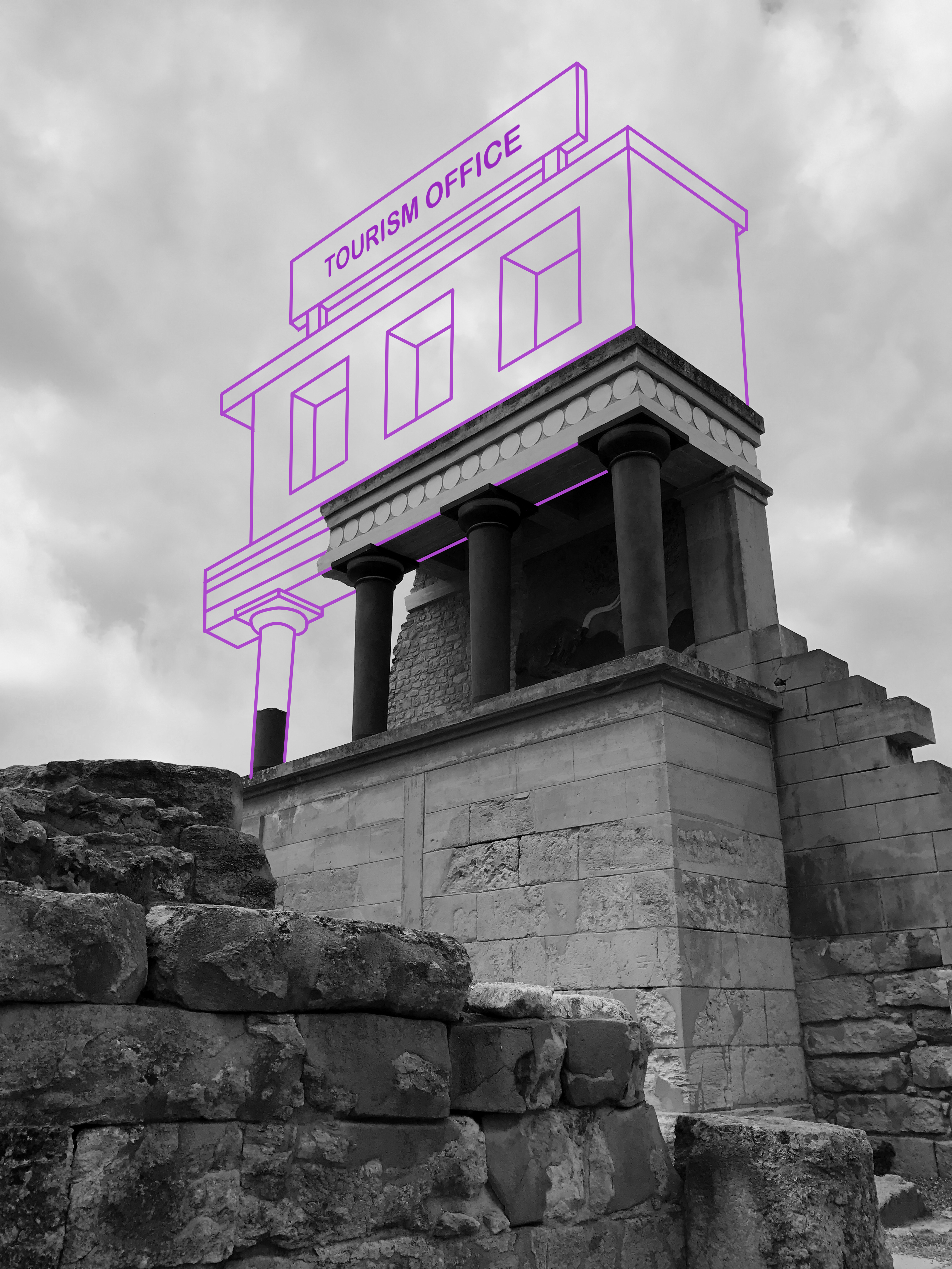
I think this is an idea worth pursuing as it demonstrates a form of originality that is currently missing from my work. Illustration is something that I am passionate about, and I think I possess the keen eye required to impose imaginative ideas upon standard environmental photographs. With this experimentation complete, I will continue to produce more responses.

 

Shoot 2 Edits

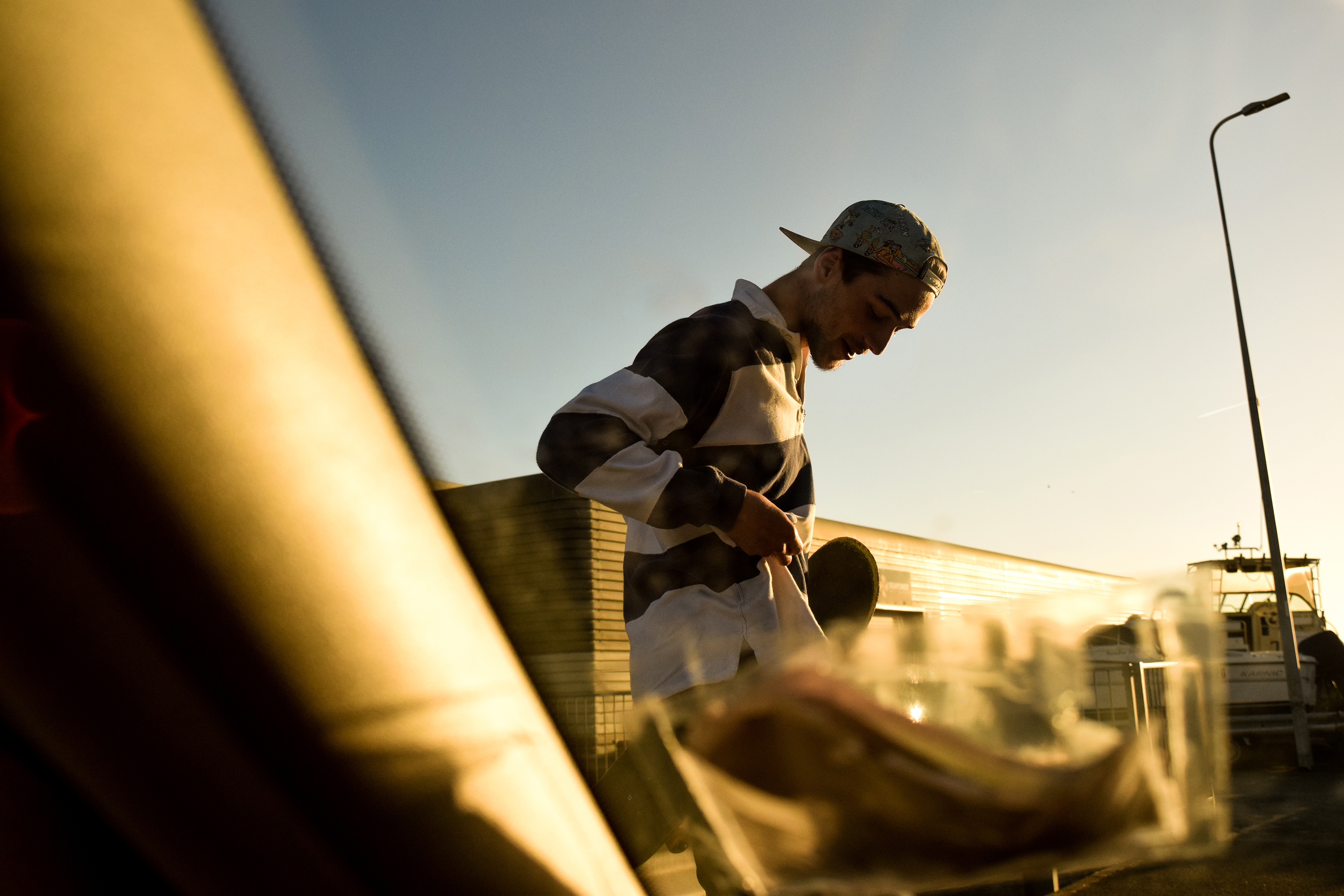
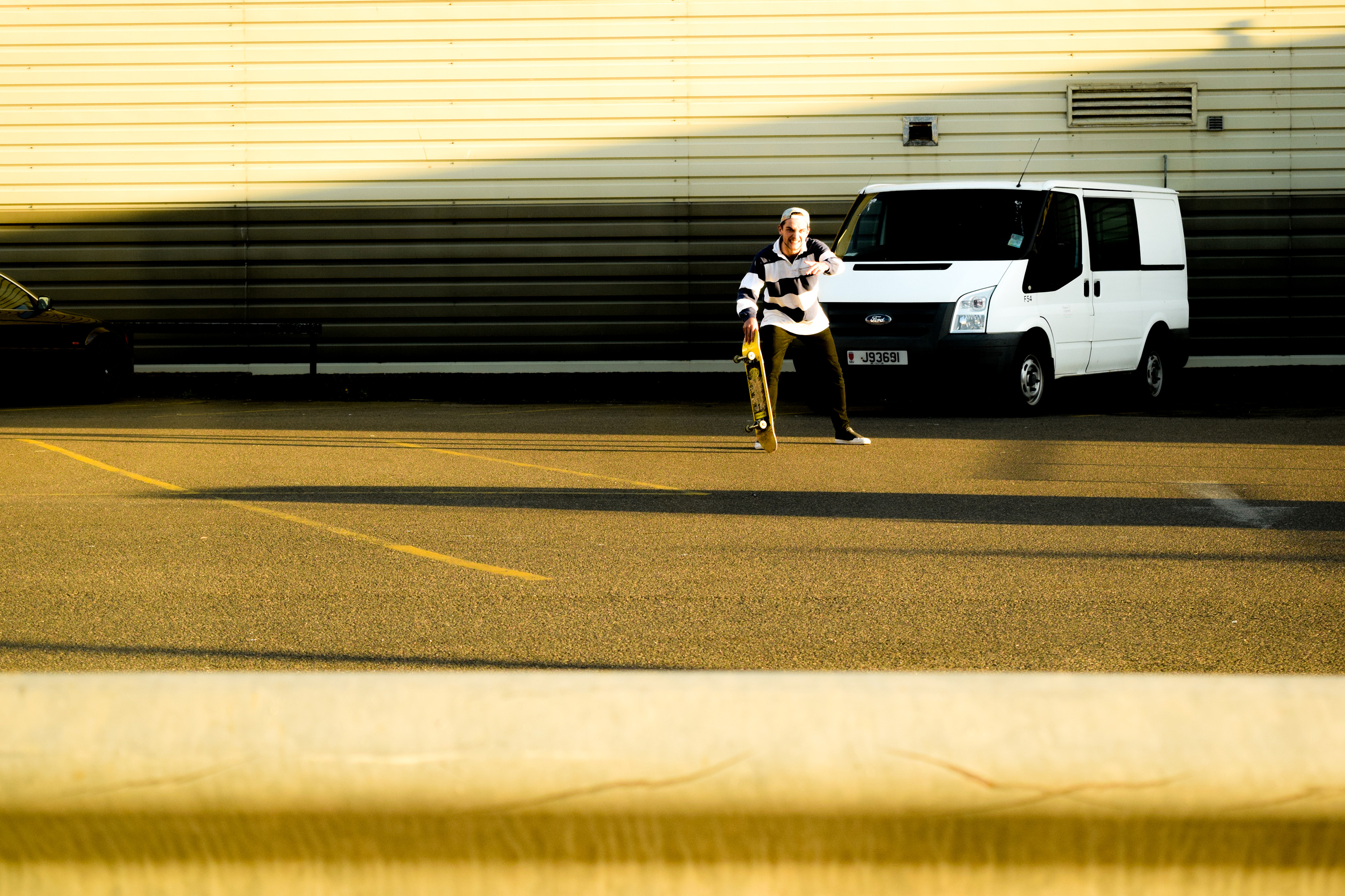
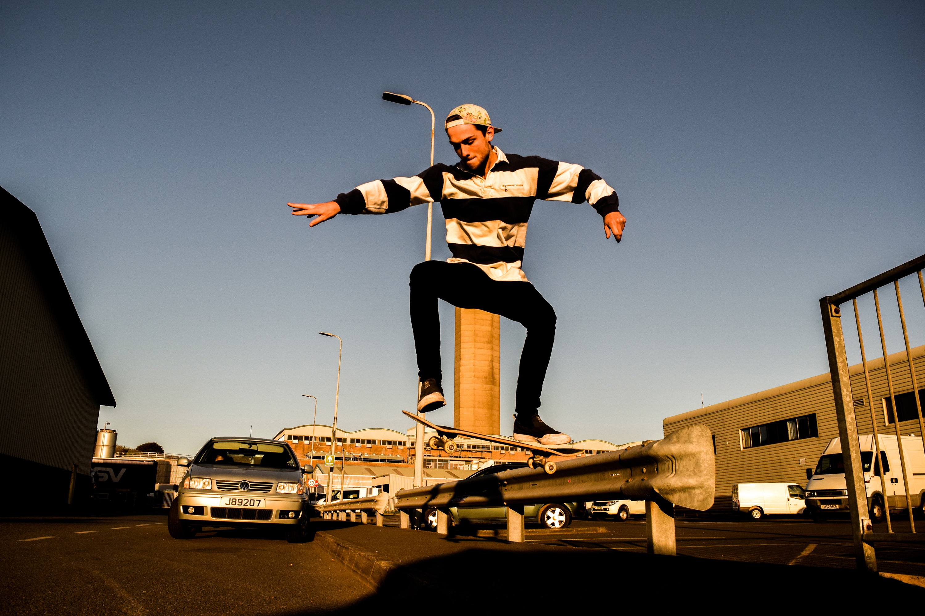
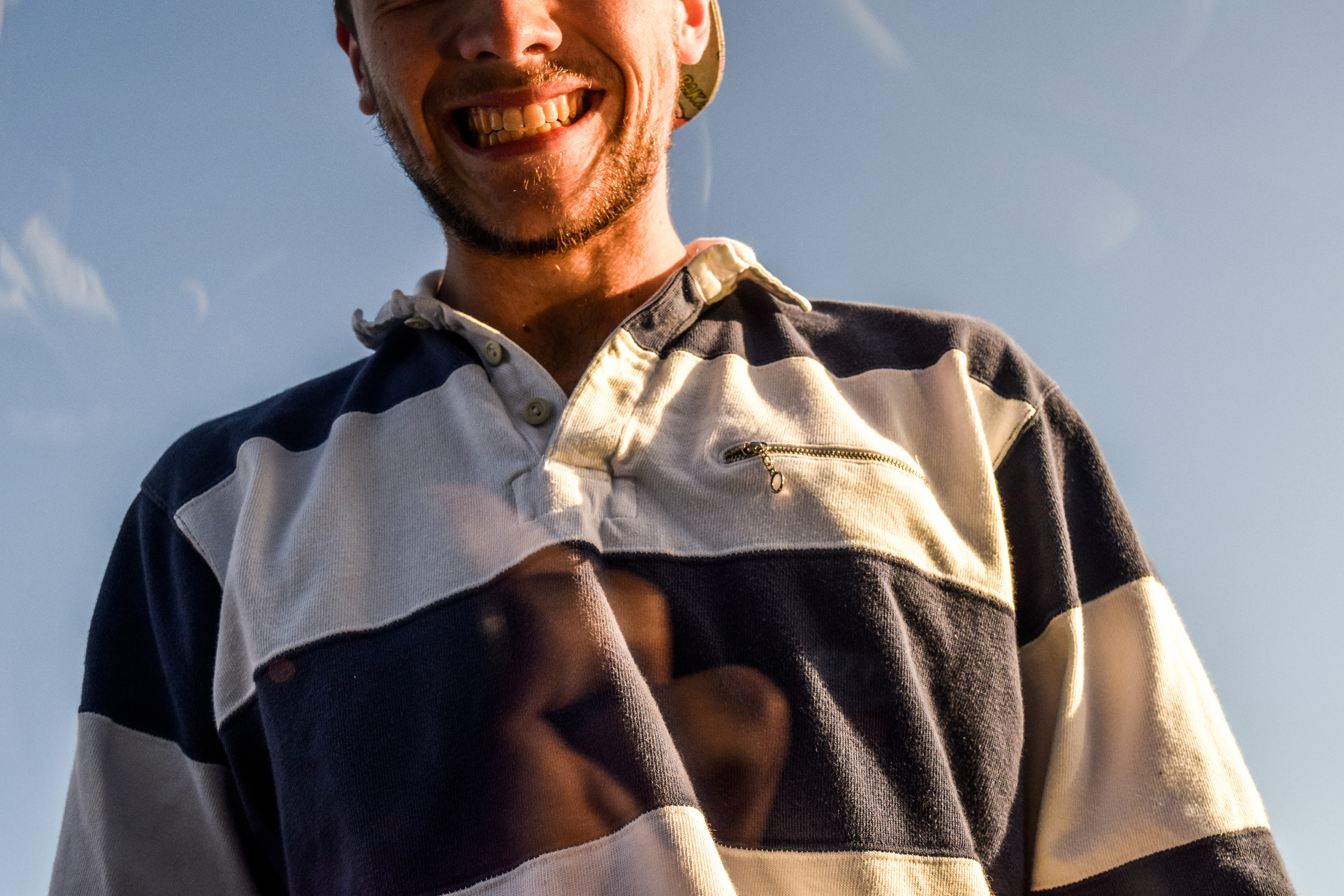
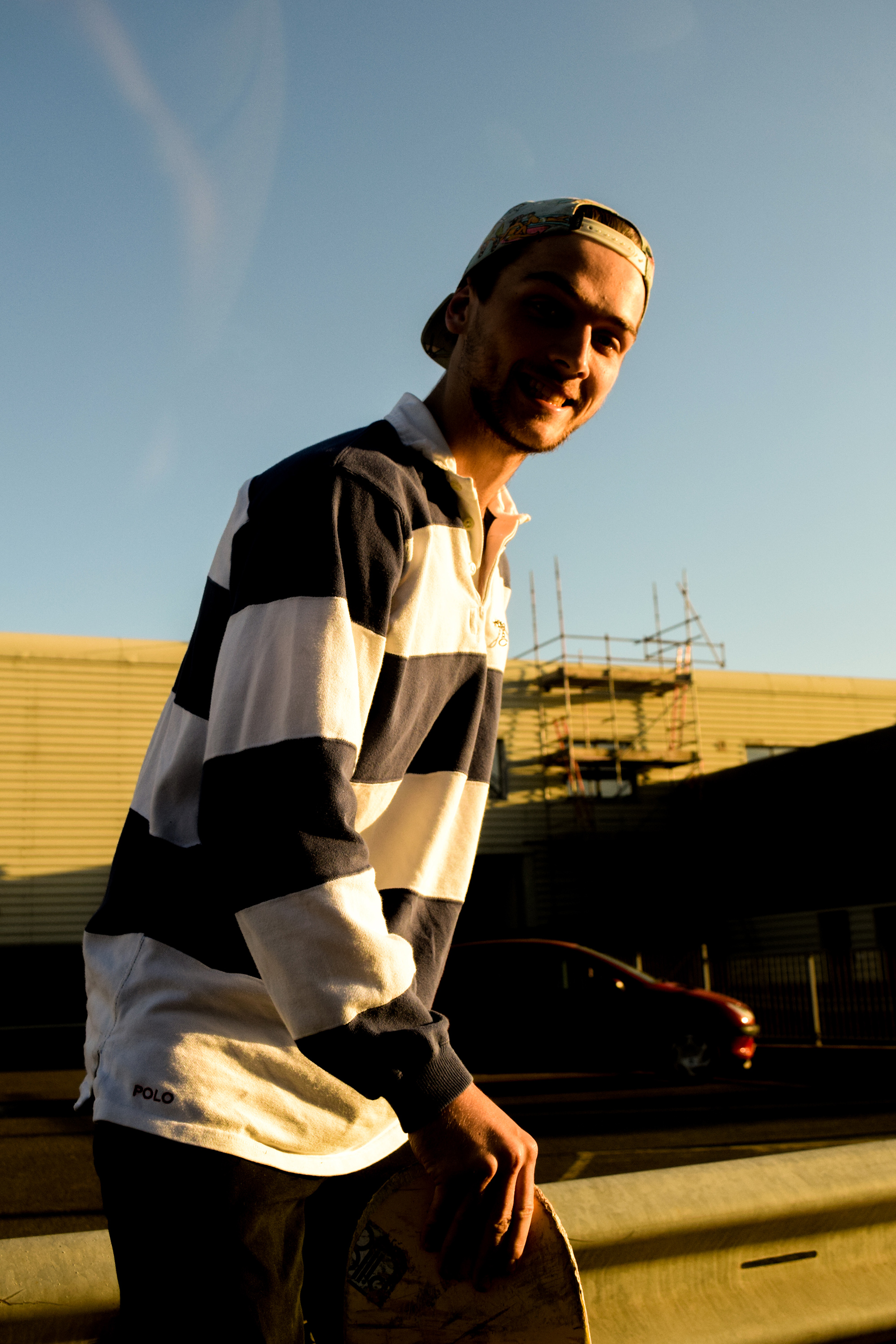
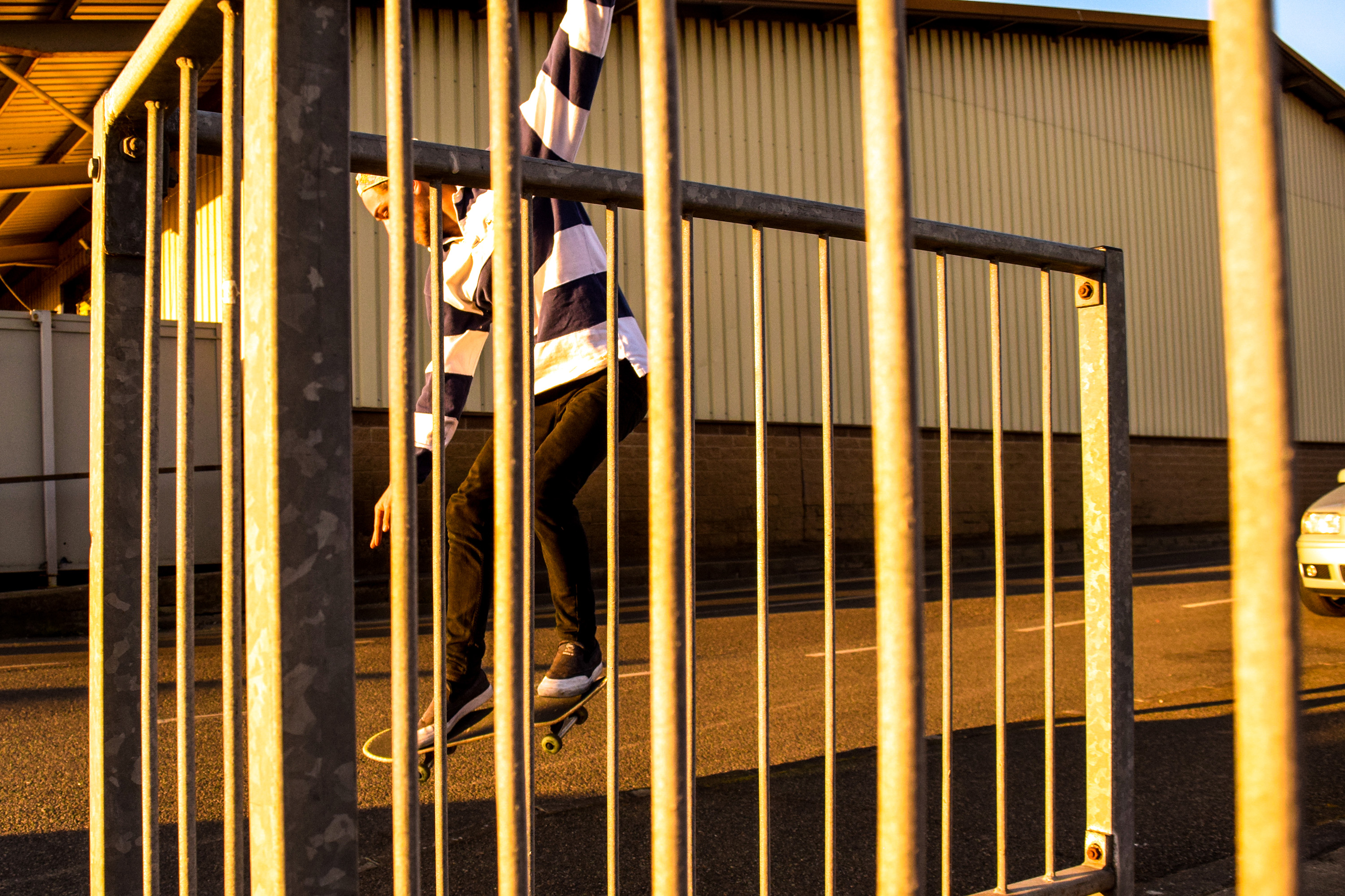
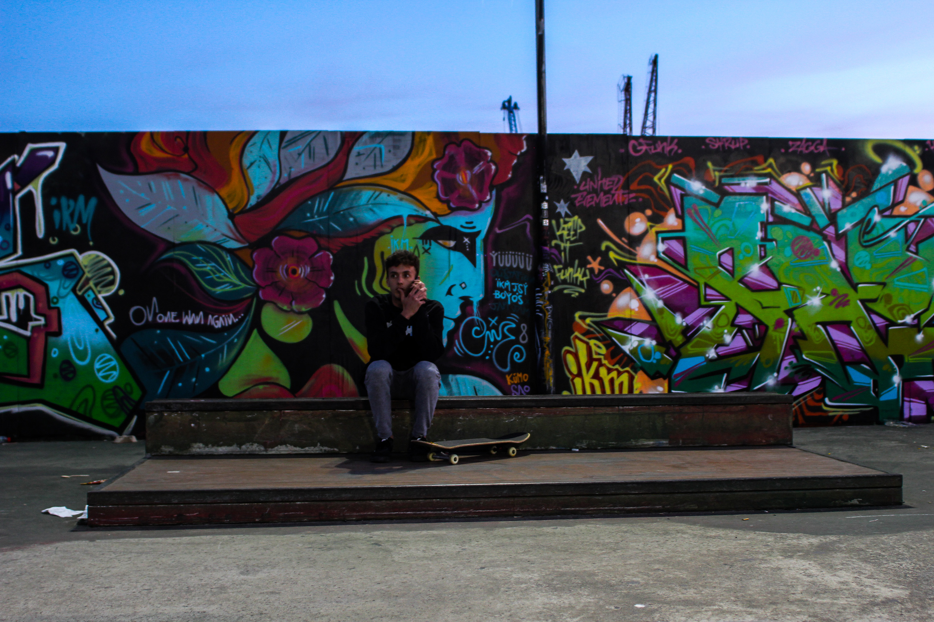
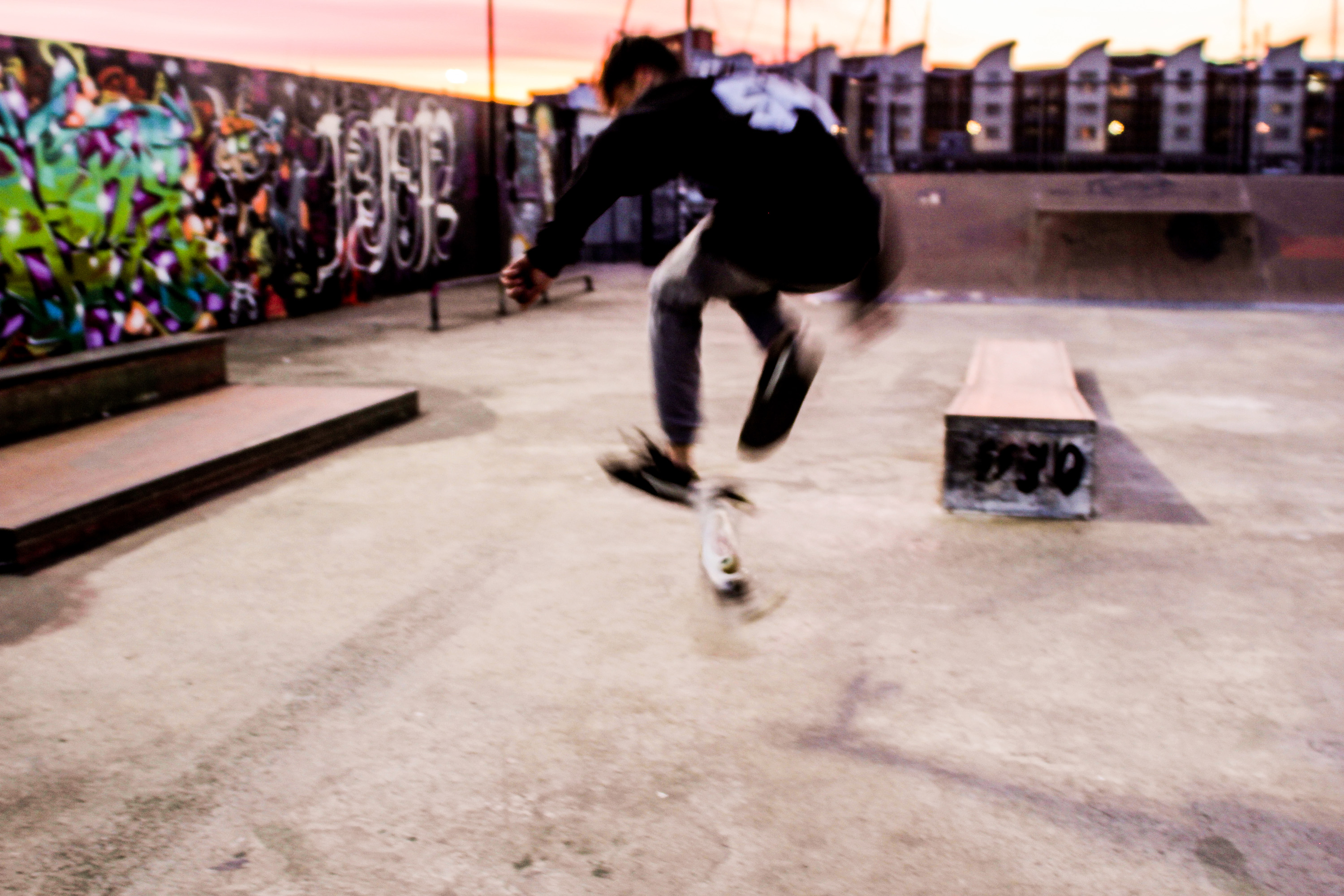
The following images are edited influenced by Theo Gosselin’s cinematic style, as well as traditional skateboard documentation. I experimented with shutter speed, shooting angle, and I tried to capture motion full images of skateboarding, as well as sharp portraits with interesting compositions. I am fairly happy with the outcome of the shoot, however

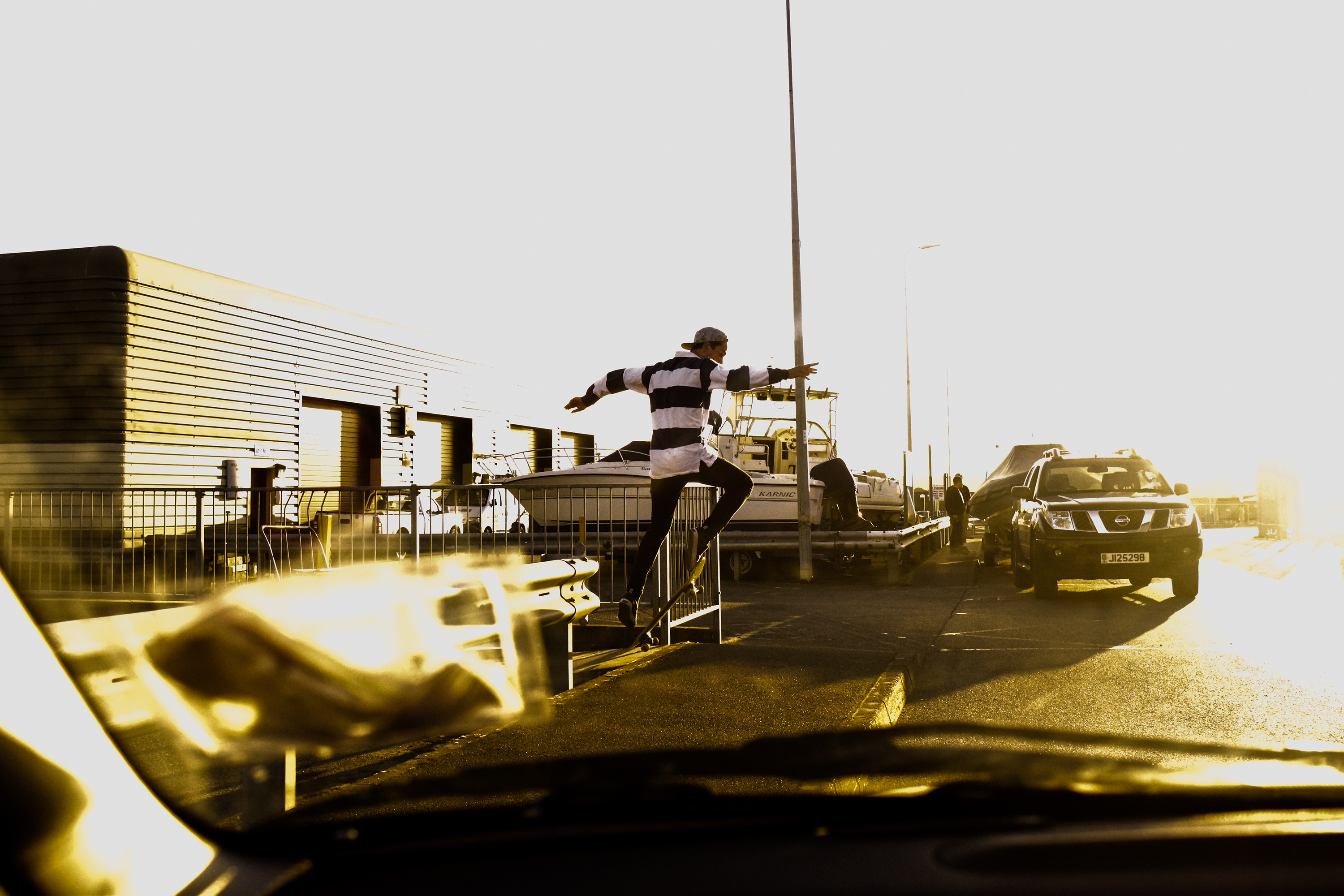
I edited this image to look fairly cinematic. I increased the whites in particular with this photograph to create a very bright, sky has become hard to make out from other areas of the image, forcing us to focus more on Zac. I tried to use the windscreen of the car to compose the image interestingly. Whilst using a larger aperture and shorter shutter speed I managed to blur the windscreen again focusing us on Zac far more.

Similar to the first, I used a short depth of field to blur the windscreen I purposefully added into the frame for interesting composition. This time, the image is a portrait of Zac looking at something, but the space of interest to him is covered by my blurry insurance disc and windscreen frame. I really like this composition as the way my insurance disk and windscreen frame cover from the top left down and round to the right side works very well against Zacs torso and the open space in the top right.

With this image I wanted to create a heavy contrast to attemot the cinematic look again. I raised the whites and brought down the black, and also but down the shadow toggle the have a large contrast of light and dark. This made the image look more ‘epic’ due to the strong sunlight, the shadow cast behind Zac running towards the sunlight away from the dark.

This image shows an example of my angle experimentation. Zac repeatedly did a trick over a pavement until I got a good angled photograph. I wanted to get really low to further capture the height of Zac on his skateboard, so I lay down as close to the ground as possible and angled my camera up. I also turned my shutter speed up slightly, and turned my aperture down to give a larger depth of field so I was able to definitely capture Zac moving in the air sharply.

This image is an example of my portrait experimentation. I saw Zac standinghere and thought it may be interesting to capture an image of this wall with him at the very center. The size and repetition of the wall is very interesting against Zac breaking this pattern up in the centre. His horizontal striped shirt makes a hard break from the background, and the colour difference also makes him stand out so greatly. Overall I really like this image due how the background and model work off eachother. 

This image shows an example of shutter speed experimentation. I set my camera up on a low shutter speed and took an image of a skateboarder doing a trick. The result was an interesting blur of motion that I feel works nicely, and represents qualities almost similar to a painting. I wanted to experiment with some layering, almost similar to the way Idris Khan brings images of similar subjects from different moments in time together into one photo. However, I only wanted to blend two images together. in which I used the last photo and an image I took of some grafiti at the skatepark. The outcome looks even moreso like an urban influenced painting.

Double-exposure Edits

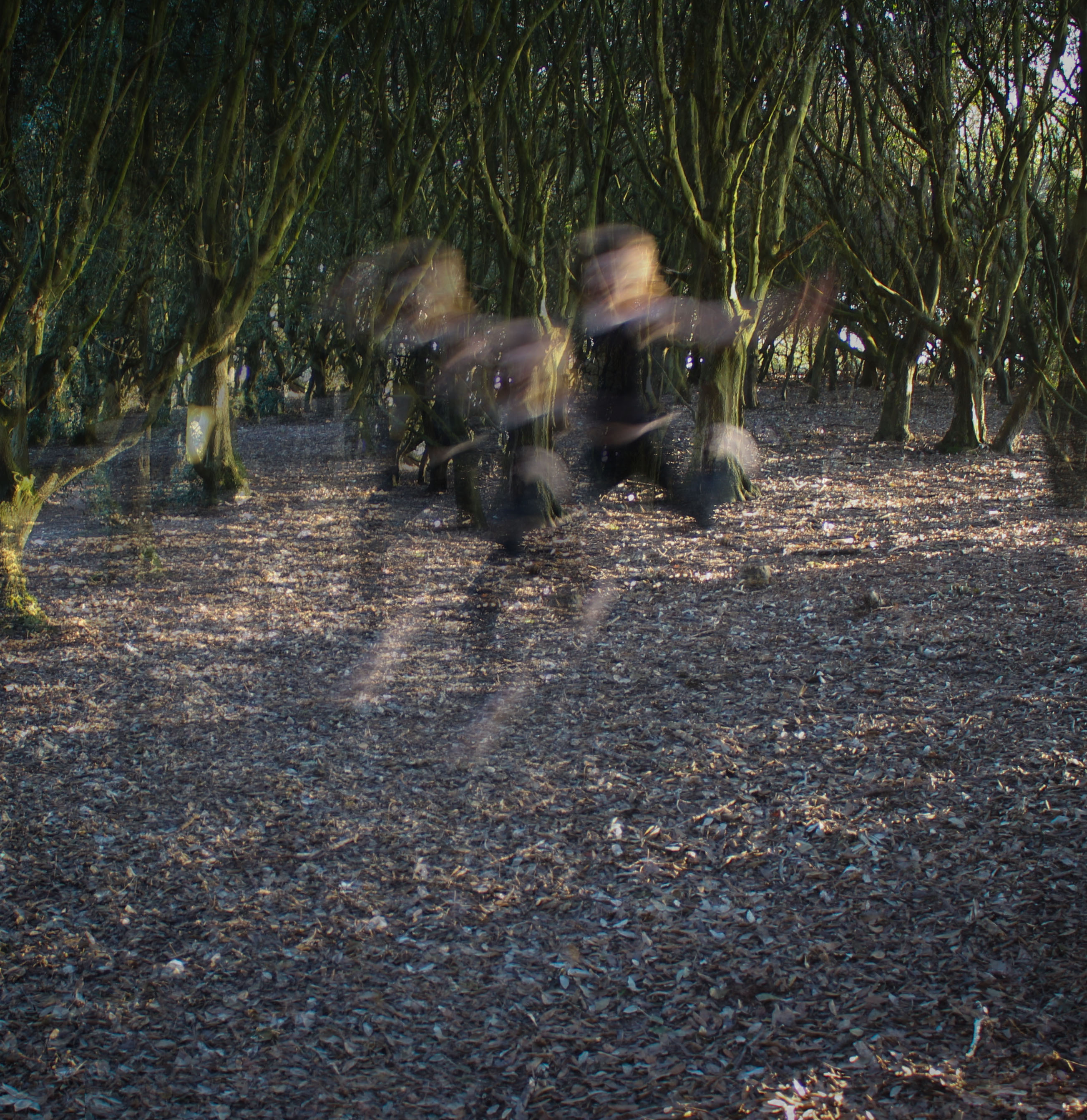
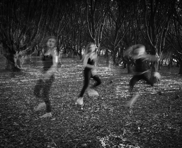
As an element of my performance work I wanted to try a more surreal approach and experiment with editing techniques such as superimposition. I did this in Photoshop by layering or duplicating the images and adjusting the opacity and positioning. This links back to the early research I did into artists such as Idris Khan who has explored combining multiple images in his work. I think this has been a worthwhile experiment because it has allowed me to develop and emphasize the idea of movement and create a slightly spectral appearance. I could expand on this idea by refining the outcomes I have and also trying different variations and effects. However in a way I prefer the simplicity and clarity of the original images and I think I would rather dedicate my time to investigating interesting presentation techniques for my final outcomes.
3rd Shoot (Progress)

Destroying Negatives, Progress Update


26/04/2017:

  • I have now collected all of the water from the different locations and they are in the buckets.
  • Getting the sample from the desalination plant proved more difficult than I expected because there was no way to get in without breaking the law. But I managed to get the water sample by asking one of the workers to get the sample instead, he was very nice about this and helped me.
  • Last night I submerged all of the negatives in their respective buckets of water and left them all overnight except for one.
  • The water from my friend’s swimming pool I kept my eye on because this was the one where I was not sure about the potential result. After 30 minutes I checked the tester piece and it had changed colour. It went from the dark brown of the negatives to a very light brown. I decided to check back in another 30 minutes and when I did the test sheet was a very pale white colour. When I saw this I pulled out the real negatives and hung them up to dry off, I did this because I did not want the images to be completely destroyed which is what I expected would have happened if I had left them overnight.
Bleached Negatives After 1 Hour In Pool Water

27/04/2017:

  • I moved the buckets into my shed to keep them out of the rain, and hopefully to keep them a little warmer to help any fungus to grow.

 30/04/2017:

  • I removed the negatives that were dipped in the two saltwater solutions because the images were starting to deteriorate. The top yellow layer began to fall off and was no longer attached to the other layers. I tried to make sure that it didn’t just come completely off and for the most part this worked well, after this I kept the negatives flat to make sure that the layers did not completely remove themselves while they dried. One of them had a lot of sand on it so I washed this off from the undamaged end.
  • In total only three images were damaged by this process, so I’m going to put the other ends of the strips into the water to see if I can get the same effect to happen again.
Negatives Damaged By Salt Water

03/05/2017

  • This morning I checked on the negatives that were till in the water and I got a bit of a shock. The tap water negatives were almost completely destroyed in the submerged part. The damage to it is far beyond what I had expected. I tried to remove the negative as carefully as possible from the water but unfortunately almost all of the of the gelatine layer on the third image from the right was removed and the other images were also very heavily ruined. This has really surprised me because the tap water was the one that I thought would damage the negatives the least but it has done easily the most damage the the physical gelatin layers.
  • At this point I also removed all of the other remaining negatives and have left them to dry before being scanned and printed. The negatives in the saltwater buckets seemed to have had the same kind of separation of the layers that they did before but to a lesser degree.
Negatives That Were Suspended In Tap Water

04/05/2017

  • I got all of my negatives, print and scans back from the shop today and I am really pleased with the results. I did not expect the images to turn out as well as they have. I will not post them all here because I am going to do their own blog post for them but I will post a few of the more abstract ones.
  • Now that the process of making the images is complete I will move on to displaying them.
Damaged by Water from Desalination Plant
Damaged by Tap Water

Performance/reflection Shoot outcomes

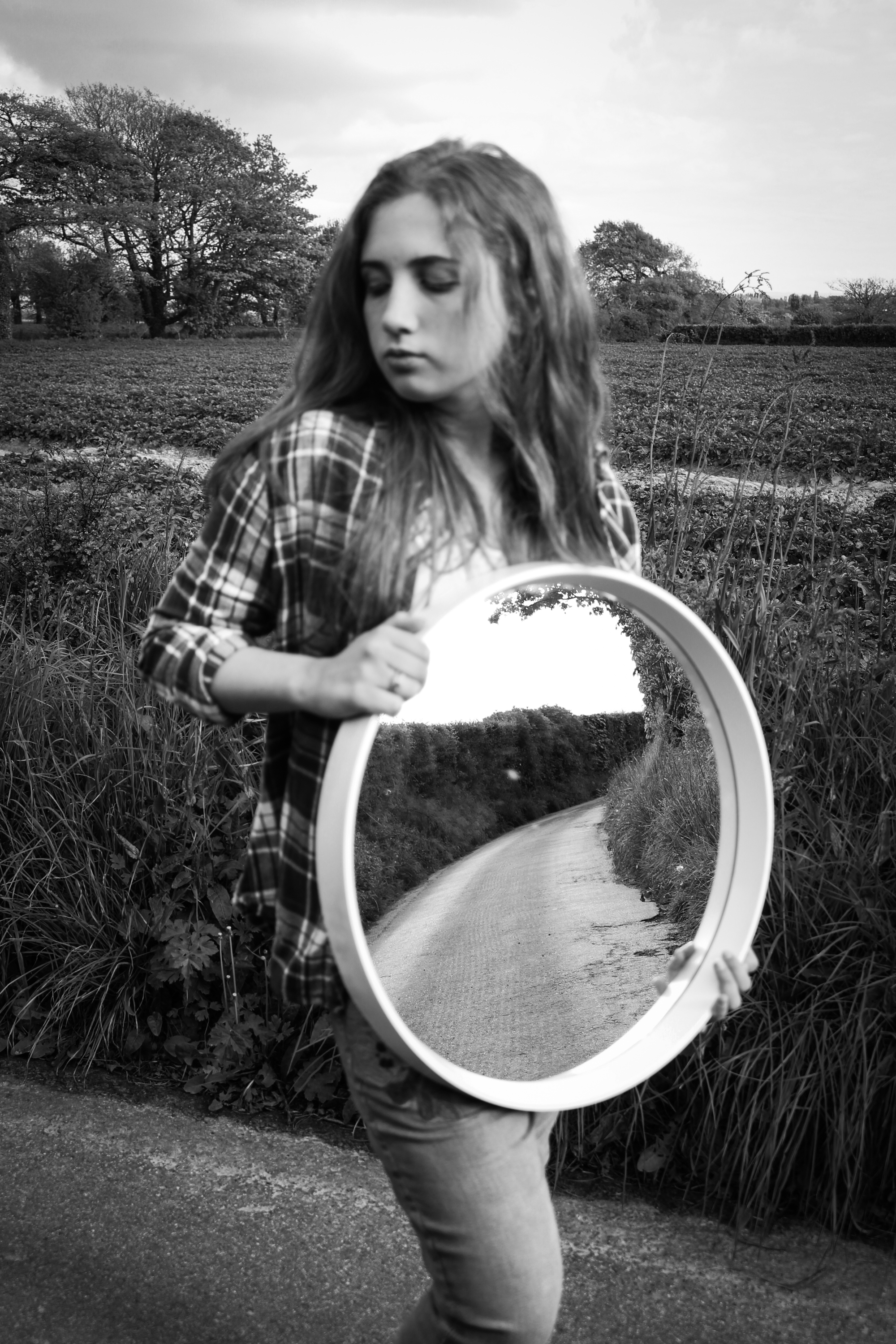
I have continued to experiment with more shoots based around performance and the use of reflections and shadows.  As with my earlier shoots the aim was to explore human relationships to environments and the process was fairly spontaneous. I have continued to use myself as the subject in many of the images as well as my younger sister, Lillian. I wanted to try and develop the idea of collaboration in reference to performance artists such as  Claude Cahun so I occasionally allowed my sister to help direct some of the photographs or press the shutter for the pictures I had set up involving myself. Once again I have made basic adjustments to the images in post-production to improve the colours, lighting and clarity.

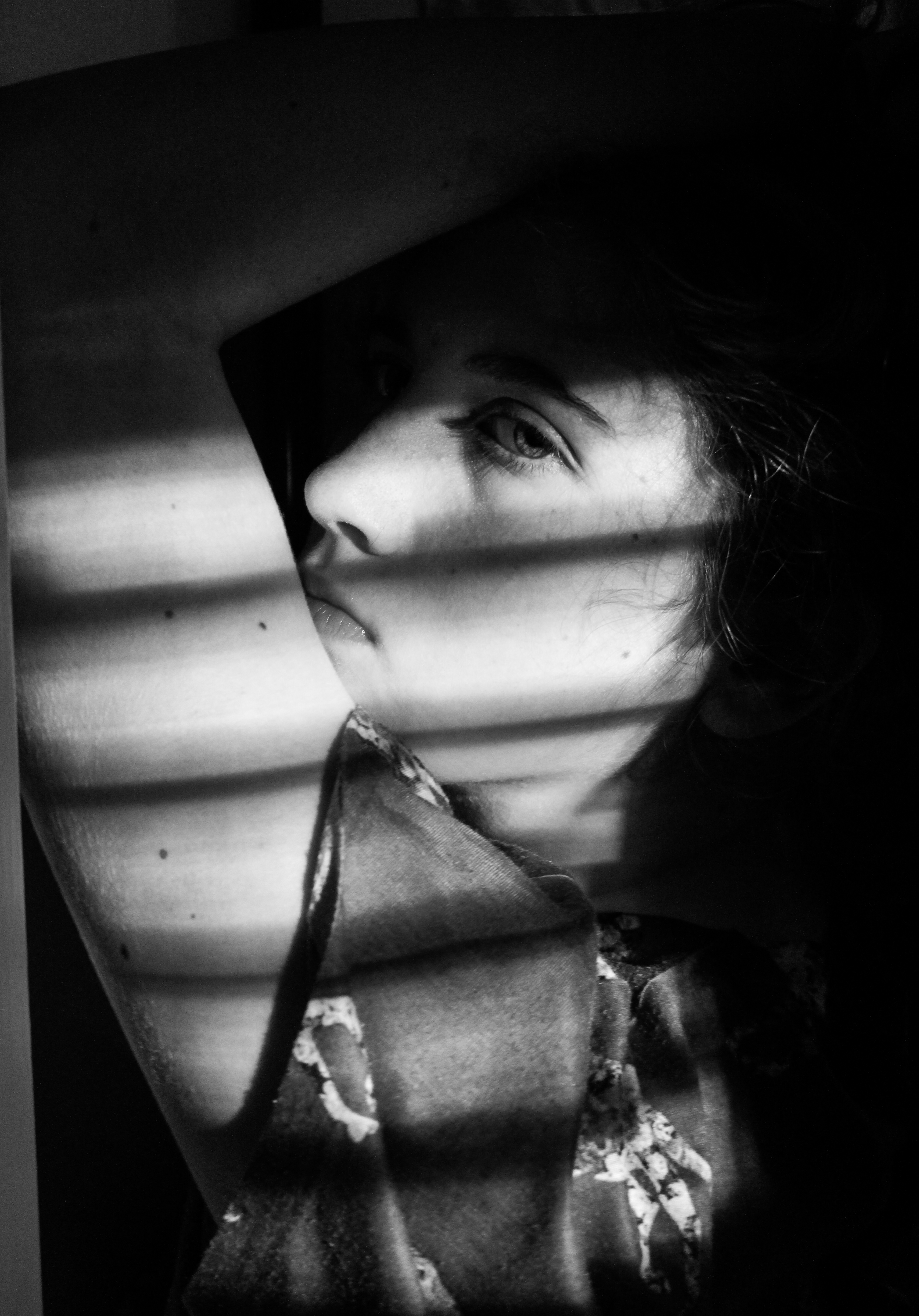
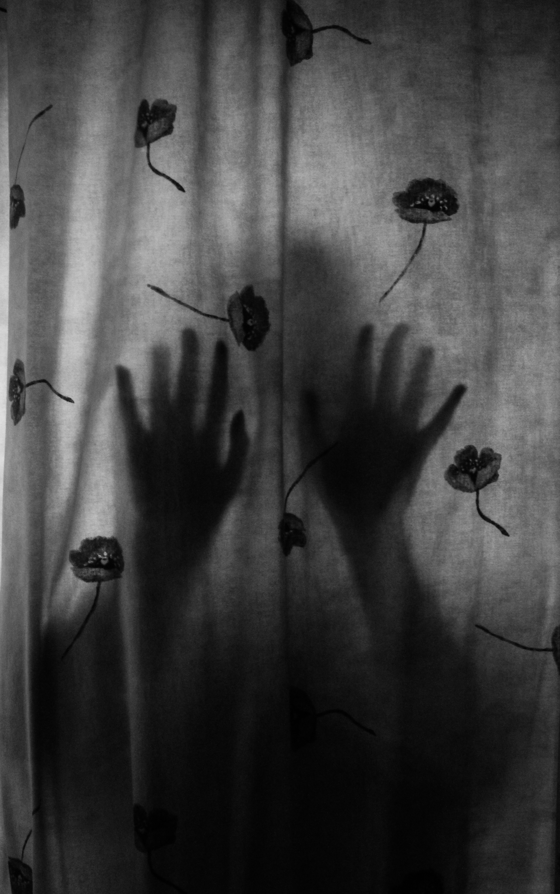
I wanted to try and explore interior environments specifically focusing on shadows.  I didn’t have many successful outcomes from this and for this reason I decided to base the rest of my shoots in natural, outdoor locations. However, I was pleased with the two examples below and I am planning on using them as final pieces.  I like the first because of the interesting combination of light and shadow created by the strips of light and the position of her arm so that it frames her face, with the dark background also meaning the viewer’s attention is drawn to her. I  think the second image with her silhouette visible through the curtain is also quite interesting and has an unusual, eerie atmosphere. I edited both of these to black and white to emphasise the qualities of the shadows for a more dramatic appearance because I felt the colour detracted from this.

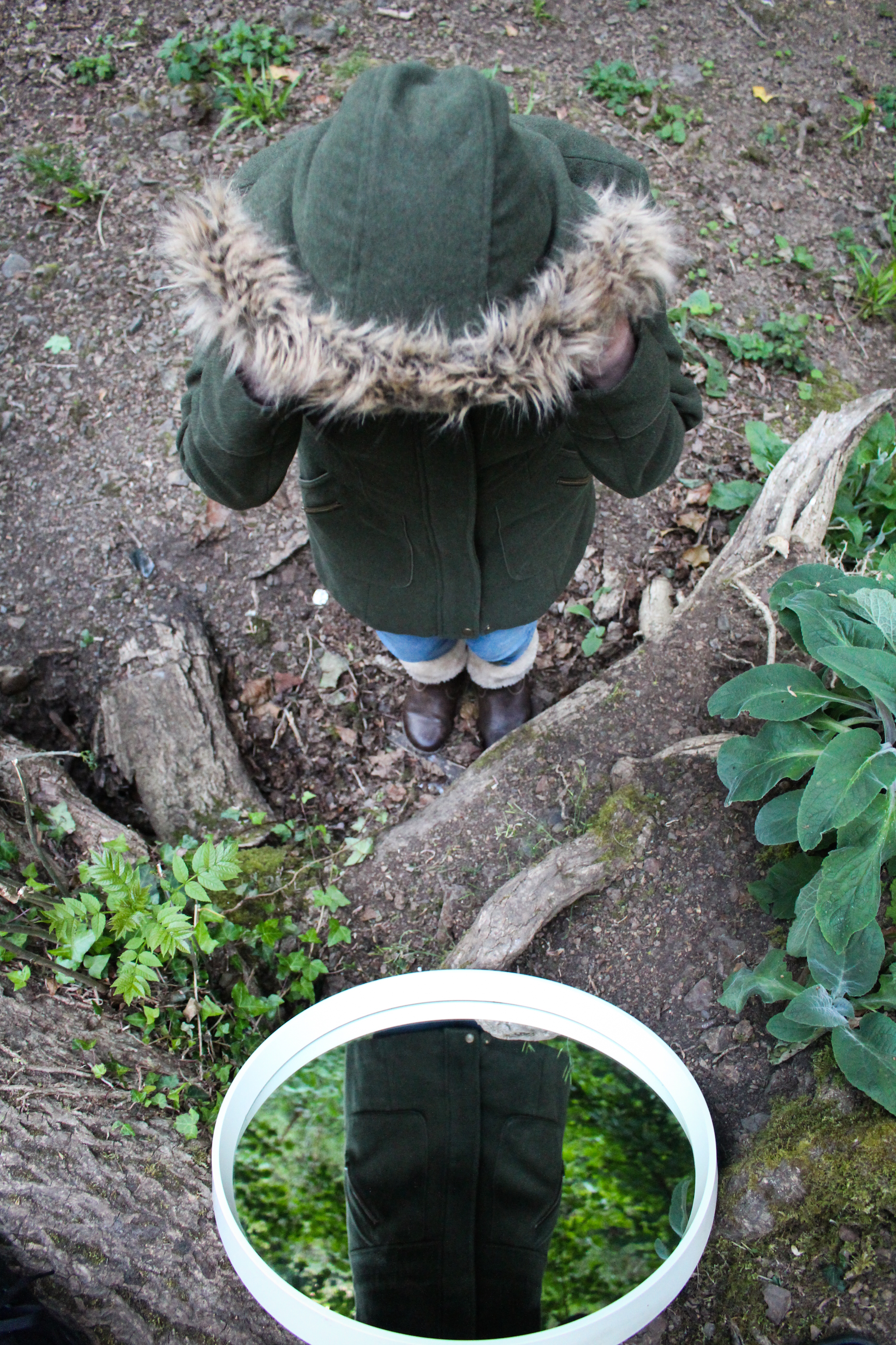
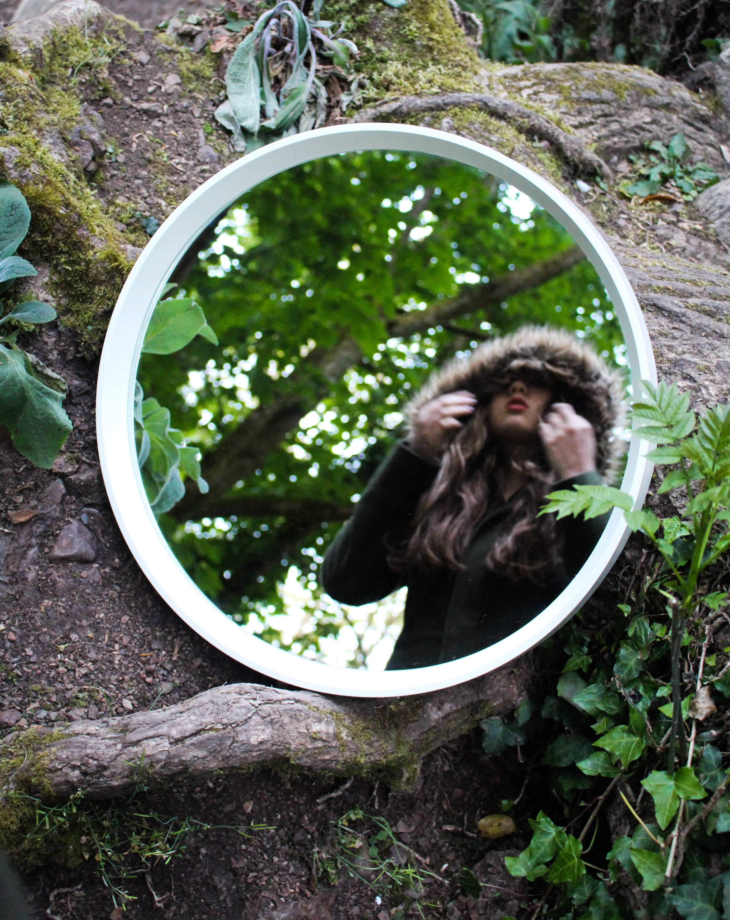
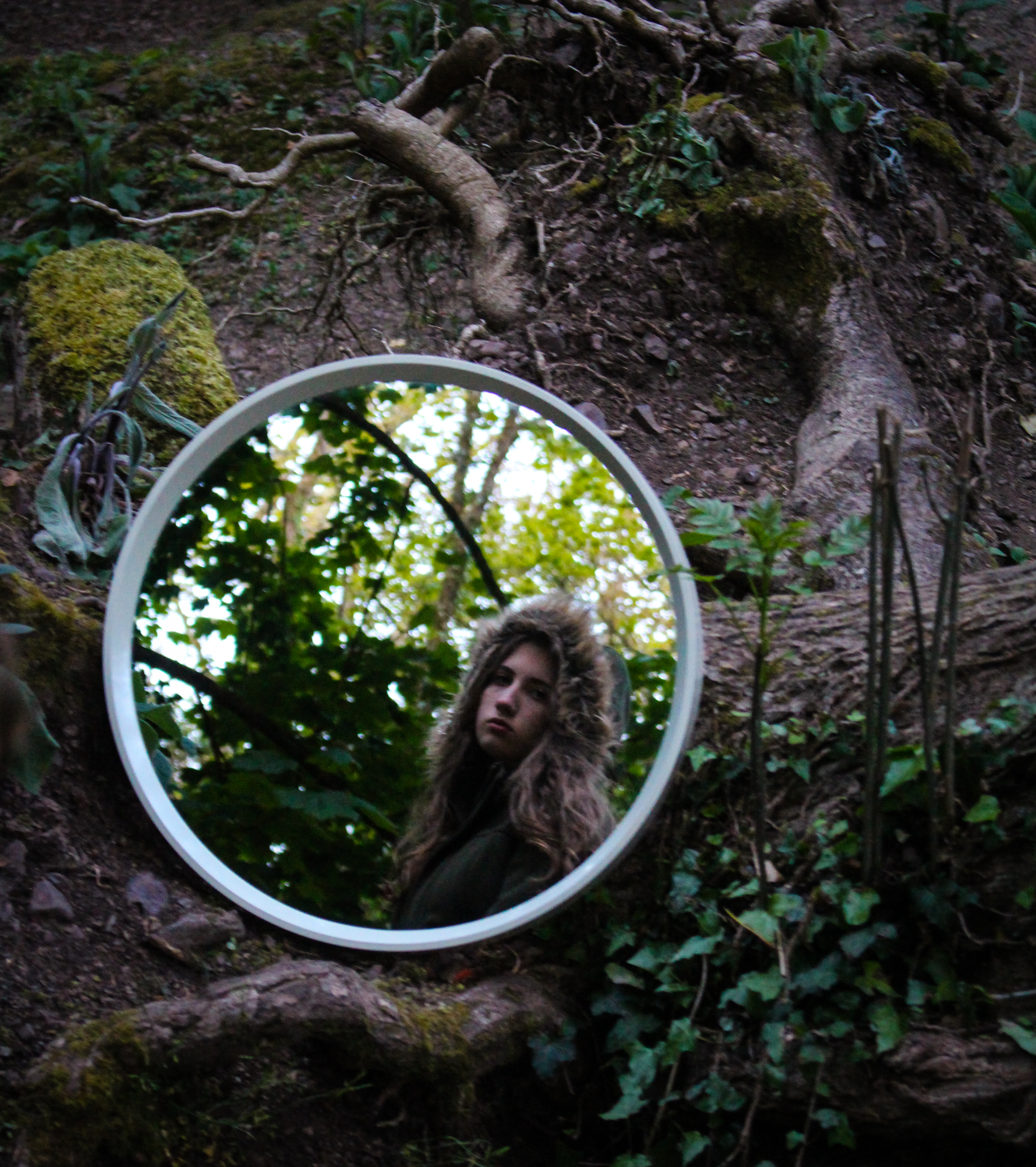
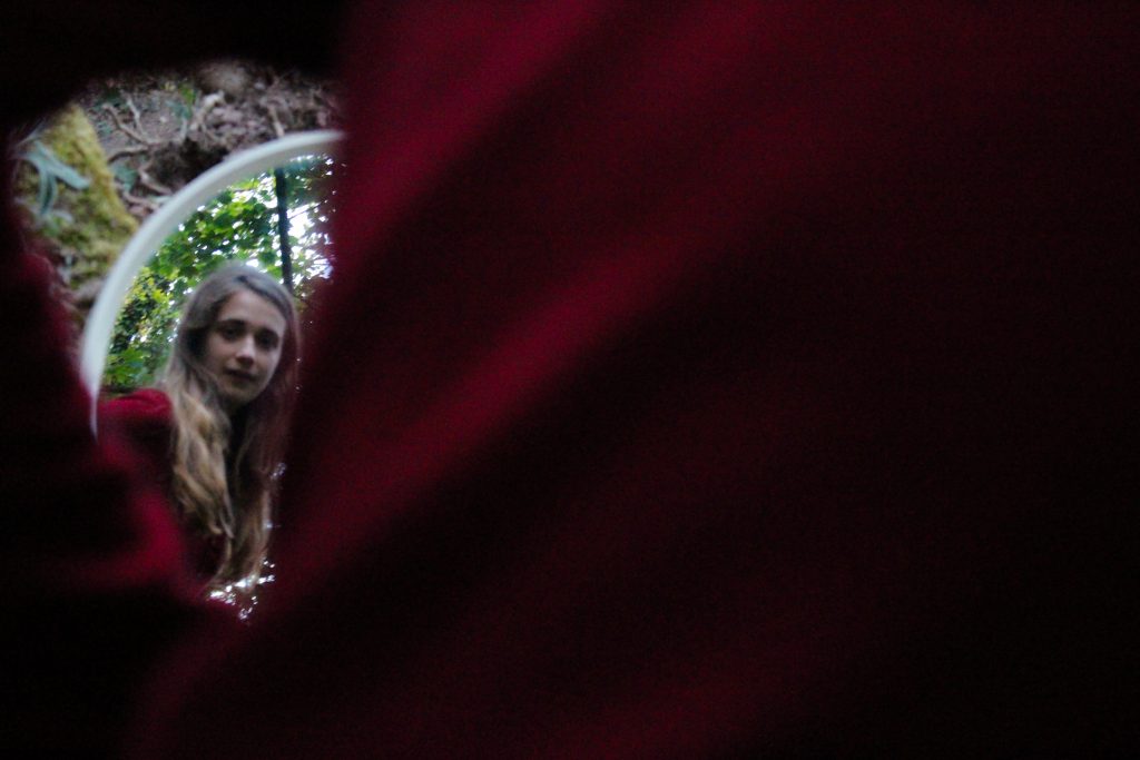
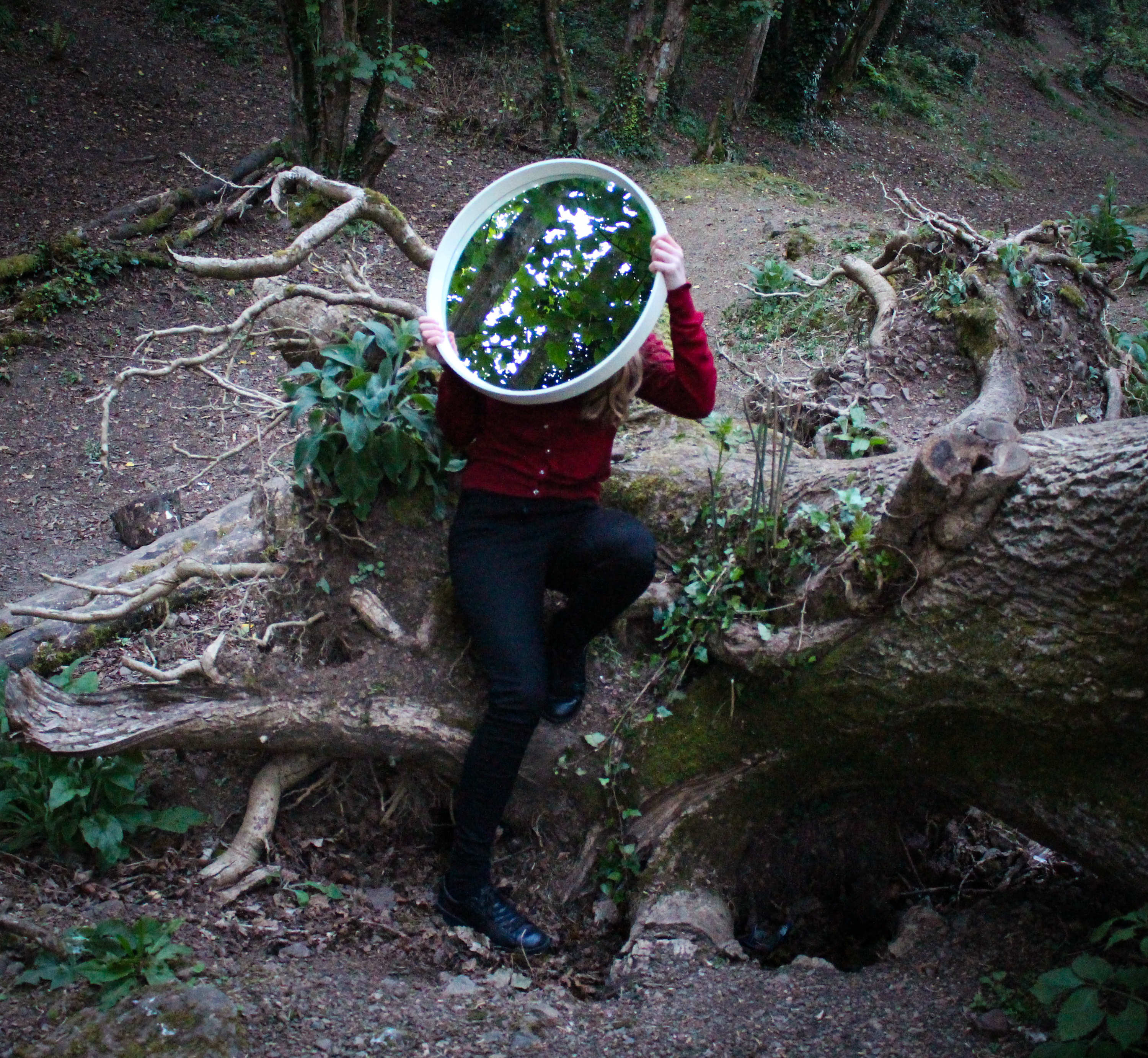
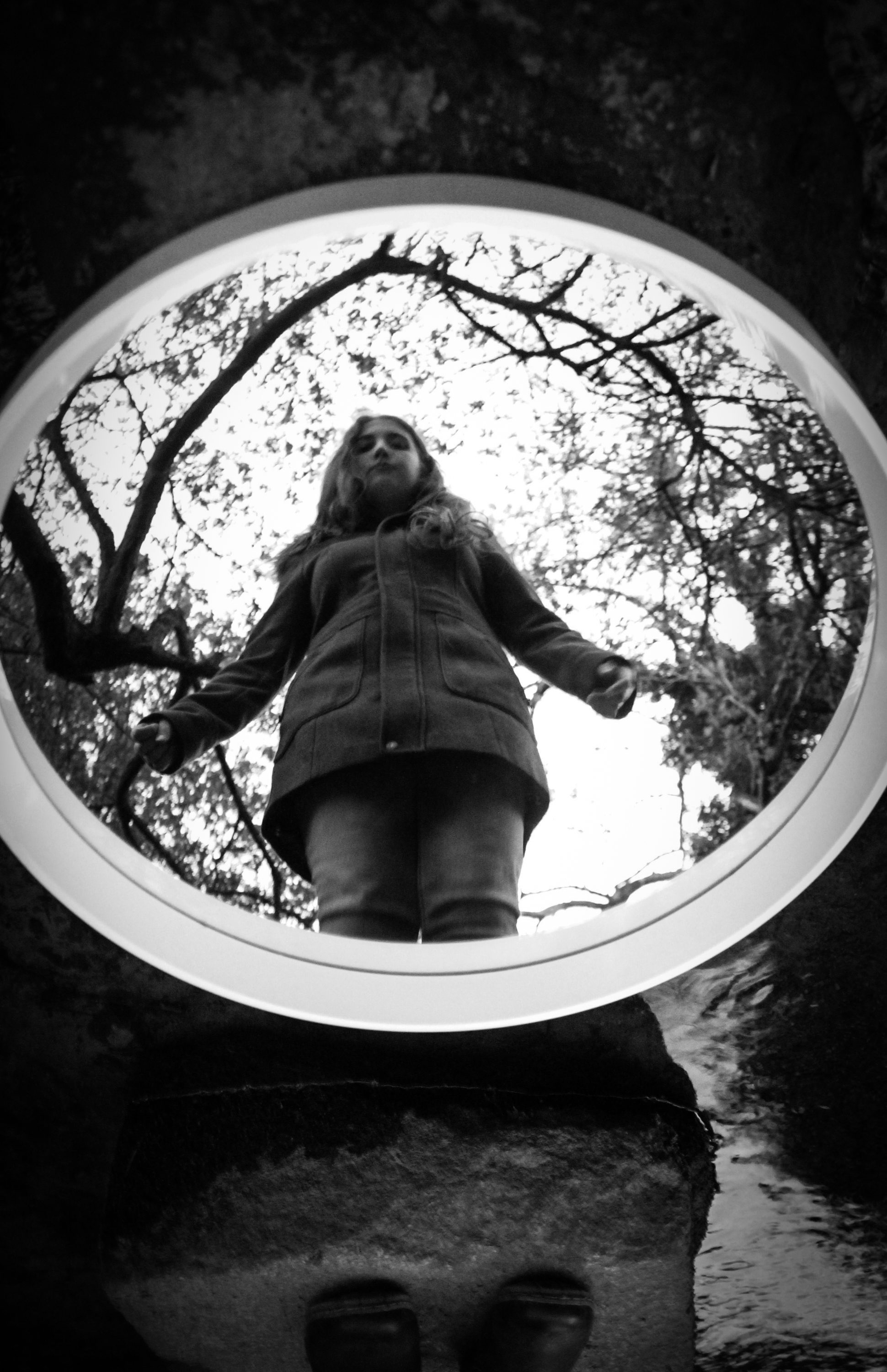
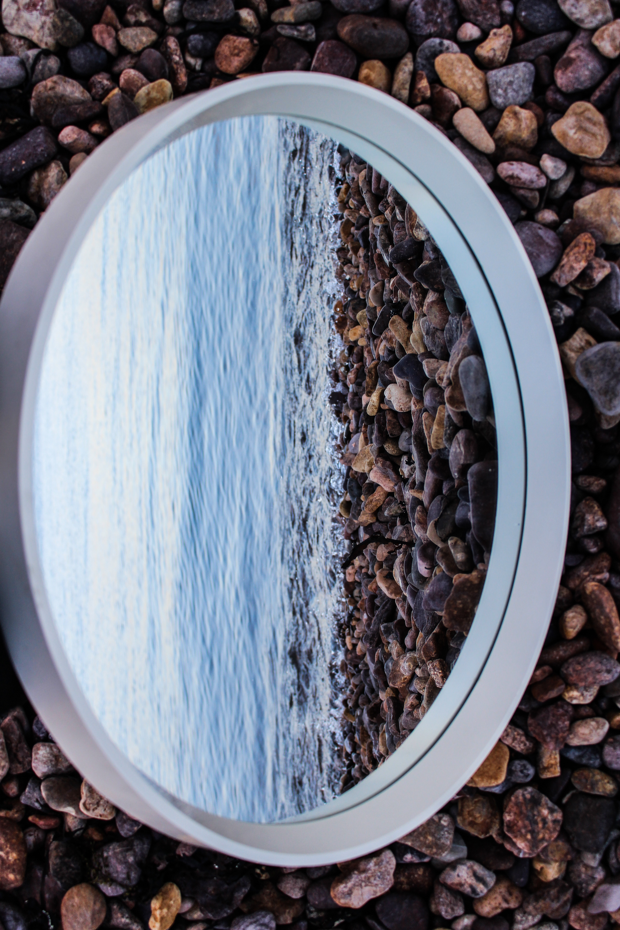
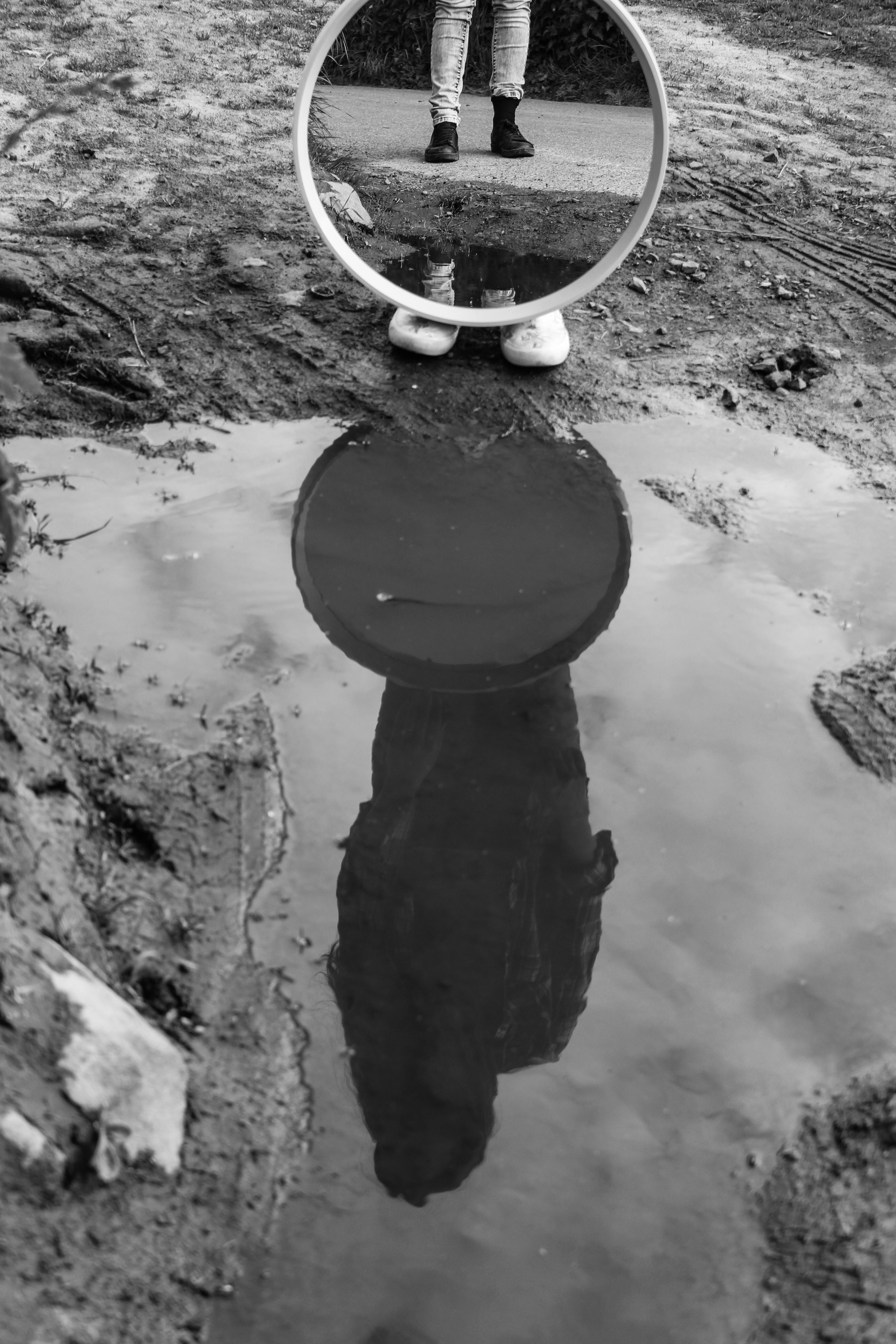
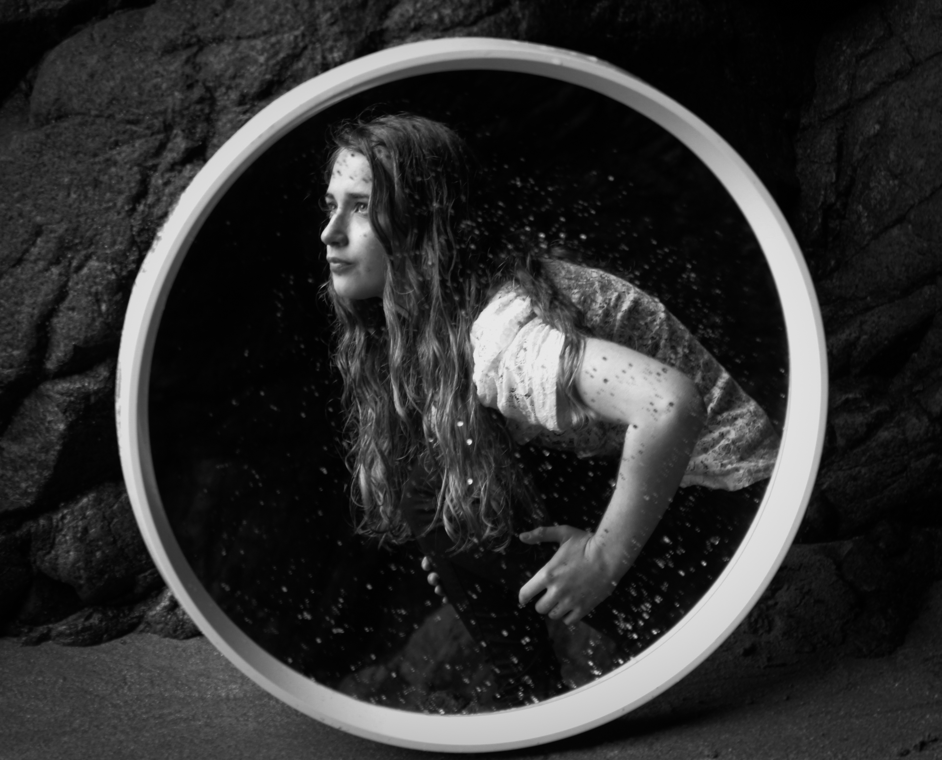
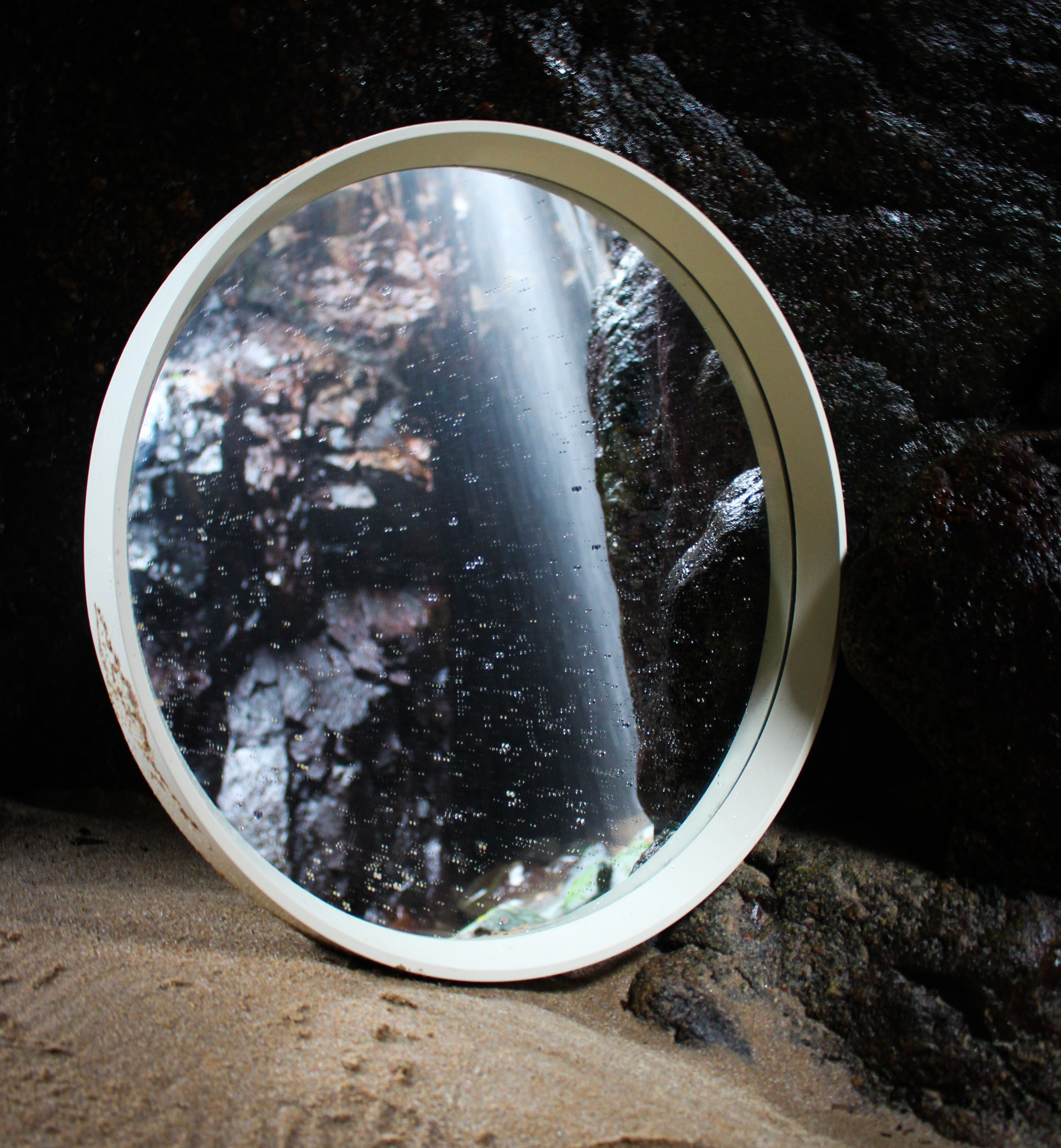
The next few outcomes are from a shoot I did in a different wooded location. I also experimented using a round mirror rather than a rectangular one. This allowed me to experiment with different techniques because it is smaller and has a thinner frame. I think this one stands out more within the environment because it’s round shape often contrasts with the other shapes in the image. However, I did like how the rectangular one echoed the shape of the image itself. My sister was wearing green with a brown fur hood which blends in with the naturals hues and tones of the environment. Contrastingly, I wore red which complements the green and stands out.

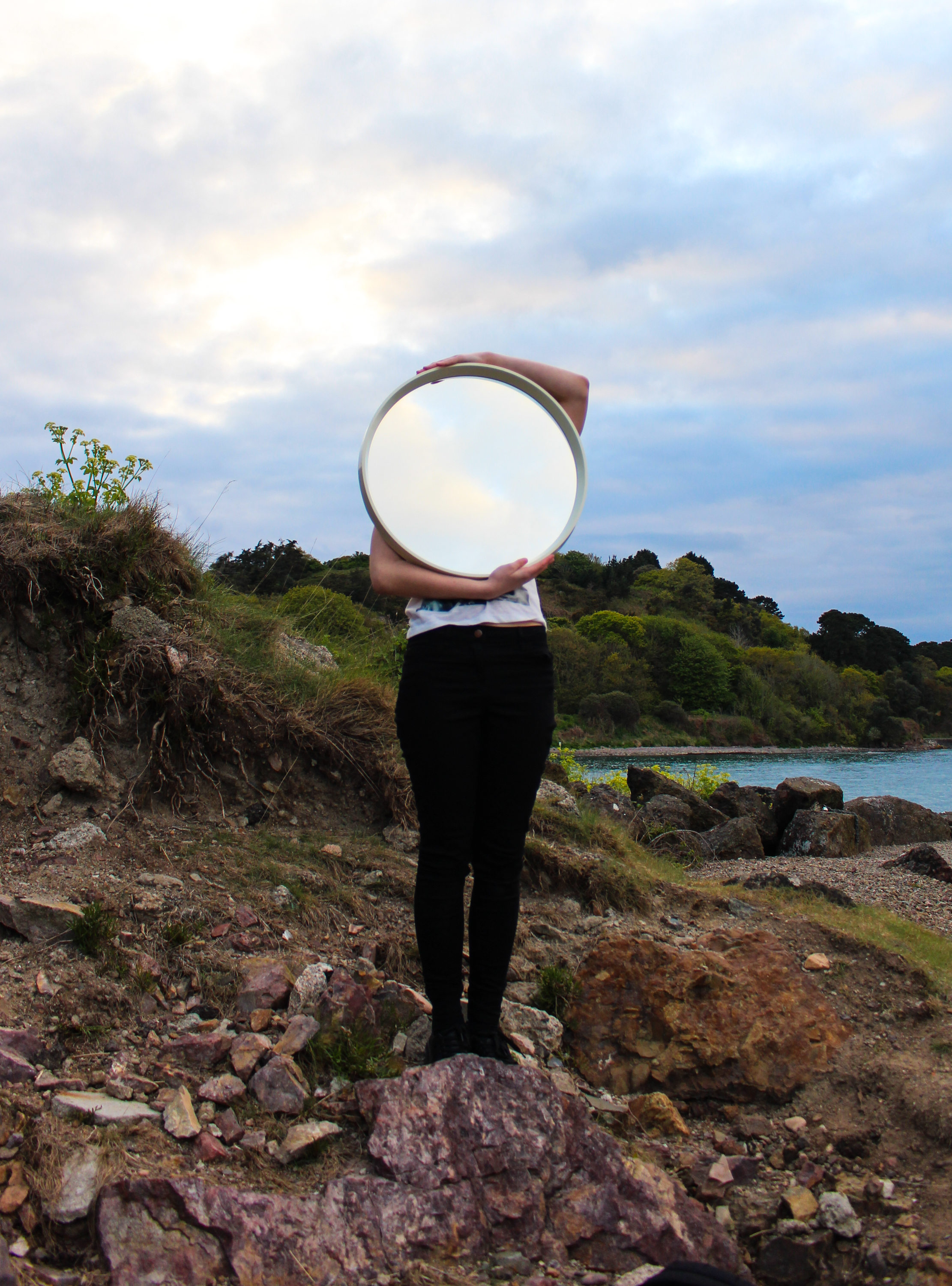
I also did a shoot at a beach location and made some landscape images without people with the use of the mirror. I don’t think these are particularly exciting but I  think the second example below is effective because of the dramatic sky and the way that the arms follow the shape of the mirror.

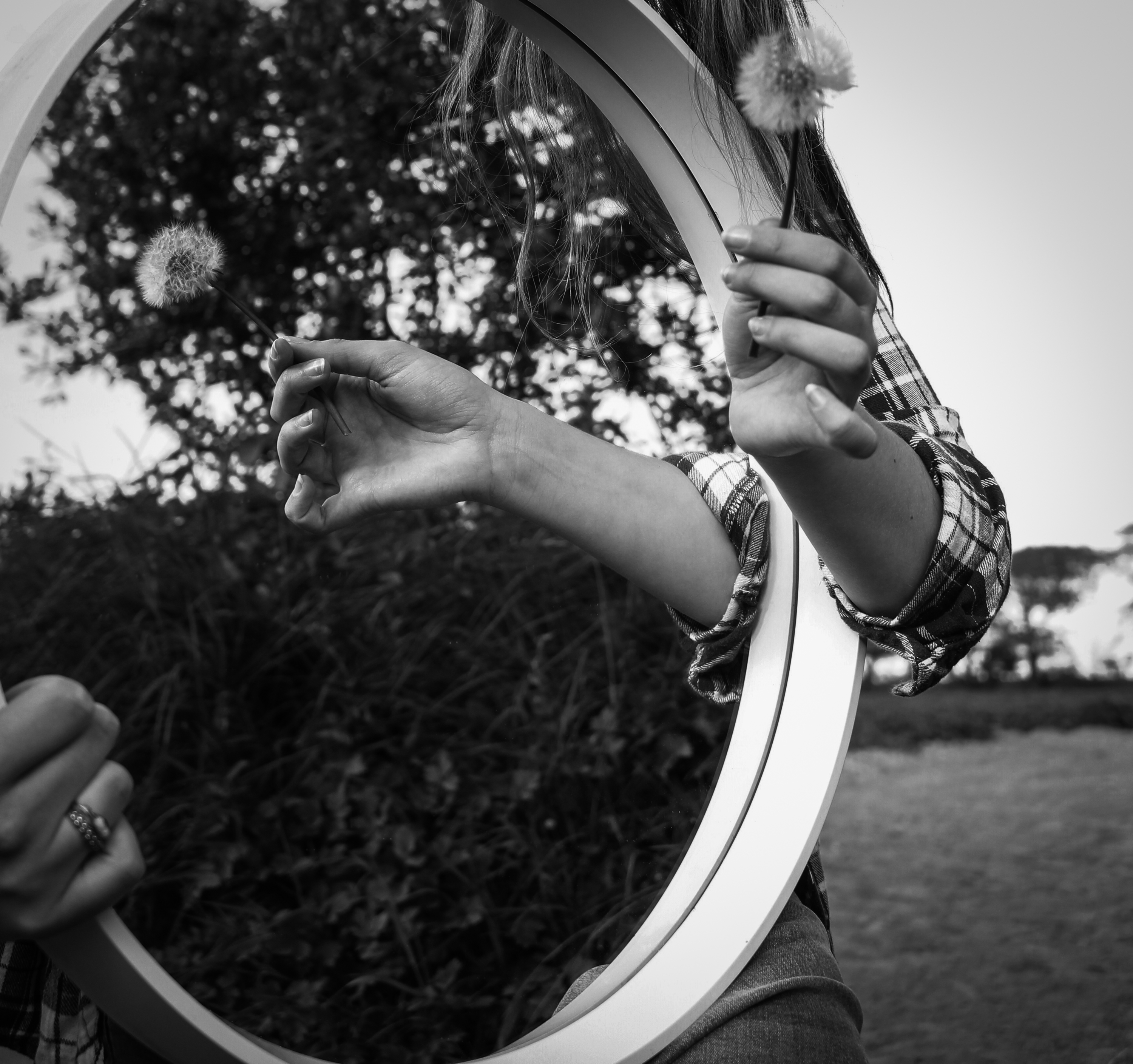
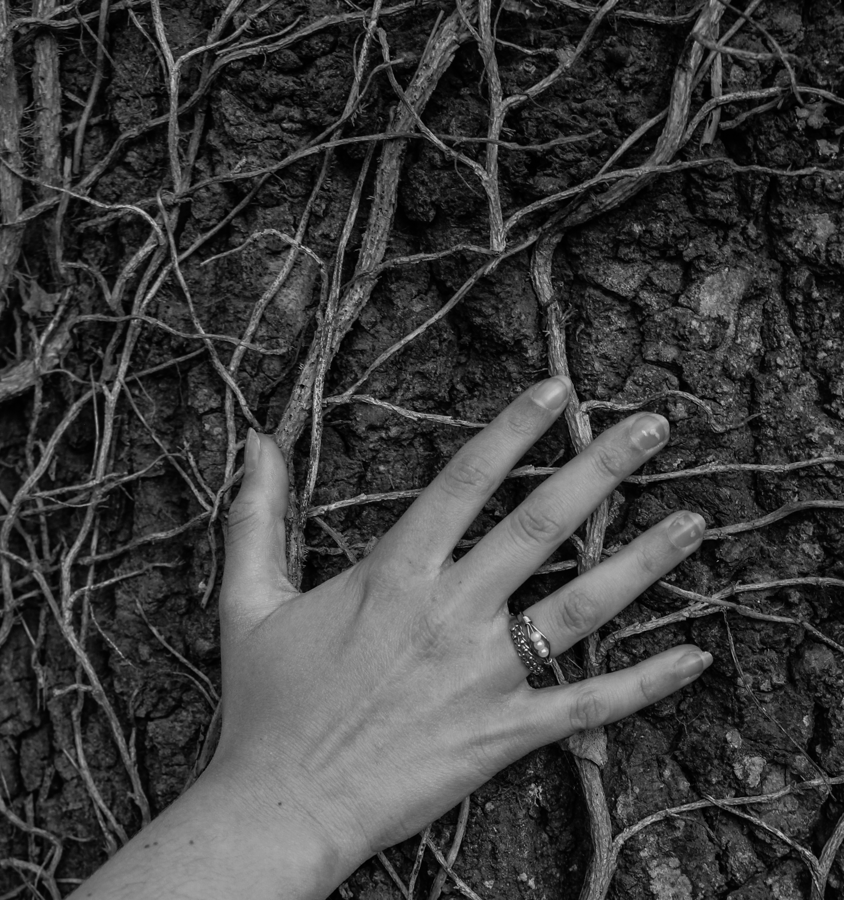
These images are from a shoot I did around some country lanes. I prefer the shot of the mirror working with the reflection in the puddle and I also like the shot of her hand on the tree because of how the veins show the similarities between humans and environments and how they can blend together.

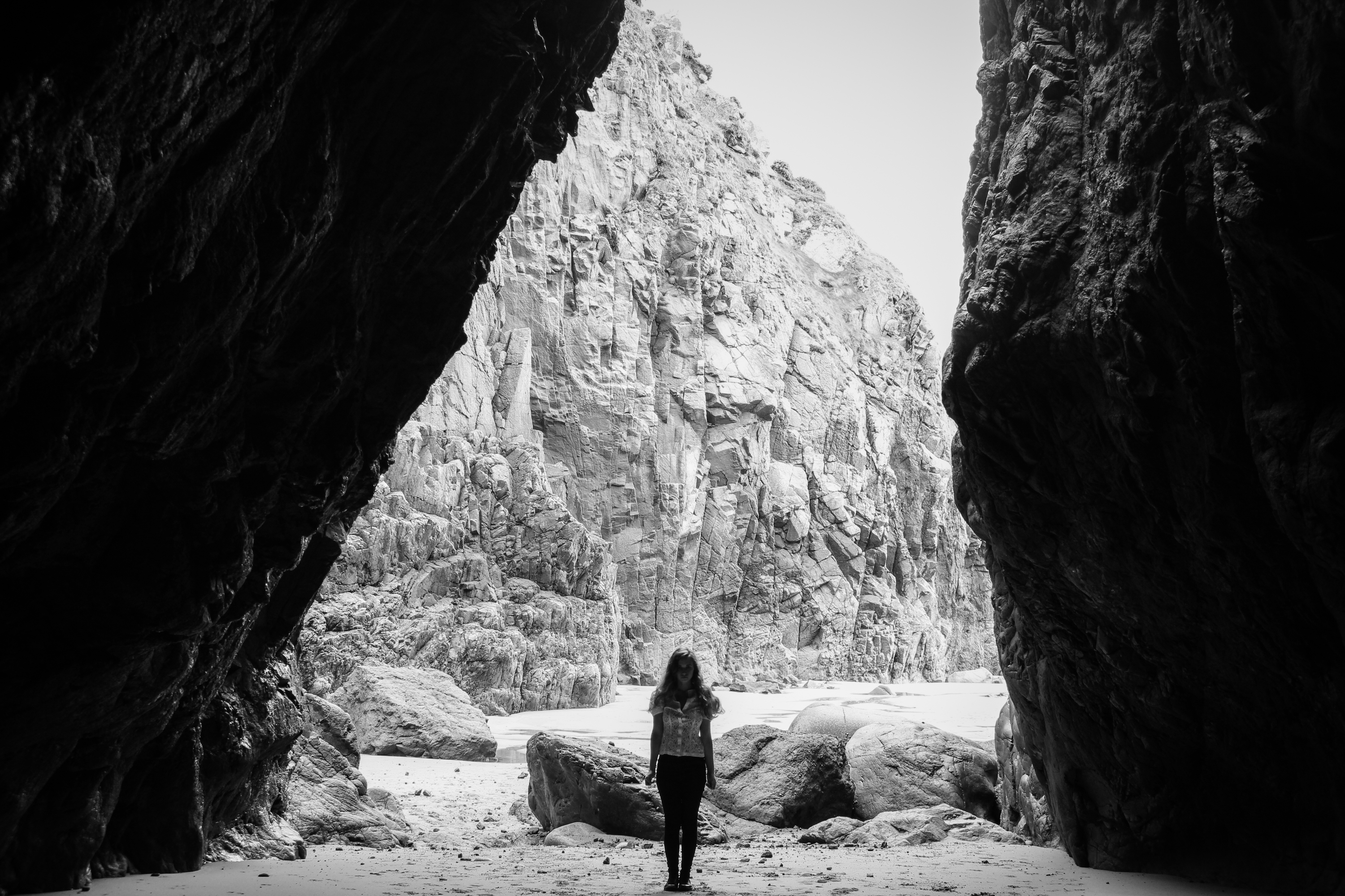
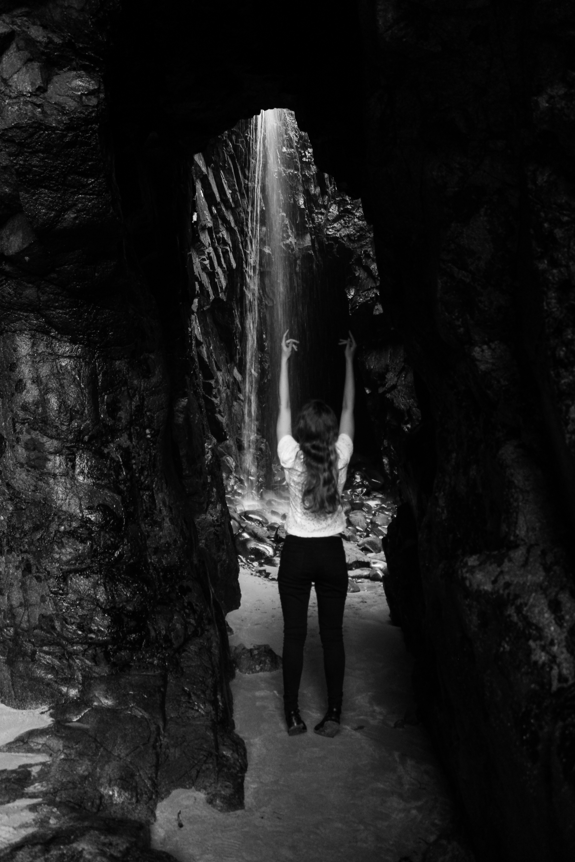
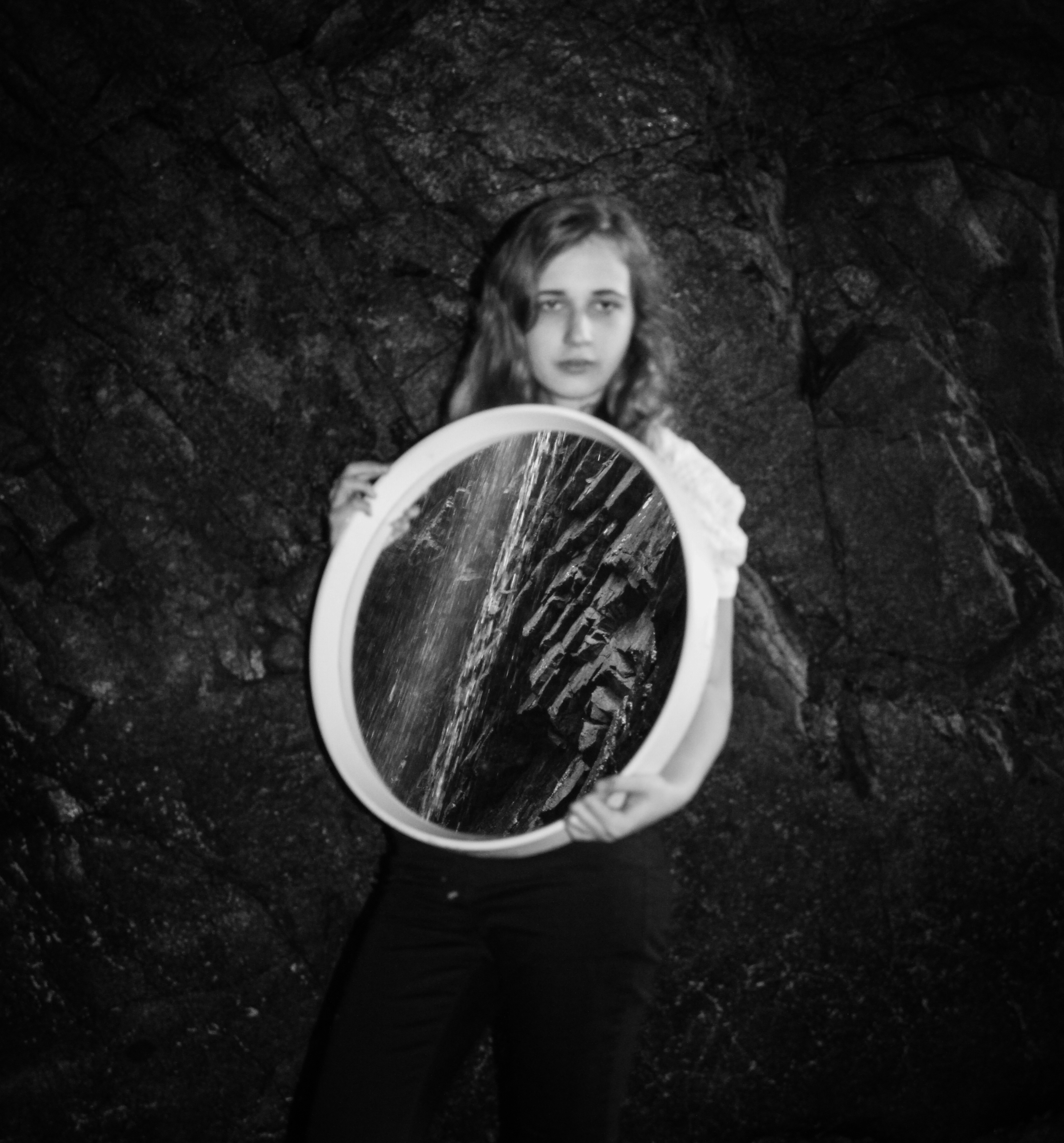
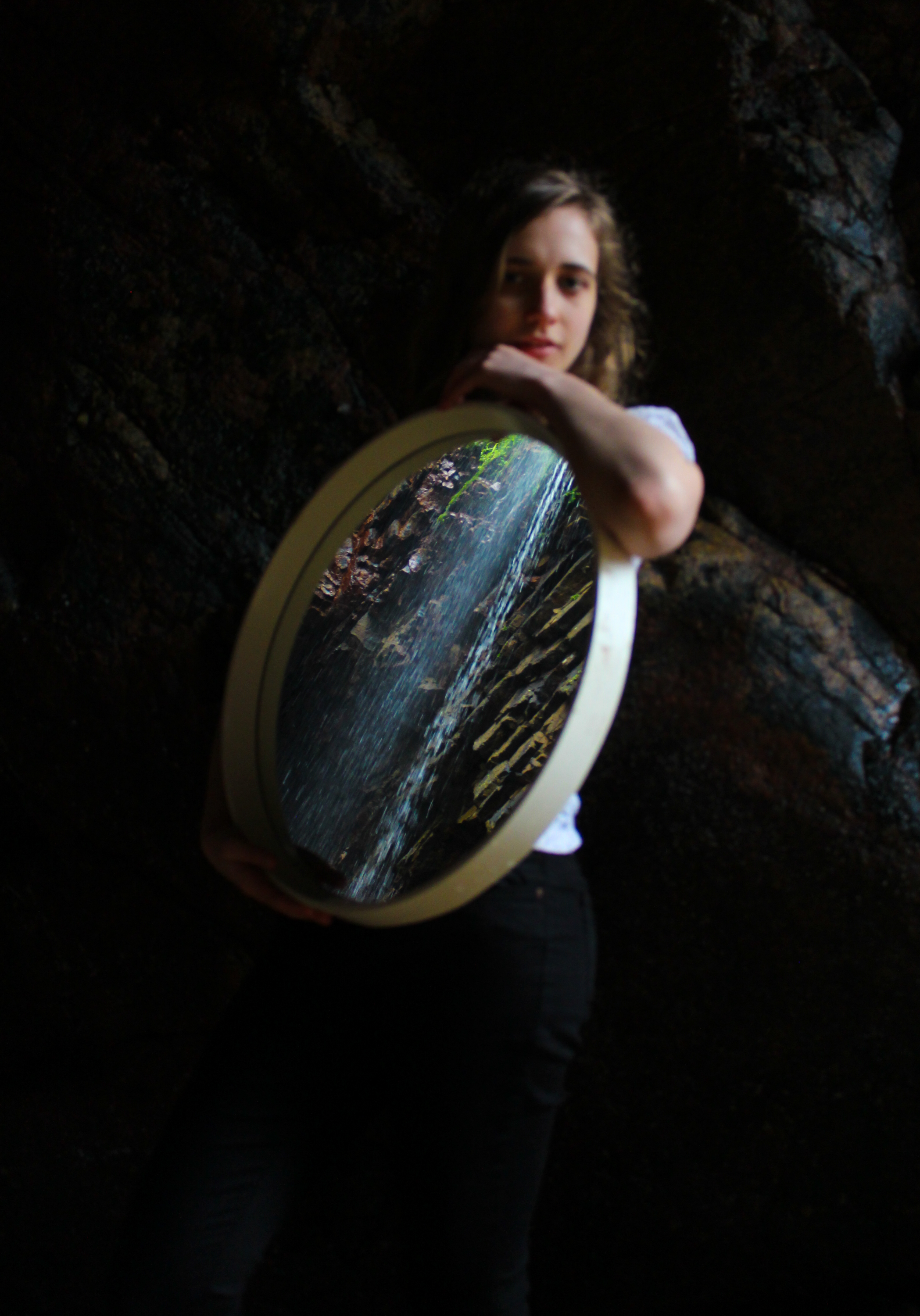
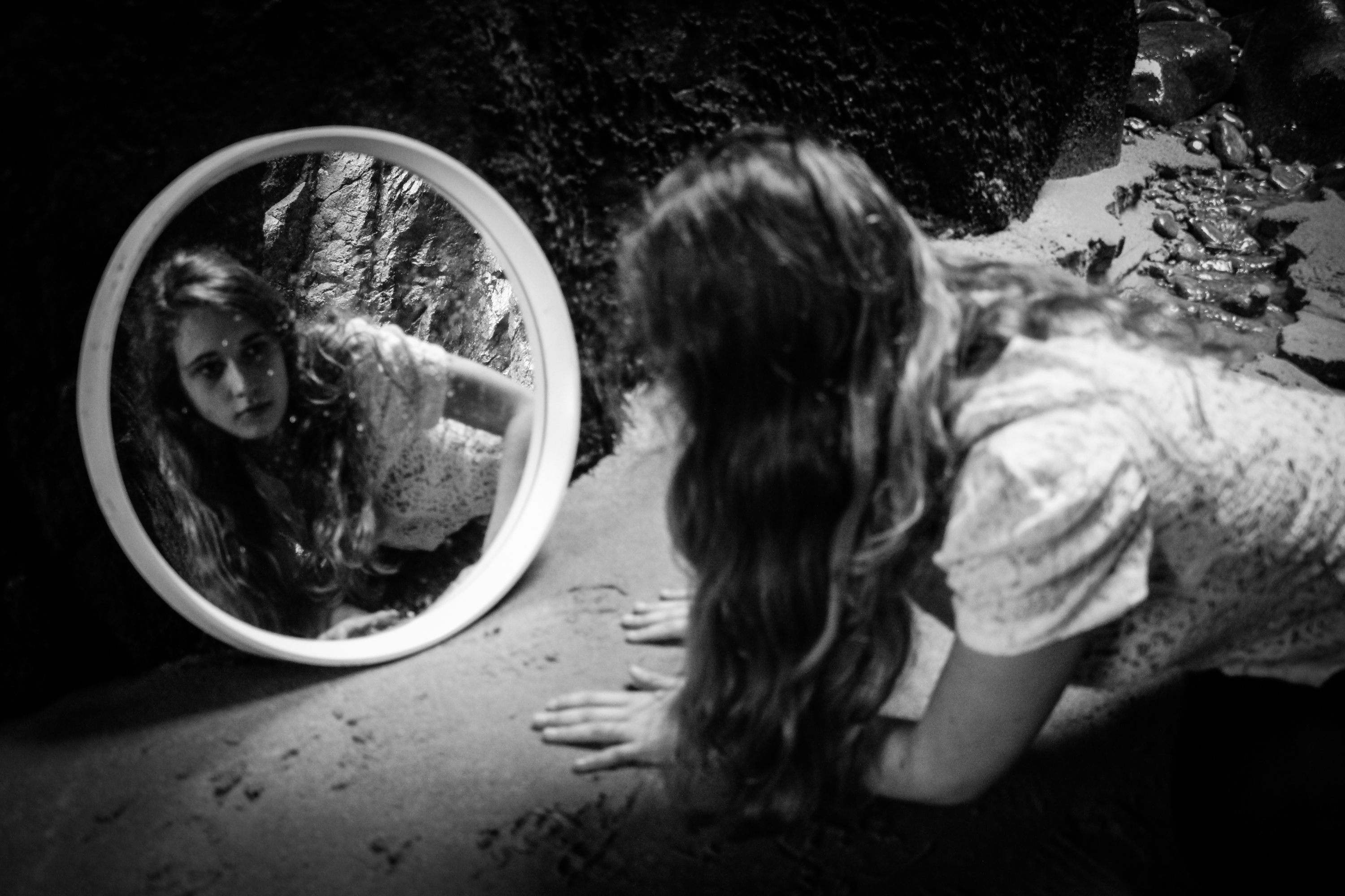
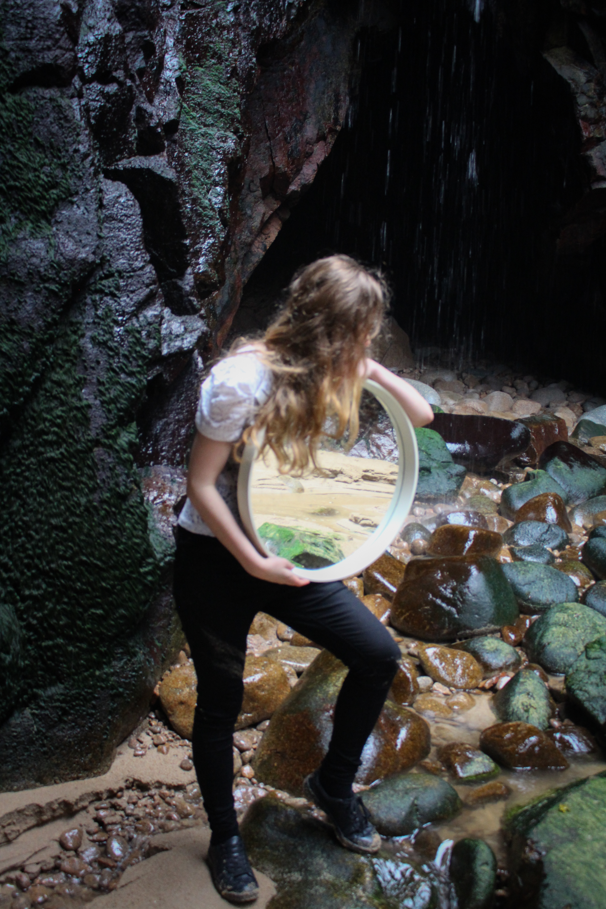
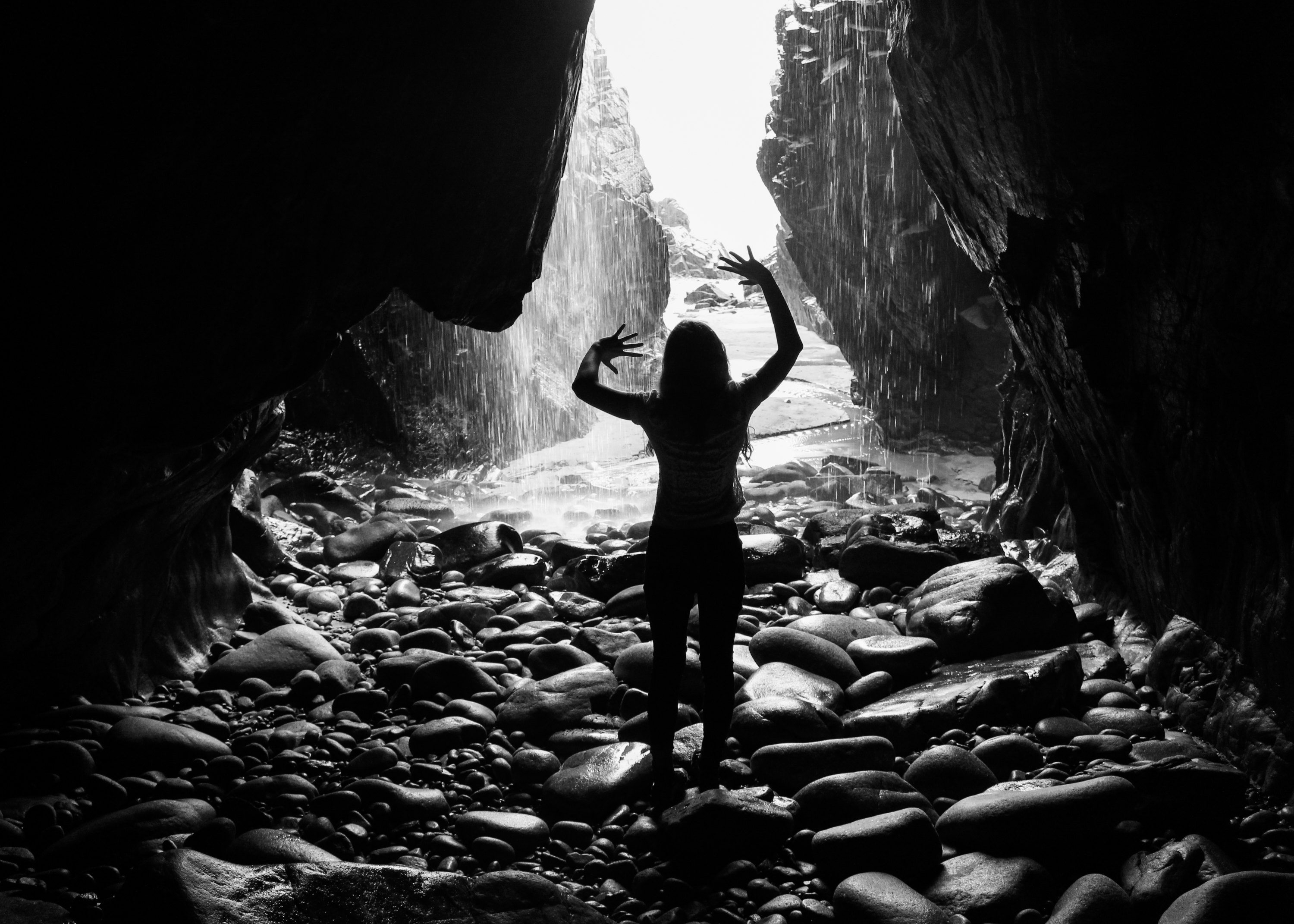
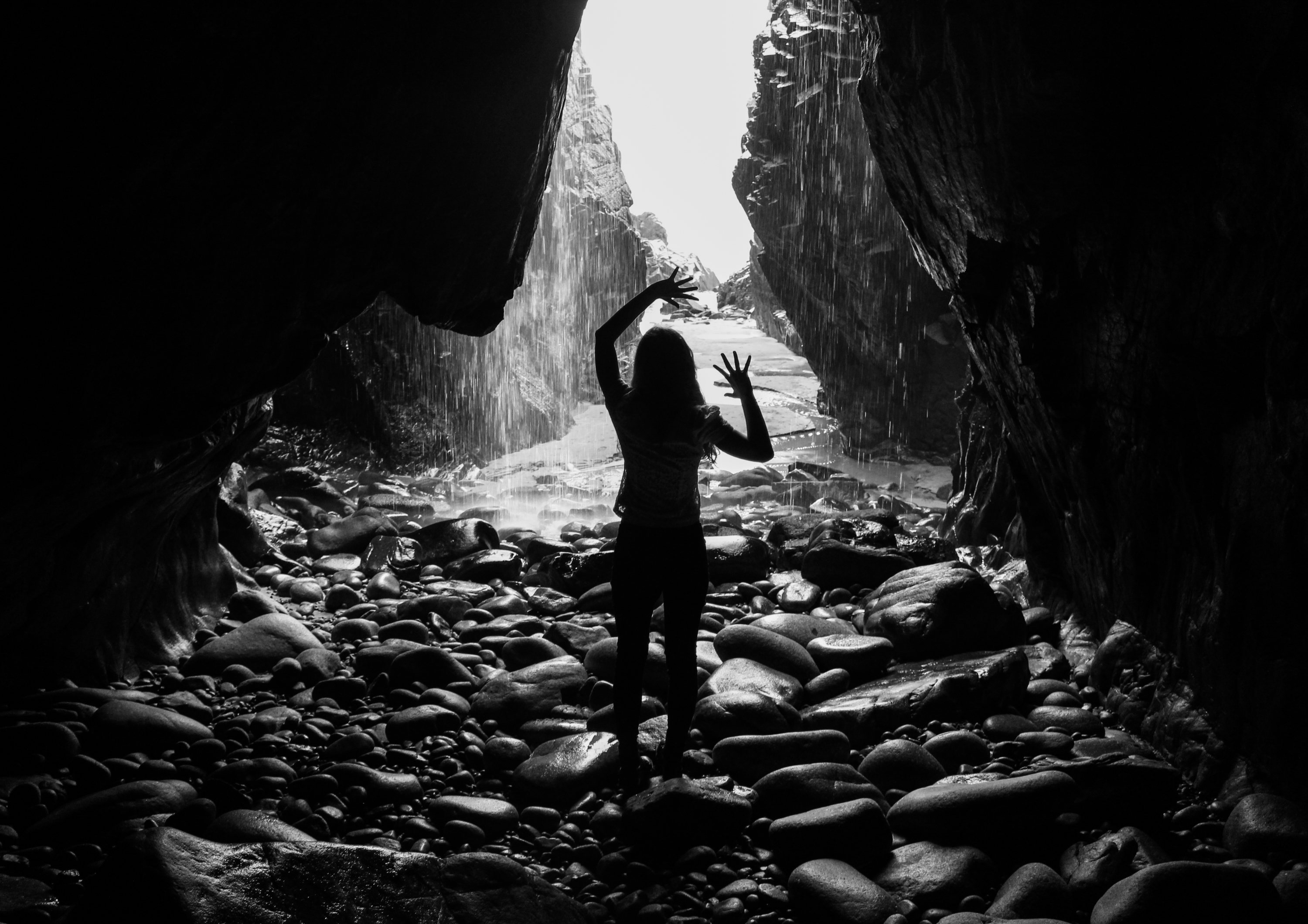
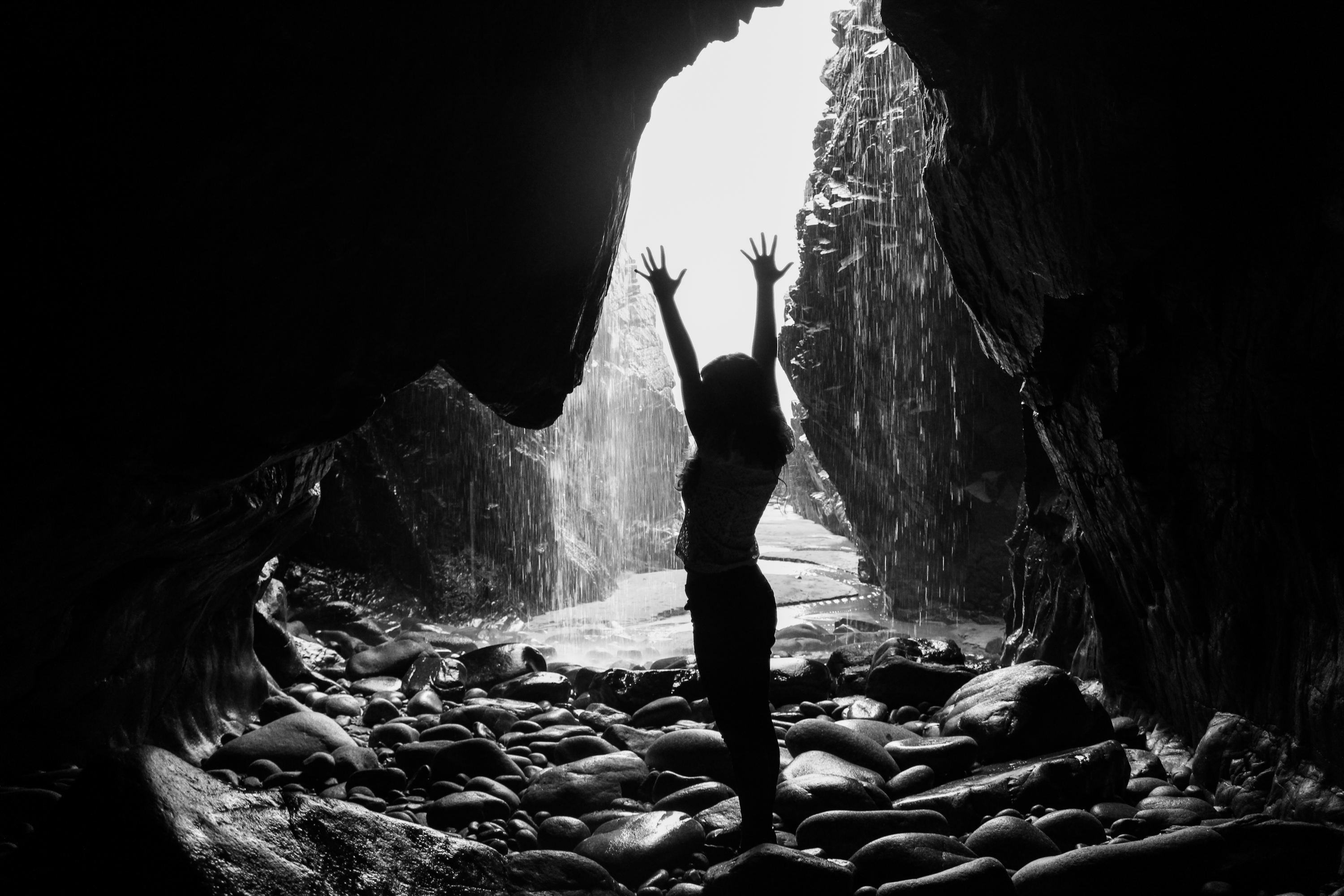
The outcomes from this final shoot were taken in caves. I chose this location because I wanted to base my exploratory performance shoots on interesting environments to respond to. This landscape was quite different to some of the others I have used and I think it has dramatic qualities. However, I also faced some technical problems here such as difficulty in access and low levels of light. Nevertheless I have some outcomes that I am happy with, I especially like the silhouetted ones with the cave entrance acting as a frame and the waterfall providing an interesting backdrop.

Pieter Hugo Inspired Photo Manipulation


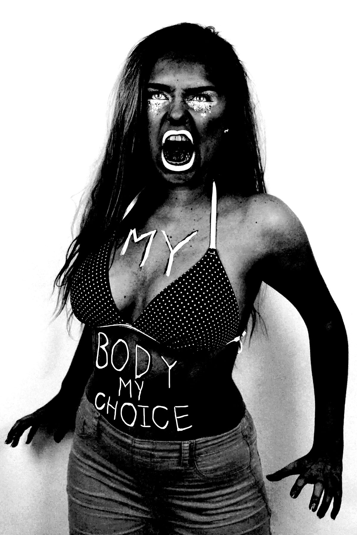
Here are three images (and their originals) from my angry feminist activist photo shoot that I manipulated in way that was inspired by the photo series “There’s a place in hell for me and my friends” by Pieter Hugo. I created these images  by placing a black and white filter over the images and adjusted the colour channels. I made the reds much darker, which made the red tones in my skin appear darker and more intense. I slightly adjusted the yellows to be darker to make the yellow tones in my skin darker, I didn’t make them as dark as the reds because i still wanted the high points of my face to be light to get a sense of depth and contrast. I didn’t adjust the greens because it didn’t make any different to the image due to the lack of green tones in the raw images. I made the cyan’s much lighter to make the background of the image white, which created a dramatic outline and sense of contrast to the figure. I also increased the brightness of the blues and magentas to make the pink makeup under the eyes, the straps of the bikini top and the lipstick white to make the eyes and the mouth, thus the facial expression more intense. The white straps of the bikini top also draw the eye up towards the face.

I also experimented with painting over the writing on the raw photo with white, as most of the text was lost when the yellow and red tones of the skin were darkened. I initially used the regular brush tool to write over the top of the text but for some reason, the airbrush edges didn’t look right. I then used the brush tool with the solid edges but I couldn’t get the flow of the accuracy needed to make the text look right. I then tired using the 48 brush which is an angled brush with long flexible bristles that are sensitive to how much pressure is applied in the stroke. This tool helped me get the rough, uneven lines I was aiming for. 

I then experimented with combining the images together, to create a small group of angry feminists. I think these images are strong as when the images are displayed together there is a primal sense of anger and intensity. The combination of the different stances and expressions make it appear as it they are ready to attack. I combined these images by using the lasso tool and dragging each figure onto the same canvas, I used the lasso tool as opposed to the quick selection tool as I wanted to make the figures relatively close together and I didn’t want the white edges of the original images to overlap. I made two version of all three images together, I also experimented with cropping the images to focus on the faces, I had to move the images closer together so that their bodies overlapped to create the intensity needed for the cropped image.

I then used the same 48 angled brush tool that I used to paint over the text in white in one of the images over to add some text to the cropped image of just the faces. I tried to make the writing both raw and rough, as if written with a sense of anger as well as legible, which is why I decided to use block capitals like the text written on the torso of the original photographs. I then used the lasso tool to more the words and sometimes individual letters into place as the white background allowed me to do this easily. I then decided to try adding some texture to the image to give it a different effect that connoted ideas of violence and anger. I experimented with a scratched texture that I blended with the image on photo shop.

combining prints – digital and physical


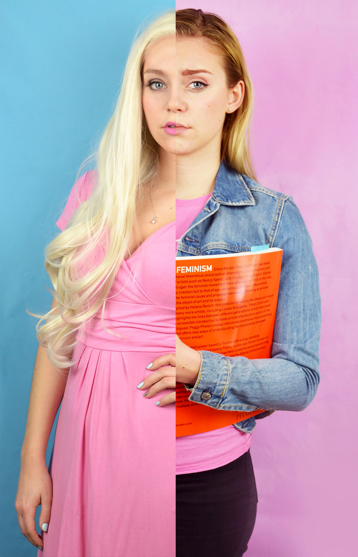
Here are my first attempts of combining my feminist and blonde stereotypes, I felt that these images would work well when combined because the different hair colours would make the split more obvious than other combinations of images. I also felt that these would work together because the blonde image features a blue background and a pink dress and the feminist image features a oink background and a blue jacket. A digitally combined these by using the quick selection selection tool and simply selected half of the corresponding image and layered it on top of the other. As you can see from the two potential images above, the image on the right worked better than the one of the left. Once the images were combined but not flattened into the same layer I altered the colour balance on the feminist side to try and make the skin tone match the other side so that the split was less jarring. I also moved the images as appropriate to make the hair lines meet as I it looked quite odd if they didn’t.

I also experimented with combining the photos in a more diptych fashion. I created this image by flipping the feminist horizontally creating a canvas in Photoshop that was long enough to take both images placed next to each other. I then selected the images in turn and placed them onto the same canvas. I then arranged them and cropped the as appropriate. Although I do like how this image looks I do think that the text that appears in the feminist image and on reflection it may have been a better idea to flip the blonde image instead.

I then experimented with combining physical prints of the the images in order to get the white ripped paper effect between the images. I actually found ripping the printed image quite tricky, I knew that I wasn’t going to get a perfectly straight line but I did find it challenging to control the direction of the tear. Despite the fact that the faces in the first manually combined image don’t match up exactly I feel that this one is the most successful. I want to experiment with these combined images further, perhaps with the addition of text.


Photoshoot 4 Todd Hido/ Bill Henson Portrait Interior photoshoot

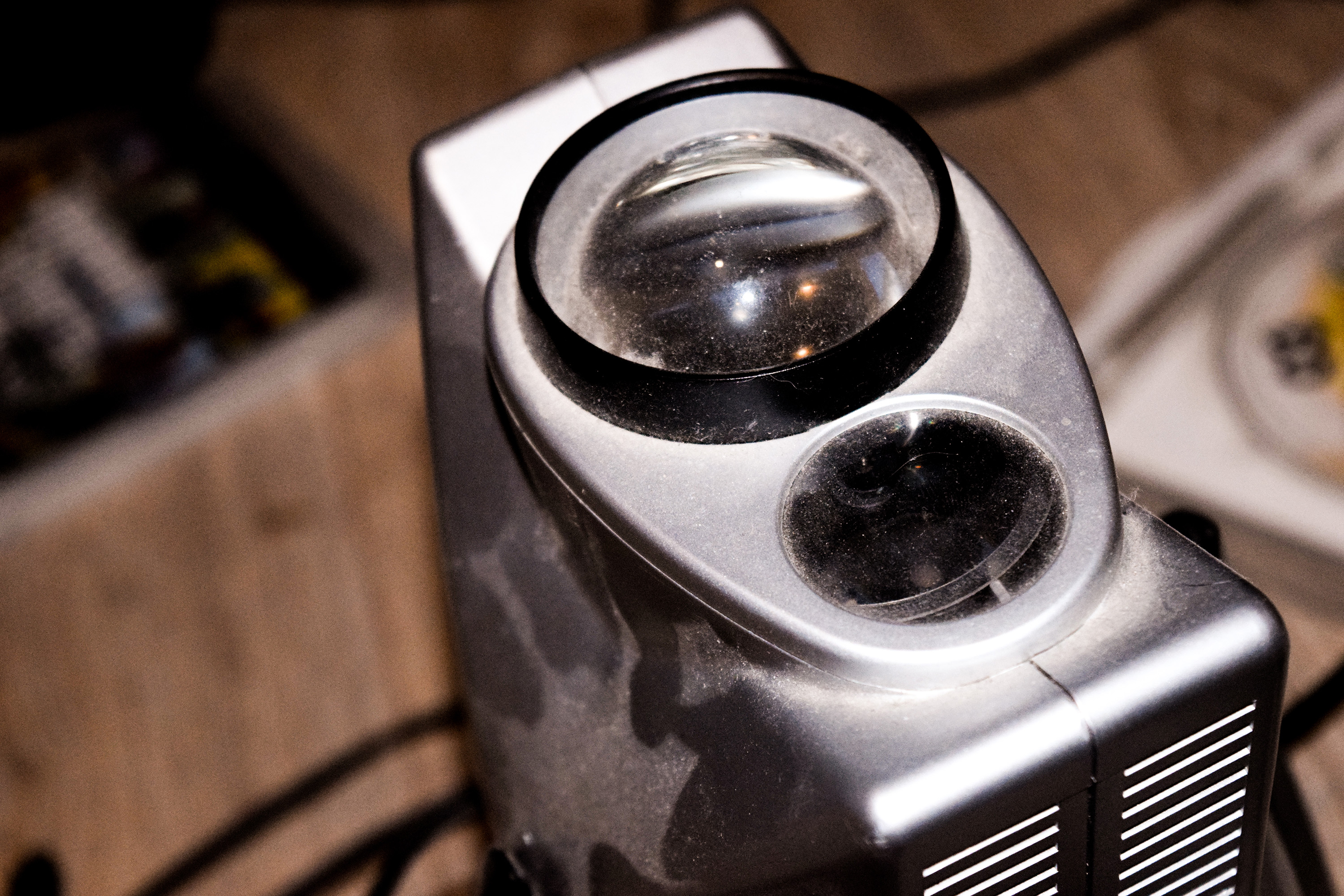
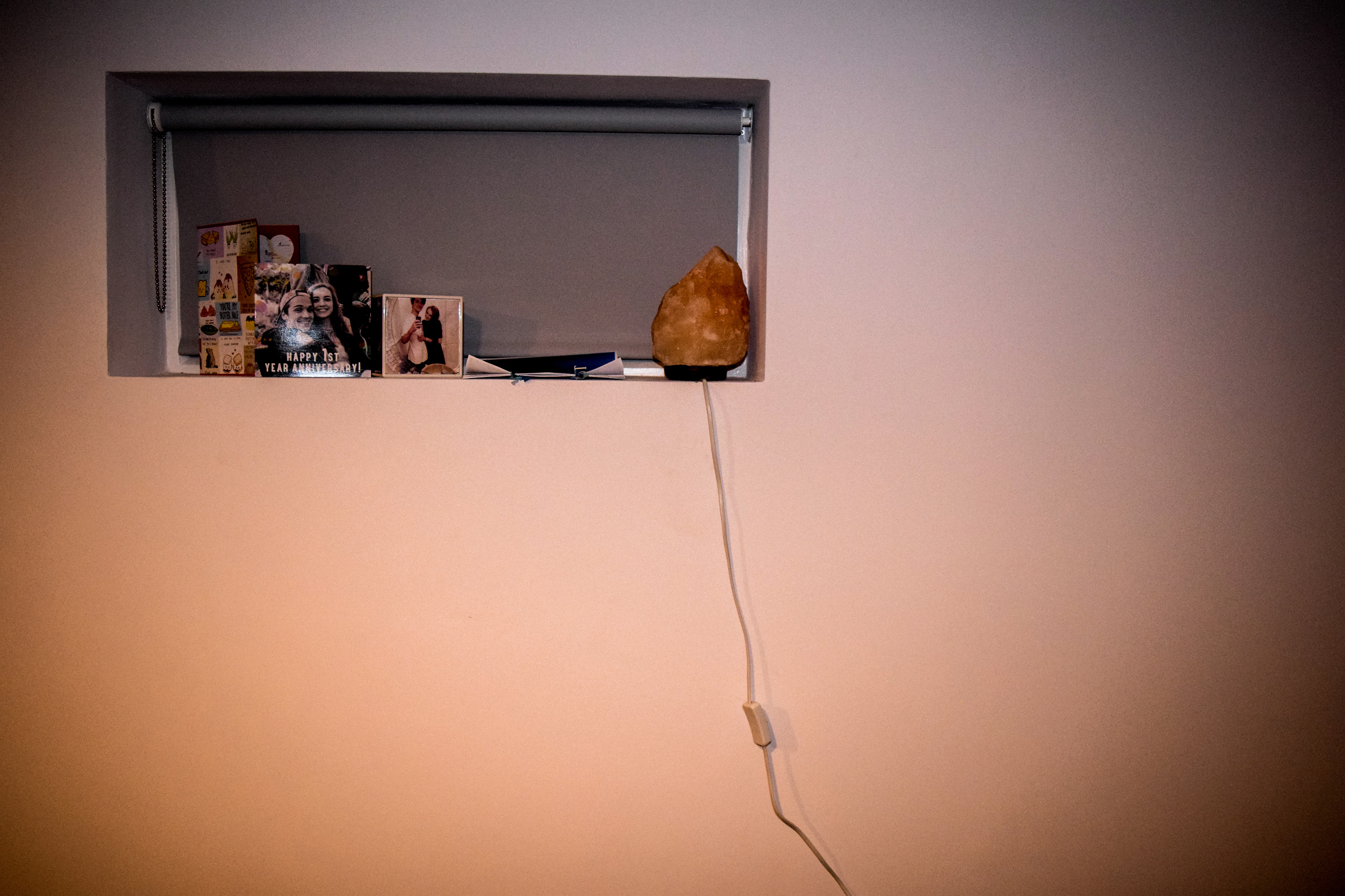
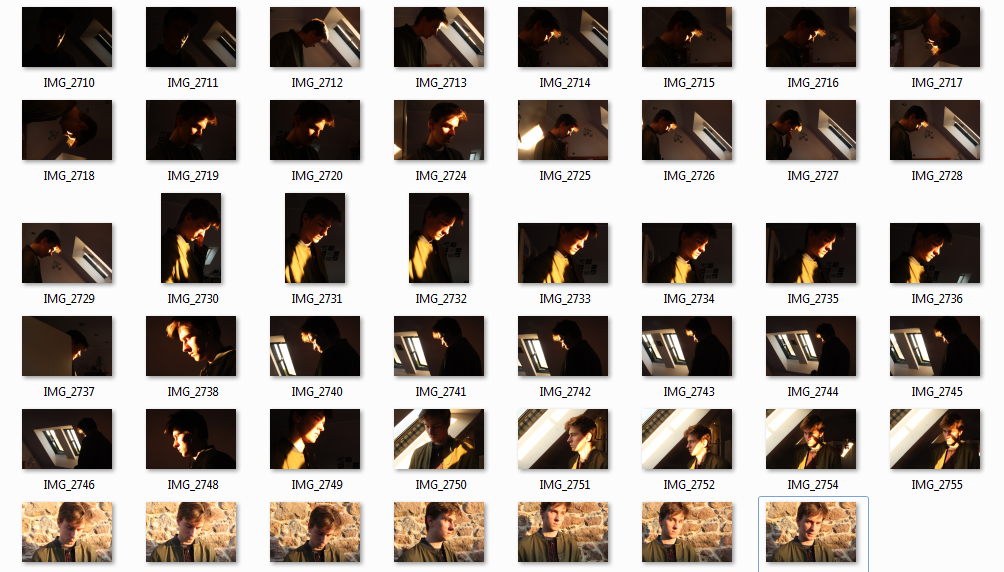
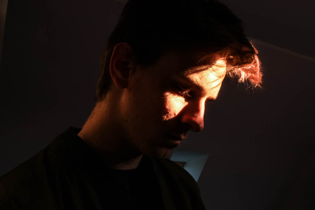
In response to Bill Henson and Todd Hido’s portraits, I wanted to explore the use of interior scenes and the use of natural lighting to build narrative and add emotion and feeling. In relation to my starting point, the natural light contrasts the dark spaces created by the walls and  small light sources. I took over 50 photographs, each experimenting with different ISO’s and exposures and I also left it on auto focus, this evoked a sense of depth without creating overly blurry photographs, I also tested long exposures to give the photos a ghostly effect. I did not use a tripod and in hindsight this would have been more beneficial for creating a sharper image especially when working with longer exposures. I decided to not use multiple exposures or HDR techniques unlike many of my previous landscape photographs as I wanted to keep the strong contrasts of dark space with the warm light. The composition of the photographs features closeups as well as shots that feature more of the open space which reflects a bigger sense of environment. I have also made the compositions to work with a book layout so they could possibly work with a double page spread but also just on a single page, complimented with a text on the opposite side.

I first edited the photograph in Photoshop by using the spot healing brush tool to remove lights and posters that cluttered the image.This would also enable more room for accompanying text. I then used the adjustments> Shadows/Highlights to add more light into the image without the lighter points being overexposed.

The strong contrasts reflect Bill Henson’s work with his use of chiaroscuoro. I wanted to keep most of them in colour as I wanted to reference how Todd Hido had created warm tones photographs with natural light, I adjusted the original images only slightly to give a slightly more even, cooler effect. I like how the light bounces off white surface which gives the photographs a softer effect.

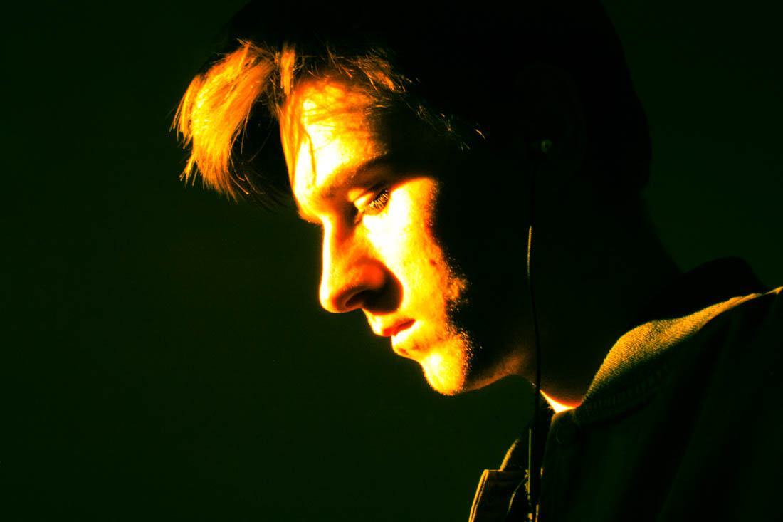
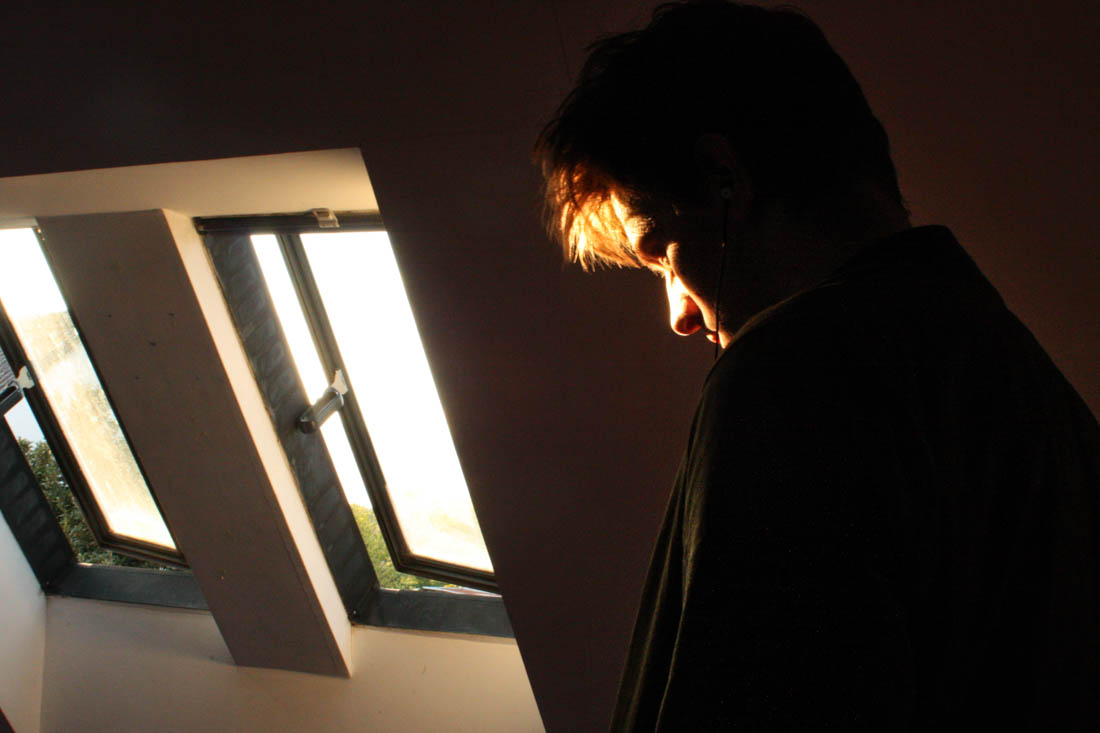
I wanted to capture the light reflecting off Ryan’s face with Ryan facing the window, so each would be opposite each other. In the first photograph I like how the white wardrobe has reflected light into his neck, adding a sense of depth to the image. I set the image to a slower shutter speed for the second above image, creating this ghostly movement effect, I found this photograph worked best in black and white to bring out the tones and shades more. For the third image I used a quick exposure time to capture just the light that hits his face, also evoking a sharper image, the huge amount of black space creates similarities between Henson’s dark chiaroscuro style portraits.

I really like the above image for its use of Rembrandt lighting and how the lighting evokes an interesting glowing texture. I also like the contrast between the warm tones in the highlights and the cool shades in the background such as from the window. I decided to keep the window as I found it added a sense of depth to the image.

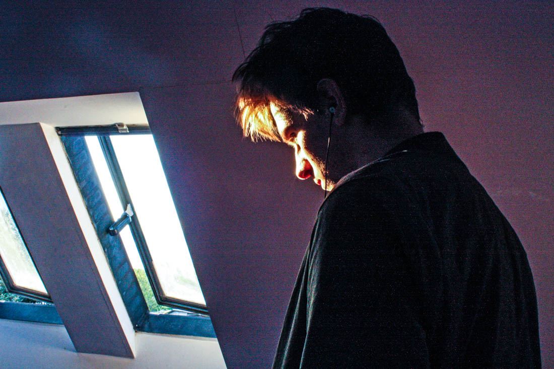
I decided to create a closeup portrait featuring only the light from he window and a plain background. I used the preset features to show experimentation, the last two images are two different cross process settings with add an interesting tint to the images inspired by how Bill Henson will often change the image white balance.

Below is an experimentation image inspired by Bill Henson. I added lots of contrast and clarity to give the photograph a grainy texture. I also added vibrancy to bring out the colours as well as changing the white balance to an overly cool tone.

Art Student Shoot 2 – Editing

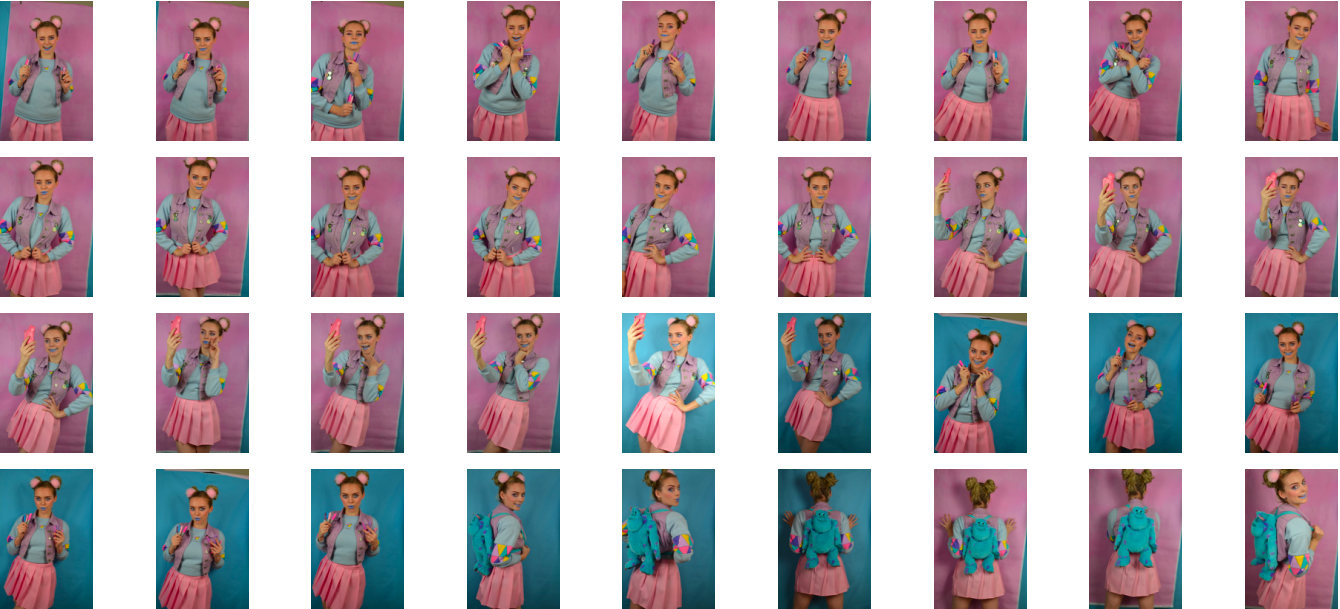
Above is the initial contact sheet from my second, more fashion forward art student photoshoot. As seen above I experimented with using both my pink and blue backdrop but during the editing process I decided to use the photo with the pink backdrop incase I decided to display both art student stereotypes as a diptych. If I did decided to do this I felt that there would be a greater sense of contrast if the images had different background colours and the different coloured backgrounds connote ideas of masculinity and femininity, the first scruffy art student is more masculine and the second more fashion conscious art student is more feminine. When shortlisting the photos I also decided against using photos from the second outfit I used because I liked that the blue of the fluffy monster’s inc backpack would work well with the blue background of another images if I decide to use it as part of a diptych.

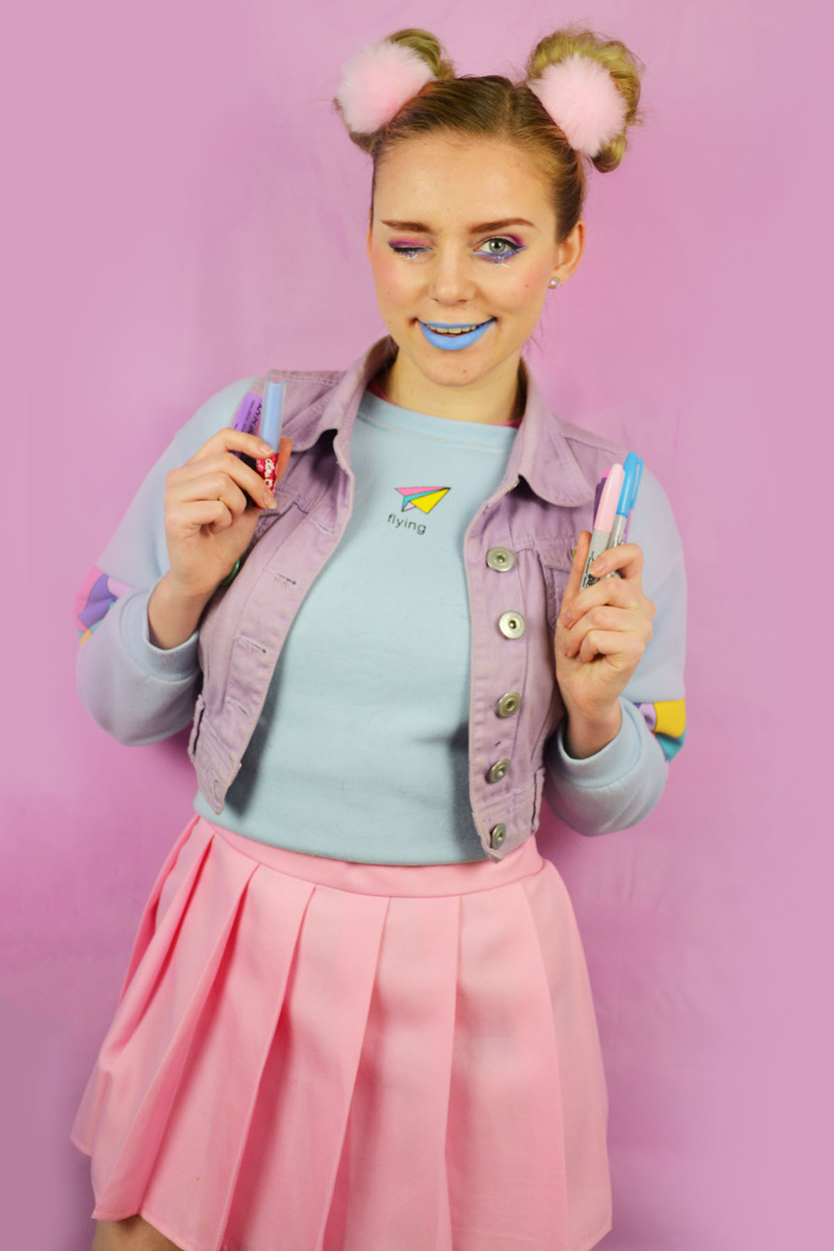
Here are the shortlisted photos from my fashion forward art student photoshoot. I selected these images because I felt that they captured the bubbly nature of the instagram active, stylish art student. As stated in my planning post I experimented with miming taking selfies and I shortlisted one of these images (above, centre). I edited these photos by cropping them as appropriate, increasing the brightness and contrast and slightly adjusting the levels. I also used the spot healing tool to remove any distracting blemishes and using the brush tool to smooth out the background as my pink backdrop was very wrinkled, even after ironing it as I couldn’t use the iron on too higher setting as I was at risk of melting the vinyl.