Category Archives: Experimentation

Filters

Author:
Category:

Environment – Presentation

In this post, I will be highlighting how I have presented my final outcomes for this project. I started by window mounting my favorite piece from the project. This Black frame works effectively due to the high contrast present in the image. The black frame ensures that the highlights and illustration really pop into the foreground. The shadows that engulf a large majority of the composition, merge nicely with the black border, maintaining an organic visual style.


A3 Window Mount

For the main body of my work, I decided to make a three-dimensional collage, as seen below. Here, I selected my favorite images created during the exam and positioned them ontop and around one another upon a white foam board. Each image was previously mounted upon foam board beforehand, ensuring a sense of depth and dimension. I like the final presentation for these images, as the blocky organisation supports the cartoonish, satirical aesthetic that I have been trying to employ. This completed board, feels like a summary of my travels which I like. The white background enables the colors and tones within these images to truly feel vivid, drawing the attention of the viewer.  Additionally, I created one more collage that features a set of black and white photographs. This presentation works effectively as all 4 images feel natural in co-operation with another, due to their striking visual similarities. This board focuses a lot on the juxtaposition between old and new and has a direct observation on youth culture and history.

Experimentation

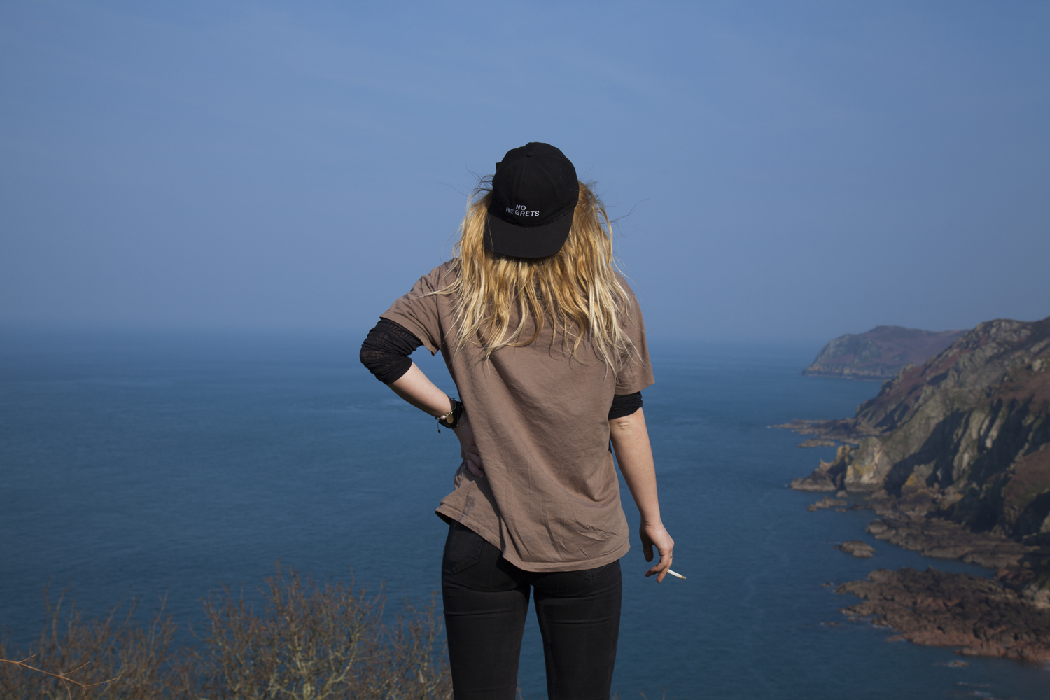
I wanted to create a variety of different aspects to my project and make it less direct my adding pollution particles onto my studio portraits. I believe that the images that have come from this are really strong and will round my project off nicely as i will have combined abstract photography, tableaux photography, landscape photography and portraiture in one project. I got the particles off google and many of them were in poor quality which is why when printed they may be pixelated but it could work well as it will create a different look to my sharp photos from other shoots.

To start, i turned all my particles into black and white so that they would match my photos and not affect them to much, this works well but after the merge, the photos needed to be edited on light room to make them the standard black and white so that my book would look consistent. However, some photos do have a slightly vintage colour but this could work well as it will make them stand out from the book.

This image is really strong because i used pollution particles which were scattered so that it created this appearance. The photo has a slight vintage ting but i wanted to keep it otherwise the particles would not be so prominent. This is the original image of the particles: As you can see the image is blurry which is why the photo will look pixelated when printed or in my book but this will add a different look to my images as my book is a combination of many different things which is why i want to combine many different appearances to my images. It could also represent the blurred vision of the world as the media hides the real problems by covering stories which aren’t relevant to helping the world. This is not the strongest image in this series but my models eyes make the image eye catching which is why i will use it in my photo book and it will be part of my finals.

This is one of my favourite edits because of how clear the original image is and how the particles have created different tones within the image but not covering my model too much so that we can still see her eyes so clearly which is why this image is so strong. The particles i used were fairly clear, more than the others and they worked really well with this image:

To create this photo i zoomed into the left side of the image as i already had a large photo of the image on the right. I thought this would make the particles extremely blurry but they weren’t too bad. I like the left image because it has different depths and textures which will be put onto my image making it much more interesting than if the image was on it’s own.

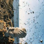
The particles in this image represent the hidden world which we cannot see but that follows us around. This image is very dramatic and dark because of the large particle behind/on my models head which could represent the looming danger which no one can see. The particles i used for this were the clearest but only seemed to work best on the darker images from my studio shoot:

To create my image, i flipped the particle image horizontally then zoomed in so that the large particle was much more visible in the dark image. By zooming in and cut off a few of bubble like particles but it is the large one which i wanted to focus on and it represents a danger and looks menacing in the image compared to the “bubbles”.

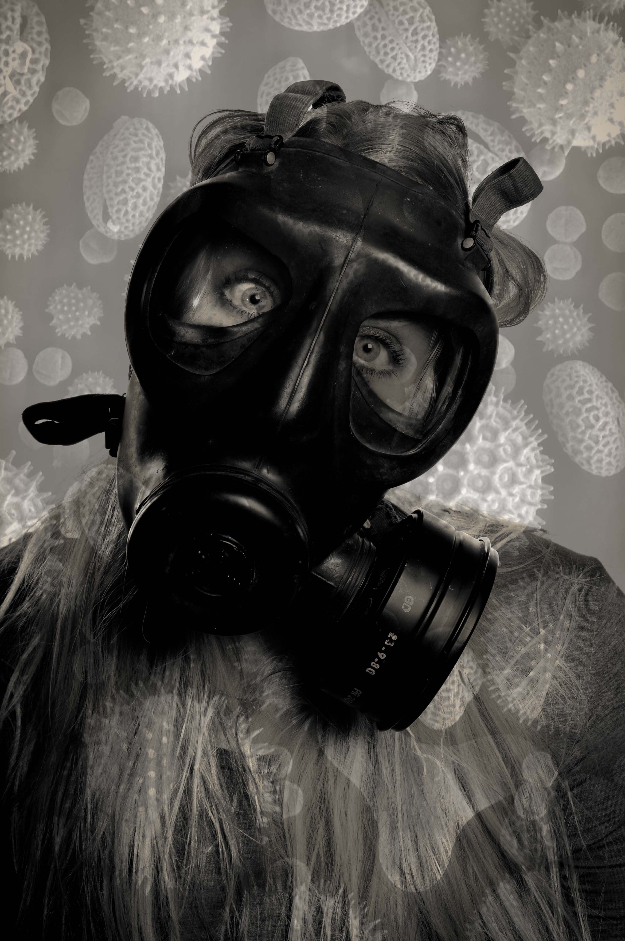
This image symbolize how when we breath all the toxins and particles are pulled towards us and are stuck on the mouth mask/our face. It is the most sinister image of the set because it’s meaning behind it and it is quite clear and will become clearer when the viewer knows that the book is about pollution. I will also add a quote about particles next to this image to make it much more powerful and dramatic. The particles i used for this were not very clear to begin with so i was worried that they would come out really blurry and affect the whole image but it did not luckily:

To create this image, i turned the image 90 degrees so that it was up right and i zoomed in so that the bulk of the particle was on my models face to create the impression as it is stuck to his face. This image is sinister because it could potentially represent what is really happening but we cannot see it because they are so small.

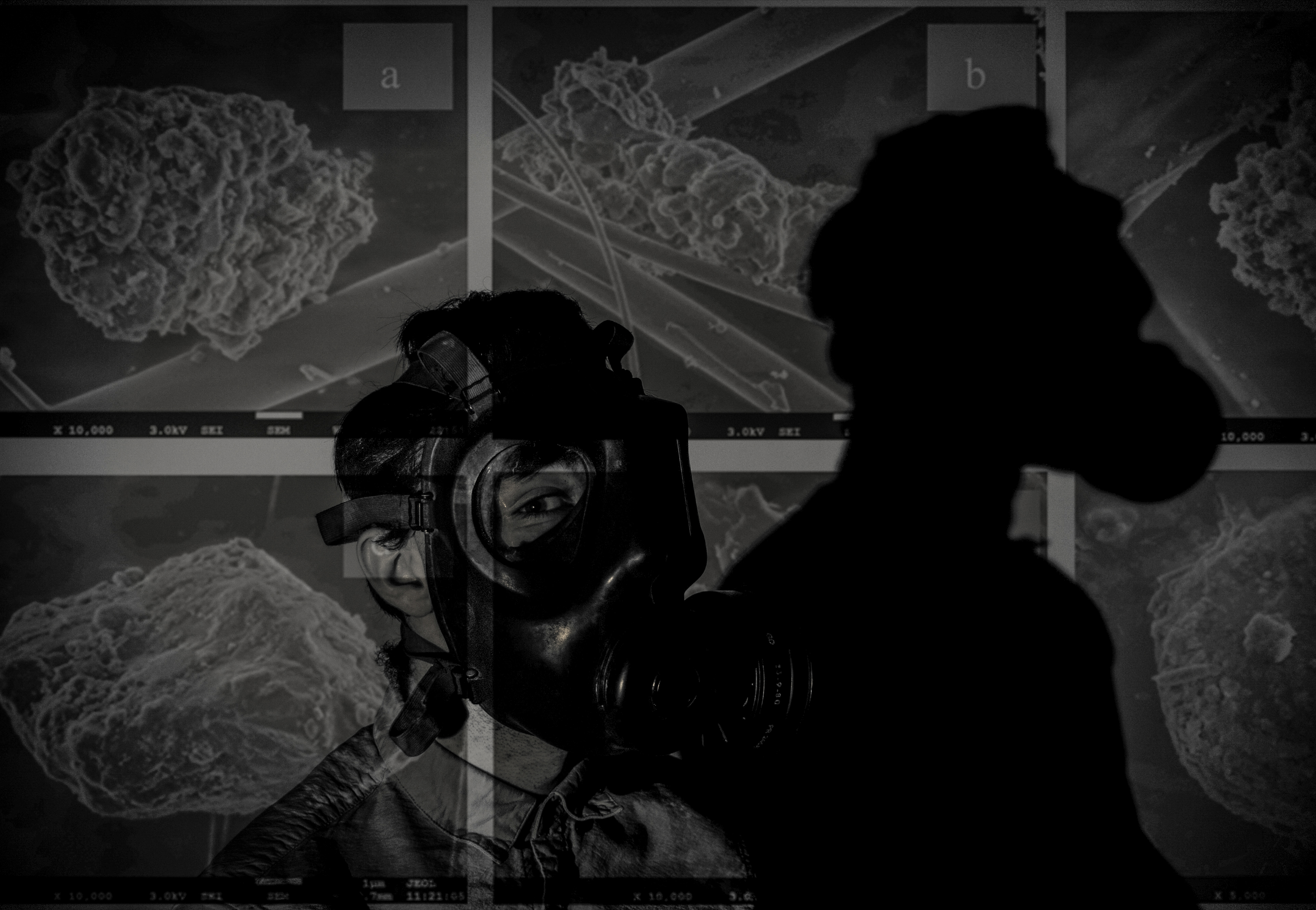
This image looks as if it projected onto my model and it does not look like it is photoshopped and that is it the original image. The only thing i would change about this image is that it is slightly slanted but it works well as i do not want my photoshopped images to be perfect and symmetrical as that will ruin the point of creating these images as they aren’t meant to be perfect. The particles that i used for this was a long image with lots of different particles and their names on them:

To create my image, i zoomed in on the image so that some of the particles were cut off creating tension in the image and this will allow the viewer to create an idea of what the particle might look like making it much more interesting and intriguing to the viewer. Also it makes the photo look like it is projected when zoomed in rather than left as the original image.

I am unsure if i will use this image in my book as it does not seem as threatening and sinister as the other images as it is not as dark and the particles do not seem as scary. I think this image works better on it’s own without photoshop because she has lots of emotion in her eyes and the photo is sharp and clear which will work well in my book. The particles i used for this was an image with all different particles of different sizes, textures and tones:

To create my image, i turned the image 90 degree to he right so that the triangular particle was at the bottom. I then zoomed in so that they were bigger and more prominent in the photo. What i do like about this image is that the particles have created different tones, textures and depths to the image which makes it intriguing.

I definitely will not use this image in my book as it is not as interesting as the other photoshopped image of this one and it does not look as sinister as all the other photos. It does look like there is something dangerous around us or something looming behind us slowly harming us and the planet. The image i used had lots of these spider type particles:

To create my image, i zoomed into the main particle in the image but the rest did not show up as much in the dark areas of the image but i did try it on different studio portraits but it did not work on them either. This is the worst out of the series of images because it just appears boring compared to the rest.


Analog combination of images and text

After manually tearing the images I had printed out early I decided to take the experimentation further and continue with an analog approach. I was able to use these prints for experimentation because I forgot to edit out the hand of the blonde side of the photo and the image looked rather strange with only a small portion of the hand from each photo, luckily I was able to use the letters and words in my experimentation to mainly obscure it from view. I have previously experimented with overlaying text on photoshop but know I want to experiment with cutting out letter and sticking them individually onto the prints. I attached the ripped photographs together by pray mounting them onto a piece of card. I used microsoft word to create the black and white letters, I created individual text boxes that I coloured as appropriate. I then made two copies of the alternating black and white letter and one copy of with each word having the same colour for all their letters. I  printed out the letters and cut them out and played around with how I wanted to display them on the prints. When sticking the individual letters onto the prints I ruined my first set of letters in my first attempt. When n i placed the letters face down onto some newspaper when spraying them with spray mount the pressure of the spray caused them to fly everywhere and got the wrong side of many of the sticky. I was able to solve this issue by using a rolled piece of masking tape. One side of the tape stuck to the newspaper and the other held the printed side of the letters still while I sprayed them.

For the above image I used black and white alternating letter and contrasting backgrounds for the words “beauty and “bitch” and block backgrounds and letters of the same colour for the words “and” and “the”. As previously stated, I wanted to try and hide the hand in this print as it is a little distracting as at first glance it appears to be a hand that works with both images but it is distorted in a way that is a little disturbing. I placed the words “and” and “the” in the centre of the image and the join, as if the two words are holding the images together, similarly to how the two words hold the phrase together. I then placed the letters for “beauty” and “bitch” is a disjointed stylistic way.

As this image combines each of the stereotypes separately and they are presented individually I decided to experiment with printing out the letters of the words in the same colours, although I still wanted a sense of alternating between white and black (because I think it works well with the alternating pink and blue of the outfits and backgrounds) so I made the text in the following colours “beauty” on white, “and” on black, “the” on white, “bitch” on black. I decided to make the background of beauty white because of the positive connotations of the colour and the word “beauty” and vice vera for the black background of the word “bitch”. Unlike the previous image I decided to place the words on opposite sides of the image rather than making them overlap, to give a greater sense of division.

I also had an already digitally combined print of the two sides, but similarly to the other images, it had the hand that was strange looking and distracting. Luckily I was able to completely cover it up in this version. For this image I took inspiration from Barbara Kruger’s work and used block backgrounds for full words rather than more ransom note inspired individual letters. I placed the words in such a way over the join of the image so it appears that the words are holding the two sides together.


Inspirations for development of combined images


I decided to develop my idea of combining images and text together by experimenting with an analog as opposed to a digital approach. I was inspired by the aesthetic nature of  Barbara Kruger’s work and how the importance of symmetry and balance is replaced with expressive angles for the text. Sometimes the unbalanced and disjunct nature of her work actually makes it more interesting to look at. I was also inspired by stereotypical ransom notes, similar to ones seen in movies and tv, that include letters cut out of magazines, each letter is a different colour and font, this makes the process of reading the text very disjointed and fragmented.

As seen above, the burn book from the film “Mean Girls” which I have referred to on multiple occasions during the course of this project, takes inspiration from the cinematic ransom notes I described. The burn book is a scrapbook created by the Regina George, the popular antagonist and her “plastic” followers, Karen Smith and Gretchen Weiners. The burn book was a single pace where each of the girl would write down their completely uncensored (and often exaggerated or untrue) opinions of various students and teachers at their high school. The book was kept safe at Regina’s house and was intended to never see the light of day. At the climax of the film the burn book pages are photocopied and hung up all over the school, which leads to scenes of absolute chaos. This leads to a workshop lead by the school where all of the girls are made to confess to all of their catty and bitchiness.  This leads to the scene ( screen capped above) where the token art student, feminist character Janis sarcastically admits to having a “big lesbian crush” on Regina, exposing the fact that all of the lies and rumours written in the burn book stem from Regina’s self obsession and her own insecurities.

I also want to take inspiration from movie posters that feature what appear to manually ripped, contrasting images that are combined to create something intriguing, like the poster above for the iconic Stanley Kubrick movie, “The Shining” and the layered ripped poster for “Eternal Sunshine of the Spotless Mind”. I included the poster for Jim Carrey’s “Me, Myself and Irene” in my mini mood board above because the split of the face representing a multiple personality disorder fit into the conceptual  nature of how I want to combine my two contrasting images of the angry feminist and the blonde (pictured above) .I feel that combining similar stereotypes from my project (Janis and Regina can be seen in my initial mood boards above from my angry feminist and blonde stereotypes) with a words inspired by both ransom notes and the burn book would be an interesting development for my project.


Barbara Kruger Digital Response

I was inspired by the work of Barbara Kruger and how she uses text to make her images stronger and make a statement. After experimenting with the addition of simple text to my images using Photoshop I decided I wanted to develop this idea further by using boxed text, similar to Barbara Kruger. I was inspired by Kruger’s images featuring pop culture icons and a phrase that ran as follows “not —– enough”, these images can be seen in the header of this blog post. I wanted to experiment with the use of both monochrome and her signature cherry red.

I chose to use my blonde and beauty queen images because I felt that these were the most timeless of my stereotypes. I experimented with making my blonde photo black and white, I adjusted the colour channels to create some contrast between the figure and the background. I tried using black and white blocks behind the text as well as the red. I also created a colour version with monochrome text, which I didn’t feel was as dramatic as the black and white and red versions. My favourite of the four images above is the black and white image with the white and red text. I selected the phrase “not pretty enough, not skinny enough, not blind enough” because of the reference to Barbara Kruger’s work as well as trying in nicely with the blonde stereotype and the standards that women are held to.

I took inspiration from another iconic Kruger piece, that being a monochrome portrait of a young (around 6 years old) American child beauty pageant winner, accompanied by the line “I don’t want to grow ugly” clearly a disturbing spin on the phrase “grow old”. The original piece draws attention to the superficial nature of beauty pageants and the effects it may have on such young competitors. My image, featuring the phrase ” She had opinions, we didn’t care as long as she smiled” is suggestive of how the public speaking nature of being a beauty pageant winner, and thus an ambassador for the region, is often overlooked or simply ignored with the superficial beauty portion of the competition receiving the most publicity. I personally believe that I was selected as Miss Saint Helier 2017 because I was the strongest speaker out of all of the competitors for the role. However, other than the competition I haven’t had a chance to do any public speaking in my role as Miss Saint Helier, so perhaps the competition was more superficial and based on appearances then I was initially lead to believe.

I also developed my “Beauty and the Bitch” image with a different font and style, more similar to the work of Kruger. I feel that this works really well with the image and the label style rectangles that the text sit on helps the words to stand out, I feel that this is really important as the words I have chosen are powerful. I want the viewer of the image to read the words accompanying the image and think about which side of the photo is the beauty, and which is the bitch. I have included both the colour and the black and white version of the image because I was unsure which of these I preferred.


Designing

// P O S T C A R D S    P A R T   T W O//

To present the final pieces for this project I am creating a series of postcards from my images shot of different characters around the island in response to a series of questions asked to them beforehand. The aim of this project was to create something each person can take away with them as they leave home – something creeping towards everyone i’ve photographed for this series. There are many elements of homesickness which can affect those moving away and I particularly wanted to zone in on the idea of home and places that will be missed. To visualise this, I went on a journey with each model driving around to locations of importance and significance to them, shooting as we went. This narrative timeline then resulted in a series of final images showing each person in their physical home as well as their interactions with areas they will miss when they have to leave. The sections of this project will be presented in various ways. A selection of stylized portraits will be made into prints which can be mounted, and a more extensive collection will become postcards with messages written on the reverse. These postcards can then also be made into a kind of hand made photobook using some of the handmade book stitching methods and techniques as well as a laperello design. The front of each card will be created with an image from the selection below which will be A6 in size. The next section of design for this project is to create the backing of the postcards which will be fabricated on Photoshop.

To start designing the reverse side of the postcards, research was carried out into existing designs and their formats. Below is a selection of five examples found on illustration sites, template websites and tourism sites. From these, I started to build my own collection of ideas working on aesthetics and practicality twinned together. 

The first thing to do in photoshop was work out a basic format for the card. This included a dividing line and three rows for an address to be written in. The colours are neutral and overall relatively blank. The important design elements will be the text added and the stamps which I experimented with below.

These postage stamps were downloaded from freepik and worked as background additions to the cards. When adding my own stamps, these could then become ‘standard’ looking images to fill the background as I layered up the graphic stamps made previously.This is the first basic example I created in photoshop. The layers are simple but included to show the process. I used a magic wand selection tool to isolate and duplicate the ‘Thailand’ stamp from the set above and lay it flat on the piece as a background. Over the top of this, I digitally placed one of my own graphic stamps made in photoshop. This was rotated on a slight angle to give a manual feel to the piece removing small elements of standardisation and generic formatting. The text on the left hand side, ‘Hello!’ is an idea that came from a previous piece of research into postcard design which can be viewed here [X
The picture I looked at in particular was this set of graphic postcards which use a simple generic text starting point of ‘Hello!’ in printed letters. For my postcards, the rest of the text will likely be hand written making the printed letters important in their contrast with the rest of the backing. In the address line, the plan is to include the model’s name and where it is they are leaving for (the name of the university / travel location). The font is called ‘Art Brewery’ but I may change this later on depending on styles and developments I make.

Experimenting with texts, fonts and colouring I created a second template shown below. This was then experimented on and developed further with various shapes, colours and the inclusion of images. The stamps will be separately printed on appropriate paper and manually applied for the final versions though here they are digital as an example of presentation.Above is the blank basic template for this second design. It uses the same phrase, ‘Hello!’, but a new crisper font which is clearer to read. Below I added a border and slight drop shadow between the two layers so I could add an element of colour to the design. The grey outline is the photoshop background and not part of the design. For the second postcard below, I added an image of plants – taken outside Maya’s house – instead of  colour which created a textured feel. I did experiment with various colours of text and lines but most of the time it looked childish and inappropriate so the black details were chosen as a final look.

This example mock up was made with a green border, drop shadow and black text. The stamp used features Maya and was also designed previously in photoshop. The ‘Madrid’ stamp was lifted and modified from the freepik contact sheet above and added at a 75% transparency so you can see the layered effect of the images. The address section is on the opposite side in this example to a ‘traditional’ postcard but arguably fills the space in a more graphic and aesthetic layout. This design gives space on the printed piece for the same information specified before as well as a hand written message by those featuring in the images. The next step of development for the postcard section of my design will be to finalize the stamps to be printed, fonts and colours to be used and the variations which will be backed with the A6 images.

Mail Art

// R A Y   J O H N S O N //

Looking into the theme of ‘Mail Art’ and its place in historic and modern creative movements, the name Ray Johnson was a quick one to appear. the twentieth century artist was popular following his activity as part of the downtown art scene in New York in the early 1950s. Johnson painted geometric and abstract images heavily influenced by his previous professor, Josef Albers. The crucial thing about Johnson’s work was not just how he created it but later his destruction of the same pieces. Most of his pieces were destroyed in his personal process of creating collages which resued this original artwork. In 1954, these small-scale collages were labeled as “moticos” and featured irregular shapes and images from popular culture. Some of these celebrity influences included Elvis Presley and Shirley Temple as well as regular department store models. Much of Johnson’s work in this area anticipated Andy Warhol’s pop imagery which started to appear in 1960. Despite artistic similarities, Johnson’s approach to work and fame was drastically opposed to Warhol’s and he was known for dodging it being labeled as “the most famous unkown artist” by Grace Glueck in the New York Times (1965). His deliberate elusiveness was a popular debate and added to the interest of his character. 

Much of Johnson’s work started a modern understanding of performance art such as his tendency to share his moticos around New York with strangers in the streets, train stations and cafes. These performances were even sometimes self recorded in order to collect public reactions to his work and each intricate creation. Much of the work used in these sessions of self publication were later supposedly burned.

Jonson reused his moticos by cutting them up and creating new tiny compositions with them which could then be inked on, painted and sanded to create new pieces of work. These new collages were extremely complex and had an underlying emphasis on structure repetition and semi-geometric forms and shapes. Johnson can easily be seen as an early instigator of performance art acting in other’s pieces and creating his own such as the staging, “Funeral Music for Elvis Presley”. 

“In his typically self-deprecating way, Johnson would say that he did not make Pop Art, he made “Chop Art”.”

In 1995, Johnson was witness dressed in black as he dived off a bridge in sag Harbour, Long Island before backstroking out to see. This suicide was heavily speculated and many aspects of his death seemed calculated such as the repetition of the number 13. The date of his death, the 13th January; his age at the time (67, 6+7=13) and the number of the motel he had checked into earlier that day, 247 (2+4+7+13).

“There was much speculation amongst critics, scholars, admirers, and law-enforcement officials about a “last performance” aspect of Johnson’s drowning. After his death, hundreds of collages were found carefully arranged in his Long Island home.”

Ray Johnson is still considered one of the major artistic innovators of the second-half of the 20th century within the critical community but his work remains mainly unknown and heavily under-appreciated by the general public. Some of his relevant pieces are selected below and will be used as starting points for further experimentation with my postcard images.

Working from these ideas, I intend to print a selection of my post card images and effectively graffiti them with block colours and shapes in a similar style to Ray Johnson’s work above. To do this, I will print them on standard 80gsm paper and use ink pens to illustrate them with words and text. I printed four of the postcard images onto sheets of paper with a white border which allowed me to work slightly around the image as well as directly onto it. I also printed all eight of my stamp experience to work with as a test influenced by this artist. I started by drawing rough doodle-like images directly from Ray Johnson’s work onto a plain sheet of paper before starting on the images. The sayings, words and illustrations used are all heavily influenced – if not directly lifted (such as the legs below) from Ray’s own postcard projects as part of his Mail Art series.
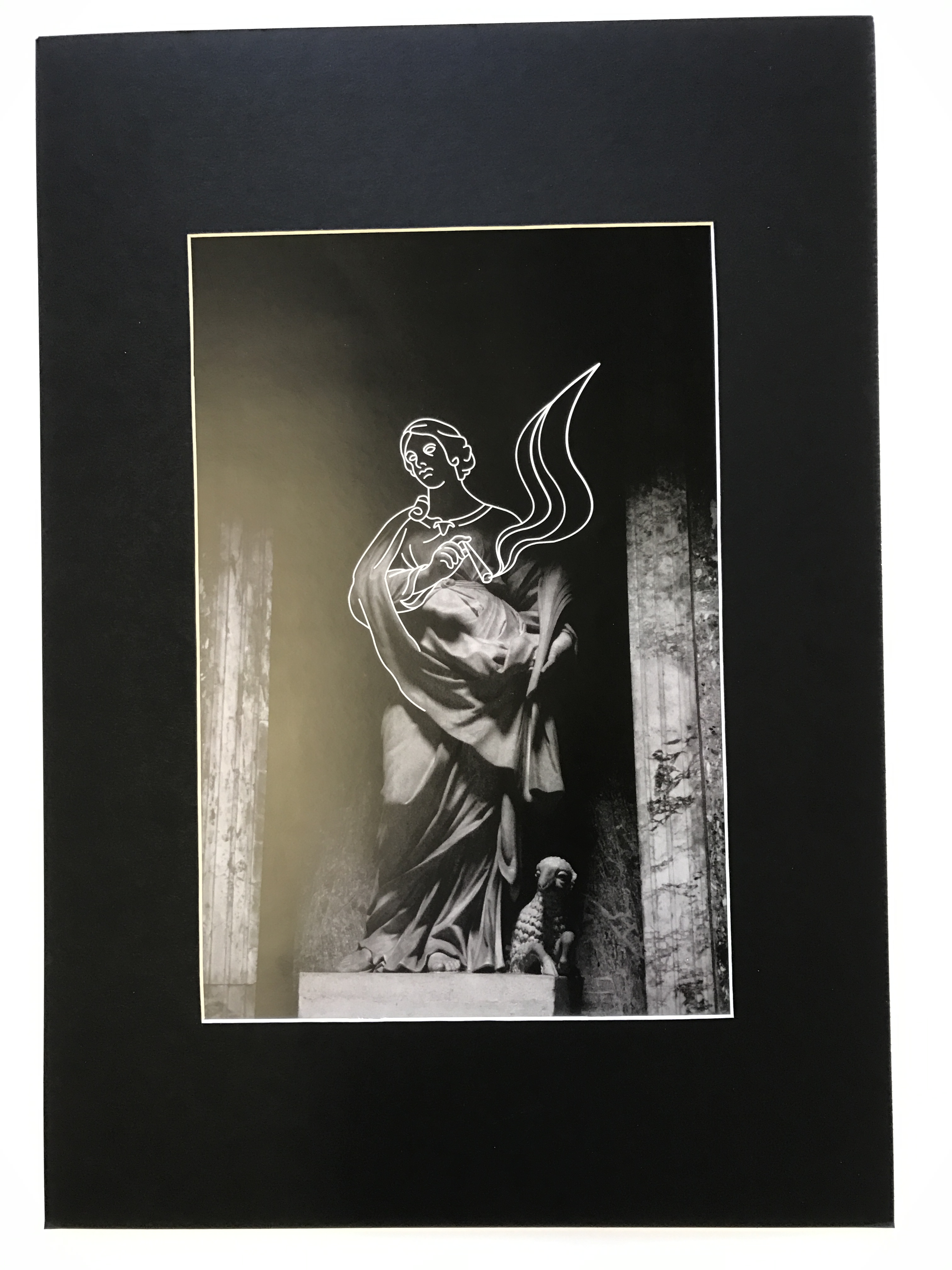
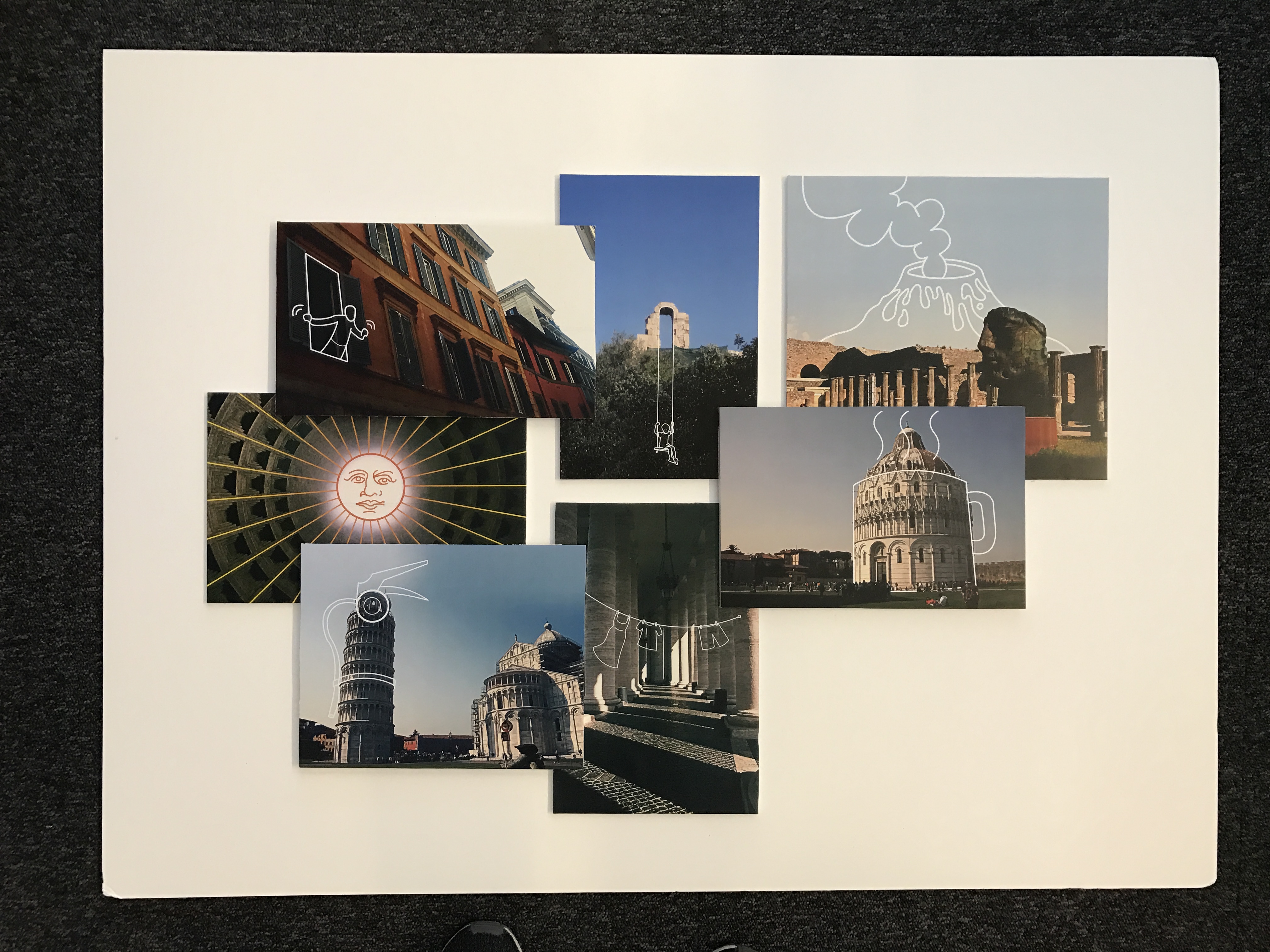
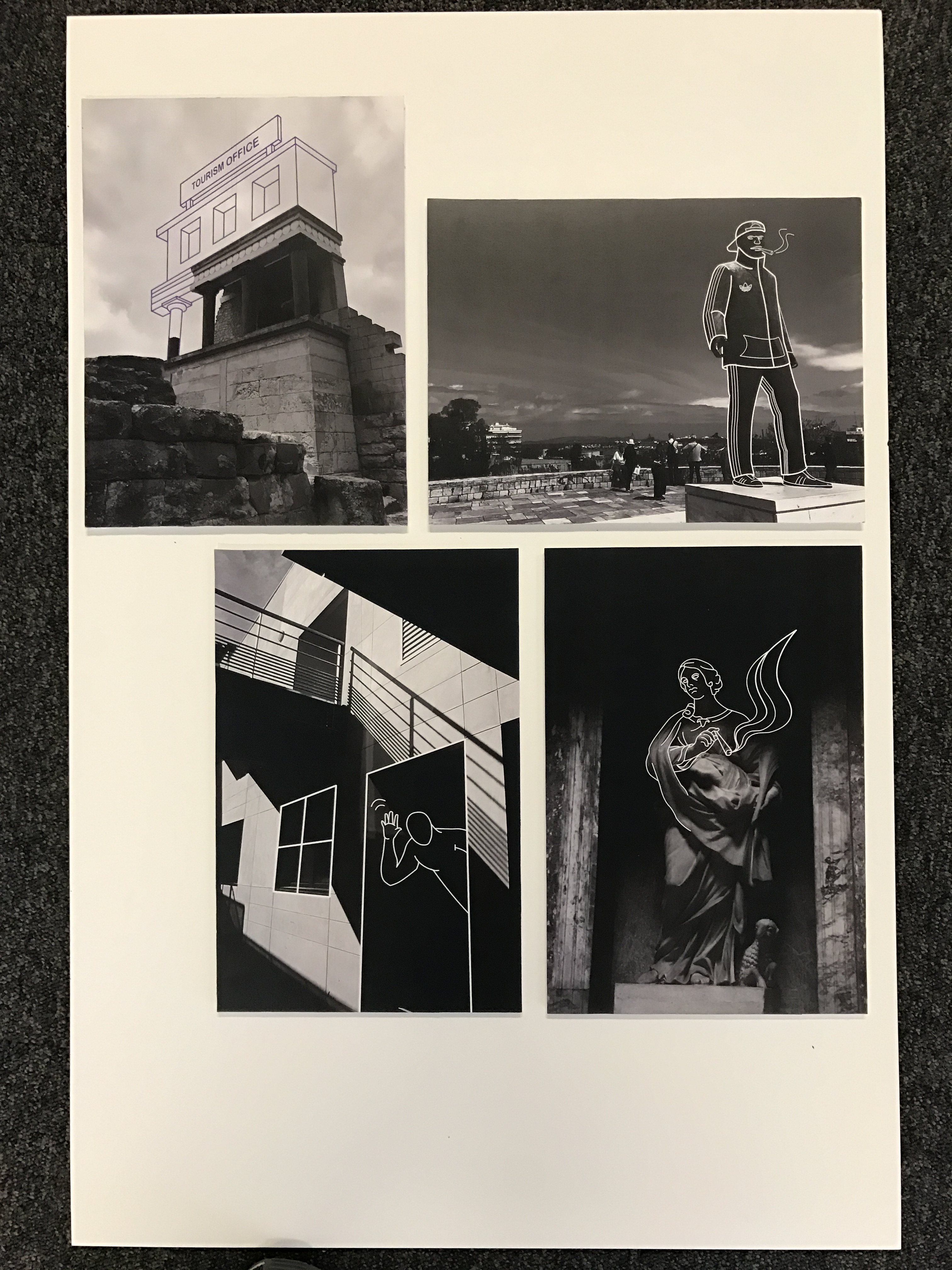
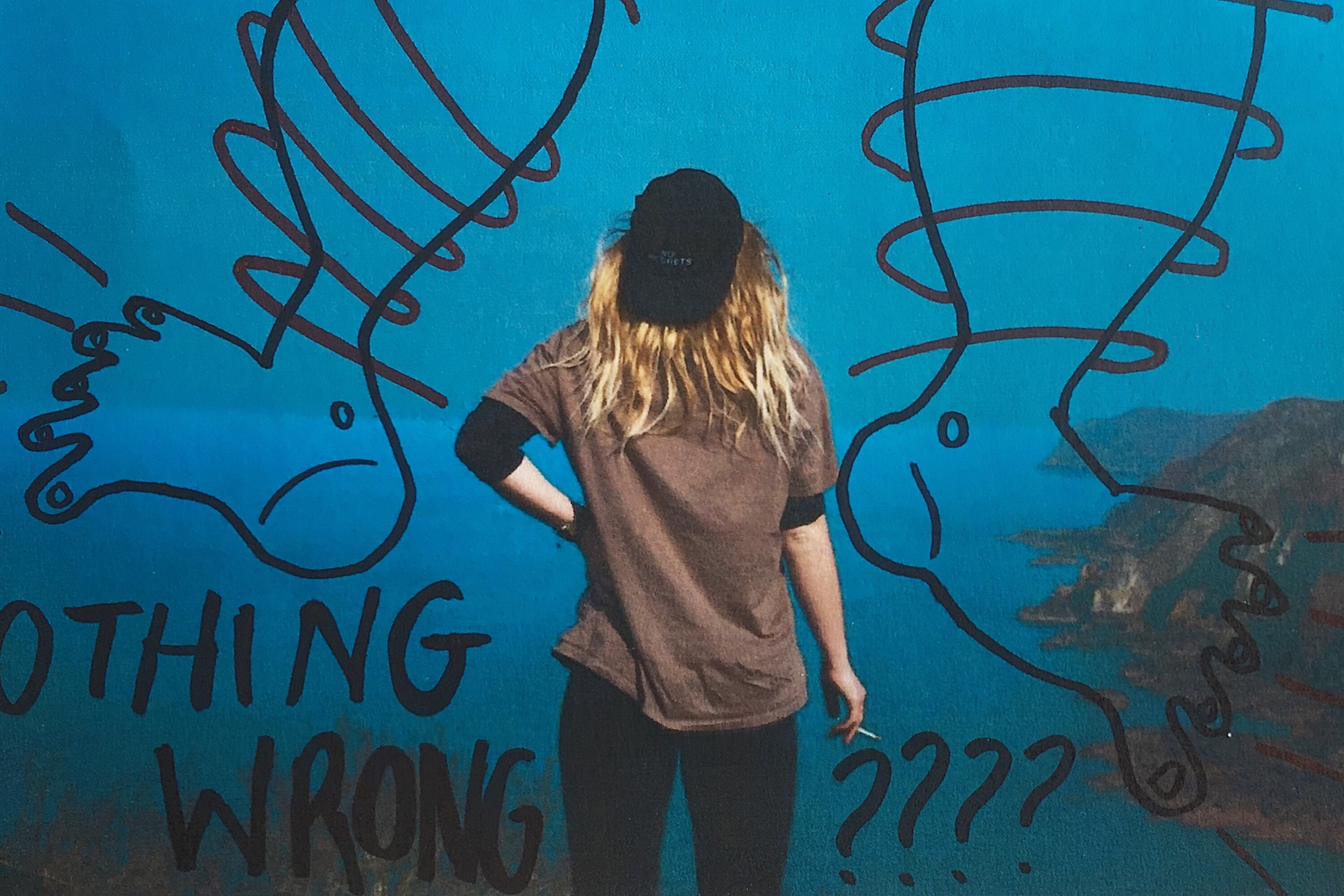
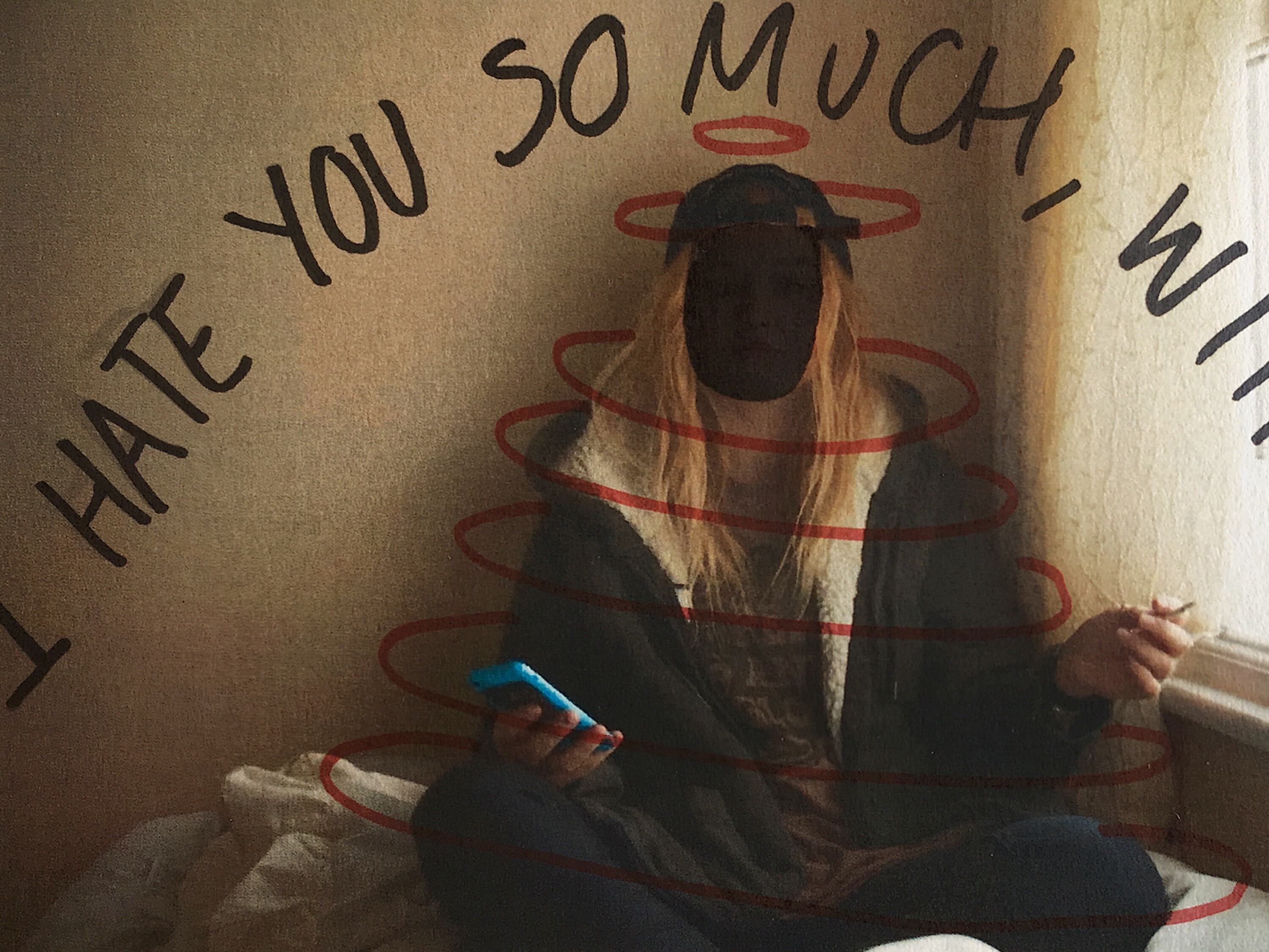
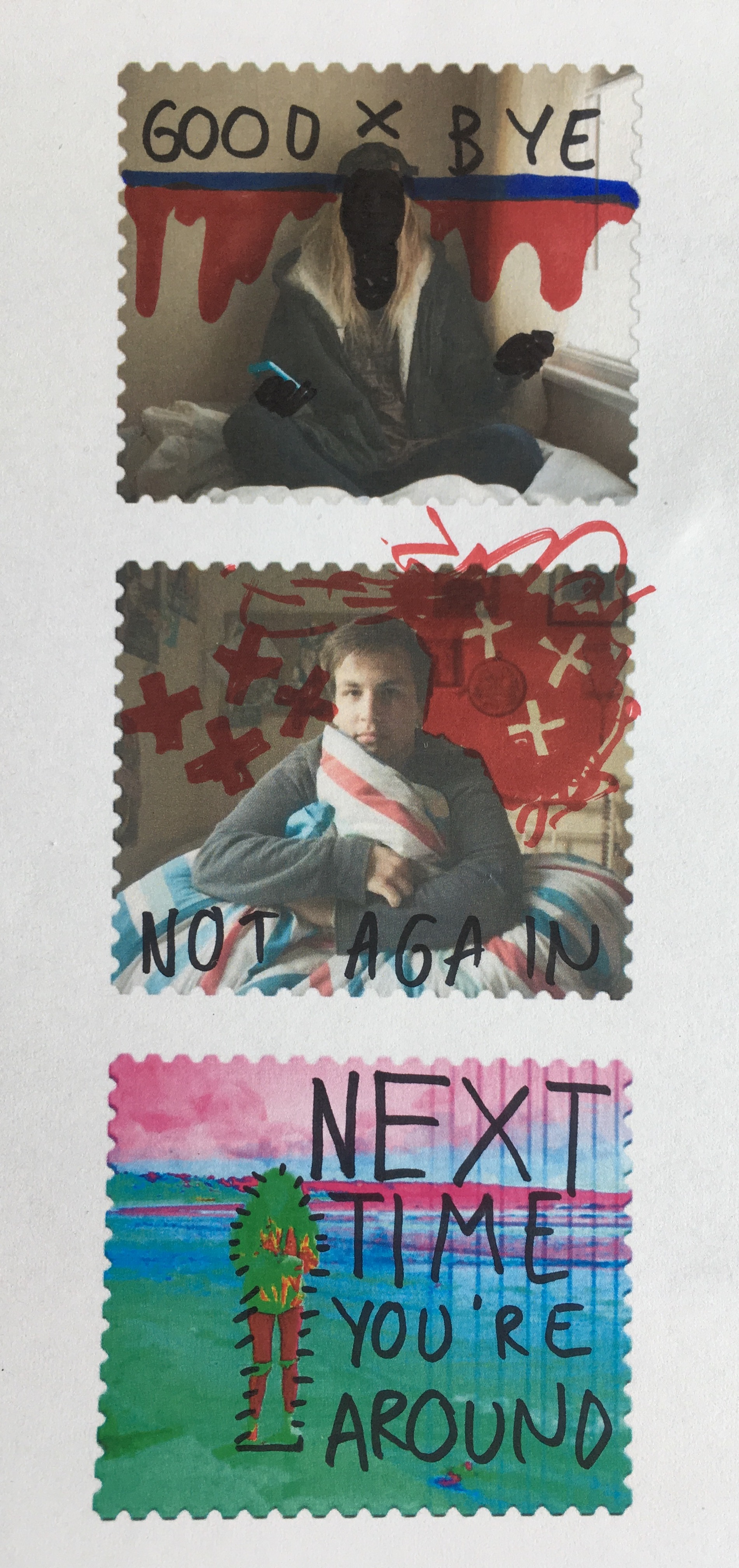
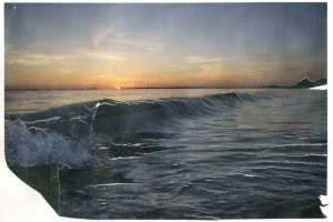
Below are a series of small tests on my own images. They were printed out on a normal copy printer so are not a high quality and were manually deformed with pens and ink markers. 

I also used this experimentation technique on some of the stamps I created in photoshop after they were printed out. Again, they have been manually manipulated rather than digitally and feature a mixture of original ideas and influenced doodles for Johnson’s own project work.


The Addition of Text

I experimented with handwritten and typed text for this image. To get the uneven lines of the handwritten text I used the 48 brush tool which has long angled bristles that are sensitive to how much pressure is applied and adjusts the thickness of the brush stroke as appropriate. For the typed text I selected simple font which I added over the top of the image in varying sizes. I chose to use the phrade “I’m only an angry feminist when you’re a sexist asshole” because it appeared on a poster on my initial angry feminist mood board. I also though that the phrase was sassy and fit with pose ad expression of the figure in the image.

For this image I also experimented with handwritten and typed text. As previously stated for the handwritten text I used the 48 brush tool, when using the computer mouse to write the letter I chose to write in block capitals as they are mainly composed of straight lines, these were more effective and easier to write. This can be seen by the strange appearance of the more rounded letters such as o and s. I think that the typed text works better for this image, the somewhat balanced nature of the word “feminine” and “feminist” at the top and bottom of the image makes the overall image visually pleasing. I chose the phrase “Feminine is not anti-feminist” because it is something that I feel very strongly about. Just because a woman dress in a traditionally feminine way and subscribes to particular female gender roles does not make her any less of a feminist or an empowered and free woman.

I also wanted to reference the idea of a 00’s high school it girl so I decided to include a sassy, bitchy comment. I chose the phrase “At least it’s only my hair that’s fake, bogus bitch” because of the snappy alliteration of the phrase “bogus bitch” but also because the fact that a woman decides to colour her hair does not reflect her personality or whether or not she is a genuine person.

I had fun experimenting with different words to place on top of this image. Before adding words to this image I edited out the finger of the blonde image because In felt that they were distracting as they were right in the centre of the image. I removed them by using the colour picker tool and the airbrush brush tool to paint over the top, I achieved a crisp edge at the divide by using the flat edge brush tool and holding down shift in order to paint a completely straight line. I knew that when choosing a phrase to accompany the image in wanted to draw attention to the split personality feel of the image. I experimented with the phrase “Step aside Jekyll and Hyde” as a reference to the book and film “Strange Case of Dr Jekyll and Mr Hyde” which is about a man with a alter ego. I also tried the phrase “Beauty and the Bitch” as an obvious reference to the fairy tale “Beauty and the Beast” with the word “beauty” having positive connotation and “beast” having negative connotations which is replaced with the word “bitch” which has similar connotations. Another interesting thing about this phrase is that the viewer is able to decide which side of the image is the “beauty” and which is the “beast” as both sides of the image could arguably be both.

I also experimented with coloured images and white text as well as monochrome images with coloured text. I struggles with the balancing of the text within the first image but I knew that I wanted the words “polite” and “violence” to be in the largest font size and I felt that these were the most significant. I managed to balance the text more successfully in the second without having to obstruct the face. I also made the decision to edit out the painted words on the torso in the second colour image because I felt that they would distract from the over layed text. I edited out the original words by using the spot healing tool and then the blur tool to try and smooth out the skin.

In this image I experimented with two different phrases “Vegetarian martyr with the leather Doc Martens” and “Her worst critic and yet her best advocate” I chose the first phrase because I felt that it tied in well with the art student stereotype but also a satirical stab at myself and my own values as I am both a strict vegetarian and an owner of leather shoes. I chose the second phrase because, again, it ties in with the art student stereotypes but it is also very personal to me and I can be both overly critical and overly confident about my own work.

I tried adding words to this image and although I like the words I selected i don’t feel that the aesthetic nature of the texts adds anything to the image. I actually feel that the texts causes the image to lose some of its intensity and drama. My thinking behind the words is an extension of the phrase used on one of the previous images. It is a little satirical and in my personal opinion, humorous. However, I don’t think that the text works visually with the image.


3rd Shoot (Results)

3rd Shoot (Results)


This is the results of the final images exactly as I got them back from the developers. There is an amazing range of different colours that came out from the images. The first 6 are bleached from the pool water, then next are mostly unaltered with some discolouration except for frame 7 that suffered the effects of the sea water a little, I found out that the salt water solutions caused the different coloured layers of the emulsion to separate from each other giving these big blocks of colour. Frames 13-18 were kept in the water from the desalination plant, the layer separation here was much more pronounced and produced the incredible colour blocks on frame 18. 19-24 were from St. Catherine’s Woods, this water was fresh and relatively clean but in the first two frames of this set the emulsion begins to crack and break apart, the results of this if it had been left can be seen in the last set of six images. 25-30 are the results of the water damage from Queen’s Valley reservoir, these are the least damaged but they do have some discolouration and frame 25 is just beginning to crack. The final set of frames are easily the most damaged, this surprised me because they were suspended in the tap water, I assumed that this one would damage the negatives the least and I was very wrong, the cracking produced some incredible results, the remaining parts of the image are just visible and are framed by the broken areas. I am so happy with how these final few images turned out.

The way that the environment was able to affect the image in these different ways is fantastic. The results are better than I expected and I am really happy with them.

The other experiment that I tried was to submerge 6 prints in the same types of water, this was mostly an insurance incase the negatives were not damaged by the water. These look really interesting and I have mounted them as an experiment. I only mounted 4 because the other two were not very interesting, I used foam board pieces to keep them off the back piece so that the crumpled, water damaged nature of them still exists. The also still have a tactile nature to them, this tactility gives the viewer a connection to the environment and will make them think about the process over the image itself.


Dawn Final Photoshoot

I wanted to capture the warm lighting that protrudes through a window in Ryan’s room. I had to work very quickly as the light moved fast and the light was constantly changing, meaning I was constantly adapting the exposure and experimenting with the white balance. Although Ryan’s room was ideal for capturing Ryan’s personality, it was very cluttered in comparison to my room which was used in the previous shoot, for example the lights that hung from the hall stuck down with dark duck tape, in some photographs i used the spot remover tool to remove the duck tape. I wanted to evoke the warm colours from the sun light but also the blue tones from the shadows, I also had to work with the tones in the window in the background. This will also add narrative to my book and raise enigmas such as how maybe the mysterious character was dreaming and has just woken up.

I asked him to wear a white outfit that would give the impression of youth and vulnerability which was very different to the black outfits he’d worn in previous shoots. I plan on using the above photo in my book, this is also an indication to the audience of dawn and the sun rising, especially with the striking warm lighting.

I covered the light from the window, leaving this cool light from the back window. I liked these photographs together as a diptych as it captures the confusion on his expression. I wanted to create portraits and experiment with composition. I like the ominous dark lighting with soft shadows. I like how the white walls contrast the dark shadows in his face. This lighting is very natural and gives the photographs a very everyday effect.

I plan on using the second photograph for its use of gold light and strong dynamic shadows. When I was editing I wanted to bring down the light from the window in the background but it came out unnatural as it was slightly too overexposed, so I have left it as it was. I like how the dynamic lighting reflects off the wardrobe and the shadows in the background contrast with the light on his face. Below are two closeup portraits featuring a softer use of light, giving him a softer less intimidating expression.