After researching and finding inspiration from the brilliant artists Goussin and Hortense, Kim Preston and Steven Hirsch I was ready to complete my ocean pollution shoot. Originally this idea was simply inspired by the massive problem of waste disposal in our ocean’s ecosystem. My aim for this shoot was to use a number of different documentary and abstract techniques to truly capture this issue as well as intrigue my viewers. These finals below will most likely be split up into my documentary and symbolism categories that I am using to fully explore each environmental subject throughout my project.
When finding the sources of pollution to capture from the water, I found that it was all washed up on the beach, to be later swept out to sea again at high tide. Because of this, I decided to use the category of conservation photography known as ‘The carefully crafted image’. By doing this I was able to pick up evidence of ocean pollution from the beach and capture it in a dramatic and powerful way floating on the water’s surface. The message I am hoping to portray with my final results is the reality of this issue, and how it affects every corner of the world. Because of the pollution I found and used in this shoot, the results below will go really nicely with my plastic pollution symbolism shots as well as my connected beach clean ups. The location I decided to use was one of my favourite small beaches near Faldouet because of is interesting and diverse background/surrounds. To complete this shoot was not as easy as I had planned and I ended up running into some equipment problems, having to improvise with what I had. Unfortunately, just before I went out, my iPhone broke down, this meant my underwater phone case could not be used. Luckily for me, I was able to borrow my mother’s iPhone 7 and her waterproof case, but unfortunately, I could not actually capture anything when the phone was fully submerged. However, I still went forward with my plan of using the rubbish accumulated at the location to create interesting photographs using natural light and my phone above the surface. Below is a visual description of what I was planning to use to complete this shoot compared to what I ended up with…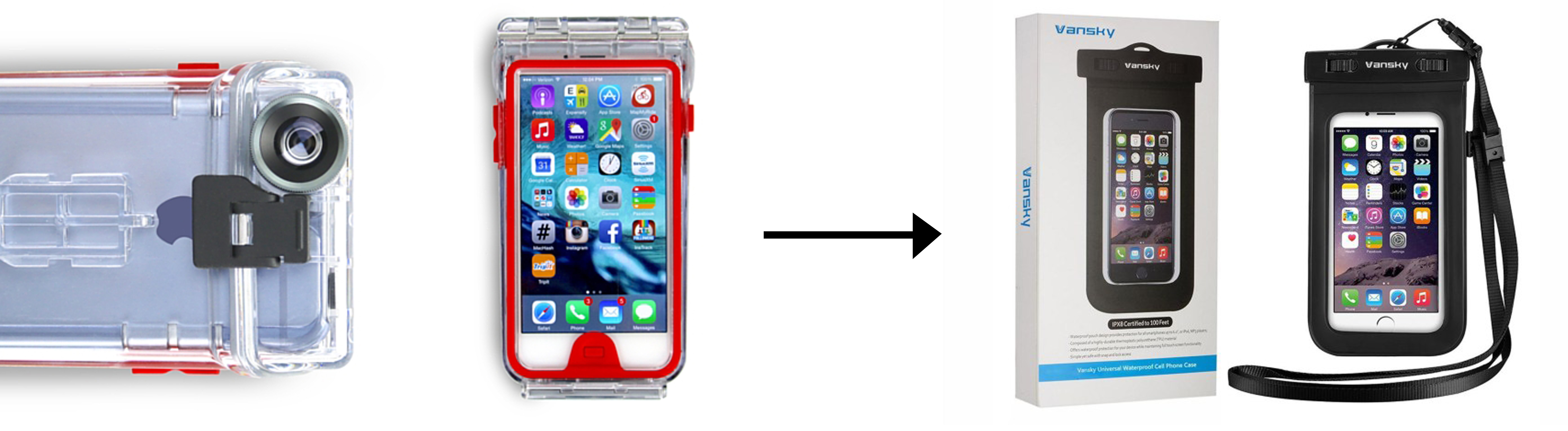
 This contact sheet above shows all of my favourite clear and interesting above water shots. As you can see I did manage to take a few photographs underwater although it would only work 1/10 times and the quality is very poor. When editing these images I cropped them down massively to only include the most important and interesting features. Below are my 8 documentary/abstract finals for looking at ocean pollution…
 This first final is a documentary style photograph depicting the waste I found on Faldouet beach that would later be washed into the sea at high tide. To capture this image I carefully gathered the biggest examples of pollution together and let them float on the surface as an example of public pollution reaching the sea. I chose this as a final outcome for this shoot because of the images high-quality (for and iPhone), interesting subject composition and amazing natural colours. With this photograph, I hope to get across the message that this problem is real, effects all areas, and is rapidly getting worse. I like the calm sense you get from the flat and clear sea as it strongly contradicts the travesty of the plastic floating on top. Compared to other historical evidence of ocean pollution this image is very tame, however, because of is centred subject and beautiful scenery I think it can get across a very clear warning that we are destroying this ecosystem.
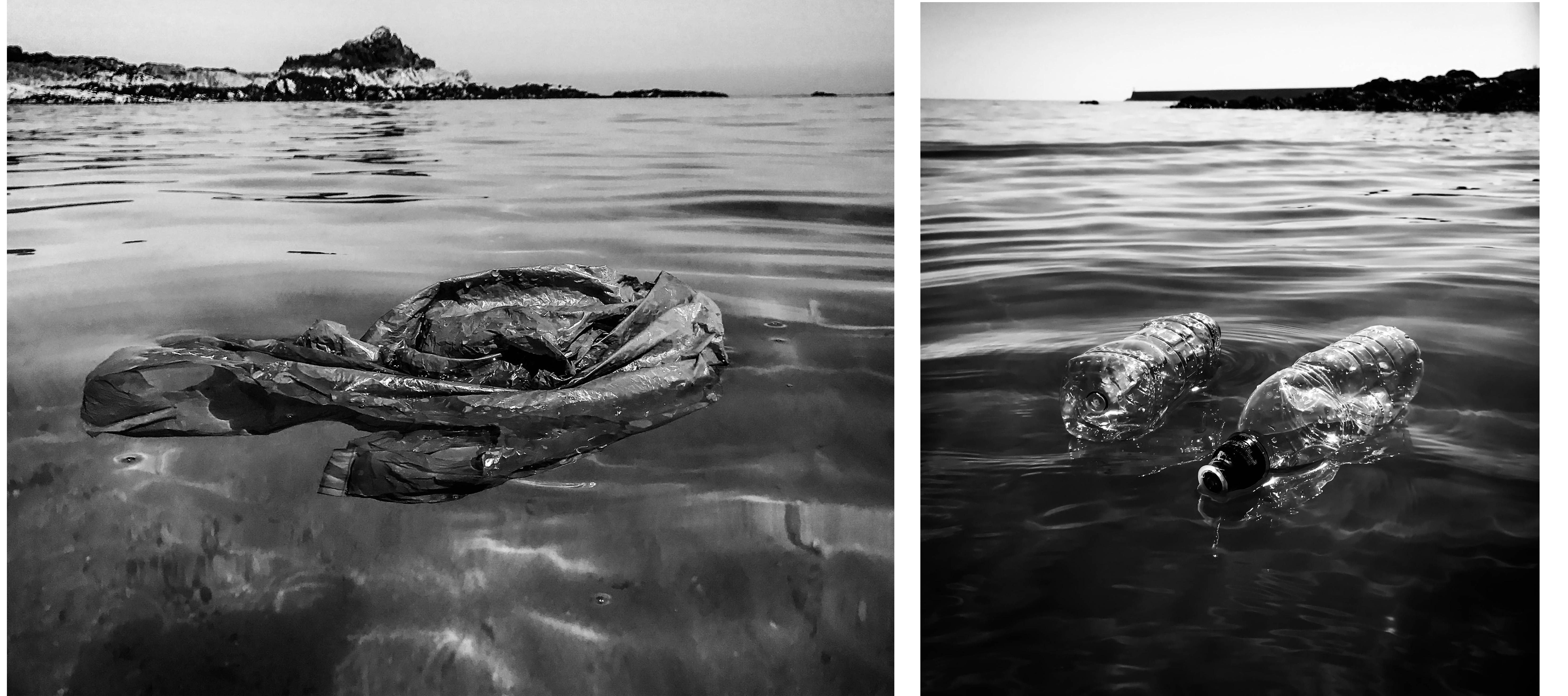 These next two finals are my other documentary style edits that I believe can clearly get across my message. By using straight photography techniques I have created a sense of this harsh reality and given my viewer a way to clearly analyse the subject matter and better understand this collection. The first image on the left depicts a plastic bag spread out and floating on top of/underneath the surface. I love the effect making this image black and white has, as it creates this sense of dread and makes the subject appear more ominous. I chose this image out of my 300 or so originals because of the way the bag is spread out at this one specific moment, making it unmistakable for anything else. The next photograph on the right shows to plastic bottles floating in front of a pier. I really like the symmetry and parallel composition of the subjects and the way they have reflected the natural light. Again I think this image is much more effective in black and white as it gives it a very dark and gloomy overtone, perfect for getting across the depressing meaning behind the photograph.
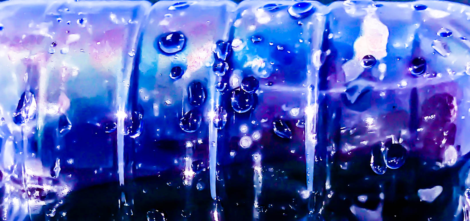 For my first abstract final of ocean pollution presented above, I have captured a close-up image of a plastic bottle floating on top of the water. This final, as well as the ones below, are all inspired by the beautiful work of Steven Hirsch and his take on capturing the surface and pollution of water. I decided to take this image when noticing the inside of the bottle start to steam up and create an array of interesting colours. This effect, mixed with my adjustments made in post production is what has created this vibrant and intriguing piece. The meaning behind this image is to draw the viewer’s attention with its surreal beauty. I think this is an important technique to include in my pollution project as not everyone reacts well to straightforward portrayals of the truth. I also like the subtle definition of this piece as I believe it is possible to work out what the subject is from the indents of the rings around the bottle as well as the many emphasised water droplets on the side.
 These three finals above are a mixture of colour and black and white abstract pieces intended to capture the viewer’s interest and make them think about the context themselves. The meaning behind the photographs is to show something that has devastating repercussions in a beautiful way, thus subtly informing the public of one of modern society’s biggest environmental problems. In this context the pictures may be considered as fine art photography, meaning that my message may be able to get across to people who would have no interest in conservation photography. The first colour final on the left is a low angle shot of a plastic bottle and its reflection on the ripples of the water’s surface. I like the confusing and abstract look of the bottle that was created by using a very shallow depth of field. The next outcome in the middle shows the bottom of the bottle, seemingly melting down onto the calm black ocean surface. Lastly, the photograph on the right is a cropped close-up of all three pollution subjects I used in the shoot. I like these items together and their proximity along with the water in between says a lot about this issue.
 My last final displayed above is an abstract piece that was heavily inspired by one of Steven Hirsch’s beautiful examples of water pollution. The smaller image on the right shows the piece from his project capturing the pollution in Brooklyn’s canal that I used as an inspiration when planning this shoot. My final is a recreation of this image created with a plastic bag placed just beneath the ocean’s surface. These types of photographs are also very much influenced by today’s modern consumer culture and the ever-growing problem of human waste. Like with Hirsch’s project and my previous abstracted outcomes, the meaning behind this image is to intrigue all types of viewers and subtly remind/inform them of this issue. I love the way I have captured the same kinds of ‘surface ripple’ effects as my inspiration but have done so in my own abstracted style. I also love how the natural light is intensified and distorted through the water’s surface, as well as the blue writing on the plastic bag creating a very interesting and twisted pattern.


 As the book progresses the images appear to get darker, evoking a more eerie narrative, making the viewer question he mental state of the character.
 the images then progressively get lighter, suggesting the return of day, the book follows a fairly chronological narrative. the first image below I used a portrait photo of Ryan in his bed which is an important part in evoking the enigma that the character could have possibly been dreaming.
 I wanted to finish the book with a closeup and picked a high contrast photograph. the book then finished with the quote ‘Carpe Noctem’, adding mystery to the viewer.


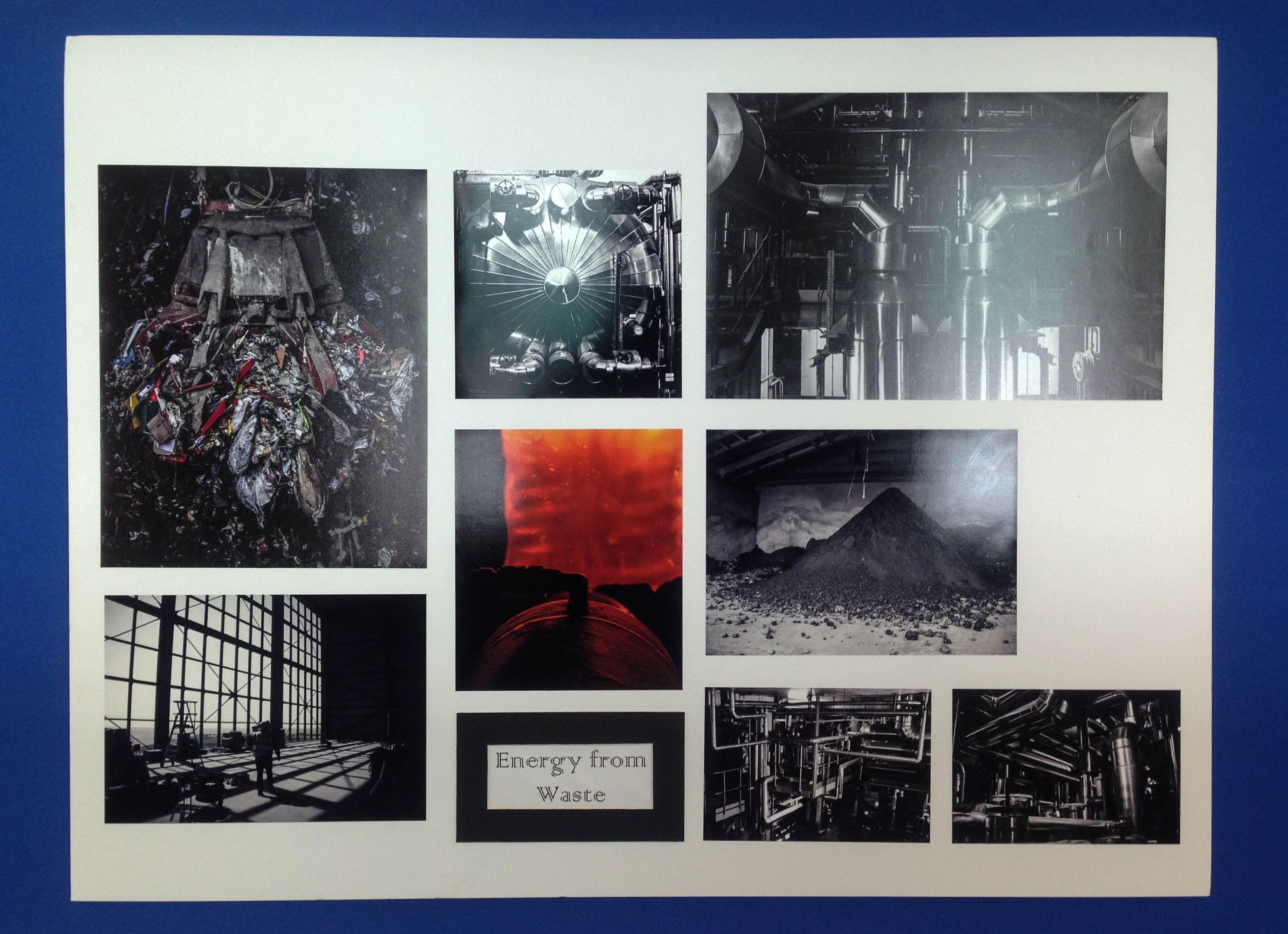
 Above I have added a few images depicting my finished final presentations of my favourite outcomes from this project. I love my use of window mounts, story boards, triptychs and diptychs to present my work and feel as my outcomes really extenuate the meaning behind my project. What I think makes this collection so successful is that each set of images displays a different message and is presented using a different type of photographic practice. This variety has produced a really interesting and intriguing project, with something that hopefully every one can emotionally respond to. My favourite outcomes above are my large collection of waste to energy images because of the precise way I managed to fit each one together in a story board. As well as this I also really like my documentary plastic pollution outcomes on the bottom left as the double window mount technique has produced very professional and clean looking outcomes.
 Lastly I have presented my final photo book layout as an online link and contact sheet above whilst I wait for the physical copy to come down in the post. The reason I decided to create a book as well as many final prints is because I think it is a really nice way to bring all my outcomes together, showing my journey as well as thoroughly getting across some environmental awareness. I love the layout I have created above as I have really showed how each shoot works together, getting across the same message in different ways. The facts that I have gathered from my previous research throughout this project give some amazing context to my images as well as emphsising there meaning and the harsh truth of our environmental impact.


 I am going to present the following two images in A4, displayed in a Typtic window mount. I am presenting these together because I like the combination of a close-up portrait shot and more of a landscape photograph. I chose the first picture because I like the effect of the raindrops on the mirror and I think the position I chose also works well because the fact that I’m crouching down means I’m inside the mirror and have fitted myself to it. The dark background is also effective because it contrasts with the white of my shirt and the mirror frame. I chose the second image because I like how small the human figure seems compared to the environment and the dramatic nature of the cliffs.


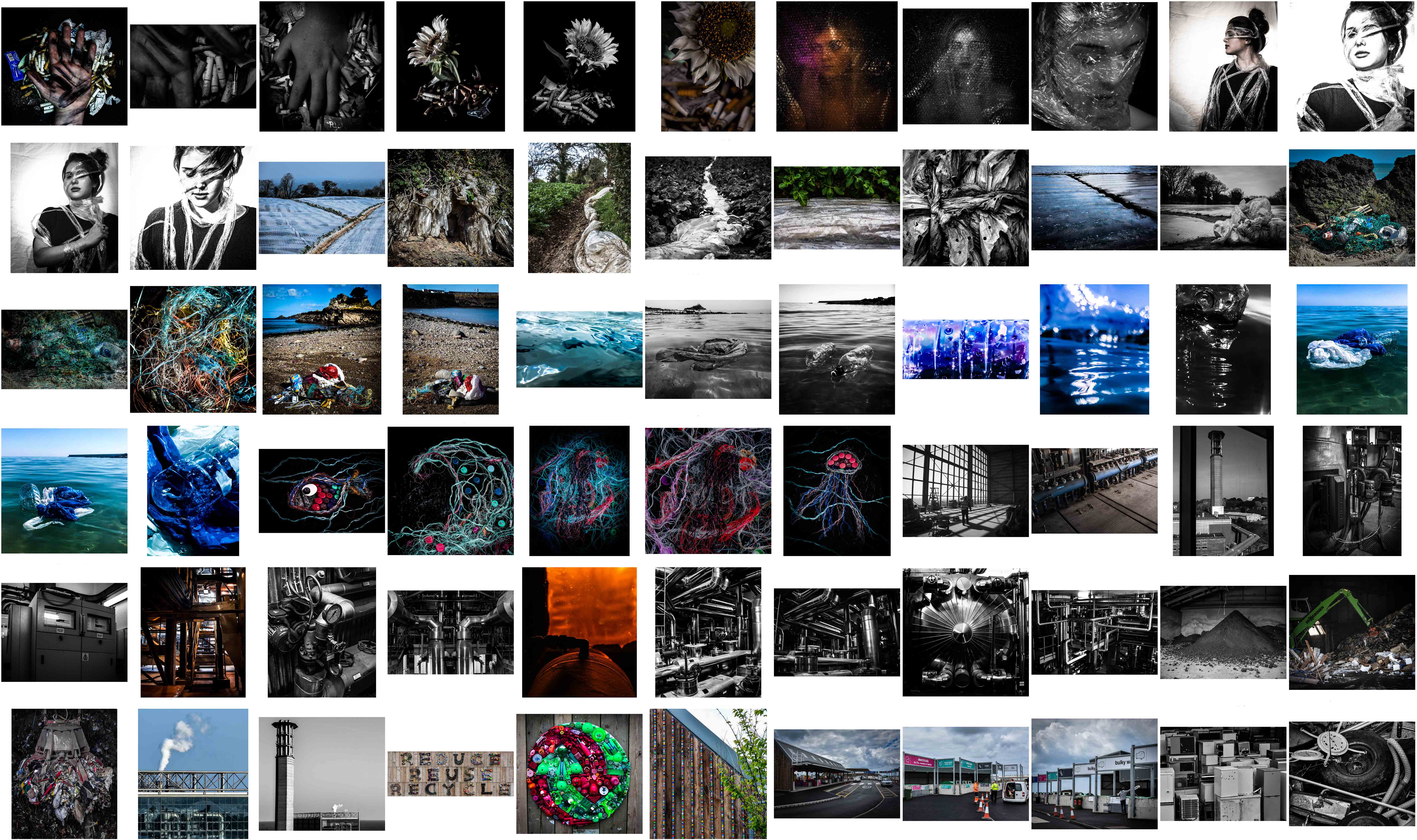
 By viewing my best images from all 10 shoots together in this contact sheet above I can start to get an idea of what my potential photo-book may look like. As well as this I am now able to see how many of each symbolic, abstract and documentary photographs I have comparatively and how each section could possibly work together or be separated. Overall I am quite pleased with the variety of techniques I have managed to portray within one project as well as the quality and symbolic strength of my final images. Below are my favourite 25 photographs that may well be presented as prints, split up into 3 sections and evaluated…
 The seven images depicted above are my favourite final outcomes taken from three out of five of my completed symbolic shoots. The reason I have chosen the least outcomes from my symbolism shoots is because I had to create each scene instead of just picking them out of the environment around me. After comparing all my outcomes I have decided against including any of my ‘plastic symbolism portraiture’ for printing and presentation simply because the symbolism isn’t as strong. As well as this I much prefer the successful and more surreal symbolic images above that depict my carefully crafted use of props and a lot of thought behind their message. For my first representation portraying the issue of smoking waste (presented on the top row) I have chosen two of my ‘man vs nature’ photographs and one ‘connecting mankind to this problem’. I have chosen these images one, for their clear message to the audience and two, for my soft lighting techniques and dramatic studio effect. On the bottom row are my four different symbolic representations of ocean pollution crafted from waste I sourced from Jersey’s coastline. I love the emphasised meaning behind these carefully created photographs and think their vibrant and intriguing subject matter will contribute nicely to my overall project.

 Next are my nine favourite abstract outcomes that were all taken simply as the opportunity arose during four out of five of my documentary shoots. Although I have also created a few abstract photographs in my cut out sections (depicting my beach cleans and the recycling centre) they are nowhere near as vibrant and interesting as the ones I have presented above. The first three chosen outcomes of the top row depict a few close-up detailed shots of specific parts of Jersey’s extensive ‘Energy to Waste’ setup. The reason I am keen to present them is I love the simplicity of these images as I feel they display a very strong and beautiful topographic style. The next two abstract pieces below show my vibrant and textured results documenting the issue of agricultural waste in Jersey from up-close. Although abstract, the meaning behind these images is dramatic and they perfectly depict a type of large-scale plastic going to waste – directly related to where we live. Lastly, on the bottom row, I have chosen to add my abstract pieces that portray something with devastating repercussions in a beautiful way, thus potentially intriguing my viewers and subtly informing them of the reality of ocean pollution.

 Lastly, depicted above are my very important documentary images cut down to eight photographs from three out of five of my original shoots. As with my abstraction outcomes, I have decided to exclude my sections presenting my three beach cleans and my visit to La Collette Recycling Centre. This is because although they have a lot of educational value they would not intrigue my viewers when printed out and presented on their own. My first chosen finals on the top row can portray how much agricultural plastic is used in the potato farming industry, plastered over Jersey fields every year. The reason I have chosen these images as final prints is the obvious connection of this issue to our island as well as the beautiful way they work together to tell the story. The next row depicts a clear view of the waste I found on Faldouet beach that would later be washed into the sea at high tide. Finally, the bottom row of this contact sheet depicts three finals portraying the narrative of what ends up happening to Jersey’s un-recycled waste. The reason I have chosen these images is one, because of the contrasting natural light and shadows and two, their dramatic intensity and ability to give my viewers an idea of how much we produce.
 By viewing them in this composition I have realised that I have mostly touched down on three major themes; plastic pollution, beach/ocean pollution, and Jersey’s waste disposal systems. When comparing all my work above with my initial ideas mind map for this project, I found that I did not manage to bring to life some of the original plans I had. If given more time I would definitely include some of these ideas such as depicting rural landscapes vs urban landscapes, melting ice symbolism, air pollution and exploration of the smaller factors. However, In the amount of time we were actually given to complete this exam, I am quite pleased that I managed to show my original goal: portraying environmental awareness using a mixture of symbolism, abstraction, documentary photography and topographic photography.
 To chose between these photographs and produce my final outcomes, I was particularly interested in having a mixture of dynamic straight photography as well as abstract photography to intrigue my viewers. When editing the landscape documentary photographs I experimented with the highlighting to really emphasise the dramatic sky. With the more abstract pieces, however, I concentrated on really bringing out the vibrant colours and brilliant texture. Unlike with most of my previous shoots, I have decided to keep all of my finals in colour. This is because, unlike my previous shoots, these images attempt to show something good and hopeful towards the environment. Below are my final chosen and edited 6 outcomes for this last shoot in my environmental project…
 This first piece above was created by stitching three separate photographs together to make one easy to read piece. I have put them together because the ‘reduce, reuse, recycle’ sign featured at the Recycling centre is situated all in one long, hard to capture horizontal line. I love the effect of this sign that has been created using recycled items and kids toys to create a textured, colourful and inspiring outcome. The meaning behind this photograph is obvious as I am simply getting across this clear message from a straight forward perspective. The final result of this, I believe, emphasises the written message and brings out the beautiful and striking details.
 These next two outcomes are my more abstracted results featuring some beautiful and inspiring artwork I captured when visiting the location. The meaning behind these two photographs is to intrigue the viewer about the recycling centre itself as well as spread the message of its importance. The first outcome on the left depicts a beautifully crafted recycling symbol made from a vast amount of green and red discarded children’s toys. I love the depth and contrast between the tiny objects as well as the vibrancy and texture of the whole piece. Next is a more abstract piece featuring the side and rooftop of the decorated facility building along with part of a growing tree. I love the strange symbolism in this piece and I like how, without context, the audience is forced to come to their own conclusions.
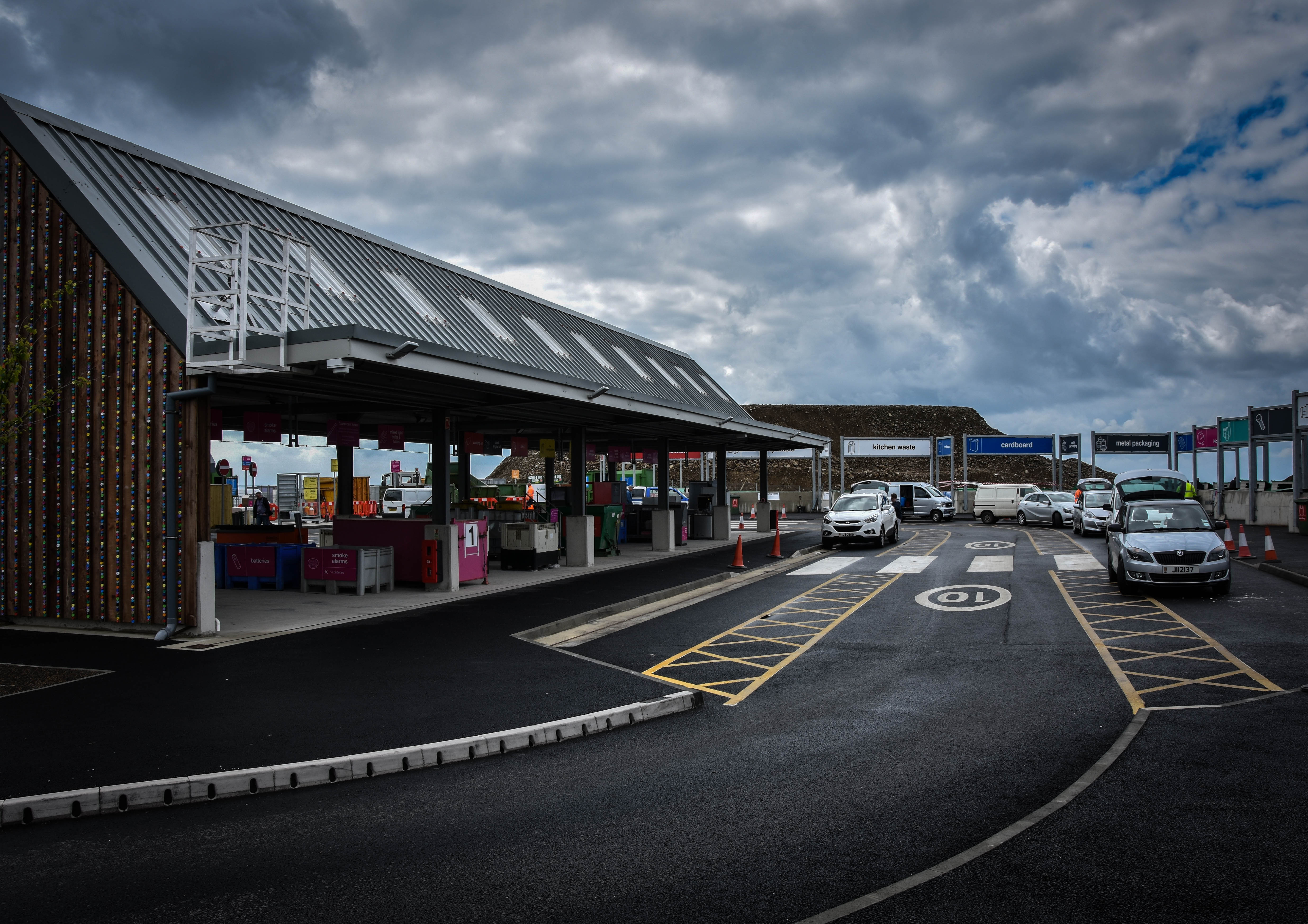 For this next documentary look at Jersey’s new and improved recycling facility, I have attempted to capture the location featuring as many important aspects as possible. My outcome above portrays the main recycling building on the left, the elegant car system running around the facility and a few of the many many drop-off points for waste that continues all the way around. The meaning behind this image is to show how the recycling centre now works and how effortless it is to drive around and dispose of our pollution safely. I have chosen this image as a final as I love the angled perspective of the facility and the dramatic overtones created with the contrast of the sky.
 When selecting my final outcomes out of the images above I wanted to make sure that I included a varied selection of each subject I have created. Below I have chosen five photographs (out of the 12 original images) that each show its subject matter either from a different viewpoint or in a different light. When it came to editing these photographs the first thing I did to all of them was make them more dramatic and eye-catching by playing with the exposure, shadows and contrast. After this, I judged each photograph individually and went through my normal editing routine of changing things like colour, temperature, clarity, saturation, highlights and blacks. The reason I have decided to keep all these outcomes in full colour is because they are aimed to catch my viewer’s attention and really stand out.
 The final outcome above is my favourite result from this creative symbolism shoot. To create this subject matter I used a black sheet of fabric I had at home as well as a Nutella jar lid, some old fishing rope and loads of plastic bottle caps that I found on a few of Jersey’s beaches; ultimately arranging them into the shape of a fish. Although abstract and eye-catching the context of this image is to spread awareness about something very bleak. The reason I have created a fish is because it is a good symbol for the ocean and its ecosystem and can give the viewer an idea about the wider message I am trying to get across. I love how I have captured the composition of this subject matter and enhanced its dramatic intensity by manipulating colours, contrast and highlights.
 The next final outcome displayed above depicts a jellyfish made with blue rope creating movement in the background, bottle caps forming the shape of its head, and separated strands rope as the tentacles. Although I was not really planning on creating this subject matter, as jellyfish are not really symbols of the whole underwater eco-system, I have found that this idea has, in fact, worked very well. The meaning of this subject is to show a futuristic world where all marine life has been replaced by our waste. This is futuristic tone is emphasised by the neon colours I have created and the black dark ocean background. Overall I think this abstract piece has a really strong centred composition and I have managed to create a really intriguing yet ominous tone.
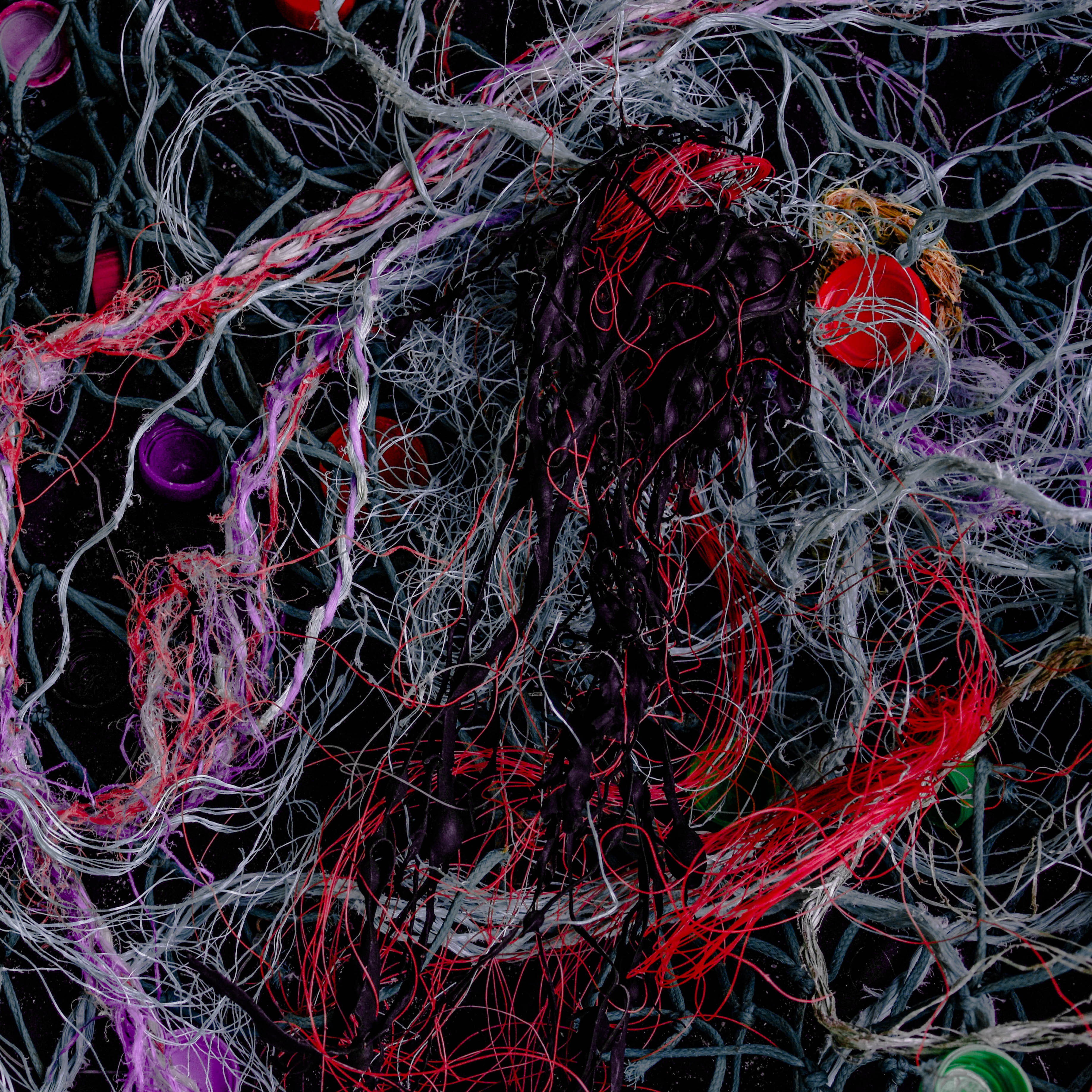 Next is an abstract image that has a very different subject matter to all my other final outcomes from shoot. This photograph depicts a massive amount of material and plastic fishing ropes/lines along with bottle caps and an oddly shaped piece of seaweed in the middle. The shocking thing about this, for me, is the how easily I managed to source these discarded materials washed up on a few of Jersey’s famous beaches. The symbolic message behind this image is pretty much a realistic version of the final above, where a jellyfish-shaped creature is being engulfed and tangled in pollution. The reason I chose this as final outcomes is because of the intriguing way I have managed to digitally manipulated the colours of certain ropes/lines and toned down all the rest.
 Lastly are two more images that are aimed to give an insight into the problem of ocean pollution and hopefully make the viewer think twice about how they discard their waste. The meaning behind these two photographs is quite similar in that they both show a futuristic ocean scene that has been completely taken over by synthetic substances. The first piece on the left is simply a differently captured and edited version of the larger final outcome above. I have chosen to add this to my results blog post as well because I love the dramatic effect the subject has it fades into an ominous black border. The last image is of my fourth subject matter that I had previously planned out to depict a wave created by pollution. I love this outcome as I think the message is really clear as well as the composition of materials showing movement and intricate textures.
 To chose between these photographs, and produce a final collection, I was looking for a few certain aspects. To cut my shoot of around 50 images from each beach to these 7 originals above I was mainly concentrating on the quality of light and the perspective of my subject matter. My final results below show the photographs that most highlighted the subject matter, making it appear bigger against the location, and in result making my message more obvious. When editing these photographs the first things I did was crop them to make the pollution the first thing you notice. After that, I decided to keep all my results in colour because of the high contrast between the man-made objects against the colours of the natural locations…
 The first two finals above are depictions of the result of my beach clean ups on two separate beaches. The image on the left depicts a mixture public waste and fishing pollution with rocks and the sea in the background at a small quiet beach near Faldoeut. To create this image, as with the other outcomes as well, I simply walked to the length of my chosen beach and clustered together everything I could find. The meaning behind this image is mostly based on the huge green fishing net trapping everything it comes in contact with. This is a perfect example of the problem of fishing waste on marine life and the amount of it that is found in the sea. I like the dark overtones of this image along with the interesting composition and arrangement of items. The next photograph on the right is my least favourite outcome from this shoot, however, I still chose to include it in my blog as it clearly shows what was found on a well-known and recognisable beach, Gorey. I will not be featuring it in my final outcomes for this project as the subject matter of what I found is not very interesting.
 These next two photographs are more abstracted examples of the pollution found on two separate beaches. The first image on the left was inspired by the amazing layering techniques used by Idris Khan and Stephanie Jung. Although their work usually revolves around much bigger landscapes I like the effect this technique has on my close up shot, and it abstracts the image and hopefully intrigues the viewer. By doing this, I hope this photograph may help spread awareness in a more light-hearted and artistic way. The next image on the right shows a straightforward closeup of the many strands of discarded rope found at Bouley Bay. I chose this photograph as a second final, as although it is similar to the one on the right, it can emphasise the problem of fishing waste in much more un-manipulated and realistic way. I like the dark contrasts between the many colours of the rope and the shadows in between as it really makes the subject matter stand out and look very dramatic.
 These last two photographs are from, what I consider to be, my most successful beach clean, completed at Bouley Bay. When putting together everything that I found I decided to loosely arrange it in categories of waste. By giving this rubbish pile some structure it allows the viewer to really easy to see and pick out nearly every single object that was there. The first image on the left is the classic scene of Bouley Bay with the interesting rock formation and tree behind my subject matter. I like the meaning behind this image as it is very clear to see, from this low angle perspective, the massive amount of waste on such a tiny little beach. I also love the composition of this subject matter, making it seem larger and emphasising its dramatic effect. The last photograph one the right is the same arrangement but taken from the other side. I like the context the Pier in the background gives this image, as it can tell us why this beach is often used and why it may have so much pollution. Overall I think these are the best images from this shoot because of the location, arranged subject matter and quality of light.