Category Archives: Development

Filters

Author:
Category:

Process of Making Final Pieces

Making Final Display


Because of the different parts of my final project there was a lot of work that I needed to do to make them. The first element that I started working on was the slides. I knew that I would need to have some way to keep them flat but still be able to see them clearly.

The photo above shows me testing using two pieces of acrylic to look through, one either side of the negatives. The back piece is tinted slightly brown, this was because I knew what It would look like with just clear acrylic or glass there so I wanted t test to see if this was any better. As it turned out it wasn’t, the main problem was that you could see shapes and things from behind the negatives, this made it difficult to see the images properly.

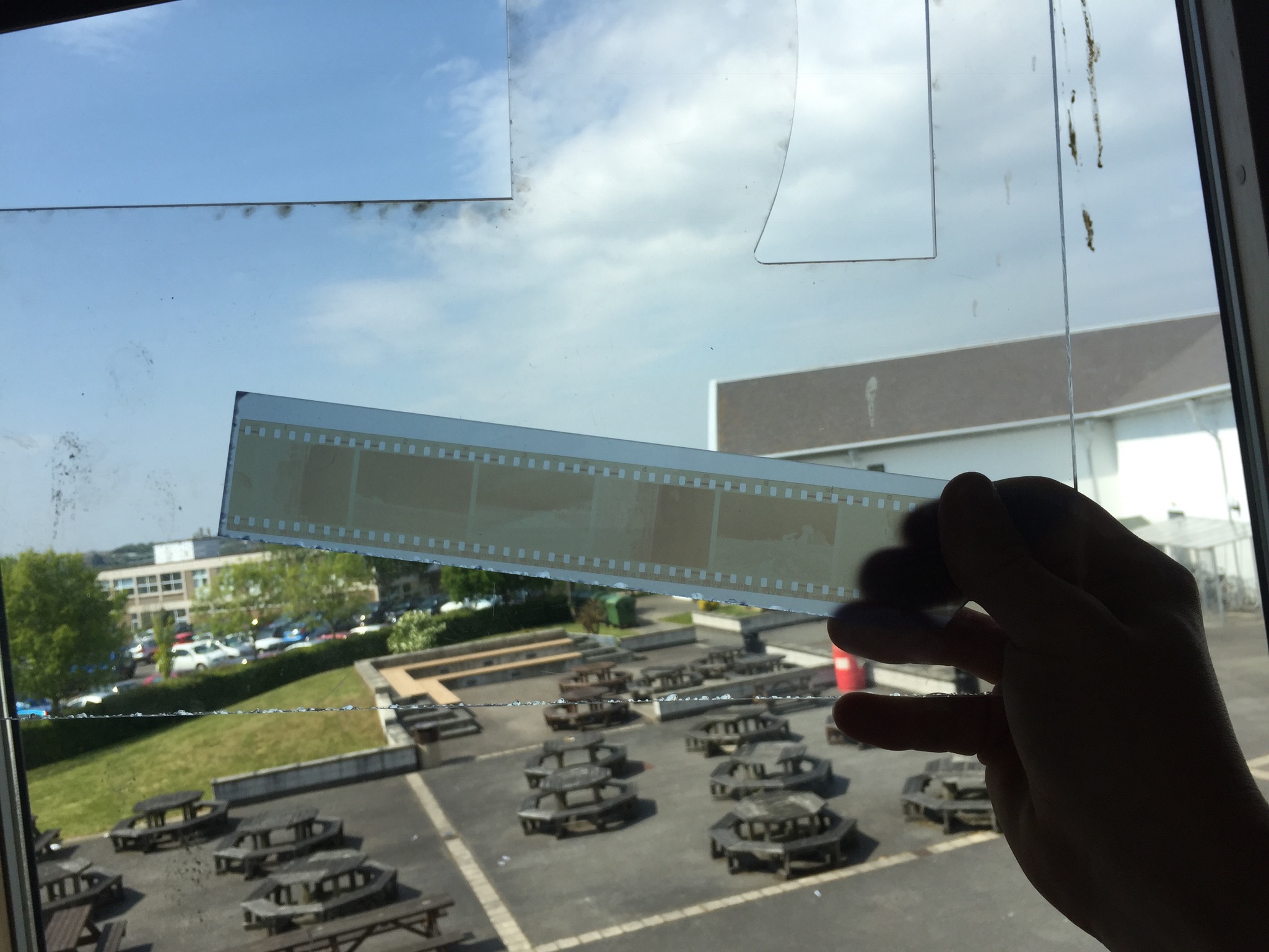
To try and beat this I tried using a piece of frosted acrylic instead of the clear one. Ths as it turned out worked really well for what I wanted as seen in the above photo. It just helped to soften and distribute the light while the light colour of the acrylic helped to let as much light through as possible.

The next step was to make a frame for the negatives. I decided to use a window mount for each of the strips, the first tester one that I did had to have a white background but I made some different variations to test and see which one I liked the most (these can be seen below). The different versions are different colours and some have beveled window mounts and some are just simple cuts. In the end I decided to go with the bottom one as the final version, the contrasting white against the black worked really well and helped to lead from the dark into the light of the negatives (the second last one is the template that I used to mark out the final ones.

Once I had cut all of the frames out I needed to cut the acrylic. The pieces that I used for the backs in the end were not the same colour as the part that I tested, this was because the school workshop where I got the acrylic from did not have any more of that colour. As it turns out though the lighter turquoise colour worked better for what I wanted and made it easier for the negatives to be seen. I cut the acrylic to the same size as the outside of the frames so that it would fit flush with the card.

Then the negatives needed securing to the frames. The side of the negatives that holds the image on faces away from the outside of the frame and touches the acrylic, this protects the images a little and makes sure that the viewer is not looking at an inverted image when they hold it up to the light.

Securing the negatives was done with just some small pieces of masking tape, this was so that if I wanted to I could remove the negatives at some point or reposition them without damaging the film. After this I just placed some double sided tape on the card and used this to hold the acrylic in place and secure the images.

All of the final mounted negatives. This was just keeping them still so that there would be no issue with the tape sticking, i was not taking any risks at this point.

The next thing to do was to make the big boards, although a lot less fiddly and delicate this was the part that took the longest to do and was the most challenging.

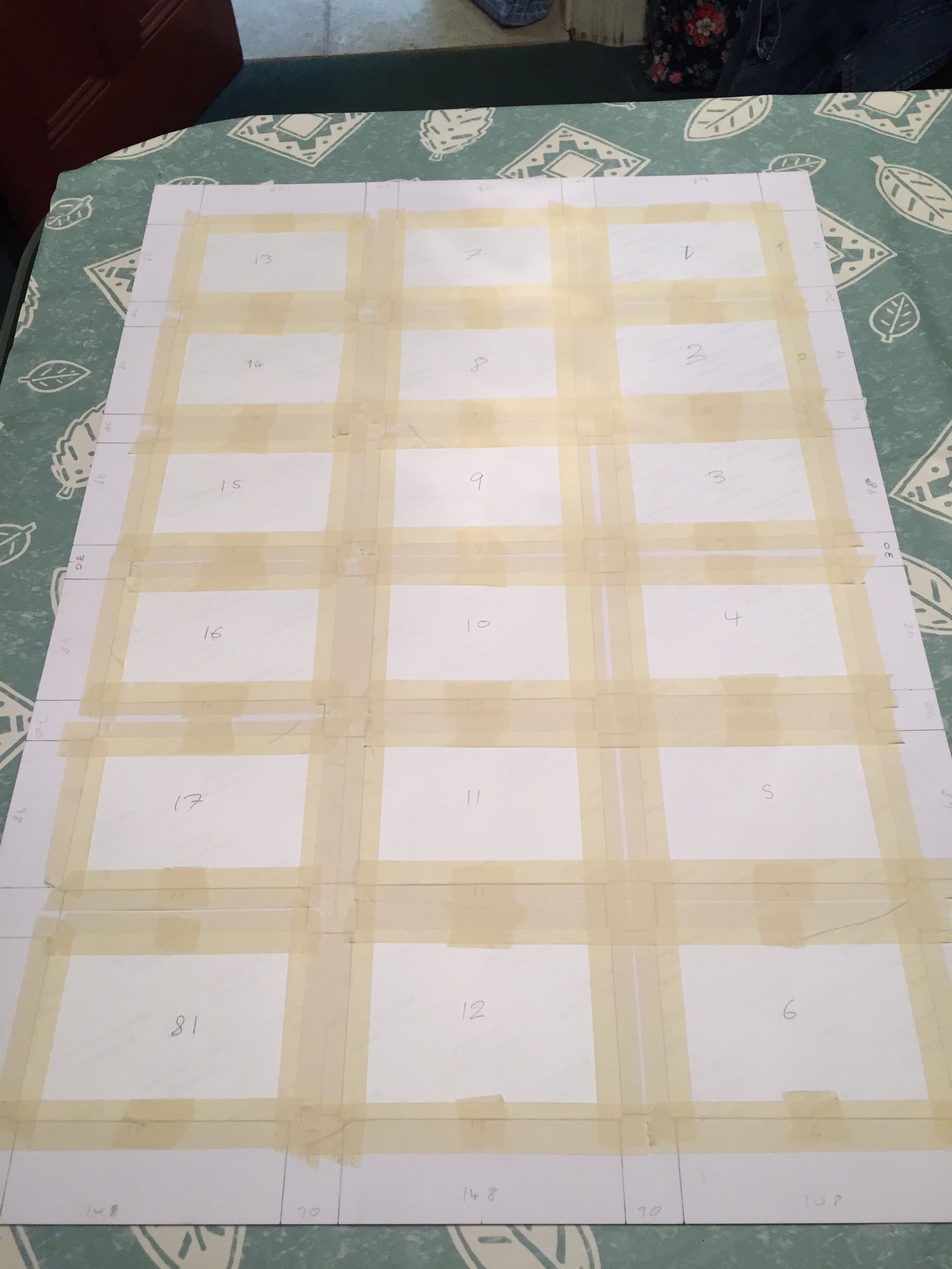
The first step was to mark out all of the sections that I would need to cut out. This entailed working out the size for the frames and then marking out this on the two large boards. This marking process took a very long time to make sure that I had got every measurement correct. I completely did one board first before I did the other Incase I decided that i had done something wrong on the first I would not have to remark and cut both boards.

Cutting out the boards took the longest (I did use a window mount cutter it’s just not in this photo) out of all the different parts to this because it was the most important that I got right. I had several scares that I had messed some things up but in the end they all were cut just fine.

The next challenge was to decide how to order the images on the boards. The image below shows how I originally laid them out,meant to be viewed from the left side of this image I decided against this because most of the images are landscapes so most would be at an incorrect angle.


The image above here is the next layout that I tried. This one was better because the majority of the images were orientated the correct way but then I thought about the contact sheets that I had based this on and thought how it was just too different from them. The issue also arose of how the two boards would work together, in blocks of six images they did not work as well.

This layout was the  one that I went with in the end, It works in columns in the order that the images were taken. this way your eyes can follow one column and then go onto the next, seeing the effects of different water damage in each one.

Once laid out they were then taped onto the back of the boards inside their window mounts, again I used masking tape so that I could remove the images without damaging them if I needed to. The tape held strong enough to keep the images in place permanently unless they were intentionally removed.

Making the  other board was exactly the same aside from the missing frame. for this I used some art paper that lets light through quite well in lieu of an image.

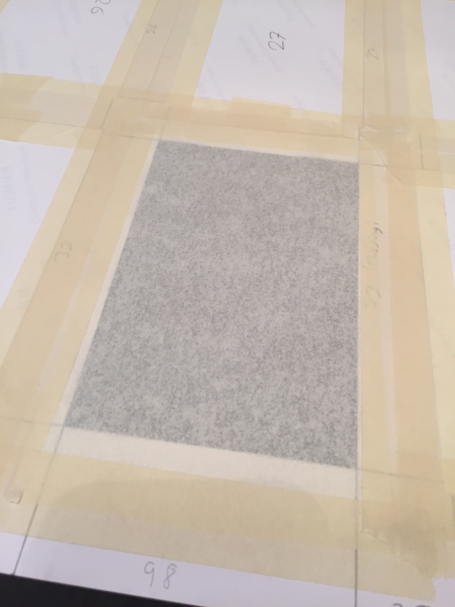
To finish the boards I mounted them with solid backing pieces of card to help protect them and keep the a little stronger, for the missing frame (33) I cut a corresponding hole in the backing for this so that light could still pass through.

I bought some chalk pens for writing on the images and boards. I tested them on some spare photographic paper and on the off cuts of card. I tested if they rubbed off, and tested out some brush strokes and just generally got used to using the pens.

Then I wrote on the numbers of each of the frames, this i felt was necessary because it gave the boards more of a feel of the traditional contact sheets while still being my own interpretation of them.

The final works with the drawings with coloured pens on can be seen on the final evaluation and display post. I am happy with how the boards and slides turned out and I feel that the time that I put for them was worth it.

Analog combination of images and text

After manually tearing the images I had printed out early I decided to take the experimentation further and continue with an analog approach. I was able to use these prints for experimentation because I forgot to edit out the hand of the blonde side of the photo and the image looked rather strange with only a small portion of the hand from each photo, luckily I was able to use the letters and words in my experimentation to mainly obscure it from view. I have previously experimented with overlaying text on photoshop but know I want to experiment with cutting out letter and sticking them individually onto the prints. I attached the ripped photographs together by pray mounting them onto a piece of card. I used microsoft word to create the black and white letters, I created individual text boxes that I coloured as appropriate. I then made two copies of the alternating black and white letter and one copy of with each word having the same colour for all their letters. I  printed out the letters and cut them out and played around with how I wanted to display them on the prints. When sticking the individual letters onto the prints I ruined my first set of letters in my first attempt. When n i placed the letters face down onto some newspaper when spraying them with spray mount the pressure of the spray caused them to fly everywhere and got the wrong side of many of the sticky. I was able to solve this issue by using a rolled piece of masking tape. One side of the tape stuck to the newspaper and the other held the printed side of the letters still while I sprayed them.

For the above image I used black and white alternating letter and contrasting backgrounds for the words “beauty and “bitch” and block backgrounds and letters of the same colour for the words “and” and “the”. As previously stated, I wanted to try and hide the hand in this print as it is a little distracting as at first glance it appears to be a hand that works with both images but it is distorted in a way that is a little disturbing. I placed the words “and” and “the” in the centre of the image and the join, as if the two words are holding the images together, similarly to how the two words hold the phrase together. I then placed the letters for “beauty” and “bitch” is a disjointed stylistic way.

As this image combines each of the stereotypes separately and they are presented individually I decided to experiment with printing out the letters of the words in the same colours, although I still wanted a sense of alternating between white and black (because I think it works well with the alternating pink and blue of the outfits and backgrounds) so I made the text in the following colours “beauty” on white, “and” on black, “the” on white, “bitch” on black. I decided to make the background of beauty white because of the positive connotations of the colour and the word “beauty” and vice vera for the black background of the word “bitch”. Unlike the previous image I decided to place the words on opposite sides of the image rather than making them overlap, to give a greater sense of division.

I also had an already digitally combined print of the two sides, but similarly to the other images, it had the hand that was strange looking and distracting. Luckily I was able to completely cover it up in this version. For this image I took inspiration from Barbara Kruger’s work and used block backgrounds for full words rather than more ransom note inspired individual letters. I placed the words in such a way over the join of the image so it appears that the words are holding the two sides together.


Inspirations for development of combined images


I decided to develop my idea of combining images and text together by experimenting with an analog as opposed to a digital approach. I was inspired by the aesthetic nature of  Barbara Kruger’s work and how the importance of symmetry and balance is replaced with expressive angles for the text. Sometimes the unbalanced and disjunct nature of her work actually makes it more interesting to look at. I was also inspired by stereotypical ransom notes, similar to ones seen in movies and tv, that include letters cut out of magazines, each letter is a different colour and font, this makes the process of reading the text very disjointed and fragmented.

As seen above, the burn book from the film “Mean Girls” which I have referred to on multiple occasions during the course of this project, takes inspiration from the cinematic ransom notes I described. The burn book is a scrapbook created by the Regina George, the popular antagonist and her “plastic” followers, Karen Smith and Gretchen Weiners. The burn book was a single pace where each of the girl would write down their completely uncensored (and often exaggerated or untrue) opinions of various students and teachers at their high school. The book was kept safe at Regina’s house and was intended to never see the light of day. At the climax of the film the burn book pages are photocopied and hung up all over the school, which leads to scenes of absolute chaos. This leads to a workshop lead by the school where all of the girls are made to confess to all of their catty and bitchiness.  This leads to the scene ( screen capped above) where the token art student, feminist character Janis sarcastically admits to having a “big lesbian crush” on Regina, exposing the fact that all of the lies and rumours written in the burn book stem from Regina’s self obsession and her own insecurities.

I also want to take inspiration from movie posters that feature what appear to manually ripped, contrasting images that are combined to create something intriguing, like the poster above for the iconic Stanley Kubrick movie, “The Shining” and the layered ripped poster for “Eternal Sunshine of the Spotless Mind”. I included the poster for Jim Carrey’s “Me, Myself and Irene” in my mini mood board above because the split of the face representing a multiple personality disorder fit into the conceptual  nature of how I want to combine my two contrasting images of the angry feminist and the blonde (pictured above) .I feel that combining similar stereotypes from my project (Janis and Regina can be seen in my initial mood boards above from my angry feminist and blonde stereotypes) with a words inspired by both ransom notes and the burn book would be an interesting development for my project.


Final Stamps

// R E T U R N   T O   S E N D E R //

Following up on the research and experimentation I have carried out for this project, I created my twelve final stamps ready to be printed. Incorporating a mixture of artists I have researched such as Ray Johnson’s mail art and linear illustration techniques, the set below is my finished collection. Anna di Prospero is another artist who heavily influenced many of these designs with her soft floral double exposure techniques. This first image was created using a double exposure technique which involved altering the blending options, in particular the ‘lighten’ option. The second image is one from the same shoot and shows a selection of bright purple wildflowers. The white illustrations were inspired by Ray Johnson’s artwork but unlike his pieces, these were applied digitally using the pen tool in photoshop. This second image was digitally altered using the colour settings as well as the dodge tool, saturation settings and posterise options. The wrapped white pen was digitally added afterwards and a clipping mask created the postage stamp shape. The third used a channel mixer to create the alien looking colourings of cyan and lime green. The illustrations were drawn using a square brush to create a rougher and less finished look. So below is the finished set of twelve which will be displayed along side my prints and finished postcards – as both small scale stamps and as prints themselves.


Symbolism: Final Prints – Layouts & Designs

After creating, experimenting with, and evaluating my final presentation plans for my documentary outcomes, I next moved on to deciding how to portray my chosen symbolism results. Below I have taken all the outcomes I had decided to use in my previous ‘selections post’ and organised them as well as slightly narrowing them down. These designs are mock-up versions and experimentations of my favourite symbolism outcomes and how I want the final printed versions to appear when presenting my project. From my knowledge of printing final images in previous projects, I will be asking for my A4 and A5 prints to be on gloss paper and my A3 on matt. The red cross’ below indicate that I will definitely not be using this version of the display to physically recreate and the question mark means I am still unsure. To create these I simply used layering tools in Photoshop to make black and white backgrounds give off the illusion of window mounts, triptychs, and diptychs…

Symbolism – Final Prints – Presentations :

My first symbolism presentation above depicts the problem of cigarette waste and represents the message of ‘man vs nature’. These computer generated displays depict how I am intending to display my results in a classic black diptych window mount. Because of the dramatic black background of these pieces, I will be requesting they are printed off size A4 so that they can appear on gloss paper. Although I am fond of my symbolism piece using a human hand as the subject matter, I have found that the more simple mirroring effect of the two flower images looks much more dramatic and stylish. To create this display above I actually had to go back and re-edit these two images in order for both to appear in colour with the same tone and lighting effect. To make the window mount simulation above I used a very thin frame of white background before the black to create the illusion of the black frame having a bevelled edge.

For my next pieces presenting my creative ocean pollution symbolism finals, I will be presenting two sets of diptych images backed onto large white foam boards. Because these will all be A3 prints I originally thought about backing them onto foam board and simply displaying them as four separate pieces. However, because the images are quite similar in colour and subject matter I decided that they are best off displayed together in the hopes that they will compliment one other. I particularly like the two examples on the left together because they are a simple/abstract version of the same jellyfish-like creature. As well as this the fish and wave outcomes also work well together as it is an obvious symbol of ‘under the sea’. To re-create the Photoshop examples I have displayed above I will be first backing them onto black foam board separately (giving them more visual weight) to then arrange them side by side.

Lastly, for my surreal and abstract outcomes above, taken during my documentary ocean pollution shoot, I have decided to put together my most complicated window mount so far. This presentation will be paired up with my black and white documentary outcomes depicting the pollution I used to create these images. As with those outcomes, these were taken on an iPhone and therefore will also have to be printed off on A5 and A4 gloss paper. The reason I am unsure whether I will be using the five image window mount on the left or the smaller one with four is because I first want to judge the quality of the top abstract piece to see if its good enough to display. When recreating one of these examples I will most likely crop the A5 pieces to the same size in order for them to appear more professional. To create this complicated window mount will take a lot of planning, however, when finished, the end result will accentuate my photographs and present a visually stimulating collection.

Mail Art

// R A Y   J O H N S O N //

Looking into the theme of ‘Mail Art’ and its place in historic and modern creative movements, the name Ray Johnson was a quick one to appear. the twentieth century artist was popular following his activity as part of the downtown art scene in New York in the early 1950s. Johnson painted geometric and abstract images heavily influenced by his previous professor, Josef Albers. The crucial thing about Johnson’s work was not just how he created it but later his destruction of the same pieces. Most of his pieces were destroyed in his personal process of creating collages which resued this original artwork. In 1954, these small-scale collages were labeled as “moticos” and featured irregular shapes and images from popular culture. Some of these celebrity influences included Elvis Presley and Shirley Temple as well as regular department store models. Much of Johnson’s work in this area anticipated Andy Warhol’s pop imagery which started to appear in 1960. Despite artistic similarities, Johnson’s approach to work and fame was drastically opposed to Warhol’s and he was known for dodging it being labeled as “the most famous unkown artist” by Grace Glueck in the New York Times (1965). His deliberate elusiveness was a popular debate and added to the interest of his character. 

Much of Johnson’s work started a modern understanding of performance art such as his tendency to share his moticos around New York with strangers in the streets, train stations and cafes. These performances were even sometimes self recorded in order to collect public reactions to his work and each intricate creation. Much of the work used in these sessions of self publication were later supposedly burned.

Jonson reused his moticos by cutting them up and creating new tiny compositions with them which could then be inked on, painted and sanded to create new pieces of work. These new collages were extremely complex and had an underlying emphasis on structure repetition and semi-geometric forms and shapes. Johnson can easily be seen as an early instigator of performance art acting in other’s pieces and creating his own such as the staging, “Funeral Music for Elvis Presley”. 

“In his typically self-deprecating way, Johnson would say that he did not make Pop Art, he made “Chop Art”.”

In 1995, Johnson was witness dressed in black as he dived off a bridge in sag Harbour, Long Island before backstroking out to see. This suicide was heavily speculated and many aspects of his death seemed calculated such as the repetition of the number 13. The date of his death, the 13th January; his age at the time (67, 6+7=13) and the number of the motel he had checked into earlier that day, 247 (2+4+7+13).

“There was much speculation amongst critics, scholars, admirers, and law-enforcement officials about a “last performance” aspect of Johnson’s drowning. After his death, hundreds of collages were found carefully arranged in his Long Island home.”

Ray Johnson is still considered one of the major artistic innovators of the second-half of the 20th century within the critical community but his work remains mainly unknown and heavily under-appreciated by the general public. Some of his relevant pieces are selected below and will be used as starting points for further experimentation with my postcard images.

Working from these ideas, I intend to print a selection of my post card images and effectively graffiti them with block colours and shapes in a similar style to Ray Johnson’s work above. To do this, I will print them on standard 80gsm paper and use ink pens to illustrate them with words and text. I printed four of the postcard images onto sheets of paper with a white border which allowed me to work slightly around the image as well as directly onto it. I also printed all eight of my stamp experience to work with as a test influenced by this artist. I started by drawing rough doodle-like images directly from Ray Johnson’s work onto a plain sheet of paper before starting on the images. The sayings, words and illustrations used are all heavily influenced – if not directly lifted (such as the legs below) from Ray’s own postcard projects as part of his Mail Art series.
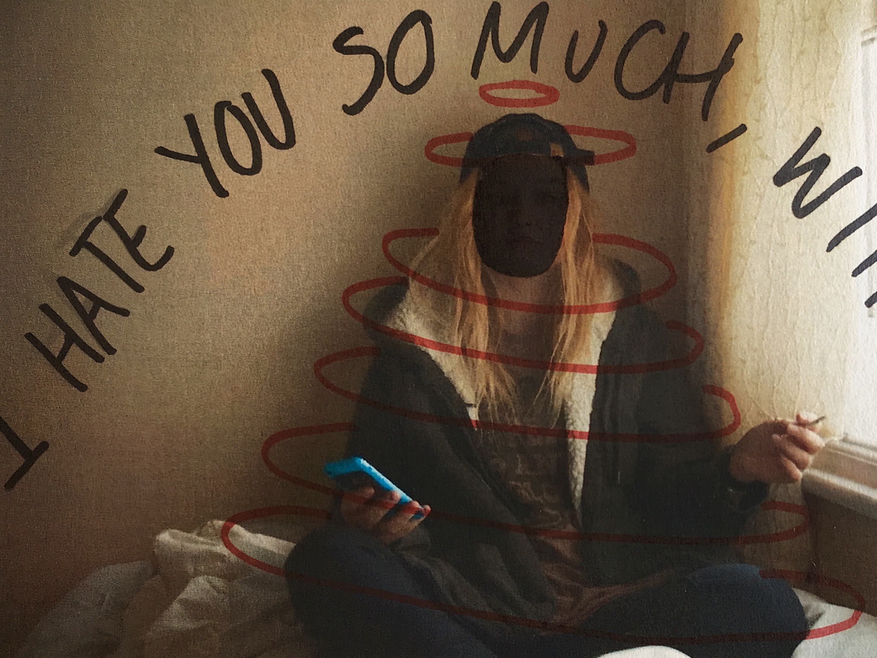
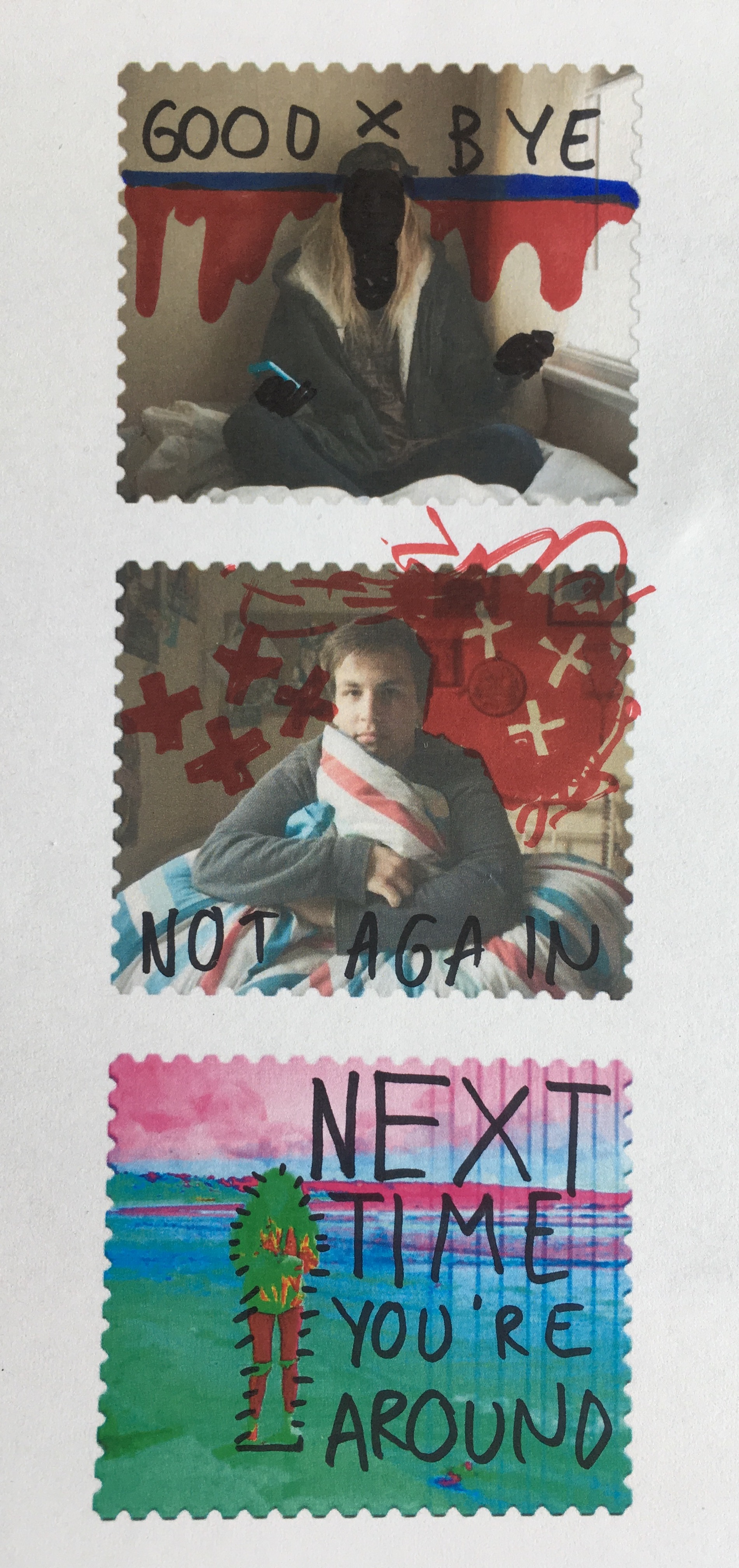
Below are a series of small tests on my own images. They were printed out on a normal copy printer so are not a high quality and were manually deformed with pens and ink markers. 

I also used this experimentation technique on some of the stamps I created in photoshop after they were printed out. Again, they have been manually manipulated rather than digitally and feature a mixture of original ideas and influenced doodles for Johnson’s own project work.


Photoshop Skills

// S T AM P   D E S I G N //

To finish my post card creations I wanted to create a series of stamps using the home shoot images which can be added to the back of the outdoor images after they’re printed as the card sets. To do this, I worked in Adobe Photoshop to create a series of stamps based around a free template I found online. The original image of a blank postage stamp is shown below and comes from ‘backgroundsy’ which is a shutter-stock style site where vector images can be downloaded. I filtered through a number of these template blanks to find a design which would be suitable for what I was looking to create. I selected the image on the right hand side below as i was happiest with the edging format. Loading this into photoshop, I added my own images as a second layer on top of the original template. These were scaled to size and adjusted to fit the frame. The next step was to create a clipping mask and mask the images to the shape layer forming the stamp image.

The stamps I created using the process above in photoshop had sections of pure white which didn’t show up clearly against the background on this blog. To add clarity, I added an artificial drop shadow – again in Photoshop – which will not be printed with the final image and is purely for presentation purposes. The plan for these stamps is to have them printed on sticky-back paper (likely 85gsm) and attach them manually to the back of my cards rather than having them printed as part of the designs. This manual method will produce a hand-made finish to the final piece which should still look professional if printed correctly. I will have the stamp series printed privately as I need full control over the weight and finish of the paper and prints. Below are the first two stamps I designed which feature full frame images taken from the home shoots. Though plain, they are effective but overall very basic. To expand and develop on this idea, I intend to experiment with a series of images from across all shoots to create a selection of alternative ideas which may focus more on abstraction.

Working with images from the shoots that explored subjects further than a typical front-facing portrait, the next step was to experiment with a series of stamps that utilised my knowledge of both photoshop and graphic design. The first of these experiments was a simple double exposure image featuring photos from both the home and external environments. I focused on a closer portrait for the base image and overlaid a photo of the landscape the model chose which happened to feature a vertically focused display of trees with some elements of water in the background. Rather than using a dodge tool, I used a simple eraser and blending sliders to have complete control over the format of the images and the way they connected together. This process used fewer layers and resulted in a double-exposed final stamp image. Below is also a slide showing my photoshop layout complete with the layers used in this section of the project. 

Linking to some of the more abstract orientated stamps I researched as part of the inspiration for this project section, the stamp below was created by layering several images over each other in a block-colour format. The image in the background needed to be relatively calm with a central focus which in this case is Maya. On the left and right of her are two more abstract photos which feature small sections of landscapes we crossed through on the journey to create the final images. The plants were taken outside her house which she identified as not being a physical home for her in any sense other than the place she sleeps. On the right of the image is a small section of sky which fades out towards the bottom of the stamp. This image actually shows Maya too up at St Ouens bay but for this experiment I cropped it to show just the blues of the sky.The next experiment was a simple image rotation technique which runs back to the work we completed earlier in the year on Idris Khan and the double exposure methods which rely on multiplying images. Further research on this experimentation can be found here in a previous post, “Multiply“. The method is simple but worked well with the relatively plain portraits I shot of Jack against a natural, green background. The second layer image is actually a different photo but is almost identical other than slight changes in the facial expression. Though still relatively simplistic, this image is arguably one of the more successful as the uncluttered design draws the eye but won’t distract from the rest of the piece.Going a bit mad with design ideas now, I created a bizzare and colourful stamp using a base image from Emily’s shoot on the beach. The slide below shows the original image, though adjusted and faded slightly, clipped to the stamp design but otherwise natural.
Using a variety of photoshop options such as posterise, colourise, colour burn, dodge, full saturation and other editing methods – I created  the alien looking landscape below. The image features rich colours that draw out tiny details with the mad colourings (such as seaweed in the bottom right). Though odd looking, there is something pleasing about the unnatural edits of this image and the way they are presented here. Taking this further, I blended a selection of stock images and patters to create further distortions in the image. Below are a selection of slides from photoshop showing the layers used for this part of the project as well as the blended stock images used . 

The final outcome has an off-world feel and is more science fiction than anything natural or human. The colours are unsettling and focus heavily on saturation, hue and contrast to form the final image. The next step of experimentation here will focus on possible additions to the postcard backs such as letter stamps, wording and placements. Another possible addition could be layering the stamps as if each image had ben posted more than once? Just something to think about and possibly explore later on in the project.

Documentary: Final Prints – Layouts & Designs

Before designing my photo book I first wanted to plan out how I will be presenting my final outcomes that I have chosen in my previous ‘selections’ post. To do this I have first split my results into documentary and symbolism presentations and separated them into two posts. Below are mock-up versions and experimentations of my documentary outcomes and how I want the final printed versions to appear by the end of the exam. To create these displays I will be using a mixture of gloss paper A4 and A5 images as well as A3 matt pieces and the materials provided by the school. The red cross shown over the top of my designs below indicates that I will definitely not be using this version to physically recreate in the exam whereas the question mark means I am still unsure. To create these examples I simply used layering techniques in Photoshop to make black and white backgrounds give off the illusion of window mounts and storyboards…

Documentary – Final Prints – Presentations :

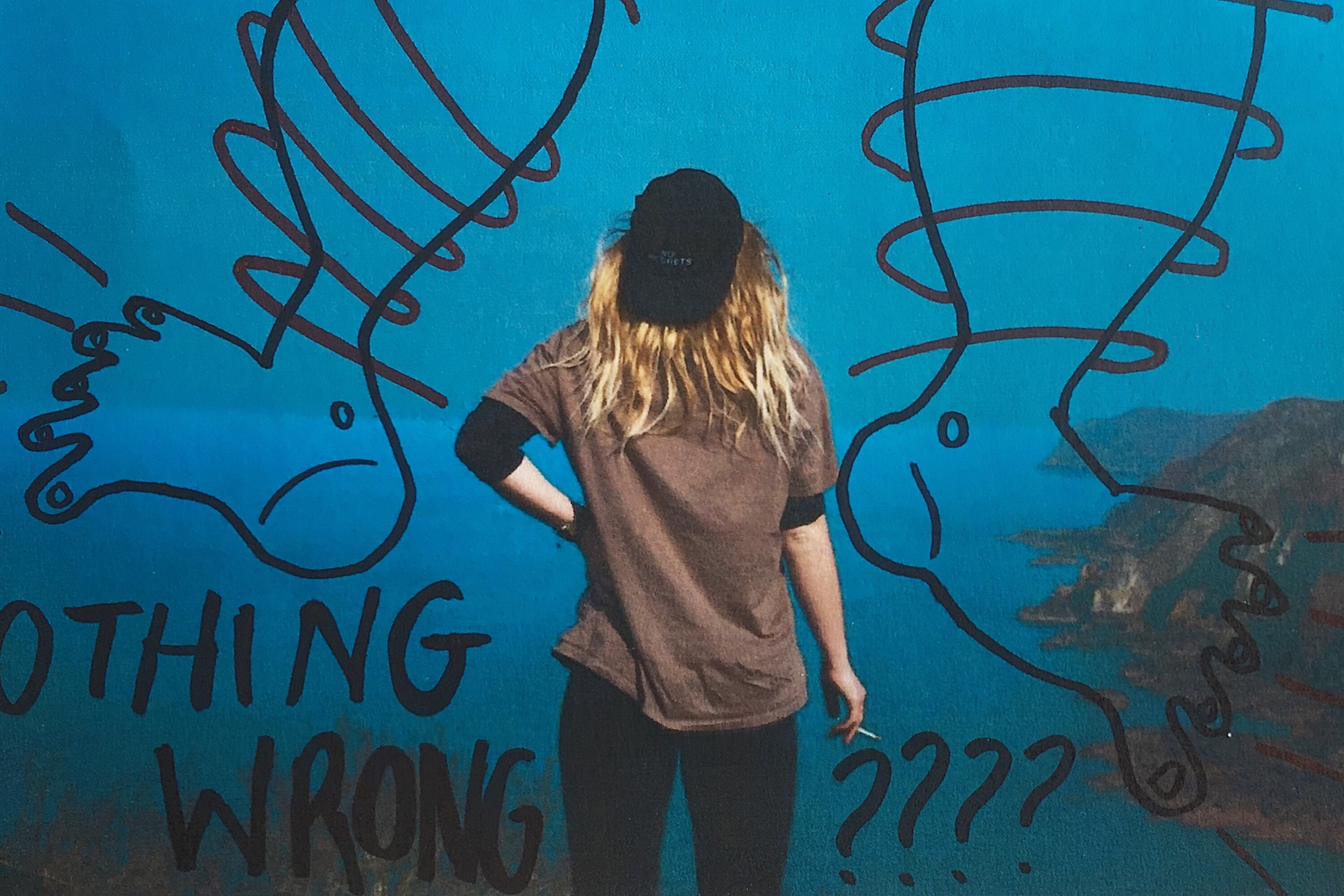
This collection of computer generated displays above depicts how I am intending to display my results on the problem of ‘plasticulture’ in Jersey. For these pieces, I am planning on creating my most difficult presentations to emphasise my A3 images using a double window mounting and diptych technique. To do this I will first be creating a white window mount for all three of my pieces and then a larger black window-mount to go on top. The reason I have separated my outcomes into two pieces is because the black and white abstract image is very dark and dramatic compared and looks much better as a single display. As well as this I have chosen to create a diptych because the two colour images work together to tell a frightening story about where this plastic ends up. Because the two documentary images are not the same size, after testing it out, I have decided they look much better as a vertical display with one on top of the other.

The next design above shows how I am planning to lay out and put together my many final outcomes taken to explore the methods of Jersey’s common waste disposal. To do this I will be using my previously researched picture story technique, my 6 – 8 professionally printed photographs, and two pieces of large white foam board. The reason I will need two pieces of foam board is to separately mount each photograph, giving them a lot more visual weight and emphasis,  before sticking them all down together as a final collection. As I am unsure how big of a board I will be able to use I will be printing two extra A5 images as well as an A3 and A4 version of the same piece. This is so that when it comes to actually laying these out, in the set sizes that they are produced, I will be able to make my best judgments on the day. This piece will be my largest presentation for my project as I love the overall tone of the shoot and the fact it is an insider’s view on where all of Jersey’s pollution ends up.Lastly, for my documentary final outcome presentations, I will be showing a much smaller display of A5 images that will later pair up with the abstract finals from the same shoot. These two photographs depicting ocean pollution will be made as a simple black window mount presenting a diptych technique. Although I could possibly crop them down (using the frame) to exactly the same dimensions, I feel as though they would work better as a vertical presentation rather than as the crossed out horizontal one I have displayed above. This is mainly because of the lengthy way I have presented the surreal versions from this shoot in my next post as well as it mirroring my plastic documentary diptych above.  The reason I am printing these images so small is because they were originally taken using an iPhone and an underwater phone case and therefore are not the highest of quality.

The Addition of Text

I experimented with handwritten and typed text for this image. To get the uneven lines of the handwritten text I used the 48 brush tool which has long angled bristles that are sensitive to how much pressure is applied and adjusts the thickness of the brush stroke as appropriate. For the typed text I selected simple font which I added over the top of the image in varying sizes. I chose to use the phrade “I’m only an angry feminist when you’re a sexist asshole” because it appeared on a poster on my initial angry feminist mood board. I also though that the phrase was sassy and fit with pose ad expression of the figure in the image.

For this image I also experimented with handwritten and typed text. As previously stated for the handwritten text I used the 48 brush tool, when using the computer mouse to write the letter I chose to write in block capitals as they are mainly composed of straight lines, these were more effective and easier to write. This can be seen by the strange appearance of the more rounded letters such as o and s. I think that the typed text works better for this image, the somewhat balanced nature of the word “feminine” and “feminist” at the top and bottom of the image makes the overall image visually pleasing. I chose the phrase “Feminine is not anti-feminist” because it is something that I feel very strongly about. Just because a woman dress in a traditionally feminine way and subscribes to particular female gender roles does not make her any less of a feminist or an empowered and free woman.

I also wanted to reference the idea of a 00’s high school it girl so I decided to include a sassy, bitchy comment. I chose the phrase “At least it’s only my hair that’s fake, bogus bitch” because of the snappy alliteration of the phrase “bogus bitch” but also because the fact that a woman decides to colour her hair does not reflect her personality or whether or not she is a genuine person.

I had fun experimenting with different words to place on top of this image. Before adding words to this image I edited out the finger of the blonde image because In felt that they were distracting as they were right in the centre of the image. I removed them by using the colour picker tool and the airbrush brush tool to paint over the top, I achieved a crisp edge at the divide by using the flat edge brush tool and holding down shift in order to paint a completely straight line. I knew that when choosing a phrase to accompany the image in wanted to draw attention to the split personality feel of the image. I experimented with the phrase “Step aside Jekyll and Hyde” as a reference to the book and film “Strange Case of Dr Jekyll and Mr Hyde” which is about a man with a alter ego. I also tried the phrase “Beauty and the Bitch” as an obvious reference to the fairy tale “Beauty and the Beast” with the word “beauty” having positive connotation and “beast” having negative connotations which is replaced with the word “bitch” which has similar connotations. Another interesting thing about this phrase is that the viewer is able to decide which side of the image is the “beauty” and which is the “beast” as both sides of the image could arguably be both.

I also experimented with coloured images and white text as well as monochrome images with coloured text. I struggles with the balancing of the text within the first image but I knew that I wanted the words “polite” and “violence” to be in the largest font size and I felt that these were the most significant. I managed to balance the text more successfully in the second without having to obstruct the face. I also made the decision to edit out the painted words on the torso in the second colour image because I felt that they would distract from the over layed text. I edited out the original words by using the spot healing tool and then the blur tool to try and smooth out the skin.

In this image I experimented with two different phrases “Vegetarian martyr with the leather Doc Martens” and “Her worst critic and yet her best advocate” I chose the first phrase because I felt that it tied in well with the art student stereotype but also a satirical stab at myself and my own values as I am both a strict vegetarian and an owner of leather shoes. I chose the second phrase because, again, it ties in with the art student stereotypes but it is also very personal to me and I can be both overly critical and overly confident about my own work.

I tried adding words to this image and although I like the words I selected i don’t feel that the aesthetic nature of the texts adds anything to the image. I actually feel that the texts causes the image to lose some of its intensity and drama. My thinking behind the words is an extension of the phrase used on one of the previous images. It is a little satirical and in my personal opinion, humorous. However, I don’t think that the text works visually with the image.


Pieter Hugo Inspired Photo Manipulation


Here are three images (and their originals) from my angry feminist activist photo shoot that I manipulated in way that was inspired by the photo series “There’s a place in hell for me and my friends” by Pieter Hugo. I created these images  by placing a black and white filter over the images and adjusted the colour channels. I made the reds much darker, which made the red tones in my skin appear darker and more intense. I slightly adjusted the yellows to be darker to make the yellow tones in my skin darker, I didn’t make them as dark as the reds because i still wanted the high points of my face to be light to get a sense of depth and contrast. I didn’t adjust the greens because it didn’t make any different to the image due to the lack of green tones in the raw images. I made the cyan’s much lighter to make the background of the image white, which created a dramatic outline and sense of contrast to the figure. I also increased the brightness of the blues and magentas to make the pink makeup under the eyes, the straps of the bikini top and the lipstick white to make the eyes and the mouth, thus the facial expression more intense. The white straps of the bikini top also draw the eye up towards the face.

I also experimented with painting over the writing on the raw photo with white, as most of the text was lost when the yellow and red tones of the skin were darkened. I initially used the regular brush tool to write over the top of the text but for some reason, the airbrush edges didn’t look right. I then used the brush tool with the solid edges but I couldn’t get the flow of the accuracy needed to make the text look right. I then tired using the 48 brush which is an angled brush with long flexible bristles that are sensitive to how much pressure is applied in the stroke. This tool helped me get the rough, uneven lines I was aiming for. 

I then experimented with combining the images together, to create a small group of angry feminists. I think these images are strong as when the images are displayed together there is a primal sense of anger and intensity. The combination of the different stances and expressions make it appear as it they are ready to attack. I combined these images by using the lasso tool and dragging each figure onto the same canvas, I used the lasso tool as opposed to the quick selection tool as I wanted to make the figures relatively close together and I didn’t want the white edges of the original images to overlap. I made two version of all three images together, I also experimented with cropping the images to focus on the faces, I had to move the images closer together so that their bodies overlapped to create the intensity needed for the cropped image.

I then used the same 48 angled brush tool that I used to paint over the text in white in one of the images over to add some text to the cropped image of just the faces. I tried to make the writing both raw and rough, as if written with a sense of anger as well as legible, which is why I decided to use block capitals like the text written on the torso of the original photographs. I then used the lasso tool to more the words and sometimes individual letters into place as the white background allowed me to do this easily. I then decided to try adding some texture to the image to give it a different effect that connoted ideas of violence and anger. I experimented with a scratched texture that I blended with the image on photo shop.