Category Archives: Analysis

Filters

Author:
Category:

Documentary: Plastic Pollution – Results

Since deciding to look at plastic pollution from the viewpoint of agricultural plastic waste, or ‘plasticulture’, I was ready to complete my first documentary shoot for my environmental awareness project. Because of where I live, my previous travels around this side of the island, and the immense size of the potato farming industry in Jersey, these scenes where not at all hard to find. To complete this shoot I simply walked around a few fields that I have noticed displaying this agricultural technique. As well as the plastic covered fields, I was also looking for examples of used and discarded plastic that will contribute massively to the growing problem of plastic pollution. The aim of this shoot is to represent the darker side of Jersey’s most famous product as well as a pollution issue that is directly related to where we live. By using straight photography I can give more context for my symbolic shoots where I try to show the problem of plastic filling our surroundings, the effect it has on animals / marine life, and our connections to this issue. As this is my first documentary shoot for this project I wanted to make sure not to manipulate any of my scenes, making sure to capture the subject exactly how I found it. Below is a select few unedited outcomes, taken from many different locations around the northern side of the island…When choosing my final outcomes below I found that it was very hard to narrow them down. This is because of the many different scenes and subjects shown above that, for me, are all important for documenting this massive pollution issue in Jersey. Therefore I have ended up with my eight final edited outcomes below that I will choose from when putting together my final piece. When editing these outcomes I decided to include a mixture of colour / black and white outcomes to produce a vibrant and dramatic variety. This kind of plastic was really interesting to capture as the texture and light contrast was easily emphasised in post production. Below are my final eight results which I will choose from when creating my final piece…

The first two images above are vibrant and abstract pieces documenting this issue from up-close. The first photograph on the left shows the contrast between the green leafs from a potato plant and the bright shine of the plastic used to grow it. I love the simple composition of this piece as, the fact the plastic takes up the majority of the scene, represents just how much is needed to grow these important plants. The meaning behind this photograph is to give a close up view of this type of plastic paired with the product it helps create. Overall I really like the dark tone and abstract composition of this image as well as the obvious symbolism (created by the vibrant leaves hovering over the bleak plastic) showing my previous idea of ‘man vs nature’. The photograph on the right however has a much more simple point. Here I have captured three sheets of plastic with the thin dirt lines running in-between. By depicting this in such a simple yet intriguing way I was aiming to give a quick insight into where this plastic waste is coming from and how it is used. Although this is a very simple image, without context, this mixture of dark and shimmering light could be seen as very abstract. I love the different textures, reflections and depths that can be seen on these ugly sheets of plastic, emphasised during post production in Lightroom.
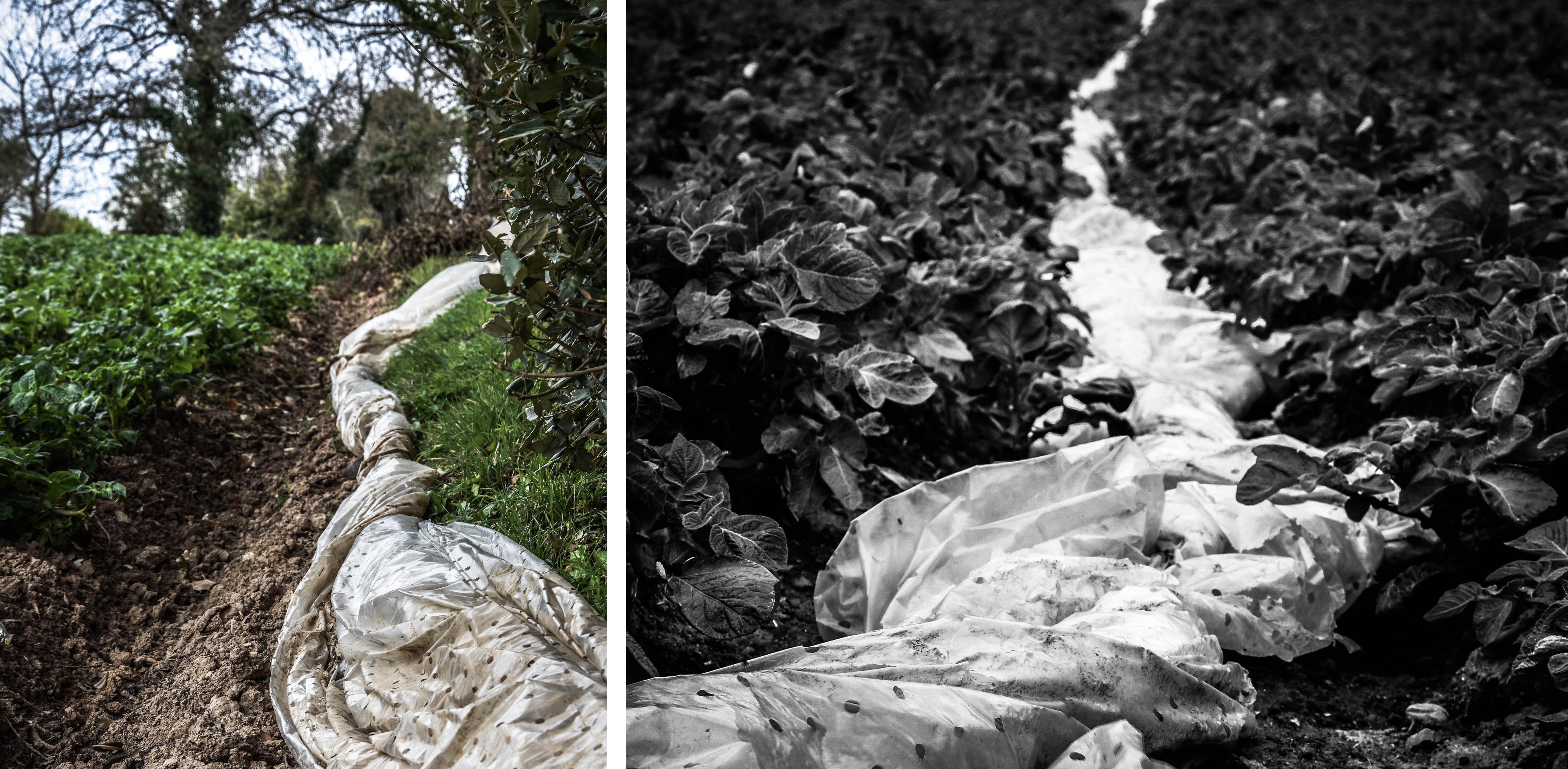
The two final outcomes on the top row of the contact sheet above depict the material, after is has been used, but before it is thrown away. The photograph on the left is a portrait shot of the plastic, bunched up, and shoved to the side of a potato field. I like this image for emphasising my point because it is clear that the plastic has been used for a short while then pushed aside before being binned. I love the vibrant and natural colours of this image contrasting the white plastic as well as its interesting composition. The photograph on the right is a very similar piece depicting the plastic bunched up between two rows of potato plants. I like the composition of this as there is a really good sense of perspective to show just how big of a problem plasticulture is. The meaning of this documentary image is obviously to depict the nature of this topic as well as being a good symbol for excess plastic waste. Overall I love the dark tone of this image along with its interesting depth of field. The fact I have made it black and white also increases the dramatic shadows in the plants and highlights the subject matter.

The first photograph depicted above on the left is a close up abstract shot of the plastic sheeting all tied together, ready for disposal. To create this abstract look I have shown the most textured spot that the plastic was tied around itself, in a simple square composition. The meaning behind this image is quite strong as this is the perfect depiction of this type of large-scale plastic going to waste. To make this subject matter more interesting in post production I changed it to black and white and increased things like the clarity, contrast, shadows and highlights. Overall I think this is a very successful photograph that would pair nicely with my presentations of plastic waste previously done in the studio. The next image on the right shows this same waste plastic but with its composition and surroundings as well. I was very happy to find this scene as it perfectly represents what I am trying to say about plasticulture. The white plains of plastic in the background emphasis the dramatic impact of the subject matter and states where it has come from. In the context of documentary photography I think this photograph works very well for portraying my meaning of this subject as well as not being staged at all.

Lastly are two of my favourite images from this documentary shoot. I like how these images go together as the second scene, shown in the image on the right, was found right behind the tree line of the first scene. The photograph on the left depicts the texture of the plastic, being caught in the wind, with trees and the sea in the background. The meaning behind this image is to give a clear idea of how this plastic is used and just how much is plastered over Jersey fields every year. The trees and the sea as the background, along with this images vibrant colours, give the viewer a false sense of beauty for this scene. This is why it is important that it is paired with the image on the left, depicting exactly why this scene is corrupt. This photograph depicts an area in the cliff face I found when walking on the beach directly behind the previously mentioned field. Here you can see the horrible consequences of farming industries using plasticulture, as plastic pours out from under the shrubbery, partially ripped away by the sea. The meaning of this image is to show that our actions have horrible environmental consequences as well as that this material will never just disappear.

Initial specification and reflection

So far I have thought about various approaches to the theme of environment. I have considered ideas to do with performance, documentary, land art and sculpture. There are elements from each of these that interest me but don’t appear strong enough alone. From reviewing the mark scheme and examples of student exam projects I can see the importance of sustaining and developing focused ideas rather than having many disconnected responses. For this reason I have narrowed my ideas down to several key starting points which I am going to focus on and develop.  I am also planning to do more research around the deeper themes in my work and consider other disciplines as well as looking into some more artist references.

Firstly I am going to explore portraiture and performance photography possibly using a more surreal approach by experimenting with long exposures and some artistic editing techniques such as superimposition. I’m also going to make use of mirrors and reflections which is how I could bring in the idea of the mirror from the Foot buildings if this is a possibility. In my shoots I could consider human relationships and connections to environments as well as the idea of natural vs domestic spaces. I am thinking of taking inspiration from artists such as Clare Rae as well as others such as Francesca Woodman.

As an element in my project I think I am going to consider the concept of abandonment in relation to how humans alter environments. This connects to previous ideas I have explored such as the decay of old buildings and past human traces in them. I am going to explore the idea of abandoned/lost things that don’t belong in certain environments and things that have been given away. I might take inspiration from photographers such as Mark Dion and collect objects from environments and photograph them. This idea could also include photographing environments such as storage spaces and charity/ antique shops and could incorporate the ideas from early shoots I have done at the animals shelter and the idea of institutions/community services.

I would also like to include an element of Earth art in my project possibly by using the materials found in the environments  where I am exploring performance photography. This could also relate to the idea of abandoned objects by showing the human presence in natural landscapes for example at beaches and working with natural and man-made materials. This could also be an opportunity to make use of stop-frame animation and film as I was inspired by the idea of animated land art such as the example below.

Additionally If I was going to use myself in photographs I think it might be easier to use film and then take stills from the video footage. I could possibly experiment with combining performance and stop frame animation using materials from landscapes to further consider the relationship between people and environments.

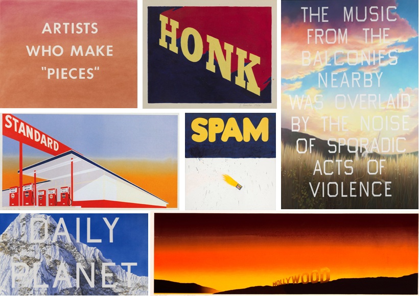
Edward Ruscha

Edward Ruscha is an American artist who explores language and West Coast culture and well as taking inspiration from Hollywood to create compelling yet perplexing pieces of art.

I was inspired to explore his art after wanting to look at artists who use text and language to elevate the meaning of their work. He has also published a lot of books featuring his work which is something I plan on looking at for my final piece.Similar to Todd Hido, his work is about the viewers interpretation and how the viewer builds their own narrative. His work also explores how text and phrases is so overused in today’s society especially with such an over-saturated media world.

I plan on responding to his use of published work and creating my own book as well as referencing his use of abstraction and carefully composed enigmas. Similar to that of Misrach and Hido, his work explores mundane subject matter in a whole new and dymanic light.

https://www.nationalgalleries.org/art-and-artists/features/ed-ruscha?gclid=CLP2ptuivdMCFUeVGwodrAMN5w

http://www.independent.co.uk/arts-entertainment/art/features/ed-ruscha-a-man-of-his-words-1801704.html

http://www.theartstory.org/artist-ruscha-ed.htm


Clare Rae – Artist Analysis

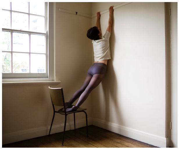
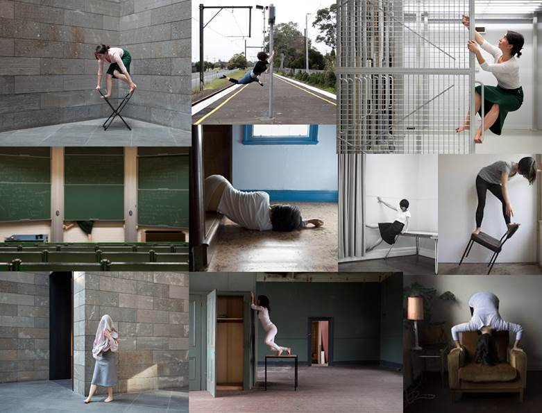
Clare Rae is best known for her self portraiture  where she uses her body to create intruiging environmental portraits. The above image is from her collection  from 2010 entitled “Testing” where she manipulates her body into different shapes, often hanging off things or performing a feat or strength and flexibility such as the “bridge” pose and holding her body horizontally in a straight line on a chair. The above image is part of a period a Rae’s work where she was exploring the concept of partial nudity with the use of translucent nylon tights. I find the figure holding onto the rail on the wall rather intruiging because it raises the question of some kind of allegory. Is the subject reaching for, reliant on or desperately trying to hang onto something. Another interesting thing about this particular portrait is that it subverts the presentation of women in art. Although the body is in a way accentuated through the pose and the tights can arguably be a garment with sexual connotations, the use of the white t-shirt short hair cut create a gender neutral feel to the image.

Technically Rae’s photographs are very interesting. Above I have separated an image from the “Testing” collection into nine sections, you can see how the image has been composed with the rule of thirds in mind. The figure is clearly placed in the centre three vertical thirds. The window, which acts as the light source for the image is placed in the upper two thirds on the left hand side. The creates a nice curve in the composition that helps the eye to move around the image. The shadow of the figure on the wall also creates a triangle shape between the actual legs of the figure and the shadow cast on the wall. The two converging lines in the top centre third of the image created by the rail the figure is holding onto  and the skirting board in the bottom centre third also creates a sense of depth. The use of light and dark in the image is also interesting, Rae mentioned at the talk I attended that in these image she almost always uses natural light from windows as opposed to any form of studio lighting. the natural light from the window also creates a shadow on the wall that it is coming from, creating a darker “L” shape in the composition, allowing for the lighter areas of the image to be the window and the wall on the right side of the image.

The above image is a work from part of Rae’s undergraduate degree in 2007 entitled “Desire and the other” this collection was were Rae first started to use her own body within environments that she had lived in or that had some importance to her, Rae stated in the talk that I attended that at this point she preferred to speak for herself rather than for womankind. These images, in my opinion are quite passive as most photos involve the figure lying on the floor or being partially concealed. Although someone who is familiar with Rae’s work will know that all of the images feature herself as the model, the images from the “Desire and the other” have a sense of anonymity as the face is always obstructed by hair or clothing or simply cropped out. This anonymity could also however, be interpreted as objectification as the body depicted in the image is not given a face or identity. The image above also has a sexual suggestive nature as the jumper of the subject is pulled over the head of the subject, which in turn would expose the subjects breasts or undergarments, however the chest of the subject is obstructed by what appears to be a sofa in the bottom right of the image. The figure also has their hands held above their head, making no attempt to pull the clothing back down to maintain modesty but also appearing as if the jumper was not pulled into its position by the subject. I feel that the image suggests both a sense of submission and passivity and well as some kind of provocative feel which I believe is a fair assumption due to the word “desire” being used in the title as it has very strong sexual connotations.

Similarly to the photograph from Rae’s “Testing” collection, this image has the figure placed in the centre thirds of the image, however in this example the figure is placed horizontally as oboes to vertically. The image is also separated horizontally in terms of light and dark, although not completely evenly, as seen in the gridded image above, into three sections. One being the light section in the top horizontal third provided by the daylight coming through the window, another being the dark middle third containing the dark wall under the window and the third being the light wooden floor in the bottom third of the image, which is reflecting the light from said window. The composition of the image is not this simple however, another point of interest is the vertical third on the right side of the image which contains the sofa which obstructs both the chest of the figure and the window. The arm of the sofa which blocks the light from the window is incredibly dark as it is placed directly against it. The cushions of the sofa do reflect some of the light from the window despite not being very reflective. The use of natural light from above lights the figure in quite a romantic way, interesting shadows are caused by the folds in the fabric.


Bill Henson

Bill Henson is a contemporary art photographer from Australia. He has created a multitude of photo books including Lux et Nox (2002) and Mnemosyne (2005). His psychologically charged work is a reflection of the human condition and its interaction with nature. With his use of enigmatic and dark tones to give candid portrayals of topical themes such as youth and loneliness. The twilight period between night and day is an iconic theme in his work used to provoke a rawer, much darker narrative.He has been featured in the 2006 compilation of Twilight: Photography in the Magic Hour, which shows just a taster to his compelling portraits and landscapes.

I was inspired to explore his work after looking at the work of American photographer Todd Hido who explores similar concepts in his own work, in particular the notion of the magic hour and how that can build a compelling new sense of narrative. Hensons work shares a lot of similarities with my starting point with the juxtaposition of rugged and crumbling dark landscapes with blunt portrayals of the human condition. His landscapes show natures tug between man and nature.

Lux et Nox

Lux et Nox was published in 2011, featuring a selection of Henson’s work which explores in particular humanistic themes of youth and vulnerability with a dark and honest undertone thru ought. Work word Lux et nox is Latin for day and night, referring to how the photograph were taken in between the transition between these. I like the use of Latin in his title which is something I could possibly use in my own title for my nook, this use of hidden meaning adds a very cryptic layer to his work, evoking a more active response from the viewer. This juxtaposition of day and night also elevates the meaning and narrative in his work.

The provocative subject matter often featuring semi nude figures often depicted doing rebellious actions such as drinking alcohol or being intoxicated adds a controversial nature to his work. The pale and bruised complexion of the figures as well as the distressed expressions adds a sense of vulnerability and misery to his work, this again evokes a narrative. Henson has used this as a way to create an active response and connect his work with the viewer to make the viewer draw on their own experiences and feelings.

“Henson has always prioritized composition and visual beauty, even when his pictures seem to depict pain, despondency and the results of violence.  He has often concentrated on youthful subjects, and in recent years he has tended to depict young naked people who seem desperately unhappy, and console themselves with sex and drugs” – Metapsychology Review

Untitled # 115, 2000-03,


Caravaggio and Tenebrism

After looking and analyzing Henson’s work I saw similarities between is work and the style of Tenebrism and in particular the Italian Renaissance/Baroque artist Caravaggio.

Tenebrism is a very dramatic style of art featuring a harsh chiaroscuro style as well as often evoking drama, intensity and most importantly tells a narrative. This is very present if Henson’s work with the use of black negative space and dramatic tones. There are a lot of similarities between his and Caravaggios work both visually and conceptually. Caravaggio’s work highly scandalous during his time and has been referred to as the ‘succès-de-scandale’ or the ‘antichrist of painting’. His work was highly acclaimed during his early years for his high skill level and was often commissioned such as by the Contarelli Chapel in the church of San Luigi dei Francesi. The controversy came from how he would often depict religious figures in highly realistic, approachable manor, stripping the figures from a sense of power and their religious properties and instead portraying them as vulnerable, emotional and most importantly their innate human nature, this is similar to what Henson’s was displayed in his work.
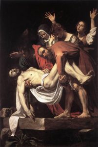
An example of this in Caravaggio’s work is his famous painting The Taking of Christ which was commissioned in 1602  by the Roman nobleman Ciriaco Matteithe painting depicts the crucifixion of Christ. the composition shows exaggerated movements to give the painting a sense of story line and give the viewer a sense of what is happening. Similar to a portrait by Henson, there is very little in the background leaving the viewer to focus on the figures. Another similarity between Caravaggio and Henson is the use of expression on the figures faces which create a sense of despair as well as evoke an uncomfortable feeling from the viewer. Most crucially the figures are depicted as very everyday and almost lifeless, Caravaggio makes you feel as if you were present withing the harrowing scene as opposed to an idealized fantasy version. Caravaggio and Henson capture the vulnerability and reality which connects to the viewer on a deeper level. I like his use of dark colours and use of aesthetic, he also experiments with white balance to eokve narrative. His photos represent a huge use of engaging visual beauty.

Art remains the one great constructive bridge between the subconscious and the conscious world – Bill Henson (Ocula.com)

I like his use of translucent appearing skin tones which show a psychologically charged atmosphere, they are both mature and yet unsettling. Similar to Hido his work explores a feeling of loneliness and vulnerability. Another similarity is that he also creates a lot of published work which is something I plan on looking at for my final piece. I plan on creating a published book as a final outcome.

Clare Rae-Performance and the Body

Clare Rae is an artist based in Melbourne, Australia but she is currently visiting Jersey as part of the Archisle International artist-in-residence program. She is here to to research the  Claude Cahun archive and shoot new photography and film in Jersey.  This week I attended a talk she gave at the museum about her photography and film. She spoke about how she explores performance and representations of the female body and her connection to physical environments. Performance photography normally involves as artist staging a performance for the camera and testing the physical and psychological limits of the body.

Rae began the talk by discussing the research areas that have influenced her work such as feminist theorists like Laura Mulvey. She also mentioned her artistic influences; photographers such as Francesca Woodman, Jill Orr and Cindy Sherman. She went on to talk about her own photographic methodologies and techniques. Her work is mostly self-portraiture which involves her exploring physical environments and challenging female representations of being passive by exploring things actively/ dangerously and using awkward poses. For example in her project ‘Desire and the Other’ she analysed the idea of passiveness of the female body by lying on the floor, often with her face concealed by furniture or her hair.

She spoke about how she carefully chooses her outfits before going on shoots, for example she described how she changed from wearing tights because these are a very fetishized garments but now she often wears the same green skirt because it is easy to move in.

Her projects are often captured and displayed within the same environments and she is interested in how the camera can act as a collaborator, rather than mute witness, to the performer. She is known for her engagement with domestic and institutional spaces and she spoke about how her work is influenced by notions of private and public and how her performance is influenced by the gaze of onlookers. For example she talked about her experiences in engaging with the environment of the National Gallery of Victoria in Melbourne in particular the photography and print store rooms. She explained that she was followed by a guard and a curator and the idea of being watched had an impact on her final  outcomes.

The environments she explores are often fascinating in themselves for example she has explored the site of the Magdalen Asylum which is a place where girls and women were housed whilst working in laundries. On her website it explains that, These rooms are laden with history, and provided a dense and loaded environment within which to make artwork. Using this history as a starting point,I attempted to activate these spaces using my body, gently testing the physical environment”. 

In the talk I attended Rae also spoke about her project ‘20+9+5′ which is a black and white series which she did whilst pregnant with her son. She explained that being pregnant is a very ‘feminine’ state and she wanted to explore the experience of her body. She said that during pregnancy women seem to lose some control over their bodies and she wasn’t prepared for the amount of people that commented on her bodily appearance on a daily basis and how people thought they had a right to touch her. Rae later returned to the same location that she took these images once her son was born and photographed them together. She explained that her use of a mirror was influenced by a previous project ‘Stages’ which was a collaborative project with Simone Hine and involved exploring the environment of the Rosina Auditorium and she was intrigued by the use of mirrors and reflections involved in this.

During the talk Rae also showed some of her stop-frame animation videos made from photographic stills such as the one below which I thought was particularly interesting. She said that when she is presenting her work she often leaves it playing on a continuous loop which makes it appear more and more exhausting and it grows more ridiculous every time. On her website is explains that this piece was inspired by her research into feminist theories of representation and how this often relies on binary opposites. The title is ‘The Good girl and the other’ which relates to the idea that the ‘Good girl’ is a recurring motif in culture and society but Rae wanted to complicate the traditional notions of femininity.

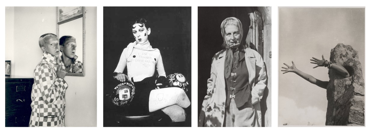
Rae also spoke about her work on the Claude Cahun archive and how she has been able to look at almost every image produced by her. She says that it was interesting to see how Cahun’s body changed and aged over time because she began photographing at a teenager and the oldest photograph of her was  from a year before her death. Cahun was born as Lucy Schwob and was from a wealthy Jewish family living in France. Her work was political as well as personal and focused on challenging traditional ideas associated with gender. This often involved  using costumes to experiment with different personalities from ultra feminine to masculine. She adopted the  gender-neutral forename Claude and by shaving her head she actively and outwardly rejected social constructions of gender and sexual identity. Her partner Suzanne Malherbe (who was also her step-sister and life-long collaborator in artistic projects)  adopted the pseudonym Marcel Moore. During the rise of the Nazi party the couple fled from Paris in 1938 for Jersey.  When the Nazis invaded Jersey Claude and Moore employed avant-garde art practices as a form of resistance. For example they created anti-nationalist leaflets mocking Nazi ideology and distributed them throughout Jersey in soldier’s pockets and on their chairs. They were sentenced to death for inciting the troops to rebellion and refused to sign letters asking for mercy, perhaps believing that martyrdom would be the most fitting end to their lives of resistance. However they were saved from execution anyway because of the Liberation of the Island.

Cahun’s revolutionary examinations of gender and sexuality were well ahead of her time and inspired many artists including Clare Rae. Cahun’s work has many connections to Rae’s in that is focuses on feminism, self-portraiture and performance.

Performance photography and self-portraiture is not something I have explored greatly in previous projects although I think it is an interesting concept.  The work of Rae and Cahun have strong links to the theme of ‘Environment’ because it relates to their psychological and personal environments as well as the politcal context of the time. After attending Clare Rae’s talk I feel I have developed a better understanding of the messages behind her art which is interesting to consider in relation to the work of Claude Cahun. If I was going to respond to this style of photography in some way I might be able to bring in the idea of the mirror from my previous project and explore ideas about self-portraiture and mirrors/reflections.

Matthew Lyn – Plastic pollution inspiration

Matthew Lyn is a Canadian photographer and creative director renowned for his intuitive and textured talents in the world of fashion photography. Son of a Chinese Jamaican father and Canadian mother, his visual inspirations hail from his many different homes growing up as a child. Now days Lyn, divides his time creating in New York and Montreal, Canada. His eye for fashion photography has been described as uniquely exhilarating and fresh, while holding true to a bold classic edge. Lyn started his photography career in 2007 focusing on inspirations from Jamaica’s coastal beauty. From there, he channeled his vision through experimentation, collaboration and mentor-ship from highly acclaimed visual artists. Despite no formal training, his early photographs captured the attention of industry insiders. Andy Whalen, Executive fashion director for Vogue Nippon believes, “Matt is a young talent to keep an eye on. He has a vision that I find refreshing and inspiring”. Encouraged by many creative professionals, Lyn solidified his unique style, developing the moody, gray-scale fashion editorials that have become his signature.

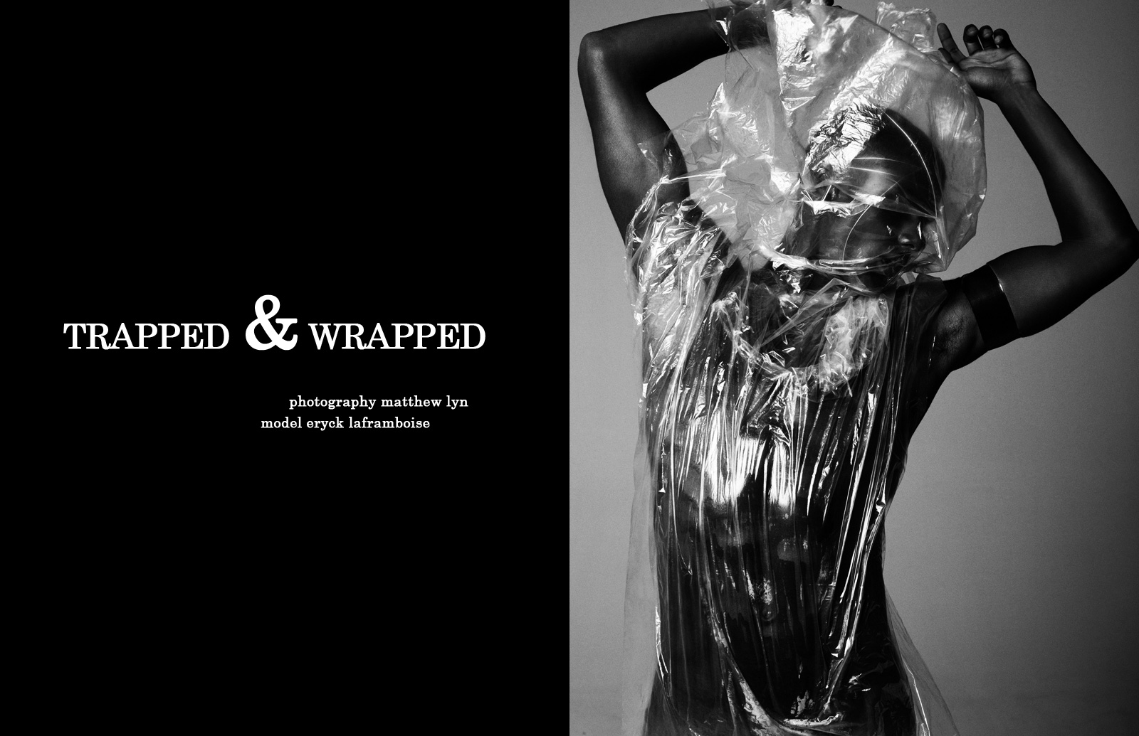
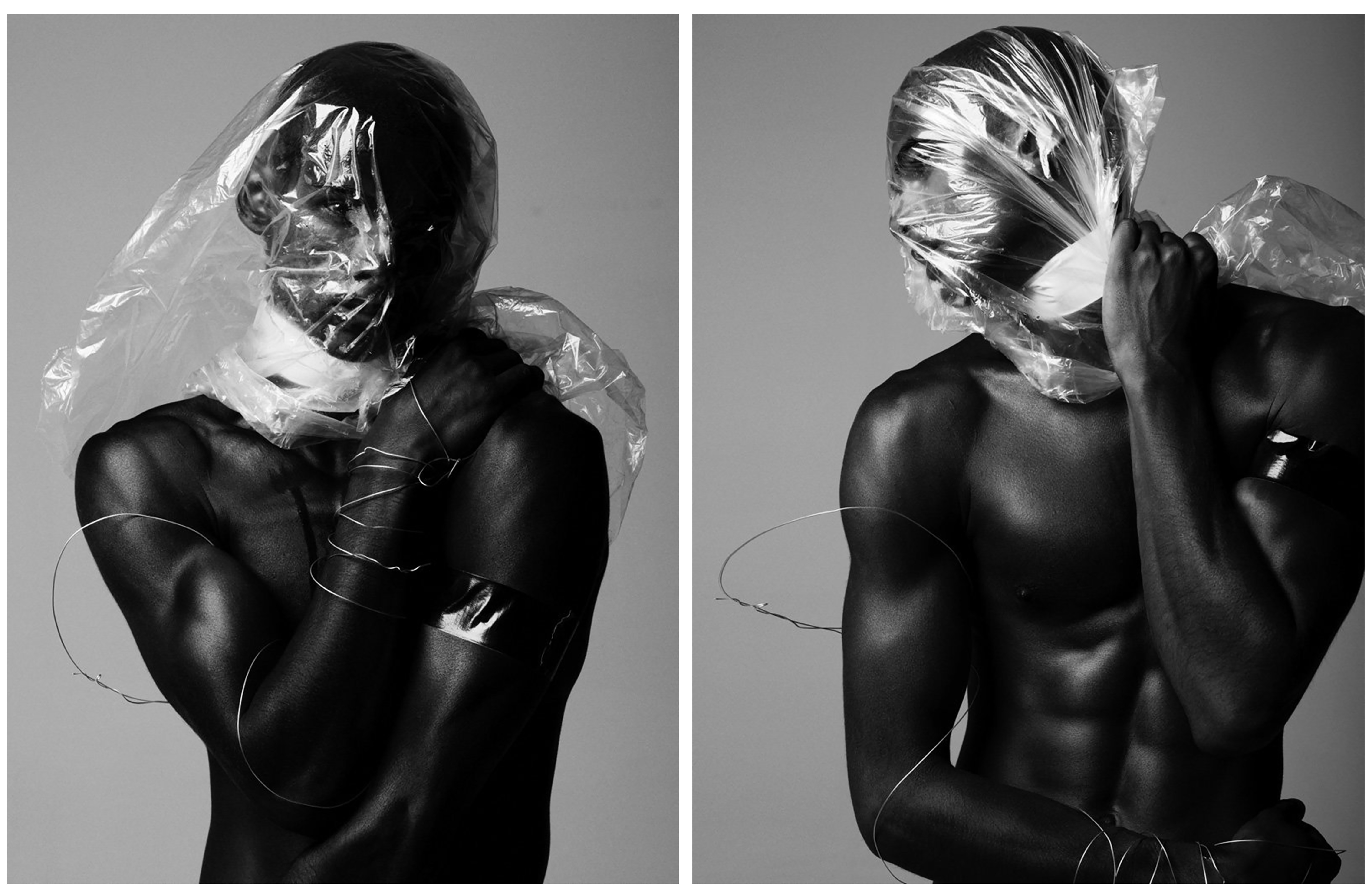
Before I move on to my own studio shoot with plastic I first wanted to explore Matthew Lyn’s amazing examples that I have presented below. Although these images are fashion photography related, their undeniable beauty and talented showcase of light and shadow on the material is enough to inspire both my next two shoots. This series, entitled ‘Trapped & Wrapped’ strips away the usual elements for a raw photo shoot. Instead of the simple portraiture techniques this fashion shoot could have contained, Lyn turns the studio into a place of pure movement and form. His model Eryck Laframboise tackles the challenge, clad in plastic and wire creating striking, unusual and emotional depictions. This title, ‘Trapped & Wrapped’, fits in nicely with my project as I am wanting to represent the worlds ‘suffocation’ from this material as well as the damage it’s doing to the environment and therefore man-kind. Although this is a fashion photography project, this series is an amazing inspiration for creating dark and emotional portraits with plastic. I love this idea he shows of wrapping the model in plastic, for me it would represent the way we do this to everything else. Below are four images from this series that I have chosen as inspirations for my next two shoots.

These first two photographs from Matthew Lyn’s collection, ‘Trapped and Wrapped’, are great examples of the kind of headshots I am hoping to create in my first self portraiture shoot. I love the black and white effect in all of these photographs, as it really emphasises Lyn’s talent for controlling light in the studio. The first image on the left shows a straightforward headshot with the model posing in a modest way, carefully wrapped in plastic and wire. Although the meaning behind this image is mainly beauty and fashion, the expression from the model and piercing eye contact creates amazing emotive qualities which can really intrigue the viewer. The image on the right depicts the model holding the plastic tight around his neck, straining as the material covers his face and suffocates him. Because of the title of these images, we are to understand that there is a deeper meaning looking past just beauty and fashion. But as it is left unexplained by the photographer, we can interpret the meaning ourselves. I will be doing this personally when using this simple idea for portraiture to symbolise the global problem of plastic waste. I hope to take inspiration from his use of space shown above, his use of the material and his beautifully crafted studio lighting.

These next two images are perfect examples of full body portraits using beautiful composition and space to capture plastic waste. These images will be a great inspiration for my second shoot, using a model and the material to show this common pollution issue. The first photograph on the left is a landscape shot showing the model breathing in the material and it floats across the scene. Although I will most likely featuring more of my model in this second shoot, I chose this image because of the beautiful composition the plastic creates as it is thrown into the air. I also love the transparency of scene with a mixture of harsh and soft light gleaming from every aspect. The next photograph on the right shows the full portrait of the model using the plastic wrapped around to cover himself. The meaning behind this image is very confusing and the pose he is performing seems unsure, yet the beauty of the light on the plastic that is distorting his body takes on a fashion orientated appearance. I if were to interpret these images with no prior knowledge of the photographer or his work I would say that this is a raw look into our dependence on this man-made material. This is because of the wire symbolising being trapped as well as the essence of the photographs directly pointing towards the effect the material has on the model.
Idris Khan

London-based artist Idris Khan was born in the UK in 1978. Since completing his Master’s Degree with a Distinction in Research at the Royal College of Art in London in 2004, he has received international acclaim for his minimal, yet emotionally charged photographs, videos and sculptures and is one of the most exciting British artists of his generation.

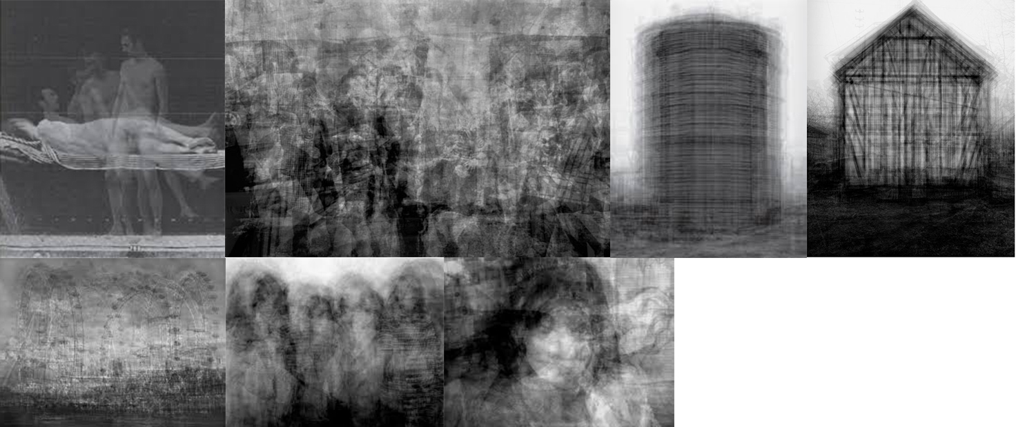
Drawing on diverse cultural sources including literature, history, art, music and religion, Khan’s work contains a unique narrative involving densely layered imagery that inhabits the space between abstraction and figuration and speaks to the themes of cumulative experience and the metaphysical collapse of time into single moments (METAPHYSICS – the branch of philosophy that deals with the first principles of things, including abstract concepts such as being, knowing, identity, time, and space). His work can be considered both abstract and figurative as it takes lots of singular straight shot images and layers them, creating an overall slightly abstract collage of different moments in time condensed into one.

Since 1959 Bernd and Hilla Becher have been photographing industrial structures that exemplify modernist engineering, such as gas reservoirs and water towers. Their photographs are often presented in groups of similar design; their repeated images make these everyday buildings seem strangely imposing and alien. Idris Khan’s Every… Bernd And Hilla Becher… series appropriates the Bechers’ imagery and compiles their collections into single super-images. In this piece, multiple images of American-style gabled houses are digitally layered and super-imposed giving the effect of an impressionistic drawing or blurred film still.

Khan’s work interests me because of how he completely changes how we perceive everyday structures, among other things, and turning them into more ghostly, alien compilations of multiple moments in time condensed into one.

Image Analysis –

Prison type Gasholders’ – Idris Khan

The image above (Prison Type Gasholders) shows a ghostly arrangement of some of the topographical series made focusing on gasholders by the Bechers’. The structures in the Bechers’ original photographs are almost identical, though for Khan the images’ contrast and opacity is adjusted to ensure each layer can be seen and has presence. Despite Khans work being very mechanised and of industrial subjects, their effect is of a soft ethereal energy. They have a spiritual quality in their densely compacted details and ghostly outlines. Prison Type Gasholders conveys a sense of time depicted in motion, as if transporting the old building, in its obsolete black and white format, into the extreme future.

Todd Hido

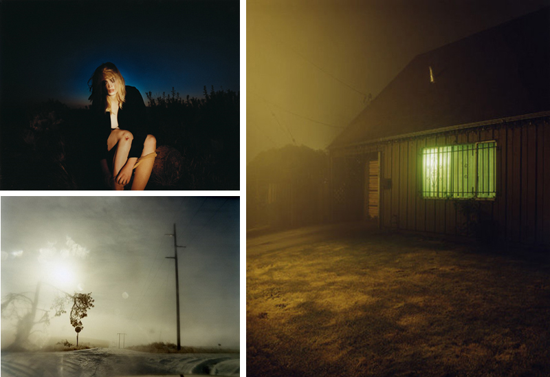
Todd Hido is a photographer and artist based in San Francisco. His work tends to capture the darker more ‘unscenic’ side of suburban American, that is both captivating and unconventional. Hes worked with an array of photographers such as world famous photographer Larry Sultan and Harvey Denge. He is also a professor at California College of the Arts. 

A huge part of his work is the human presence and its effects on the landscape and the American Environment. I was originally drawn to his work with its compelling yet eerie presentation as well as its use of natural and man-made lighting to evoke an intriguing and jarring narrative. Hido has discussed in interviews how he only uses the lighting that was already present in the scene, adding to the authenticity of his work. Much of his work is an observation of what is around him as opposed to something he was created, much of his work is unplanned and instead he travels with his camera, searching for something to photograph.

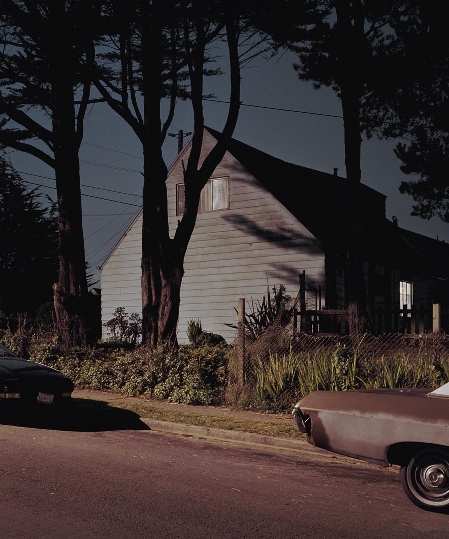
Lighting is a crucial part to what makes his work so compelling, the lighting evokes a very different form of ambiance into his work by adding depth and mystery such as the piece above to the right, the eerie green glow of the window implies there are people living inside the home and the street light adds depth. Man-made lighting is used in Hido’s work to reflect a sense of human presence.

Landscapes

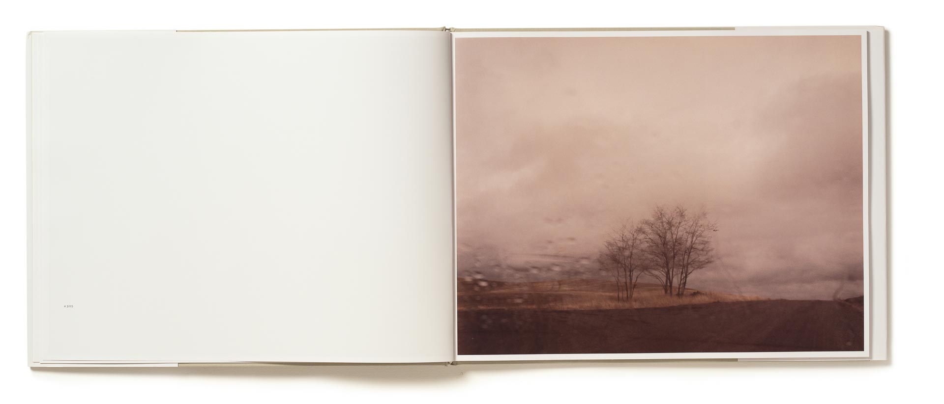
Landscapes is a series of photos in a large portfolio featuring a selection of photos taken over the years. A selection were taken from inside his car, adding another sense of depth and perspective to his work with the use of internal and external viewpoints. The use of the window as a second lens adds a complete new texture to the image, often adding a dreamy yet distorted, claustrophobic feel, this creates an intentional disconnection between the viewer and the landscape, building on the narrative of traveling, being stuck in a car, in a constant limbo from destination to next.

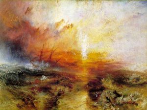
This series of work reminds me of the romantic landscape painter J. M. W. Turner with Todd’s use of washed colours and emotionally charged tone and texture. An example of this is Turner’s famous painting ‘The Slave Ship’ painted in 1840.

Turner took classical genres and scenes and infused them with a new dynamic in painting. He reflected on the increasing importance of individual experience in the era of the Enlightenment where the perceptions of human beings led to exalted personal moments and sublime interactions with nature.

This is similar in the case of Hiddo’s work where the subject matter often reflects something very mundane, but then with the use of lighting and timing he has added energy, ambiance and meaning, evoking a deeper narrative that is personal to the individual viewer and their own experiences. Both Hiddo and Turners work is based around a sensation felt by the viewer and how our surroundings effect us.

HOMES AT NIGHT

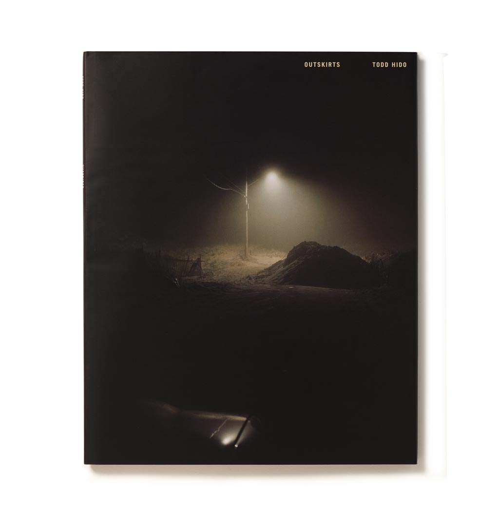
Houses at night is his second portfolio featuring various houses from all around the American country. A lot of this work can be seen in his books ‘House Hunting’ and ‘Outskirts’. This series is by far the most compelling to me in terms of how well they can evoke such a enchanting yet personal and complex narrative with the use of lighting and composition of very basic every day landscapes.

“I believe that all those signs from your past and all those feelings and memories certainly come together, often subconsciously, and form some kind of a fragmented narrative” Interview : Todd Hido, Ahorn Magazine

The subtle imagery such as just a simple depiction of light pouring from a window builds a mystery, leaving the audience to their own imagination to what might be occurring within the house. The soft glow from streetlights and harsh shadows adds an uncanny ambiance to the photographs. It is so easy for the viewer connect with his work due to how common or mundane the subject matter is, considering most of us see this suburban, built-up environment every day.

‘I take photographs of houses at night because I wonder about the families inside them,’ Hido tells me. ‘I wonder about how people live, and the act of taking that photograph is a meditation.’House Hunting, therefore, is more question than answer. A rumination without resolution.  Katya Tylevich

Monographs

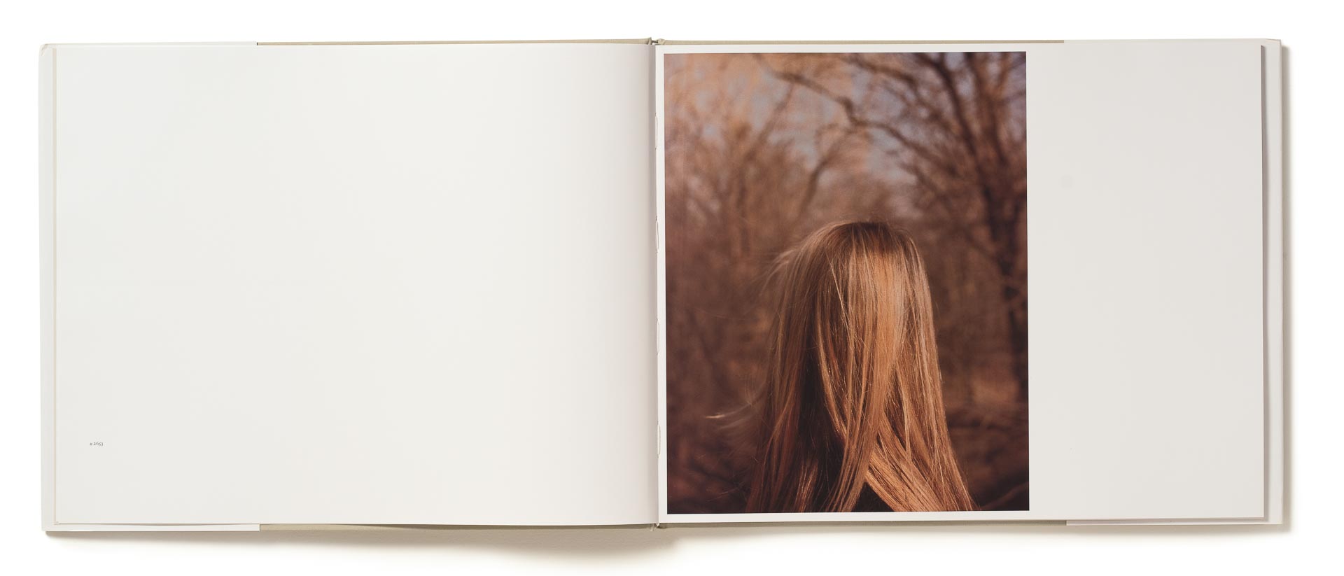
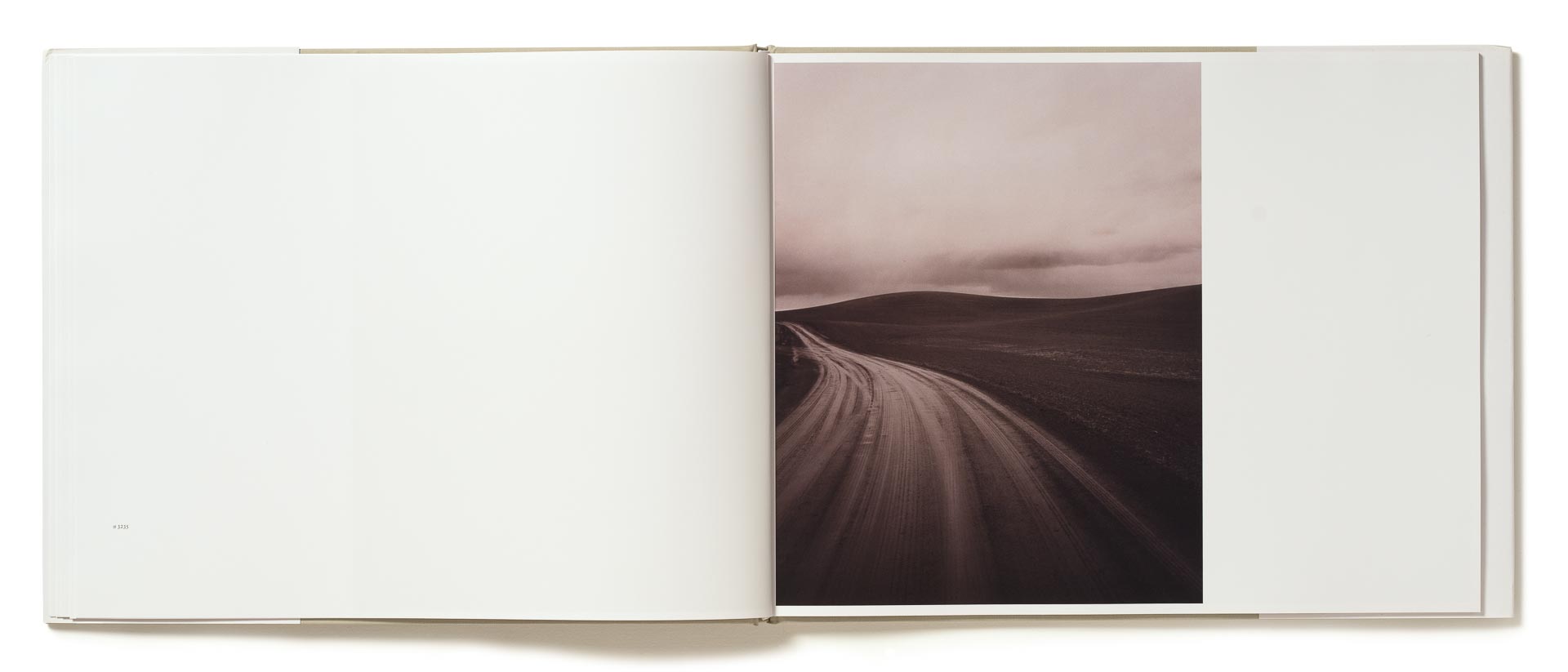
Hido has created a selection of books from his work, his first being the enchanting book from 2001 named ‘House Hunting’, featuring a selection of houses as well as abandoned interiors from around America, such as the photographs I have mentioned from his ‘Homes at night’ portfolio. The series focuses on America from a very candid perspective, viewing how people thrive in a country struggling from the effects of the economy, in this way it shares a slightly political motif, making a statement about the welfare of the American people. His next book, Outskirts, shares a very similar theme wit his firs book, featuring ominous images depicting the darker side  of suburban america.

He then moved into a different style of landscape images with his next two books ‘Roaming’ and ‘A Road Divided’, where he also explored portraiture. These pieces shared a very different genre to his previous work, featuring softness as well as warm tones that comes across more harmonious and even poetic.

#2514-a, 1998

The above image really stood out with its dramatic and almost sinister ambiance. The photograph depicts Hido’s trademark focus on the suburban landscape. The cinematic harsh lighting protruding from outside the scene creates dark shadows evokes a very mysterious and sinister ambiance. The grey background adds depth and sense of space to the image whilst also showing the viewer the silhouettes of the trees. The dark shadow on the right side of the house leaves a bigger contrast for the viewer to see the light from illuminating from inside the house, another trademark feature of Hido’s work. The window suggests to the audience that someone is present in the house, thus evoking a narrative similar to Roland Barthes enigma, where there is a sense of mystery, enticing the viewer to question what might be happening or what will happen next. The overgrown surroundings and decaying old cars evokes stereotypes of run down, unsafe areas, which then adds to the feeling of fear evokes by this photograph, which again evokes the cinematic, spooky narrative of the photograph. Another iconic feature of this piece is Hido’s use of composition where he’s used a portrait frame for a landscape image, he does this to evoke an sense of isolation, creating a disconnection between this house and the surroundings.

“Yes, I do often use the vertical format. With the houses I do it quite a bit, and the reason for it is that often times I just wanted to get a single home in the frame. The place seems more isolated that way. Also it was easier to focus the viewer’s and my attention onto a single home.” – Ahorn Magazine interview

In relation to my exam coursework and project theme, his work ties in with the notion of conflict that happens between unchangeable forces such as the change from night to day and the growth and the changes the environment create around the buildings and structures such as the trees and rust that forms on unkempt constructions we have built. His work looks at the implied human presence within the environment and how this evokes narrative, this is a big part of my project which is also shown in the work of Richard Misrach who looks at the beauty evoked by this.

Part of Hido’s portfolio is a selection of portraits which he uses to compliment his landscape photographs as well as evoke peoples effects and influences within the landscape, this is something i plan on incorporating into my projects which is also similar to the work of Bill Henson who incorporates portrait photographs next to his landscapes. Using people in my photographs is something I plan on exploring later on in my project.

There are a lot of similarities of Hido’s work to the work of Richard Misrach who I have explored previously.  Both Misrach and Hido’s work is an observation of the surroundings. Their work explores the beauty evokes in the mundane and often overlooked surroundings such as a dark alleyway or an aged wooden wall. Their work then elevated the surroundings with its use of carefully timed lighting, which enhances the colours and sense of depth in the photograph, giving it ambiance, mood and most importantly narrative. This use of everyday surroundings give the viewer a bigger feeling of connection with the scenery as it draws out their own experiences or memories as well as their own subconscious thoughts and emotions.

I believe that all those signs from your past and all those feelings and memories certainly come together, often subconsciously, and form some kind of a fragmented narrative. Often you’re telling your own story but you may not even know it. Ahorn Magazine interview

I plan on taking a lot of inspiration from his work with how he uses lighting and mise en scene to add emotion and a cinematic narrative. I plan on looking at the sense of human presence within the landscape as well as the notion of nocturnal life and how it builds narrative such as how Hido uses streetlights and light from inside buildings to create ambiance and narrative. I also like how he doesn’t stage his photographs and instead, travels, waits and observes to find the perfect photograph using light from the surroundings. I also plan on using techniques to elevate the photographs, living them a new level of life such as by using HDR to create a more dramatic exposure as well as slow shutter speeds to work well in dark lighting.

Another huge influence I have taken from Todd Hido is his use of published books to show his work, which is another way to create narrative. I plan on using creating my own book inspired by Todd Hido.

JJ Levine – Artist Analysis

When looking at images from Levine’s “Queer” portraits and “Alone Time” collections, I could see that the compositions were clearly well thought out and had some inspirations from tableaux style paintings. I typed in key words into google that related to Levine’s imagery in an attempt to find some paintings with similar compositions. This proved rather successful  and although it unlikely that Levine took inspiration for the specific paintings that I selected to compare them to, it is clear that Levine had a traditional thought process when composing her images and directing their models.

Above is a comparison of JJ Levine’s “Mikiki 2012” and  Iosif Iser’s “Woman in Yellow Chair” produced in 1933. The image have a very similar composition with the subjects seated at an angle on a low chair, a green wall and a table with a vase to the left of the seated subject. Both subjects have intriguing features (when considering the time of their production) Iser’s woman has bright blue shoes, red lipstick and a matching headscarf. Levine’s male subject is pictured with traditionally feminine items including a handbag, vase of tulips and a matching pearl necklace and bracelet set. Both of the images have a provocative undertone, Iser’s subject has a seductive expression, has her arms and legs exposed and has her shirt unbuttoned to reveal a large portion of her decolletage. Levine’s subject is presented rather provocatively due to the flesh coloured clothing which at first glance the subject appear less dressed. The subject also has their cropped vest rolled up to show the pierced nipples, but not in a overly exposed fashion as they are partially concealed by the layered pearl necklaces.

Both images have a green based colour scheme. Levine’s image reinforces this theme with a bright green wall, warmer green chair and the stalks of the flowers which are contrasted by the warm pink and yellow undertones of the the flesh of the subject and the  warm ocher tone colour of the small table the vase is placed on. The wall in Isef’s painting is also green, however unlike Levine’s solid coloured wall, Isef’s wall features both cool and warm green tones. Isef exploits the complementary colour of red in the tones of the lipstick, headscarf, table cloth and floor. The orange and yellow tones in the flesh and chair are also contrasted with the cooler green tones and the blue of the shoes.

Above I separated the two images, Levine’s “Mikiki 2012” and Iser’s “Woman in Yellow Chair” into 9 sections which shows how each composition exploits the rule of thirds. In both images the torso is places on the right vertical line and the faces seem to be cut in half by this line. In both images the foot just peeks into the bottom section. When looking at each section you can see that they have very similar contents, for example the centre segment includes part of both thighs and a hand and the top right segment contains a shoulder and half the face of the subject.

The way that the eye travels through the two images is also quite similar. The eye is immediately draw the to the face and is then directed through the image by the shape of the body, along the extended leg to the foot and then from the foot up to the vase. In the annotated versions of the images above you can see how similar the line of sight is in both compositions. Many tableaux portraits of women have a composition that exploits the form of the human body to direct the eye across the painting.

Above is a comparison of JJ Levine’s fourth of eight images from her “Alone Time” Collection and Jan Miense Molenaer’s “music making couple” Levine’s image is at first glance a portrait of a heterosexual couple seated next to each other, the female counterpart holding a banjo and the male counterpart listening. The couple in Levine’s image are actually acted out by the same person in different costumes. Molenaer’s painting also depicts a heterosexual couple where both parties are holding musical instruments, the male, a lute and the female, an early woodwind instrument. In Molenaer’s painting the male counterpart is presented as dominant, he wears a large hat, stands rather than sits, placing him physically above his partner and the line created by the fret board of the lute also makes him appear taller. In Levine’s image however, the female is presented as the dominant counterpart of the couple as she is pictured holding the banjo while the male is simply sat, listening. Similarly to Molenaer’s painting, the fret board of the lute makes the female in Levine’s photograph appear bigger than the male. Both of the images, in my opinion have a sexual undertone this is implied by the fact that the couple are pictured together, suggesting a sense of commitment. Levine’s title “Alone time” could suggest sexual as well as emotional intamacy, Molenaer’s painting has a sexual undertone due to both counterparts seemingly taking part in the “music making” which a potential metaphor for physical intimacy.