Now that I have researched, completed and analysed my outcomes individually for each of my environmental awareness shoots, I am happy with the quantity of good photographs I have, and am ready to start evaluating and finalising my project. To help with the task of narrowing down my outcomes, I have analysed all of my final images in my next blog post as four separate groups, one for each theme. Before this, however, I had included a contact sheet depicting all 66 of my final outcomes, from all 10 of my shoots depicting a few of the different elements of pollution. Although I am not yet certain on how exactly I am going to present this project I have organised my images in the order they were taken. This temporary composition can show how I have moved through my ideas of depicting environmental awareness and developed my project accordingly. As well as this, by viewing my whole project so far as a single collection of images, I am able to properly compare all of my final outcomes from each shoot against each other…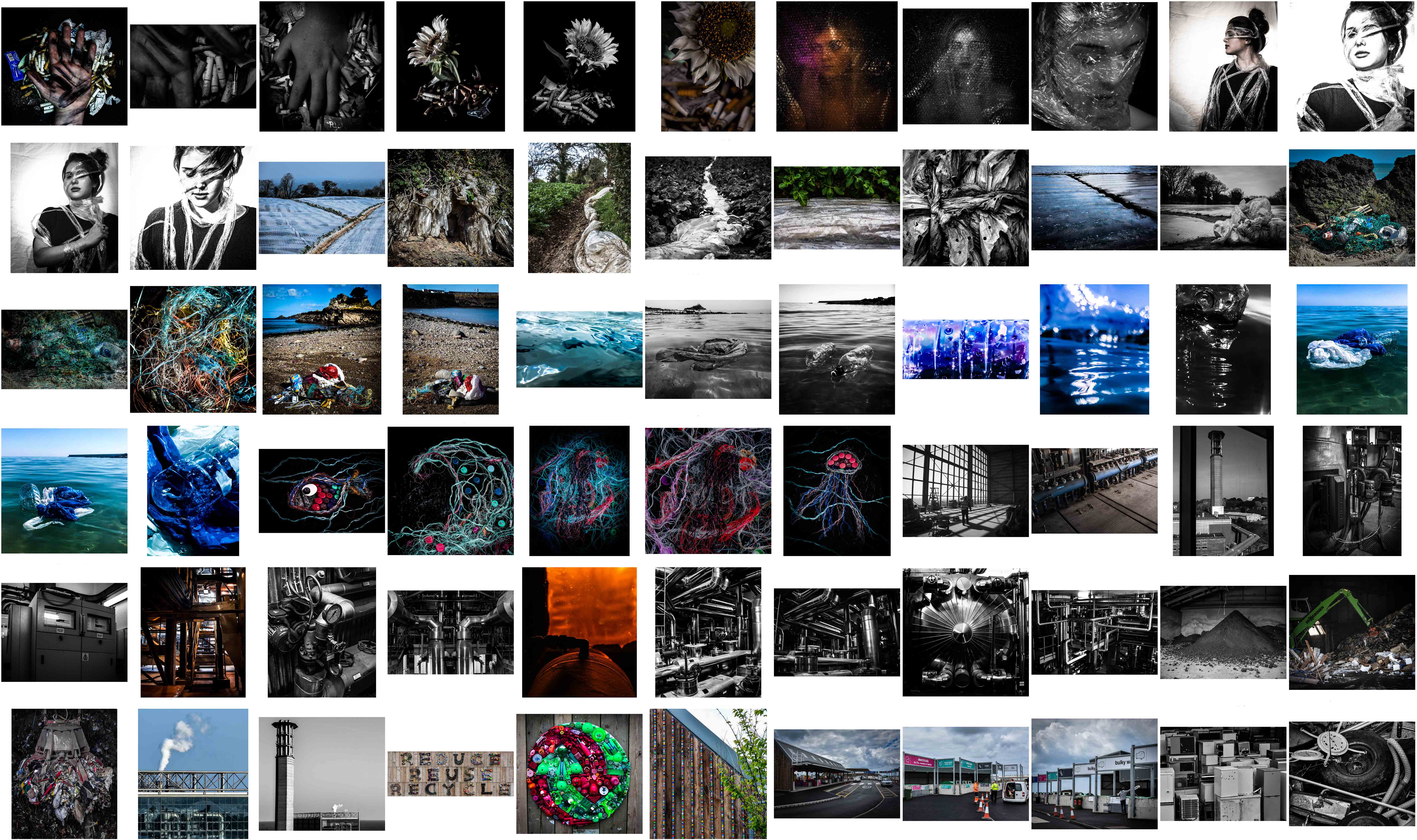 By viewing them in this composition I have realised that I have mostly touched down on three major themes; plastic pollution, beach/ocean pollution, and Jersey’s waste disposal systems. When comparing all my work above with my initial ideas mind map for this project, I found that I did not manage to bring to life some of the original plans I had. If given more time I would definitely include some of these ideas such as depicting rural landscapes vs urban landscapes, melting ice symbolism, air pollution and exploration of the smaller factors. However, In the amount of time we were actually given to complete this exam, I am quite pleased that I managed to show my original goal: portraying environmental awareness using a mixture of symbolism, abstraction, documentary photography and topographic photography.
Category Archives: Analysis
Filters
Performance/reflection Shoot outcomes
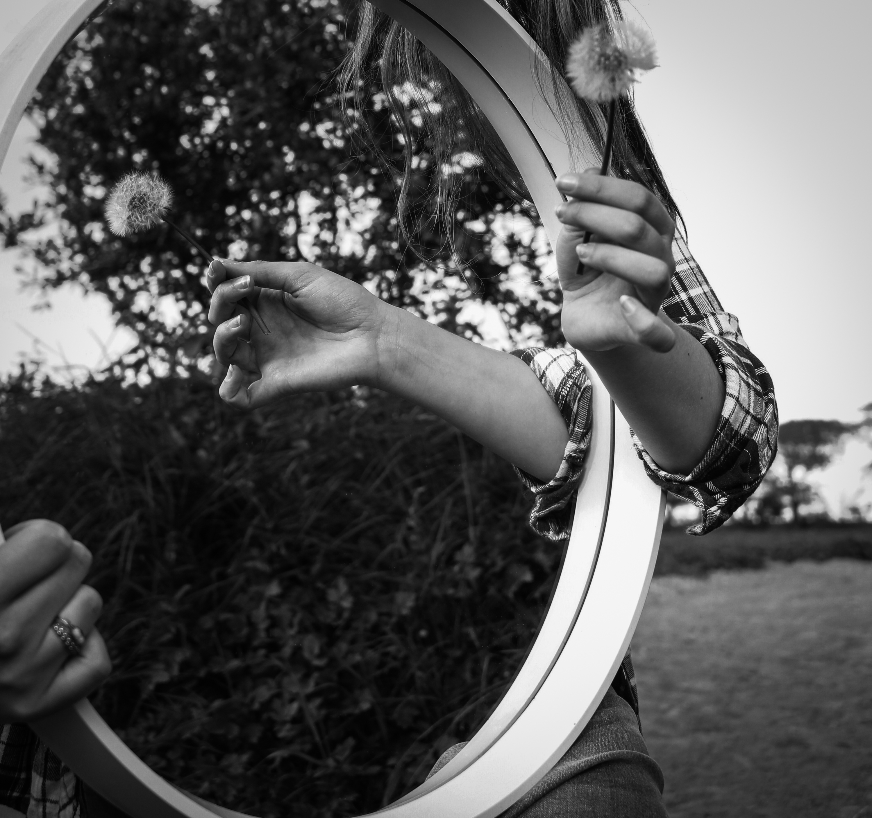
I have continued to experiment with more shoots based around performance and the use of reflections and shadows. As with my earlier shoots the aim was to explore human relationships to environments and the process was fairly spontaneous. I have continued to use myself as the subject in many of the images as well as my younger sister, Lillian. I wanted to try and develop the idea of collaboration in reference to performance artists such as Claude Cahun so I occasionally allowed my sister to help direct some of the photographs or press the shutter for the pictures I had set up involving myself. Once again I have made basic adjustments to the images in post-production to improve the colours, lighting and clarity.
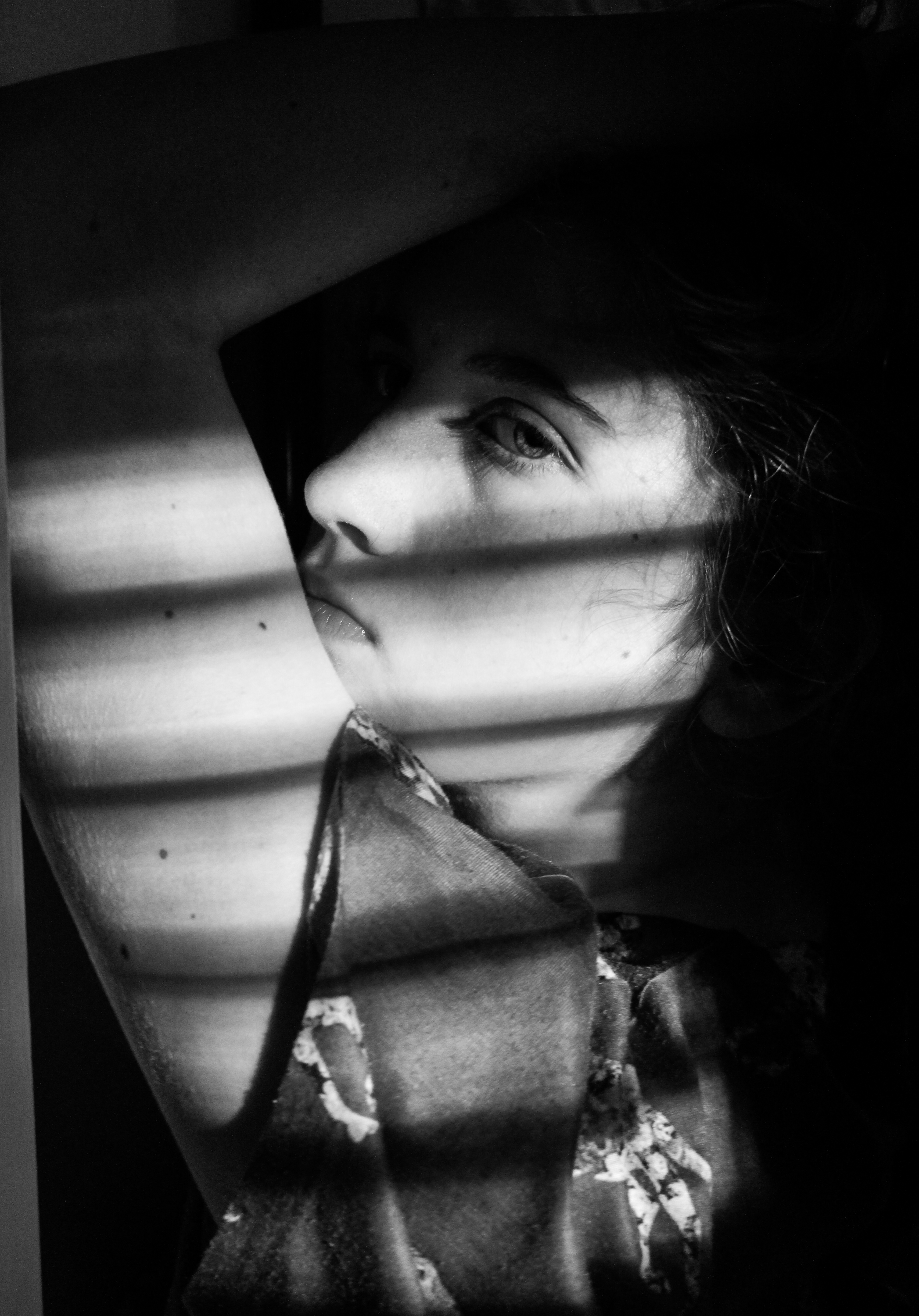
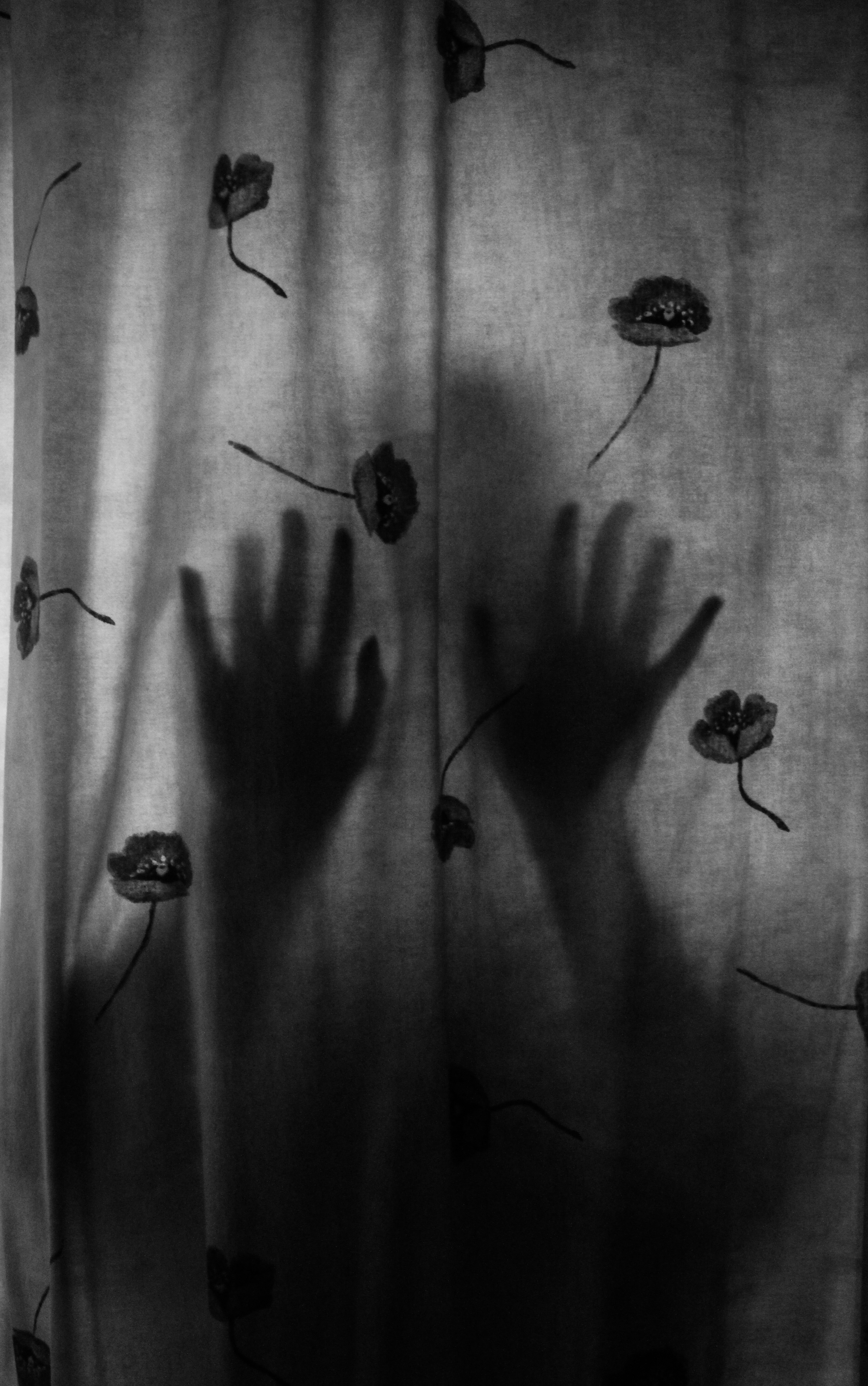
I wanted to try and explore interior environments specifically focusing on shadows. I didn’t have many successful outcomes from this and for this reason I decided to base the rest of my shoots in natural, outdoor locations. However, I was pleased with the two examples below and I am planning on using them as final pieces. I like the first because of the interesting combination of light and shadow created by the strips of light and the position of her arm so that it frames her face, with the dark background also meaning the viewer’s attention is drawn to her. I think the second image with her silhouette visible through the curtain is also quite interesting and has an unusual, eerie atmosphere. I edited both of these to black and white to emphasise the qualities of the shadows for a more dramatic appearance because I felt the colour detracted from this.
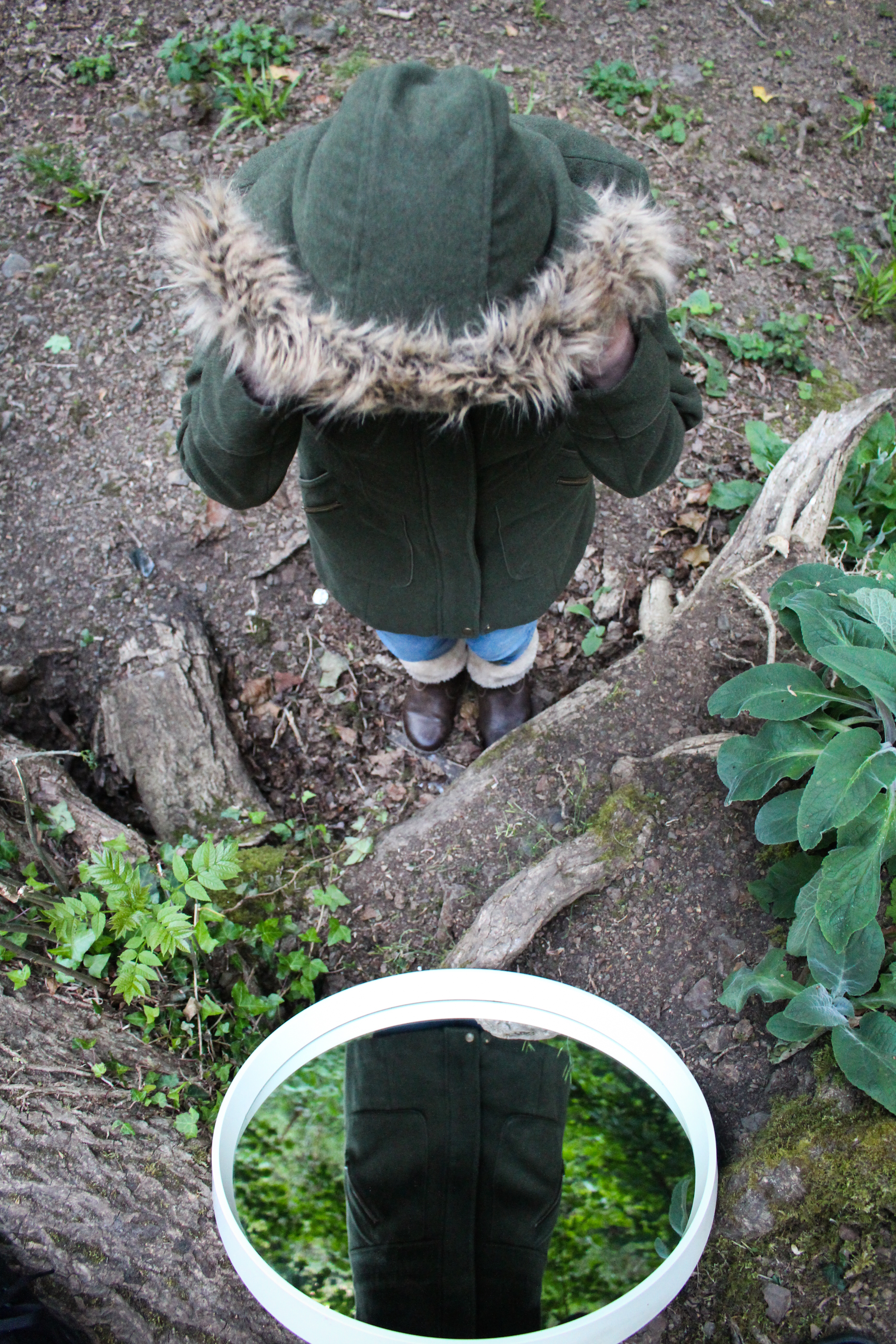
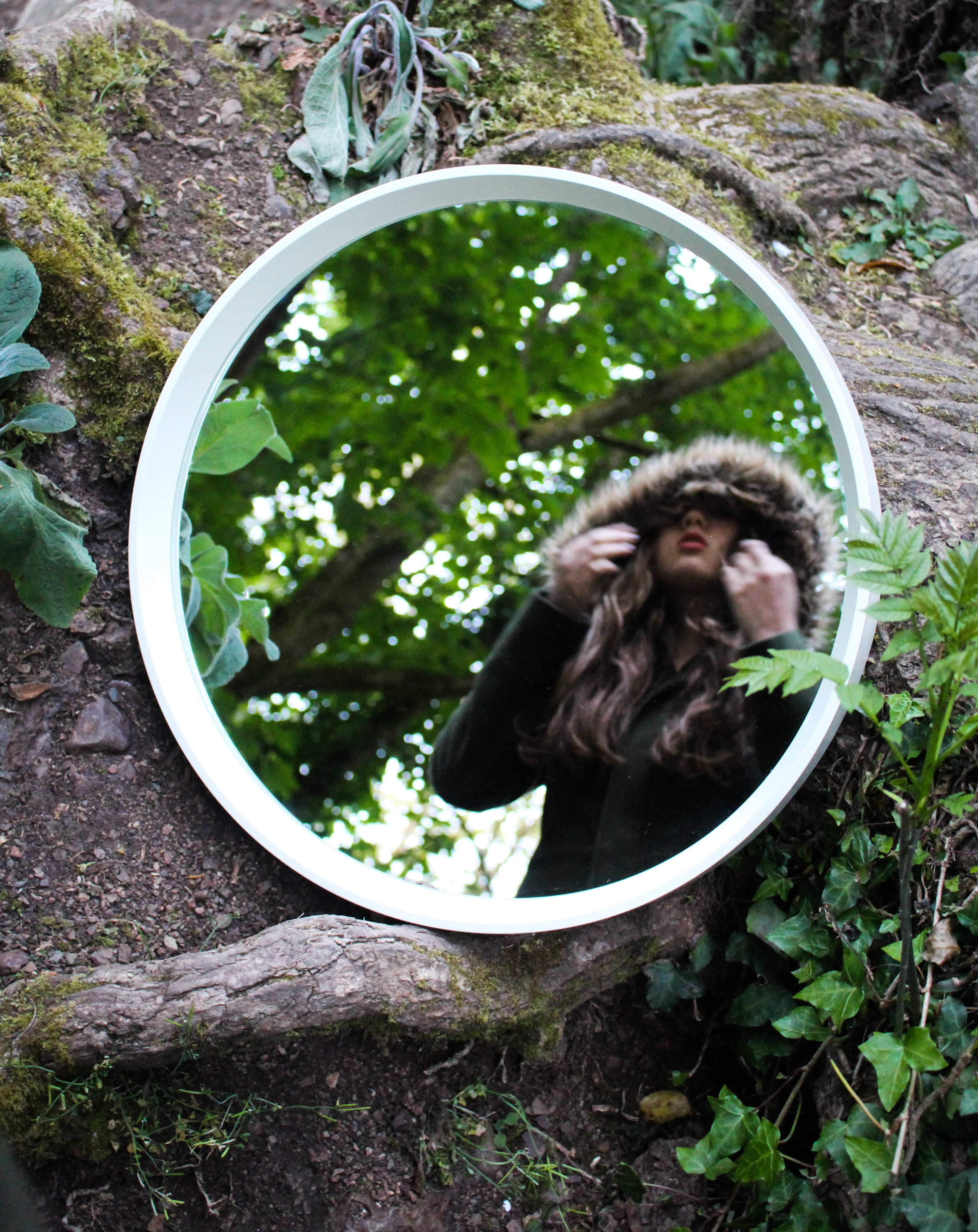
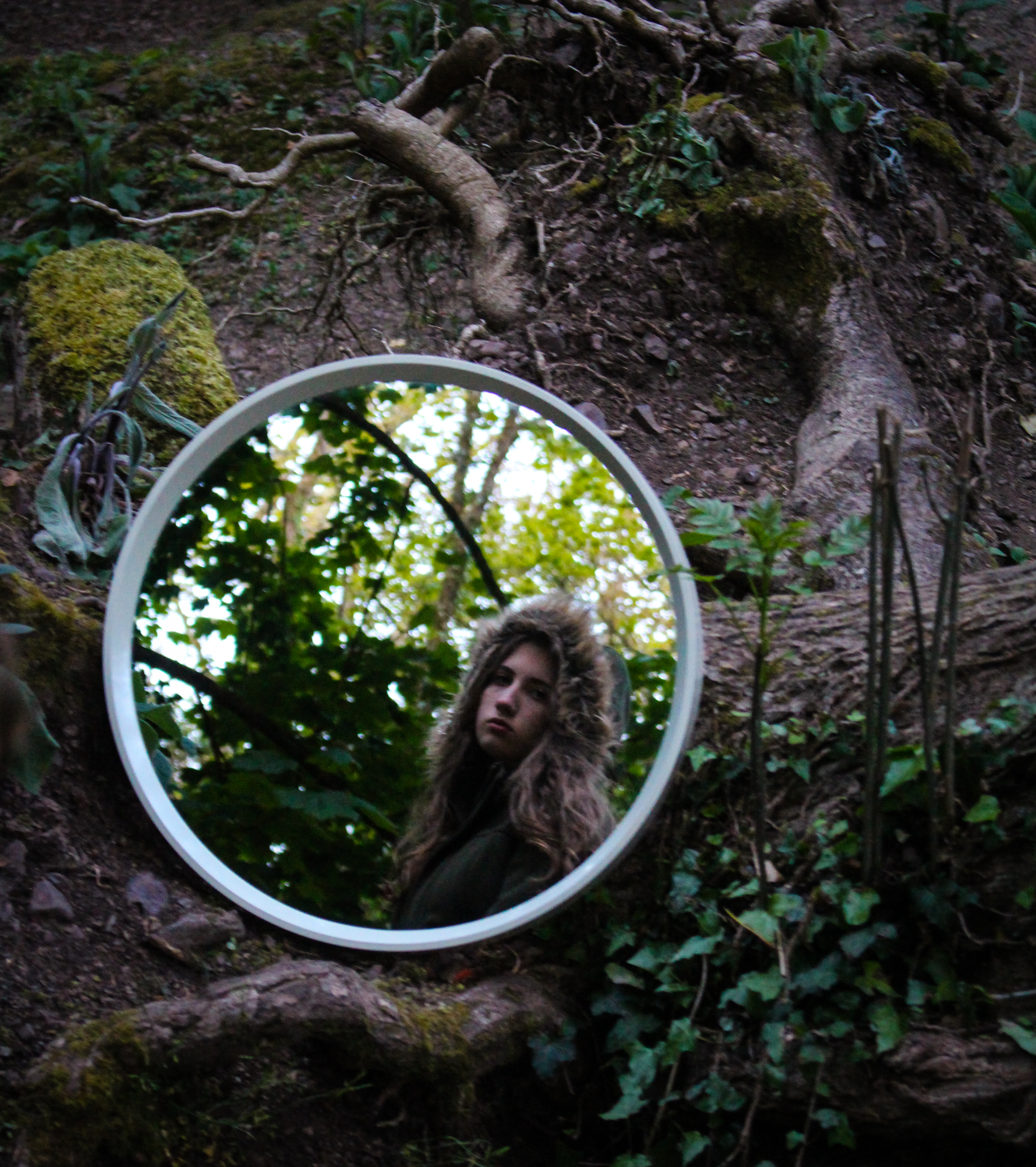
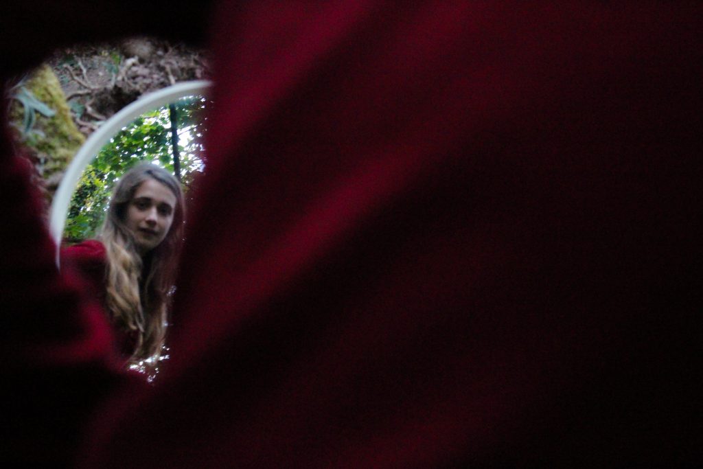
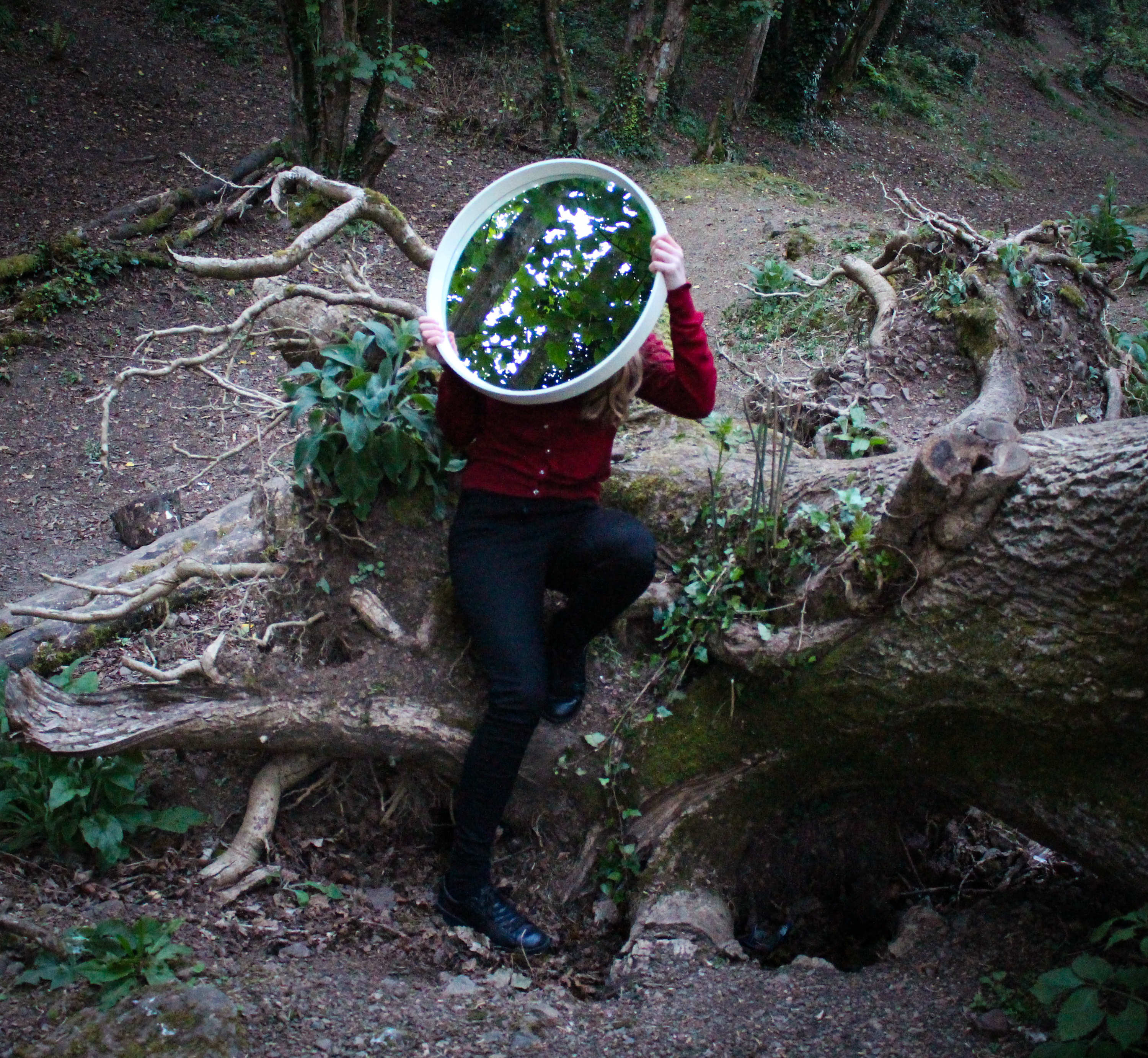
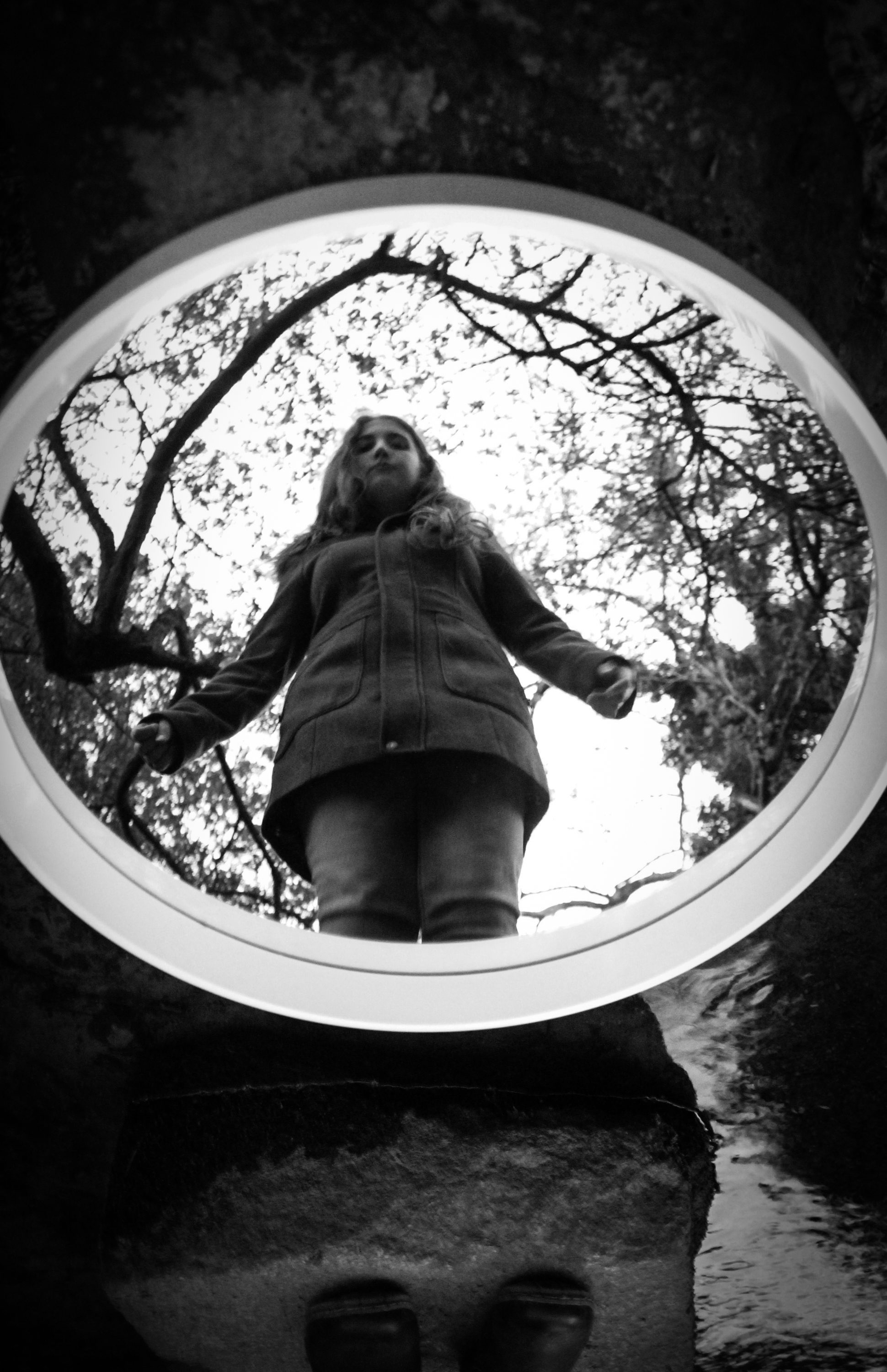
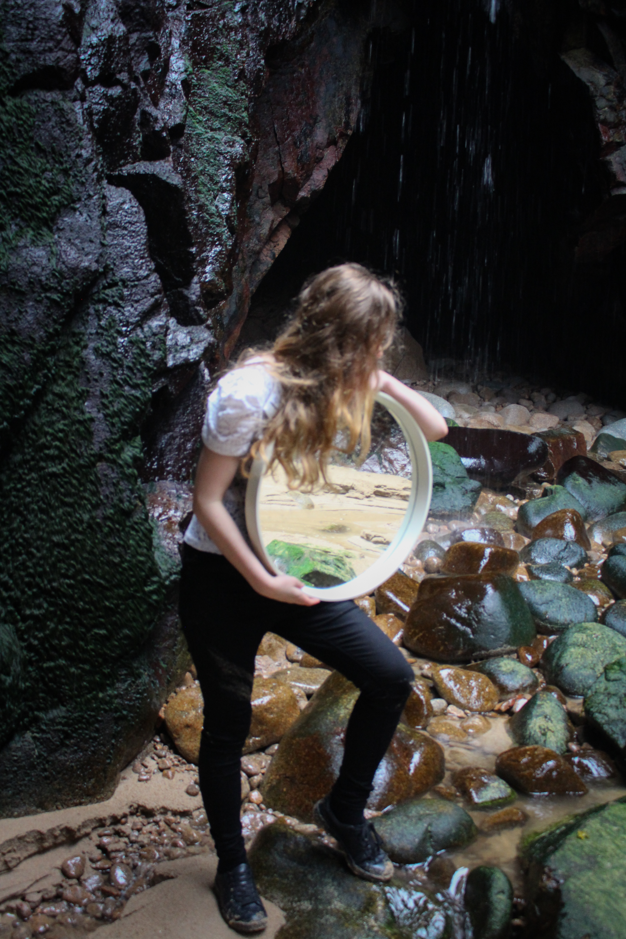
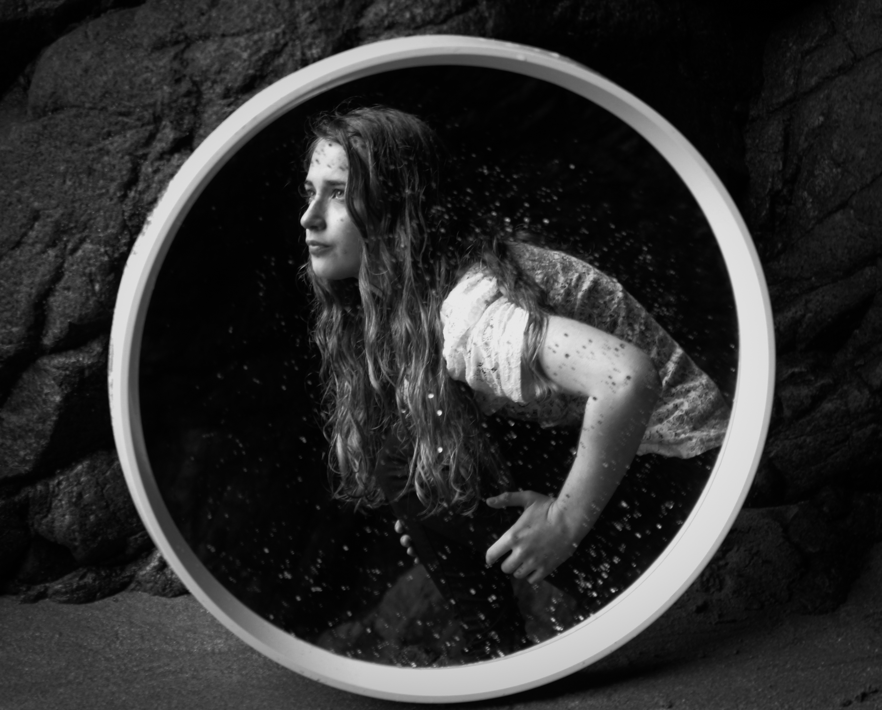
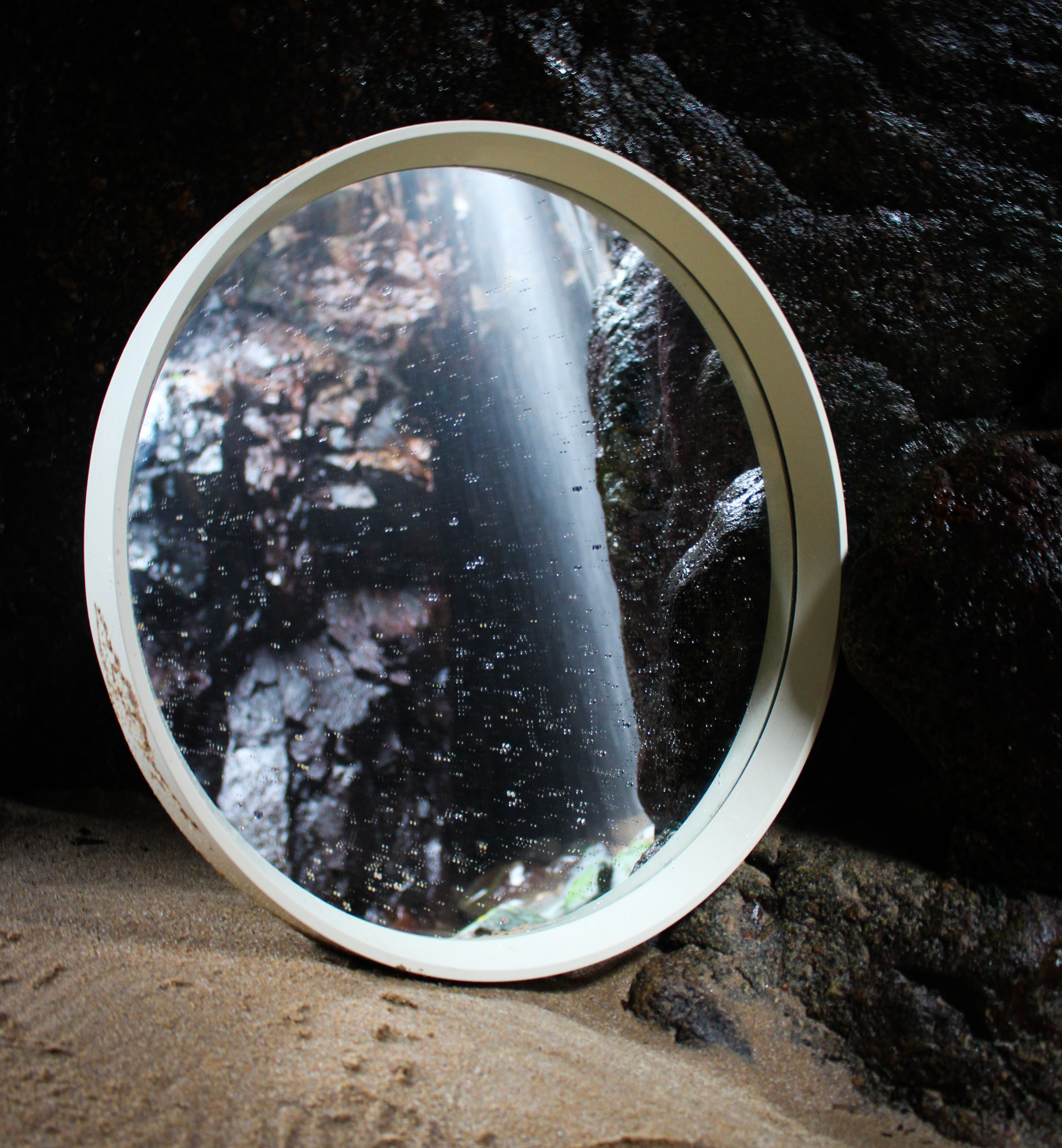
The next few outcomes are from a shoot I did in a different wooded location. I also experimented using a round mirror rather than a rectangular one. This allowed me to experiment with different techniques because it is smaller and has a thinner frame. I think this one stands out more within the environment because it’s round shape often contrasts with the other shapes in the image. However, I did like how the rectangular one echoed the shape of the image itself. My sister was wearing green with a brown fur hood which blends in with the naturals hues and tones of the environment. Contrastingly, I wore red which complements the green and stands out.
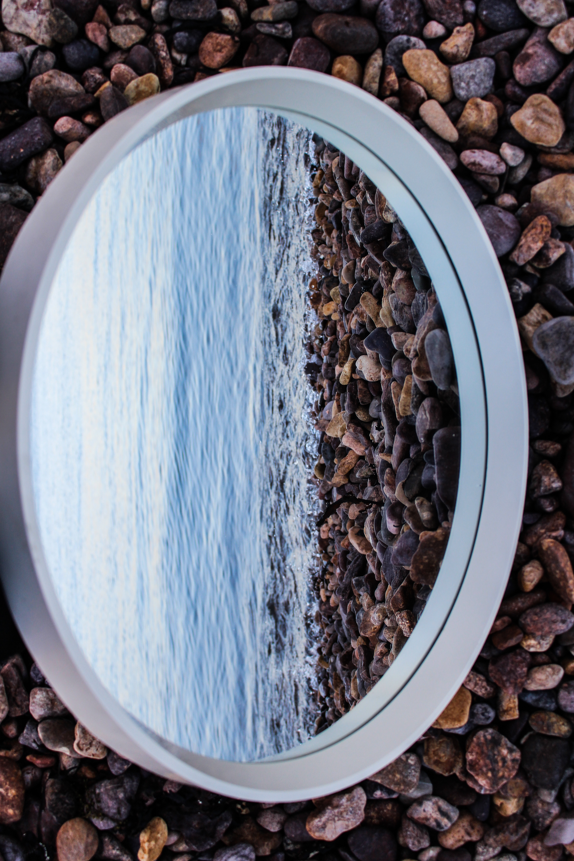
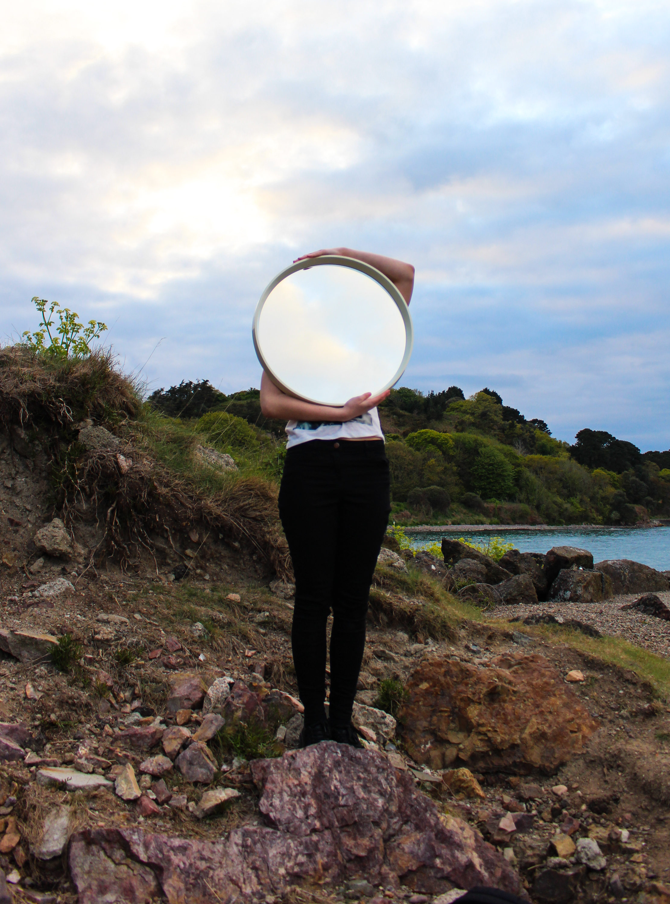
I also did a shoot at a beach location and made some landscape images without people with the use of the mirror. I don’t think these are particularly exciting but I think the second example below is effective because of the dramatic sky and the way that the arms follow the shape of the mirror.
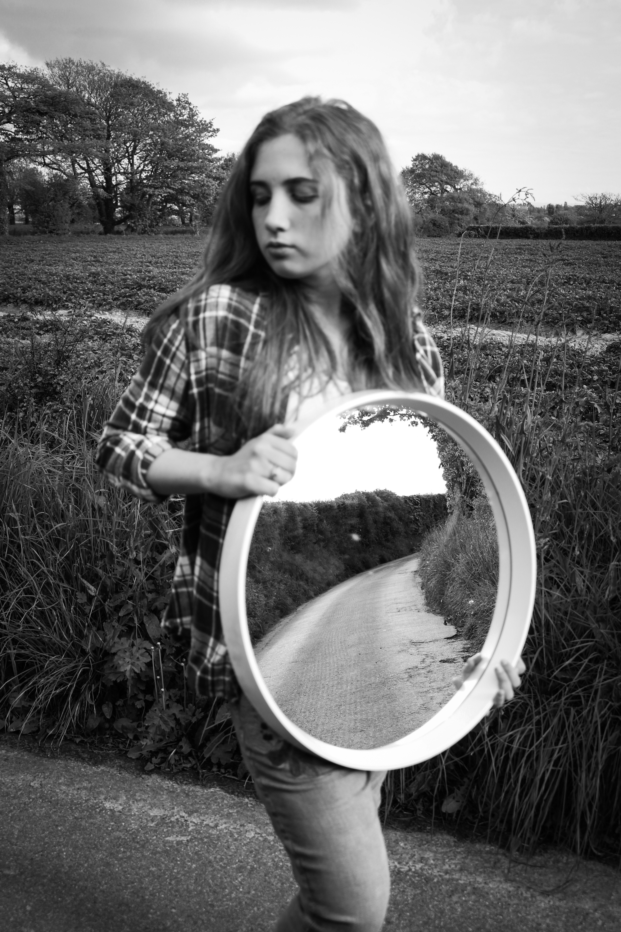
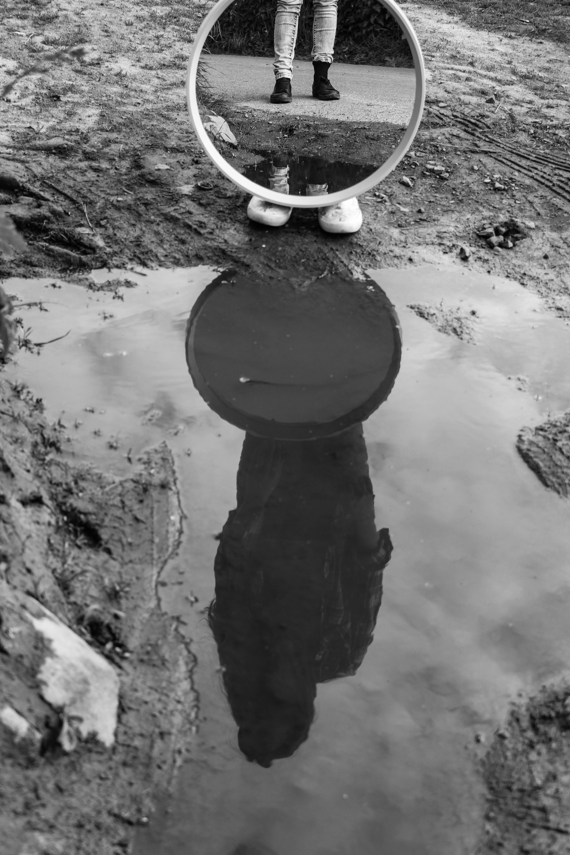
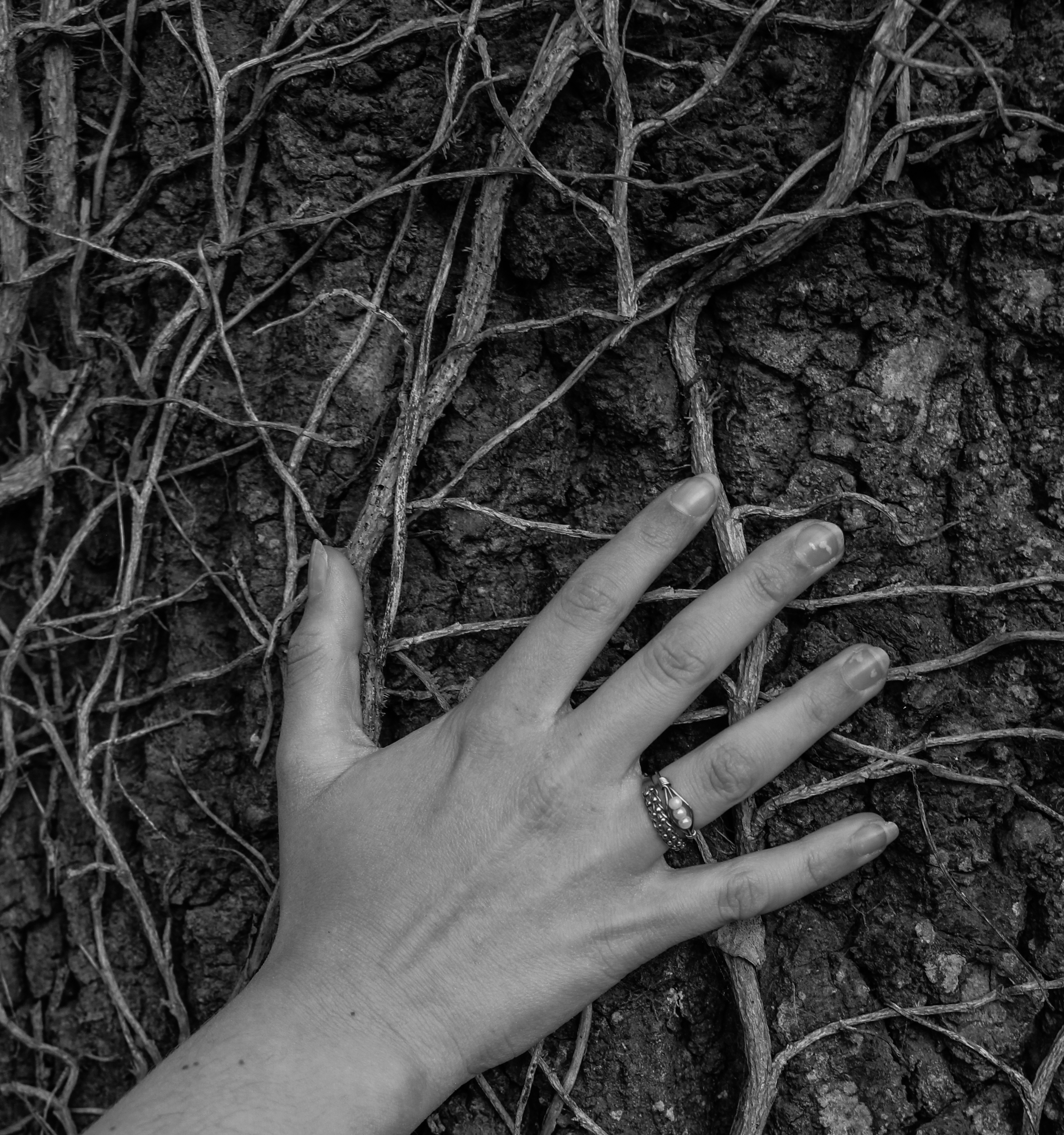
These images are from a shoot I did around some country lanes. I prefer the shot of the mirror working with the reflection in the puddle and I also like the shot of her hand on the tree because of how the veins show the similarities between humans and environments and how they can blend together.
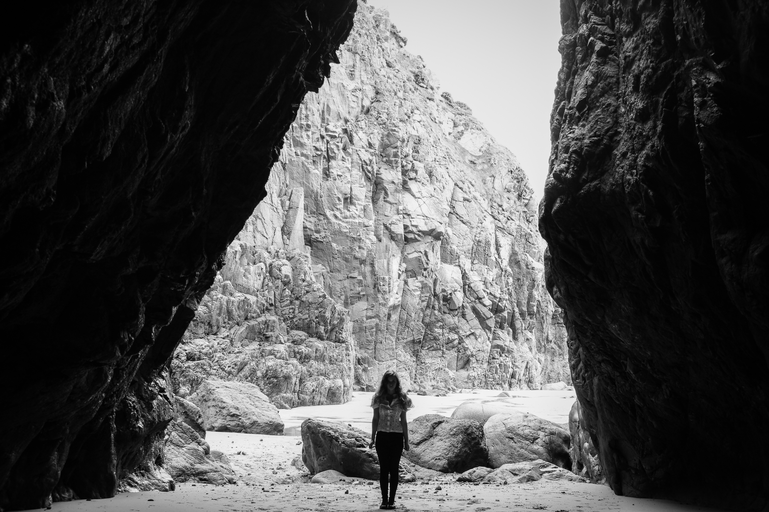
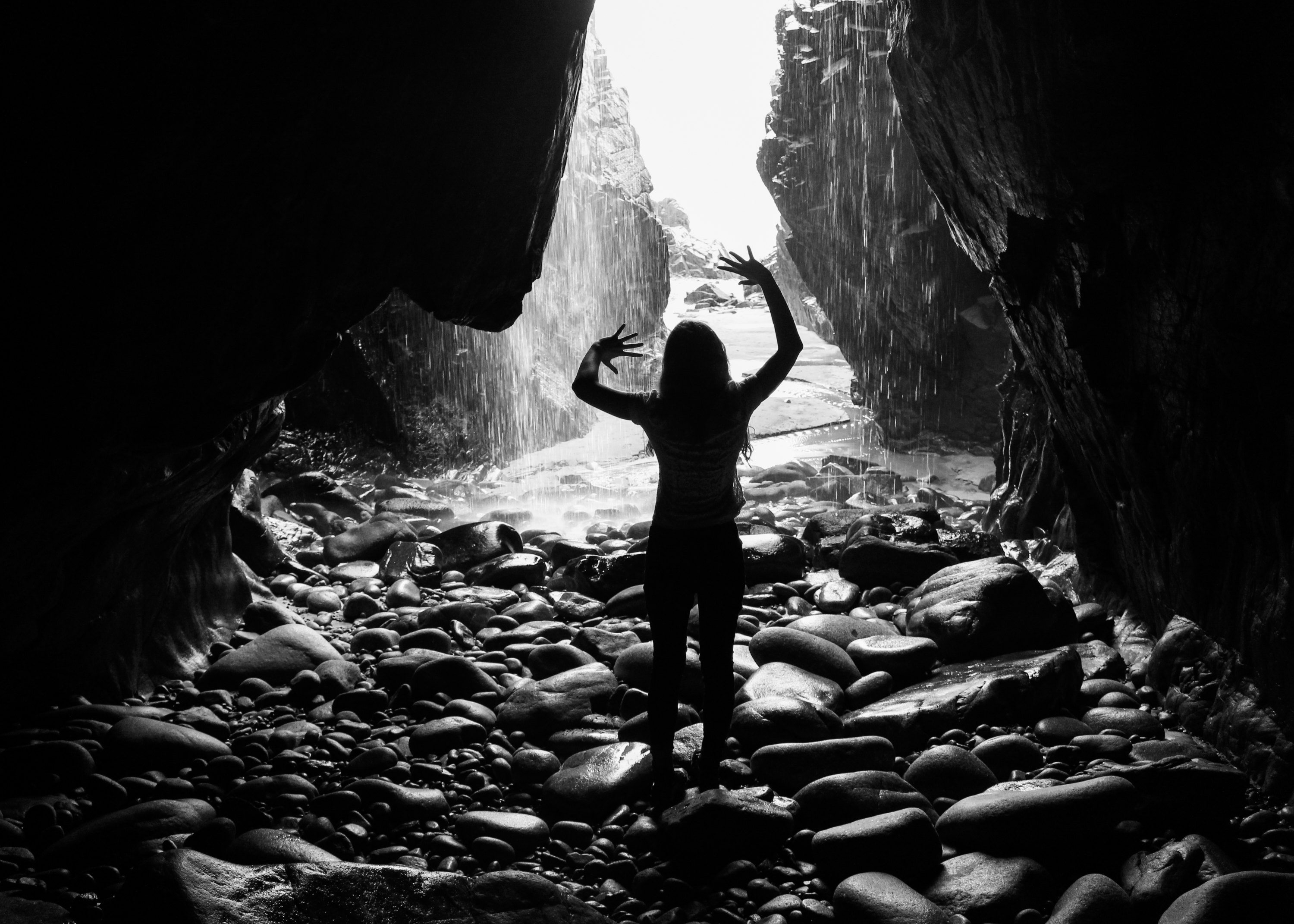
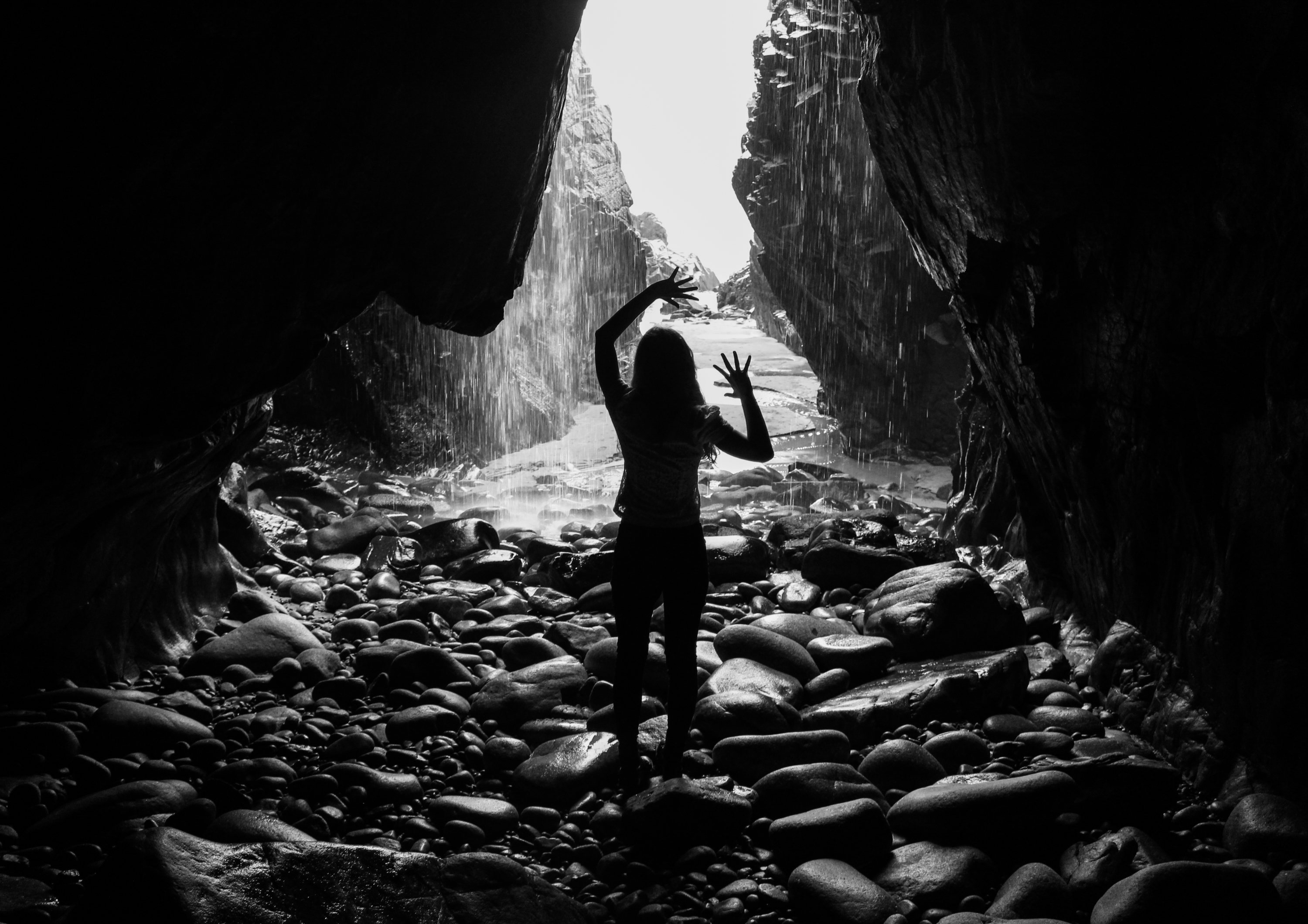
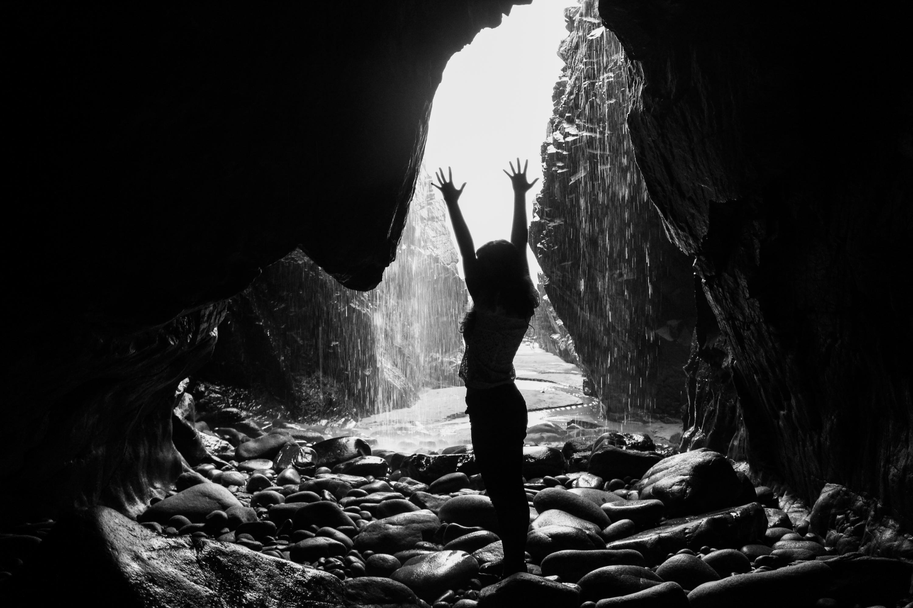
The outcomes from this final shoot were taken in caves. I chose this location because I wanted to base my exploratory performance shoots on interesting environments to respond to. This landscape was quite different to some of the others I have used and I think it has dramatic qualities. However, I also faced some technical problems here such as difficulty in access and low levels of light. Nevertheless I have some outcomes that I am happy with, I especially like the silhouetted ones with the cave entrance acting as a frame and the waterfall providing an interesting backdrop.
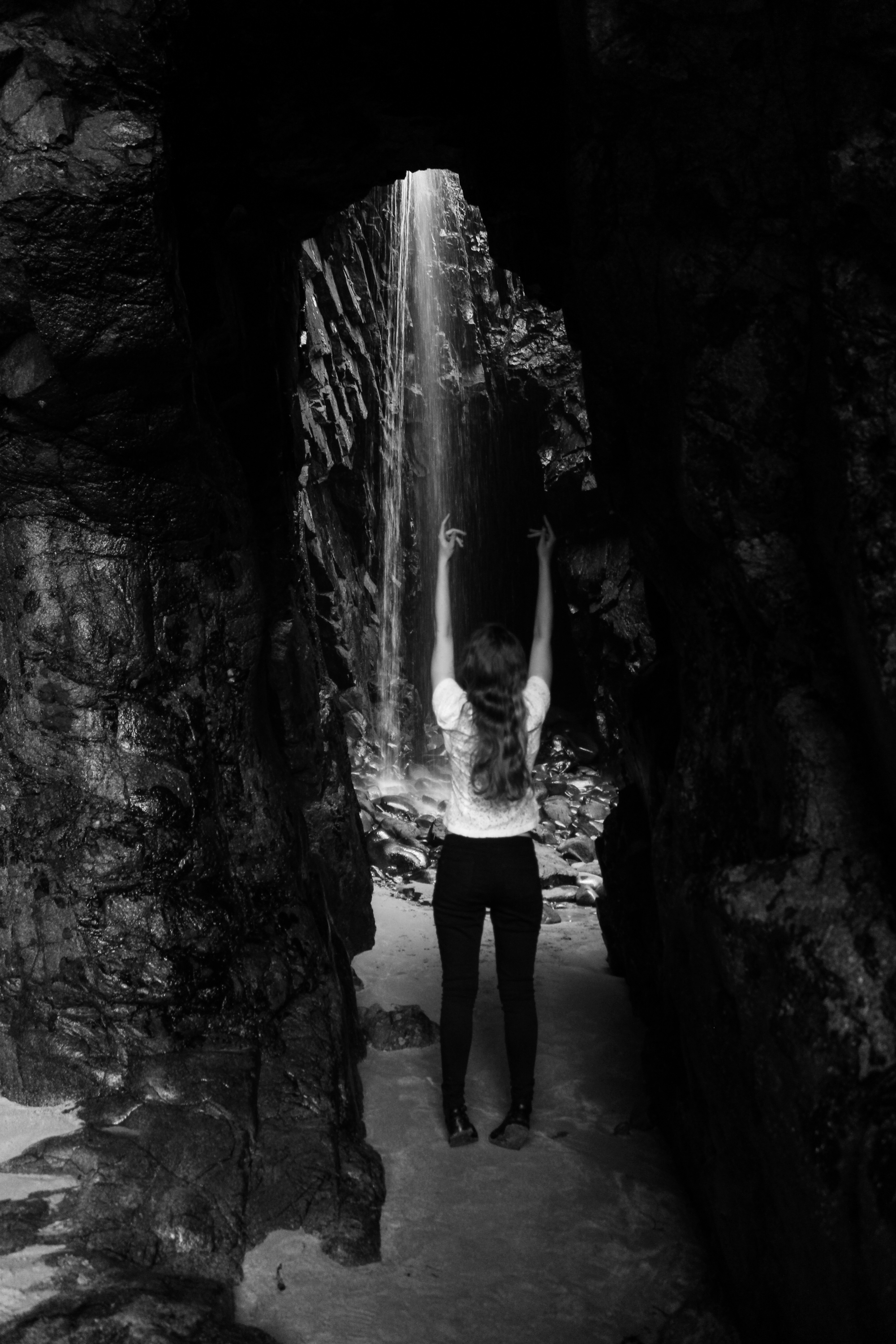
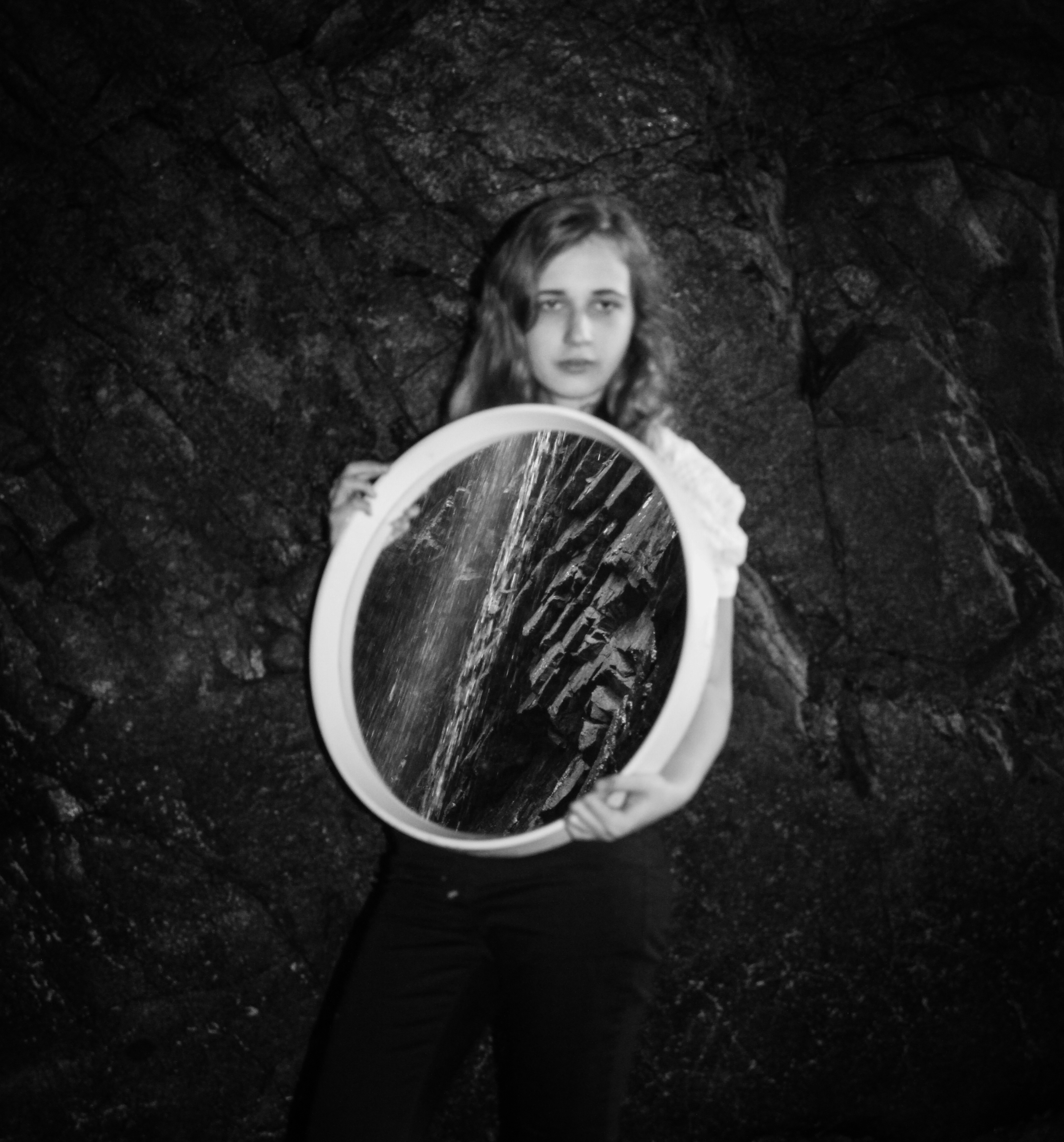
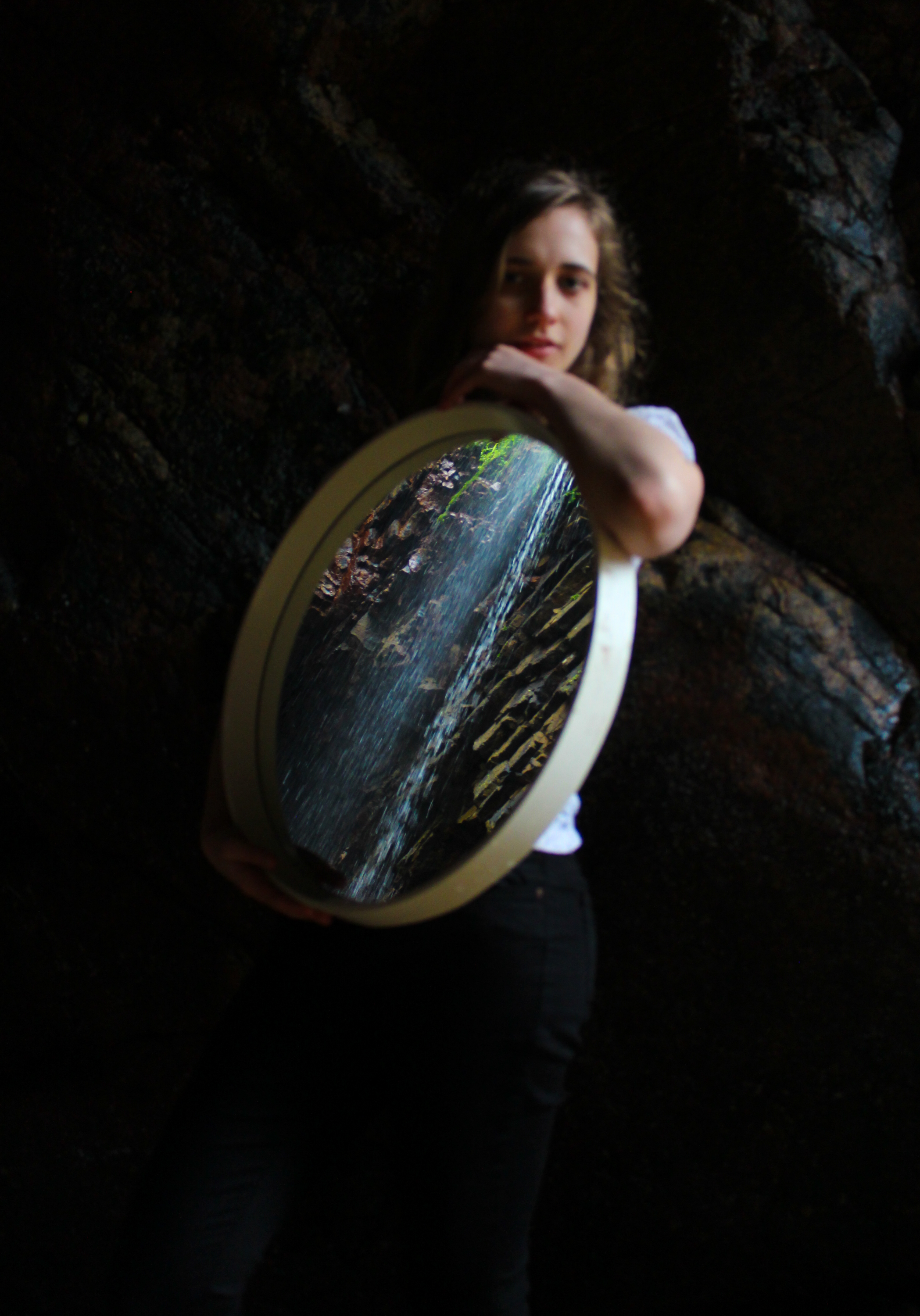
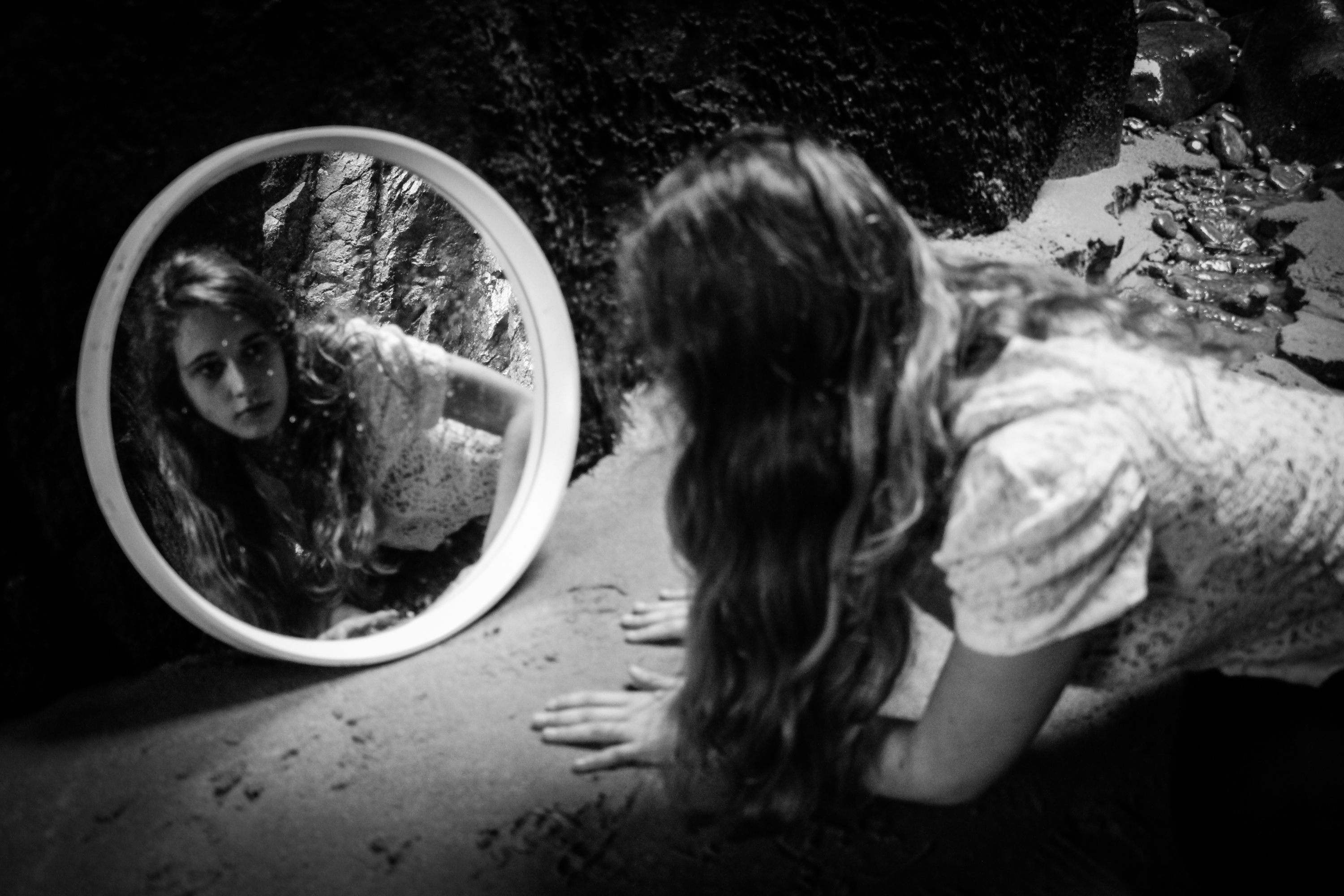
Artist reference-Duane Michals
“I think photographs should be provocative and not tell you what you already know. It takes no great powers or magic to reproduce somebody’s face in a photograph. The magic is in seeing people in new ways.”
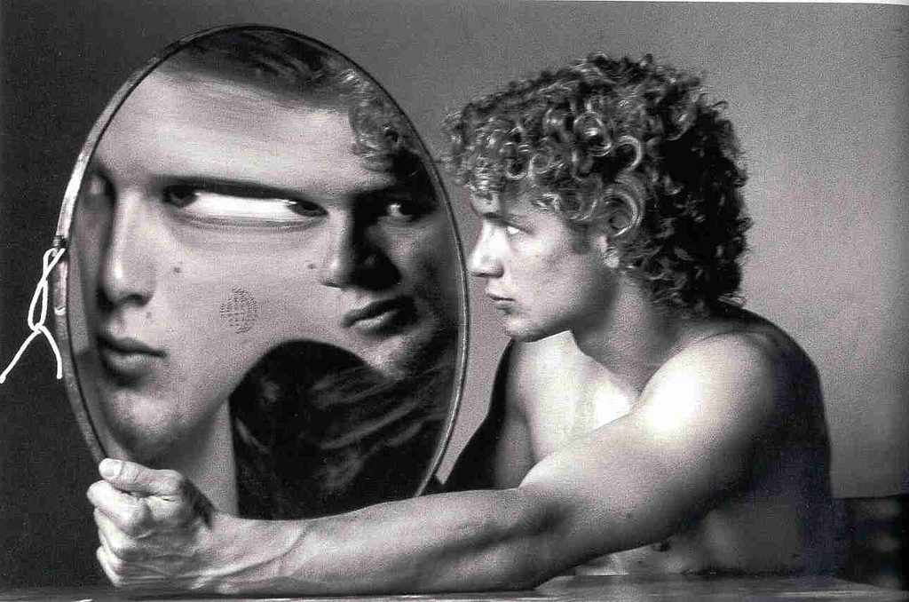
Duane Michals is considered to be one of the great photographic innovators of the last century and is well known for his work with series, multiple exposures, and text. I have decided to consider him as an artist reference because I am thinking of taking inspiration from his methods of presenting images in series combined with handwritten notes to add a new layer of meaning to the images.
On this website it explains that he “was a pioneer in the 1960s when he broke away from established traditions of documentary and fine art photography”. Rather than following the recognised methods of presenting images by focusing on them individually he created sequences of multiple images to convey visual stories using a cinema frame-by-frame format. He also incorporated text into his work with handwritten messages and poems on the paper’s surface. He said that rather than serving an explanatory function the written text adds another dimension to the images. These messages are often poetic, tragic or humorous and he has said “My pictures are more about question, not about answers.” He has also said that William Blake, Lewis Carroll, and René Magritte are influences on his work which would suggest a more surreal approach to his art.
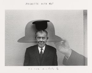
His staged photography, often includes elements of other genres, including film, theatre, and literature. He utilises cinematic language but his images also contain blurred figures which implies movement in each frame. Unlike film his images are open to individual interpretation and don’t have an overarching story-line. Initially critics were confused by his work because they reject the notion of the “decisive movement” and the popular glorification of single images. Nowadays his work is praised for this because he is considered an expressionist constructing images of the mind and exploring unseeable themes. His work is often of a personal nature, and Michals relies on his own history as subject material. They are also fantasies with a sense of absurd humour. Michals has said, “No one can reproduce my handwriting, but someone else can always make a new print” which shows his deliberate attempt to create one-off pieces which restricts the value of reproductions. This makes each piece unique, and increases the rarity of the work.
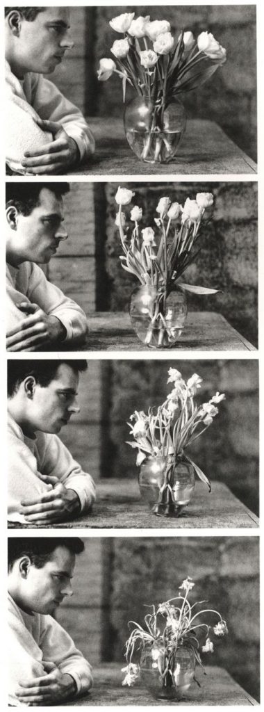
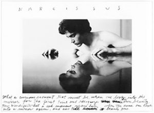
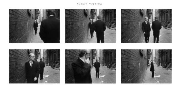 I was also drawn to Michal’s work because of the ways in which he has used reflections. He has explored the idea of mistrusting appearances and the truths that lie beyond the surface. Like mirrors cameras recreate a chosen subject ‘truthfully’ onto a flat surface by redirecting beams of light. Michals has stressed his suspicion of the purely visual to the extent of even abandoning the lens-based image in favour of purely verbal description. He has said ” I am a reflection photographing other reflections within a reflection” which suggests an unease with the process of trying to trap appearances. His work focuses on exploring invisible and internal themes and his use of mirrors could relate to the introspective nature of his work. He also connects his work on this to things such as mythology and literacy such as the example below which references the Greek myth of Narcissus.
The famous example of his work shown below was created for French Vogue and was intended to illustrate a feature on quantum physics. The series is based on Werner Heisenberg’s uncertainty principle which basically said you can’t predict with certainty the position/velocity of a particle but they instead interact in chaos. Michals has said ” I’ve always been interested in physics and I like trying to photograph things that seem un-photographable – rather than looking at reality, I aim to get deep inside it and explore”. He explains that he bought the convex mirror in an antique shop in Bath and was intrigued by the distortions it created. He used this to illustrate Heisenberg’s principle because it transforms everything in front of it. When the model moves the image changes completely which creates a powerful energy to the series. Displaying them together this way effectively presents this and in the last image, when the model is looking at the camera and her cheek appears in the mirror so that there is no face at all it demonstrates a “blank slate” of pure white energy. Technically the individual photographs are also well captured with what appears to be natural light from the window and the black and white emphasising the contrasts and forms. 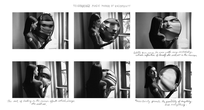
The series below called ‘Alice’s Mirror’ is presumably based on ‘Through the Looking-Glass’, the sequel to Alice in Wonderland. In the novel she considers what the world is like on the other side of a mirror’s reflection and steps through the mirror into another world. I like Michal’s use of miniatures in this series to distort the viewer’s perceptions and create a surreal piece and I would be interested in exploring something similar in my own work. 
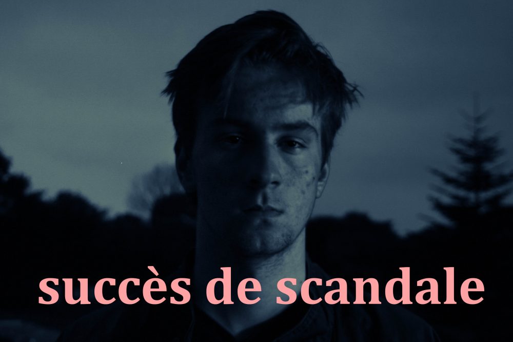
Dusk Photoshoot 5
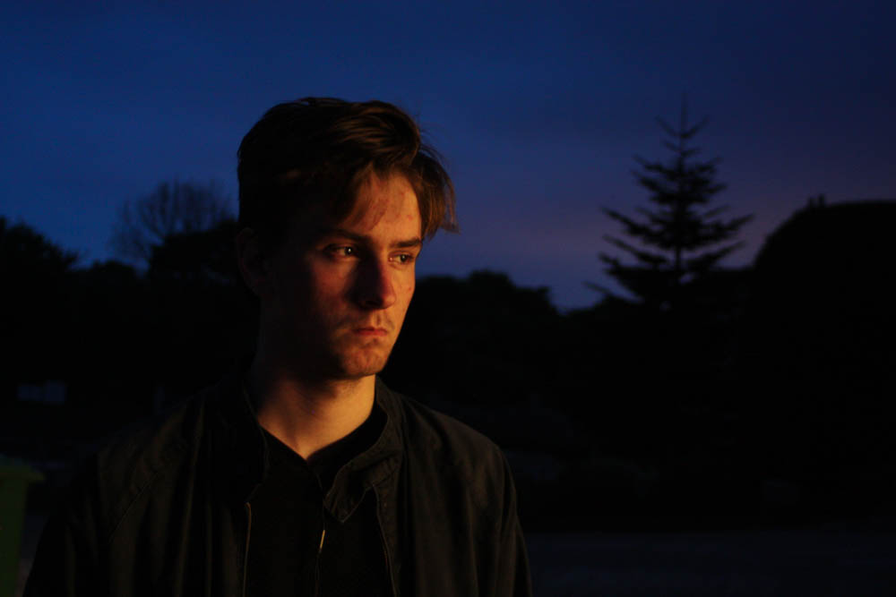
I decided to make a 5th shoot to expand on the narrative of my book. Similar to previous shoots I explored different exposures and white balance.
the light was constantly changing and even with the above photographs I was still using a longer exposure.
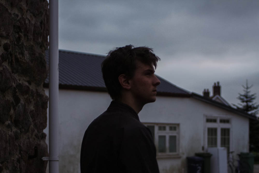
i like the dreamy, glowing appearance of the above photograph as well as the seemingly ghostly long exposures.
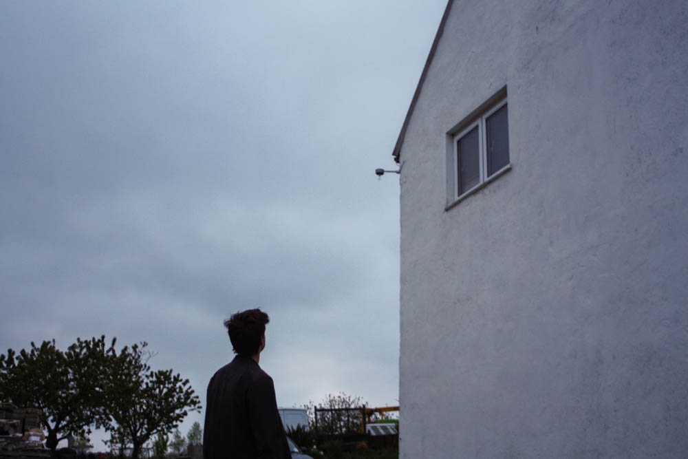
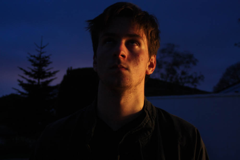
Here are some experiments where I used different filters as well as experimented with text.
Documentary: Energy from Waste – Results
Since being invited to have a insiders look of Jersey’s ‘Energy from Waste’ facility, I set out to meet with them at our arranged time. Before completing this shoot I have researched the facility located at La Collette and gathered amazing inspiration from topographic photographers Bernhard and Hilla Becher. As I explained in my planning, my main aim for this shoot was to capture the scene and show exactly what happens to Jersey’s household/commercial waste once it is thrown away. By doing this I hope to get across the message of the importance of recycling which I will back up in my next shoot depicting La Collette’s recycling centre. To complete this shoot all I needed was my camera and the safety equipment that was provided to me when I got there. Upon arriving at the location I headed up to the reception, signed myself in, and had an initial explanation of what we were doing during my tour. Fortunately, this opportunity turned out to be a great success as I was actually shown around the entire facility for 2 hours and explained exactly what happens to Jersey’s waste and how we can reuse it for energy. To take these images below I used a slightly faster shutter speed than normal, capturing as much light and detail as possible using the limited natural and artificial light. Below are some of the original unedited photographs from this shoot presented in a contact sheet… Because of my original plan to take as many photographs as possible of every aspect I was shown, the contact sheet above only shows 47 out of the 500+ images I took during my visit. To narrow down my outcomes from this selection above was quite difficult as I really liked many of the angles and compositions that I managed to capture. Below are the 14 images I have chosen as my final outcomes, although I won’t be using every image in my end result, I wanted to include them in this post for future reference to my efforts. As well as this, as requested by the manager of the energy from waste facility, Ian Williams, I have edited and saved about 16 more images to send to the department for unknown reasons. This shoot, much like my previous documentary shoots, shows a mixture of colour and black and white photographs depending on their style. Below I have displayed my final 14 outcomes along with four other images presented at the bottom that helps me to tell this documentary narrative…
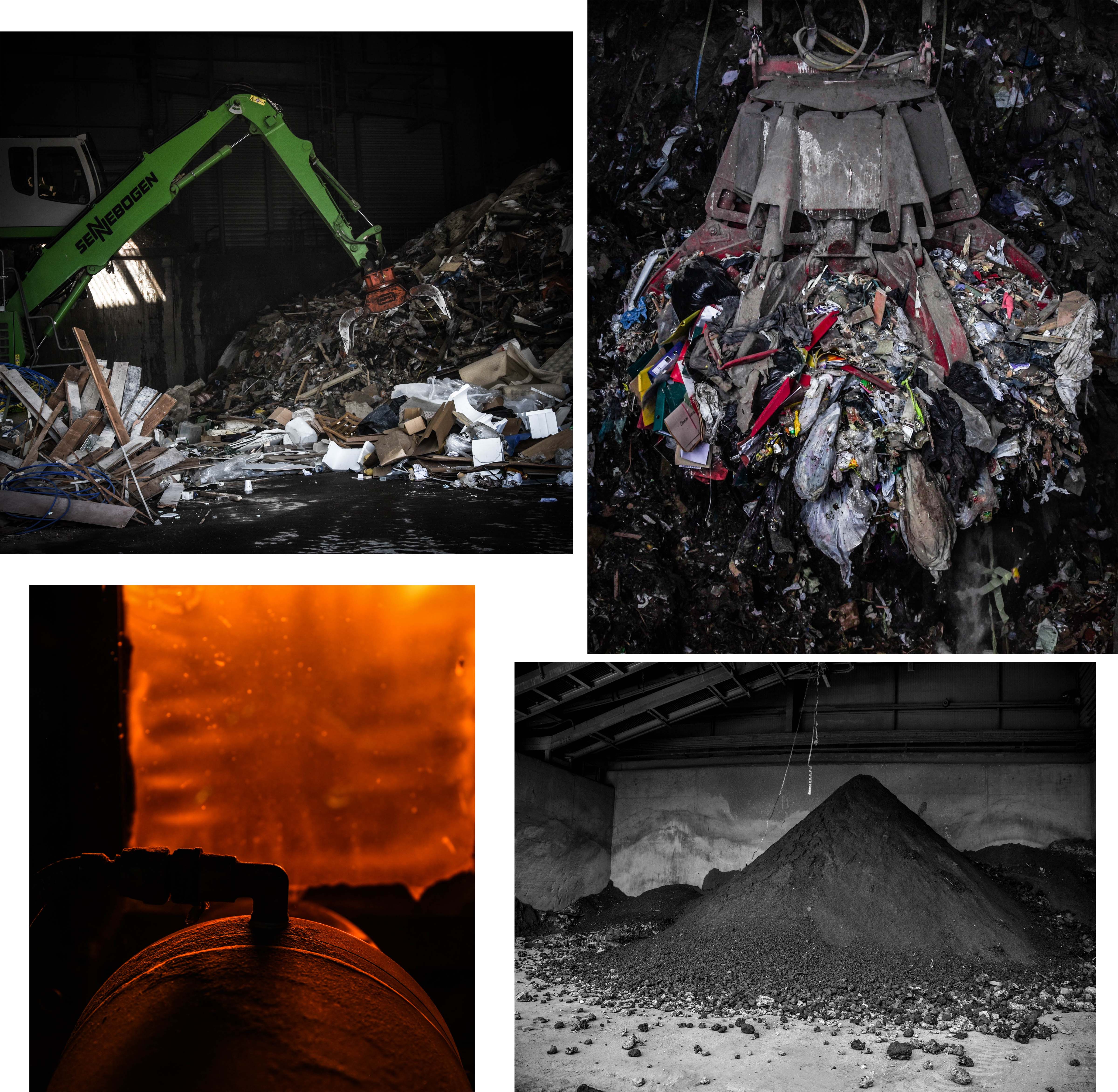 This first group of my final outcomes above depicts the waste before transformation, the burning of the waste, and the ashy result of the process. The first two images on the top row depict the difference between the amount of household and commercial waste produced on our Island. The image on the left presents an average sized machine transporting commercial rubbish from one spot to another whereas the image on the right shows a gigantic claw machine, capable of moving up to 3 tonnes of household waste. For use in my project, I love the photograph on the right because of it dramatic intensity as well as its ability to give my viewers an idea of how much we produce. This image is one of my favourites overall and was taken through one of the ‘rubbish shoots’ after the operator kindly positioned the claw for me. The two pieces on the bottom row can show what could be seen of the burning process alongside with the final outcome of this waste. I love the orange glow and intriguing composition/aperture of the image on the right whereas the one on the left shows an important part of what happens to Jersey’s un-recycled waste. – this ash is actually re-purposed to be used in Jersey and England to create buildings and roads.
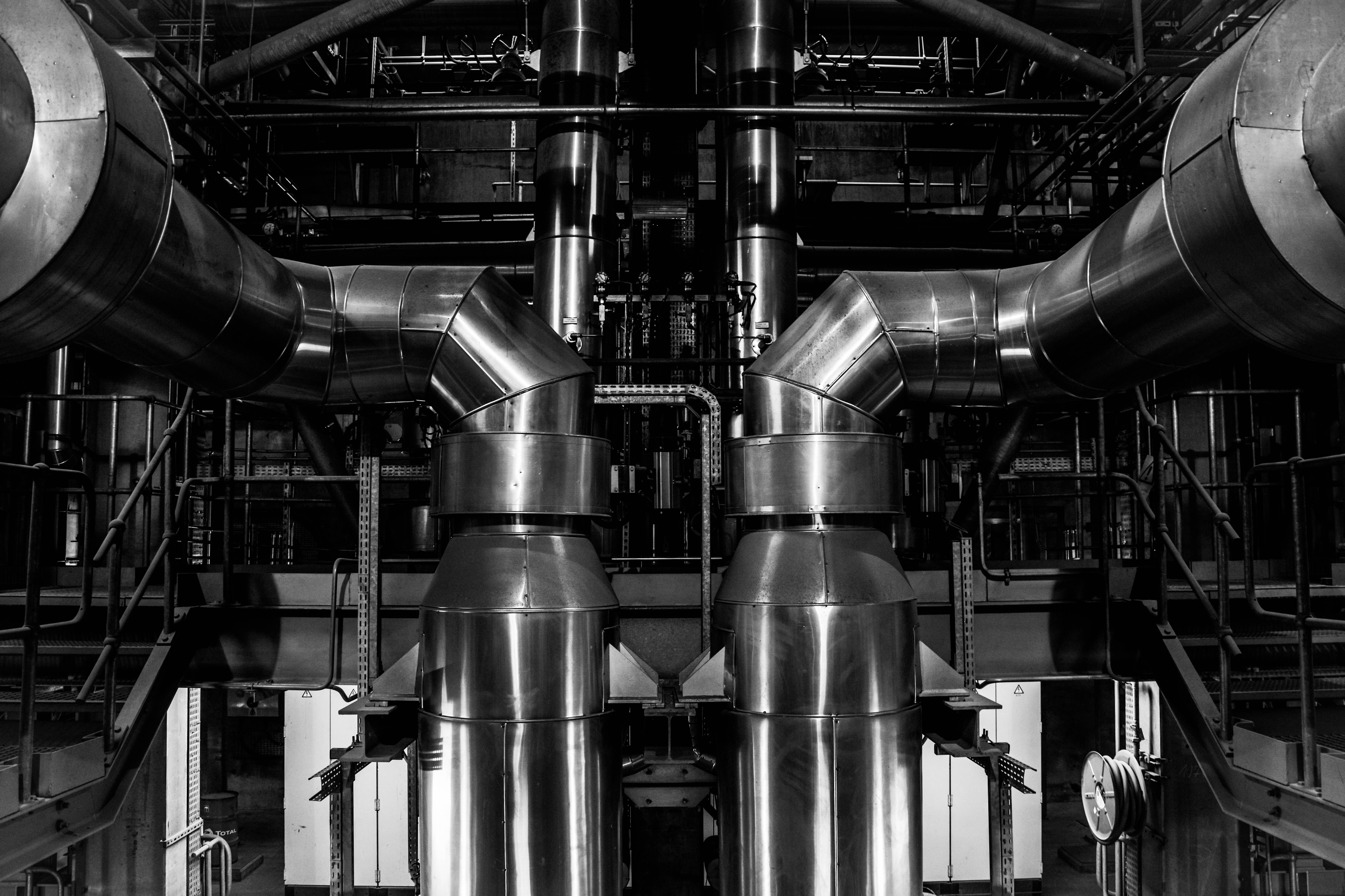 This next image is one of my favourite topographic style outcomes which was taken from inside the ‘Energy from Waste’ facility during my tour. This image depicts two massive pipes coming up from a lower floor and curling around the edge of my composition. I love the perfect symmetry I have captured in this piece and the topographic/straightforward style it was taken in. The reason I have decided to edit this image in black and white is to emphasise it dynamic features as well as resemble the many blast furnaces captured by my inspirations Bernhard and Hilla Becher. The meaning behind this image is to show a specific section of the massive machinery that combined, works to process the safe disposal of our island’s waste and turn it to clean energy.
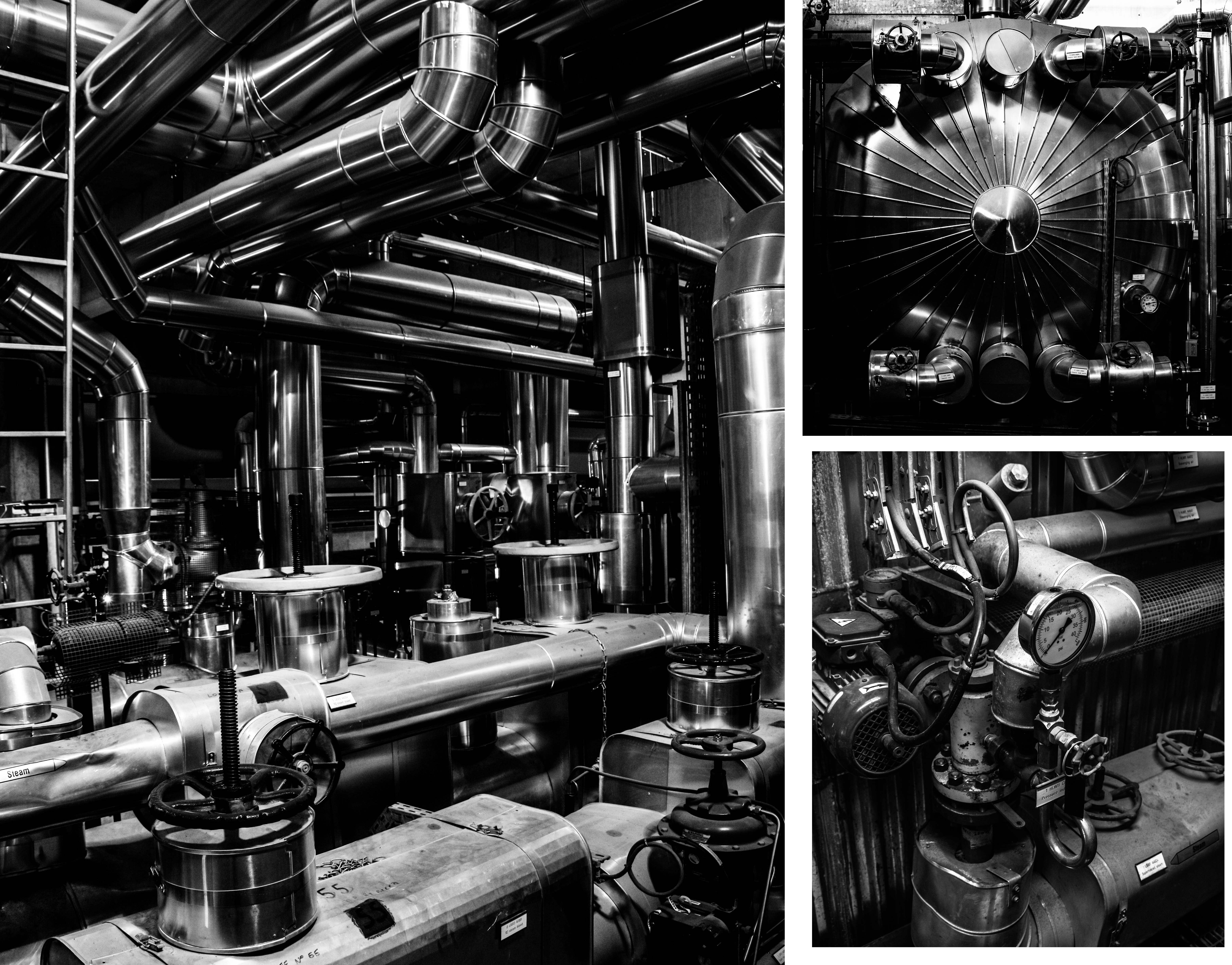
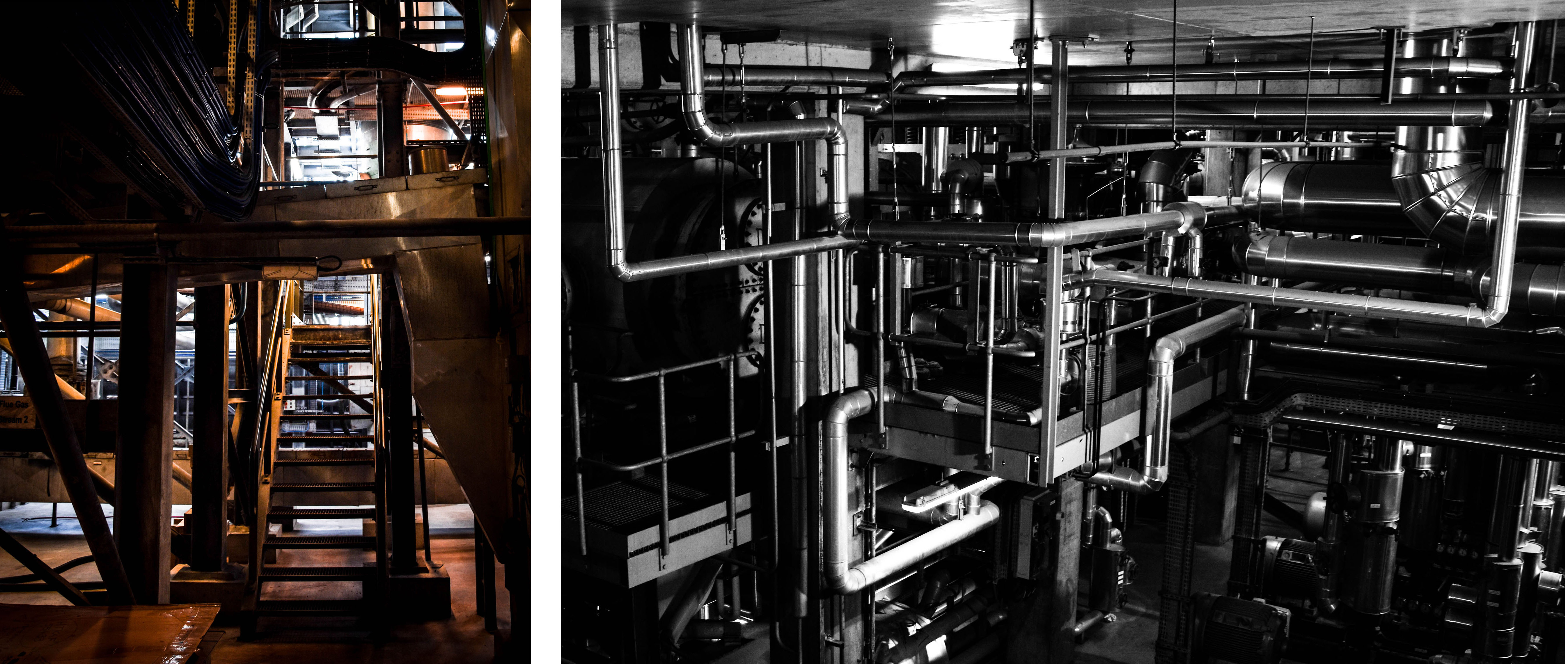 These next group of final outcomes from my shoot show more specific details from inside the ‘Energy from Waste’ facility. The meaning behind these images, along with the final outcome above, is to show exactly how much work and complicated technology goes into this process. These images can give an idea of just how difficult it is to cleanly produce only 7% of our island’s energy at the same time as disposing of our waste. The first and largest image on the top left is my favourite from this and depicts a scene through the building completely filled with pipes and machinery. I love the high contrast and dramatic overtones of this image and I think the intricacy of the pipe work really helps prove my point. The next two images on the right of this piece depict a few close-up detailed shots of specific parts of this extensive setup. I love the simplicity of these images as I feel they share a very strong topographic style. Lastly, the two photographs on the bottom row depict some amazing shadows and angels looking through the facility as well as more intricate pipe work hanging down from the ceiling.
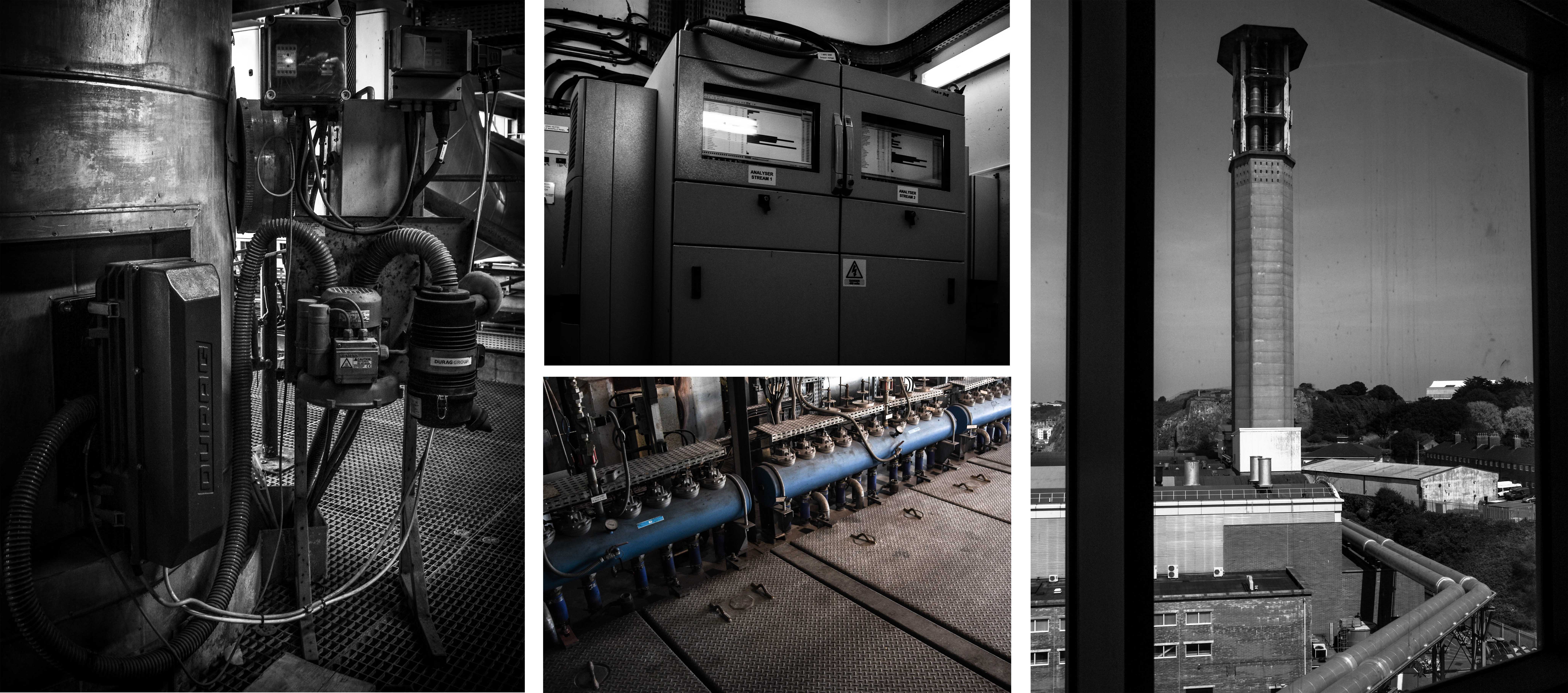 Next are some important outcomes depicting a few of the elements that go into the purification of the smoke produced from burning the rubbish. According to CSBC, the La Colette ‘Energy to Waste’ facility meets the highest air quality standards in the whole of Europe. If their emission levels are outside of the licensed limits the plant is shut down and any underlying problem is rectified before the plant is started up again. The fist three images on the left depict some features that help keep track and purify the smoke before it is released. First is the point where samples are taken for testing, next on the top is a monitor for viewing the levels of each element and finally, the bottom image shows a very small part of the machine that acts as a filter. Lastly, on the right of this contact sheet is the view from outside the window looking up at the JEC chimney and the pipes that connect the two facilities.
Lastly are some images I have taken that are not intended to contribute to my topographic photography style like the images above. Instead, I have chosen to add them to my blog simply to give a little more insight into how the facility actually works. The first two photographs on the left depict the building releasing steam from the perspective over the top of Mount Bingham. I have included these images to present the clean white steam that is let out of their small chimney which has just been through a system of turbines to create energy. The black and white image situated in the middle of the contact sheet represents how we still have a long way to go before beating the use of fossil fuels and powering the whole island cleanly. The last two images on the right are just quick snapshots of some of the tables and graphs the operators use to carefully monitor the waste disposal emissions and make sure they are under the licenced limit. By looking closely at this information we can start to understand just what types of chemicals are released from the burning of waste and exactly how much is being pumped into the atmosphere. 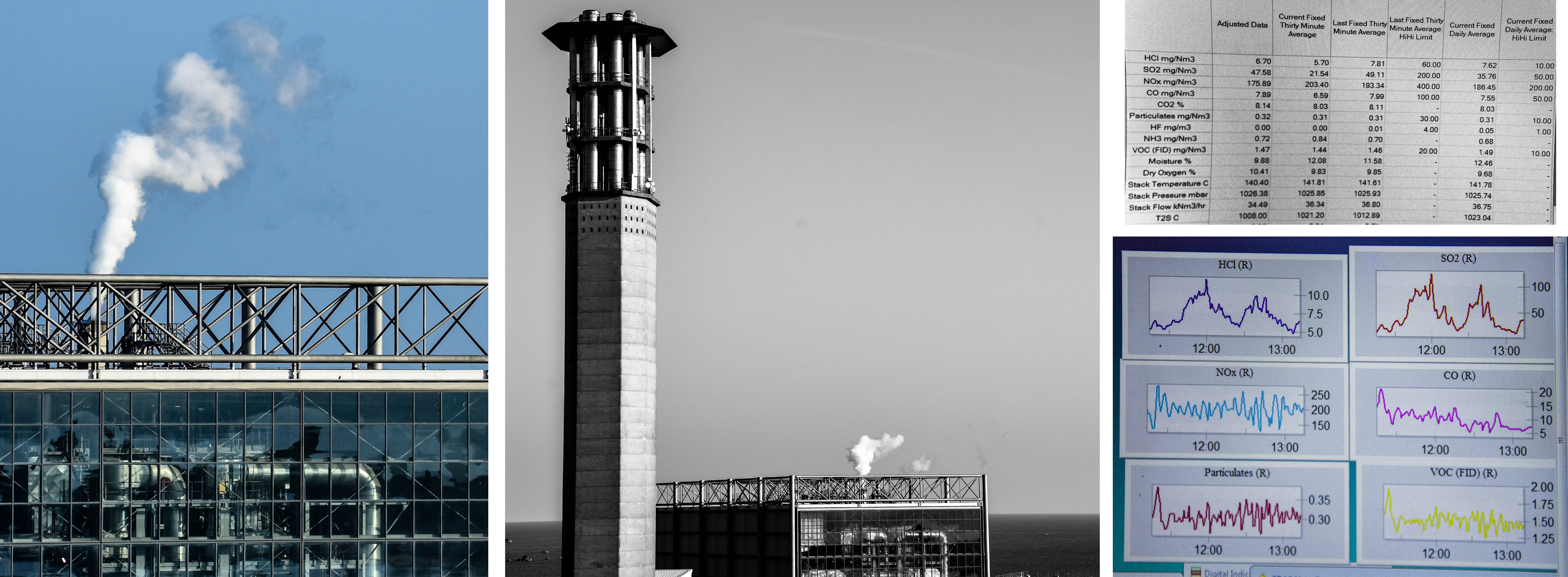
Photoshoot 4 Todd Hido/ Bill Henson Portrait Interior photoshoot
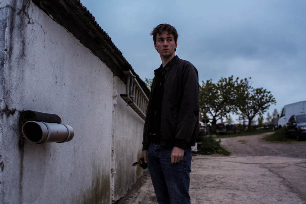
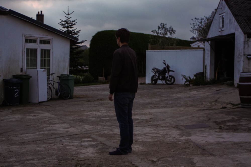
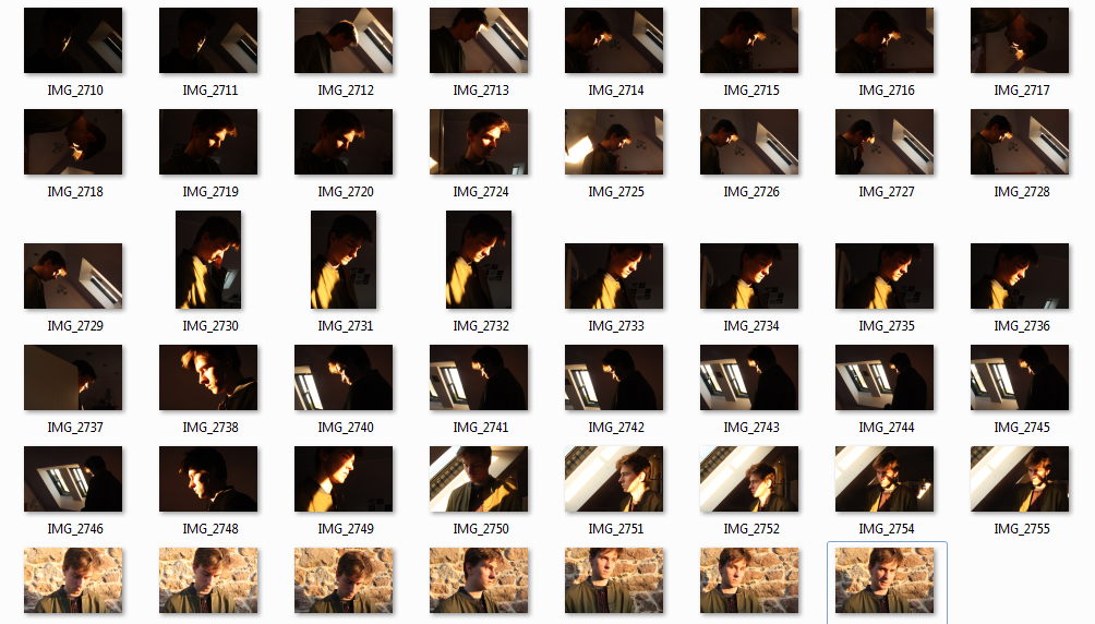 In response to Bill Henson and Todd Hido’s portraits, I wanted to explore the use of interior scenes and the use of natural lighting to build narrative and add emotion and feeling. In relation to my starting point, the natural light contrasts the dark spaces created by the walls and small light sources. I took over 50 photographs, each experimenting with different ISO’s and exposures and I also left it on auto focus, this evoked a sense of depth without creating overly blurry photographs, I also tested long exposures to give the photos a ghostly effect. I did not use a tripod and in hindsight this would have been more beneficial for creating a sharper image especially when working with longer exposures. I decided to not use multiple exposures or HDR techniques unlike many of my previous landscape photographs as I wanted to keep the strong contrasts of dark space with the warm light. The composition of the photographs features closeups as well as shots that feature more of the open space which reflects a bigger sense of environment. I have also made the compositions to work with a book layout so they could possibly work with a double page spread but also just on a single page, complimented with a text on the opposite side.
I first edited the photograph in Photoshop by using the spot healing brush tool to remove lights and posters that cluttered the image.This would also enable more room for accompanying text. I then used the adjustments> Shadows/Highlights to add more light into the image without the lighter points being overexposed.
The strong contrasts reflect Bill Henson’s work with his use of chiaroscuoro. I wanted to keep most of them in colour as I wanted to reference how Todd Hido had created warm tones photographs with natural light, I adjusted the original images only slightly to give a slightly more even, cooler effect. I like how the light bounces off white surface which gives the photographs a softer effect.
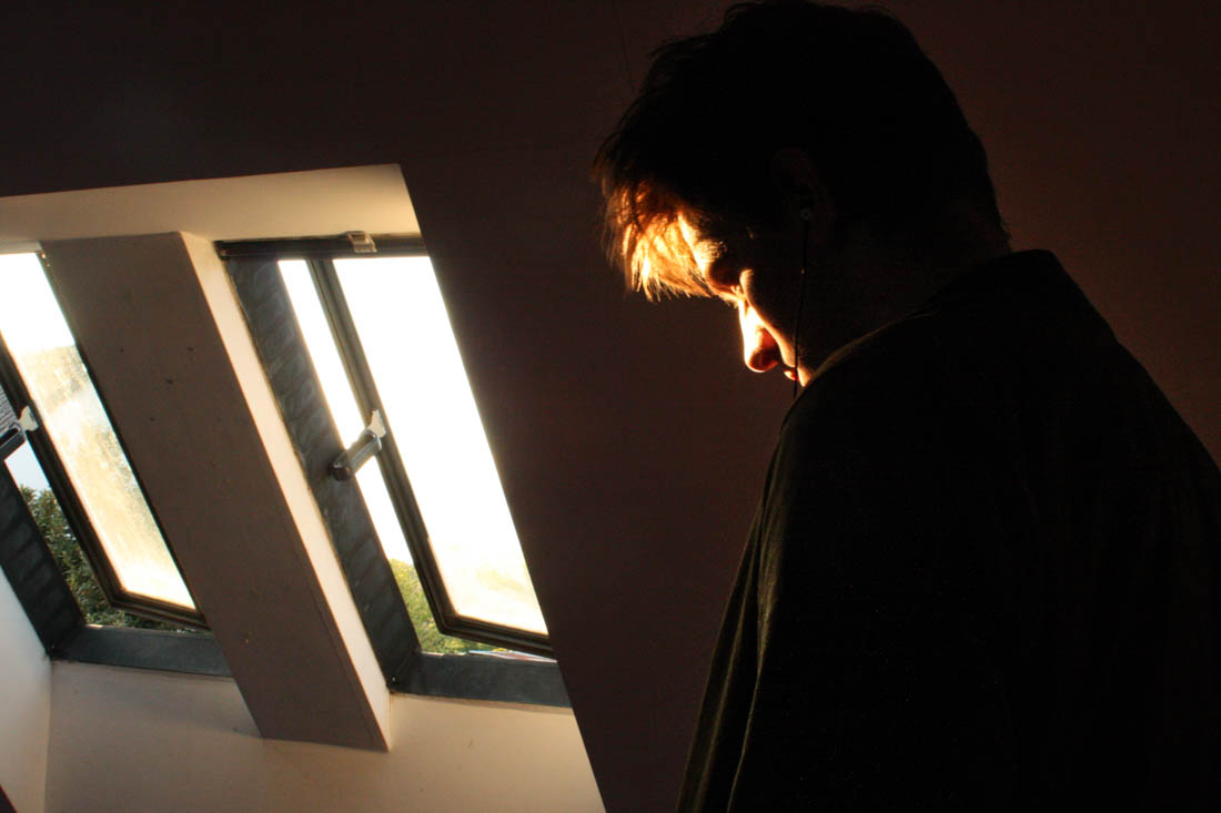
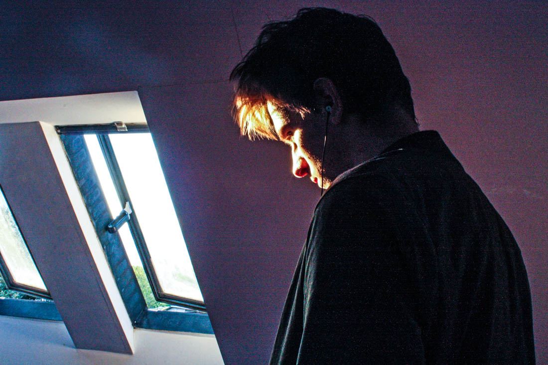
I wanted to capture the light reflecting off Ryan’s face with Ryan facing the window, so each would be opposite each other. In the first photograph I like how the white wardrobe has reflected light into his neck, adding a sense of depth to the image. I set the image to a slower shutter speed for the second above image, creating this ghostly movement effect, I found this photograph worked best in black and white to bring out the tones and shades more. For the third image I used a quick exposure time to capture just the light that hits his face, also evoking a sharper image, the huge amount of black space creates similarities between Henson’s dark chiaroscuro style portraits.
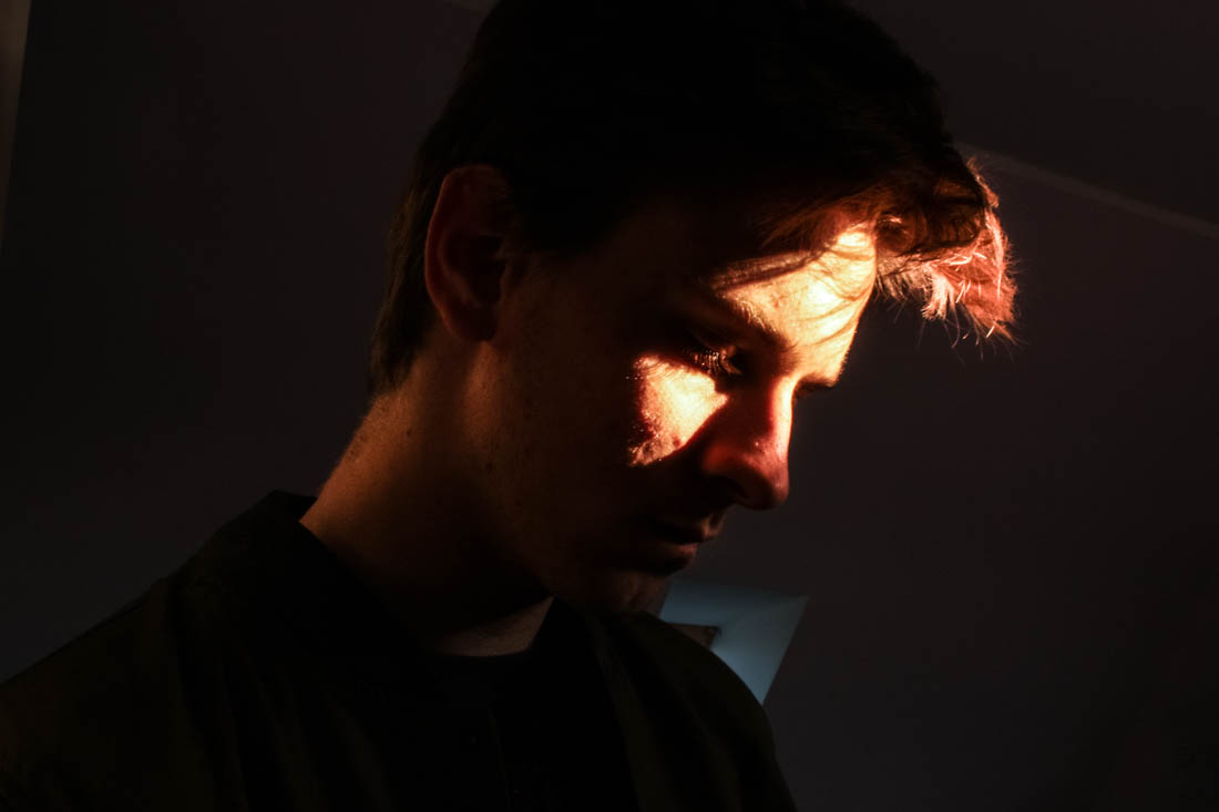
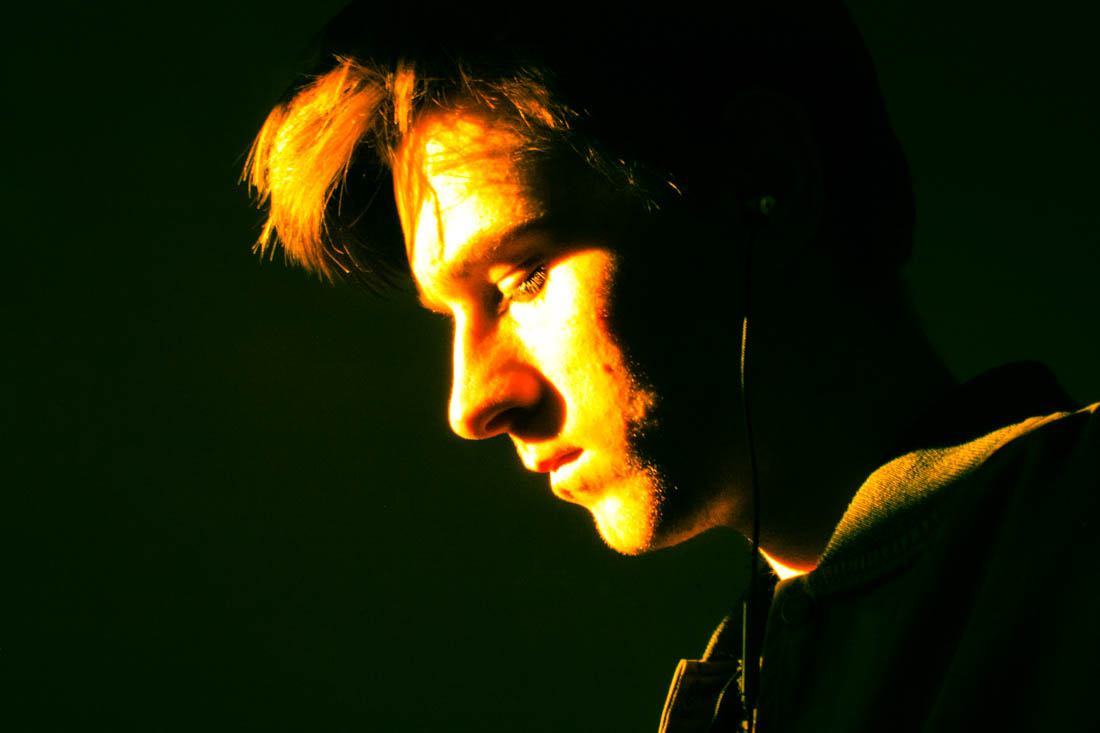
I really like the above image for its use of Rembrandt lighting and how the lighting evokes an interesting glowing texture. I also like the contrast between the warm tones in the highlights and the cool shades in the background such as from the window. I decided to keep the window as I found it added a sense of depth to the image.
I decided to create a closeup portrait featuring only the light from he window and a plain background. I used the preset features to show experimentation, the last two images are two different cross process settings with add an interesting tint to the images inspired by how Bill Henson will often change the image white balance.
Below is an experimentation image inspired by Bill Henson. I added lots of contrast and clarity to give the photograph a grainy texture. I also added vibrancy to bring out the colours as well as changing the white balance to an overly cool tone.
Bernhard and Hilla Becher – Topography inspiration
Before heading out to La Collette’s Energy from Waste facility to be escorted around I fist wanted to gather some inspiration for the kind of photography I am expecting to capture. Since the building is covered in windows I can observe that most of what I will be seeing will be complicated machinery and an extensive series of pipes. This kind of structure, along with my aim to show this facility from an intriguing yet still documentary standpoint, means that my next shoot will be focusing on using topographic photography techniques. Because of this, I have decided to look at the amazing photographers Bernhard and Hilla Bercher for their intriguing examples of capturing the beauty of industrial landscapes…
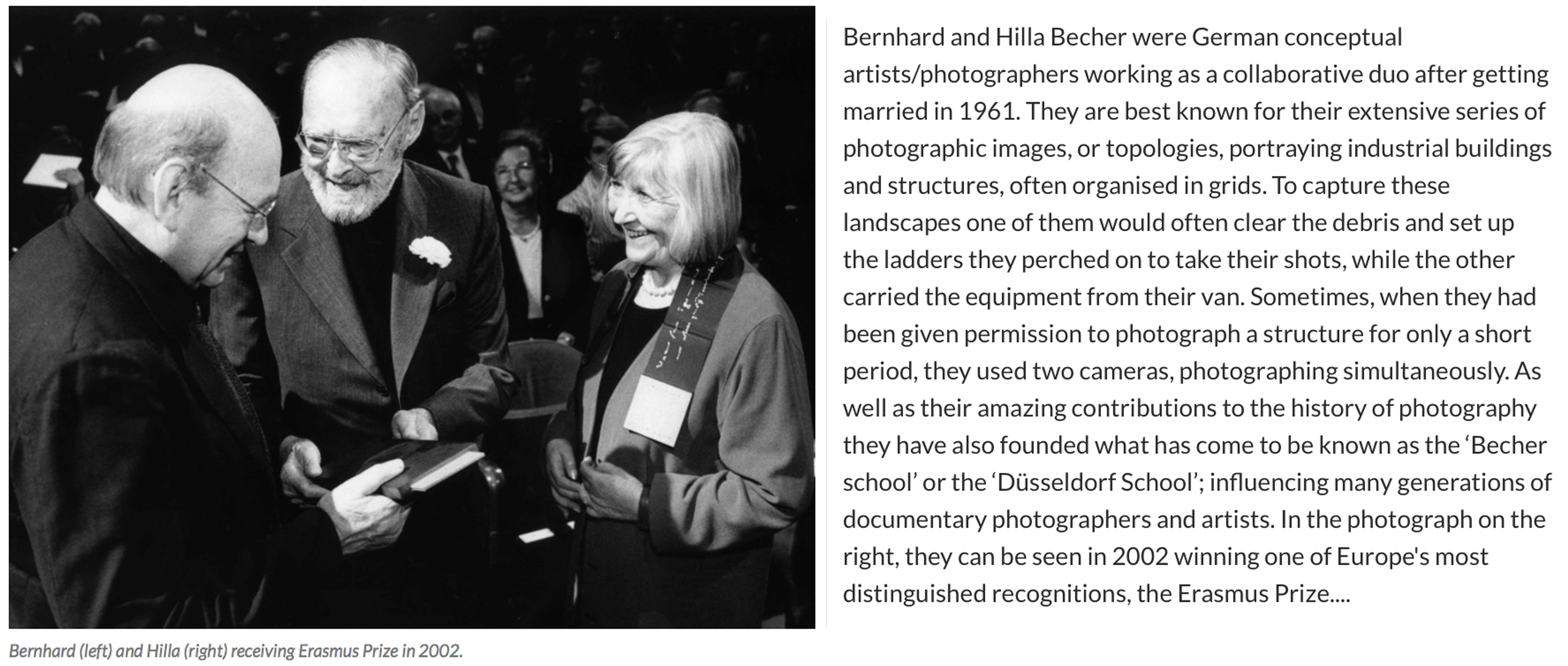 For over 40 years the pair used an 8×10 large-format camera to capture the architecture of industrialisation: water towers, coal bunkers, blast furnaces, gas tanks and factory facades. They did so in an obsessively formalist way that defined their own unique style and made them one of the most dominant influences in contemporary European photography and art. In the early years, with a young son in tow, they travelled across Europe and later the US for weeks at a time in a Volkswagen camper van, cooking and eating by the roadside. When asked in a recent interview why they only photographed industrial structures, Hilla replied: “Because they are honest. They are functional, and they reflect what they do – that is what we liked. A person always is what he or she wants to be, never what he or she is.” For Bernhard, the process of photographing and therefore fixing these brutalist structures forever was rooted in his love of the landscape he grew up in as a child. The huge buildings that dominated and defined his childhood in the Ruhr began to disappear rapidly in Germany’s postwar economic period, and he rightly sensed they would disappear elsewhere – across Europe, Britain and America. I have chosen this amazing couple as an inspiration for my next shoot at the ‘Energy from Waste’ facility because I absolutely love the simple yet fascinating way they have captured these artificial contraptions…
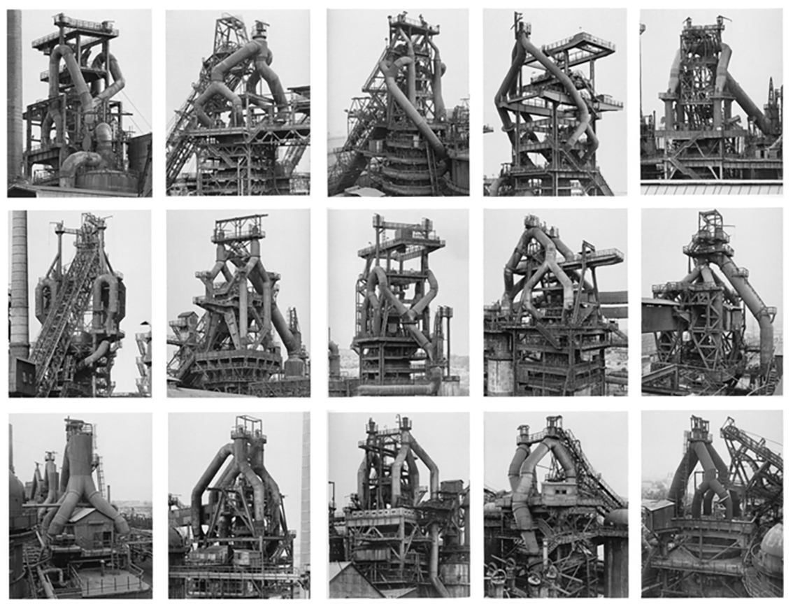 The Bechers were, first and foremost, formalists. “We want to offer the audience a point of view to understand and compare the different structures,” they once said. “Through photography, we try to arrange these shapes and render them comparable. To do so, the objects must be isolated from their context and freed from all association.” Much like the majority of the Becher’s work, this collection above depicts many different blast furnaces in different compositions, all printed in black and white and arranged in grids that emphasised their resemblance – what Hilla once called their “universality”. The meaning behind these images is to create straightforward historical documents of these vanishing industrial structures as well as beautiful topographic images. Although I will not be seeing this type of arrangement when visiting La Collette, I will be taking inspiration from the intricate way they have captured the angles and compositions from in between the pipes and framework.
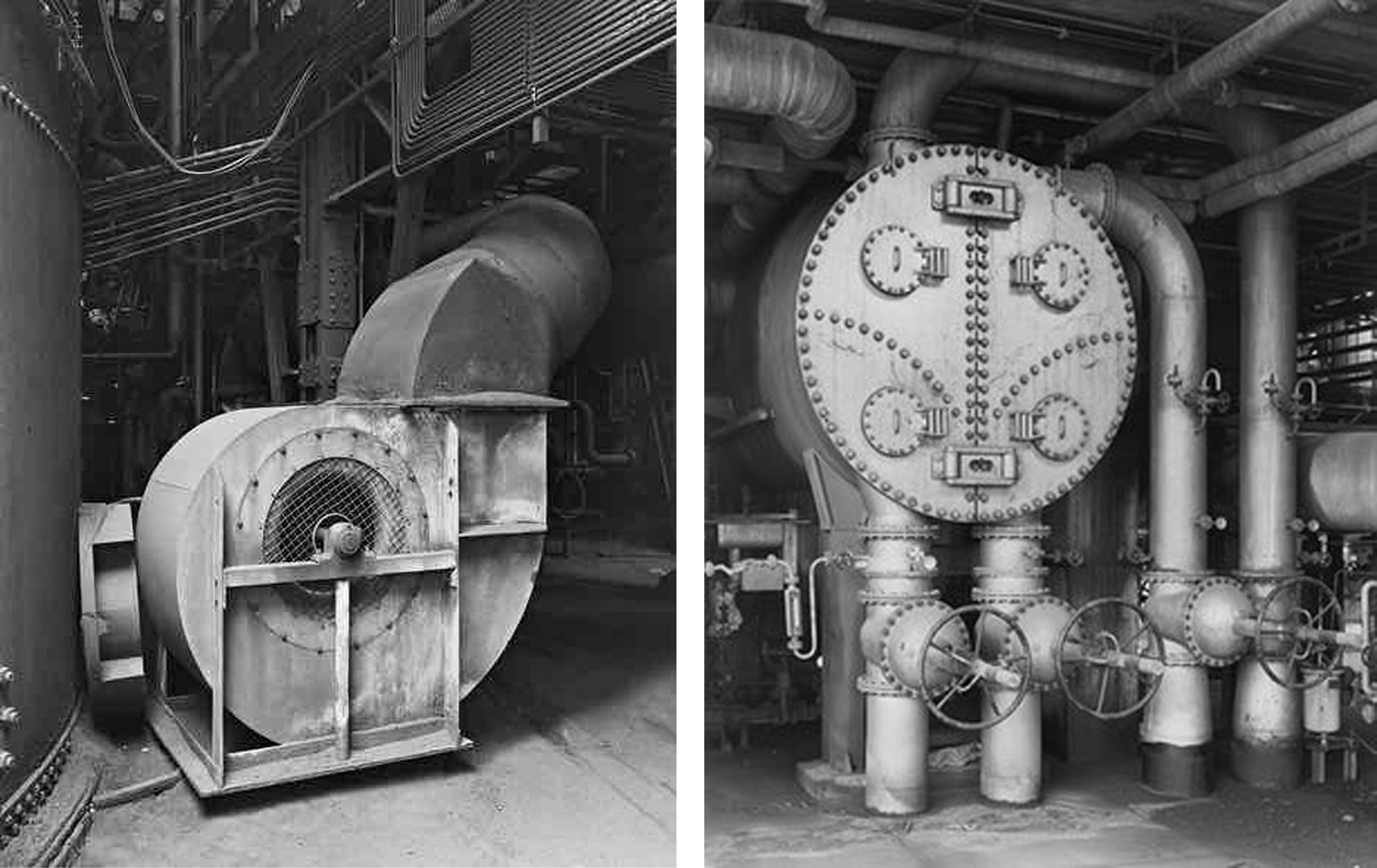
 As well as looking at the Bechers grid style outcomes I will also be taking a lot of inspiration from some of their more simple, close up work. The two photographs on the top row of the contact sheet above show detail captured from a Petrochemical Plant in 1983, Wesseling, Germany. These images depict some of the scenes I expect to find for my next shoot in the ‘Energy from Waste’ facility and I love their dynamic and structural composition. Below them, I have added three more industrial landscapes captured by the famous couple that was originally part of a much larger grid. These images depict old Stonework and Lime Kilns strategically captured against their environments. Alongside her late husband, Hilla saw structures that others might have dismissed as ugly, even threatening, and made them unforgettable.
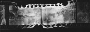
Manipulation of Film Negatives
“Breaking” Film Negatives
Going on from looking at using film I have looked into different ways that you can distort film negatives. By distorting the negatives and rescanning/printing them you can get some incredible results that are completely unpredictable. I have looked at a lot of different ways of distorting and destroying negatives. One source that I looked at first was this article. It talks about many different ways of distorting the images that are stored on a strip of negatives and how they can have different effects. One of the more abstract results that they show are by the artist Phillip Stearns.
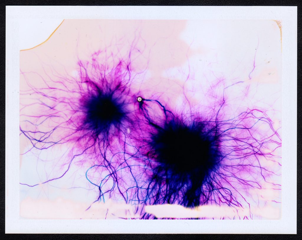
He creates his pieces in an unusual way that even different to the other artists that manipulate film. Instead of taking images on the film (Fujifilm FP-100C Color Instant Film) and then messing with the negatives, or messing with the film and then taking the images, he simply messes around with the film and then those negatives are the final pieces.
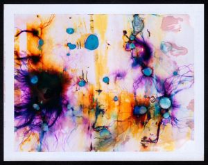
The video above shows him using some of his techniques. He uses many, many different ways to edit the negatives, including different chemicals, high voltage electricity and even common house salt but in the video we only see him using 15,000 volt electricity and comoun bleach. He never knows what the images will look like until he opens the negatives and sees the final result, this sense of the unknown and anticipation is what I want to achieve with my project, due to these both being properties of water. Stearns talks about why he has chosen this as a project that he pursued on his blog here. He says that
“I was struck by the similarities between the layering of materials in the film and the layering of cells in the [retina]… the similarities were striking.”
He goes on to talk about how the camera is the extension of the eye and looking more into the links between the images that he is creating and the different things that are going on in the human eye. Stearns mentions that with digital photography there has been a loss of connection between the eye and photography and so he is almost creating these images that bring back that link between the eye and photography. To link further to this he says:
“I find it curious and exhilarating that the impressions left behind after developing these extreme exposures so perfectly resemble networks of blood vessels in the retina.”
The two images above demonstrate this visual relationship between his creations and the physiological structure of the retina. They both have these large spots of darkness, in the retina these are the optical nerves or the Fovea centralis, and in the artwork they are the epicenter from where the electrical current touches down on the film. The “veins” that come out from here also look very similar to each other and really lend to this connection between the eye and his artwork.
A similar idea but more connected with my project is “Fox River Derivatives” by Peter Hoffman. In this series of photographs Hoffman traveled along Fox River in Illinois with a medium format camera taking images of the river and it’s immediate surroundings, he then takes the negatives from this and sprays them with gasoline before throwing a match into the pile of images and gasoline and dousing them with water before they are completely destroyed. He talks about his motivation for the project being that
“our consumption habits—specifically dealing with precious natural resources—are out of control and unsustainable.”
He talks about how the next generation will not get to see what we get to see and so to highlight this he did not just want to make photographs of the river, he wanted to have an element of destructive chance being applied to his images.
“I wanted to transfer that feeling I had, which was maybe something like a sense of powerlessness or dread, to the image making process. I wanted to lose control, having the resulting work border on ceasing to exist in any recognizable form.”
The surreal bubbly effects, often obscuring other parts of the image show the rapidly disappearing natural landscapes that are almost hiding behind the destruction. By using gasoline he is using one of these natural resources that we are using up and exhausting to destroy the natural landscapes he is showing the volatility of the environment, and the randomness with which it is disappearing.
But out of all of the different examples of what other artists have done this kind of film manipulation the one that I connect with the most is the work of Matthew Brandt. He has made lots of different bodies of work and there are several of them that are relevant to my project. The first is titled “Waterbodies,” in this series he takes a number of images of different bodies of water, often oceans, and collects water from them. He then uses that water as part of the development process to create the final images.
He has not produced many images via this process but it is very interesting to see what the images have turned out like. This concept of using parts of the environment to create these images is a very interesting idea to me and even though they are not the most visually impressive the concept behind their production is really fun and suited well to my project. I looked for the conceptual reasoning for why Brandit did this particular project but could not come up with anything in particular. My interpretation of it though is that to create something then you need inspiration and resources. He already had the inspiration for these images but for the resources he decided not to use the standard salted water for the development process, instead allowing the environment to leave even more of its mark on the images. A truly personalised image that is perfectly customised for the environment.
While he was taking the exposures of this project he came across the idea to do another project, Lakes and Reservoirs. This body of work does not involve using the water to create the images, instead it involves using the water from the environment to destroy the images. Finding out the reasoning behind this project was not what I expected ether and may explain the lack of information about the previous project. In an interview with Brandit for Dazed Magazine the article states that:
“The creative process of his latest series shows that he clearly understands the art in photography, although Brandt himself insists it is merely a representation of what he sees in front of him.”
Later on he talks about the hiking and climbing that he needed to do to be able to take the images that he used. and how even though the images were being taken to be destroyed he still spent the time to get into good position and to properly compose the images.
“For these ‘shots’, I was looking for the most calendaresque view I could find. A view and composition that was the most encompassing to visually represent that lake and/or reservoir… to me, I enjoy the perversity in subverting all this photographic labor by later degrading it with the lake water.”
This is definitely something that I am going to look into for my project. There are a lot of different water sources around Jersey and it would be interesting to see the difference in effect that this could have on the images. I will be updating about my process of altering the negatives in another blog post.
More links to pages that I found interesting:
Shoot 4 – Pisa
My next shoot, was located in Pisa, Italy. Pisa is a city in Tuscany, Central Italy, straddling the Arno river. Although Pisa is known worldwide for its leaning tower, the city of over 90,834 residents contains more than 20 other historic churches, several medieval palaces and various bridges across the Arno. Pisa is a very popular tourist attraction, but I was excited to see the site for myself and compare how the location conflicted with my expectations. The leaning tower is constantly talked about and remains as one the most special architectural wonders in the world. I had an expectation that perhaps the tilt was exaggerated or enhanced in photographs and was consequently keen to investigate with the naked eye. Below is a contact sheet that presents all the photographs taken on the shoot.
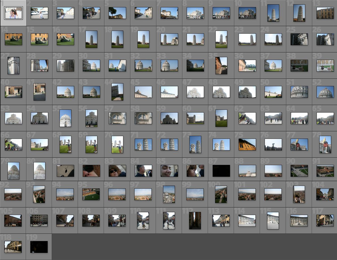
Pisa was a very small town and I was surprised by its casual and mundane appearance. Besides the Tower and main cathedral, the town is largely narrow and regular streets equipped with shops and houses. Nevertheless, in summary I really liked the town. It felt cosy and clean but filled with history and culture. There were almost no modern or out of place buildings, securing a consistent Tuscan, countryside atmosphere.
— Its important to note that these images have been selectedwith the intention to develop with illustrations. They are not individually the best photographs from the shoot, but provide the best opportunities for overlaid drawings. —
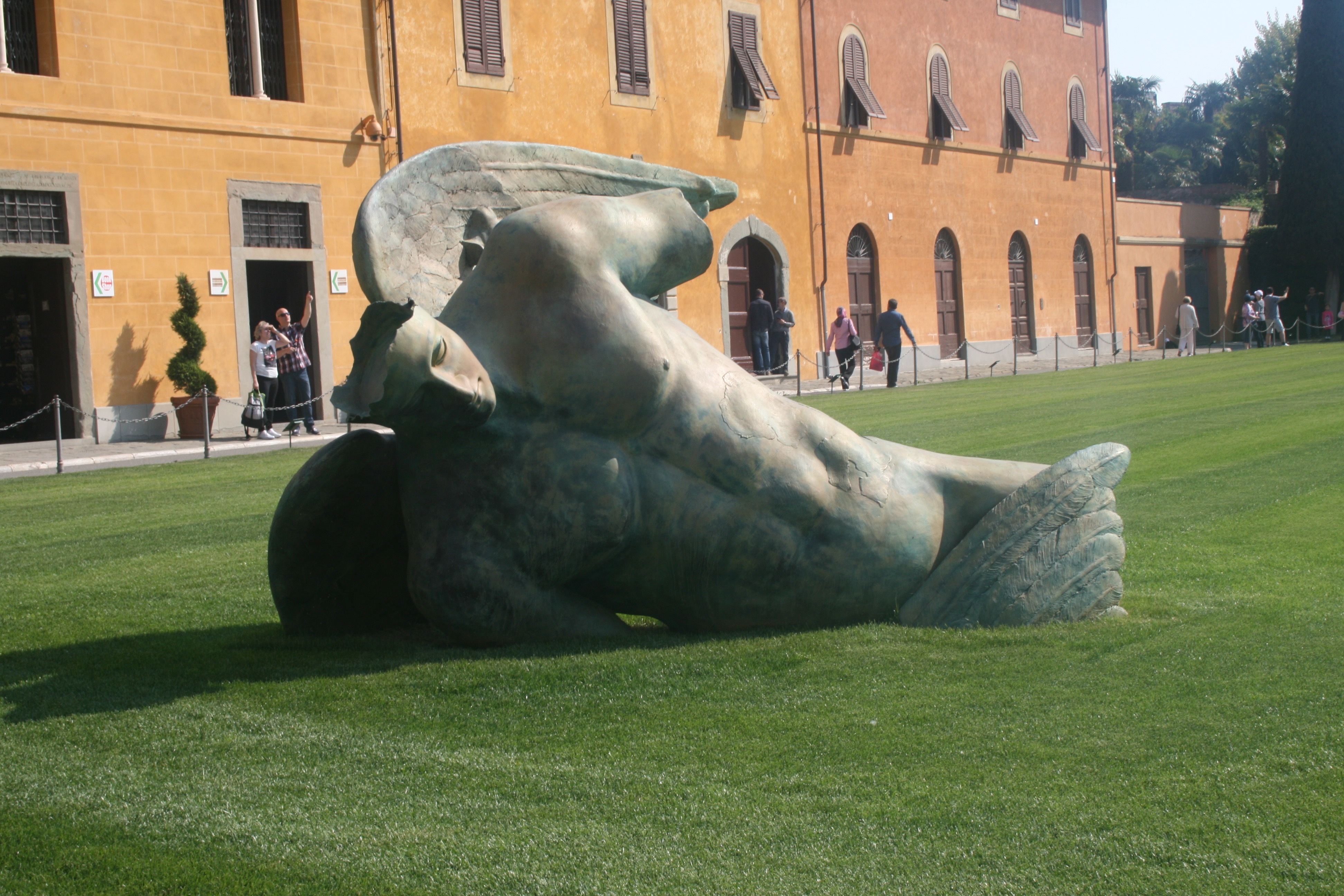
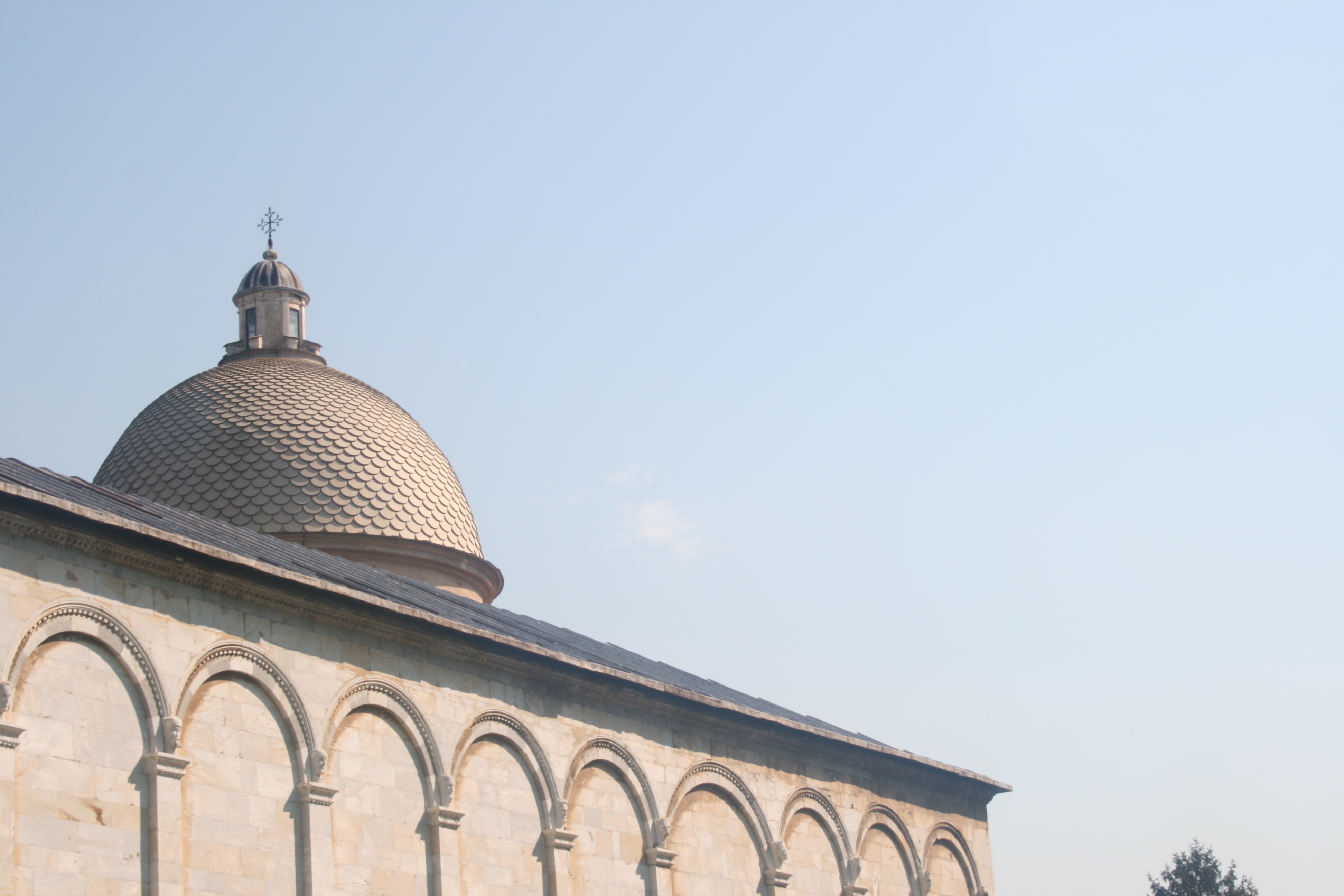
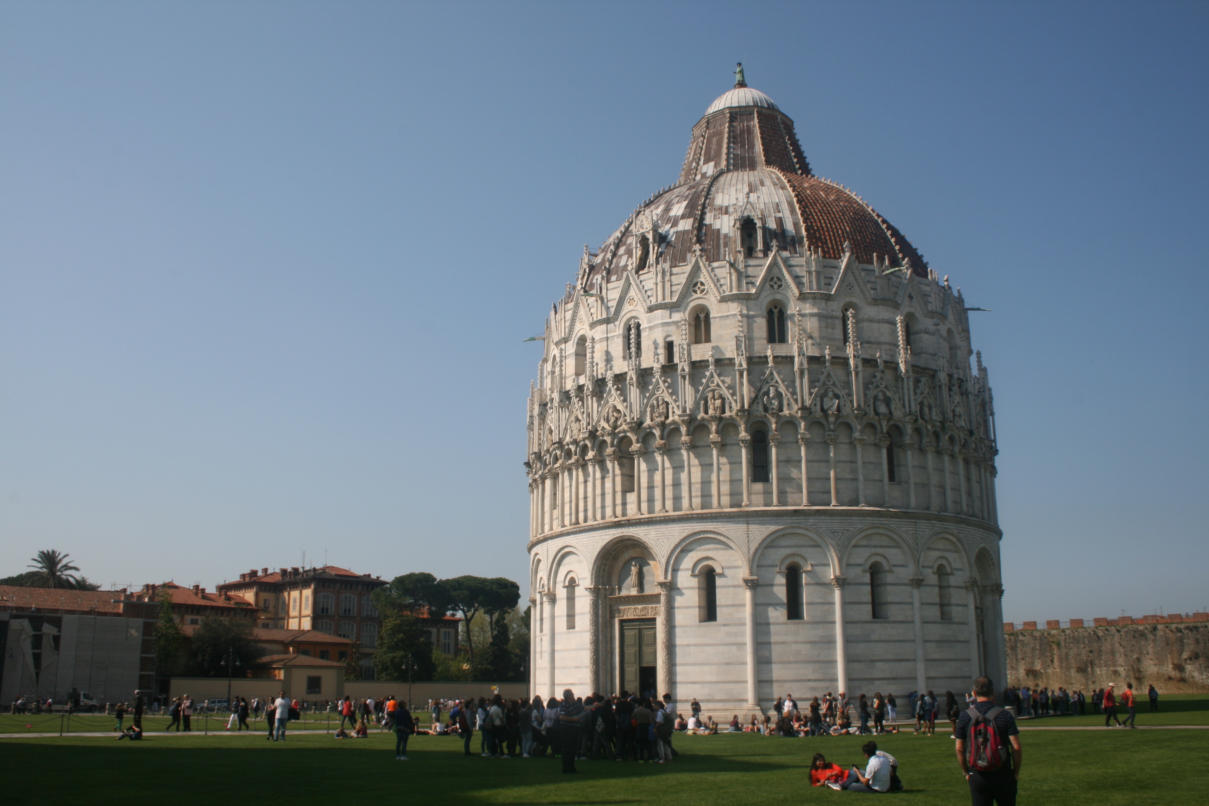
In these three photographs I have tried to capture the attractions and sites surrounding the notorious leaning tower. All these sites are located within The Square or Miracles. The Pisa tower is one of the four buildings that make up the cathedral complex in Pisa, Italy, called Campo dei Miracoli, which means Square of Miracles. The square is not located in the center of the city as you might imagine but to the north-west of the fortified wall, almost out of the town. The square is surrounded by a beautiful green lawn where tourists and university students can lie down and relax in this setting. The square is recognized as an important center of European medieval art and one of the finest architectural complexes in the world. In the first photo I have captured a statue lying beside the leaning tower. This is a fallen angel, created by the Polish artist Igor Mitoraj. Though the statue is part of a temporary exhibit, it demonstrates the square’s abilities to showpiece art work from contemporary artists across the world. The reason I have selected this image is because I believe it will be perfect for illustration and drawing. Due to the fact that the fallen angels limbs and other body components are missing, I am provided with the opportunity to implement new ones. I can draw my own arms or perhaps implement some religious imagery throughout the background. In the second photo, I have captured a tiled dome peaking over the top of the square walls. I discovered that this dome is situated within the square graveyard, otherwise known as the Camposanto. The graveyard is an ancient monumental cemetery set on the north side of the Square of Miracles. Begun in 1277 by the architect Giovanni de Simone, it is a rectangular structure with an inner cloister with Gothic arcades. As ancient tradition would have it, the graveyard was built on dirt carried back from the Holy Land, in particular from the place where Jesus was crucified. Within the cloister you’ll find many sarcophaguses and Roman graves, used exclusively for the burial of prestigious men, while beneath the floor are graves of the nobles of Pisa. I really like this photo, and I think its simplicity works to an advantage. Nevertheless, I do think the exposure could be reduced a little in the editing stage and this will be executed if I decide to utilise this image in further stages of the project. The photo has a very minimalistic aesthetic as the clean and crisp sky dominates the composition. This will be ideal as it provides a blank canvas for me to illustrate upon. I really like the way that the graveyard dome is only just peaking over the square walls. Its almost a reminder that death is always a part of life and that it cannot be ignored nor forgotten. Despite the beauty and life symbolised through the inner square, death lingers within the background, watching.
In the final photo of the set, I have captured The Baptistery of St. John. Construction started in 1152 to replace an older baptistery, and when it was completed in 1363, it became the second building, in chronological order, in the Square of Miracles. The building is the largest baptistery in Italy and an example of the transition from the Romanesque style to the Gothic style. The lower section is in the Romanesque style, with rounded arches, while the upper sections are in the Gothic style, with pointed arches. The Baptistery is constructed of marble, as is common in Italian architecture. As it shares the same unstable ground as the tower, the baptistery also has a slight lean of 0.6 degrees towards the cathedral. I found this baptistery really beautiful and am happy with the photo I have taken of it. There is an attractive sense of light and dark as we the find details of the architecture pop into the foreground. I really like how the light source is coming from the left side and it consequently casts one side of the baptistery in light and the other in darkness. The sky works in cooperation with the image here as an absence of clouds and colourful blue tone makes the building more prominent within the landscape.
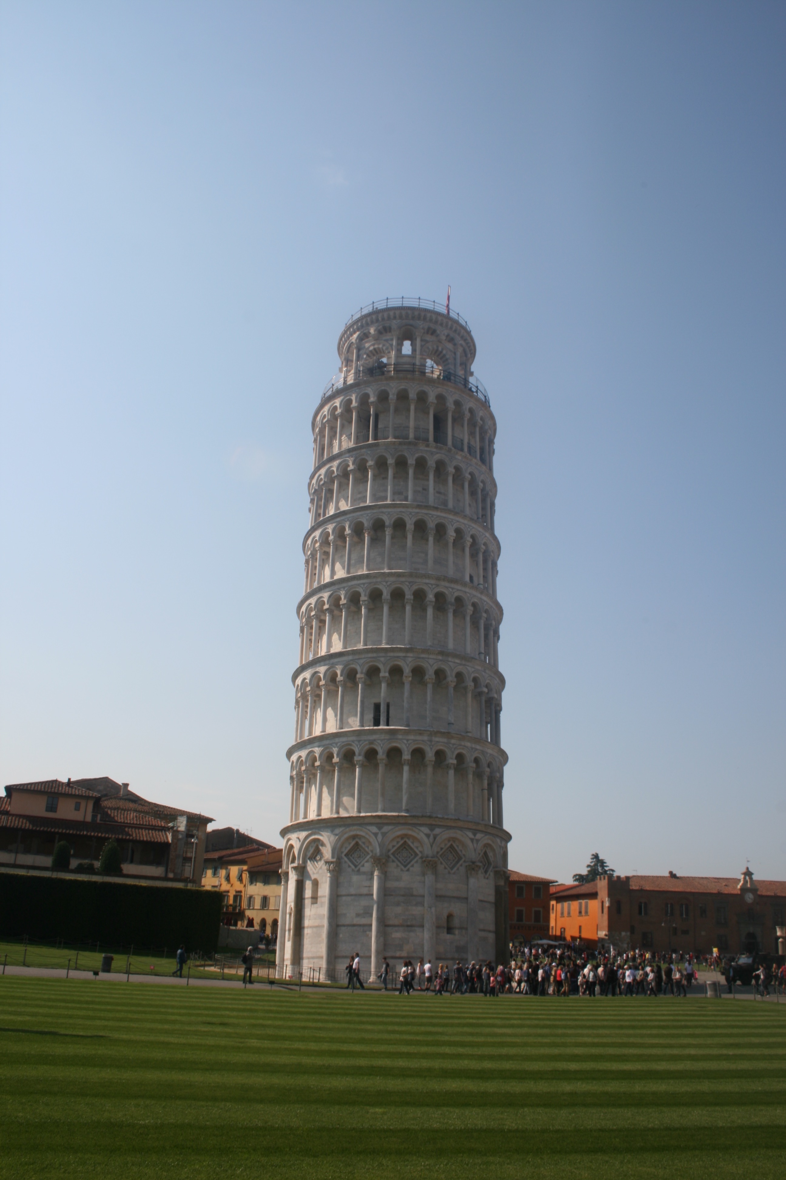
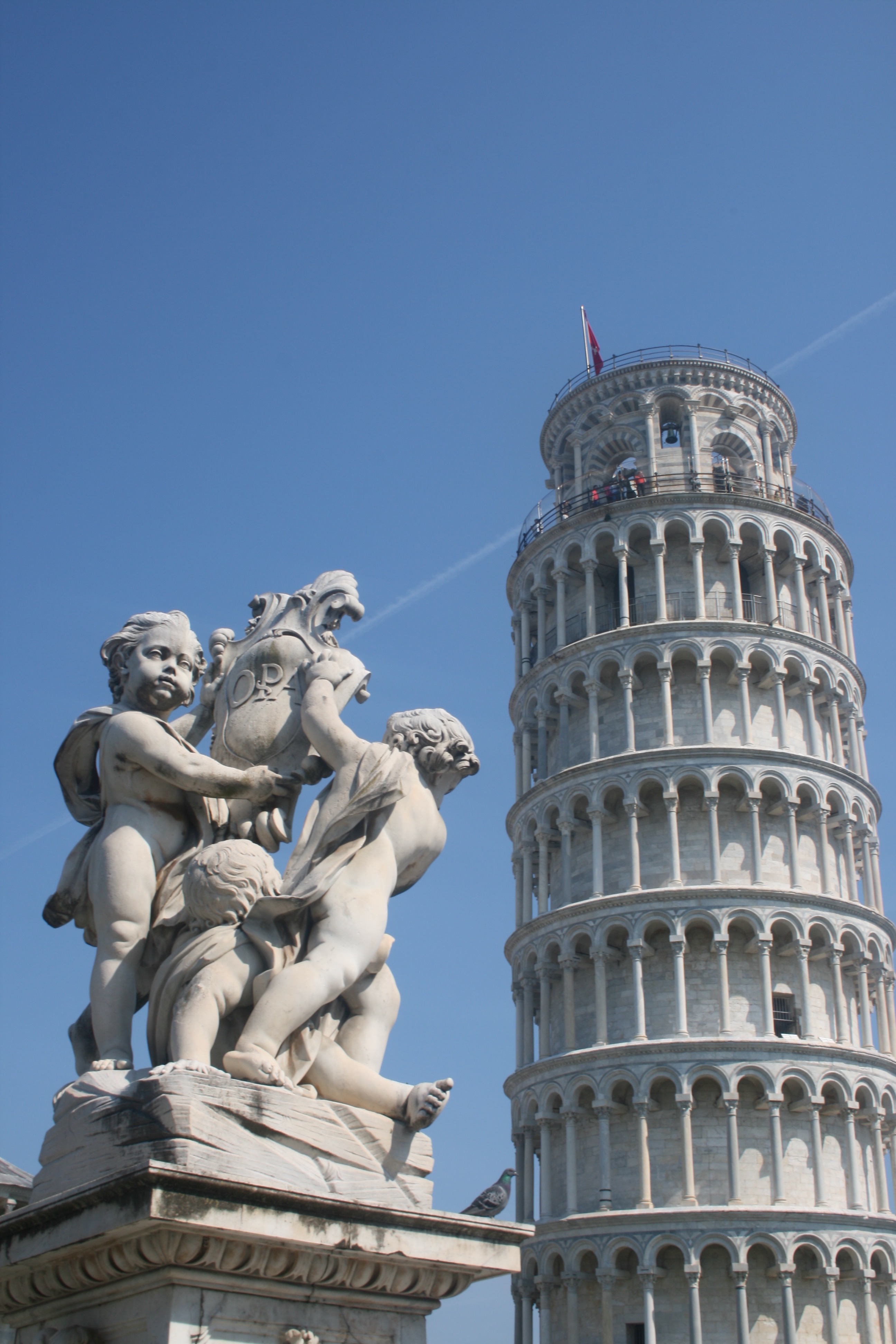
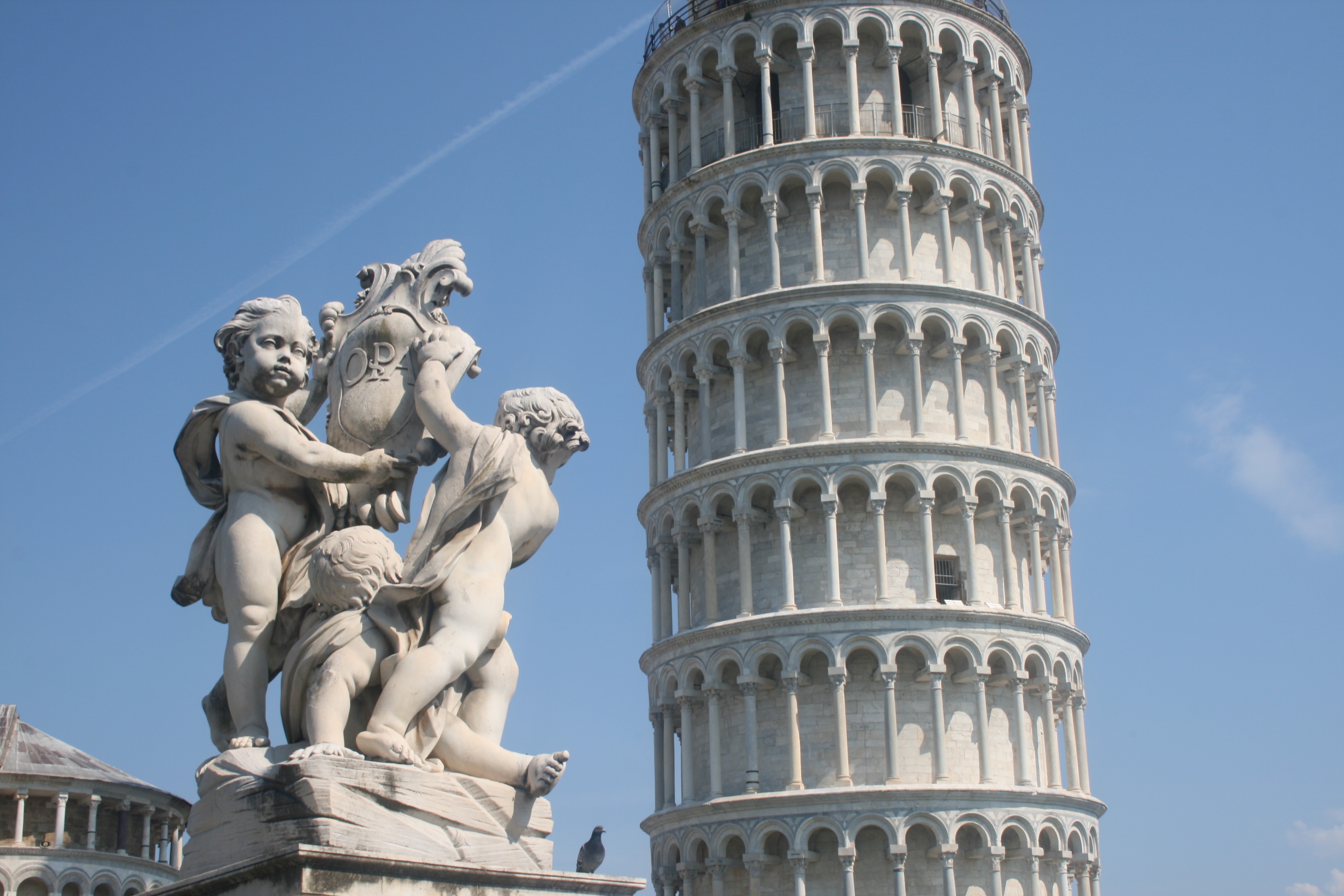
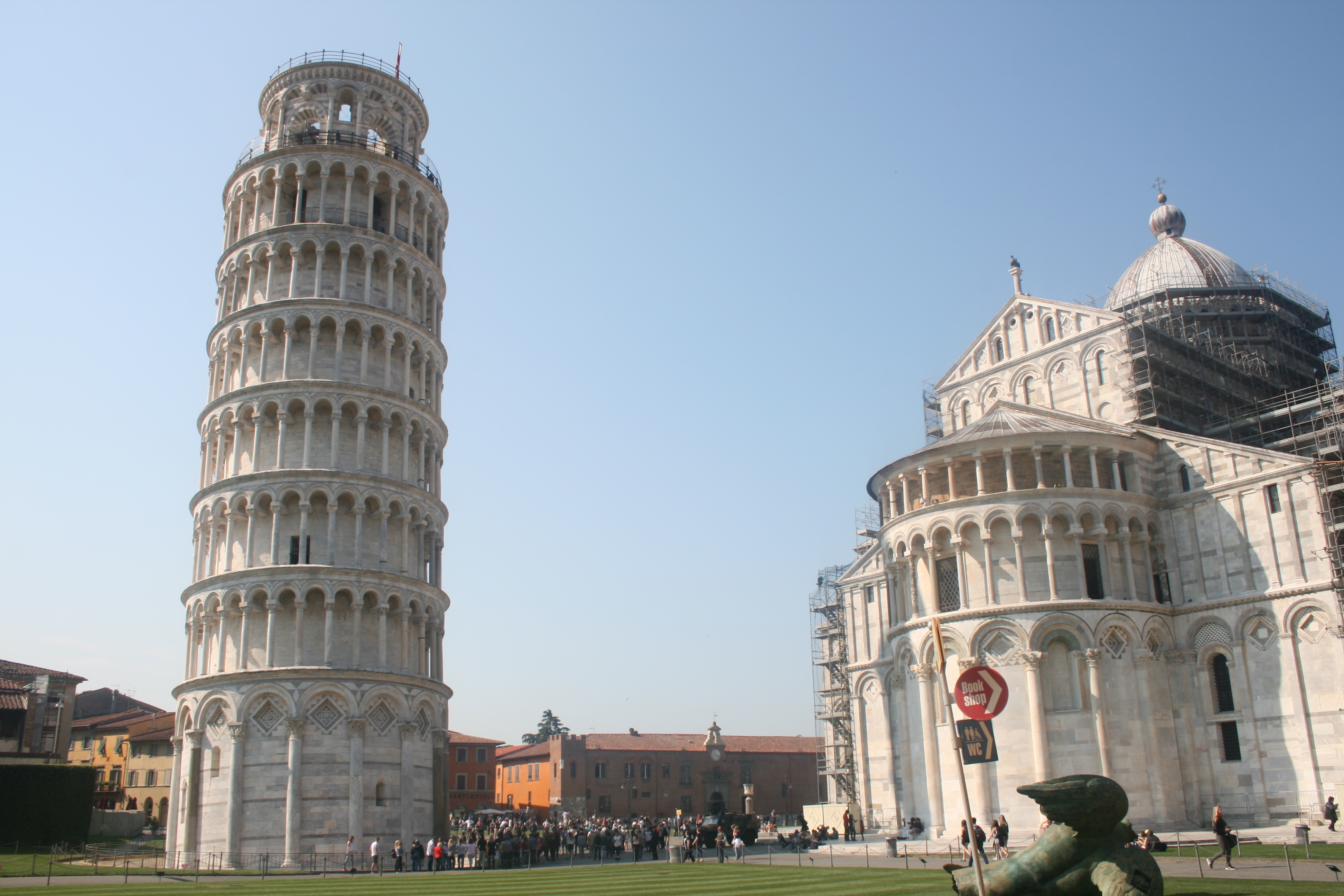
Next, we have the images that focus primarily and almost entirely on the famous Leaning Tower. Tower of Pisa is more accurately referred to simply as the bell tower, or campanile. The Leaning Tower of Pisa is the piazza’s crowning glory. Although only a third as high as the Washington Monument, it was a miracle of medieval engineering, probably the tallest bell towers in Europe. With the spiralling exterior columns ranged around eight stories, I found that the tower of Pisa looks like a massive wedding cake. The construction of Tower of Pisa began in August 1173 and continued for about 200 years due to the onset of a series of wars.The top of the leaning tower of Pisa is about 17 feet off the vertical and the tower is also slightly curved from the attempts by various architects to keep it from leaning more or falling over.Many ideas have been suggested to straighten the Tower of Pisa, including taking it apart stone by stone and rebuilding it at a different location. In the 1920s the foundations of the tower were injected with cement grouting that has stabilized the tower to some extent. In the first image, I have tried to capture the tower individually. Although the horizon line needs to be straightened, I like the image and think it would be suitable for illustration. The tower holds a cylindrical shape that exists frequently in everyday life and ordinary objects. This will make it easy to transform the tower into something mundane. The next two photos share a nice sense of depth and perspective. There is a clear perception of dimension with immerses the viewer. Both photos are essentially the same, except one is landscape in orientation and the other is portrait. The benefit of the portrait is that we can get a complete spectacle of the tower, allowing us to see its peak. As a result, I prefer this version of the image. In addition to this, there is also a small pigeon sat upon the statue that is more identifiable within the first photo. In the final photograph, I have tried to capture both the Tower and the Cathedral. Pisa Cathedral is a medieval Roman Catholic cathedral dedicated to the Assumption of the Virgin Mary, in the Square of Miracles in Pisa. It is a notable example of Romanesque architecture. Construction on the cathedral began in 1063 by the architect Buscheto, and expenses were paid using the spoils received fighting against the Muslims in Sicily in 1063. The church was erected outside Pisa’s high middle age-era walls, to show that Pisa that was so powerful, it had no fear of being attacked. I like this photo and feel like it a complete overview of the square and what to expect from Pisa. The marble of both buildings beautifully reflects the natural sunlight rendering both sites as bright and powerful in lighting.
Shoot 2 – Pompeii
For my second day travelling, I visited Pompeii, an ancient-roman city near modern day Naples. Pompeii, along with Herculaneum and many villas in the surrounding area, was mostly destroyed and buried under volcanic ash in the eruption of Mount Vesuvius in 79 AD. Pompeii is one of the most significant proofs of Roman civilisation and, like a book, provides outstanding information on the art, customs, trades and everyday life of the past. The city has remained intact until the present day, not only as far as its buildings are concerned, but also as regards the contents inside the houses and shops, providing a fascinating picture of daily life.
This was a fantastic location to visit, and provided me with lots of photographic opportunities that I did not expect. I was extremely surprised by the scale of the ancient city, as I had previously believed that it was just a couple dozen ruins and small houses. Nevertheless, I was blown away by the site, confronted by intact theatres, roads, mansions and shops. This truly enables you to visualise what this city would have looked and functioned like before the disaster. The sky was clear and the sun was high in the sky, generating some beautiful shadows across the town that made excellent photograph opportunities. The goal on this shoot was to capture interesting backdrops and environments for my digital illustrations. This would involve trying to take pictures with basic compositions that are not too crowded nor hectic. Its incredibly important that the lines and marks i overlay upon these images stand out to the audience, and they must therefore not clash with the details of the photograph. In addition to this, I focused a lot on shadows and lighting. Some excellent silhouettes were being casted from the peculiar and rustic shapes of the ruins, and this is something special that I wanted to draw attention to. I believe this is evident through the images seen within the contact sheet below, which presents the photographs taken on the shoot.
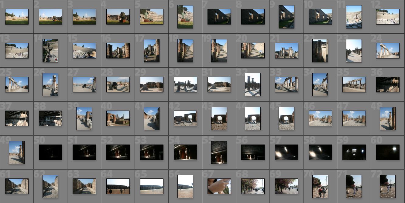
Next, I will be going through a few of the best images from this shoot. These are photographs that are essentially on the shortlist for the next stage in the process, which is the drawing part. Its worth noting that these photographs are not edited and therefore do not meet their complete visual potential. I have not done this yet, as the editing should be dependant upon the nature of the overlaid artwork. I will complete this part during the illustration part.
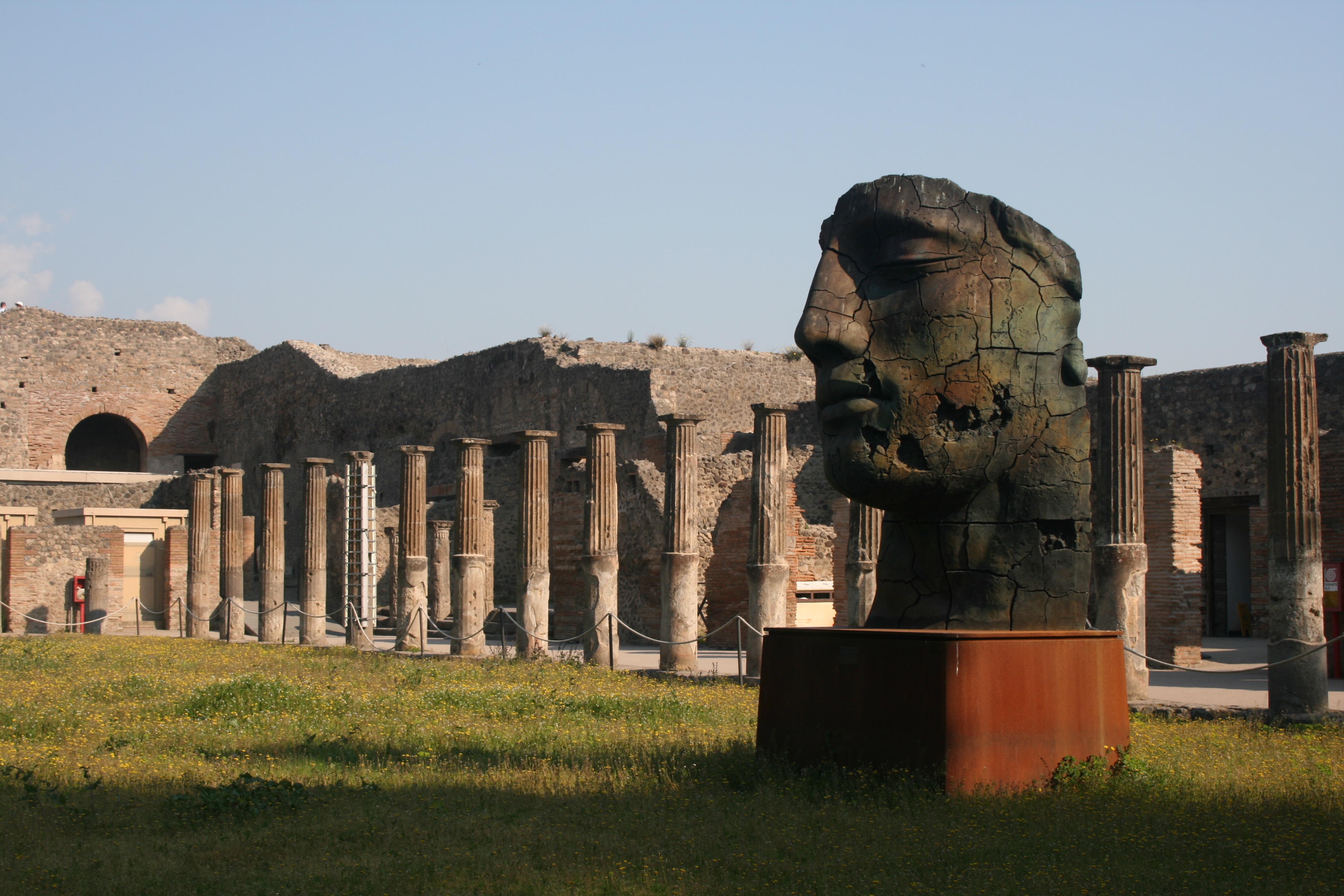
This photograph was taken within the Quadriportico dei Teatri, also known as the Barracks of the Gladiators. This part of the city was initially used for the audience to stroll and converse during intervals between acts and later as a barracks for gladiators. The portico of the Theater was built in the early first century BC, as a recreational area or shelter from the rain for the spectators within the Great and small theatres. Nevertheless, after an Earthquake, it was completely renovated and expanded, changing its function into a school for gladiators. I like the shot I have taken here as there is an appealing palette of colours and interesting lighting composition. The photograph features a warm set of colours, the greens and oranges of the field and blue of the sky creating a summery, positive atmosphere. The large head statue within the foreground, incorporates some interesting textures, as generating from the rusty, cracked metal. I like how we only see one side of the statues face as this produces a sense of mystery and intrigue. In addition to this, some vivid shadows are being casted from the sunlight as we see one surface of the ruin in the background masked in darkness. Nevertheless, a contrast is made as the highlight of the sky and pillars work nicely in juxtaposition with the shadows. These pillars are a pivotal component of the photograph working extremely effectively to generate a sense of perspective. The pillars start in the foreground and as they follow the natural flow of the courtyard they lead the eye of the viewer towards to the background. Instinctively, our eyes follow the positioning of the pillars and directing us towards the arch in the background and eventually the sky. This would be a perfect place to include an illustration.
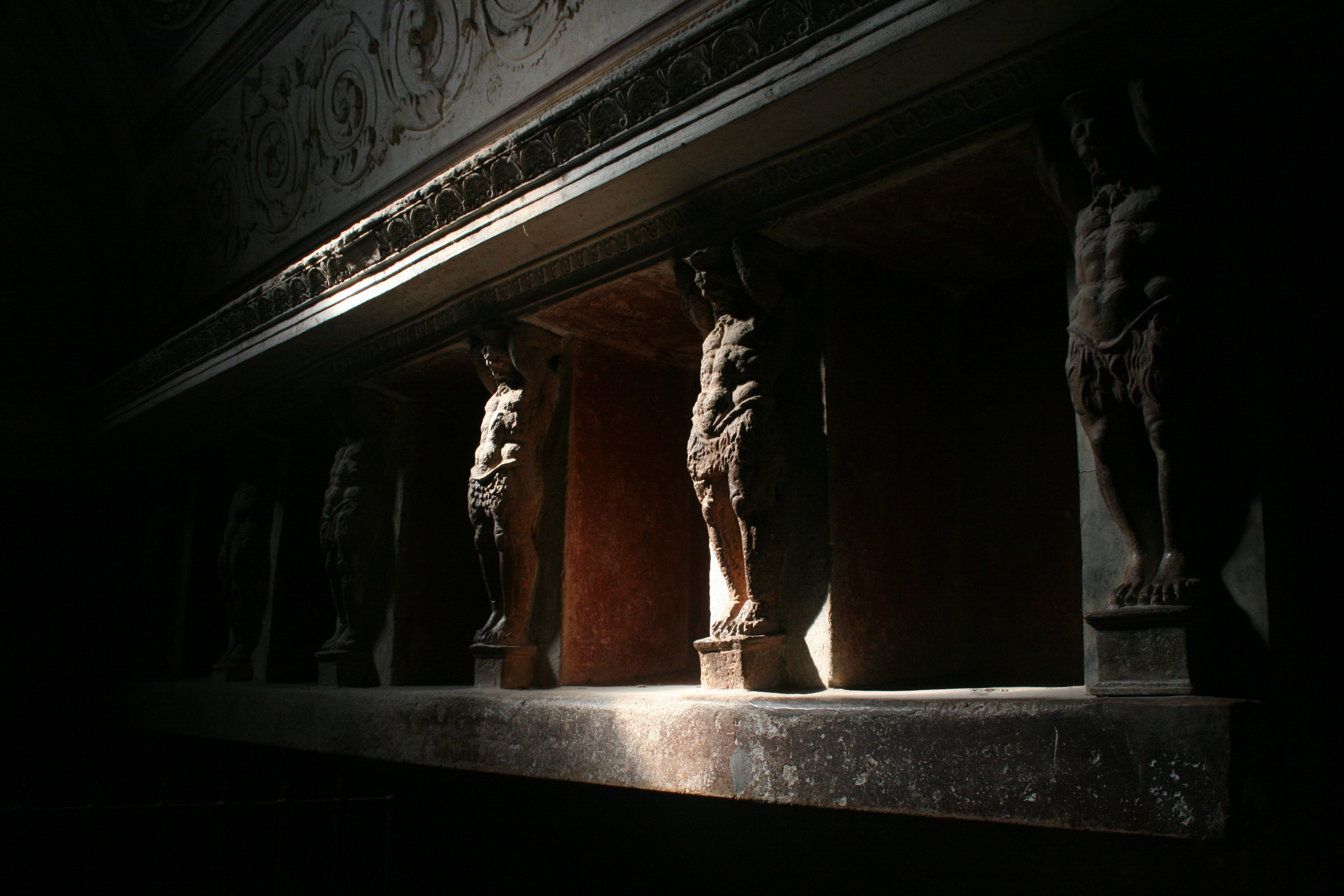
In this photograph, I have tried to capture some of the wall art within the Forum Baths. There were two separate bathing areas, one for men and one for women and there were two separate entrances. After the earthquake in 62 AD, the baths were restored and were being used again when Mount Vesuvius erupted in 79 AD. This picture shows the tepidarium or warm room of the Forum baths. The warm room was heated with hot air provided by a brazier which is at the back of the room. The walls are covered with a series of alcoves which would have been used for storing oils and other bathing accessories. These alcoves are decorated with terracotta giants holding up the architrave. You can see these sculpted figures within the photograph, lining the walls of the room. The focal point of this image is the lighting, which is dynamic and atmospheric. The room is casted in darkness, but a small leak of light that shines from the ceiling illuminates this segment of the wall, revealing the Terracotta figures. This ray of light glows upon the surface of the sculptures, highlighting the intricacies in texture as we see the powerful, carved torsos of the giants. There is an intense and compelling contrast created from this as the golden highlights clash violently with the surrounding blacks. It almost produces a heightened sense of scale as these tiny wall sculptures look like gigantic, powerful men. The fact that a lot of the content of image is shrouded in darkness, constructs a sense of mystery and fear. We see the strong muscular figures fade into the darkness as the escape the vision of the audience and camera. We are left wondering how many more live within the shadows. I really like this photograph and although it may be quite difficult, I would love to try and impose some form of illustration upon it.
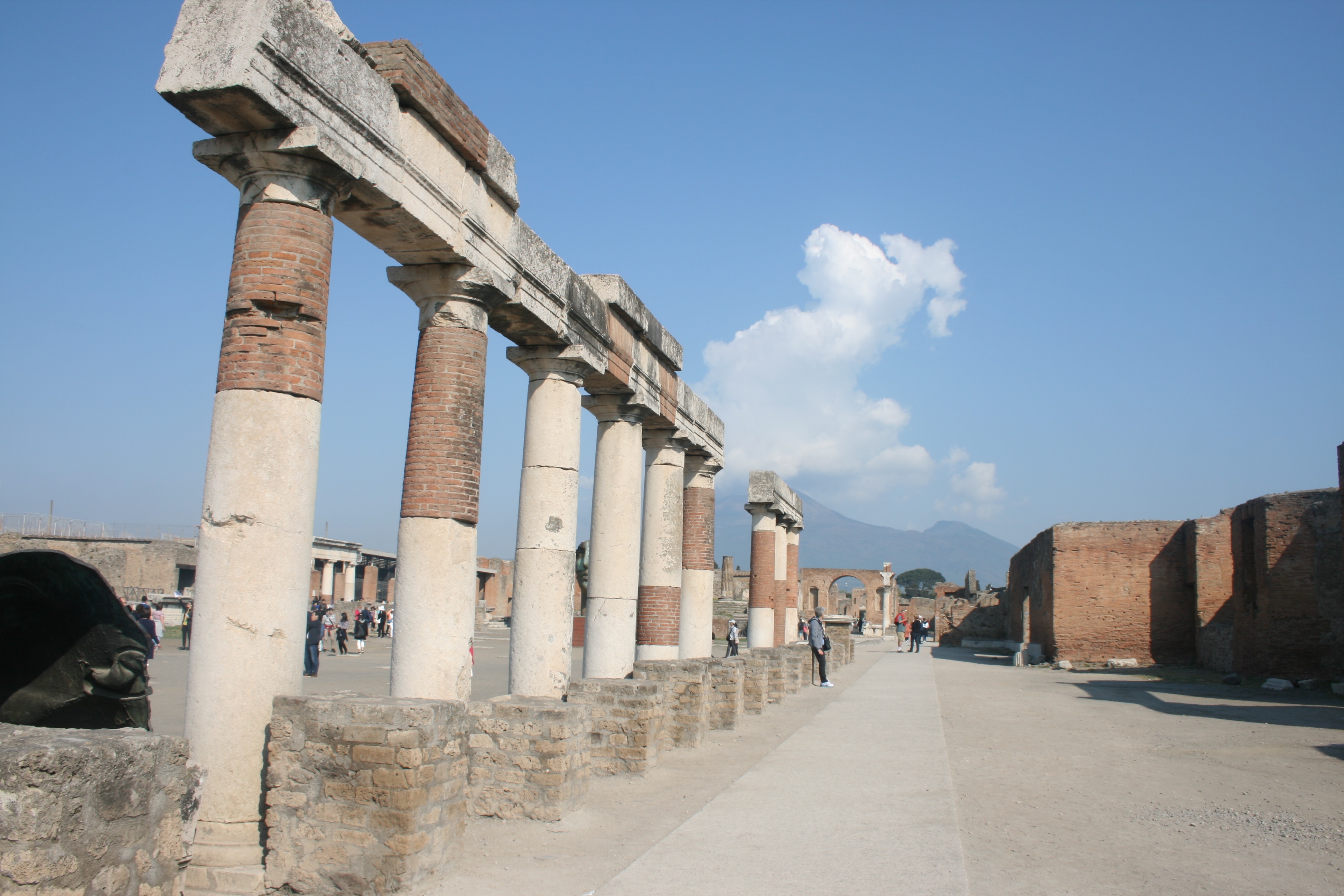
This final photograph is quite basic, but I do really like it. It is very successful in providing a response to my primary intentions, which was to capture simple and minimal environments to draw on. This part of the city is called the Forum. A huge grassy rectangle flanked by limestone columns, the Forum was ancient Pompeii’s main piazza, as well as the site of gladiatoral battles before the Anfiteatro was constructed. The buildings surrounding the forum are testament to its role as the city’s hub of civic, commercial, political and religious activity. One thing I really like about this photograph is that you can see Mount Vesuvius in the background. This was of course the volcano that erupted and destroyed the ancient city. The large cloud that is present within the photograph almost makes it look as if the volcano is erupting as it is positioned directly above the volcano peak. This creates a really though-provoking background. In the foreground we again see a clever use of pillars, as these columns lead our eye throughout the composition of the image. There is a lot of empty space for me to work with here, which is why I its a perfect photograph for my idea.


