Category Archives: Analysis

Filters

Author:
Category:

Final Results: Photo-book – Layout & First Design

After arranging how I want to present my final prints and deciding which photographs are the most important for the message of my project, I am ready to begin working on the layout of my photo-book. To start with, I have decided to have my book as a standard portrait size of 20cm by 25cm. This is because, as with my last photo-book, I have multiple portrait images that will fit nicely on a single full-page, as well as quite a few landscape shots that will work beautifully as double page spreads. For this ‘environment’ project, we were informed that our final results must be presented in a thoughtful, careful and professional manner demonstrating skills in presenting with either window mounts, picture frames, foam-board, etc. As well as doing this, however, I think my photo-book will be a really nice finish to bring all my outcomes together, showing my journey as well as thoroughly getting across some environmental awareness.

When putting together my first layout in Lightroom I spent a long time tampering with the order and sizing of all my final outcomes. Whilst doing this I found that a few of my shoots did not fit in with the dramatic theme. These excluded results include the ones from my beach clean ups, my second plastic portraiture shoot, and my results from the La Collette recycling centre. Although I feel like these are still an important part of my project, they do not really contribute to the strong messages shown throughout my book and therefore will just remain a part of my supporting studies. Below is my first design laid out in the order I wish to present it (apart from a few final changes). When putting this together I thought about how many blank pages I wanted to leave, sequencing, the way it shows the narrative and the juxtaposition of certain images. The blank pages left between each subject (cigarette waste, plastic pollution, ocean pollution and Jersey waste disposal), as well as a few others, will later be filled with subheadings, messages and facts. The contact sheet below shows my initial design presented as a contact sheet of screen shots…

Initial Photo-Book Design:

The design above shows all of the pages I plan to have featured in my end result. The only definite change I will be making to this layout is to remove my single beach clean-up image, bringing my book down from 60 pages to 58. As well as this, I will be adding in subheadings, messages and facts to the blanks pages and at the start of the book; a second title page and a preface/quote. Although I have mixed up and joined together a lot of my shoots, my book will still be presenting four different sections looking at cigarette waste, plastic pollution, ocean pollution and Jersey’s waste disposal. My first decision for the design of my book was to make all the pages black, emphasising my more symbolic photographs and giving the book an overall dramatic tone. For the layout I have decided to show my journey through exploring the Islands pollution by presenting my themes in the order I completed them. The first and shortest section introduces the dark tone that is displayed throughout my book whilst only showing one style of studio photography. The next two plastic and ocean pollution sections, however, depict an array of symbolic, documentary and abstract images that, together, really do emphasise their meanings. Lastly is my Jersey waste disposal shoot which, like the first section, only shows one type of photography to tell the story. I love the variety of double page spreads, full bleeds, and mirroring techniques I have used throughout this layout and feel as if this book will be an informative and inspiring part of my final pieces.

Post as a performance?

// P E R F O R M A N C E   A R T  |  F L U X U S //

Fluxus is an international group of musicians, artists, designers, poets and creators who shaped themselves in the 1960s and 70s. Describer by art critic Harry Ruhé as “the most radical and experimental art movement of the sixties”, it is known for its experimental nature and ability to expand and evolve. Generating a variety of new art forms that were created by Fluxus artists such as intermedia, concept art and video art this movement gave way to a whole wave of new art forms. Three main continents were involved in this dramatic and historic movement; Asia, Europe and North America. “Performance events” were a large part of this artistic movement and lead on to a series of pieces created world wide which eventually became time-based design. The main notion is that one should embark on an artwork without a conception of its final form. There must always be a relationship between the audience and artist ad the finished product is only a snapshot of the entire process of creation. This process of creation was valued highly over the finished product itself. It was actually George Maciunas, a co-founder of this fluid movement, who eventually coined the name Fluxus in 1961 to title a proposed magazine. Meanwhile Marcel Duchamp, a french artist, was a large influence for this movement focusing mainly on the ‘readymades’ he created.

These ‘readymades’ created by Marcel Duchamp were ordinarily manufactured objects that were selected and then modified by the artist. He self-labeled the process “retinal art”. By choosing a object, or selection of such pieces, repositioning, titling and signing the piece; it became art.

Above: Ray Johnson setting up a moticos installation, autumn 1955 and Suzi Gablik surrounded by the same pieces.

Ray Johnson’s early performance art was created through interactive installations which could then be represented through photography. Above is one of these first performances which took place in the autumn of 1955 and featured a variety of his moticos pieces in a street installation.

Many experimental artists of the 60s took part in the Fluxus movement either through the creation of their own art or through their participation in other’s performance pieces. Examples of artists who joined into with these Fluxus activities inclue: Joseph Beuys, George Brecht, Robert Filliou, Al Hansen, Dick Higgins, Bengt af Klintberg, Alison Knowles, Addi Køpcke, Yoko Ono, Nam June Paik, Daniel Spoerri, and Wolf Vostell.

The varied nature of the Fluxus movement involved a community of friends who would work and create together and maintain the movement as an idea. There were many different ideas about art and its role within society however which caused some debate. One co-founder actually proposed a manifesto for the way Fluxus was defined but none of the other artists agreed with it leaving the part in a varied and undefined state. Many artists didn’t even consider Fluxus to be a movement at all so instead it became a loose but robust community which earned  a name for itself through experimentation.

Shoot Two

This shoot was much more successful than the last as i am able to draw finals from this shoot however i did not adjust the ISO which means that nearly all of the images will be pixelated but not to the extent of the images before. This shoot was done in St Catherine’s with two models. My first model was wearing a bright purple jumper with black jeans and my second mode was wearing a red checkered shirt with black jeans. However, after this shoot i decided that all my images from this point will be put into a consistent black and white filter which is very bright and reduced the pixelation in the images.

My male model was very good with body language and produced very powerful images which made my project much more dramatic which has worked really well. The first few images i took were very normal but i used an opening in the trees which created a frame for these photos. I wanted to experiment with this shoot to make it more interesting than the last and give me something to use in my photobook.

This photo is really interesting as it looks like he is suffering which is create symbolism for the levels of pollution which are rising. Pollution can cause many different breathing problems as this could symbolize the suffering asthmatics go through because of pollution as they are the worst affected. The trees have create a frame for my model which draws your attention to him and the fact that his pose is unusual means that it sticks out from the forest. The black and white works really well for this image as it makes it very dramatic and interesting, this is why i have chosen to make this the consistent filter on all the images i am going to take as it will make the layout of my book much more consistent and using black and white makes it much more serious than in colour.

This pose is very sinister as it almost seems possessed which is why i like this image because it is interesting and even though he partially blends into the background, he is still very obvious and your eyes are drawn onto him. This image does not have any hidden symbols but it is a very dramatic but simple images and it works. His hands are the one part of him which stick out the most and i think this is what first draws your eyes to him but then the focus moves towards the gas mask then the image as a whole.

This image is very interesting because the model chose to crouch down and it’s a very anonymous photo as we cannot really see his eyes so the image has tension as the viewer cannot tell who is underneath. The crouching pose could symbolize a child having to wear the gas mask, it symbolizes vulnerability. Many humans think they are invincible until something so “small” as pollution damages them. We will never see pollution as a problem until it becomes a law that a child has to carry a gas mask to protect them from the toxins in the air. Children have the ability to influence adults and soon as they are affected the world will change.

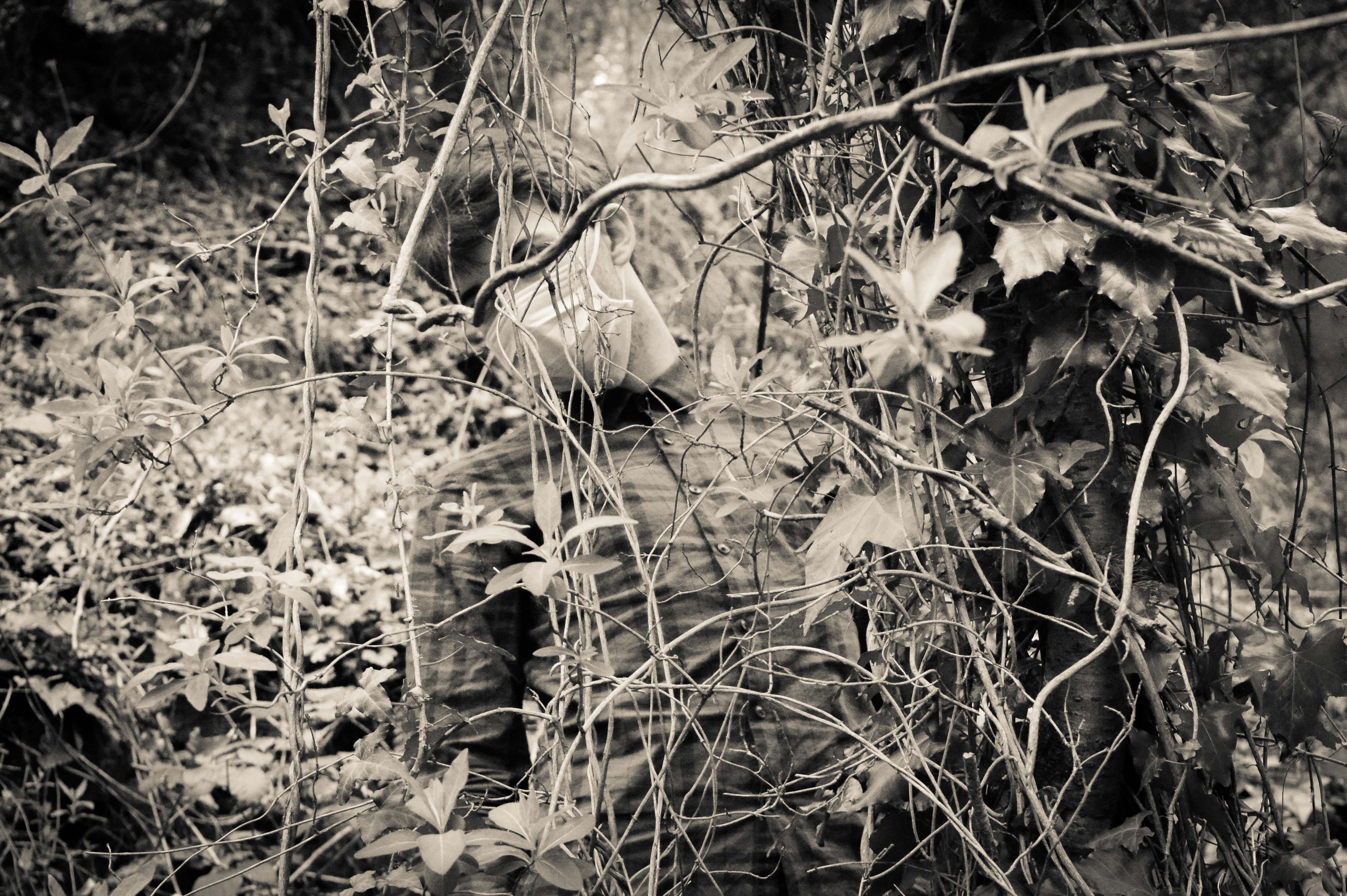
One image which i took which i like very much, is of my male model behind a tree which a branch covering his eyes. It creates a lot of tension in the image and makes it interesting as the viewers do not know what kind of emotion he is feeling as we can often tell by our eyes.

My model blends in with the background yet you can still very much distinguish him. The fact that his face is covered by the mask and that the branch hides his identity creating tension as the viewer will create an image of the model in their head of what he looks like which makes the photo much more interesting. This image represents that we are part of nature and that we are entangled in our ways and we cannot get out of them so we just keep destroying the world to make way for new people. This photo is one of my favorites because it is a form of abstract photography, within tableaux photography within nature photography. The black and white makes the image very strong and powerful and it represents my project of Our Future really well.

This is my female model who has very strong eyes which is why i have used her for this project as in the gas mask, the eyes are the only think visible which is why they need to be powerful. I used the hanging vines to create a frame for my model. This image has no hidden symbolism but it is an interesting image. Her eyes are very powerful as the white of her eyes  stands out due to the black and white filter, it is not one of my favourites but her crouching could represent trying to hide away from the pollution problems but because she is wearing a mask it means she can’t escape.

As i had two models available i wanted to try create some double images of them both in mouth masks as i though they would be powerful and interesting and a different form of portraiture.

In this image, you can clearly see the strong points of each model such as the male is good at body language as he is drooping down and look very drained whereas the female model is very stiff but her eyes are much more dramatic and show a lot of emotion, she looks scared. This image has no symbol but it is very powerful is showing how two types of people will cope with the rise of pollution. It represents togetherness and that this is something that we can change together. One person cannot change the pollution levels of the world but many people can. The composition of this image is fairly good as the focus is very much on the two models as they are in the center of the image which is where the eyes focus. This is a combination of Tableaux and portraiture, it combines both more than the others as i directed the models wear to sit and whether to face me or not. The poses they did i left up to them to make the photo seem less forced and it worked really well as the male model is much more dramatic compared to the female one which allows for an equal balance of both bold eyes and dramatic body language.

I attempted to photograph my male model in a semi cave to create dramatic photos, it worked very well as when you first look at the photo you can only see his head which adds for a lot of tension and drama.

This photo is a lot different from the others as it is very dramatic and the background isn’t visible which adds a lot of tension as the viewer will not know what is behind him. This allows imagination to take hold and makes the photo ambiguous. His pose also makes the photo really interesting as his body language isn’t stiff and he looks drained almost posed which works well for my project. The toxins of the pollution are hurting him, the darkness behind him represents the end. The light on him represents hope but the darkness is taking over, the hope is diminishing. The fact that the light is primarily on his skin draws the eyes towards him which is what i wanted from my images as my models are the main focus of this project. They represent Humanity. They represent Our Future. They represent Our Children’s Future. They represent the Loss Of Hope. This is one of my favourite images of this shoot and i will most likely use it in my book.

As i was in a forest, i wanted to use the branches and trees as much as possible to create frames around my models so that the viewer would focus on the model. I think this image has the best frame as the trees joined together to make a complete frame and it worked really well.

This image is very sinister as he looks possessed and looks like he is stalking someone. That someone is us, he is a reminded of what we are doing, he is warning people of what could happen if they do not protect the planet. Soldiers did not die to protect this earth and us for us to destroy it again. The trees worked really well to frame my model and it really makes the eye focus on him and what he could represent. Many of these images are ambiguous as they could mean lots of different things to different people but the main point of it is pollution as that is not ambiguous. One thing which is very powerful about this image is that we cannot see his eyes. this is very powerful as it hides his identity and makes the viewer create an idea of what he could look like. Some people would see him with scars all over his faces and others may see him as smiling.

Overall, this was a successful shoot as i am planning on using many of the images i have created from this shoot in my book as they have lots of hidden means and they are interesting images to look at. I tried very hard to think of composition and i think i did really well with framing my models using trees and it has allowed for some interesting and unique images to be made. I think the only thing i would improve is that the ISO was still set on 6400 maximum sensitivity which has made them pixelated but it is not majorly noticeable like the images from the first shoot but the black and white helps to reduce this as well. Another thing which i would of changed is command my female model more as her body language was quite poor is many photos and i think it let some of them down like this image:

As you can see, my female model did not pose very well which partially ruined the photo and i wished i had told her what to stand instead of let her choose as it really did not work for these sets of images. This image is not in black and white as i do not intend of using it for my book because of the poor composition and it is also more pixelated than the others.

First Shoot

This shoot was conducted in St Helier, in the area of Le Frigate and People’s Park. This shoot was unsuccessful as the ISO Sensitivity was on 6400 which meant all the photos which i took, which was over 200 turned out to be pixelated.

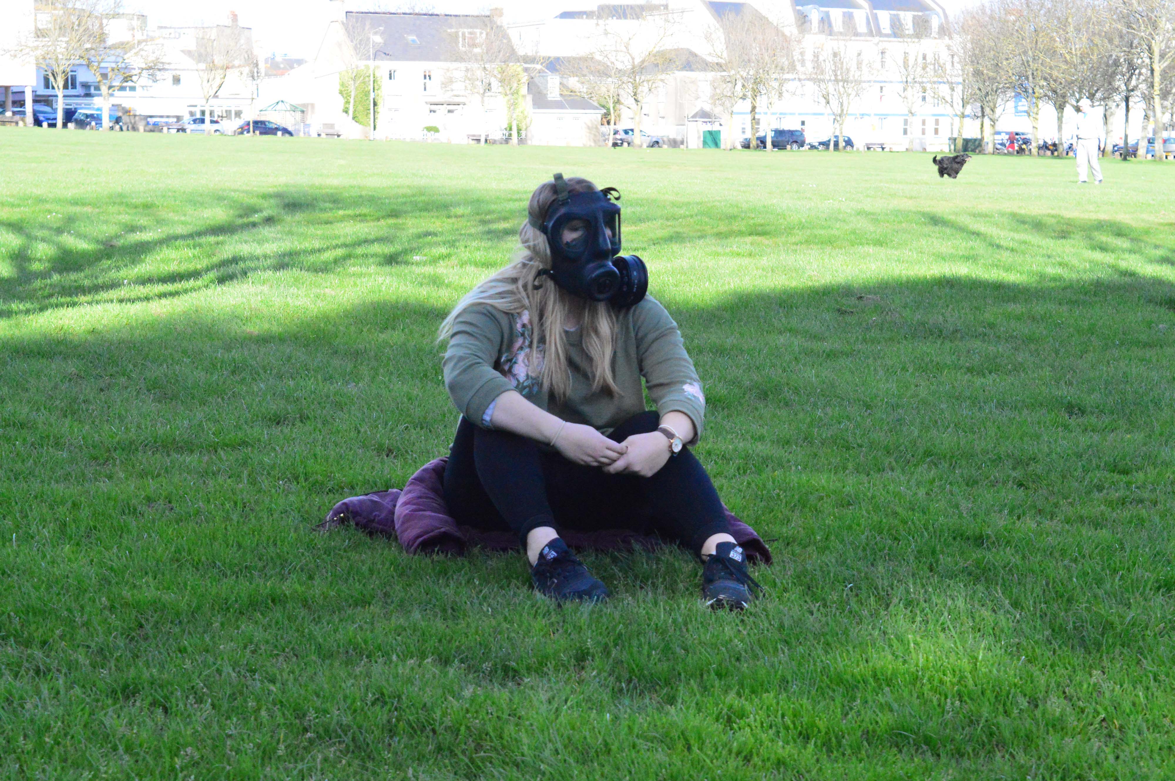
This shoot was done in direct sunlight as it was a clear sunny day which made it very difficult to get the photos to be quite dark which is what i was aiming for. The sun also made it difficult to find areas to photograph in without strange light patterns, this was very frustrating as it was my first shoot and i wanted to get it right for the next shoots. As you can see, these photos are pixelated and the light on the grass ruins the composition of the image:

The light is the background created a split in the image and the composition of the image is completely wrong. My idea for these images was to use the trees on either side of my model which you cannot see as a frame. However when i started photographing, the trees were to far apart and the light behind my model ruined each image as well as the fact that they are pixelated. I was very cautious to not photograph with the light behind my model but this did not work in this situation as the light was coming from the side. Also these images in general are bland and boring, they aren’t adventurous or interesting. I wanted to create images which are ordinary but with a hint of unusual to them as that will make my project much more interesting. However, i discovered that i wanted to do this after this shoot as i realized how boring they were.

The outfit of my model was completely wrong as she was wearing green and there was green is many of my photos which meant she blended in a lot. For this shoot, i did not think about my model’s appearance because i have never had to but i realized when doing this shoot that it is really important even down to the finest details of makeup.

The first images i took on this shoot were in between some bushes which created a fairly nice light pattern, however the light was far too bright which meant i played with the settings and got them completely wrong and i did not notice. These photos are very dull as i wanted to try reduce the brightness but that also reduced the colour, it also did not help that my model was wearing a green jumper.

These images are very dull and the pose of my model is very poor as she is hunched over which makes the photos very poor. These are my least favourite images as i think they were rushed as i did not want to take to long. The bush was not high enough so it cut off half way which meant that the image was split which ruined the composition of the image. The light patterned which the bushes created was only visible on half of her body which also ruined the image. The images may not seem pixelated from afar but when zoomed in, it is very clear that they are which isn’t good for printing the images which is why i won’t be using any of the images from this shoot in my book.

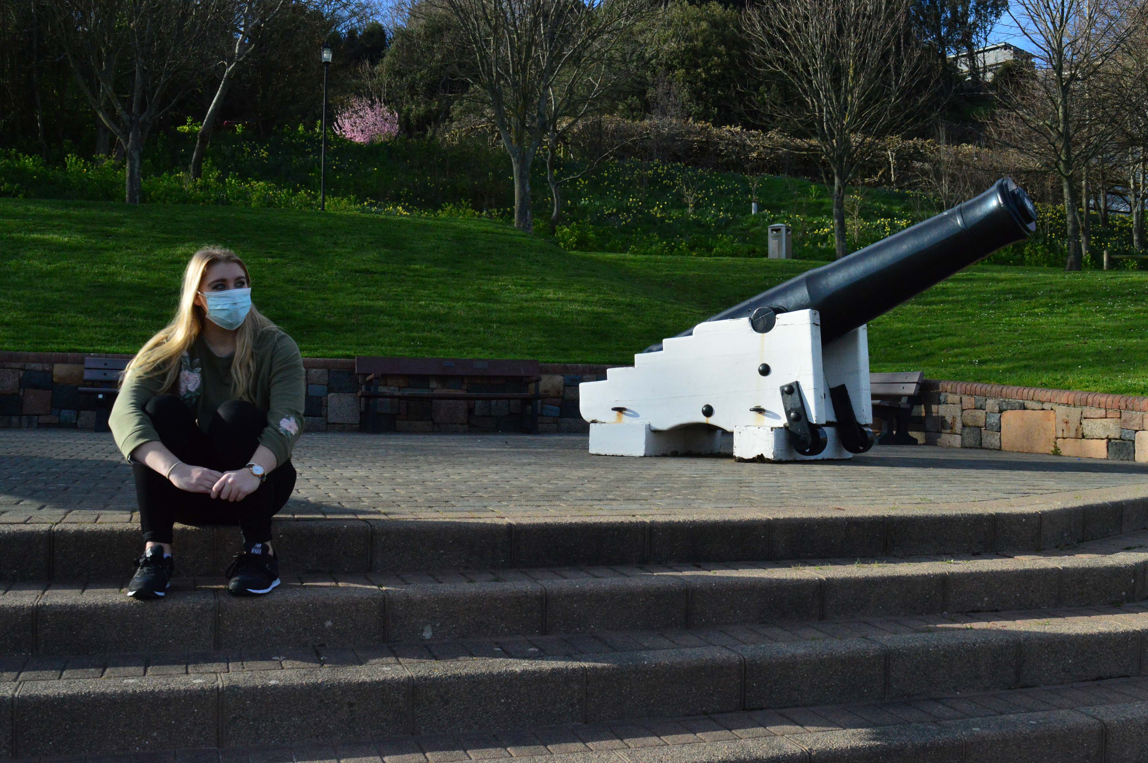
The images i do like and wish that weren’t pixelated were taken near the guns of People’s Park, i think this had create symbolism of war and the fight against pollution. The soldiers fought a completely different war to the one we are fighting today, yet somehow, this fight could end up being much more deadly than WW1/2.

The only problem i have with these images is that there is a bush which is pink in the background which is really frustrating as it ruins the composition and consistency of the images. It draws your attention away from the main focus of the image which is my model in either a mouth mask or full face gas mask. These images symbolize a hidden war which normal people wouldn’t see unless they read the pollution levels of the world and how E-waste and lots of rubbish is building up over the world and we cannot get rid of it quickly enough. The ocean floors are lined with rubbish but only the fish and deep sea divers know as the news wouldn’t cover this sort of “boring” news. The steps up to the guns represent the climb of pollution, my model is sat at the top because the pollution is at it’s highest and it’s a losing battle as not enough people are fighting this war as their lives are “too busy”.

This image represents a combination of nature and man made structures. It represents how humanity is over taking the earth’s natural environment and contaminating it with pollution.

My model sitting on a high rock and me shooting from a lower angle represents the power humans have over nature and how we can control what happens to it but yet we are destroying it with our cars and buildings and we do not care. Yet we will adopt a leopard for 3 pounds a month but won’t cycle or take the bus to work to reduce their carbon footprint. We humans sit on our high horse, thinking we’ve concurred the world and we are at the peak of technology but animals are disappearing, so are trees and so it our oxygen, yet we can’t tell cause we are sat so high on our horse that we can’t even see the ground, mostly because it’s covered in tarmac to make roads for NEW CARS! Even though this images represents a lot, the composition of it is very poor mostly because of the pixelation. I think if this image was not pixelated, i may of used it in my photobook as it has high symbolism and could represent a lot to many people.

I did a set of images on Victoria Avenue and they were very poor mostly because my model partially blends into the sea wall and also her pose does not work well, i should of told her to do a certain pose but i let her choose which i think ruined the images as the pose does not represent the severity and seriousness of pollution and how high the risk of wearing a gas mask is for parts of the world like China.

These photos are just so boring and dull, they have no symbolism and i am not sure why i photographed on the beach, mostly because people think that it is a beautiful place but it was not. The sand was dull, the sun was too bright for my model, her clothes were dull and do not stand out and the rocks are scattered everywhere ruining the composition. These are the worst composed out of all my photos, i tried different angles and i used different distances away from the model and i also used a tripod, yet the images are poor. I would never use these images in my book and in some of them it is very clear that they are pixelated. I could of seen the pixelation working for my project to represent the blurred vision of most of the people in the world but the images would of have to have met up to the standard and meaning of that symbol. None of these photos do.

Overall, this shoot was very poor mostly because i did not notice that my ISO sensitivity was on 6400 which caused the pixelation and also that my model wearing the completely wrong clothing and her makeup was all wrong but i did not consider this before i did the shoot. However, some of the images like the ones with the guns and the one on the rocks have high symbolism but i would prefer them to be clear as they would work better for my project as i do not like any photos being blurry. Next time i do a shoot, i will make sure that my model is wearing appropriate clothing such as a bright jumper and i also want her to have dark makeup to bring out her blue eyes as they are very powerful.

I am also planning on using a second model as she is not very good with posing but her eyes are so bold and they could add a lot of drama and tension to the images. My second model, will be much better at posing and will add much needed body language to the images to create a variety of different perspective and ideas to my project. However, i am going to pay attention to my ISO settings and male sure that my models are wearing appropriate clothing.

Environment – Artist Reference 3 – Caroline Grohs

Illustrator and designer Caroline Grohs was born in Düsseldorf, Germany. She grew up in a small town near Düsseldorf where her parents still live today. At the age of 19, she began her studies in Düsseldorf but a year later she moved out of her parents’ home and spent a year studying in Hamburg. Her mother is a graphic designer, so was introduced to graphic design, art and photography at an early age. I have selected Grohs as inspiration for my further work, her illustrative line work being being synonymous with the visuals I am creating. Her drawing work is largely geometric and polygonal, creating a contemporary and modern design that works effectively for the commercial nature of the art.  Grohs talks about this, stating that her favorite subjects and priorities were Corporate Design, Editorial and Illustration. This is evident through her corporate design project for a ballet/theater.This project is named Motion Theater. Grohs talks about the process of this project below: 

“After defining the brief for myself, I searched for inspiring photos and was fascinated by a photos from John Davis and other similar photographers. Their photos of dancers were just focused on the dancer with a clear background. I loved them. They were perfect to show how my concept should work. Then I tried to create a logo for the Motion Theater. A symbol combining the features of this theater – especially the focus on the main dancer – and the movement of dance. I drew many sketches and finally created this kind of “screening”, which has been adapted in different ways to represent the different figures and moves. The logo resulted from these sketches. The posters intertwine the dancers movements and their connections to the theater, so that it appears to be “in motion” at all times. The “floating” typography also expresses dance as movement in space. I love this kind of typography because it is a strong and clear statement, especially for this modern part of my theater.”


Grohs’s work on Motion Theatres can be seen above. She has essentially created these advertising posters for a ballet event, employing both her photographic and illustrative skills in order to generate a professional, corporate piece. We can identify the significant use of typography, as discussed by Grohs previously. She has employed a narrow, sans-serif, bold font for the important text that must be seen by the viewer. In addition to this, a collection of colours have been used to segregate components of text. We see the inclusion of a pale orange and turquoise that successfully organise the text without overpowering the primary image or main headline. These photographs themselves are very minimalist and simple. Taken within a studio environment, all emphasis is on the dancer. With a complex background, these images would be way too crowded. There would be too many clashing components such as the text, illustration background and subject. This is something to remember when I produce my work. The illustrations themselves are thin, white-line drawings. Polygonal shapes are being created to replicate the form and silhouette of the dancer. These geometric lines all originate from the word ‘Motion Theatre’ almost like they are being projected upon the dancer. It creates an interesting visual effect, looking as if the subjects are being consumed or protected by these transparent shells. I really like this project and it provides me with a number of different ideas that I can employ going into my exam. The work of Grohs has enlightened me regarding the use of typography and how this can assist in conveying a message within my work. Furthermore, Grohs work demonstrates the effectiveness of subtle line work. Her mark making is thin and reclusive. It is not in your face or dominating the composition. It shows how sometimes simplicity, and allowing the image to breathe and show its positive visuals can be a successful decision.

Mirrors and gazes

I have previously explored the use of the mirror in art history and considered how they act as a motif in contemporary portrait art for examining and portraying the identity of the artists.  Since the reflected image in the mirror has an unpredictable quality, it has become a common instrument to show portrait artists’ self-exploration. In this article it explains that “Mirror surfaces reflect both the environment and the viewer, ‘like a visual pun on representation’, as Ian Burn observed. Not just a looking glass, mirrors index the instability of perception, while inviting a viewer to participate in the purported endgame of late Modernism”Dr Stephens explains that ‘Artists from Manet to van Eyck and Magritte have always been fascinated with mirrors,’ he says ‘Mirrors are a source of reflection and self-representation and artists engaged them to tease out the roles of artist, spectator and voyeur.’ I want to further consider this idea of ‘artist, spectator and voyeur’ in relation to the notion of the ‘gaze’ and the function of mirrors in relation to this.  I am going to explore this in reference to female performance artists who use mirrors to elaborate the exploration of self-knowledge. 

The concept of the ‘gaze’ in analysing visual culture deals with how an audience views the subject presented. In the book ‘Critical Terms for Art History’ edited by Robert Nelson and Richard Shiff, it explains that the term “pertains to the way in which the audience is made unaware of the constructed quality of the gaze”. It goes on to discuss how “In paintings people don’t question whose view of a landscape is depicted but in film a shot of a landscape will be followed by a shot of a character looking at it which the audience identifies as the landscape” this means that the audience is told whose view it is and they are looking at through the eyes of a character and their gaze. The term has negative connotations of power manipulation, “Respect for the power of the gaze survives today in the injunction not to stare” and “Culturally determined precepts regulate photography, which involves having ones image looked at in one’s absence”.

The French psychoanalyst Jacques Lacan (an early and influential theorist of child development) found the concept of the gaze important in what he termed “the mirror stage”, where children gaze at a mirror image of themselves and use this image to “derive a degree of coordination over their physical movements”. He linked the concept of the gaze to the development of individual human identity and an investigation between the ideal-ego (the idealised image of oneself) and the ego-ideal (the imaginary gaze of another person who gazes upon the ideal-ego) .

The idea of the gaze has been extended into the framework of feminist theory, where it deals with how men look at women and how women look at themselves as well as the effects surrounding this. A key text regarding the male gaze is Visual Pleasure and Narrative Cinema (1975) by Laura Mulvey. Gerry Badger has explained the male gaze was “the realisation that most of the images of women throughout history were fabricated by men, to be gazed at by other men” he explains that art history was basically misogynous and suggests it has been the duty of women artists to counter this distorted view. He has analysed how power has been embedded in the relationship between seeing and being seen. Using the painting ‘Vanity’ by Hans Memling (shown below) , he writes, “The mirror was often used as a symbol of the vanity of woman. The moralising, however, was mostly hypocritical. You painted a naked woman because you enjoyed looking at her, you put a mirror in her hand and you called the painting Vanity, thus morally condemning the woman whose nakedness you had depicted for your own pleasure”. 

One of the contemporary female artists that Badger references is Cindy Sherman who is viewed by many as a highly important post-modernist artist. He says “Sherman’s work as a whole has been a crucial component of the feminist influence upon women’s photography”.  Sherman began her work by exploring personal interests such as a love of film and masquerade and she had never heard of the male gaze theory when she began her Film stills series. In ‘Bachelors’  by Rosalind Krauss, Sherman’s film stills are said to be “rehearsing this structure of the male gaze, of the voyeuristic, constructing the women in endless repetitions of her vulnerability and his control”. Krauss technically analyses Sherman’s work by considering ‘The signified and signifier’ which is a term relating to  semiotics devised by Ferdinand de SaussureSherman’s photographs examine the idea of ‘women’ as a sign and signs of femininity which are dominant in American culture. Her work is represented as stills from films but in reality they are not. The absence of a narrative and the fact that Sherman is both present and absent ( we are not viewing the ‘real’ her) encourage the viewer to consider the status of such signs. The viewer recognises the signs and how they generate particular ideas about women, and her work broadly explores the idea that the signs of ‘women’ are not fixed.

Krauss references Mulvey’s interpretation of Sherman’s images “The camera looks; it captures the female character as a parody of different voyeurisms. It intrudes into moments in which she is unguarded, sometimes undressed, absorbed into her own world in the privacy of her own environment”. In many of Sherman’s images the viewer is constructed as a hidden watcher. For example Krauss discusses the image below with Sherman looking in a mirror while wrapped in a towel. She says, “the focal length of the lens creates an unimpeachable sense that her look at herself in the mirror reaches past her reflection to include the viewer as well”. Instead of looking at the camera or the suggested viewer Sherman looks at herself.  She places the mirror in her work as a symbol to refer the male signifier that portrays the female as a sight with her “vanity” and “self-absorption” in the mirror.

Kruass also discusses the image below and how “as it reaches the bottom edge of the image, the spectator’s view encounters a gaze that projects toward it from within the matrix of its own invisibility. Reflected in the tiny mirror of a discarded compact,this gaze cannot be identified with any source in the image. instead it seems to join all the other gleams and reflected points of light in the image”.

In ‘Cindy Sherman-Retrospective’ there is a reference to another of Sherman’s images that make use of a mirror and explains that “It is as if we are attempting to see ourselves in the mirror (of her face) but are blocked from doing so by her head and visage”. It goes on to say “The picture throws the gaze back onto itself in a gesture Duchamo explored as a ‘mirrorical return’ (where the image in the mirror and the viewers ‘gaze’ bounces back and forth, producing the flesh of one another)”.

In ‘Rose is a Rose is a Rose-Gender Performance in Photography’ Nancy Spector explains that photography provides “Multiple, frequent and literal reminders of oneself as another thus enforcing the notion of a kind of split personality: the one that sees itself looking at another one, which is itself”. She says “The recognition of oneself is a photograph can serve to define oneself, to create an identifiable and distinct subject. This narcissistic pleasure of the mirror in which we reassure ourselves of our existence”. She describes how self-portraiture functions as a private use for realising the self yet often has an artistic significance. In a similar way sketches and journals of artists were  once considered private art tools of the artist but are now valued as independent forms of art. Spector explains how the photography of Claude Cahun can be situated in relation to the tradition of self-documentation. She discusses “The prevalence of mirror images , doubled and multiple portraits”. She says “these reflections challenge the very idea of self-hood as stable, as in her formula “To mirror” and to “stabilise”.

In the image above Cahun poses facing a mirror on the wall but rather than looking at herself she stares at the viewer with a serious, confronting gaze.  The ‘real’ figure appears to register the presence of the viewer and does not flinch from eye contact. Her other half, the mirror image, however, averts her eyes gazing into the unknown. Interestingly both the feminine and masculine aspects of herself can be seen by the fact that she is wearing a ‘masculine’ coat with her hair cropped short. The position of her hand can be seen as an uninviting and protective gesture as if it’s an instinctive response to the viewer’s intrusion. However in her reflection she seems to expose herself with her neck visible. It can also been seen in the reflection that she is wearing a ring which is not visible from the angle she is positioned in against the mirror.In this photograph, Cahun represents both the objectified woman, as seen in the reflection, as well as male gaze, which she turns back from and faces the viewer. Cahun explored different aspects of herself through her photography and it could be said that there is a separation between her self and the different versions of herself that she portrays. Through the use of mirror reflection in her photography or the way of using the camera as a giant mirror to reflect the mirror image of herself; thus questioning the authenticity of the “self” and leads to a deeper self-exploration. In reference to this image Nancy Spencer says the”power of both projecting the gaze and returning is, as Claude’s eyes meet ours, sometimes seductively, sometimes hostilely some times quizzically, from within the image. Indeed they go on to say the very enterprise of self-portraiture …comes down to reclaiming agency for the female subject”.

Another performance artist  that I have looked into is Francesca Woodman. Her use of a mirror is very different to that of Sherman and Cahun as she plays a kind of ‘hide and seek’ game with herself reflected in a mirror. Often her reflection in the mirror is clearly revealed but her real figure is portrayed as a ghost-like presence as a result of long exposures.  The mirror in Woodman’s self-exploration appears more like a blurry and over-exposed reflective surface. The mirror which normally acts to reveal instead becomes a barrier to conceal her identity and the environment becomes a reflected void. The presentation of the real self seems more elusive, like an ethereal projection. Cahun on the other hand uses the mirror to clearly reflect herself and Sherman’s use of a mirror has the role of deflecting the self and questioning the viewers position as a ‘voyeur’. While Cahun’s may represent different versions of herself Sherman presents a constructed image of a staged character. The viewer/voyeur represented in the outside world appears to be intruding upon Sherman while Cahun partly meets the viewer’s gaze. This relates to what Margreth Olin has said about the gaze that “If you can look back you cannot be possessed by the gaze of another”.

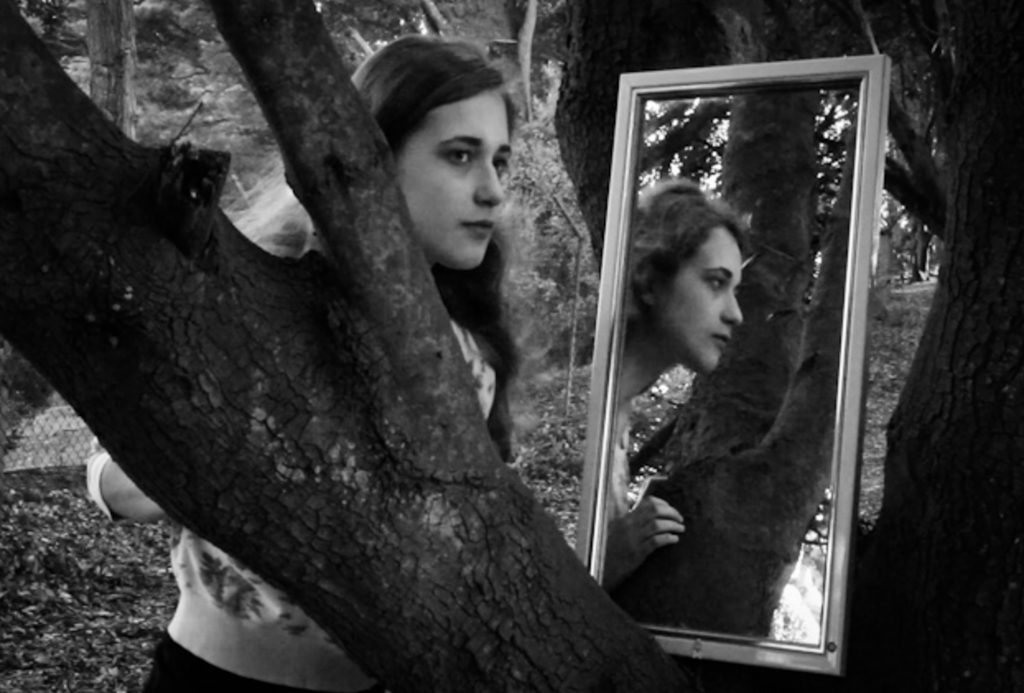
When exploring the use of mirrors in my own work I thought carefully about how to position it and what I wanted to reflect within it to capture a small part of the environment within its frame. I also considered the positioning of the subject’s gaze and experimented with various angles. For example in the two photographs shown below the first one is more effective because the subject glances sideways into her reflection and there is the interaction and connection between the two which makes it more engaging than the second in which she neither looks at the viewer or herself.

When using myself as the subject, again I experimented with different approaches as can be seen below. I tried looking out of the image to something unseen by the viewer, looking at myself in the reflection and also looking directly at the viewer. I now feel the last one works the best because my gaze meets the gaze of viewer while the reflection is positioned so that it is looking through the gap in the tree branches.
Dawn Final Photoshoot

I wanted to capture the warm lighting that protrudes through a window in Ryan’s room. I had to work very quickly as the light moved fast and the light was constantly changing, meaning I was constantly adapting the exposure and experimenting with the white balance. Although Ryan’s room was ideal for capturing Ryan’s personality, it was very cluttered in comparison to my room which was used in the previous shoot, for example the lights that hung from the hall stuck down with dark duck tape, in some photographs i used the spot remover tool to remove the duck tape. I wanted to evoke the warm colours from the sun light but also the blue tones from the shadows, I also had to work with the tones in the window in the background. This will also add narrative to my book and raise enigmas such as how maybe the mysterious character was dreaming and has just woken up.

I asked him to wear a white outfit that would give the impression of youth and vulnerability which was very different to the black outfits he’d worn in previous shoots. I plan on using the above photo in my book, this is also an indication to the audience of dawn and the sun rising, especially with the striking warm lighting.

I covered the light from the window, leaving this cool light from the back window. I liked these photographs together as a diptych as it captures the confusion on his expression. I wanted to create portraits and experiment with composition. I like the ominous dark lighting with soft shadows. I like how the white walls contrast the dark shadows in his face. This lighting is very natural and gives the photographs a very everyday effect.

I plan on using the second photograph for its use of gold light and strong dynamic shadows. When I was editing I wanted to bring down the light from the window in the background but it came out unnatural as it was slightly too overexposed, so I have left it as it was. I like how the dynamic lighting reflects off the wardrobe and the shadows in the background contrast with the light on his face. Below are two closeup portraits featuring a softer use of light, giving him a softer less intimidating expression.


Environment – New Idea – Digital Illustration Experimentation

Now that I have completed my travels and have collected my images, I am tasked with creating some original final images. On this post, I am going to be documenting and experimenting with an idea I had whilst on my travels. As discussed in a previous post, I felt the urge to incorporate some external art within my photography, in order to avoid generic tourist responses.The genre of Travel Photography is now very crowded due to its accessibility and ease of involvement and there is little originality in documenting the landscapes and atmospheres of foreign locations as it can essentially be done by anyone. I left on my vacation having looked at Carlos Spottorno,  planting concepts in my head surrounding illustration, but no solid ideas that could be experimented with. Nevertheless, I began investigating contemporary illustration given that this is my chosen course at my future university. I looked at the work of Michael Craig Martin, studying crisp, clean line work and if I could perhaps implement this within my work. After experimenting in Photoshop, I finally found an idea that has the potential to produce distinctive results. Here, I will be outlining the process of creation and my thoughts on the prospects of the concept. 

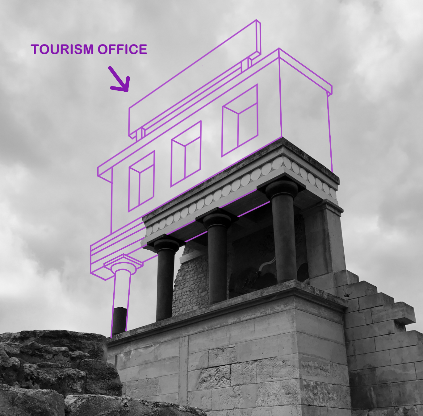
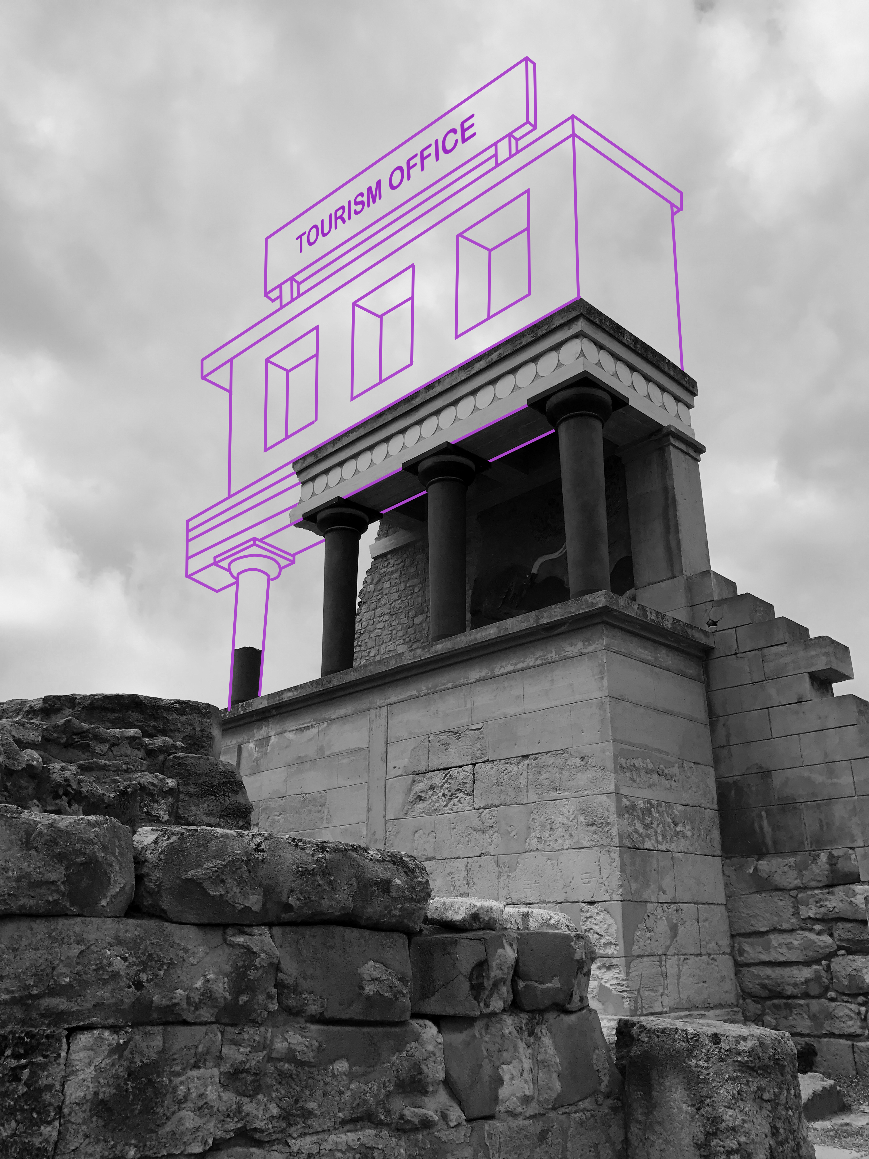
I start by selecting an image that is very open for further adjustment and reconstruction. I wanted something basic and simple in order to avoid complex compositions that will crowd the photographs. This photograph that I took in Knossos, Greece seemed appropriate. A large portion of the image is cloudy sky, which provides a blank canvas for digital drawing. In addition to this, I was attracted to the way in which that the building is partially destroyed, which will enable me to reconstruct the structure that is missing. I am essentially re-building this ancient temple in the way that I please. Its important to note the way this all links back to the exam brief of ‘environment’. In this case, I am manually manipulating this landscape, adapting and changing the environment into something different. The first thing I do, is import the image into Photoshop and make it black and white. For the piece I am planning, the linework created is going to be colourful. With a desaturated background, these colours will be perceived a lot more vividly, popping into the foreground. With a blue-grey sky, the tones begin to combine and merge together which ruins the crisp, clean aesthetic I am searching for. I turn the contrast up a bit, ensuring some dark shadows that will serve as effective backdrop.

With the image prepped, I now select the Pen tool. The Pen is an excellent tool that allows me to draw lines in a very controlled and manual manner. The key feature of the Pen is its adaptability. Click once to add a single point and create an angle to the next, or alternatively click, hold and drag to create a curve. It enables me to create any shape I want, straight or rounded. In addition to this, every point is completely editable after you’ve finished the shape, and you can add new points if you want to add an extra curve into the shape. This means I can come back to my illustrations at any point and make further adjustments to improve the piece. In the image above, you can see that I have started reconstructing the base of the building, drawing in the collapsed pillar and first floor. On the top tool bar, you can also spot an array of options that are available regarding the visuals of the lines being created. For example, I can change the weight of the line for thicker strokes and manually select a colour of my choice. For this piece, I have selected a mid-tonal purple. It works effectively due to its ability to stand out upon both shadows and highlights.

With the building complete, I decided to implement a large sign upon the roof. Currently, the illustration lacks personality and individuality. I would like to incorporate a sense of fun within the piece in order to rectify the bland visuals. As you can see above, I wanted to create a sign that labels the building as ‘ Tourism Office’. I thought this was a witty way of enforcing a theme of visual satire, almost mocking this ancient city and essentially labelling it as just a tourist attraction. It forces the audience to think which creates discussion. Nonetheless, I cannot simply rotate the text and slot it within the sign margins. The piece sustains a sense of perspective, as the construction gets smaller as it moves further away from the audience. Consequently, the text must share the same qualities. I select a font that enforces this fun, satirical attitude as suggested by the rounded edges and capital letters. In order to make proportional adjustments to this piece of text, I must convert it into a pixels as oppose to a text layer. With this complete, all I have to do is Transform the layer and select ‘Perspective’. This option permits me to manually adjust the positioning and perspective of the text, meaning I can make it larger in the foreground and smaller in the back. The final result can be seen below.

I think this is an idea worth pursuing as it demonstrates a form of originality that is currently missing from my work. Illustration is something that I am passionate about, and I think I possess the keen eye required to impose imaginative ideas upon standard environmental photographs. With this experimentation complete, I will continue to produce more responses.


Environment – Artist Reference 2 – Michael Craig Martin

Sir Michael Craig-Martin is an Irish-British contemporary conceptual artist and painter. His early work drew together a variety of objects and materials and questioned the nature of art and representation. In the late 1970s he began to make line drawings of ordinary objects, creating over the years an ever-expanding vocabulary of images which form the foundation of his work to this day. His more recent work, which includes painting, printmaking, installations projections and drawing, continues to depict common place objects. During the 1990s the focus of his work shifted decisively to painting, with the same range of boldly outlined motifs and vivid color schemes applied both to works on canvas, and to increasingly complex installations of wall paintings. This is a visual style that I would love to apply to my own photography.  I think that Martin provides a possible link between both traditional art and photography, uniting the two mediums. This is perfect for me, given my passion for drawing and taking photographs. By undertaking this project, not only can I link two of my school subjects ( Art and Photography) but I can produce work with enjoyment. I love drawing and taking Photographs so merging the process together should be a fun challenge.

Below I have included a collection of Martin’s work for analysis. I truly love this work and I think it is something that I am passionate enough about, to pursue for my project. This is assuming I incorporate a sense of individuality upon the idea and find a way to apply it to travel photography and environment.

As demonstrated in the artwork above, Martin is very intelligent in the way he creates his imagery. Martin creates brightly coloured and minimally drawn paintings of everyday objects. There is nothing special or interesting about the objects that Martin selects to study. They are mundane, regular items that we frequently encounter in everyday life, but never pay attention to. It is therefore quite, thought-provoking and intriguing when you begin to produce huge exhibitions focusing on them. Its triggers questions surrounding what makes real art. I really like the minimalistic visual style employed by Martin as well. He creates simple line drawings with no shading, indicating shape and form. He then incorporates an array of vivid and powerful colour tones throughout the piece that frequently clash with one another. This works effectively as we begin to question our familiarity with these everyday objects. Michael Craig Martin uses bold colours and lines to enhance his work, he also adds bold backgrounds that complement his art. As demonstrated above, he frequently places the object right in the middle of the picture to create a strong sense that nothing is more important than the other.

Applying to my Project

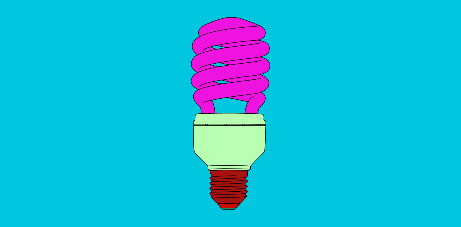
So they question is, how does this work apply to my photography? Inspired by the work of Martin, I would like to create my own digital illustrations that merge and combine with my photographs. Picture one of Martin’s individual object pieces, except the coloured background has been replaced with a photograph. This develops some concepts and imagery that has potential to look good. But we are left questioning the relevance between photograph and drawing. A drawing of a lightbulb upon an image of field looks confusing, random and out of place. This where my own individual thinking and style will be forced into action. Although I would to still like to maintain Martin’s ‘everyday’ way of thinking within my project, I would like to organise these objects so that they work in co-operation with the photographs. Although Martin’s digital illustration was the initial stem of inspiration for this concept, upon further research, I discovered some of his sculpture work that comes close to demonstrating my visual plan. I have included some images of this above. 

These images are all taken from Michael Craig Martins exhibition at Chatsworth. This is a major display of contemporary sculpture in the garden with new works made specifically for this exhibition. Installed in the Gardens of the Chatsworth house, home of the Duke and Duchess of Devonshire, Martin created twelve heavy, steel ‘line drawing’ sculptures including vibrant umbrellas, huge garden implements and a giant pink shoe. While the objects themselves may be ordinary, their form and scale are anything but. When captured on camera, the resulting image represents something similar to my intentions with this project. The main difference is that, I will not be erecting any sculptures, but digitally drawing these objects upon my travel photography. This will experimental and largely improvisational as I select objects that I feel would be appropriate to the landscape and environment. With digital drawing, I also have a lot less restrictions than Martin did with his sculptures, meaning I can test out unusual visual effects and compositions. This idea provides me with the opportunity to provide messages and thoughts surrounding the cities I am visiting. For example, in Rome, I can illustrate Roman gladiators over a photograph of the Colosseum, as if to impose history and heritage over modern day imagery. Although Martin’s work has served as excellent inspiration for me, I am certain now that my work will be very different. Whilst I love Martins exhibition at Chatsworth, his sculptures a very random and pitch little relevance to the environment present. My work will be a lot more focused and directed, paying attention to the landscape and working off of these visual cues. 

Final Results: All Project Outcomes – Grouped Evaluation

After comparing all of my final outcomes that I have produced during this project, I next wanted to look closely at each theme, analyse images relevance to the project and decide how I will narrow them down.  By doing this I am making the next step of selecting my final few photographs much easier and showing exactly how I reached that point. Below are four contact sheets depicting symbolic smoking waste and plastic pollution; documentary plastic and beach pollution; symbolic and abstract ocean pollution; and the different methods of disposing of waste in Jersey…

The first 2 rows of the contact sheet below are images from my 2 symbolic portrayals of smoking waste and plastic pollution. The meaning behind the first 6 images on the top row is to symbolise the vastness of this pollution issue and how it is caused by us, affecting and poisoning everything natural. The next 7 images depict the problem of plastic being used for everything (filling our surroundings), the effect it has on animals and marine life, as well as our connections to this issue. Because in both of these shoots, each image is depicting a different way to symbolise a similar message, I will narrow them down simply by judging their symbolic strength and visual appeal. If selected for printing I will most likely change certain aspects of each image to ensure its quality when enlarged and presented…


Next in the two rows above are my outcomes from my documentary style shoots depicting plastic pollution and beach pollution.  The meaning behind my plastic agricultural shoot is to represent the darker side of Jersey’s most famous product as well as a pollution issue that is directly related to where we live. For the second shoot on beach pollution, my aim was to show the scale of common beach pollution using what I found collected together in one powerful photograph. Although very educational, because of the not so appealing subject matter, I will most likely not be using the photographs for final prints. Apart from a few of the more dynamic scenes I have presented above, I will be choosing from these documentary images mainly based on their relevance to the message.

The next collection below consists of my different styles and techniques used to look at the growing problem of ocean pollution. The first 9 images in this contact sheet depict a mixture of documentary and abstracted pieces taken of pollution in Jersey seas.  The aim of this shoot was to portray the reality of this issue, and how it affects even the cleanest seeming waters.  The next 5 outcomes show my symbolic take on this subject using real pollution I collected from a few of our Island’s beaches. As these are all very vibrant and interesting portrayals of this pollution issue I will most likely be using quite a few in my final presentation. However, because the documentary/abstract shoot was taken using a mobile phone, I will have to be careful about how large I display the chosen images…


Lastly, the final sections of my project above portray the different methods of disposing of common household waste in Jersey. The first and most extensive shoot in my project, featured on the top 2 rows, depicts my visit to our ‘Energy from Waste’ facility that deals with all common un-separated waste. I will most likely be featuring many of these photographs as this insider’s view of the plant produced a lot of intriguing and educational images. The bottom row however, depicts the new La Collette Recycling Centre and is aimed to inform my viewers on its importance and how easy is has now been made for us. As both shoots are very relevant to the of this project (because they show exactly what happens to the waste we don’t recycle and how easy it is) I have decided many of these abstract/documentary images will be used in my final presentation.