I was especially inspired by photographers Todd Hido and Bill Henson for their use of twilight lighting to evoke an enigmatic and dynamic environment with the use of natural and man made lighting. I was especially intrigued by the juxtaposition of these two features which I have explored thoroughly in my work. I also looked at the photo book Twilight: Photography in the magic hour which explores contemporary twilight photography. I was very inspired by the simple layout and its use of high concept imagery. I also looked at the work of Ed Ruscha who studied photo books and was heavily influenced my using text and literature in his work, which i plan on using by using accompanying text with my work. I did a huge variety of different shoots, 6 shoots in total exploring night photography and how it could be used to explore narrative. I used these photographs to explore mood and narrative and how it could affect and relate to the reader with their own past experiences.
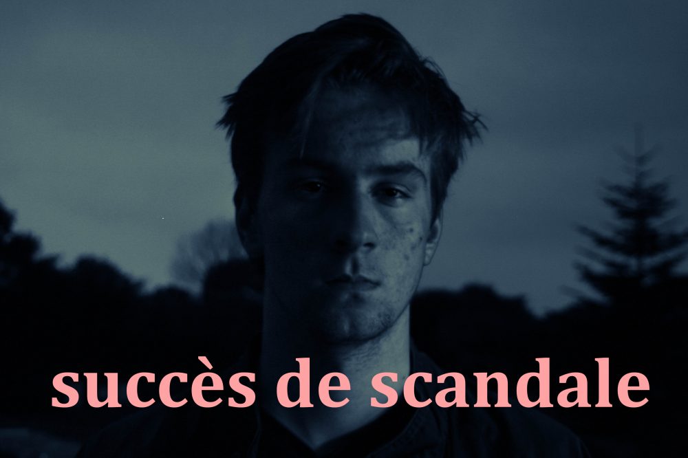
I was inspired by how Bill Henson used Latin in his books to add another narrative which is how I came up with the phrase ‘Carpe Nocten’ which translates to ‘Seize the day’, an interesting spin on carpe diem or ‘seize the day’. I used font Shruti in regular.
I have also created a variety of different experiments inspired my English photographer Hamish Fulton where he used text to elevate and add meaning to his photographs. I also experimented with different techniques such as HDR and long exposure to create a more dynamic image especially when working with natural lighting.
I started with the day photograph, I wanted to use a landscape to start to establish a sense of scenery and gradually build up on the character. I picked intriguing yet perplexing phrased with could build a narrative to the reader. I made them in small size 12 font as to not distract from the photograph.
I put one image to a page but some are double spread. this is similar to the twilight book I have looked at as they often use one image per two pages.
As the book progresses the images appear to get darker, evoking a more eerie narrative, making the viewer question he mental state of the character.
the images then progressively get lighter, suggesting the return of day, the book follows a fairly chronological narrative. the first image below I used a portrait photo of Ryan in his bed which is an important part in evoking the enigma that the character could have possibly been dreaming.
I wanted to finish the book with a closeup and picked a high contrast photograph. the book then finished with the quote ‘Carpe Noctem’, adding mystery to the viewer.
Below are the images I plan on using as final pieces which I plan on presenting as A1 images with white borders. I wanted an even number of portraits to landscapes to evoke the notion of contrast between nature and civilization which I discussed in my starting point. Thru ought have tried to explore a variety of different atmospheres and lighting to create a varied set of images.
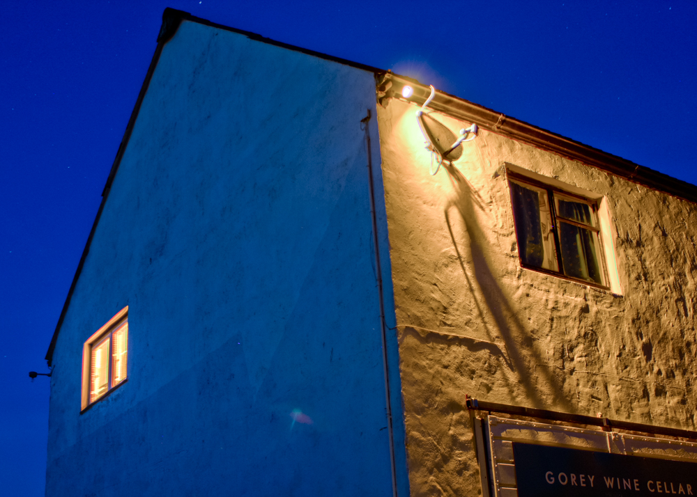
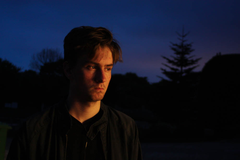
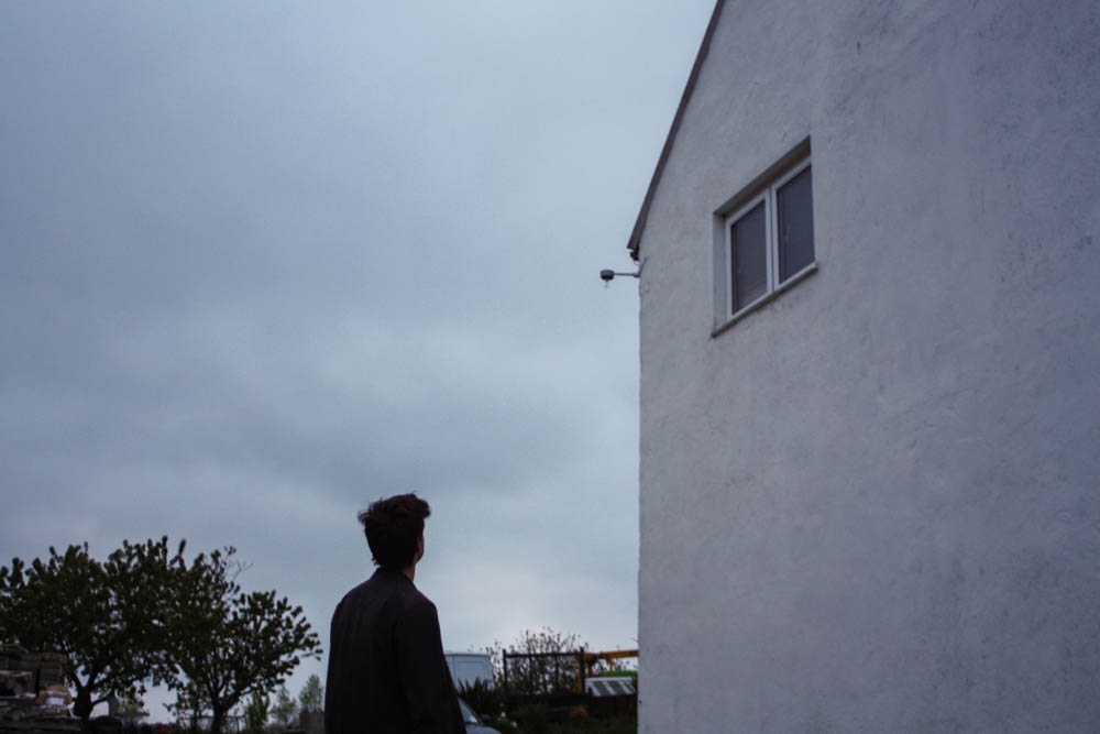
I wanted to capture the warm lighting that protrudes through a window in Ryan’s room. I had to work very quickly as the light moved fast and the light was constantly changing, meaning I was constantly adapting the exposure and experimenting with the white balance. Although Ryan’s room was ideal for capturing Ryan’s personality, it was very cluttered in comparison to my room which was used in the previous shoot, for example the lights that hung from the hall stuck down with dark duck tape, in some photographs i used the spot remover tool to remove the duck tape. I wanted to evoke the warm colours from the sun light but also the blue tones from the shadows, I also had to work with the tones in the window in the background. This will also add narrative to my book and raise enigmas such as how maybe the mysterious character was dreaming and has just woken up.
I asked him to wear a white outfit that would give the impression of youth and vulnerability which was very different to the black outfits he’d worn in previous shoots. I plan on using the above photo in my book, this is also an indication to the audience of dawn and the sun rising, especially with the striking warm lighting.
I covered the light from the window, leaving this cool light from the back window. I liked these photographs together as a diptych as it captures the confusion on his expression. I wanted to create portraits and experiment with composition. I like the ominous dark lighting with soft shadows. I like how the white walls contrast the dark shadows in his face. This lighting is very natural and gives the photographs a very everyday effect.
I plan on using the second photograph for its use of gold light and strong dynamic shadows. When I was editing I wanted to bring down the light from the window in the background but it came out unnatural as it was slightly too overexposed, so I have left it as it was. I like how the dynamic lighting reflects off the wardrobe and the shadows in the background contrast with the light on his face. Below are two closeup portraits featuring a softer use of light, giving him a softer less intimidating expression.
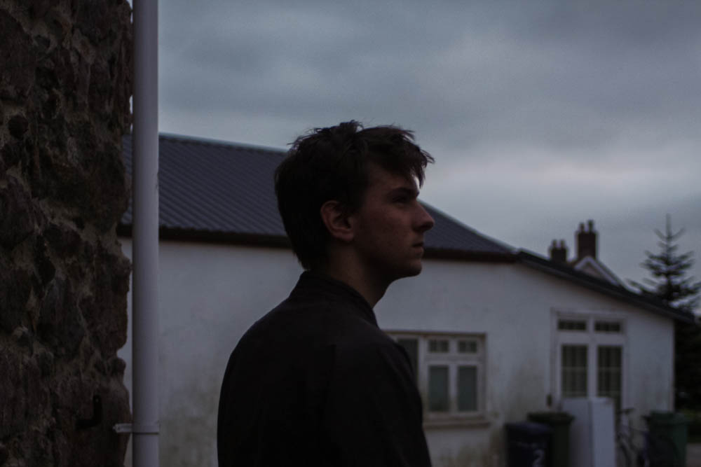
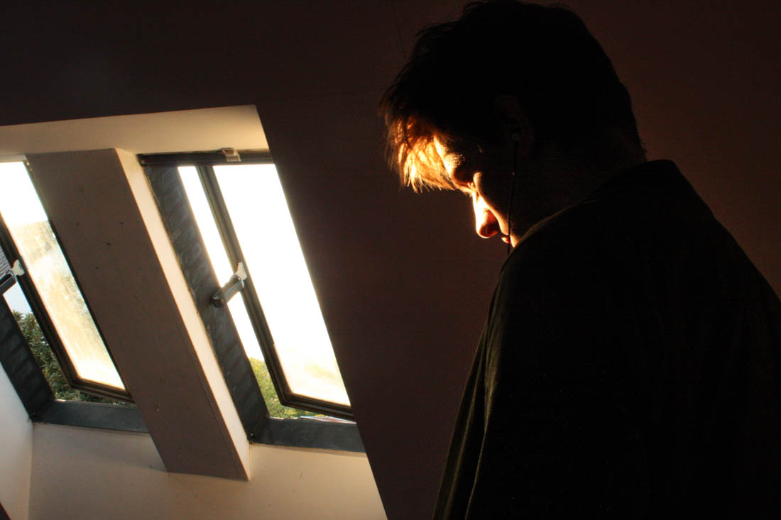
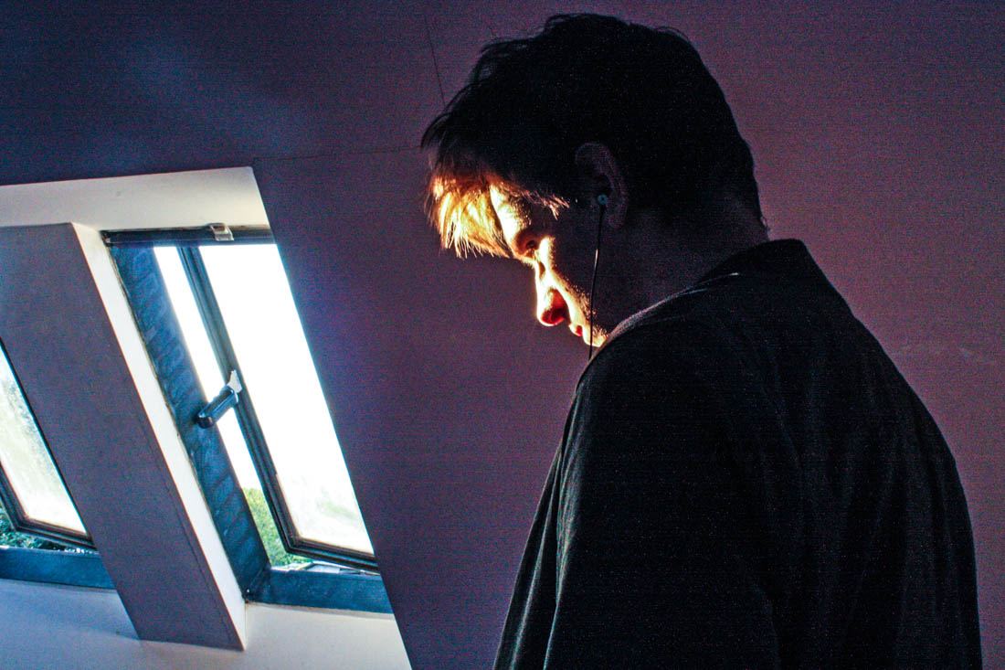
After looking through my previous shoots and the layout for my book I noticed the photos seemed to follow a fairly chronological narrative, moving from evening to night and back to morning. I wanted to do a final shoot focusing on ‘dawn’. I also wanted to explore the character I have build thru ought the book. I decided to feature my brothers room as a scene. I plan on taking these photographs early in the morning to truly capture the effect of early morning. Similar to previous shoots I plan on using as much natural light from windows as possible, Ryan’s room has two large windows and a window on the opposite wall which reflects the early morning light into Ryan’s room.
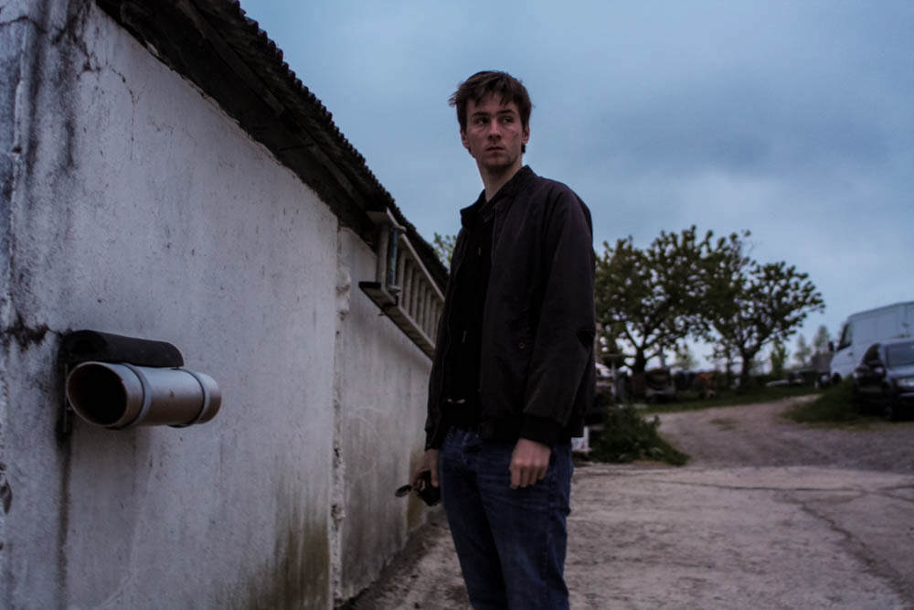
I decided to do a 5th shoot to tie together the photographs I have previously made, also combining techniques I have used previously. I plan on making these portrait photographs. These photographs will feature similar locations and buildings featured previously but featured with different lighting. I also plan on taking photos from inside the garage I have previously photographed as well as the white house. I plan on working with different lighting such as light from at light as well as unnatural lighting. I really like the warm lighting contrasted with the cool shadows in the first photograph by Todd Hido, this use of colour is something I plan on emulating in my own photos.
In response to Bill Henson and Todd Hido’s portraits, I wanted to explore the use of interior scenes and the use of natural lighting to build narrative and add emotion and feeling. In relation to my starting point, the natural light contrasts the dark spaces created by the walls and small light sources. I took over 50 photographs, each experimenting with different ISO’s and exposures and I also left it on auto focus, this evoked a sense of depth without creating overly blurry photographs, I also tested long exposures to give the photos a ghostly effect. I did not use a tripod and in hindsight this would have been more beneficial for creating a sharper image especially when working with longer exposures. I decided to not use multiple exposures or HDR techniques unlike many of my previous landscape photographs as I wanted to keep the strong contrasts of dark space with the warm light. The composition of the photographs features closeups as well as shots that feature more of the open space which reflects a bigger sense of environment. I have also made the compositions to work with a book layout so they could possibly work with a double page spread but also just on a single page, complimented with a text on the opposite side.
I first edited the photograph in Photoshop by using the spot healing brush tool to remove lights and posters that cluttered the image.This would also enable more room for accompanying text. I then used the adjustments> Shadows/Highlights to add more light into the image without the lighter points being overexposed.
The strong contrasts reflect Bill Henson’s work with his use of chiaroscuoro. I wanted to keep most of them in colour as I wanted to reference how Todd Hido had created warm tones photographs with natural light, I adjusted the original images only slightly to give a slightly more even, cooler effect. I like how the light bounces off white surface which gives the photographs a softer effect.
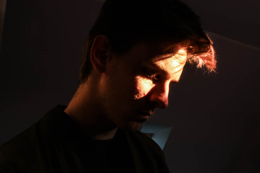
I wanted to capture the light reflecting off Ryan’s face with Ryan facing the window, so each would be opposite each other. In the first photograph I like how the white wardrobe has reflected light into his neck, adding a sense of depth to the image. I set the image to a slower shutter speed for the second above image, creating this ghostly movement effect, I found this photograph worked best in black and white to bring out the tones and shades more. For the third image I used a quick exposure time to capture just the light that hits his face, also evoking a sharper image, the huge amount of black space creates similarities between Henson’s dark chiaroscuro style portraits.
I really like the above image for its use of Rembrandt lighting and how the lighting evokes an interesting glowing texture. I also like the contrast between the warm tones in the highlights and the cool shades in the background such as from the window. I decided to keep the window as I found it added a sense of depth to the image.
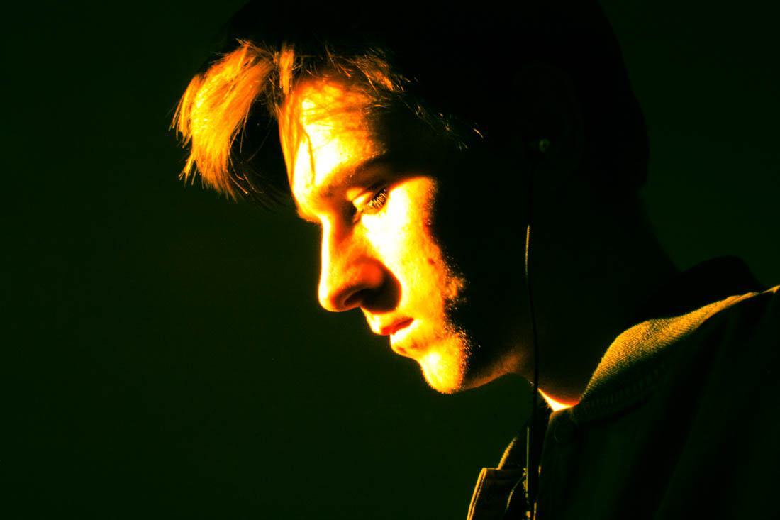
I decided to create a closeup portrait featuring only the light from he window and a plain background. I used the preset features to show experimentation, the last two images are two different cross process settings with add an interesting tint to the images inspired by how Bill Henson will often change the image white balance.
Below is an experimentation image inspired by Bill Henson. I added lots of contrast and clarity to give the photograph a grainy texture. I also added vibrancy to bring out the colours as well as changing the white balance to an overly cool tone.
After looking at the books, monographs and other published work of my chosen artists and photographers, I have been inspired to create a book with a compilation of my photographs from this project.
The book will explore the way the environment can change and how lighting ant atmosphere evokes narrative and emotion as well as the use of natural and man-made components especially natural and man-made light and the contrast between these. It will also feature the juxtaposition of a natural human being and how they are influenced and affected by their environment as well as how they interact.
I started looking at the work of Todd Hido and his 2001 monograph House Hunting which explored America from a very candid perspective as well as the suburbs and homes which people lived in, this took a selection of photograph from his portfolio Homes at Night. I then looked at the photo book Twilight: Photography in the Magic Hour which was based on the 2006 London exhibition featuring artists such as Bill Henson and Philip Lorca Dicorcia. Exploring this nocturnal theme is also something I plan on referencing in book as with how it evokes atmosphere and narrative into the environment. I then looked at Bill Hensons alluring nocturnal book Lux Et Nox. His book explored the notion of nature and civilization and how they effect each other, which is a key theme in my work, his work also looks at negative spaces and transitions in the atmosphere.
Ed Ruscha
Pay Nothing Until April 2003 Edward Ruscha born 1937 ARTIST ROOMS Acquired jointly with the National Galleries of Scotland through The d’Offay Donation with assistance from the National Heritage Memorial Fund and the Art Fund 2008 http://www.tate.org.uk/art/work/AR00047
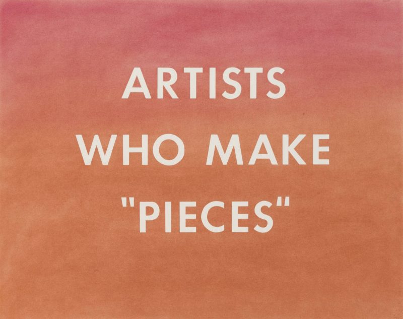
ARTISTS WHO MAKE “PIECES” 1976 Edward Ruscha born 1937 ARTIST ROOMS Acquired jointly with the National Galleries of Scotland through The d’Offay Donation with assistance from the National Heritage Memorial Fund and the Art Fund 2008 http://www.tate.org.uk/art/work/AR00057
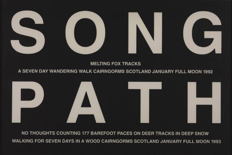
Hamish Fulton Song Path 1992, 1993 Hamish Fulton born 1946 Purchased 1993 http://www.tate.org.uk/art/work/P77622
The Crow Speaks 1986, 1991 Hamish Fulton born 1946 Purchased 1993 http://www.tate.org.uk/art/work/P77616
Wind through the Pines 1985, 1991 Hamish Fulton born 1946 Purchased 1993 http://www.tate.org.uk/art/work/P77621
I then looked at text and graphic design based artists Hamish Fulton and Ed Ruscha who used text to elevate the meaning as well as add new context. I have experimented a lot through my coursework with testing different fonts, colours and compositions but plan on recreating new designs with my photographs for my book to create a more consistent theme for the book. I also plan on having a variation of two page spreads and single spreads with complementary text opposite the image.
I plan on using Lightroom to upload and compose my photographs into a book format and will add text over the images using Photoshop, to publish my book will use the publishing website Blurb.com. This will be done during my exam.
I created more images with the second photo shoot featuring Ryan. I found the composition and minimal features would be useful to use with text. The dark tones would also make the font stand out more. I used the font Perpetua Titling MT Bold because of its classic style. I started by using a small text over the image to create a more subtle impression. I liked the classical style it evoked. I picked a simple phrase with small words that evoked the notion of being nocturnal and night life. I wanted it to be simple yet full of impact.
I then tried using a larger font that would take up a large amount of space on the image. I positioned it so the mirror and reflection was still visible. I made two, the first where the text was in the centre and the second where the image is placed to the right.
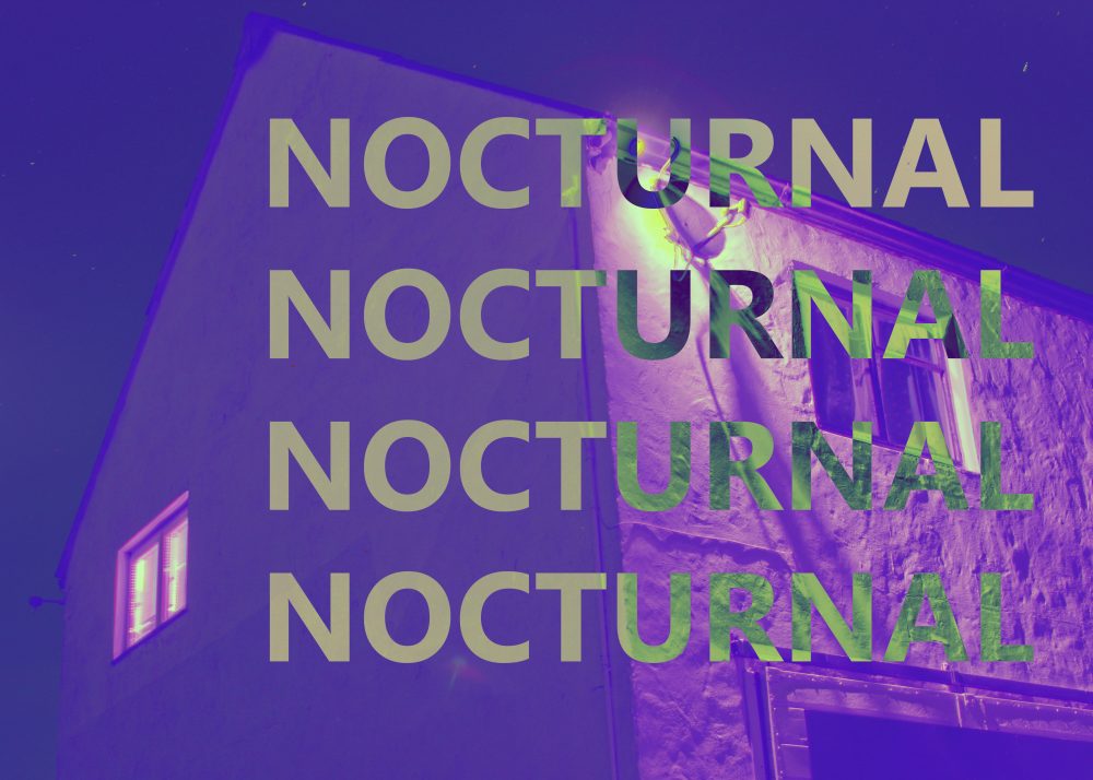
I then returned to the word nocturnal which I had used in previous images. I then used borders to add with the text. I then moved onto using filters using the colour layer feature. The second one was not just a single colour but a mix of pinks and oranges, creating a warm, dreamy ambiance.
The above image was created with the bright green layer set to luminosity creating the grey tones. I also used the previous pink layer from before to give it the warm tones. I wanted to pick words that would evoke the sense of ambiguity but still create a feeling of narrative. I plan on exploring more images using text and other graphic design features in my work.
Hamish Fulton uses a combination of text and imagery to evoke meaning and a deeper narrative from his long travels through various countries. I wanted to experiment with my own photographs using text to create a more compelling photograph as well as give more context and understanding to the message behind the photos.
I picked the above image because the composition enabled a lot of open space to place borders and text. The image also didn’t have a main focus point enabling to leave more focus for the text over the top. The tones of the image were also fairly dark so white text would stand out more. I tried a selection of colours but found white worked best. I started by placing a white-border what was a similar thickness to the font I panned on using. I used the font Segoe UI Bold Italic to create a simple effect that still evoked impact. I found the photograph was already fairly busy with the texture selection of small details to didn’t want to add too much that would make the image too busy.
I picked a selection of words that linked into what was happening in the photograph as well as the message I want to show the viewer. The first set of words in the top corner of the first image represent the more serene elements of nature whilst the words below evoke the industrial, man made side. I used these words to represent the combination of nature and man made.
For the above images I removed one of the words and put them into order of length. I then became more experimental with the layer types. For the first image I selected the layer of the text and the border and changed them to exclusion, which inverted the white, making it contrast from the background image. For the second I again used the exclusion feature by creating a second layer of orange and blue then changed it to exclusion. This gave the image a new more abstract style.
I then moved onto a second image featuring a huge amount of warm tones. I wanted to include the phrase ‘The juxtaposition of nature and man made’. I picked a cream colour that was present in the image and found it worked better then white.
I used the same colour and font for the text in the two images above from the previous image. Similar to the previous, I think the cream worked better as was softer then white and could contrast the blue tones in the unlit areas. I sued extracts by the poem ‘As I walked out one evening’ by the English poet W.H Auden. The poem discusses important themes such as love and time, mixing in references and imagery of urban and rural settings. I picked lines that referred more closely to the transition of time. I found the text worked well in this image was it wasn’t too overpowering, making the image not too overly busy. I also found a border wouldn’t have worked with the composition as crucial features of the image such as the window in the lower left corner would have been covered.
I used the same cream text for this image but changed the font to regular as opposed to italic like the rest. I picked a word that related to what the focus of the image was, the work nocturnal refers to the idea of being active and awake during the night, which relates to the light coming from the window. I used the exclusion feature similar to my previous pieces.
I used the colour filters and the exclusion filter to create the above images using different coloured layers. I find they work well as a series.
I wanted to explore and respond to the dark portraits of Bill Henson as well as how Todd Hido used lighting to evoke a sense of ambiance and human presence as well as how both these artists used this as a way to build meaning and narrative.
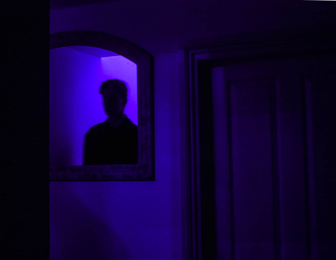
After looking at Todd Hido I wanted to use low light as a way to add drama and narrative to something that would have otherwise appeared mundane. I noticed how the mirror in my house allowed for someone to be seen looking in, but only show the reflection of a person, I wanted to test this use of reflection and how this could evoke an eerie form of narrative but with the lighting style of Todd Hido. The blue lighting comes from Christmas lights whilst the lighting in the second photo below comes from regular house lights.
Due to the very little light and single light source, the photographs are made with a long exposure of about 8 seconds with an ISO of 200. This long exposure creates a ghostly effect from when Ryan moves slightly, although this was not intentional, I think it works really well. For the photographs above I made them both have a ratio of 8.5×11, I wanted it to be a smaller ratio to give more isolation to both the figure, the mirror and the door. For the below photograph I made a longer landscape photograph.
Bill Henson, Untitled # 115, 2000-03
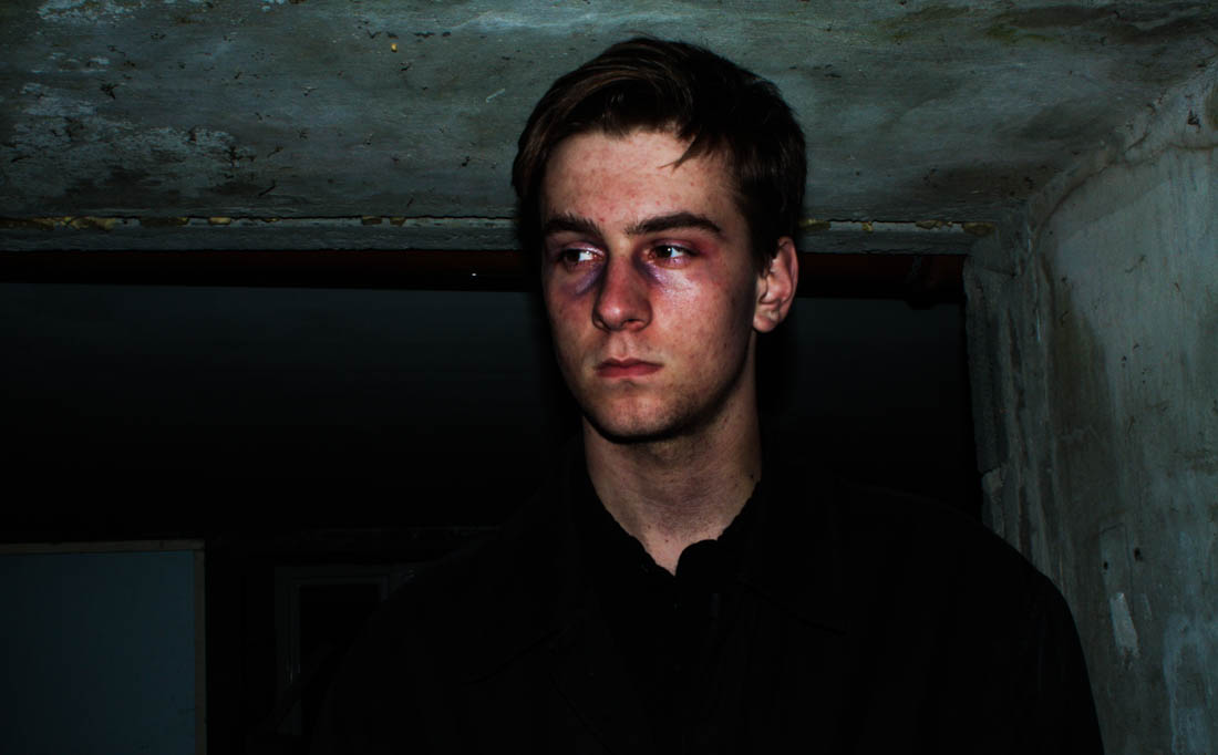
The above photographs is the photograph I have based the below photographs on. I planned on including a lot of dark tones and black space to leave focus on the figure in the photograph. I wanted to evoke the murky cool tones that Henson had shown in his work as well as evoke a dark, melancholy tone as well as the fearful expression on the girl face. Before the shoot I used blue and red eye-shadows on Ryan’s face to evoke a more eerie effect, the red was a cream consistency which added a glossy effect, I also used these on his cheekbones to give a more dramatic effect.
The above photograph came from using a too long exposure with lighting from an iPhone. I found the blurriness added to the eerie ambiance I wanted to reflect in Henson’s work. I was very reluctant to use the flash from my camera at first because I was concerned it would make the images too bright or flat. All these photographs were taken outside in almost complete darkness, even with the camera set to manual, the camera often wouldn’t take the picture due to there being not enough light, to override this I used the iPhone lighting to trick the camera into taking the photograph. I went back to locations I had previously taken pictures of such as the house and garage from my HDR photographs. When editing the above photograph I changed the levels to add more contrast to add more depth.
All photograph are of a different ratio that suits the individual photograph. I preferred how they looked in a longer landscape ratio as it gave them a more cinematic effect, as if they were a still image from a film. Whilst editing in Light room I upped the contrast as well as decreased the shadows whilst increasing the highlight levels, making Ryan stand out more but also defining his features more, this also brought out the tones in his skin, making him look sick, evoking an uncomfortable narrative to the audience. The dark, grungy backgrounds added with the rugged threatening look of the character gives the photographs a harrowing effect, similar to that of a horror film.
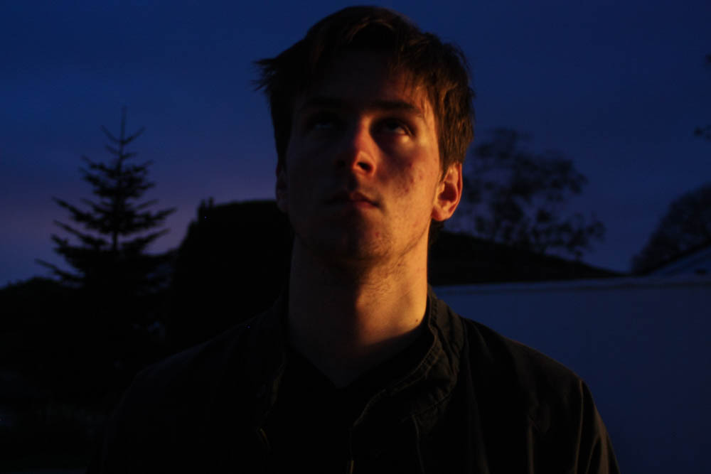
The above photograph is a good example of how I could use media techniques use in films to evoke a narrative to the viewer and add more context to what I am trying to show. The low angle of the camera looking up at Ryan makes him look larger and more frightening. The dark low lighting also makes him look more uninviting, the low key lighting with harsh shadows creates a chiaroscuro effect, which evokes tension that would typically be used in a horror film. His body language makes it appear as if he has just turned to face the viewer, the use of eye contact directly at the camera also creates a connection with the subject and the viewer, the resentful expression adds to the melancholy effect created in this photograph.
I wanted to evoke this in these portraits as I wanted to explore how low, night lighting could completely change the ambiance of a photograph and add narrative to something that would have otherwise been very mundane. This use of low light has also been used in the work Henson to evoke meaning and ambiance. For this shoot I would have preferred to use natural lighting such as moonlight as well as surrounding street lights but found this was unreliable and there was still not enough light available to create a good image.
The above image is probably the most jarring of the selection I have taken. The use of chiaroscuro is very present in this image, giving it the eerie effect. Using the flash gave the background a very textured, grungy effect as well as adding to the mise-en-scene of the image, giving more context to what might be happening within the image, adding narrative. His troubled expression and his complexion suggests a troubling narrative. Again I have used a long landscape ratio to create a more cinematic effect. The juxtaposition of natural and landscape is also subtly shown in this image, such as the weeds and moss that have grown through the wall.
The relevancy of this shoot to the rest of my exam coursework is not exactly obvious, but it could be argued that the juxtaposition of nature and urban is shown from the human present within the image, considering that people are in fact living, natural things. It could also be said that the raw and jarring expression evoked in the photographs is created by human emotion, which is innate within everyone. The unnatural aspect comes from what we have created around us such as the buildings and walls, the images themselves are also not natural from how I have added in lighting that was not present in the surroundings, for subject I have also used makeup to add more emotion and character. These also share a lot of similarities to the artists I have looked at such as the tone and composition as well as how they have used these to evoke narrative and ambiance to the viewer.


 As the book progresses the images appear to get darker, evoking a more eerie narrative, making the viewer question he mental state of the character.
 the images then progressively get lighter, suggesting the return of day, the book follows a fairly chronological narrative. the first image below I used a portrait photo of Ryan in his bed which is an important part in evoking the enigma that the character could have possibly been dreaming.
 I wanted to finish the book with a closeup and picked a high contrast photograph. the book then finished with the quote ‘Carpe Noctem’, adding mystery to the viewer.


 In response to Bill Henson and Todd Hido’s portraits, I wanted to explore the use of interior scenes and the use of natural lighting to build narrative and add emotion and feeling. In relation to my starting point, the natural light contrasts the dark spaces created by the walls and small light sources. I took over 50 photographs, each experimenting with different ISO’s and exposures and I also left it on auto focus, this evoked a sense of depth without creating overly blurry photographs, I also tested long exposures to give the photos a ghostly effect. I did not use a tripod and in hindsight this would have been more beneficial for creating a sharper image especially when working with longer exposures. I decided to not use multiple exposures or HDR techniques unlike many of my previous landscape photographs as I wanted to keep the strong contrasts of dark space with the warm light. The composition of the photographs features closeups as well as shots that feature more of the open space which reflects a bigger sense of environment. I have also made the compositions to work with a book layout so they could possibly work with a double page spread but also just on a single page, complimented with a text on the opposite side.


 The above image was created with the bright green layer set to luminosity creating the grey tones. I also used the previous pink layer from before to give it the warm tones. I wanted to pick words that would evoke the sense of ambiguity but still create a feeling of narrative. I plan on exploring more images using text and other graphic design features in my work.


 I then moved onto a second image featuring a huge amount of warm tones. I wanted to include the phrase ‘The juxtaposition of nature and man made’. I picked a cream colour that was present in the image and found it worked better then white.