
Since looking at the beautiful and informative work of Gregg Segal I was really inspired to go ahead with my first shoot. Using this same kind of stage photography I hope to capture equally as meaningful images that may even inspire change. My first idea for this project is to use a studio setting to depict a strongly symbolic piece, clearly demonstrating some of our most common pollution issues.
The first subject I would like to tackle in this way is the number of cigarette butts there is littering the environment compared to other waste. Later in this project, I will explore this same topic from a photojournalistic point of view to show its effect on our island. The reason I feel this issue needs to be brought to light and clearly represented is the pure fact that over 4.5 trillion cigarettes are littered worldwide each year. As well as this, each of these cigarette butts can take anywhere from two to twenty-five years to biodegrade. 80% of them that are thrown on the ground find their way into our water systems and detract from the quality of our drinking water. Cigarette butts can leach chemicals such as cadmium, lead and arsenic into our marine environment within an hour of contact with water. They have also been found in the stomachs of fish, whales, birds and other marine animals which lead to ingestion of hazardous chemicals and digestive blockages. I believe, using studio techniques and symbolism, I will be able to get across the gravity of this common pollution problem. Below is my plan of action as well as two quick sketches of my original ideas for how I want these photographs to look… My goal for these two shoots is to portray a really symbolic representation of the growing problem of cigarette waste that is produced each year. These two sketches above show an idea of what I want my final results to look like. On the left shows a dirty and greasy hand surrounded with discarded cigarettes on a black background. As well as cigarette butts I will be adding a very small amount of other rubbish to compare with the amount of waste produced by smoking. By using a dirty human hand I am symbolising man-kinds connection to this issue. The image on the right will be a depiction of a flower growing from a pile of cigarettes with a black background. This is an obvious symbol of man vs nature and the problem this pollution is causing.
My plan of action for these two shoots is to use a home-studio of black paper, black fabric and a LED light to capture dark and emotive outcomes. In this ‘studio’ I will use a male model’s hand, a fake flower, cigarette buts and other waste in the way I have presented in my sketches above. The reason I want to use a man’s hand is because men are more obvious symbols of ‘mankind’ and also tend to smoke more than women. The hand is also a symbol of our species and what sets us apart from other animals as well as being what allows use to damage the environment so much. To create the greasy marks I want on the model’s hand I will use acrylic paints and capture the image whilst it is still wet. For the flower shoot I will be using a fake flower, as to not poison its soil, and a pile of waste to spread around the base. I like this idea as it is a really nice representation of the chemical damage cigarettes can do to plants and animals. These shoots are heavily inspired by Gregg Segal and his beautiful staged portrayals of the problem of household waste. Below I have added three images that show the dark tone, different subjects and style of images I am hoping to capture…
 Here I have presented two of my favourite images from the ‘7 Days of Garbage’ series to compare and evaluate. By looking at these two pieces together you can really start to understand the growing problem of consumerism in younger generations. Both of these images depict a straight forward full body portrait image of a person lying on top of a week’s worth of their own rubbish. The meaning behind these creations is quite well explained by the photographer in a powerful statement; “We’ve made our bed and in it we lie”. This explains his intentions that, using his own blend of editorial, fine art and documentary photography, Segal has portrayed one of most problematic pollution issues to the environment in today’s society. I like the age diversity that he has included in this project as it is a really powerful statement that no-one is safe from this problem and everyone unintentionally contributes. I also love the compositions and structure of these images as the strong and obvious symbolism (created by strategically placed rubbish) emphasises the dramatic impact we are having on the world around us. These staged photographs are, in my opinion, essential for documenting our society’s problems today.
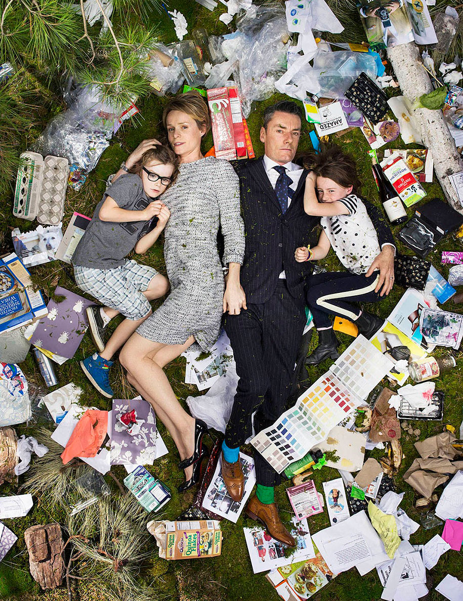 Lastly is my favourite image from this collection depicting a typical 1st world family of four, surrounded by a weeks worth of their house-hold rubbish. I love the overhead perspective of this image as it adds to the staged photography style and overall dramatic tone. This way we are able to view the whole scene from a ‘new perspective’ and really clearly see the layout of the family and their waste. Because of the cloths and ethnicity of these people we can assume it is based currently in the western world. This emphasises this growing problem as a critical issue in first world countries that’s happening right now and will only get worse. The photographer names this family in order from left to right as Alfie, Kirsten, Miles, and Elly. By informing us of each of their names he has really made the project personal and allowed us to relate and connect to the subjects on deeper level. The meaning behind these images is very obviously a statement towards pollution and what we leave behind. Gregg Segal describes his goals and aspiration for the project; “by personalising the problem of waste – by starting with myself and working outwards from there, I’ve found that some are taking small steps to mitigate the crisis. Reflecting on the pictures I’ve made, I see 7 Days of Garbage as instant archaeology, a record not only of our waste but of our values – values that may be evolving a little”. This quote tells us that the meaning of these images is to inform the public of this common travesty as well as to inspire change. The many discarded food wrappers and massive amounts of waste paper symbolise how we can unintentionally, and without regard, waste these every day objects because of consumerism. Overall I love the fine art nature of this image as it still portrays a very clear meaning whilst balancing on the line between staged and documentary photography. The real scale of the rubbish against the size of the family really puts this problem into perspective. Without this use of staged photography, these issues would never come to light and be encouraged to change.
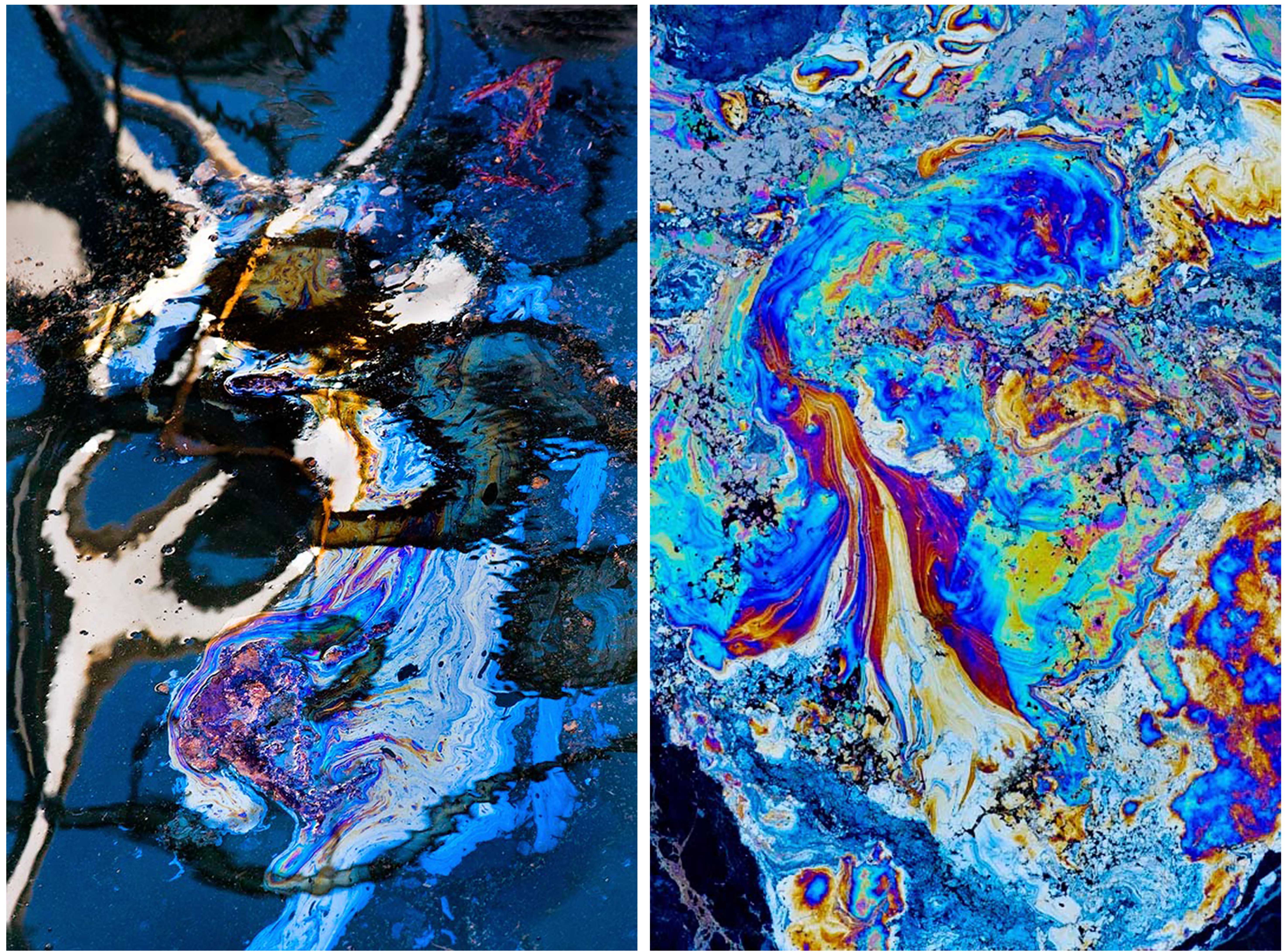 The first photographs that caught my eye from this series are the two abstract ‘painting like’ pieces above. The photograph on the left shows a dark and beautiful mixture of blue canal water, black shadows, multicoloured oil and gold reflections. This piece is entitled ‘Epiales’, which in Greek mythology is the name of the spirit and personification of nightmares. Because of this mythical context, we can assume it is more about the colours, shapes and beautiful symbolism; then the recording societies effect on the canal. However, I believe that because of the nature of this represented character being the ‘personification of nightmares’, this image takes on a much deeper meaning. Human culture naturally and ‘accidentally’ creates these beautifully sickening masterpieces on the water’s surface, so traumatic to the environment it can be compared with nightmares. The photograph on the right comes at this theme from a different viewpoint. Entitled ‘Chloris’, the goddess of flowers, it seems as if it would have a much happier theme. This, however, is not possible with the vibrant, unnatural and toxic colours swirling together mimicking and possibly one day replacing the natural colours found in beautiful untouched flowers.
 These next two astral looking images really express the representation of this project well for me. On the left is a piece entitled ‘Phorcys’, in greek mythology, meaning the ancient sea-god of the hidden dangers. Although this piece looks like a galaxy to me, with its bright colours and deep black background, the title has completely changed its context. Now knowing that this image relates to the dangers of the sea it is a clear representation of constant man-made disasters, like oil spills, that pollute our oceans. I love the beauty he has captured of the oil shimmering on the water’s surface and the ripples that really emphasises its dark and daunting meaning. The next photograph on the left is a bit more straight-forward as it is indeed meant to appear as a constellation of stars. The title of this image, ‘Pleiades’, is named after the seven mountain-nymph sisters who were banished to live amongst the stars. In astronomy ‘Pleiades’ is an open star cluster dominated by hot blue and extremely luminous stars that have formed within the last 100 million years. This astral depiction of all of these dead inhabitable stars (showed with canal pollution) for me, represents the bigger picture of the universe and our underappreciation of Earth as a source of life.
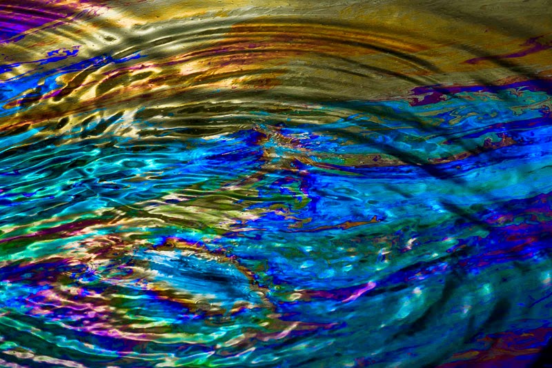 Lastly is my favourite image from this collection depicting the water’s surface lined with reflective oil that is distorted by ripples. I love the perspective the ripples give water and the composition of the many recurring rings inside the frame. Its populated location, current time period and abstract view can tell us a lot about the context and tone of this image. This piece is named after ‘Hephaestus’ the Greek god of blacksmiths, craftsmen, metals and fire. This is a very obvious connection between the metallic shine of the oil and the ‘Greek god of metal’. Because of the titles of each of these pieces being related to Greek mythology, we can assume there is a greater meaning behind the beauty of each image. However, since researching further into this series I have found that for Hirsch, it’s the composition that fascinates him. In an interview about his work, he explains that “a lot of people see an environmental disaster. I just want the pictures to look beautiful”. This quote tells us that the meaning of these images is up to the viewer, some may choose to see the tragedy and others simply the beauty. For me, I believe the meaning of this image is very strongly orientated towards this environmental issue. This oily subject matter and its array of man-made colours is directly linked to the pollution we face in current times paired with the result of sustaining populated cities. I believe that the recurring ringlets in this photograph can symbolise humanity’s devastating and repetitive actions against nature and the beautiful colours shows our distraction and ignorance towards the subject. Overall I love the abstract nature of this image as it contains lots of intense reflective light creating brilliantly contrasted tones. These shadows in the water create a great perspective for this photograph and give us a strong clue for understanding the subject matter. My favourite factor in this image is, of course, the brilliant and vibrant colours that flow from, and contrast,each other.
 Depicted above is a quick diagram made in Photoshop, using many different layers, showing how I might set up my final pieces as two separate but equally as important designs. I created this simple example to show how (depending on how my images work together) it might be best to split them up into symbolism and documentary/studio and location photographs and present them as two different projects, done on the same environmental awareness subject. To create this kind of presentation I will print of my finals as a mixture of A3, A4 and A5 pieces and spray mount them onto two separate large white boards.


 – Mixture of stock images and other artists interpretations of this theme.