Overview of my work:
- Archival/new images – Jersey Archives
- Industrial – Rue De Pres and La Collette – Stephen Shore, Lee Friedlander, Robert Adams
- Pollution – Lu Guang
- Contrasting – Ansel Adams, Romanticism – J.M.W Turner
- Night social landscapes – Todd Hido
- Final outcomes – Photobook, topographic frame, 3 window mounts (night social landscapes).
My initial idea for this project based on ‘environment’ was to explore to changing landscapes of Jersey due to social and industrial development, I wanted to explore human’s effect on the environment. After exploring this I then wanted to emphasise the impact of these factors on the environment by taking contrasting landscape images which would show to extreme difference between the two outcomes. My key ideas were; Jersey archival photos (then and now), industrial and social landscapes, pollution and contrasting landscape images.
My first shoot consisted of exploring archival images of Jersey’s landscape through research which I then replicated by taking similar images in the same locations today – to create a ‘then’ and ‘now’ style of work. This idea was some small background research to start off my project and explore Jersey’s landscapes and environmental change over time.
Archival Image:

My Outcome:

Archival Image:

My Outcome:

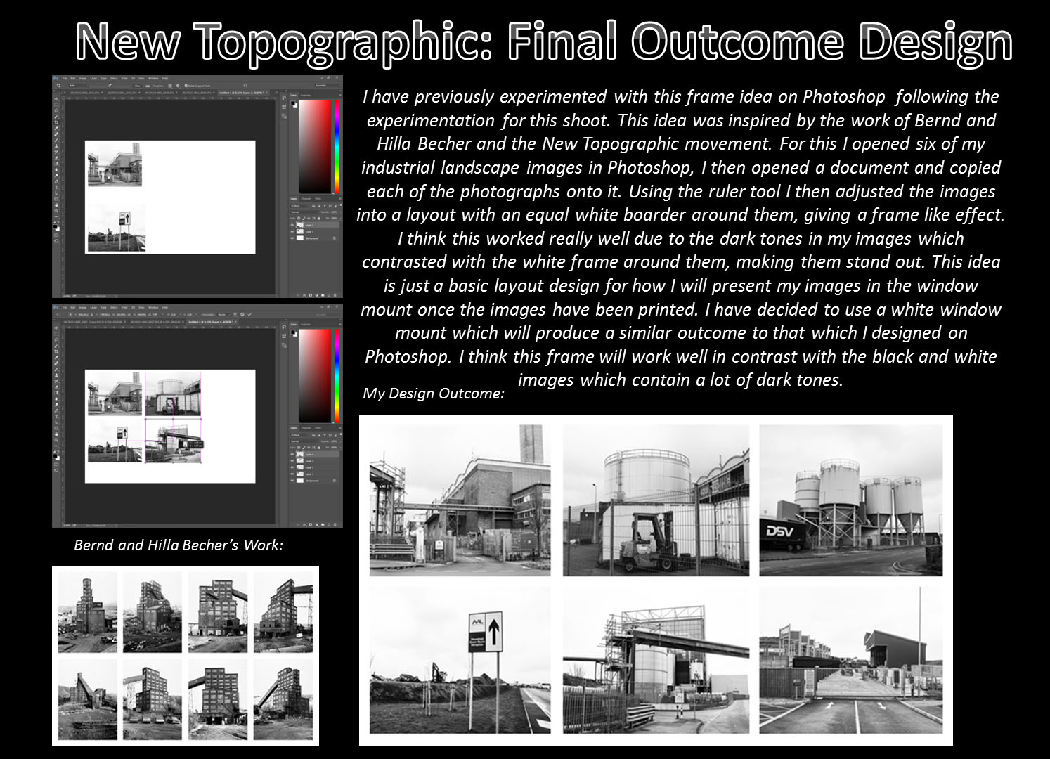
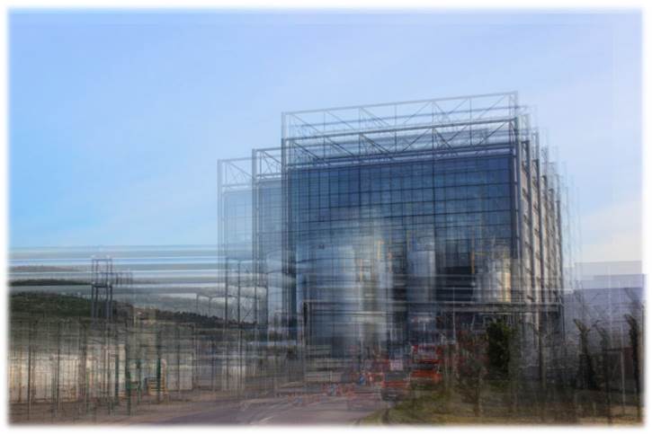
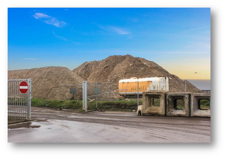
Following this shoot, I then wanted to explore social and industrial landscapes in more depth. For these two shoots I went to Rue De Pres trading estates and La Collette, these locations were successful for the type of images that I wanted to create and many of the outcomes were similar to the work of my artist inspirations (Lee Friedlander and Robert Adams). Using these images, I experimented with layering my images (inspiration from Idris Kahn) as well as looking at the work of Hilla and Bernd Becher and experimenting with arranging my images in Photoshop to create a similar style of work to their outcomes in this area (new topographic frame). I also experimented with layering and cropping these images together to create a range of outcomes from this shoot.
Lee Friedlander’s Work:

Robert Adam’s Work:

My Outcomes:


Idris Kahn Inspired Idea:
My forth shoot was based around exploring another area of human’s impact on the environment. After looking at the work of Lu Guang in my initial research for this project I decided to look at the area of pollution and its impact. After researching some statistics into Jersey’s pollution levels I decided to base my images around beach/water pollution. I found this shoot quite difficult as I was not able to photograph my intended outcomes due to the fact that Jersey generally does not have a lot of visual displays of high levels of pollution. I decided to focus on the area of litter as this is still looking at Human’s impact on our environment and I was able to photograph this on the beach/in the water which created interesting and abstract style outcomes.
Lu Guang’s Work:


My Outcomes:


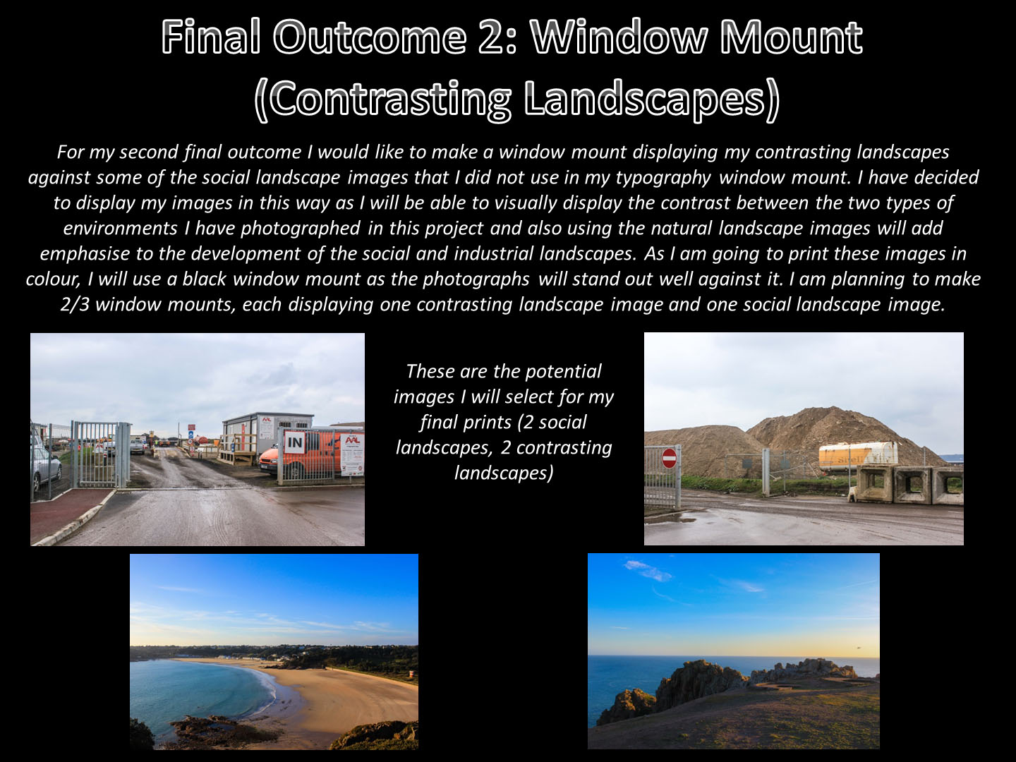
After looking at industrial and social landscapes closely and the effects of it on our environment, I then wanted to explore the idea of contrasting landscapes and how drastically these outcomes would differ from my previous shoots. To inform this shoot I looked at the contextual background of romanticism style photography and J.M.W Turner’s work. As a more recent artist reference for this shoot I also looked at the work of Ansel Adams and his use of the zone system. Following this, I visited many locations including: St Brelade’s bay, St Ouen’s beach, Sand dunes and Corberie to produce my outcomes. Overall, I am happy with these outcomes as I took these photographs as the sun was setting so I was able to capture very warm tones in these images which allowed me to follow the style of work which I was inspired by for these images due to the lighting available. This also gave the images a calm and relaxed feel which work well in contrast to the overcast, serious industrial images. With these images I experimented on Photoshop with combining these outcomes with my other images to emphasise the contrast between the two.
My Outcomes:


Combined Image:
My final shoot for this project was inspired by the work of Todd Hido. He took many social landscapes using night lighting, I thought these outcomes looked very effective and thought it would be interesting for me to explore something similar to this in my own work. I re-visited the previous locations from my other shoots (Trading Estates and La Collette) and used a tripod and cable release to take these images. Although the technical side of this shoot was relatively difficult, I am pleased with some of the outcomes I was able to create and if I was to have more time on this project I would have liked to explore this area further.
Todd Hido’s Work:


My Outcomes:


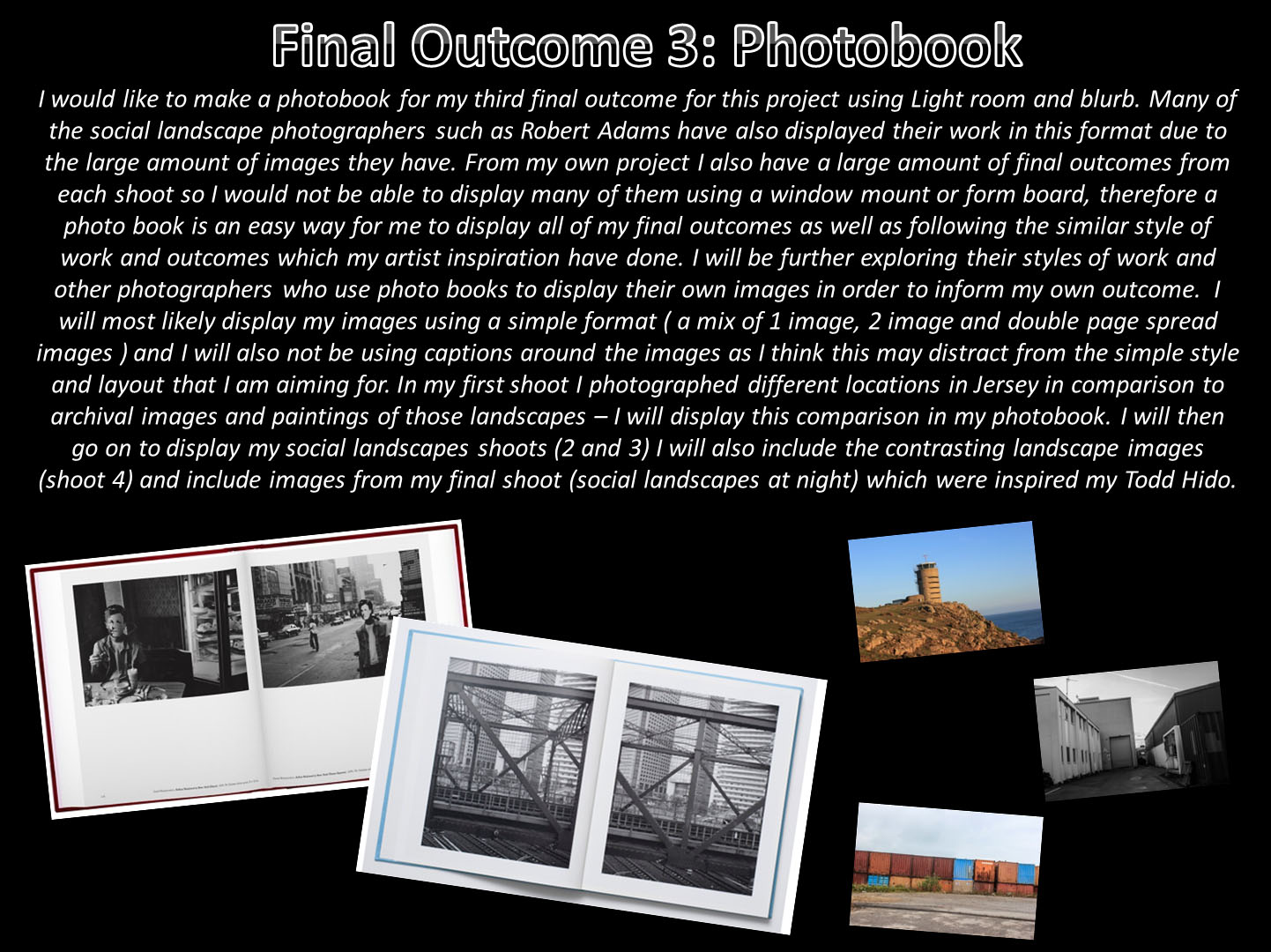
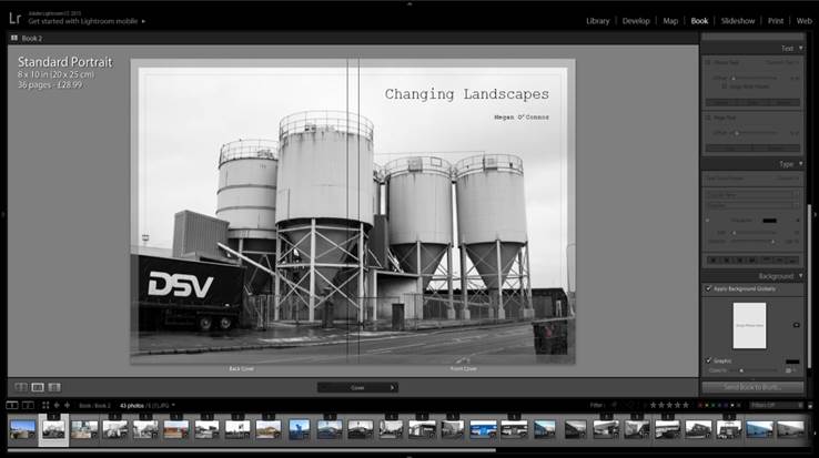
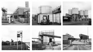
To present my work from this project I have designed a photo-book called ‘Changing Landscapes’ which displays a range of my social landscapes from the different locations I visited. I looked at the work of Robert Adams and Gerry Johansson as inspired for the layout and style of my book. I decided to use a simple and visual layout and uses a range of double page spreads, two images per page and single image layout designs. As my second final outcome I have chosen six black and white industrial images which I will mount up together in a window mount – following the style of work of Bernd and Hilla Becher. I am also printing three of my night time social landscapes which I will be mounting up on either foam board or putting into a single window mount (depending on which one looks more effective).
New Topographic Frame Design:
Overall, I am pleased with the outcomes of my project and think they have successfully captured the intended meaning behind my idea. To improve, I would have explored each idea in more depth and visited more locations for my shoots to give me a wider range of final outcomes to choose from.