All posts by Matthew Knapman

wagwan selecta

Filters

Author:
Category:

Environment – Presentation

In this post, I will be highlighting how I have presented my final outcomes for this project. I started by window mounting my favorite piece from the project. This Black frame works effectively due to the high contrast present in the image. The black frame ensures that the highlights and illustration really pop into the foreground. The shadows that engulf a large majority of the composition, merge nicely with the black border, maintaining an organic visual style.


A3 Window Mount

For the main body of my work, I decided to make a three-dimensional collage, as seen below. Here, I selected my favorite images created during the exam and positioned them ontop and around one another upon a white foam board. Each image was previously mounted upon foam board beforehand, ensuring a sense of depth and dimension. I like the final presentation for these images, as the blocky organisation supports the cartoonish, satirical aesthetic that I have been trying to employ. This completed board, feels like a summary of my travels which I like. The white background enables the colors and tones within these images to truly feel vivid, drawing the attention of the viewer.  Additionally, I created one more collage that features a set of black and white photographs. This presentation works effectively as all 4 images feel natural in co-operation with another, due to their striking visual similarities. This board focuses a lot on the juxtaposition between old and new and has a direct observation on youth culture and history.

Environment – Final Outcomes

In this post, I am going to be looking at and evaluating my final outcomes for this project. I think that my work fulfils the exam brief of’ Environment’ innovating upon the word in order to create something original and unique. My work for this exam is entirely focused upon my travels around the Mediterranean and the different environments I visited. There is a specific emphasis on location which is reflected through the photography produced throughout my project. I was very motivated in ensuring that the individual styles and personalities of each city was accurately portrayed through the work so that we, as an audience, are forced to study and investigate the environment showcased. This project has undergone a series of transformations before finding its final balance and identity. The project originally started at a direct narrative surrounding tourism and disposable cameras. I was certain that I would be studying tourism history and that disposable cameras would be the primary focus of the whole project, due to their popularity in the 90’s and presence within my childhood. Nevertheless, I soon found the concept uninspired and began to look into illustration and digital drawing. I discovered that this would be an excellent way to weave a narrative or message into the environments present from my holidays. Nevertheless, I could not predict the satirical, comedic tone that came to fruition as I began producing some work. The resulting visuals are truly interesting, and quite successful in my mind. We see these goofy, almost childish drawings merging with typical tourist images, generating a very unique aesthetic. I am very happy with the project.

If I was to try and describe my project, I have received the theme of ‘Environment’ and manually manipulated these European environments in a comedic, humorous fashion, almost mocking the serious perspective we are expected to hold. My project is about poking fun and demoting large scale tourism, using visual sarcasm to parody these locations. I have tried to integrate modern culture and the lifestyles of me and my friends in order to evoke a more personal message. 

This piece is very important, as it is the first response I created for this project. It set the tone for the remaining project, which I think has worked successfully. This is the only response that I took from my shoot in Pompeii, Italy. Pompeii, along with Herculaneum and many villas in the surrounding area, was mostly destroyed and buried under volcanic ash in the eruption of Mount Vesuvius in 79 AD. This was a fantastic location to visit, and provided me with lots of photographic opportunities that I did not expect. This photograph was taken within the Quadriportico dei Teatri, also known as the Barracks of the Gladiators. This part of the city was initially used for the audience to stroll and converse during intervals between acts and later as a barracks for gladiators. The portico of the Theater was built in the early first century BC, as a recreational area or shelter from the rain for the  spectators within the Great and small theatres. Nevertheless, after an Earthquake, it was completely renovated and expanded,  changing its function into a school for gladiators. I like the shot I have taken here as there is an appealing palette of colours and interesting lighting composition. The photograph features a warm set of colours, the greens and oranges of the field and blue of the sky creating a summery, positive atmosphere. The large head statue within the foreground, incorporates some interesting textures, as generating from the rusty, cracked metal. I like how we only see one side of the statues face as this produces a sense of mystery and intrigue.  In addition to this, some vivid shadows are being casted from the sunlight as we see one surface of the ruin in the background masked in darkness. Nevertheless, a contrast is made as the highlight of the sky and pillars work nicely in juxtaposition with the shadows. These pillars are a pivotal component of the photograph working extremely effectively to generate a sense of perspective. The pillars start in the foreground and as they follow the natural flow of the courtyard they lead the eye of the viewer towards to the background. Instinctively, our eyes follow the positioning of the pillars and directing us towards the arch in the background and eventually the sky. This left a perfect spot to add an illustration. I thought about Pompeii history and how the city was almost destroyed from the eruption of Mount Vesuvius. This led me into drawing a cartoonish volcano in the background, allowing us to visualise, in a funny kind of way, what happened on that very day. This photograph stands out from the rest in that I am actually telling history through the illustrations.  

These next two photographs come from my visit to Pisa, Italy. As shown, I have tried to incorporate imagery, from an everyday lifestyle. I wanted to continue this comedic visual style and have hence demoted these significant and historic sites into regular, boring objects. There is a sense of irony surrounding this, which is great as it triggers discussion regarding your work. For example, I have transformed the Tower of Pisa, one of the architectural wonders of the world into a fire extinguisher. I like the cheeky, almost controversial nature of the transformation as it forces the audience to think. In the second image I have  captured The Baptistery of St. John. Construction started in 1152 to replace an older baptistery, and when it was completed in 1363, it became the second building, in chronological order, in the Square of Miracles. The building is the largest baptistery in Italy and an example of the transition from the Romanesque style to the Gothic style.  The lower section is in the Romanesque style, with rounded arches, while the upper sections are in the Gothic style, with pointed arches. The Baptistery is constructed of marble, as is common in Italian architecture. I found this baptistery really beautiful and am happy with the photo I have taken of it. There is an attractive sense of light and dark as we the find  details of the architecture pop into the foreground. I really like how the light source is coming from the left side and it consequently casts one side of the baptistery in light and the other in darkness. The sky works in cooperation with the image here as an absence of clouds and colourful blue tone makes the building more prominent within the landscape. Here, I identified the curvature and shape of the baptistery and turned it into a mug of hot tea. Again, this is a very boring, ordinary object that we see frequently and pay little attention to. I was inspired by Michael Craig Martin in the incorporation of mundane objects like these. 


In these three images, I have tried my best to try and incorporate contemporary and modern culture, illustrating key components of the society I am invested in. This involves visual cues associated with teenage and student lifestyle. This can be seen within the first photograph, which is probably my favourite image from the whole project. This photo depicts the statue of St Agnes within The Pantheon in Rome. I like the way the lighting submerges the statues top half in shadow and the way in which the smooth, folds within the cloth of the gown has been highlighted by the soft light. With the top half of the statue shrouded in darkness, the opportunity to use crisp white-line drawing was available. I began to fill in where the details of the statue start to disappear around the waistline, working upwards towards the head. At this point I noticed the gesture of the subjects right hand, which visually looks like she is grasping a small, thin object. Yet on the statue, no object is present within her fingers. As a result, I identified the opportunity to implement a joint/spliff. This is something largely present and associated with teen culture, as drugs are consistently an active force within the life of a student. Visually, I think this creates a very striking juxtaposition, following the irony that I have been enforces so far. We see a historical piece of art within an extremely catholic building. This is an environment where a joint could not feel any more unnatural. There is a powerful contrast of ideologies and lifestyles. I continued this theme of teenage culture with the next photo, where in which I have photographed my sisters phone capturing my reflection in the front-camera. The image itself is not very interesting, but I thought I could create something unusual with additional illustrations. The phone surface presents me with a canvas that is in direct view of the audience. With this in mind, I decided to outline my silhouette within the phone screen which creates quite a cool, stylistic effect. In the final image of this set, I have produced an aesthetic that is synonymous with the photograph of St Agnes. I have decorated this statue within the city of Heraklion, Greece with a very urban and modern set of clothing. Inspired by the outfits of teenagers and students I know, I have equipped this statue with an Adidas tracksuit and cap. This evokes a youthful visual message that clashes with the heritage and history associated with statues.

In these three photographs, I have payed specific attention to the environment and architectural clues provided. I have tried to weave my illustrations within the photographs so that they feel natural and organic. The first photo was taken in Athens. the capital of Greece. I captured an old, stone archway in the distance, peaking over the shrubbery and tree-line. I was quite interested in the crisp arch shape that had been created, intrigued by its position in the center of the composition. I saw the opportunity to include two parallel, vertical running lines that I eventually transformed into a tree-swing. I like the resulting outcome as we again see this juxtaposition of age. Youth and childhood is being pitched against maturity and age. The next photo was captures the Colonnades that enclose St. Peters Square. The colonnades define the piazza. I like this image, the lighting working very effectively to create a domino-like effect. We see the large, marble columns spiral around the corner out of sight which leads the eye throughout the composition of the photo. There is a great balance of light and dark here, splitting the image into separate segments. Furthermore, another beautiful lighting display is presented on the clean brick floor as a zebra-crossing effect is created. The shadow of each pillar generates a striped pattern which is quite intriguing. Here, I integrated a clothing line, again following this concept of mundane and regularity. I like its natural integration within the composition as the line crosses across the pathway to connect to the pillars. The final photo of this set was taken in Knossos, Greece. I have tried to reconstruct this destroyed, ancient temple filling in where the structure has collapsed. In addition to this, I have improvised upon the upper layers, creating a floor of my own and a large sign upon the roof that reads ‘Tourism Office’. I thought this was a witty way of enforcing this theme of visual satire, almost mocking this ancient city and essentially labelling it as just a tourist attraction. 

These three photographs all possess specific emphasis on lighting, hence working well as a set. Moving away from monuments, churches and ruins, for the first two photographs I have directed my attention towards ordinary streets and alleys. I wanted to capture average lifestyle as oppose to the landmarks and tourist attractions that we are accustomed to viewing in these popular cities. The first photo was taken in Rome and features an appealing colour palette, the oranges and cream-painted walls evoking a warm and European ambience. We get a summery feel from this image which I like. In the first photo, the uniform, organised layout of windows creates a sense of satisfaction, as we see the blinders, open and closed, line the walls of the street. I like the texture of the wall, the paint beginning to fade and crack suggesting a sense of imperfection. I thought that the first photo would provide a fantastic opportunity to draw something within the open window in the foreground. Perhaps a resident within the room or a romantic balcony interaction. I decided to pursue this and am quite happy with the final result. The seconf photograph is probably my favourite from the Monaco collection due to the lighting. The shadows being casted are uniform and organised as correlated with the architecture of the building. The railing at the top of the image creates a crisp, lined shadow that disperses down to the bottom of the composition. I like the blocky, box form of the photograph as almost all shapes are made from sharp connecting lines. For this image, I transformed it into black and white in order to ensure focus on lighting rather than colour. Additionally, I  drew someone peeping out of the door in the foreground. I thought it would be interesting to transform this cold, industrial building into a home. The final image of this set was taken within the Pantheon in Rome. The highlight of the site is the hole in the center of the domed ceiling, otherwise known as an oculus. This was an engineering gem of the Roman world. No oculus had even dared come close in size to the one in the Pantheon. It is still lined with the original Roman bronze and is the main source of light for the whole building. This was one of my favourite sites within the city and I wanted to include this magnificent oculus within my project.  I have stood directly below the hole in the ceiling and pointed my camera upwards, capturing the leaking light. The resulting image was quite abstract and I decided to illustrate the face of a sun upon the hole of light. Furthermore, I drew shines of light emitted by the sun, that were uniform with the inner architecture of the dome. I like this photo as it is very different from the remaining portfolio.

These final three photographs are all portraits, hence their grouping together. In these images, I tried to create something different that stood out from the remaining photos. These images are intended to retain the youthful, fun and cool vibe that is popular within student art and illustration. As a consequence, you can identify the clear use of powerful and vibrant colours that pop away from the surrounding environment. In the first photo, I have decorated the glasses of my sister with a series of parallel, thin lines that sit upon the lens. I selected a gradient of yellow and purple to evoke this cheerful, holiday-esque colour palette. The youthful, free-spirited visuals are supported by the facial expression of the subject who is sticking her tongue out at the viewer. This enforces a sense of casual, easy-going informality. Similar styles are conjured in the following two images as the black and white works as an effective backdrop to these colourful illustrations. The subject holds up the hand gesture for ‘peace’ invoking thoughts of the hippy movement and love. This is fortified by the choice of colours, a sequence of rainbow that transpires across the image. We of course associate rainbows with equality, LGBT and freedom.

Environment – Artist Reference 3 – Caroline Grohs

Illustrator and designer Caroline Grohs was born in Düsseldorf, Germany. She grew up in a small town near Düsseldorf where her parents still live today. At the age of 19, she began her studies in Düsseldorf but a year later she moved out of her parents’ home and spent a year studying in Hamburg. Her mother is a graphic designer, so was introduced to graphic design, art and photography at an early age. I have selected Grohs as inspiration for my further work, her illustrative line work being being synonymous with the visuals I am creating. Her drawing work is largely geometric and polygonal, creating a contemporary and modern design that works effectively for the commercial nature of the art.  Grohs talks about this, stating that her favorite subjects and priorities were Corporate Design, Editorial and Illustration. This is evident through her corporate design project for a ballet/theater.This project is named Motion Theater. Grohs talks about the process of this project below: 

“After defining the brief for myself, I searched for inspiring photos and was fascinated by a photos from John Davis and other similar photographers. Their photos of dancers were just focused on the dancer with a clear background. I loved them. They were perfect to show how my concept should work. Then I tried to create a logo for the Motion Theater. A symbol combining the features of this theater – especially the focus on the main dancer – and the movement of dance. I drew many sketches and finally created this kind of “screening”, which has been adapted in different ways to represent the different figures and moves. The logo resulted from these sketches. The posters intertwine the dancers movements and their connections to the theater, so that it appears to be “in motion” at all times. The “floating” typography also expresses dance as movement in space. I love this kind of typography because it is a strong and clear statement, especially for this modern part of my theater.”


Grohs’s work on Motion Theatres can be seen above. She has essentially created these advertising posters for a ballet event, employing both her photographic and illustrative skills in order to generate a professional, corporate piece. We can identify the significant use of typography, as discussed by Grohs previously. She has employed a narrow, sans-serif, bold font for the important text that must be seen by the viewer. In addition to this, a collection of colours have been used to segregate components of text. We see the inclusion of a pale orange and turquoise that successfully organise the text without overpowering the primary image or main headline. These photographs themselves are very minimalist and simple. Taken within a studio environment, all emphasis is on the dancer. With a complex background, these images would be way too crowded. There would be too many clashing components such as the text, illustration background and subject. This is something to remember when I produce my work. The illustrations themselves are thin, white-line drawings. Polygonal shapes are being created to replicate the form and silhouette of the dancer. These geometric lines all originate from the word ‘Motion Theatre’ almost like they are being projected upon the dancer. It creates an interesting visual effect, looking as if the subjects are being consumed or protected by these transparent shells. I really like this project and it provides me with a number of different ideas that I can employ going into my exam. The work of Grohs has enlightened me regarding the use of typography and how this can assist in conveying a message within my work. Furthermore, Grohs work demonstrates the effectiveness of subtle line work. Her mark making is thin and reclusive. It is not in your face or dominating the composition. It shows how sometimes simplicity, and allowing the image to breathe and show its positive visuals can be a successful decision.

Environment – New Idea – Digital Illustration Experimentation

Now that I have completed my travels and have collected my images, I am tasked with creating some original final images. On this post, I am going to be documenting and experimenting with an idea I had whilst on my travels. As discussed in a previous post, I felt the urge to incorporate some external art within my photography, in order to avoid generic tourist responses.The genre of Travel Photography is now very crowded due to its accessibility and ease of involvement and there is little originality in documenting the landscapes and atmospheres of foreign locations as it can essentially be done by anyone. I left on my vacation having looked at Carlos Spottorno,  planting concepts in my head surrounding illustration, but no solid ideas that could be experimented with. Nevertheless, I began investigating contemporary illustration given that this is my chosen course at my future university. I looked at the work of Michael Craig Martin, studying crisp, clean line work and if I could perhaps implement this within my work. After experimenting in Photoshop, I finally found an idea that has the potential to produce distinctive results. Here, I will be outlining the process of creation and my thoughts on the prospects of the concept. 

I start by selecting an image that is very open for further adjustment and reconstruction. I wanted something basic and simple in order to avoid complex compositions that will crowd the photographs. This photograph that I took in Knossos, Greece seemed appropriate. A large portion of the image is cloudy sky, which provides a blank canvas for digital drawing. In addition to this, I was attracted to the way in which that the building is partially destroyed, which will enable me to reconstruct the structure that is missing. I am essentially re-building this ancient temple in the way that I please. Its important to note the way this all links back to the exam brief of ‘environment’. In this case, I am manually manipulating this landscape, adapting and changing the environment into something different. The first thing I do, is import the image into Photoshop and make it black and white. For the piece I am planning, the linework created is going to be colourful. With a desaturated background, these colours will be perceived a lot more vividly, popping into the foreground. With a blue-grey sky, the tones begin to combine and merge together which ruins the crisp, clean aesthetic I am searching for. I turn the contrast up a bit, ensuring some dark shadows that will serve as effective backdrop.

With the image prepped, I now select the Pen tool. The Pen is an excellent tool that allows me to draw lines in a very controlled and manual manner. The key feature of the Pen is its adaptability. Click once to add a single point and create an angle to the next, or alternatively click, hold and drag to create a curve. It enables me to create any shape I want, straight or rounded. In addition to this, every point is completely editable after you’ve finished the shape, and you can add new points if you want to add an extra curve into the shape. This means I can come back to my illustrations at any point and make further adjustments to improve the piece. In the image above, you can see that I have started reconstructing the base of the building, drawing in the collapsed pillar and first floor. On the top tool bar, you can also spot an array of options that are available regarding the visuals of the lines being created. For example, I can change the weight of the line for thicker strokes and manually select a colour of my choice. For this piece, I have selected a mid-tonal purple. It works effectively due to its ability to stand out upon both shadows and highlights.

With the building complete, I decided to implement a large sign upon the roof. Currently, the illustration lacks personality and individuality. I would like to incorporate a sense of fun within the piece in order to rectify the bland visuals. As you can see above, I wanted to create a sign that labels the building as ‘ Tourism Office’. I thought this was a witty way of enforcing a theme of visual satire, almost mocking this ancient city and essentially labelling it as just a tourist attraction. It forces the audience to think which creates discussion. Nonetheless, I cannot simply rotate the text and slot it within the sign margins. The piece sustains a sense of perspective, as the construction gets smaller as it moves further away from the audience. Consequently, the text must share the same qualities. I select a font that enforces this fun, satirical attitude as suggested by the rounded edges and capital letters. In order to make proportional adjustments to this piece of text, I must convert it into a pixels as oppose to a text layer. With this complete, all I have to do is Transform the layer and select ‘Perspective’. This option permits me to manually adjust the positioning and perspective of the text, meaning I can make it larger in the foreground and smaller in the back. The final result can be seen below.

I think this is an idea worth pursuing as it demonstrates a form of originality that is currently missing from my work. Illustration is something that I am passionate about, and I think I possess the keen eye required to impose imaginative ideas upon standard environmental photographs. With this experimentation complete, I will continue to produce more responses.


Environment – Artist Reference 2 – Michael Craig Martin

Sir Michael Craig-Martin is an Irish-British contemporary conceptual artist and painter. His early work drew together a variety of objects and materials and questioned the nature of art and representation. In the late 1970s he began to make line drawings of ordinary objects, creating over the years an ever-expanding vocabulary of images which form the foundation of his work to this day. His more recent work, which includes painting, printmaking, installations projections and drawing, continues to depict common place objects. During the 1990s the focus of his work shifted decisively to painting, with the same range of boldly outlined motifs and vivid color schemes applied both to works on canvas, and to increasingly complex installations of wall paintings. This is a visual style that I would love to apply to my own photography.  I think that Martin provides a possible link between both traditional art and photography, uniting the two mediums. This is perfect for me, given my passion for drawing and taking photographs. By undertaking this project, not only can I link two of my school subjects ( Art and Photography) but I can produce work with enjoyment. I love drawing and taking Photographs so merging the process together should be a fun challenge.

Below I have included a collection of Martin’s work for analysis. I truly love this work and I think it is something that I am passionate enough about, to pursue for my project. This is assuming I incorporate a sense of individuality upon the idea and find a way to apply it to travel photography and environment.

As demonstrated in the artwork above, Martin is very intelligent in the way he creates his imagery. Martin creates brightly coloured and minimally drawn paintings of everyday objects. There is nothing special or interesting about the objects that Martin selects to study. They are mundane, regular items that we frequently encounter in everyday life, but never pay attention to. It is therefore quite, thought-provoking and intriguing when you begin to produce huge exhibitions focusing on them. Its triggers questions surrounding what makes real art. I really like the minimalistic visual style employed by Martin as well. He creates simple line drawings with no shading, indicating shape and form. He then incorporates an array of vivid and powerful colour tones throughout the piece that frequently clash with one another. This works effectively as we begin to question our familiarity with these everyday objects. Michael Craig Martin uses bold colours and lines to enhance his work, he also adds bold backgrounds that complement his art. As demonstrated above, he frequently places the object right in the middle of the picture to create a strong sense that nothing is more important than the other.

Applying to my Project

So they question is, how does this work apply to my photography? Inspired by the work of Martin, I would like to create my own digital illustrations that merge and combine with my photographs. Picture one of Martin’s individual object pieces, except the coloured background has been replaced with a photograph. This develops some concepts and imagery that has potential to look good. But we are left questioning the relevance between photograph and drawing. A drawing of a lightbulb upon an image of field looks confusing, random and out of place. This where my own individual thinking and style will be forced into action. Although I would to still like to maintain Martin’s ‘everyday’ way of thinking within my project, I would like to organise these objects so that they work in co-operation with the photographs. Although Martin’s digital illustration was the initial stem of inspiration for this concept, upon further research, I discovered some of his sculpture work that comes close to demonstrating my visual plan. I have included some images of this above. 

These images are all taken from Michael Craig Martins exhibition at Chatsworth. This is a major display of contemporary sculpture in the garden with new works made specifically for this exhibition. Installed in the Gardens of the Chatsworth house, home of the Duke and Duchess of Devonshire, Martin created twelve heavy, steel ‘line drawing’ sculptures including vibrant umbrellas, huge garden implements and a giant pink shoe. While the objects themselves may be ordinary, their form and scale are anything but. When captured on camera, the resulting image represents something similar to my intentions with this project. The main difference is that, I will not be erecting any sculptures, but digitally drawing these objects upon my travel photography. This will experimental and largely improvisational as I select objects that I feel would be appropriate to the landscape and environment. With digital drawing, I also have a lot less restrictions than Martin did with his sculptures, meaning I can test out unusual visual effects and compositions. This idea provides me with the opportunity to provide messages and thoughts surrounding the cities I am visiting. For example, in Rome, I can illustrate Roman gladiators over a photograph of the Colosseum, as if to impose history and heritage over modern day imagery. Although Martin’s work has served as excellent inspiration for me, I am certain now that my work will be very different. Whilst I love Martins exhibition at Chatsworth, his sculptures a very random and pitch little relevance to the environment present. My work will be a lot more focused and directed, paying attention to the landscape and working off of these visual cues. 

Shoot 4 – Pisa

My next shoot, was located in Pisa, Italy. Pisa is a city in Tuscany, Central Italy, straddling the Arno river. Although Pisa is known worldwide for its leaning tower, the city of over 90,834 residents contains more than 20 other historic churches, several medieval palaces and various bridges across the Arno. Pisa is a very popular tourist attraction, but I was excited to see the site for myself and compare how the location conflicted with my expectations. The leaning tower is constantly talked about and remains as one the most special architectural wonders in the world. I had an expectation that perhaps the tilt was exaggerated or enhanced in photographs and was consequently keen to investigate with the naked eye.  Below is a contact sheet that presents all the photographs taken on the shoot. 

Pisa was a very small town and I was surprised by its casual and mundane appearance. Besides the Tower and main cathedral, the town is largely narrow and regular streets equipped with shops and houses. Nevertheless, in summary I really liked the town. It felt cosy and clean but filled with history and culture. There were almost no modern or out of place buildings, securing a consistent Tuscan, countryside atmosphere.

— Its important to note that these images have been selectedwith the intention to develop with illustrations. They are not individually the best photographs from the shoot, but provide the best opportunities for overlaid drawings. —

In these three photographs I have tried to capture the attractions and sites surrounding the notorious leaning tower. All these sites are located within The Square or Miracles. The Pisa tower is one of the four buildings that make up the cathedral complex in Pisa, Italy, called Campo dei Miracoli, which means Square of Miracles. The square is not located in the center of the city as you might imagine but to the north-west of the fortified wall, almost out of the town. The square is surrounded by a beautiful green lawn where tourists and university students can lie down and relax in this setting. The square is recognized as an important center of European medieval art and one of the finest architectural complexes in the world. In the first photo I have captured a statue lying beside the leaning tower. This is a fallen angel, created by the Polish artist Igor Mitoraj. Though the statue is part of a temporary exhibit, it demonstrates the square’s abilities to showpiece art work from contemporary artists across the world. The reason I have selected this image is because I believe it will be perfect for illustration and drawing. Due to the fact that the fallen angels limbs and other body components are missing, I am provided with the opportunity to implement new ones. I can draw my own arms or perhaps implement some religious imagery throughout the background.  In the second photo, I have captured a tiled dome peaking over the top of the square walls. I discovered that this dome is situated within the square graveyard, otherwise known as the Camposanto. The graveyard is an ancient monumental cemetery set on the north side of the Square of Miracles. Begun in 1277 by the architect Giovanni de Simone, it is a rectangular structure with an inner cloister with Gothic arcades. As ancient tradition would have it, the graveyard was built on dirt carried back from the Holy Land, in particular from the place where Jesus was crucified. Within the cloister you’ll find many sarcophaguses and Roman graves, used exclusively for the burial of prestigious men, while beneath the floor are graves of the nobles of Pisa. I really like this photo, and I think its simplicity works to an advantage.  Nevertheless, I do think the exposure could be reduced a little in the editing stage and this will be executed if I decide to utilise this image in further stages of the project. The photo has a very minimalistic aesthetic as the clean and crisp sky dominates the composition. This will be ideal as it provides a blank canvas for me to illustrate upon. I really like the way that the graveyard dome is only just peaking over the square walls. Its almost a reminder that death is always a part of life and that it cannot be ignored nor forgotten. Despite the beauty and life symbolised through the inner square, death lingers within the background, watching. 

In the final photo of the set, I have captured The Baptistery of St. John. Construction started in 1152 to replace an older baptistery, and when it was completed in 1363, it became the second building, in chronological order, in the Square of Miracles. The building is the largest baptistery in Italy and an example of the transition from the Romanesque style to the Gothic style.  The lower section is in the Romanesque style, with rounded arches, while the upper sections are in the Gothic style, with pointed arches. The Baptistery is constructed of marble, as is common in Italian architecture. As it shares the same unstable ground as the tower, the baptistery also has a slight lean of 0.6 degrees towards the cathedral. I found this baptistery really beautiful and am happy with the photo I have taken of it. There is an attractive sense of light and dark as we the find  details of the architecture pop into the foreground. I really like how the light source is coming from the left side and it consequently casts one side of the baptistery in light and the other in darkness. The sky works in cooperation with the image here as an absence of clouds and colourful blue tone makes the building more prominent within the landscape. 

Next, we have the images that focus primarily and almost entirely on the famous Leaning Tower. Tower of Pisa is more accurately referred to simply as the bell tower, or campanile. The Leaning Tower of Pisa is the piazza’s crowning glory. Although only a third as high as the Washington Monument, it was a miracle of medieval engineering, probably the tallest bell towers in Europe. With the spiralling exterior columns ranged around eight stories, I found that the tower of Pisa looks like a massive wedding cake. The construction of Tower of Pisa began in August 1173 and continued for about 200 years due to the onset of a series of wars.The top of the leaning tower of Pisa is about 17 feet off the vertical and the tower is also slightly curved from the attempts by various architects to keep it from leaning more or falling over.Many ideas have been suggested to straighten the Tower of Pisa, including taking it apart stone by stone and rebuilding it at a different location. In the 1920s the foundations of the tower were injected with cement grouting that has stabilized the tower to some extent. In the first image, I have tried to capture the tower individually. Although the horizon line needs to be straightened, I like the image and think it would be suitable for illustration. The tower holds a cylindrical shape that exists frequently in everyday life and ordinary objects. This will make it easy to transform the tower into something mundane. The next two photos share a nice sense of depth and perspective. There is a clear perception of dimension with immerses the viewer. Both photos are essentially the same, except one is landscape in orientation and the other is portrait. The benefit of the portrait is that we can get a complete spectacle of the tower, allowing us to see its peak. As a result, I prefer this version of the image. In addition to this, there is also a small pigeon sat upon the statue that is more identifiable within the first photo. In the final photograph, I have tried to capture both the Tower and the Cathedral. Pisa Cathedral is a medieval Roman Catholic cathedral dedicated to the Assumption of the Virgin Mary, in the Square of Miracles in Pisa.  It is a notable example of Romanesque architecture. Construction on the cathedral began in 1063 by the architect Buscheto, and expenses were paid using the spoils received fighting against the Muslims in Sicily in 1063. The church was erected outside Pisa’s high middle age-era walls, to show that Pisa that was so powerful, it had no fear of being attacked. I like this photo and feel like it a complete overview of the square and what to expect from Pisa. The marble of both buildings beautifully reflects the natural sunlight rendering both sites as bright and powerful in lighting.

Shoot 3 – Rome

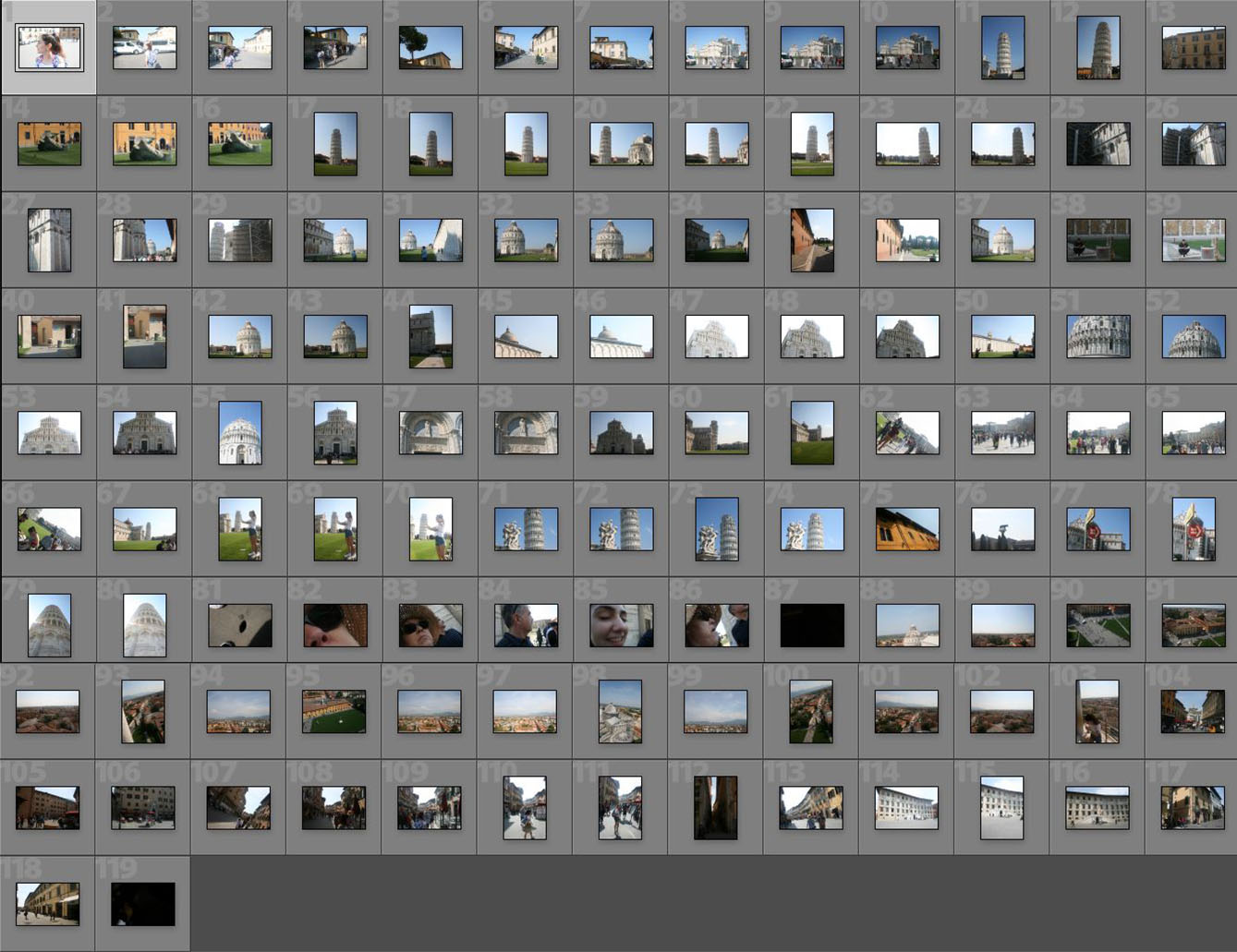
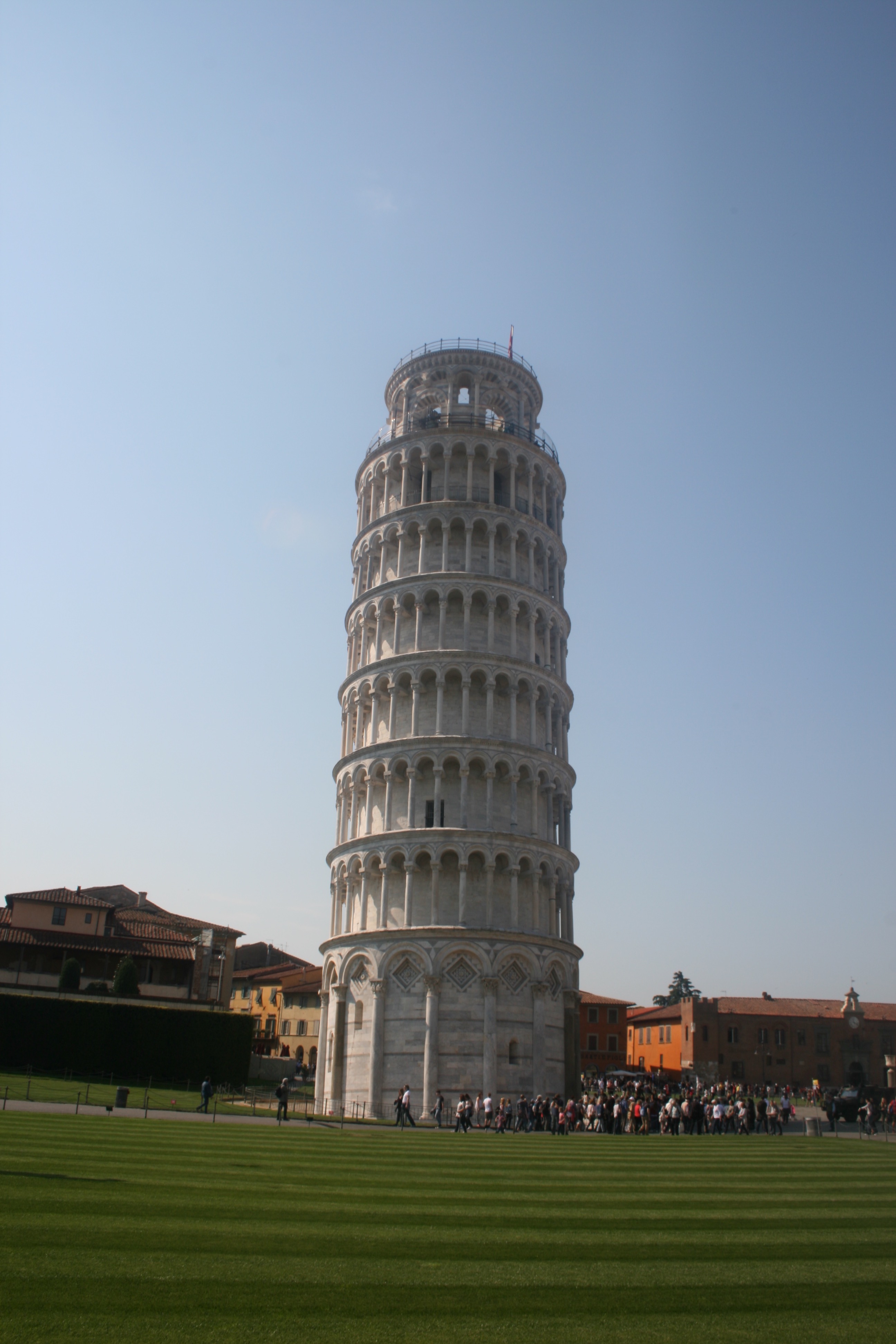
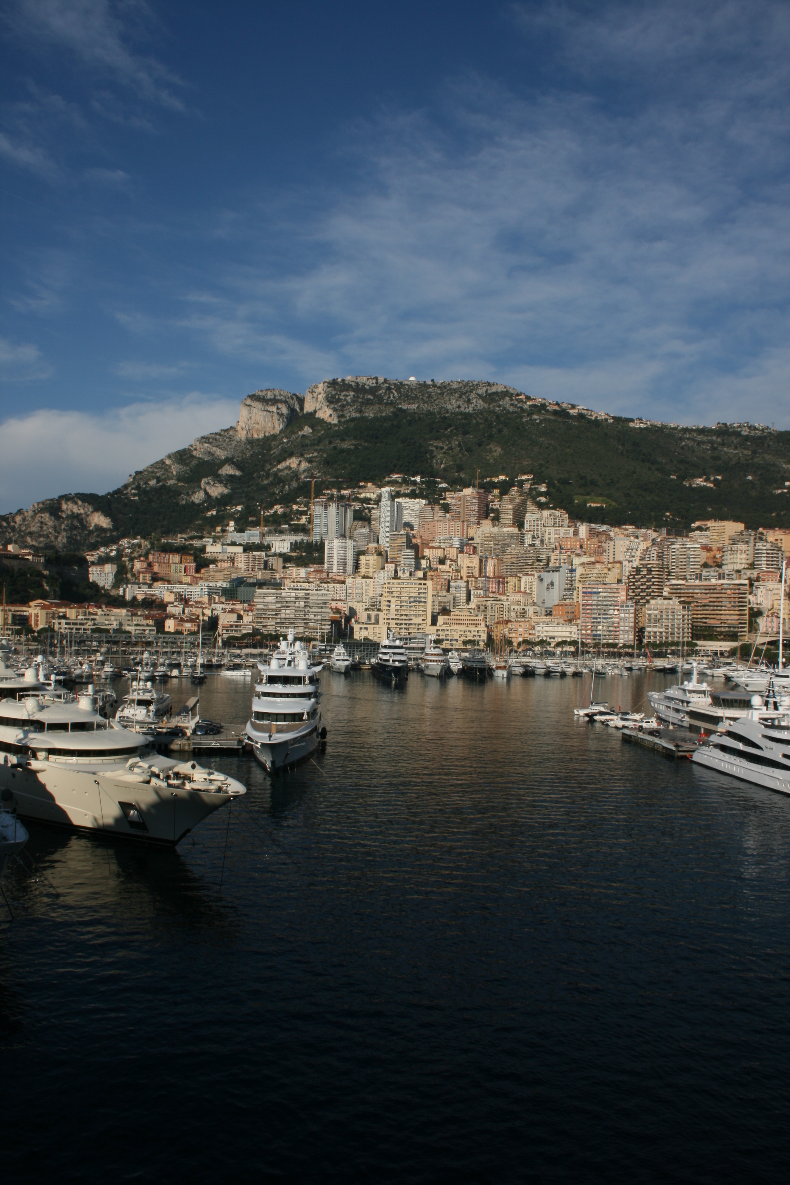
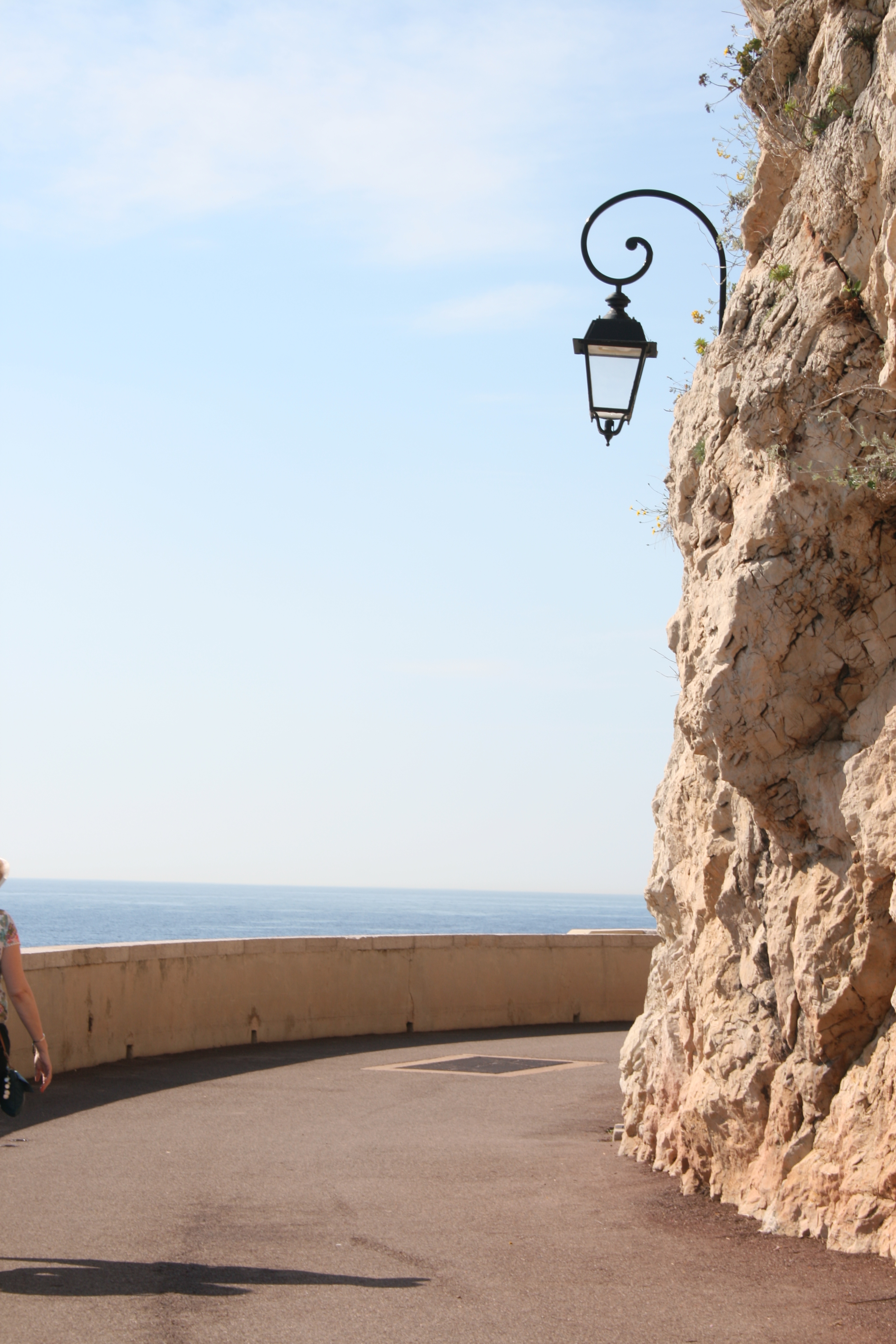
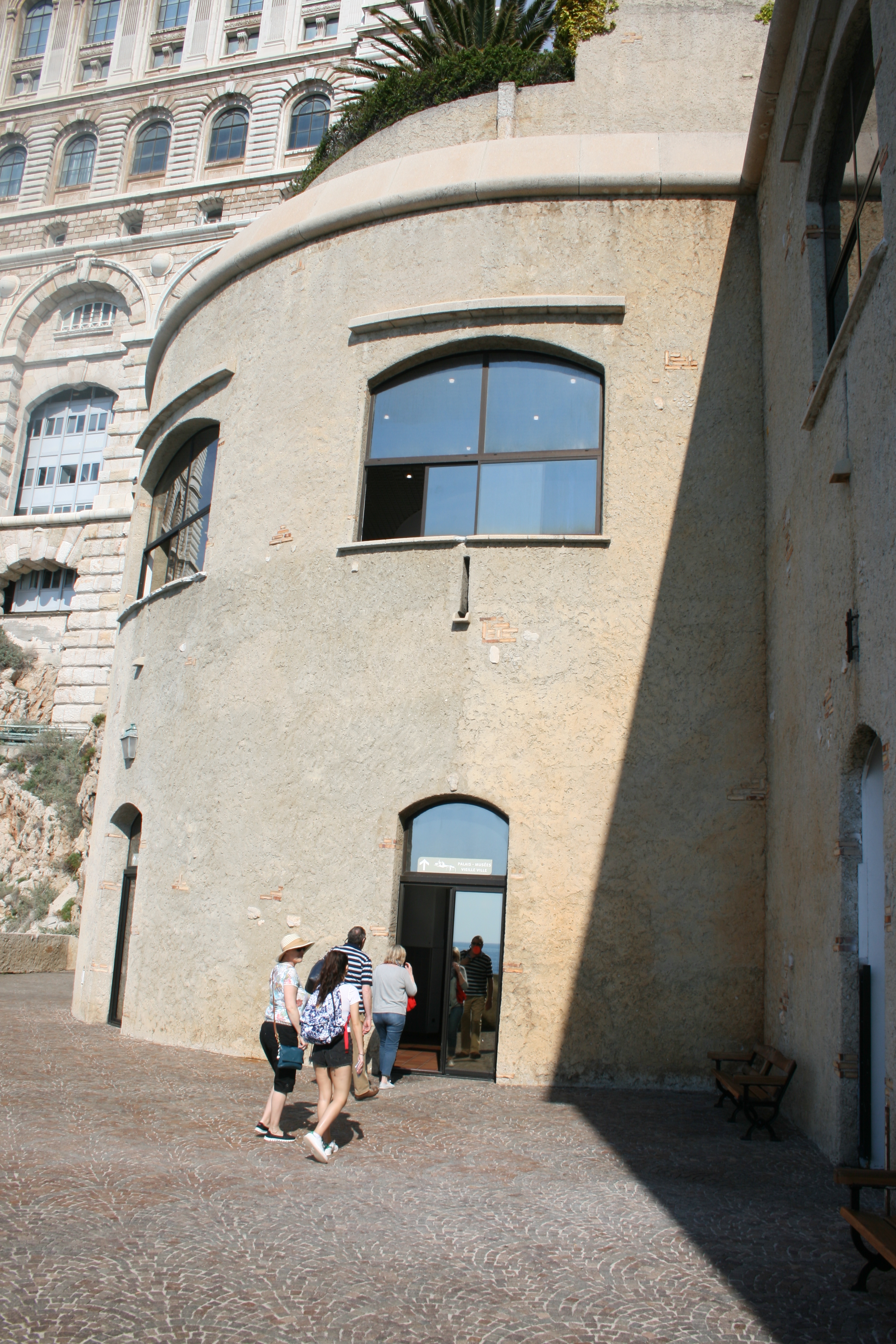
On the next day of my travels, I visited the capital of Italy, Rome. Rome was once the cradle of one of the globes greatest civilizations ever, and is a historic centre of power, culture and religion. The city has exerted a huge influence over the world in its roughly 2800 years of existence. With wonderful palaces, churches, grand romantic ruins, monuments, ornate statues and fountains, Rome has an immensely rich historical heritage and cosmopolitan atmosphere, making it one of Europe’s and the world’s most visited, famous, influential and beautiful capitals. I was incredibly excited to visit Rome as I am fascinated by history and have read and consumed so much material about this famous city. I had desperately wanted to the visit Rome for many years and was excited to take some photographs upon my visit. I had to remember and consider my project idea, which was to produce work that could be utilised as a backdrop for external illustrations. This would involve focusing on elements such as lighting whilst maintaining a direct focus on the city itself and trying to capture the atmosphere and style. Below, I have included a contact sheet of all photographs taken on the shoot . 

Rome is traditionally said to have been founded by the mythical twins Romulus and Remus on 21 April 753 BC. The twins were abandoned as infants in the Tiber river and raised by a wolf before being found by a shepherd, who raised them as his own sons. The settlement developed into the capital of the Roman Kingdom, led by a series of Etruscan kings, before becoming the seat of the Roman Republic and then the centre of the Roman Empire. For almost a thousand years, Rome was the largest, wealthiest, most powerful city in the Western world, with dominance over most of Europe and the Mediterranean Sea.  Even after the fall of the Western Roman Empire in 476AD, Rome maintained considerable importance and wealth. Beginning with the reign of Constantine I, the Bishop of Rome gained political and religious importance, establishing the city as the centre of the Catholic Church. Throughout the Middle Ages, most of the city’s ancient monuments fell in disrepair and were gradually stripped of their precious statues, ornaments and materials; these were either recycled in other constructions or, as in the case of marble, baked in order to obtain mortar for new buildings. With the Italian Renaissance fully under way in the 15th century, Rome changed dramatically. Extravagant churches, bridges, and public spaces, including a new Saint Peter’s Basilica and the Sistine Chapel, were constructed by the Papacy so that Rome would equal the grandeur of other Italian cities of the period. The city became the centre of Baroque architecture, renowned artists such as Michelangelo, Bernini and Caravaggio worked there. 

To summarise my experience, Rome exceeded my expectations and I was amazed by the appearance and design of the city. Rome is essentially a giant piece of art, the architecture and street design is articulate and decorative drawing emotion just like a painting would. You are forced to look in all directions just due to the sheer amount of history and culture that constantly surrounds you. On every street corner you are confronted by another church or monument with its own individual story and history. It felt like a city where life was built around the history, monuments and ruins rather than on top of it. There is a beautiful combination of old and new which creates a vivid contrast. Nevertheless this juxtaposition feels natural as the aesthetic of the city is maintained throughout and no building looks out of place. Architecturally and culturally, these contrasts are shown through areas with pompously huge majestic palaces, avenues and basilicas which are then surrounded by tiny alleyways, little churches and old houses.  You may also find yourself walking from a grand palace into a small and cramped Medieval-like street. Hopefully I captured this within some of my favourite images below.

— Its important to note that these images have been selectedwith the intention to develop with illustrations. They are not individually the best photographs from the shoot, but provide the best opportunities for overlaid drawings. —

These two photographs display the Arch of Constantine. This is a triumphal arch in Rome, situated between the Colosseum and the Palatine Hill. It was erected by the Roman Senate to commemorate Constantine I’s victory at the Battle of Milvian Bridge in 312. Dedicated in 315, it is the largest Roman triumphal arch. The statues at the top were taken from the Forum of Trajan. They depict Dacian captured soldiers, defeated by the Trajan army. The relief panels between the statues were created for Marcus Aurelius while the roundels are from Emperor Hadrian’s time. Some figures in the roundels were modified to resemble Constantine. The decorations on the central and lower part were created specifically for this triumphal arch. I really like these two images, despite their basic compositions. The blank emptiness of the sky really compliments the complexity of the arch design, enabling the engraving and sculptures to truly stand out. The lighting works effectively, casting delicate shadows from the details of the monument. The main reason why I selected these two photographs is because I believe they will be highly suitable for draw on top of. As mentioned before hand, the blank sky can be taken advantage of, as it provides a blank canvas for my illustrations. Perhaps some Roman history can be incorporated within the artwork.

These 4 Photographs are very different from the remaining shoot, as they are portraits. Here, you can see some images that I captured of my sister as we travelled throughout the city. I think that its always a positive to obtain variety within a portfolio and implementing a few images that break the trend of landscapes can be effective. The portraits incorporate more of a personal feel to the project as I begin to integrate my life, friends and interests within the work. It provides the photography with personality as it becomes unique to me. If my travels through Europe are being presented as a story, the audience is now supplied with characters within the narrative. This assists significantly with story-telling. In the first two photographs, we see closeups of my sister, one outside the Colosseum and one outside the Vatican. Both these photographs retain a fun and youthful aesthetic, as portrayed through facial expressions. The happiness upon the subjects face can reflect upon the viewer consequently evoking cheerful emotions. I really like the reflective imagery within the subjects sunglass lenses as we see the surrounding environments duplicated and presented back to us through these small, distorted viewing-holes. For example, within the first photo we can identify the Arch of Constantine inside the left frame and myself in the right. A full perspective of the scene is shown. A similar effect is replicated in the next photograph, where you can see the statues within St Peters Square and myself reflected on the glass. The 3rd photograph features a slightly different composition, where we get a more enhanced look at the surrounding environment as well as a portrait. Whilst my sister is in the foreground, the background is occupied by St.Peters Square and the Saint Statues. St. Peter’s Square is one of the largest and most beautiful squares in the world. It is located in Vatican City, at the feet of St. Peter’s Basilica. The final photo is very different from the rest, as I attempted something peculiar and new. In this image, I have photographed my sisters phone capturing my reflection in the front-camera. The image itself is not very interesting, but I think I could create something unusual with additional illustrations. The phone surface presents me with a canvas that is in direct view of the audience.

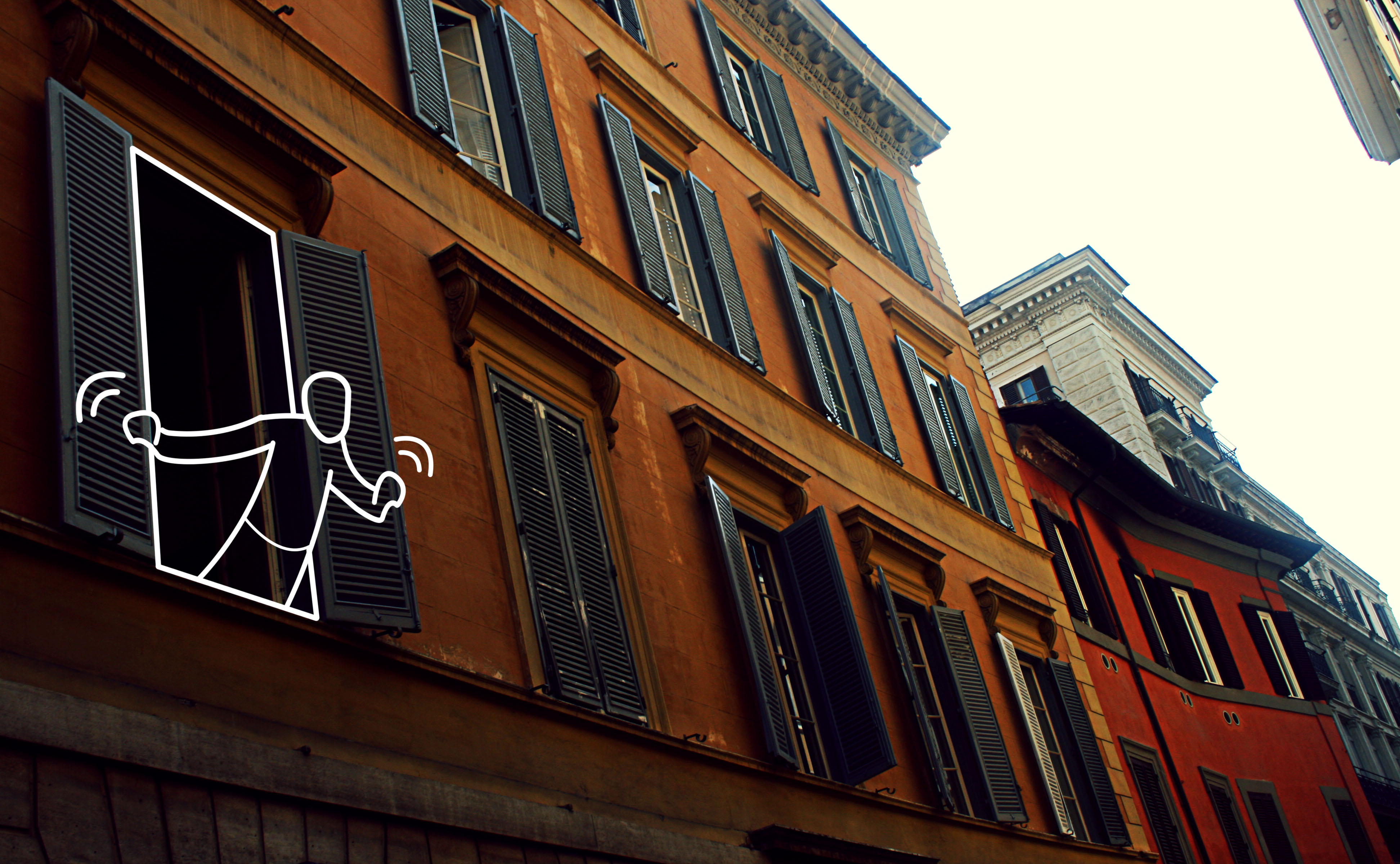
These 4 photographs are more casual, displaying less grand sites. Moving away from monuments, churches and ruins, for the first two photographs I have directed my attention towards ordinary streets and alleys. I wanted to capture average Roman lifestyle as oppose to the landmarks and tourist attractions that we are accustomed to viewing. Both photographs are simple, but as explained previously, this is perfect from digital manipulation and editing, which is why they have been selected. Both images share an appealing colour palette, the oranges and cream-painted walls evoking a warm and European ambience. We get a summery feel from these images which I like. In the first photo, the uniform, organised layout of windows creates a sense of satisfaction, as we see the blinders, open and closed, line the walls of the street. I like the texture of the wall, the paint beginning to fade and crack suggesting a sense of imperfection that is also present in the second image. I thought that the first photo would provide a fantastic opportunity to draw something within the open window in the foreground. Perhaps a resident within the room or a romantic balcony interaction.

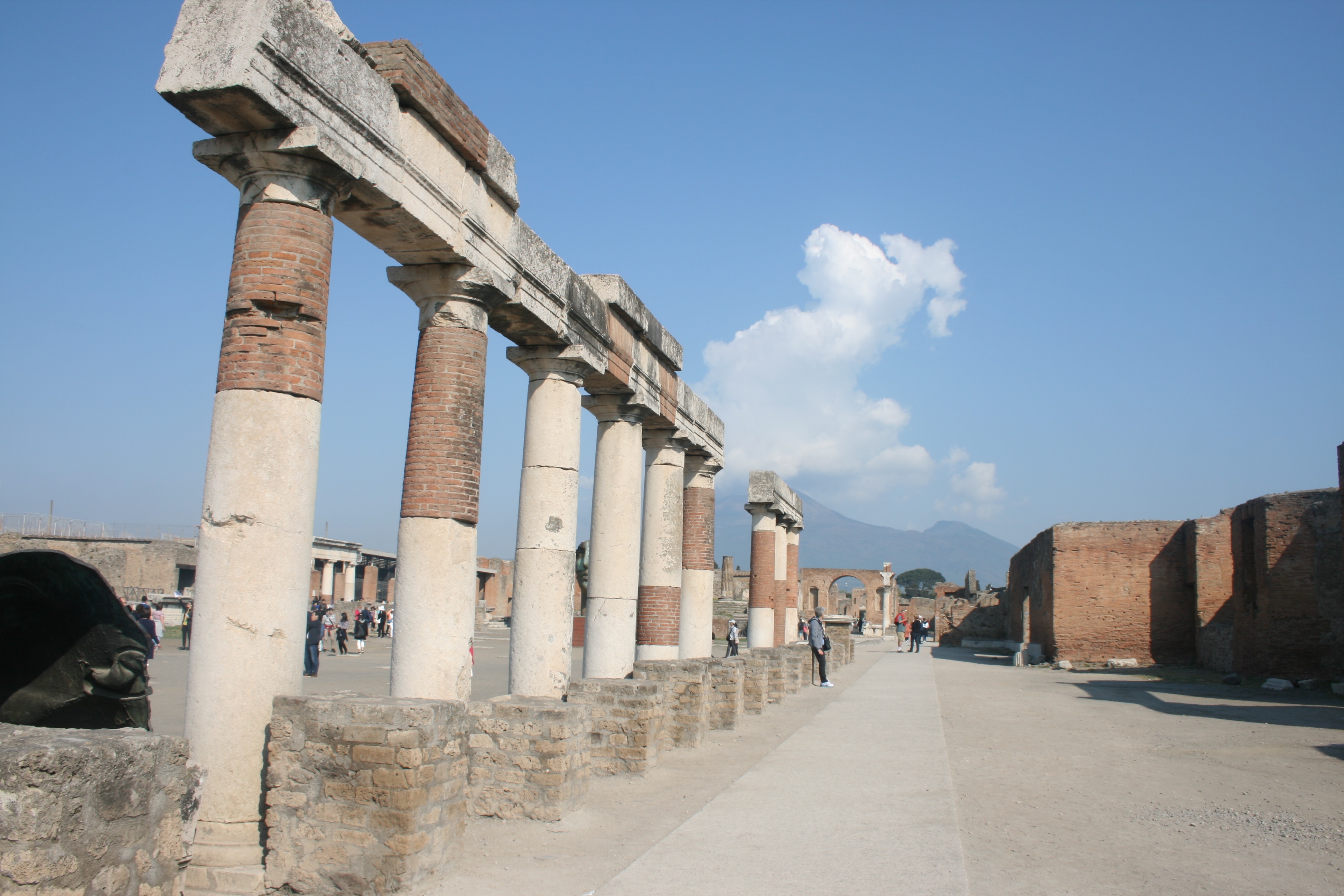
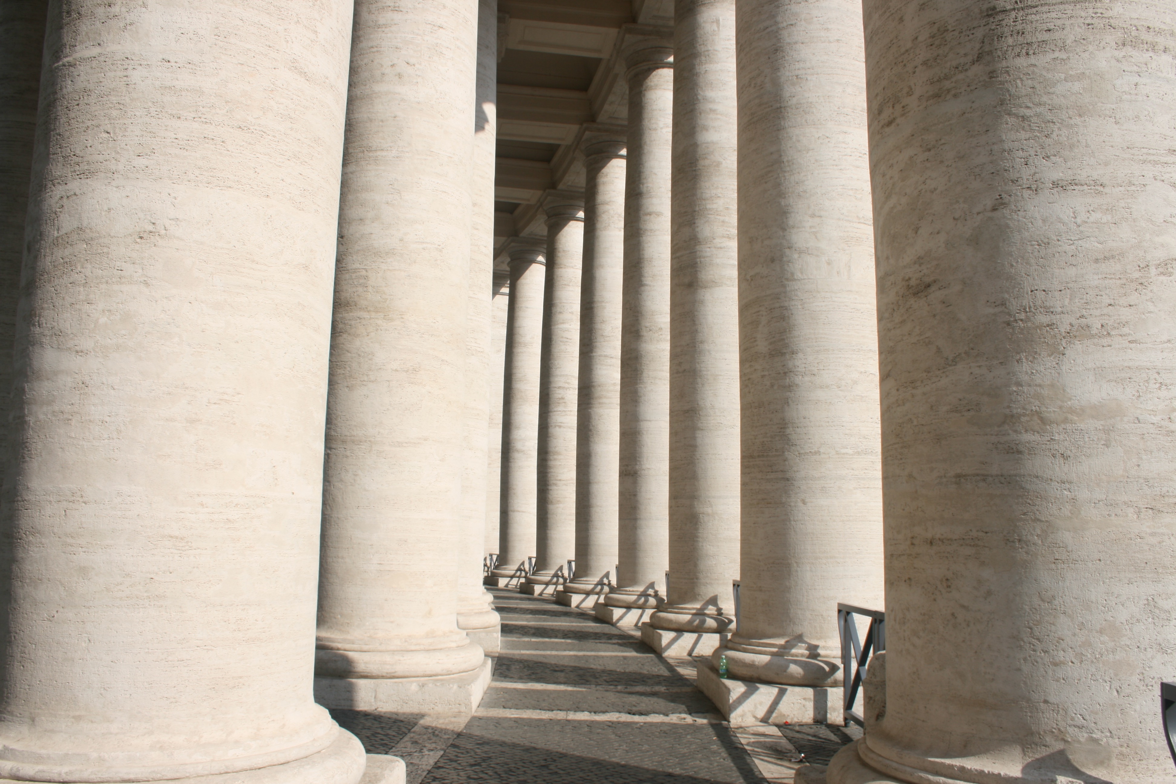
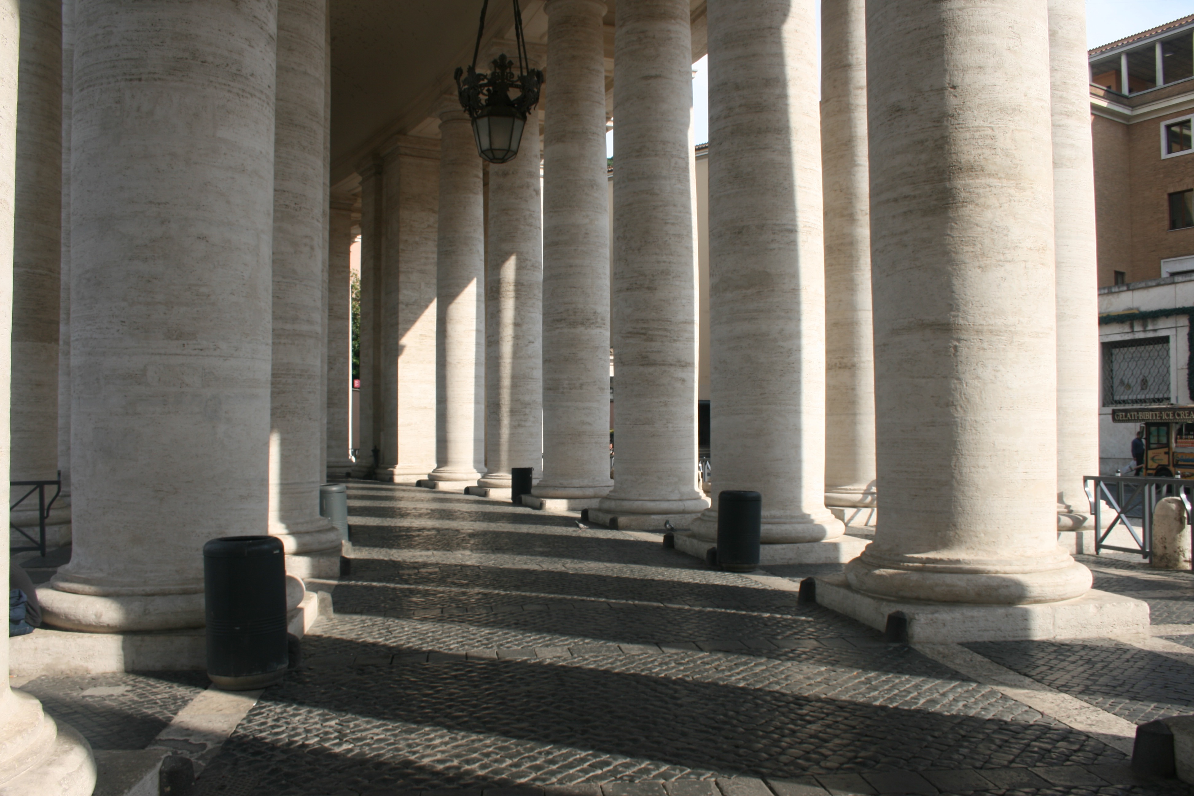
In the next two, I have captured the Colonnades that enclose St. Peters Square. The colonnades define the piazza. I really like these two photographs, the lighting working very effectively to create a domino-like effect. We see the large, marble columns spiral around the corner out of sight which leads the eye throughout the composition of the photo. There is a great balance of light and dark here, splitting the image into separate segments. Furthermore, another beautiful lighting display is presented on the clean brick floor as a zebra-crossing effect is created. The shadow of each pillar generates a striped pattern which is quite intriguing. 

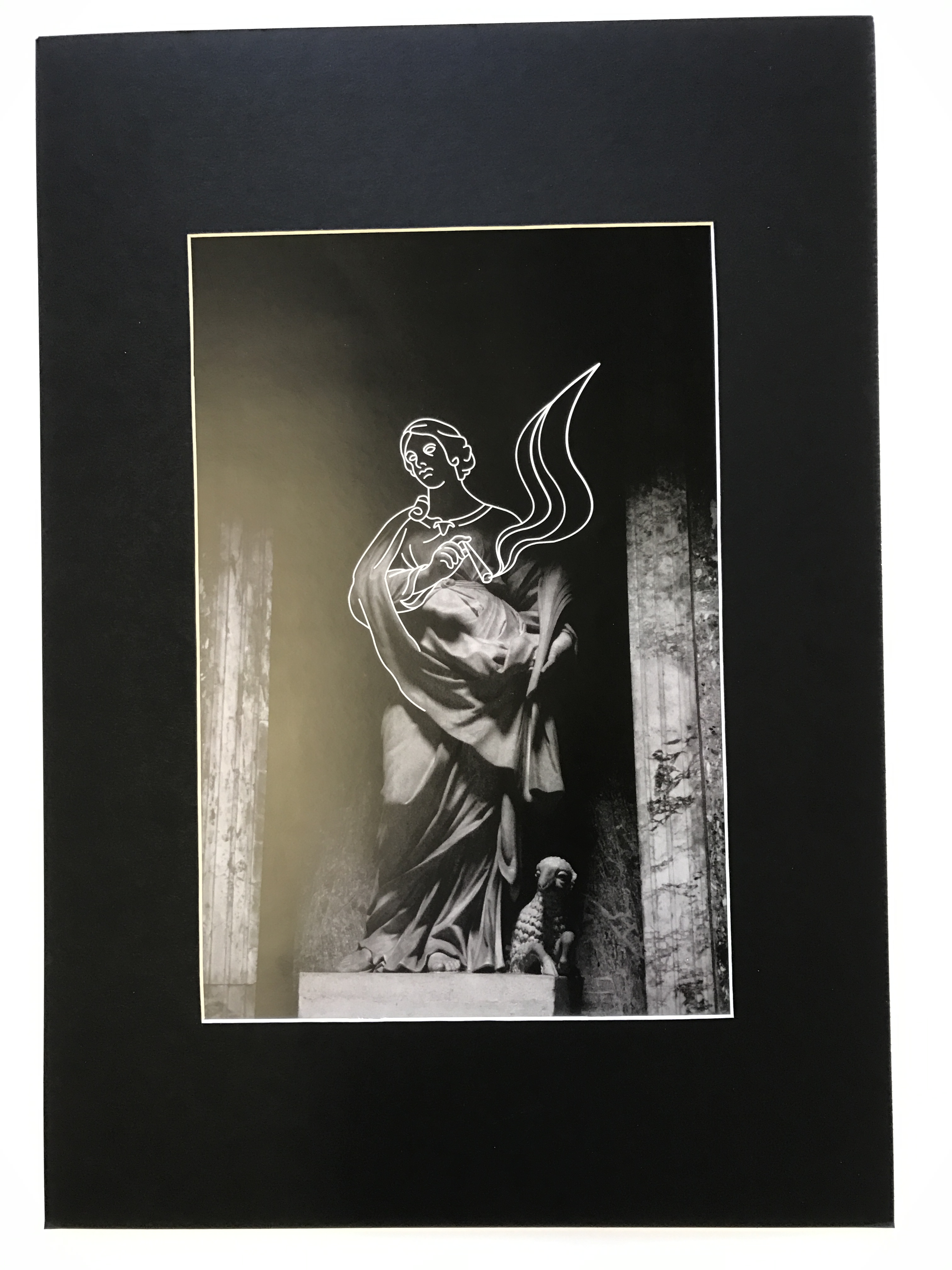
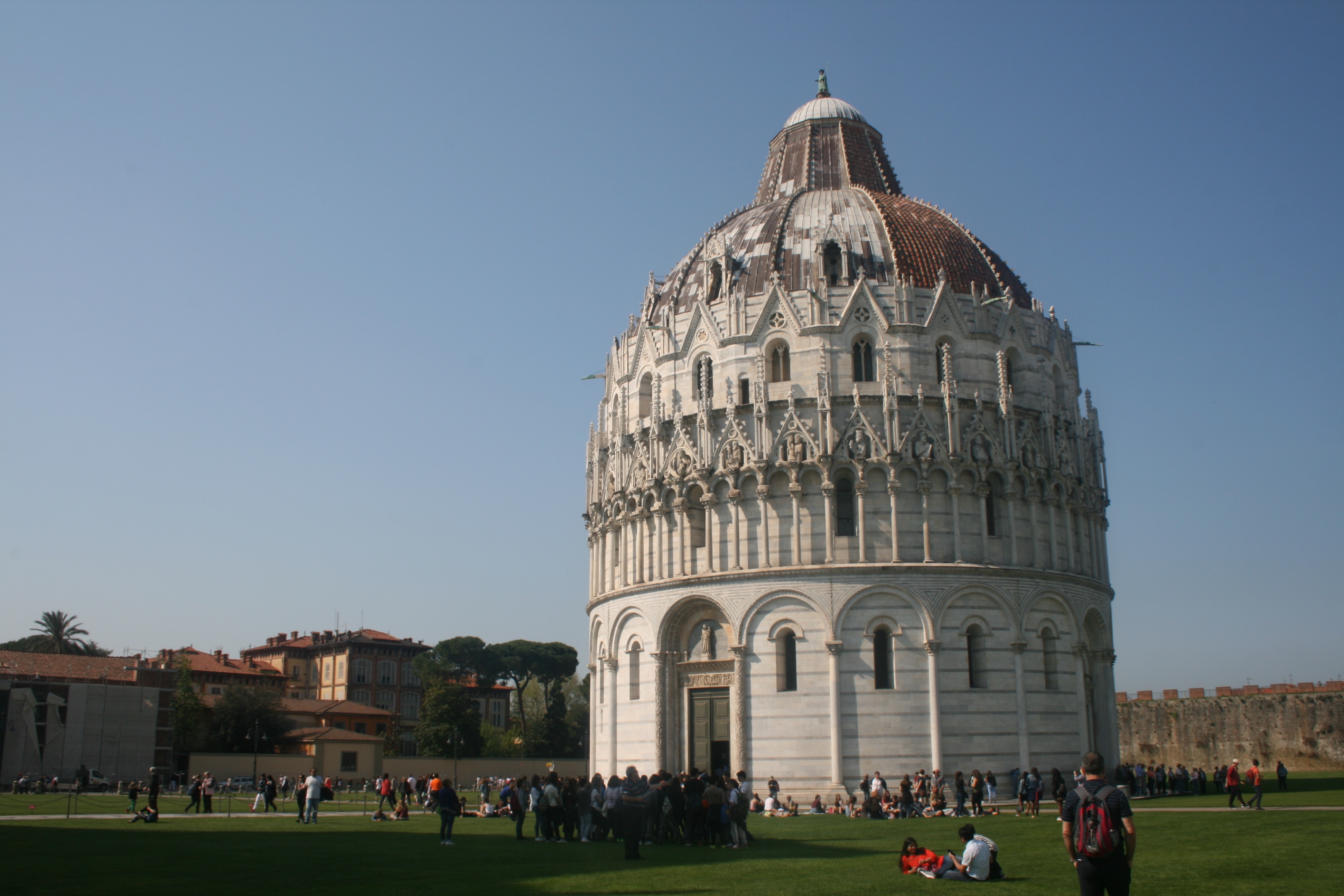
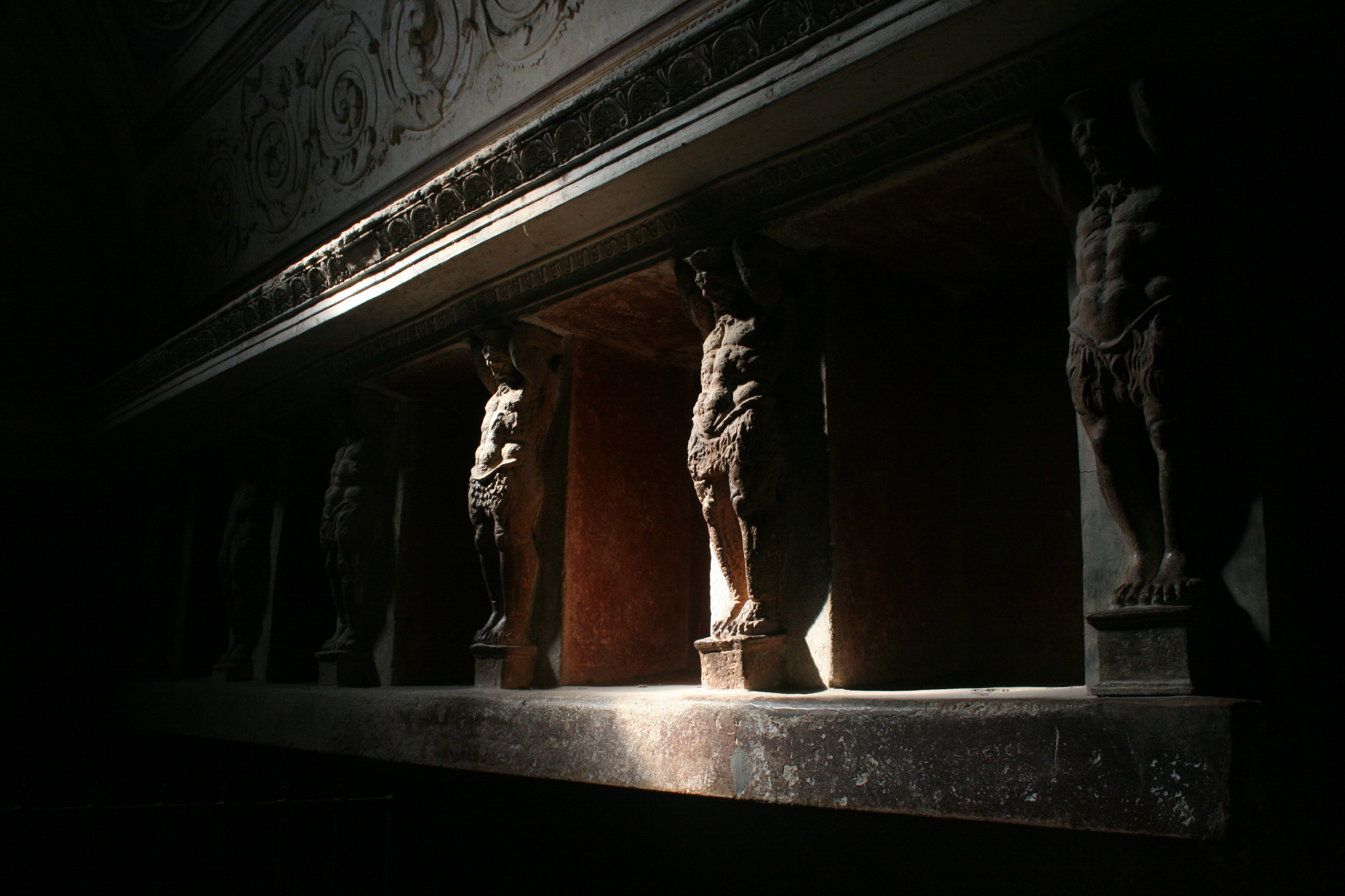
In these 3 photographs, I have tried my best to experiment with lighting, focusing on light and dark rather than direct content. The first photograph, again, depicts the Saints Statues within St. Peters Square. These Statues that lay ontop of the Collonades were directly infront of the sun, and consequently created some beautiful, angelic silhouettes. The way in which we are looking up to the Saints from a Low angle, almost creates some religious imagery as they appear to be above us in heaven. This is supported the the bright sunlight behind them that shines into the camera suggesting an opening in the sky. This photograph came out really well and I think it is one of the most successful pieces from the shoot. The following two photographs were taken within the Pantheon. The Roman Pantheon is the most preserved and influential building of ancient Rome. It is a Roman temple dedicated to all the gods of pagan Rome. As the brick stamps on the side of the building reveal it was built and dedicated between A.D 118 and 125.The original use of the Pantheon is somewhat unknown, except that is was classified as a temple. However, it is unknown as to how the people worshipped in the building, because the structure of the temple is so different from other traditional Roman temples.Probably one of the most fascinating features of the Pantheon is the Architecture. The dome would have been built to look like the heavenly sphere of all the gods that the name Pantheon evokes. The highlight of the site is the hole in the center of the domed ceiling, otherwise known as an oculus. This was an engineering gem of the Roman world. No oculus had even dared come close in size to the one in the Pantheon. It is still lined with the original Roman bronze and is the main source of light for the whole building. This was one of my favourite sites within the city and I wanted to include this magnificent oculus within my project. Consequently you can see it present within the second photograph which is quite abstract. I have stood directly below the hole in the ceiling and pointed my camera upwards, capturing the leaking light. This photo provides me with many illustrative opportunities to experiment with when I start drawing due to its abstract visuals. The final photo of this set is a statue of St Agnes. I like the way the lighting submerges the statues top half in shadow and the way in which a smooth texture has been included over the subjects clothing.

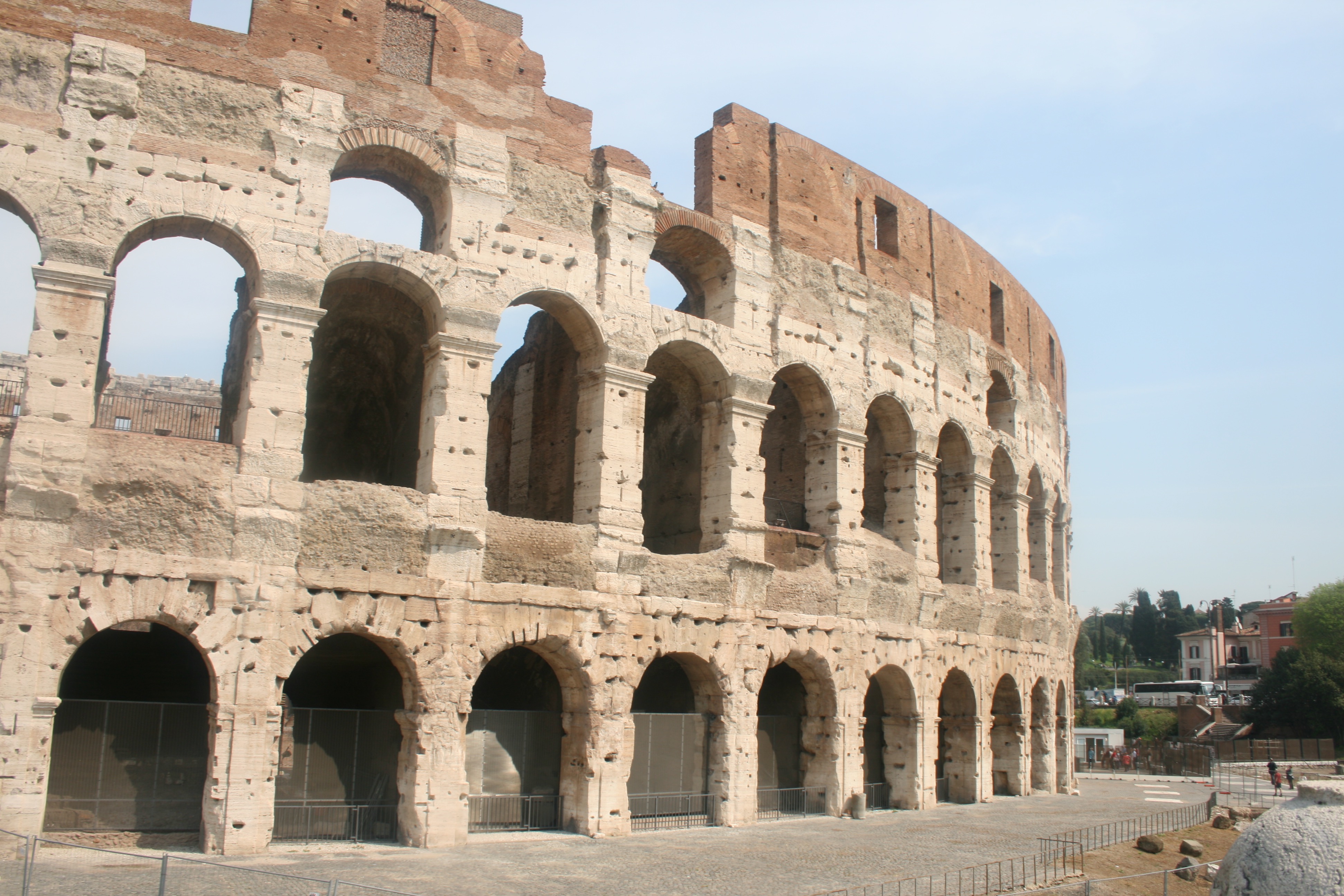
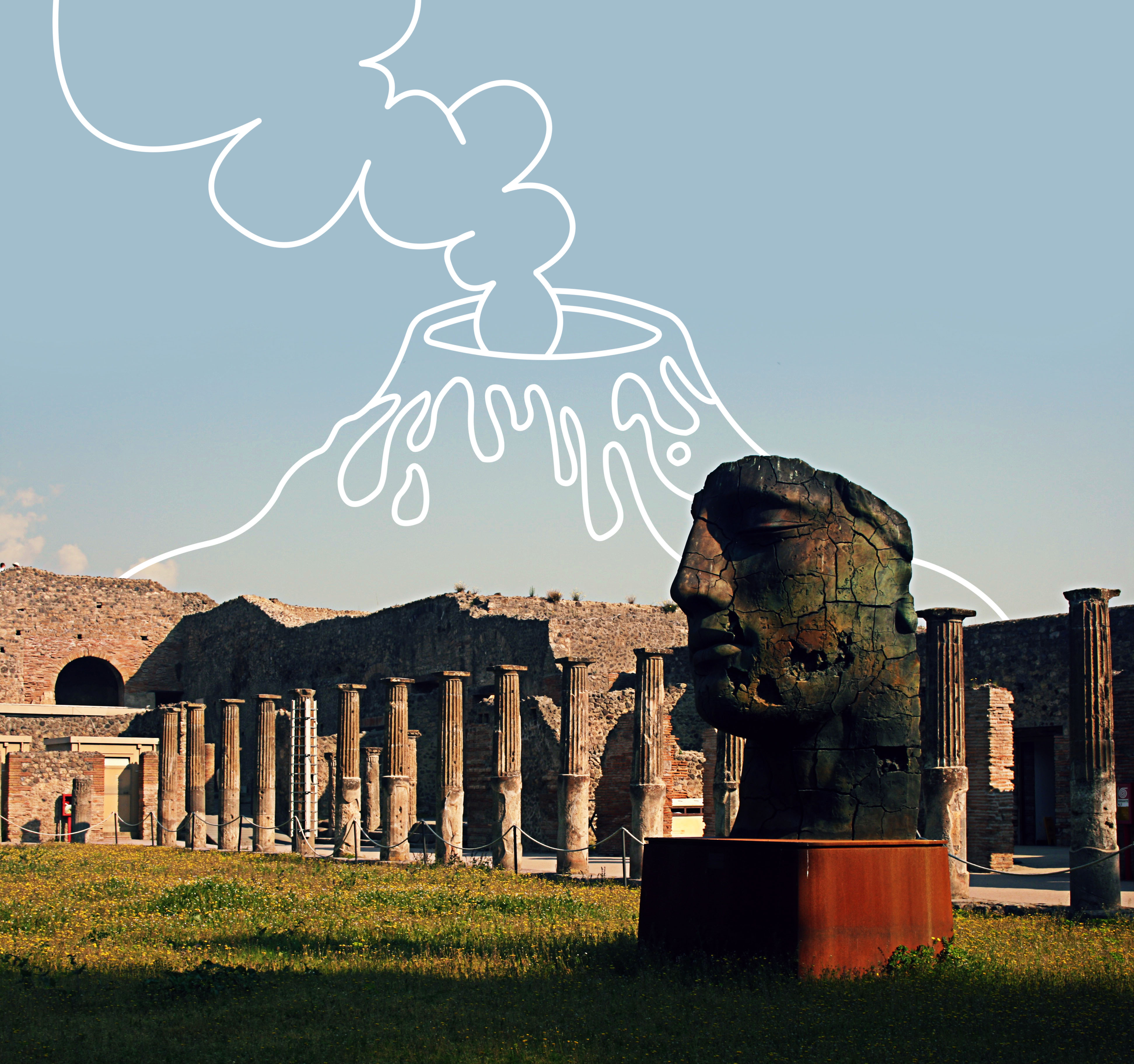
Finally, I have my photographs taken from my visit to the famous Colosseum. Located just east of the Roman Forum, the massive stone amphitheater known as the Colosseum was commissioned around A.D. 70-72 by Emperor Vespasian of the Flavian dynasty as a gift to the Roman people. In A.D. 80, Vespasian’s son Titus opened the Colosseum–officially known as the Flavian Amphitheater–with 100 days of games, including gladiatorial combats and wild animal fights. After four centuries of active use, the magnificent arena fell into neglect, and up until the 18th century it was used as a source of building materials. Though two-thirds of the original Colosseum has been destroyed over time, the amphitheater remains a popular tourist destination, as well as an iconic symbol of Rome and its long, tumultuous history. The Colosseum could hold, it is estimated, between 50,000 and 80,000 spectators. It was used for gladiatorial contests and public spectacles such as mock sea battles, animal hunts, executions, re-enactments of famous battles, and dramas based on Classical mythology. The building ceased to be used for entertainment in the early medieval era.

I think it is integral that I include the Colosseum within my project and study on Rome. This is due to my belief that it is the most famous building within the city and therefore Representative of its history and culture. I have tried to include a nice variety of responses for this landmark as seen above. The first image would be ideal for the drawing stage due to its simplicity and basic composition that would provide me with more freedom when drawing. Some kind of artwork could easily be implemented within the blank sky or upper quarter of the architecture due to its lack of texture or detail.  The photo is not fascinating but will serve effectively in its complete purpose. The second image is more generic and what we would typically expect from Colosseum photography. The picture features a full survey of the scene and we can admire the arena in its full beauty. Given that the site is so recognizable and identifiable within this photo, I think it would be ideal to consider it for further development. And then finally, I have taken a slightly different photograph that moves away from the grand, imposing scale of the stadium and focuses more on the mundane interior details. We see an archway entrance that reveals the colosseum interior like a window. The main focal point of this image is the lighting which works effectively due the way in which light is seeping through the archway and generating crisp silhouettes.

Shoot 2 – Pompeii

For my second day travelling, I visited Pompeii, an ancient-roman city near modern day Naples. Pompeii, along with Herculaneum and many villas in the surrounding area, was mostly destroyed and buried under volcanic ash in the eruption of Mount Vesuvius in 79 AD. Pompeii is one of the most significant proofs of Roman civilisation and, like a book, provides outstanding information on the art, customs, trades and everyday life of the past. The city has remained intact until the present day, not only as far as its buildings are concerned, but also as regards the contents inside the houses and shops, providing a fascinating picture of daily life.

This was a fantastic location to visit, and provided me with lots of photographic opportunities that I did not expect. I was extremely surprised by the scale of the ancient city, as I had previously believed that it was just a couple dozen ruins and small houses. Nevertheless, I was blown away by the site, confronted by intact theatres, roads, mansions and shops. This truly enables you to visualise what this city would have looked and functioned like before the disaster. The sky was clear and the sun was high in the sky, generating some beautiful shadows across the town that made excellent photograph opportunities. The goal on this shoot was to capture interesting backdrops and environments for my digital illustrations. This would involve trying to take pictures with basic compositions that are not too crowded nor hectic. Its incredibly important that the lines and marks i overlay upon these images stand out to the audience, and they must therefore not clash with the details of the photograph. In addition to this, I focused a lot on shadows and lighting. Some excellent silhouettes were being casted from the peculiar and rustic shapes of the ruins, and this is something special that I wanted to draw attention to. I believe this is evident through the images seen within the contact sheet below, which presents the photographs taken on the shoot.

Next, I will be going through a few of the best images from this shoot. These are photographs that are essentially on the shortlist for the next stage in the process, which is the drawing part. Its worth noting that these photographs are not edited and therefore do not meet their complete visual potential. I have not done this yet, as the editing should be dependant upon the nature of the overlaid artwork. I will complete this part during the illustration part.

This photograph was taken within the Quadriportico dei Teatri, also known as the Barracks of the Gladiators. This part of the city was initially used for the audience to stroll and converse during intervals between acts and later as a barracks for gladiators. The portico of the Theater was built in the early first century BC, as a recreational area or shelter from the rain for the  spectators within the Great and small theatres. Nevertheless, after an Earthquake, it was completely renovated and expanded,  changing its function into a school for gladiators. I like the shot I have taken here as there is an appealing palette of colours and interesting lighting composition. The photograph features a warm set of colours, the greens and oranges of the field and blue of the sky creating a summery, positive atmosphere. The large head statue within the foreground, incorporates some interesting textures, as generating from the rusty, cracked metal. I like how we only see one side of the statues face as this produces a sense of mystery and intrigue.  In addition to this, some vivid shadows are being casted from the sunlight as we see one surface of the ruin in the background masked in darkness. Nevertheless, a contrast is made as the highlight of the sky and pillars work nicely in juxtaposition with the shadows. These pillars are a pivotal component of the photograph working extremely effectively to generate a sense of perspective. The pillars start in the foreground and as they follow the natural flow of the courtyard they lead the eye of the viewer towards to the background. Instinctively, our eyes follow the positioning of the pillars and directing us towards the arch in the background and eventually the sky. This would be a perfect place to include an illustration. 

In this photograph, I have tried to capture some of the wall art within the Forum Baths. There were two separate bathing areas, one for men and one for women and there were two separate entrances. After the earthquake in 62 AD, the baths were restored and were being used again when Mount Vesuvius erupted in 79 AD. This picture shows the tepidarium or warm room of the Forum baths. The warm room was heated with hot air provided by a brazier which is at the back of the room. The walls are covered with a series of alcoves which would have been used for storing oils and other bathing accessories. These alcoves are decorated with terracotta giants holding up the architrave. You can see these sculpted figures within the photograph, lining the walls of the room. The focal point of this image is the lighting, which is dynamic and atmospheric. The room is casted in darkness, but a small leak of light that shines from the ceiling illuminates this segment of the wall, revealing the Terracotta figures. This ray of light glows upon the surface of the sculptures, highlighting the intricacies in texture as we see the powerful, carved torsos of the giants. There is an intense and compelling contrast created from this as the golden highlights clash violently with the surrounding blacks. It almost produces a heightened sense of scale as these tiny wall sculptures look like gigantic, powerful men. The fact that a lot of the content of image is shrouded in darkness, constructs a sense of mystery and fear. We see the strong muscular figures fade into the darkness as the escape the vision of the audience and camera. We are left wondering how many more live within the shadows. I really like this photograph and although it may be quite difficult, I would love to try and impose some form of illustration upon it.

This final photograph is quite basic, but I do really like it. It is very successful in providing a response to my primary intentions, which was to capture simple and minimal environments to draw on. This part of the city is called the Forum. A huge grassy rectangle flanked by limestone columns, the Forum was ancient Pompeii’s main piazza, as well as the site of gladiatoral battles before the Anfiteatro was constructed. The buildings surrounding the forum are testament to its role as the city’s hub of civic, commercial, political and religious activity. One thing I really like about this photograph is that you can see Mount Vesuvius in the background. This was of course the volcano that erupted and destroyed the ancient city. The large cloud that is present within the photograph almost makes it look as if the volcano is erupting as it is positioned directly above the volcano peak. This creates a really though-provoking background. In the foreground we again see a clever use of pillars, as these columns lead our eye throughout the composition of the image. There is a lot of empty space for me to work with here, which is why I its a perfect photograph for my idea.

Shoot 1 – Monaco

For the first shoot of my travels, I visited Monaco. Monaco is a sovereign city-state and microstate, located on the French Riviera in Western Europe. France borders the country on three sides while the other side borders the Mediterranean Sea. A magnet for high-rollers and hedonists since the early 20th century, it’s also one of the world’s most notorious tax havens as residents pay no income tax. It’s also famous for its annual Formula 1 Grand Prix, held every year in May since 1929. Visually, Monaco is almost entirely concrete and glass, dominated by high-rise hotels and apartment blocks that rise into the hills like ranks of dominoes. This is the second smallest independent state in the world  and is almost entirely urban.

I think Monaco was a very interesting place and I thoroughly enjoyed visiting. Visually the city center is incredibly clean and crisp and everything is precisely organised. The city is very light, almost all buildings painted white or bright creamy tones. As a result, all the sunlight is reflected generating a positive atmosphere. You can identify the wealth and money existing in this country just through the people and environment present. Buildings are made from shiny marble and car dealerships and expensive jewelry shops are on almost every corner. Decorative elements including balconies, multi-coloured ceramics and courtyards create a picturesque fantasy of pleasure and luxury, and an alluring expression of how Monaco sought, and still seeks, to portray itself. Not to mention that, from my perspective, the population consisted almost entirely of adults and elders. I did not see any children nor teenagers. The city was very much mature and civilized, almost completely quiet at some moments. My goal on this shoot was to try and capture the brightness and cleanliness of the environment. I wanted to focus on lighting, capturing shadows in order to emphasize the brightness and crisp, geometric aesthetic of the architecture. Nevertheless, I still had to maintain my overall goal, which is to additionally incorporate digital illustrations. With this in mind, I had to avoid complex and detailed compositions as these would be too crowded paired with drawings. The photographs must be somewhat basic in content. I tried to keep an eye out for shapes that can be transformed with ease into every-day objects. Below I have included my favorite photographs from the shoot.

— Its important to note that these images have been selected with the intention to develop with illustrations. They are not individually the best photographs from the shoot, but provide the best opportunities for overlaid drawings. —

These three photos work effectively as a set because they all provide a overview of the scene. We are supplied with a wide- perspective of the environment and specific areas of the city. The first photograph was taken from the balcony of my cruise and features a full view of the city, hills and port. This photograph is simple but I think it works very effectively. It enables the audience to see the whole location and gather a general concept of the aesthetic it possesses. I like the way that the photograph is split into four segments. In the lower quarter you have the ocean and harbor which holds a hugely significant role in Monaco lifestyle and culture.There are two ports in Monaco, Hercules and Port Fontvieille. The one I have captured within this photograph is Port Hercules. The port has been in use since ancient times. It was used as a trading port by the Greeks and Romans but had the disadvantage of being poorly sheltered from the easterly winds. This prompted the erection of two piers in the early twentieth century which went some way to providing better protection.The modern port was completed in 1926, and underwent substantial improvements in the 1970s. In the central quarters of the photo you have the landscape and urban city. And then finally, the upper third features a rich blue sky, a typical representation of Southern France. I like how each segment imposes a different colour palette, almost creating layers to the photo composition, like the inside of a cake. In the bottom layer, you can identify the deep blues and green of the ocean that serve as the darkest part of the image. This is juxtaposed with the creams and pale oranges of the city landscape which also introduces a sporadic, blocky texture. The next layer is a fresh combination of rich greens and browns. This segment consists of cliffs and vegetation that towers above the city. And then finally, the top quarter of sky and clouds features a lighter shade of blue. As a complete image, this presents a ultimate colour palette for the country of Monaco, summarizing the way it looks visually. In the second photograph, I have directed my camera out to sea, capturing the sandy shore and some palm trees. This photo evokes a very tropical, summery feel due to the connotations attached to these kind of components. I like this image as it is very different from the urban landscapes recorded in the remaining shoot. Nevertheless, this photo requires some adjusting in the editing stage in order to make it more professional. The horizon line must be straightened and I think the pier towards the right side of the frame should be cropped out for a cleaner image. The final photograph is very simple, but takes advantage of the powerful lighting present. The puddles sat upon the cobbled pathway reflect the light nicely, and our eye if lead through the photograph utilizing perspective.

These four photographs were all taken right next to the coast of Monaco. I think all  these photographs are somewhat more abstract, attention being payed to lighting, shape and form rather than content. The first photograph is probably my favorite from the collection due to the lighting. The shadows being casted are uniform and organised as correlated with the architecture of the building. The railing at the top of the image creates a crisp, lined shadow that disperses down to the bottom of the composition. I like the blocky, box form of the photograph as almost all shapes are made from sharp connecting lines. For this image, I will perhaps transform it into black and white in order to ensure focus on lighting rather than colour. Additionally, I would like to draw someone peeping out of the door in the foreground. The second and third photos were taken along a coastal pathway, adjacent to the Monaco cliffs. These rocky surfaces can be seen within the second photo as they intercept the pathway. In this image, I have tried to draw attention to the lamp attached to the cliff face. I thought this was an interesting contrast, a juxtaposition between man-made and the natural environment. The photo also requires some cropping as the arm of the woman on the left side ruins the minimalism of the composition. The following image, is basic and not particularly special but I do like the shape of the shadow that diagonally intersects the entrance to the circular building. The window above reflects the light nicely and I think the image possesses potential for further illustrations. The final photograph displays a tall flat building on the coast. The greenery and vegetation at the bottom of the photo illustrates a contrast in colour and environment. The reason behind selecting this photo was the tall, rectangular shape of the flat building. I immediately visualized transforming this building into a half-opened chocolate bar through drawing on top.  This is something I would like to experiment with and therefore decided to select this photo.

Environment – Artist Reference 1 – Carlos Spottorno

Carlos Spottorno


Having confirmed a plan in producing photographic responses to my travels throughout the Mediterranean, I wanted to investigate some methods in making this kind of photography more original unique. As discovered in my previous blog post, the genre of Travel Photography is now very crowded due to its accessibility and ease of involvement. There is little originality in documenting the landscapes and atmospheres of foreign locations as it can essentially be done by anyone. Consequently, I may have to indulge in some peculiar methods in order to make my work more personal and distinctive. With this plan in mind, I began looking at the work of Carlos Spottorno. Carlos Spottorno is a Spanish documentary and Travel photographer with an artistic background who has focused his main personal projects on subjects related to power shifts, economy, and social issues that shape the real world. Born in Budapest in 1971, Spottorno has travelled all across the globe, generating editorial, commercial and personal projects that possess some fork of message or deeper meaning.

One of his projects called “The PIGS” bears some visual resemblance to the work I am producing due the synonymous European environments explored. For this project, Spottorno intended to capture Portugal, Italy, Greece and Spain through the eyes of the economists. PIGS is a term coined by the business and financial press as a way to refer to Portugal, Italy, Greece and Spain during their current financial plight. These countries are all united in facing vast loss in historical prominence and are hence grouped together under this banner. What started as a pejorative label used by neoconservatives, mainly from English speaking countries, was eventually taken up for some time without any qualms by the media. Excessively high levels of public and private debt, government deficits, a property bubble and very disappointing political and economic policies, have put the PIGS in the crosshairs. It is alleged that the PIGS won’t be able to bear the pressure of sharing a common currency with their stronger European brethren. Spottorno states:

“I have often asked myself how, after so many centuries of splendor, could these countries have come to their current destitute state. What happened to Greece, the cradle of Western Civilization? What became of Italy, heir to the Roman Empire and endowed with one of the richest artistic heritages in the world? What went wrong with Portugal, the first global naval power in history? At what point did Spain and its empire, on which the sun never set, see the onset of their decline? I believe the root-cause of our countries’ current sorry state of affairs is to be found in the distant past. Issues that for many centuries piled up on our doorsteps are now rearing their heads and plain to see.”

Spottorno continues, arguing that the PIGS view themselves, rightly, as the architects, and as the stem cells from which the idea of Europe developed. Southern Europe resists admitting its loss of political stature in the global political arena, seeing itself as the wellspring of Western Civilization. Spottorno sees The PIGS as old, cynical and individualistic countries. I think this is a really interesting concept, and I something that I have frequently thought about in the past. Its quite staggering how these countries were formerly, some of the most powerful and dominant forces on the planet and now are simple, weak shadows of these former identities. I think that Spottorno had an excellent lead for a photographic project here, due to the passion he had behind the project. He attempts to illustrate the stereotypes brought up by the term PIGS. In other words, what we would see if we were to translate into images the articles we read in the financial press. He intends to present how he imagines economists perceiving these countries. The result is a collection of clichés, some true and incomplete. The same way a travel guide carefully avoids anything seemingly unattractive, this book shows much of what we find embarrassing, oftentimes rightly, and at times unfairly.  What stands out the most is the glaring absence in these images of all that is positive, beautiful and promising in these countries.

In this photograph, we see a young gipsy holding his horse after cleaning it. In some parts of Portugal, like in other european countries it is still possible to see working horses in urban context. Nomad gipsies settlements are in the middle of town, generating sometimes troubles between them and the other people living in the areas. They are accused of being dirty and chaotic, besides dealing with drugs and crime. This is a clear highlight of the plight endured by Portugal and he transformation experienced through history. I like this photograph a lot, a powerful composition evoking a lot of emotion. The boy and the horse are stood central dominating the frame and drawing the attention of the viewer. Nevertheless, in the background, we see the urban landscape, a  white blocky building providing the context and message. The building features an interesting lighting setup as certain faces are shrouded in complete shadows and others in complete light. A nice contrast is created that doesn’t distract from the subject and his horse but ensures our eyes naturally meet this component.
Carboneras, Almería: hotel “El Algarrobico” was built in a protected Natural Park with the complicity of local authorities. Popular activism and the pressure made by Greenpeace stopped the project, although after a decade of legal activity it has not yet been demolished. Nevertheless, It’s interesting, though, that many locals would like the hotel to start operating, and revitalize the poor local economy. This photograph is really interesting as we see a lot of opposition and clashing of certain messages. Typically we associate tourism with lush landscapes, clean architecture  and bright, vivid colours. However, within this photograph this idea of tourism which is ushered in by the family sat upon the beach, is conflicted by the surrounding landscape. This abandoned hotel that still remains to be demolished is just sitting there, whilst the dingy colours of the surrounding environment produces quite a depressing tone. We truly see the repercussions of this failing economy and stereotypes surrounding Spain have been challenged.

The photographs within the PIGS project represent, visually, my initial intentions for this study. The photographs concentrate primarily on the landscape and significance of the local environment which is what I wished to do as well. They occasionally feature a subject within the foreground who can provide context and intrigue surrounding the narrative. Nevertheless, my travels around the Mediterranean do not possess the same kind of depth and meaning that Spottorno has here. The reason why the PIGS project is so successful is due to the direct, concentrated proposition organised by Spottorno. He has discovered something that he is passionate about and ensured absolute focus upon this for his photographs. On the other hand, this kind of depth or internal meaning is absence from my work, meaning minimal focus would be achieved on my shoots. This is why I would like to find something more unusual for my work, and fortunately Spottorno has another project that I would like to reference.

LA GRIETA / THE CRACK


In December 2013 reporter Guillermo Abril and Spottorno received from the assignment of preparing a series of stories about the European Union’s external borders. THE CRACK is Spottorno’s field journal as he followed the border from Africa to the Arctic with the aim of identifying the causes and consequences of Europe’s identity crisis. Halfway between a photobook book and a graphic novel, in as much as it uses narrative elements of the latter, the end result is not a story based on actual events: these are actual events. At the time the media’s coverage was focused on the migration flows in Melilla and the Southern Mediterranean. The great migrant exodus in the Balkans, and the attacks in Paris and Nice were still a long ways in the future. The war in Ukraine seemed to have stabilized, and the United Kingdom hadn’t yet voted to leave European Union. These and many other events would take place over the course of time it took them to cover their assignment, which took them all the way from Melilla to the Arctic. After three years working on the story, several covers, dozens of pages in magazines, and a World Press Photo, the authors set out to convey, with the 25,000 photographs and 15 notebooks they had compiled, the story of what is happening on the European Union’s borders, making use of an innovative narrative form.

This project is a perfect example of how to present Travel Photography in an innovative and original way in order to separate it from the crowded genre and boring photographs. Spottorno has borrowed the aesthetic of comic-book art presenting his images upon paneled pages with a typical comic-book filter employed onto the images. The pages feature speech bubbles and narration boxes, just like a comic book would, enabling a narrative to be told. The idea is very imaginative and a good representative of the originality I intend to capture for my travel photography. By presenting the images in this way, Spottorno is provided his travels around the globe with a story and sense of progression. The portfolio becomes more than just images, and Spottorno has created a professional and sophisticated final product. This is something that I would like to replicate for my Environmental project, essentially utilizing the travel photograph as a backdrop for something greater and more creative. Whilst the visuals of the PIGS project can still be echoed, I would like to incorporate an individual style through the editing stage, perhaps taking advantage of my artistic abilities as I have done in the past. The next stage is to try and think of an concept i  manipulating my shoots that is original and individually relevant.