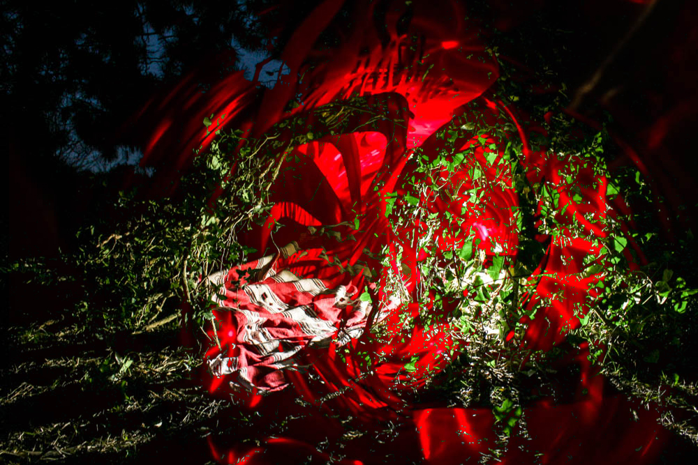
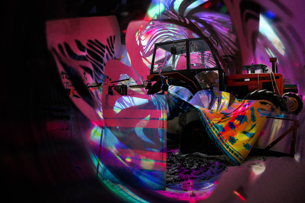
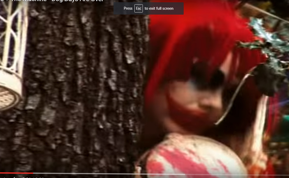
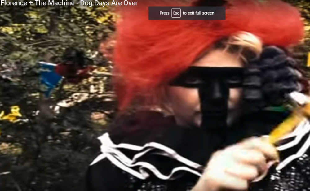
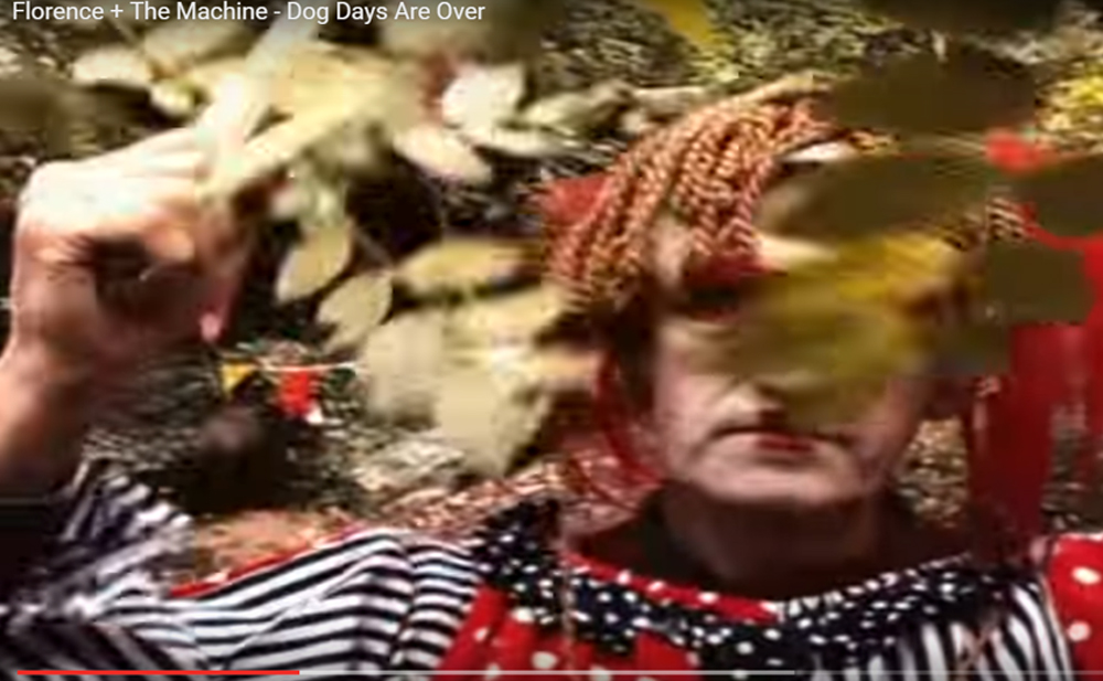
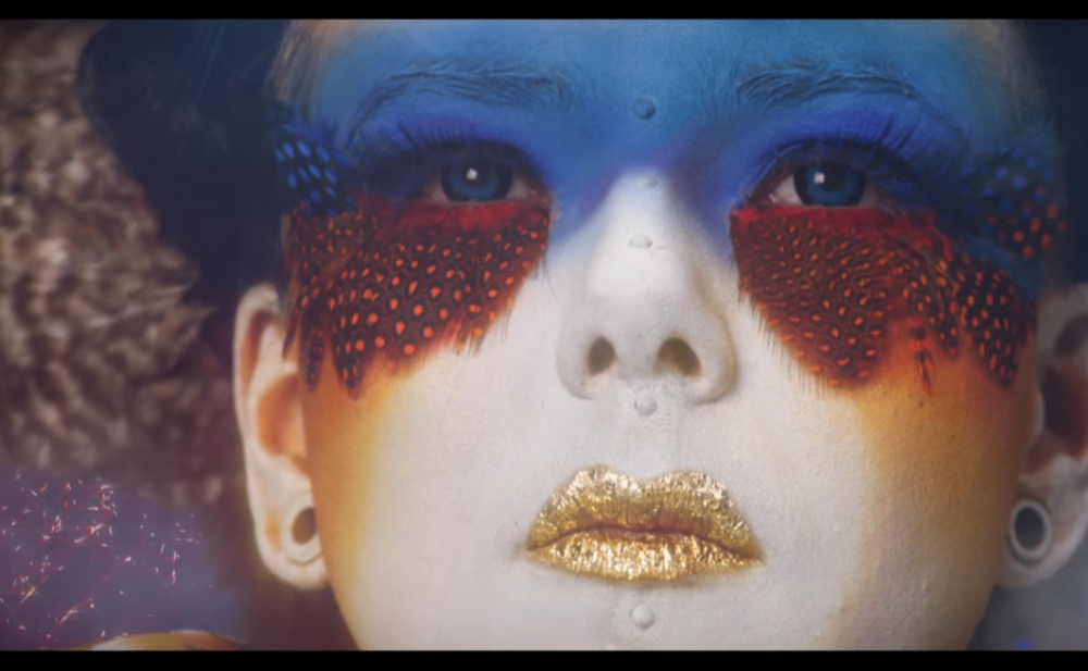
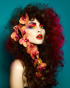
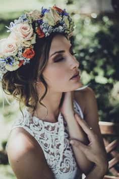
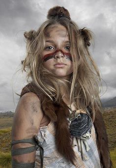
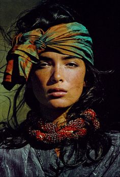
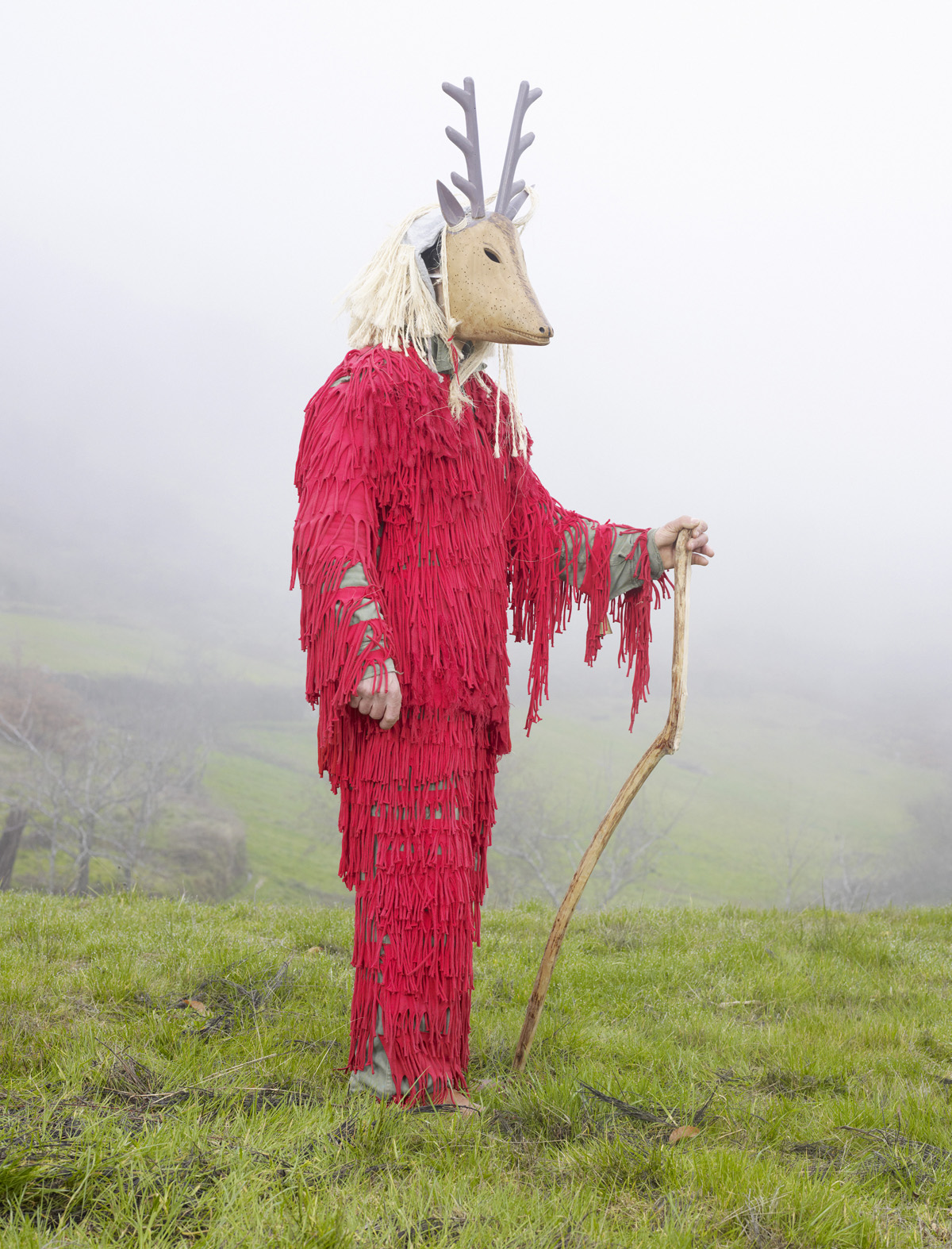
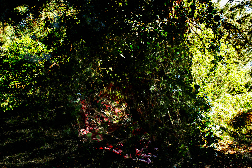
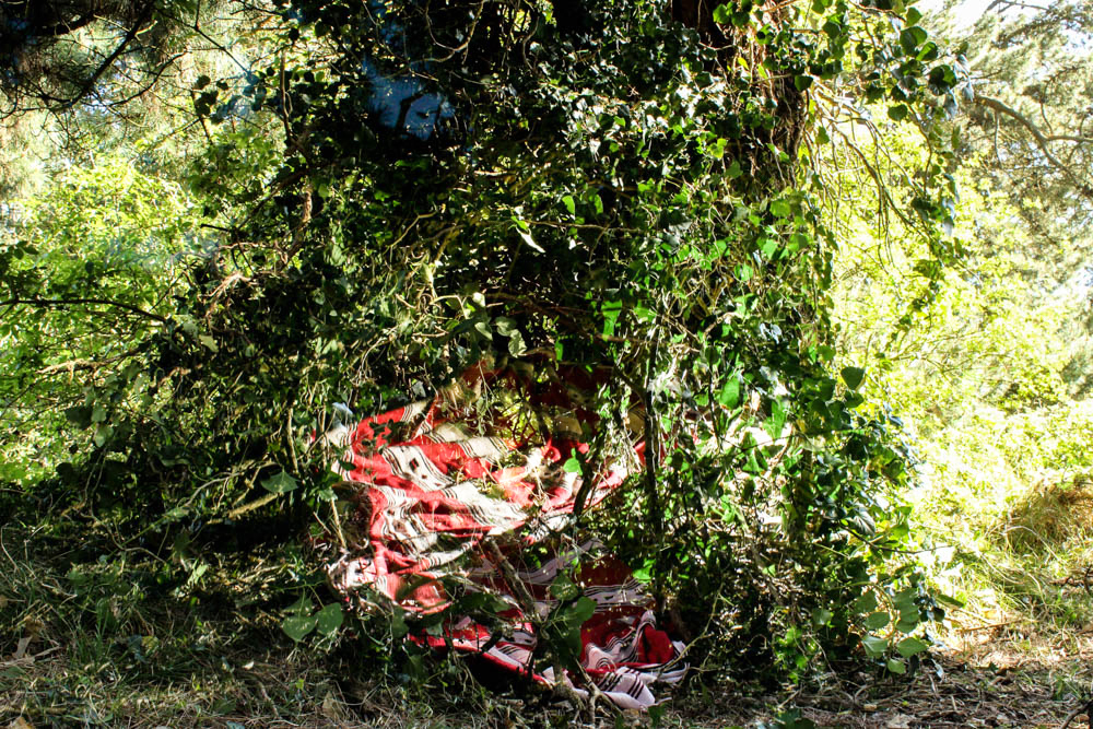
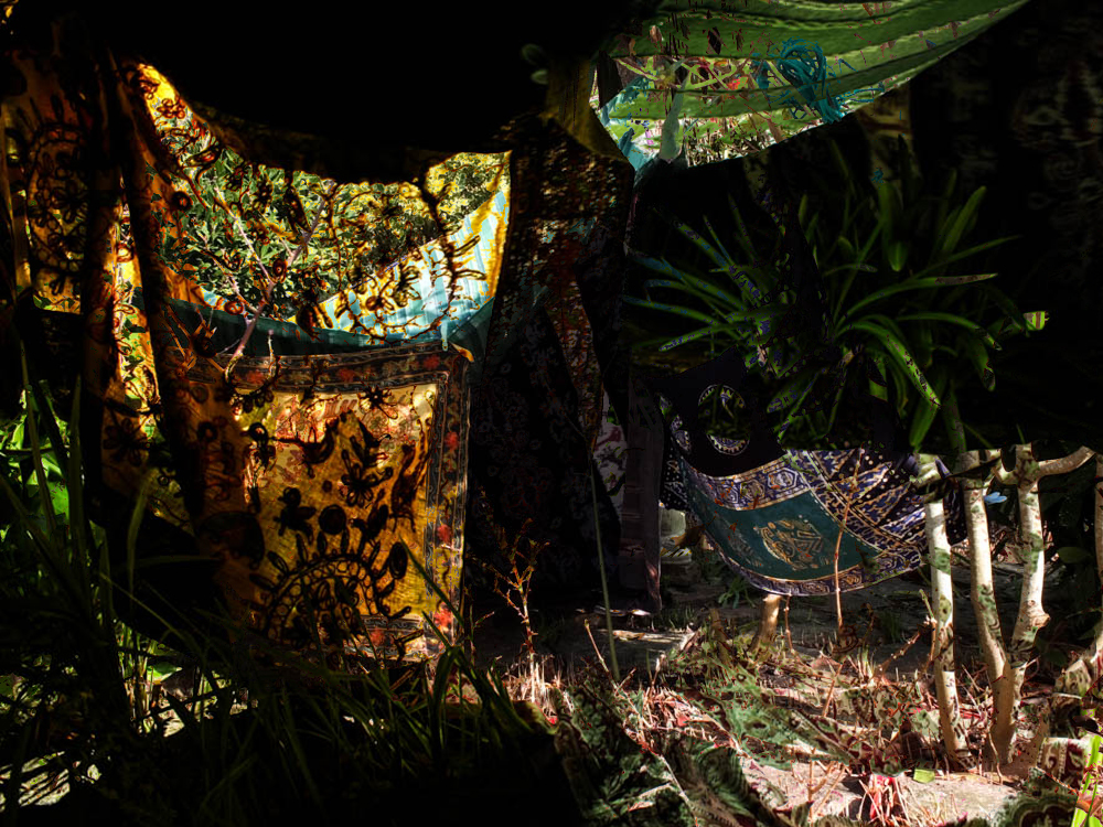
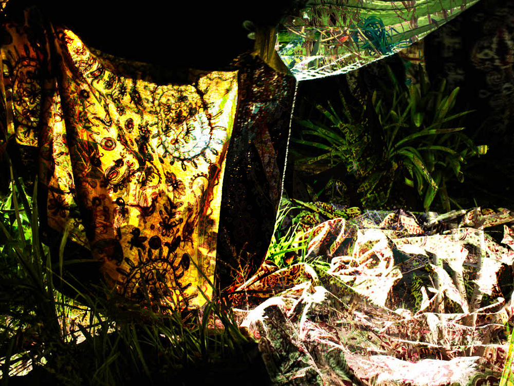
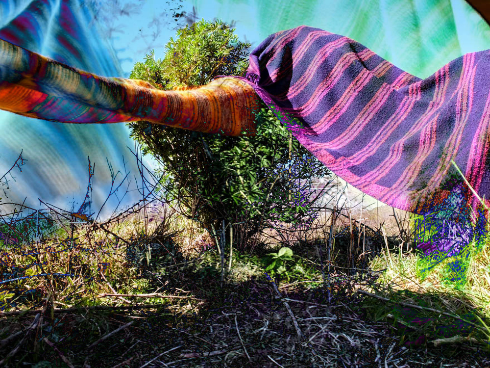
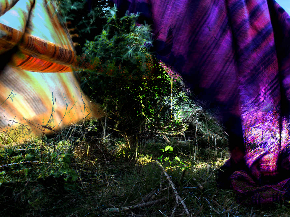
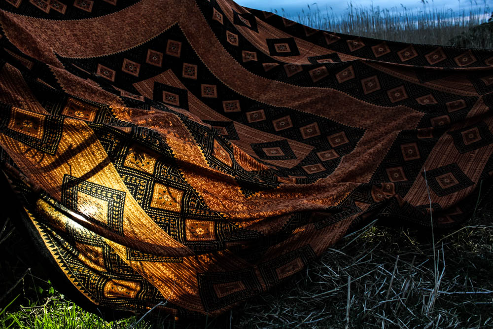
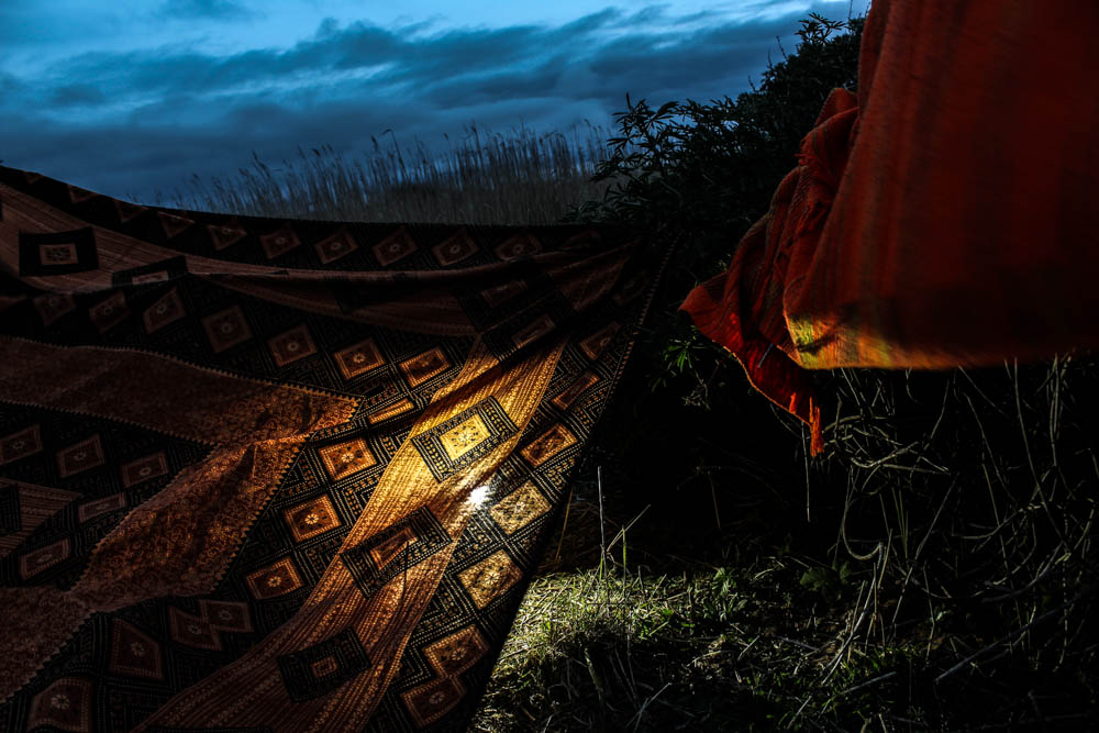
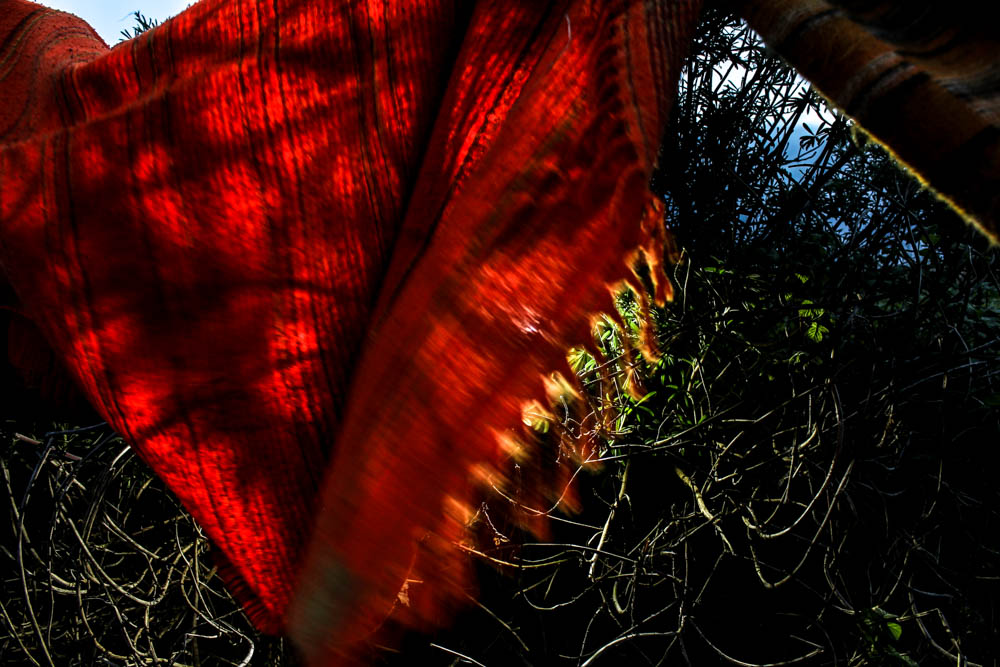
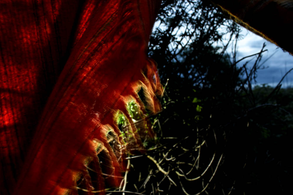
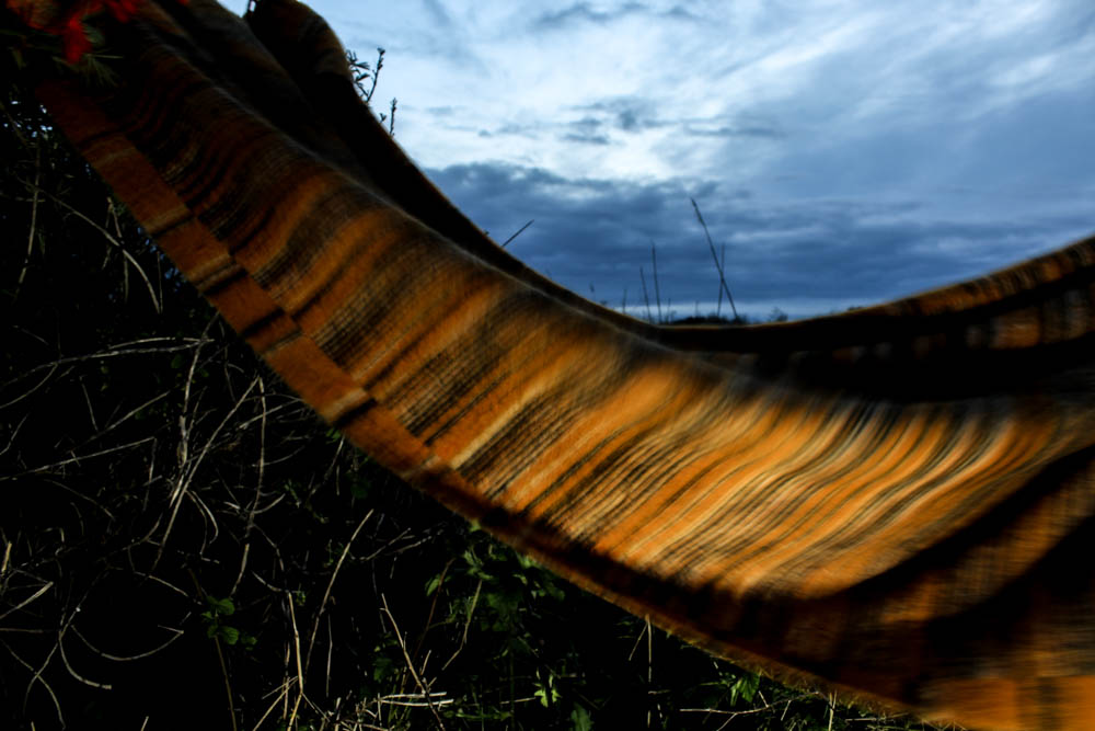
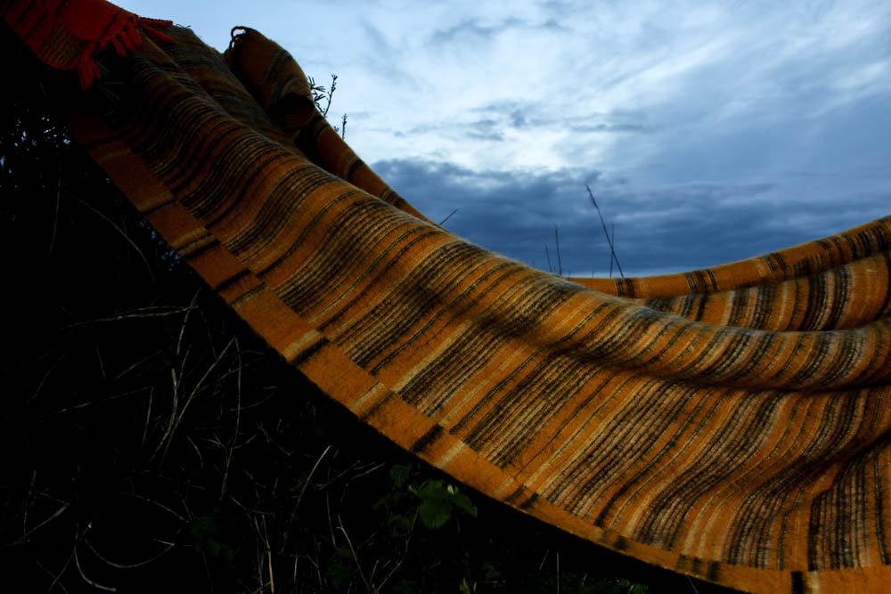
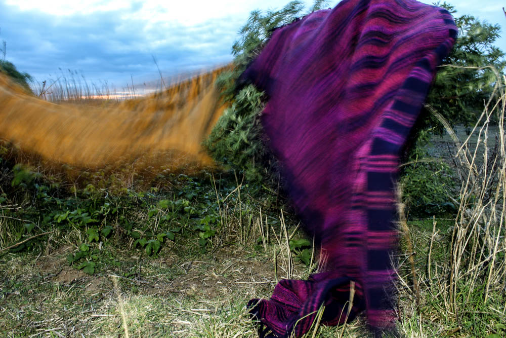
The below photographs are my first attempt at portraits which link to my dens. When i was doing my den shoots there was defiantly a theme to some of the dens and i want to be able to incorporate that into my portraits. This first set of portraits is for my field den. When i took those photographs there was a distinct African vibe to the den, both in the landscape i took the photographs in and also the materials i used for the dens. I therefore translated this into my photographs.
I decided to photograph my subject on a fairly overcast day because i want these portraits to almost act as a link in between the day dens and the night dens i am going to photograph. The day photographs are intensely bright and i didn’t want to have too much glare on the faces in my portrait so that was also another major factor in why i decided to photograph my subjects on an overcast day. I also chose my location carefully considering how it linked directly to my den. I decided to use tall yellow grass as i felt like that linked directly to my theme. You can also see in the photographs of my den this grass within the background. The photographs were taken in the same location just not exactly the same area in which i took the den images.
Over all i composed the majority of my photographs fairly close to the face of my subject on landscape mode. This is because i wanted to take the pictures fairly close to my subjects face in order to capture an intensity in her gaze. In all of the photographs i used a narrow depth of field so the background is always out of focus to emphasis the subjects face. Overall i think i have two outcomes from this shoot that i am really happy with. For each set of portraits i do only need one photograph for how i am intending on displaying my photographs so overall the shoot was a success.

In the above and below photographs i decided to use a landscape composition to include more of the background of the grass in the frame. I really like the similarities between the subjects hair and the grass as they are both very similar colours and they are both fairly straight. This creates a link between the subject in the environment, another connection within my images. The feathers in these images also blend quite well into the hair but then also add another texture, particularly in the below. I quite like both the above and below photographs but for different reasons. The hair in the top image adds a lot of movement and creates a more dynamic image blowing across her face. Her eyes are also more narrowed in staring at the camera, as if questioning or challenging rather than gazing passively. In the photograph below the eyes have the opposite effect, they look more haunted. Her eyes are a lot wider and while she is once again staring directly at the camera i feel as if this whole image is a lot more passive and the face has a lot less character in it. I therefore prefer the above photographs of the two as it conveys a better sense of a wild child behind the face.
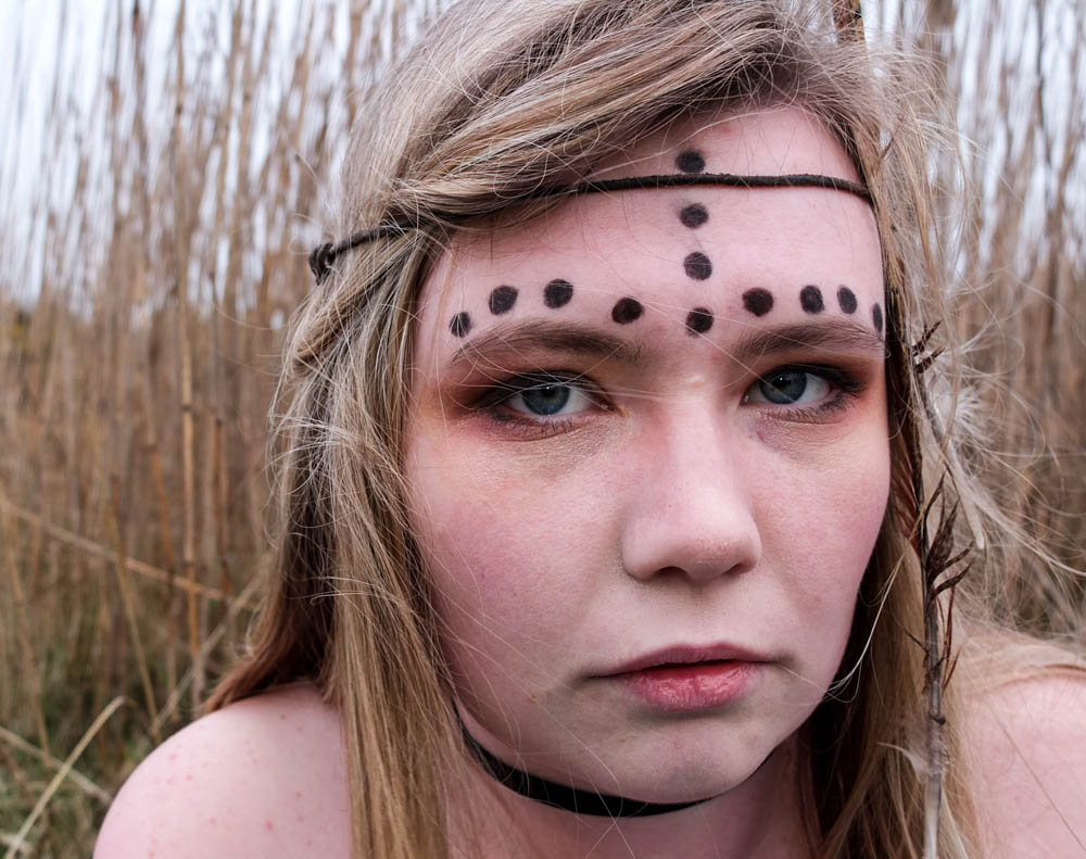
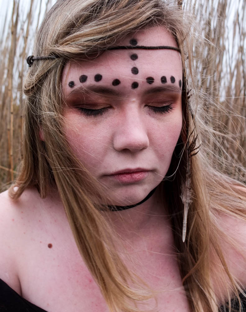
I wanted to try a couple of portrait compositions as well as landscape to see which ones worked best. I also directed my model to close her eyes to see what impression it would create. While it does work i think i defiantly prefer having the eyes open as eyes and expressions of people faces add a lot of character to an image. I think you lose this a lot in this photograph because her eyes are shut .
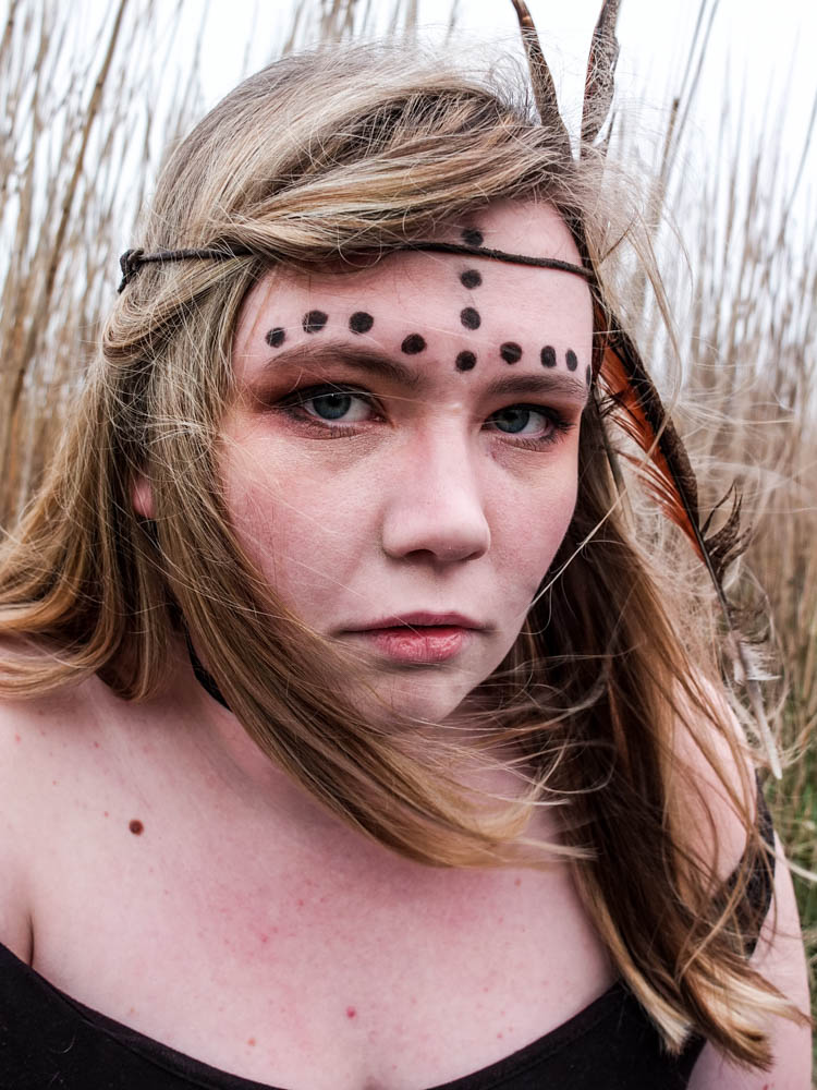
The above photograph is the best photograph from my shoot and i think that it has defiantly incorporated all the elements of the other photographs which i like so much. This photograph is composed to be portrait and therefore it includes less of the environment then some of my other images. The main light source comes from the top right hand corner and shines directly onto the left side of the subjects face. This photograph is better lit then the rest of the images, i think this is because of the portrait composition including more of the sky and therefore the image appears brighter through the white sky. In this image like in the others the subjects hair matches the colour of the environment behind. This creates more of a sense of unity between the subject and the environment but the subject doesn’t become lost in the environment as i used a narrow depth of field so as to separate the two out. In this image the subjects hair is blowing over her face to the perfect extent. In the other photograph her hair covers her face perhaps too much. In this photograph however her hair blows not obstructing any element of her face and the small wisps which do blow over her face actually add to the wild impression of her. The fact that all her hair is blowing in the same direction works quite well as it almost leads you around the image. You start with the bright white light of her hair which then leads you into following the direction of her hair which leads you around her face. Her hair ends up framing her face really well. The movement of the feather along with her hair is also very suggestive of being wild and adds to the loose feel to the image. The photograph feels less rigid and staged as the feather is also following the direction of the hair. The expression on the subjects face also works really well in this photograph as the angle of the subjects face turning towards the camera is suggestive of challenging and being confrontational. The eyes do gaze more passively then the first photograph but the overall impression of the image is still a wild child. Overall i think this photograph works the best because the lighting is brighter and the composition of her hair and face is very effective in conveying the impression i was intending.
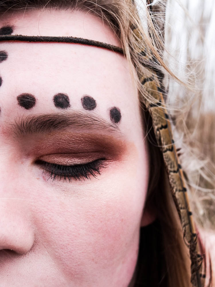
These last two images were experimentation’s with using one of the blankets from the den i built within the composition of the portrait. I decided to simply wrap the blanket around the subjects shoulders and i think the final outcome actually works really well. I composed the images as landscape as it allowed me to convey how the blanket was wrapped around the subject better. These photographs are also very well lit as the sun had broken through the clouds a bit. The compositions and angles of the subjects face towards the camera is slightly different in both photographs. In the first image the top of the subjects head is cut off just above the subjects hairline which includes more of the blanket itself within the frame. The subjects face is then turned almost directly towards the camera. The position of the subjects head within the frame is also a lot closer to the edge of the frame. The second composition includes more of the top of the head, the head being center more towards the middle of the image and including less blanket. In both pictures once again the wind blows the subjects hair slightly across her face . This composition also allows for the background of the grass to be seen clearly. I think i prefer the first image, even through the second includes more of the head.


