All posts by Layla Arthur

Filters

Author:
Category:

Book Layout

Digital version of my final book layout here

In the layout for my book i combined all my material from my archival old diary with my new photographs of the dens both at night and during the day. My book didn’t have a specific consistent layout in the order and arrangement of the photographs as i though this would make it more interesting. It did however have all the photographs of the same den in the section of the book together. Each section of photographs of dens are then separated by diary entries and the slow shutter speed images that i took.

I decided for the front cover to have a wrap image across the front and back cover of my favourite night time image. This worked well as it then allowed the title on the front cover to stand out well. I decided to call the book “Do you want to play a game?” as i thought it created a sinister atmosphere to the book. The whole book is about playing games as children in which we made a home in the environment and therefore i think this works well in inviting the reader to consider what the structures are made for more closely.

Below is the entire layout of my book. I included images from all of my different shoots to create a variety of images rather then simply having all the same type of image. The suggestion of people works really well throughout the book as it adds another element and really highlights the lack of people within the den pictures themselves.

My Final Photographs

As the exam brief was “Environment” i feel like i fulfilled it well. My project revolves around making a home in the environment, reminiscent of childhood dens. When beginning this project i immediately had this idea in my initial brain storm and therefore i feel as if this has allowed me to fully explore this concept. I begin with photographing my dens during the day, then adding in a sinister notion by photographing them at night. I was also able to create a couple of portraits of the people i imagined lived in the dens as i child and explore the impact of slow shutter speed photography suggesting the presence of a person. I feel as if the final consideration of archival diary entries i made about dens adds the final element to my project as it ties it all together to suggest the intentions of building these structures. They link the dens directly to childhood dens, without overtly stating it. My final book contains images from the very beginning of my project and the very end as my ideas progressed. A real turning point was to consider Yury Toroptsov to lead me to create the photographs at night, which was undeniably my best photographs of the project. 

After my experimentation of projecting onto the den i also wanted to print up some of my images like normal  to display in window mounts. I choose three main central images to print to have as single images. All of these images are from the night dens as when i photographed my dens the night time version had a lot more of an impact. They work quite well all together as the blackness of the night creates a link between all the images. I choose images from all different dens so as to show the range of materials i used. I choose the woodland den, umbrella den and the garden one with material as each one being made of different material created a more interesting final set of images. 

Above is the best photograph that i took of the wood den as a whole radiating light. This image was taken in the blue hours after the sun has set which you can slightly see by the sky in patches through the leaves in the background. With this photo shoot as the photographs were taken underneath the trees, the den being built in the woods, the background is made up of the dark shadows of the trees rather then the sky like my previous shoot. I composed this photograph according to the rule of thirds with the den itself more over to the right side of the frame. I also positioned the light inside the den more to the right side of the frame and so the image is fairly weighted on that side of the composition.  This contrasts quite well with having the bright blinding light of the den to the right and then in the sky the patches of light from the blue sky are on the opposite side of the frame, balancing the image.  I took the photograph from a slight angle, not photographing the den straight on so you can see directly into the den but more from the side so the inside of the den remains more mysterious. By putting the light within the den you are able to see clearly how the structure of the den is made up of branches and leaves intertwined together and the light then shines through these gaps.  The light quite literally radiates out from the points at which it escapes the inside of the den to create an interesting pattern of lines from the center of the den outwards. I think the effect is further emphasized by the light making the leaves it shines through a more vivid green, these bright green then contrasting with the red of the blanket.

The above image plays with the blur of the blankets in the wind. The impression of the photographs is that as the light is behind the blurred blanket, that it is rushing forward towards the camera and has a presence as the light suggests life. The light is intense and shines from directly behind the blanket  in a circle. The rest of the image is slightly illuminated, the tree and some plants but the background is an intense black which only exaggerates the whiteness of the blanket further. The blanket is also just blurred enough to suggest a fast pace of movement but without being too fast to become transparent. The image is composed to consider angles, the blanket covering most of the frame but its straight lines being complimented by the straight lines of the tree also. The tree flanked on both sides by different blankets. The image is illuminated so that it included the light shinning onto the plants and also the light shines onto both blankets. 

I then choose these two images below as a pair as they are a bit more abstract and i wanted to show the abstraction of the material and how it was layered over each other. These two images also show the imperfections of the den, with gaps in between the material. 

The above photographs are more abstract compositions which focus on the point at which material is over-layed. The two colours being various shades of blue complimenting each other. The light in the photographs comes from the top left hand corner to shine directly onto the material. The points at which the light shines onto the material is washed out with colour which shows the harsh intensity of the light. These bright sections of light then contrast with the dark shadows in sections where the blanket has slipped and therefore leads into the inside of the den. Both these contrasting lights and dark’s then make the colours themselves more intense. I quite like the contrasting angles in these photographs alongside the vivid lights and darks as the material runs alongside each other but then has different folds and patterns on them which adds a dynamic to the photographs. They also show the process of the den breaking and then being rebuilt. When considering Goldsworthy’s work this was a key part of his process, to rebuild and continue to re-build until the structure becomes sound. This is as much about the den being created as having a final product as the den comes undone because of the environment, be it wind or the un-ablity to get a blanket to balance. The above photographs focus in on the tiny points of the den which have become to come apart, where holes have developed in the structure. I quite like these photographs in showing the layering of material and the tiny holes giving an insight into the inside of the den. The photographs are composed so that the break in the den is right in the center of the frame. The light in both photographs is intensely bright. 

The next two sets of images show more of the process and how the dens are constructed. The set directly below is held together by pegs which shows how the images are put together. 

The above photographs are all small details which held together the den. I quite like them as detail shots to go alongside the photographs of the main dens. So often with dens people look at the final structure and don’t consider the process. As these photographs in this section of my project are all about process and how the structure comes together, as much as the final product i think these photographs work really well as part of the series. In particular i like the photograph which suggests the movement and tensions of the material in creating the den. I composed the photograph according to the rule of thirds, the peg which joins the material positioned to the left top corner of the frame. From this point the material billows out at an angle which suggests it is being blown from behind. I quite like how the background is over exposed as the light outside is so bright as it causes the material in the foreground to be more prominent. You can also see to an extent the light shinning through the blanket which adds another dimension to the photograph.

This image below then shows the process of each element of the den coming together to create the structure. It shows how each individual umbrella is an individual which comes together to make a den.

Projecting onto a den


As i looked at the work of  Felicity Hammond i decided to create a den and then project my images onto it. Below you can see the structure of the den with no images projected onto it. I decided to build the den out of white material as i wanted the projections to be as clear as possible. I built the den to have loads of layers of material as i wanted the projections to be projected onto an abstract surface. I wanted my projections to look more abstract by having the material in wacky fold and curves. I used a variety of different types of white material as i wanted to see how the different opacities of the material looked with the different projections on them. The majority of the material i used was some sort of lace. I though that symbolically this could be quite interesting to consider the contrast between the old fashioned material and the dens made in childhood. My images of dens are essentially looking back in to the past and i used a material to construct my den which was traditionally used in the past. Lace has an extensive history, beginning to be made in 1500 AD. In my mind it is mainly associated with the Victorian ages and grandmothers houses. I simply though that as my whole project is about looking back in time, the material itself in this den should be a reflection of times past. 

Overall the idea worked better then i thought. I wasn’t sure how clear the projections were going to look when they were projected onto the material but they actually showed up really well. I was also able to make quite an interesting den structure as i made it inside and therefore had more walls ect to be able to attach the material to so that it lay right. This den more than any of the others really explores how material can be layered and folded over each other to construct a structure. 

The below image shows the setup i used. I simply used a normal projector in which i moved the distance towards and away from the den to project the dens onto the structure. The only thing was that the projector created quite an yellowish light which was not as effective as the white light i had been using to photograph my night time dens.

Above and below are the umbrella den projections. Some of the projections worked a lot better then others and this was one of the most effective ones. I quite like how there is the slight hints of colour from the projection but without it being a solid form or colour. I think this works better as the den and the projection therefore blend together better. The only annoying thing is the definite line where the projection ends as the light from the projector ends. This is frustrating just because i would have liked to have been able to take some pictures of the den as a whole with the projection on them but it doesn’t look very effective as you can see from the below image.  This is defiantly an instillation however which needs to be seen in person as it looks a lot more effective when you can see the projections in reality. 

The above image shows a close up of the projection on the den.

The beach den at St Brelades also worked really well. The way the material falls within the photograph in the foreground works really effectively. I think this image works so well as the colour of the sky has been washed out to become white and therefore it blends really nicely into the material. 

These images were the best as i started to project the material a bit more abstractly. I projected the above photograph on the corner of the den which was where the material fell in an abstract way. As i wasn’t projecting the material straight onto the structure and it wasn’t a flat part of the structure it created a more dynamic image. I quite like in this one how the projection ends and the rest of the frame is in darkness. It doesn’t work for other images but for this one it is really effective in emphasizing the abstract way in which the material falls. I think it also works because the angle of the purple material it at the same angle as the material coming down from the top of the frame. This creates the impression that the projection and den is more of the same.

The above and below images are close ups of where the material is curved and folded over itself and the projection appears in a more abstract manner because of this overall, i quite like the effect. 

The above and below dens were the ones which didn’t work very well. I think it was probably the photographs i choose to project from which just weren’t as effective.


Sewing into Photographs

Thinking about ways to display my photographs has lead me to the little experimentation below. As Hammond’s work was all about conveying the tactile nature of photographs by making them into sculptures i wanted to experiment with other ways to make my photographs tactile. Therefore i decided to sew into them. My photographs are all about the materials used to build the dens and building dens is a tactile experience. I therefore decided to create some images which revolved around a tactile experience. I photographed some plain white sheets and then decided to sew into them adding loads of bright colours. The whole point of the dens is also the bright and vibrant colours which causes them to clash with their surroundings and so i wanted to add colour to the white sheets. I think this also links quite well with my idea which came directly from Hammond’s work, the projecting of my images onto white sheets. Here instead of projecting the images i am sewing patterns and colours into the work. Overall i quite liked it as a little experimentation of creating tactile photographs. 

Artist reference: felicity Hammond

Now that i have all my photographs taken i am starting to think about how i want to display them as i final piece. Something which i thought was really interesting was how much my photographs were about process which i explored with organic architecture and photographing the adding of each element. As this became the whole point of my photographs, the photographs becoming more and more simply a recording of the dens existence i wanted to consider ways of displaying my work which revolved around keeping this tactile nature to my photographs. I therefore decided to look at an emerging photographer called Felicity Hammond who displays her work in a really interesting way.

Hammond creates her photographs as sculptures which she displays within a space. Her work explores construction sites and places of ruin and destruction.

“I spend around a year photographing the same site and documenting its development over that time. There is a Baroque feel to the landscapes I choose, and they become shrouded with tarpaulin that looks incredibly sculptural – just like dressed objects in classical paintings. There’s theatre in these building sites, especially when they are lit at night.”

Her photographs once taken can then be printed onto acrylic sheets which can be manipulated into sculptural objects. She uses advanced photographic technologies such as CGI to print her photographs. The first time Hammond experimented with printing directly onto acrylic was in her project “You Will Enter An Oasis”. Previous to this she did  a residency at Bow Arts where she made cyanotypes, which are really early print processes of making photographs. UV light is used to expose an image.This project really led her into realizing her love for the changing nature of a place into destruction and her love for blue prints and exploring the process of change. This is also where the inspiration for so much of the blue used in her work comes from, Hammond remembering as a child being obsessed with her father’s engineering manuals and drawings. She likes the idea of her work revolving around the concept ‘restore to factory settings’. I think i want to mainly take inspiration from her work in considering how it creates a more immersive viewing of the photographs to be surrounded by the images. I want to try and re-create the experience of being surrounded by the dens and therefore evoke more of the childlike wonder of the experience. I want the experiences of the photographs to go beyond the photographs as in to have more of a connection with the process of building dens.

“This was my first material investigation into working with printing directly to acrylic. I wanted to allow the imagery used on rendered images to manifest itself into the physical world.”

Considering her work has given me an idea of how i am going to display my images in another form of presentation other than a book. I am considering now also making an instillation of a den inside a studio. The whole idea being to create a mass of material which hangs from the ceiling in a den like shape and to then project the photographs of my different dens onto this generic mass of a den. The sheets to create this den will be white to allow the details of the photographs to be as clear as possible and i will light the room to be very dark with only the den with the photographs projecting onto it illuminated. I can then photograph this process to create another set of images which show the process of creating a more tactile way of viewing my images. I think the whole concept behind this comes back again to how all the dens merge into one long childhood game. How each game played in each den leads onto the other and in building each den as children we learn tips and tricks which we carry on into our next den. The instillation will show this by having all these different dens printed onto the same generic shape of a den.  This is similar to Hammond’s work as the photographs are printed onto a material which is then sculpted into a different shape but i am simply projecting the images rather then having it literally printed onto the material. 


Bonfire movement

I wanted to experiment as well with creating some abstract movement photographs. I really liked how the over exposure of the woodland photographs worked and therefore i wanted to play more with creating slightly over exposed which had movement within them. After taking my more formal photographs of my friends as wild children and considering the work of Charles Fregar, i wanted to add an element of eeriness and almost suggestions of how the dens could be considered more sinister. I therefore decided to do the below photo shoot to juxtapose against my other images which involved making a fire and then movemnt around a fire. The idea od people dancing around a bonfire to me has strong connotations of witchcraft and paganism and therefore i was hoping this shoot might add these impression of something more sinter to my shoot.

I deliberately decided to plan this shoot down the beach as i wanted the images to be on the verge of being over exposed and i though the white light of the sand would help to create this impression. I however didn’t want the images to be too overexposed and so i did the shoot as the sun was setting so the light wasn’t intensely bright. Overall the outcome i think worked really well as the images give exactly the impression that i wanted them to. Another reason i choose to make a fire within this movement shoot is that a fire was a consistent element of every den we made as children. We would always make a fire to go with the den to “keep us warm” and to “cook food on.” I therefore was think again about presenting the cross over between the reality of the game and the real reality.

Most of the photographs i took i only focused on the legs and feet of my subjects. This is because i didn’t want the images to be about the people and personalities of the people but more so the concept of people being present. I created these images to create the abstract concept of people being present without obviously stating it and therefore i thought the inclusion of faces and whole bodies might be quite suggestive of this. The above and below images i composed so that the fire was in the right hand side of the frame and then the subjects are to the left surrounding the fire. The main source of light is coming from the left hand side of the frame towards the outside of the image and then spills into the rest of the frame. The images are fairly exposed as the smoke from the fire is also drifting into the frame from the fire and causing a haze in front of the figures. I remembered from my last photo shoot the speed in which i got my subject to move and i asked my subjects to replicate this. Therefore in these images you can see the movement of the subjects clearly but you can also still distinguish that they are human figures. I quite like the very pale and bright tones of the images, the bright light from the sun and the fire has meant the image is fairly washed out of colour which means the odd hint of colours stands out even more. 

The above and below images worked really really well. These images rather then showing feet show the movement of a figure reaching. This works really well as the figure is solid as their legs are stillish and then the top half of their body and arms as they reach for more wood for the fire are blurred. I really like how in these images the movement has created a curved blur which is different from the other types of movement. The photographs are composed similarly with the fire in the right hand corner and the blur of the people to the left. 

I quite like the above photograph for being really abstract as the impression of the smoke from the fire creates an interesting dynamic to the feet walking away. 

The last image below was taken with the least amount of light as the sun was almost completely set. I quite like the composition of this image as it is different to the others. There is one subject walking in the very foreground of the frame and another in the center of the frame in the background. Even though the entire of this subject is in the frame you can not see there face and there body as it is blurred becomes all about the movement of bending over to pick up stuff for the fire. In this image the fire isn’t the center feature which draws you into the frame. You can see a bit of it to the right of the image but its not the main focus. In this image the fire and the sky in the background compliment each other, each bringing out the colour of the other. 


Wood den Movement

I decided to begin with experimenting with movement with my woodland den. I thought this would be the best one to begin with as under the tree’s there was less light then with some of my other dens during the day and i assumed that over exposure was going to be a problem with such a slow shutter speed. I actually really like the slight over exposure in the images as it makes them appear less realistic and more in the realms of fantasy. It took quite a while to be able to balance the light levels with the aperture and shutter speed as even with the trees casting shadows the light levels were still very high with the slow shutter speed. I then got my model to walk up and down within the frame of the camera. Throughout the images below we experimented with different speeds of walking to create different effects with the shutter speed. I composed the framing of the images to have the den right in the center of the frame and then the figure is flittting around the frame. The light spills into the image mainly from the right hand side and this is predominately the side of the image in which light is coming from. 

These first two images experiment with the subject moving quite quickly through the frame. Therefore the subject is very blurred to the extent that you can’t tell that it is a definite figure. The first image is composed to have the subject in the right hand corner of the frame, the direction of the movement suggesting the subject is moving inwards towards the center of the frame and towards the den.  As this is the direction in which the light spills it works quite well in looking as if the subject is following the beams of light into the image. In the top image the figure looks more like a person as the shape of the blur maintains the appearance of a head and some sort of arms and legs. 

The below image is composed differently and the subject is moving a lot quicker through the frame. In this image the subject is running towards the light and away from the center of the frame. The blur of the subject is much more extensive and is a lot less suggestive of being a person. You can tell that they are wearing something green and the colour of skin in the blur suggests that the photograph shows the movement of a person. I personally prefer the above image just because it conveys some sort of presence to the blur more so then the image below. While i do want to create mysterious blurs i do what there to be some substance to the photograph. 

All of the rest of the images show my subject walking a lot slower through the frame so you can see the complete outline of the subjects body it is simply blurred in some places to show the movement of these specific body parts. The above image shows the whole figure almost in completeness simply with the arm of the subject and the face of the subject being blurred. I think this works really well in creating the sinister impression that the subject is turning towards the camera to look at you as the viewer. I also really like how the light in this image works, having the light coming from behind the subject and therefore illuminating the back and shoulders of the subject. This intense light on the subject also suggests an eerie ethereal quality. The above image is the most solid of my blurred images, the rest of the photographs descending into more of a blur of movement.

The three images below act almost as a little series of photographs, showing the progressive movements of the subject in and around the den. I think if i use these images they would work really well to be displayed as a trip tic.  

This last image is almost an odd one out as the subject is walking forward and therefore in a completely different direction to the rest of the images. Almost the whole of the figure is blurred in these image and the lighting on the subject is completely different and therefore conveys a different impression. 

Overall i think these images worked really really well as they convey exactly the impression that i wanted them to. They show the presence of people without having a solid presence and this creates an eerie impression to the photographs. 

Artist Reference – Clare Rae

Clare Rae is the latest photographer to be in Jersey working with the Jersey Archive in order to inform her artistic practice. Her current body of work is inspired by the photographer Claude Cahun and as she lived and produced work in Jersey we have extensive material in the Island on her. Clare Rae is a photographer who explores performance within her practice and therefore i thought she would be a really significant photographer to consider within my project. The process of building my dens is a performance for the camera as i am creating something to be recorded by the camera. I think more significantly my movement photographs are going to be capturing a blurred impression of a performance and therefore i wanted to consider how a performance can be captured within a space. I went to a workshop and talk given by Clare Rae which really really intriguing to consider the nature of performance photography and what exactly that means. 

Clare Rae is an artist based in Melbourne, Australia. She has created many body’s of work, starting from her time at university. I really like how when she was talking about each project she mentioned how they all link together. She began creating work for one reason and then everything she learnt from that project and the inspiration for that project then inform her next body of work and so on. It really conveyed to me how an artistic practice and style of work can grow to become your own unique style as you as a person grow and evolve forward. I think its actually quite hard to define the exact “overview” of Rae’s photography. Her work is basically to go into a space and interject her own body within this environment doing a movement which becomes a performance. She interestingly spoke at the talk about how she only ever uses herself within her work. This stems back to her research on feminist theory at university and how she doesn’t want to impose what she is doing on another person so as to speak for them. She feels that by photographing herself she can convey the message that she wants and is not making someone else conform to the message she wants to present.  This links directly to the main concept of all her bodies of work which is representation. She uses performance and the photographing of gestures to present her own body and her experiences of it. Another reason that Clare uses herself within her work is because of this consideration of the smallest, authentic gestures. It is amazing that none of her photographs have a rigid nature to them, as if the movement is anything but spontaneous and Rae believes this comes from the lack of direction. She knows sort of the movement she is going to make and the pose it will take but when the photograph comes to being taken doesn’t need to consider creating a pose someone has told her to. This is because being both subject and photographer she can translate her concept within her head into her photograph without over analysising being asked to do something very specific. I really love her work for this lack of rigidness to the movements. At the talk Rae was asked about her photographic process in creating her bodies of work. She spoke about how she chooses her locations very carefully to consider light and also space. Her early work in particular explores domestic spaces. Once she has chosen her space Rae then goes to the location to consider the composition of her photograph. She considers what is available within the space to use as a part of her performance and then will take test shots of the lighting and composition to make sure the photograph is going to work. She doesn’t however create the movement until the day that she is actually taking the photograph. This is another way in which she avoids the rigid movements of pre-planned actions as the exact movement while it is considered is not tried out. Rae can then take up to 100 photographs of that same movement on shooting day and will then consider them to find the best movement.

Rae’s most recent work explore producing work within a specific location and then having her work displayed in this location.


One of Rae’s more recent bodies of work was “NGV” which explores the difference between the public and private spaces of the National Gallery of Victoria. In these photographs like all her other’s Rae interjects her body within the space to capture her movement and the form of her body. This work stood out to me to consider as it was her first work which explored a space which wasn’t domesticated in some sense. I think it also really reflects the possibilities of surroundings, which seems to be another key element of her work. To go to a space which is both public and private and then to create movements which would never normally be associated with that space suggests what you can do within a place is not limited to what is expected for you to do. In a public gallery you would never normally hang from the stair case but then what really stops you from doing this? I think Rae’s photographs explore an alternative to how you can treat your surroundings and interact with them as much as to show the representation of self.  I think the fact that many of her poses are completely frozen, almost in suspension of a moment, in the sense that she is hanging and so eventually will come down or balanced on objects which will eventually fall over creates a real tension in her photographs. You look at the images and consider not just the position Rae is in but also how they got to this point and the eventuality of it falling apart.

When speaking about this body of work at the talk Rae mentioned how for the first time her performances had viewers within the room with her. As it is a professional space which deals with precious material she was followed everywhere by a guard who would watch what she was doing to make sure that she didn’t hurt herself or damage anything. This then raised the question to herself of how much this influenced her performance. She spoke about being acutely aware of this guards presence at every point, particularly when climbing the decanter racks as he would continually run forward to catch her when it looked like she was going to fall. It is interesting to think how different actions can be with or without someone watching you. When questions were being asked at the end of the talk the concept of Claude Cahun’s work came up in considering how she created her work for no audience. Her work created in Jersey was never exhibited in her lifetime, she created her photographs almost only for herself and her partner. Had she known her work was to be exhibited it would have influenced the outcomes as she would have had a notion of how others were going to perceive the work. This becomes the difference between how in Clare Rae’s work she is doing the action for the camera and the camera becomes the witness to her act. She knows that the poses she makes are to be seen by others through the camera capturing the act. She is making the work to be seen. Whereas with Cahun her work doesn’t seem to have been produced with this notion exclusively in mind.
With Raes work if the  performance  is to be seen by an audience who are not present, some form of documentation is necessary; this meaning she utilises the camera as an active participant and collaborator in her process, rather than as a silent observer recording her movements.

Rae created a couple of series of works which explore very similar concepts. “Testing”, “Climbing the walls” and “Tumbler” all explore a specific type of movement within a domestic space. “Testing” is a series of movements which seem to test Rae’s body to become different shapes and stay suspended in these shapes. “Climbing the walls” quite literally seems to show Rae both climbing walls and other objects and “Tumbler” is a stock animation which again explores similar movements. Rae developed at university as part of her practice a way to layer photographs together to create animations which are repetitive and played on a loop. “Tumbler” is one of these animations which explores the layering of hundreds of photographers over each other to creating a moving sequence. Rae says when she displays were animations in public galleries she leaves these animations on a continuous loop so that they become monotonous. I found when watching them that the repetition of movement actually became really hypnotic in causing me to continue to watch the video over and over again.  I really like these series of spaces because of the sparseness of the frame, the minimal composition making the poses themselves the most significant feature.

This last project that i want to consider shows how Rae would take photographs within a specific location and then also show the work in that place. This body of work is called “Magdalen” and explores the site of the Magdalen Asylum, where girls and women were housed at the Abbotsford Convent, whilst working in the laundries downstairs. The asylum was in operation for approximately 100 years until it was decommissioned in the 1970’s. These photographs very much follow the same compositions as Rae’s other work, simply using new spaces and her poses being influenced by the buildings history. Rae did say she was carefully not to completely explore the lives of the women who lived their in her poses. She didn’t feel as if it was her story to tell and instead decided to create movement which showed her impressions of the place as it is now. I feel like the poses she creates in this environment are a lot more dynamic then other movement in her other works and i feel as if its because she is trying to add life and energy back into this space. The space is vast and its minimalism in these photographs appear cold compared to the homely minimalism of the other domestic spaces. I feel like Rae’s poses are to compensate for all this and to give a sense of feeling back into these rooms.

IMAGE ANALYSIS


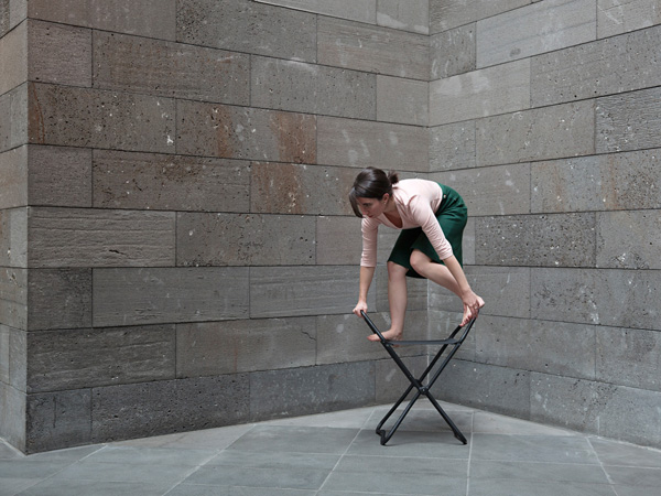
The above photograph is part of the NGV series and explores the contrast between public and private spaces. This is one of the private spaces in which the paintings are stored within these decanter racks to be protected. The photograph is composed according to the rule of thirds. Rae is positioned to the right hand side of the frame, hanging from the decanter. I think this photograph is very cleverly composed to suggest movement as the position of Rae’s body being at a downward angle hanging off the decanter suggests the movement of her having pulled it out from among the rest. We can see in the photograph that this decanted is extended out while the others are still tucked away and the composition of the photograph gives the impression that she has pulled out the decanter by running and jumping on it leaning backwards. This is suggested by the dynamic nature of her pose. Many of her movements in other works are more docile but in this piece the unbalanced nature of her pose, leaning backwards powerfully resting on legs and hands which are at different levels suggests the application of power and force. The structure of the decanter itself is positioned so that the line of  the end of it exactly divides the photograph into the third quarter of the third of the frame, Rae then being in the end third. As with all her other compositions the photograph is very minimal, the colour scheme being all whites and grey’s and the lines of the photograph being made up distinctly of straight lines. Rae’s body shape therefore contrasts even further with the surroundings as it is curved compared to the straight lines of the shelves and ceilings. The only colour within the frame also comes from the green skirt that Rae wears. Within her talk Rae spoke about wearing this skirt in many of her pieces of work as it allows a lot of movement and also records movement well. The way her skirt is hanging down also suggests the gravity of the pose.

This is one of Rae’s earliest pieces of work and shows the beginning of how her compositions began. The main composition of this work is to consider how the curve of the body of Rae is contrasting with the straight lines of the rest of the composition. The body is composed to be in the very center of the frame. The body looks as if it is spilling out the door frame into the room. This impression gives more of an appearance that the body is in a sense a material or more fluid as it “spills”. I think it is that the body’s position has connotations of being more than a body, more like a substance that in entering the room. The lighting in the photograph comes from the window which is seen within the frame. The light shines directly onto the body and the floor around the body. This light shinning onto the face of the body emphasizes the body’s form and its outline. The rest of the frame then contrasts with the body as it is composed all of straight lines. The door frame is made up of all straight lines, there is then the lines of the skirting board and the lines of the window. The colours within the frame are then also very complimentary and neutral, bland colours. The brightest colour of the frame is the blues of the wall, the wall contrasting with the browns and whites of the rest of the picture. I think the fact that Rae is also wearing white clothes goes back to the idea that the body doesn’t appear like a person but more an object spilling into the room. The white clothes add to this impression as they paint her as a white canvas.

MY OWN INTERPRETATIONS


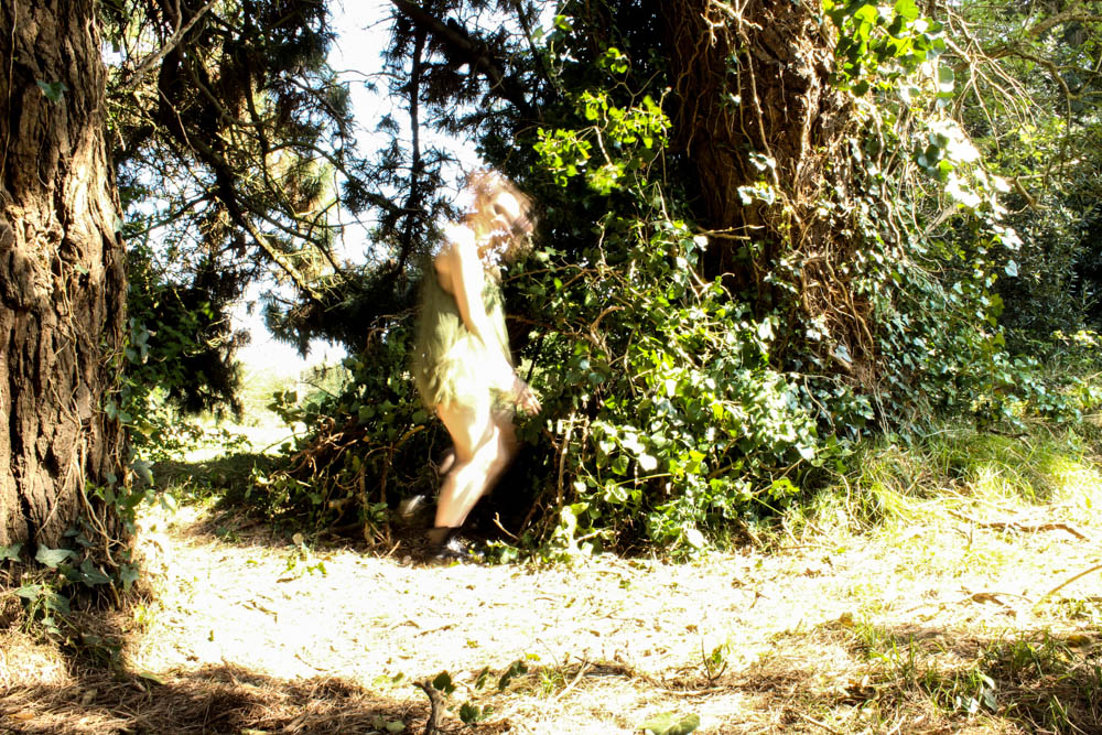
These first two images are an experimentation of self portraiture in the style of Rae. One of the things which seems to be common in her photographs is an extension of the body which is what i have tried to achieve in these photographs. I composed both fairly classically as her photographs have quite a traditional style to them. Both images work quite well in having a contrast between the curves of the body and the straight lines of the environment. 

The above photograph was more of an experimentation with capturing a dynamic movement. Rae’s photographs look in many of them as if the subject has merely frozen in their action and i wanted to take a photograph which reflected this. I composed this image according to the rule of thirds, again having a contrast between the straight lines of buildings and the pole with the curved form of the body. I quite like this position in conveying tension in the figures form aswell. 

These last two images simply explore existing within a space. We choose an elevator and decided to have the subject facing away as the image wasn’t so much about the person as an individual but more having a body within a location. 

Artist reference – Alexey Titarenko

Alexey Titarenko is a really intriguing and inspiring photographer. He took my favourite style of photography which is street photography and turned it into a completely otherworldly experience of an image. His distinct photographic style makes his work instantly identifiable as he uses an incredibly slow shutter speed so that people’s movements become a blur. This is such an interesting concept as street photography is all about capturing individual, key moments of peoples lives while Titarenko’s work gives us everybody and yet nobody’s story all at once. I am goign to be taking inspiration from his work to consider taking some photographs of blurry movement of people. I want to suggest the presence of people within my photo book but without having solid figures. I think this will add to the eerie and dreamlike quality of my project. I think it works quite well to have no people within my den photographs as the absence of people is then heavily noticed. This way by using Titarenko’s form of photography i can include people but keep them mysterious. 

His work is very political as he created the majority of his photographs in Russia after the collapse of the USSR when people had been seriously influenced by Socialism. He mainly photographed St Petersburg but he has also created work in Havana and Venice. He is an incredible individual as he chose to become an artists in a time and place where artists who didn’t produce propaganda work for the government were repressed. He only has one body of work called “Nomenklatura of signs” that he created under socialism in the USSR, the rest of his work explores the effects of this time period afterwards. Even one body of work however is an incredible achievement as it was displayed in a solo exhibition in 1988. He was lucky that he only began to produce work under Gorbachev who had a lot more relaxed views on culture and the arts than Khrushchev or Brezhnev.

“Through the prism of my native city, I attempt to show events that occurred not only here, but throughout the country – the changes, the catastrophes, and the human tragedies, which have swept this city and the people of this land.” – Alexey Titarenko

He wanted his work to reflect the human condition of these individuals living under oppression and how they were forced to assume one identity under communism. His photographs portray a real sense of uncertainty due to the lack of solidity and this dehumanizes the people in the images. This links so directly to communist oppression in Russia where people were expected to have one identity which matched everyone else’s identity; being a committed communist. His images present a lack of an actual person behind the shadowy blur and a real sense of living and going through the movements of life for the sake of it.The figures appear fragile and ghostly as if from the past as they have no solid presence in the image and so appear to have no solid presence in the present. This is exactly the metaphor I think Titarenko wanted his images to display as they show a link between the people after the collapse of the USSR going about their daily lives still being so effected by their past it is as if they are the past. The images show a transition of movement in a time where the people themselves are going through a transition of discarding old values and stumbling into new ones. Time seems to be moving all at once and yet is frozen, his images really causing a person to reflect on their own life. It caused me to question all the everyday movements and journeys i make, where to so many people i am simply another blur walking past them on their own journey.

The below video is the first of a series of video in which Titarenko takes us on a day photographing around his home town and really shares what it means to him to be a photographer. These videos are hugely insightful in getting to know the person behind the lens which in these images is so significant.  Titarenko wants to reflect the history of his home town St Petersburg and the history it shares with the rest of Russia in his images. He talks about how walking around the city, alley ways or a courtyards will suddenly strike him from a childhood memory and he know he needs to create an image of that place. The places he takes his images touch him form the past and it is this connection which gauges to him the authenticity of his photographs. To an extent he see St. Petersburg as a city whose soul hasn’t changed, only the people.

I chose Alexy Titarenko as a relevant artists research as i wanted to add a sinister element to my dens and the show shutter speed makes people appear as ghosts. I though this could be quite an interesting concept to play around with having fragments of people moving around my dens. 

IMAGE ANALYSIS


short

The above image is my favourite photograph of Titarenko’s and is probably also his most famous. The image is taken in St Petersburg as people go up and down the staircase. The composition of the image is really clever as it uses angles of harsh lines but these are softened by the lines ending in curves. The whole image feels very surreal and has a lack of presence almost in the lack of people and yet the reality of so many people. The grey and white blur really breaks up the straight lines of the background filled with buildings and the straight lines of the steps as it is just a mess of shadows.The barrier of the staircase stands out really prominently in the image as the grey blur of people really separates the background from the foreground. The barrier appears really solid as if it roots the photograph in time and place  compared to the blur of life behind it. I really like the phantom hands which are placed along the barrier where someone has rested their hand for a while as walking. They are the only distinguishable factors which show that the mass is the movements of humans. The whole images feels very detached and it is only the barrier which really cements the image. The photograph feels really fragile and brings to mind the word “wispy”, the people appearing as whispers of smoke and whispers of who they are in reality. The idea of the people being presented as ghosts creates a really morbid feel to the image which is only intensified by the black and white of the image. The image is very dark with the background receding into darkness and heavy shadows in the foreground. The lack of any people in the immediate foreground in front of the barrier gives a sense that the place is deserted and yet in reality there are so many people. I think Titarenko’s photograph perfectly captures the human condition of the people in Russia. They are living life which seems fragile and easily wafted away after years of oppression and so it is almost as if they are tip toeing around their lives not wanting to draw too much attention. They also seem like the ghost of the people they could have been, as they have become different people to who they wouldn’t have been without communism.

whitedresses_000

The above image is more ghost like than the other image as it only includes two figures and probably had  a slightly faster shutter speed. This means that the figures are more clearly distinguishable as people rather than a mass of grey movement. I think the colour in the above image is key in establishing the ghost like impression. Both the girls are wearing white dresses which fits with the idea of stereotypical ghosts being dressed in white. The slow shutter speed has also created an element of translucency to the figures and so in parts they are see though to the street behind. The idea that they are ghosts is heightened even further by how there is a man in the background who doesn’t appear as the forefront figures do and the contrast between the two makes the figures seem other worldly. The straight lines of the image, the buildings,the pavement also emphasizes further how the figures lack in a shape. They are made up of “wisps” of shapes especially their dresses which fade into nothing. I think the fact that the image is taken from behind the girls is also very powerful. It is almost as if these pure white girls have turned their backs on society and the idea of communism. They are walking away from that ideology and to something new, something more solid maybe.

Wild child – ruby

This was my second photo shoot in which i created a potential character which lives within the den. This one was to correspond with my wood den and therefore i decided to make my subjects face look muddy and dirty as if she has been living among the woods. I got her to dress up in a a green dress as i wanted to continue on the idea of camouflage which this den revolves around so much. Overall i think the images work really well. For this particular shoot i decided to use my sister as my model as she has green eyes and i thought that this would correspond further with my den.  I defiantly think i have got some images from this shoot which i can use. 

The above and below images i took in a portrait framing, the light in both images coming fromt he right hand side of the frame. Both images are very similarly composed, it is simply the slight angle of the subjects head and the expression which differs. The angles of the subjects face in the image below appear a lot sharper and therefore cause the subject to have a tougher impression. The top image is a lot softer as the subjects face is facing towards the camera directly. The light in both images is quite a harsh light which contrasts which the dark marks on the subjects skin and also the subjects skin being very pale. The skin almost becomes washed out to a bright vibrant white by the light. The subjects hair in both images is very wild and therefore frames the face well as it blows in and around the face in a natural way. I used a narrow depth of field in the images so as to blur the background behind the subject. I quite like however how you can still tell clearly that the background is filled with pine leaves. This then links the location directly to the den images and creates a link between them.  Something which i had a problem with was that i couldn’t take a picture in which my subjects eyes had the sunlight illuminating them without washing out the entire of the subjects face and creating terrible images. I therefore opted that for these images i would focus on the lightning of the face rather then the eyes. Overall i think i prefer the below image for a photograph which shows the whole of the subjects face in a more formal portrait.

I also took some more abstract images as you can see from the images above and below. Above i experimented a bit with focus, having the focus in the background rather then the foreground to add mystery. I think the outcome of the images turned out okay. I like the below image best because of the contrast between the sharp lines of the light and the dark shadows of the rest of the face. The brightest point of the image is where the light from the right hand side cuts lines across the face. The subjects hair which then blows across their face creates a wild impression and also adds flicks of light as the stands capture the light. The image is composed so that one of the subjects eyes is directly in the center of the frame. I quite like the abstract nature of the image.


The above image is one i managed to capture which had light in the subjects eyes. I really struggled to get my subject at an angle in which i could easily show the light colour of my subjects green eyes. I think this image only really works because the background is such a light green colour that it brings out the lighter green colour of the eyes. I used a really narrow depth of field in this image to blur the background but keep the foreground in focus. This blur causes the subjects hair to look straggly which was the impression i was going for with the whole wild look. Only the immediate foreground of the eye was in clear focus, the black mud on the face contrasting with the white skin of the subject. I quite like how the blur of the rest of the images means the little details of the hair of the eye brow and the eye really stand out.