All posts by Jasmin Ross

Filters

Author:
Category:

Evaluation

Overall, I think my project has been successful as i have successfully contact 3 shoots which perfectly clear and sharp photos. However the first two shoots were of extremely poor quality because of the ISO and i could not tell what was wrong in the images. I have 11 finals which i have mounted on foam board, i wanted to create two window mounts, one with two images in and the other with three. However i did not have enough time which is why that have all been mounted on foam. This is a let down for my project as i think that the images would of looked very nice in window mounts and it would of rounded it off nicely.

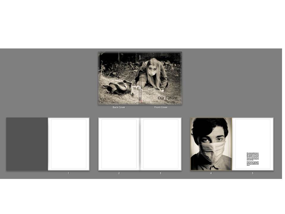
I Have created a 48 page book which is called Our Future, it has a combination of abstract, landscape and portraiture and tableaux in it. I have 5 edited photos which i did on photoshop which was very successful and they turned out really well after being edited in lightroom.

After each portrait image, there was a quote from the official website of WHO and The European Environment Agency.

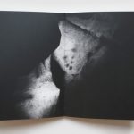
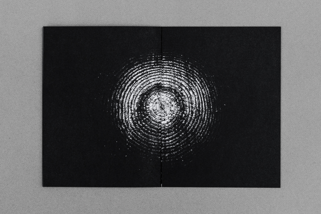
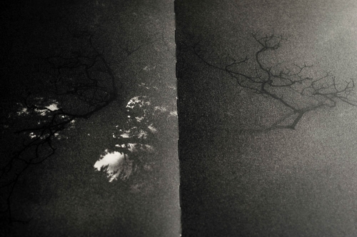
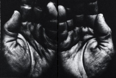
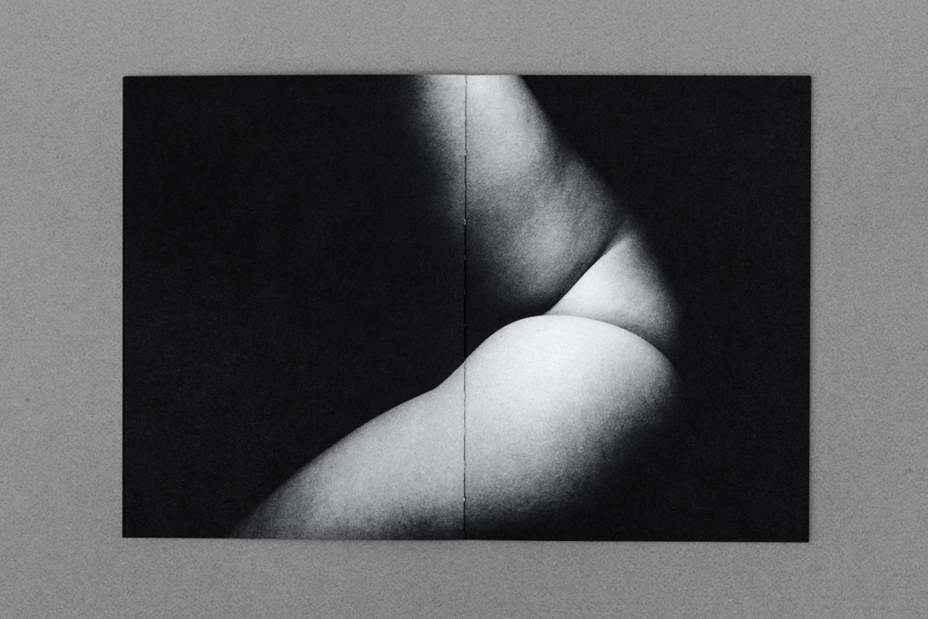
I have referenced Jon Cazenave who made a book called Ama Lur in which he investigated his homeland in Uruguay with the Basque people. He created a book with abstract images with dark shadows to allow for the viewer to image what the photo may be of. It is a very personal book very similar to mine.

I have also done many different artist references from Lu Guang to Christian Rodriguez. Not many of my artists are professionals but not many would link to my work if i used professionals. All my artists had a link to pollution whether it was E-waste or air pollution with gas mask which is almost identical to my work.

I have also researched the history of the gas mask and air pollution statistics and have added them to my book and onto my blog. My book and project is based on Symbolism, how the gas mask symbolizes war and how it will symbolize future fights and the invisible ones which we will fight such as Air pollution.

Link to my book: http://www.blurb.co.uk/b/7920634-our-future

Finals

I have chosen 11 finals to print out as well as my book. I have chosen these because i think they represent my project well and represent my skills as a photographer as well. The first set of finals are my experimentation finals which i created on photoshop using a combination of my studio portraits and photos which i got from google of pollution particles to merge them together. I have chosen 5 of the merges to be my finals as they are a strong point in my project as they show a hidden part of pollution which we cannot see, they show a sinister hidden danger which we do not think about every time we step outside. Overall my images have turned out really well and are very dramatic but they could of been improved by finding better quality images from google as it may make the images pixelated when printed which is something that i hate but it could add something different to my project which i have mentioned before of humanities blurred vision about pollution. Each image has a different meaning and each image of particles is a symbol of something different.

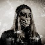
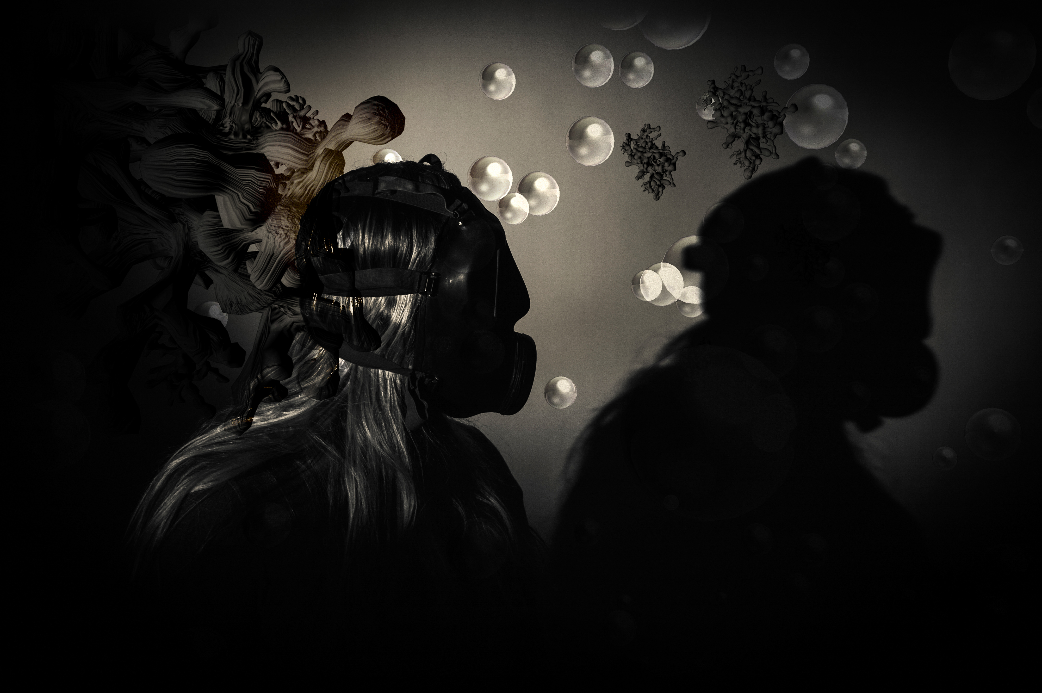
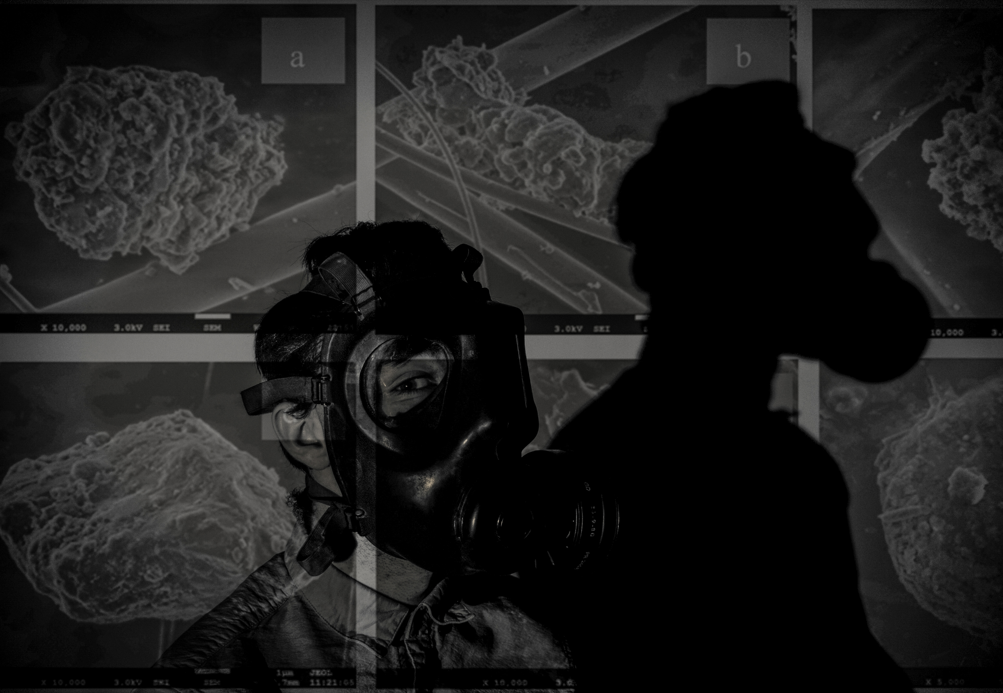
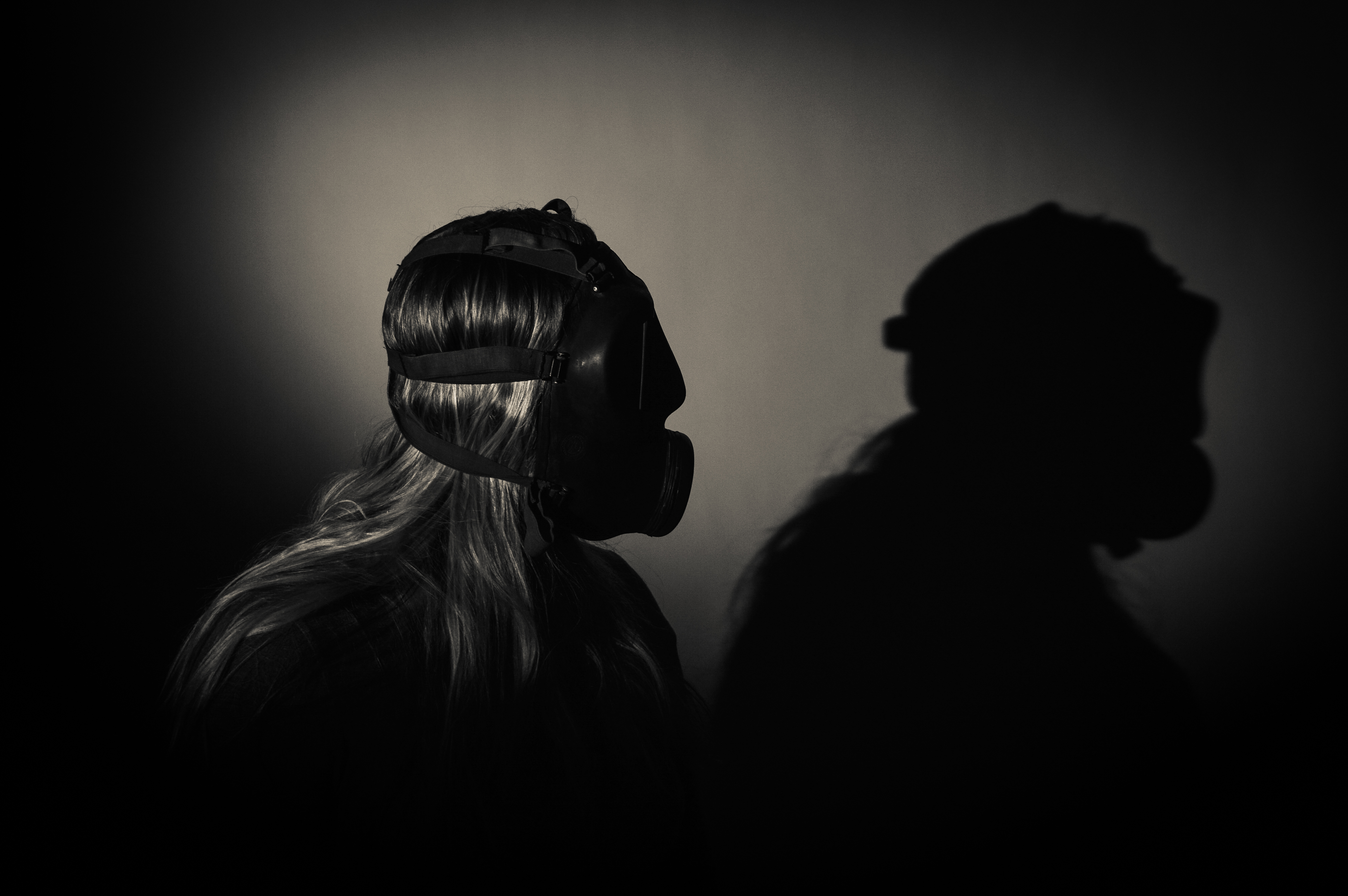
This image was taken in the studio with my model facing slightly to the right as before this i was using a  flash setup. The spotlight was angled so that it only lit her shoulders and her head. I asked my model to turn to the right and partially look at her shadow to represent her acknowledging that she needs to change. Before this image was merged with the particles, it was edited in lightroom with the same filter which i have used for all my photos. Next was merging the image of the particles, i did this by flipped the image horizontally and zooming into to make it like the large particle is looming behind my model and she does not know it. This image of particles symbolizes the looming danger which is in the air which no one notices because it is apparently small but under a microscope they seem very large.

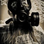
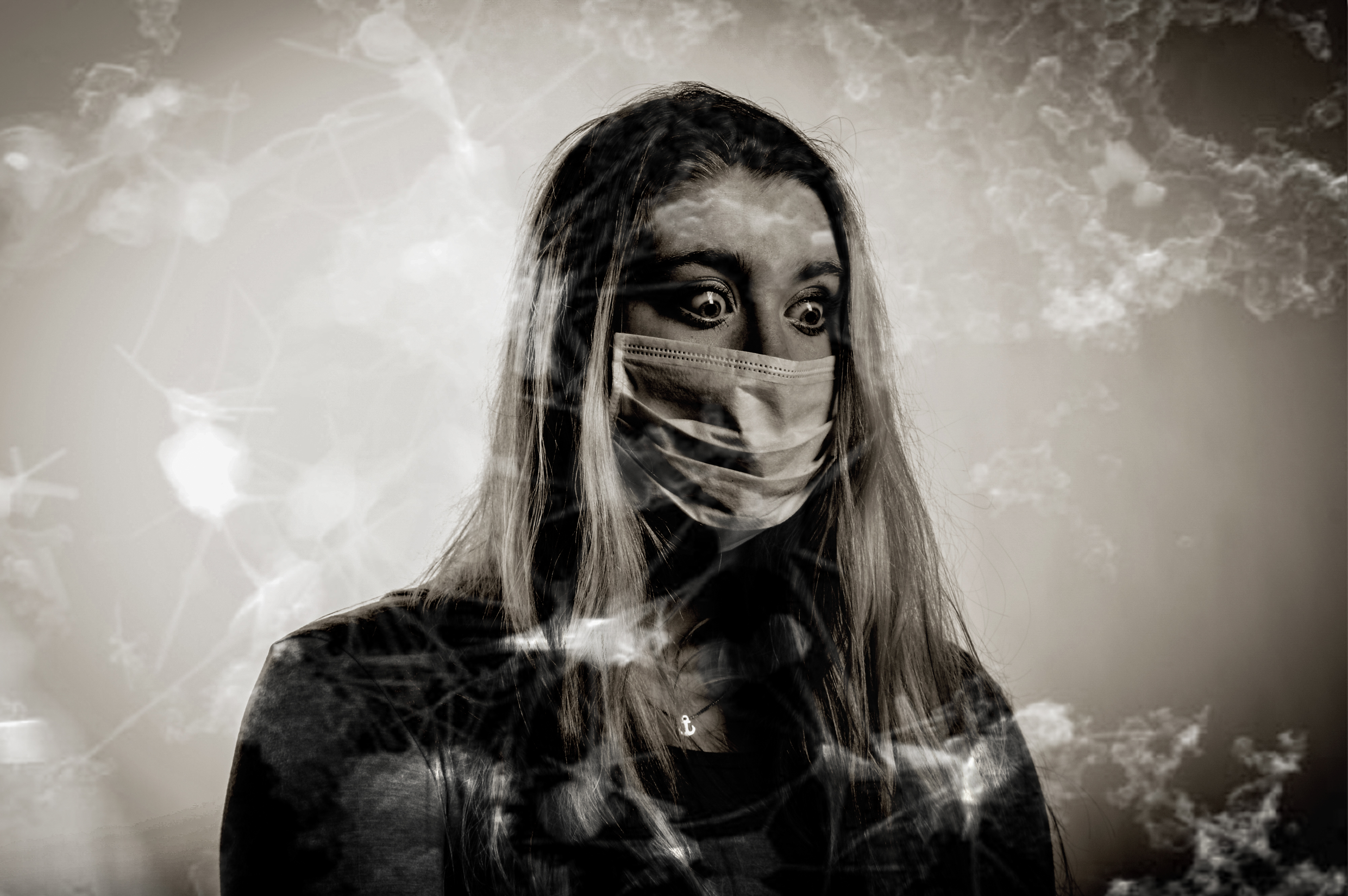
The original photo of my model was taken in the studio using a flash setup in which a flash was facing a white background and another flash was to the right of the model, This created a bright background which lit up the features of my models hair and face. The image of particles which i used on this photo made it a vintage tone but the particles weren’t as visible if it was put into more black and white colour.

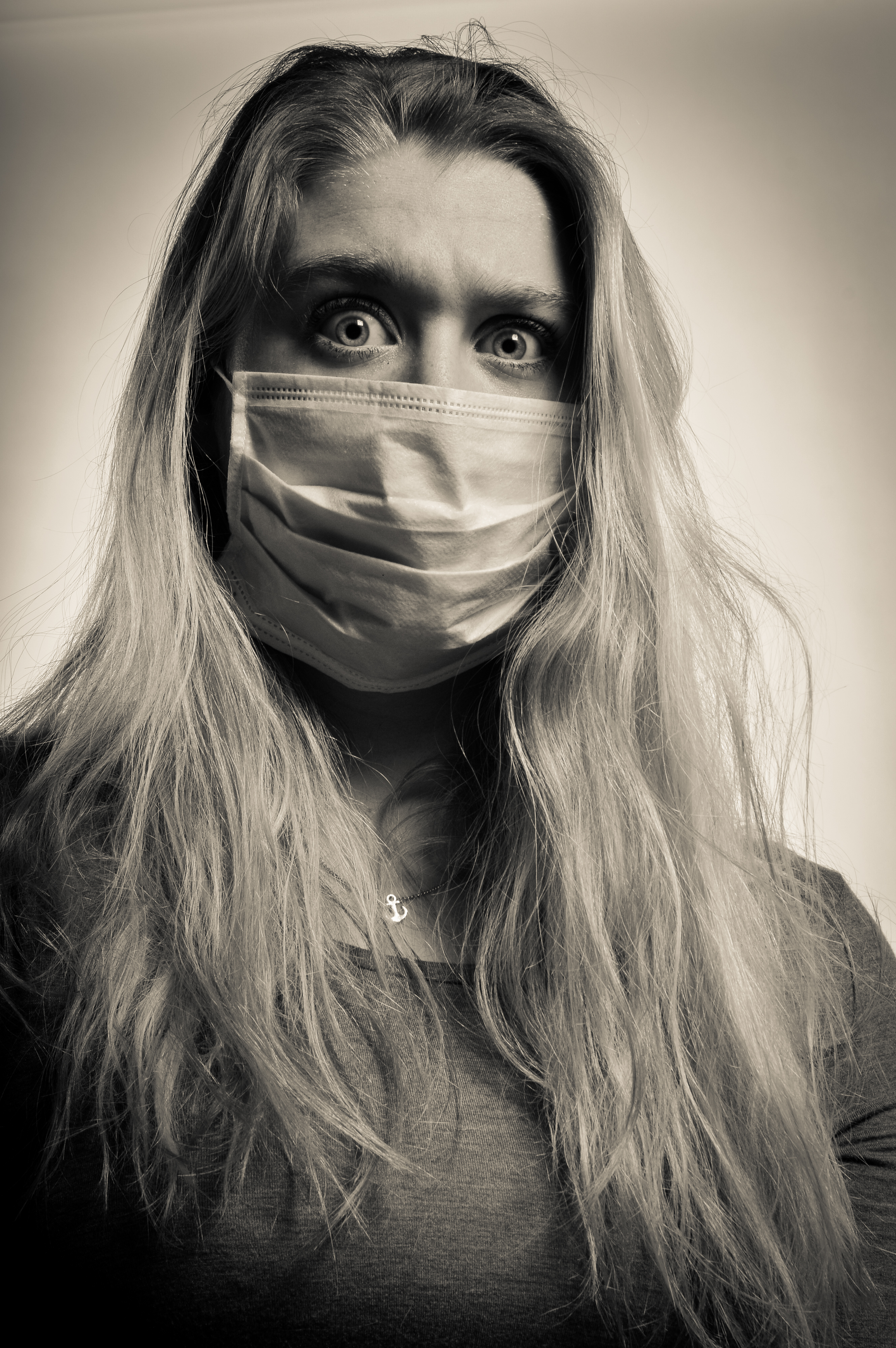
This image is very strong mostly because of her eyes as she is showing lots of emotion which is why this image stands out in my book. I put it as a double spread because i think it is worth that and because this image is in landscape. This image has more of a vintage colour than the rest but it i had changed it to the standard black and white filter, the particles would not be as visible.

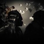
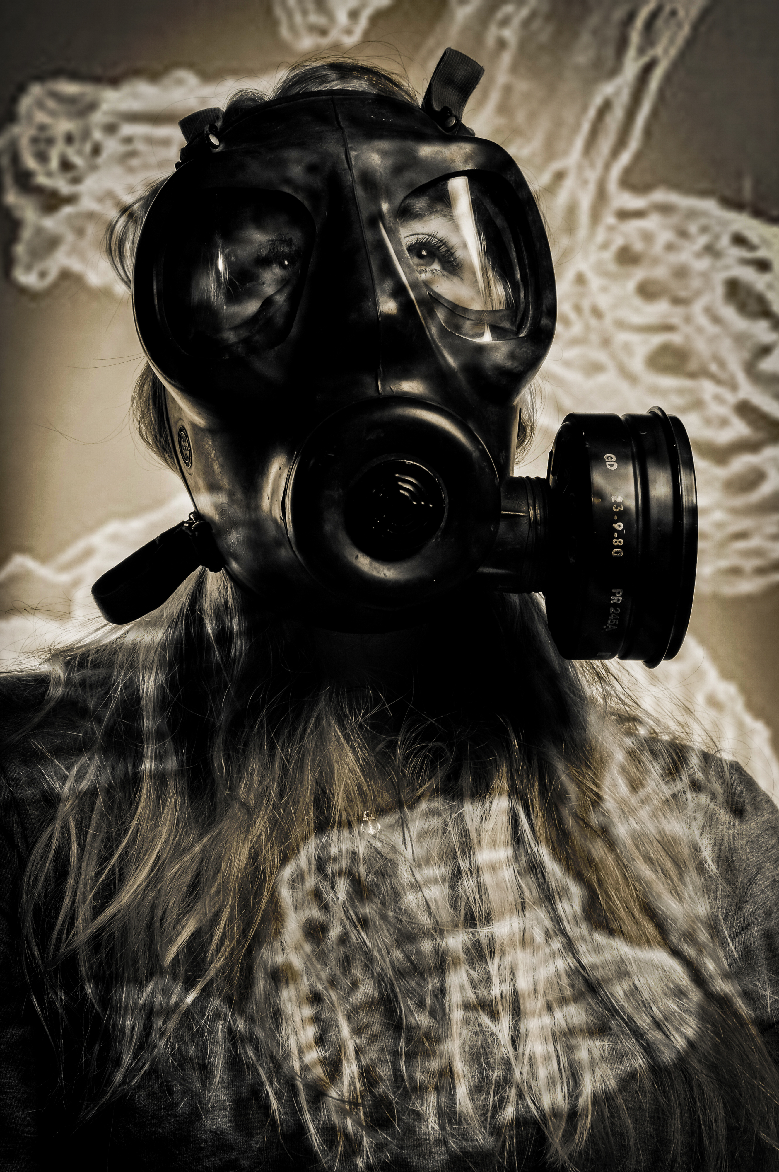
This image looks like it is being projected with particles but it is actually merged. This image worked really well as a double page spread in my book. However, i slightly wish that the image was not so dark because it does not match the brightness of the other images.

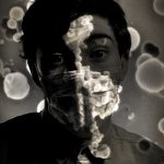
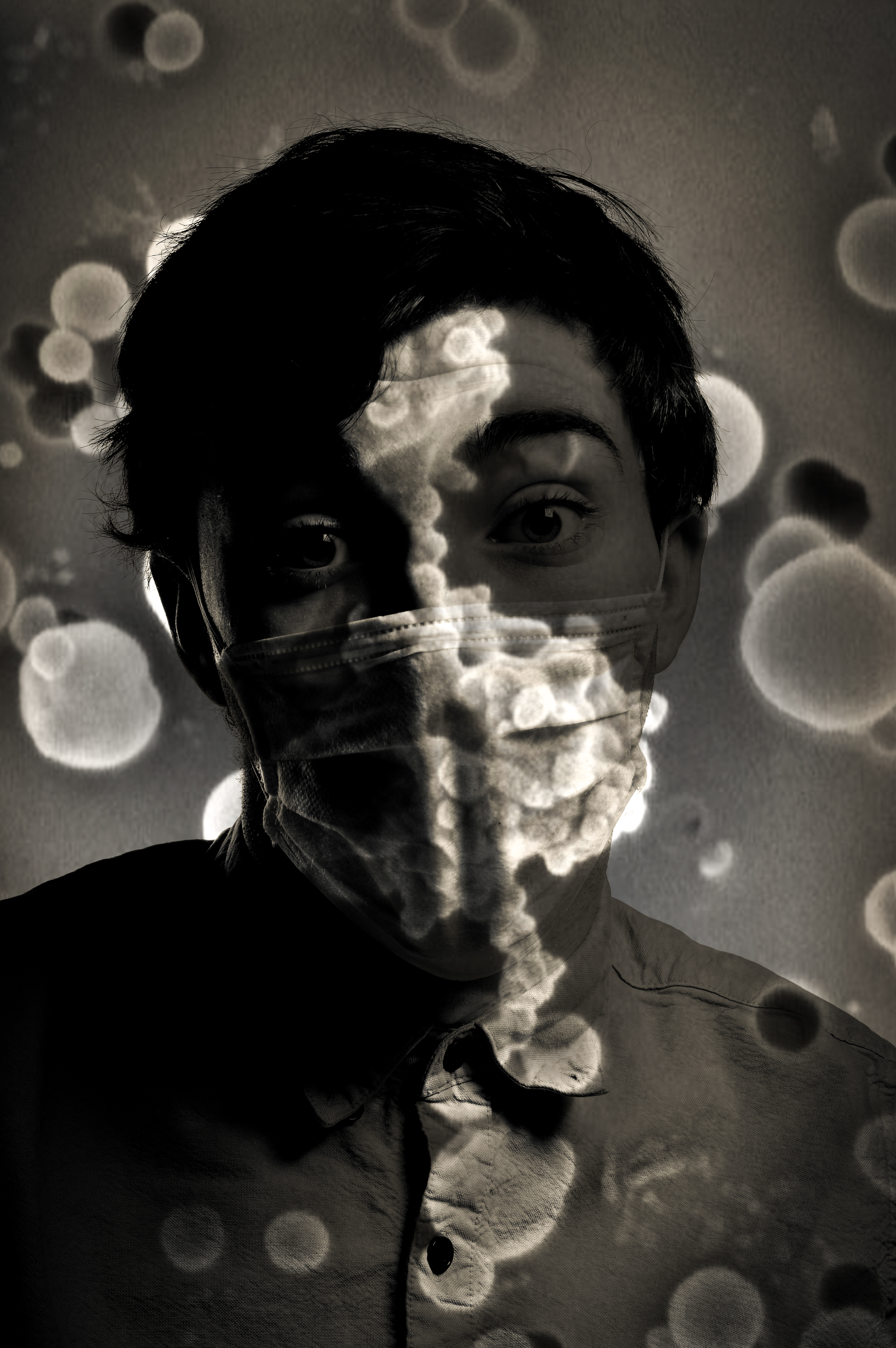
This image is the best because it shows how invisible pollution particles are everywhere. How scary it is that it attaches to our mouth and faces. I like also how the particles are much brighter than the rest of the images which makes everything stand out but the sharpness of the image behind has stayed.

Photobook Layout

Our Future


My book is 46 pages long and is a combination of single page images and double spreads. The layout is consistent through the book in which it begins with a small image and some text then a double spread, then a single image with text and it continues in this layout through the book. My quotes about pollution are from the WHO website which i have referenced and here are the links to the websites and another one which i have used to gather a statistics image from. My book is all black and white and they all have a standard black and white font which i made using filters and adjustments.

Who : http://www.who.int/mediacentre/factsheets/fs313/en/

Who: http://www.who.int/mediacentre/factsheets/fs292/en/

European Environment Agency: http://www.who.int/mediacentre/factsheets/fs292/en/

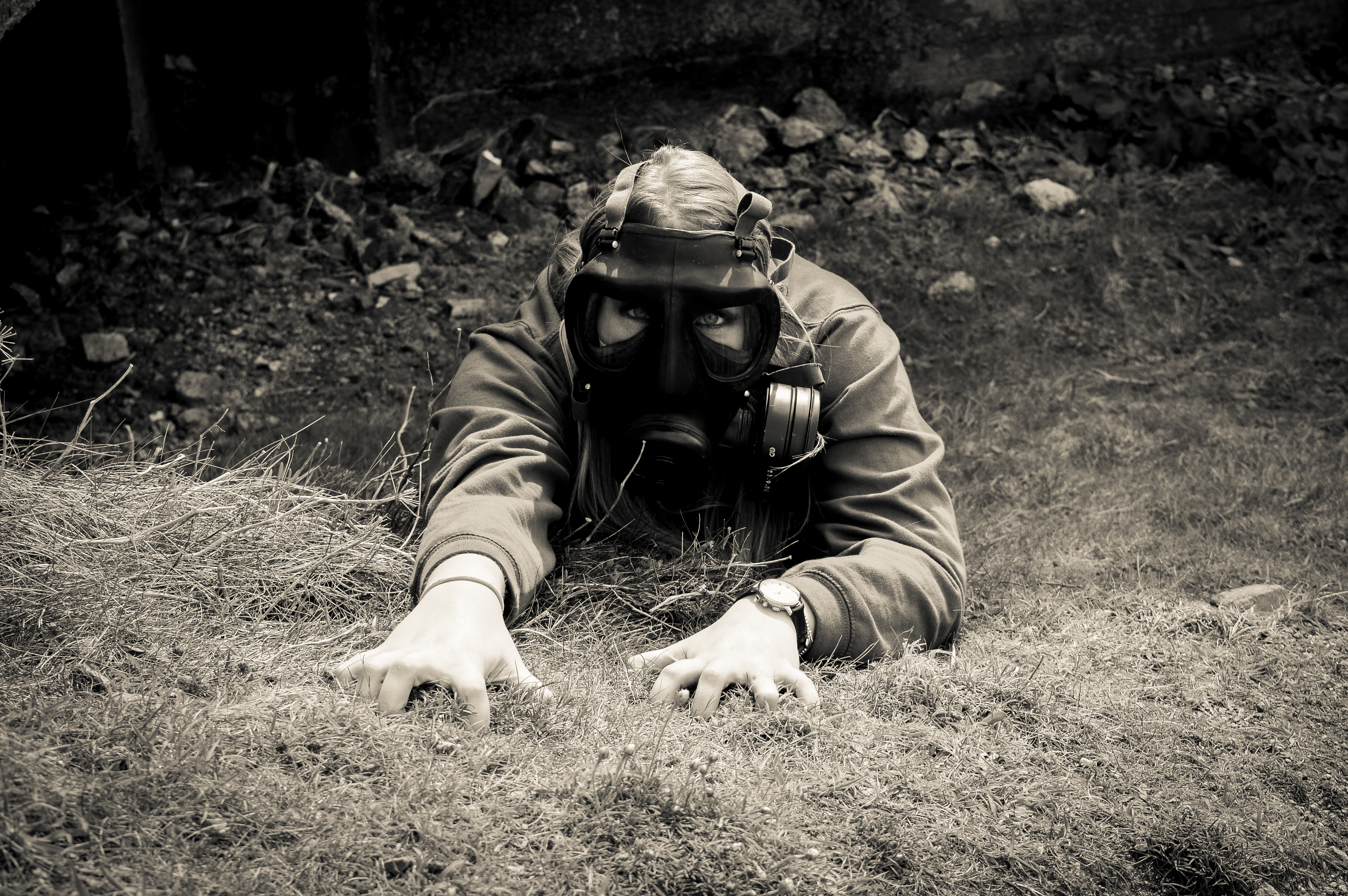
My front and cover photo are both one image and it is one of my favourites as it is of my female model reaching out for a gas mask. Even though my project is on pollution, this image may be misinterpreted for a project on war. My title is Our Future which is situated in the lower right hand corner, the font i used is Calibri, it is a very simple font but it works well as i do not want to take away the attention from the images. My title is 60pt which is large but it needs to be as the title is very important. I have left two blank pages at the beginning of my book so that it starts of slowly and the book does not look clustered and full. The first page is a studio picture of my male model, it is a close up of his face which is very clear and sharp, he has the mouth mask and his eyes are full of emotion which makes it a very powerful image to start the book off with. The text next to the image was written by me and is not quoted from any sources, it says:  “China is the most polluted country in the world. The pollution levels show no sign of slowing down and the rest of the world does not care. The high levels of pollution will not just stay in China, they will eventually affect the rest of the world. This will mean mouth masks and gas masks will become the normal way of living. Clean Air projects can only do so much on their own, they need people to help. Will you be one? Will you help save Our Future and The Future of Our Children? ”

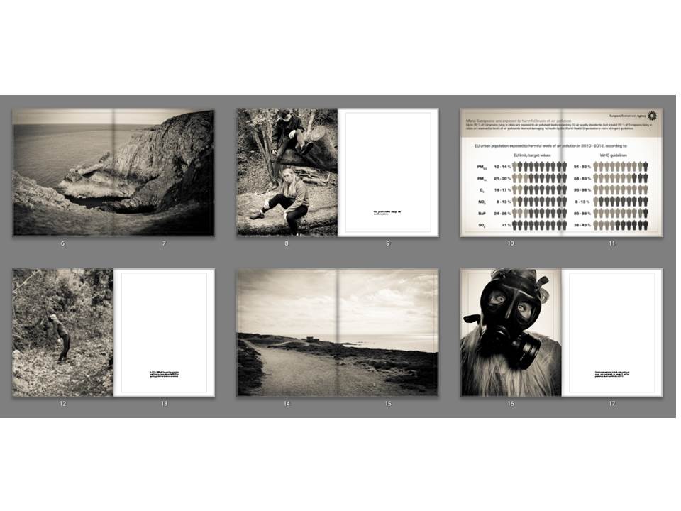
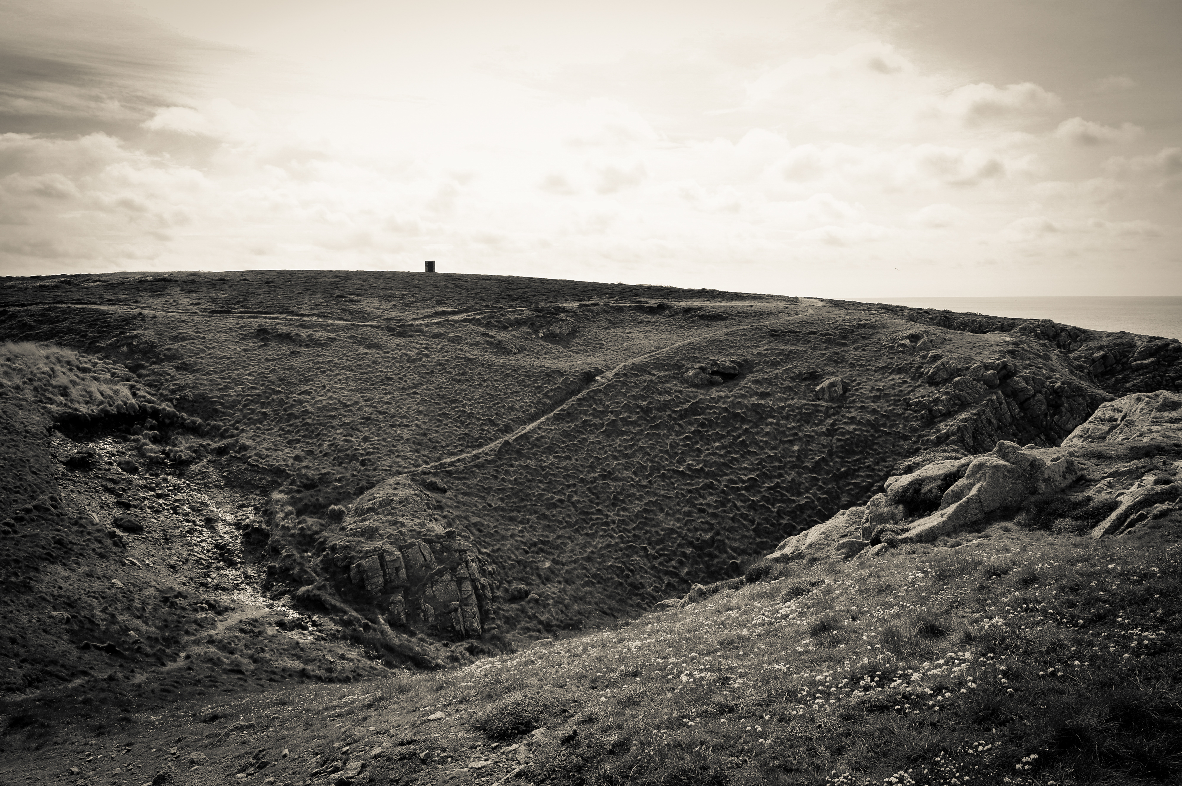
The landscape image is used as a break between the images so that the book is not filled with portraits and so it does not look clustered. This image works really well as it is a very simple landscape but the black and white makes it really strong and it works well with all the images in my book. The landscape was taken at Gronez and it did not look very interesting to begin with but it fits in perfectly with my work now. The image of my two models is used to represent that one person cannot change the world but more people together can such as communities recycling more and organisations working together to clean the air. The next image is of a landscape which i took at Gronez, it is very natural and bare landscape because it is untouched by new buildings apart from the old bunkers which is why it is so beautiful. These double page spreads are similar to the work of Jon Cazenave who used double page spread to create an abstract looking book which is dark but much darker than my images as they have a slight vintage ting to them. The last image is a studio portrait which i did of my female model with a gas mask on, the quote next to her was taken from the official website of WHO.

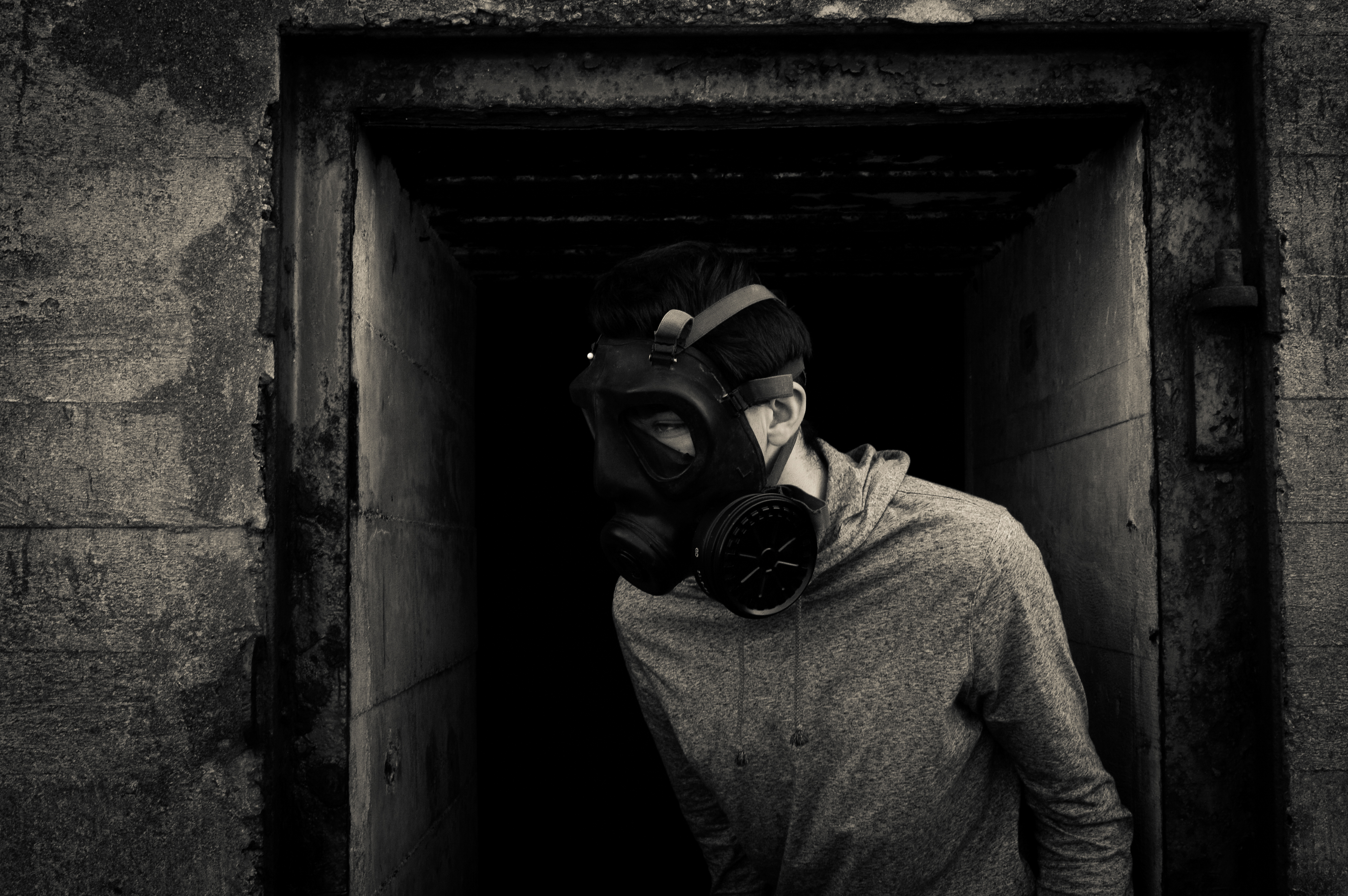
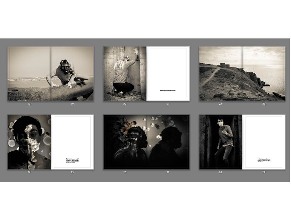
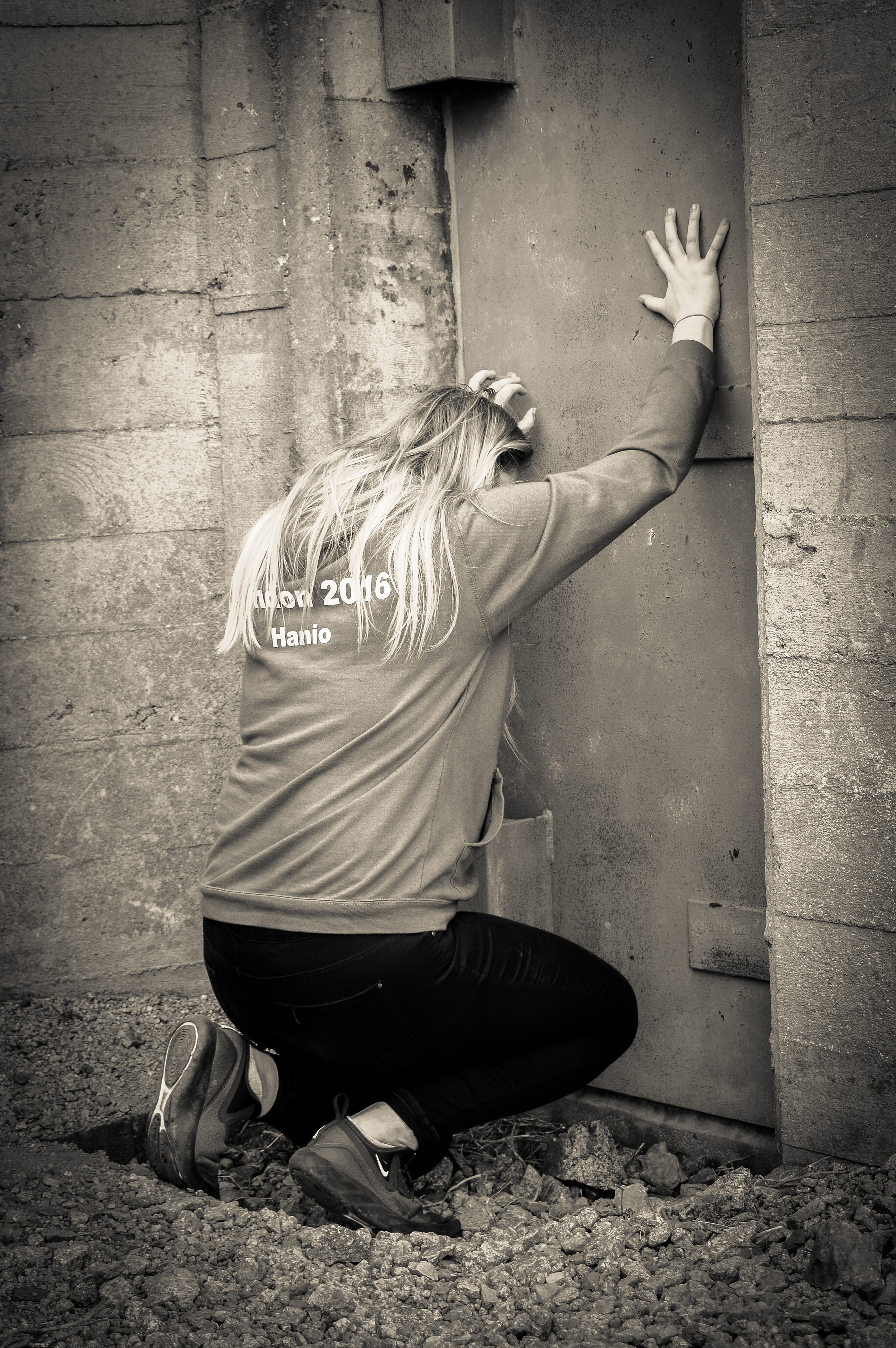
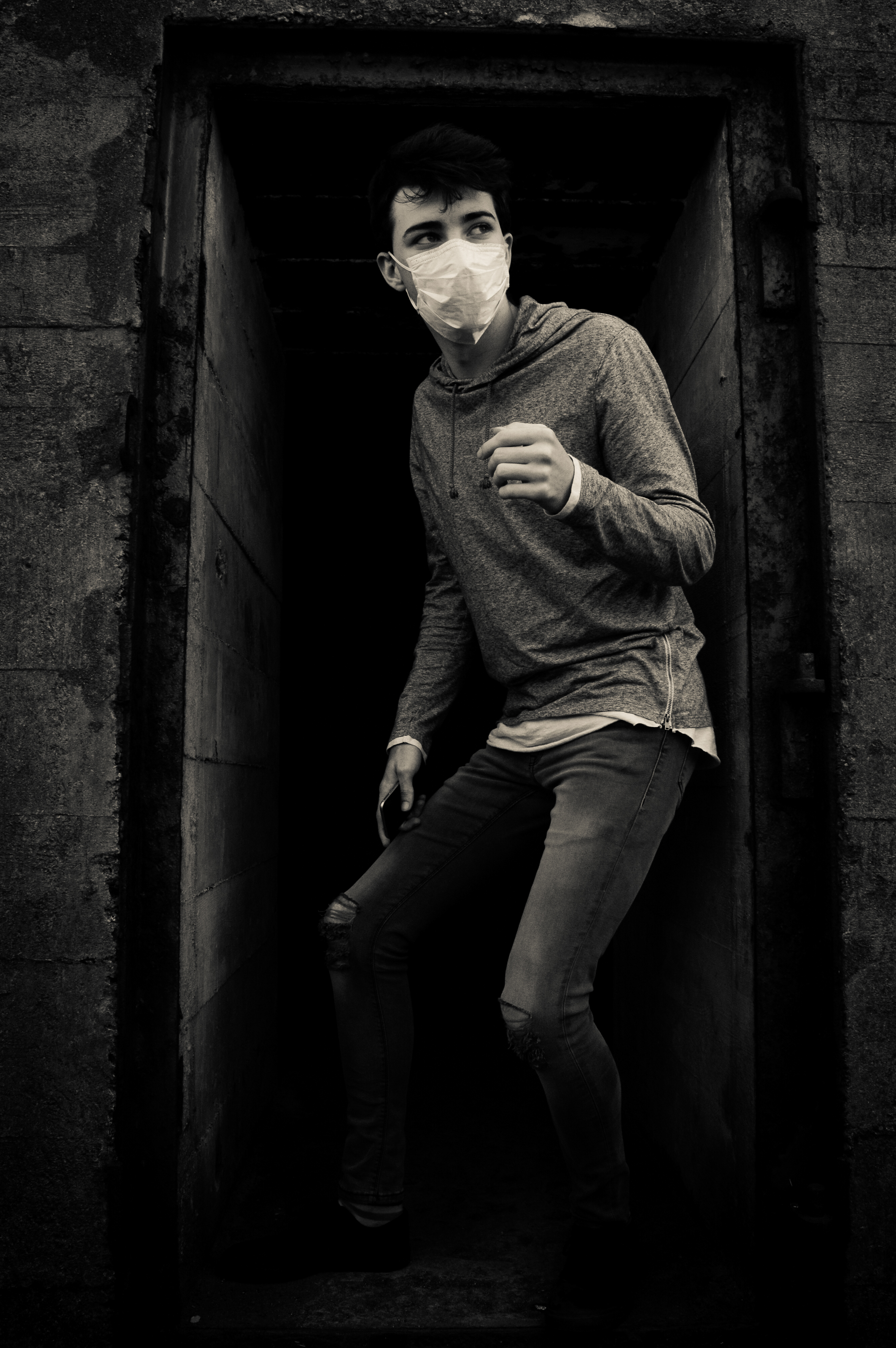
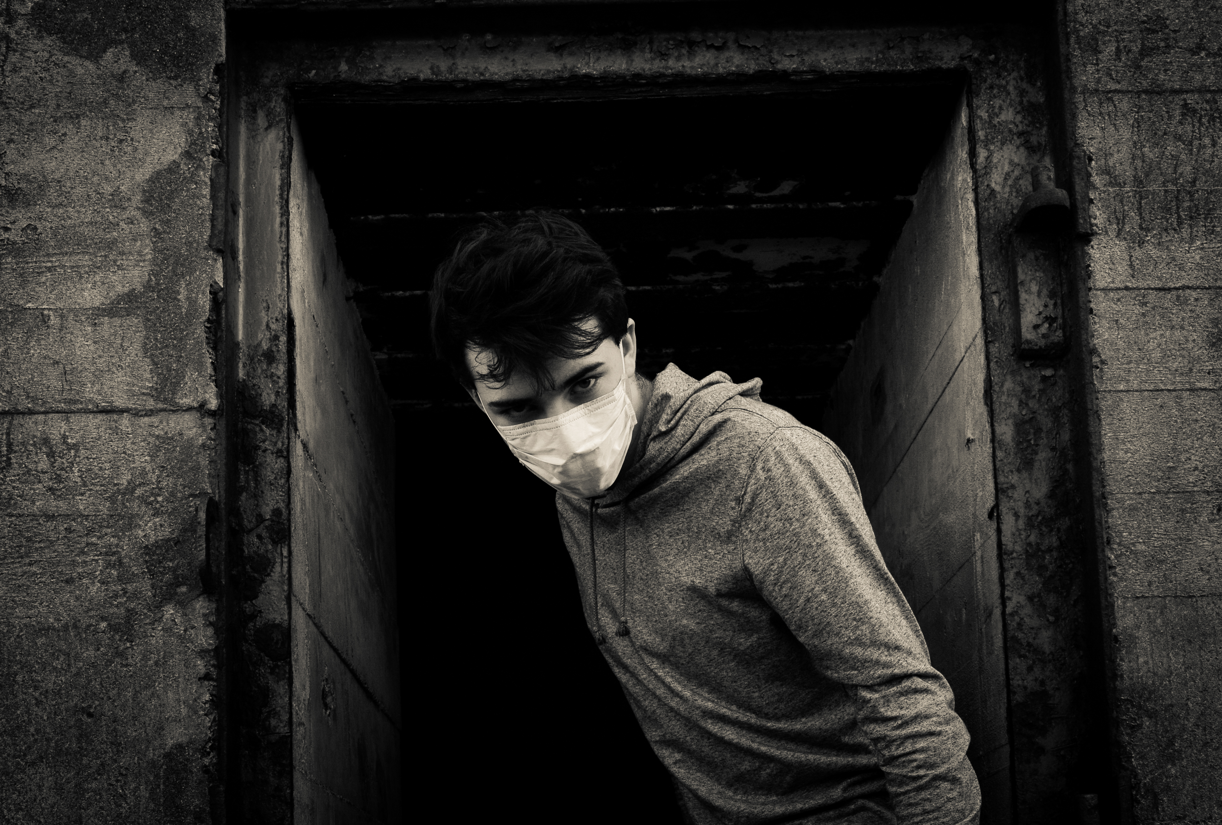
The first image is of my male model struggling to get off the gun and it is another double page spread to separate the portraits so that the book does not look too clustered. It has a vintage look like all the photos. The second image is a portrait of my female model banging on the door to try be let in to escape from the air but it will not be able to save her, next to that image is a quote from WHO saying Outdoor air pollution is carcinogenic to humans.  After that there is another landscape to split up the portraits and make the book look neater. After this the book starts to look into my photoshop work which i did using air pollution particles and merging them with studio portraits. I did this to add variety to my work. Next to this photo there is a quote which says: Particulate matter is composed of sulfate, nitrates, ammonia, sodium chloride, black carbon, mineral dust and water. It is closely associate with increased cancer incidence. The second of my edited images is on a double page spread and this work is very similar to the work of Jon Cazenave who used very dark images and very ambiguous ones to investigate his homeland with the Basque people. The next portrait is of my male model who is stood in the door way of an bunker armory with a mouth mask on. Next to this image is a quote which links directly to the image, it says: Over 4 million people die of premature deaths from illness attributable to the household air pollution from cooking with solid fuels

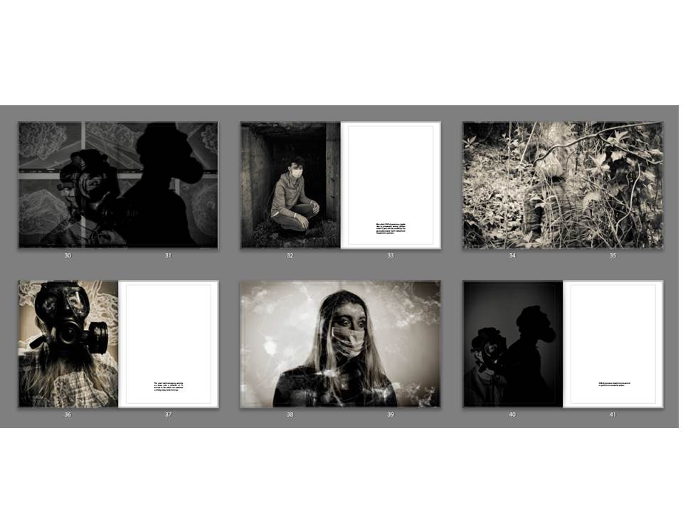
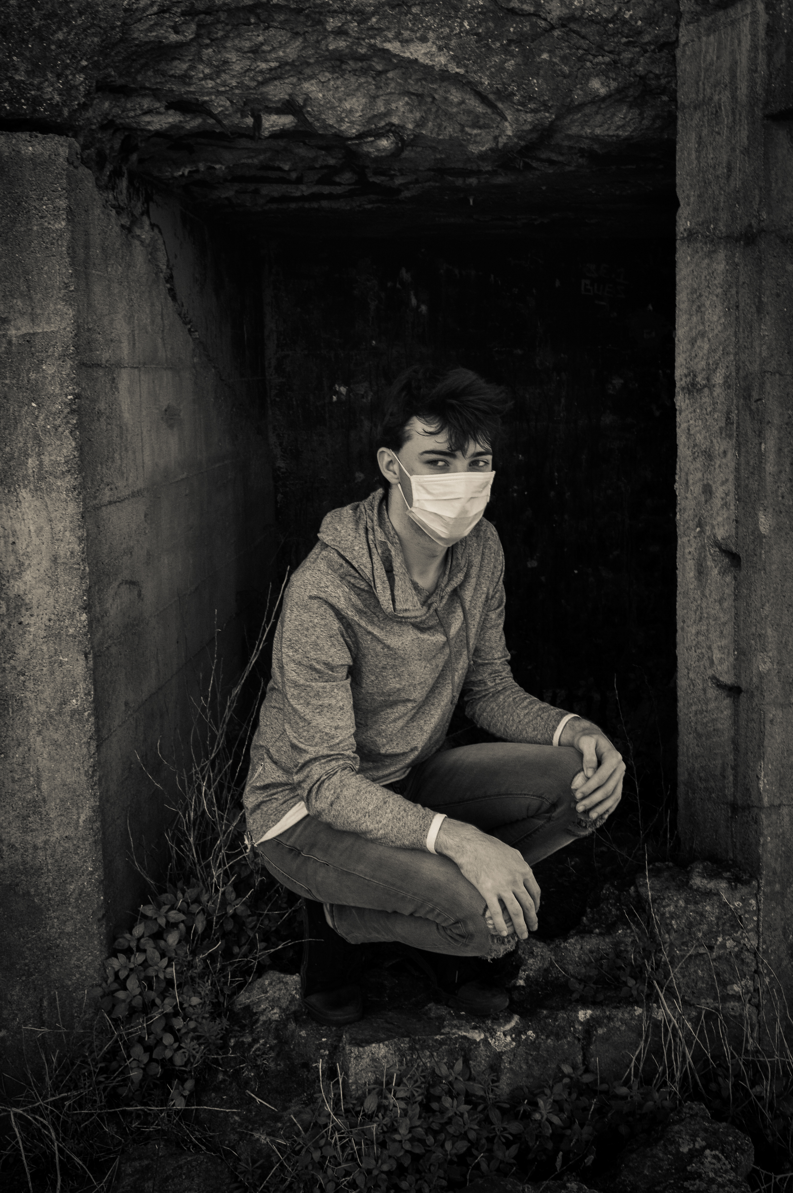
The next double page spread is of my third edited portrait which appears to be projection of particles onto an image but they are actually merged together. Again this relates to the work of Jon Cazenave as it is a very dark image with very dark shadows just like what he did with his book called Ama Lur.  The next portrait is of my male model crouching in an entrance to a small cavern like area. Next to him is a quote which directly links, it says: More than 50% of premature deaths due to pneumonia among children under 5 years old are caused by the particulate matter (soot) inhaled from household air pollution. After this is a double page spread of my model integrating with the environment which symbolizes how pollution fades into the background and we do not notice until we look closer. The fourth one of my edited portraits has a slightly vintage tinge more than the rest of them which makes it stand out but without this the particles would not be as visible, next to this image is a quote which says:The most health-damaging particles are those with a diameter of 10 microns or less which can penetrate and lodge deep inside the lungs . A double page spread of my fifth edited portrait splits up the portrait orientated images and it is very strong as she has very big eyes portraying lots of emotion. The next portrait was done in the studio with a spotlight and it is very dark with dark shadows and my models face isn’t very visible. Next to his is a quote which says: 34% of premature deaths from household air pollution are caused by strokes.

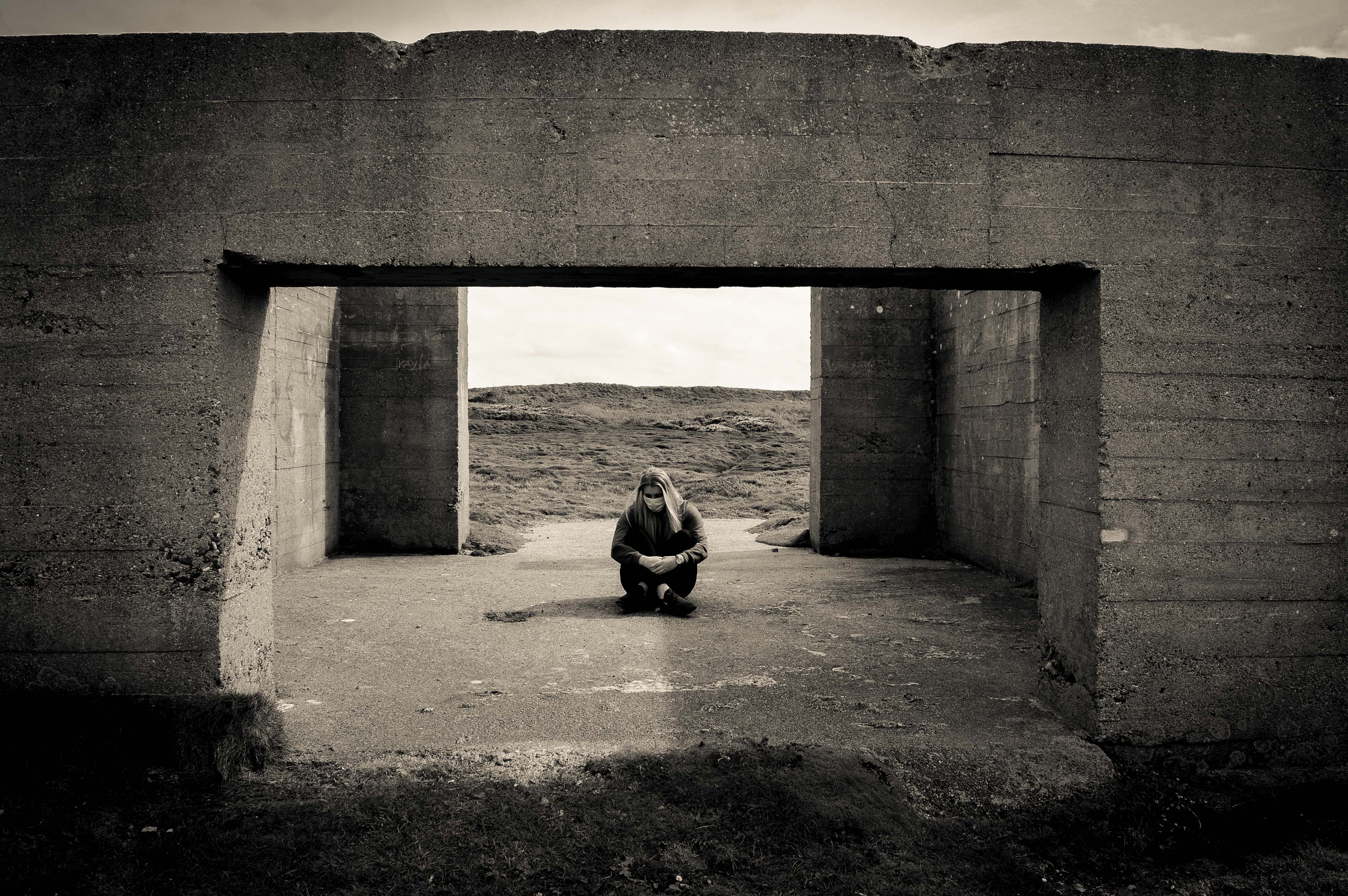
A double page spread of my male model looking directly into the camera splits up the last two portrait orientated images. It is very dark and his eyes show a lot of emotion. The final portrait is of my female model who is sitting between two walls which have been destroyed are Gronez. The quote next to her says: No structure can protect us against the air. Finally there are 3 references in my book from the official website of WHO and The European Environment Agency.


Jon Cazenave: Ama Lur

Website: http://www.dalpine.com/en/book/ama-lur

In 2001, He received a B.A. in Economic Sciences from the University of Deusto. In 2006, after working for 5 years in the finance world, he decided to move to Barcelona to study photography.

He began working in documentary photography so that he could capture and depict the contemporary world and completed his studies with Pep Bonet, Christopher Anderson and Paolo Pellegrin, after having been selected to participate in the first Magnum Workshop taking place in Oslo.

Since then, he has been working on a long-term research project called GALERNA. This work focuses on the idiosyncrasy and aesthetics of the Basque Country with an anthropological perspective.

This book is the closing chapter of an 8 year project by Jon Cazenave, he has compiled a book of the Basque people’s idiosyncrasy and their aesthetics, to unravel his home’s political intricacy from an anthropological perspective.
I have chosen this book as part of my inspiration for my book because i like the very dark black and whites in the book which i partially want to recreate in my book as all my images have a standard black and white filter as i think it is very dramatic and my project is very important and dramatic.

His work is very unusual and i would consider it abstract photography but his work is very ambiguous if you have not read the description of the book which is similar to mine as my project could be mistaken for a project on war. His book is in a portrait orientation which is completely covered with images/black paper. The edges of the book are a grey colour and the seem of the book appears to be covered with glue. It is a soft cover book as the cover is an image. Every single image is a double page spread.

The whole book is on black paper with the images on top, all the images are double spread and go from edge to edge. In my book i will have double page spreads splitting up the portrait orientated images as otherwise it will look too clustered. The double page spread will be black and white and many will have high contrast and dark shadows to make the images look much darker to show how worrying and dramatic my project is.

His work only shows parts of an image which leaves it up to the mind of the viewer to make up the rest or what could the image be apart of. Some of his work is much clearer than this one which is very ambiguous.

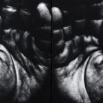
This image which is back of his book is much less ambiguous than just simply the patterns which are on some of the pages. However each image has a symbolic meaning to him personally as his work is exploring his homeland which is why all the images are symbolizing his home land. The hands could represent those of his family members or just people from the community. His work is very intimate and he has some up close images of body parts which can be ambiguous as the viewer does not always know what they are of.

I think this image is of an arm but i am not quite sure, i do not like images which i cannot clearly make out what they are. For many photographers it will add tension into their work but i do not like this as i do not like the uncertainty.

Personally i find this book not very good because you do not understand what it is about without reading the description. There is no explanation about why the book was made or what it is about within the book.  Also there is no name or date on it and the cover does not give any clue to what the book might be about. I like books which have a title which gives you a clue of what it may be about or if not the images will tell the viewer what it is about.

For my book, i will make sure that the meaning and concept behind it is clear through the use of quotes from external sources, i will make sure my book has my name and title very clearly written on it.


Christian Rodriguez

His work: https://www.lensculture.com/articles/christian-rodriguez-motobaik#slideshow

Christian Rodriguez investigates themes related to gender and identity by working with communities all over the world. His work has been published in The National Geographic, The New York Times, The Guardian and The New Yorker.

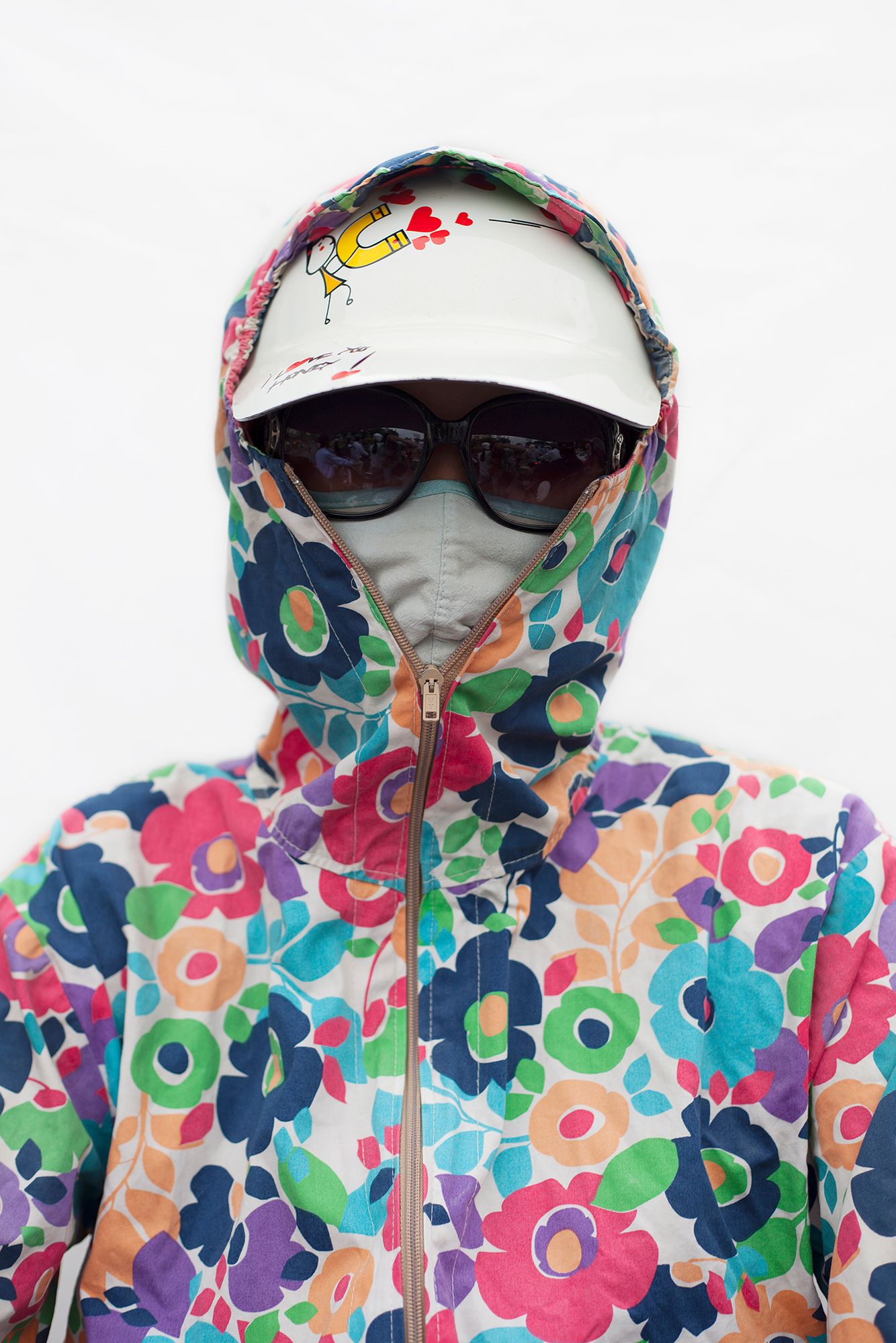
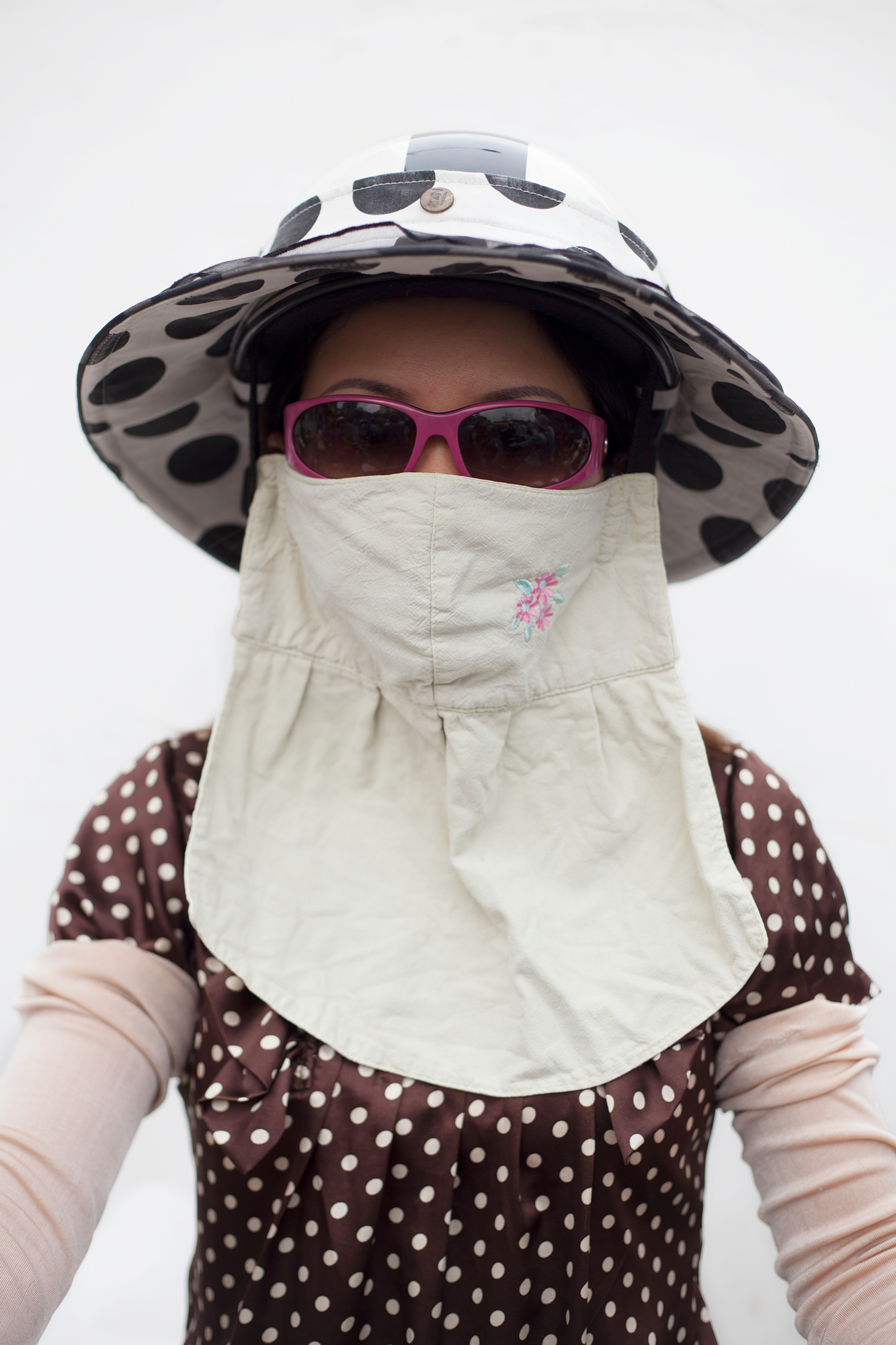
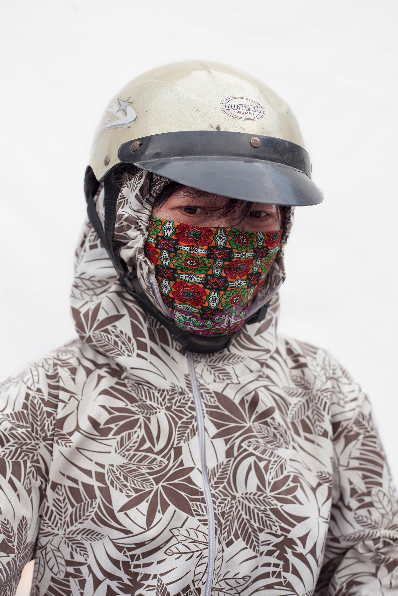
Motobaik is a term which refers to scooters in Vietnam, he has done a projected exploring Vietnamese women who wear specially designed fashionable motorbike jackets which almost cover their faces and hands when they ride. This relates to my project as i am exploring mouth masks and gas masks which cover my models face.

This project is similar to mine as the jackets cover their faces which is similar to what my mouth mask ans gas mask do. The women do this because they want to avoid the pollution caused by so many motorbikes and they also use it a sun protection. They do this because of beauty standards in Vietnam, having paler skin shows a higher socioeconomic status because it shows that you work in a place with no sun exposure. His photos are a mixture of formal portraiture as well as environmental portraiture, there seems to be a standard pattern for designer jacket with floral/colourful patterns being the primary design. All of his photos have a standard and consistent composition which is the same for each photograph.

This portrait is fairly formal as there is nothing in the background to distract the eye from the women in the centre of the image, also by having a completely grey background could represent the smoke and pollution caused by the 37 million motorbikes travelling at rush hour. The floral coat stands out from the image which is what attracts the eye to begin with, this directs our vision to the full covered face on the women so that no smoke or sun can get through. The mask underneath is used for the pollution and this creates different depths to the image as the coat is on top and is what we see first then the cloth mask is what we see next. The glasses keep the anonymity of the women which makes the viewer wonder what she looks like and what kind of emotion she is showing underneath the glasses, mask and coat. The coat which the women is wearing is to protect her from the sun but it does not match her floral jacket but it blends in with the pale grey background which is why it is not noticed straight away. Within the image, there are four different types of what as there is the grey/white of thr background, the bright white of the cap, beige/white of the jacket and the dirty white of the mask. These all work together to create a consistent composition of the image. This image has no hidden meaning as Christian Rodriguez project of Motobaik is very clear and the description is clear.

This portrait differs from the others as the women is not wearing a jacket but she is wearing a bib like cloth mouth mask to protect her against the pollution, she is also wearing sunglasses and a hat to protect her against the sun so that her skin does not tan more as otherwise it will symbolize a low socioeconomic status. Like the other images, the background is a grey/white which for me symbolizes the pollution in the air during rush hour which is caused by motorbikes and cars. The different patterns of her outfit clash which does not make for perfect composition however as this is an environmental portrait, Rodriguez does not have control over what they wear when he photographs them. There seems to be a trend with the women he chooses to photograph as they are all wearing bold patterns and it is not clear that all women wear patterns like this but it seems to be a sign of being of a higher socioeconomic status because they can afford face masks, hats, glasses and jackets etc.. This image has the same composition as all the other images when it comes to the women’s faces in the sense that almost all the women preserve their identity with sunglasses or a low hat and Rodriguez respects this and does not ask for the glasses to be removed as they also protect their eyes against the smoke and sun. This is the only women out of my gallery to be wearing a different form of hot to a cap or a helmet, this could potentially be because she is not wearing a jacket for the cap to stay on or because she does not like it.

This is the only women out of my gallery of images which who has not covered her identity/eyes with sunglasses or hats. Also her jacket is not as colourful as the other women and she matches with the colours of the women above. Rodriguez has kept the same consistent grey/white background which could represent pollution. This women is the only one who is wearing a colorful mouth mask which is interesting because her jacket is lacking in colour which is why the viewers eyes are attracted to the colourful mouth mask which is protecting her from pollution. She is also wearing a helmet which is similar to a cap as it protects her eyes from the sun which is potentially why she is not using sunglasses. The mouth mask is the only colour in the whole image which is why it stands out so dramatically and makes the image much more interesting than the rest as she does not fit with all the women yet and the same time she does. The eyes of the women show lots of emotion almost sadness but we do not know, possibly because she has to wear all of this just to fit in with beauty standards in Vietnam and protect herself against the high levels of pollution during rush hour.

Experimentation

I wanted to create a variety of different aspects to my project and make it less direct my adding pollution particles onto my studio portraits. I believe that the images that have come from this are really strong and will round my project off nicely as i will have combined abstract photography, tableaux photography, landscape photography and portraiture in one project. I got the particles off google and many of them were in poor quality which is why when printed they may be pixelated but it could work well as it will create a different look to my sharp photos from other shoots.

To start, i turned all my particles into black and white so that they would match my photos and not affect them to much, this works well but after the merge, the photos needed to be edited on light room to make them the standard black and white so that my book would look consistent. However, some photos do have a slightly vintage colour but this could work well as it will make them stand out from the book.

This image is really strong because i used pollution particles which were scattered so that it created this appearance. The photo has a slight vintage ting but i wanted to keep it otherwise the particles would not be so prominent. This is the original image of the particles: As you can see the image is blurry which is why the photo will look pixelated when printed or in my book but this will add a different look to my images as my book is a combination of many different things which is why i want to combine many different appearances to my images. It could also represent the blurred vision of the world as the media hides the real problems by covering stories which aren’t relevant to helping the world. This is not the strongest image in this series but my models eyes make the image eye catching which is why i will use it in my photo book and it will be part of my finals.

This is one of my favourite edits because of how clear the original image is and how the particles have created different tones within the image but not covering my model too much so that we can still see her eyes so clearly which is why this image is so strong. The particles i used were fairly clear, more than the others and they worked really well with this image:

To create this photo i zoomed into the left side of the image as i already had a large photo of the image on the right. I thought this would make the particles extremely blurry but they weren’t too bad. I like the left image because it has different depths and textures which will be put onto my image making it much more interesting than if the image was on it’s own.

The particles in this image represent the hidden world which we cannot see but that follows us around. This image is very dramatic and dark because of the large particle behind/on my models head which could represent the looming danger which no one can see. The particles i used for this were the clearest but only seemed to work best on the darker images from my studio shoot:

To create my image, i flipped the particle image horizontally then zoomed in so that the large particle was much more visible in the dark image. By zooming in and cut off a few of bubble like particles but it is the large one which i wanted to focus on and it represents a danger and looks menacing in the image compared to the “bubbles”.

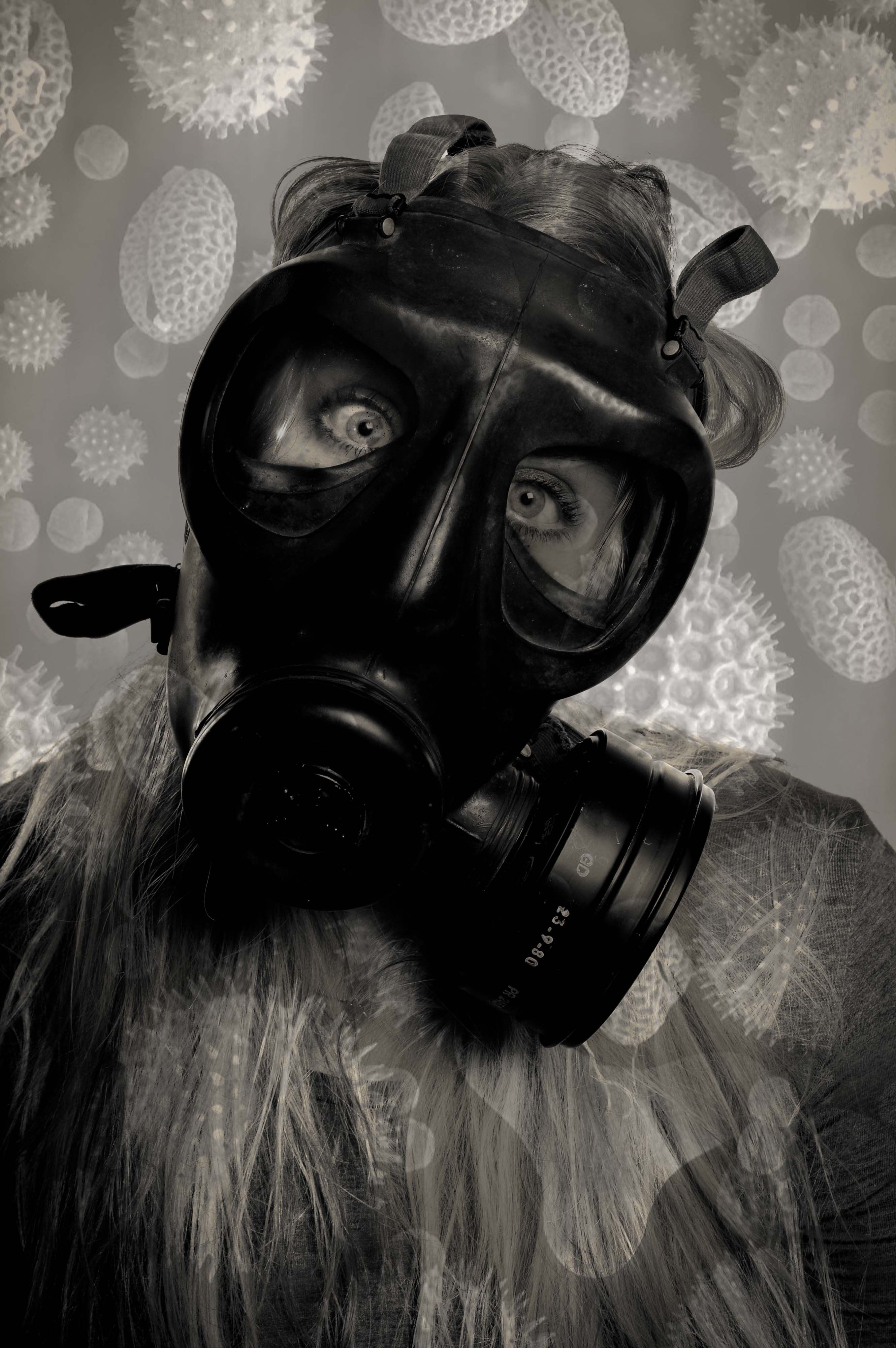
This image symbolize how when we breath all the toxins and particles are pulled towards us and are stuck on the mouth mask/our face. It is the most sinister image of the set because it’s meaning behind it and it is quite clear and will become clearer when the viewer knows that the book is about pollution. I will also add a quote about particles next to this image to make it much more powerful and dramatic. The particles i used for this were not very clear to begin with so i was worried that they would come out really blurry and affect the whole image but it did not luckily:

To create this image, i turned the image 90 degrees so that it was up right and i zoomed in so that the bulk of the particle was on my models face to create the impression as it is stuck to his face. This image is sinister because it could potentially represent what is really happening but we cannot see it because they are so small.

This image looks as if it projected onto my model and it does not look like it is photoshopped and that is it the original image. The only thing i would change about this image is that it is slightly slanted but it works well as i do not want my photoshopped images to be perfect and symmetrical as that will ruin the point of creating these images as they aren’t meant to be perfect. The particles that i used for this was a long image with lots of different particles and their names on them:

To create my image, i zoomed in on the image so that some of the particles were cut off creating tension in the image and this will allow the viewer to create an idea of what the particle might look like making it much more interesting and intriguing to the viewer. Also it makes the photo look like it is projected when zoomed in rather than left as the original image.

I am unsure if i will use this image in my book as it does not seem as threatening and sinister as the other images as it is not as dark and the particles do not seem as scary. I think this image works better on it’s own without photoshop because she has lots of emotion in her eyes and the photo is sharp and clear which will work well in my book. The particles i used for this was an image with all different particles of different sizes, textures and tones:

To create my image, i turned the image 90 degree to he right so that the triangular particle was at the bottom. I then zoomed in so that they were bigger and more prominent in the photo. What i do like about this image is that the particles have created different tones, textures and depths to the image which makes it intriguing.

I definitely will not use this image in my book as it is not as interesting as the other photoshopped image of this one and it does not look as sinister as all the other photos. It does look like there is something dangerous around us or something looming behind us slowly harming us and the planet. The image i used had lots of these spider type particles:

To create my image, i zoomed into the main particle in the image but the rest did not show up as much in the dark areas of the image but i did try it on different studio portraits but it did not work on them either. This is the worst out of the series of images because it just appears boring compared to the rest.


Studio

I did a studio shoot so that i could merge pollution particles with them as i wanted to keep the landscape portraits natural. The shoot went really well and i used a flash set up in which the key light was facing slightly to the right of my model and the background light faced a white background so that it would light up the back when the photo was taken. The allowed for the model to have light all around her instead of just on one side. I also experimented with using one small spotlight to create very dark shadows to add a bit of variety to my shoot.

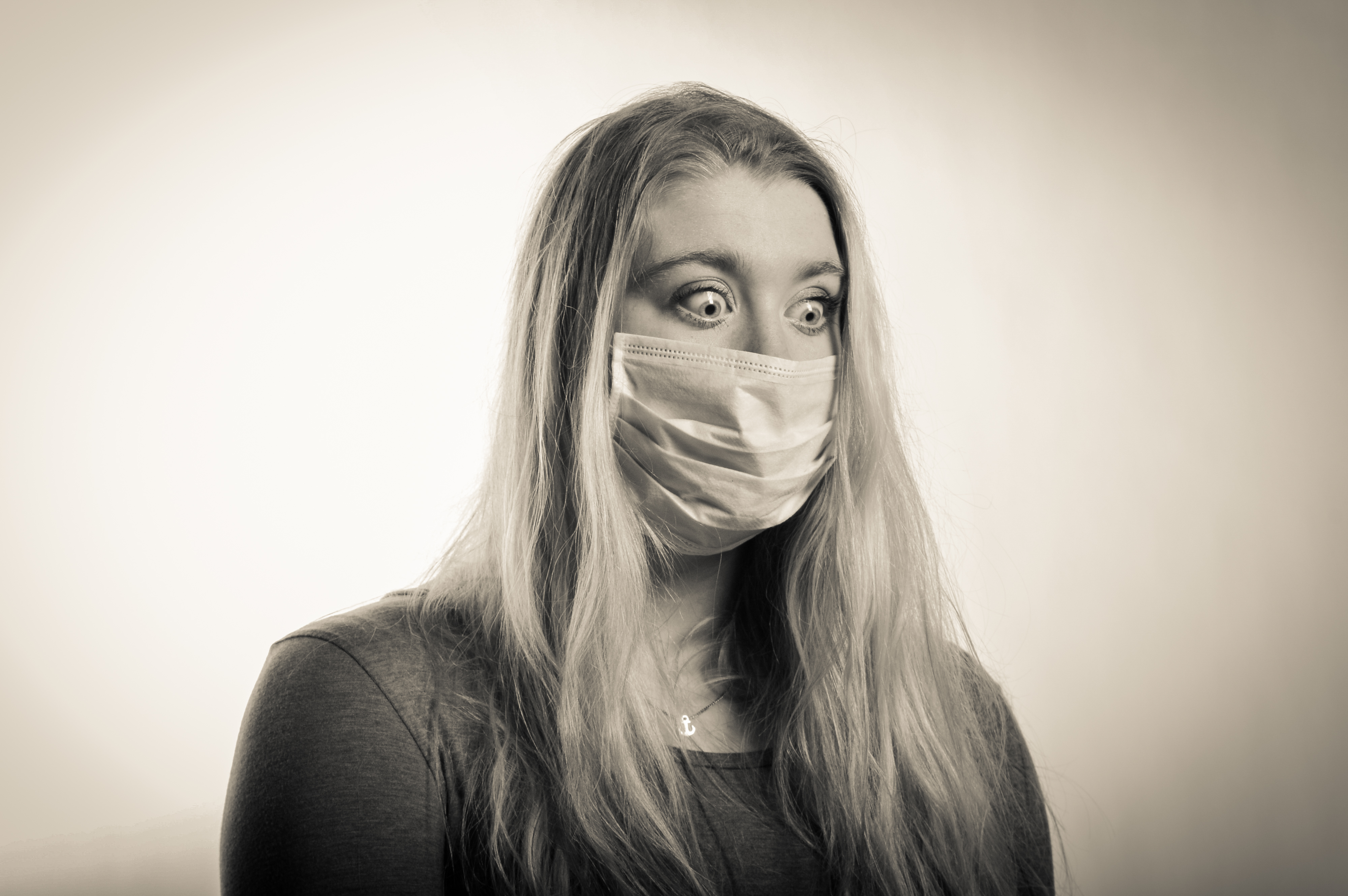
The first few photos were of my female model with the mouth mask on, i made sure that her eyes stood out and she had strong facial expressions as these are key to the success of my shoot. Her eyes represent so many emotions such as panic, fear and anger. I think these photos are really successful as they are clear and sharp, my models hair falls well on her face creating nice shadows and the images are nice and bright which will work well with photo shopping the pollution particles on top of.

The next set of photos were taken with my female model wearing the gas mask and this is where her eyes are key as they are the only thing visible when the gas mask is on. The gas mask is much more difficult to photograph but her eyes and her poses actually worked very well and produced very good images. The best image out of the gas mask set in the last one because it is a very powerful image because it is so clear and sharp and her eyes can be perfectly seen and they are wide and full of emotion. I will definitely use this one in my book but i may use it also to photoshop the pollution particles onto as it is such a strong image. The gas mask works really well in the studio as all the details on it can be seen and her eyes are so sharp through the windows of the mask. I did not get this kind of crisp and clear image when photographing in the environment but i wish i did as my project would of been much better.

After these photos i wanted to try experiment with the spotlight as i noticed it create a big dark shadow of my model which i wanted to photograph. I had to adjust the settings on my camera but this did not take long and some really interesting photos were made. Her poses played the main part in making these photos work and she did really well. The shadow of my model represents death because pollution will kill many people and will carry on to do so if we do not change. It could also represent former people looking down on us to try persuade us to help reduce the pollution around the world. These images are really powerful because of how dark they are and how the spotlight has made my models hair shine and we can only see her shoulders in the light which adds tension as we do not know what is hidden in the dark areas of the image.

I then photographed my male model who is much stronger with body language but he did very well with facial expressions as well. His photos are very emotional and you can clearly see different emotions in his face. I experimented with photographing his face up close to create dramatic images for my book and to edit later on, this worked really well as i managed to get all the up close images in sharp focus. My male model is very good with his eyes and they also show lots of emotion just like my female models eyes. The close ups of his face are the most powerful as they allow the viewer to feel connected with the model and see what they are feeling through their eyes. I will most likely use these to photo shop the pollution particles on because they are clear and i think they will work well in my book. I also think that i want to use the close up in my book on it’s own as it is a very powerful image simply on its own.

I then photographed my male model in the gas mask. These images weren’t as successful as the photos with the mouth mask but the close up and body shot looked good and i could potentially use them to merge with the pollution particles. His facial expressions did not come through as much in the gas mask as he isn’t as good with facial expressions as my female model as he does not have as strong and bold eyes. The gas mask photos aren’t are strong and powerful as my female models which is mostly why i will only use them to photoshop onto because they are not powerful to use on their own. These studios photos do not have hidden symbolism like the environmental portraits which i have done as i did these to add a different type of photography to make project and so i could use them to experiment with and add abstract photography to my project.

Finally i used the spotlight to create dramatic shadows which could represent death due to pollution and i think these types of images will work really well on their own in my book or merged with pollution particles as there is the potential for them to be really bold and dramatic and for them to stand out from the book. My male model did much better on the shadow part of the shoot as his body language is so strong which allowed my shoot to have a variety of images in instead of just simple portraits with the gas mask on. These images have the same symbolism as my female models shadow photos but his body language shows suffering and extreme panic compared to hers which are much more formal and tame. This is why i like these photos because they are extreme and interesting. I think these photos could potentially work on their own but i think they would look much better with pollution particles on top because that would make them much stronger than simply on their own. His eye is really powerful in the first image because it is the only one we can see and for some people they will be able to see emotion in it and as we can only see one, it adds tension to the image and anonymity as we cannot see the rest of him.

Fourth Shoot

This shoot was very successful, it was done at Gronez with only my female model. it was a sunny/cloudy day which made it good to photograph in however there were lots of tourists which made it difficult to photograph. The photos were all clear and i also took many landscape which could potentially be added to my book.

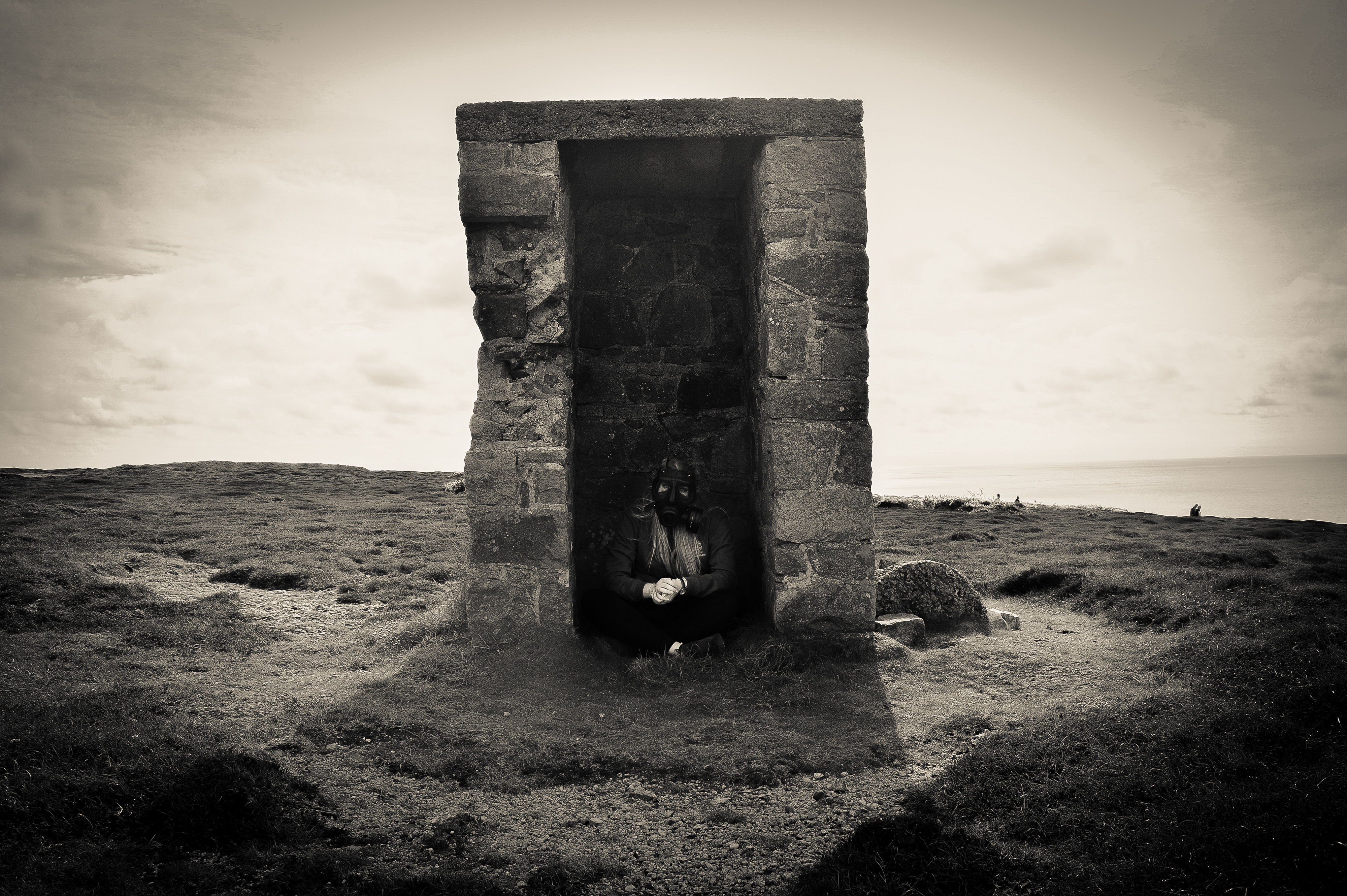
The first place i photographed was in a ruin as i think the walls could have a symbolic means such as no structure can protect us from the air. The sun was behind my model and it was partially hazy. These images combine a landscape image with a portrait image and it works really well to create a powerful and meaningful image. The best image out of these two is the first because my model is looking away from the camera which makes it much more dramatic and anonymous but however you can still see my models eyes which is what makes the image so powerful. I am unsure of what these images symbolize but i think they could represent being on the edge of a steep drop such as the steep downfall of humanity due to the population growing and the air slowly suffocating us and our future children. Does the world really want their children to live their life in a gas mask?

I then photographed in the arch but it was extremely difficult due to tourists and i did not notice that one of them had placed their bags in the way of my photos which is why i will not be using any of them in my book. Also my model did not pose very well and these photos relied very much on body language and she is not very good at that.I wish these images had turned out how i had planned as the arch would of created a perfect frame and representing the framing of the pollution problem in the eyes of the world. Showing them one of the biggest problems in the world which is above war because without air and a world to live on, war wouldn’t even take place. I also thing that the images did not work because of the angles which i photographed them at because i think i needed to be higher to create more of a sense of looking down on my model to symbolize loss of power.

The next area i went to was in between the ruins of the castle in which i made my model sit down and i laid on the grounds and photographed her from different angles whilst using the walls to my advance. These are my favourites images because they are more unusual than the others because i chose to do different angles to create more interesting images and symbolize that no building could protect you against the air because most buildings won’t survive a bomb. The second image is very string because we cannot see her body which creates tension within the image and makes it very ambiguous which allows the viewer to create ideas in their head about what these images mean and what my model looks life behind the wall. I think what makes these images really powerful is that they are in black and white as it makes them much more powerful and they catch the eye much more than when in colour.


On the way to different areas, i photographed the landscape to use a fillers in my book and so that the book is not completely full of portraits as this would be boring. I thought that the landscapes were originally poor quality as they looked boring but when turned into black and white they looked much better and more interesting. They are very natural and it is completely untouched land which is why they are very bare as it is completely natural landscape. My landscapes have no hidden symbolism as i simply made them to add to my book are splitters to make my book more interesting and not so clustered with portraits.

The next photos were taken in ruins of most likely bunkers of some sort and they worked really well to create a frame round my model. This makes the eyes focus on the model rather than the background. It also makes the image very dramatic specially in the light is coming from behind the model this is something which is considered wrong in portraiture but i used it to my advance to create a unique image. These images symbolize taking cover and hiding away from the world, trying to escape what is truly going on but the buildings only half cover my model to represent the idea that no building can protect you and soon enough the air will get to you. The second image has split lighting as the my model is half in the shade created b the sun and in the light of the sun. This symbolizes that the mouth mask can only protect you for so long before the air gets to you. The first images lighting represents the incoming storm, an afraid child hiding under their bed because of lighting but they will soon be doing this with a gas mask. The image looks almost like something which would be seen in a dream with the bright light behind it and the dark shadows which the light is casting on my model and on the ground.

The next few photographs were taken on a bank on the way down to a view tower. I asked my model to act as if she was reaching for the gas mask to imitate her struggling to breath so she needs the gas mask. The surprisingly worked well as she had good body language and her eyes made the photos perfect because they were so wide and visible. These are the best photos of the shoot. The first image symbolizes reach for something more powerful to protect her against the air because the mouth mask does not work anymore. It symbolizes desperation and panic specially in the second image as her eyes are so powerful and they are the main reason the image is so powerful. Her eyes show lots of emotion mostly panic and fear which works perfectly for my project. These images are still ambiguous because they could be seen as my model reaching for the gas mask to protect her against poisonous gas which someone has thrown into the trenches but this could link to air pollution being a form of poisonous gas which slowly kills her. The black and white makes them much more powerful as they catch the eye much more and makes the light in certain areas stand out much more and the shadows darker creating tension in the areas which we cannot see what is there.

After this i used the door to the tower and i made my model act as if she needed to get inside so as if she was banging on the door and clawing at it for someone to let her in because of the toxic air. Yet the building would not save her. These images did not appear great when in colour as they look very forced and they were very dull however when turned into black and white, they looked much better. I would like to use these images in my book as they could look powerful with a quote next to them as these images are more ambiguous, specially the first one as we cannot see her face. It creates tension as the viewers will create an idea in their head to what my model looks like  which makes the image much more interesting. However i do wish that she has used more body language and showed much more panic to represent the desperation to get inside as she believes that it will save her specially as she does not have a gas mask in the firs image. Her eyes are so important in these types of images as they allow the viewer to feel connected with the model and feel what she is feeling as she is able to portray it in her eyes instead of body language.

Finally i used a real bunker to photography my model looking out from the bunker as it has crumbled towards the edge of the cliff which made it seem like a window. These images worked really well but my model posed more like she was in a fashion shoot rather than a shoot about pollution which ruined it slightly but they look good in black and white. These images symbolize that again no building can protect you against the air specially if they can be taken down by war as the air is more powerful. The air is the most powerful thing in the world, everything in the world relies on it so if we do not fix it, we will fall victim like the 3 million people of 2012. My models pose could of been much better but she does look very sad which works really well as it represents loss of hope and faith in humanity to fix what they have done wrong. 1 million people cannot fix the world when there is 7.5 billion people in the world. Over 4 billion people will need to help change the world otherwise it will just keep going down hill.

Third Shoot

This shoot is definitely my favourite out of the past shoots i have done as i fixed the ISO which meant none of the photos which i took were pixelated. During this shoot i also took landscapes which i could use in my book to separate the portraits. I am not the most skilled at taking landscapes as i never know what looks good and what does not. The landscapes at Noimont are very natural and untouched by modern buildings and technology, this makes me very plain landscapes which i thought didn’t look especially amazing in colour but they look very powerful in black and white specially if combined with other powerful portraits which i have created both in the studio and in the environment. I think what is powerful about these images when in black and white is that the horizon almost merges with the sea level creating a never ending path. Also each image has a different sense of depth due to the angle i have taken it at, as the first landscape has many different depths from the wall up close in the corner to the rocks at the bottom far away from the lens. These landscapes symbolize uncontaminated nature, parts of the world which we have not ruined and destroyed to create new buildings for people to work or live in.

I did a shoot on the big gun at Noimont point and the images turned out really well but the sun was very bright which made it difficult to photograph my model without the photos coming out to bright. My male model is very good with body language which is why i think these photos worked really well, as he did what i said but he also added in poses and movements of his own which added variety and a different perspective to my images. These images look very sinister in the sense that it links to the battle fought at Noimont and the lives which were lost there. The mask symbolize the battles which have been fought in the world, the wars which we will fight and the invisible wars which not everyone knows about like pollution. I chose these images to be potentially part of my book as i think they are powerful, they look like a moment in time which has been stopped such as my model trying to get up off the gun, that symbolizes the wars which we will continue to fight no matter what the set backs are, we will continue to fight. However the image of my model reaching out towards the camera symbolizes the need for help, the need for more people to join the fight, the war against pollution. I could see this image being used as a propaganda poster to join the army in WW1. The last image of my model simply sitting on the gun symbolizes the loss of hope, the loss of faith in humanity. It symbolizes giving up  as he is slouching with his hands just resting, there’s no sign of a fighting spirit like the other photos. Each image symbolizes something different in my project, they all have different meanings which will come together to link to my theme of pollution. The gas mask is the biggest symbol in my project and in each image it can represent a different struggle.

After this shoot i moved to the bunkers which were open, i decided to photograph my model in the entrance to the armory rooms as it was too dark inside. I did not change the settings on my camera which meant the photos came out dramatic and sharp, it also helped that the sun was not shining directly onto my model or me so it was much easier to photograph and the photos came out dark which added a lot of suspense. These images have a direct link to the war fought in jersey and the wars fought all around the world. All of these images symbolize that no bunker, one of the strongest structures in the world can protect us from pollution, No matter where we hide we will need air to breath and it won’t always be clean. The strongest image of these three is the second image as his eyes are very strong in the image and show a lot of emotion primarily anger but many different people will interpret his emotion differently which makes the image very ambiguous. These image do not directly link to pollution but they symbolize a war, a fight which not many people know about such as most of the people in the world have no clue that Jersey exists just like the war against Pollution. The black and white makes these images really strong, powerful and dramatic, the images need to be like this otherwise they would not stand out and their symbolism would not be so powerful. If i put these images in my book, i will make sure to put text to them to give the viewer an idea of what they could symbolize but leave the rest up to them to image and create an image in their head.

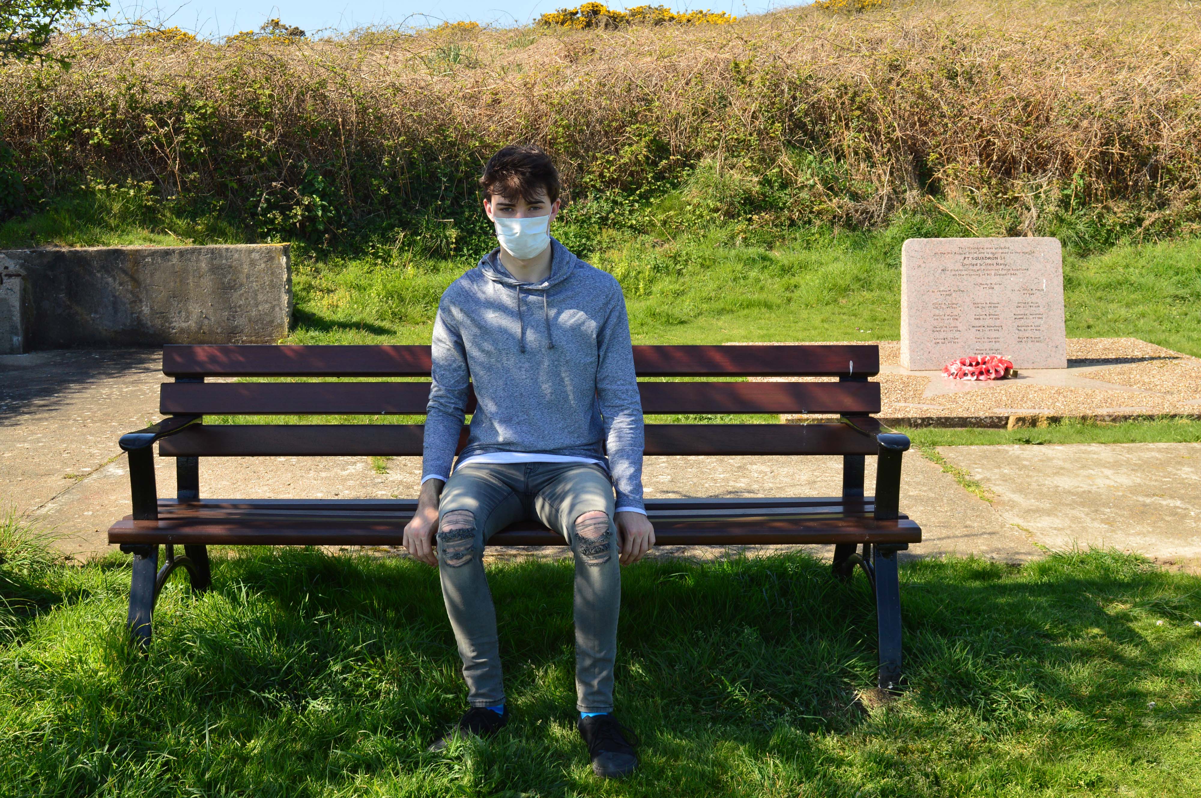
The next part of the shoot was done next to a memorial for navy soldiers who died off the coats of Noimont. This didn’t work out as well as planned as the images look too planned and bland which isn’t what i wanted for my project. This is why they are not in black and white as i do not plan on using them in my book. These images were the least successful of my shoot because they look extremely staged and my model looks to stiff as he is sat very straight against the bench which i think was the wrong pose as it needs to seem more natural or dramatic like the images above. I also feel like the link to war is too direct in these images and does not leave any room for the imagination and the images are very unambiguous which does not fit with the theme of my project. All my images will be ambiguous until fitted into the book then they will become much clearer but still leave room for the imagination of the viewers.

The next part of my shoot was also done on a bench but it was much more successful as it included much more landscape such as the bunkers in the background. The photos appear to be much more natural looking than the ones above which is why i have changed them into black and white as i want to use them in my book. I think these images turned out really well as they are strong in black and white creating a very dramatic image. These images are fairly ambiguous on their own but hopefully they will make more sense if they are placed in my book. The most powerful image out of these two is the second one because of the low angle making my model seem powerful, the image is very strong because we can only see a limited amount of the landscape which adds tension to the image as the viewer will make up what the rest of the landscape will look like. These images symbolize the calm before the storm, the laid back approach that the world is taking to pollution as they do not see it as a serious issue like the war in Afghanistan. They represent the landscape which we have only altered so we can view it, the landscape that we haven’t not destroyed for the “benefit” of Jersey.

For the next part of this shoot i found some metal bars sticking out the wall which was mostly likely used as steps at one time but i thought these would create interesting photos of my model hanging from them and climbing them. The photos turned out really well but the sun was shinning on part of the wall by the bunker which partially ruined the photo as the composition did not look right as the light did not match how dark the area was. These images are a combination of Abstract, tableaux and landscape photography. They are my favourites of my shoot but they could of been greatly improved if the light in the background was not there as this ruins the consistency of the composition of the images. However, in the first image the light works well as a model is in a pose which replicates the angle of the light which makes it much more interesting but the other two images would be much more powerful if the light was not visible, i tried to work around it by photographing my model up close but it did not work. All these images have the same meaning of clinging onto the hope that the world will change, the world will heal itself if we help it like a toddler learning to walk, they simply need help to start with. The pegs in the wall represent the ladder which we need to climb to help the world, the steps are broken, twisted and rusted because the journey will not be easy to fixing the world just like how the war wasn’t easy yet we still managed to do it, so what’s different not?

The last part of my shoot was done underneath a ramp which was most likely used to push the gun up, the light was not shinning directly on my model or me which meant the photos came out fairly dark and sharp which works really well for this project as it is all about how pollution is affecting the world. My model crouched down in front of an opening which i am not sure what it was used for but it worked well to frame my model in the center of the image. The images are very simple but they are lots of meaning behind them in the sense that no amount of hiding behind walls and instead caves will protect you from pollution. No mask will protect you and eventually there will be a memorial with your name on it. Pollution killed 3 million people in 2012, those numbers will only rise with the more cars and buses we put on the roads, the more forests we destroy who suck up all our carbon dioxide and buildings more buildings so that the population which keeps growing will have space to live but actually most of them won’t be able to afford it so the building will be for let for months or years.

Shoot Two

This shoot was much more successful than the last as i am able to draw finals from this shoot however i did not adjust the ISO which means that nearly all of the images will be pixelated but not to the extent of the images before. This shoot was done in St Catherine’s with two models. My first model was wearing a bright purple jumper with black jeans and my second mode was wearing a red checkered shirt with black jeans. However, after this shoot i decided that all my images from this point will be put into a consistent black and white filter which is very bright and reduced the pixelation in the images.

My male model was very good with body language and produced very powerful images which made my project much more dramatic which has worked really well. The first few images i took were very normal but i used an opening in the trees which created a frame for these photos. I wanted to experiment with this shoot to make it more interesting than the last and give me something to use in my photobook.

This photo is really interesting as it looks like he is suffering which is create symbolism for the levels of pollution which are rising. Pollution can cause many different breathing problems as this could symbolize the suffering asthmatics go through because of pollution as they are the worst affected. The trees have create a frame for my model which draws your attention to him and the fact that his pose is unusual means that it sticks out from the forest. The black and white works really well for this image as it makes it very dramatic and interesting, this is why i have chosen to make this the consistent filter on all the images i am going to take as it will make the layout of my book much more consistent and using black and white makes it much more serious than in colour.

This pose is very sinister as it almost seems possessed which is why i like this image because it is interesting and even though he partially blends into the background, he is still very obvious and your eyes are drawn onto him. This image does not have any hidden symbols but it is a very dramatic but simple images and it works. His hands are the one part of him which stick out the most and i think this is what first draws your eyes to him but then the focus moves towards the gas mask then the image as a whole.

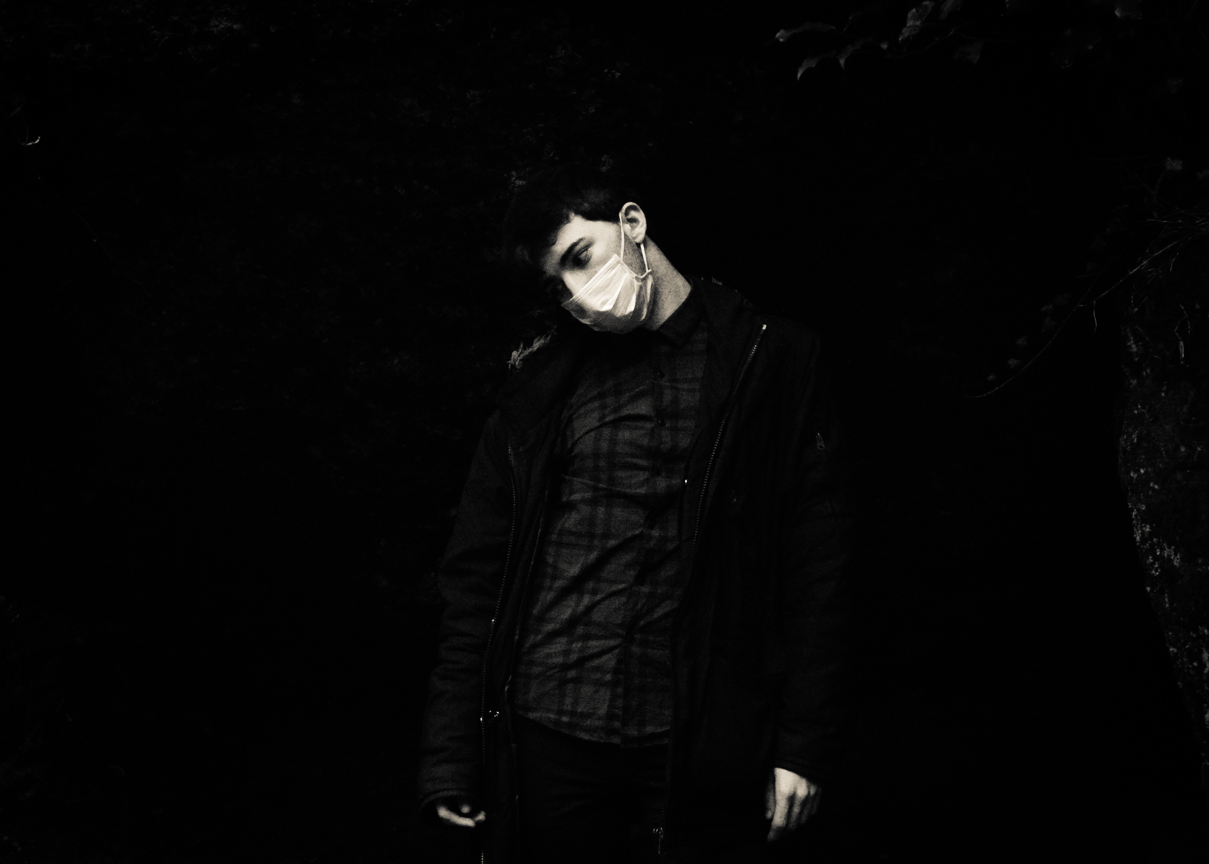
This image is very interesting because the model chose to crouch down and it’s a very anonymous photo as we cannot really see his eyes so the image has tension as the viewer cannot tell who is underneath. The crouching pose could symbolize a child having to wear the gas mask, it symbolizes vulnerability. Many humans think they are invincible until something so “small” as pollution damages them. We will never see pollution as a problem until it becomes a law that a child has to carry a gas mask to protect them from the toxins in the air. Children have the ability to influence adults and soon as they are affected the world will change.

One image which i took which i like very much, is of my male model behind a tree which a branch covering his eyes. It creates a lot of tension in the image and makes it interesting as the viewers do not know what kind of emotion he is feeling as we can often tell by our eyes.
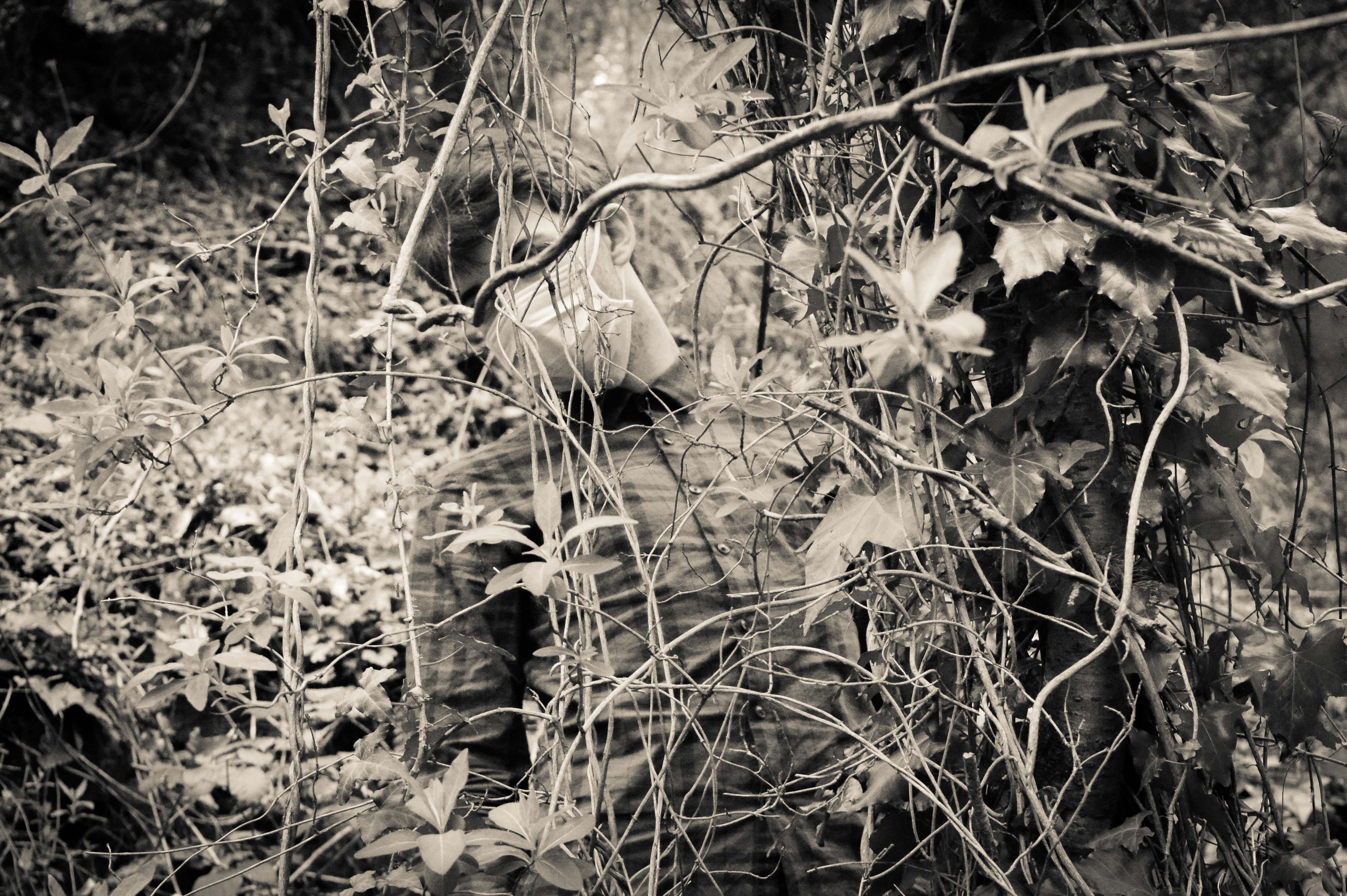
My model blends in with the background yet you can still very much distinguish him. The fact that his face is covered by the mask and that the branch hides his identity creating tension as the viewer will create an image of the model in their head of what he looks like which makes the photo much more interesting. This image represents that we are part of nature and that we are entangled in our ways and we cannot get out of them so we just keep destroying the world to make way for new people. This photo is one of my favorites because it is a form of abstract photography, within tableaux photography within nature photography. The black and white makes the image very strong and powerful and it represents my project of Our Future really well.

This is my female model who has very strong eyes which is why i have used her for this project as in the gas mask, the eyes are the only think visible which is why they need to be powerful. I used the hanging vines to create a frame for my model. This image has no hidden symbolism but it is an interesting image. Her eyes are very powerful as the white of her eyes  stands out due to the black and white filter, it is not one of my favourites but her crouching could represent trying to hide away from the pollution problems but because she is wearing a mask it means she can’t escape.

As i had two models available i wanted to try create some double images of them both in mouth masks as i though they would be powerful and interesting and a different form of portraiture.

In this image, you can clearly see the strong points of each model such as the male is good at body language as he is drooping down and look very drained whereas the female model is very stiff but her eyes are much more dramatic and show a lot of emotion, she looks scared. This image has no symbol but it is very powerful is showing how two types of people will cope with the rise of pollution. It represents togetherness and that this is something that we can change together. One person cannot change the pollution levels of the world but many people can. The composition of this image is fairly good as the focus is very much on the two models as they are in the center of the image which is where the eyes focus. This is a combination of Tableaux and portraiture, it combines both more than the others as i directed the models wear to sit and whether to face me or not. The poses they did i left up to them to make the photo seem less forced and it worked really well as the male model is much more dramatic compared to the female one which allows for an equal balance of both bold eyes and dramatic body language.

I attempted to photograph my male model in a semi cave to create dramatic photos, it worked very well as when you first look at the photo you can only see his head which adds for a lot of tension and drama.

This photo is a lot different from the others as it is very dramatic and the background isn’t visible which adds a lot of tension as the viewer will not know what is behind him. This allows imagination to take hold and makes the photo ambiguous. His pose also makes the photo really interesting as his body language isn’t stiff and he looks drained almost posed which works well for my project. The toxins of the pollution are hurting him, the darkness behind him represents the end. The light on him represents hope but the darkness is taking over, the hope is diminishing. The fact that the light is primarily on his skin draws the eyes towards him which is what i wanted from my images as my models are the main focus of this project. They represent Humanity. They represent Our Future. They represent Our Children’s Future. They represent the Loss Of Hope. This is one of my favourite images of this shoot and i will most likely use it in my book.

As i was in a forest, i wanted to use the branches and trees as much as possible to create frames around my models so that the viewer would focus on the model. I think this image has the best frame as the trees joined together to make a complete frame and it worked really well.

This image is very sinister as he looks possessed and looks like he is stalking someone. That someone is us, he is a reminded of what we are doing, he is warning people of what could happen if they do not protect the planet. Soldiers did not die to protect this earth and us for us to destroy it again. The trees worked really well to frame my model and it really makes the eye focus on him and what he could represent. Many of these images are ambiguous as they could mean lots of different things to different people but the main point of it is pollution as that is not ambiguous. One thing which is very powerful about this image is that we cannot see his eyes. this is very powerful as it hides his identity and makes the viewer create an idea of what he could look like. Some people would see him with scars all over his faces and others may see him as smiling.

Overall, this was a successful shoot as i am planning on using many of the images i have created from this shoot in my book as they have lots of hidden means and they are interesting images to look at. I tried very hard to think of composition and i think i did really well with framing my models using trees and it has allowed for some interesting and unique images to be made. I think the only thing i would improve is that the ISO was still set on 6400 maximum sensitivity which has made them pixelated but it is not majorly noticeable like the images from the first shoot but the black and white helps to reduce this as well. Another thing which i would of changed is command my female model more as her body language was quite poor is many photos and i think it let some of them down like this image:

As you can see, my female model did not pose very well which partially ruined the photo and i wished i had told her what to stand instead of let her choose as it really did not work for these sets of images. This image is not in black and white as i do not intend of using it for my book because of the poor composition and it is also more pixelated than the others.