All posts by Heather Barette

Filters

Author:
Category:

The Daughter of Nature

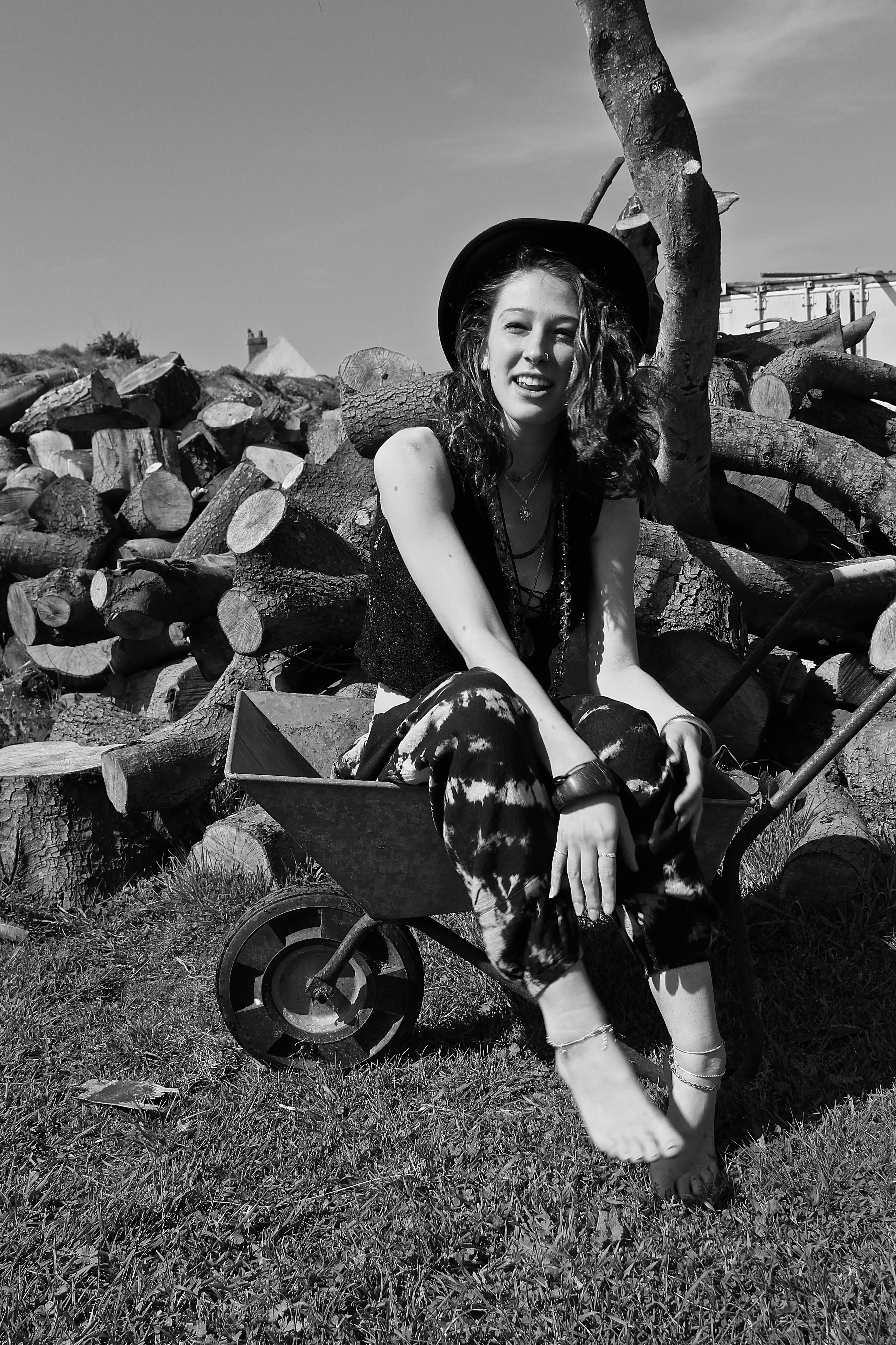
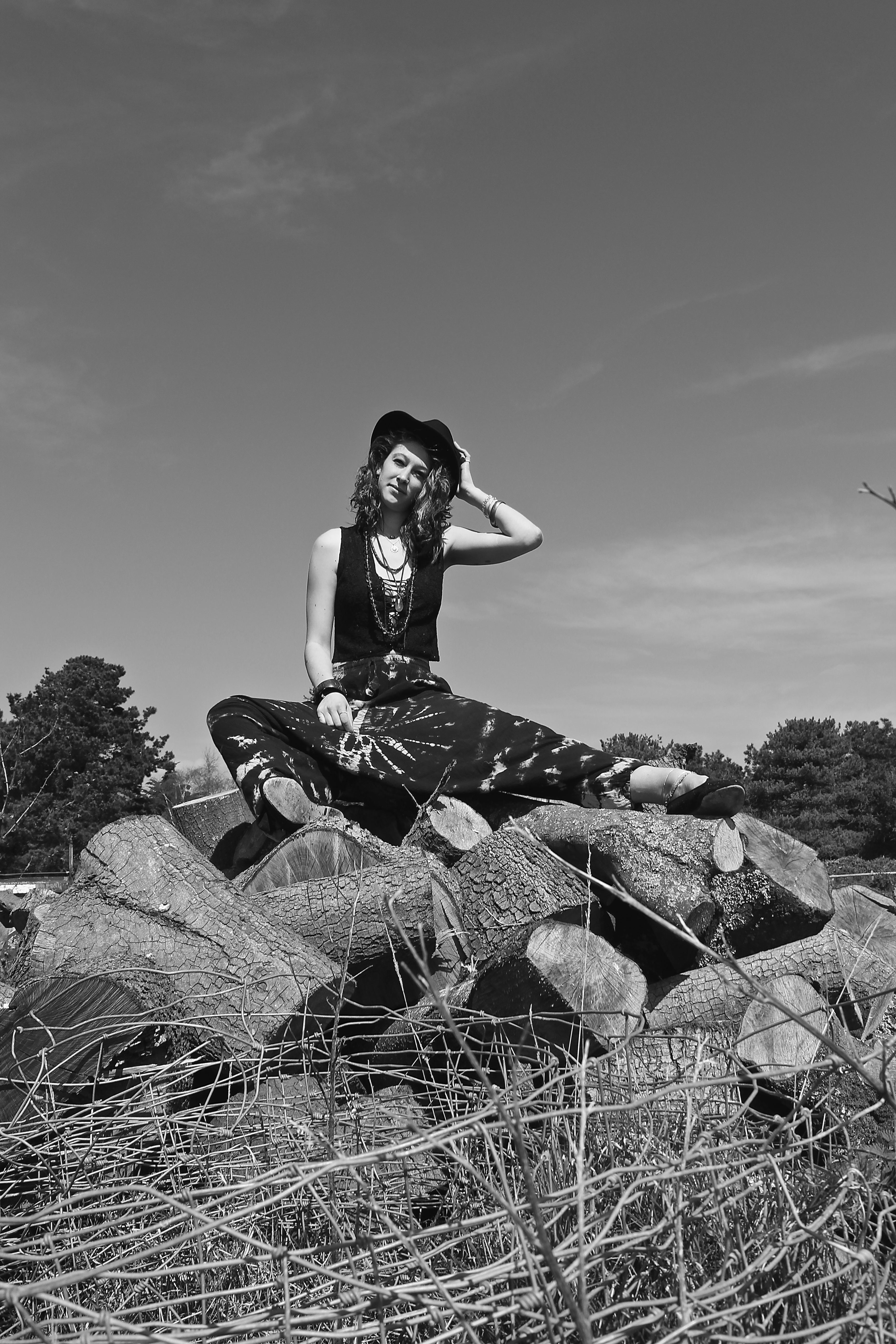
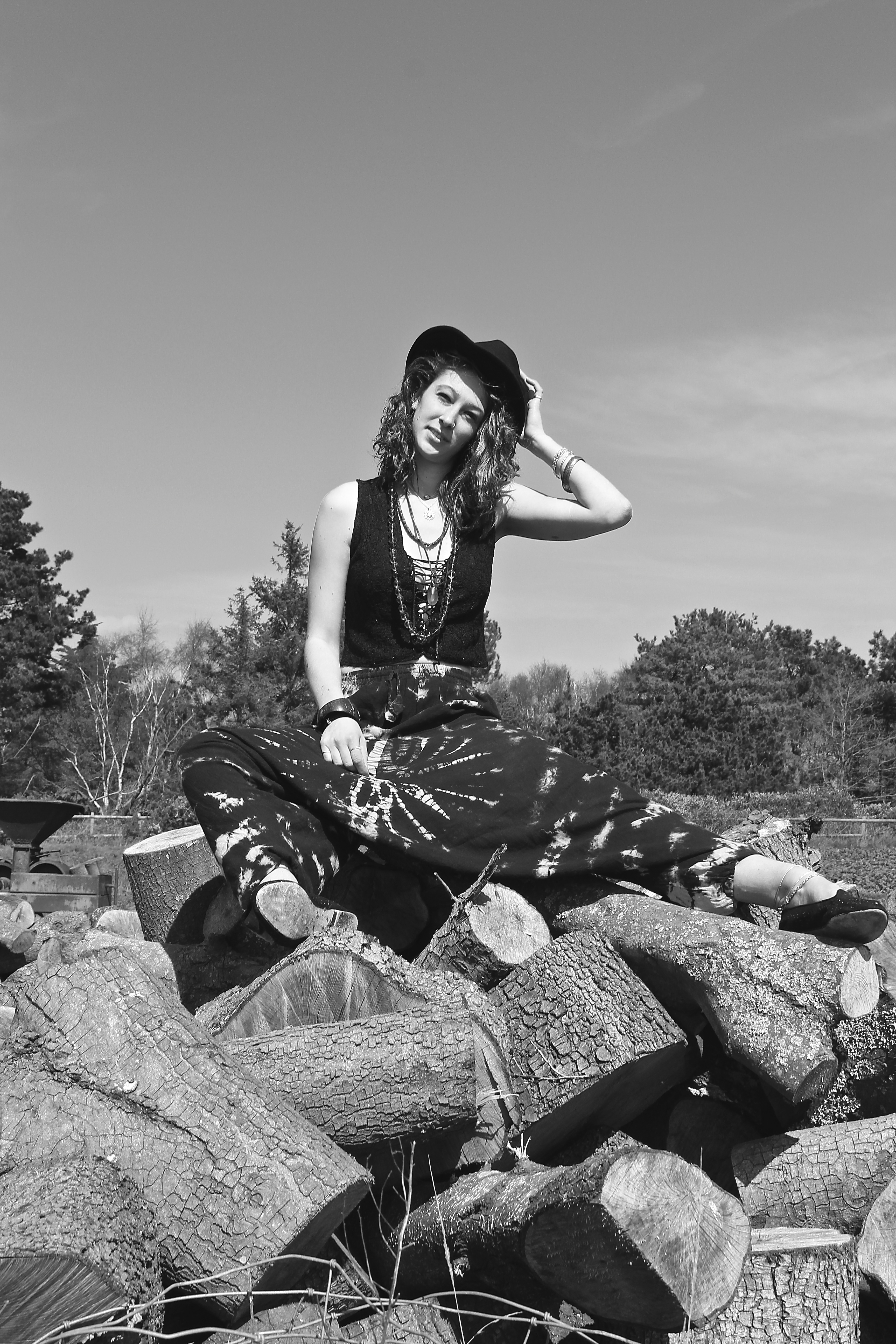
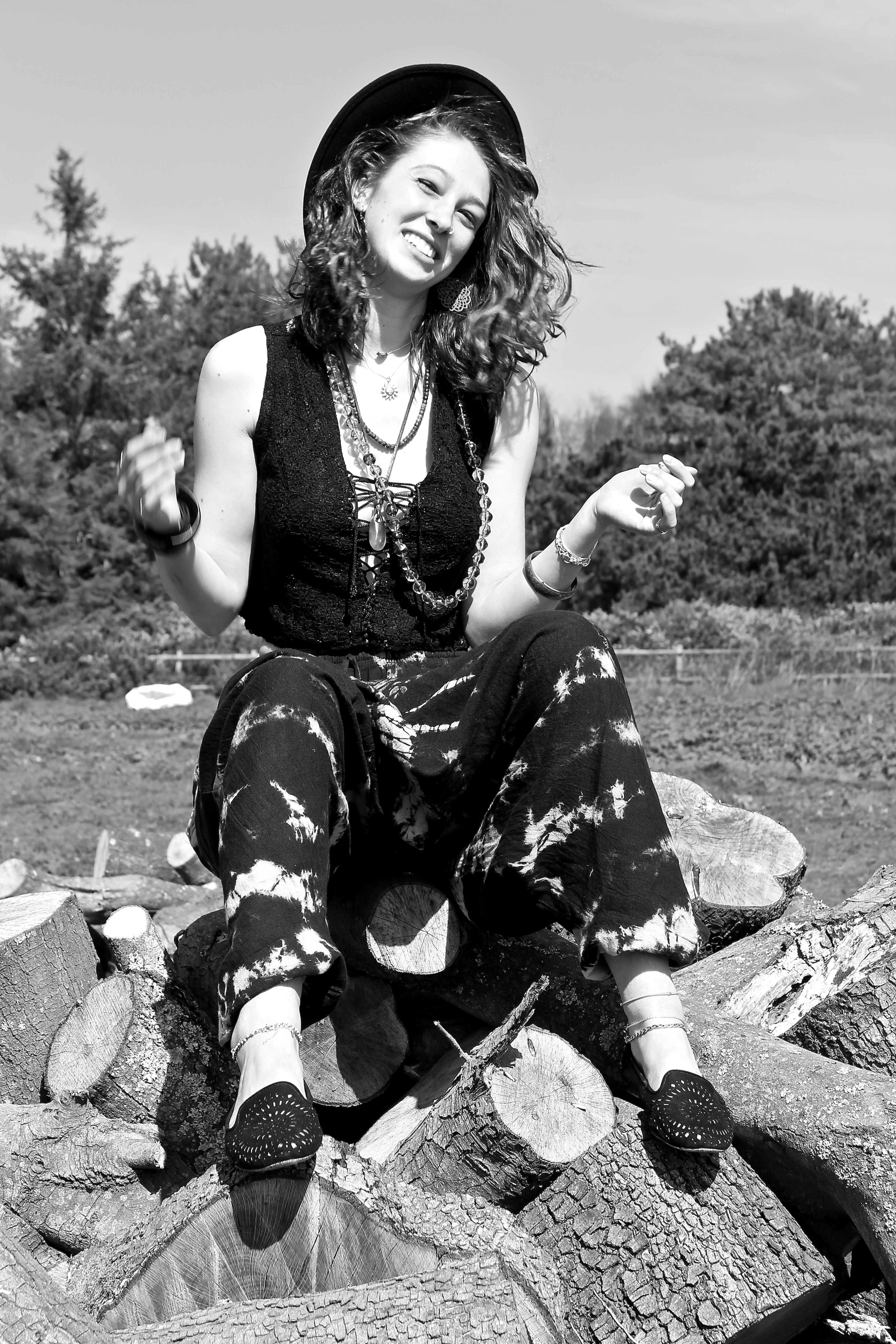
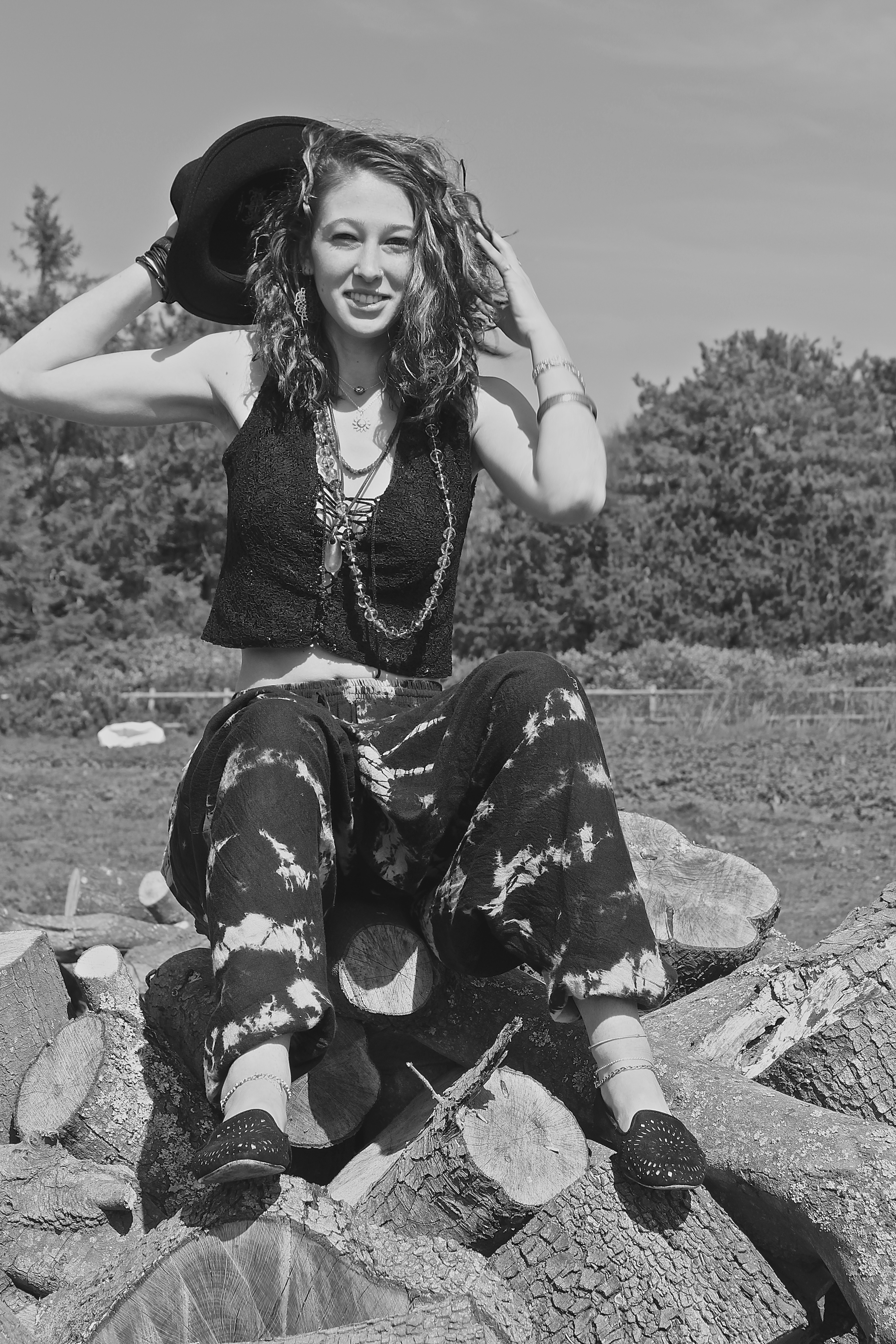
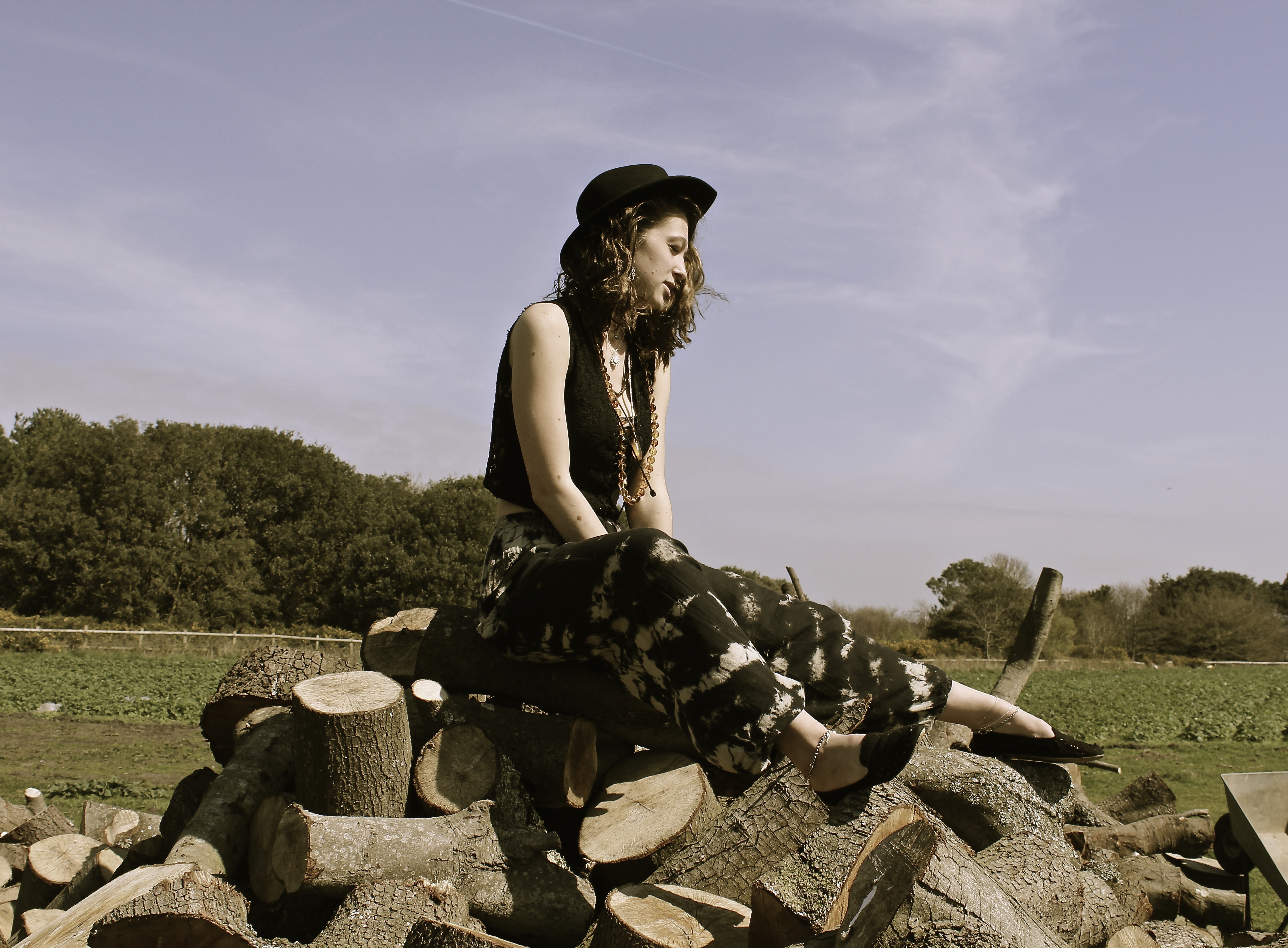
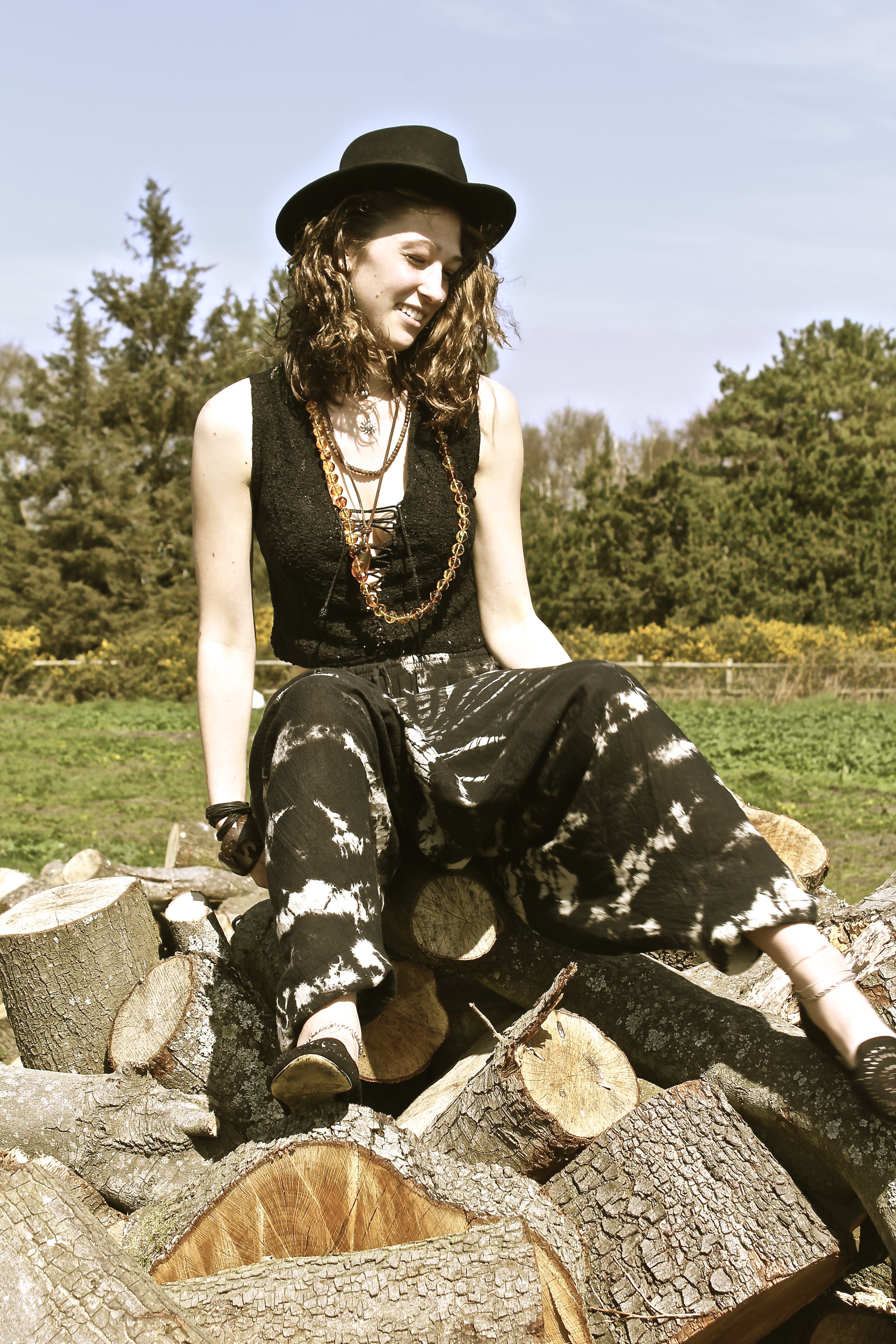
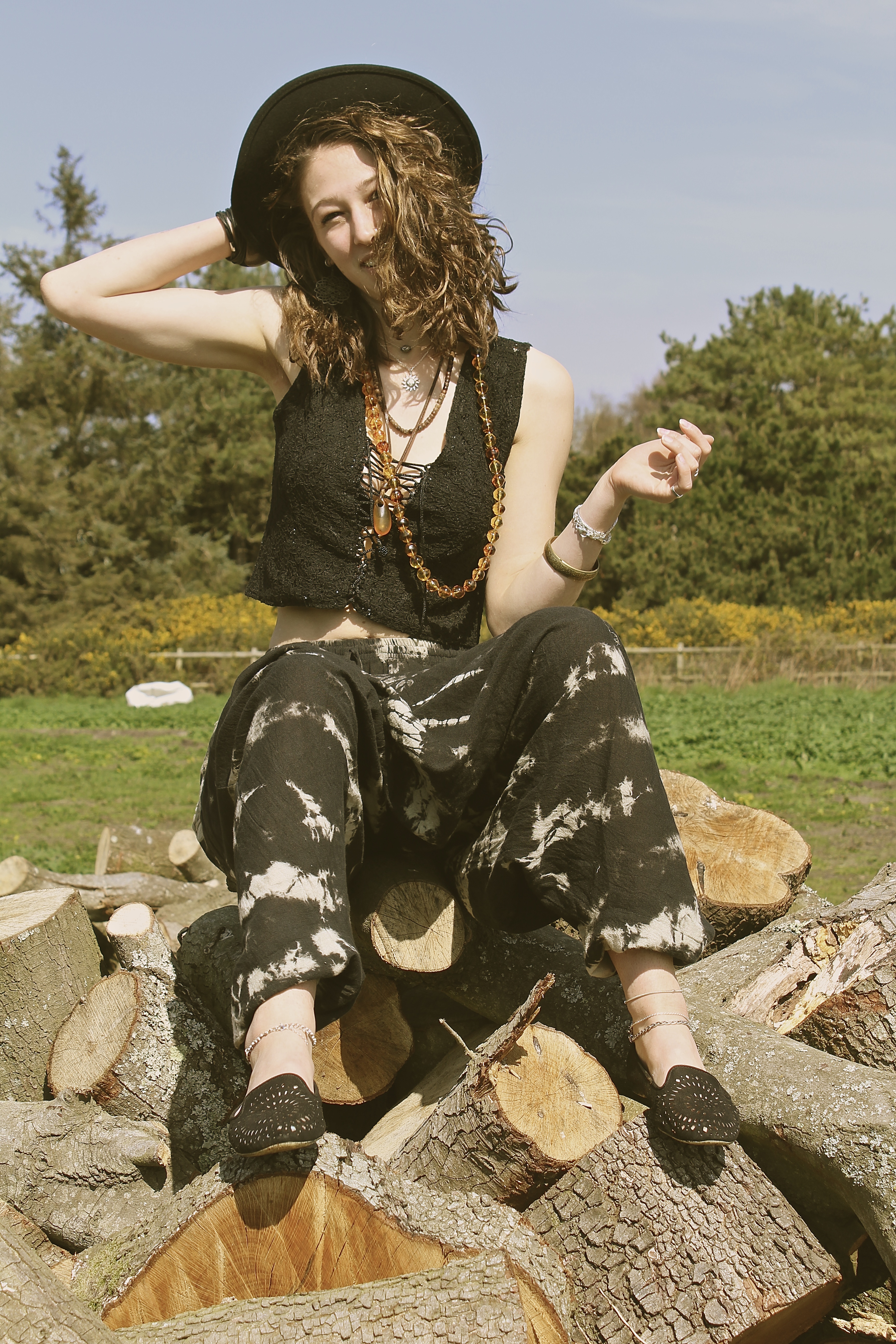
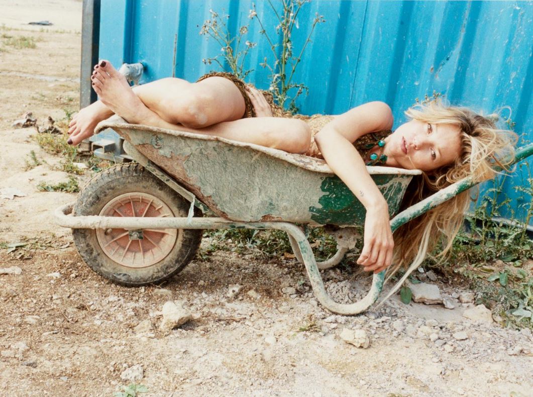
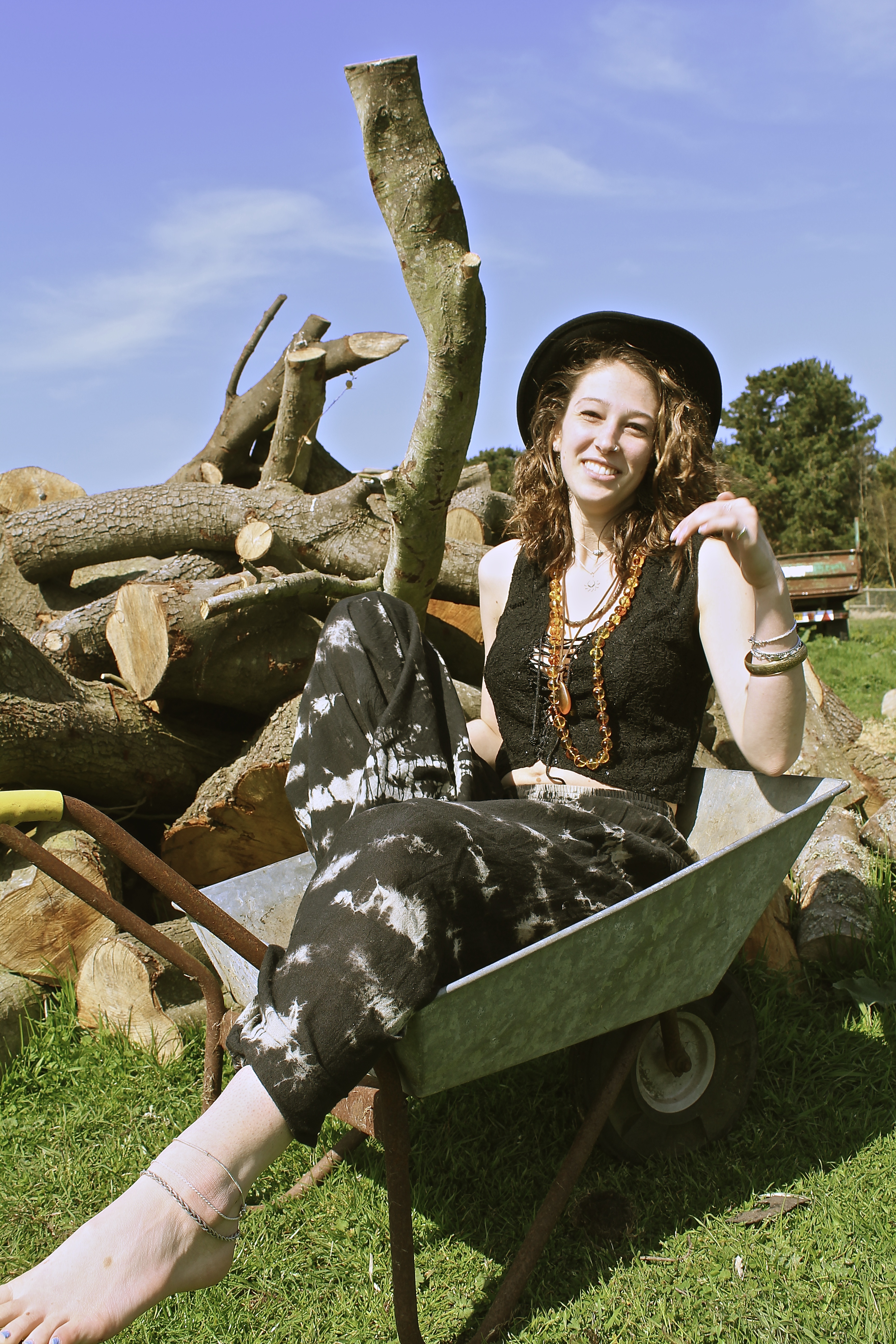
This shoot was inspired by the photograph taken by Juergen Teller of Kate Moss in the wheelbarrow. However, we got to the location with the wheelbarrow, and I ended up being more intrigued by the log pile behind it. The reason for this is because I was trying to represent with these photographs how humans are such consumers, as one can see the trees in the background which perhaps will soon be knocked down and made into this piles of logs – like the ones the model is sat on – this is us ( the consumers) can use them to our advantage, therefore destroying the beautiful land around us. This is why the trees are slightly out of focus in the background as we put ourselves before the world we live in and believe we’re more important than nature, which isn’t true as we need trees to breathe. This is what I wanted to represent through the use of the model, as one can see she’s dressed in a ‘hippy’ style, and hippies are referred to as tree huggers  which is kind of a metaphor as she’s sat on a pile of logs, the message I was trying to get across is we’re destroyed the world that we live in.

“I’m not a political artist in any way, but if an idea takes me somewhere or something is emotionally impactful, I find a way to make a painting that encapsulates it.” Idris Khan 

Even though I preferred the log idea, I still managed to caption some photographs of the model in the wheelbarrow, inspired by Juergen Teller. As shown below;

I love this image below, because the way the models looking directly at the camera, smiling but showing a bit of tongue making it look a bit provocative, also by the way she’s bending over in a low cut top. It makes it look slightly suggestive without intentionally doing this. The way the foot on the left is slightly blurred actually gives it more of an effect, as it looks as if the photograph was taken on a old film camera, which is the same style as Juergen Teller.

The composition of the image below works well as I have taken it from below angle, therefore creative negative space behind the models head and therefore not having anything in the background which is distracting. The model and the log pile appear clearer than the background of trees, this works well as they are the main subject and what I want the viewer to look at more.


Derelict Dreams

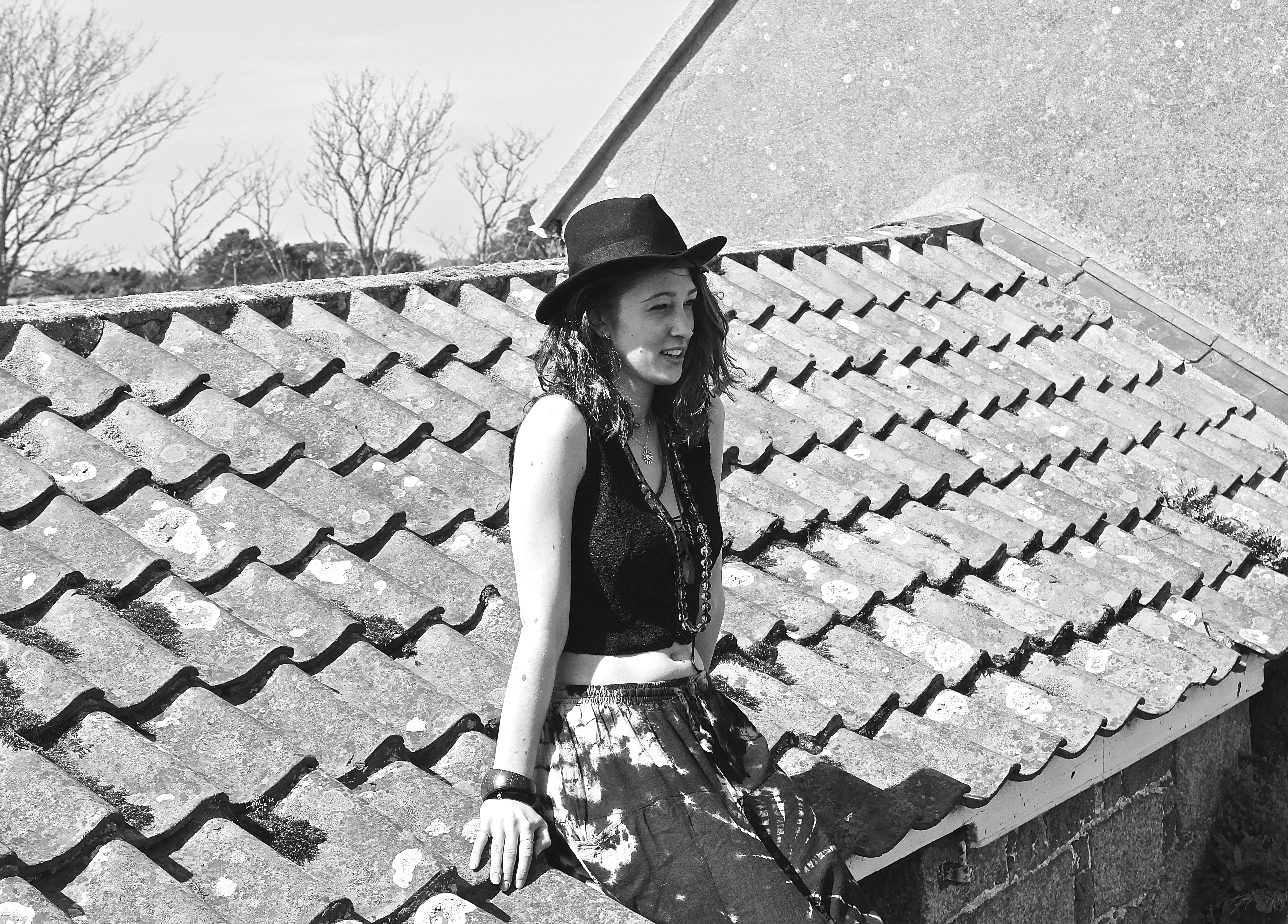
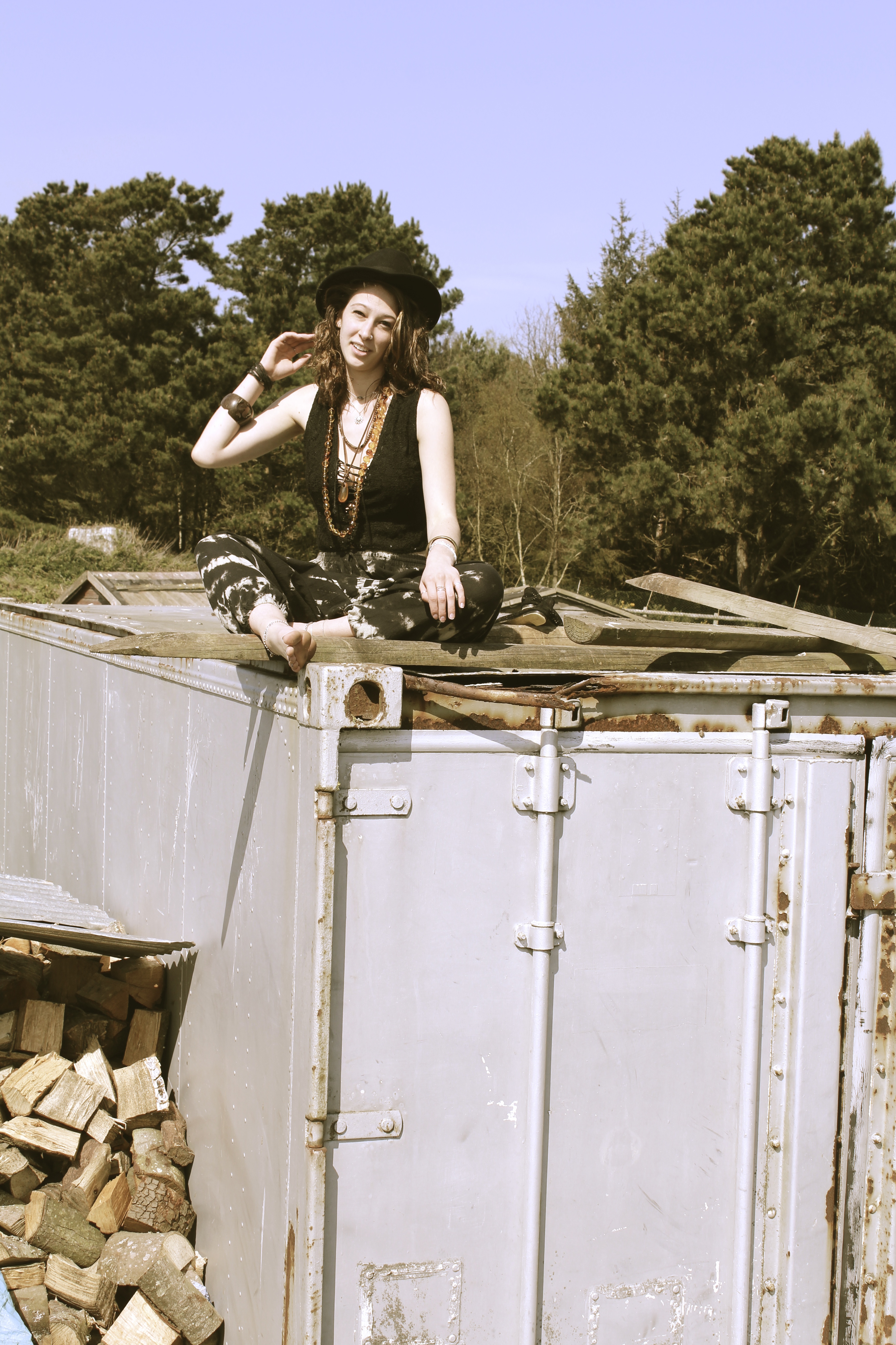
This shoot was initiated because it was to represent how the travelers would go on adventures and would end up doing something peculiar like climbing up old derelict buildings. Their adventurous exploring sides would come out, and they’d get the best views and sights because they were high up on the roof of somewhere remote.

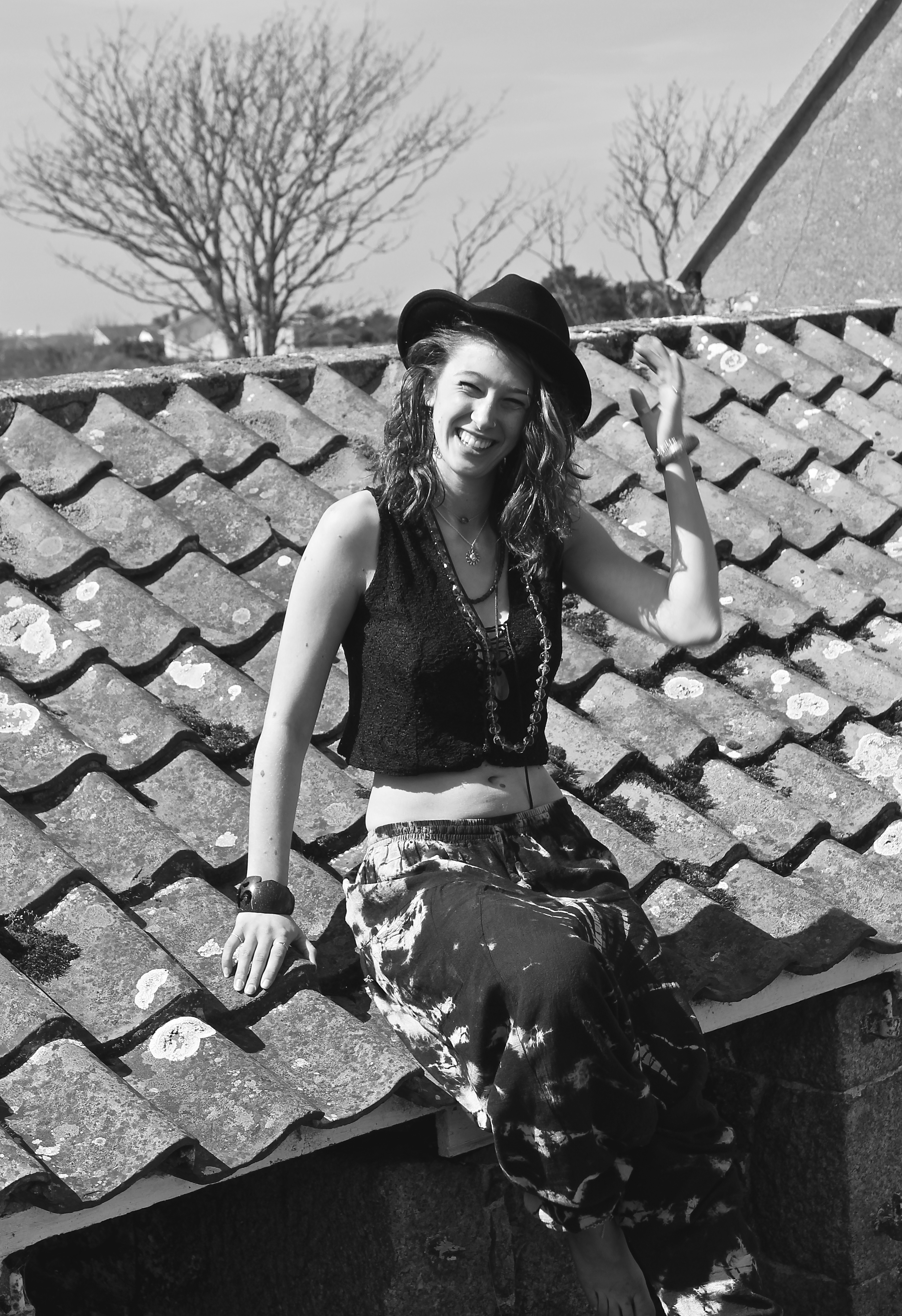
The image below reminds me of the series of Kate Moss  by Corinne Day, ‘The Third Summer of Love’. This is due to the model being smiley and squinting her eyes, very similar to how Kate Moss posed before becoming a Super-Model with Day. It also reminds me of that shoot by the use of accessory’s such as the hat and the necklaces. It is also taken in black and white like Days.

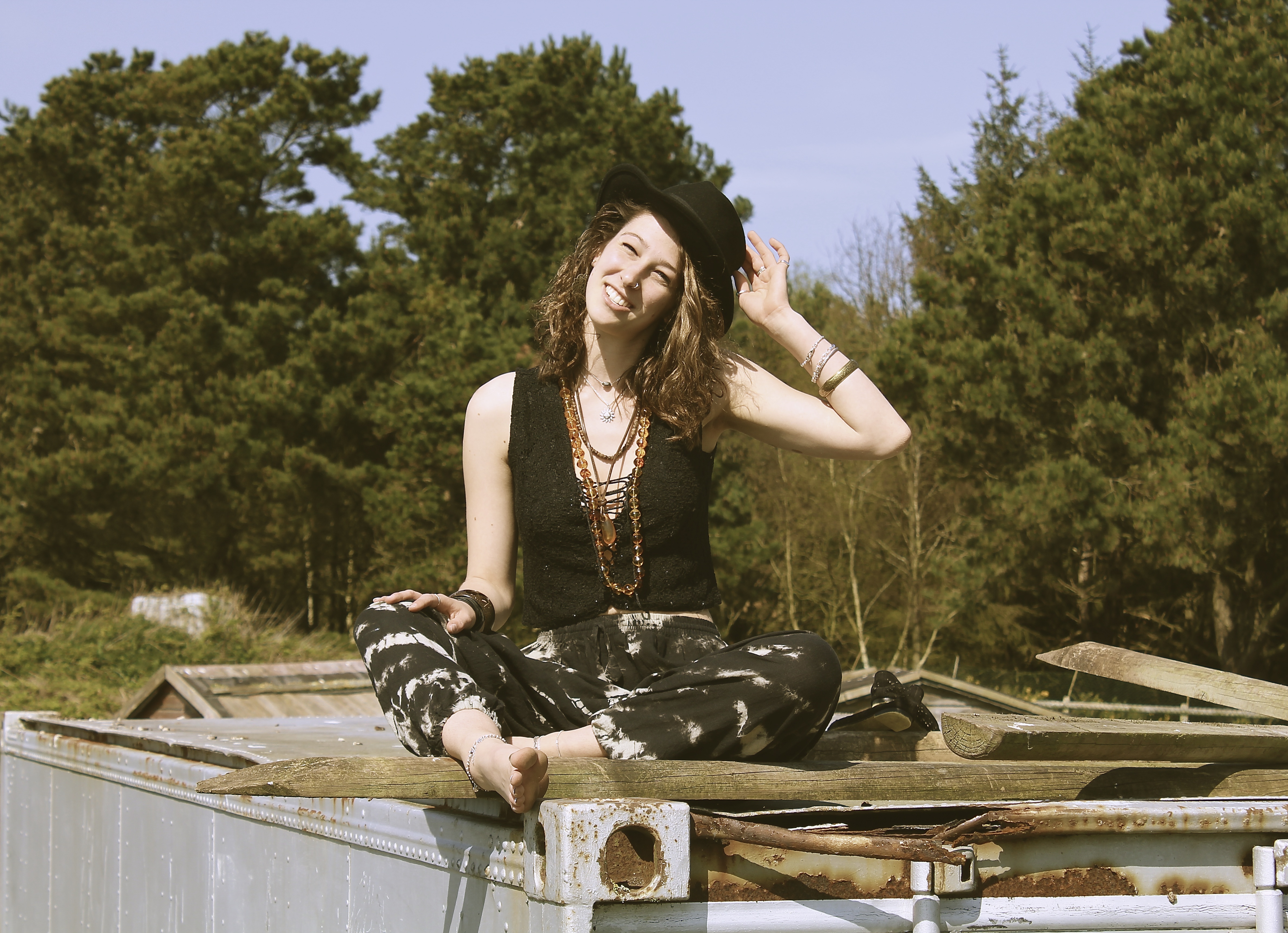
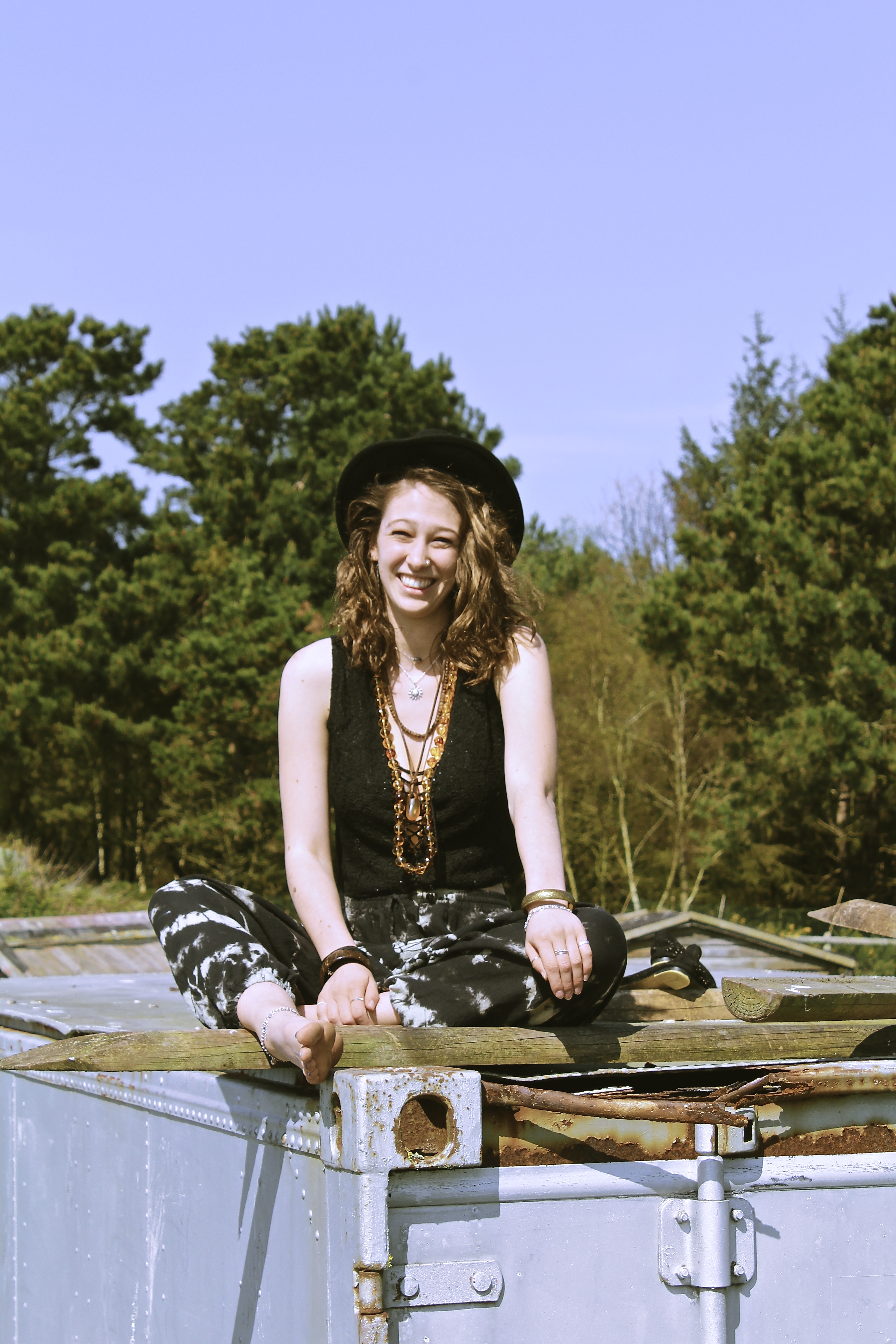
I like the image below due to the compositon, as the camera is looking up at the model, which usually tends to be an unflattering angle. However this technique works well here, as it creates negative space in the background, making the model be the main focus of the image. The color tones for this image also work well, as all the colors are a blue or brown, for example the rust on the container brings out the necklace and highlights in the models hair. The use of the natural lighting also creates and interesting shadow on the models neck, which makes the image look more fascinating.


Fields of Melody

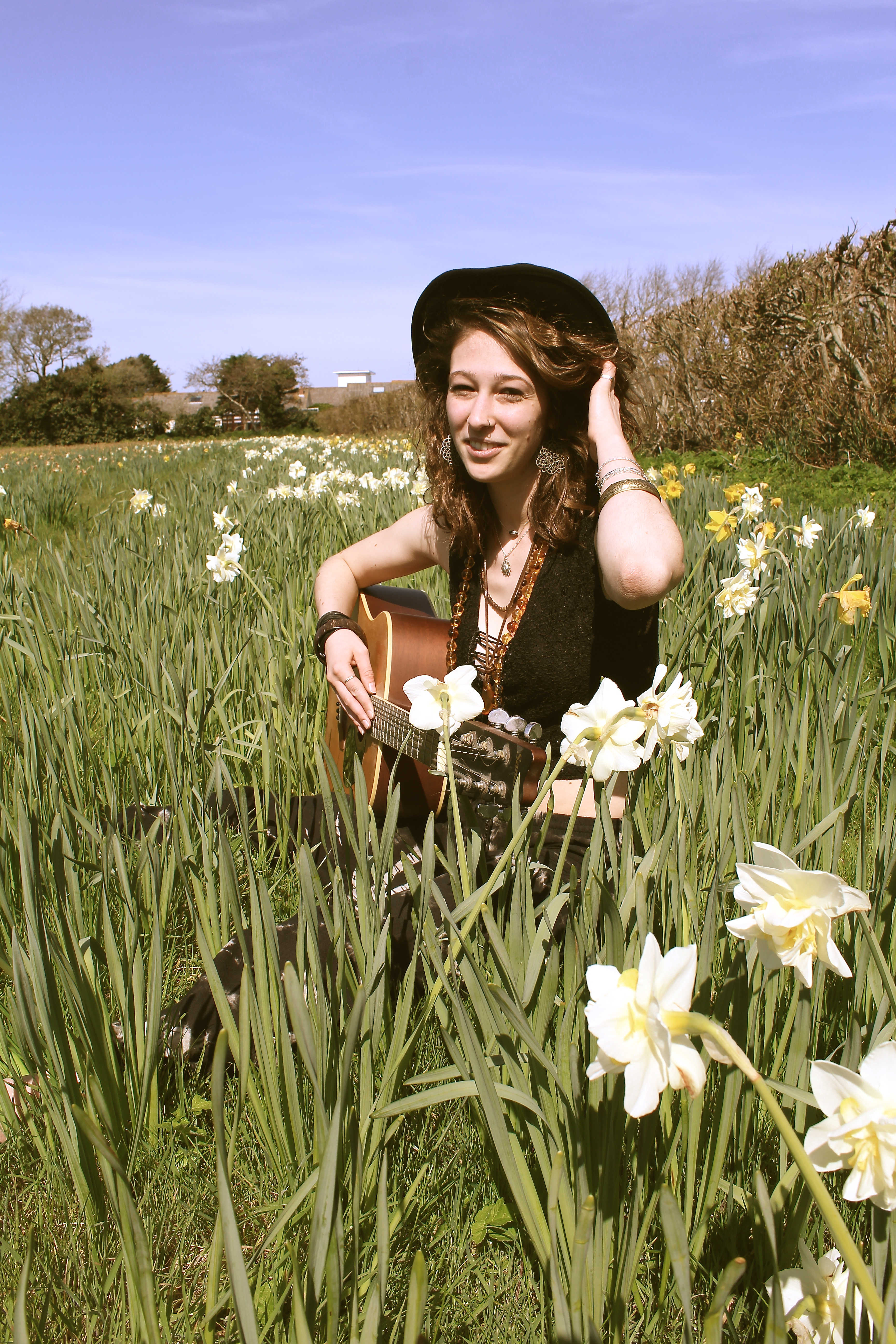
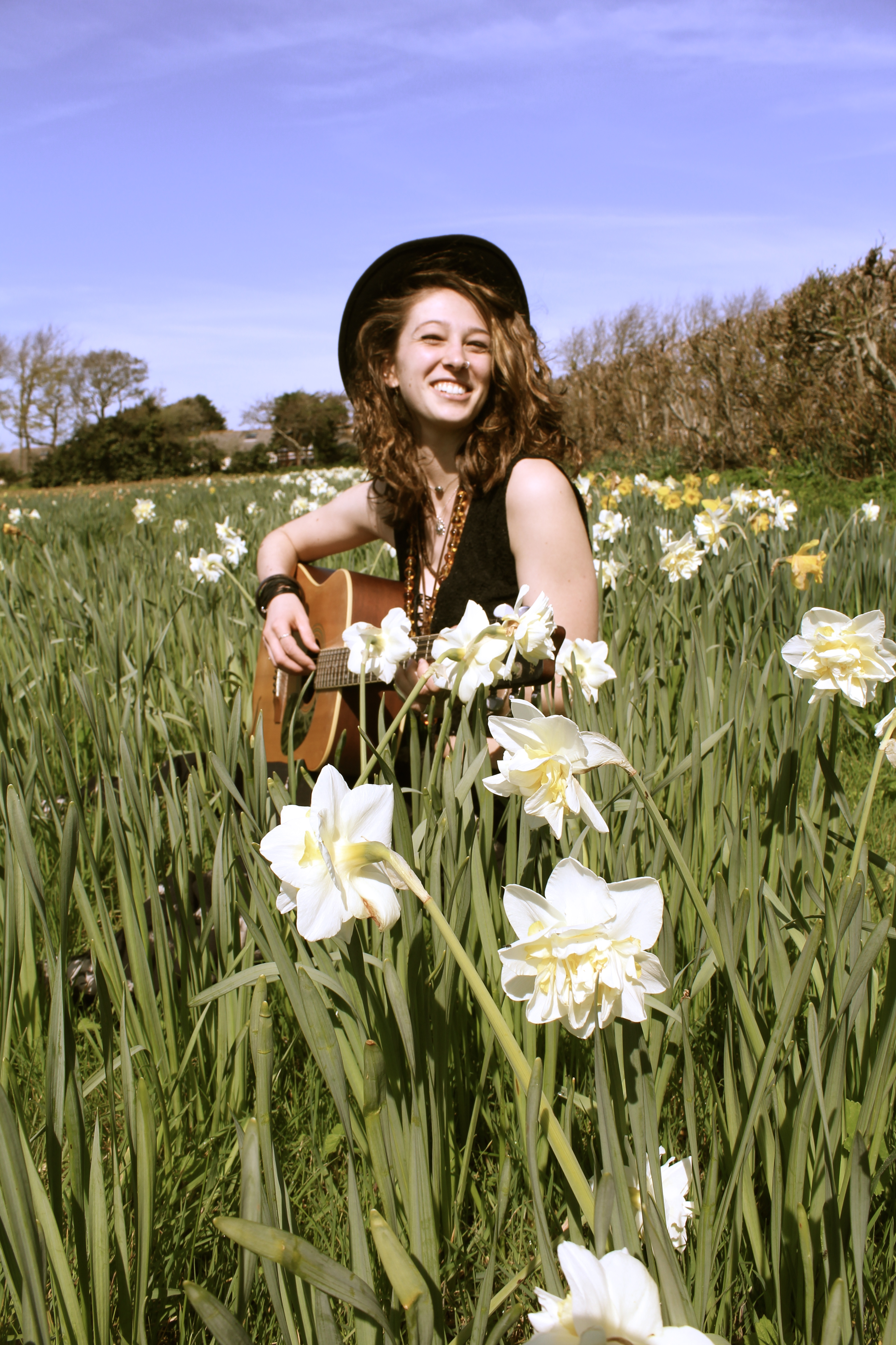
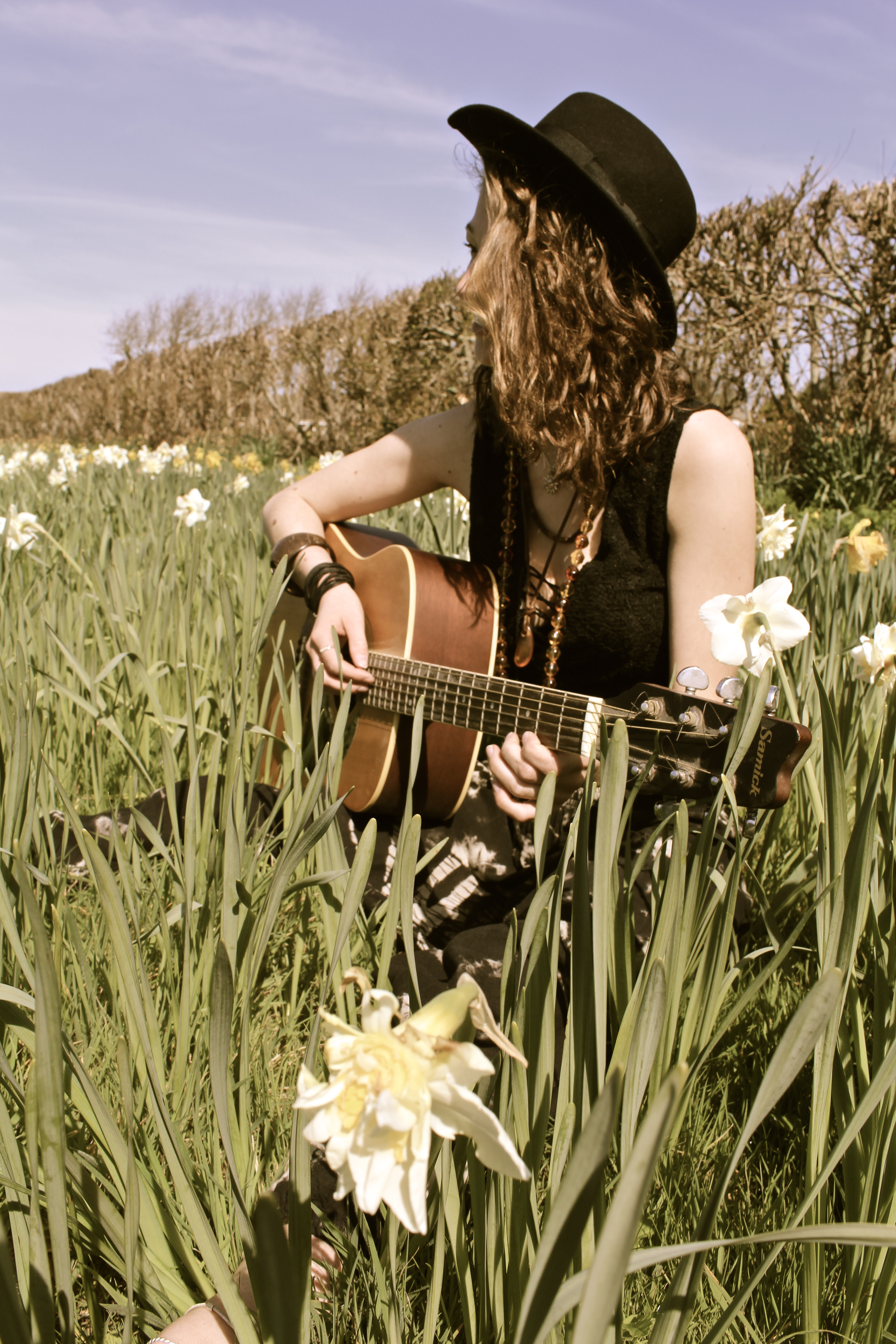
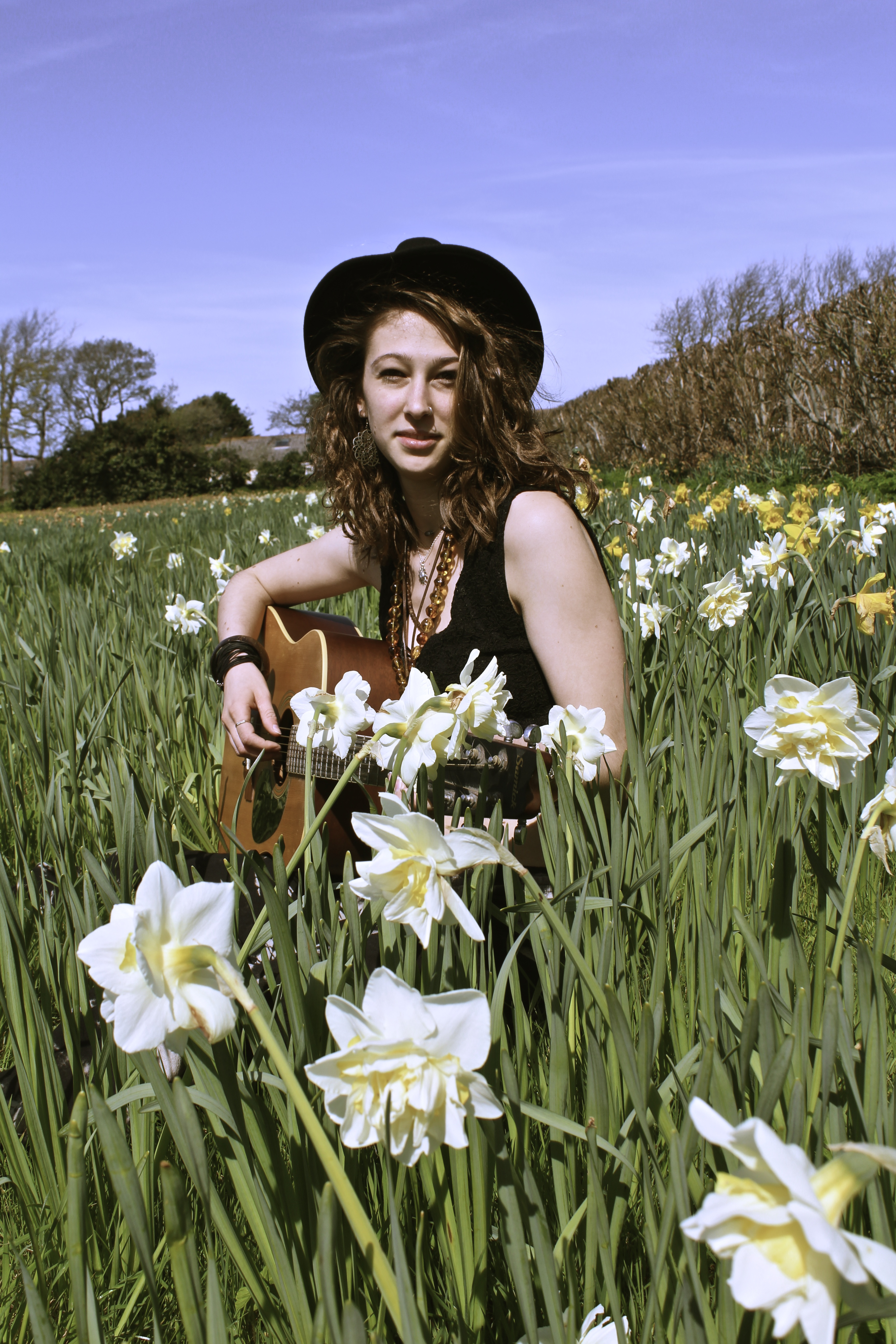
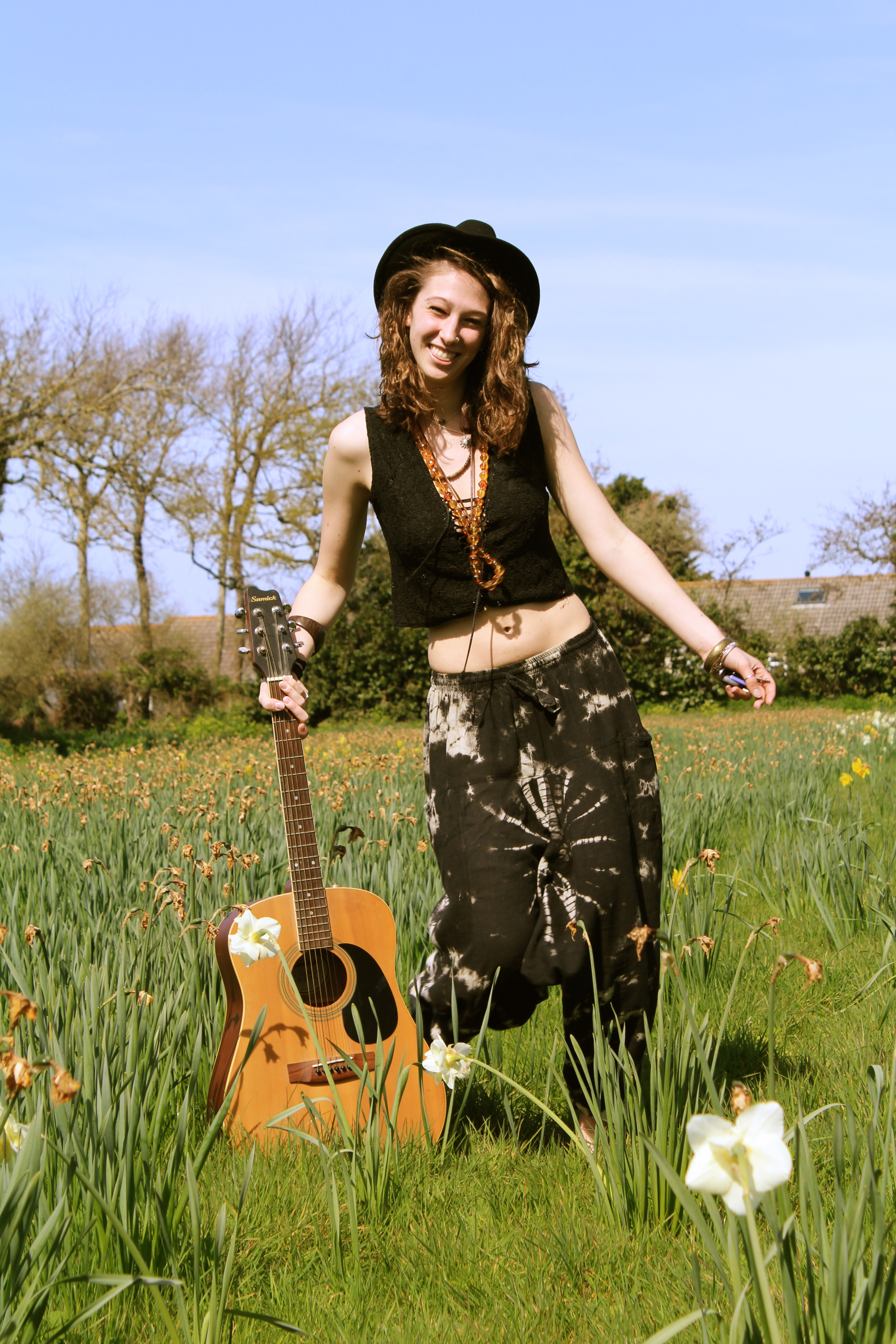
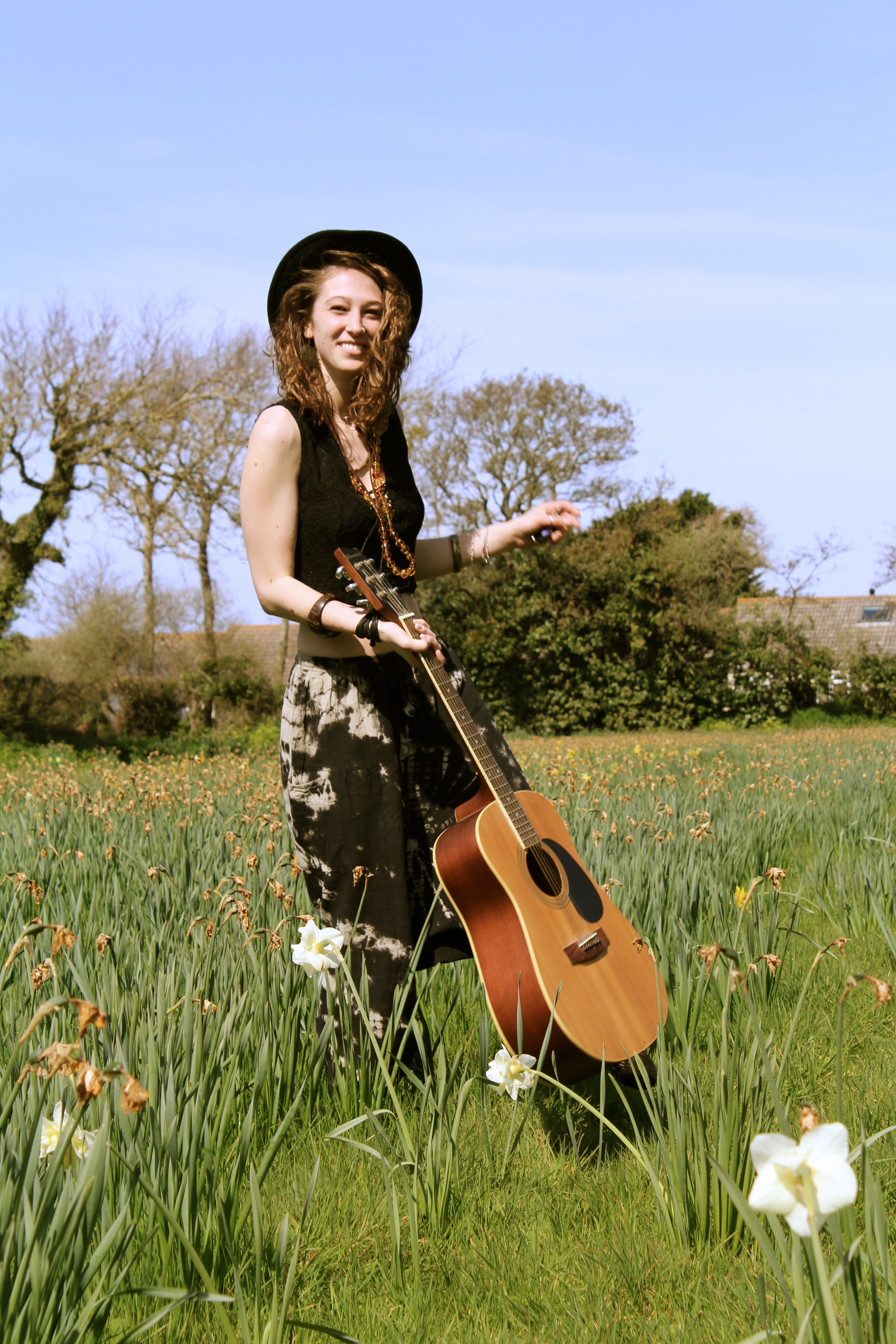
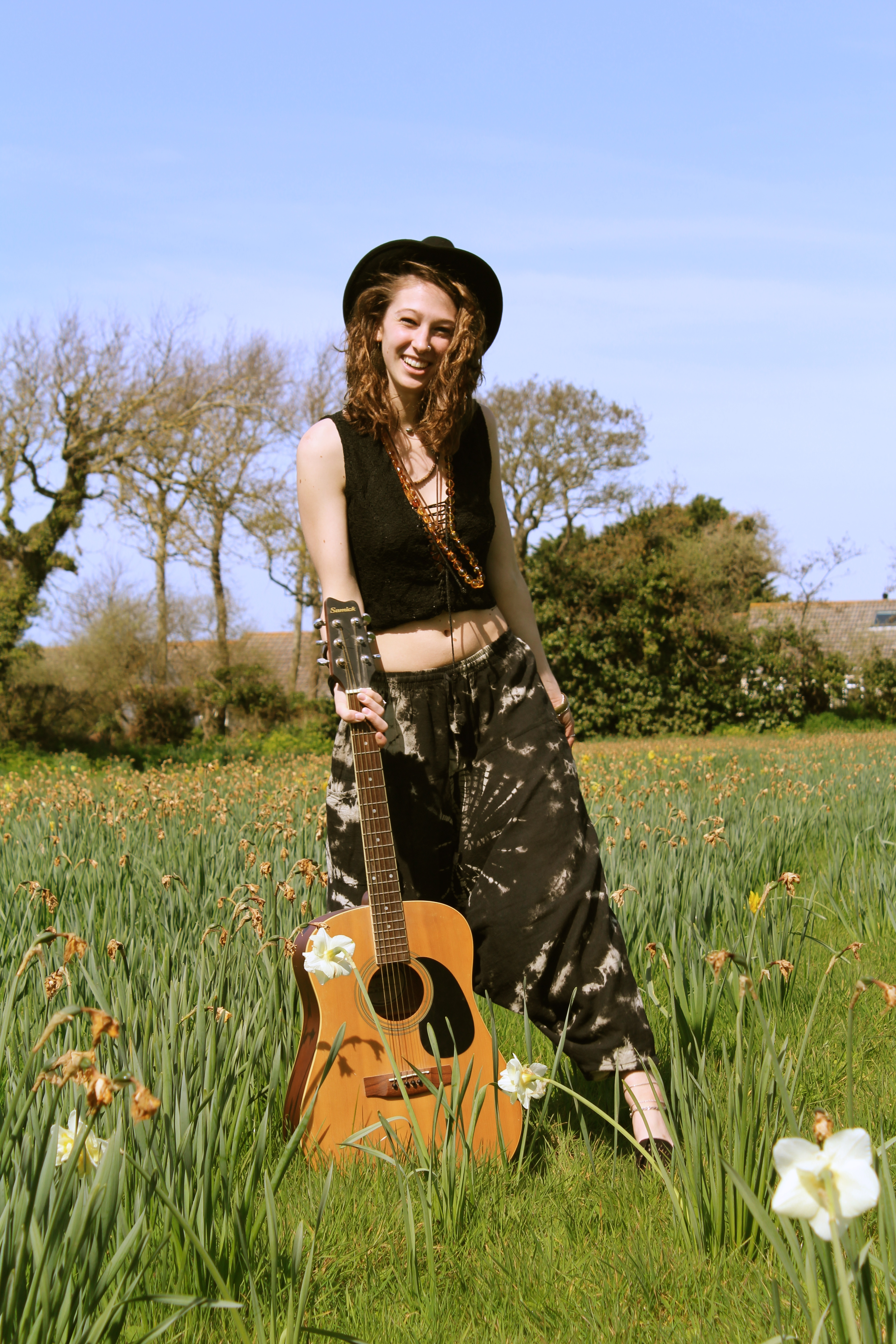
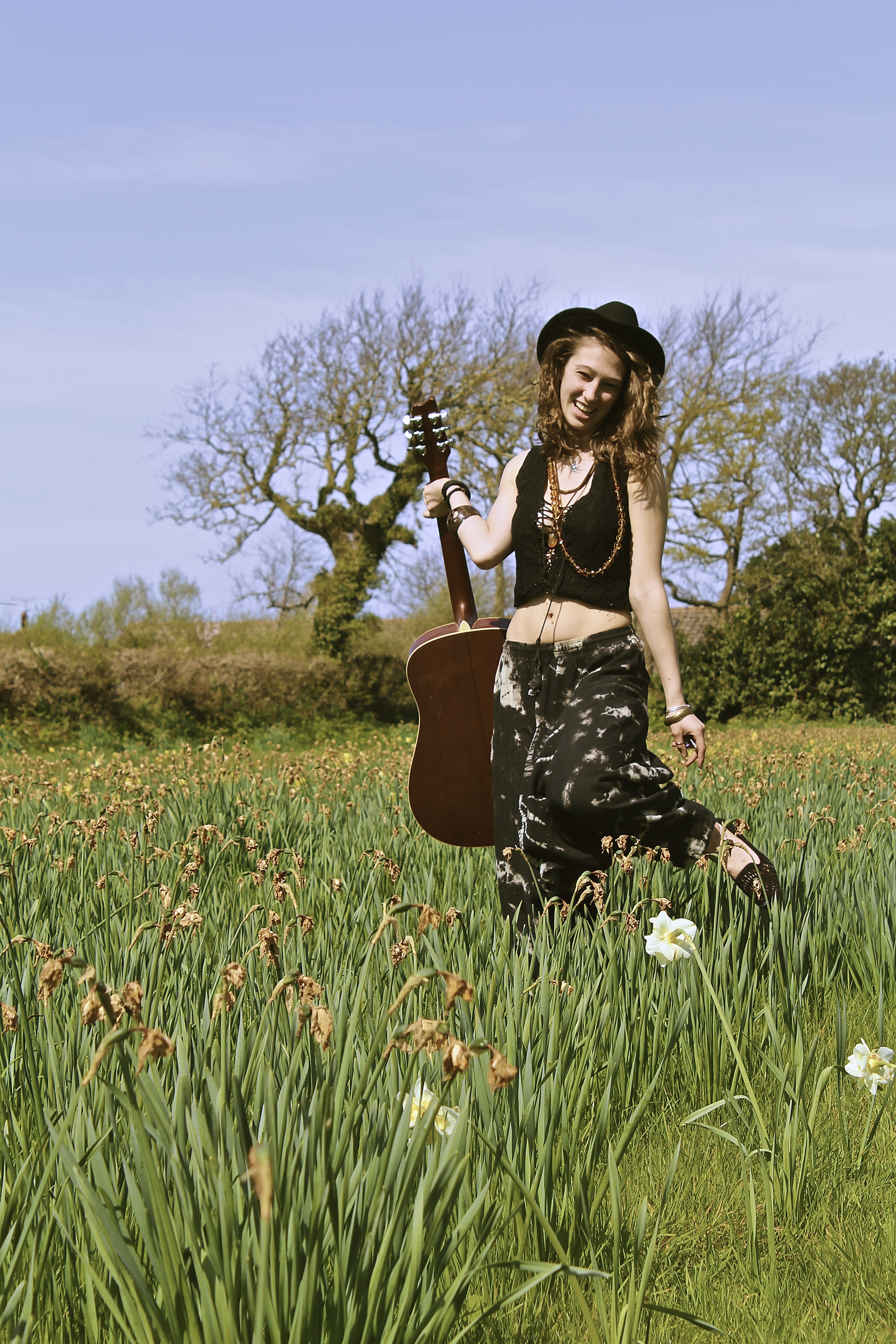
The reason for this shoot is because genuinely people associate spring with positivity,  because it’s going from the end of the bad weather to the start of the good weather. Therefore I thought I’d use the season to help bring positive vibes to my photographs, another prop I used was the daffodils in my shoots, these are an important aspect as they are one of the most typical spring flowers, and therefore what represents spring in my photographs.

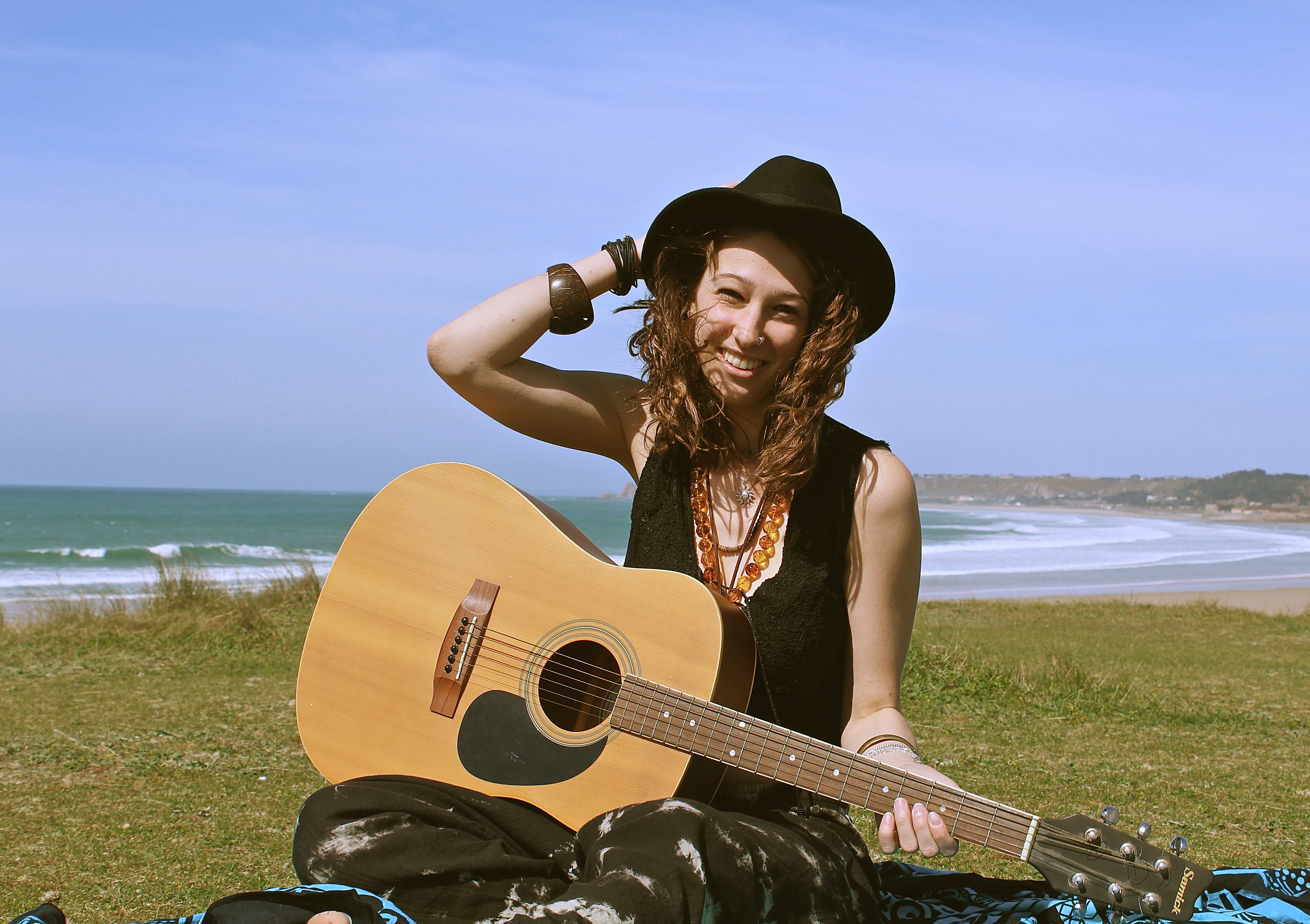
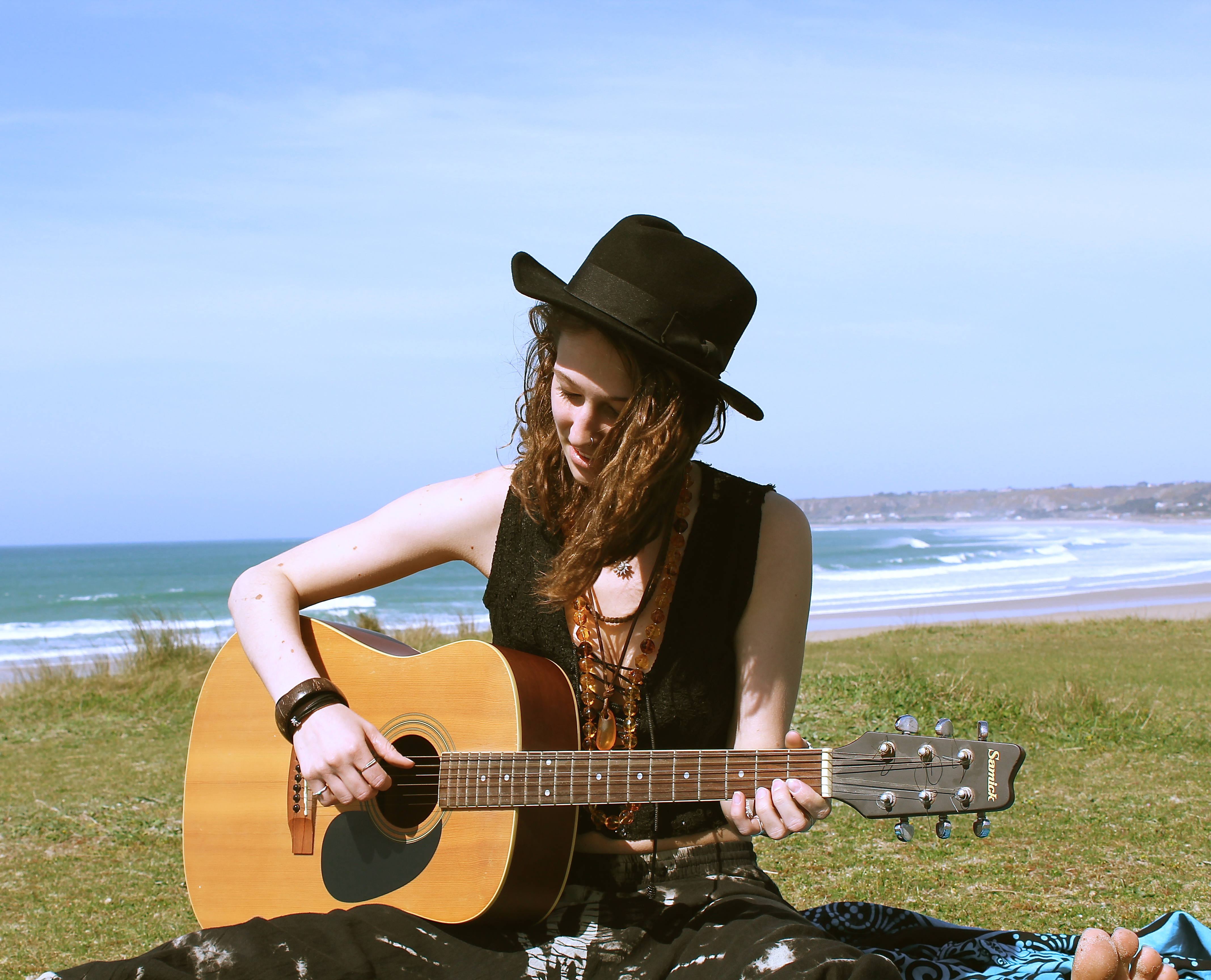
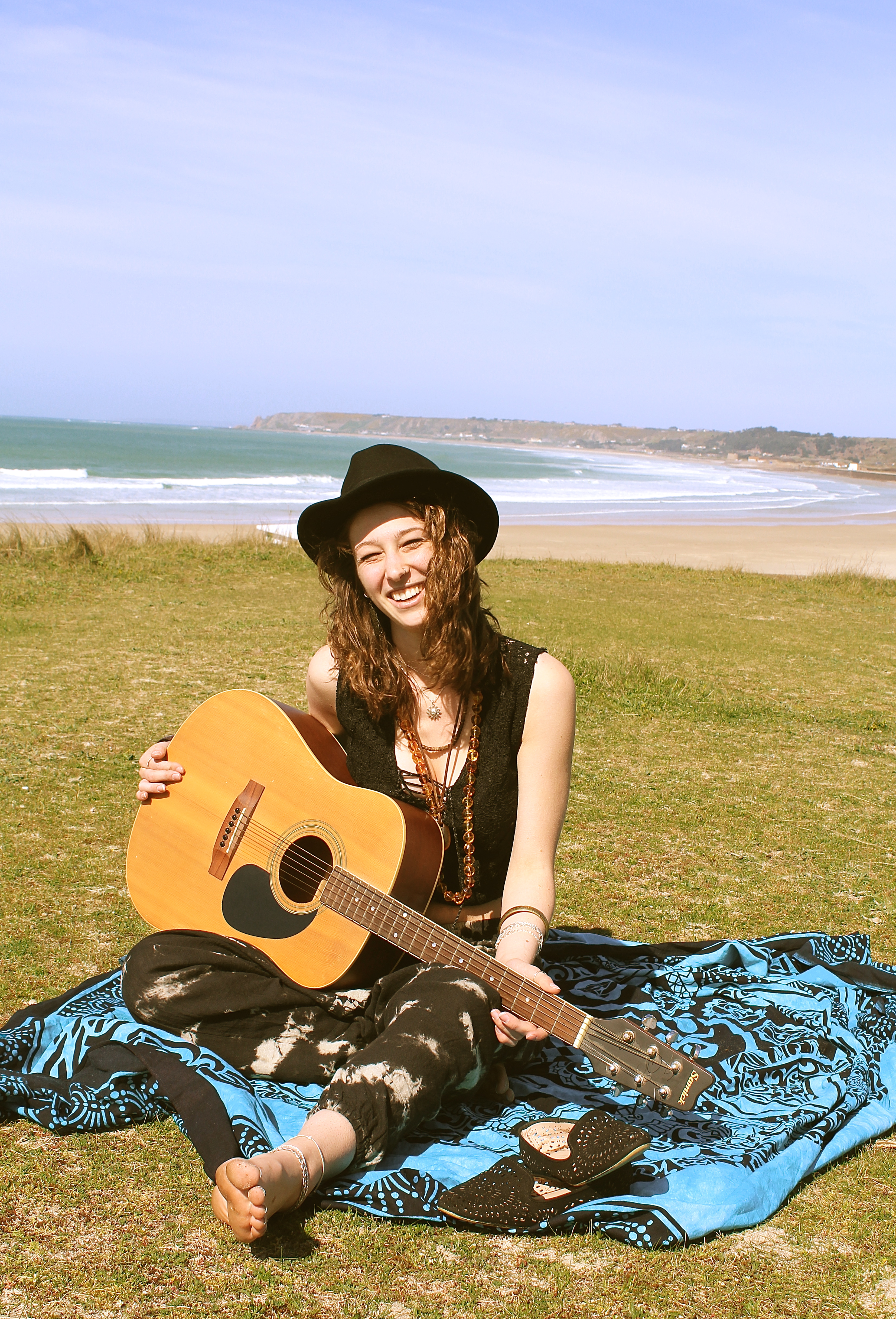
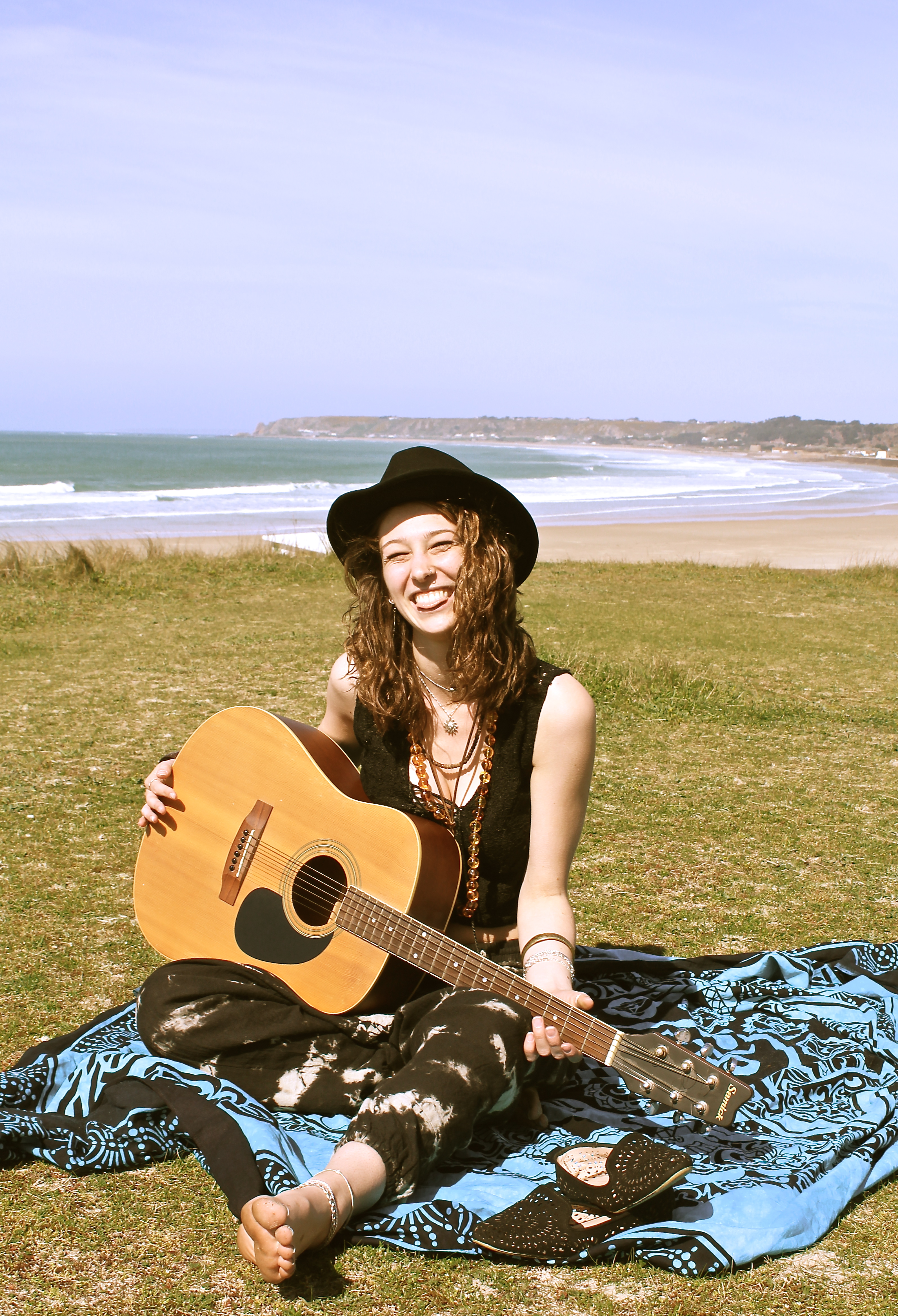
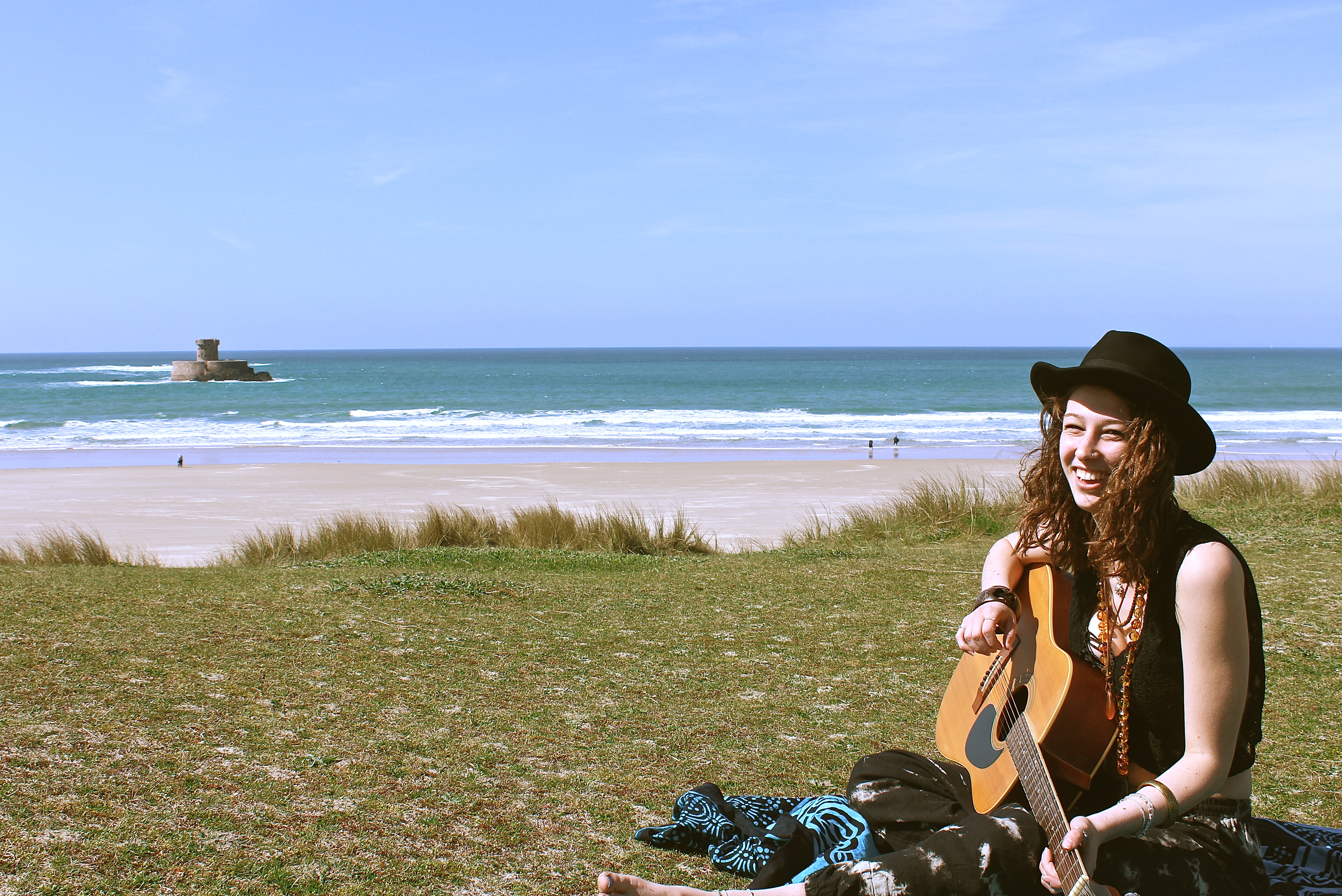
The image below works well as it looks like an image which may have been taken in the 60s when it was the decade of hippies, it looks like this by the use of the outfit the model is wearing, the use of the guitar and also the field of flowers, it also looks like its taken on an old film camera and looks like its been developed. This works well as with this shoot I was trying to represent peace and happiness and thats exactly what hippies are about, also it tends to be ‘free spirits’ / ‘hippies’ who tend to do a lot of travelling. Which works well as my photographs are all about a journey.

I love the photographs below, as they are capturing movement of the model, giving the photographs energy. The focus is on the model and the guitar, even though they’re both in the midground they are the focus and the foreground such as the daffodil is even slightly out of focus. The composition works well as the white daffodil is what your eyes are immediately drawn to therefore you look at that which shows you the season, making it positive before you even see the main subject, one then looks up to the model holding the guitar. The use of facial expression on the models face also creates a positive atmosphere and feeling to the photographs.


Nomadic Soul

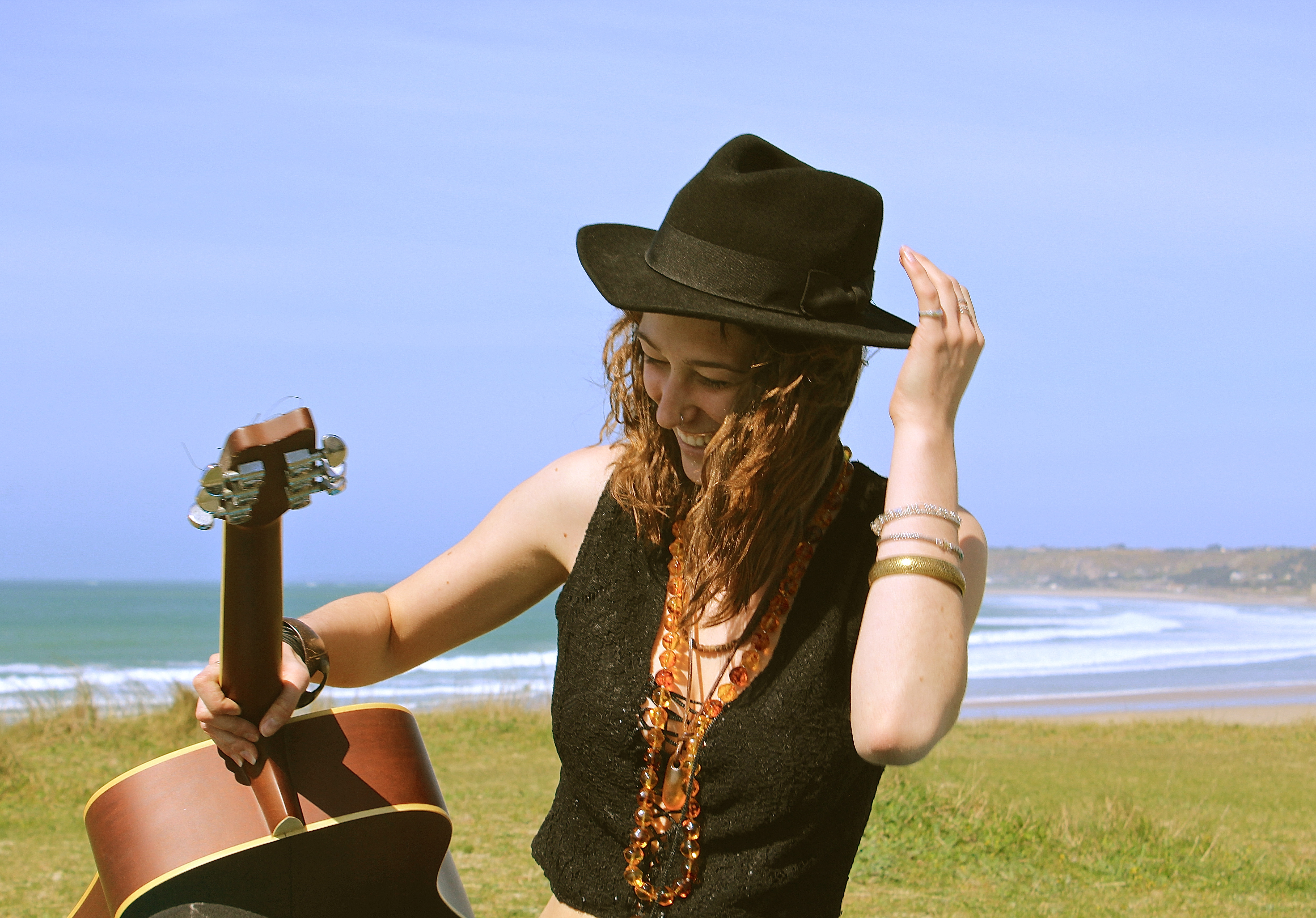
For this shoot, I wanted to represent a musical journey combined with a travelling journey. I wanted to represent a girl who was on the move, but would take her music with her everywhere, but not someone who would just use their IPod and headphones to listen to music, but someone who makes their own.

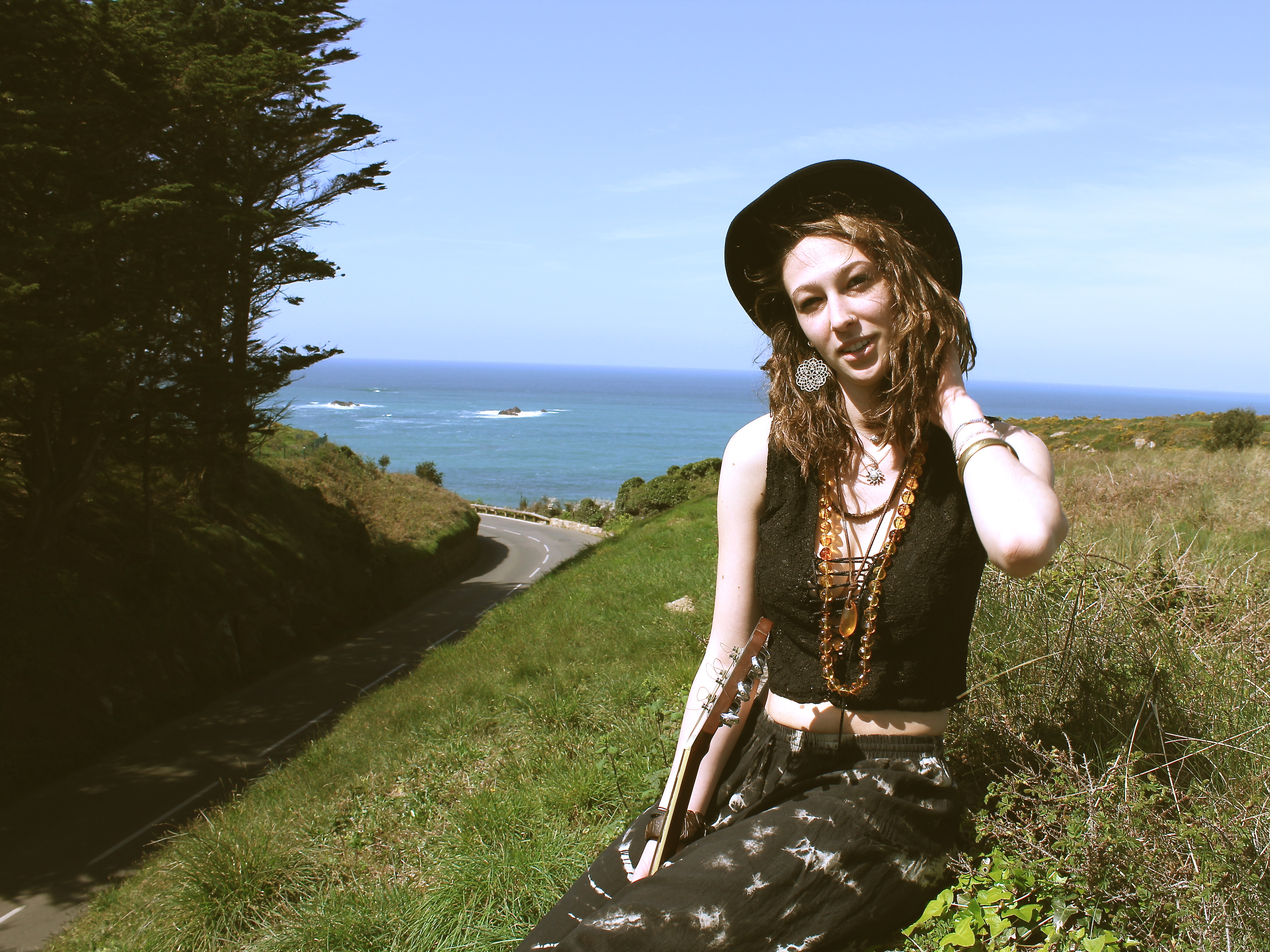
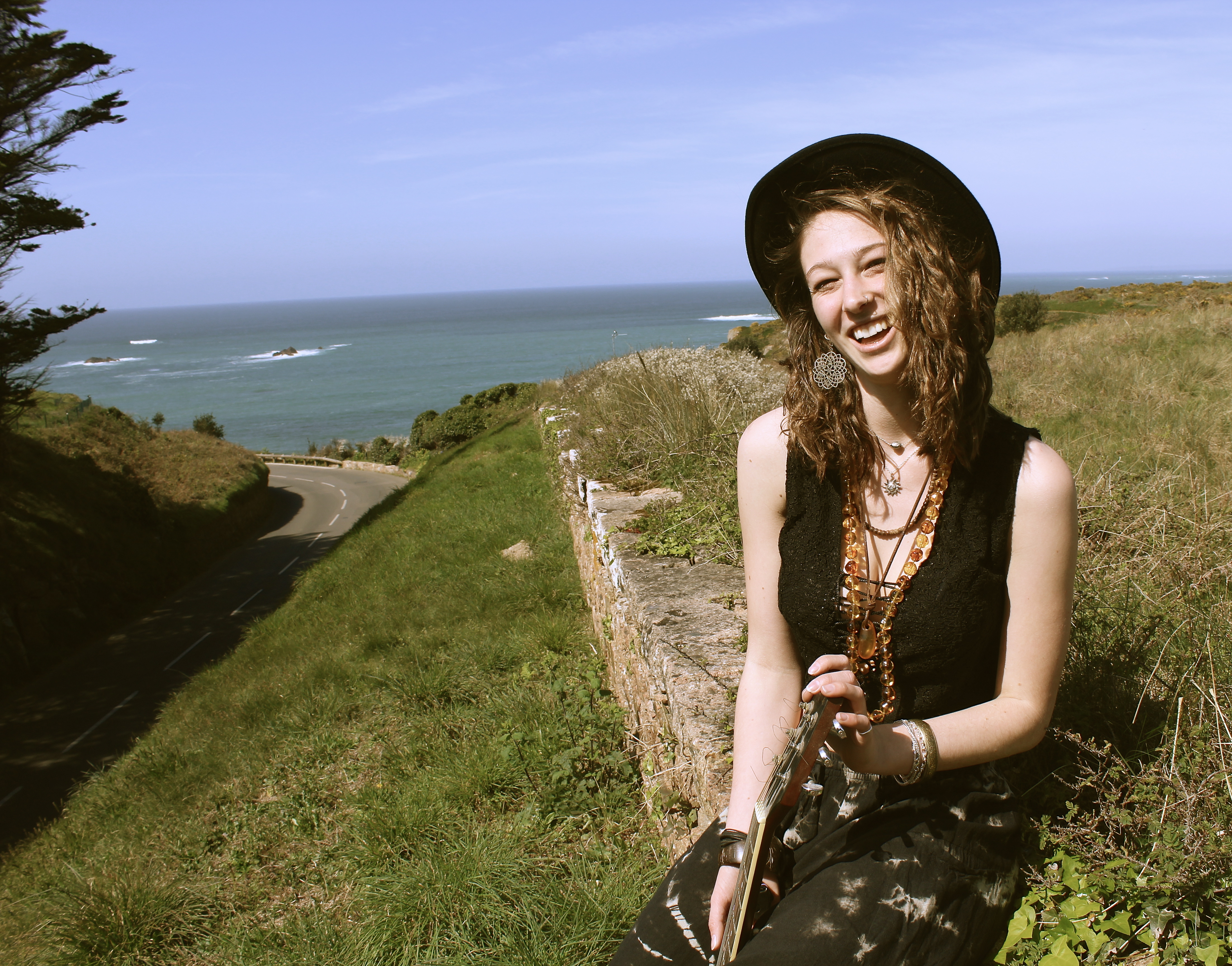
The reason for the location at the start of the shoot was because it shows a beautiful environment with the sea and trees in the background, but it also shows a road which represents movement and travelling. It’s as if the girl is following the road to the sea. This is why she ends up sat in front of the sea, because its representing her journey.

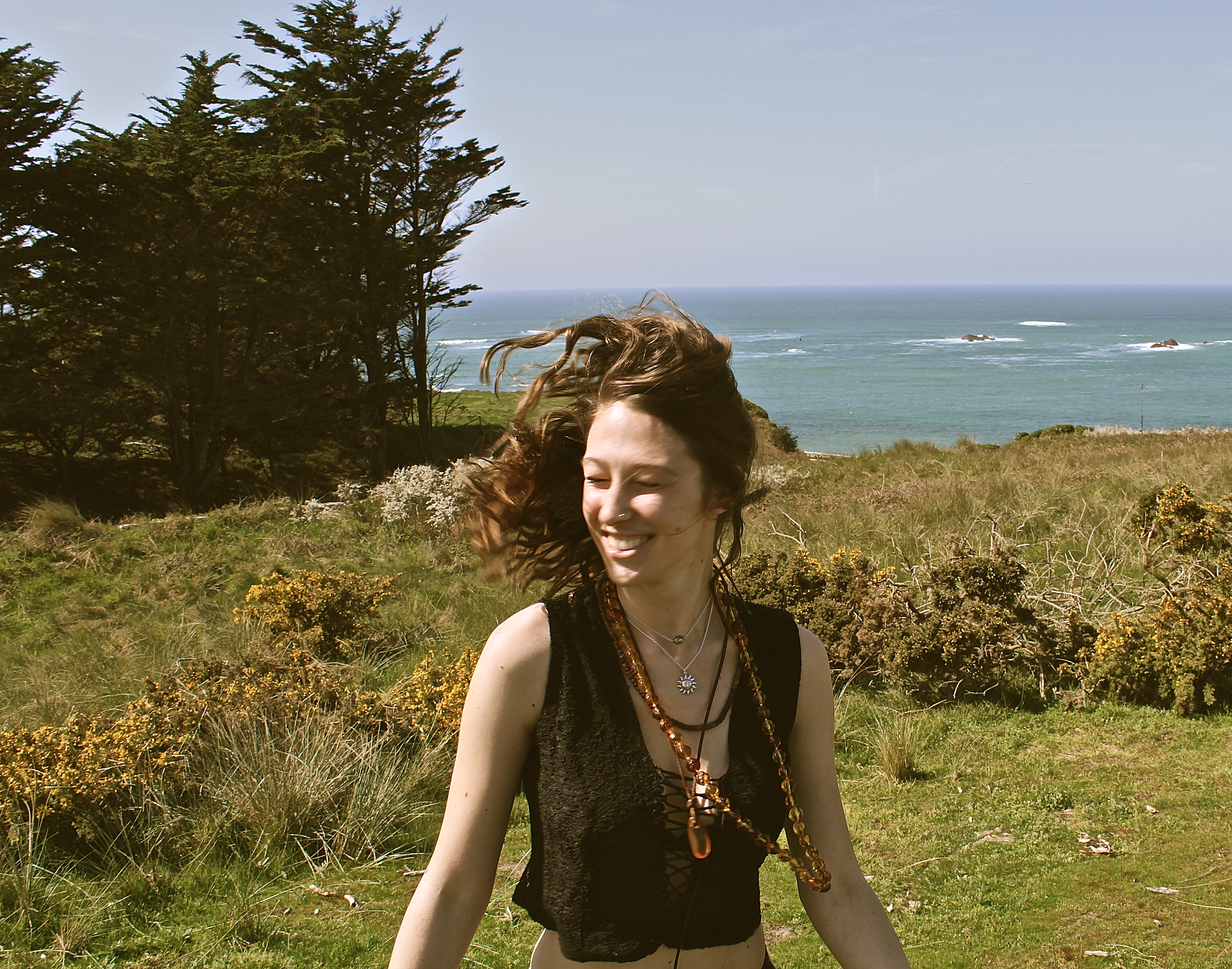
For this image below, I made her face away from the camera, and then I would count down to free and she’d turn her face around and I’d capture the moment. This technique is done to capture a moment which doesn’t look as posed and make it not feel as posed for the model so they don’t feel as awkward in front of the camera, and also to create movement in the photographs. In the image below, due to the position and natural lighting there is a loop lighting technique created on the models face. The thing I would change about this portrait is I should of waited a few more minutes for the cars to pass in the background, because I find they take away from the portrait, and I should have positioned the model slightly different so she wouldn’t be blinded by the sun and her eyes would be more open. However, I think the use of focal point worked well in this image, as I wanted the model to be the main subject, yet showing the important aspects like the sea and the road.

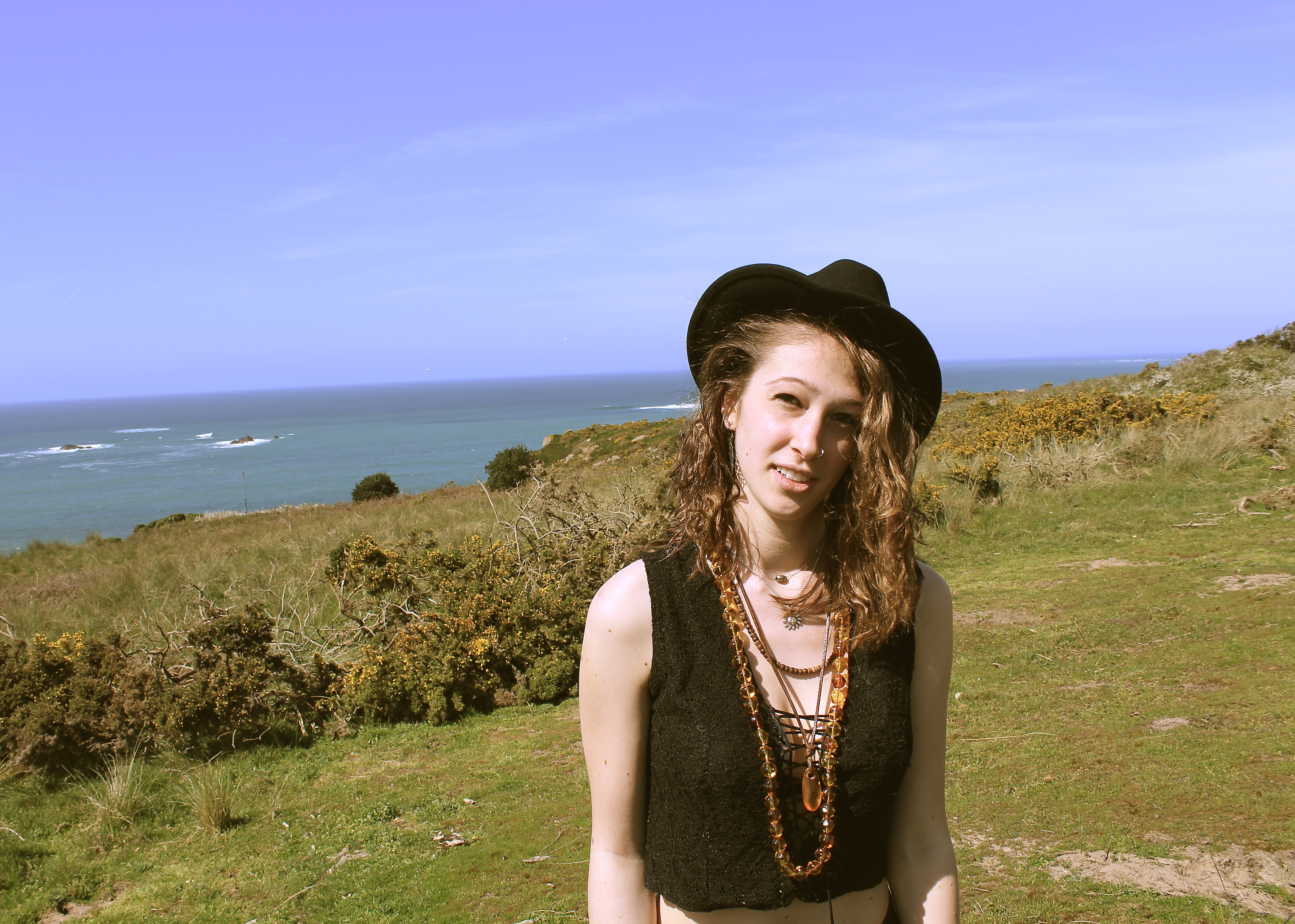
In the image below, there is a split lighting on the models face produced by natural lighting. The model is slightly positioned to the right however she is what immediately look at, due to her skin colour being pale. The composition works nicely as one can see the road which looks like it takes you directly to the sea. The way the model is higher up than the level of the road, makes her look adventurous and takes risks to appreciate natural beauty, and views like this inspires her to write new music. In this image there is a lot of depth, except in the background behind her upped body, where there is negative space, i think this works well as you focus on the mode more and aren’t distracted by a busy background. When editing this photograph I referred back to Theo Gosselin, as he tends to have a cinematic/vintage effect which I chose to use on this image.


I love this image, as it looks so natural and in the moment, as if I just picked up my camera at the perfect time. When in reality it was staged to look the way it does, for example I wanted her to sit in this position so I could get the trees, on the right, and the wall on the left to frame her and the sea in the background. For this image I also used the technique where I would get her to turn around so it wasn’t looking posed.

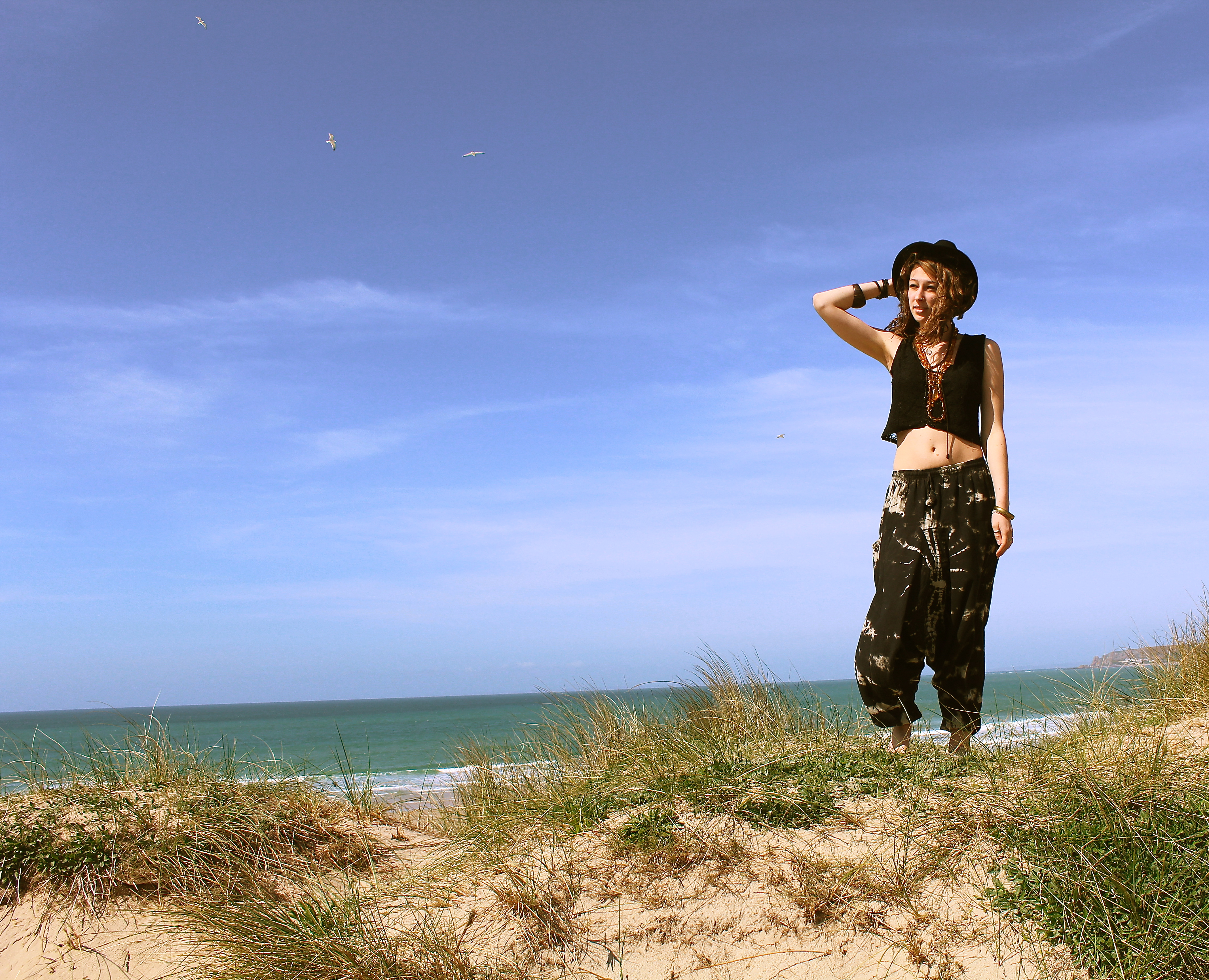
This image works well due to all the different elements, such as the birds in the background. The way the models got her arm bent, holding onto her hat, the carve of her elbow almost works as an arrow therefore your eyes follow the direction the elbows pointing in, which makes your eyes focus on the birds in the background. Normally one associates birds with peace and freedom, which is what i wanted to represent in this shoot. When i think of birds, i think of fleeing the nest, which is what these young people have done, they’ve taken their vans and have gone travelling away from home. I also like the fact one quite often hears the term ‘a songbird’ which is a bird with a musical song, like what the girl in this shoot has, as she’s got her guitar with her in most photographs.

Point of view

In the photograph below, I was trying to focus on the whole meaning of my photographs, like a journey of my life showing the environments I surround myself in.  This is represented by the fact they were taken in a mirror in the car. One can also faintly make out that the beach is what’s in the foreground, meaning we’ve stopped to take time at the beach, however I didn’t want to capture it that simply so I thought I’d try and experiment with things such as reflection and composition.

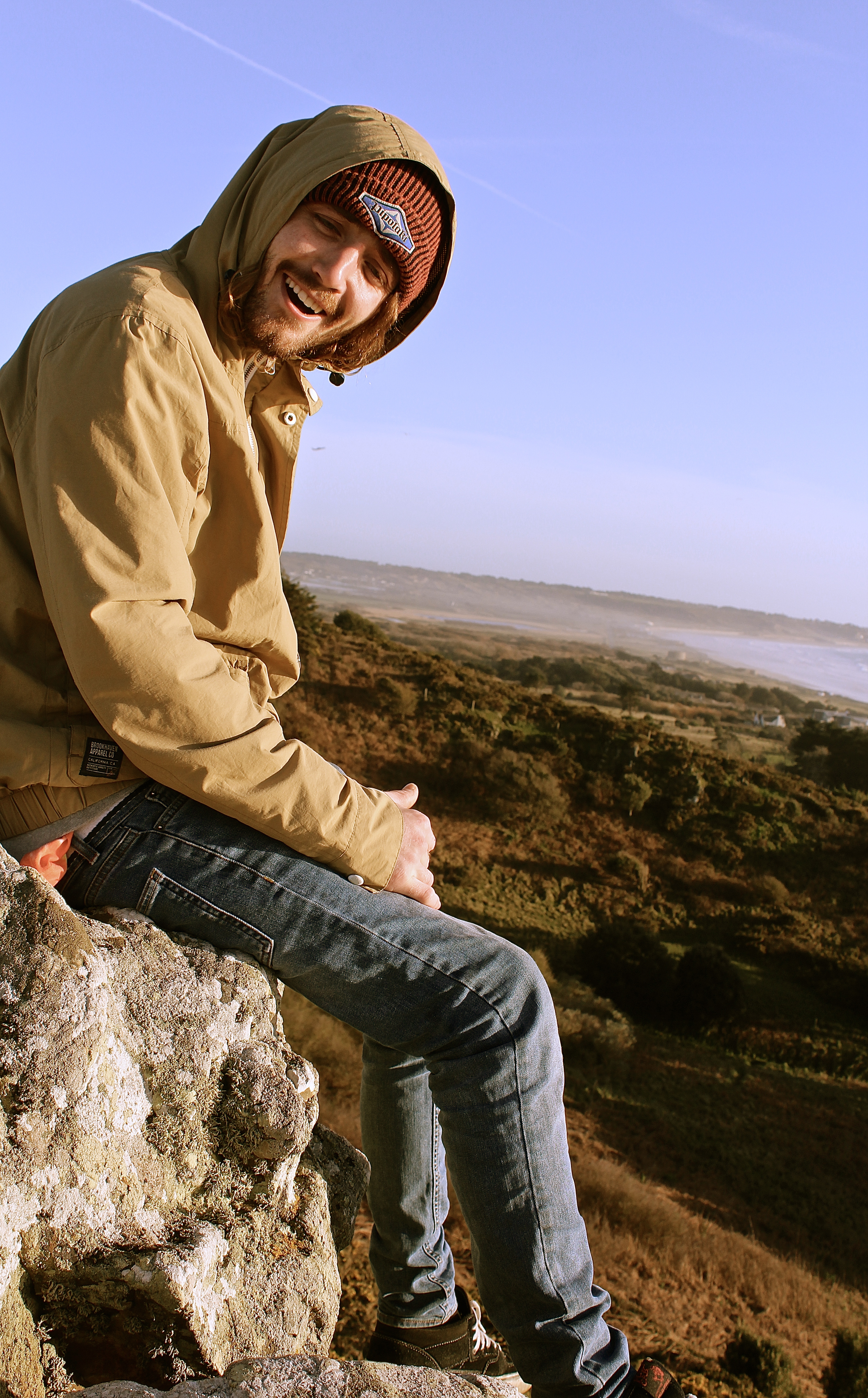
The photographs below were inspired mainly by the photographer Ivan Troyanovsky. This shoot was different for me as I used the natural lighting of the sun, rather than using artificial flash lighting, which I tended to use on my last project looking back at Helmut Newton. This makes the way you photograph completely different, as with flash you can photograph wherever as it’s going to be well lighten with high contrasts, however with natural lighting you must think about the positioning of the model before shooting, whether you will get a silhouette or too much shadow etc.

An example of the use of lighting is shown below, where the photograph is being shot towards the light, whereas in all the others i’ve shot with my back to the sun, this is because after taking this photograph, I didn’t think the high exposure on the right hand side worked that well.

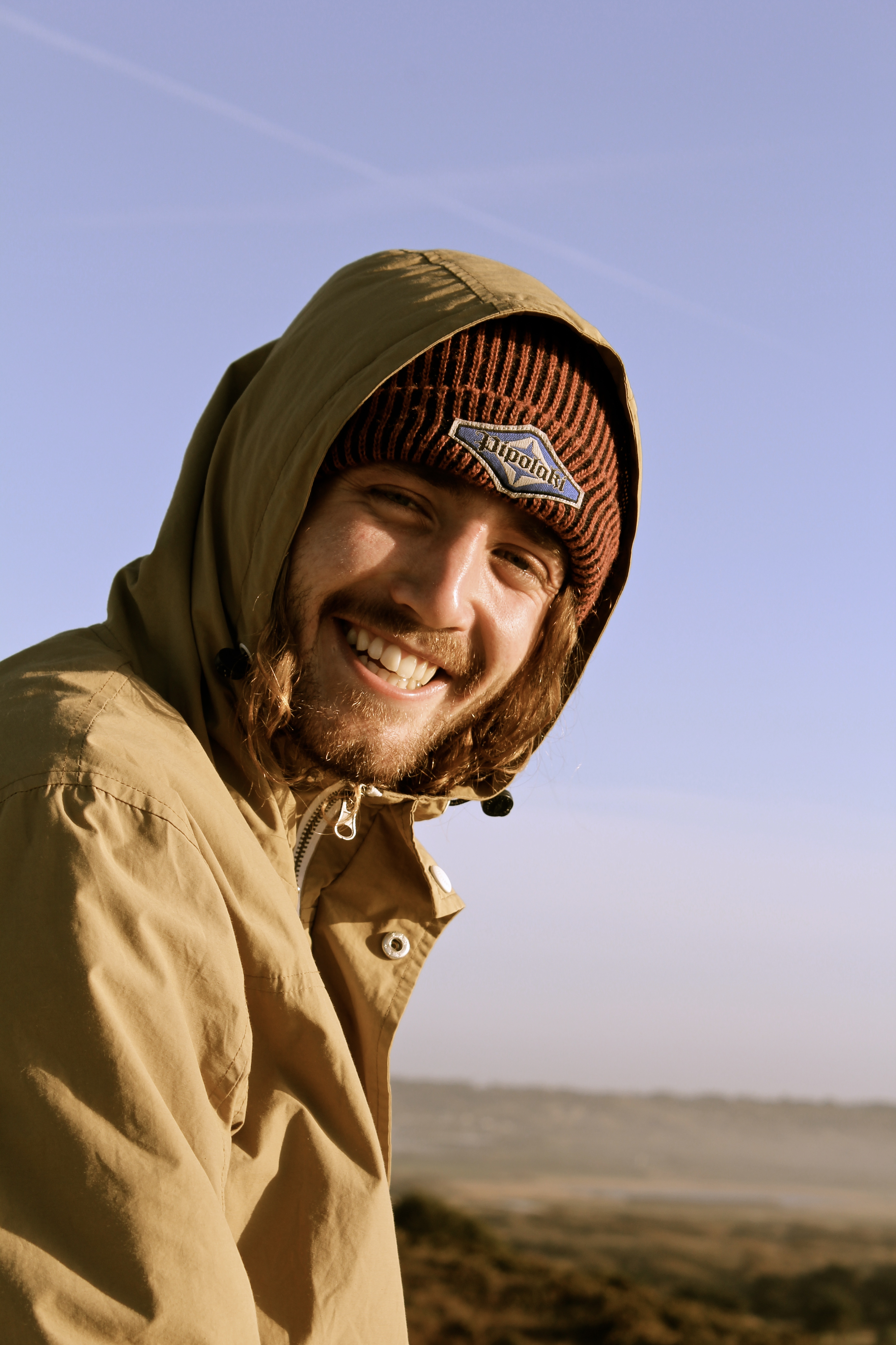
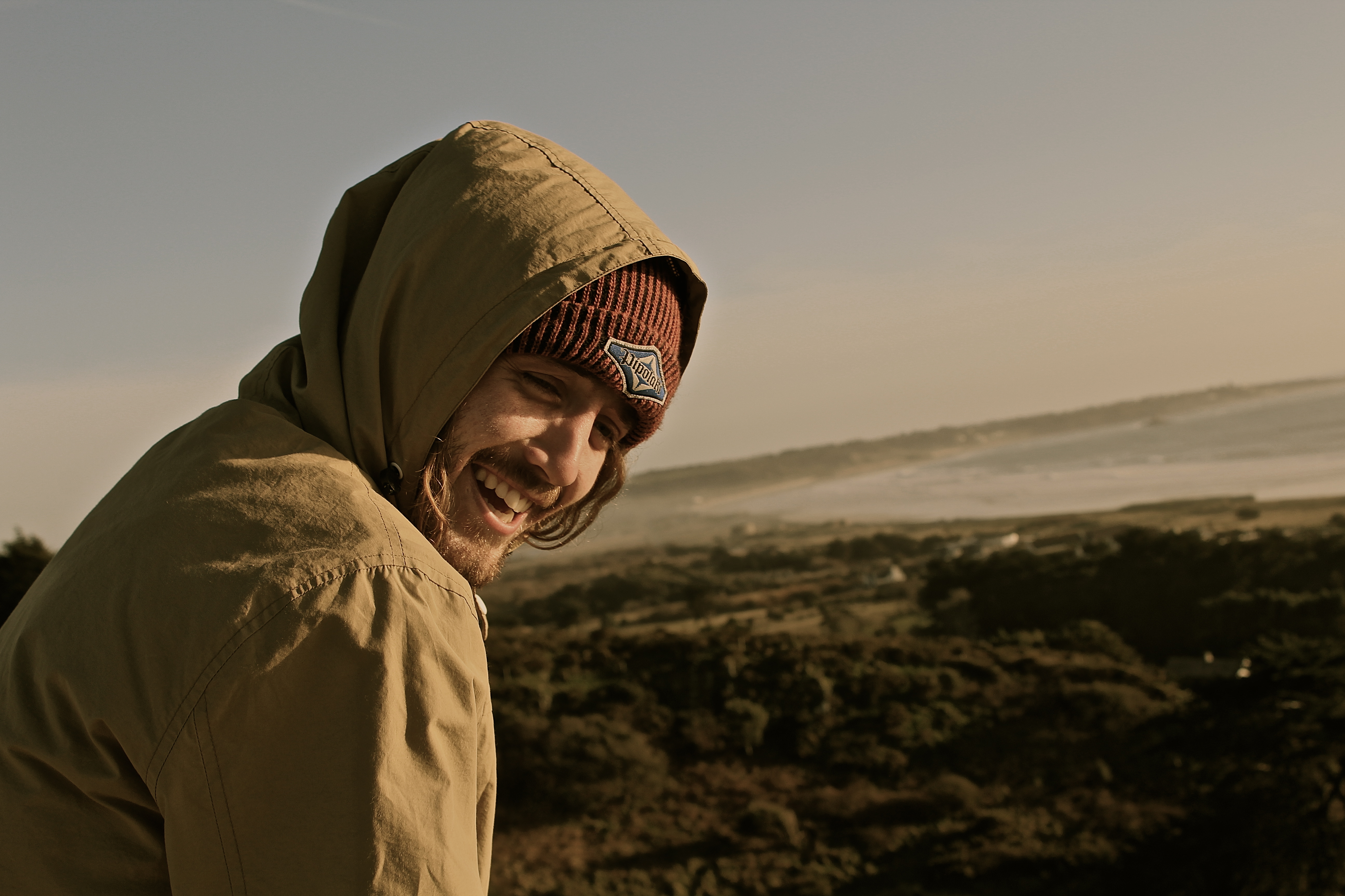
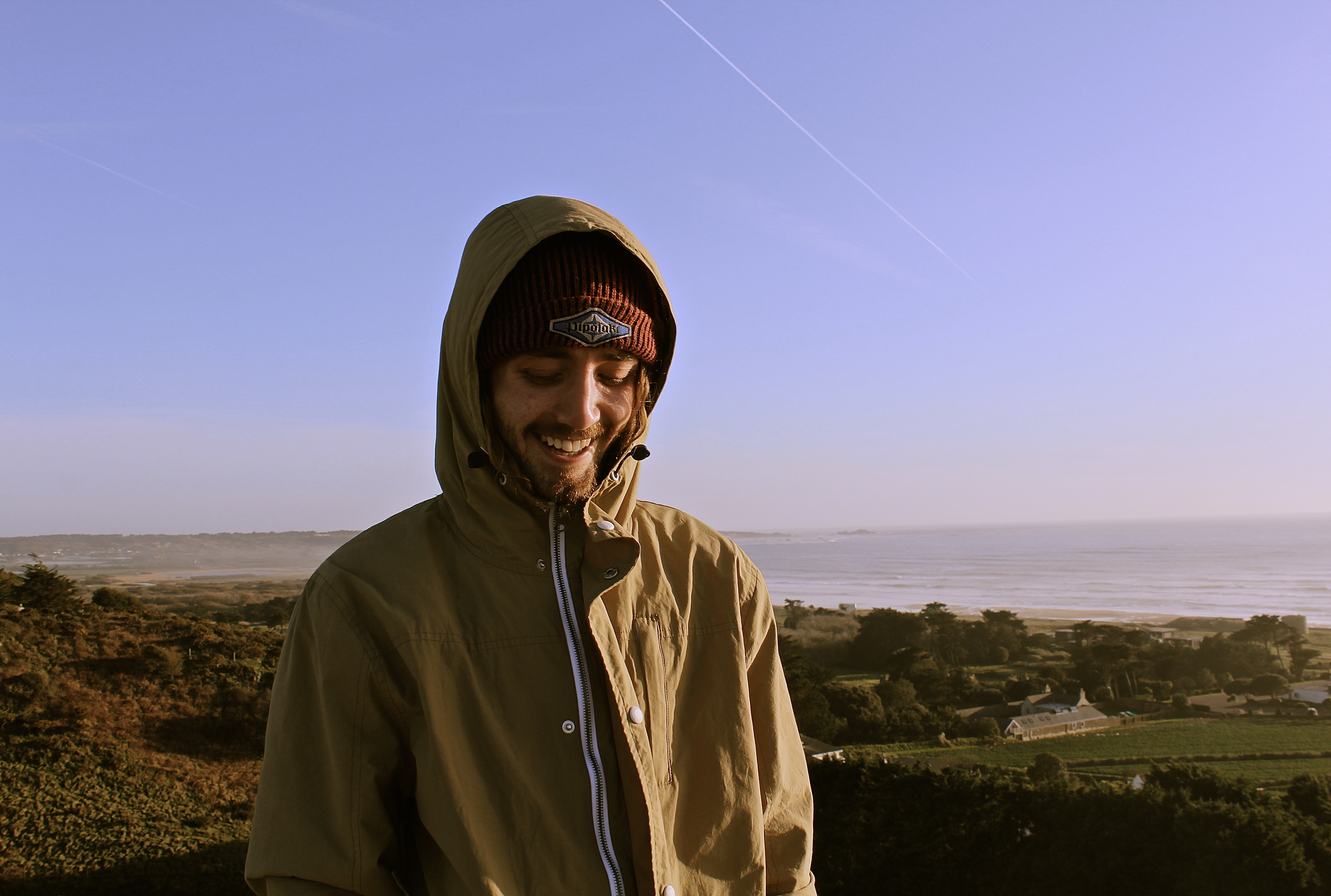
In this photograph I tried to capture the emotions behind the subject. I wanted to try and and create a natural image where in which the facial expressions of the model involved were not forced or provoked by the camera. The photograph features split organic lighting, which enhances and emphasizes the facial features consequently bringing out the smile.

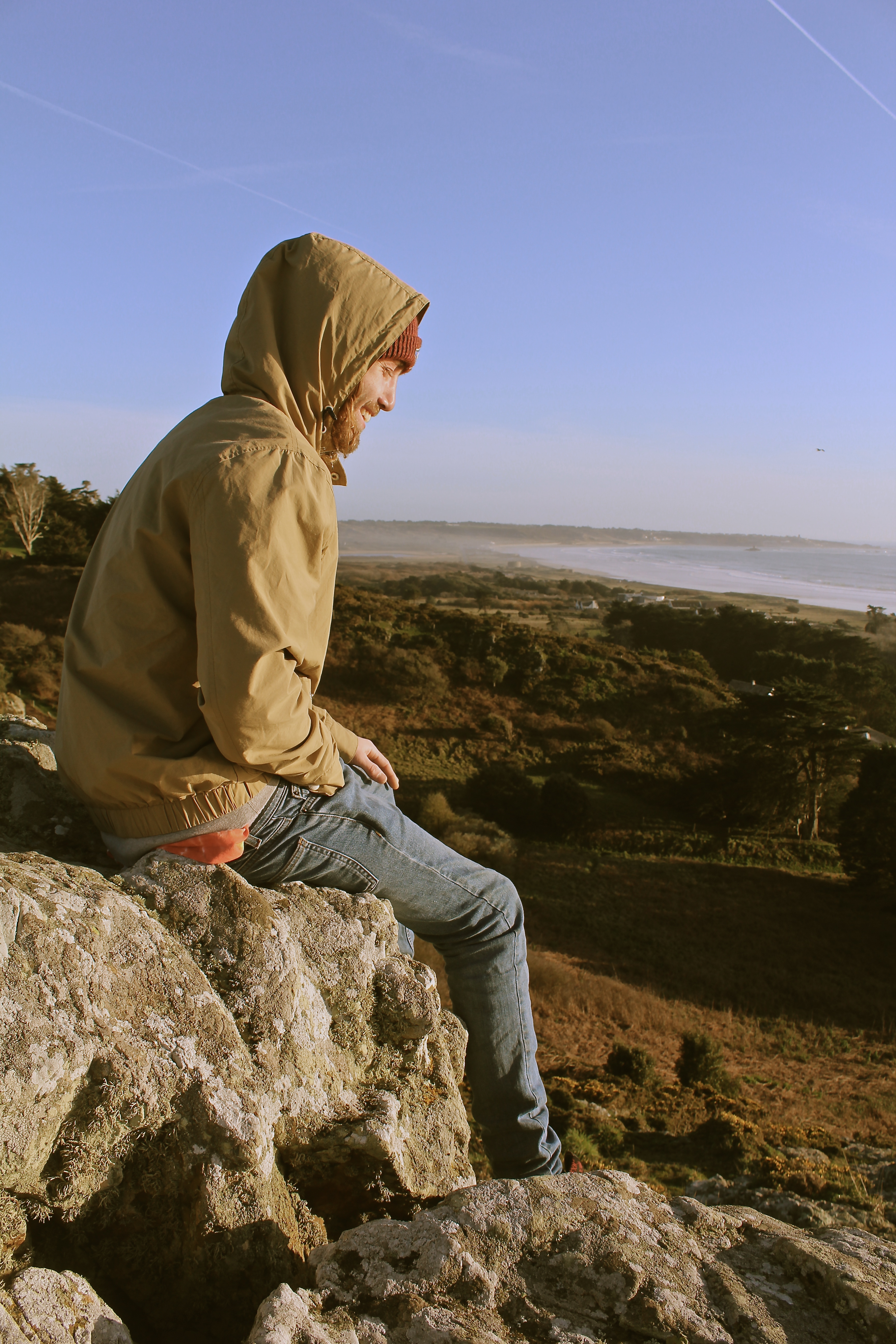
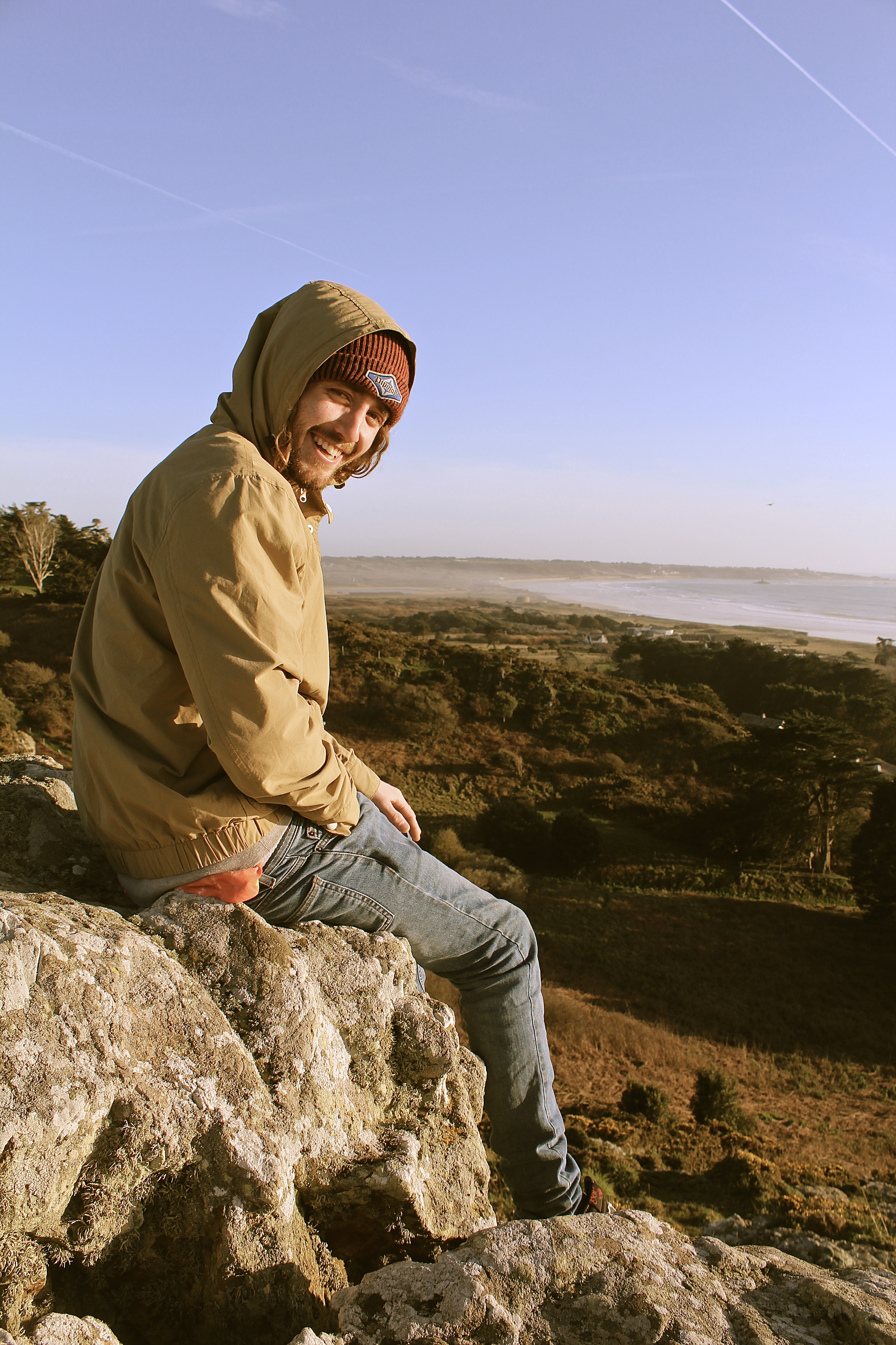
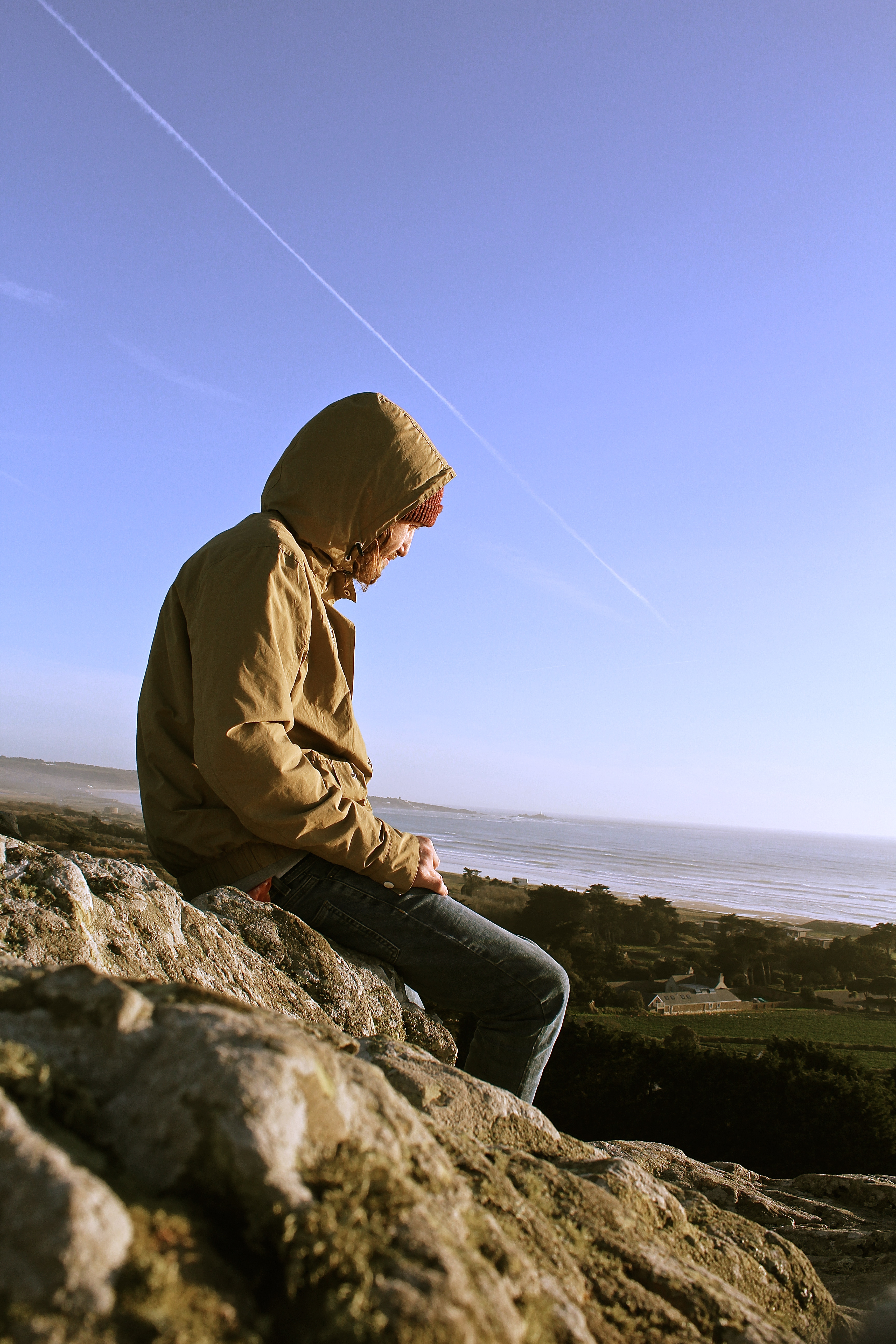
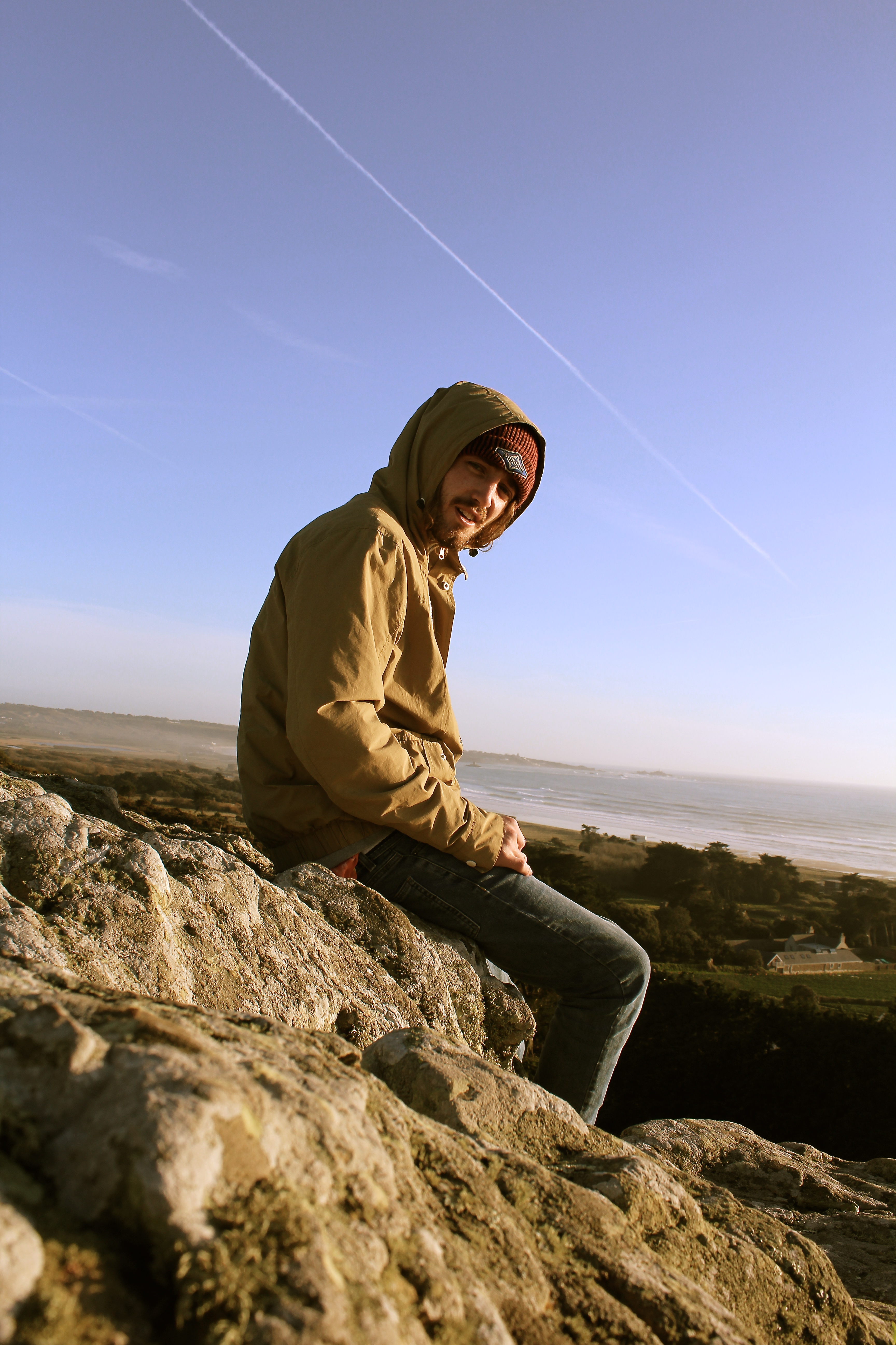
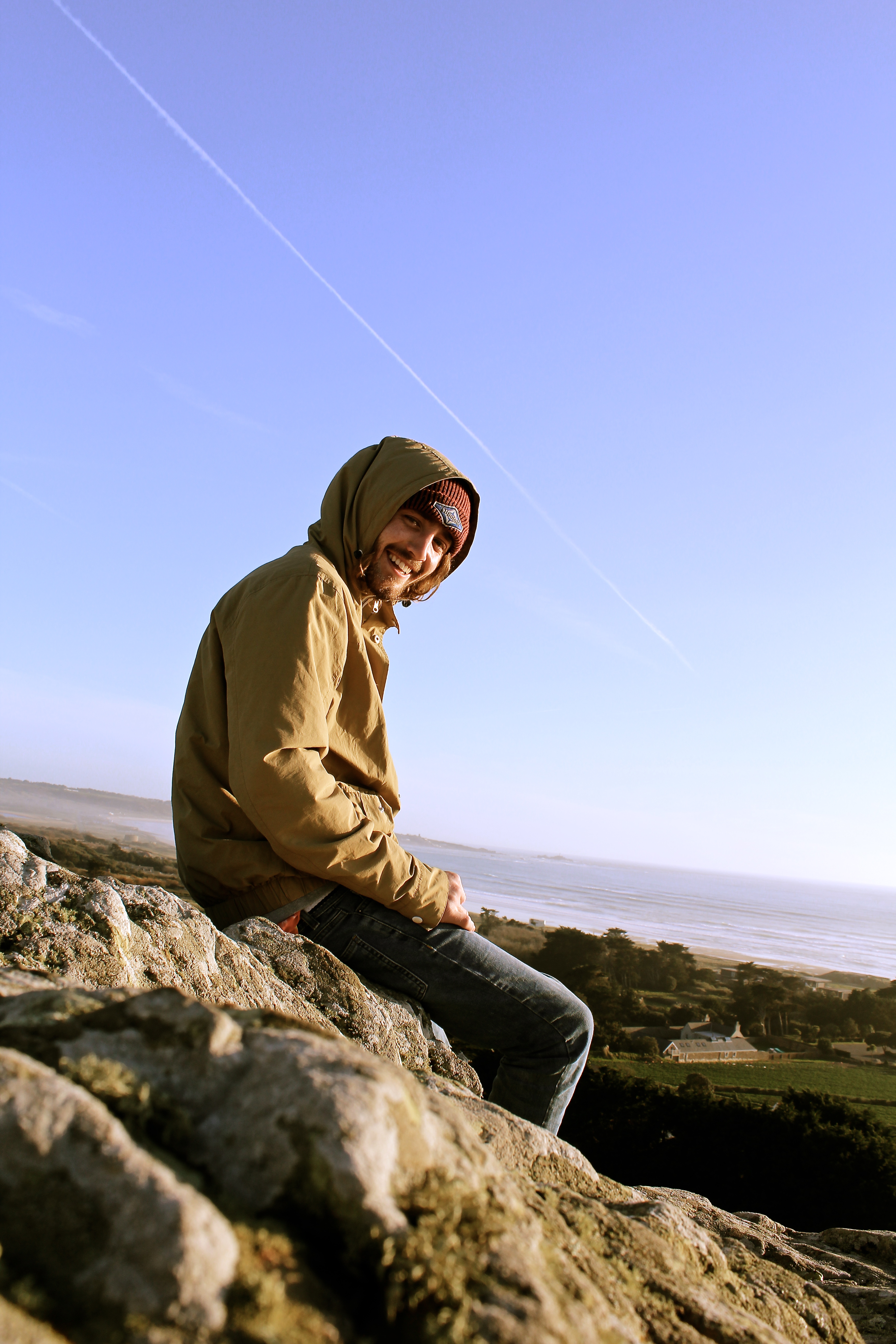
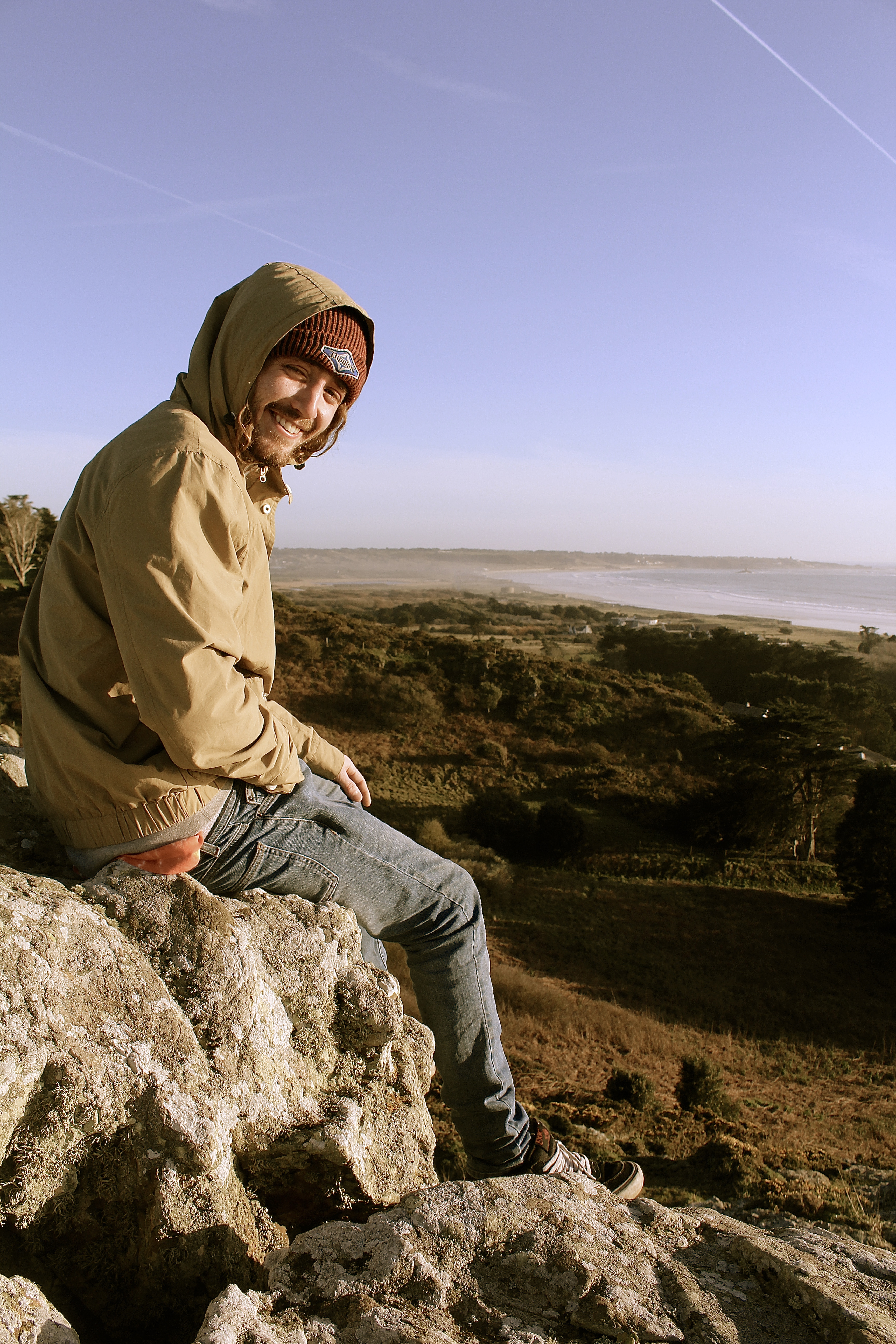
I have attempted to capture the two images below as a set as they work effectively as a pair.  Both photographs tell a natural narrative, as the subject can be seen identifying the presence of a camera and producing a reaction. The composition is reliant upon a low-angle perspective which works successfully due the way it captures the subjects relaxed body language whilst simultaneously incorporating the background and landscape. This enables the viewer to establish a connection between the model and surrounding environment, hence generating an atmospheric aesthetic.

The most visually pleasing component of this image is the distortion of color tones which produces a vintage, relaxed aesthetic. This is very similar to the way Jeurgen Teller edits her photographs.

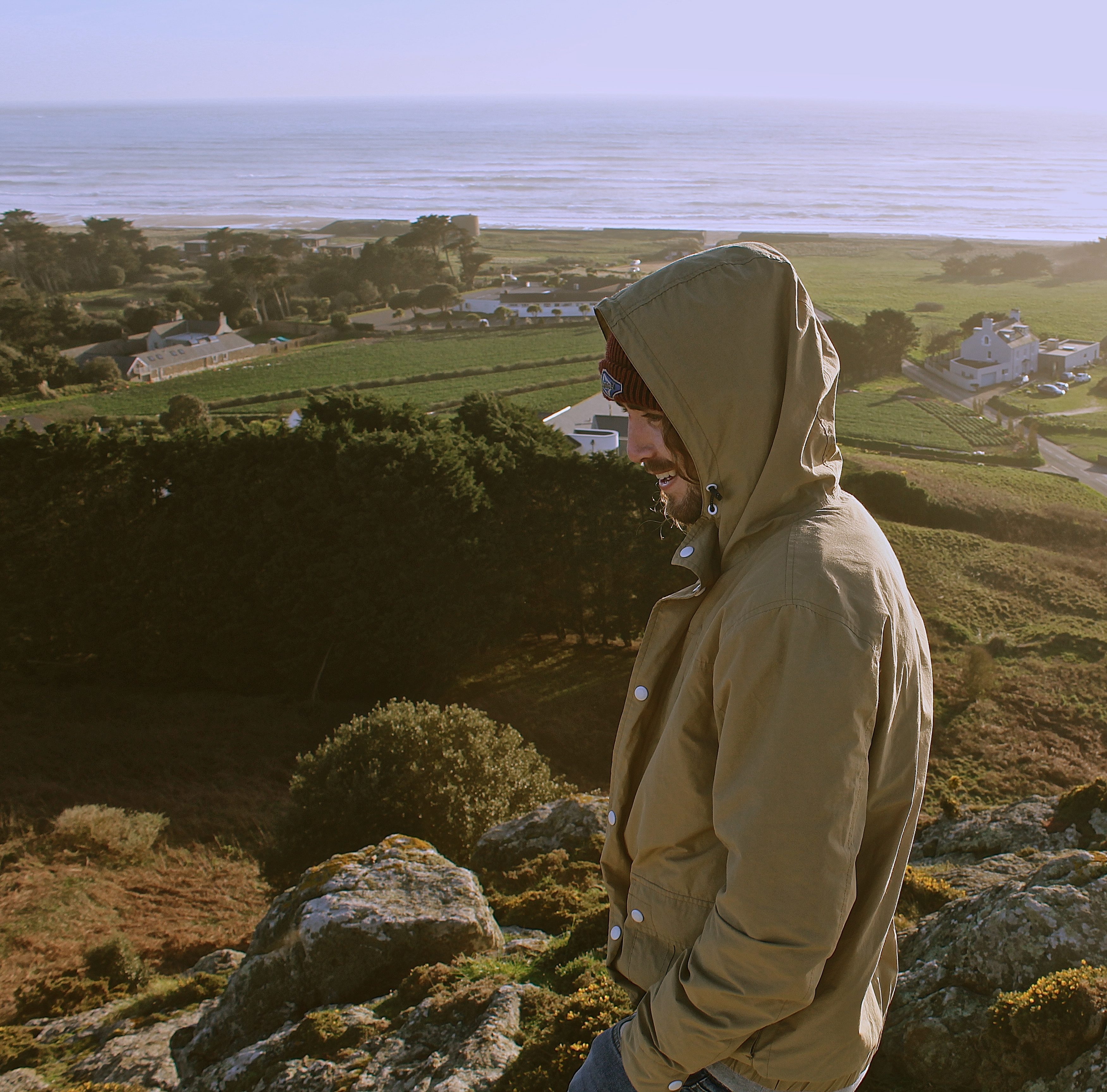
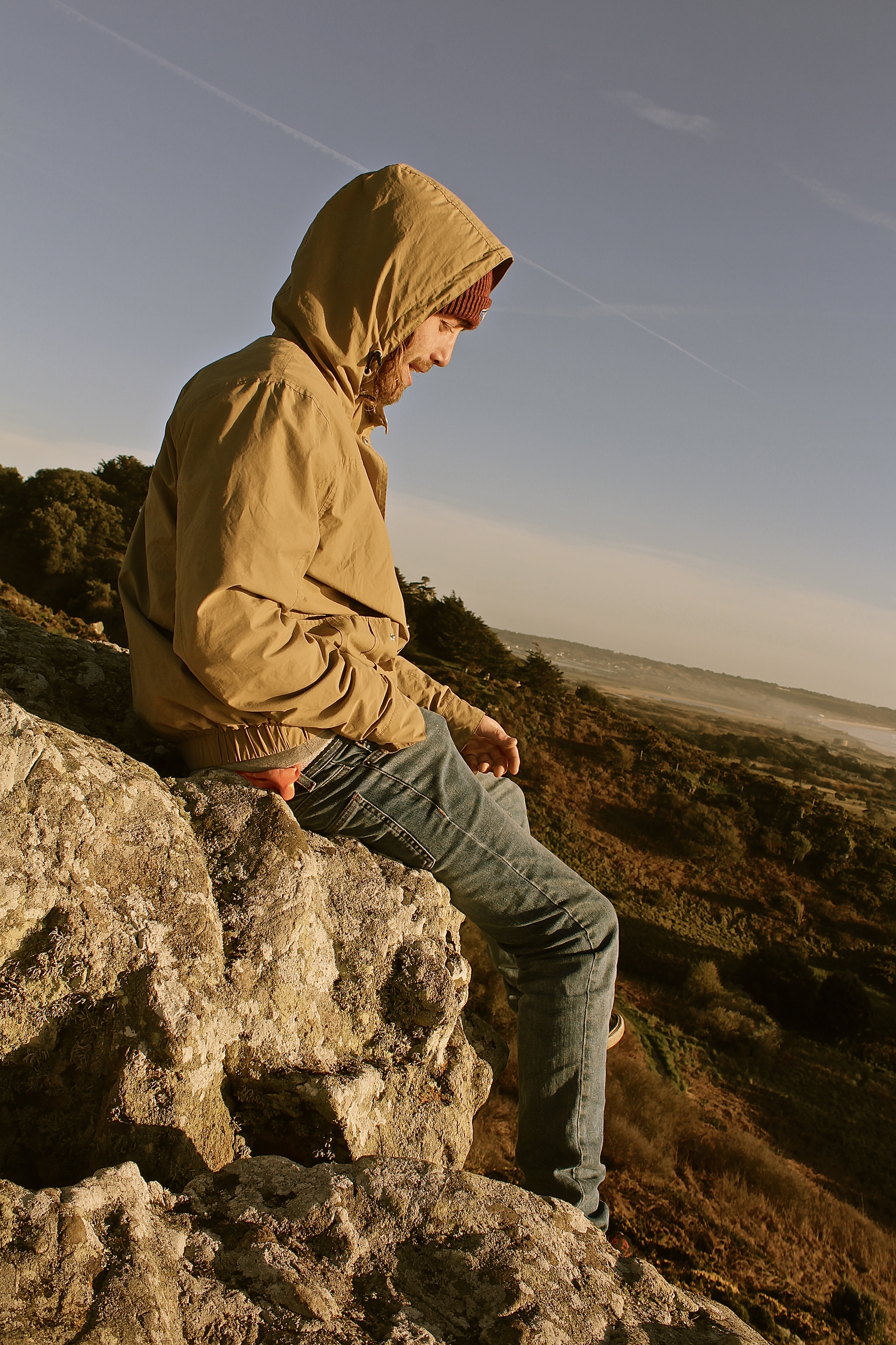
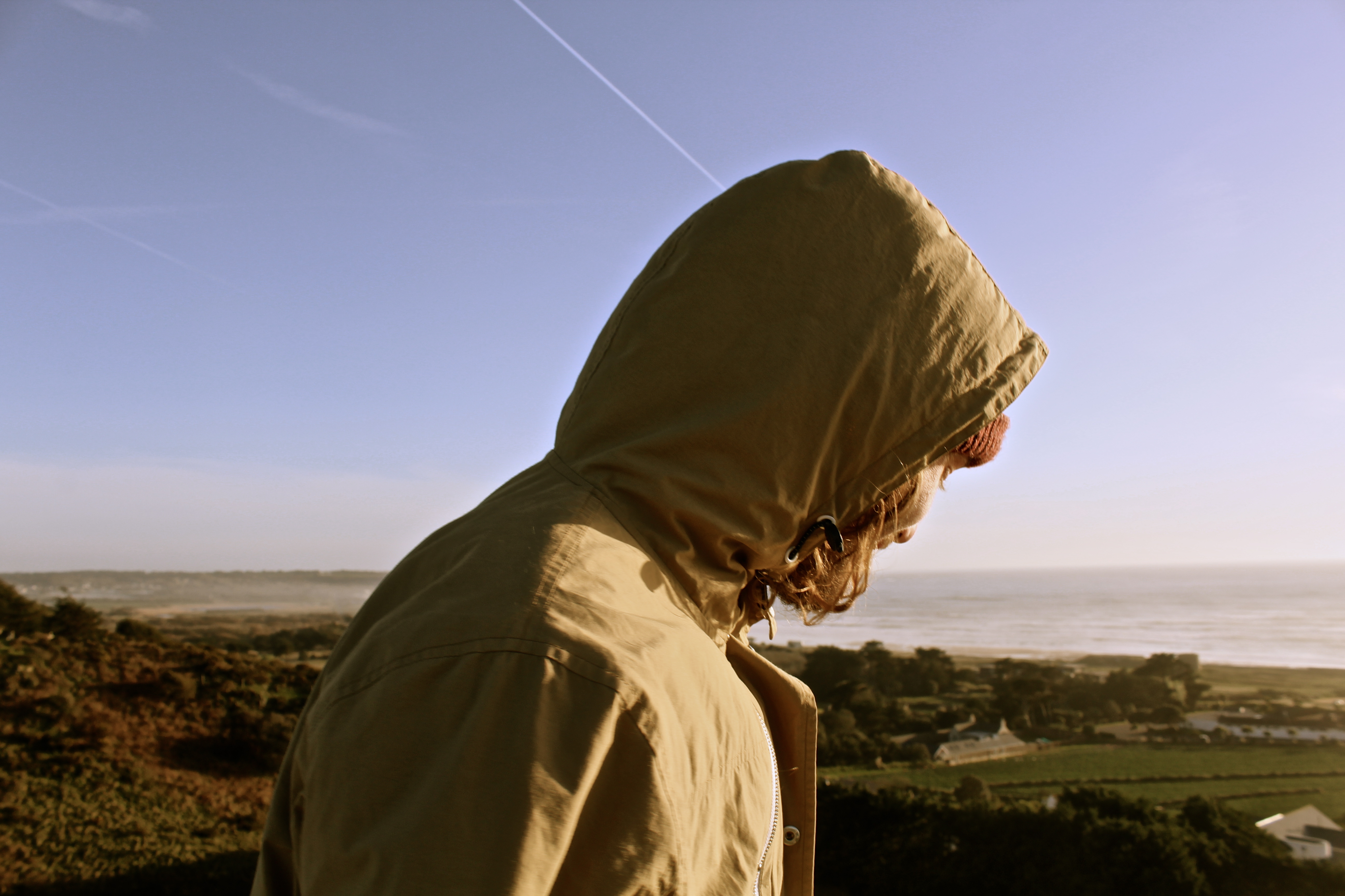
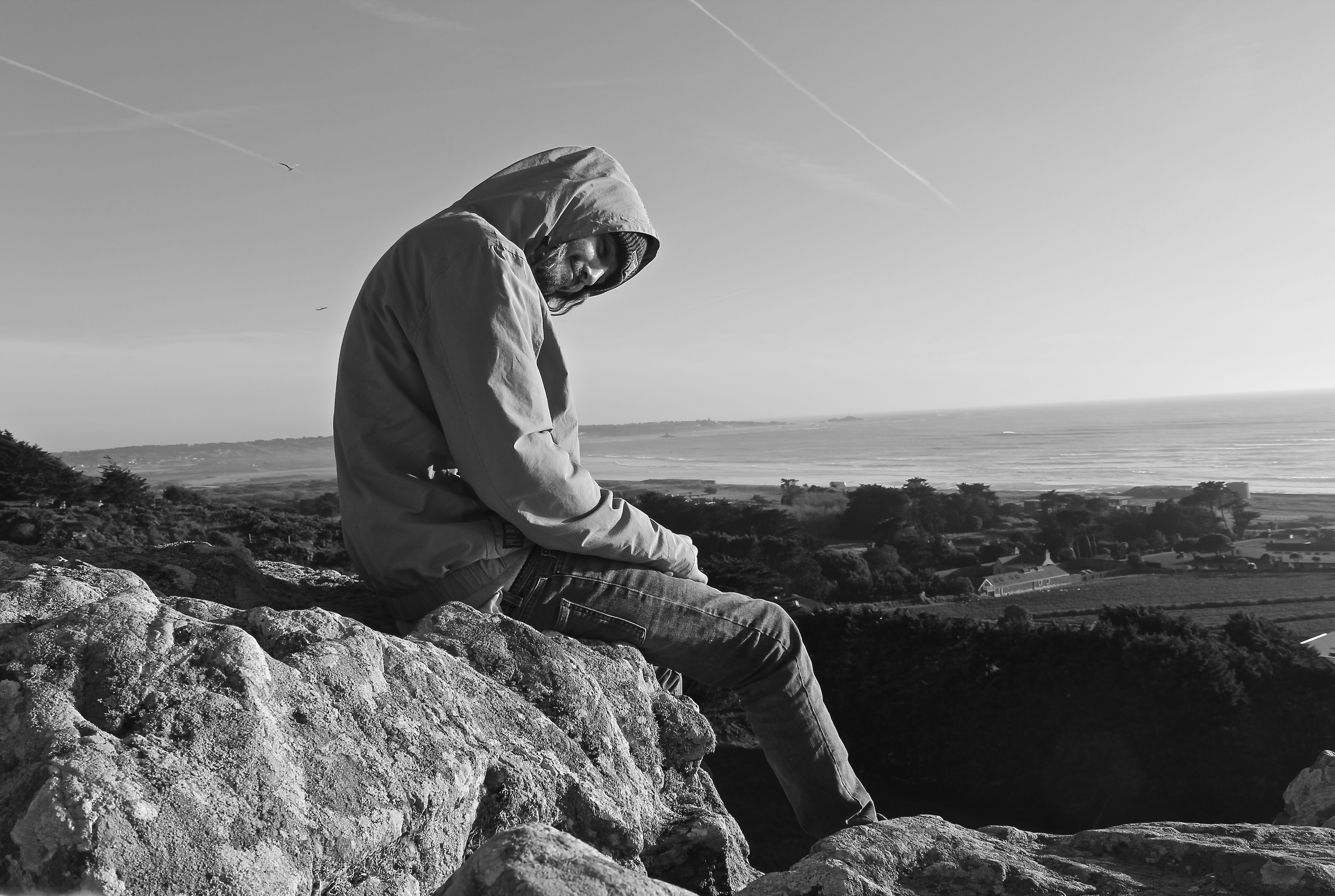
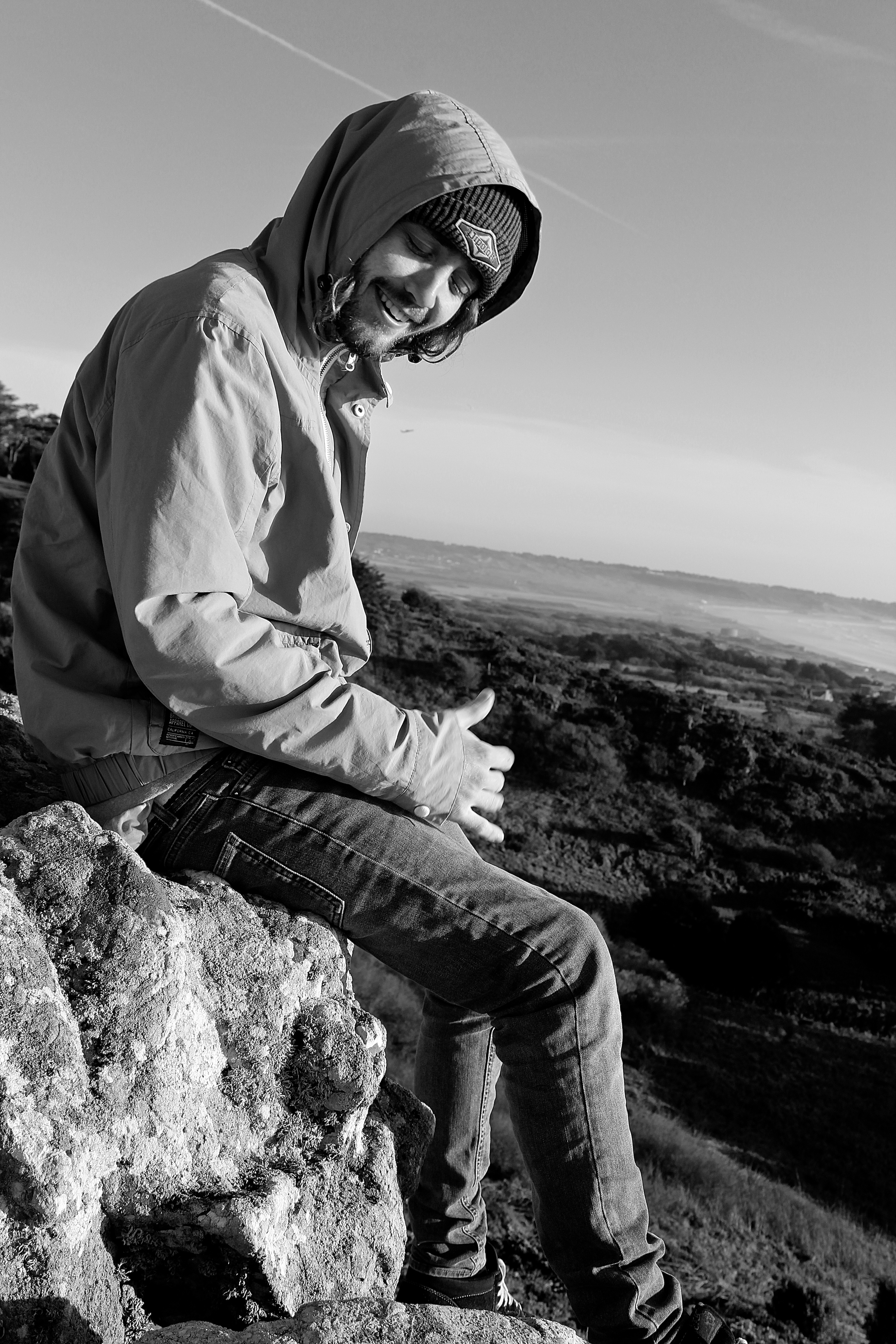
In the triptych below the composition works well, as the rock-face and the chem-trail are parallel to one another which creates a frame around the model and the landscape.

I then edited the photographs in black&white, for experimentation purposes. Personally I think distortion of color tones which produced a vintage feel were better than just the black and white, as the black and white took away from the landscape aspect of the photograph, which I believe is an important component for the images from this shoot.

Typically in portraits having ones eyes closed doesn’t work, however I believe the eyes being closed links nicely with this image, as he looks very relaxed and to say he is hanging off a cliff face shows the attitude he has to the environment he is surrounding himself in.

Sunshine Isle

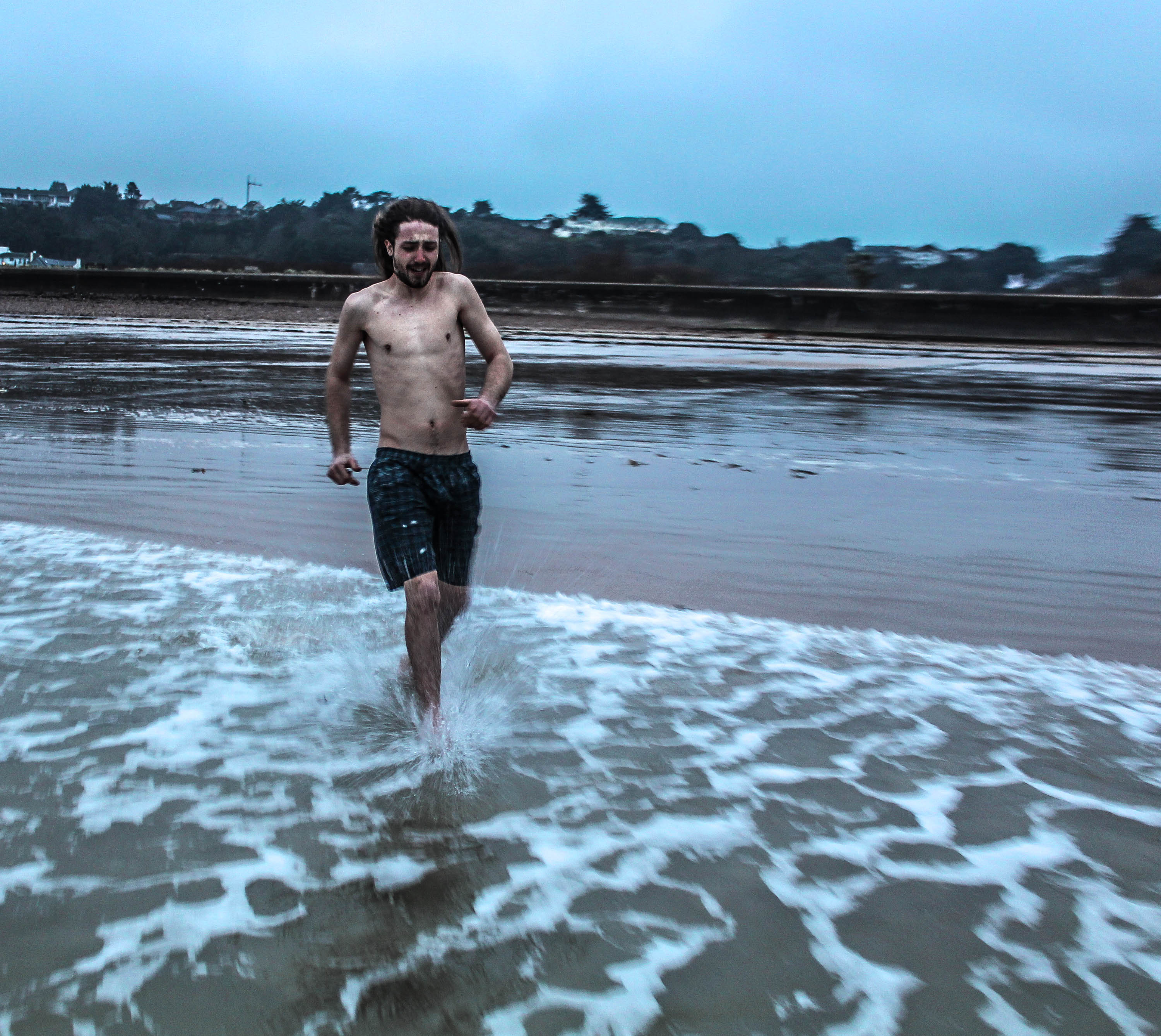
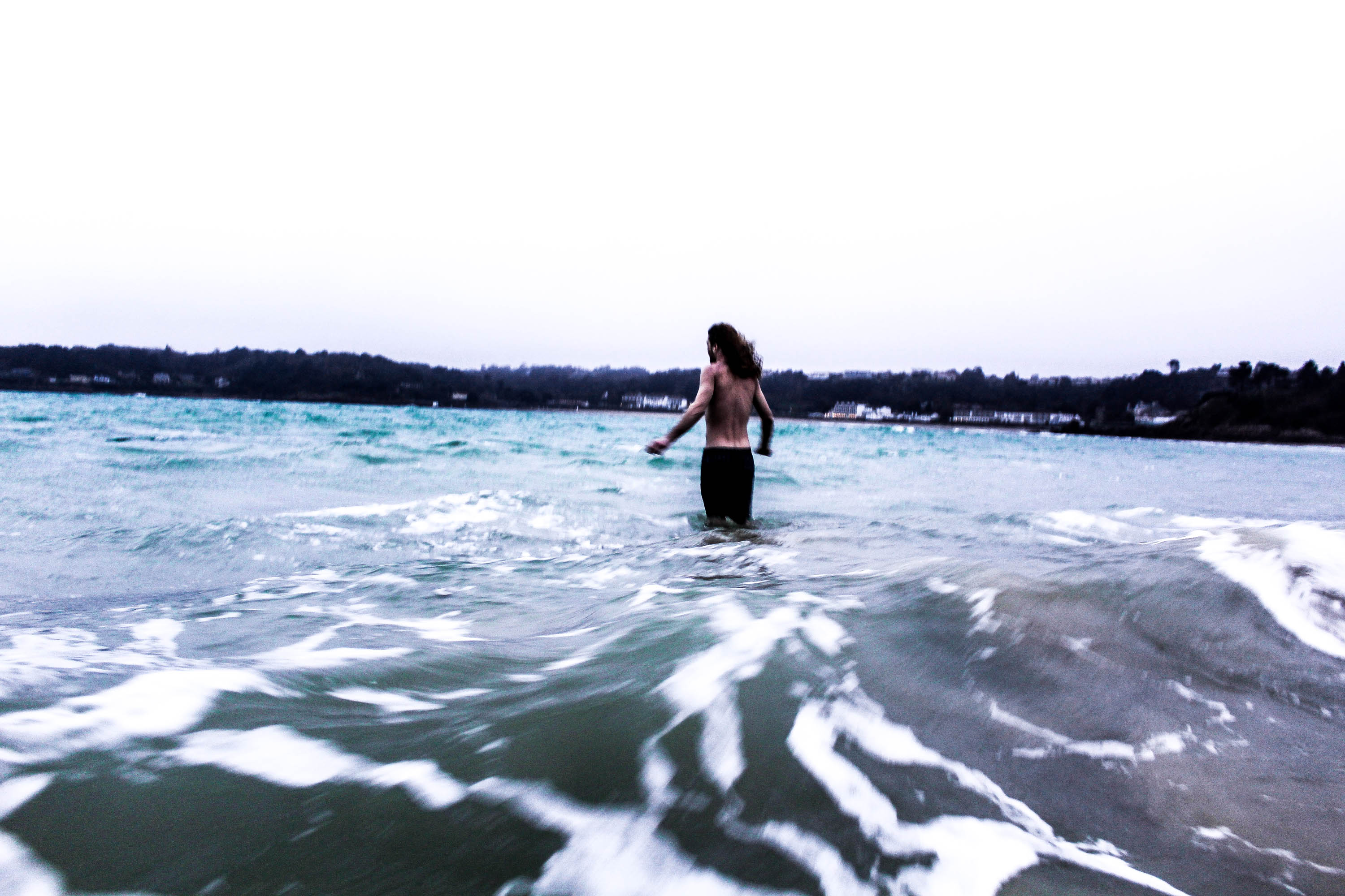
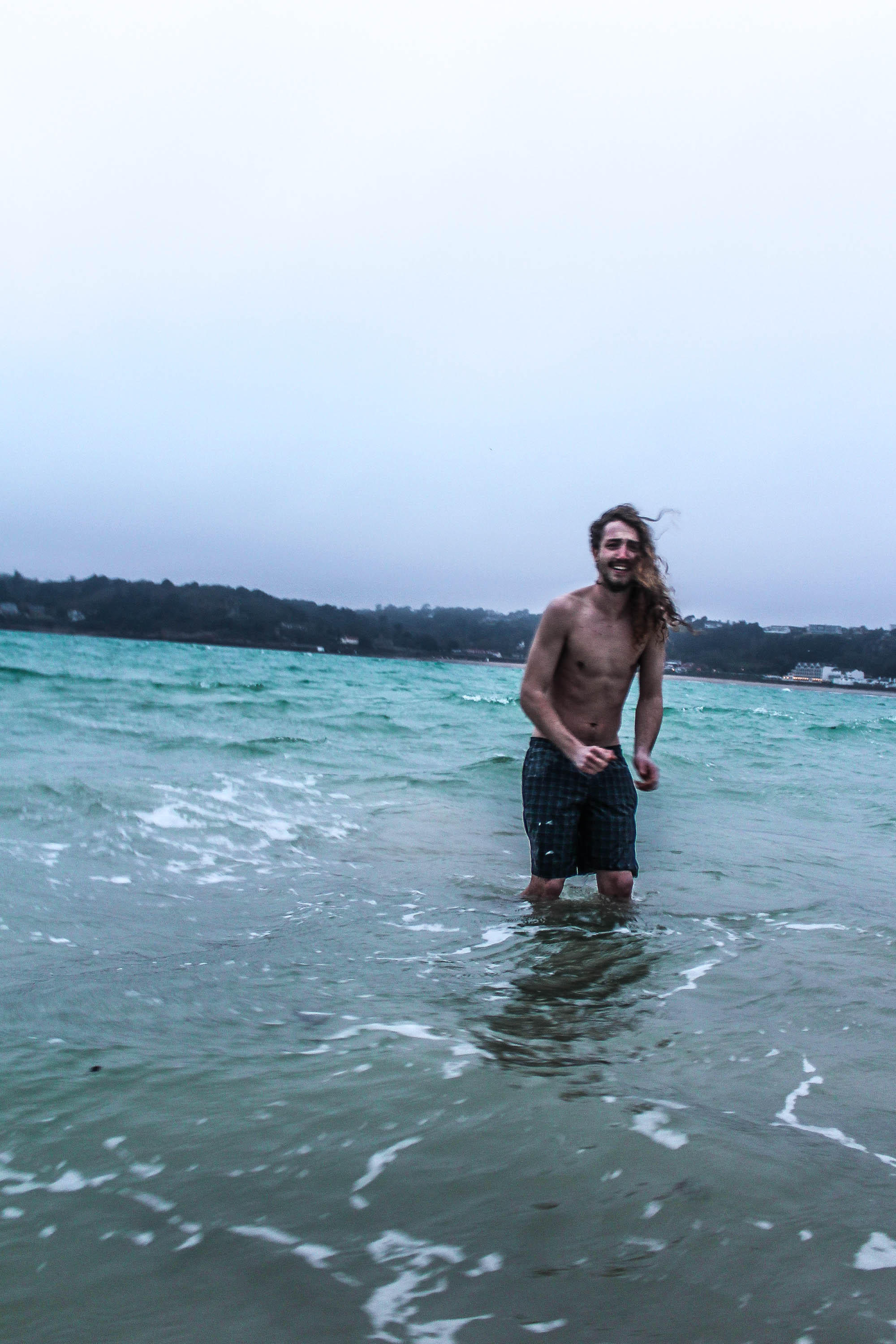
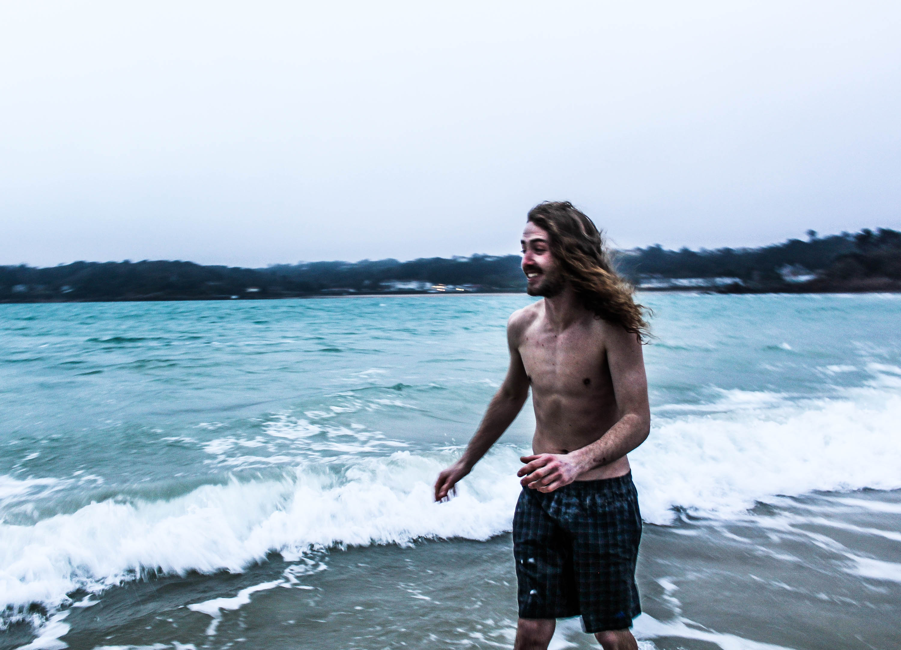
This shoot was inspired by Theo Gosselins photographs of the guy in the sea, the initial idea was to go deep in the sea and go swimming, however this didn’t quite go to plan as it was too cold.

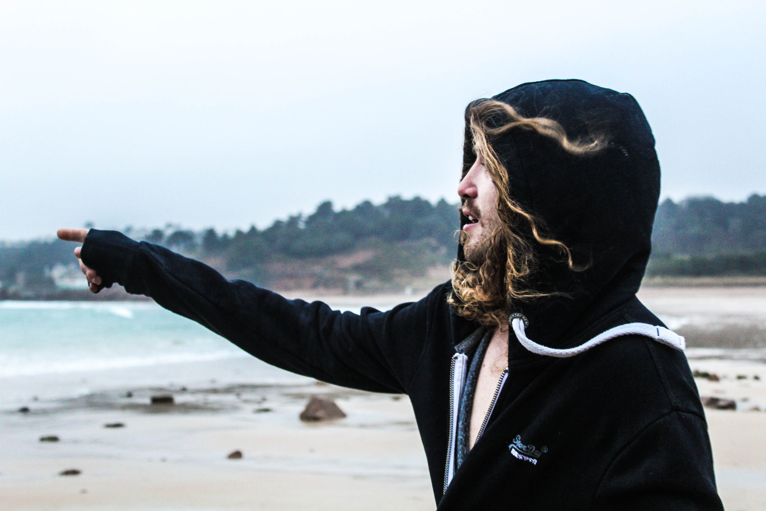
I love this photograph as he’s pointing at the sea, which indicates what he’s about to do, as he’s topless underneath his jumper. This photograph reminds me of Theo Gosselins work as the foreground is very detailed and clear and the background is very out of focus, therefore using the depth of field, by having a wider aperture.  For this photograph I purposely used the natural lighting to benefit my photograph, therefore the highlights of his face and hair are lit up nicely.
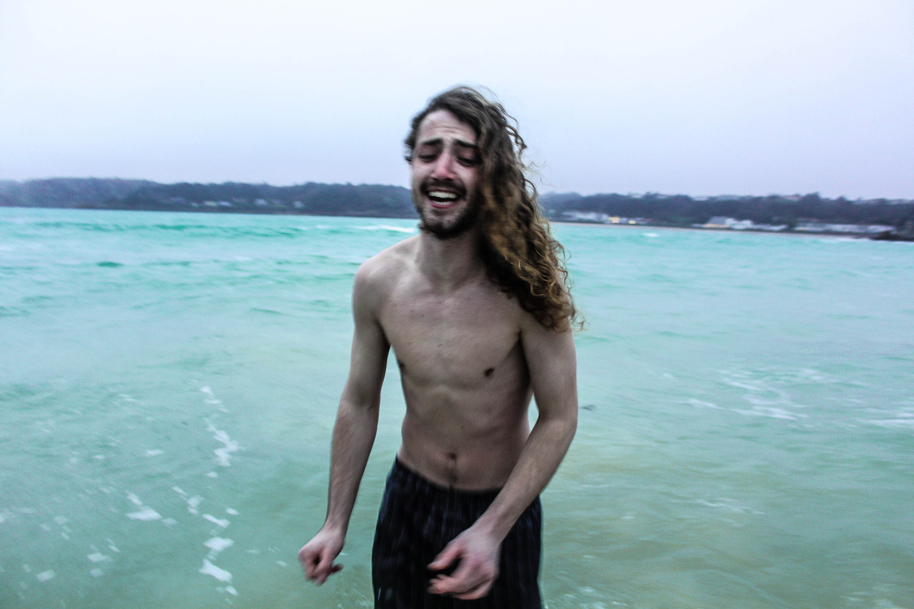
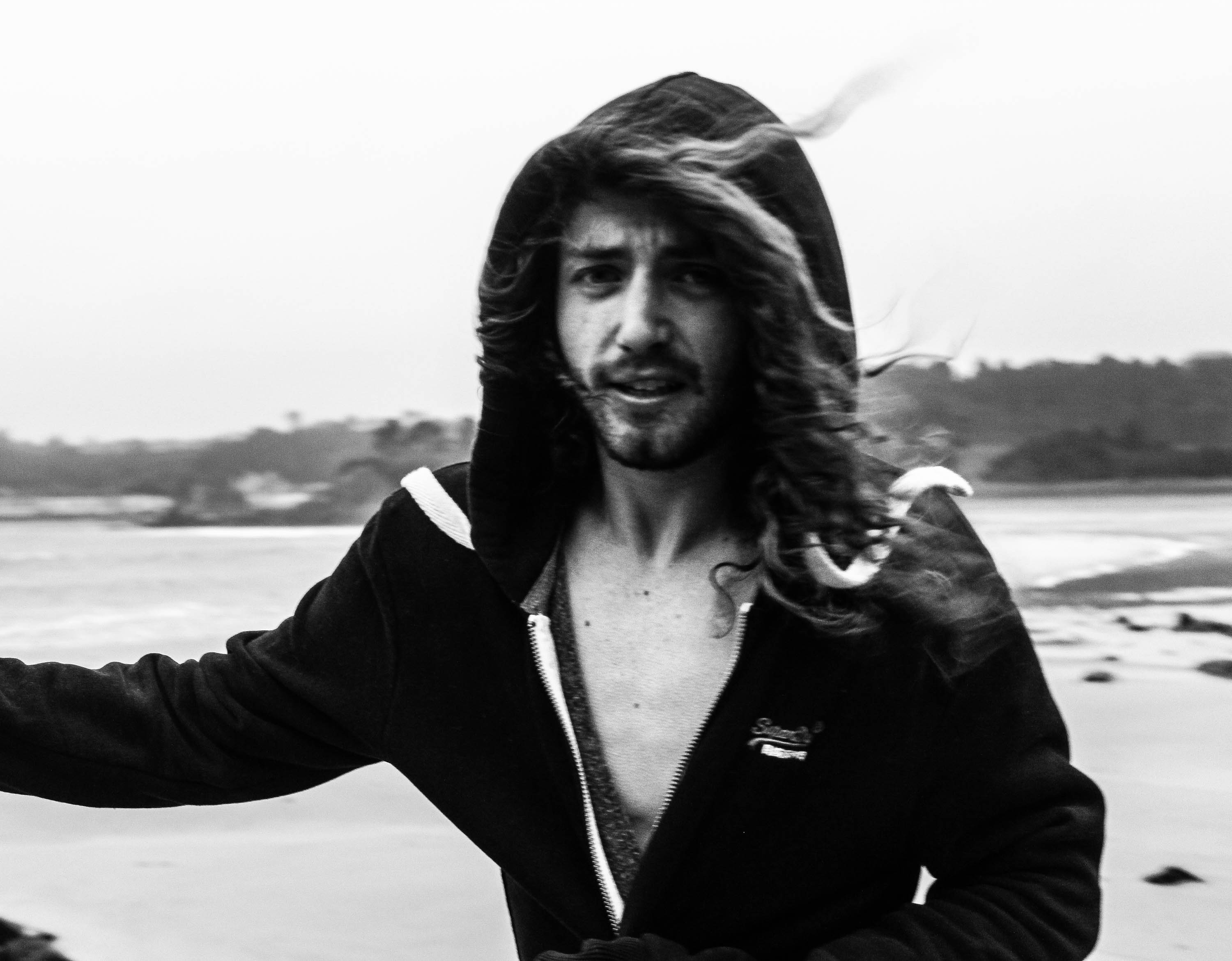
For the photograph below, I edited it in a way where there was a huge contrast, therefore making the skin stand out and the use of his facial expression, which is important for the mood of the photograph. The natural lighting has also created a split lighting effect on the model face which is a technique that produces a sense of drama to a portrait, it is a way to add a unique look and feel to a photograph. The sense of drama displayed in the photograph by the use of split lighting works nicely, as his facial expressions are vert dramatic as well, as if indicating he does not want to go in the sea as it’s too cold. The model is the main aspect of the photograph, as I’ve used the rule of third so he is the center focus. Also the use of the dark clothing makes his flesh stand out more, and makes him stand out more against the over exposed background.
 

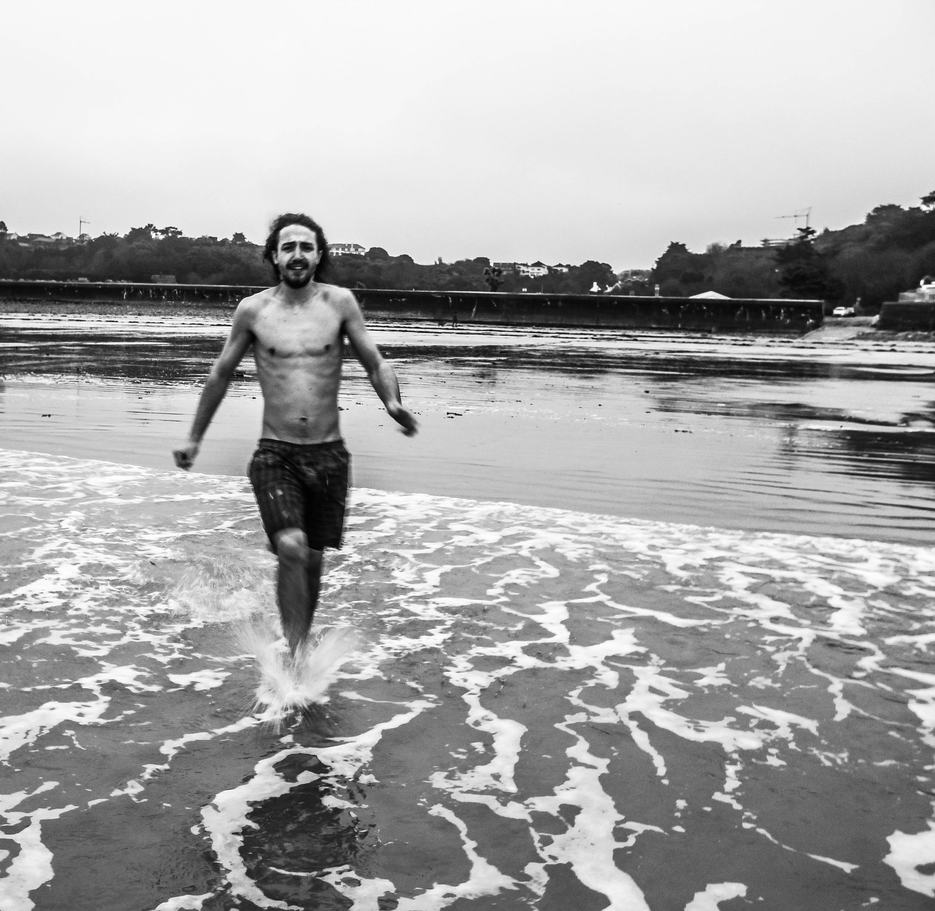
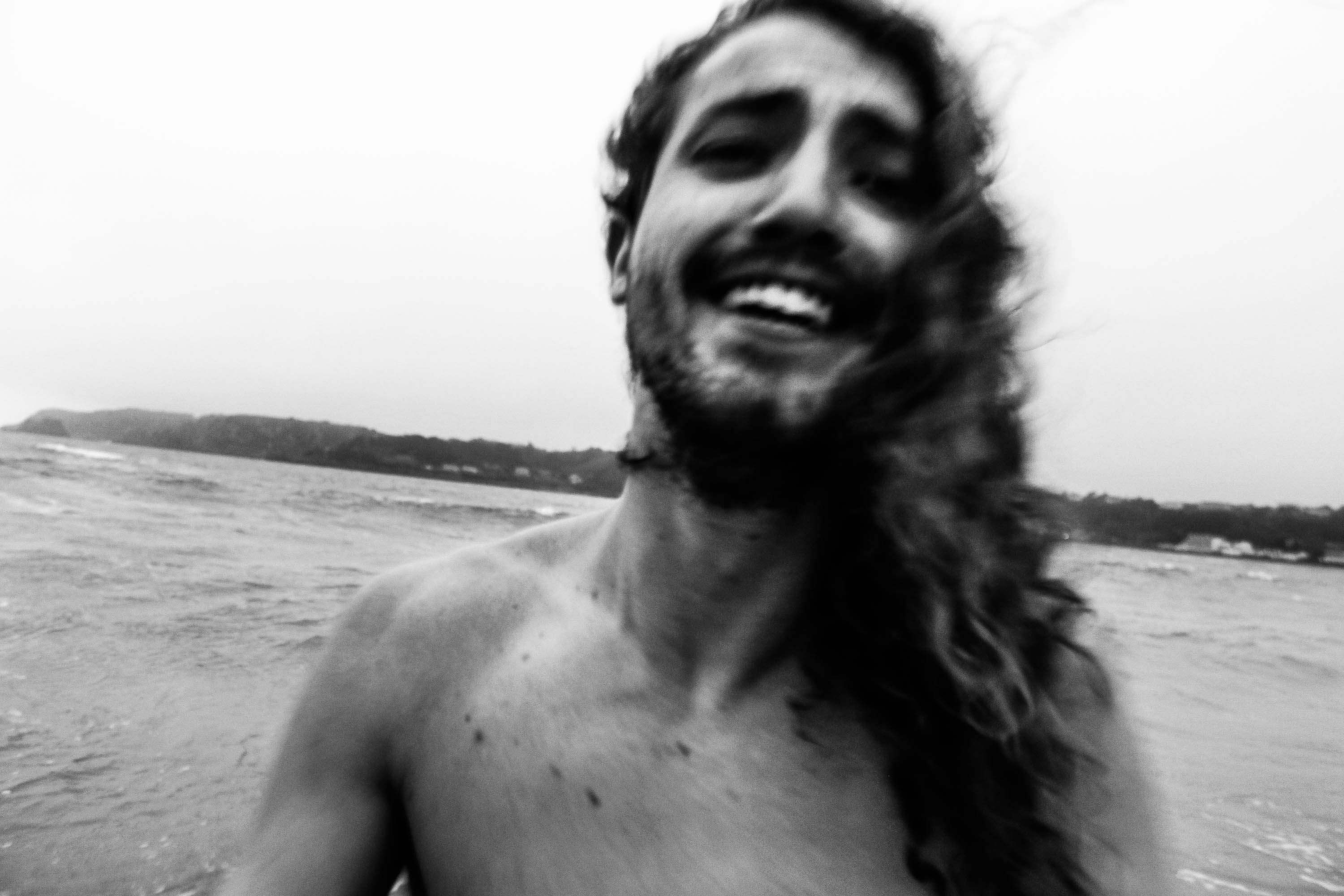
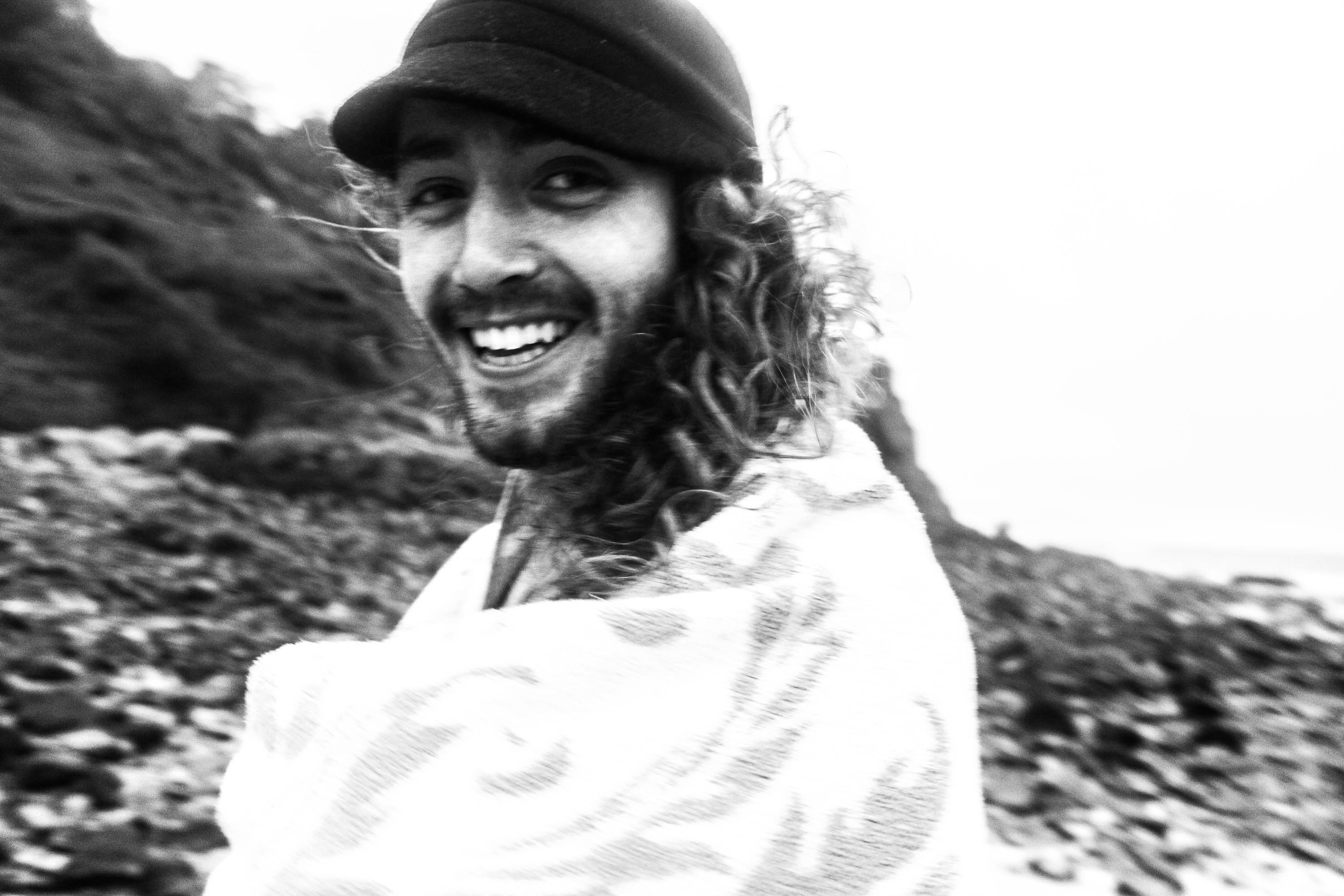
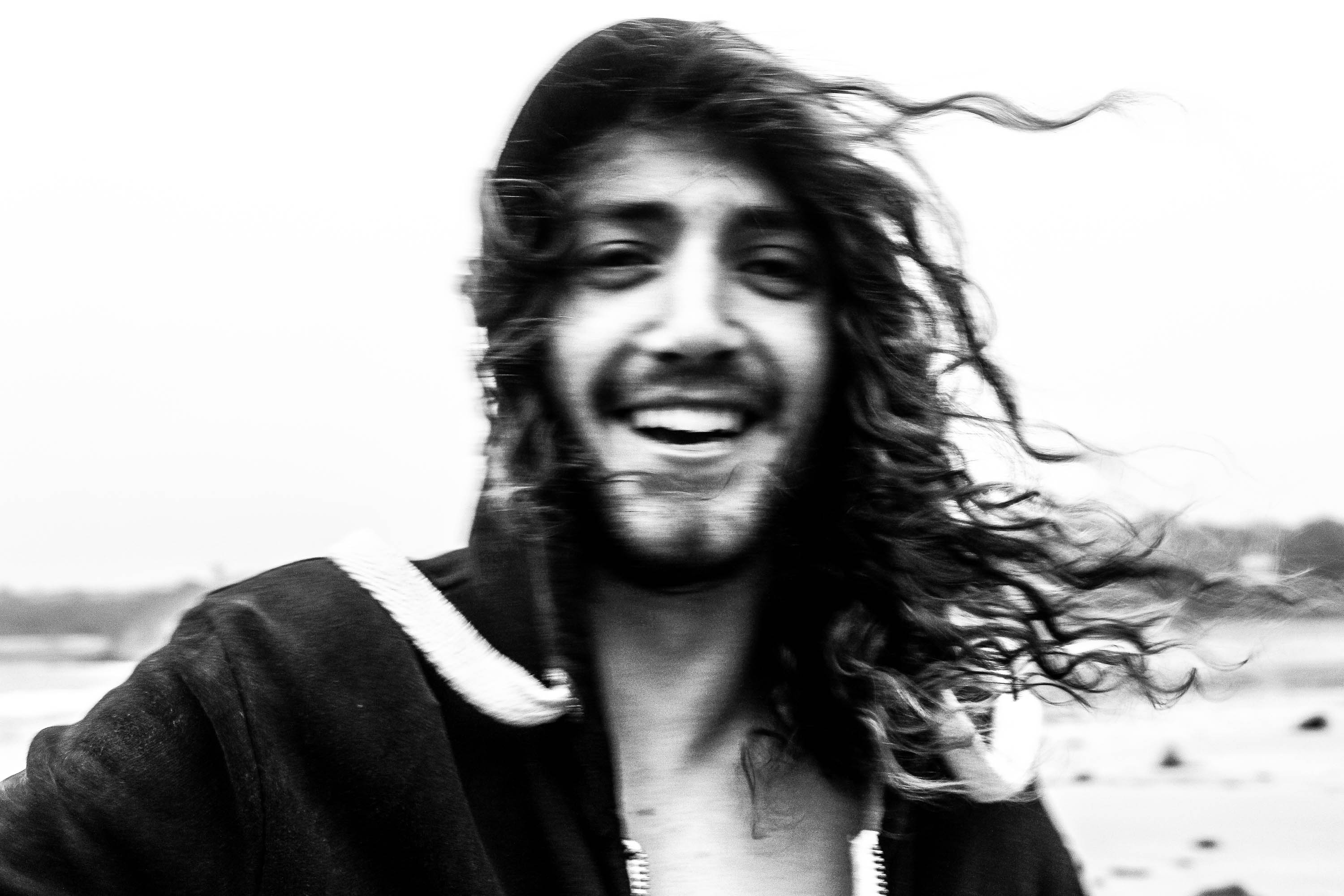
I love this photograph because it really captures the mood, in my chosen environment, how I like to surround myself with positive people, as shown by his facial expressions. This photograph works well as it’s over exposed and in black and white which makes him stand out more and for the viewer not to be distracted by the background. The use of the slight blurred effect represents the movement and energy of the photograph, which wouldn’t be represented in a still image shot. Also the way I have cropped and positioned the camera close to the models face, represents how personal I am with the model, and reflects the emotion behind the photograph.
The composition works well in this photograph as the white wash of the water allows his body to stand out against it. Therefore drawing the viewers eyes immediately to the main subject in the photograph, which is him. I also like the movement behind this photograph, how he’s running into the water and the water reflection on the sand shows the movement of the sea, which reflects the energy behind the picture.

Personally for this photograph I would have preferred if the buildings weren’t in the background as I find they’re a bit distracting and take away from the model in the sea. I also think it makes it not look as adventurous and as remote as i’d of liked it to look, however by taking this photograph it made me try different compositions  and angles where the buildings wouldn’t be as distracting.
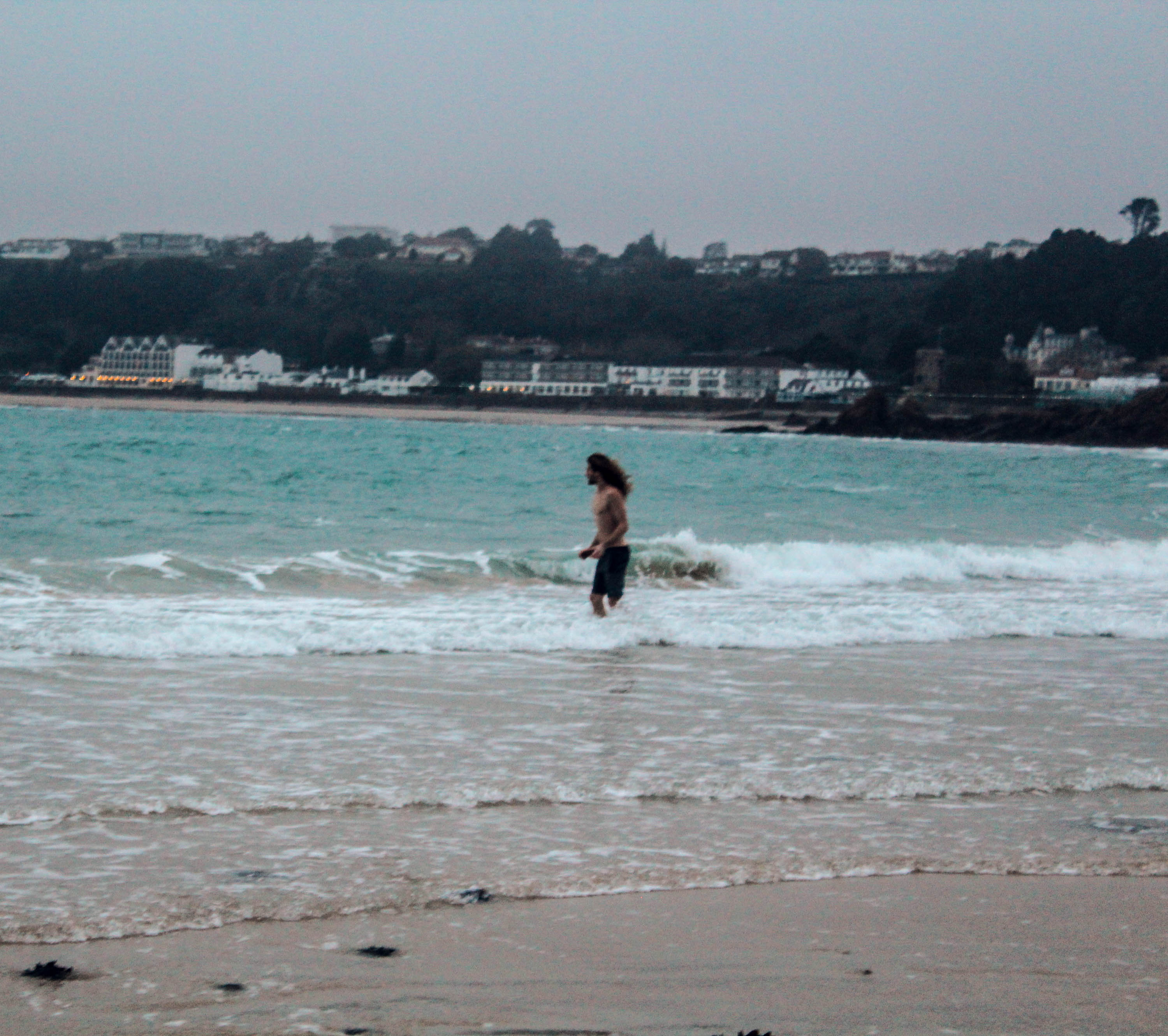
For this photograph I used the rule of third, to make sure he was the focus of the picture. I like the whole body language of the model in this photograph as you can tell he’s extremely cold, which is reflected by the cold surroundings. However he’s still happy, which makes the picture look carefree as he doesn’t care about the consequences as long as it’s fun and exciting, which is what I’m trying to get across with my images as I’m showing my youthful life through the emotions and environments of those around me.
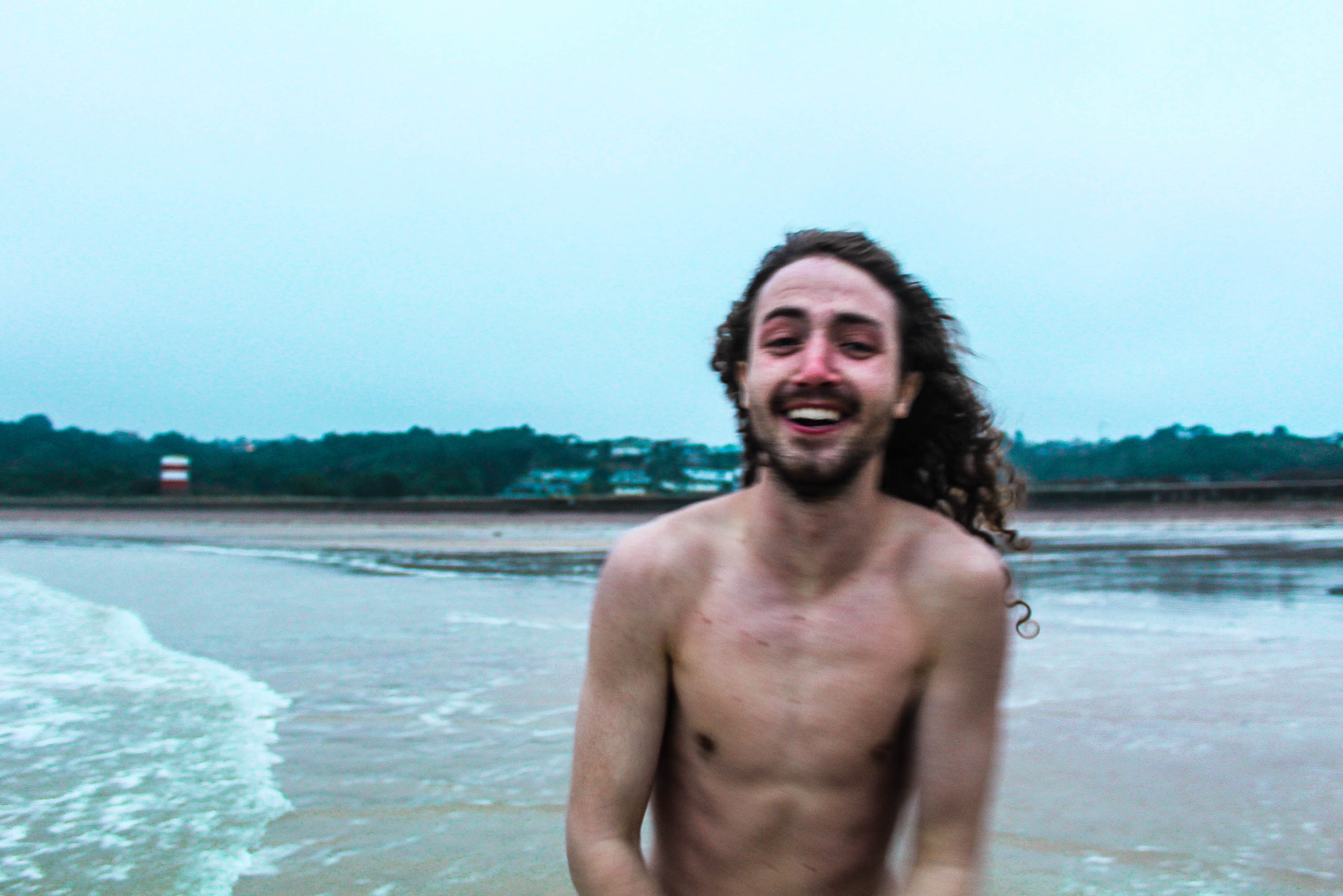
For the image below I wanted to capture the emotional environment I surrounded myself in, so I referred back to the quote;

“When you photograph people in color you photograph their clothes. But when you photograph people in B&W, you photograph their souls.” Ted Grant

This is why I chose to edit this in black and white as it is capturing the souls of the people I like to surround myself in, in my own environment and also the environments I choose to be in.
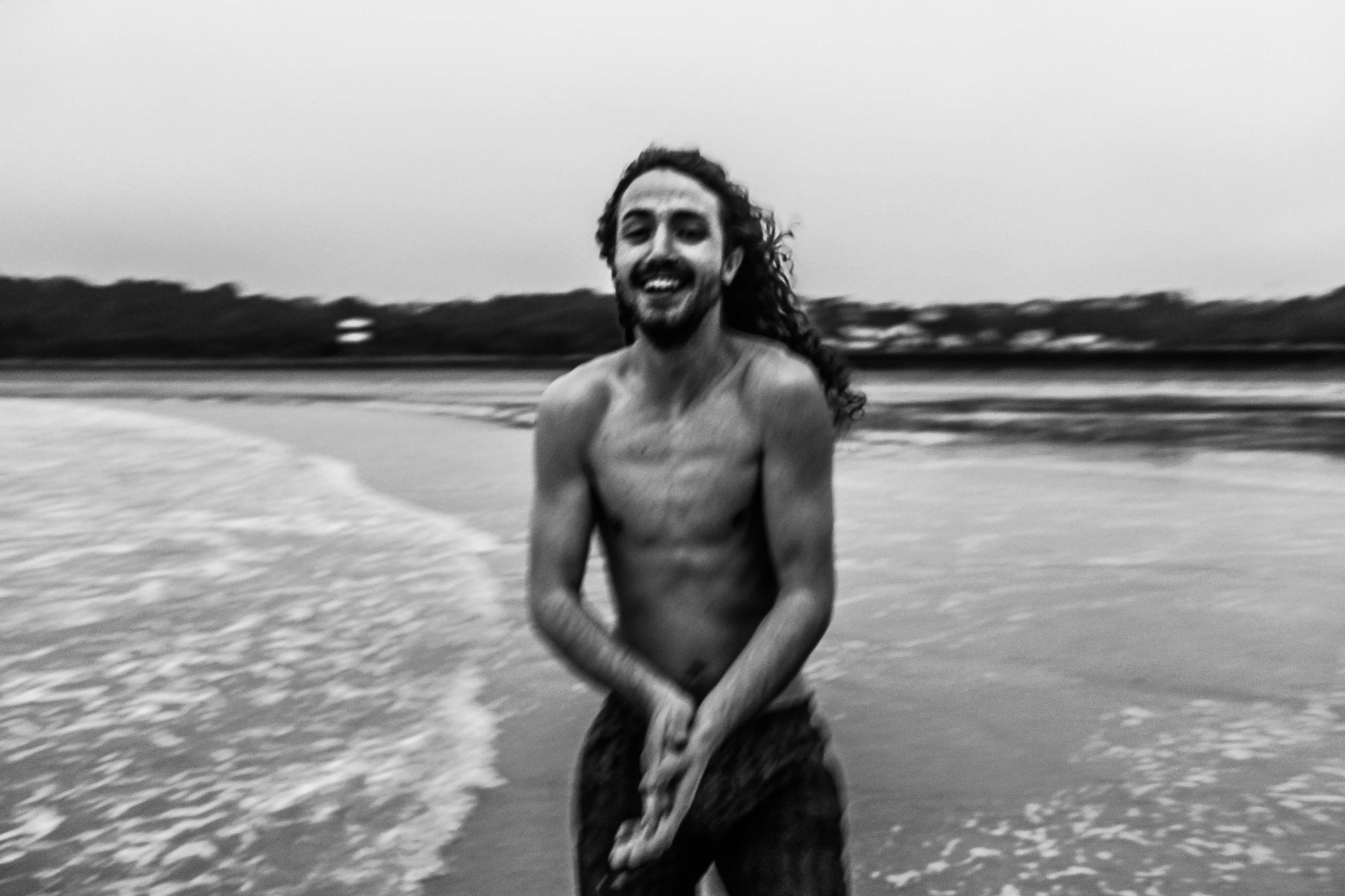
In the pictures below I wanted to keep referring back to Theo Gosselin  and the way he uses a lot of blue and brown tones to make it look almost surreal or dream like, so I edited mine exaggerating these tones.
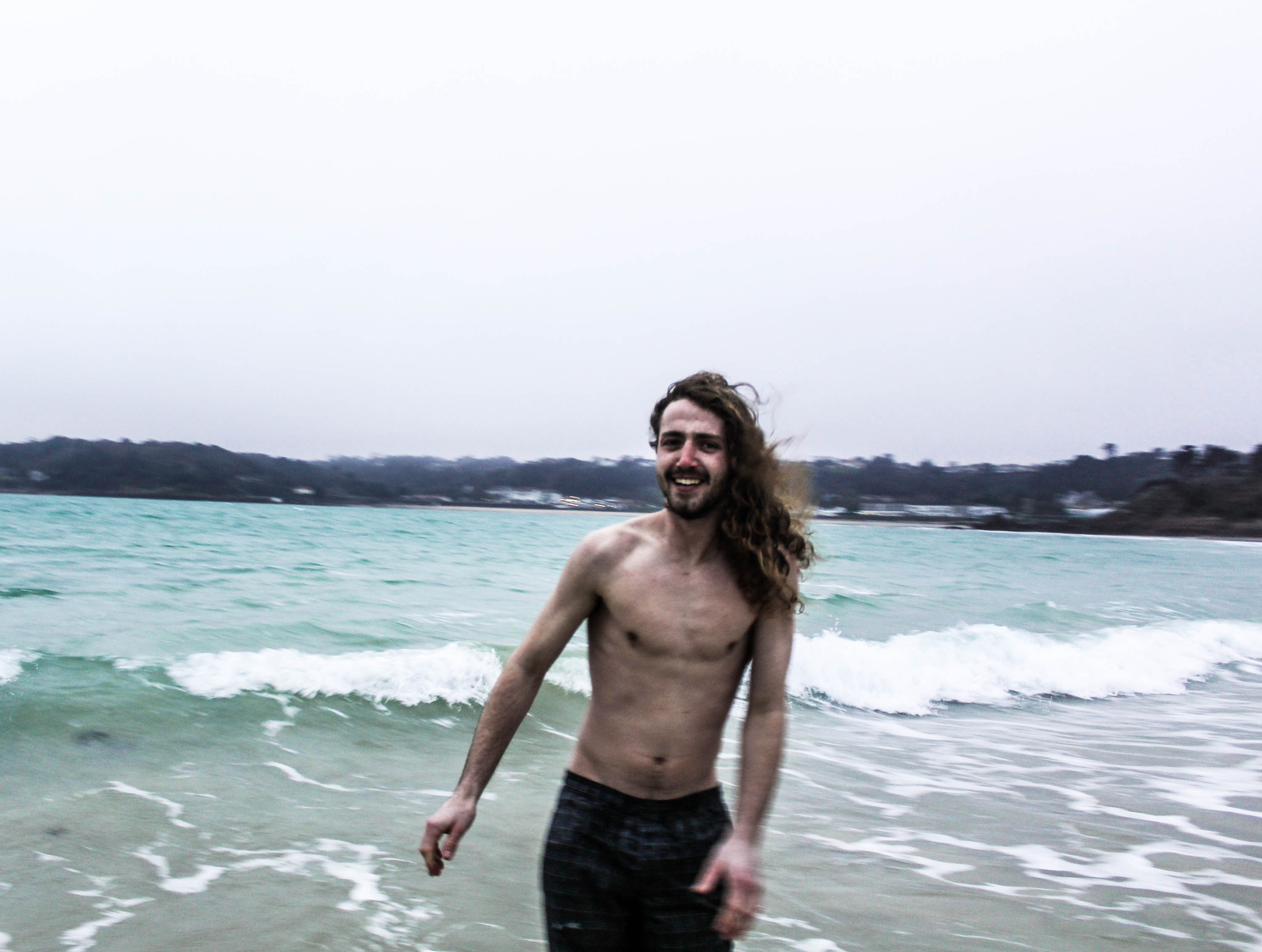
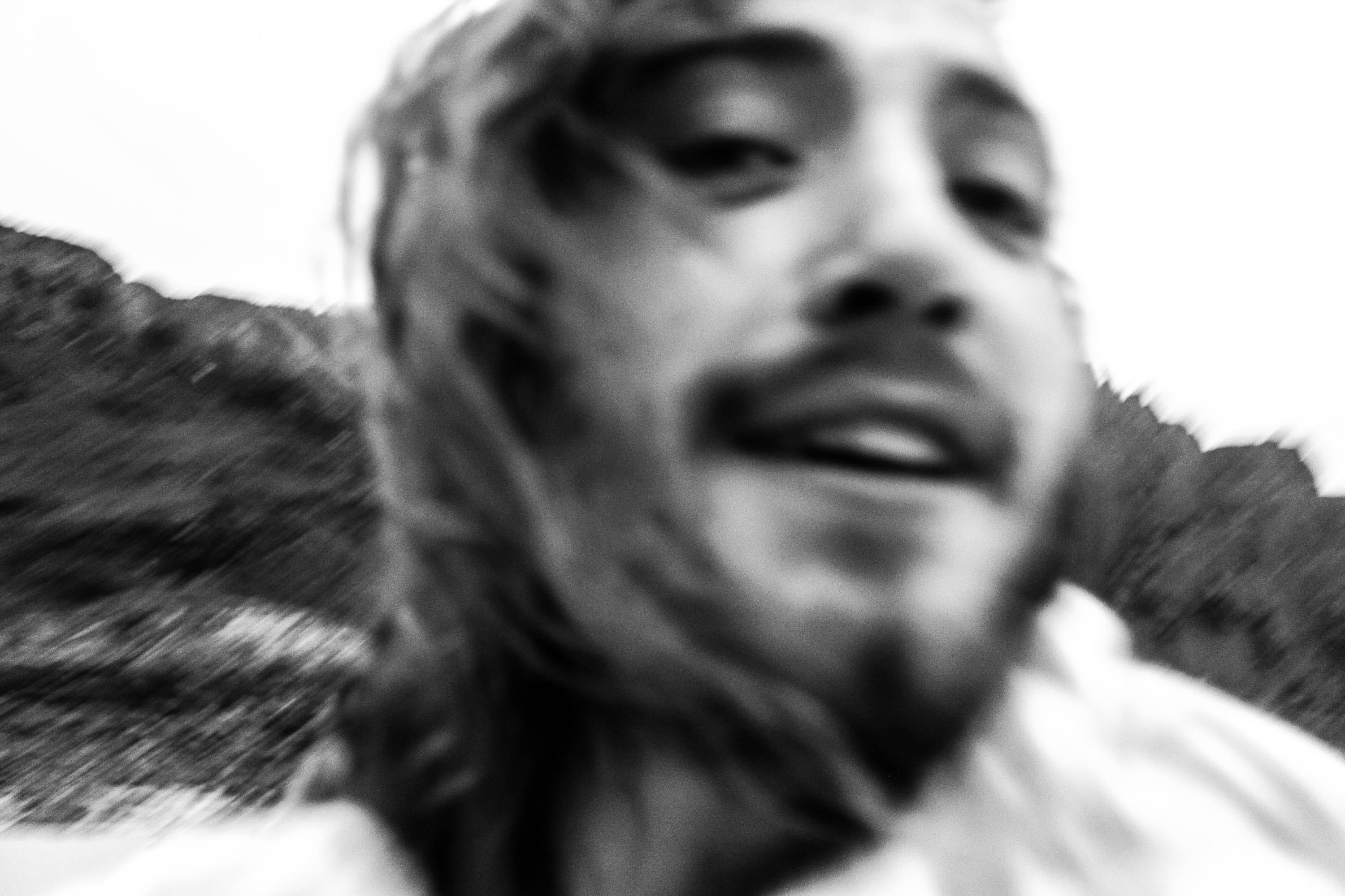
These photos below remind me of Jacob Sobol’s photographs of Sabine, how they’re quite personal and up close. The use of black and white and being over exposed and out of focus, is very similar to the style of Sobols shoots of Sabine, except Sobol uses flash and I chose to appreciate the natural lighting. Referring back to other artists which I’ve analysed I remembered Corinne Days famous quote;

“When a relationship forms between the subject and the photographer, a natural interaction takes place making the images more intimate. ” Corinne Day. 

I believe this quote is very true as the model felt as if he was comfortable enough to act like this in front of the camera due to mine and his close relationship, whereas perhaps if he wasn’t as close with me(the photograph) the photographs wouldn’t have had the same amount of intimacy.
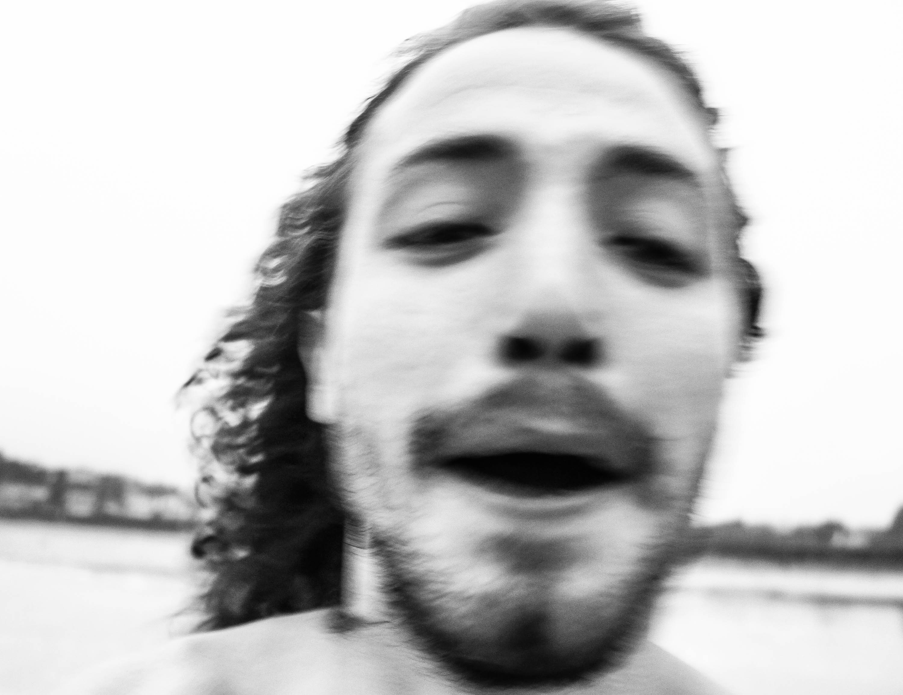
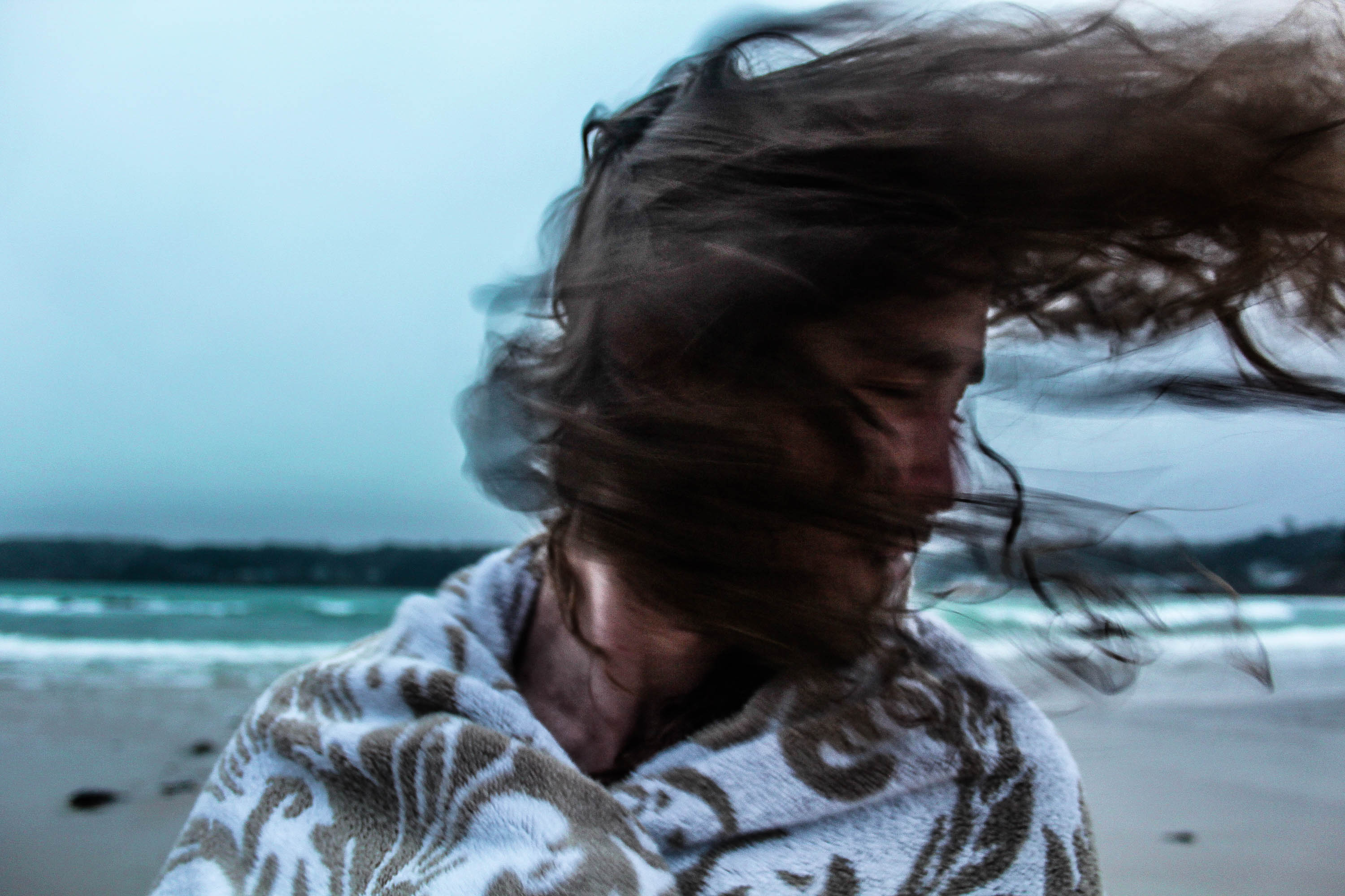
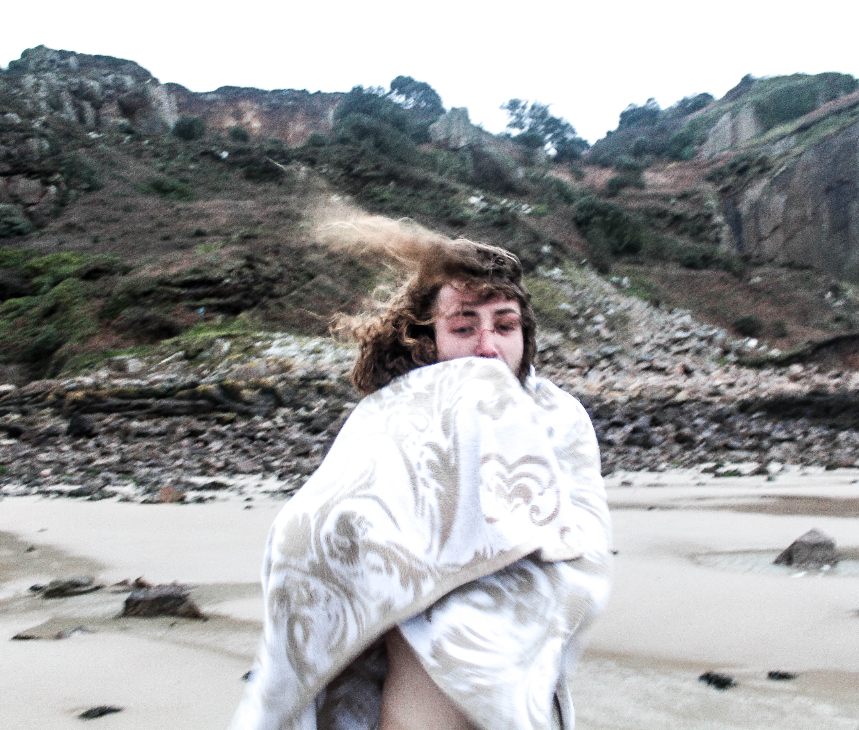
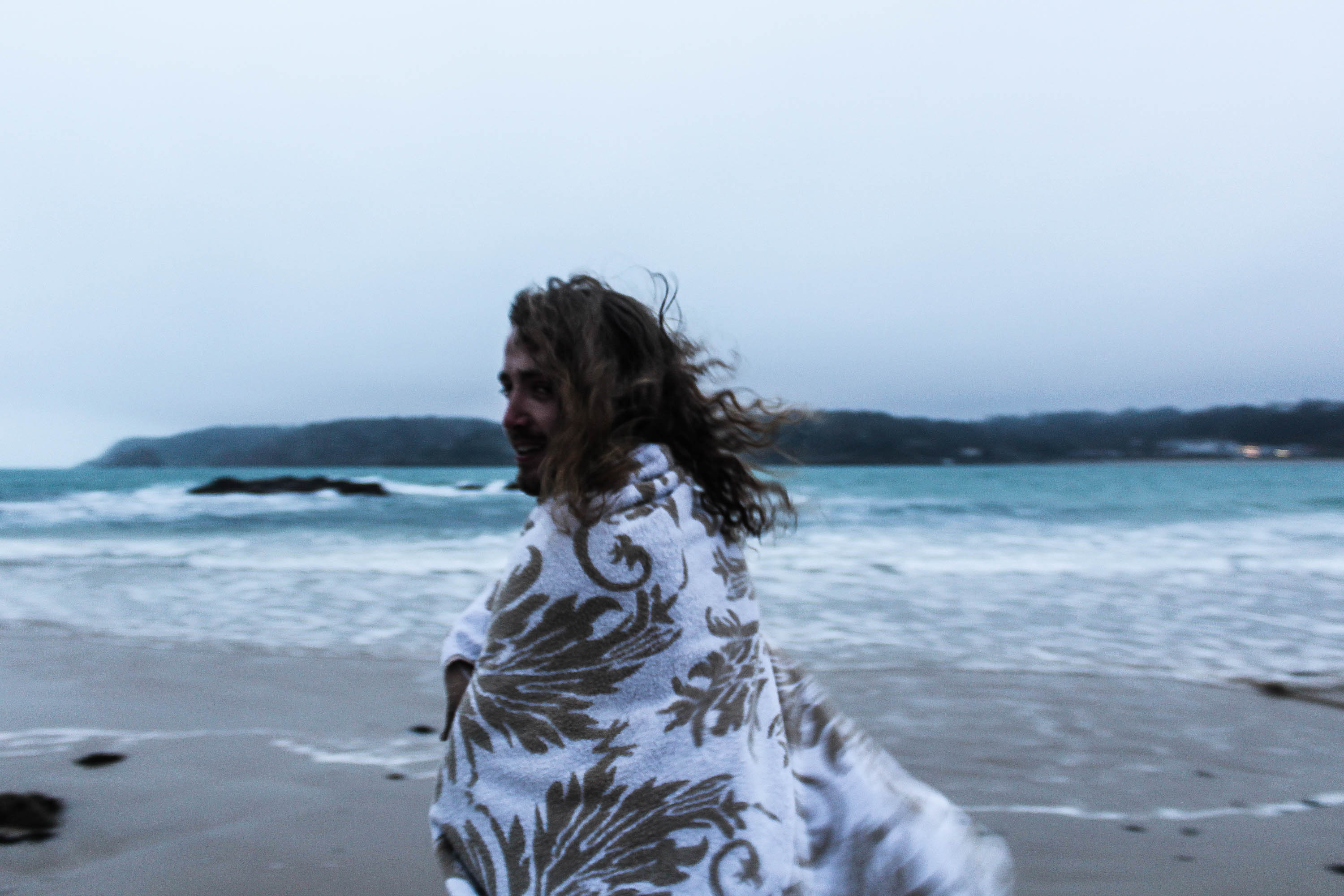
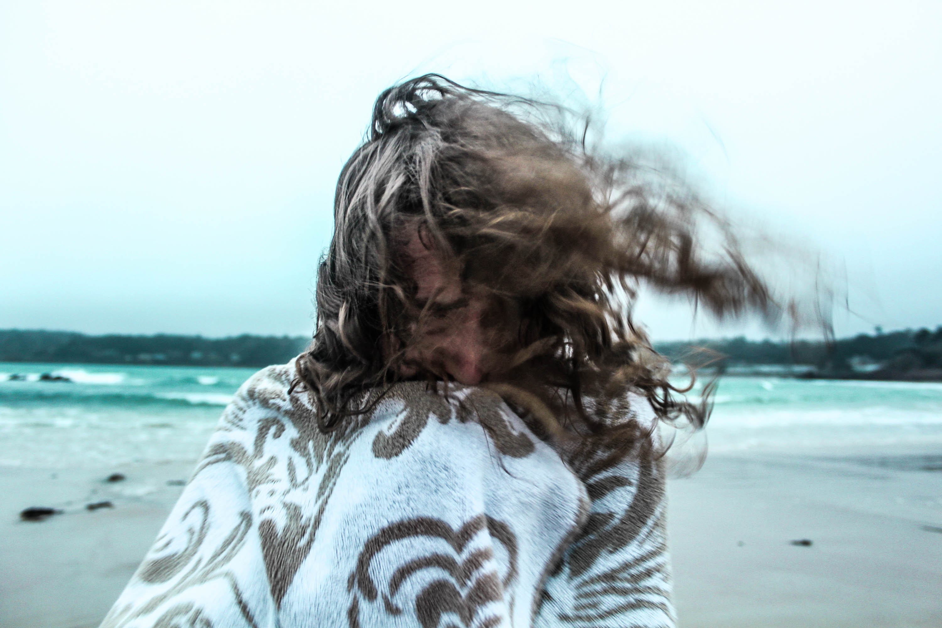
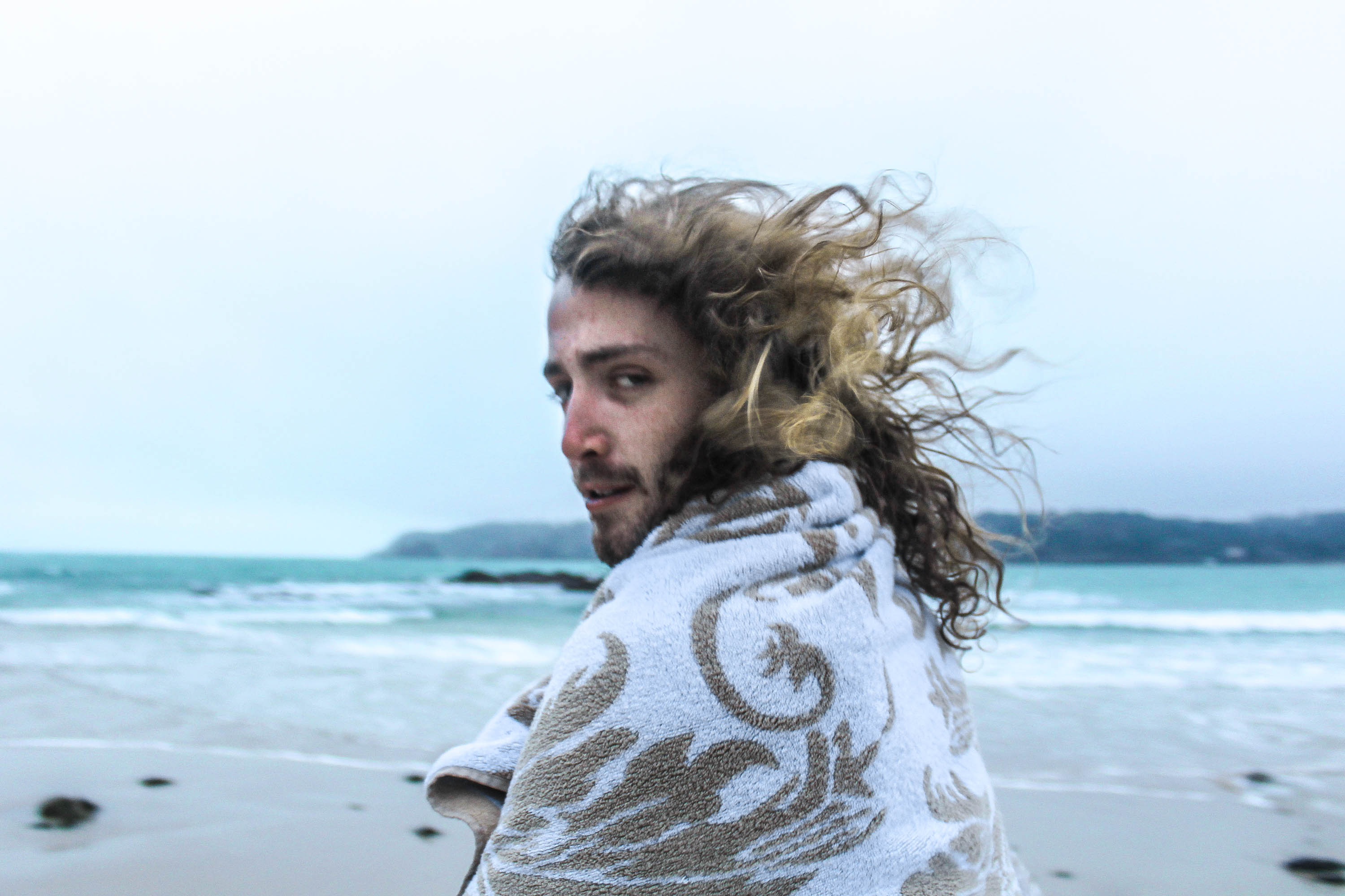
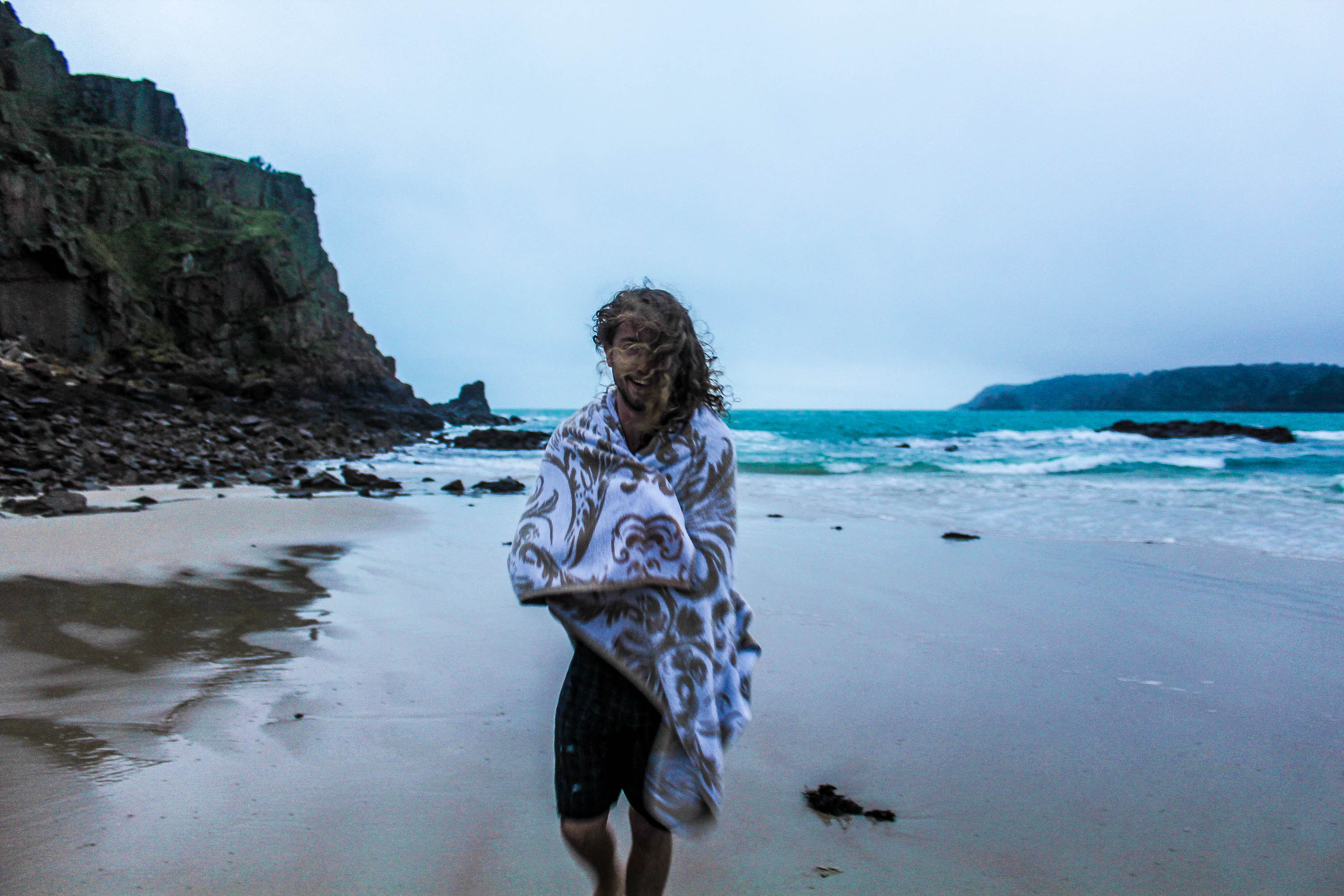
For this shoot I was pleased it was windy this day, as it helped give character to the photographs.
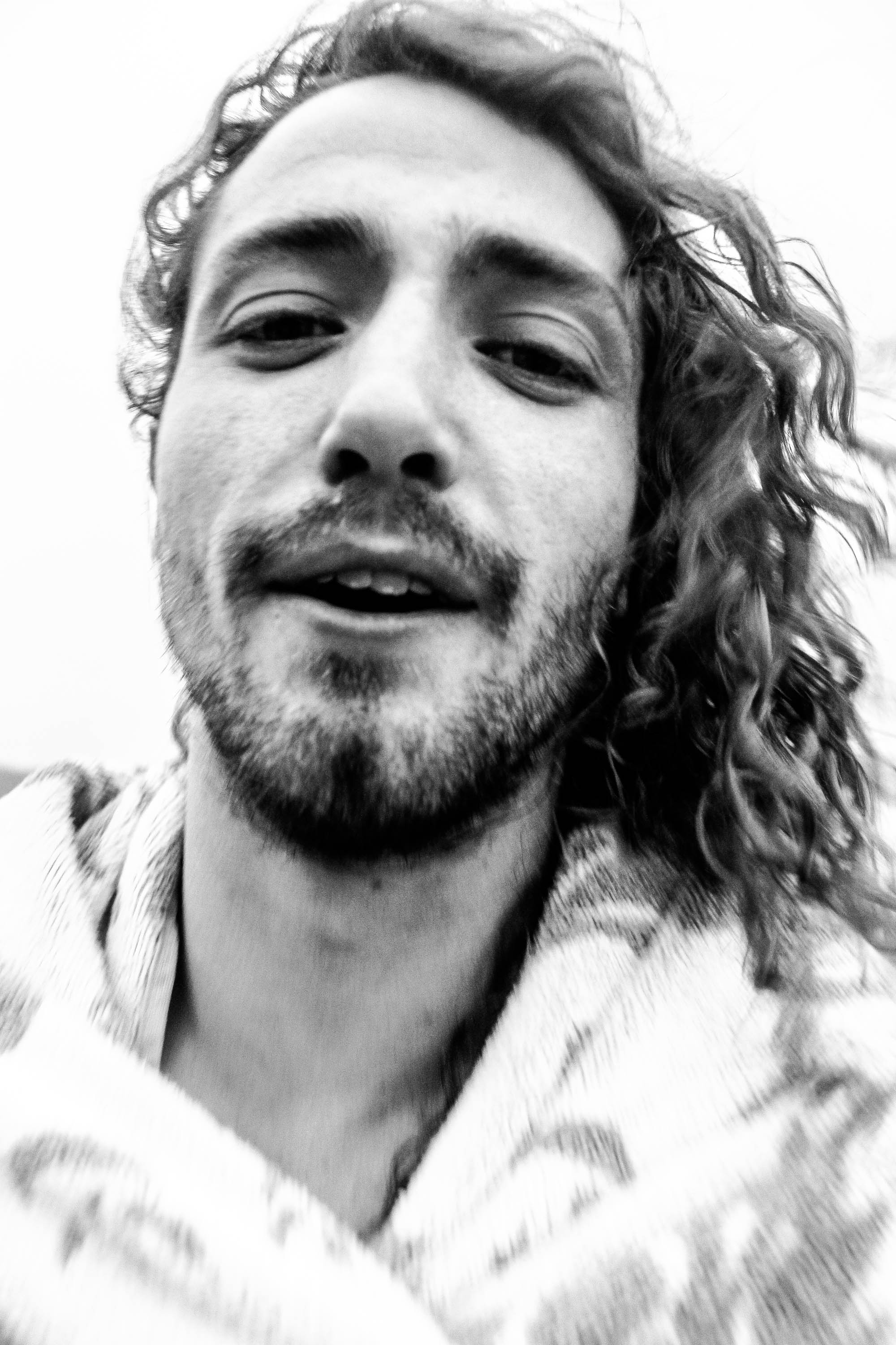
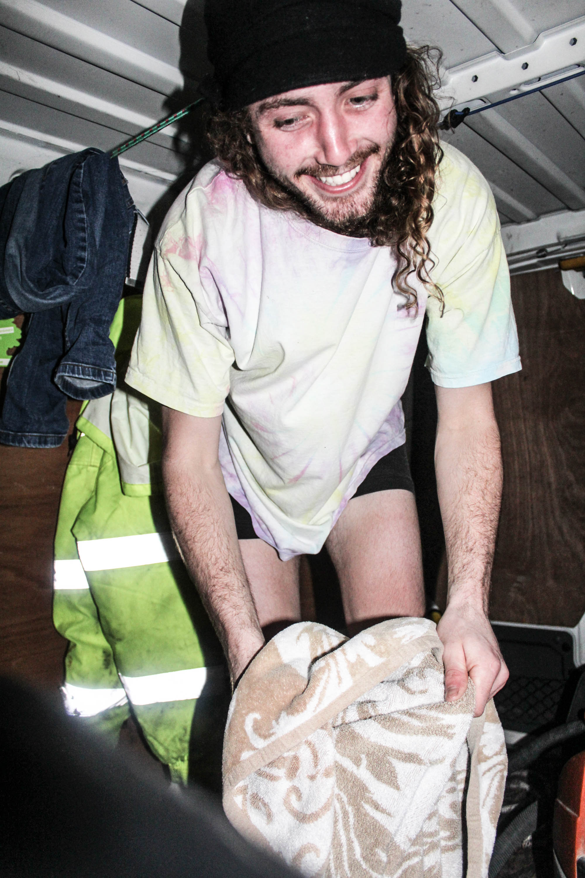
The photograph below is in the style of fashion photography. This is due to the towel being so clear in comparison to the rest of the photograph, it make’s it stand out, and therefore focusing on what he’s wearing.
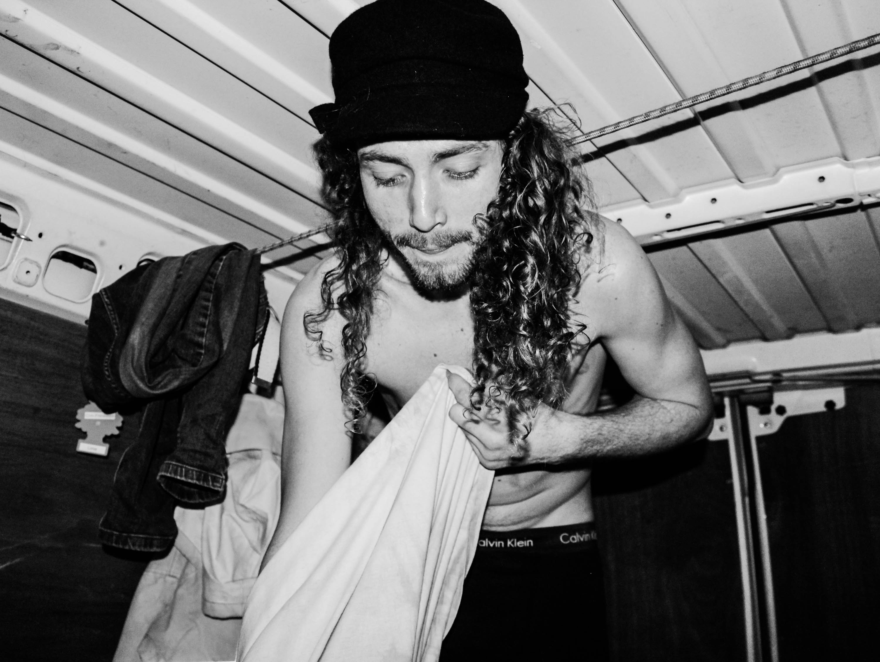
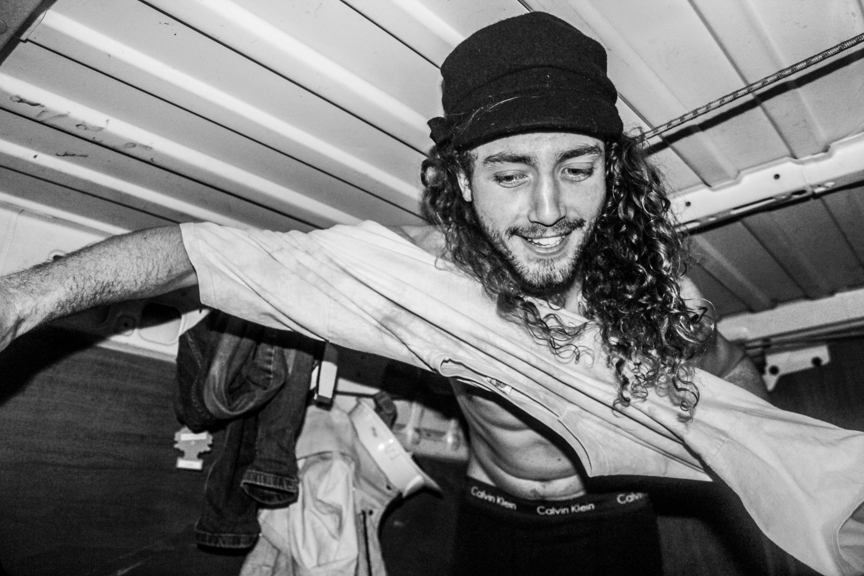
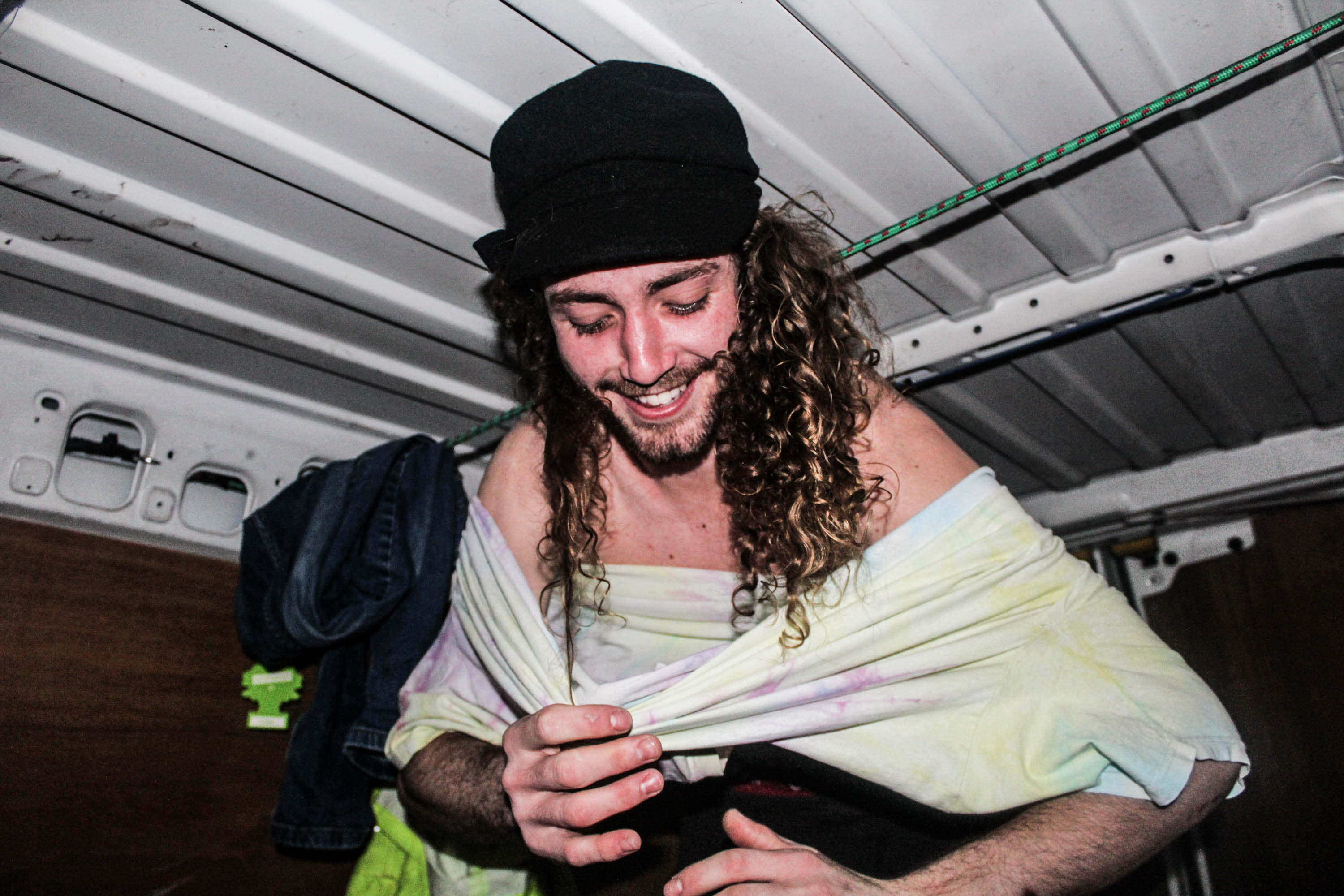
I took these photographs below, as Theo Gosselin represents his life in a van on a road trip, and the model was getting changed in the van so I thought the link with the artist reference corresponded nicely. The images below reminded me of the quote;

“My pictures were always misunderstood as having a sexual theme.” Nan Goldin. 

The reason my images below remind me off that quote is because he’s getting changed, therefore linking to nudity, which makes the viewer think sexually. However, I did not shoot these images with the attention of being provocative, they were taken innocently after going for the swim. He was putting the clothes on, not taking them off, therefore I see it differently to having a sexual theme, whereas perhaps the viewer wouldn’t.
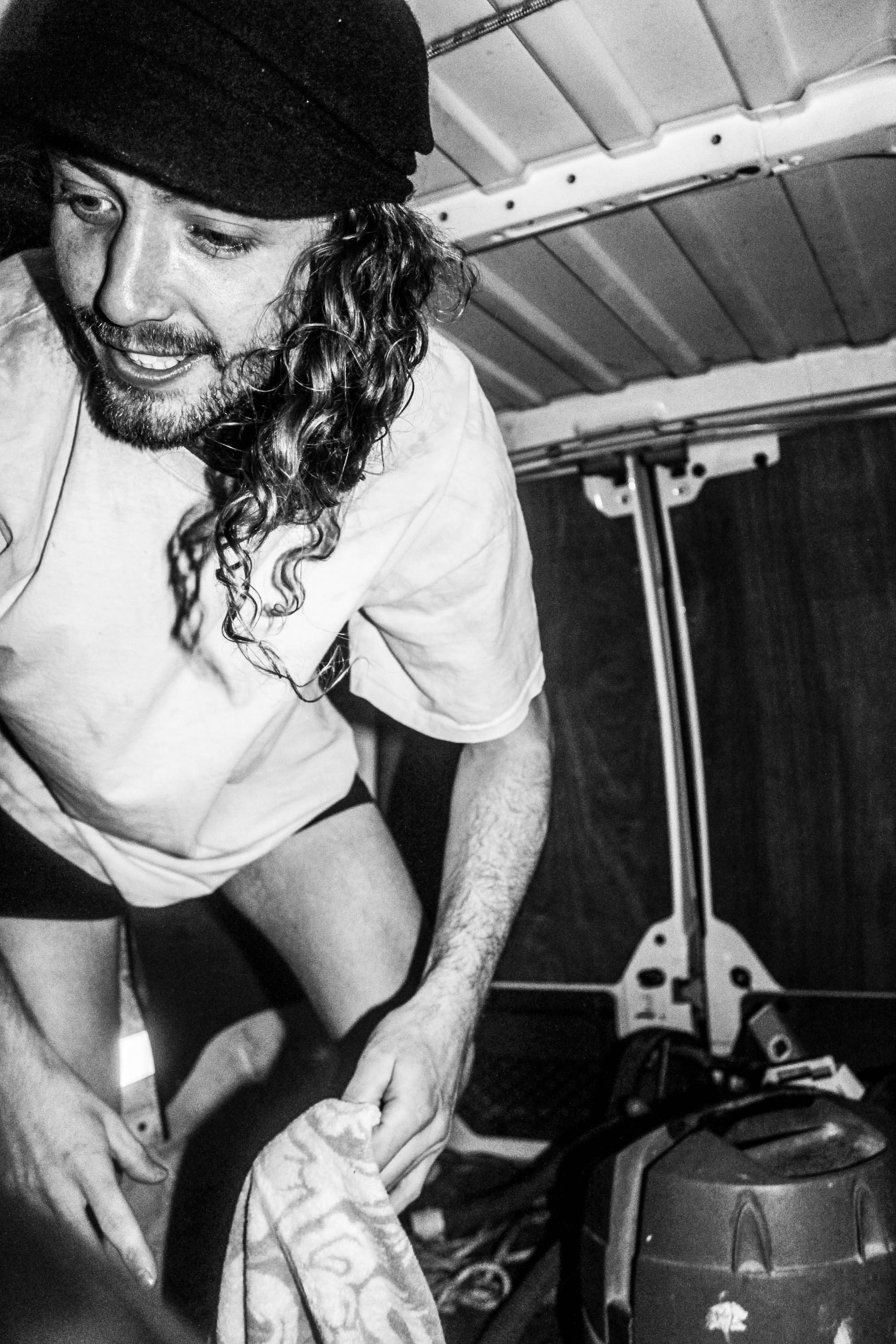
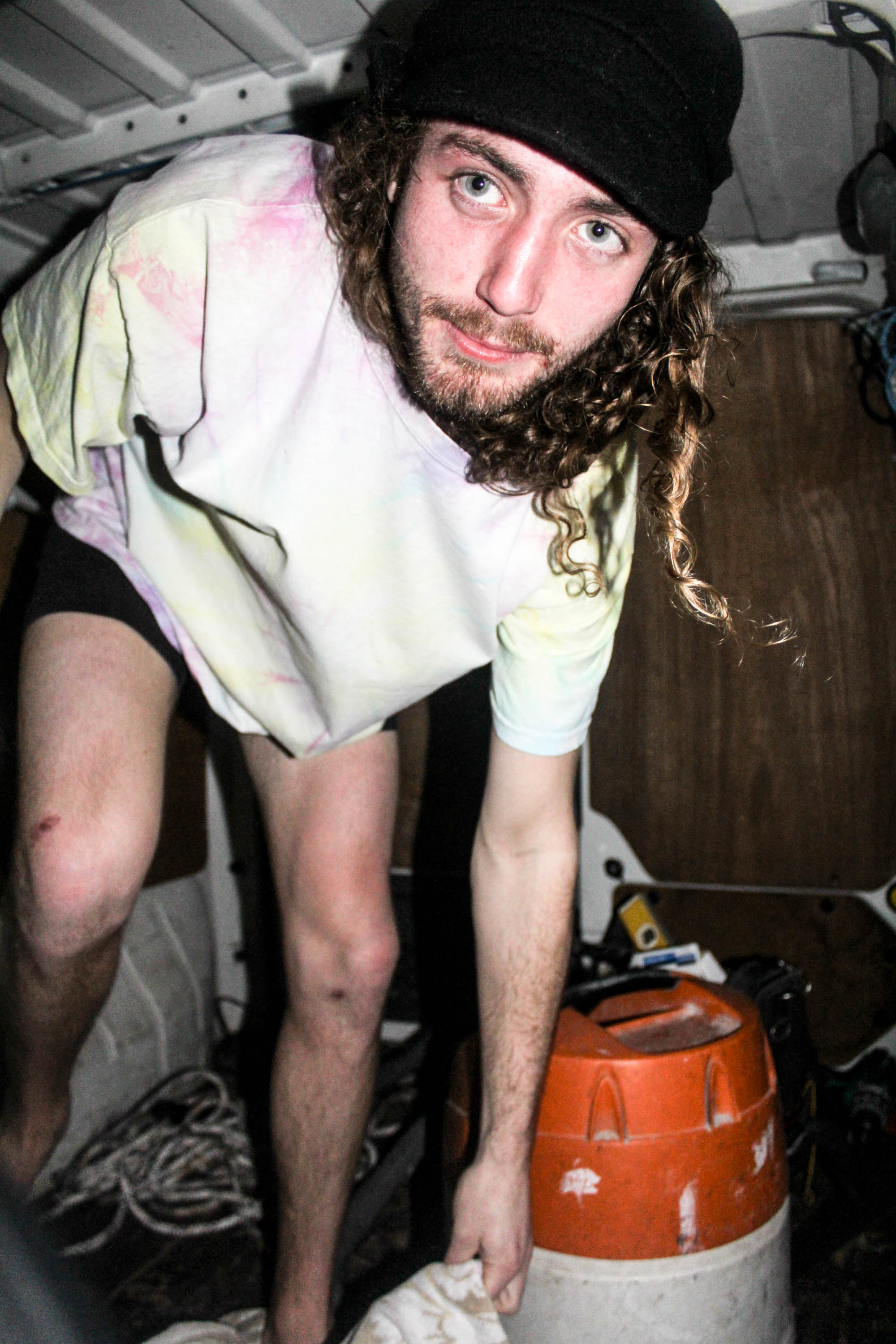
In the photograph below, it was an accident that I left the florescent jacket in the background, however I think it actually works because the viewers eyes are immediately drawn to it and because his legs and boxers are in front of it, it makes you realize straight away that he’s getting changed. Which is what I wanted to be the main subject of the photograph, as it shows how comfortable he is in front of me.

I love these two photographs as a gallery as they’re taken one after the other, going to pick up the towel and then picking it up. These two work well together because as he bends down his eyes are the main subject, and then coming back up it’s his smile,


Ivan Troyanovsky

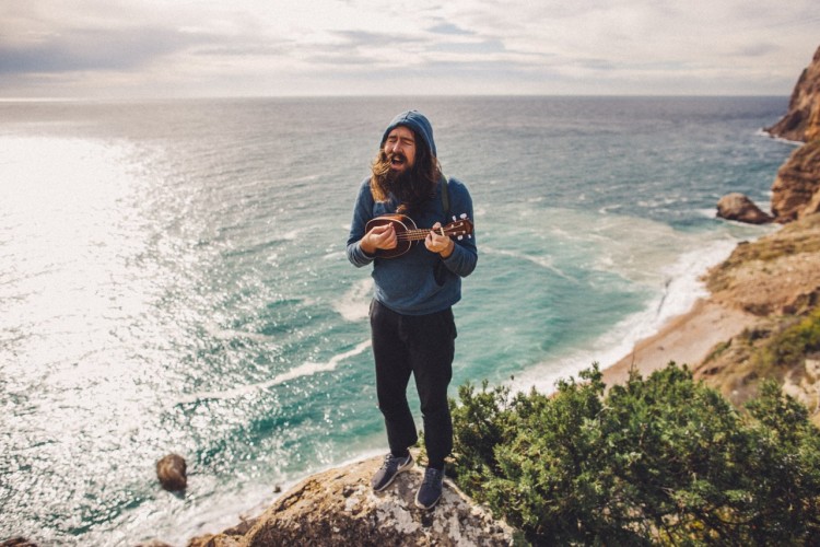
Ivan Troyanovsky is a bit of an unknown artist, however his photographs speak for themselves. He captures his friends and loved ones in exciting environments, capturing events and moments which happen in his life, usually embracing his natural surroundings.

I love this photograph because even though the sea is rough and the weather is bad, the image still maintains a sense of calmness. The photograph is minimalistic and this represents them being isolated, they are segregated from the worries and issues of daily life, hence generating a peaceful, calm aesthetic.

This photograph evokes a happy and carefree atmosphere, as generated by the bright visuals and humorous facial expression upon the face of the subject.

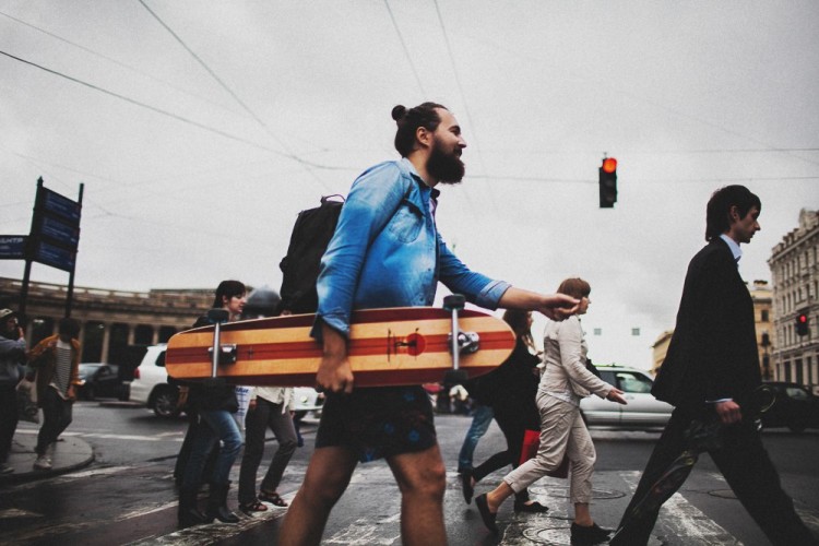
This photograph maintains a strong composition, and places vivid emphasis on the subject in the center. The man pictured in the middle, is obviously intended to be the focal point of this image as demonstrated by the way in which he is a lot more colorful than the remaining photograph. This is meant to represent the fun-spirited, youthful generation in juxtaposition with the industrial and corporate lifestyle which is represented by the monotone, suited figures surrounding him.
Nan Goldin

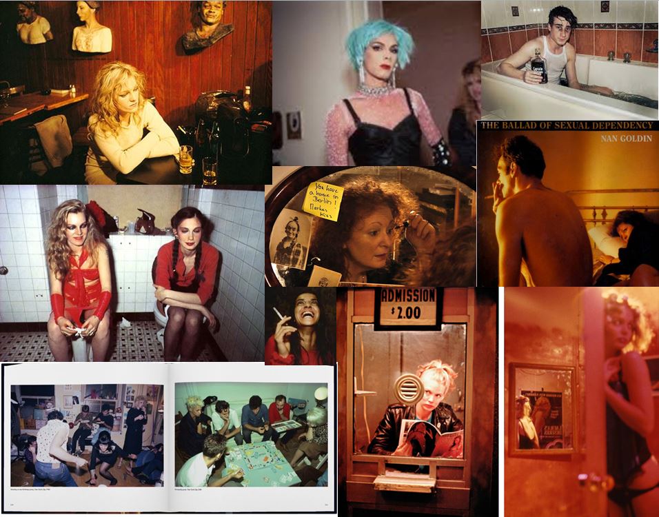
As a teenager in Boston in the 1960s, then in New York starting in the 1970s, Nan Goldin has taken intensely personal, spontaneous, sexual, and transgressive photographs of her family, friends, and lovers. In 1979 she presented her first slideshow in a New York nightclub, and her richly colored, snapshot like photographs were soon heralded as a groundbreaking contribution to fine art photography. The Ballad of Sexual Dependency—the name she gave her ever-evolving show—eventually grew into a forty-five-minute multimedia presentation of more than 700 photographs, accompanied by a musical soundtrack.

This therefore links to my project as I will also be capturing those around me and pushing social boundaries, such as photographing flesh or partying. Literally just capturing the true life of a teenager.

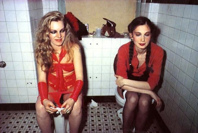
I love this photograph below, as outside of the toilet they probably look like very strong and independent women, due to the bold makeup and courageous outfits. However put them in an all women environment and they make themselves look vulnerable and unattractive. I like the use of flash in this photograph and color scheme of reds and browns, which are colors which compliment each other nicely.

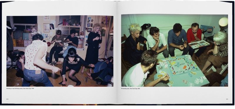
The two sets of photographs work well together as they show perhaps a pre-drinks gathering and also a after party. Or it could just be the same event but just showing the contrasts from before a drink to after a drink. The photographs are well shot as Goldin captures them from slightly a raised perspective, therefore capturing a lot more detail than just a straight on shot.

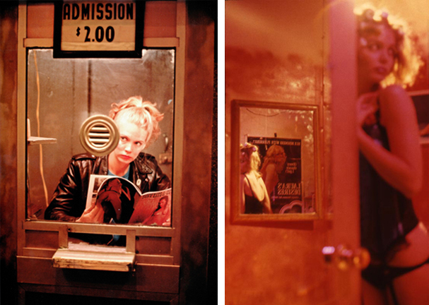
I like the way these photographs have a red tone, creating a sexual and energetic vibe to them.

Corinne Day

Corinne Day (1965) is a British photographer whose influence on the style and perception of photography in the early 1990’s has been immense. As a self taught photographer, Day brought a more hard edged documentary look to fashion image making, in which she often included biographical elements. Day is known for forming long and close relationships with many of her models (most famously Kate Moss), which have resulted in candid and intimate portraits. The most notable of these being the photographs of Moss in the 3rd Summer of Love editorial for the FACE magazine in 1990. Days approach as illustrated within the lifestyle and fashion magazines of the 1990’s, came to be known as grunge and grew into an international style.

In 1993 Day photographed Kate Moss in her own flat for British Vogue. In the context of a fashion magazine the images appear to have a documentary feel about them and when published caused a certain frisson of discomfort.

For the following seven years Day spent much of her personal time taking photographs for her first book, Diary (Kruse Verlag, 2000), an intensely personal visual record of her life and friends. It is bleak but also a tender, poetic and honest chronicle of young lives. Day also continues to take photographs for fashion magazines.

Her style of photography links really well to my project as Day brought a documentary look to fashion image making, in which she often included biographical elements. Which is the same style I’m trying to create for my shoots.  Also for my shoots I will represent the close relationships I have with the models I photograph as they are a part of my environment, like Day does.

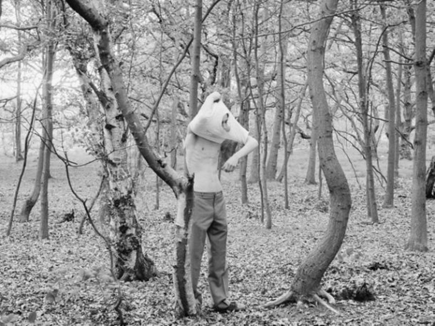
I love the photograph below as it is completely bizarre, it looks as if they have ended up in the woods perhaps after a night out and woke up early morning. I like the soft black and white effect on the photograph as it makes it look like an old faded image.

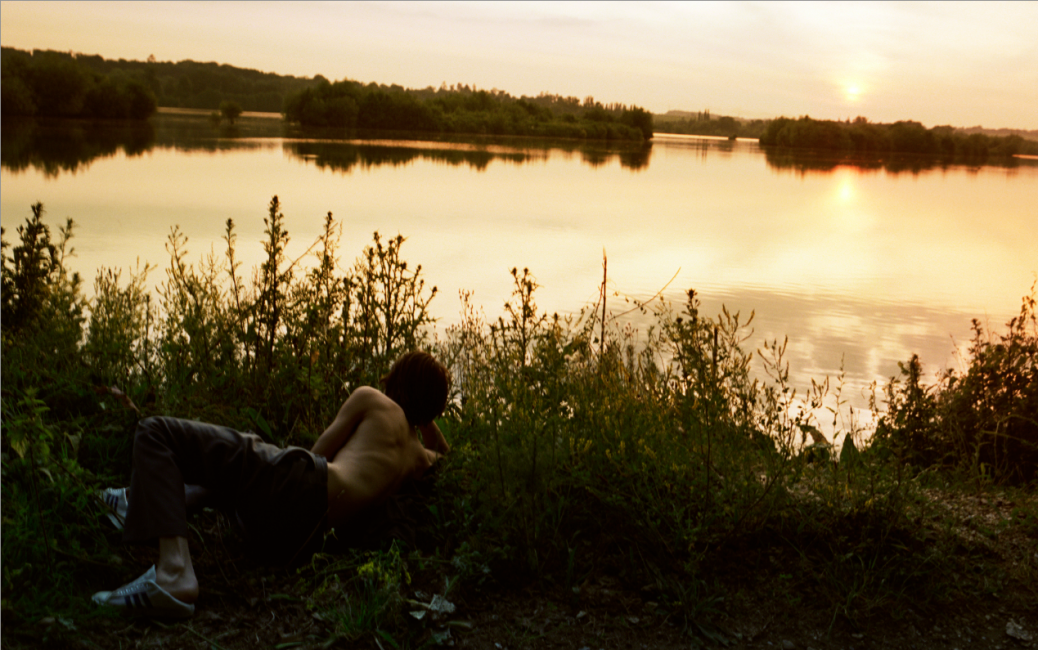
This photograph works well as the photographer has had to work hard to capture the perfect lighting, as normally the person would be a silhouette in the sunset whereas he is seen clearly. The sunlight on the his skin, gives it a soft feeling.

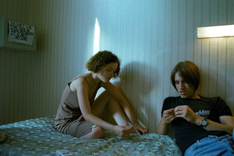
Day uses the natural and artificial lighting to her benefit, by helping the photograph with its structure. This is a perfect example of her combining the styles  of documentary and fashion photography together. As she is capturing the literal scenario she is in, however your eyes are immediately drawn to the watch the guy is wearing which is a fashion item, due to it being the second purest white in the photograph.

Jeurgen Teller

Teller’s work, in books, magazines or exhibitions, is marked by his refusal to separate the commercial fashion pictures and his mostly autobiographical un-commissioned images. He employs a raw, overexposed style and he uses a Contax G2 camera with an onboard flash. He prefers to work in color, and regularly includes himself in his photographs. His fashion photographs have been featured in The Face, Vogue (US, France, England, Italy), Another Magazine, Index, W Magazine, Self Service, Details, Purple, i-D and 032c, among others.

Teller links to my project as his work has a youthful and playful feel to it. This is good for my project, as because I am young myself, my activities and environments I surround myself in are very youthful, therefore my photographs will turn out in a similar style.

I love the fashion aspect to the photographs, how he’s got a blue container and brown rocky floor, therefore the model is wearing brown with a blue necklace. At first glance this looks like a carefree photograph, however when you properly analyse it, one can see that it’s very set up. This will be interesting when trying to do a similar thing whether my photo’s will look to set up or not.

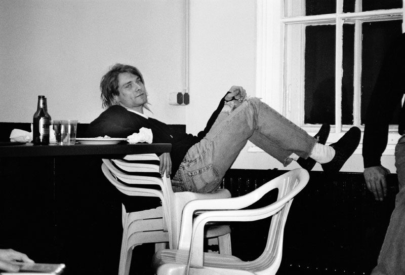
I like the use of the flash in this photograph, to create the contrasts and details.  The way the chairs are stacked up and he’s got his feet on the radiator or wall pannel show his lack of respect for the place, and how he feels comfortable enough there to behave like that. I like this because it shows in this environment he feels carefree and as if he doesn’t have to worry.
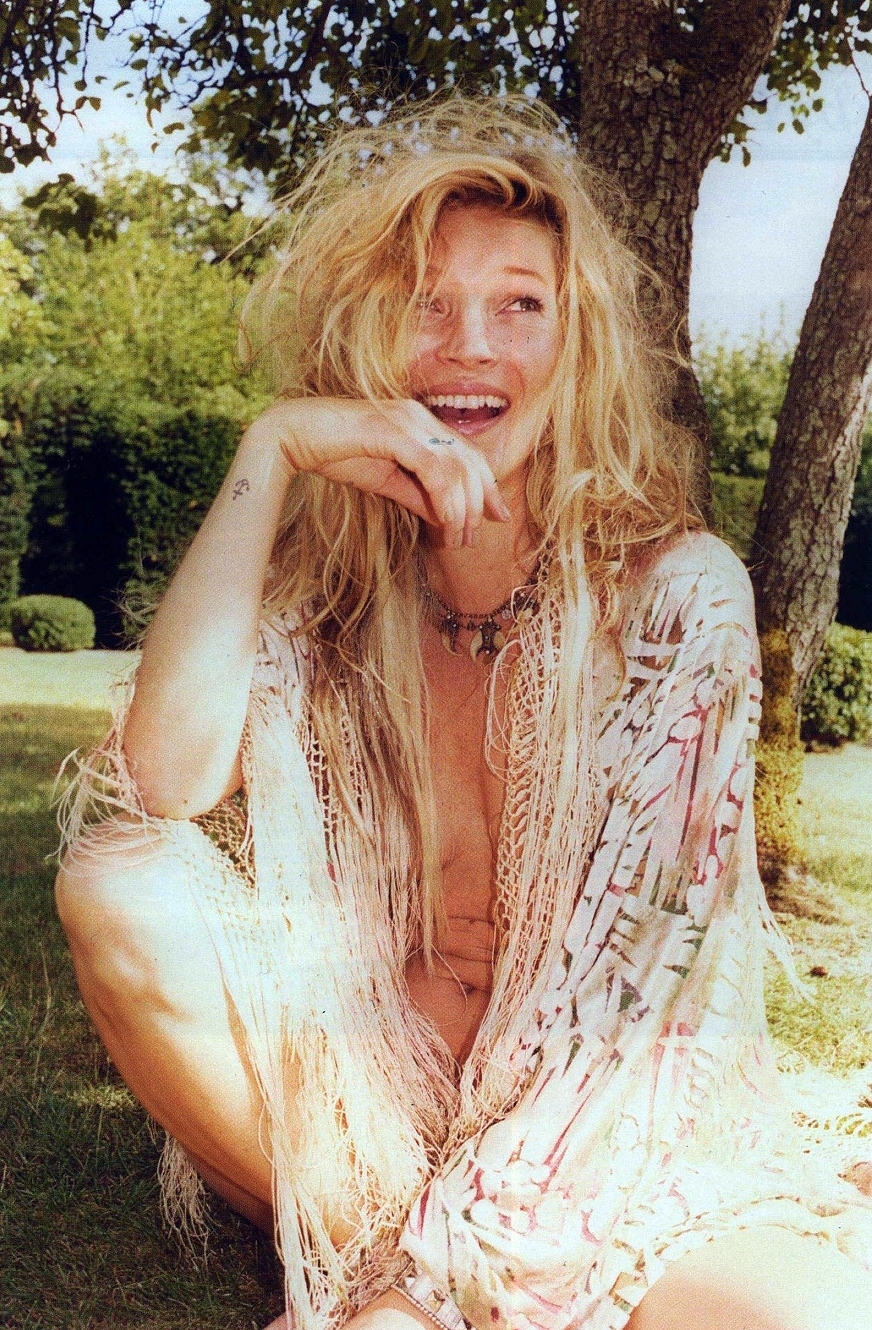
This photograph is beautiful by the use of natural lighting, and the emotion behind the photograph. As one can see she’s laughing and perhaps being playful with the photographer by the way she is nude underneath her cardigan, however it is slightly open therefore being suggestive.