All posts by Heather Barette

Filters

Author:
Category:

My Book Layout

Finally, after doing artist research and choosing my favorite selection from my shoots, I was able to produce my own book for my project ‘Environments’. After designing my book I definitely knew it was the right way to present my shoots, as it allowed all of my photographs to flow.

Here is a link to my photobook: Nomadic Soul

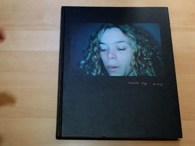
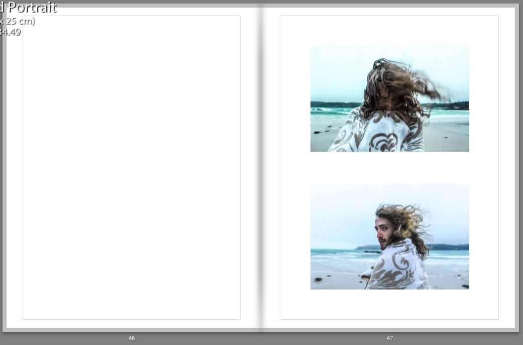
Thumbnail of book layout; 

The reason for print-screening the book in a thumbnail version was because its more visually easy to see why I choose my certain layout. When designing the book I had to think about spreading out the double spread pages, the black and white images, and certain layouts. I had to make sure all images on the page next to each other worked well together. Another important thing when editing is if a page has a similar layout to another one, they have to have the same padding etc, so it looks organised and neat.

Digital version of my book; 

I believe the title of the book is very important aspect. Titles should convey not only a sense of the book’s subject, but also a feeling. The title you choose for your photo book sets the tone, hints at the genre or style of book, and draws the reader in. It’s your very first opportunity to “market” your book and make someone want to read it. I finally came up with the name ‘Nomadic Soul’ this was due to the word nomadic meaning living the life of a nomad; wandering, and a soul is an emotional or intellectual energy or intensity, especially as revealed in a work of art or an artistic performance. I found this title was perfect for what I was trying to represent as I wanted to represent a lot of energy and intensity of a traveler.

 My front cover was inspired by Theo Gosselins, as he had an oil spill which links to the fact he’s on a road trip, and it doesn’t have the book title on it. Therefore, mine is similar in the perspective neither of the front covers show a person, and don’t have the title featuring on it. The reason I choose this image for my front cover is because all my photographs are taken nearby to the sea, and a majority of them have a bit of the sea showing. The use of the waves also represents the energy and movement which will be in the book.
Back Cover;                                                      Front Cover; 

Unlike the artists such as Juergen Teller, Corinne Day and Theo Gosselin, who’s photo books I decided to analyse I  decided to put the title and my name on the first page. This is due to me wanting my first image to be a double page spread, and this wasn’t possible without having a first blank page, so I thought I would just make the most of this page, and immediately tell the reader what I was going to show them in my book. This was due to the title being on the first page working well with the rest of the layout.

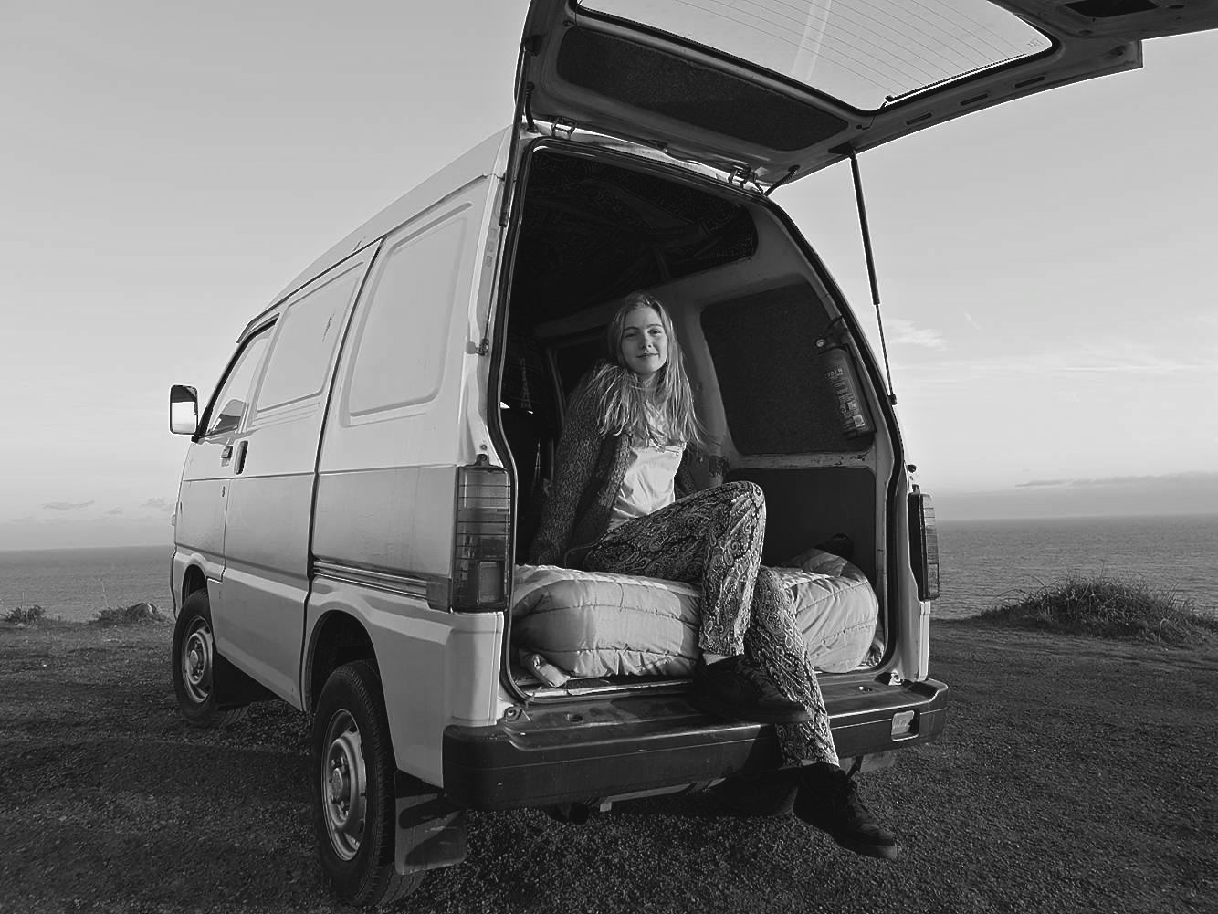
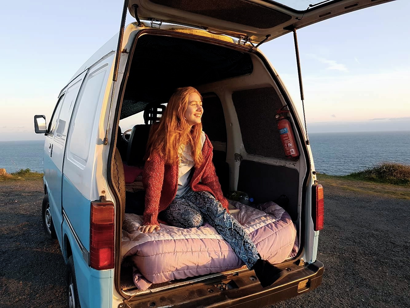
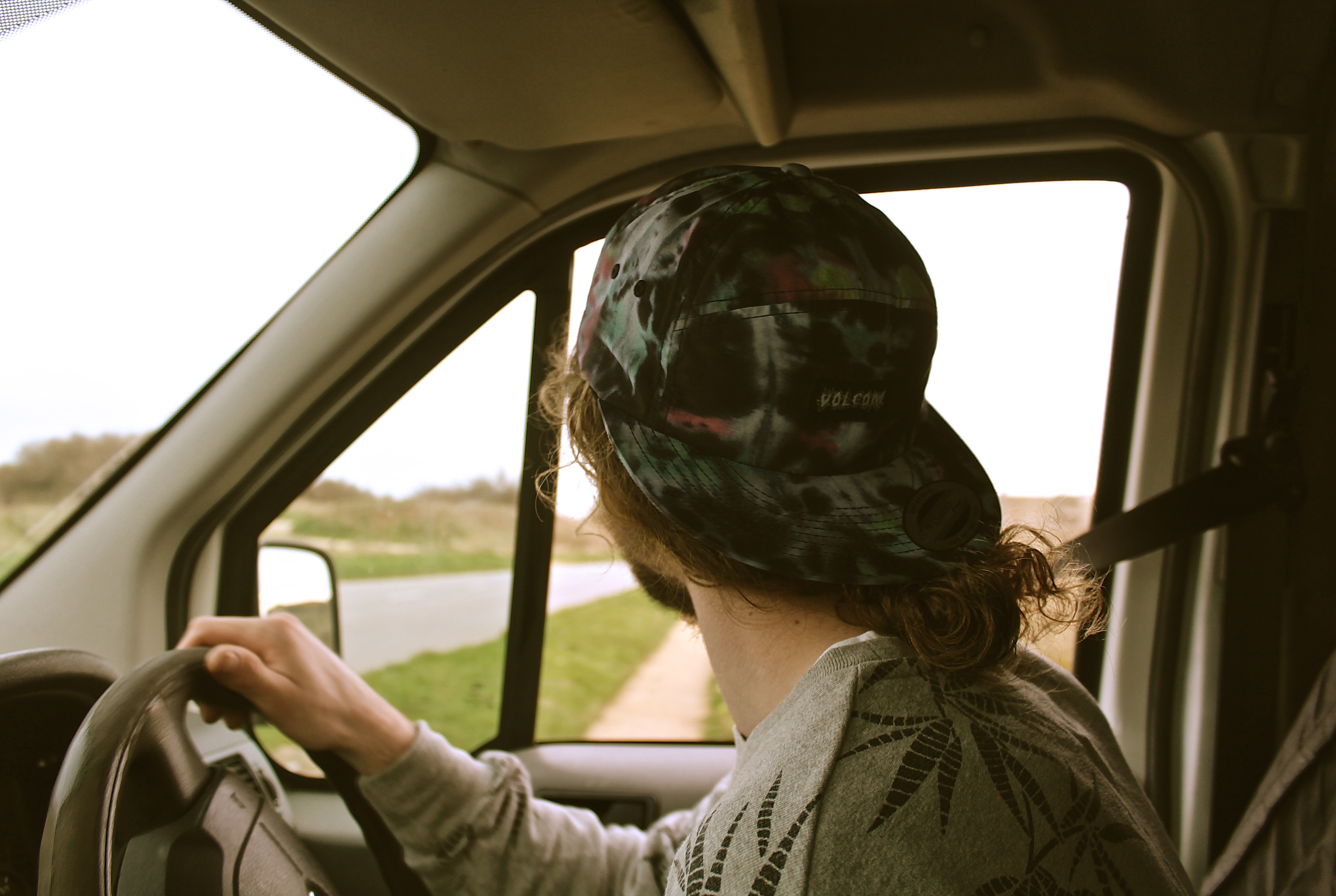
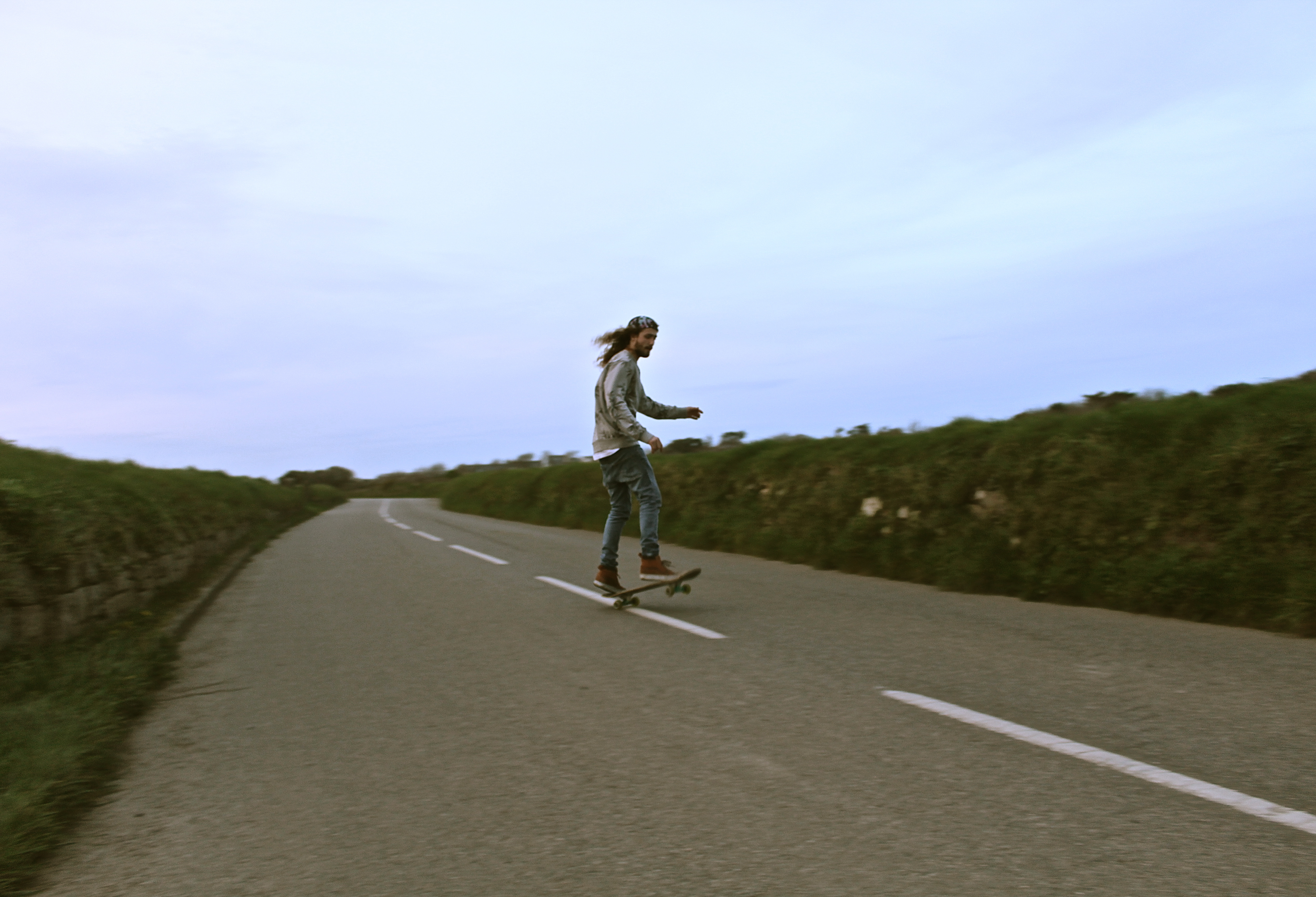
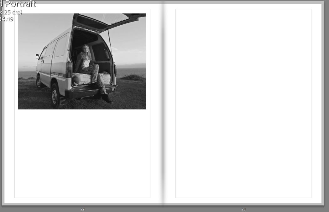
It is crucial to use the perfect first image, as it makes or breaks whether the reader is going to carry on reading it or not. The reason for the choice of this image is because the book is representing a journey, and there is no better way to represent this than by a photograph inside a car, which isn’t stationary.

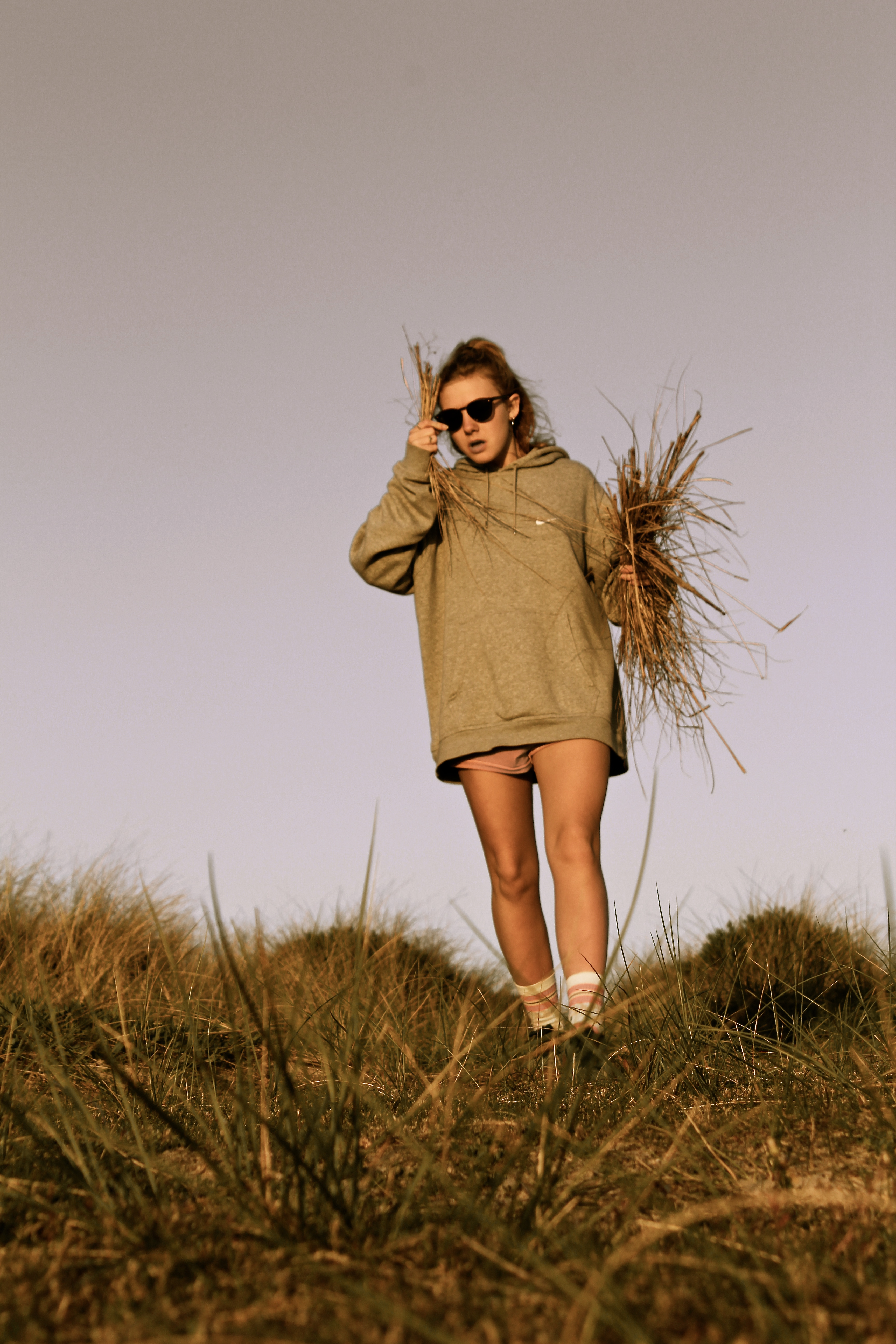
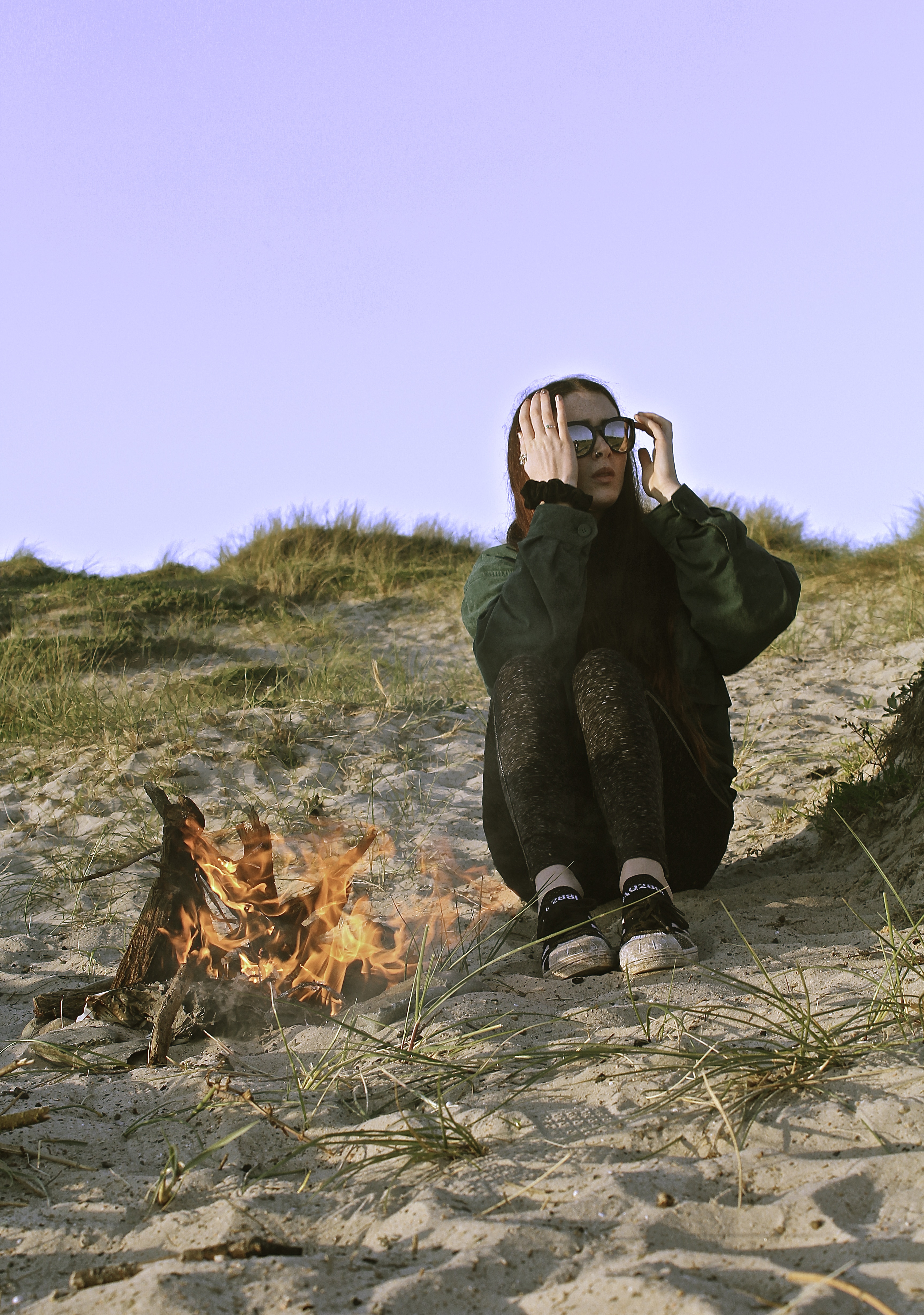
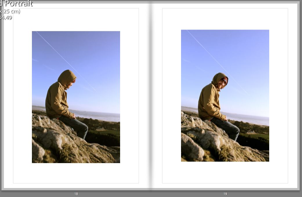
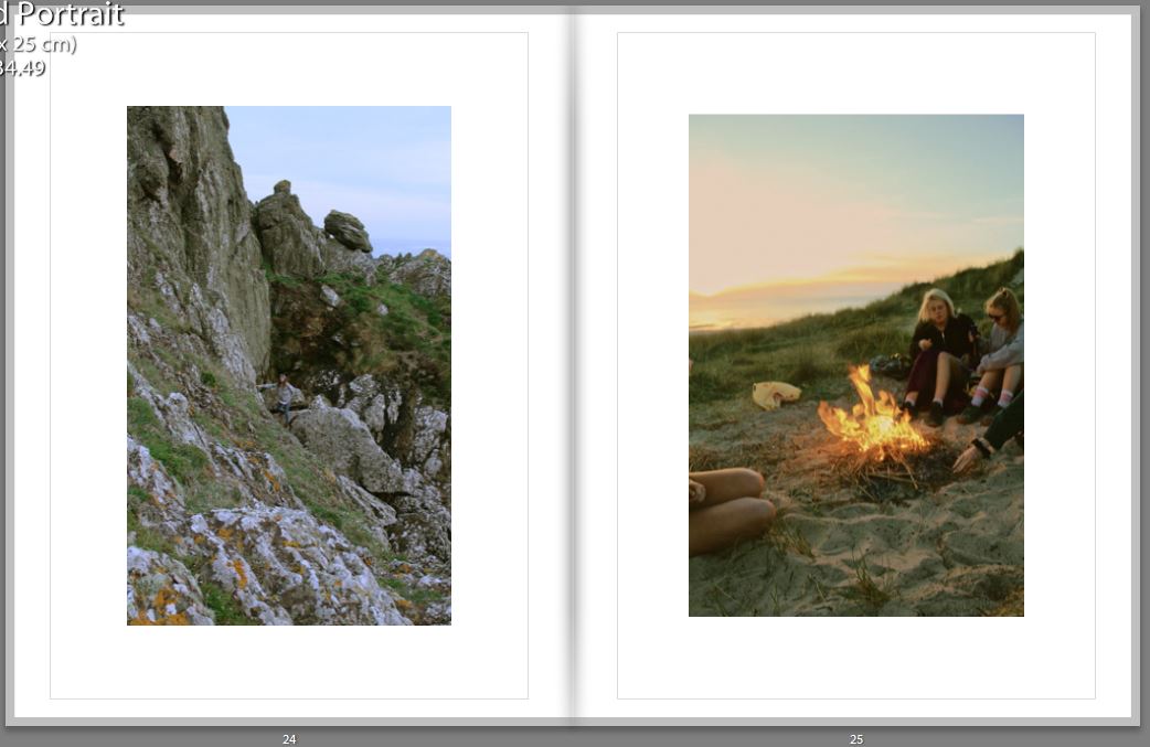
Every 4-6 pages I choose to have a double page spread, as it would break up the smaller images, and is almost like having different chapters in written books. It gives it a stronger structure and shows principal images. The images I’ve chosen for double page spreads also tend to be some of my favorite images, as they have so much detail and interesting aspects to them. The difficult thing about selecting my double page spreads was the fact most of my images had someone featuring in them, and usually tended to be central of the image, which made it difficult for designing the book, as I didn’t want the people to end up being split by the binding of the book.

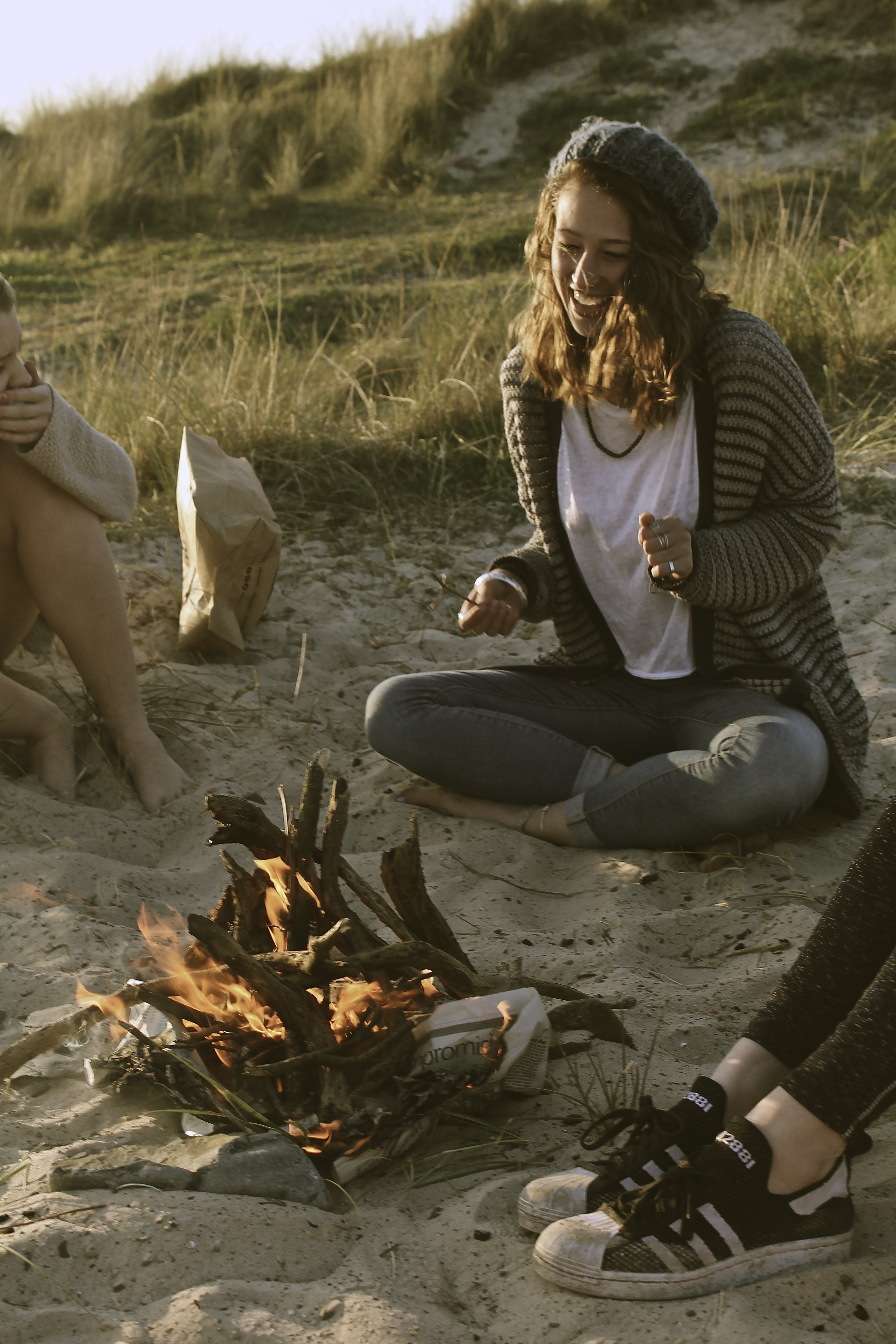
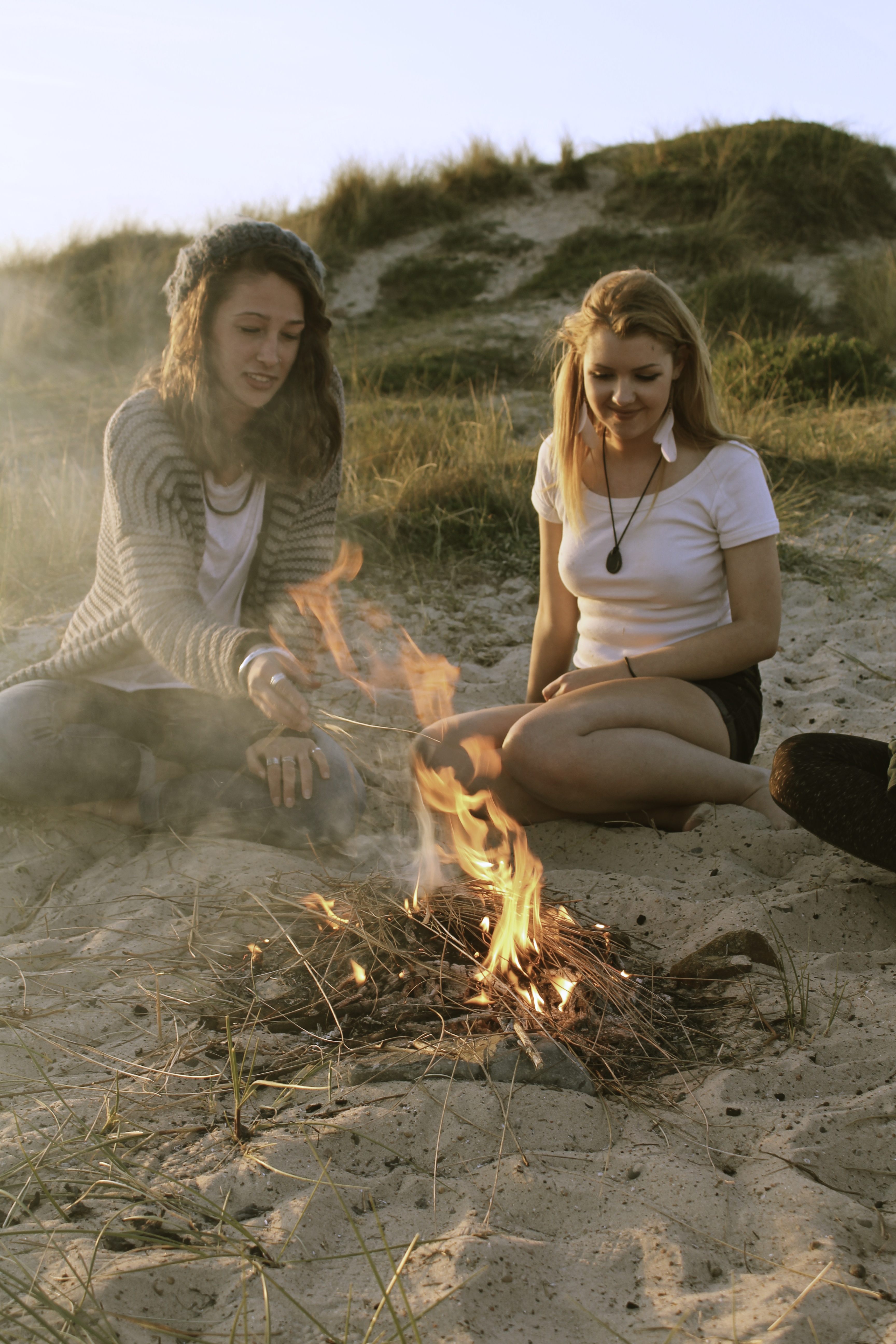
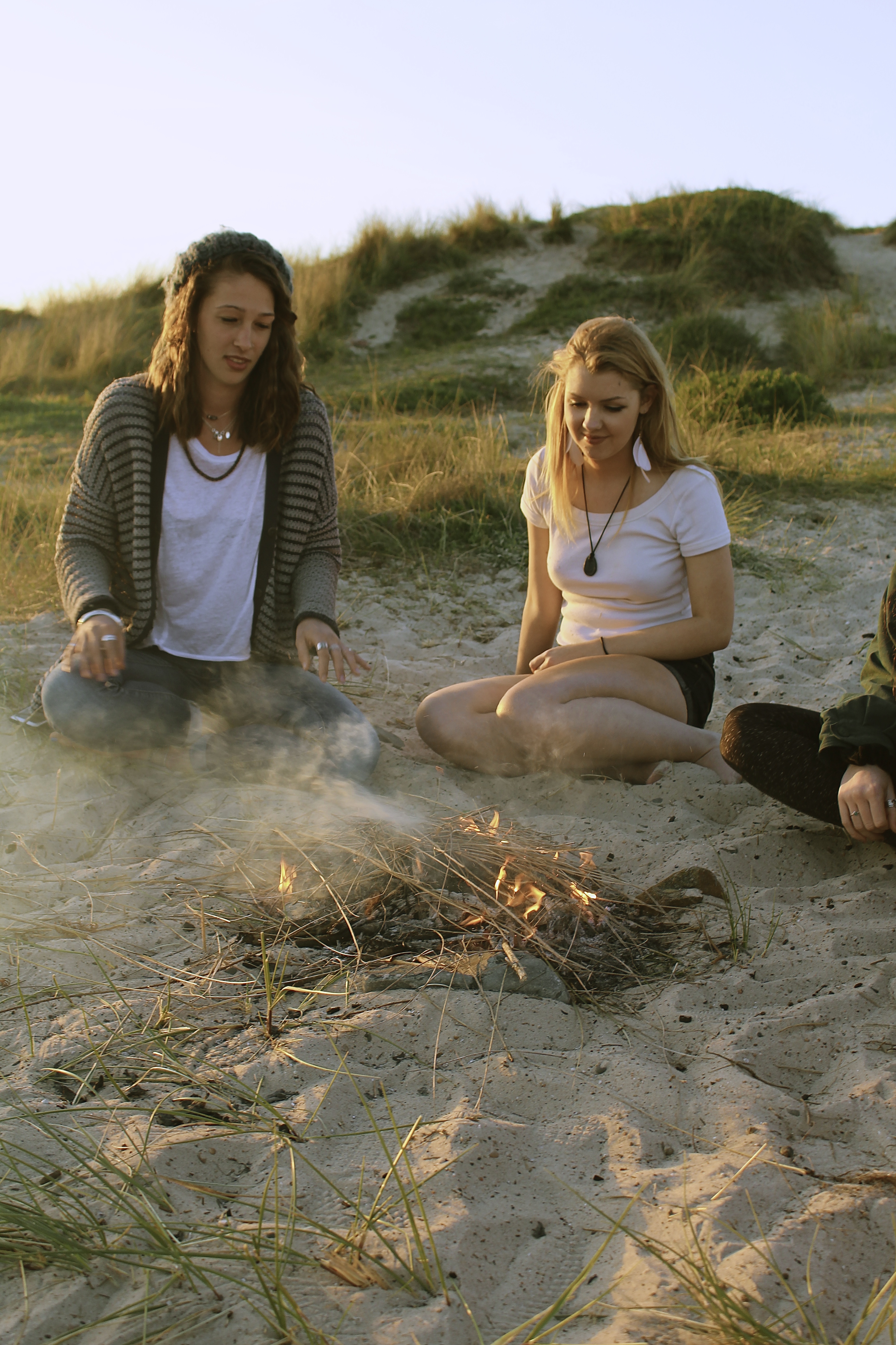
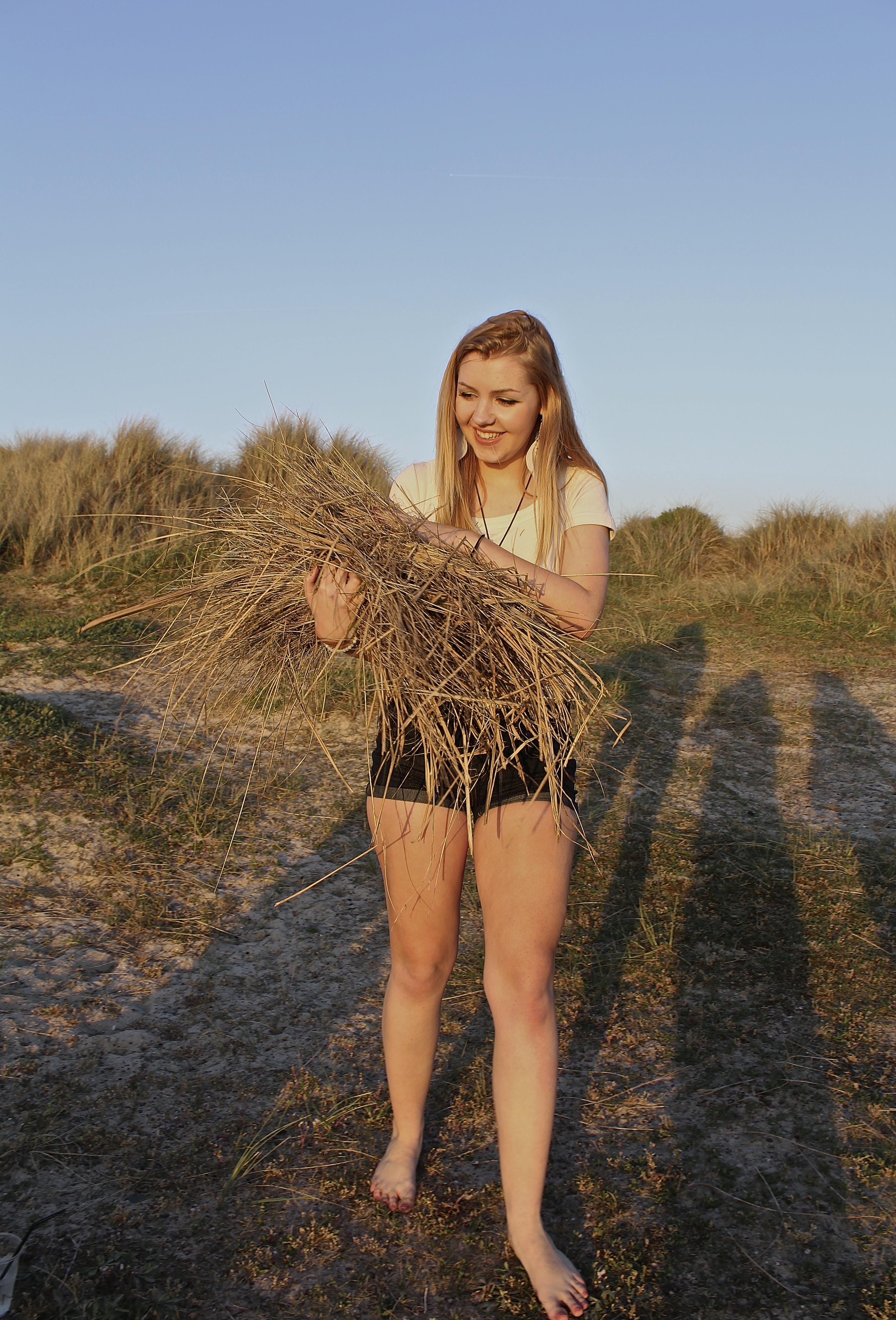
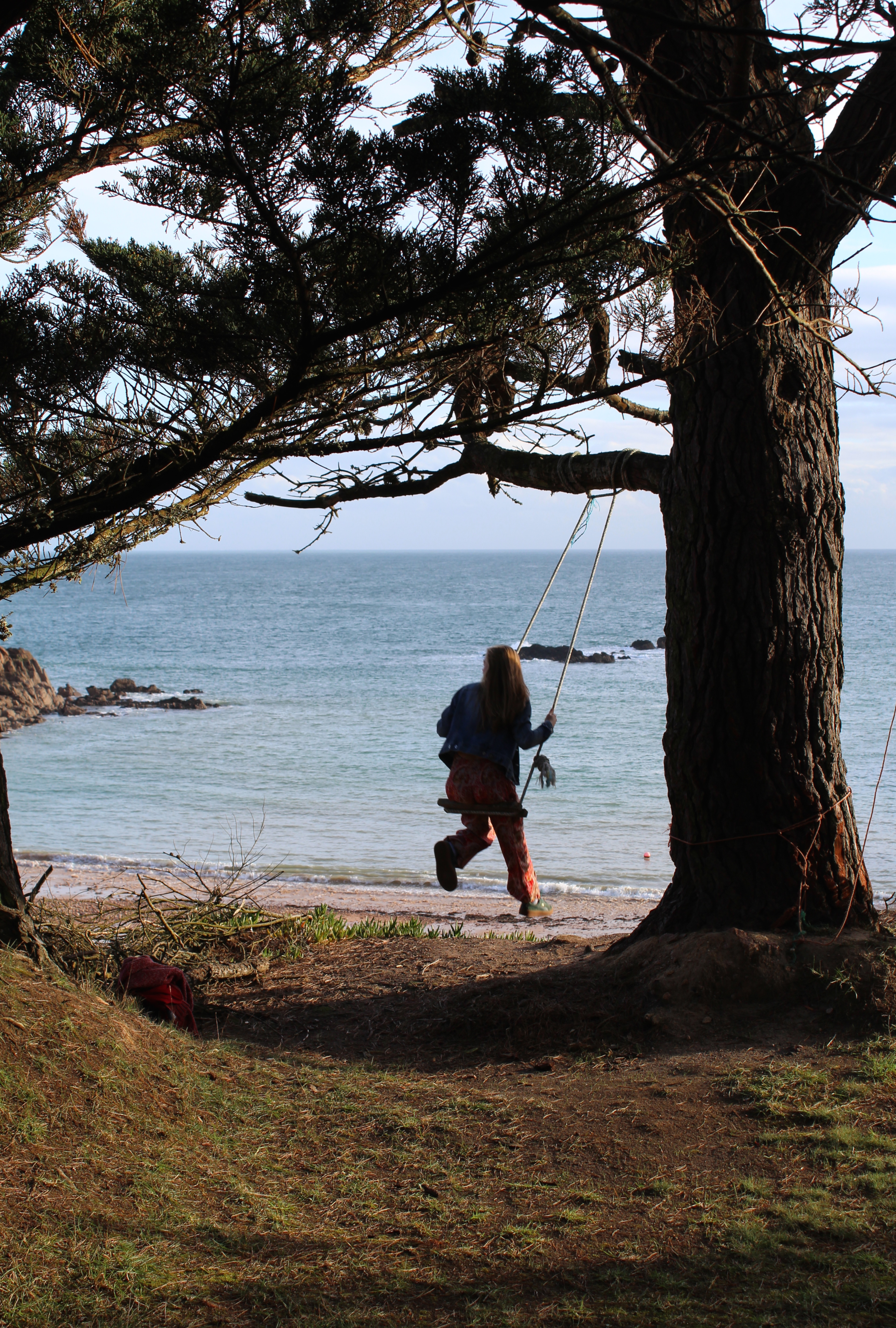
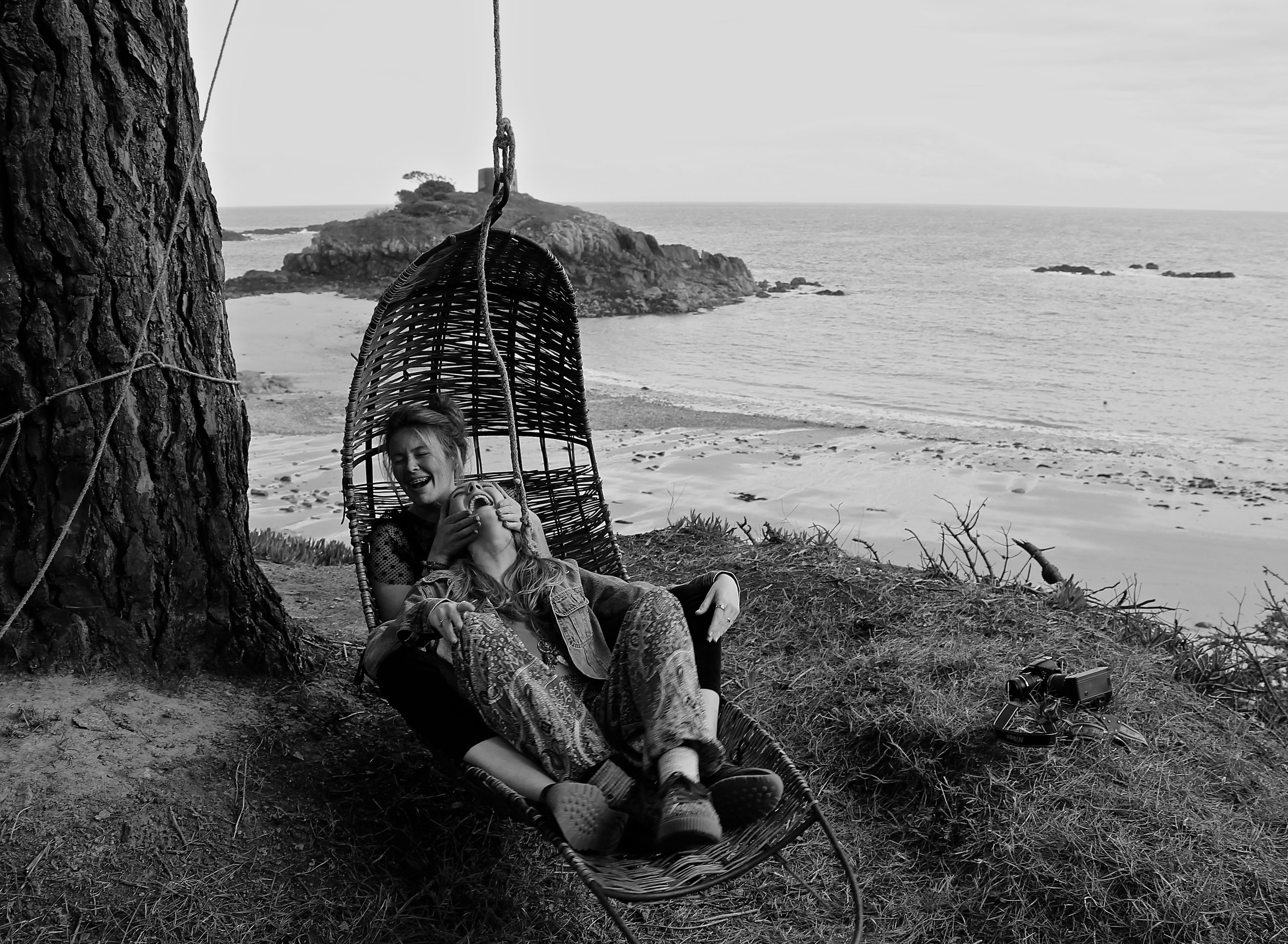
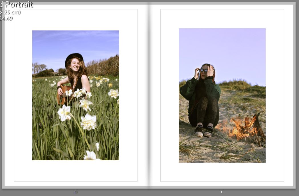
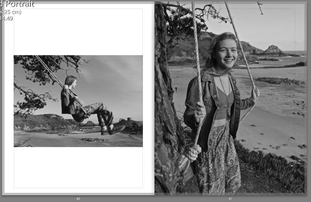
When selecting two images from different shoots on opposite pages, I would make the images link in a certain way, for example below one can see that the girl on the right page looks as if she’s looking up at the girl on the left page, this is shown again two images below. Therefore I had to think about the composition of the images before putting them in a certain layout.

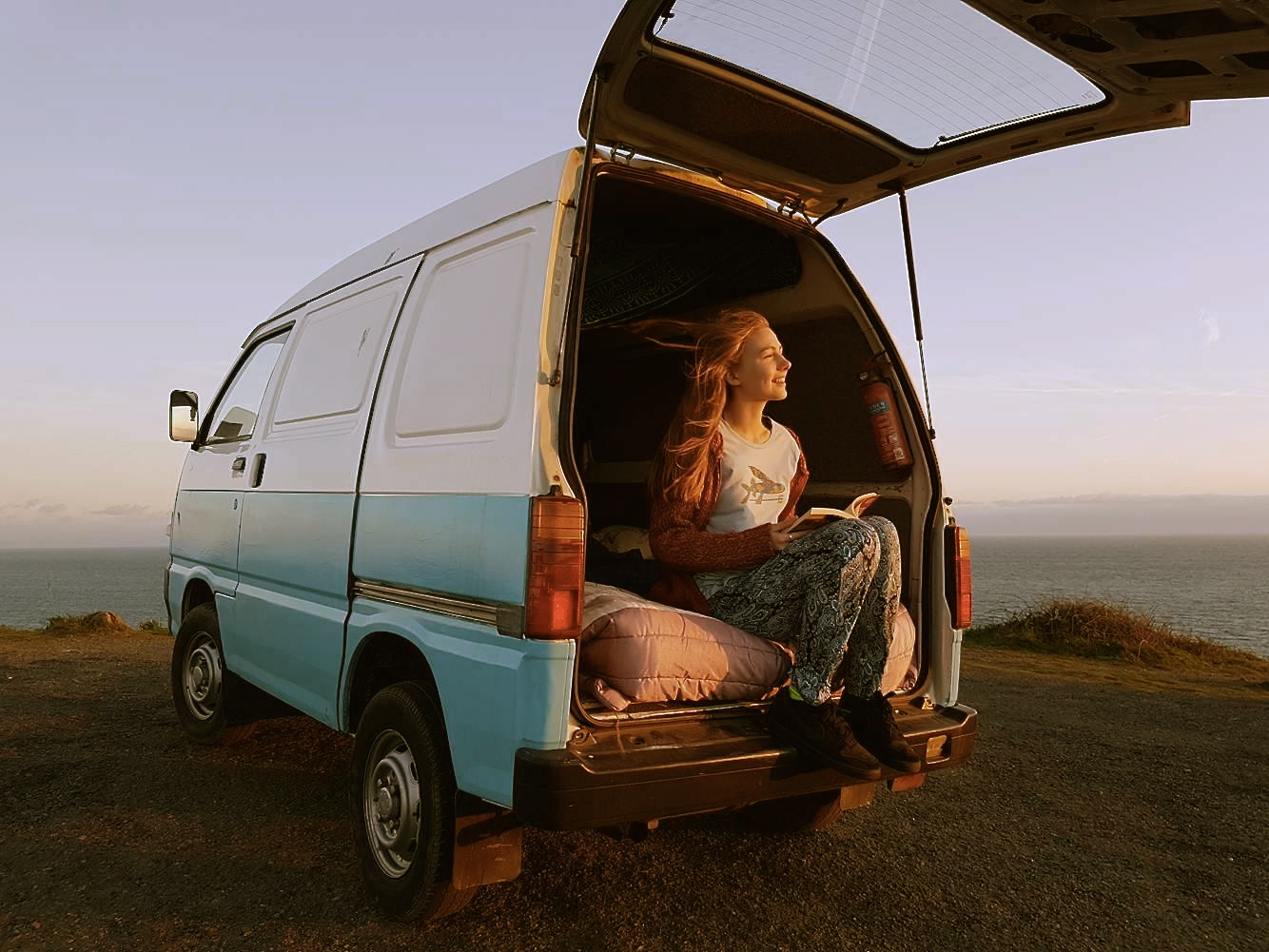
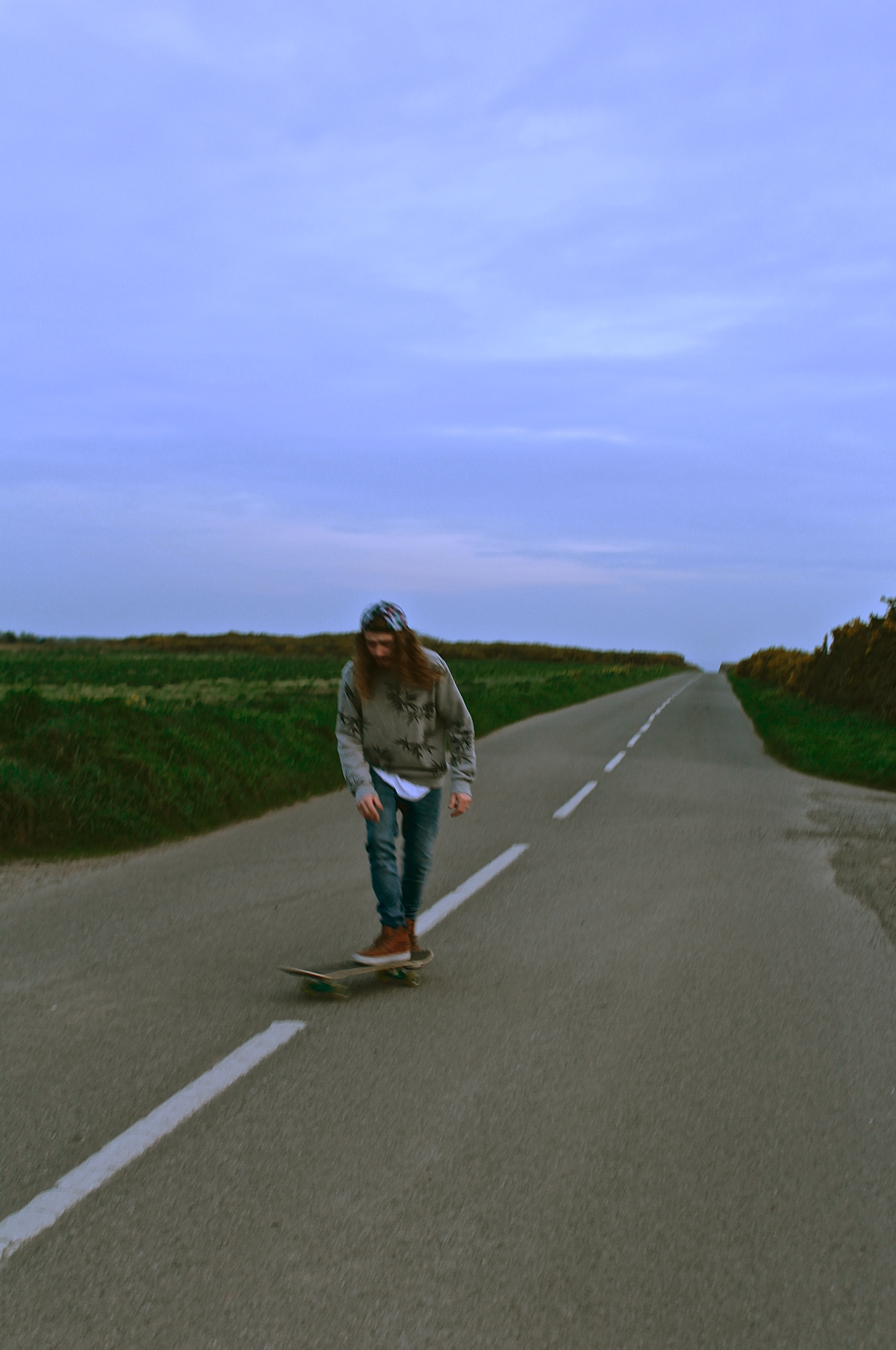
For my final image shown in my book, I choose a similar one to the first image as they both represent the journey. By having this as the last image, it looks as if even though the journey for the reader has finished, the journey for the people featuring in the book hasn’t finished.

How well have I responded to Artist Research

For all my artist reference, I based my shoots on some of my favorite photographs taken by the photographers. Therefore, In this blog post I have wrote and represented visually the similarities and difference, of my work to the artists I researched.

Response to Theo Gosselin;

I personally feel as if Theo was the main artist I was inspired by for this project of ‘Environments’ as I loved his style, locations and adventures I went on to capture photographs like his.

With most of Gosselins shoots I would take the principal idea and then just alter them into my own style. As seen below, the top image is Gosselins and the bottom image is mine, the difference are fairly blatant, as the time of the day we took the photos differs, he took his just after sunset and mine was taken just before, therefore creating different lighting effects on the models. Gosselins photograph also features to girls completely nude, whereas all four of my models are are fully dressed this was due to school restrictions not allowing full nudity in my images. The similarities are there are more vertical objects on the right side of his image and the girl standing up in my image is on the right. Then obviously there’s the fact it’s only females who surround the fire in both images, and both of the fires are on a sandy location, nearby to the sea.

The image above which is taken by Theo Gosselin is similar to mine below because both are featuring blue vans, and both have their door open, allowing the viewer to briefly see the inside. Also, both images are taken in a car park which is located next to an area with a large mass of water, for example in my photograph one can see the sea, and in his it’s either the sea or a lake. The difference between the two images is that he’s made the van be in the mid-ground of the image, whereas mine is located in the foreground of the image.

Response to Juergen Teller;

The main difference between the two images below is the persona of the model, Juergen Teller has shot Kate Moss looking moody in the photograph below. Whereas I have captured my model looking happy and smiling. The other significant difference is the fact that his image is horizontal whereas mine is portrait, due to the way the model is posing, Kate Moss is lying in the wheelbarrow whereas my model is sat inside. The similarities are the rustic wheelbarrow used as a prop in the two images, and due to the background of both images one can see that they’re both in natural environments. In both images similar color schemes are used, both using a lot of brown, blue and green, all very natural and pure colors. However Teller creates more vibrant colors in hers by the use of jewelry and the container in the background.

Response to Corinne Day;

The main difference to these photographs is Corinne Day(below) has more negative space in her image than I do, this is due to me contrasting my images more and making there be more definition, therefore creating more detail in the background than Days photograph. Whereas the way she’s taken the image has a high exposure and more sharpness in her image, than to mine. The main similarity is the way the model is positioned, for example they both look a bit shy with their body and are smiling nervously infront of the camera, they’re both titling their heads facing to the left of the image, and use their shoulders both shrugged with a bent left arm. Both of the models are very slim as well, with messy hair, blowing in the wind.

Response to Jacob Sobol;

These two images I find our very similar, as both models are trying to kiss the photographer, therefore conveying the same message and emotions behind the image. Both images are out of focus and taken in black and white and are slightly over exposed, the models both have their eyes slightly closed and hair scrapped back. The main difference is the photograph above by Sobol is taken of a women, whereas mine is taken of a man. Also Sabine, the model for Sobol is looking up at the camera. Whereas in my photograph he’s looking down at the camera. Therefore creating a slightly different composition. In my photograph I feel the model isn’t being as serious as Sabine as he looks like he’s jokingly try to kiss me, whereas Sabine looks more serious. This is perhaps because of the location both images were taken at, Sabine is in a bedroom so it’s more personal whereas me and the man in the photograph were on the beach, where it’s a public place.

Response to Ivan Troyanovsk;

Mine and Troyanovsk photograph are similar yet very different. They are similar in the perspective that the photographer is looking down at the model, and are above the sea, with the coati coming from the right across to the left hand-side. Therefore, they both have a similar composition, they both also have V shape in the rock, almost like the top of a heart on the left of the photograph. The differences are, there are two models in the image of Troyanovsks, with their backs facing the viewer. Whereas in my photograph the modelling is turning facing the camera, and is alone. Another huge difference is the fact the models, in the above image taken by Troyanovsk, are standing on a rock which isn’t as visible as the one my model is standing on. The environments are also different, for example my environment had a lot more rock and the waves were a lot more choppy than the image by Ivan Troyanovsk.

In conclusion, I feel I have responded well to my artist references, as every single shot was somehow influenced by a photographer. Although, no shoots were directly copied, I would take an idea and then alter it to make it my own.

My Final Prints

How I will present my Final Prints; 

I have chosen 5 photographs for my final prints. I’m going to mount them onto foam board separately, as I’ve designed a book which already puts them together as a story, so for my prints I want them to represent their own journey. The reason for presenting them on foam board is because I feel the images are too contemporary to have a border around them. I have experimented by choosing both landscape and portrait layouts for my final prints.

Final Prints; 

Image 1 – 

I love the image below, because the colour scheme works perfectly, his grey jumper with the grey stones and the brown shoes and hair combined with the brown seaweed. I also like how the image is shot from a birds eye view.

Image 2 –

The reason I selected the image below for printing, is because it’s very similar to one of the images I’ve selected for my book, except this has a portrait layout. This one is also framed by the rocks within the image, unlike the one chosen for my book. I would have put this one in my book although they were too similar for them both to be chosen. All my other prints I have selected have also been selected for my book as well, so I wanted something different.

Image 3 – 

I chosen the image below for my final print as it has a lot of energy and movement in it, which I wanted to represent in my photographs. I also like the surrounding the model is in and how it has a cinematic effect.

Image 4 –

The reason for choosing this image, is because I didn’t just want my prints to be just of individual models, I wanted to show the group journey. I love the natural lighting of this image, and the facial expressions of the model.

Image 5 – 

I chose the image below as I like how it looks like its been taken in a fashion photography style. Also, the image shows my use of experimentation with focal point, as the girls legs are more in focus than her face, which actually works well. When printed this is more obvious than on the screen of the computer.

Theo Gosselin Book ‘Sans limites’ compared to Corinne Day’s ‘Photo Diary’

For my final outcome for the project ‘Environments’, I’m producing a book, this is because all my photographs can finally come together and tell a story.  Therefore when designing my layout I compared Theo Gosselins Book ‘Sans limites’ to Corinne Day’s ‘Photo Diary’. The reason for selecting these two photographers is because they were both big influences to my photographs, and there photo books have a lot of similarities and differences which are good for comparing when it comes to designing my book.

Theo Gosselin – Sans Limites; 

Theo Gosselin has been my main source of inspiration throughout this project, therefore I have looked at his book ‘Sans Limites’ to get ideas and inspiration for the layout of my book.

The video below shows a flick-through of Theo Gosselins work in his book Sans Limites;

Gosselin has purposely chose not to put the title on the front cover. Also, he’s intentionally chosen a cover which is an oil spill, which is linked with the fact he’s on a road trip. Therefore using an image which makes you think, because before opening the book one doesn’t know he’s on a road trip, and therefore capturing the readers attention before even opening the book.

When reading the book ‘Sans Limites’ there is 3 double spread pages before the page which states the title, and Theo Gosselin, the photographers name. I believe this makes it more interesting as normally that’s the immediate page you see when opening a photo-book. Alternatively, Gosselin captures the readers attention and allows them to think for themselves what the book is going to be about, rather than just reading the title.

After analyzing Theos book I have noticed the vast majority of his pages are double-spreads. I think this is because there’s so many aspects to his photographs which he doesn’t wants the reader to miss, which the viewer may have done if he put them on a smaller scale.

On the other hand, when he doesn’t do double page spreads he tends to have pictures which have white borders around them, and tend to have a completely blank page opposite. This is probably because he doesn’t want the viewer to get distracted and not completely focused on one.

When I saw this double page spread in Gosselins book, I was quite surprised, as he’s put the models face directly in the binding of the book. Personally I wouldn’t do this in my own layout, as it takes away from one of the main aspects of the photograph, just because of the way he’s presented the photo. In my opinion, I would still do a double page spread but with a white border as that way you can still take in the photograph but the binding isn’t as distracting. Although, this doesn’t work with Gosselins work as he has the theme of using the full double page spread or having it very plain, there’s no in-between. I think that this image has to many aspects which are aesthetically pleasing to put it onto a smaller layout.

After scrutinizing Theo Gosselins book ‘Sans Limites’, I have noticed my photo-book should have some sort of layout and pattern, which how I present double page spreads against my smaller scale images. I’ve also thought about how I don’t necessarily have to have my title on the front cover or immediately when opening the page, which may be interesting when reading my book. Another important aspect I noticed is when reading his book, there’s no text among the images. I think for my personal project I won’t add text either, as I want the photographs to tell a story in themselves.

Corinne Day – Photo Diary

The reason for comparing Gosselins work to Days is because I analysed both artists work, and their work has both differences and similarities.

The video below shows a flick-through of Corinne Days work in her book Photo Diary;

Her autobiographical book, “Diary” was published by Krus Verlag in 2000, and contained frank and at times shocking images of Day and her friends. The images in “Diary” featured young people hanging out, taking drugs and having sex, and have been compared to the documentary realism of Nan Goldin, another artist who’s work I’ve analysed for this project. Coinciding with the publication of “Diary”, Day had two large scale exhibitions in London in 2000.

The front cover of Days book is black, with a photograph of her friend on the front cover, with ‘Corinne Day Diary’ written underneath the photograph, looking like a caption but actually being the title for the book. This is opposite to Gosselins as he has no writing on it, and nobody featuring on it.  Day has used a very explicit image for the front cover, as it looks as if the girl has just snorted some sort of drug as she has blue around and inside her nostril.

Similarly, to Gosselins book she opens immediately with an image and not her name or title. Capturing your attention straight away. However, she uses text in the way she captions the photographs, giving the viewer a bit more of an insight to the image, whereas Gosselin never uses text with his images.

Corinne Day tends to shoot images in colour, except for a few, which are presented next to one another in the book. Gosselin is similar in the way he tends to shoot in colour, however he has no images in his book which are in black and white.

The main difference I personally noticed between Day and Gosselin, is that the majority of Gosselins book is double spread pages, whereas Day has no double page spreads featuring in her book. Also, when Gosselin doesn’t do a double page spread he tends to have one next to a blank page bordered, however Day uses book next to one another for most of her book, as shown below;

In both books nudity is shown, however Gosselins nudity seems to be not as sexualised as Days. As one can see in the below image, hers are very explicit. However, the image below shows a similar layout to what Theo Gosselin uses when he doesn’t do double page spreads.

In conclusion, I have been influenced by both photographers books as they both have a certain style which I find aesthetically pleasing. Therefore, when designing my photo book I will take ideas from both of their books and alter it slightly to make it my own, combining both of their ideas.


The Journey

The reason behind this shoot was because it makes all of my photographs come together, as what I wanted to represent was some young adults on journey, exploring, taking in beautiful landscapes etc. Showing what they would do when away from home and away from the worries of typical every day life. Therefore I wanted to show a carefree youth. The van represents the literal movement between each place I’ve photographed, and show’s how relaxed they are on their journey as all they need is a bed, some books, and a camera to capture their moments. For my final outcome, i’m going to present it as a book, with all my favourite photographs to show the journey their vans have taken them on.

I choose this location as I wanted to show that the people I photographed would just pull up in a beautiful area and stay there for the night. Even though this is a fairly remote location, there were still other cars and people in the background, therefore we had to park the car so they wouldn’t be in the image. I also parked the car in the position which used the natural lighting to my advantage, as I originally was going to park it the other way so I could capture the sunset and the more scenic background, however because of the lighting I wouldn’t be able to get the natural lighting on the models face and show the little details which were important to the shoot.

The photographs below taken in black&white remind me of documentary photography, as they’re self explanatory and documentary photography generally relates to longer term projects which mine is meant to represent a group of my friends travelling.

I think these two photographs work really well together as it shows the movement of the model, and the composition is exactly the same, so it works nicely as a couple. The weather was perfect for the day as the wind made her hair blow and it made the photographs have more character.

The photograph below is shows the models surrounding and shows her looking directly at the camera. Therefore, because she’s looking at the camera it makes it feel as if she’s interacting with the person taking the photograph, and this makes the person who views the image feel as if they’re in that moment.

Referring back to the quote by Ted Grant, which I’ve analysed in my previous shoots; “When you photograph in colour you photograph their clothes. But when you photograph in B&W, you photograph their souls.” I think this quote is very true and important for the type of photographs I’m trying to capture, as I want my images to portray the basic life of a free soul.

For this photograph I was originally going to get the model to lie down surrounded by the pillows on the bed, however I noticed the lighting lying down wasn’t the best and there was a bit of natural lighting coming through the window so I made the model sit up against the back of the van, so i could capture the concentration on her face whilst reading the book.

I then left some of the images in colour, as the sun lit up the models her beautifully and made the images very colourful and therefore look playful.

Frequently in my shoots, I’ve captured the models hair blowing in the wind, an example is given below. This is due to the wind creating a carefree image. The natural lighting also captures the hair blowing and lights up half of her face and making her features stand out. I like the fact the model is not smiling in this photograph as it shows the images are purposely meant to look as if they’re not posed;

“photography is about capturing souls and not smiles.” Dragan Tapshanov.

The reason I believe this photograph works well is due to the composition of the photograph, because where the line of paint stops on the van it starts on the other side yet the line of the horizon.

For the images below I tried to capture it from a different perspective, and I took it up-close to create a more personal effect between the model and the viewer.

In the image below, one can see that it has had a filter added to it, like many of my photographs. This is done to add a certain feeling or aesthetic to the images;

“A lot of people in the art world hate to use the word Photoshop like it’s cheating or easy or something. I say bollocks to that. For me, it’s my tool, my paintbrush if you like, and lets me create my own visual language.” Idris Khan 

Side by Side

This shoot is really important, as the other shoots are more focused on a certain individual from the friendship group, and therefore this shoot show’s all the previous models together, except for the guy I took photo’s of and this is to make it feel as if he perhaps took the photos of the girls, and vise versa, they took the pics of him. Therefore that’s why there’s always someone missing in the adventures photographed, because it’s as if they were taking the photos. The girls from the swing, the girl playing the guitar, and the girl who went paddle boarding, altogether.

For this shoot, I choose this location as it’s one of the same places I shot the girl with the guitar, and it’s also remote and close to the sea. Which is similar to most of my shoots. Originally I was going to photograph them around the fire with the sunset in the background, however this didn’t work with the lighting because it would tend to make the photograph over exposed or underexposed, turning the people into silhouettes. Therefore I was pleased I shot images during this lighting.

The propping for this shoot was more difficult then expected, as the area which we did the bonfire was on the sand dunes so there was no wood for the fire. Therefore, before the shoot I had to collect the wood for it, however there wasn’t enough so we had to work with the dead marram grass, which would make the fire really big for a minute and then it would die down. In addition, we had to keep collecting lots of grass for the photographs to look good, the collecting of grass is shown in some of the images below.

The use of the models sunglasses makes the image more interesting, as one can see the fire reflected in the models lenses. Also the way the sun lights up the models hair makes it a very bright amber color, which works well with the fire in the foreground that looks as if it’s touching the models hair, who’s in the middle-ground. Therefore making the composition interesting.

In the image below, I tried to get the image to have the sunset in the background, but without allowing the people to become silhouettes. This was difficult as the sunset is over exposed, however i find it actually works in this image, as it creates an ambiance.

The image below relates to the quote;

“I always thought [my models] looked best when they were sitting in their pajamas smoking pot and getting pissed on a bottle of wine. So that’s what I documented. I liked the girls looking how they were naturally… ” Corinne Day 

The reason this quote links to the image, is because I’ve captured my models sitting around a bonfire and smoking, showing them in a natural manner and not posed. Also, these images documented the moment and not a posed image.


In the two images below I took them in a documentary style, the model not knowing they were being taken and capturing a moment/event, however they’ve ended up looking like fashion photography images, therefore making me think of the quote by Corinne Day;

“The best thing I did for fashion was bringing it down to earth, bringing a documentary quality to it.” Corinne Day 

I believe this is an important image from the shoot, as it’s very simple, and doesn’t have anybody’s faces giving away the emotions behind the scene. Therefore the viewer interprets the ambiance of the moment themselves.


Out at Sea

This shoot was more difficult then I expected, due to me being deep in the water myself, it was hard to get a good balance and make sure the photos were focused.

This shoot worked well, as because neither of the models are wearing wetsuits, it made it look less cold than it actually was, giving it more of a tropical feel. Unfortunately the weather wasn’t the best for this particular shoot, as the bright lighting coming from the clouds made the lighting harsh on the models faces. Although, the benefit to the lighting was that it allowed enough lighting to create interesting textures in the sky and on the sea.

This is my favorite image from the shoot, as the lighting is perfect on his face, as it makes his features and emotions stand out, but are not harsh on his face. The fact he’s wearing a white T-shirt and is in the middle-ground works nicely as it draws your eye to him immediately, then after looking at him your eyes go towards the buildings in the background which makes you look at the paddle boarder, which is important for feeling the mood of the photograph. The thing I like about this image is that it looks like I’ve just taken a photograph of a young boy who’s far out and sea, which gives it more character.


Unfortunately, with this photograph the waterproof case got in the way, and made it have a black line over the top. This ruins the photograph as if i was to crop the image it wouldn’t be an even balance, although the black takes away from the photograph as well. Also, this image has been taken when there’s lots of raindrops on the lens and therefore making some parts of the image slightly out of focus, as shown on her chin area, which makes it look worse in the way it would look good if it was all detailed, however at the same time adds character to the image. My favorite aspect to this image is the smile on her face, and the way the hair is blowing in the wind as she looks over her shoulder at the camera.

This photograph works well, as it looks as if there is a tropical island in the background. I also like the the different textures, of the clouds, the sea and the rock combined. The downfall to this image is that the exposure on the models face is too dark and one can’t see her features properly. This is due to the model facing towards the sun, therefore making her become a silhouette, which I’ve brightened up in Photoshop.

The Secret Spot

This shoot was to show, how they would find remote locations, and then give these locations a youthful and energetic ambiance by their presence. It was to capture living in the moment.

When organizing this shoot, I had to ask for permission to use this land, as it’s actually private land. Therefore I had to set up a time and day for the models to come with me, by looking at things such as the weather forecast in advance, just so I could make the owner aware. This location was special to me, as the swing makes it energetic and youthful but the remote location of the beach in the background, shows the adventurous side to the models.

The form of the image below, is a girl playing on a swing whilst holding her little dog, and closing her eyes, smiling to herself. It looks as if she’s breathing in the salty air and taking in every single aspect of the remote location she has found. It’s about how she’s content, feeling completely relaxed in life, which is hard to do with modern day standards. However she’s escaped everyday reality in this moment and she’s embracing every single moment she has away from it. I think the image has worked well below as it is over exposed in the top right corner by the sun, which actually works well. The light brightens up the model and makes her stand out, lighting up the important characteristics of the photograph such as her smirking.


Even though the model’s looking directly at the camera, in the image below, it still looks natural. It’s as if she’s looking into someones eyes and not the lens. The way she’s looking into the lens, makes it feel more personal to the person viewing the photograph, and therefore captures the moment more from the viewers perspective.

The composition of this photograph works well, as in the foreground of the image  there is the tree and grass, in the middle ground the girl and in the the background the sea and the sand. However, by the use of the rope it works as a border making the model the main focus, also making her the main subject by using the rule of third.


I love the image below, as the contact between the two models creates a playful energy. It’s as if they’re completely oblivious to the camera pointing directly at them. They are the main subject of the photograph, and the background is slightly out of focus. The natural lighting has created a split lighting on the models face to the left, which is typically used in dramatic portraits,  I believe this works well in this image.

When taking my images I would approach the models directly making them aware the camera was in front of them, this is shown in the image below as one of the models is looking directly at the camera, when taking the images I felt the quote below by Juergen Teller was relevant to how I approach my shoots;

“I don’t like taking a sly picture on the side. I like the direct approach. I want to be as honest to myself and the subject as possible. And I’m depending on their humanness to come through.” Juergen Teller. 

The colors of the clothes and hammock, compliment one another, and look’s as if it was done on purpose. As if it’s in the style of a fashion shoot.


Le Cœur de la Mer

For this shoot, I wanted to represent the obscure places the friendship group would find, just from driving around with one another. This shoot was inspired by Ivan Troyanovsky and Theo Gosselin.

The image below reminds me of Theo Gosselins work as Theo tended to capture people in cars driving, as a way to represent the road trip that he’s on whilst taking his photographs. Therefore, I took a photo of the model driving to the location. This photograph worked well because we were driving up a hill, we were above sea-level and therefore one can see the sea out of the window, which shows the viewer we’re very close to the sea. The natural light coming through the window, adds a bit of light highlighting his silhouette which makes him stand out.

When taking this photograph, composition was key, as anyone can take a photo of someone standing on a beach. However,  understanding how to make it different from your stereotypical image was important. Therefore, to achieve this image I climbed up this wall so I could be a lot higher than the model, yet because it was high tide the model doesn’t appear to be too far away from the camera lens. This image represents how small we are, in the world that we live.

I love the colors of these two images, as the models hair and shoes are a very similar color to the seaweed, and the grey jumper matches the grey rocks surrounding him. Therefore they’re all the same colors just slightly different tones. In the image on the right as well if you look really closely the model has green eyes, and he’s holding up a piece of sea glass covering his eye, which is bright green

The image below reminded me of this quote from my artist research;

“When I photograph, I try to use my instincts as much as possible. It is when pictures are unconsidered and irrational that they come to life; that they evolve from showing to being.” Jacob Aue Sobol 

This quote links to the below image because if I was to stage a shoot, where I had the models to pose for me down at the beach, the outcome would be completely different, for example the body gestures would be perhaps more tense. As the viewer can see this is a moment which has been captured rather than set-up, it makes the viewer imagine the moment more, and therefore become more connected to the image.


I love this image, as it shows a lot of the landscape which is important. When looking at this image your eyes are immediately drawn to the wave which is crashing in the background ,therefore creating white wash surrounding the coast, and therefore your eyes follow from the left where the wave is crashing to the left where there is white wash and therefore one can see the person standing up on the rock.  I love the expression of the model, as he’s looking directly at the camera, it looks as if he’s implying ‘common lets go.’ yet there isn’t really anywhere else you can go.


The concrete wave

This shoot was because skating is a form of travelling, without harming the environment and often one see’s travelers with skate boards when exploring new places nearby to their camp set-up.

The reason for capturing the model driving, is because I didn’t just want to capture the moment, but I wanted to capture how we got to that place, the journey that happened to live these moments. This represented how I went from one shoot to the next, as if it was a journey I went on, and not staged shoots.

The image below works well as the focal point is on the models head/hat, this shows his long hair which he’s covering by the hat, but also focus’ on the tye-dye which is on the hat, both of these aspects tend to be associated with people who are free spirits etc. therefore representing the people on the journey to the viewer subconsciously. The negative space on the windows, caused by the over exposure from the lighting outside, creates a frame around the model and therefore isn’t too distracting from the image.

This image works well as he’s skating along the white line in the middle of the road, therefore drawing your eyes to him immediately as he’s in the center third and he’s breaking up the white line which your eyes are drawn to. For this image, I love the style as he’s doing a skating trick and therefore showing that this is a hobby of his and he’s not just got on a skate board for my shoot. He’s the most detailed subject in the image, and he’s the most important, which was hard to capture as he’s the subject which is moving in the image yet the road and the banks are the aspect which are out of focus.

The image below is one of my favorite photographs from this shoot, this is due to the composition, as I was sat down on the bank on the side of the road I was taking the images from below. Therefore it made the road look more interesting, as it looks as if the white lines are merging into the sky, and therefore looking as if the road takes you into the sky, this is just due to the angle I’ve taken the photograph and the way the road goes up and then down. Also the image works nicely, because of the composition the models head is against the negative space (the sky) and therefore making one focus on his face almost immediately as the brightest space is where you immediately look which is the sky and then your eyes go to him.