All posts by George Tidy

Filters

Author:
Category:

Presentation of Final Work

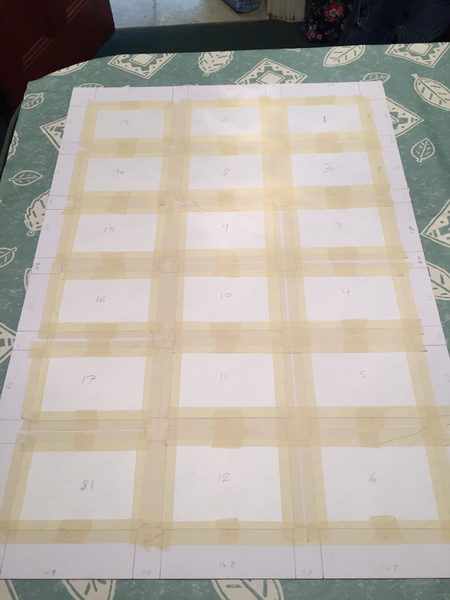
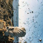
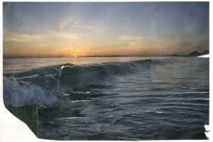
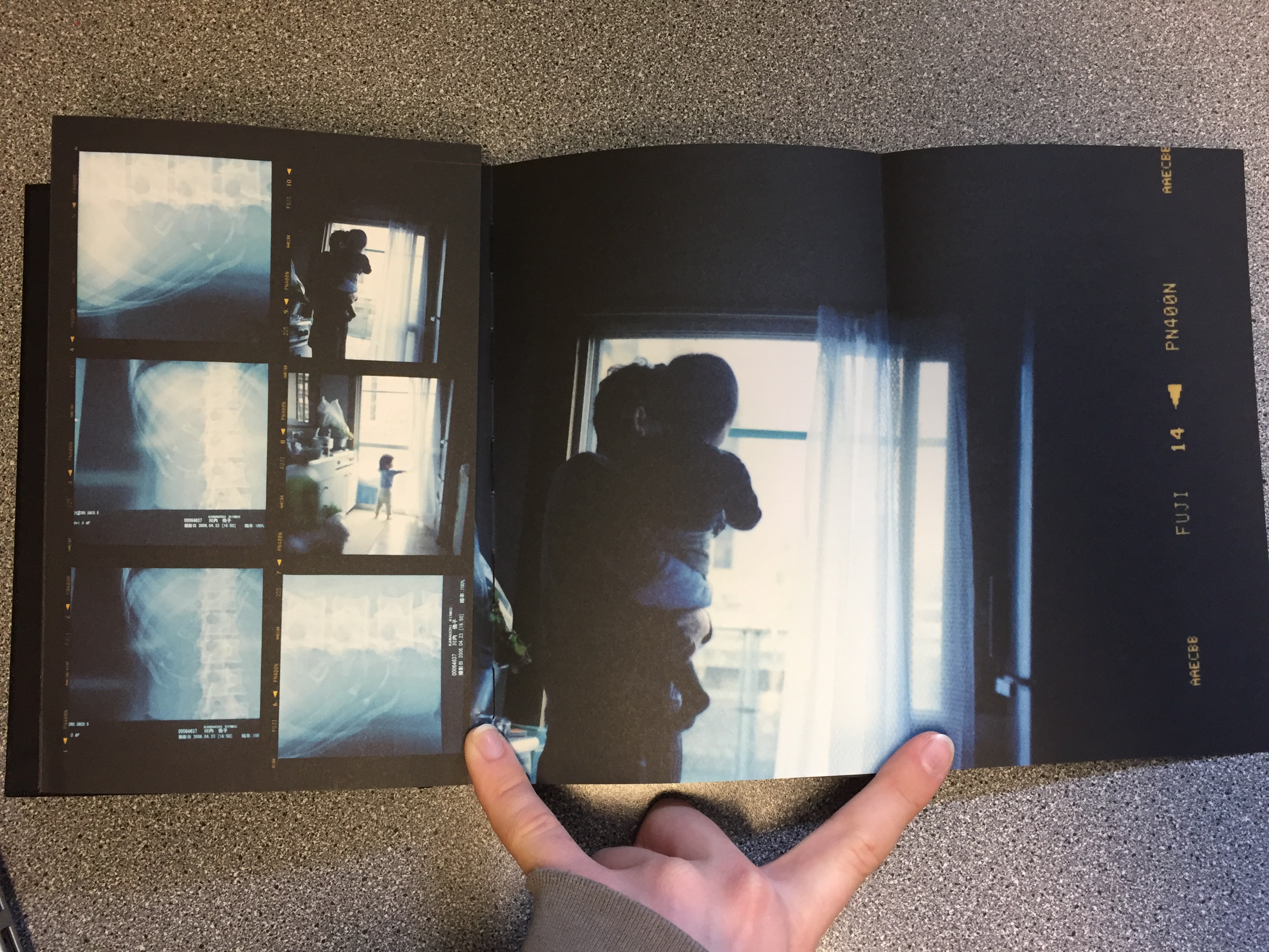
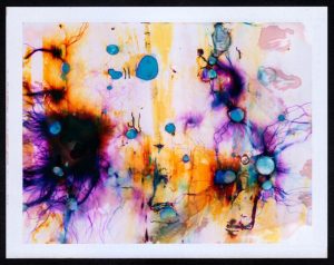
For my final pieces I ended up making two big boards, each with 18 window mounts so that the 36 images could be presented in the style of a contact sheet. These boards were then drawn on with chalk pens to give them the look of marked contact sheets. I really like this part of my final project. The boards are very large and the images being 6X4s are plenty large enough to be able to see in very good detail. I like the spacing of the colours, I feel like the spread of the different colours works well with the range of different images that there are on the boards. I tried to get the colours of the pens to work with the colours of the images as well as with the other pens. Frame 22 shows the red very well against the dark and the contrast between the yellow and green on frame 15 is really positive too. The placement of the different pen colours or strokes are not based on liking or disliking the images, they are an art piece and not a real contact sheet and so this is not important. I would have liked the pens to be more vibrant and a bit brighter so that they could stand out even more against the black board and the images. the board looks much better in person than in these photographs. I left the 33rd frame blank because the image was so destroyed that it could not be printed, to try and make this feel like it was a missing section of film I decided to use some slightly thin art paper and have a hole cut in the back of the backing piece to allow the light to still pass through. It was difficult to draw over the window cuts without jumping the pen, the effect would probably have looked more like the real contact sheets if it was, smoother pen strokes would definitely have helped with this. I decided to move away from the traditional style of contact sheets by laying the images in order vertically rather than horizontally which is the traditional way, this was done in part because the boards were not big enough to be able to fit the images lek this and I did not want to split one set of 6 images over 2 boards, and now the two boards can be viewed individually rather than as a whole unit at the same time.

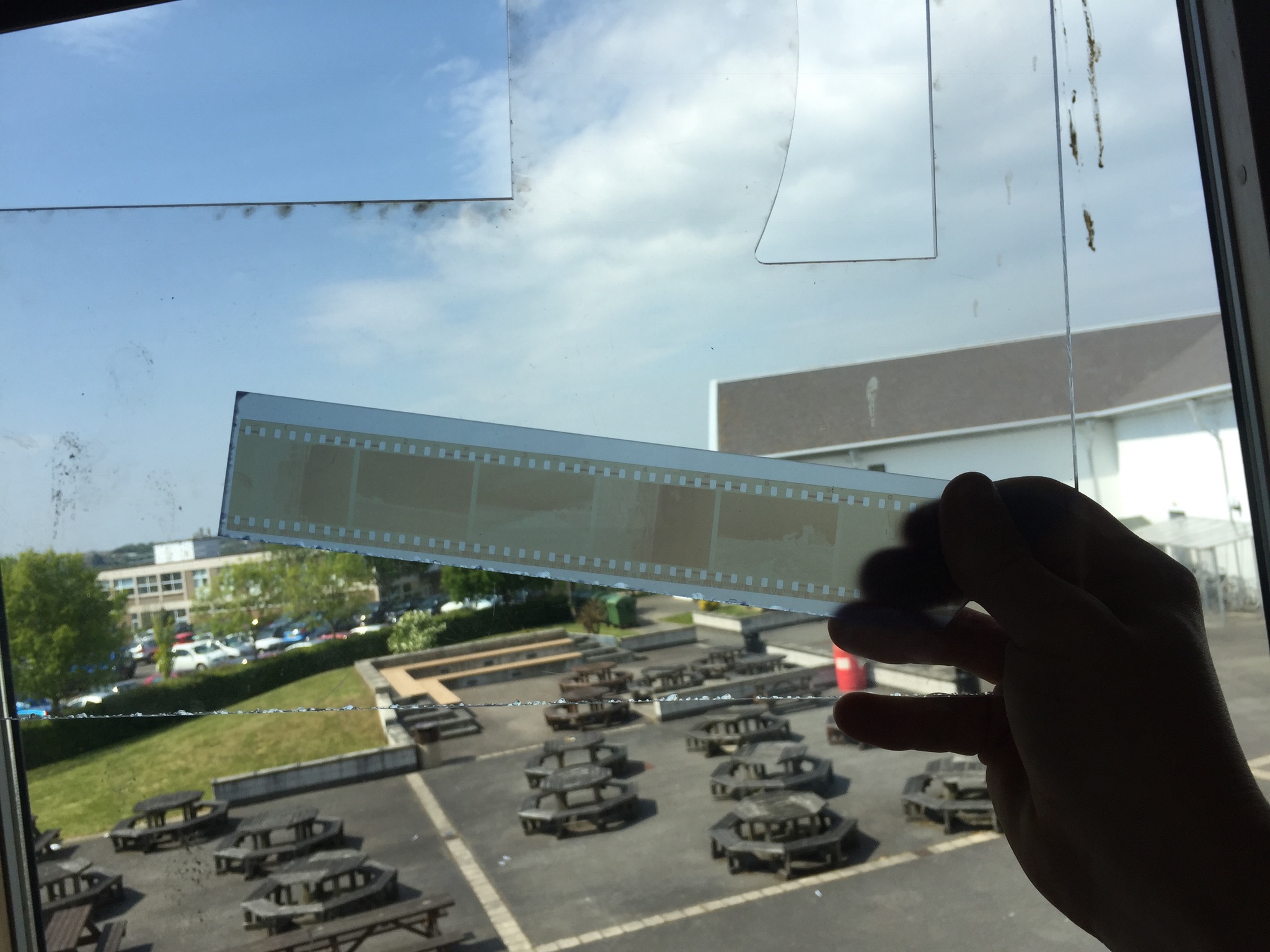
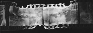
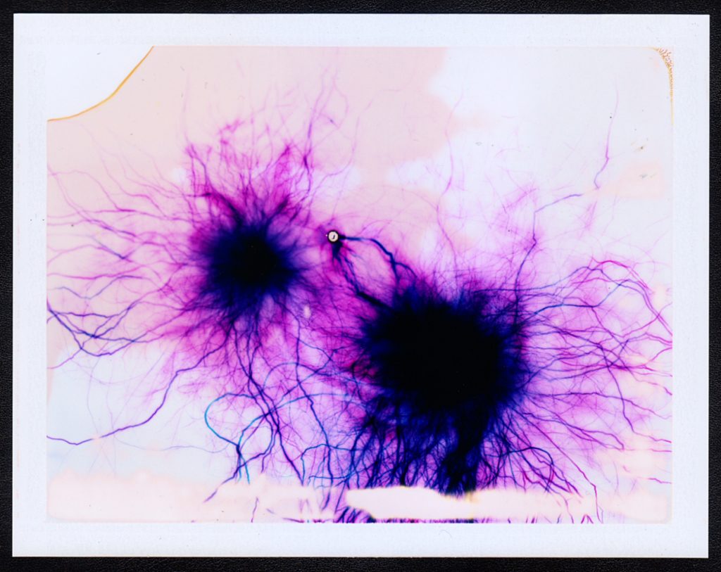
The next component of my final project is the “slides” that I made. These can be used on a light box or they can be held up to a light or window. They really help to frame the images with all of the different types of distortion shown on them, the last 6 frames in the bottom sides show the complete breakdown of the emulsion layer in some places leaving only the plastic base of the film. The first 6 also show the real difference from the others. These ones were completely bleached and so the emulsion layer is a light beige colour instead of the dark brown of the rest of the negatives. These are my favourite part of the final results, they add something really tactile and get the viewer to interact with the images and therefore the environment. Originally they were simply going to be placed on the light box flat [1/4] but I decided that this was not the best way to display them so I made a frame for the light box to make it look nice and hide the unattractive edges of the light box [2/4]. After this i decided that it was a little difficult to lean over the light box to see the images face down so using three small pieces of foam board for each slide I propped them up so that they could all be viewed at one angle [3/4] [4/4]. This really helped them to be easier to view and makes the presentation of them a lot nicer to look at, the foam board pieces do not look good but even when viewing the slides from the side they are difficult to see and so should stay hidden. The element of them that I like the least is the first slide, it is so faded that it is difficult to see against the bright background. If I was going to do this again then I would try and use something to make these easier to see. I would also try and create a viewer that the slides could be placed int to be viewed, acting like a mini light box the slides could be exchanged for one another to be viewed one at a time.

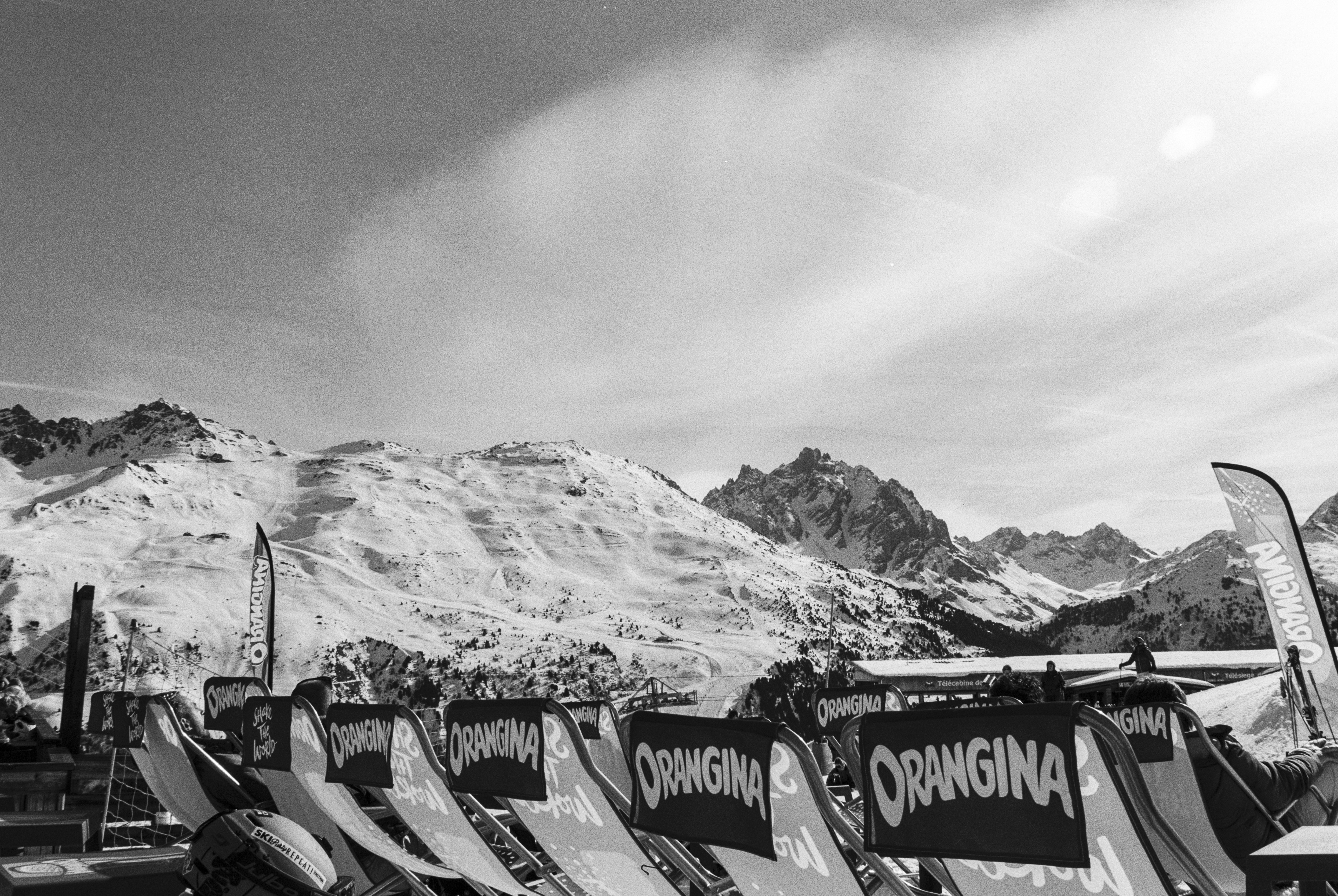
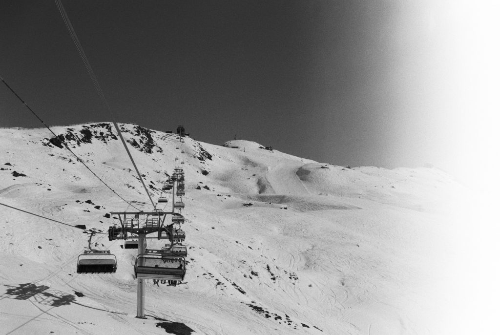
Overall I am very pleased with the final outcomes of this project, it took a lot of time and effort to do because it involved using film but it was definitely worth it because the results would not have been achievable without using film. The different colours and effects that came from them is fantastic and turned out much better than expected.

Process of Making Final Pieces

Making Final Display


Because of the different parts of my final project there was a lot of work that I needed to do to make them. The first element that I started working on was the slides. I knew that I would need to have some way to keep them flat but still be able to see them clearly.

The photo above shows me testing using two pieces of acrylic to look through, one either side of the negatives. The back piece is tinted slightly brown, this was because I knew what It would look like with just clear acrylic or glass there so I wanted t test to see if this was any better. As it turned out it wasn’t, the main problem was that you could see shapes and things from behind the negatives, this made it difficult to see the images properly.

To try and beat this I tried using a piece of frosted acrylic instead of the clear one. Ths as it turned out worked really well for what I wanted as seen in the above photo. It just helped to soften and distribute the light while the light colour of the acrylic helped to let as much light through as possible.

The next step was to make a frame for the negatives. I decided to use a window mount for each of the strips, the first tester one that I did had to have a white background but I made some different variations to test and see which one I liked the most (these can be seen below). The different versions are different colours and some have beveled window mounts and some are just simple cuts. In the end I decided to go with the bottom one as the final version, the contrasting white against the black worked really well and helped to lead from the dark into the light of the negatives (the second last one is the template that I used to mark out the final ones.

Once I had cut all of the frames out I needed to cut the acrylic. The pieces that I used for the backs in the end were not the same colour as the part that I tested, this was because the school workshop where I got the acrylic from did not have any more of that colour. As it turns out though the lighter turquoise colour worked better for what I wanted and made it easier for the negatives to be seen. I cut the acrylic to the same size as the outside of the frames so that it would fit flush with the card.

Then the negatives needed securing to the frames. The side of the negatives that holds the image on faces away from the outside of the frame and touches the acrylic, this protects the images a little and makes sure that the viewer is not looking at an inverted image when they hold it up to the light.

Securing the negatives was done with just some small pieces of masking tape, this was so that if I wanted to I could remove the negatives at some point or reposition them without damaging the film. After this I just placed some double sided tape on the card and used this to hold the acrylic in place and secure the images.

All of the final mounted negatives. This was just keeping them still so that there would be no issue with the tape sticking, i was not taking any risks at this point.

The next thing to do was to make the big boards, although a lot less fiddly and delicate this was the part that took the longest to do and was the most challenging.

The first step was to mark out all of the sections that I would need to cut out. This entailed working out the size for the frames and then marking out this on the two large boards. This marking process took a very long time to make sure that I had got every measurement correct. I completely did one board first before I did the other Incase I decided that i had done something wrong on the first I would not have to remark and cut both boards.

Cutting out the boards took the longest (I did use a window mount cutter it’s just not in this photo) out of all the different parts to this because it was the most important that I got right. I had several scares that I had messed some things up but in the end they all were cut just fine.

The next challenge was to decide how to order the images on the boards. The image below shows how I originally laid them out,meant to be viewed from the left side of this image I decided against this because most of the images are landscapes so most would be at an incorrect angle.


The image above here is the next layout that I tried. This one was better because the majority of the images were orientated the correct way but then I thought about the contact sheets that I had based this on and thought how it was just too different from them. The issue also arose of how the two boards would work together, in blocks of six images they did not work as well.

This layout was the  one that I went with in the end, It works in columns in the order that the images were taken. this way your eyes can follow one column and then go onto the next, seeing the effects of different water damage in each one.

Once laid out they were then taped onto the back of the boards inside their window mounts, again I used masking tape so that I could remove the images without damaging them if I needed to. The tape held strong enough to keep the images in place permanently unless they were intentionally removed.

Making the  other board was exactly the same aside from the missing frame. for this I used some art paper that lets light through quite well in lieu of an image.

To finish the boards I mounted them with solid backing pieces of card to help protect them and keep the a little stronger, for the missing frame (33) I cut a corresponding hole in the backing for this so that light could still pass through.

I bought some chalk pens for writing on the images and boards. I tested them on some spare photographic paper and on the off cuts of card. I tested if they rubbed off, and tested out some brush strokes and just generally got used to using the pens.

Then I wrote on the numbers of each of the frames, this i felt was necessary because it gave the boards more of a feel of the traditional contact sheets while still being my own interpretation of them.

The final works with the drawings with coloured pens on can be seen on the final evaluation and display post. I am happy with how the boards and slides turned out and I feel that the time that I put for them was worth it.

Artist Reference – William Klein

Artist Reference – William Klein


William Klein is a photographer whose work has spanned decades. He has worked with many different subjects and has captured all different kinds of scenes from photojournalism to fashion and even some street photography. Due to the time that he was working in he shot almost all black and white and on film. Recently he has taken a look back at some of his most famous images and the contact sheets that go with them, he has then painted over the image, similarly to how people would mark contact sheets to identify good images and poor images, there is not much reasoning behind way he has done this further than:

“The idea for the colour and graphics comes from the red lines
photographers put around their choices on a contact sheet.”

The massive size of these images once blow up makes them really impressive and striking, the contrasting colours really help to accentuate and frame the images and makes them really standout. I really like this idea and I think that I am going to employ this for the presentation of my final project.

William Klein : “Painted Contact Sheets” Series

https://petapixel.com/2011/08/31/the-stories-behind-photographer-william-kleins-contact-sheets/

Don’t just take, make

3rd Shoot (Results)

3rd Shoot (Results)


This is the results of the final images exactly as I got them back from the developers. There is an amazing range of different colours that came out from the images. The first 6 are bleached from the pool water, then next are mostly unaltered with some discolouration except for frame 7 that suffered the effects of the sea water a little, I found out that the salt water solutions caused the different coloured layers of the emulsion to separate from each other giving these big blocks of colour. Frames 13-18 were kept in the water from the desalination plant, the layer separation here was much more pronounced and produced the incredible colour blocks on frame 18. 19-24 were from St. Catherine’s Woods, this water was fresh and relatively clean but in the first two frames of this set the emulsion begins to crack and break apart, the results of this if it had been left can be seen in the last set of six images. 25-30 are the results of the water damage from Queen’s Valley reservoir, these are the least damaged but they do have some discolouration and frame 25 is just beginning to crack. The final set of frames are easily the most damaged, this surprised me because they were suspended in the tap water, I assumed that this one would damage the negatives the least and I was very wrong, the cracking produced some incredible results, the remaining parts of the image are just visible and are framed by the broken areas. I am so happy with how these final few images turned out.

The way that the environment was able to affect the image in these different ways is fantastic. The results are better than I expected and I am really happy with them.

The other experiment that I tried was to submerge 6 prints in the same types of water, this was mostly an insurance incase the negatives were not damaged by the water. These look really interesting and I have mounted them as an experiment. I only mounted 4 because the other two were not very interesting, I used foam board pieces to keep them off the back piece so that the crumpled, water damaged nature of them still exists. The also still have a tactile nature to them, this tactility gives the viewer a connection to the environment and will make them think about the process over the image itself.


3rd Shoot (Progress)

Destroying Negatives, Progress Update


26/04/2017:

  • I have now collected all of the water from the different locations and they are in the buckets.
  • Getting the sample from the desalination plant proved more difficult than I expected because there was no way to get in without breaking the law. But I managed to get the water sample by asking one of the workers to get the sample instead, he was very nice about this and helped me.
  • Last night I submerged all of the negatives in their respective buckets of water and left them all overnight except for one.
  • The water from my friend’s swimming pool I kept my eye on because this was the one where I was not sure about the potential result. After 30 minutes I checked the tester piece and it had changed colour. It went from the dark brown of the negatives to a very light brown. I decided to check back in another 30 minutes and when I did the test sheet was a very pale white colour. When I saw this I pulled out the real negatives and hung them up to dry off, I did this because I did not want the images to be completely destroyed which is what I expected would have happened if I had left them overnight.
Bleached Negatives After 1 Hour In Pool Water

27/04/2017:

  • I moved the buckets into my shed to keep them out of the rain, and hopefully to keep them a little warmer to help any fungus to grow.

 30/04/2017:

  • I removed the negatives that were dipped in the two saltwater solutions because the images were starting to deteriorate. The top yellow layer began to fall off and was no longer attached to the other layers. I tried to make sure that it didn’t just come completely off and for the most part this worked well, after this I kept the negatives flat to make sure that the layers did not completely remove themselves while they dried. One of them had a lot of sand on it so I washed this off from the undamaged end.
  • In total only three images were damaged by this process, so I’m going to put the other ends of the strips into the water to see if I can get the same effect to happen again.
Negatives Damaged By Salt Water

03/05/2017

  • This morning I checked on the negatives that were till in the water and I got a bit of a shock. The tap water negatives were almost completely destroyed in the submerged part. The damage to it is far beyond what I had expected. I tried to remove the negative as carefully as possible from the water but unfortunately almost all of the of the gelatine layer on the third image from the right was removed and the other images were also very heavily ruined. This has really surprised me because the tap water was the one that I thought would damage the negatives the least but it has done easily the most damage the the physical gelatin layers.
  • At this point I also removed all of the other remaining negatives and have left them to dry before being scanned and printed. The negatives in the saltwater buckets seemed to have had the same kind of separation of the layers that they did before but to a lesser degree.
Negatives That Were Suspended In Tap Water

04/05/2017

  • I got all of my negatives, print and scans back from the shop today and I am really pleased with the results. I did not expect the images to turn out as well as they have. I will not post them all here because I am going to do their own blog post for them but I will post a few of the more abstract ones.
  • Now that the process of making the images is complete I will move on to displaying them.
Damaged by Water from Desalination Plant
Damaged by Tap Water

Contact Sheets

Contact Sheets


Sometimes called “contact prints” contact sheets were used much more frequently in the past world of photography than they are today. A contact sheet is a single piece of paper that is used to show all of the images from a roll of film or for single large format images. For 35mm and 120 film the developed negatives are placed on photographic paper and are then exposed onto the paper. This leaves a trace on the paper of the whole of the negatives, chraceristicaly leaving the sprocket holes and film data on the image also.

Contact sheets were a way for a photographer to be able to view all of his/her images in one place and be able to make easier comparisons between individual frames. Often using pens they would annotate, circle and frame certain images to denote if they are still useful or not, this is similar to how photographers do this today with digital images. When using Adobe Bridge or Lightroom you can go through your images and separate out the ones that you do want and don’t want using colours or numbers, by colour coding using different pens on a contact sheet the images you can do this also. Each photographer had their own method of doing this, come used an X to mark out images, others would put borders around images in different colours to denote different meanings, and some would circle specific frames.

This contact sheet above is of Marilyn Monroe, the flow of the images shows the method of the photo shoot. After processing and creating a contact sheet Marilyn herself has gone through the images, presumably with the photographer Bert Stern, and she herself has crossed out the images which she does not like. There are several contact sheets similar to this with her starring in them that she has also marked. The contact sheet below is another of these. This one is composed of a series of medium format negatives of the star, probably wanting to protect her personal image she has crossed out all of the 11 images, the publication of this image defeats the purpose of her crossing out the frames in the first place but that is beside the point, the fact that the contact sheet gives you a view into the mind of the photographer (or in this case the model) is very interesting. Normally the only image we see from a photoshoot is the one final image, but with this we really get to see the process of the photographer, we get to understand why they chose that one specific image to share over the others that they had available.

One of the most interesting things about a contact sheet is often why a particular image is chosen and why others were rejected. In the youtube video above Elliot Erwitt talks about his feelings towards contact sheets. He starts off by stating that a photographer should never show the world his contact sheets. This is not something that I agree with, I feel that sometimes the context behind why a photographer took certain photos to be one of the most interesting parts of the image. An example of this is “The Magnificent 11” by Robert Capa.

This set of 9 images from the D-Day landings were taken by Capa when he landed with the second wave of assaulters on Omaha Beach. There were meant to be three rolls of images that he sent back but instead these are the only images to exist (frame 9 is published in many different places but the negative itself is missing). There are different theories as to how these other images were destroyed but that is not particularly important, however they were lost it is a great shame that they were. This contact sheet shows the surviving negatives and although small shows a really incredible insight into his short time on the beach. This is why having contact sheets is so important, if only the published images were shown then we would not see some of the other frames, the smokey, shaky, out of focus images that show Capa’s own fear.

This video above is similar to the first one but shows the works of William Klein instead. One of the specific points in the video (6:03) he talks about taking photos of a shop window, a person approaches the window and stands there “it’s a photograph” then the person starts pulling faces and it’s ruined. This ability to capture “the decisive moment” is often not thought about enough, because today we can snap away at crazy speeds we capture every moment and look back later, with film this was harder and so seeing how this perfect moment was captured is often very important. Klein also talks about the amount of time of a photographer’s work that is seen.

“The picture is taken at 1/125 of a second. What do you know of a photographer’s work? A hundred pictures? Let’s say 125. That comes out to one second. Let’s say, more like 250 photographs? That would be a rather large body of work. And that would come out to two seconds. The life of a photographer — even of a great photographer, as they say — two seconds.”

he mentions this because although the work of photographers takes a lot of time to set up in the end often is is only a second or so of their work that we really see. This makes being able to expand upon these single images so important, understanding an image takes more than simply seeing it. Thought has to be given to the background of the image and why we are seeing it over the other images that were likely taken at the same time.

This link was really useful for me in looking at how photographers mark their contact sheets. the hand written nature of the marks on the images really lends a touch of personality to the images. Not only has the photographer taken the image they are leaving this personal mark on them. The different colours work really well against the black and white images, they highlight different elements of the sheet to be looked at closer. Sometimes even making notes on the image or highlighting areas of the images for post processing.

The book Sheets by Rinko Kawauchi is another example of this artistic use of contact sheets. Although the images  are not in the traditional contact sheet style they do show the progression of work that has happened throughout the life and work of Kawauchi. With folding out pages with larger images it is almost the same kind of thing as writing on the images. Attention is drawn to the photographer’s favourite images, and the other images are still there to give context to the best images. The book is fantastic because it not only shows the work of her for one project but it shows most of her work over her lifetime. Although more of an artistic book it is still a fantastic thing to behold. This link goes to the page for her book and this one to another page that shows some more of the pages.

Because I am using film for my project I could possibly look at making a contact sheet from the negatives and blowing it up or I could use larger printed images and make a background for them. By drawing on the images using different coloured pens I can create different effects, drawing attention to the different images and annotating them. Alternatively I could look at using the colours to complement the colours of the images, I have looked at the work of Klein briefly and will do in more depth but specifically his contact sheets project. He uses coloured paint on blown up negatives to create art pieces, the paint is not usually denouncing images but just to act almost as a frame for the real images.

This link also shows some other examples of famous contact sheets.

3rd Photo Shoot (Planning)

Destroying Negatives, Shoot Plan


After doing some research into different was that people have of destroying negatives to create new artwork I have decided to do this for a shoot (I don’t think “shoot” is the right word but I’m going to use it). I’m going to start off by taking a roll of film and shooting all of the images on it of the coast and possibly reservoirs and other water sources (the images will more likely be of the sea because that is the main focus of my project), and then I plan on getting the roll of negatives developed before using water to destroy, corrode or otherwise alter the negatives. By using different water sources and looking at and comparing the different ways that the images are distorted I can show how water is not all the same.

Fungus Damaged Film Slide

I have two plans for how I am going to go about this. The first is going to be involving the negatives from the roll that I will have taken, the second is going to be done using printed images that I have already taken on my digital camera. I am going to collect the water from 6 different sources for the project (about a buckets worth for each), some of the locations will produce different types of water and others will produce similar types of water. Despite this I am still looking forward to seeing the different results, the locations that I am going to source the water from are listed below:

  1. Queen’s Valley Reservoir
  2. Sea water from long beach
  3. La Rosière Desalination Plant
  4. Stream in St. Catherine’s woods
  5. Pool water
  6. Tap water from my home

Once I have collected the water I am going to bring it back to my house, once here a small amount of each sample is going to be poured into a tray that I have borrowed from the school’s science department, these are what will hold the printed images, I will use some blue tack to hold the images under the water and I will be keeping an eye on them to determine how long they should be kept in there for. I am expecting the images to run but I am not sure on specifically what will happen, this again lends to the uncertainness and ideas of the unknown and random that I am looking for in my project.

The trays that I borrowed/stole from the science department

The negatives are going to be done slightly different and will require more time and thought given to them. I have looked into the different ways to use water to edit negatives, and for the most part, simply submerging the negatives in the water will likely not do much due to the fact that negatives need water to be developed. The main cause of water damage to negatives is from fungus/mould that grows on the negatives and eats into the gelatin layer thereby destroying the image. This will make the process more involved because it will involve me removing the negatives from the water and drying them out before submerging them again. To involve the environment more I am going to also take pieces of the environment like sand or dirt, leaves and seaweed to keep in the buckets also.

To help me get the best out of this process I have been doing a lot of research online into water damaged film. Almost all of the results that came back were about how to recover film from water damage and cleaning them up afterwards. With this in mind however I will try and employ the opposite techniques to what they suggest, so this means that I will need to let the film dry to induce growth of fungus on the film and when they are drying I will not have them free floating, I will let them dry face down and curled up to induce distortion on the images. To try and understand a little more about the process of doing this I emailed someone who used to be a specialist in film restoration to see what he could tell me about this. the first thing Mick (I didn’t get his full name) told me was that:

“it’s not actually water that damages film, film is born and bred in water during processing, the issue is bacteria that will start to colonise the film once it is wet and remains wet for some time and these are responsible for the effect that is called water damage.”

He then suggested

“leaving some negatives (colour film may work better as the silver ions in B&W film are highly toxic to bacteria) in a bowl of pond water (no chlorine etc added that will impinge on the rate of growth) somewhere not too light (but it needn’t be dark) for a while.”

He could not give me specific time frames but he said anything from a few days to a week depending on where the images are stored. He also gave me one final piece of advice for possible health issues that I may encounter;

“careful, you are dealing with a potential biological hazard (known moulds on film include aspergillus fumigatus – Google it).”

Taking all of the information that I have gathered into account I have come up with a plan for how I am going to create this part of the project.

  • The first step will be to take the exposures on an appropriate roll of film, as Mick suggested I will not be using black and white film, from here I have chosen to use a roll of Fuji Superia 200 that expired last year. I chose this roll over some of the others that I have have for the main reason that it was the cheapest, because it was a little expired I got it at half price and it is not that expired so the images will turn out fine I’m sure. And as long as it is bright when I decide to shoot then I can use that film.
  • To take the exposures I will load up one of my cameras and will travel around the different waterways in Jersey (depending on time constraints I may have to just stick to photographs of the coast).
  • Once I have taken all of the exposures I will need to get the film developed, get the negatives back and cut them up into 6 sets of 6 or individually divided into 6 groups.
  • Then I need to collect the water from all of the different sources, bring them home, and submerge the negatives under the water.
  • After about an hour I will take them out and suspend them just above the water, making sure to splash them every 12 hours or so to make sure that they don’t completely dry out.
  • Other than this there is not much I can do except for handling the negatives roughly but while still wearing gloves and letting the gelatine surfaces stick to each other. Possibly touching the wet gelatine layers will distort the images but I’m not too sure.

To help me with this process I have got some negatives off a friend, these were almost all completely exposed and so are perfectly blank, this will allow me to see if there could be any changes that I might not be able to see on frames with images on them.


Manipulation of Film Negatives

“Breaking” Film Negatives


Going on from looking at using film I have looked into different ways that you can distort film negatives. By distorting the negatives and rescanning/printing them you can get some incredible results that are completely unpredictable. I have looked at a lot of different ways of distorting and destroying negatives. One source that I looked at first was this article. It talks about many different ways of distorting the images that are stored on a strip of negatives and how they can have different effects. One of the more abstract results that they show are by the artist Phillip Stearns.

He creates his pieces in an unusual way that even different to the other artists that manipulate film. Instead of taking images on the film (Fujifilm FP-100C Color Instant Film) and then messing with the negatives, or messing with the film and then taking the images, he simply messes around with the film and then those negatives are the final pieces.

The video above shows him using some of his techniques. He uses many, many different ways to edit the negatives, including different chemicals, high voltage electricity and even common house salt but in the video we only see him using 15,000 volt electricity and comoun bleach. He never knows what the images will look like until he opens the negatives and sees the final result, this sense of the unknown and anticipation is what I want to achieve with my project, due to these both being properties of water. Stearns talks about why he has chosen this as a project that he pursued on his blog here. He says that

“I was struck by the similarities between the layering of materials in the film and the layering of cells in the [retina]… the similarities were striking.”

He goes on to talk about how the camera is the extension of the eye and looking more into the links between the images that he is creating and the different things that are going on in the human eye. Stearns mentions that with digital photography there has been a loss of connection between the eye and photography and so he is almost creating these images that bring back that link between the eye and photography. To link further to this he says:

“I find it curious and exhilarating that the impressions left behind after developing these extreme exposures so perfectly resemble networks of blood vessels in the retina.”

The two images above demonstrate this visual relationship between his creations and the physiological structure of the retina. They both have these large spots of darkness, in the retina these are the optical nerves or the Fovea centralis, and in the artwork they are the epicenter from where the electrical current touches down on the film.  The “veins” that come out from here also look very similar to each other and really lend to this connection between the eye and his artwork.

A similar idea but more connected with my project is “Fox River Derivatives” by Peter Hoffman. In this series of photographs Hoffman traveled along Fox River in Illinois with a medium format camera taking images of the river and it’s immediate surroundings, he then takes the negatives from this and sprays them with gasoline before throwing a match into the pile of images and gasoline and dousing them with water before they are completely destroyed.  He talks about his motivation for the project being that

“our consumption habits—specifically dealing with precious natural resources—are out of control and unsustainable.”

He talks about how the next generation will not get to see what we get to see and so to highlight this he did not just want to make photographs of the river, he wanted to have an element of destructive chance being applied to his images.

“I wanted to transfer that feeling I had, which was maybe something like a sense of powerlessness or dread, to the image making process. I wanted to lose control, having the resulting work border on ceasing to exist in any recognizable form.”

The surreal bubbly effects, often obscuring other parts of the image show the rapidly disappearing natural landscapes that are almost hiding behind the destruction. By using gasoline he is using one of these natural resources that we are using up and exhausting to destroy the natural landscapes he is showing the volatility of the environment, and the randomness with which it is disappearing.

But out of all of the different examples of what other artists have done this kind of film manipulation the one that I connect with the most is the work of Matthew Brandt. He has made lots of different bodies of work and there are several of them that are relevant to my project. The first is titled “Waterbodies,” in this series he takes a number of images of different bodies of water, often oceans, and collects water from them.  He then uses that water as part of the development process to create the final images.

He has not produced many images via this process but it is very interesting to see what the images have turned out like. This concept of using parts of the environment to create these images is a very interesting idea to me and even though they are not the most visually impressive the concept behind their production is really fun and suited well to my project. I looked for the conceptual reasoning for why Brandit did this particular project but could not come up with anything in particular. My interpretation of it though is that to create something then you need inspiration and resources. He already had the inspiration for these images but for the resources he decided not to use the standard salted water for the development process, instead allowing the environment to leave even more of its mark on the images. A truly personalised image that is perfectly customised for the environment.

While he was taking the exposures of this project he came across the idea to do another project, Lakes and Reservoirs. This body of work does not involve using the water to create the images, instead it involves using the water from the environment to destroy the images. Finding out the reasoning behind this project was not what I expected ether and may explain the lack of information about the previous project. In an interview with Brandit for Dazed Magazine the article states that:

“The creative process of his latest series  shows that he clearly understands the art in photography, although Brandt himself insists it is merely a representation of what he sees in front of him.”

Later on he talks about the hiking and climbing that he needed to do to be able to take the images that he used. and how even though the images were being taken to be destroyed he still spent the time to get into good position and to properly compose the images.

“For these ‘shots’, I was looking for the most calendaresque view I could find. A view and composition that was the most encompassing to visually represent that lake and/or reservoir… to me, I enjoy the perversity in subverting all this photographic labor by later degrading it with the lake water.”

This is definitely something that I am going to look into for my project. There are a lot of different water sources around Jersey and it would be interesting to see the difference in effect that this could have on the images. I will be updating about my process of altering the negatives in another blog post.

More links to pages that I found interesting:

Film

Why Use Film?


Recently I have begun to use film to take photographs with. I did not use it in my coursework but I do plan to use it for my exam to a degree. Film does not have a huge number of advantages over digital for the purposes of an A-Level course but I feel that it is important to understand where photography has come from if we are to use it properly today. Film also increases the challenges with photography, not being able to see the image straight after it has been taken makes it hard to be sure that your focus is set correctly or that the image is not under/overexposed. One of the biggest hurdles that I have encountered is the set ISO of the roll, this effect makes it difficult to use a roll for more than one shoot, and the ISO needed must be assumed before it is loaded into the camera. The set number of exposures that can be taken on a roll can also be a challenge, often it would be alright if one roll is completely used to load another roll of the same film and continue shooting but with my project being about water and one of cameras being an underwater camera this roll cannot be changed while still around the water. This factor limits me to 24-36 exposures per in water shoot. In doing so I am forced to think a lot more about each image, the framing and composition of each image is much more important because I cannot simply delete the image and take another, what you have taken is what you get. Another major drawback is the price, buying film is expensive (£5-£8 for a roll) and getting it developed, scanned and/or printed is even more expensive unless you learn to do it yourself (the cost really makes you value each exposure that you take). All of these reasons combined make film a difficult thing to shoot with and it makes me glad that I have access to excellent digital photography equipment for relatively low prices.

Even with all of the downsides of film it is still  a lot of fun to shoot. The grain of film is sometimes seen as a downside of film over digital but I like the effect that it gives to the images. They have a certain softness present that can be achieved in after editing of digital photos but will never be quite right. The way that the individual crystals will change under the different light is recognised as an organic process, they do not change to specific values. This is something that favours film over digital, with digital the information for each pixel is defined, there is a certain point that a colour can reach before it becomes another colour, this change is a gradual change and not a one-or-the-other change. The smoother transition through colour ranges or from black to white is the biggest visual advantage of film over digital.

Orangina – Ilford FP4 Plus 125

The image above is one that I took on a recent skiing trip. The gradient of light in the clouds at the top of the image is fantastic, to get this kind of flow of from black to white would be harder to achieve with a digital camera.

I also recently bought a fully manual 35mm film camera from a local charity shop. Only costing me £10 including the lens this camera only needed a little fixing and a clean up before it was ready to use. The camera is fully manual, the only aid on it is a light meter and the focusing meter. All of the individual settings (aperture, shutter speed,  focus  and ISO) have to be set separately for the images. Although doing this for each photo can be tedious at times the result is that I have spent more time learning about what settings all of the different scenes will need, getting used to balancing the aperture and shutter speed to fit the ISO has really helped me when I am using my digital Nikon for different shoots.

One of the other aspects of shooting film is the chance for it to become corrupted in different ways. The four images a bove were from the same roll as the other black and white image above but have suffered a light-leak (someone opened the back of my camera), this is where unintended light somehow or other gets onto the film and exposes it. This causes the film to become discoloured if it is colour film or to become completely white like the images above for example. Although technically ruining the image, the effect of this can sometimes make the images much more interesting than they already were. Film can also be corrupted by going out of date, the image below is one that had been sitting in a camera of my mum’s for about 15 years, this has changed the film’s colours quite a lot giving the image the super funky blues and the heavy grain. Again while technically ruined I really love the image, the colours again making the image more interesting that if it was just as it was means to be. it is not something that would be used for a documentary style of image but using exposed film for artistic purposes is perfectly legitimate.

All of these things have convinced me to pursue film photography as an aid for this project. Mainly I will be using my digital camera but there is definitely still a place for film in my project.

2nd Shoot (Experimentation)

Experimenting With 2nd Shoot


Normally when trying to achieve abstract results on photographs I would use different images or textures as layers to do this but after a little bit of trying it was difficult to find anything that worked well so I decided to use different colour and effect layers to see what kind of effect they could give to my images. There are lots of different options that photoshop  has for me to use like this, the first of which is the Posterize Tool.

These two images were created by using the posterize tool. The first one is just the posterize layer placed on top of the image and the intensity reduced a little. After I had created the first image I decided that I liked the effect but there was something missing from the image, it felt a little too disconnected from the original image but I still really liked the effect of the reflection on the water’s surface. To try and overcome this I used a layer mask to remove the posterizing effect from the model’s body, head, chin and arms. This does not make it look that different from the previous image but on its own I much prefer having the slight posterization effect on the water but still being able to have the model looking normal.

Even Though the shoot was meant to be based around colour while editing this image I decided to try out the black and white tool to see what kind of effects I could come up with. The first experiment with black and white was to just add a black and white layer to the posterized image layers in Photoshop. This gave an unusual effect to the image, the posterization is particularly noticeable on the subject’s neck, the solid blocks of dark grey make the image lose some of its feeling of reality, the image looks overly fake I think. Insite of this I still liked the B&W and wanted to pursue it further on this image, so I started again with the original image as my base. The first step was to add the black and white layer, but when I added this layer I did not just leave it as it was, because doing this it just made the image much more boring.

Instead I changed the levels of the different colours to change how dark all the different colours were represented. The image on the right above shows what the image looks like with just a regular B&W layer added and the image above on the left shows the final settings that I used to create the final B&W image. In addition to this I added a gradient map layer that only had a little effect but really helped to make the watershine on the model’s chest show up better and drew the dark background in around him more. I also used the sharpen tool to help with the general softness that comes from shooting underwater and the dirty condition of the pool.

The other image that I decided that I wanted to try and experiment with is this one. It does not look very clear in this state but after editing it I got a really abstract effect to it and it became much sharper. The screenshot below shows the layers used to create the image.

For this image I first tried to use just a black and white layer to do the same thing as before but this ended up just like the first B&W attempt for the previous image and even adding the gradient map layer it did not look how I the other image did, because of this I decided to take a different approach. This mostly involved just randomly adding different effect layers and playing around to see what would come out. This image was one of these random experiments.

By adjusting the channel mixer and B&W layers I managed to get  really unusual effect whereby all of the model’s makeup which was a light blue colour turned to a very stark black and really stands out where it had not before. This, combined with the reflections behind the model really make this an unusual image to look at, there is lots going on and yet the viewer’s eye is drawn to to the model’s face still through the regular shapes of the dots of his makeup which starkly contrast the flowing irregular patterns of the water’s reflections. An element that was not very easy to see in the original image was the bubbles in front of the model’s face which show up really well in this version. Having the dark background to the image with its tentacle like lengths of darkness that almost seems to be drawing the model under the water and into its depths, combined with the model’s pained expression (he could not stand getting water in his eyes, hence the squinting) really add a sense of drama and feat to this image. The image lends itself well to the notion of fear and mystery that surrounds water that I have already looked at. The image is not exactly how I would like it to look though, the model’s chest and arms are kind of lost into the background, they do not stick out from the background, in a way this is good because it does not detract from the model’s facial expressions that are the main feature but I would have still liked for them to be a little more visible. I am also not too keen on the vignetting at the image’s corners. This element, although it does not take much away from the image, draws in too much from the bottom left and the top right of the image, making it seem like the “drawing in” effect is overdone. I was oping that I would be able to obey the rule of thirds for this image a little better too but this did not work out perfectly ether. The background over the model’s right shoulder while taking up a large proportion of the frame does not take up two thirds and so does not fit well, I tried cropping the image so that this would work but it could not be done at the same aspect ratio without losing too much of the background of the background, and I did not want to change the aspect ratio. Overall though I really like this image, it is abstract and involves the ideas of colour and water by replacing what would be grey and white in a B&W image was blue, the traditional colour of water in a very non traditional image.

Unlike the previous image this one managed to follow the rule of thirds, with about a third of the image being a dark mass overseeing the model it works quite well I feel. I really like how the reflections on the underside of the water’s surface worked out, they act as a sort of set of leading lines almost that lead towards the model’s shoulders and alluded to something more existing above the water but by not showing his face removes this reality. The empty spaces on the right of the image are not completely empty, I think this really helps the image in not being an uninteresting image, the slight ripples and the fading out arm fade the image away and ease the viewer out of the scene instead of having a solid cut. The idea of mystery and power is also conveyed through this image because of the low angle of the photograph, the model’s face being obscured makes you wonder who they are and why we cannot see their face. The B&W really helps with the abstraction for this image, giving it a wholly unnatural look to it making the water seem murky and asif the subject is being pulled back into the darkness or if he is emerging from the darkness towards the viewer. I do wish that this images could have had the same kind of effect in color because this was the original intention of the shoot, but sometimes things don’t work out as planned and you need to adapt to what you have to be able to produce something.


This video is not important to the blog post but the reflections of the waves reminded me of the results that came from this shoot so I thought that I would just put this here.