All posts by Gio Rios

Filters

Author:
Category:

Environment – Evaluation

To conclude my project, I will discuss how well I believe I have fulfilled exam criteria, as well as realising my initial intentions for the project.

Initially, in regards to my exam brief I believe that I sufficiently addressed the task at hand to a respectable standard and to one that I am proud of. Environment is of course a broad topic, but I feel I had narrowed down my thoughts well enough to pinpoint an idea small enough that it became personal to me.

I feel like my photography has vastly improved in comparison to my previous works throughout the course. Not only in technical qualities but also through the art of story telling, being more conceptual and as well conveying more of a message through my imagery in such a way that I haven’t quite been able to in previous projects.

In addition, the initial ideas I set out to explore within my project, I feel I successfully explored in sufficient depth. My intentions were to explore significant aspects within my own personal life, which in turn almost create my environment. Through exploring this theme of environment I have realised that the friends within my life predominantly make up my environment, as no matter where I am, being with them creates and becomes my ideal setting.

The images I have taken and presented show the relationship I share with these individuals in such a way that is almost poetic. They are of course not saying anything verbally, or even specifically acting in an irrational or noticeable way. Yet through their comfort and equally their shyness or awkwardness, a sense of relationship is shown that is almost hard to describe through words. I think the images speak for themselves.

In terms of my artist references and inspirations, my final body of work was heavily influenced by this. All artists that I chose to explore, featured a strong sense of environment within their work, as they all explored their own personal ones. Which is of course what I went on to do myself, fitting into my exam theme. Overall, studying these artists led me to take my exam title ‘environment’ and make it personal.

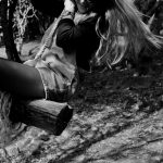
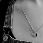
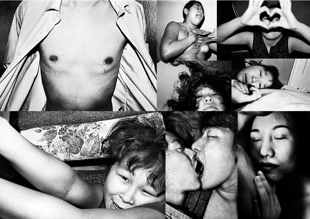
The styles of each artists has in some way become incorporated within the photographs I have taken. Examples are shown below, where I have attempted to create my own response to certain photographs by each artist, containing similar composition and aesthetic, in my own style.

Ben Gore 
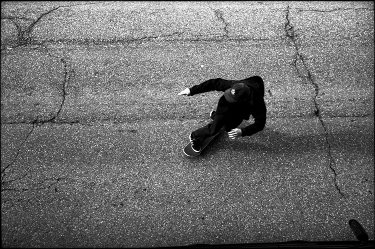
Related image

Jacob Sobol 

Image result for Jacob sobol sabine

Theo Gosselin

My work is summarised and presented most confidently through my final images, where I display a portrait of each character I photographed alongside an image that is juxtaposed. This in many ways creates a more personal image, as firstly the use of a portrait implies a sense of relationship as only a certain type of person would be allowed to photograph a subject so closely or intimately. As well the inclusion of a juxtaposed image suggests understanding of the subject.
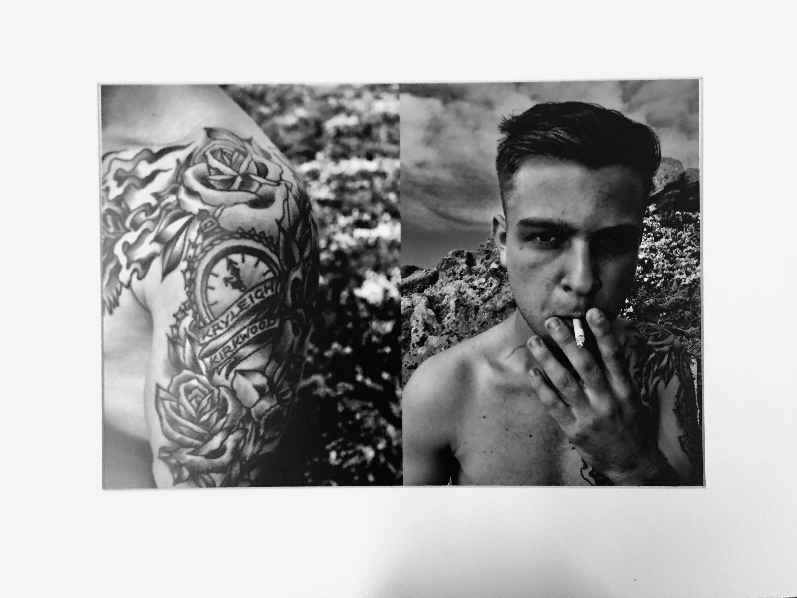
An example of one of my final images, mounted and presented as an A3 photograph, is featured above. Firstly, I chose to print my final images as A3, as I was combining two images into one and felt that they needed to be on a large scale in order to fully see the image and my intentions for combining two. Secondly, my choice of a white window mount was to allow for the high contrast within my images to really stand out and become a focal point, I felt that black almost drained my images of this quality.

In terms of the compositions of my final outcomes,  each was created with the same intension, which was to present a portrait with a juxtaposing image that would suggested something about the character.

This would then help to add meaning to the photograph. The concept was ultimately to to present a personal relationship between myself and the subject, which was achieved in the way I photographed these characters so intimately. Symbolising friendship and closeness.

Environment – My Book Layout

Here is a link to my Blurb photo book:

http://www.blurb.co.uk/b/7937421-are-you-even-cool

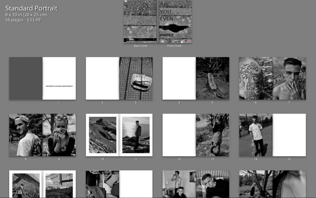
After the refinement of each of my photo shoots, I came to the realization that I had a large amount of strong images, in which I would have been happy to present as finals. With this in mind, I therefore decided to create a photo book in blurb to present these images more intimately.

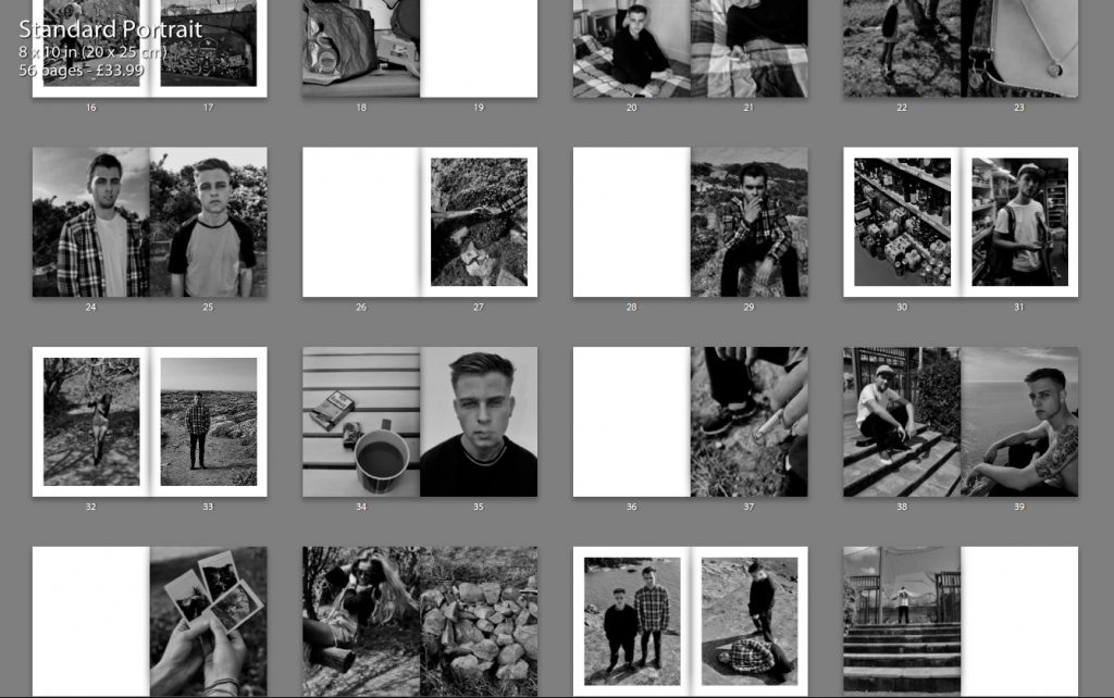
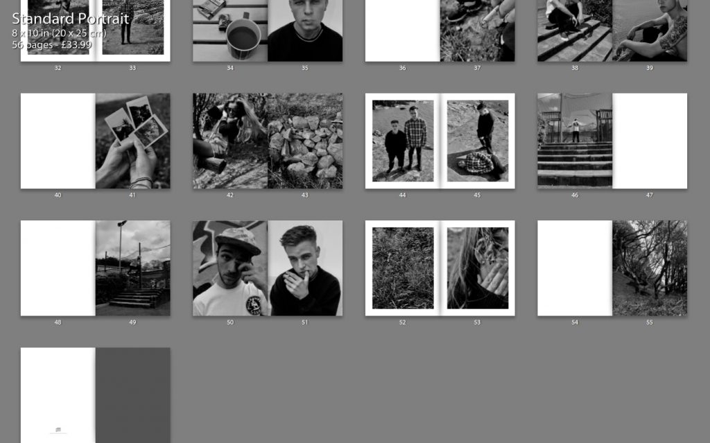
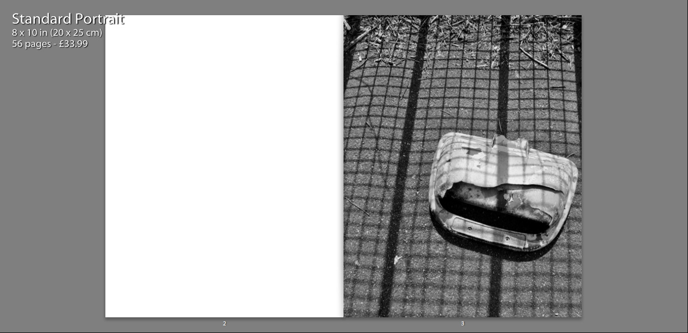
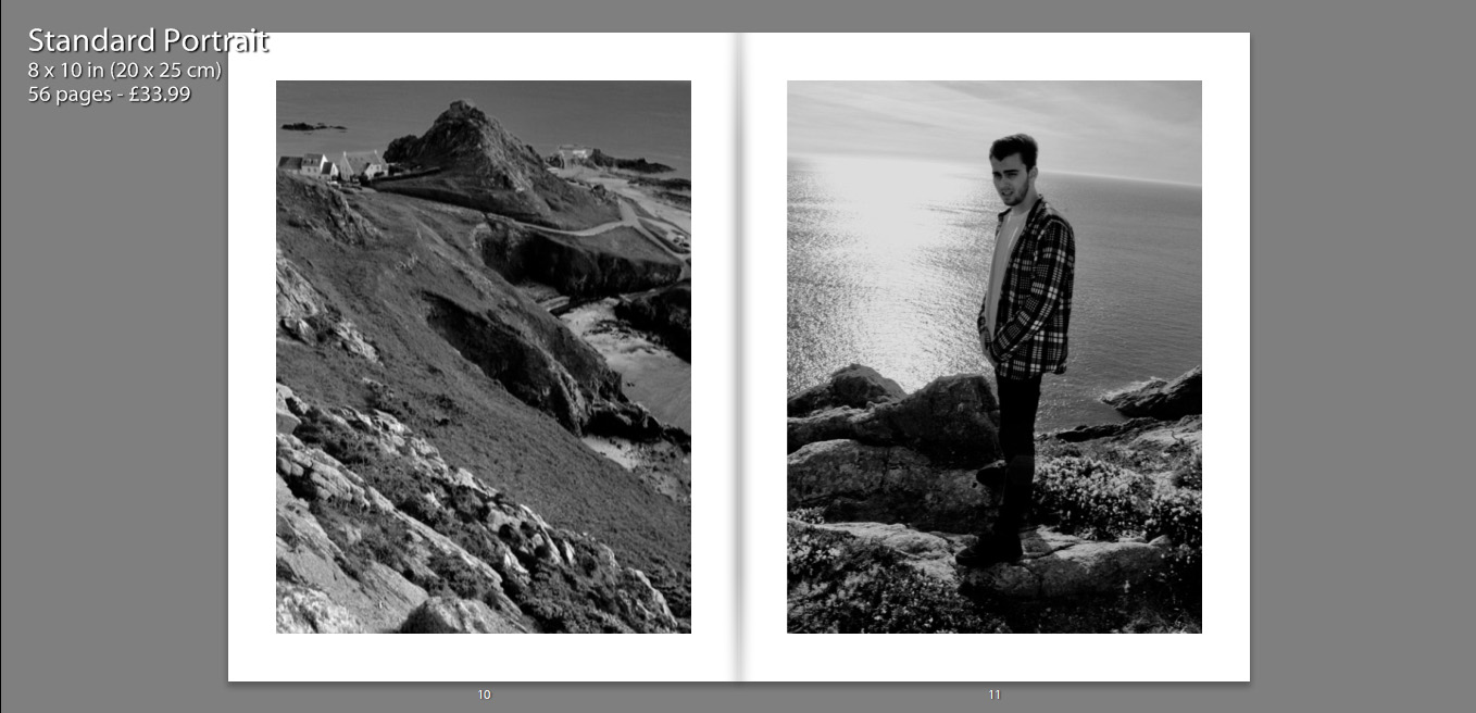
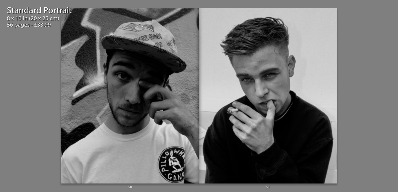
Below shows a thumbnail view of my final book layout. I feel that this thumbnail view gives a stronger perspective of the layout as a whole, in comparison to the individual pages, as it is much clearer to see the overall aesthetic of the book and why I made certain choices with the layout.

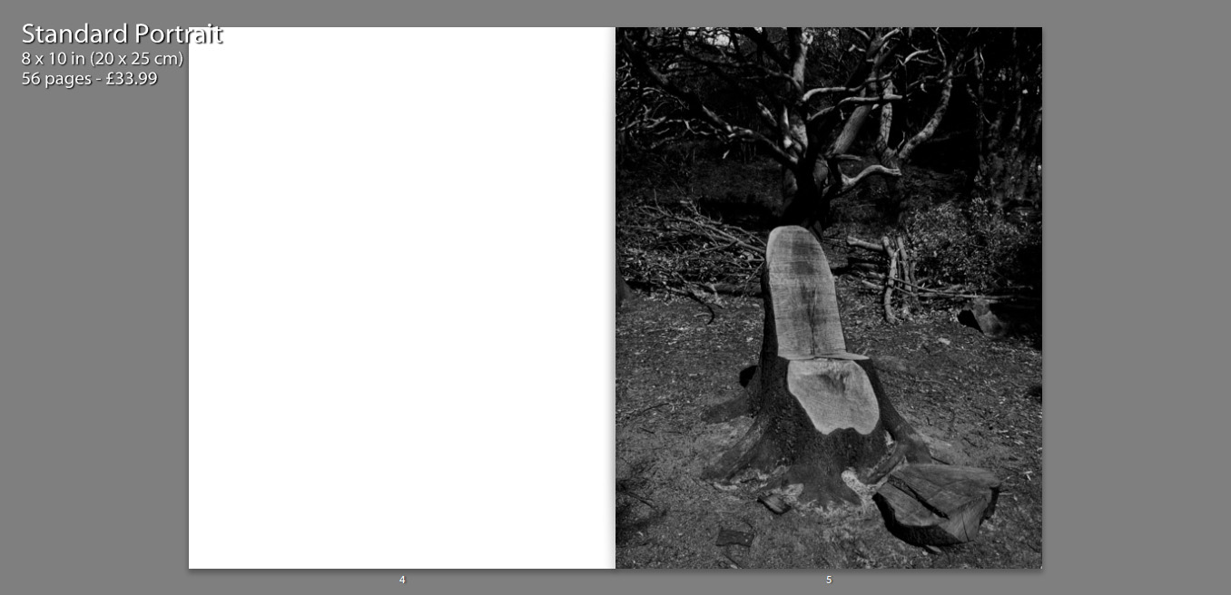
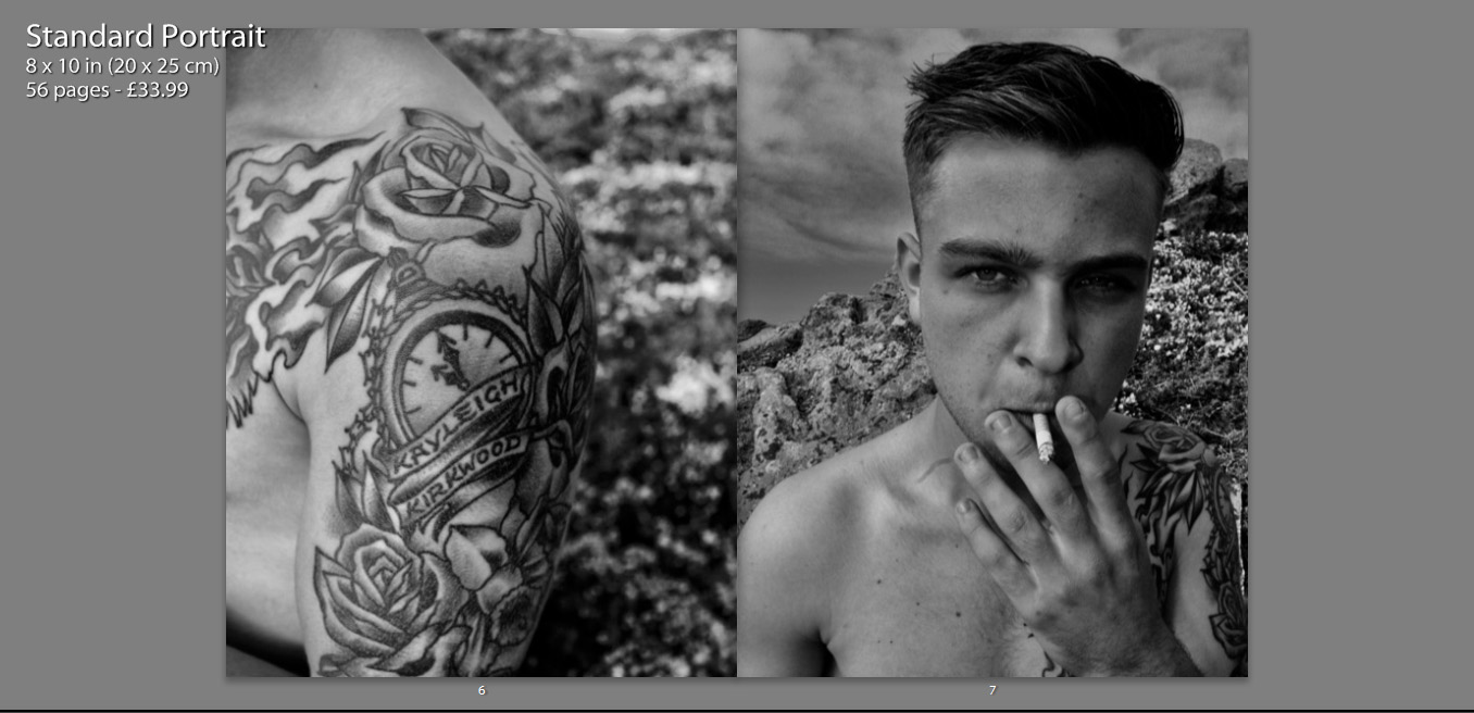
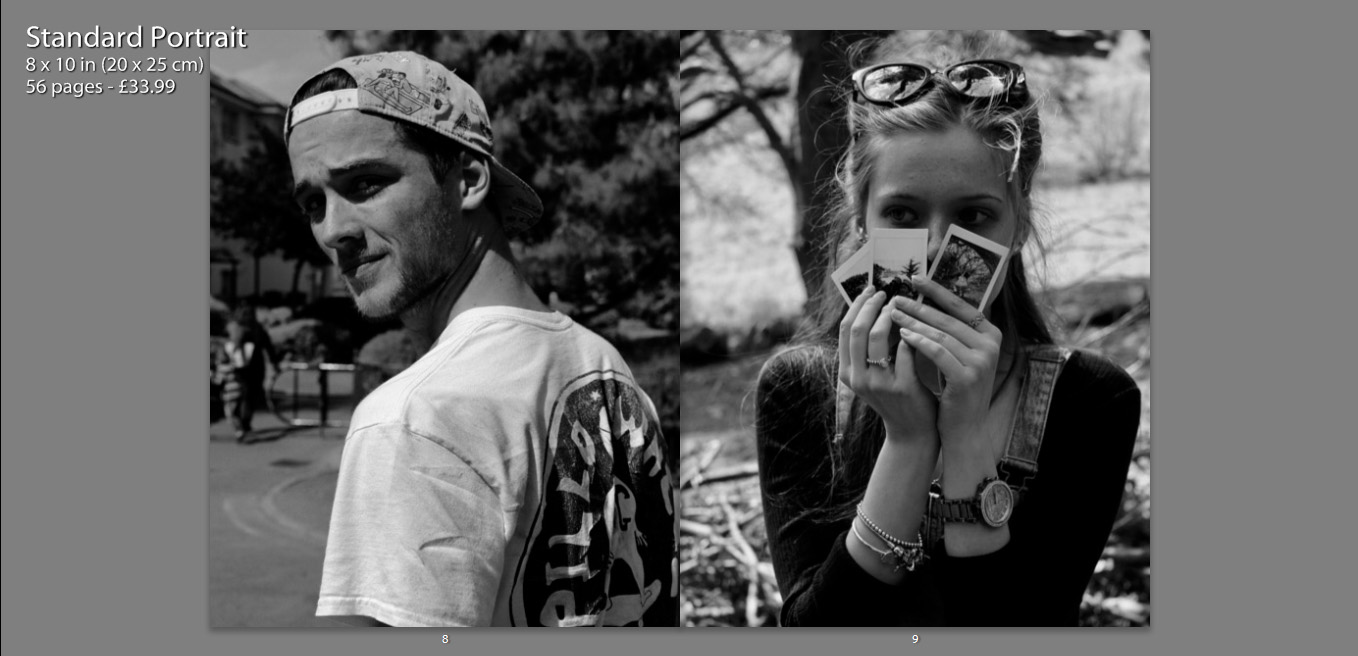
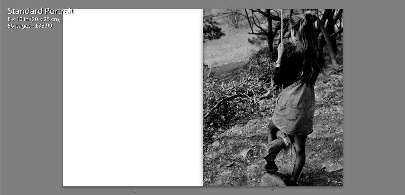
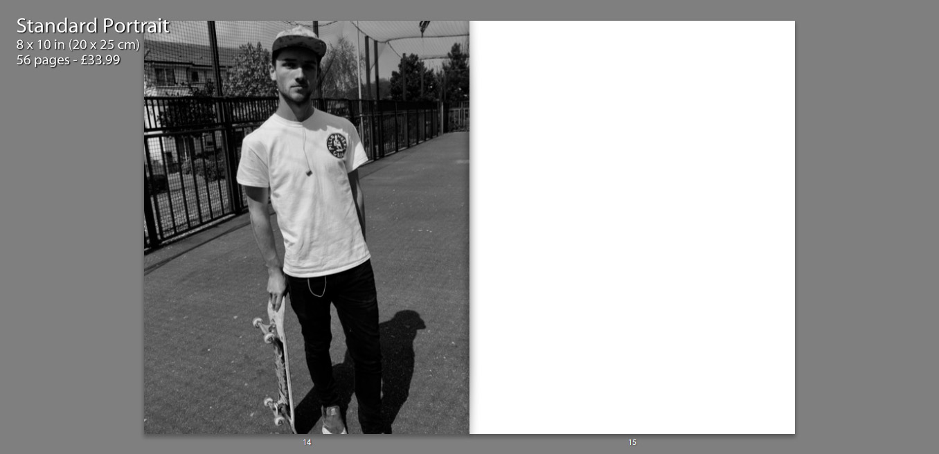
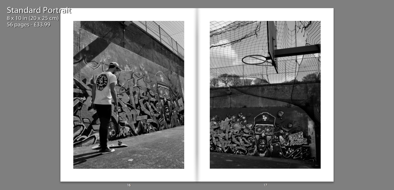
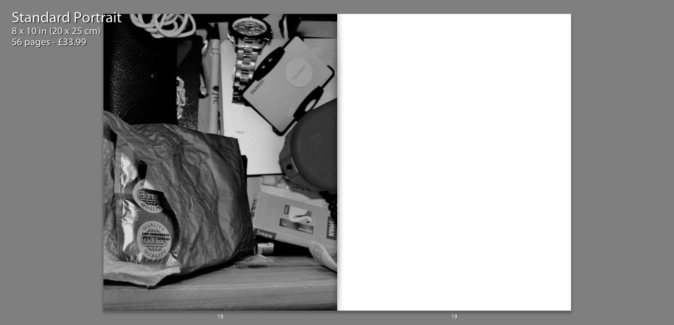
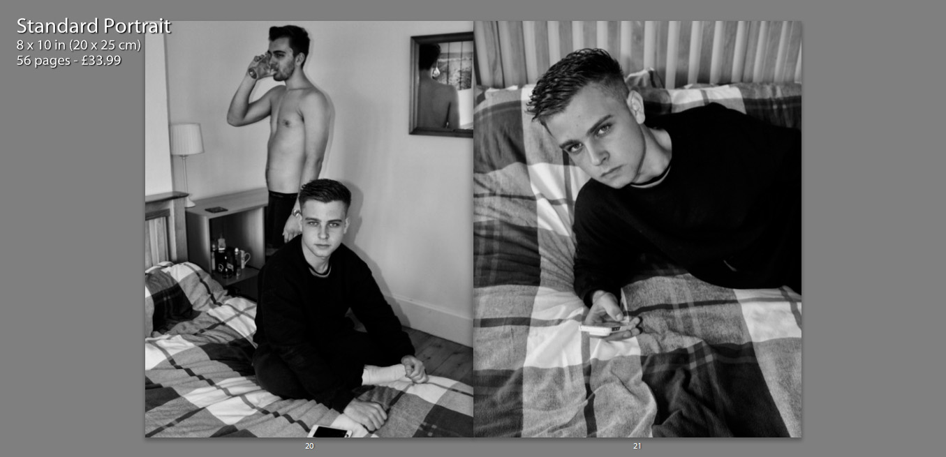
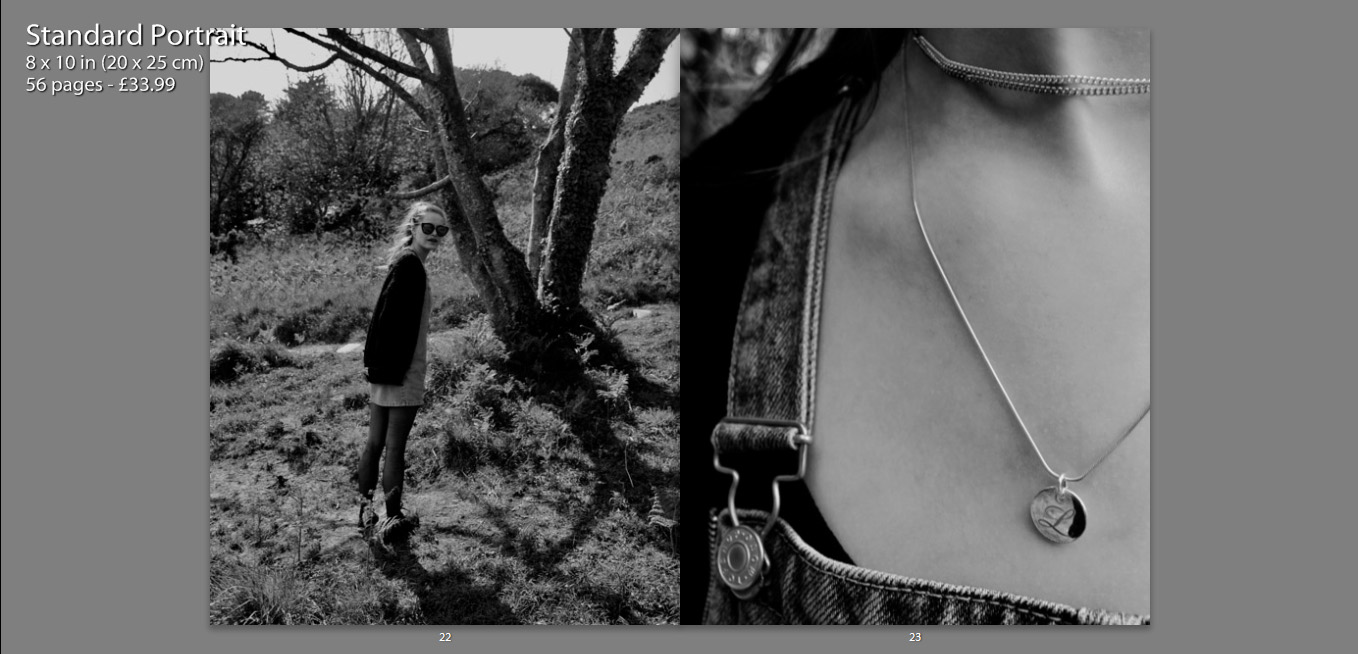
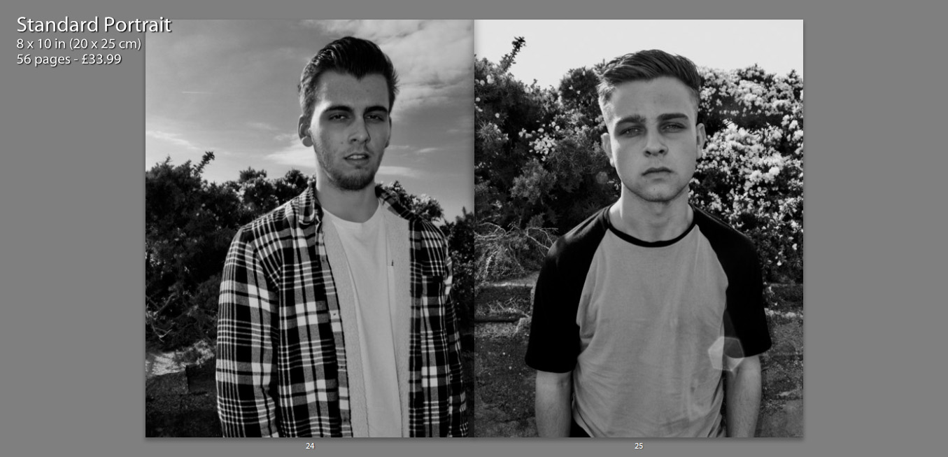
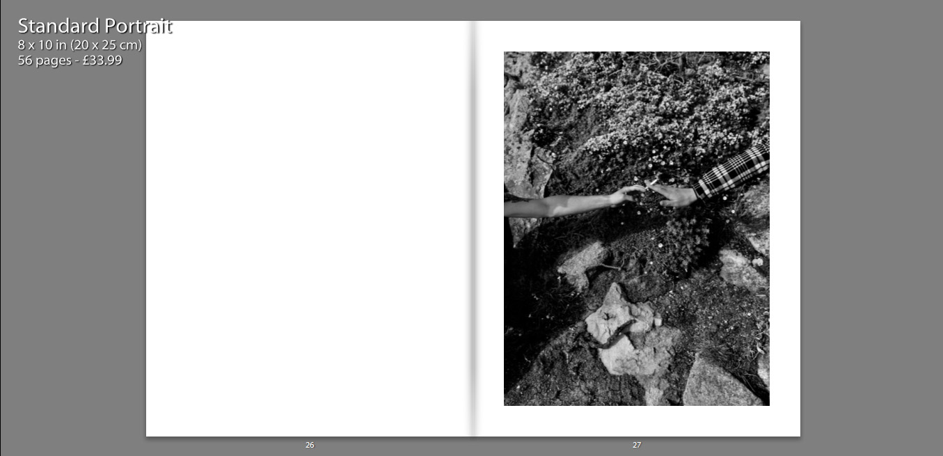
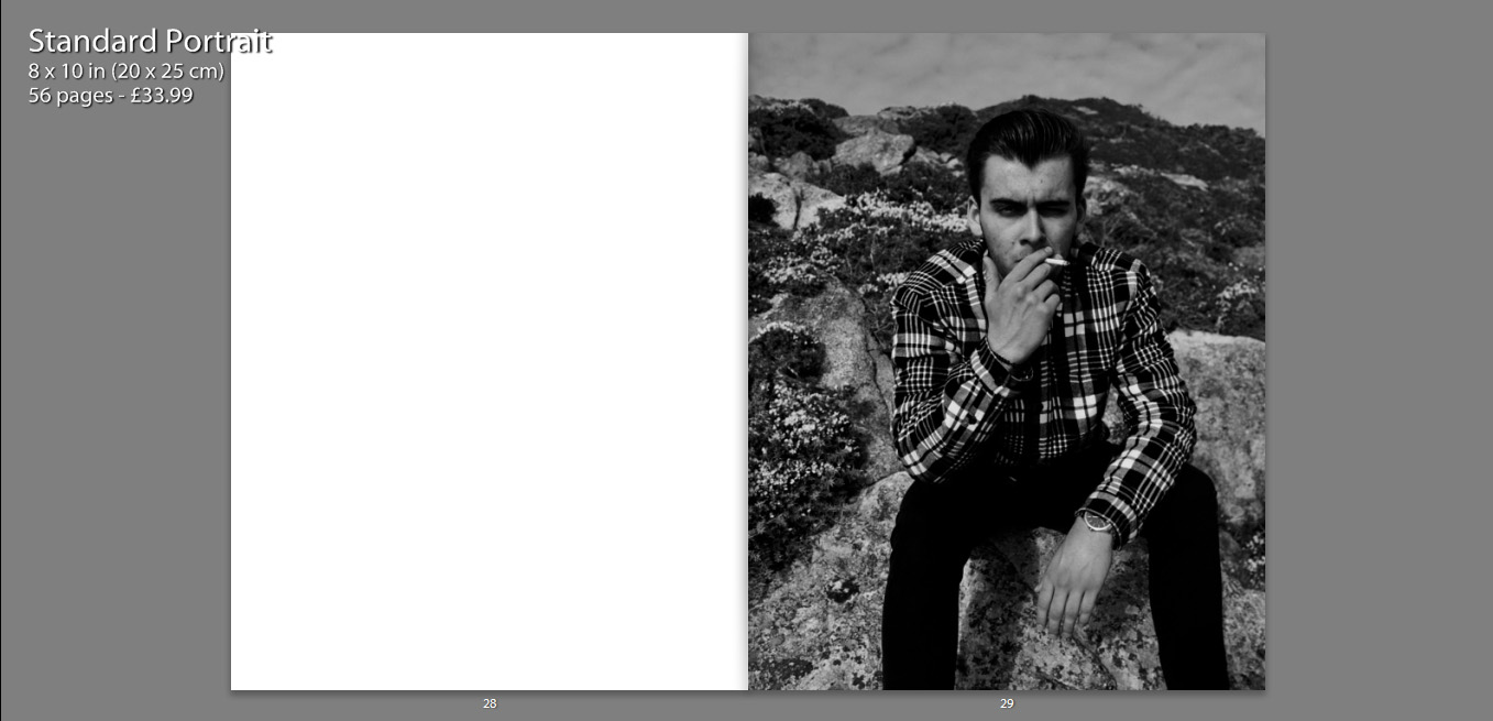
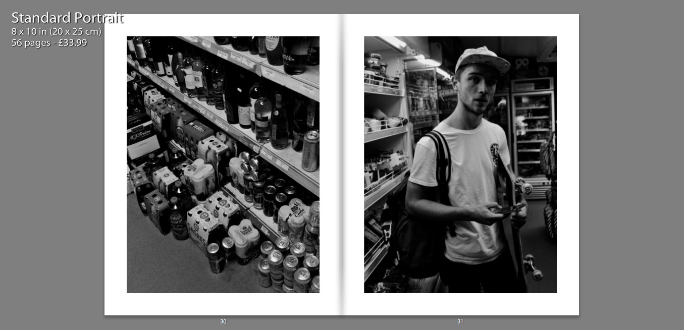
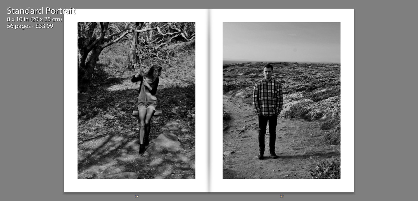
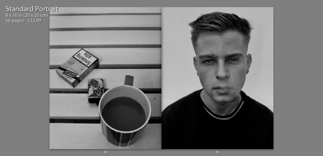
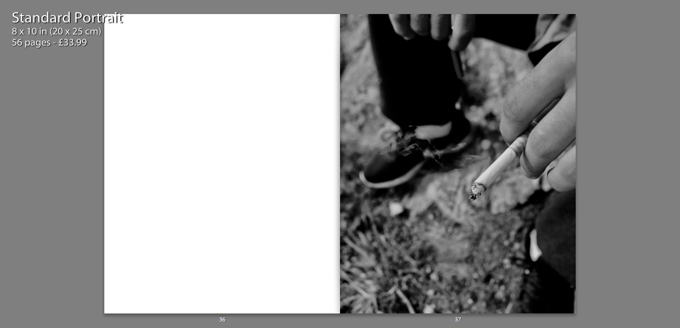
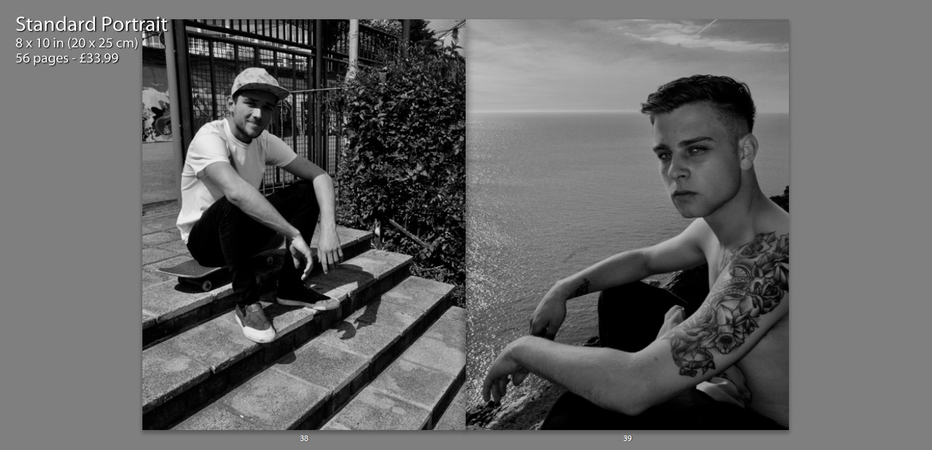
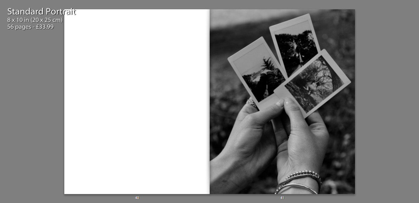
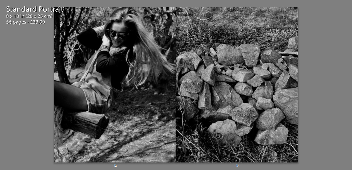
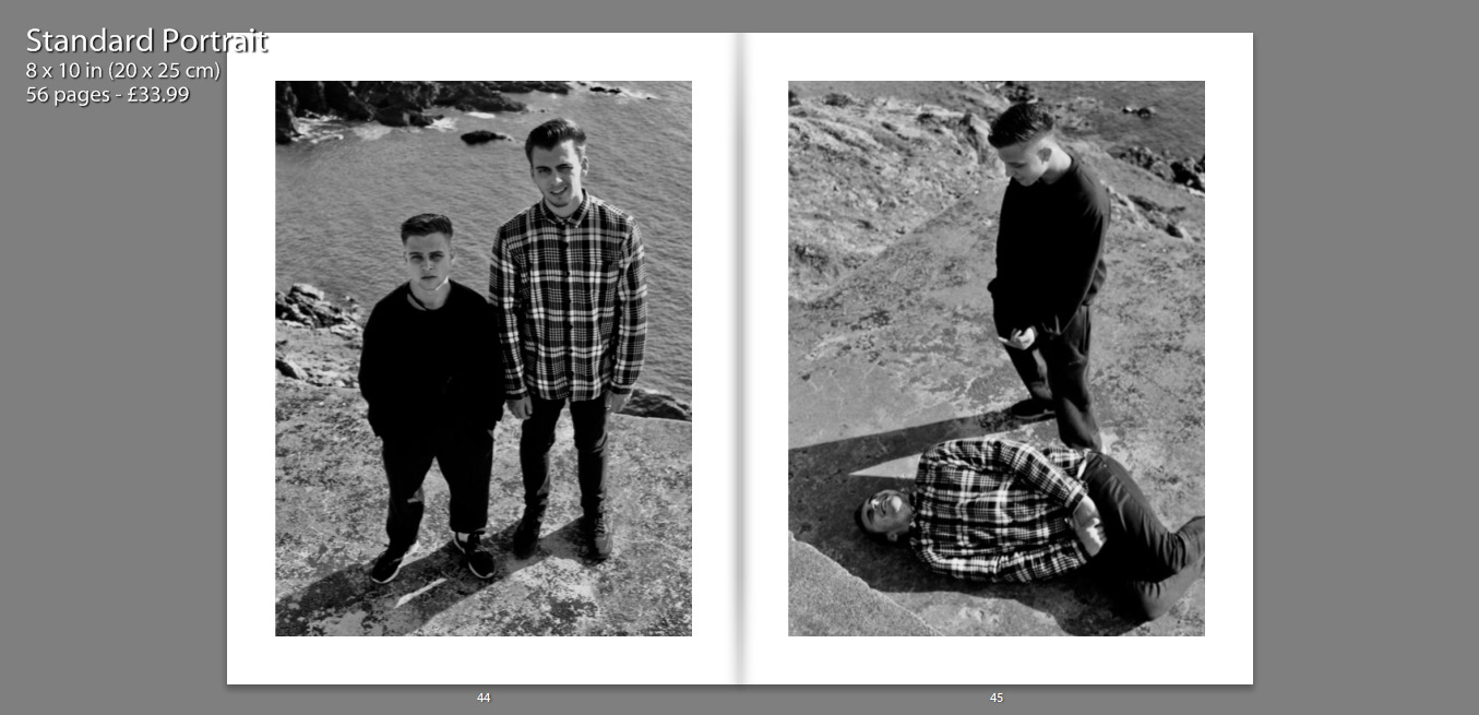
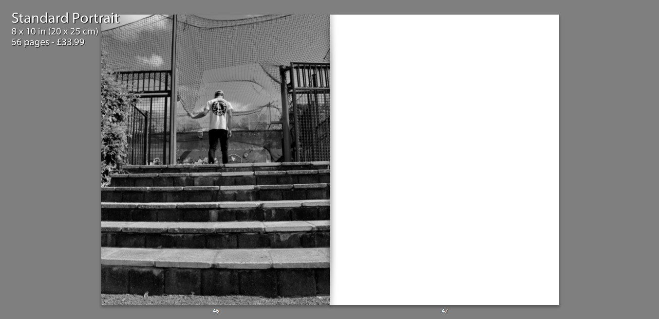
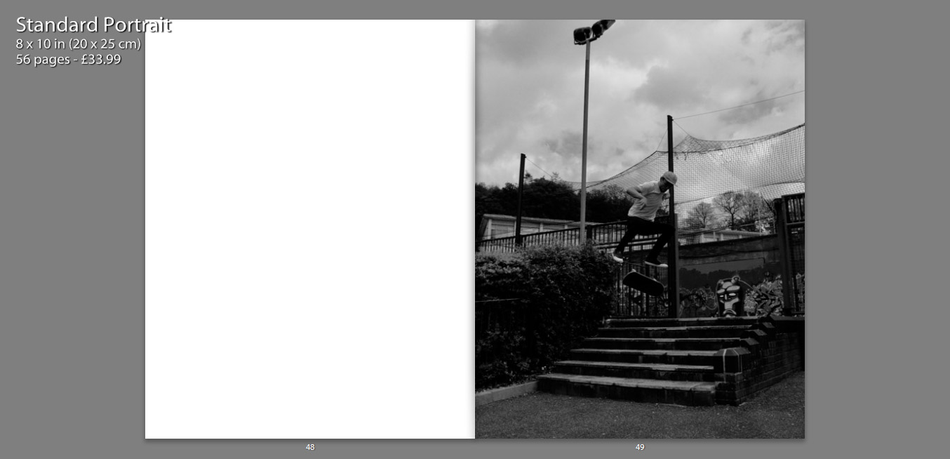
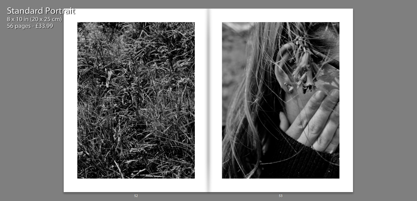
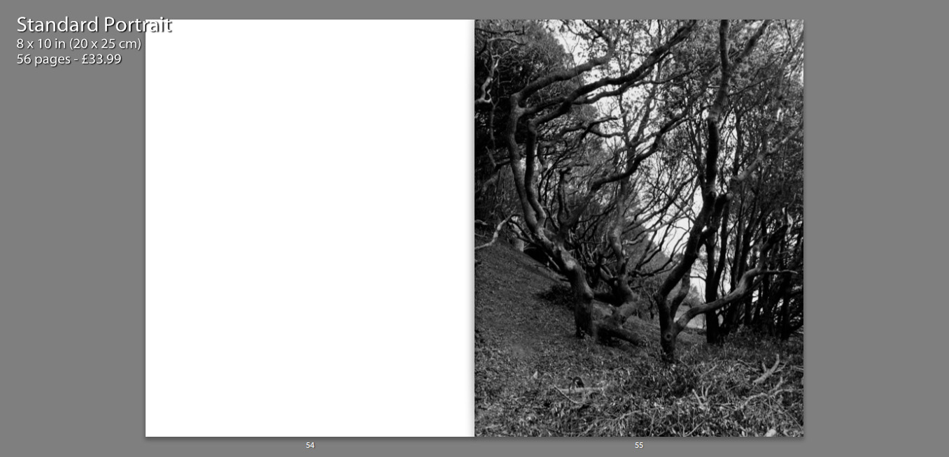
The following print screens, show my book layout as double page spreads, this way we can see images and the specificity layout more closely, as well as how images have been presented effectively.


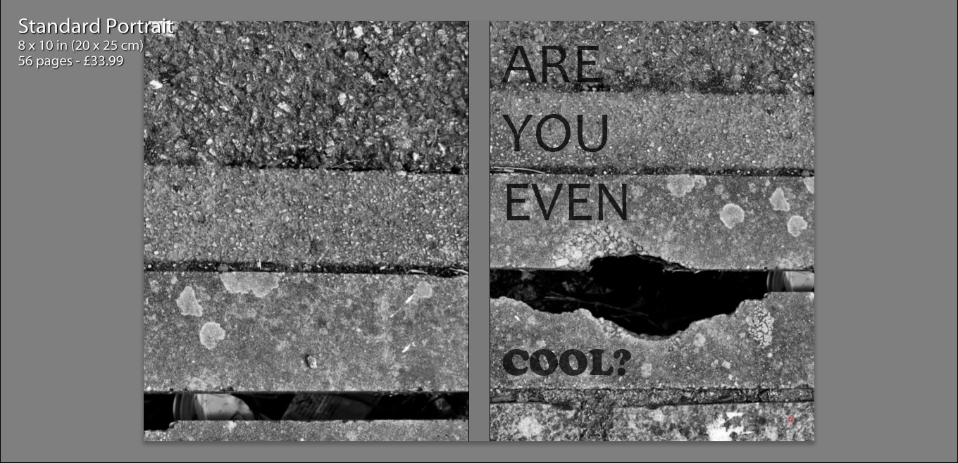
I decided to title my book ‘Are You Even Cool’?’. I titled the book this, as I feel that in a modern day society, especially within the age confinements of an older teen, there are many expectations as to what we should be doing, or looking like in order to fit this idealization of ‘cool’. I feel that my book contains many of these aspects, such as smoking, skating, having a boyfriend/girlfriend, sex, alcohol, drinking coffee and tattoos. I think that this title enables the reader question the book as well as themselves, making them want to open the book and see what is contained. It also creates a more personal title as I am asking the reader a question, it is also as if I am asking the characters in the book the same question.

Initially we see my front and back cover, as well as the book title. I chose to use the same image for both the front and back cover, zooming in and aligning them differently, so that they appeared to be two separate photographs. I felt that use of this image was almost a summary of my book. Very gritty and in many ways unpleasant, but as well see a very interesting texture alongside well positioned lines which in some sense convey beauty. So more simply put, my book is a contrast of beauty and ugliness, making it rather controversial.

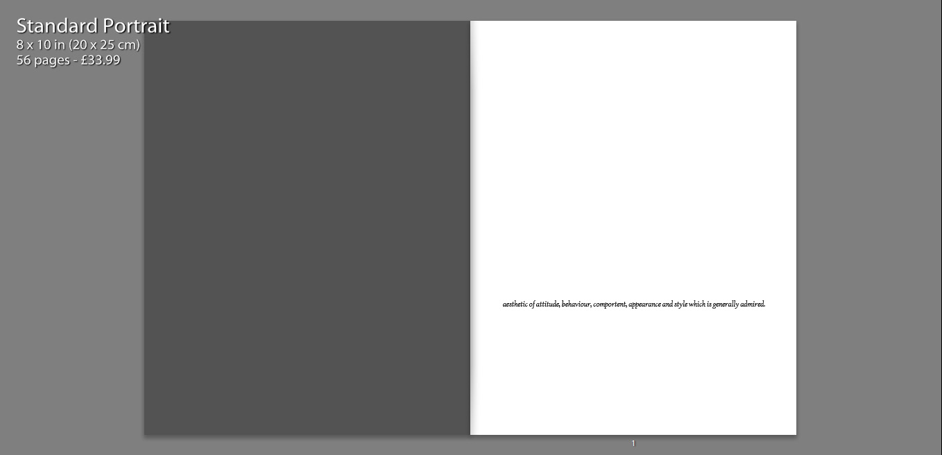
I also include a quote on the first page, how the Urban Dictionary defines the word ‘cool’. I felt that this was relevant as I wanted to include a sense of what the world defined the word as, a ‘style which is generally admired’ is a common theme running through a modern day Jersey. So many children are concerned with living up to social expectations and imitating others and their styles.

In terms of imagery, within the book we firstly see an image standing alone on a single page. My intentions with this are largely to provoke thought, what is this? What does this mean? Why is this the first photograph?

As well, I feel that an image which appears alone becomes more poetic, as we only focus and analyse this one photograph and it is not particularly related to anything else at the time we view it.

On a large amount of my pages I feature two full page photos on a double spread. These images often juxtapose one another and create meaning, as well as contrast. I chose photos of similar form and aesthetic, which means they fit well together and almost appear to be one photograph.

Another way in which I have presented my images, is contrasting other charters within the book on opposing pages. I placed images of similar composition and pose next to one another, which I feel creates a relationship between the two characters as they are shown in a similar perspective.

Some images have also been resized, so that they are not full size, as I felt that having a boarder allowed the details of the image to be more dominant. It also condenses the photograph which helps to bring focus to the subject also.

The inclusion of various still life photographs, that appear on their own in the boo, as well as alongside other images, allow the book to become more personal. We are also able to gather a better understanding of the characters and their interests.

My layout of my book is in simple terms attempting to present images in such a way that they tell a story. Some images stand alongside others, juxtaposing one another, whereas others stand alone so that the viewer can gather some sense of emotion of relationship with the image. This book is a personal insight into the relationships I share with my close friends, as well as a representation of what my life and environment is and once was.

Environment – My Book Idea

As an idea for a photo book, I decided to combine the styles of two artists I had researched, Jacob Sobol and Theo Gosselin. Two books of theirs particularly inspired my own ideas, these were ‘Sabine: A Love Story’ by Sobol and ‘Sans Limites’ by Gosselin.

Sobol’s book,  which documents his experiences living within his Greenlandic girlfriend Sabine and her family in 1999, was taken over the course of three years. Sobol’s book records both in photographs and in narratives, his encounters with Sabine and their life on the east coast.

Many of the photographs are very intimate and personal and would may only really contain relevance to the couple themselves. Which is ultimately the aspect of this book that I want to focus on within my own, the personal qualities, that will only be sentimental to myself and the subject.

The photographs from Gosselin’s book, were taken on various road trips in the US, Scotland, France and Spain. His images are full of youthful energy which captivate the viewer with stories of freedom love and friendship.

The book reveals his attempt to communicate the actual visual conditions seen at the time of the photographing. This is similar to how I wish to portray the images within my own book. I am showing the viewer a scenario of raw emotion, which is real as it’s exactly how it was at the time.

I am venturing with my closest friends to locations that are full of life and freedom and capturing them as they act in their youthful ways.

Environment – Final Image Layout

When contemplating an idea for the presentation of my final photographs, I was initially unsure of what to do. Though after some thought I decided upon an idea which I felt would justify my images the best and my importantly my project. Below documents the process of this.

This collection of images feature my final photographs that will be presented for my exam project. These images alone, are not all necessarily my favourites or even my strongest in my opinion, but I wish to present them in such a way that they do become my strongest set of images.

My intentions are to present images in sets of two, I have a collection of 10 images, which will be made into 5 by pairing the photographs in Photoshop. Images of similar aesthetic qualities have been chosen to be paired together, a standard portrait is always featured, alongside a more metaphorical image, that conveys a more poetic feel. Ultimately, I am attempting to juxtapose my images, with others that may make the viewer question the character.

Examples of my final works are displayed below. These images will be printed into A3, where they will then be mounted onto white card, which will help to highlight the heavy contrast within the images.

Environment – Image Refinement

In terms of refinement of my images, I have been consistent in editing my photos in a monotone colour scheme, accompanied by a high contrast and low use of highlights.

I made the decision to stray from the use of colour, in order to focus the viewers attention to the subject of my photograph, as apposed to beautiful colours or surroundings, although the surrounding or environment itself is highly important, I am trying to present the impression that the subject is the environment. The people I am with and the activities I engage in become my environment and essentially we could be anywhere, as long as the people were those that are photographed.


Environment – Shoot Four

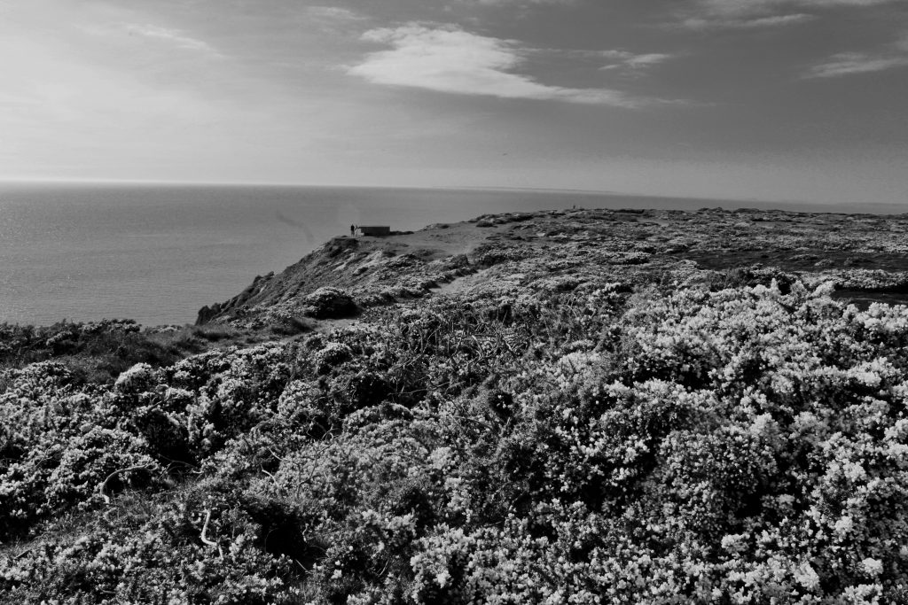
For my fourth and final shoot, I decided to create an extension to my third shoot, still photographing my friends. This time, I decided to venture out, in order to capture them in a different environment.

The way they both act in front of me proves that both posing and acting foolish are nothing that would phase friends that are not intimidated or judged by one another. I have tried to capture our boyish ways and what a typical day for us entails.


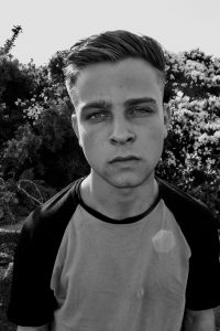
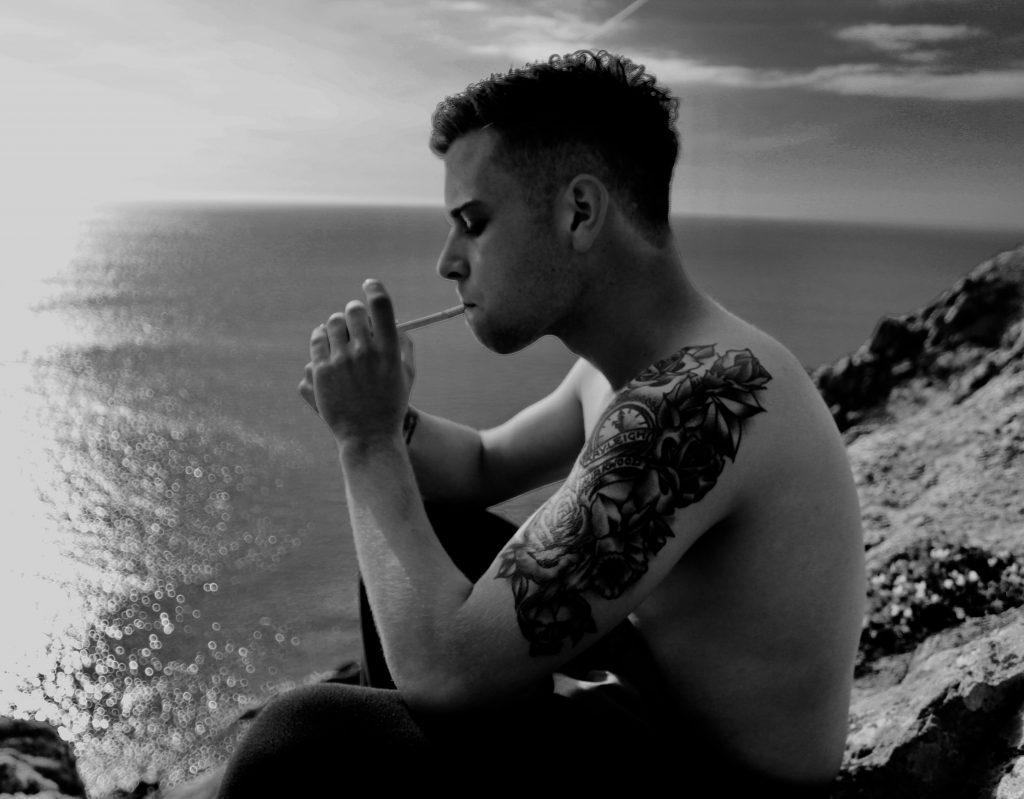
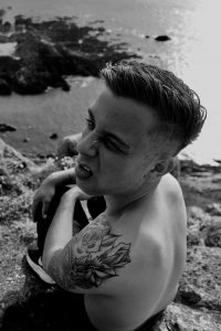
Here I capture Michael, in front of a hard sun, which helps to create a highlighted area on one side of his face, as well as providing light to intensify his eyes.

I felt this portrait was very direct and bold. It took out as one of the best photos from this shoot, for those qualities. His fixed posture, as well as facial expression create a memorable impression, as if he was starring at you. I feel of the boys, Michael most definitely performs the strongest in front of camera, as his facial features are very photogenic, I have I have captured this perfectly here. I think there is a strong essence of beauty, through the face of the subject, alongside the lighting and flowers in the background. Ultimately I am presenting an important figure within my own life, in a way that appears positive to other viewers. Seeing my friend the way I see him and not how you may think of him from a first impression.

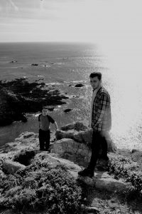
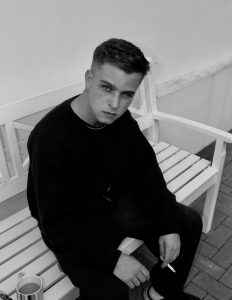
Within this photograph we see both Michael and Joe alongside each other. Taken from a higher point of view, that allowed for an interesting perspective as the two of them were forced to look up towards the camera.

The height difference is very apparent between the two characters initially, which gives the impression of an age difference, although the taller one, Joe, is the younger of the two. The pair look unusual together, which to me is exactly what I wanted to capture, how friends are uncaring of these differences, as we see each other for how we treat one another, as apposed to the way we look or dress. This photograph shows me two closest friends, who’re complete opposites, looking towards me in the exact same fashion, therefore at this moment in time, they’re completely equal.

Environment – Shoot Three

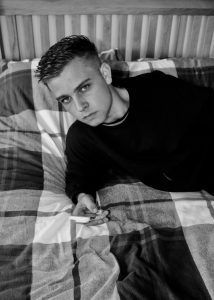
During this photo shoot,  I spent the day with my two closest friends Michael and Joe. During this day, along with the photos I took, I attempted to recreate the type of activities we would usually proceed on an average day.

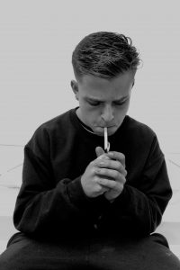
Simple things that most teenagers are interested in like music, driving, tea and coffee, pets, smoking. Of course I myself am not featured within these images, but  I feel me and my perspective is very well documented throughout these images, being someone that is allowed into the lives of these two, in such a way that can capture their everyday lives.


When photographing Michael, it is hard to capture an image of him where he isn’t in some way posing, or showing his imperfections. This photo of him above, features him biting his nails, which was completely unintentional in comparison to the other set of images. This photograph became my favourite from the entire shoot as I felt it was the most real.

When taking this picture, I simply pointed the camera in front of Michael’s face and pressed the shutter. So this photo is essentially a snap shot, that became successful. I felt that this image contained very strong qualities in terms of expression, as I caught him in a moment of vulnerability, which actually became very strong.

Joe poses with his guitar, even though he can’t play it, which is why I see this as one of the most important photographs from this shoot. Without knowing any background into this photograph or the subject, this would not be obvious. But knowing Joe, his immaturity as well as confidence is shown clearly through this portrait. He sits in his boxers and his hoodie, while trying to play an instrument, which to me implies a comfortable relationship between myself and Joe, that he is able to do this in front of me and even the camera.

This in a sense summaries this whole shoot. The ability to act comfortably in front of one another and replicate real and raw moments.

Environment – Theo Gosselin

Theo Gosselin is a French photgrapher, born in Le Havre, a small harbour city in Normandy. He grew up surrounded by the ocean and was in love with the outdoors. His involvement with photography started from an early age when he saw his parents taking photos on their analog cameras, Gosselin began to capture things like butterflies and flowers in his garden, later becoming more skilled he studied photography at Art College. His friends and his life became his subject “not as a photographer, but as a teenager who wants to capture memories just like everyone else.”

Gosselin’s approach to photography is very simple, no sets, no staging, just allowing moments to happen. This is ultimately how I intend to photograph a large proportion of my own shoots, simply spending time with those that are most important within my life and capturing them as they are. This is to give a true representation of the people themselves and present images of raw quality.

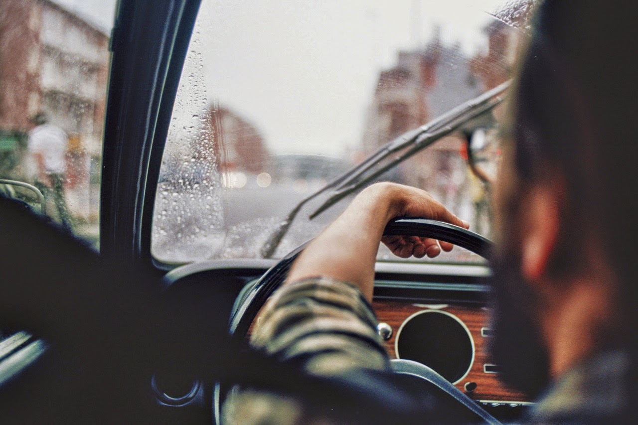
The image above, from a collection of Gosselin’s work, features an over the shoulder perspective of a car journey, with a strong depth of field. Although this image appears simple, I feel that it is encapsulates the intentions of Gosselin’s work well, as well as his relationships with those around him. As Gosselin, shoots over the shoulder, it is almost implying that both him and the subject share the same perspective, as if their journey is both the same, which to me created a strong photograph in terms of it’s deeper connotations, which include friendship, togetherness and even sharing. Ultimately I feel like this image is telling us that Gosselin is on a journey.

Here, despite the fact that the subjects face remains hidden, I feel this image encapsulates the living conditions and lifestyle that Gosselin surrounds himself in. The light shining through the windscreen highlights the subject, yet this cloud of smoke distorts him, which in itself is interesting as a composition, as we are forced to take a closer look at the photograph to work out who we are looking at. But also, I gather an impression that this lifestyle comes with ‘clouds and sunshine’, there is freedom, but with this becomes instability and not knowing where you may end up.

Environment – Shoot Two

For my second shoot, I photograph my girlfriend, Lizzy. Within this shoot I attempt to capture the relationship we share and my perception of her. I see Lizzy as both very innocent and sensitive, sometimes shy, but can be herself around me.

This can no be entirely represented through the lens of a camera, as people often become embarrassed, or even overact. Despite this, I feel that within this shoot I have captured some sense of both emotion, in terms of feeling comfortable and uncomfortable. We see photographs where her face remains unseen and others where this is not the case. I think this reflects her personality greatly, as often in certain situations she will become reserved, but around me she is able to open up in such a way that is expressive and emotive.

Ultimately in terms of my environment, as well as hers, I am trying to show that wherever we are together, the two of us will feel comfortable in our surroundings.

Environment – Jacob Sobol

Jacob Aue Sobol’s book reveals a candid account of his intimate relationship with girlfriend Sabine and their life together on the east coast of Greenland. In 1999, Sobol went to live in the settlement of Tiniteqilaaq, Greenland, where he lived the life of a fisherman and hunter with his Greenlandic girlfriend and her family.

Taken over three years Sobol’s book records, in photographs and narratives, his encounter with Sabine and their life on the east coast. This was the starting point of Sobol’s photography and has since in 2012  been declared as a Magnum photographer.

My reasons for choosing Sobol as an artist reference, is due to the fact that he is capturing intimate moments within his natural surroundings, non-staged and unedited moments are captured as they truly are. This is essentially how I wish to photograph my own project, in order to encapsulate my very own environment and surroundings.

Image result for Jacob sobol

The image above features Sobol’s girlfriend, Sabine, whom he captures kissing the camera, before her boyfriend was due to leave for a hunting trip.

This photograph, features a snapshot style, that does not follow any of the conventions that make a good photograph, in relation to photography. Despite this, it does contain a very emotive feel, as Sobol has captured an intimate moment, the act of kissing directly towards a subject, that is often unseen in a general scenario, as we cannot freeze the subject or the moment itself.

I feel that the fact that the camera is out of focus only adds to the rawness of this photograph, as we see Sabine throwing herself at Sobol, in an act of passion, something he himself is only experiencing. Which is essentially what Sobol’s work and in particular this project consists of.