All posts by Cerian Mason

// a little bit here, a little bit not //

Filters

Author:
Category:

Jack Goes Outside

// J A C K PART 2 //

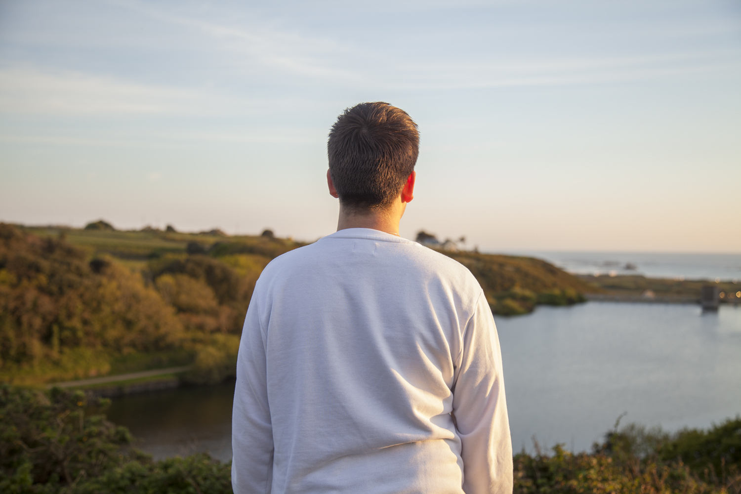
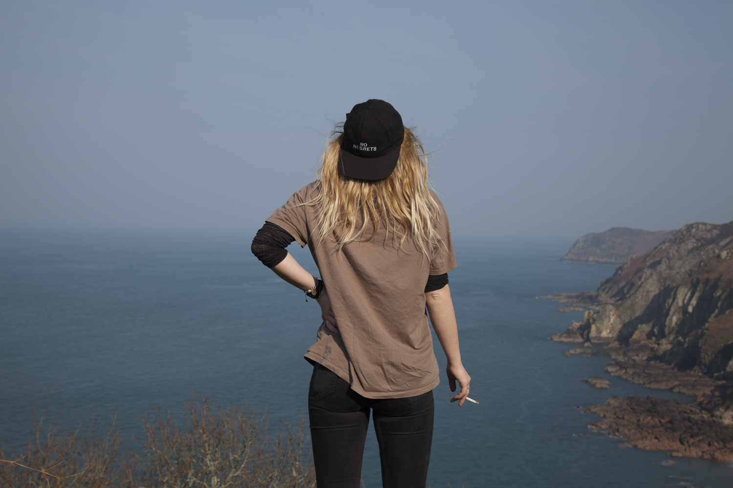
The second shoot with Jack was the external environment which was selected by the model, Jack. I asked each participant three questions before I planned out the shoots which are shown below.

Where is home for you? Why is this place home? Are your family there? Do you feel safe here? What is it that makes this particular place home?

Home is wherever my family is and a place that I feel comfortable. It normally tales me a while to settle in somewhere, but I always have family and friends and try to stay positive and surround myself with positive people. Anywhere can be home as long as I’m happy. 

What makes Jersey important to you? Do you have good memories here?

Jersey is the place I have grown up, it will always he special to me. It hasn’t always been easy, but then again it isn’t going to be easy anywhere. I have made so many amazing friends and happy memories here. I’ll never forget this lil rock and the awesome times I’ve shared here with my friends and the little adventures I took to find quiet places to relax and unwind. 

Where in Jersey holds the best memories for you? Why is it positive for you?

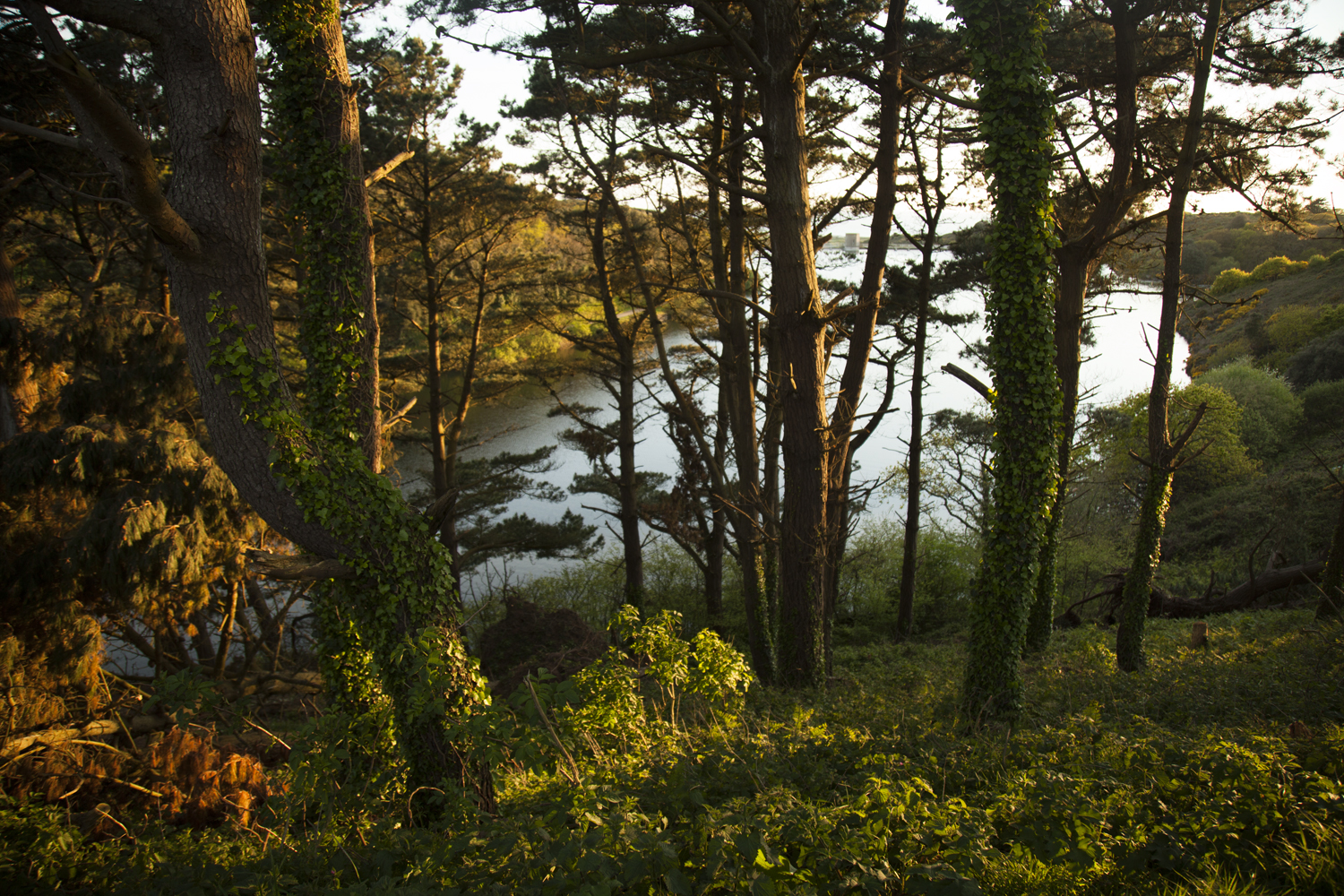
My favourite place is actually a newly discovered area. It was previously the top of the hill in St. Brelades (just beyond the wayside cafè). My mum took me up to Val de la mar reservoir and I immediately fell in love with it. There are so many paths and unique plant life in the separate areas. Parts I like most are the Australian and Japanese sections. But my absolute favourite part is just above the Japanese section where there is an incredible view over the reservoir and St. Ouen’s bay.

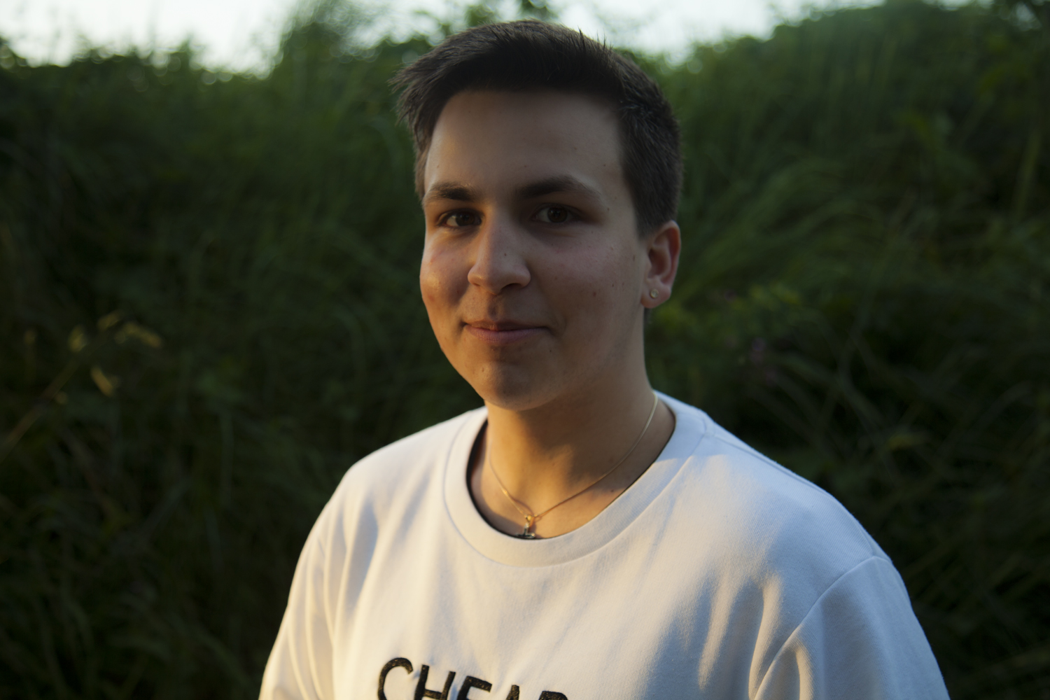
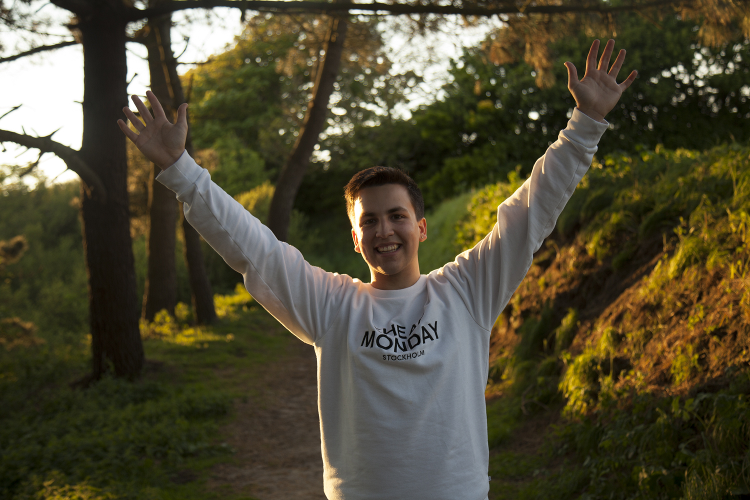
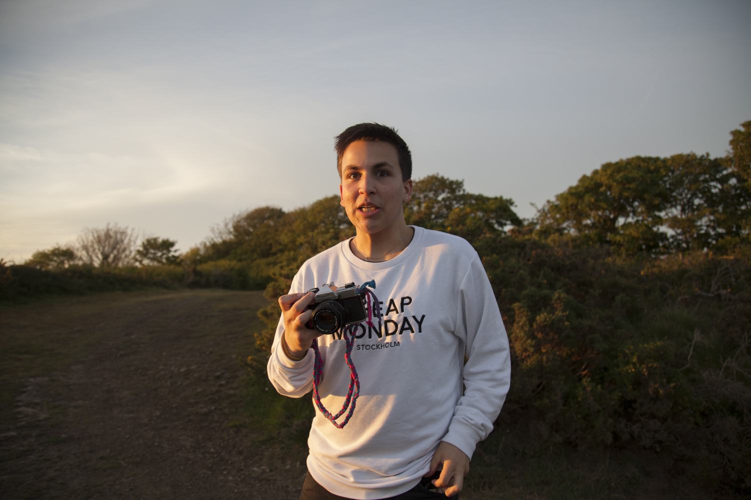
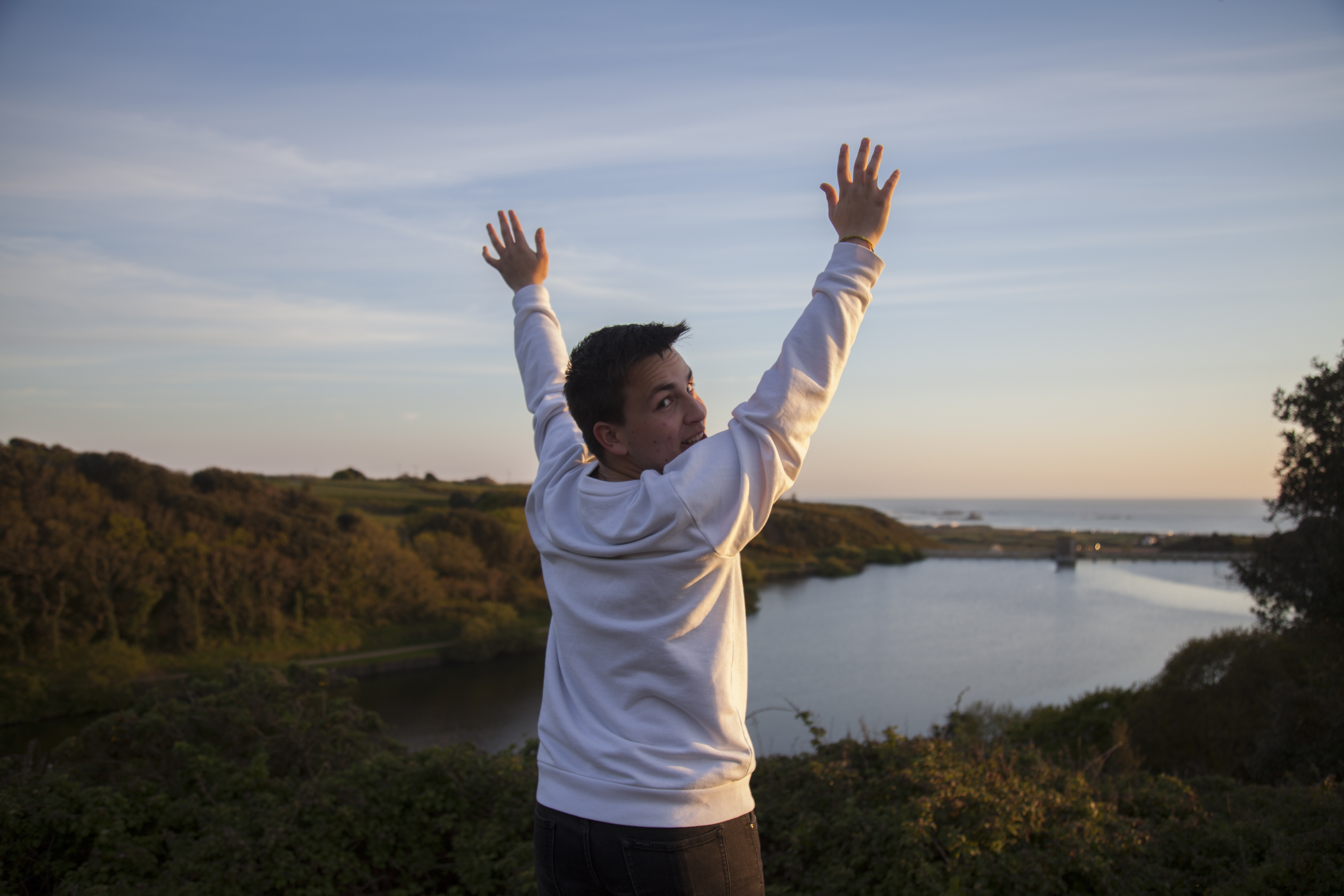
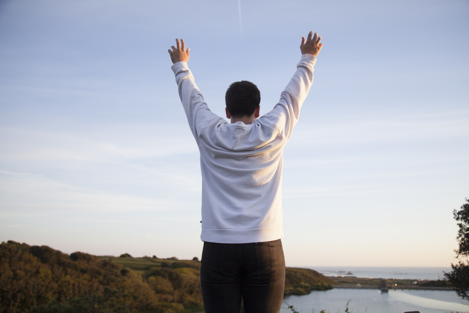
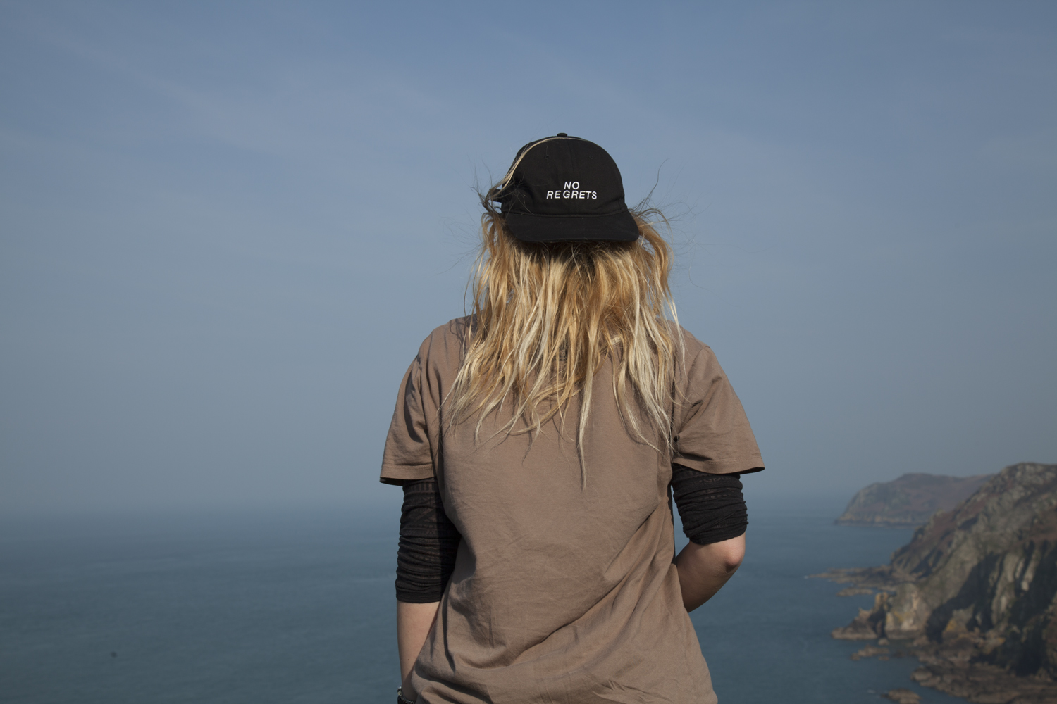
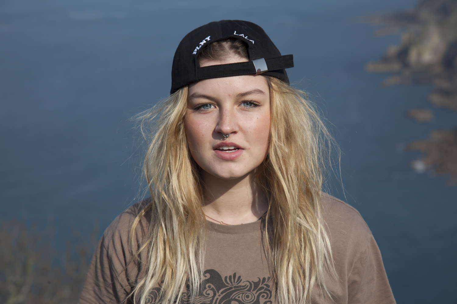
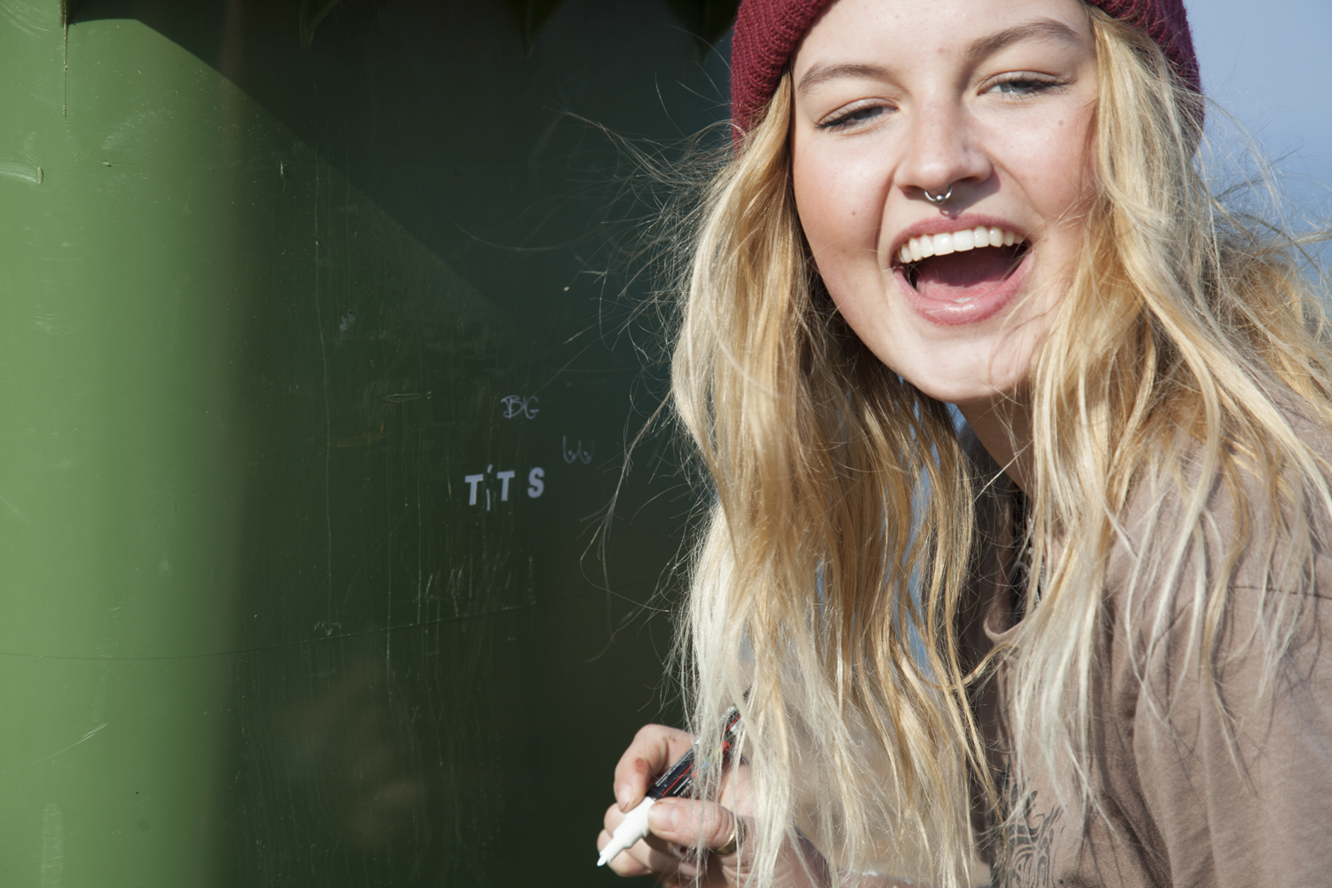
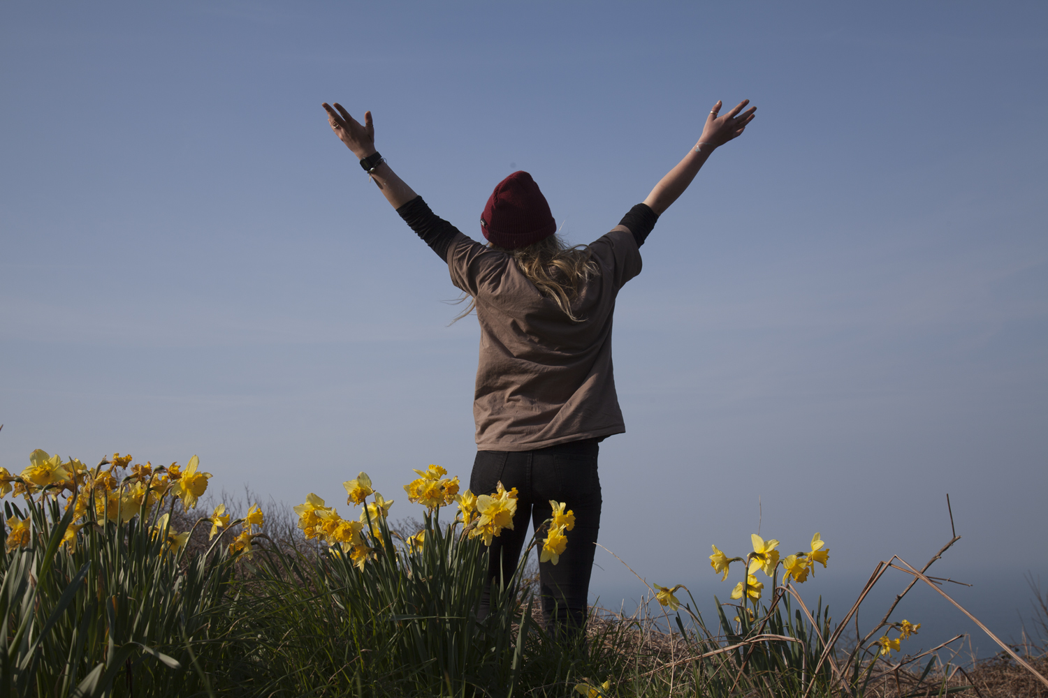
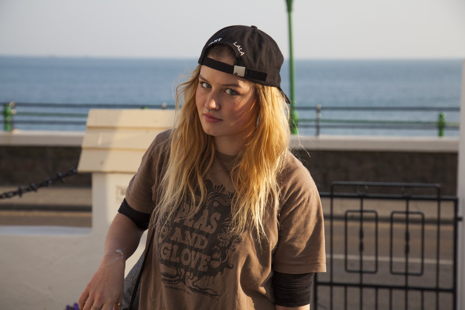
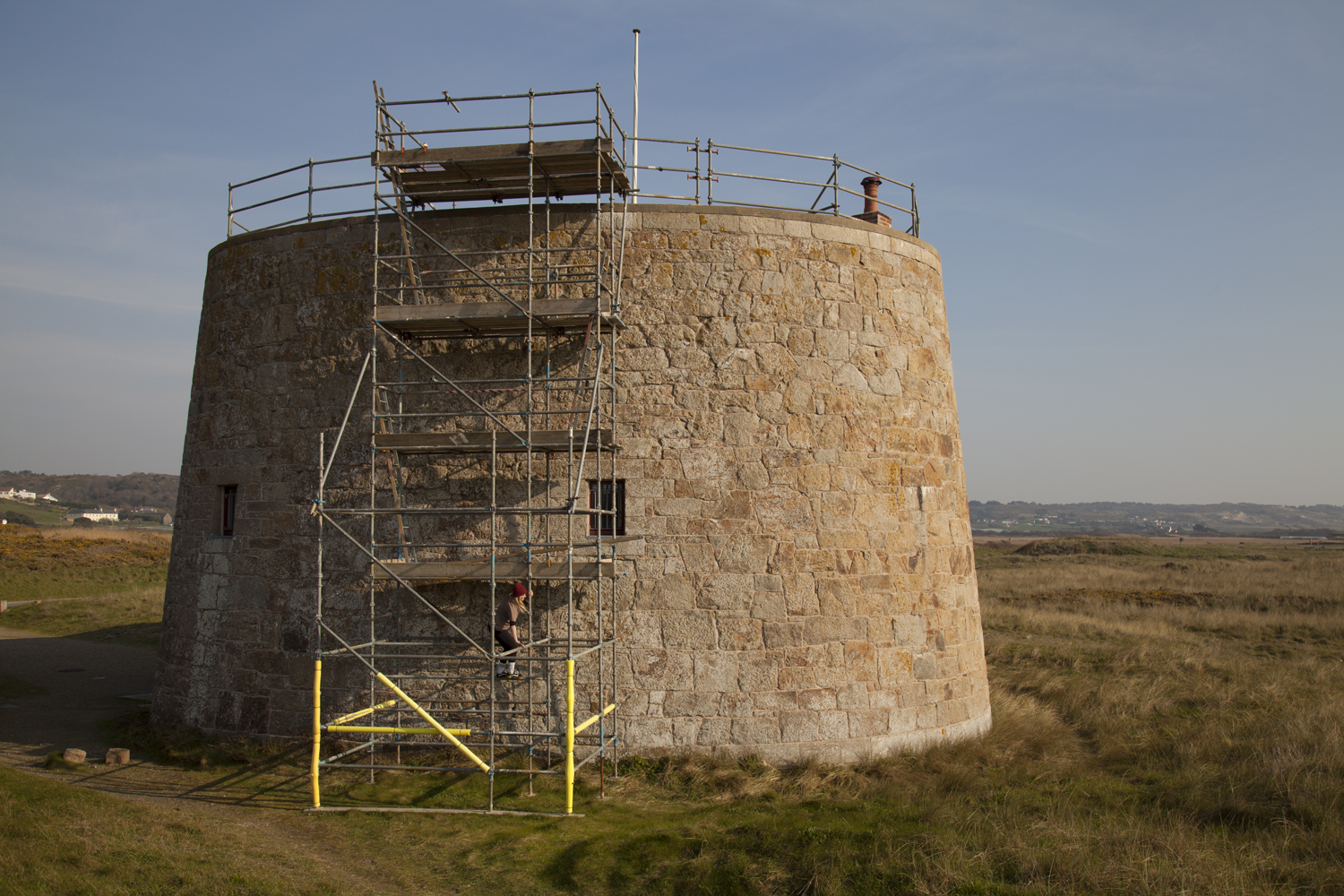
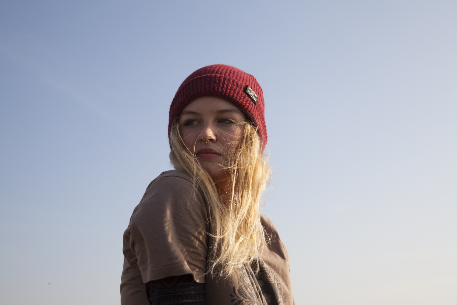
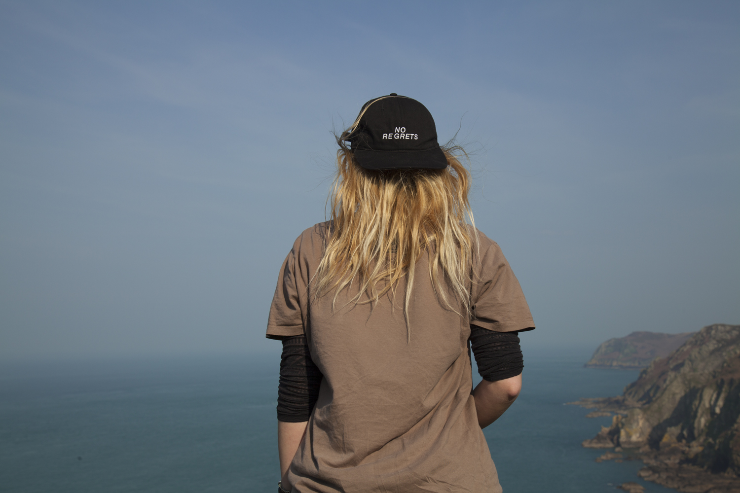
With this response from Jack to work with, we went up to explore around the area and shoot in each of the places previously mentioned. Below is a small selection from the session.

The images above are from the walk we took and show a more varied selection of photos facing different angles with changeable lighting. Below are a selection of images which might be suitable for the final picture of this project section. The portraits are stylized and feature people looking at a particular landscape from the back. details on the body are limited – so no facial features are visible – and there is a much higher emphasis on the area itself. Contrasting this with the inside portraits which feature characters looking strait on, there is a bigger focus on the environment rather than the person here.


J A C K 

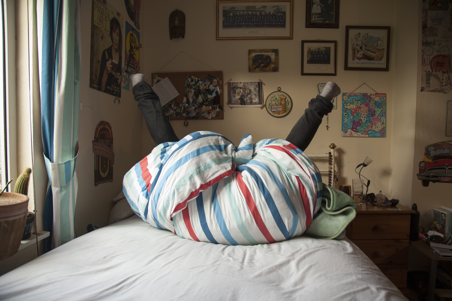
The two images I have ultimately selected for this project share a continued line of similarity across their compositions and photographic structure. The first from the home shoot is exactly what I was looking for. A blank expression that shows the figure in their home environment around the things they have grown up with. For many of my models they are still in rooms which they have had since they were very young which is visible in the images. There is something surreal about the contrast between the figure and the backdrop. It is more than typical to surround yourself – and in particular your room – with things that mean the most to you. In a way these portraits are reflective not only in the character shown but also in their room which is ultimately a self portrait of their attitude and emotions.

The internal shoot produced this outcome below which shows the character, Jack, sat in his bedroom at his mum’s house. There is a lot happening in the image so to highlight the central figure I adjusted – mainly through trial and error – the lighting and curtains in order to alter the natural highlights produced across  the face. The duvet and blankets mirror several of the colours featured in the background a

A Little Paint

// E X P E R I M E N T I N G //

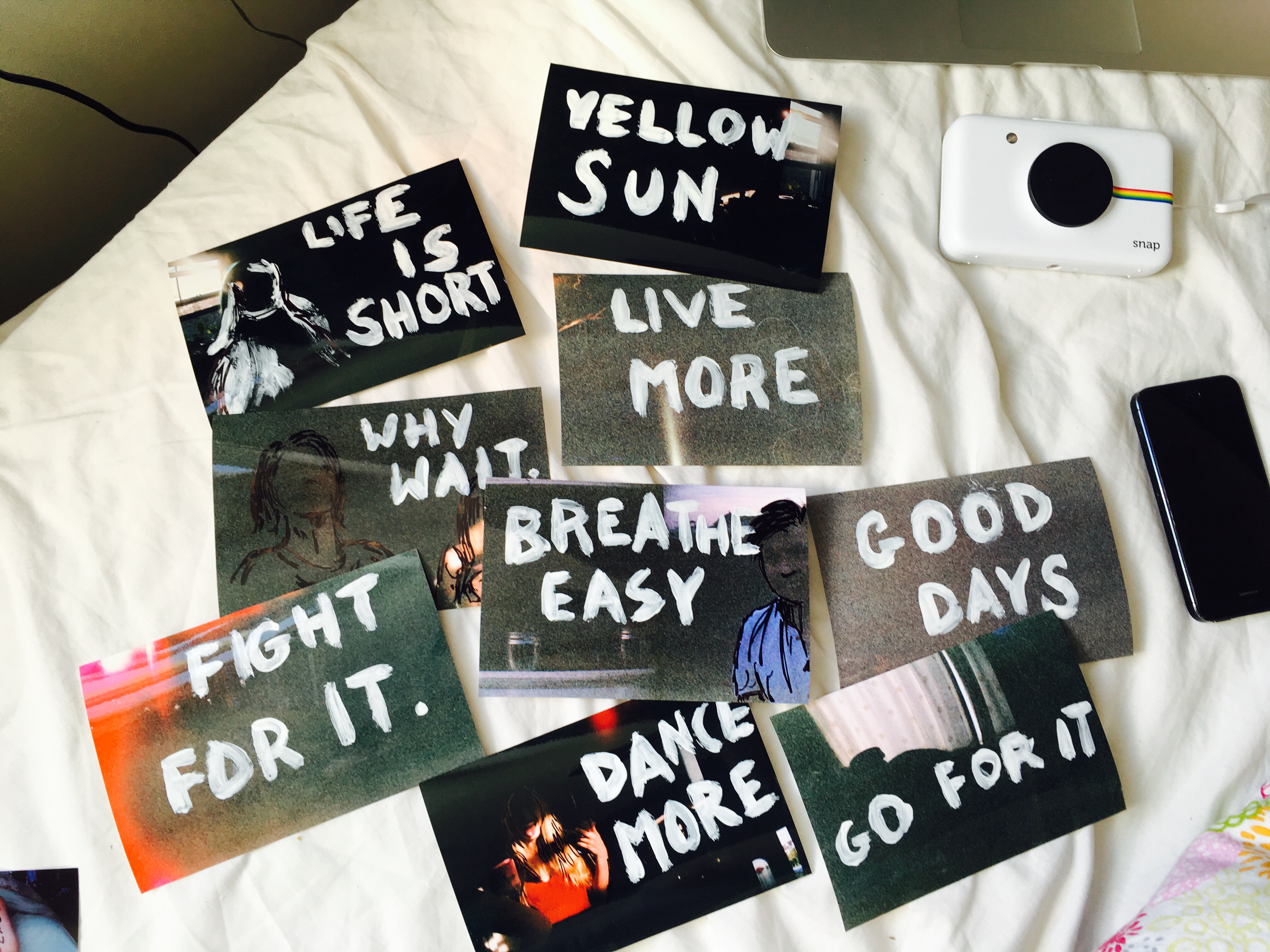
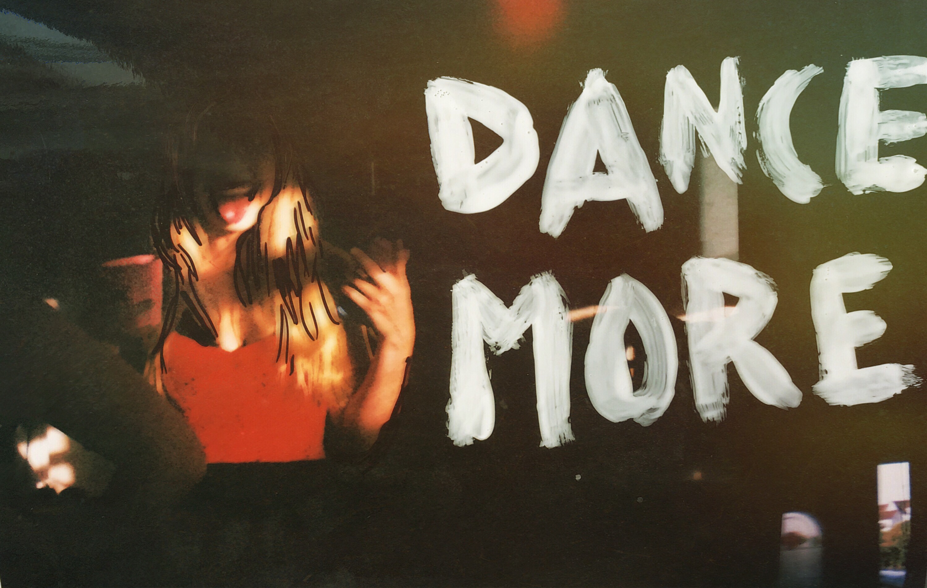
The images used for the postcards are taken of individual characters in environments of their choosing which mirrors the words they write about the place which will ultimately be added to the back of the piece. After getting back a set of disappointing negatives, I experimented with painting and drawing over the prints as a way to enhance the images and make at least something out of them. Though most of these are just for fun, one image came up particularly well and made me consider the possibility of using a handmade technique to edit images that I would receive back on the last day of the exam. 

This image was successful with the colourings of the film, the dark sections of the image and the bright colours that contrasted this darkness with their vivid shades. The words painted on were taken from popular phrases said by people within a lot of the images relating to the situation. The reason for the failure of these images was the previous exposure of the film which resulted in images already being overexposed before the film was used. This happened when removing the film from its source – an expired 27 exposure chuck away camera. To release the film, we covered the lens with electrical tape, wound the film into its canister and broke open the surrounding container. This roll unfortunately was overexposed as the tape was not applied and then added as a panic last minute resulting in a lot of overexposed film.

Jack’s Home Environment

// J A C K //

The second person being photographed in this project is Jack who is leaving for university this summer (August ’17). Jack’s parents are separated so I gave him the choice of which home he wanted to use for the first of the two shoots. His Mum’s house features a lot of throws collected from various trips, posters and prints cover a lot of the walls and there are chilis planted across the windows. The natural light comes from the window on the left hand side of the room and there is a central light hanging above on the right which adds a yellow-toned luminance to the room. I was keen to mirror a soft kind of aesthetic similar to Sian Davey’s images from her ‘first love’ series for this project. Working both digitally and on 35mm film, I started in the house by setting up the initial image. This first photo is a front facing portrait with the model sat facing forwards towards the camera. On my Canon 5D, I used a relatively high shutter speed to capture a crisp and clean image with the ISO set accordingly. My instructions to the model were to face me and remain as neutral as possible. The point of these first home images are to stay as blank and neutral as each character can. The external environmental shoots will be the characterised ones with light and life in them reflecting the energy of each area.

Rather than add an entire contact sheet below, I have chosen six photos which ultimately came up as the strongest images in terms of both colour, lighting and composition. All of these images have been edited in photoshop in order to adjust the colourings and white balance in particular. Because I typically shoot in RAW on my Canon, the level of post-shoot editing I can do is much greater than if I was working with a standard JPEG image. I have used adobe Bridge and Camera RAW to edit the images below gently increasing the temperature of the room and the shadows.

The final image I select from this shoot will depend more so on the second set of images for this character. I don’t want to decide on a photo now that may not work with its sister image.

Postcards

// W R I T I N G   H O M E //

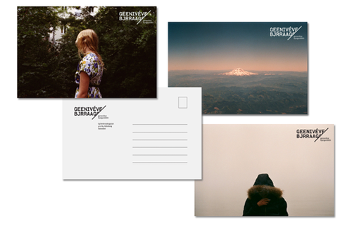
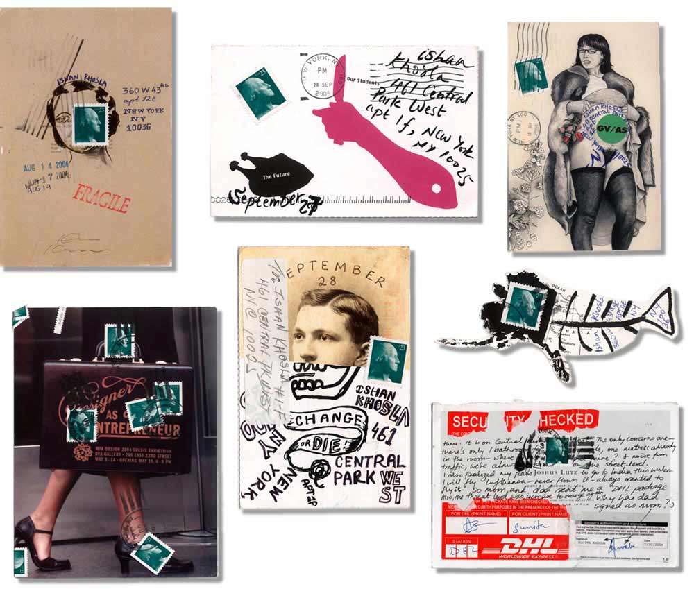
Continuing to explore options for the presentation of my final images in this project, I would like to explore the process of creating post cards as a way to link to my theme of leaving home. The images I have made come in two different forms. I have the ‘home images’ which feature a single figure in their home environments in a relaxed but stylised portrait. I also have a set of external environmental photos which show the same set of people in a landscape of their choice. There are questions asked to each participant which link the two places together and the choice of location was ultimately their choice. By presenting these images as postcards, I could explore the contextual themes of writing home, family and connections to the island. To start the process of deconstructing a postcard in order to make my own designs.

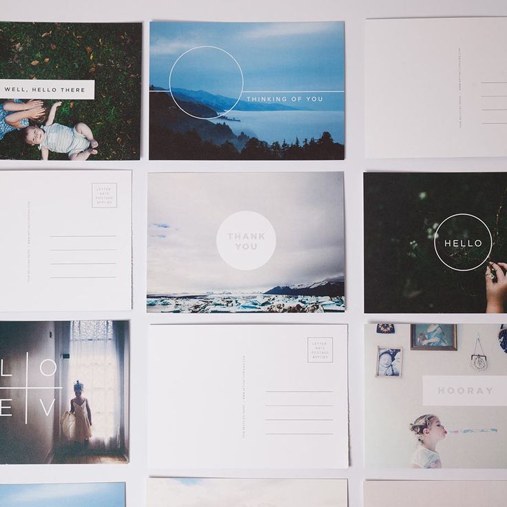
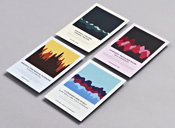
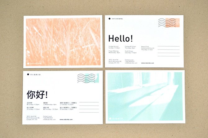
There is an extensive variety of postcard designs available worldwide fitting into a range of genres and themes. The example images I have selected here are all minimalistic graphic designs which make use of negative space and heightened simplicity. 

To create my own postcards, I will need to form a template for the front and back of each card separately and have them printed together – or manually attach them by hand. For the front of the images, I intend to use the images I have shot in the external environments featuring a character facing the landscape of their choice. This might be a full image, or one with a white boarder depending on the experiments I carry out. The back section of the postcards will likely be a minimalistic design with an address space – probably with light lines – and a large blank area for either typed or handwritten responses to the survey questions given to each of my models.
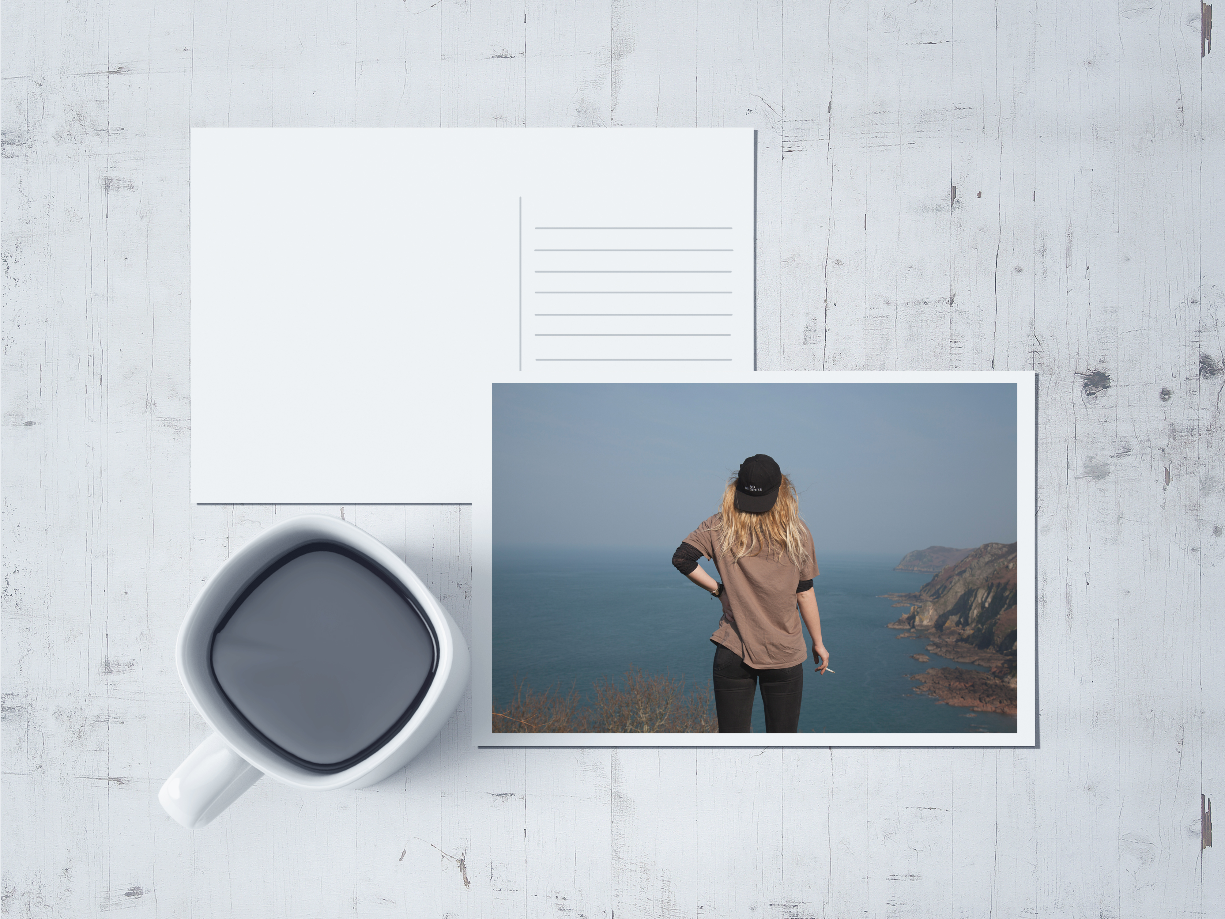
To start this process of graphics and development off, I made a rough mockup of my own using Adobe Photoshop. This involved creating the postcard shapes, guidelines, adding backgrounds, adjusting my own images to fit my templates and finally applying effects such as filters and shadows. I used an image of my first model, Maya, for this postcard and used a white boarder to frame the photo. Yes the mug and background are pretentious but I like how to shadows came out across the image on the postcard. The point of this mock up is to show a minimalistic layout which could ultimately be printed as a final piece. I would aim for a minimalistic backing which could be printed or handwritten with the responses given from the survey I set out before each shoot. 
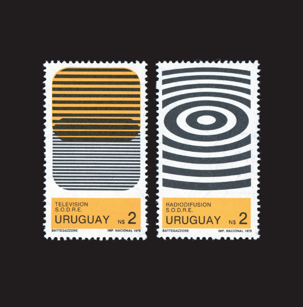
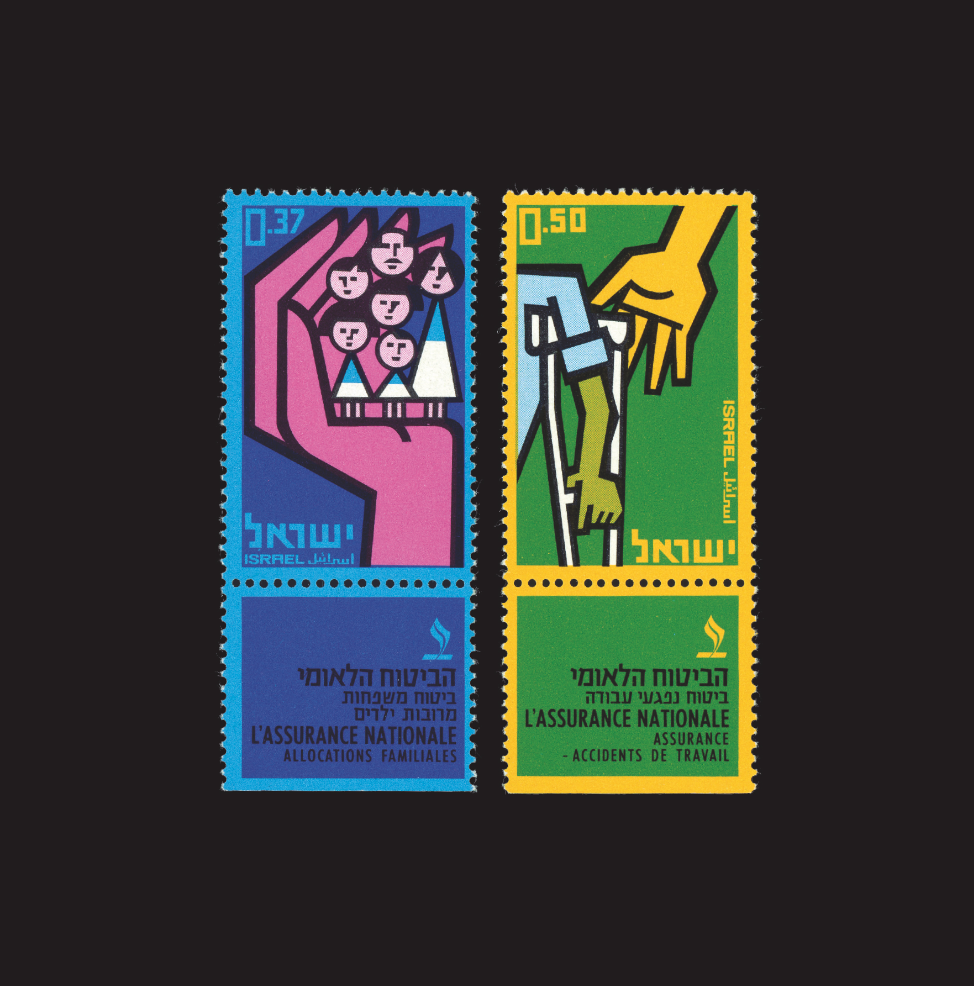
I could create a small series of stamps using other images which could reflect the home environments of each character. These could follow a more graphic layout with block colours and maybe feature colour block editing to contrast with the slightly washed images on the front of the post cards. To do this, I would edit the images in photoshop and print them onto thick sticker paper. They could then be cut or pressed with a cutter to create the stamp-like edges and applied to the postcards in place of a traditional postage stamp.


Anna Di Prospero

// A N N A   D I   P R O S P E R O //

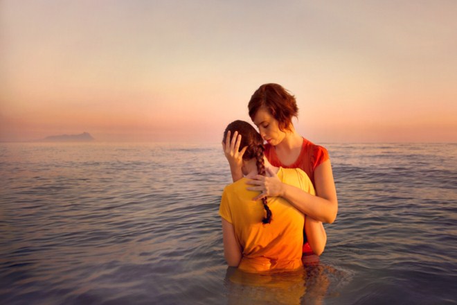
Anna di Prospero is an Italian photographer who has been working on a self-portrait series called With You, where she appears alongside family members and friends. i like that even though it’s a self-portrait series she isn’t necessarily the star of the images – but the focus if rather about her relationship with these important people in her life. however you may interpret it, the images themselves are absolutely beautiful – with an amazing rich colour palette that runs through the entire series.”

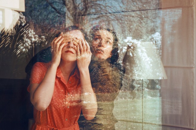
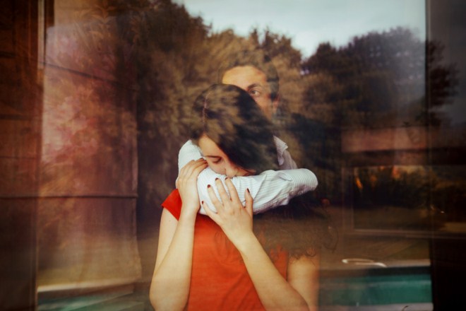
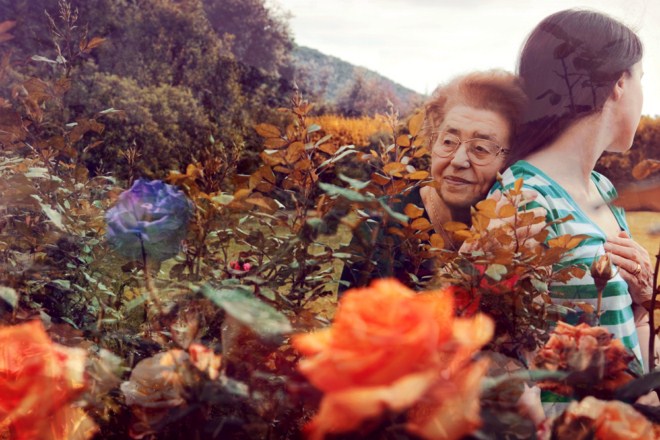
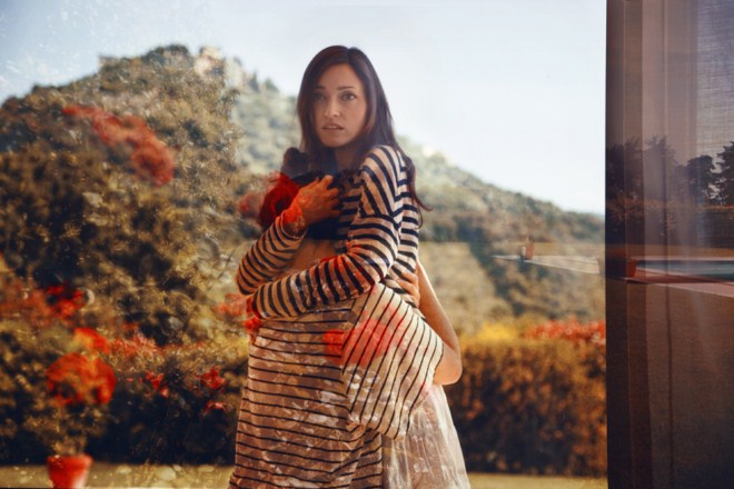
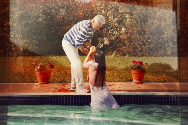
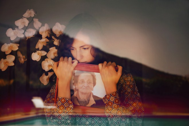
Anna’s images pair rich landscapes with intimate portraits in a bid to form both aesthetically pleasing and contextually thoughtful images. Many of her images make use of the double exposure technique which combines multiple layers of photos to create a final composition. Often this process makes use of landscapes and textures overlaid with forms and figures as seen below in Anna’s own work.

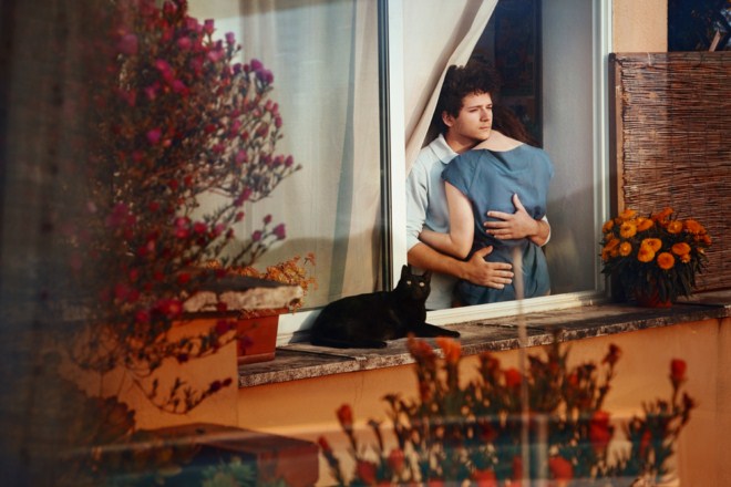
Much of her work is shot though a window such as the above creating a seemingly natural double exposure which makes use of reflections occurring within the image. This photographic technique and style creates a double image within a single frame where two photos can be seen together rather than separately. The landscape above shows an urban garden and swimming poor reflected onto herself and her family member. Perhaps by linking each part of her family to a particular area or setting an emotional link is created between person and place. 

Other examples of Anna’s work feature what could be seen as ordinary double exposure techniques such as digitally – or manually – layering two images over each other with a difference in opacity rather than relying on natural reflections and lighting. In the two photos above, flowers have been overlaid across the figures forming unusual compositions. The muted colour palette in Anna’s work helps to carry her aesthetic and supports her overall theme of identity and confusion within the midst of reality. Using her family as models within each of her tableau images, Anna finds herself in the people who mean the most to her.

Water plays an important role in many of Anna’s images representing a different reality which she tends to be being pulled out of or falling into. The second image here has a strong symbolic reference of the help and support given to her by her family and friends who literally pull her out of the deep water she is trying to escape from.

Itamar Freed

// I T A M A R   F R E E D //

Born in 1987 in Manhattan, Itamar Freed studied at the Bezalel Academy of Arts and Design where he received his B.F.A in 2012. His work has since taken him to London where he is now studying at the Royal College of Arts on the photography program. Freed’s work conjoins reality with the artificial. Staged figures create unusual scenes often with an uncomfortable tension lying behind them. There are three main regions of his photographic work taking him from New York in America to London for his studies and the Israeli wilderness where his home studio lies. Freed’s photographic aesthetic takes much of its style from the techniques of historical painters which draws parallels from his photographs to traditional paintings within art history. His use of colour, natural light and composition blur borders between dreams and reality with open compositions. There is often more than one focus point within each image drawing the eye of the observer to  range of areas within the compositions.

“Freed’s photographic ambience exists as if in a threshold zone, beyond the bounds of specific time and place. Using the photography medium to preserve, to freeze, to grasp life and seize time.”

“My photographic work draws upon a return to the classic paintings of Art History. Through the use of color, natural illumination at its extremes, open composition and multiple vanishing points that simultaneously draw the observer’s eye to different focal points of various events, the borders between dream and wakening are blurred.”

The image below has a number of focal points within its unusual composition. The woman marks a clear part of the photo and creates her own line of sight following the curvature of her body across each of her limbs. There is a sense of fragility about her with a strong sense of vulnerability at her exposed state. Her head starts in a mess of tangled grass and branches but following along her body you arrive at her feet which are immersed in red and orange flowers. There is something to be said about the inclusion of this section of colour, red itself has multiple symbolic readings from lust and passion to danger and poison.  The bird in the background also creates a focal point along with a series of questions. Why is it there? What point is the artist trying to make with its inclusion? The background fades from a  dark, almost blackened tone in the background to a lighter mix of greens and browns in the foreground. This image interested me in particular because of its strange combination of focal points within the strange composition. The collective metaphors and symbolism in the image add a mixture of emotions which support this image and its meaning. 

Presentation

// L E P O R E L L O //

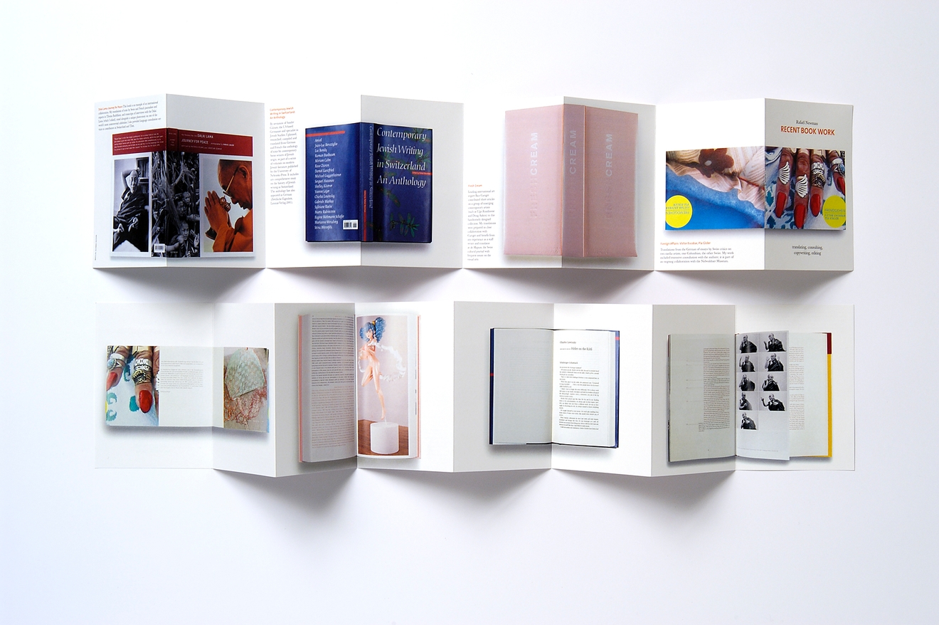
As a first glance at presentation techniques and formatting, the ‘Leporello’ book style is an areas I would like to investigate and analyse. This method of presentation includes a concertina fold which zig-zags paper forwards and backwards to create a folded booklet which can be printed on both sides. The book can be read in order as a standard story-book layout, or unfolded like an accordion to create a long project similar to a timeline. There is something aesthetically pleasing about being able to see each of the visual pages in one go which is something I admire in this presentation technique.

Looking at the possibility of using this within my own project, I could investigate the idea of pairing words and photos side by side to create this visual narrative of each character. I could also look at placing one set of images (the internal shoots for example) on one side, with the landscapes on the reverse creating a divide between the different characters.


THOMAS DEMAND

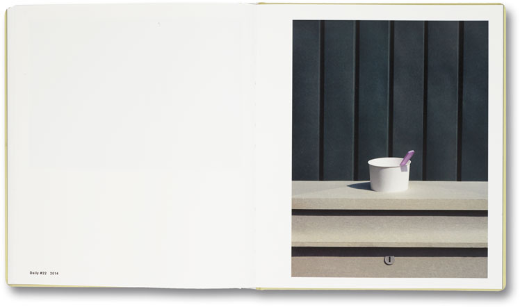
‘The Dailies’ is a project created by Thomas Demand is a book documenting a collection of carefully formed paper and card sculptures which are photographed before being destroyed. Each creation is based on something seen and photographed as part of a street photography project. Highlighting a world that is both familiar but also out of reach.

“The images lure the viewer into a mirror world, a twin universe made only of paper. But the imperfect models are awash with discrepancies from actual things, and as such, they act as small ruptures that complicate the old indexical bond between a photograph and reality. Demand describes the series as Haiku poetry, simple fragments strung together to inspire reflection; they are the stock of our daily lives, but as they trigger deja vu through performed repetition, they ask us to look again, anew, to find in the repertoire an ordinary but redemptive beauty.”

– Taken from ‘The Daileys’ description of Demand’s personal website

The 32-page book can be displayed in a circular layout (as shown above), due to its leporello binding. Each concertina page can be folded and twisted to form a structure and a sculpture in itself. ‘The Dailies‘  book design was actually created and presented by Naomi Mizusaki who has worked with Thomas Demand on a number of projects. The images within this project as less relevant to my work than the binding and structure itself of the final project. Most of the images depict urban street scenes, often with a surreal aspect of colourful isolation hidden within them.

Following the research into this book, I am keen to look into the concertina and leporello formats further and perhaps make a smaller test to try out the style with a few of my own photos. This style could be used to present my ideas on leaving home and the fears associated with it. One side could for example show a ‘traditional’ view of home, the internal photos taken from within the house, while the other highlights a version of home that comes from emotional attachment. The second side for example could show the places where people really feel at home, outside in the landscapes they have come to love with friends rather than family.

Shoots One + Two (plus three ish?)

// M A Y A //

The first person being photographed in this project is Maya, a friend from school and resident of curiosity coffee shop. Maya moved out from her mum’s house a few months ago and has had a mixture of homes since then. Last month Maya moved into a house share in Havre De Pas where she has a single room and bathroom. Visiting this space for the first time, It was hard not to notice how cold it was. Speaking to Maya about her new house, it doesn’t seem like this is home for her. The people are not kind there and she mentioned how when she stays there it feels isolated and lonely. Visitors are allowed 9am – 9pm but i’m told that if you can sneak in before 8 or so, no one will notice if friends stay the night.

The natural light comes from the window on the right hand side of the room and there is a central light hanging above on the right which adds a yellow-toned luminance to the room. I was keen to mirror a soft kind of aesthetic similar to Sian Davey’s images from her ‘first love’ series for this project. Working both digitally and on 35mm film, I started in the house by setting up the initial image. This first photo is a front facing portrait with the model sat facing forwards towards the camera. On my Canon 5D, I used a relatively high shutter speed to capture a crisp and clean image with the ISO set accordingly. My instructions to the model were to face me and remain as neutral as possible. The point of these first home images are to stay as blank and neutral as each character can. The external environmental shoots will be the characterised ones with light and life in them reflecting the energy of each area.

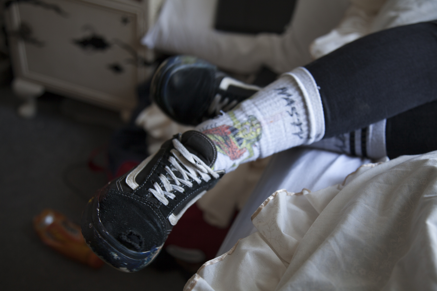
Rather than add an entire contact sheet below, I have chosen five photos which ultimately came up as the strongest images in terms of both colour, lighting and composition. Because I typically shoot in RAW on my Canon, the level of post-shoot editing I can do is much greater than if I was working with a standard JPEG image. I have not however edited the images below yet so these are the originals. The front facing portrait was the image I set out to shoot but it would have been crazy not to take advantage of the room and shoot some of the other details. I watched Maya paint her shoes earlier that morning in art and it felt natural to photograph them as well as the slight rebellion – and arguably destructive nature of her actions – matches her character very well.

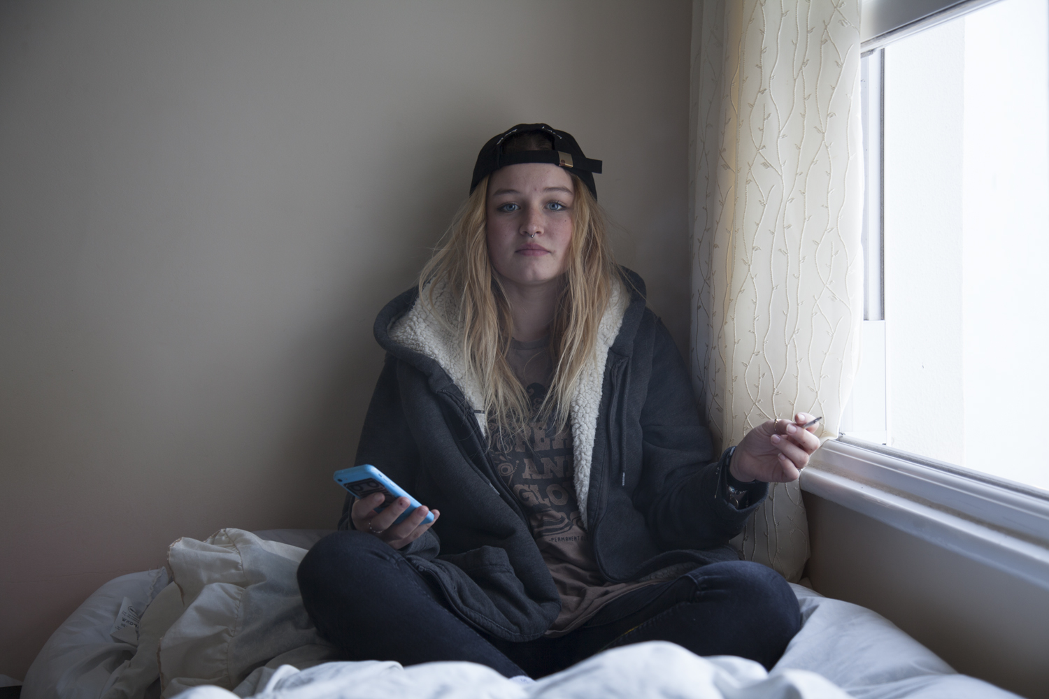
This image is one of the strongest photos in terms of composition and link to my specification. The model is facing me on her bed as I instructed. Although she is not allowed to smoke within this house, the window is opened for her to blow out of. editing this image, I increased the brightness slightly and adjusted the colour contrast. The light coming through came up much colder than it felt this day and I edited the image to reflect the brighter warmth that we felt.

The final image I select from this shoot will depend more so on the second set of images for this character. I don’t want to decide on a photo now that may not work with its sister image.


The second shoot with Maya was the external environment which was selected by the model. The point of this was to show each figure in a place of significance to them personal, an environment with a personal attachment.

The images from the first location are shot up high in St Johns. Maya was part of a house share up here called Northwood which is where a lot of our friends ether currently live or have stayed in the past. She tells me how she used to go swimming and surfing at the beaches near there and how she felt happy living there. These images have not yet been edited.

This image is more or less exactly what I was looking for on this shoot. Maya is facing away from me and looking out at the landscape she chose (looking out at the sea in St Johns parish). The colours are bright and the light is warm. I lightened some of the shadows on her shirt and upped the contrast and clarity slightly but the image is relatively natural.


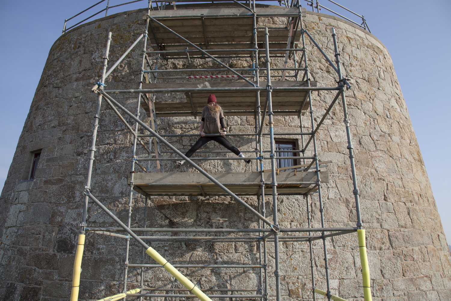
We also went adventuring to St Ouens because the sun was out and we like exploring. I need to make a note that adventures with Maya often involve climbing and cameras are somewhat hazardous when scaling four floors of scaffolding. These images have been adjusted in Camera Raw.


M A Y A 

The two images I have ultimately selected for this project share a continued line of similarity across their compositions and photographic structure. The first from the home shoot is exactly what I was looking for. A blank expression that shows the figure in their home environment around the things they have grown up with. Maya’s room is temporary but she has filled it with the things important for her.  There is something surreal about the contrast between the figure and the backdrop. It is more than typical to surround yourself – and in particular your room – with things that mean the most to you. In a way these portraits are reflective not only in the character shown but also in their room which is ultimately a self portrait of their attitude and emotions.

Driving around with Maya to each location, I asked about her home life and her relationship with Jersey. After moving here from Poland only two years ago, school is somewhat optional in her mind. Maya tells me she used to be good at school and always do the work but at some point that changed and she adopted her current care-free attitude which allows her to do as she wants. Her characteristic longboard is easily recognised and represents a large part of her being.

These images have been adjusted in Camera RAW

Kevin Russ

// K E V I N   R U S S //

“Born & raised in California, moved to Oregon, went to college, bought a camera, dropped out of college, hit the road..”

Kevin Russ is an american photographer in his 30s bringing life to a less conventional form of ‘professional’ photography. His images have a similar aesthetic to that of a medium format film camera however his equipment of choice is in fact an iPhone 5. Raised on the central coast of California, many of his artistic influences come from the natural settings around him which is visible in his work. May contain animals and he is quoted saying that he once spent seven hours with some bull moose in Colorado over the course of two days in order to gain enough trust to get close to them.

Marble Canyon, Arizona

The east side of The Grand Canyon turns north and becomes Marble Canyon. I took a couple day trips out there and you have to cross Indian reservation land to get there. I came across wild horses on the way both times which is always a bonus. It’s a great canyon because you can see the Colorado River below and you have complete solitude. No one around except the horses and me.

– Kevin Russ talking about his top three favourite images

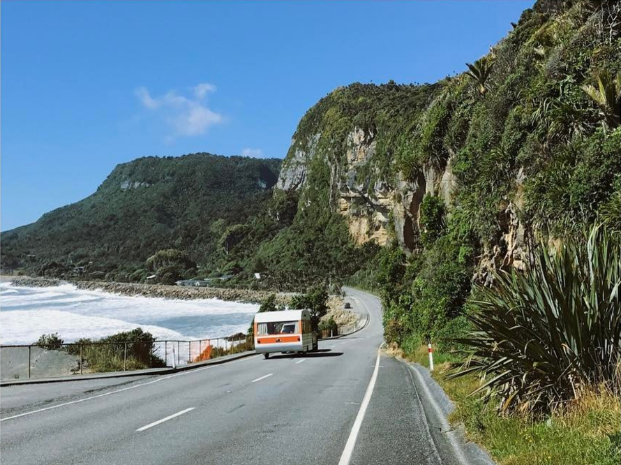
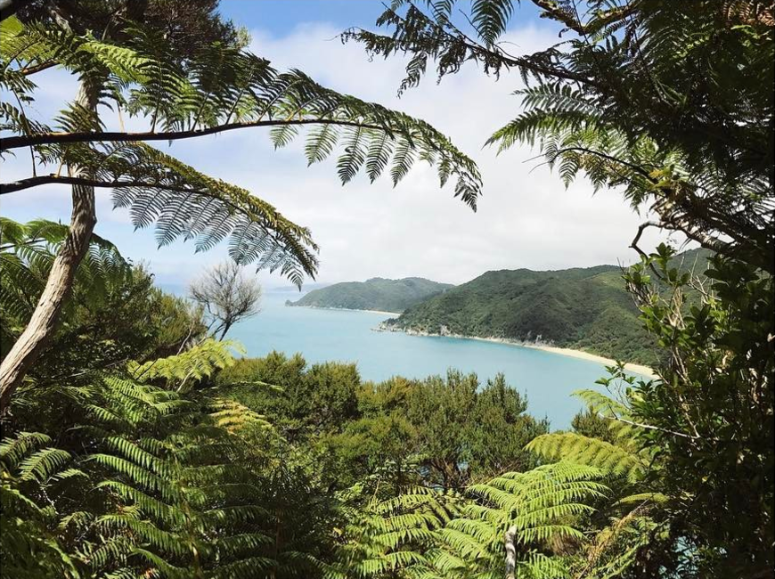
Although I won’t be using an iPhone for my own photography project, there are certainly points in Russ’ images which I will draw into my own work. The landscapes tend to have a clear line of sight and focus on bright contrasting colours which come from natural plant life, water and the juxtaposition of roads and man-made vehicles. Translating this, I will look at how I can use this style of framing to create similarly aesthetic images with my own subject matter. My images will also occasionally include people as well which is not something Kevin Russ photographs. The aspects of his work I am looking at therefore come from his natural landscapes and the way he frames each environment.

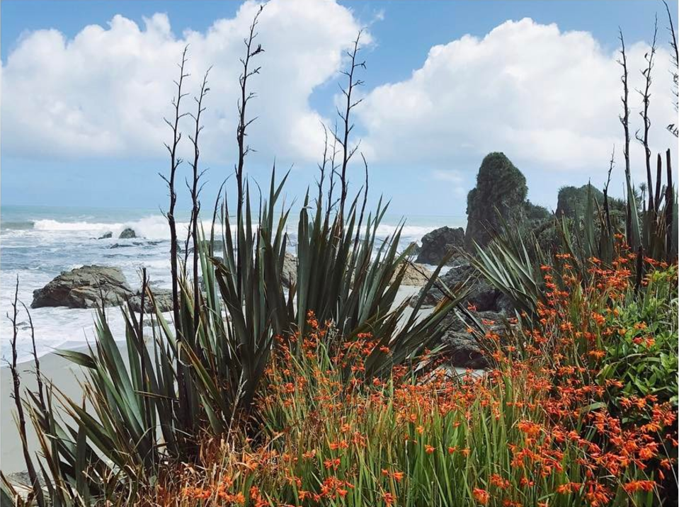
The aesthetic quality of his images come from the way Kevin Russ works with light in each frame. The set up is completely natural and so each of his compositions have to work around the way light hits a frame. In order to transfer some of these qualities to my own work, my ability to work with light in a similar way will be crucial. Nature plays a key role in his images and will have a similarly crucial part in my own project work. Though humans rarely feature in his work, it will be the landscapes making up the majority of the frames in each of my compositions.The image above features a mixture of two landscapes. You have the typical light-sanded beach scene in the background with bright greenery and red flowers in the foreground. The mixture of two environments forms a careful composition which matches colour with light and highlights the joining point between the landscapes. Arguably my interest in this image comes from the aesthetic quality of the flowers and the colour contrast between the blue sky and red plant life. With my own images, I will make sure to include elements of natural scenery to form a soft and possibly safe-seeming image. The point of the landscapes within this project are to show areas of the island we live in that people have emotional attachments to. For a lot of teenagers leaving the island, there are strong memories associated with certain places – in particular woods or beaches – which many have grown up in.
The Plan

// S P E C I F I C A T I O N //

“Write a specification with 2-3 ideas about what you are planning to do. Produce at least 2-3 blog posts that illustrate your thinking and understanding. Use pictures and annotation”

ONE

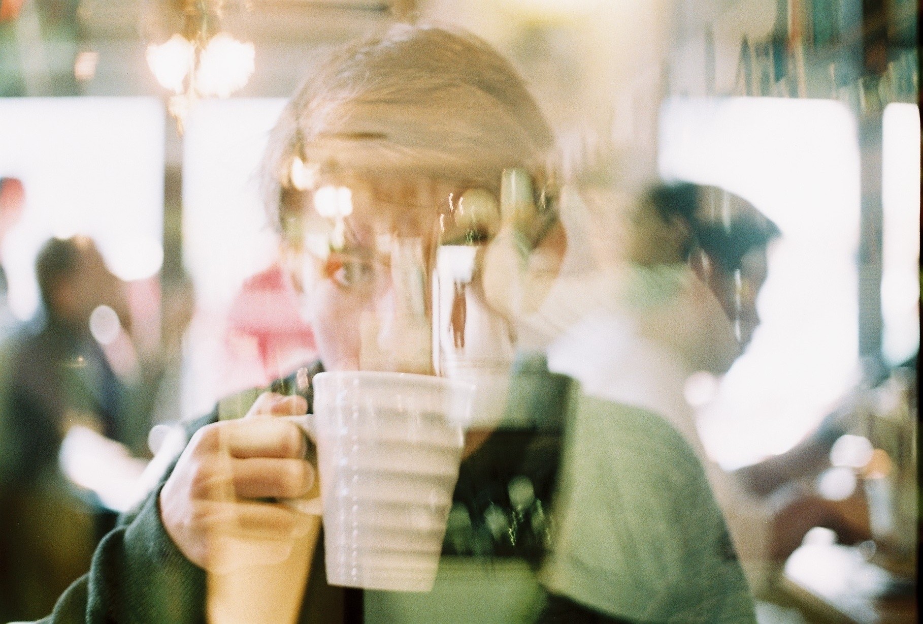
The first path I have investigated plays with the idea of techniques within photography and the way digital manipulation can advance images. Taking words from my post ‘Stereoscopic’, I explored the idea of multiple exposure images as a way to ultimately explore and expand on the idea of environment.

Double exposure photography is an area which aesthetically interests me. The process of combining multiple images to create a final photo – often with colour and contrast variations – can not only be used aesthetically but also symbolically. Tying this to the theme of environment (and possibly portraiture?) could produce some graphically interesting outcomes where people can be merged with their personal landscapes. Working on this idea can involve both
digital and analogue images which I intend to take advantage of in this project. 

So this pathway would involve a set of double exposure images tying people to particular environments of significance for them, perhaps showing how the environment ultimately affects the human form and body.

TWO

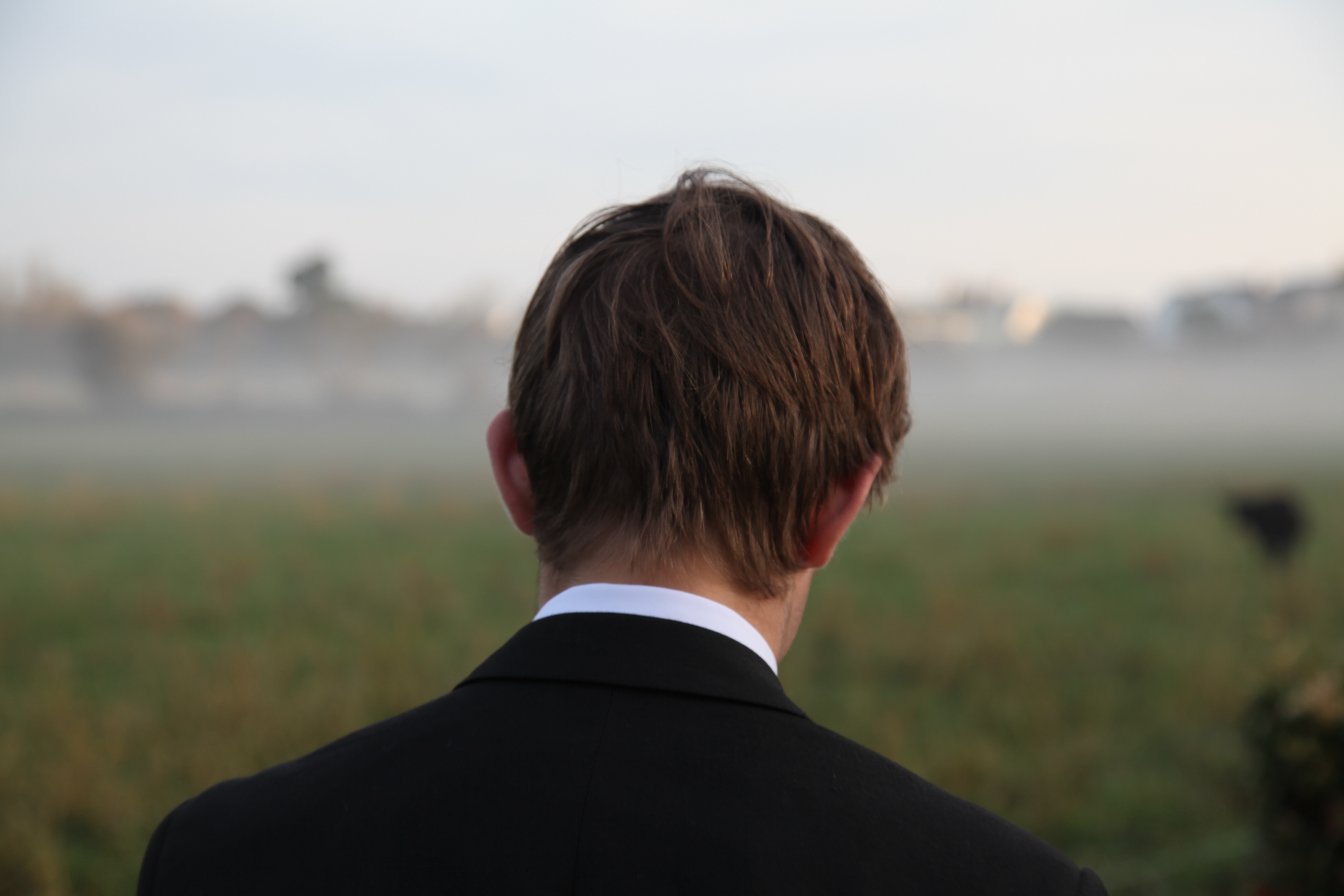
The second idea I could follow and develop further is the thought of mental effects of the environment on people – in particular playing to the idea of loss and homesickness. With so many of my peer group on the edge of moving away for university – or being on the other end of the spectrum as the ones who will be left behind – this is perhaps a more unique briefing to follow. For this idea, as explored in my previous post ‘ Run Away’, I would look to shoot a series of portraits featuring a set of characters in two locations. The first would be their home setting, most likely in a bedroom or somewhere of significance to them within the house. The second portrait will feature the same person in an environment of their choice. The point of this will be to show a particular area or landscape they will miss when they leave – most of them to university in a few months time. The images for this project will feature a mixture of front facing images and backwards portraits such as the one below which will highlight the environment chosen by the subject.

The point of both of these idea concepts is to design a project that will allow me to explore environment within a field of portraiture. One is probably more studio focused with the second idea taking me to a variety of locations which is why ultimately I have chosen to focus on this project. To start this idea, I intend to shoot one of the sets planned out in my previous blog posts as a way to test the stability of the project. This will involve a single character with photos centred around their personal fears related to leaving home.