– ̗̀ H E L P F U L L I N K S ̖́-
For the Personal Investigation [X]
For the Externally Set Assignment [X]
For a preview of the finished book as part of the externally set assignment, “Untitled.” which can be viewed digitally through Blurb here [X]

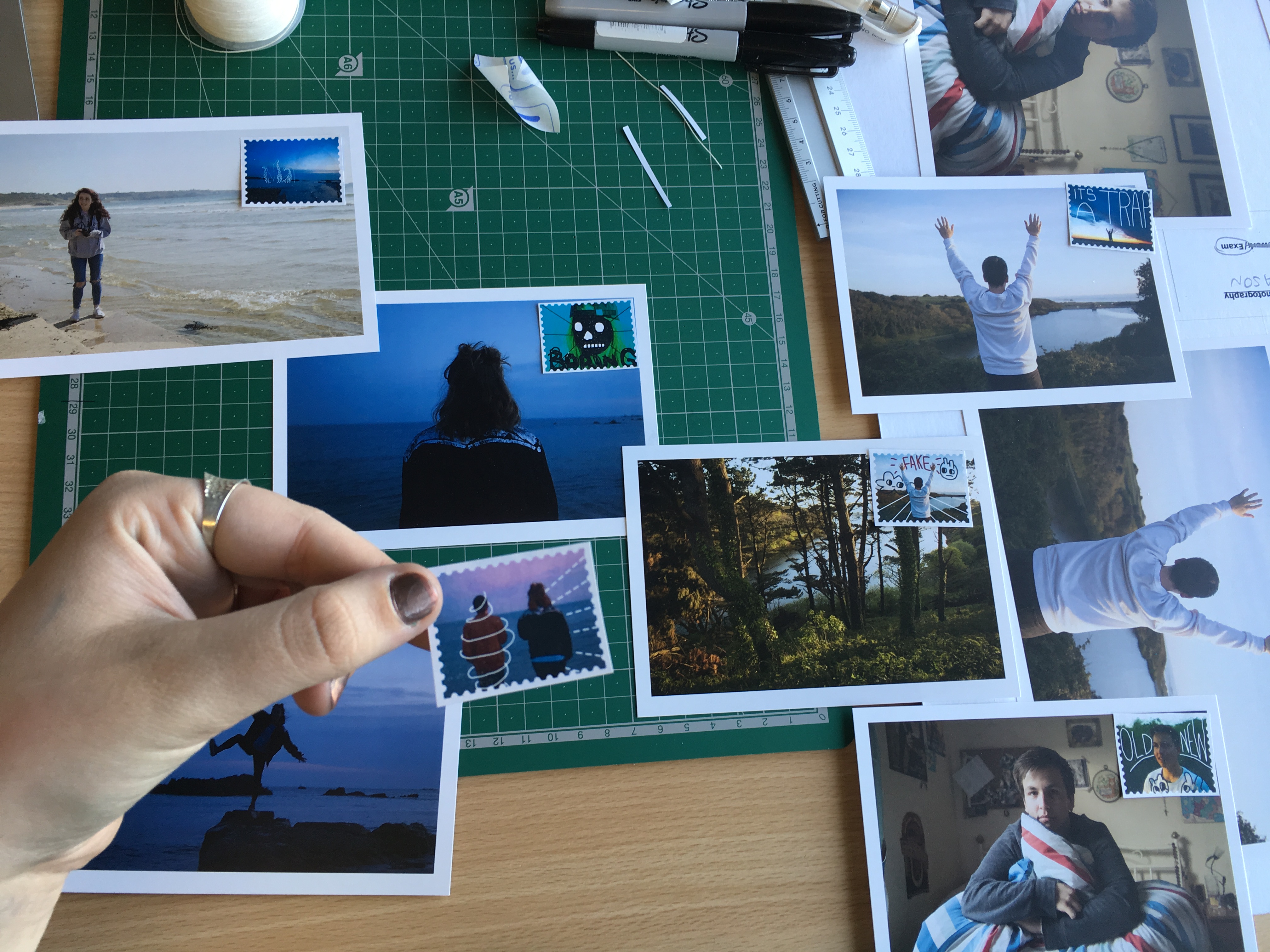
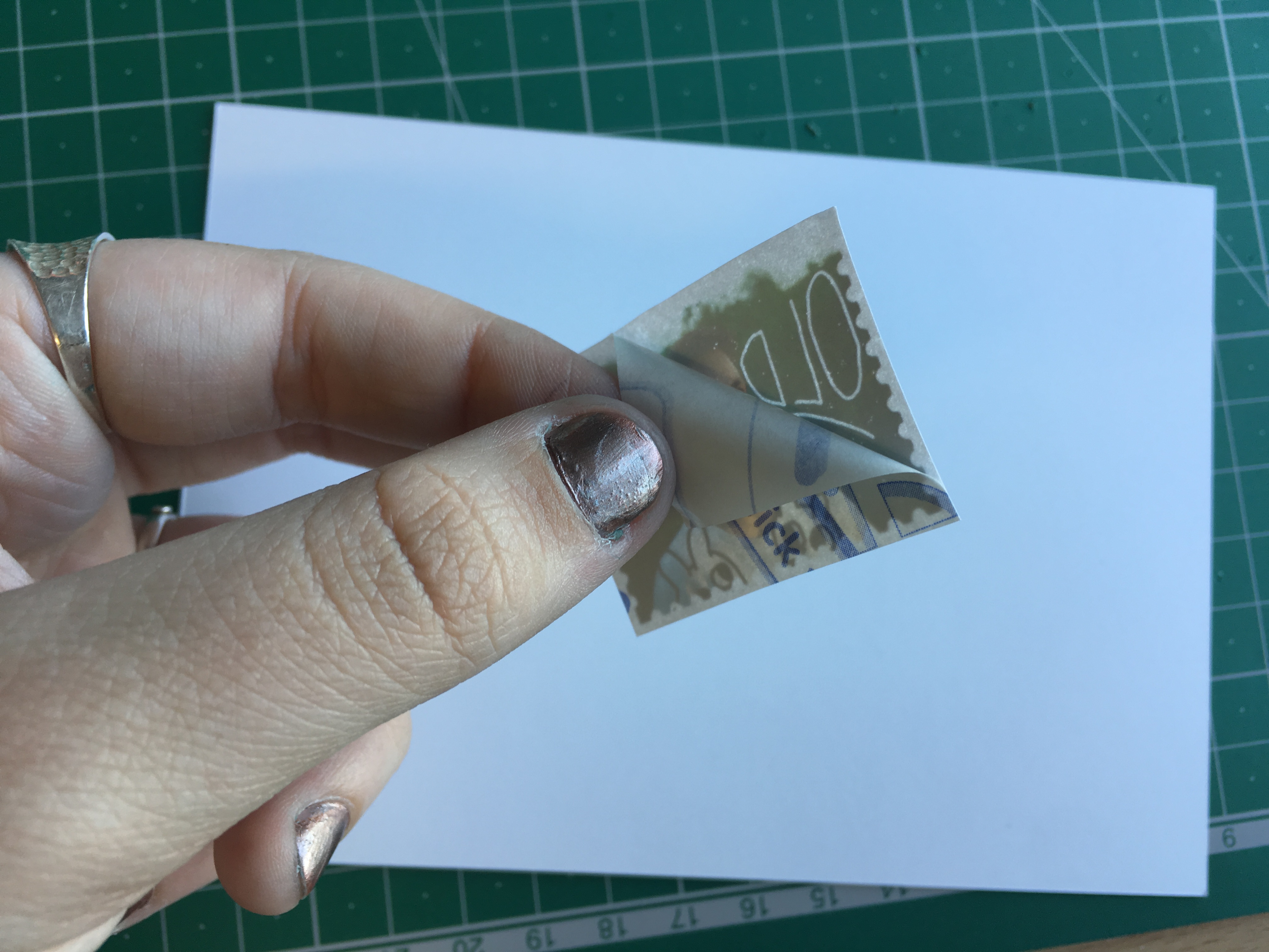
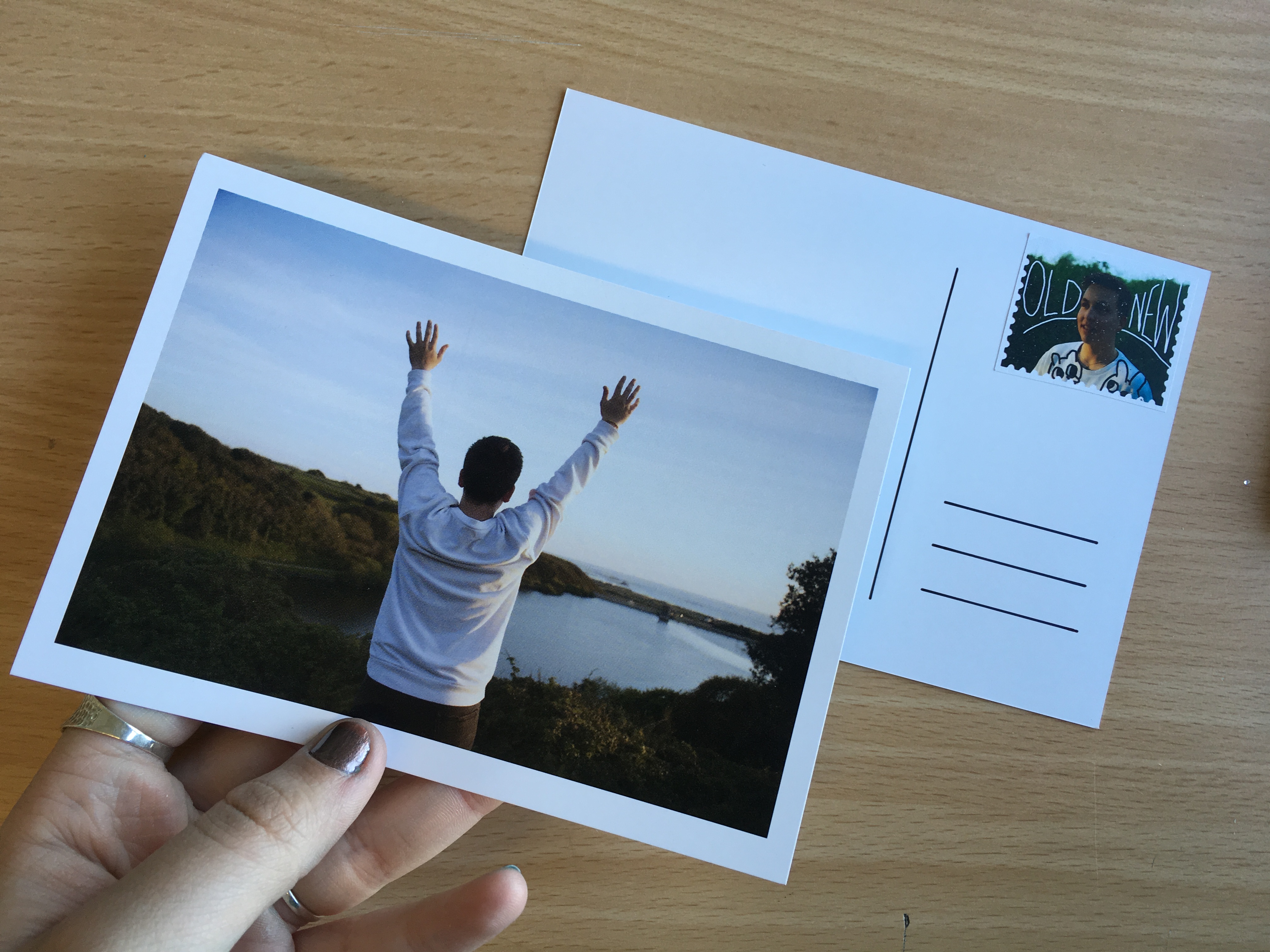
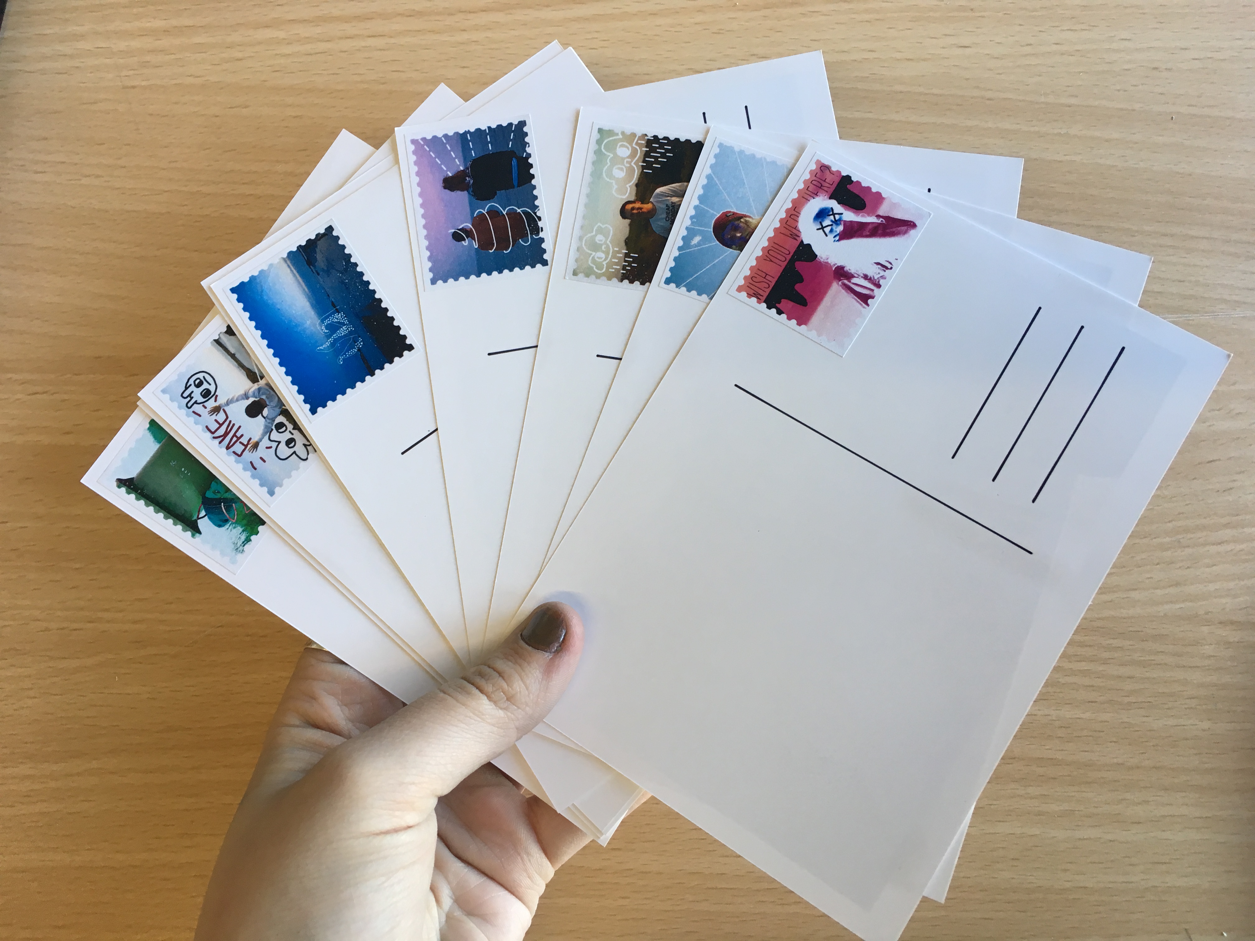
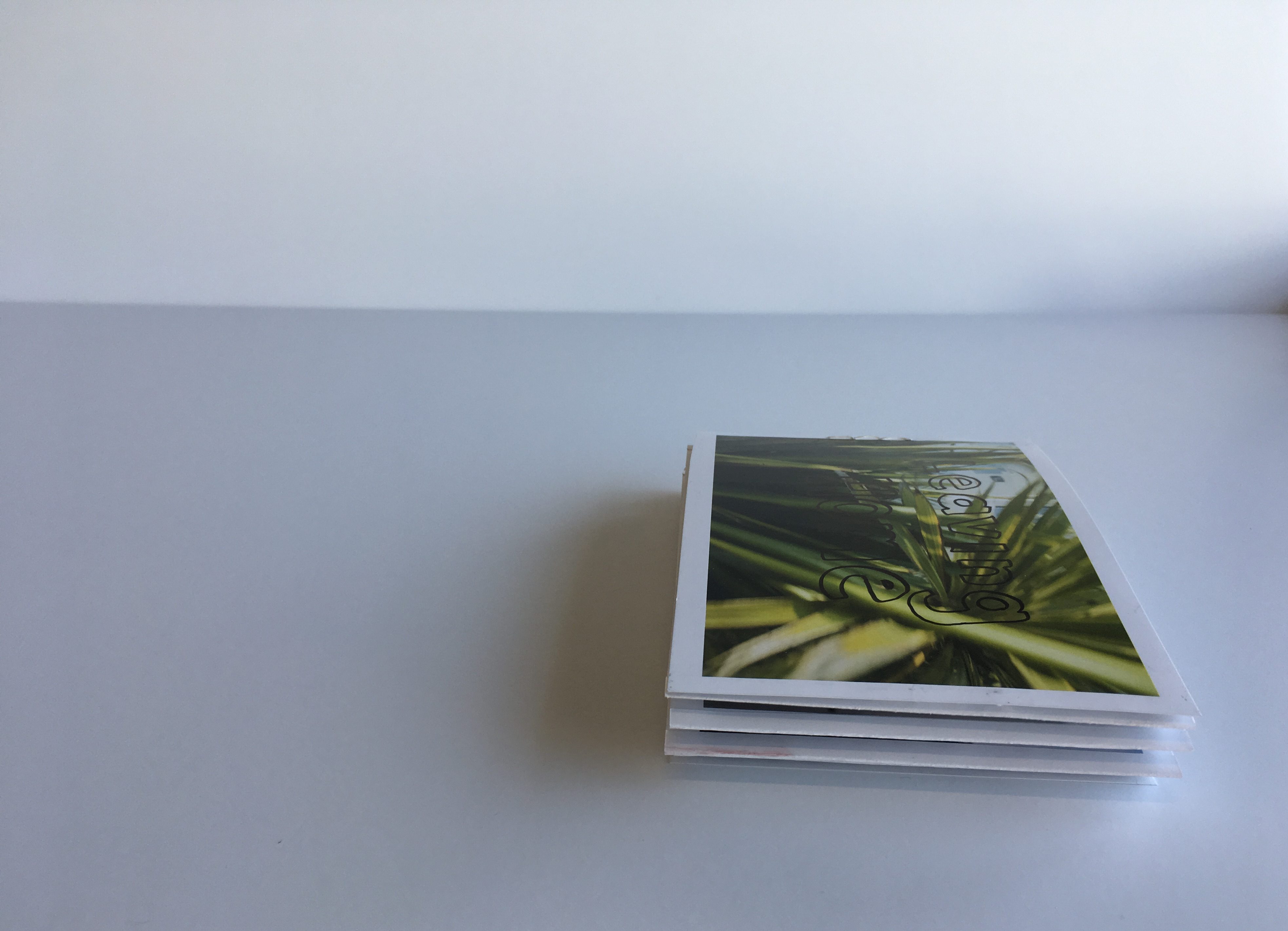
Using inspiration from Harriet Plaskitt’s post card illustrations (two of which are shown below), I handmade the backings for my final postcards. These were printed as A6 images onto high quality photo paper. The backings were drawn with permanent ink pens and the stamps applied by hand after being printed onto high quality sticker paper. All together, I have 12 final postcards and a set of 12 matching stamps. On top of this, I have also created a set of four images which have been printed at A5 size and framed in a white window mount. Below are captioned process shots for the manufacture process and final pieces.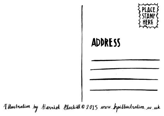
P O S T C A R D S
The post cards in this project made up the main body of work for the series. The set includes 12 images showing four characters and their relationship with the island of Jersey. The central focus for this work was to form a body of work that would reflect people’s love for the island and the way people interact with landscapes and environments of significance to them as individuals. Below are a series of images showing how the post cards were made once they had been printed – in particular with reference to the back design of the post cards and the addition of the graphic stamps.
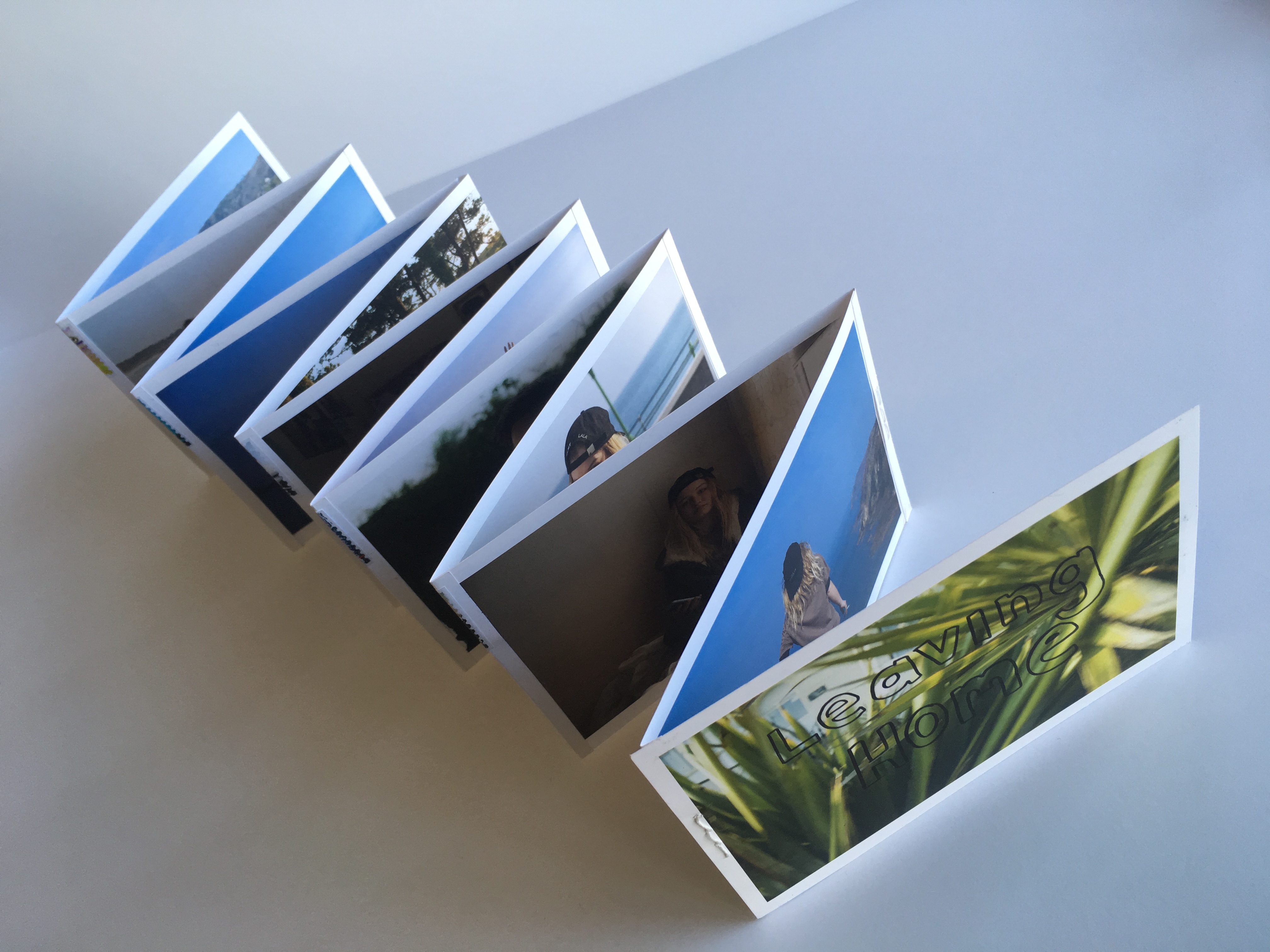
L E P O R E L L O
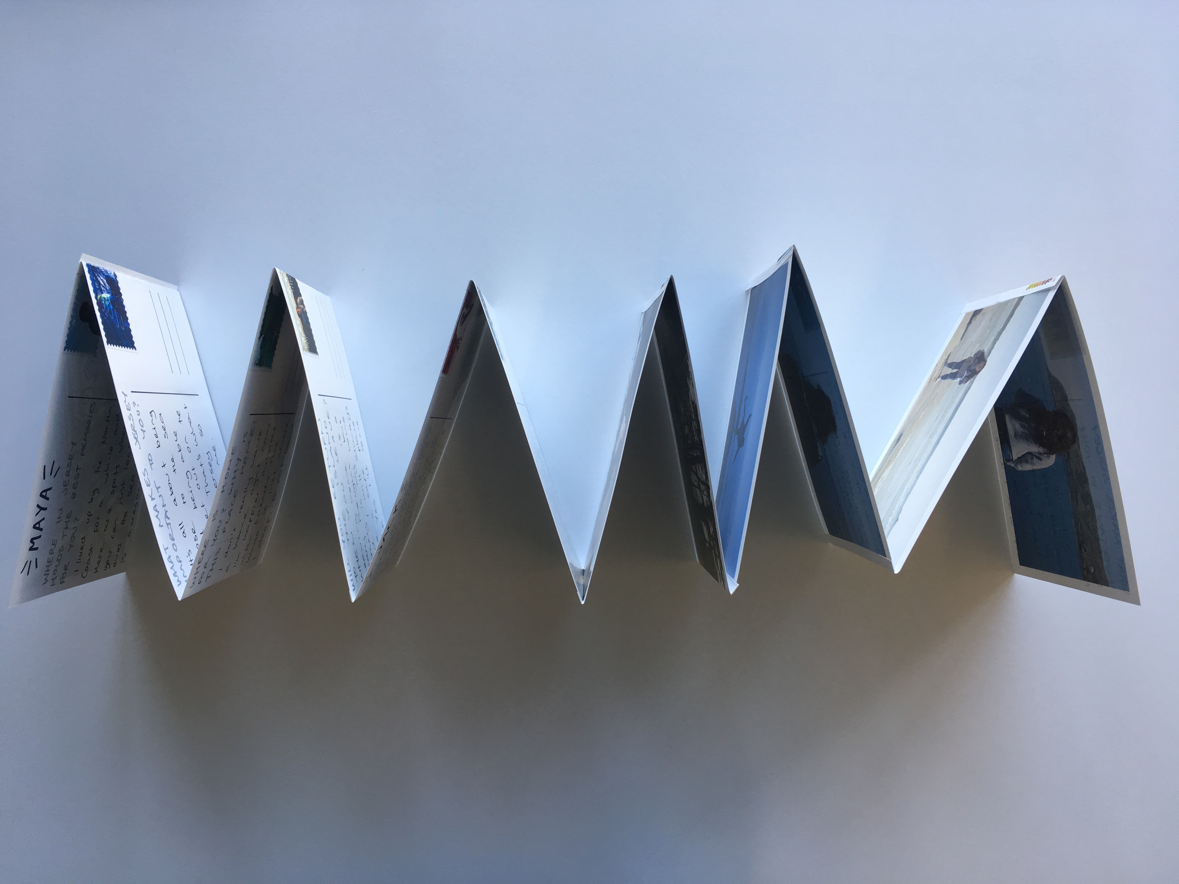
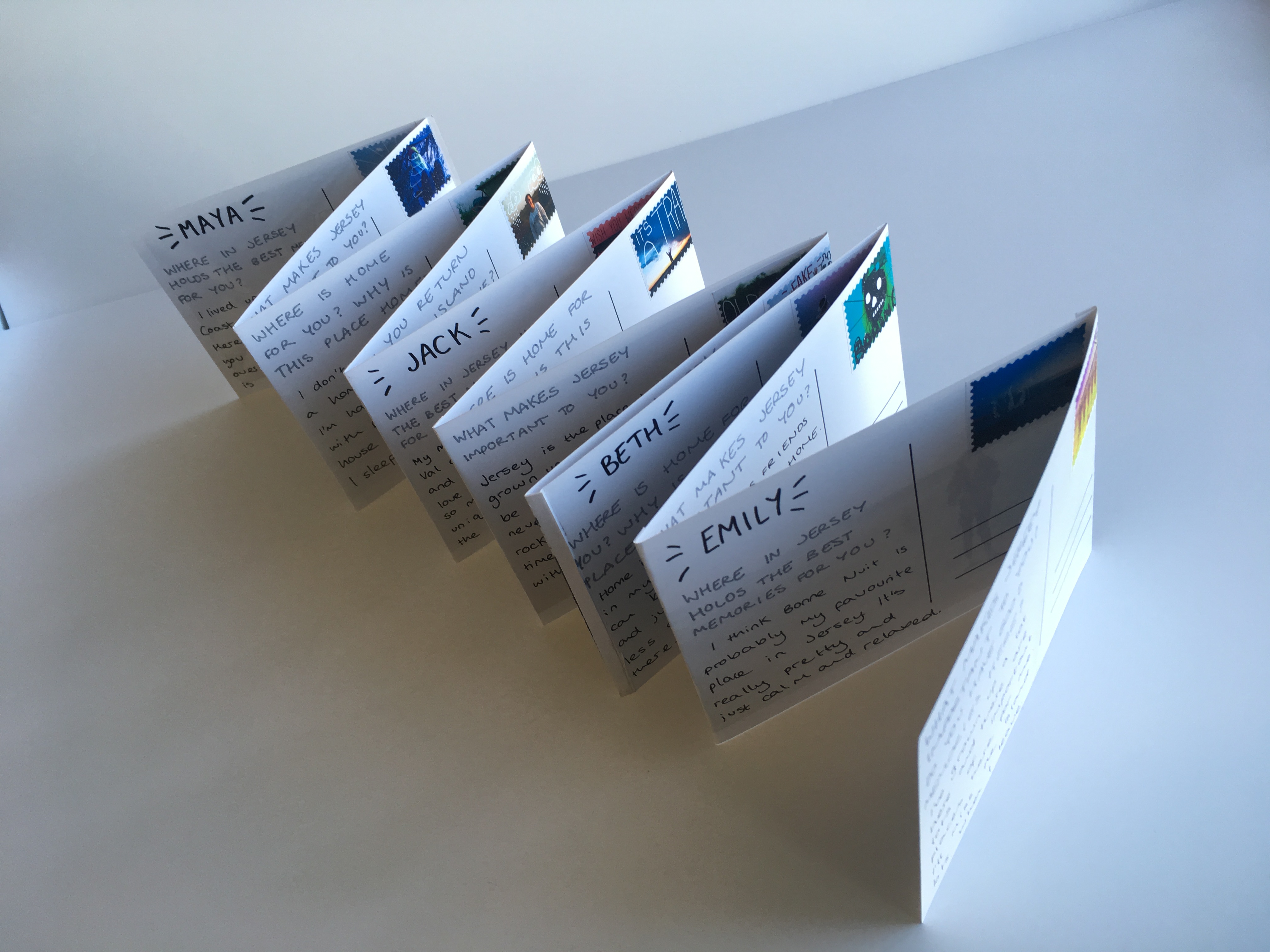
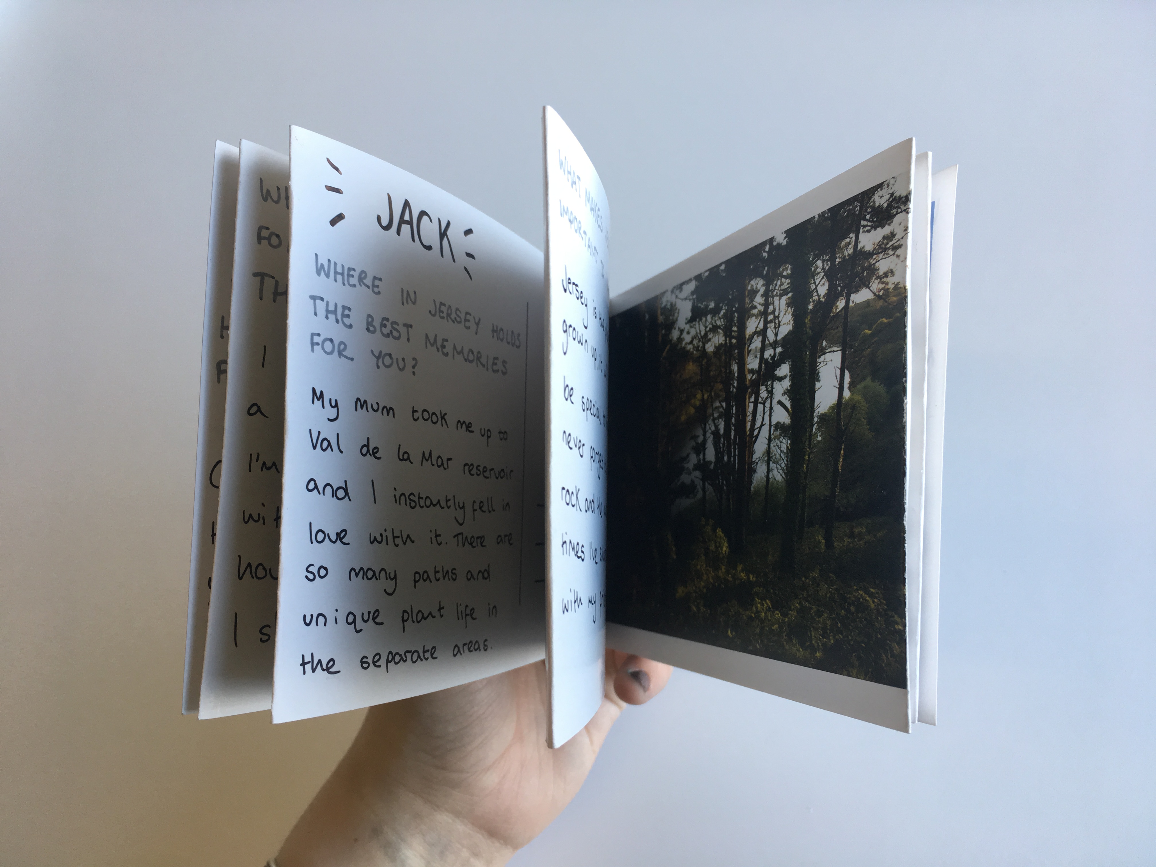
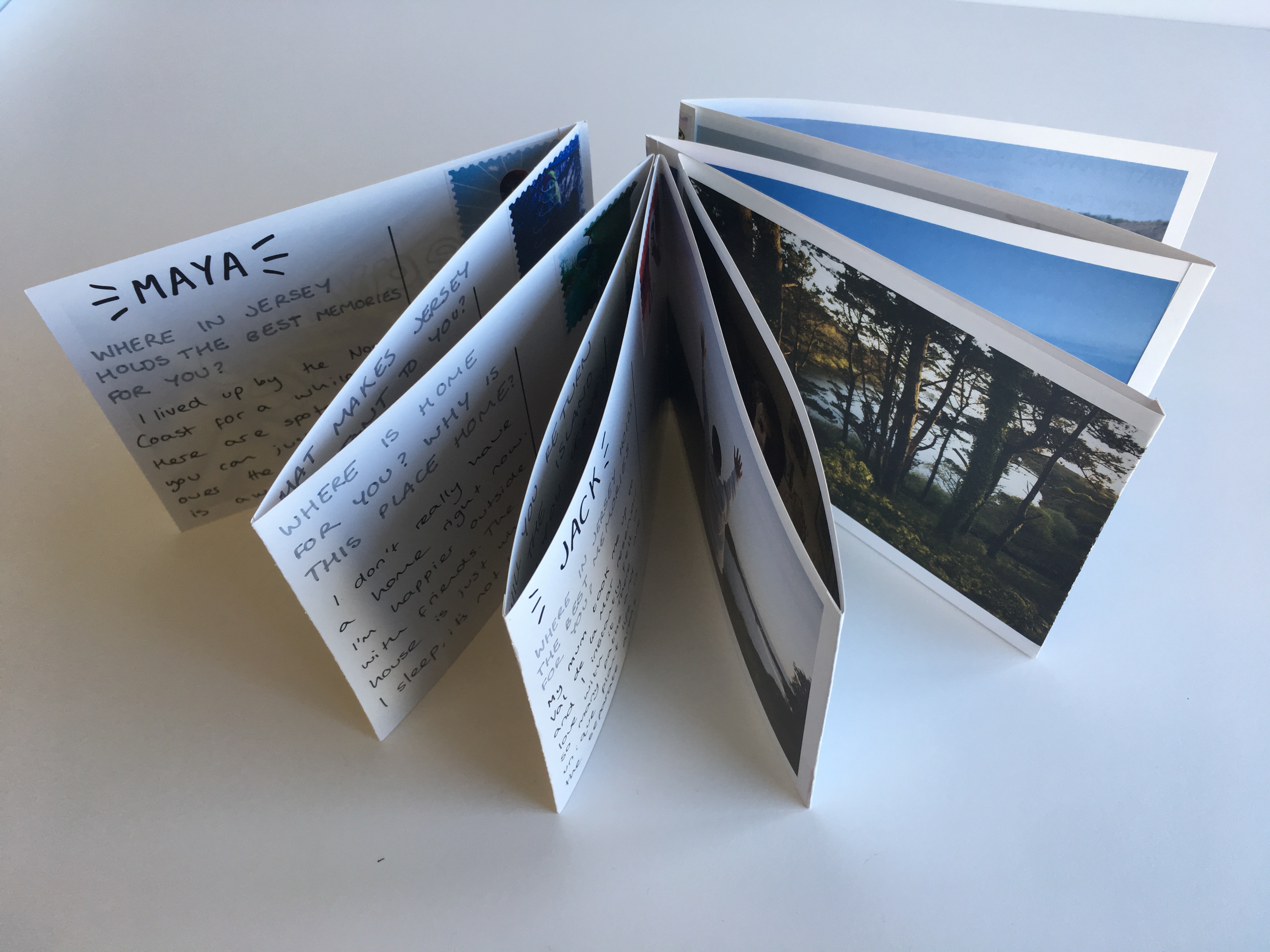
The main presentation of my final images was as a post-card themed leporello design which is shown below. The leporello can be manipulated in the hand and moved into a variety of positions and shapes displaying different sections of informations. This piece is A6 in size and is made up of postcards stitched together to form a fold-out book. On the reverse of each post card there is a stamp, a question and a corresponding answer given by the character on the front of the card. These questions were from my original survey about leaving home, homesickness and Jersey as a place of significance in different people’s lives.
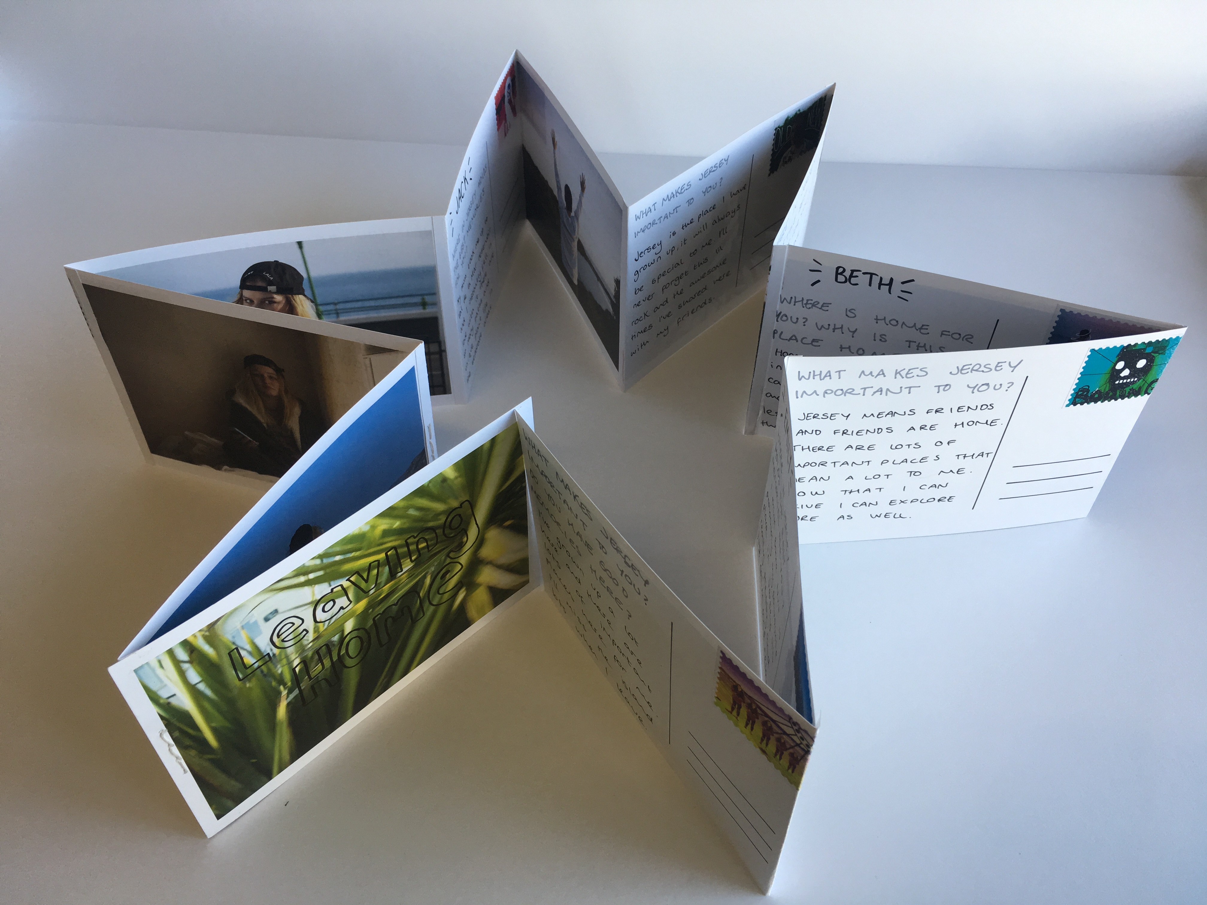
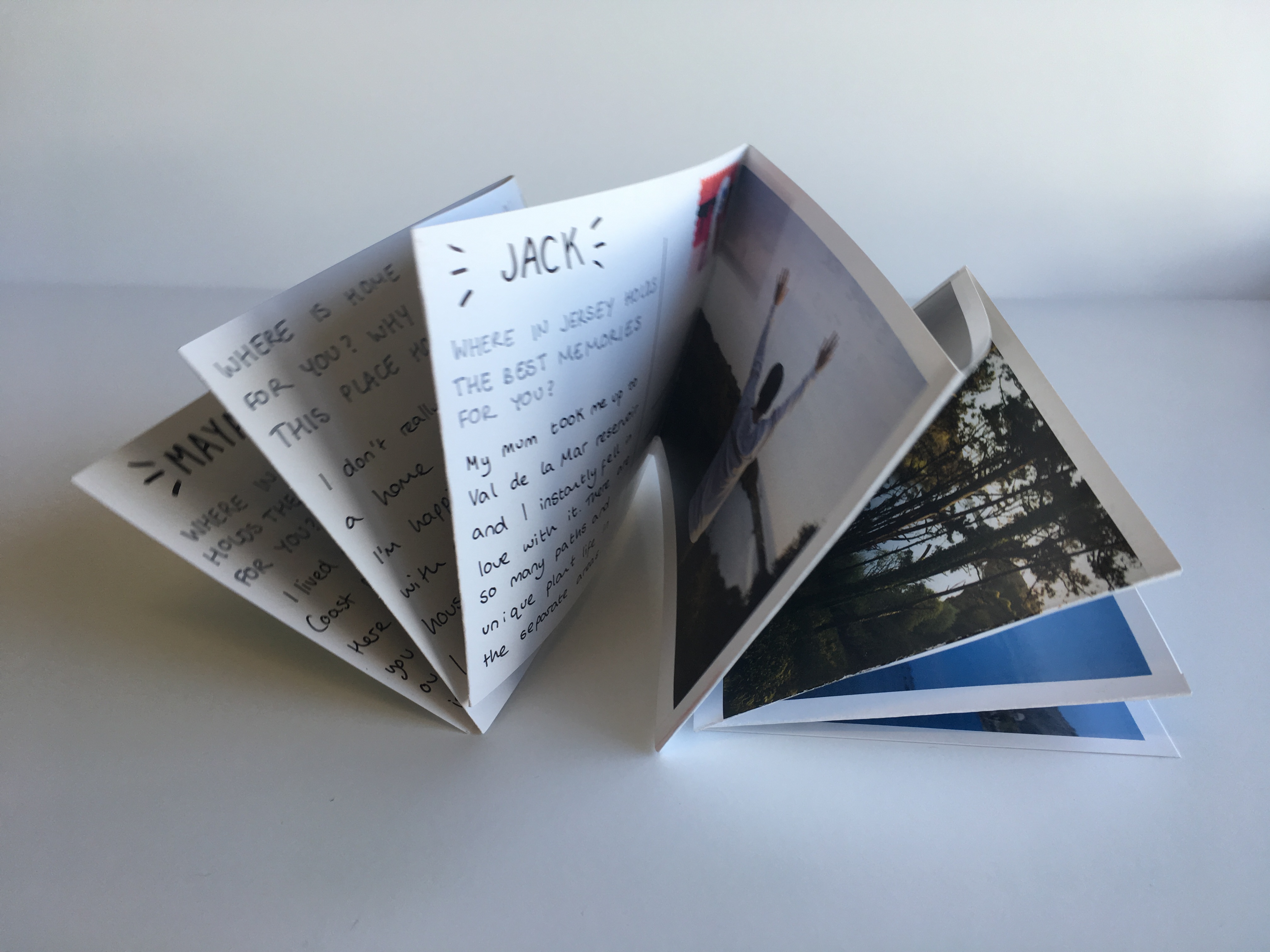
Below are a series of images showing the Leporello laid out in a book format. there are twelve pages on each side making twenty four all together including the cover page. This series is made up of 12 post cards, 12 images and 12 stamps. The significance of the letters and their matching to each image shows a journey and a connection between each character and their own experience with the island. The leporello design allowed this journey to be shown as a time-line and display different shapes as part of its final presentation, much like the changeable nature of the island and people’s opinions of it.
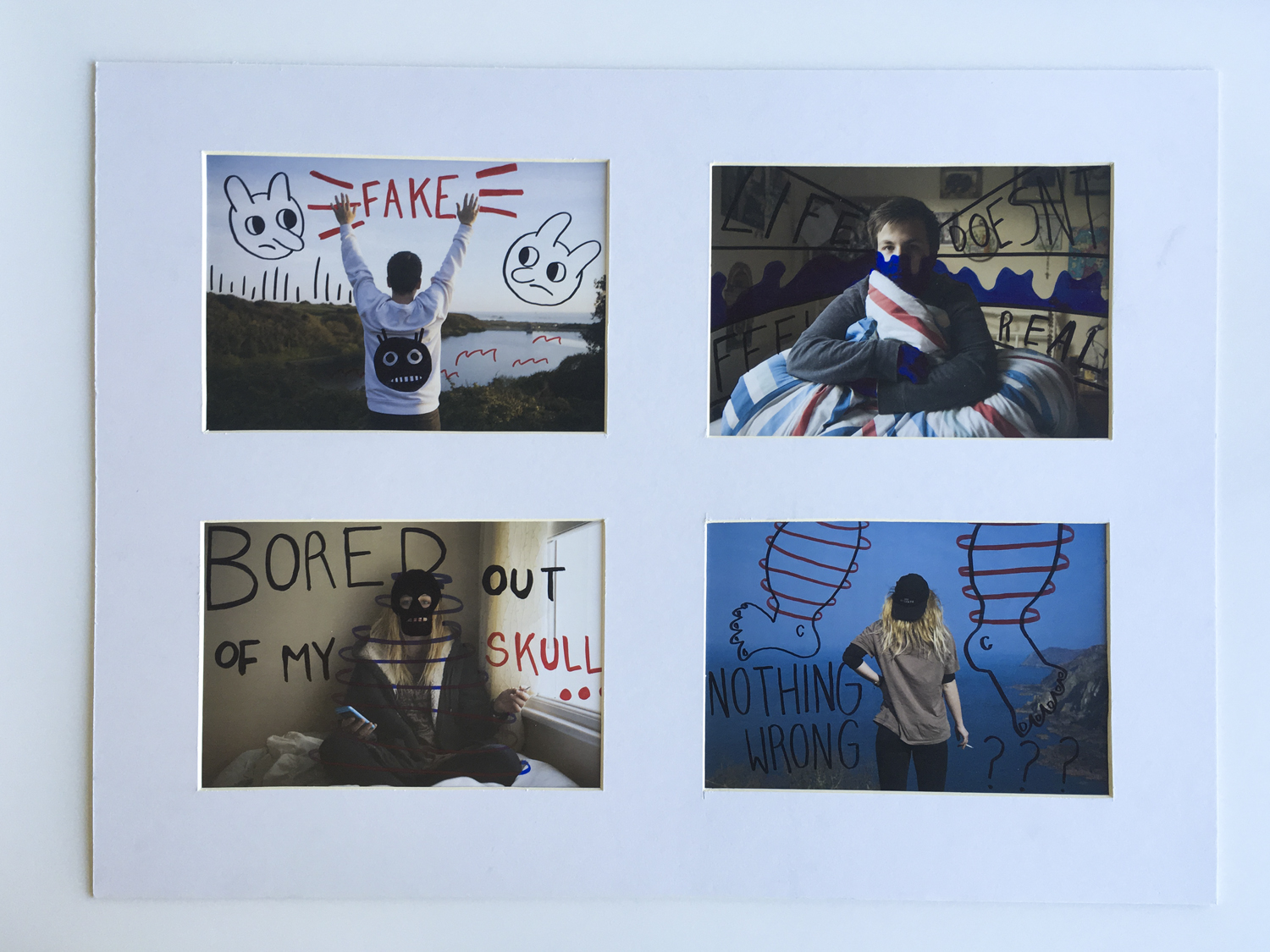
W I N D O W M O U N T
The window mount was created to hold four of my final images printed to an A5 size. These images were of two main characters who featured in this project and were all manually manipulated with ink pens post printing. The layout shows each character in their home environment contrasted with their chosen external environment on the island. The main point of this part of my final piece was to return back to the idea of home and the contrasts between people’s interpretations of the island. For many, Jersey is a small and isolated place however for some this can be seen as a direct opposite. The characters chosen for this project are all leaving their island homes soon and were selected to talk and be photographed around the idea of moving away and in particular home sickness. I was keen to capture memories for them interacting with the places that they would miss the most which is a big part of these final outcomes below.
E V A L U A T I O N
The aim for this project was to create a series of images that would help people leaving the island relate and remember the environments that meant the most to them while they lived here. I have explored the concept of home and family as well as expanding this mindset to look at homes outside of the physical house. The leporello design is arguably my most successful outcome and shows a narrative timeline that follows a journey around the island. The window mount displays a series of experiments and manual manipulation with my images and the way – in a similar style to the stamps – that illustration can be used to enhance an image.
Following up on the research and experimentation I have carried out for this project, I created my twelve final stamps ready to be printed. Incorporating a mixture of artists I have researched such as Ray Johnson’s mail art and linear illustration techniques, the set below is my finished collection. Anna di Prospero is another artist who heavily influenced many of these designs with her soft floral double exposure techniques. This first image was created using a double exposure technique which involved altering the blending options, in particular the ‘lighten’ option. The second image is one from the same shoot and shows a selection of bright purple wildflowers. The white illustrations were inspired by Ray Johnson’s artwork but unlike his pieces, these were applied digitally using the pen tool in photoshop. This second image was digitally altered using the colour settings as well as the dodge tool, saturation settings and posterise options. The wrapped white pen was digitally added afterwards and a clipping mask created the postage stamp shape. The third used a channel mixer to create the alien looking colourings of cyan and lime green. The illustrations were drawn using a square brush to create a rougher and less finished look. So below is the finished set of twelve which will be displayed along side my prints and finished postcards – as both small scale stamps and as prints themselves.


To present the final pieces for this project I am creating a series of postcards from my images shot of different characters around the island in response to a series of questions asked to them beforehand. The aim of this project was to create something each person can take away with them as they leave home – something creeping towards everyone i’ve photographed for this series. There are many elements of homesickness which can affect those moving away and I particularly wanted to zone in on the idea of home and places that will be missed. To visualise this, I went on a journey with each model driving around to locations of importance and significance to them, shooting as we went. This narrative timeline then resulted in a series of final images showing each person in their physical home as well as their interactions with areas they will miss when they have to leave. The sections of this project will be presented in various ways. A selection of stylized portraits will be made into prints which can be mounted, and a more extensive collection will become postcards with messages written on the reverse. These postcards can then also be made into a kind of hand made photobook using some of the handmade book stitching methods and techniques as well as a laperello design. The front of each card will be created with an image from the selection below which will be A6 in size. The next section of design for this project is to create the backing of the postcards which will be fabricated on Photoshop.


To start designing the reverse side of the postcards, research was carried out into existing designs and their formats. Below is a selection of five examples found on illustration sites, template websites and tourism sites. From these, I started to build my own collection of ideas working on aesthetics and practicality twinned together.


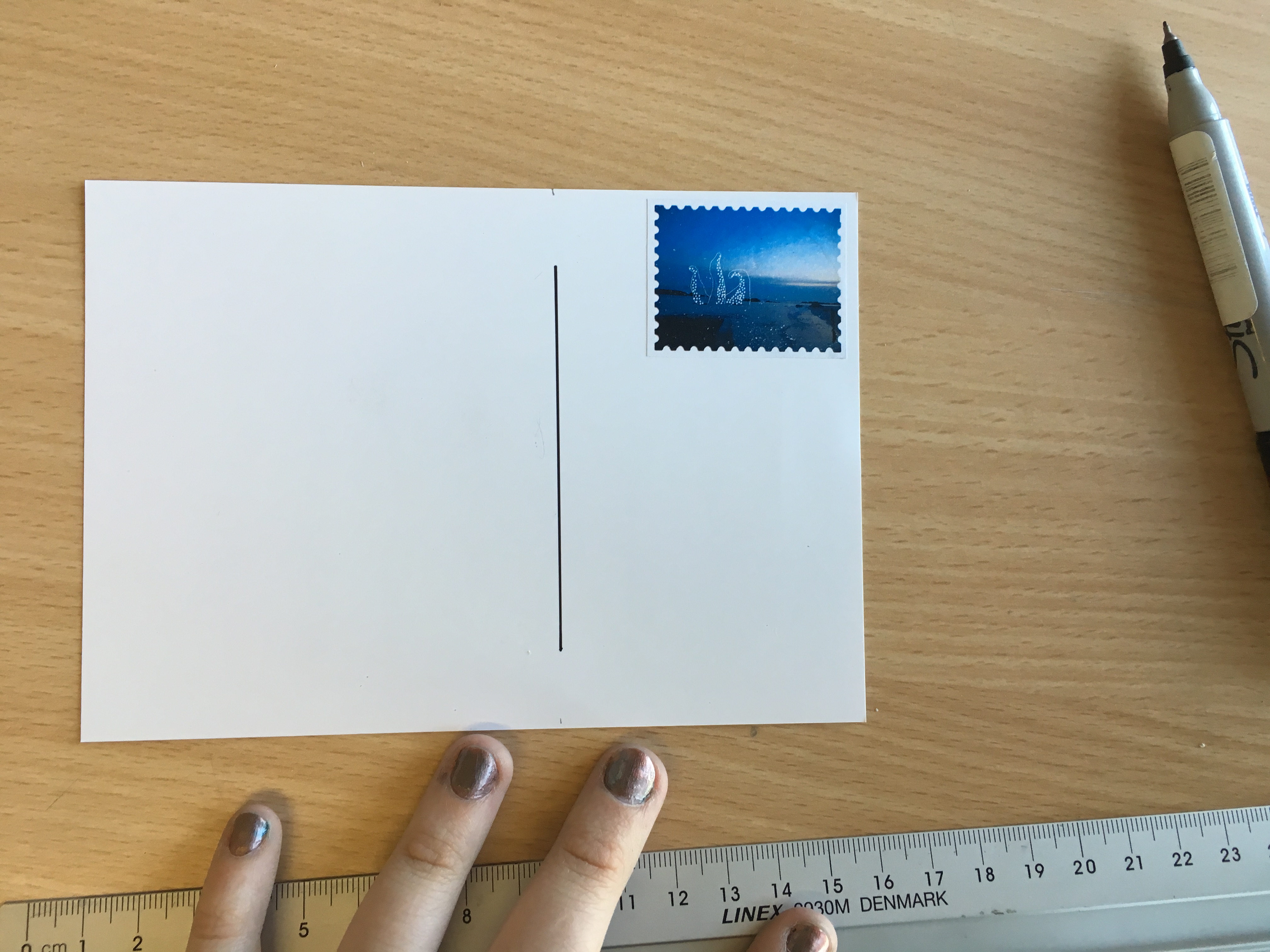
The first thing to do in photoshop was work out a basic format for the card. This included a dividing line and three rows for an address to be written in. The colours are neutral and overall relatively blank. The important design elements will be the text added and the stamps which I experimented with below.
 These postage stamps were downloaded from freepik and worked as background additions to the cards. When adding my own stamps, these could then become ‘standard’ looking images to fill the background as I layered up the graphic stamps made previously.
 This is the first basic example I created in photoshop. The layers are simple but included to show the process. I used a magic wand selection tool to isolate and duplicate the ‘Thailand’ stamp from the set above and lay it flat on the piece as a background. Over the top of this, I digitally placed one of my own graphic stamps made in photoshop. This was rotated on a slight angle to give a manual feel to the piece removing small elements of standardisation and generic formatting. The text on the left hand side, ‘Hello!’ is an idea that came from a previous piece of research into postcard design which can be viewed here [X]
 The picture I looked at in particular was this set of graphic postcards which use a simple generic text starting point of ‘Hello!’ in printed letters. For my postcards, the rest of the text will likely be hand written making the printed letters important in their contrast with the rest of the backing. In the address line, the plan is to include the model’s name and where it is they are leaving for (the name of the university / travel location). The font is called ‘Art Brewery’ but I may change this later on depending on styles and developments I make.
Experimenting with texts, fonts and colouring I created a second template shown below. This was then experimented on and developed further with various shapes, colours and the inclusion of images. The stamps will be separately printed on appropriate paper and manually applied for the final versions though here they are digital as an example of presentation. Above is the blank basic template for this second design. It uses the same phrase, ‘Hello!’, but a new crisper font which is clearer to read. Below I added a border and slight drop shadow between the two layers so I could add an element of colour to the design. The grey outline is the photoshop background and not part of the design. For the second postcard below, I added an image of plants – taken outside Maya’s house – instead of colour which created a textured feel. I did experiment with various colours of text and lines but most of the time it looked childish and inappropriate so the black details were chosen as a final look.


This example mock up was made with a green border, drop shadow and black text. The stamp used features Maya and was also designed previously in photoshop. The ‘Madrid’ stamp was lifted and modified from the freepik contact sheet above and added at a 75% transparency so you can see the layered effect of the images. The address section is on the opposite side in this example to a ‘traditional’ postcard but arguably fills the space in a more graphic and aesthetic layout. This design gives space on the printed piece for the same information specified before as well as a hand written message by those featuring in the images. The next step of development for the postcard section of my design will be to finalize the stamps to be printed, fonts and colours to be used and the variations which will be backed with the A6 images.
Fluxus is an international group of musicians, artists, designers, poets and creators who shaped themselves in the 1960s and 70s. Describer by art critic Harry Ruhé as “the most radical and experimental art movement of the sixties”, it is known for its experimental nature and ability to expand and evolve. Generating a variety of new art forms that were created by Fluxus artists such as intermedia, concept art and video art this movement gave way to a whole wave of new art forms. Three main continents were involved in this dramatic and historic movement; Asia, Europe and North America. “Performance events” were a large part of this artistic movement and lead on to a series of pieces created world wide which eventually became time-based design. The main notion is that one should embark on an artwork without a conception of its final form. There must always be a relationship between the audience and artist ad the finished product is only a snapshot of the entire process of creation. This process of creation was valued highly over the finished product itself. It was actually George Maciunas, a co-founder of this fluid movement, who eventually coined the name Fluxus in 1961 to title a proposed magazine. Meanwhile Marcel Duchamp, a french artist, was a large influence for this movement focusing mainly on the ‘readymades’ he created.
 These ‘readymades’ created by Marcel Duchamp were ordinarily manufactured objects that were selected and then modified by the artist. He self-labeled the process “retinal art”. By choosing a object, or selection of such pieces, repositioning, titling and signing the piece; it became art.


Above: Ray Johnson setting up a moticos installation, autumn 1955 and Suzi Gablik surrounded by the same pieces.
Ray Johnson’s early performance art was created through interactive installations which could then be represented through photography. Above is one of these first performances which took place in the autumn of 1955 and featured a variety of his moticos pieces in a street installation.
Many experimental artists of the 60s took part in the Fluxus movement either through the creation of their own art or through their participation in other’s performance pieces. Examples of artists who joined into with these Fluxus activities inclue: Joseph Beuys, George Brecht, Robert Filliou, Al Hansen, Dick Higgins, Bengt af Klintberg, Alison Knowles, Addi Køpcke, Yoko Ono, Nam June Paik, Daniel Spoerri, and Wolf Vostell.
The varied nature of the Fluxus movement involved a community of friends who would work and create together and maintain the movement as an idea. There were many different ideas about art and its role within society however which caused some debate. One co-founder actually proposed a manifesto for the way Fluxus was defined but none of the other artists agreed with it leaving the part in a varied and undefined state. Many artists didn’t even consider Fluxus to be a movement at all so instead it became a loose but robust community which earned a name for itself through experimentation.
Looking into the theme of ‘Mail Art’ and its place in historic and modern creative movements, the name Ray Johnson was a quick one to appear. the twentieth century artist was popular following his activity as part of the downtown art scene in New York in the early 1950s. Johnson painted geometric and abstract images heavily influenced by his previous professor, Josef Albers. The crucial thing about Johnson’s work was not just how he created it but later his destruction of the same pieces. Most of his pieces were destroyed in his personal process of creating collages which resued this original artwork. In 1954, these small-scale collages were labeled as “moticos” and featured irregular shapes and images from popular culture. Some of these celebrity influences included Elvis Presley and Shirley Temple as well as regular department store models. Much of Johnson’s work in this area anticipated Andy Warhol’s pop imagery which started to appear in 1960. Despite artistic similarities, Johnson’s approach to work and fame was drastically opposed to Warhol’s and he was known for dodging it being labeled as “the most famous unkown artist” by Grace Glueck in the New York Times (1965). His deliberate elusiveness was a popular debate and added to the interest of his character. 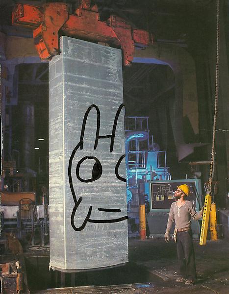
Much of Johnson’s work started a modern understanding of performance art such as his tendency to share his moticos around New York with strangers in the streets, train stations and cafes. These performances were even sometimes self recorded in order to collect public reactions to his work and each intricate creation. Much of the work used in these sessions of self publication were later supposedly burned.
Jonson reused his moticos by cutting them up and creating new tiny compositions with them which could then be inked on, painted and sanded to create new pieces of work. These new collages were extremely complex and had an underlying emphasis on structure repetition and semi-geometric forms and shapes. Johnson can easily be seen as an early instigator of performance art acting in other’s pieces and creating his own such as the staging, “Funeral Music for Elvis Presley”.
“In his typically self-deprecating way, Johnson would say that he did not make Pop Art, he made “Chop Art”.”
In 1995, Johnson was witness dressed in black as he dived off a bridge in sag Harbour, Long Island before backstroking out to see. This suicide was heavily speculated and many aspects of his death seemed calculated such as the repetition of the number 13. The date of his death, the 13th January; his age at the time (67, 6+7=13) and the number of the motel he had checked into earlier that day, 247 (2+4+7+13).
“There was much speculation amongst critics, scholars, admirers, and law-enforcement officials about a “last performance” aspect of Johnson’s drowning. After his death, hundreds of collages were found carefully arranged in his Long Island home.”
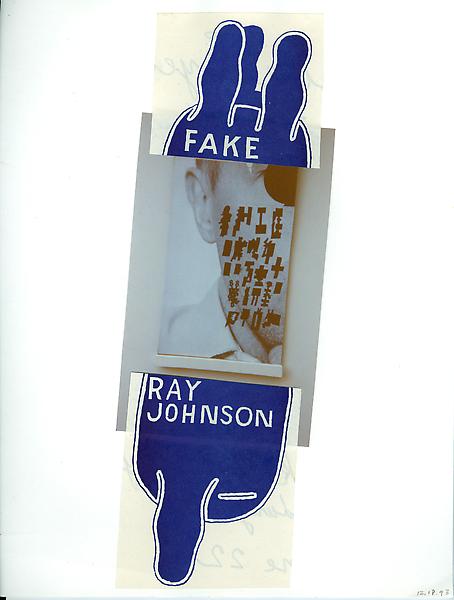
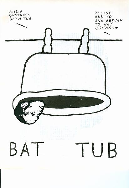
Ray Johnson is still considered one of the major artistic innovators of the second-half of the 20th century within the critical community but his work remains mainly unknown and heavily under-appreciated by the general public. Some of his relevant pieces are selected below and will be used as starting points for further experimentation with my postcard images.


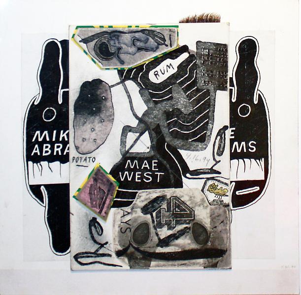


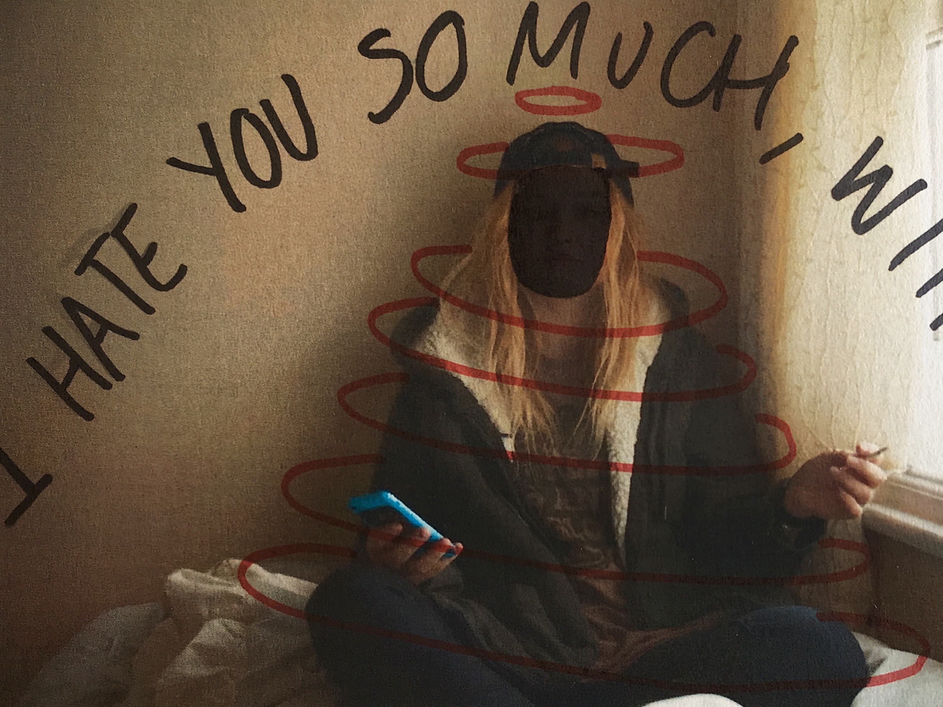
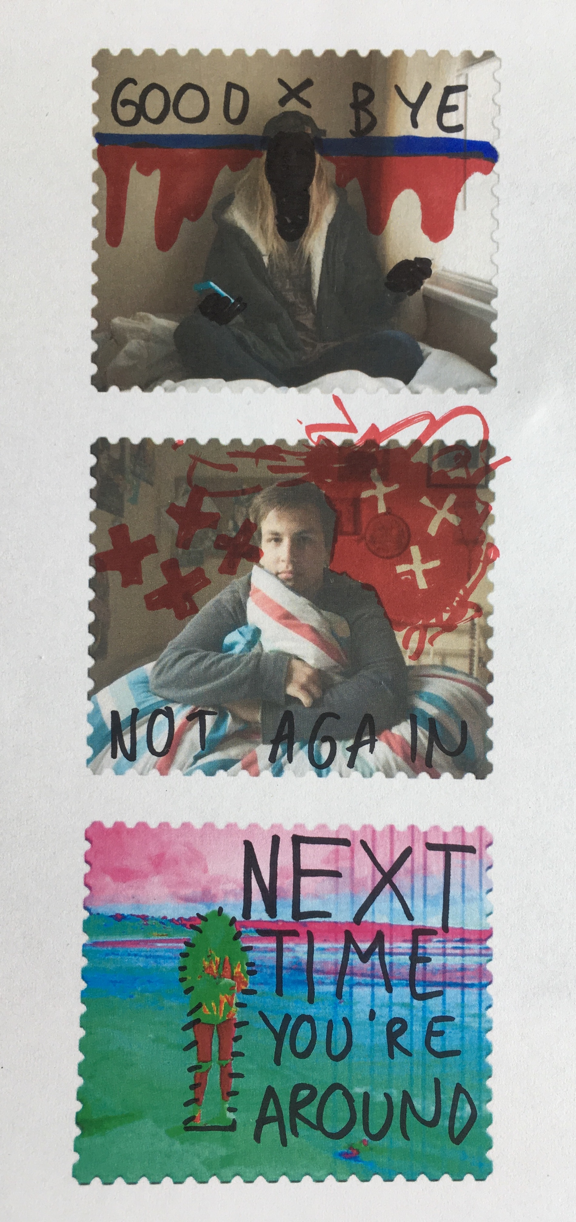
Working from these ideas, I intend to print a selection of my post card images and effectively graffiti them with block colours and shapes in a similar style to Ray Johnson’s work above. To do this, I will print them on standard 80gsm paper and use ink pens to illustrate them with words and text. I printed four of the postcard images onto sheets of paper with a white border which allowed me to work slightly around the image as well as directly onto it. I also printed all eight of my stamp experience to work with as a test influenced by this artist. I started by drawing rough doodle-like images directly from Ray Johnson’s work onto a plain sheet of paper before starting on the images. The sayings, words and illustrations used are all heavily influenced – if not directly lifted (such as the legs below) from Ray’s own postcard projects as part of his Mail Art series. Below are a series of small tests on my own images. They were printed out on a normal copy printer so are not a high quality and were manually deformed with pens and ink markers.
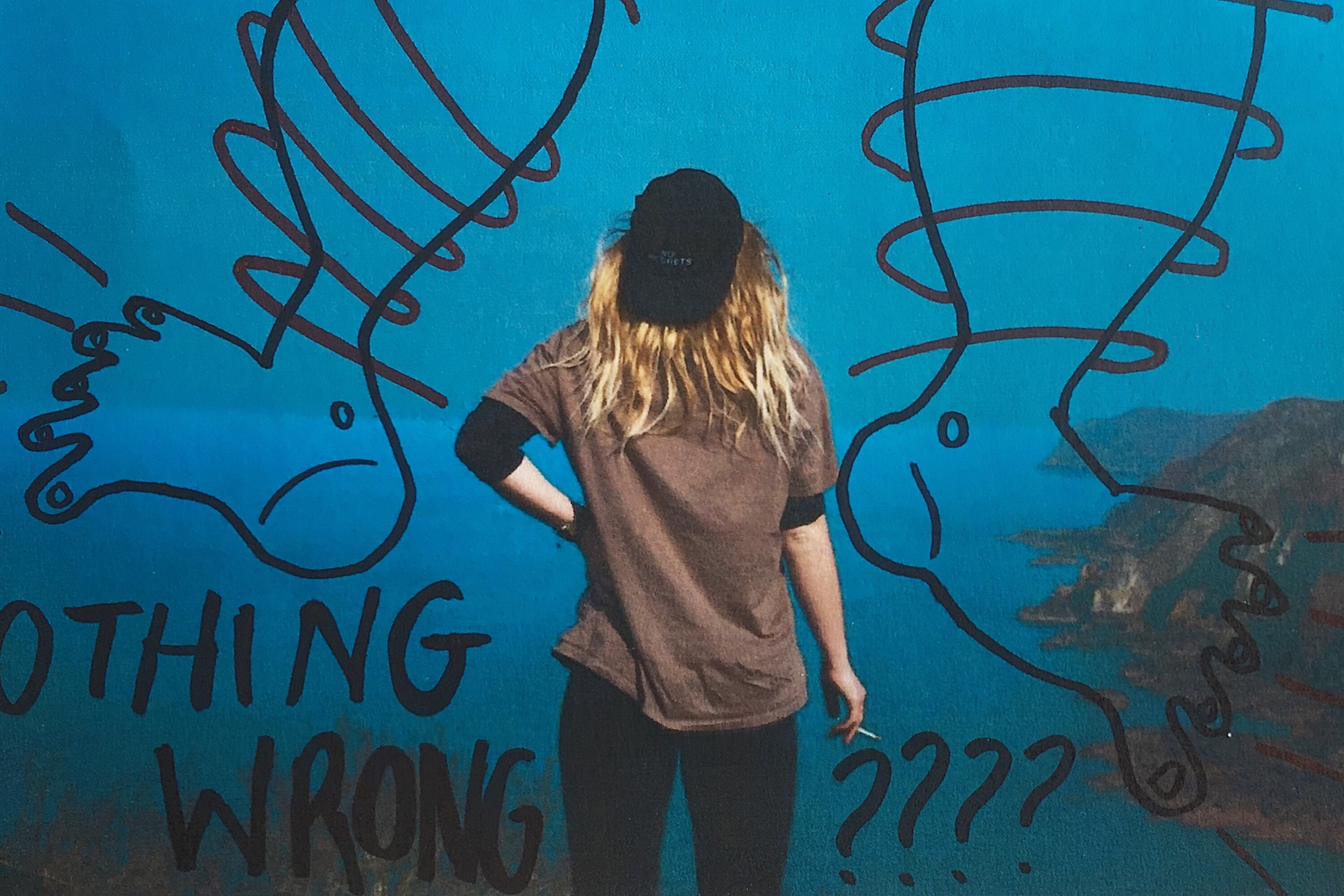


I also used this experimentation technique on some of the stamps I created in photoshop after they were printed out. Again, they have been manually manipulated rather than digitally and feature a mixture of original ideas and influenced doodles for Johnson’s own project work.

To finish my post card creations I wanted to create a series of stamps using the home shoot images which can be added to the back of the outdoor images after they’re printed as the card sets. To do this, I worked in Adobe Photoshop to create a series of stamps based around a free template I found online. The original image of a blank postage stamp is shown below and comes from ‘backgroundsy’ which is a shutter-stock style site where vector images can be downloaded. I filtered through a number of these template blanks to find a design which would be suitable for what I was looking to create. I selected the image on the right hand side below as i was happiest with the edging format. Loading this into photoshop, I added my own images as a second layer on top of the original template. These were scaled to size and adjusted to fit the frame. The next step was to create a clipping mask and mask the images to the shape layer forming the stamp image.

The stamps I created using the process above in photoshop had sections of pure white which didn’t show up clearly against the background on this blog. To add clarity, I added an artificial drop shadow – again in Photoshop – which will not be printed with the final image and is purely for presentation purposes. The plan for these stamps is to have them printed on sticky-back paper (likely 85gsm) and attach them manually to the back of my cards rather than having them printed as part of the designs. This manual method will produce a hand-made finish to the final piece which should still look professional if printed correctly. I will have the stamp series printed privately as I need full control over the weight and finish of the paper and prints. Below are the first two stamps I designed which feature full frame images taken from the home shoots. Though plain, they are effective but overall very basic. To expand and develop on this idea, I intend to experiment with a series of images from across all shoots to create a selection of alternative ideas which may focus more on abstraction.


Working with images from the shoots that explored subjects further than a typical front-facing portrait, the next step was to experiment with a series of stamps that utilised my knowledge of both photoshop and graphic design. The first of these experiments was a simple double exposure image featuring photos from both the home and external environments. I focused on a closer portrait for the base image and overlaid a photo of the landscape the model chose which happened to feature a vertically focused display of trees with some elements of water in the background. Rather than using a dodge tool, I used a simple eraser and blending sliders to have complete control over the format of the images and the way they connected together. This process used fewer layers and resulted in a double-exposed final stamp image. Below is also a slide showing my photoshop layout complete with the layers used in this section of the project.

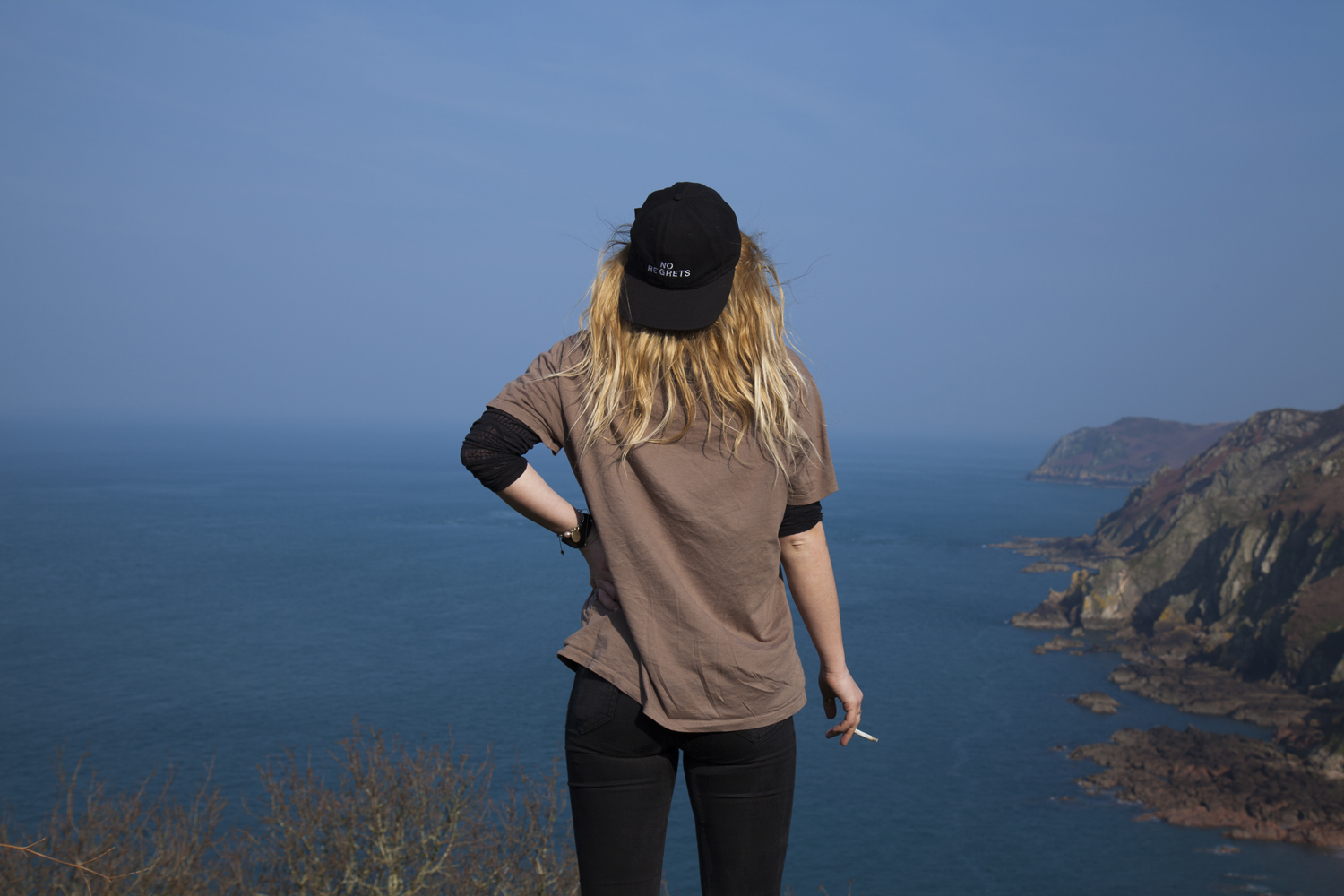
 Linking to some of the more abstract orientated stamps I researched as part of the inspiration for this project section, the stamp below was created by layering several images over each other in a block-colour format. The image in the background needed to be relatively calm with a central focus which in this case is Maya. On the left and right of her are two more abstract photos which feature small sections of landscapes we crossed through on the journey to create the final images. The plants were taken outside her house which she identified as not being a physical home for her in any sense other than the place she sleeps. On the right of the image is a small section of sky which fades out towards the bottom of the stamp. This image actually shows Maya too up at St Ouens bay but for this experiment I cropped it to show just the blues of the sky.
 The next experiment was a simple image rotation technique which runs back to the work we completed earlier in the year on Idris Khan and the double exposure methods which rely on multiplying images. Further research on this experimentation can be found here in a previous post, “Multiply“. The method is simple but worked well with the relatively plain portraits I shot of Jack against a natural, green background. The second layer image is actually a different photo but is almost identical other than slight changes in the facial expression. Though still relatively simplistic, this image is arguably one of the more successful as the uncluttered design draws the eye but won’t distract from the rest of the piece.
 Going a bit mad with design ideas now, I created a bizzare and colourful stamp using a base image from Emily’s shoot on the beach. The slide below shows the original image, though adjusted and faded slightly, clipped to the stamp design but otherwise natural.
 Using a variety of photoshop options such as posterise, colourise, colour burn, dodge, full saturation and other editing methods – I created the alien looking landscape below. The image features rich colours that draw out tiny details with the mad colourings (such as seaweed in the bottom right). Though odd looking, there is something pleasing about the unnatural edits of this image and the way they are presented here. Taking this further, I blended a selection of stock images and patters to create further distortions in the image.
 Below are a selection of slides from photoshop showing the layers used for this part of the project as well as the blended stock images used .


The final outcome has an off-world feel and is more science fiction than anything natural or human. The colours are unsettling and focus heavily on saturation, hue and contrast to form the final image. The next step of experimentation here will focus on possible additions to the postcard backs such as letter stamps, wording and placements. Another possible addition could be layering the stamps as if each image had ben posted more than once? Just something to think about and possibly explore later on in the project.
A little bit of a tidy up before the exam dates start. I have a selection of images ready to print and experiment with from my external shoots featuring Maya, Emily, Beth and Jack with internal shoots complete for Maya and Jack only. These remaining shoots will be taken over the next few days in preparation for the exam time. They can then be printed and experimented with in order to create the final presentation of post cards. This may also make use of a display board with printed images being mounted next to each other with supporting images (i’m thinking from Maya’s shoots in particular here). The stamp element is something else which should be taken into consideration but is heavily time dependent. If the postcards are successful within the physical experimentation and printing then I will have time to create, print and experiment with my internal images and how they could make stamps which reflect home. The surveys are complete and can be either hand written or printed on the reverse of each card. I have also included the visual development of images which have been edited as a before and after setup.


This image has been digitally enhanced in Adobe Photoshop and was shot in RAW allowing for a large amount of editing to take place. The main adjustments I have made are colour enhancements and shading variations – especially with the use of contrast.


Seeing the two finished sets of images together below shows the clear similarities and differences with the sets of images. Visually, there are obvious aspects of appeal across the two sets – especially in terms of colours and pallets. The internal shots are both heavily determined and characterised by the muted colourings that suggests a theme of boredom and importantly, limitations. The external shoots however are there to show freedom and a love for the outdoors. The colours are vivid and excitable. Bright shades and big open spaces, shown often in block colours which is visible in Maya’s portrait. The pink-ish hues of the bedrooms are heavily contrasted with the rich blues and greens of the plants, sky and ocean which plays such an important part in the lives of people moving away.


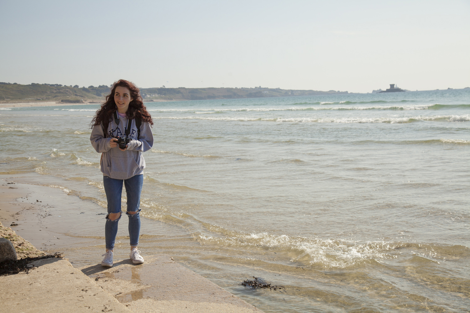
The next model for this project follows my friend Emily in the location of her choice; Bonne Nuit. When asking why she liked this area it was mainly about the size, isolation and close proximity of the rocks, bay and beach. The area itself is somewhat remote giving a feeling of isolation. Even when the sun is out it appears this isn’t a particularly busy area adding a level of serenity to the scene. The images I shot of her here follow the same formatting as the rest of this series. Bright colours were highlighted as points of interest and I took a selection of images of the figure around the area exploring different sections of the space. The main image I needed to produce was the backwards postcard shot which will ultimately make up the front of my card. Below is a small selection of images from the day where we adventured around the beach and over the rocks. There were two selected images for this which I will discuss further below. The main question was about the level of detail I wanted in the shot and how it changes the overall image.


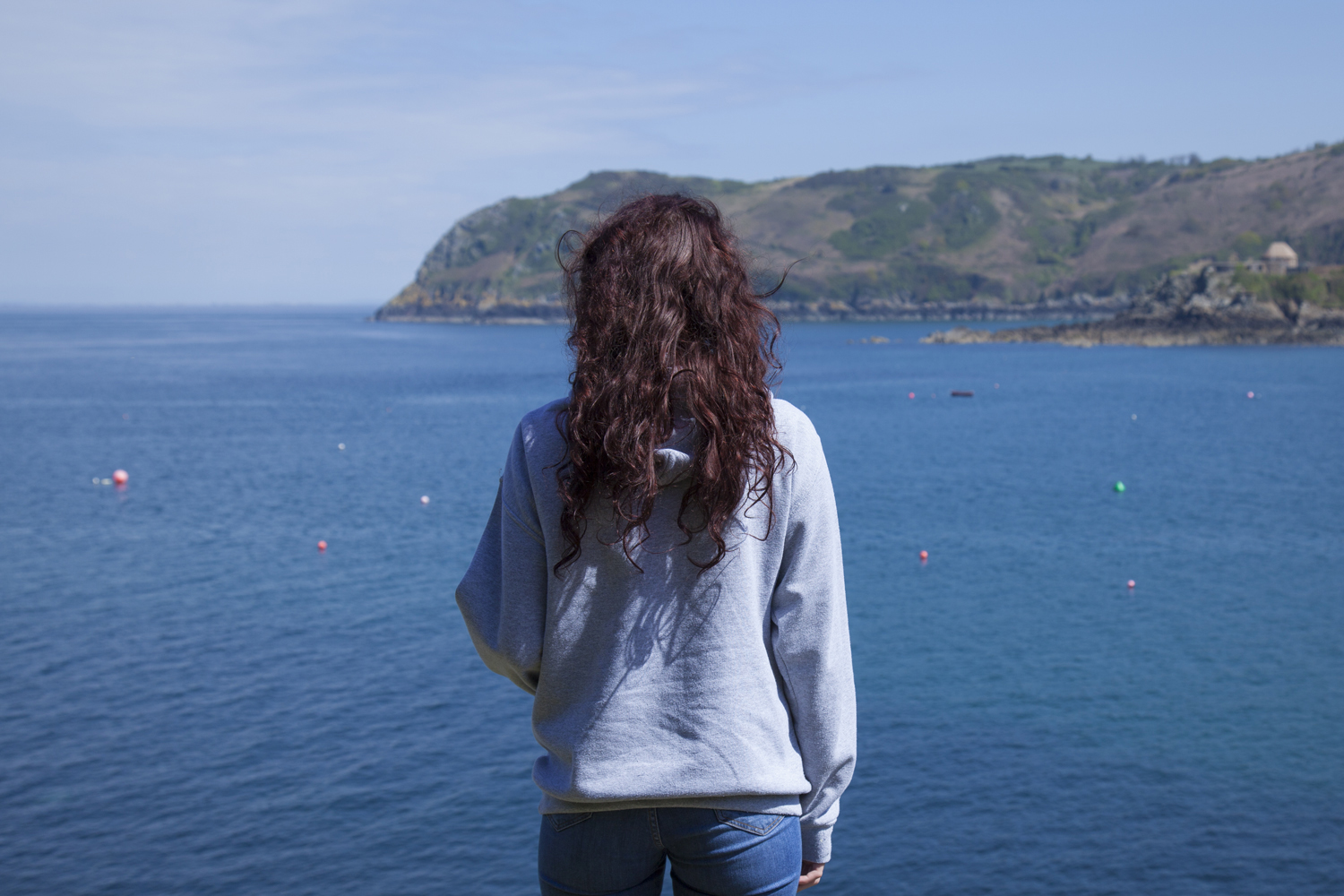

For this feature image – which will ultimately create the front of my postcard design – I took two ‘final’ images to select from. In reality there were over 50 different angles but these two were the ones I was most confident with. The main difference is the level of detail included in the image which is mainly through the addition of the green tinted rocks in the foreground. The model’s rich purple hair works brilliantly to juxtapose the blues and greens of her chosen landscape.
The final image selected from this shoot was the less cluttered figure shown below which does not have the extra detail in the foreground. This image shows a crisper final print and will work more effectively as a postcard image. Shooting the second part of Emily’s section for this project may be difficult as she is limited for the number of visitors allowed in her physical home. Because of this, we also shot in a second location which she said was important to her just in case of the impossibility of shooting in her home. Though straying from the stylized portraits in other shoots for this project, the image below was one of my preferred from the day and offers itself to a lot of experimentation. I aim to explore the images taken on this day further to produce some stamps for Emily’s section of the project.

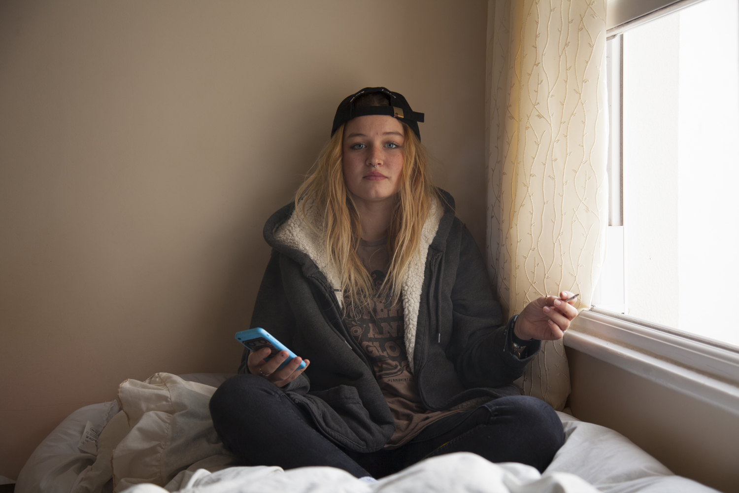
The next shoot was with two characters, Beth was the subject I had intended to shoot with but the addition of a second figure (Joe) worked very well in the images. Below, as before, is a set of images showing a variety of shots from the shoot which took place at Beth’s location of choice – Green Island. These photos were taken just after golden hour making use of the eery blue lighting and it’s soft, pastel effects. With enough light to shoot but limited colours and shadows there is certainly something beautiful in the muted colour palette. I selected two external images, one which just showed Beth overlooking the bay and a second image featuring both Joe and Beth which provided a varied alternative to this themed project. Ultimately, it was the single figure image I was after so that one came out on top.


As with all these shoots, I asked the model [Beth] to answer a series of questions about the location [Green Island] she choose.
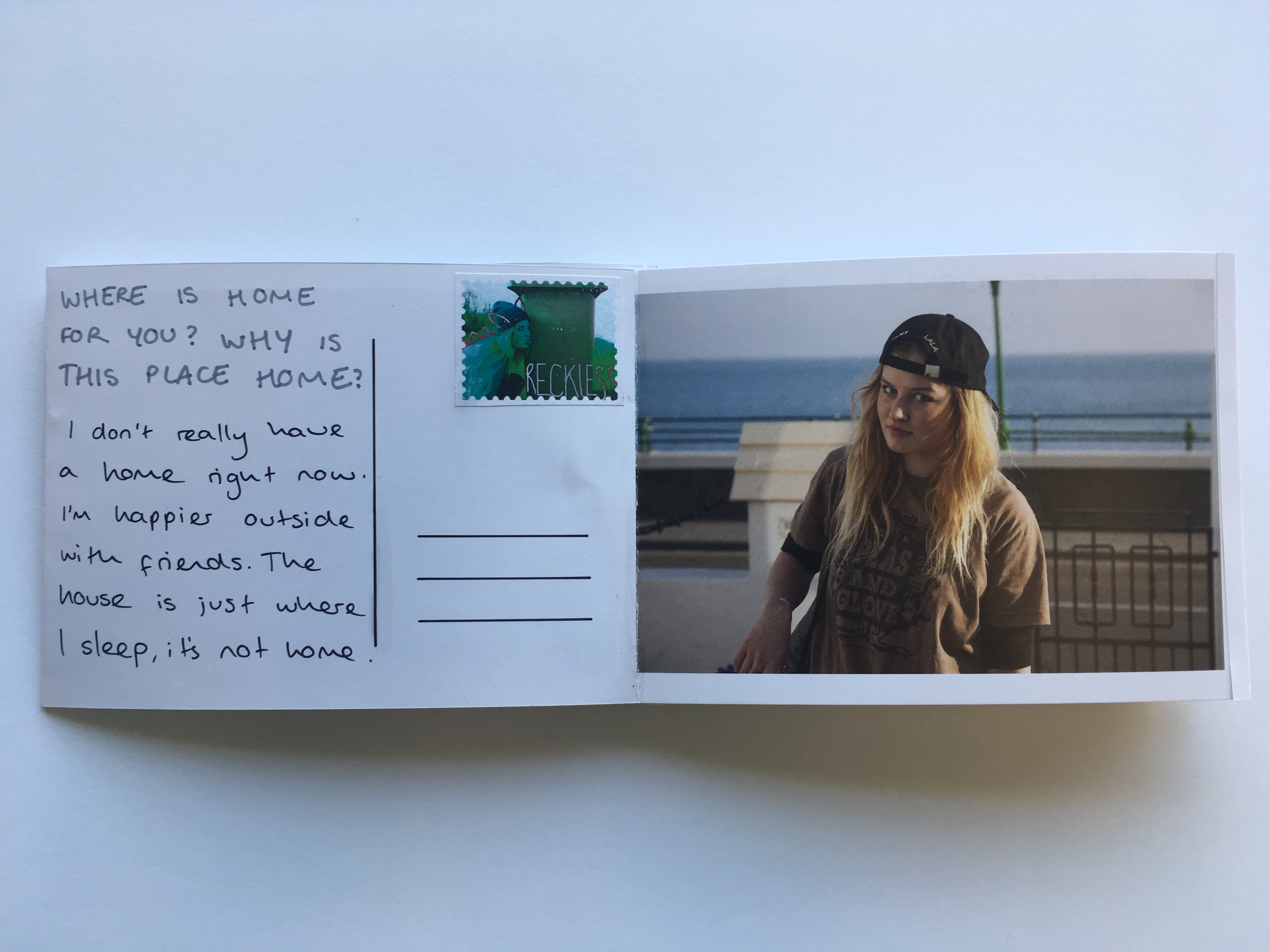
Where is home for you? Why is this place home? Are your family there? Do you feel safe here? What is it that makes this particular place home?
Home is at my house in my room where I can be with friends and just chill. Stuff is less complicated there and I can block out school and shitty people and relax a bit.
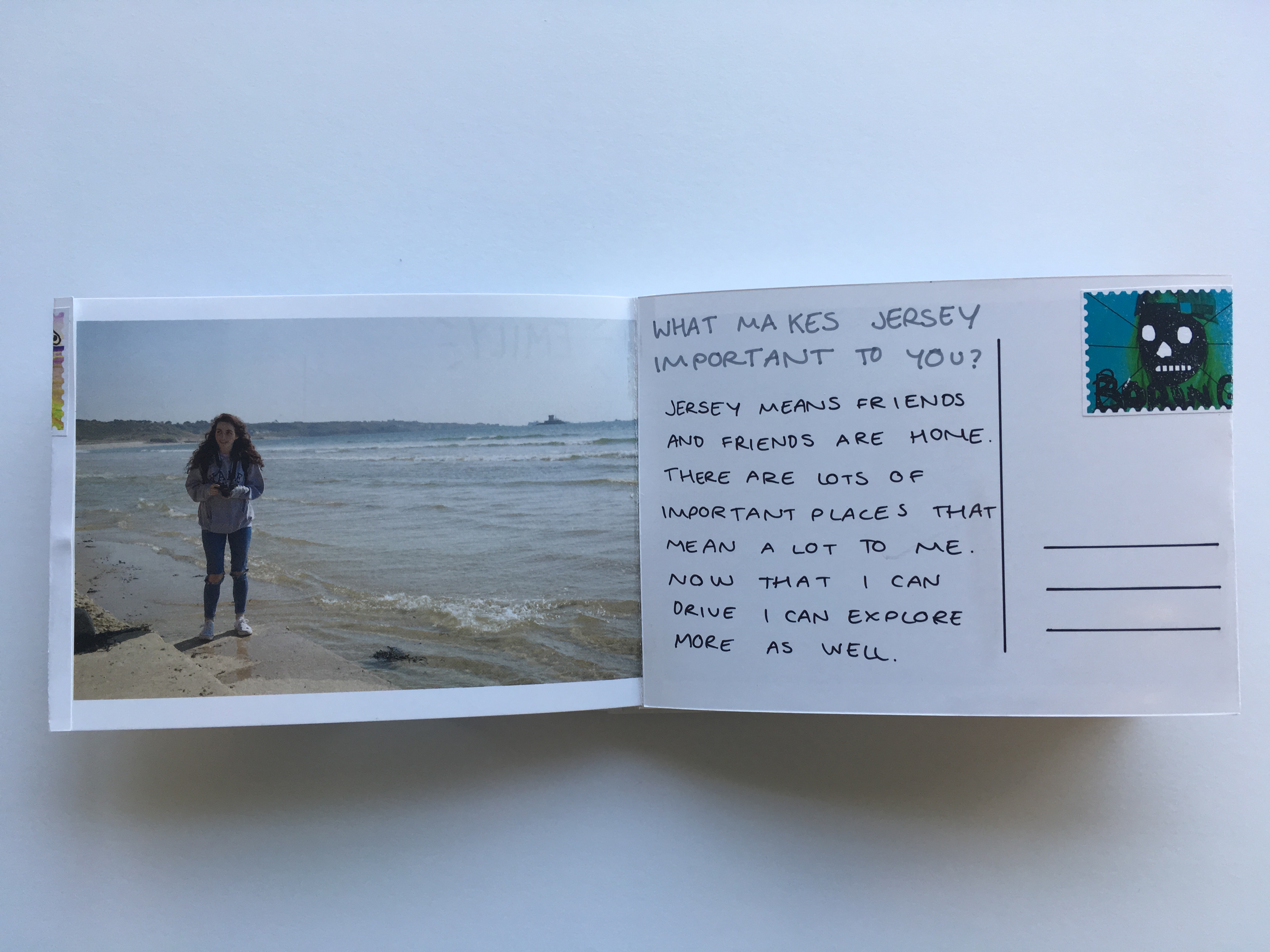
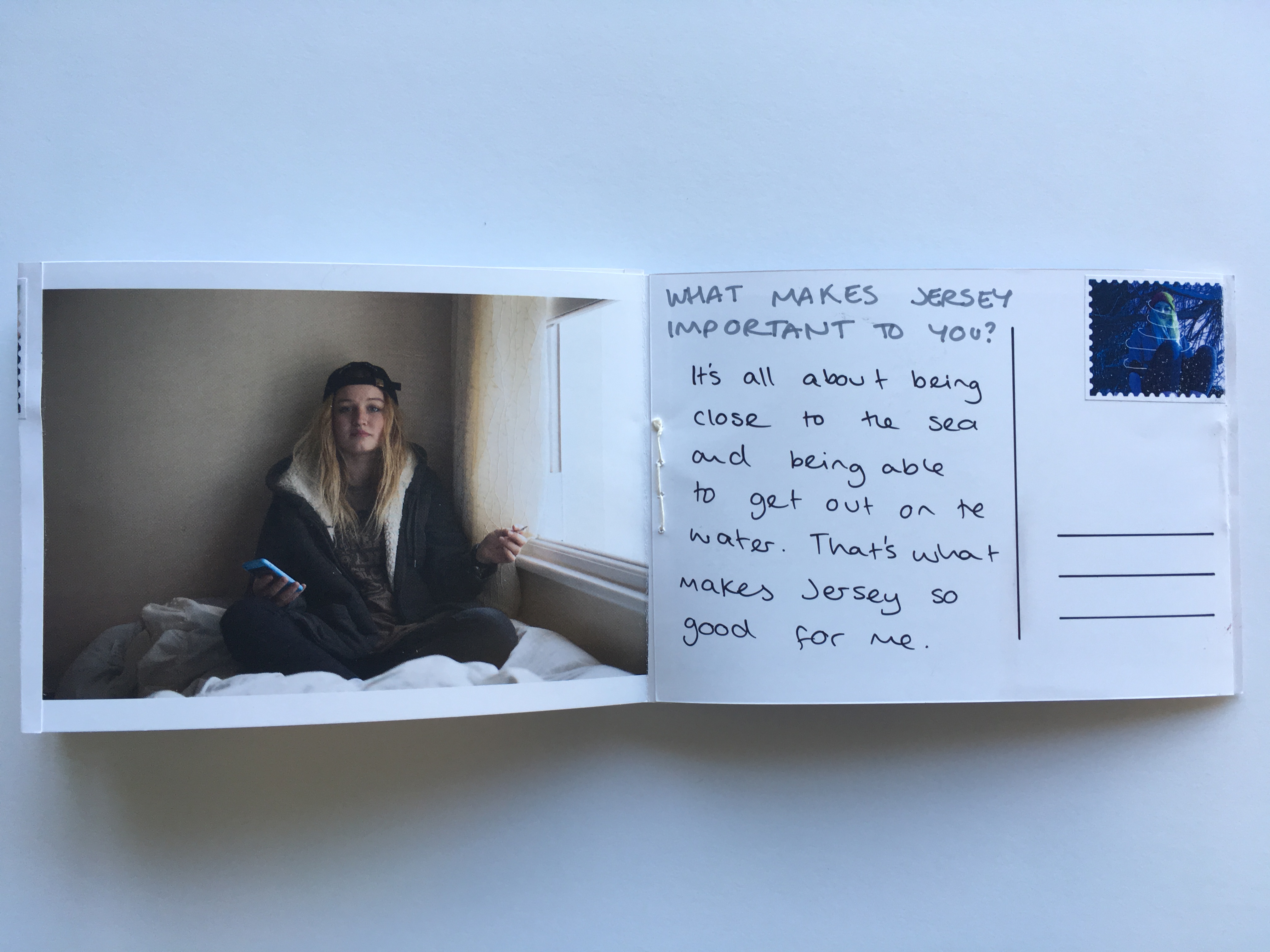
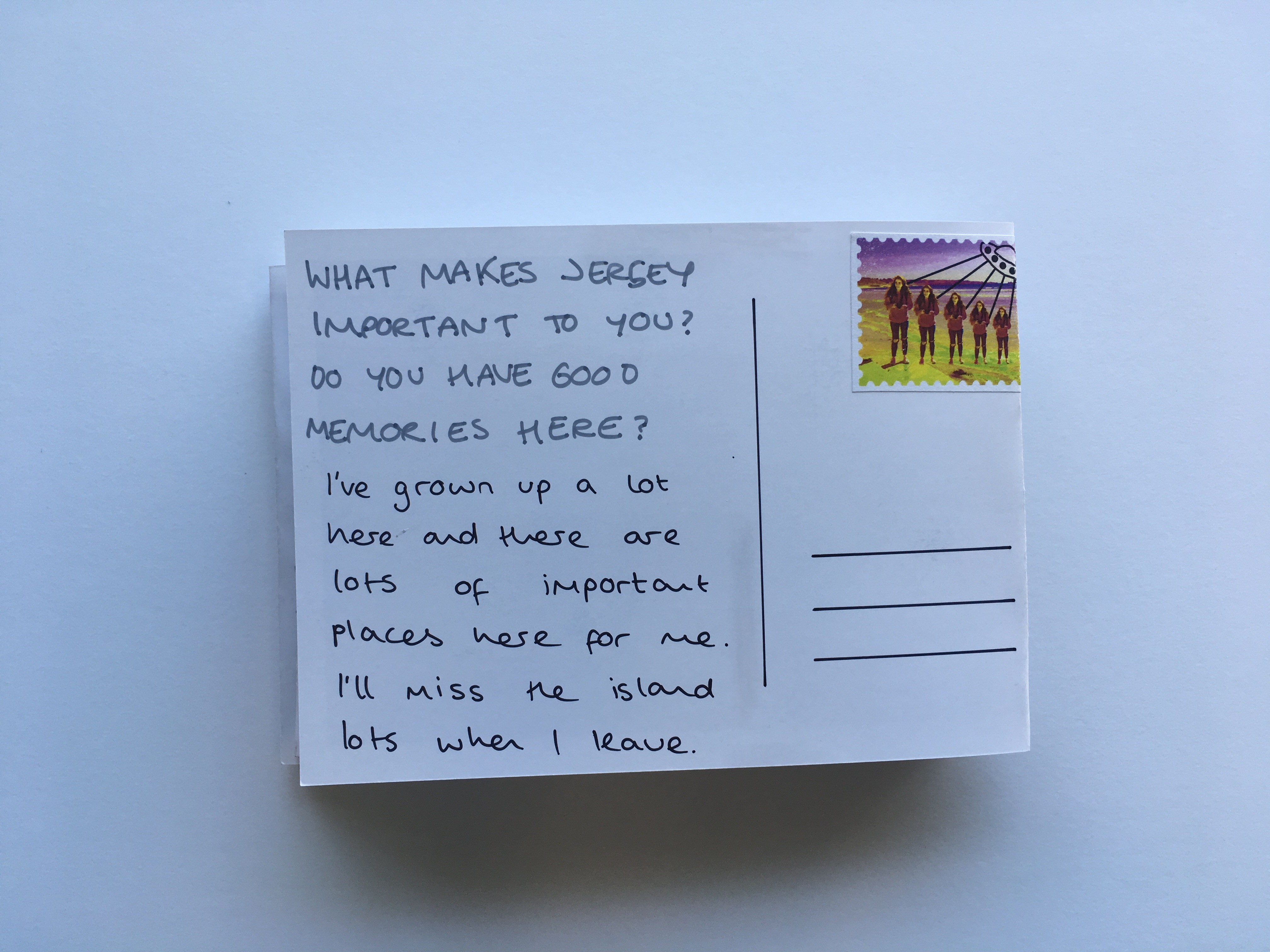
What makes Jersey important to you? Do you have good memories here?
Jersey means friends and friends are home. There are lots of important places here which mean a lot to me. Because I can drive now there’s lots of places I can get to which I didn’t know about before. It also means I can walk my dog in new places which means i get to see a lot more of the island and don’t have to rely on other people to drive me.
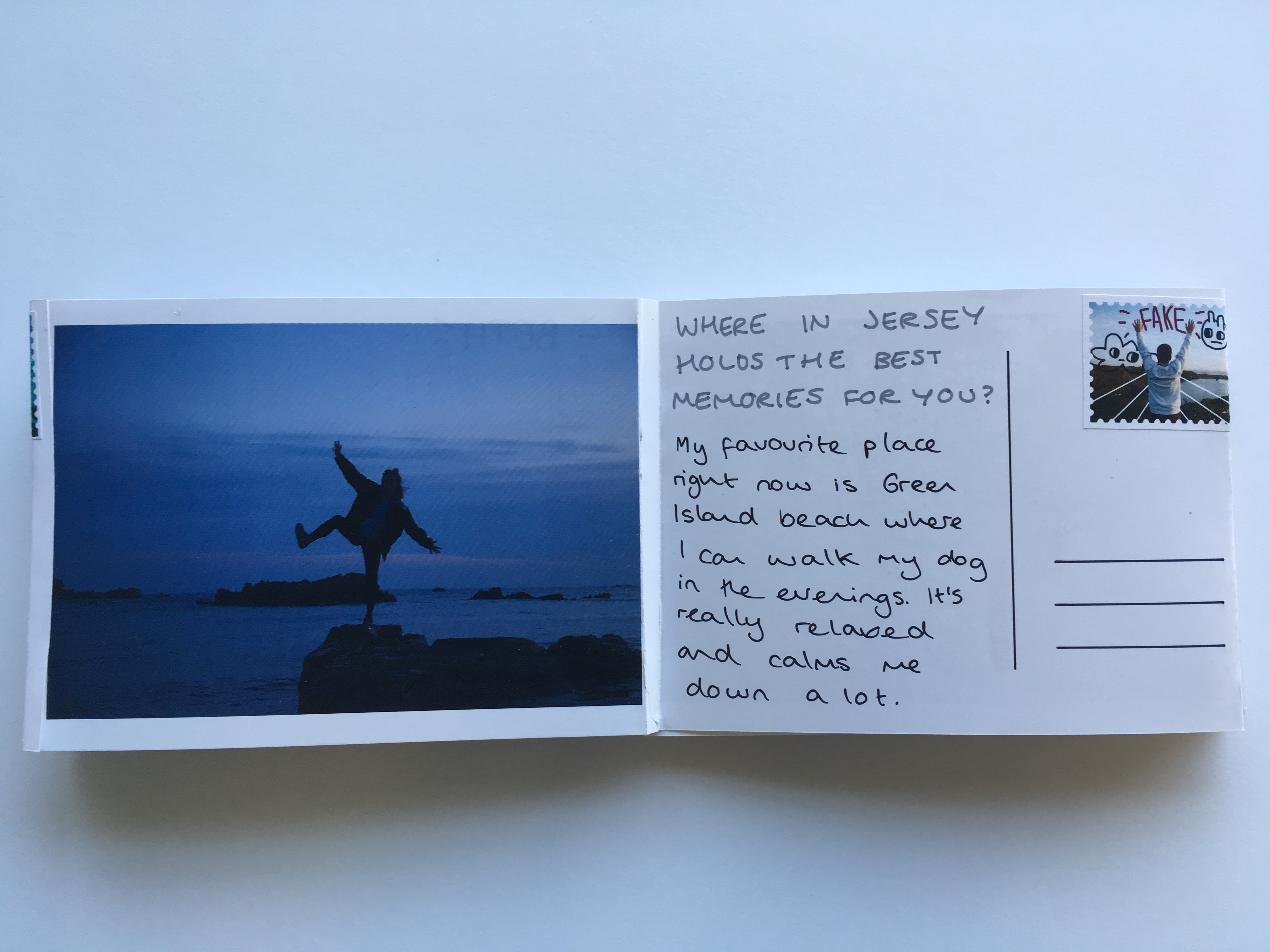
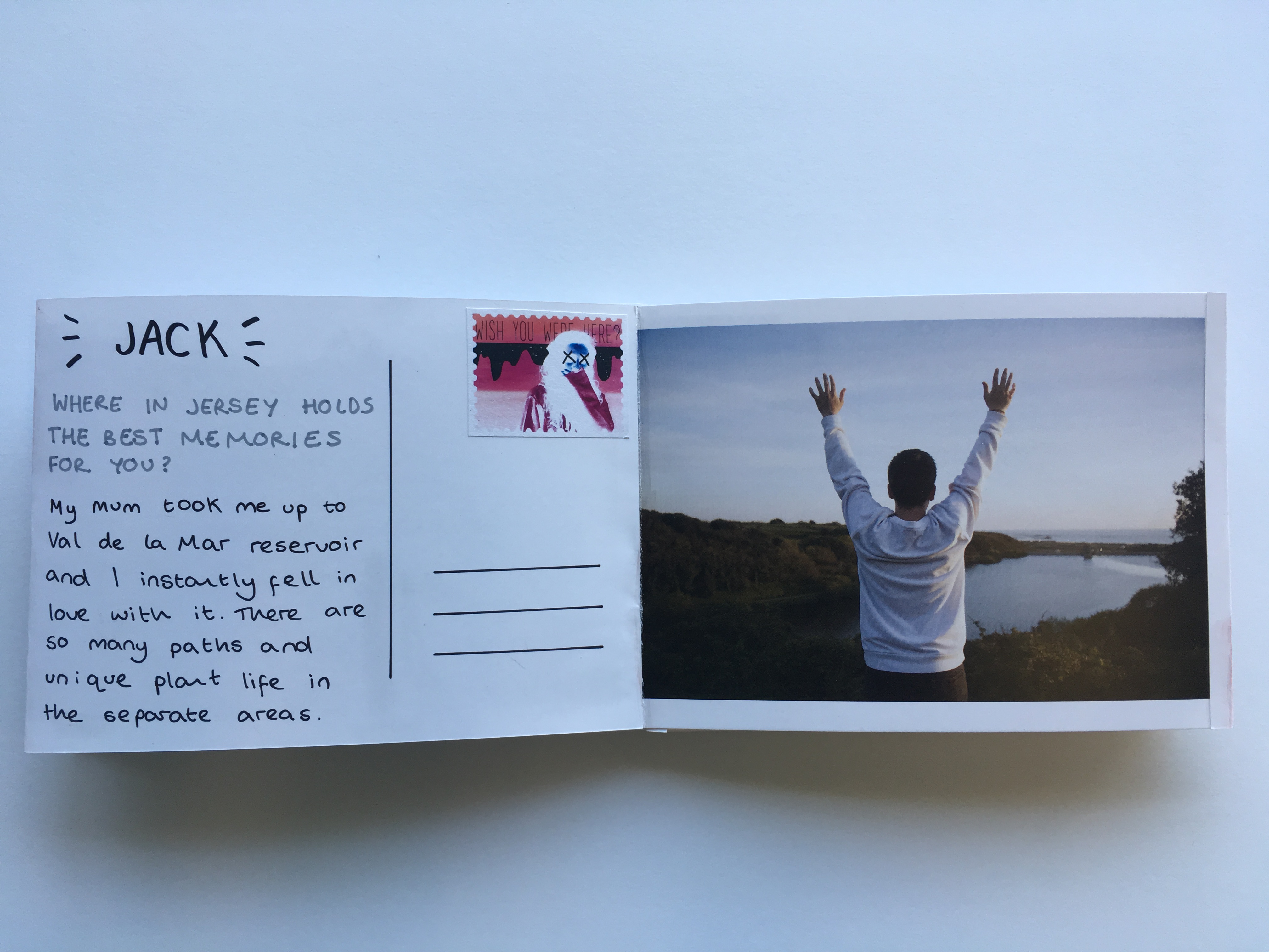
Where in Jersey holds the best memories for you? Why is it positive for you?
My favourite on island place right now is Green Island beach where I can walk my dog in the evenings. The sky is normally lighter around there and the sunsets can be really nice. If it’s high tide you can walk along the path at the top of the beach and sit on the benches which overlook the sea. It’s a good place to be on stormy days when the sea is high aswell.