All posts by Christianna Knight

Filters

Author:
Category:

Angry Feminist Shoot 1 – Editing

Above are the contact sheets from my first angry feminist shoot. In this shoot I took inspiration from the topless protests by the radical feminist group, Femen. I did some dramatic makeup, back combed my hair and painted the words “My body, my choice over my chest and torso. I experimented with using both pink and blue backgrounds, I made the decision to use the images with the blue background because of the masculine connotations of blue and to protest in such a way is not considered particularly lady-like.

I experimented with using the jacket but I felt that did not work with the “shocking” sense of “nudity” (I made the decision to wear a bikini top as an authentic recreation of the Femen protests may not be appropriate for a school project) I also experimented with various poses including fight or flight like stances and the typical fisted hand above the head. I most of the images I included an angry screaming or shouting expression as this is seen in most of the press photos from Femen demonstrations and protests.

I selected these images as my shortlist because I felt that the battle stance captured the sense of desperation and not too over the top warrior feel. I edited these photos by cropping them to frame the figure around the tops of the thighs. I also increased the brightness and contrast, adjusted the levels and slightly smoothed out the backdrop as their were still some creases that I could not fix with iron without melting the vinyl.

Blonde – Presenting

Here are the two final outcomes from my blonde photo shoots. As previously stated I do not think that I will be using the “Mean Girls” Regina George inspired image on the left due to the stereotype being heavily reliant on the viewer having seen the film. I also feel that the stereotype doesn’t really make sense out of context but I wanted to conduct the shoot to show that I had this outfit in my wardrobe and I have in the past conformed to this stereotype in one form or another. I am however, very happy with the composition and characterization of the image and still feel that it is a well executed photograph.

The image on the right depicts a more obvious stereotype of the “dumb blonde”, as seen in my planning post I took inspiration from public figures such as Paris Hilton, Nicole Richie, Reese Witherspoon’s depiction of Elle Woods from the motion picture “Legally Blonde” and the blonde pop culture icon, Barbie. I selected the image above on the right because I feel that it captured a perfect combination of confidence and absentmindedness. The pose connotes glamour and confidence but the vacant expression reinforced the stereotype of blondes being airheads. I plan to combine this strong image with another contrasting stereotype of mine.

Blonde Shoot 2 – Editing

Above is the contact sheet from my second blonde shoot. This shoot was heavily inspired by the character of Regina George from the 2002 film “Mean Girls” I was inspired by a scene where they perform a raunchy dance routine(completely inappropriate for a school situation) to the popular Christmas song “jingle bell rock”. Surprisingly I already had this Christmas costume from the Christmas of 2015. Due to the off the shoulder nature of the dress and the strange fit i found it hard to pose in a way that was flattering. Similarly to the previous blonde shoot I was rather uncomfortable posing for this shoot as I felt that the character I was trying to create was not me at all. I made the creative decision to use a blue background for these photos as the red of the dress clashed with the pink background.

These are the shortlisted images from the shoot that I decided to edit. I selected these images because they captured the playful flirty nature of Regina George’s character as well as the stereotype of the “dumb blonde”. to edit thee images I increased the brightness, contrast and colour saturation to make the red of the dress slightly more vibrant. I smoothed out the complexion by removing any distracting blemishes, I also cinched in the waist slightly in the centre photo, although it does look a little strange. Similarly to the previous shoot I had to edit out the lace of the wig by using a combination of the spot healing tool and the airbrush, selecting various toned from else where on the forehead. Although I am happy with how the images came out I don’t think that i will be using these photos as final outcomes because I feel that the stereotype is very reliant on people having seen the film “Mean Girls”. However the shoot was fun to conduct and it was a good from of experimentation.


Blonde shoot 1 – Editing

Above is the contact shoot from my first blonde shoot. This character was based on the stereotypical all american high school “it” girl as well as public figures such as Paris Hilton and Nicole Richie. I experimented with different poses that exuded confidence, sass and glamour. I actually struggled with the posing for this shoot as I felt so far removed from this stereotype as I felt that I did not conform to the personality connoted through my appearance. This outfit was something that I wore frequently to work and once to a garden party when I had blonde hair, however I felt very strange re-visiting a look that I only distanced myself from a few months ago. Before conducting the shoot I decided that I wanted to use a clue background despite the masculine connotations because my pink dress was lost against the pink backdrop.

Above are the 3 shortlisted images from this shoot. I selected these because they have a sense of glamour to them, some of the more exaggerated poses looked a little pantomimic and ridiculous. The editing process for these images was slightly more extensive than previous shoots because (as you may be able to see from the raw photos in the contact sheet above) I did not glue the lace of the wig onto my forehead, which would be the proper way to wear this theatrical wig. I decided against gluing the lace of the wig down because during my research online, spirit gum was the best option, however I only had liquid latex to hand and I knew that I would only be wearing the wig fro a couple of hours and wouldn’t be taking part in any vigorous motion that would case the wig to slip off. I had to edit out the unsightly lace using a combination of the spot healing tool as well as the airbrush. I also increased the brightness, contrast, levels and colour saturation. I used the liquefy filter to smooth out the crinkles of the dress around the waist and cinch it in to create a more pleasing hourglass shape. I also slightly smoothed out the background and used the spot healing tool to get rid of any distracting blemishes.


Blonde – Planning

As I am exploring different stereotypes within western society that I conform to or have conformed to in the past, I thought it appropriate   to explore the well known “dumb blonde” stereotypes. Above is a mood board that I compiled, including images of fictional sassy and strong blonde characters, Regina George and Elle Woods as well as blonde celebrities, Pop singer, Christina Aguilera and reality tv pioneer, Paris Hilton. Regina George is the perfect example of the 00’s it-girl, she is the queen of her high school and is both loved and envied by her peers. Regina is also presented as bitchy, mean and unloyalw, however by the end of the film, Regina as well as the other female protagonist mature and are able to make peace and unite as women. Elle woods, in my opinion is a excellent on screen and on stage role model for women everywhere. In the film “Legally Blonde” which she stars in she is initially presented as a typically dumb blonde airhead. Her character develops throughout the film where she decides to become a lawyer, breaking stereotypes, empowering women and staying true to herself. Christina Aguilera is a famous pop star who has been celebrated for her unique voice and impressive pitch range. Aguilera has experienced bad press in the past due to the media being focused on her outward appearance (her makeup, hair and weight) instead of focusing on her amazing ability to be incredibly singer, dancer and actress. Paris Hilton is great granddaughter to Conrad Hilton, the founder of the chain of luxury Hilton hotels. She is stereotypes as a dumb, superficial, blonde trust fund kid who parties, sleeps around ad spends her families’ money. However she mist be commended for her entrepreneurial skills to star in several reality TV shows, create a line of clothing and be a public figure as well as a household name.

Above is the confirmation for a lace front wig that I ordered from amazon in order to create my blonde character. As I no longer have blonde hair I had to find a good quality wig that would allow me to create a realistic and polished appearance of blonde hair. As previously stated in my initial mood boards I made the decision to dye my previously bleached blonde hair back to my natural light brown colour. I made this decision for two main reasons, the first being that I wanted my hair to remain long and healthy and be done with the constant upkeep of root and the second that I had a number of bad experiences being a young blonde woman. I experienced cat calling much more frequently than when I had pink or brown hair, the most popular being “Hey, Blondie”. I also experienced multiple scenarios on the one time I went clubbing with blonde hair, two different men in different clubs thought that they had the right to touch me without asking or even talking to me.  I hate that men associate blonde hair with someone who is “easy” because I believe this is why those men thought that they could do whatever they wanted. I have experienced much less catcalling since being a brunette again, only two instances in two months and I have had no bad experiences out clubbing either which reinforces my reasons to believe that it was my hair colour that was sending the wrong message. As a feminist I want to live in a world where women should be able to have whatever hair colour they want without being judged, but unfortunately that is not the world we live in and my safety comes first.


Above are the outfits that I plan to wear for the blonde stereotype photo shoots. I want to create two images that display the character in different way. In one image I plan to wear sunglasses and a pink v-neck dress, inspired by the LA valley girl look that paris hilton is so well known for. In the second image I plan to wear a Mariah Carey style christmas dress, inspired by the iconic cinematic Jingle Bell Rock scene in “Mean Girls”. I also plan to use the above blue backdrop as I feel that using a pink one may look strange with a dress of a similar shade as well as clash with the red of the christmas dress.


Clare Rae – Artist Response

In response to Claire Rae’s work I produced some simple portraits using the blue background I had set up for another shoot. I chose to wear a plain black short sleeved t-shirt and some grey tights, both a nod to Rae’s use of costume in her photography. I also took inspiration from Rae’s workday covering my face with my hair, although I found that the silhouette and overall effect was quite different with my long hair compared to Rae’s short black bob. I experimented with  a few similar poses that involved my being close to the ground so I could tilt my head forward easily to conceal my face with my hair. Posing in the way I wanted in the short time it took my to press the shutter and get into position proved quite challenging and in the rush I often didn’t get into the frame in time or in the incorrect place. The grid of images above where the only ones that were potentially salvageable as outcomes.

I selected this image as an outcome because I found the composition of the figure within the frame was rather successful. There is a good session of a diagonal line created by my thigh as well as a string triangular shape reinforced by my arms and my legs and the base. I altered this image by enhancing the brightness, contrast and colour saturation as well as the levels. I also edited out the hole in my tights as I felt it was an unnecessary distraction and softened some of the creases in the backdrop where the vinyl has buckled slightly under my weight being placed mainly on the ball of my foot.

This pose is at first glance similar to the previous but I decided to place my weight on my whole foot as opposed to the ball to avoid the buckling I experienced with the previous pose. I also experimented with extending my arms and placing them in a way that mirror the corresponding legs. The left arm is folded similar to the leg and the right arm is extended in a dancerly fashion mirroring the extended leg underneath it. My body is also angled away from the camera which creates some interesting negative space created between my arms and the curve of my torso and thigh.

I selected this image as an outcome because I feel that I created a completely different shape with my body compared to the other photos. My body is much more compact as I am crouching down with  my weight placed on the balls of my feet (mainly because I cannot crouch with the weight placed on my whole foot so I had soften some of the buckling created as a result of this on Photoshop) I also like the seemingly symmetrical nature of the composition at first glance but on closer inspection one hand is closer to the floor than the other and my body is leaning lightly to the right. I also like the column of black created by a parting between strands of hair, which is also a little off centre.


Clare Rae – Artist Analysis

Clare Rae is best known for her self portraiture  where she uses her body to create intruiging environmental portraits. The above image is from her collection  from 2010 entitled “Testing” where she manipulates her body into different shapes, often hanging off things or performing a feat or strength and flexibility such as the “bridge” pose and holding her body horizontally in a straight line on a chair. The above image is part of a period a Rae’s work where she was exploring the concept of partial nudity with the use of translucent nylon tights. I find the figure holding onto the rail on the wall rather intruiging because it raises the question of some kind of allegory. Is the subject reaching for, reliant on or desperately trying to hang onto something. Another interesting thing about this particular portrait is that it subverts the presentation of women in art. Although the body is in a way accentuated through the pose and the tights can arguably be a garment with sexual connotations, the use of the white t-shirt short hair cut create a gender neutral feel to the image.

Technically Rae’s photographs are very interesting. Above I have separated an image from the “Testing” collection into nine sections, you can see how the image has been composed with the rule of thirds in mind. The figure is clearly placed in the centre three vertical thirds. The window, which acts as the light source for the image is placed in the upper two thirds on the left hand side. The creates a nice curve in the composition that helps the eye to move around the image. The shadow of the figure on the wall also creates a triangle shape between the actual legs of the figure and the shadow cast on the wall. The two converging lines in the top centre third of the image created by the rail the figure is holding onto  and the skirting board in the bottom centre third also creates a sense of depth. The use of light and dark in the image is also interesting, Rae mentioned at the talk I attended that in these image she almost always uses natural light from windows as opposed to any form of studio lighting. the natural light from the window also creates a shadow on the wall that it is coming from, creating a darker “L” shape in the composition, allowing for the lighter areas of the image to be the window and the wall on the right side of the image.

The above image is a work from part of Rae’s undergraduate degree in 2007 entitled “Desire and the other” this collection was were Rae first started to use her own body within environments that she had lived in or that had some importance to her, Rae stated in the talk that I attended that at this point she preferred to speak for herself rather than for womankind. These images, in my opinion are quite passive as most photos involve the figure lying on the floor or being partially concealed. Although someone who is familiar with Rae’s work will know that all of the images feature herself as the model, the images from the “Desire and the other” have a sense of anonymity as the face is always obstructed by hair or clothing or simply cropped out. This anonymity could also however, be interpreted as objectification as the body depicted in the image is not given a face or identity. The image above also has a sexual suggestive nature as the jumper of the subject is pulled over the head of the subject, which in turn would expose the subjects breasts or undergarments, however the chest of the subject is obstructed by what appears to be a sofa in the bottom right of the image. The figure also has their hands held above their head, making no attempt to pull the clothing back down to maintain modesty but also appearing as if the jumper was not pulled into its position by the subject. I feel that the image suggests both a sense of submission and passivity and well as some kind of provocative feel which I believe is a fair assumption due to the word “desire” being used in the title as it has very strong sexual connotations.

Similarly to the photograph from Rae’s “Testing” collection, this image has the figure placed in the centre thirds of the image, however in this example the figure is placed horizontally as oboes to vertically. The image is also separated horizontally in terms of light and dark, although not completely evenly, as seen in the gridded image above, into three sections. One being the light section in the top horizontal third provided by the daylight coming through the window, another being the dark middle third containing the dark wall under the window and the third being the light wooden floor in the bottom third of the image, which is reflecting the light from said window. The composition of the image is not this simple however, another point of interest is the vertical third on the right side of the image which contains the sofa which obstructs both the chest of the figure and the window. The arm of the sofa which blocks the light from the window is incredibly dark as it is placed directly against it. The cushions of the sofa do reflect some of the light from the window despite not being very reflective. The use of natural light from above lights the figure in quite a romantic way, interesting shadows are caused by the folds in the fabric.


Contrasting portraits – Shoes and Legs – Planning


I want to create a diptych image with a contrasting set of lower legs and feet wearing different shoes. One pair with hyper-feminine connotations, sparkly silver, Cinderella style heels  on a pink background and the other with contrasting masculine connotations, black docs martens on a blue background. Another key feature of the contrasting portraits is presence of and lack of leg hair. The act of shaving leg hair is something that is considering feminine and is expected of women in our society. I have chosen to continue growing out the hair on my legs for the purpose of the masculine shoot before I will have to shave them for the feminine counterpart of the diptych. I would also like to maybe experiment with creating a portrait where i have only removed the hair on one leg to get another sense of contrast. I’m not sure if this image will be particularly successful but i think it will be worth trying.

Above is a fine liner drawing which I then altered in Photoshop of what I want to aim for when creating the feminine counterpart of my diptych. In my hyper-feminine image I want to give a sense of femininity through the use of the colour pink, feminine foot wear and a more feminine pose, the typical “popped toe” I also want my pairs of feet to be facing each other to create a sense of symmetry and contrast, although i also plan to experiment with different angles and will see which works best later on. For this image I plan to use my pink backdrop which I unfortunately ordered in the wrong size, but for a more close up image I hope that this will not be a problem.

Above is a fine liner drawing which I then altered in Photoshop of what I want to aim for when creating the more masculine counterpart of my diptych. I plan to establish a sense of masculinity by not polishing my boots for a few days before the shoot to ensure that they have a few scuffs and scrapes, the “worn” look will connotes masculinity because the wearer has clearly been wearing them regularly in not so clean environments. As previously stated, I also want to include leg hair in this image to go against the expectation that women should have to remove their body hair. I also plan to use my blue backdrop for this image, but it unfortunately was shipped to me folded up rather than rolled so I will need to find a way to iron vinyl without it melting.

Clare Rae Artist Reference

Clare Rae is an Australian artist who is currently (as of March 2017) working as an artist in residence in Jersey. She is however, based in Melbourne and has produced most of her work in Australia. On the 22nd March I attended a talk directed by Rae, explaining her previous work, her interest in the research of Claude Cahun with the Jersey Archive and a brief overview of her intentions to produce some work inspired by her research. Her work explores ideas such as performance, movement and the representation of the female body. Her work is predominantly self portraiture where she is in motion or a clear, strong pose as a reaction to the environment she is producing work in. Rae has played with the idea of public and private spaces and how one uses their body and acts in different way according to whether or not they are in a public space. Rae has also spoken about how her work is affected by the gaze of onlookers, she generally produces her work in private, performing only for the camera. However, in a project produced in the National Gallery of Victoria in 2013, Rae was followed and watched by both a curator and a security guard which she admits, affected the  way the she performed and the movements and poses that she decided to use. Despite this Rae still produced the intriguing video art piece (still pictured below) where she climbs up and down a decanted rack, admitting that the climb was very painful.

Rae’s work is influenced and produced with an understanding of feminist theory, she explores the representation of the female body within the medium of art and photography, describing them as “objectifying” in the simplest way as a photo or piece of artwork is an object, if it depicts the form of a woman then she is, in turn, “objectified”. In Clare Rae’s earlier work from her undergraduate degree including “Desire and  the Other” (2007) displays the female body in a passive and acquiescent way, often lying on the floor with the face concealed in one way or another, either out of shot or obstructed by clothing or objects. In slightly later works such as “Climbing the walls and other actions” (2009) and “Testing” (2010) present the female body is a more active provocative way, although still often concealing the face with her notable short, dark bob. In these works Rae plays with the idea of suggested nudity through her use of tights and stockings which are translucent garments that cover but do not conceal what is under them. Tights and stockings are also garments with sexual connotations and Rae mentioned during this talk that she wanted to step away from her use of (however subtle) provocative clothing so that the focus was on the performance and movement, adding that her use of pantyhose could become a “slippery slope”.

Rae mentioned in the talk that during her research of Claude Cahun’s she was able to looks at almost every photograph she had produced that there was record of in the archive. She stated that it was fascinating to see her body age and her work develop from the work she produced as a young woman to the year before her death. Rae also spoke of how she felt that the bodies of older and aging women are not presented or explored enough in art and photography. A project that related to this belief is “20+9+5” produced during the months between October 2014 and May 2015 where Rae was pregnant. All of the images in the project where created and displayed in the Sutton Project Space in Fitzroy, Victoria. She explored how the pregnant female form is presented as well as her won feelings of being objectified during her pregnancy as she felt that she lost full ownership of her body due to the amount of people, often strangers, feeling as though they had a right to touch her. After her pregnancy, Rae went back to the space and created more using her son which show a sense of development. When the photos were displayed however, Rae positioned them in a way that made the images appear as if they were not in a chronological timeline.

I found the work of Clare Rae very visually intriguing but also incredibly interesting once I attended her talk and was able to understand her thinking behind her images and work in general. It was interesting to hear another artist talk about their work in a critical way, as Rae stated that some projects were more successful than others and also spoke of what she would do differently if she was to reproduce the work. I want to take some inspiration from Clare Rae’s work and as in my own project I am having to be myself or a version of myself in front of the camera which is something that I struggle with.


JJ Levine – Artist Analysis

When looking at images from Levine’s “Queer” portraits and “Alone Time” collections, I could see that the compositions were clearly well thought out and had some inspirations from tableaux style paintings. I typed in key words into google that related to Levine’s imagery in an attempt to find some paintings with similar compositions. This proved rather successful  and although it unlikely that Levine took inspiration for the specific paintings that I selected to compare them to, it is clear that Levine had a traditional thought process when composing her images and directing their models.

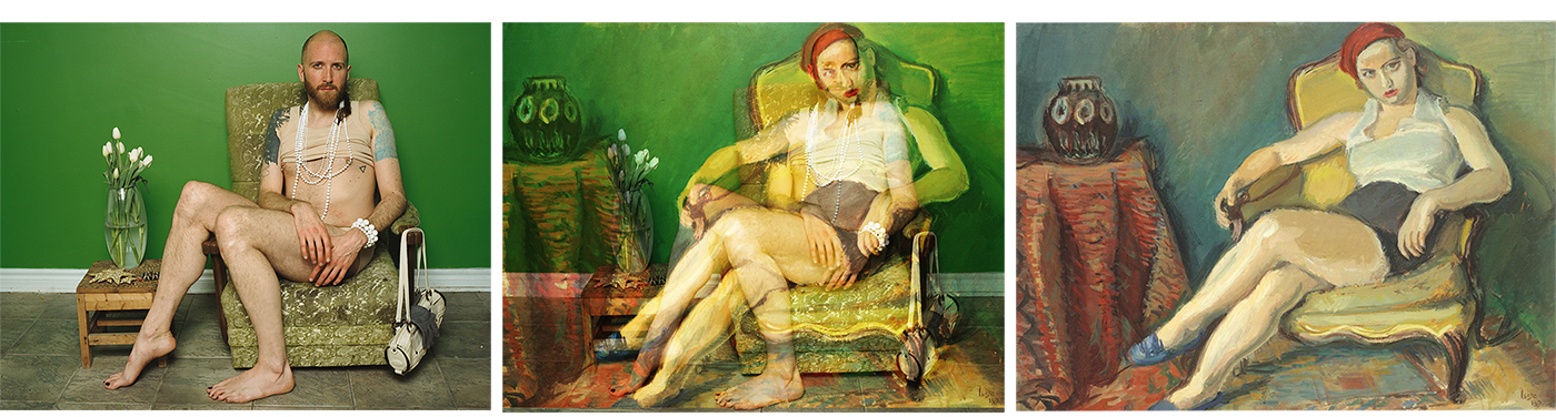
Above is a comparison of JJ Levine’s “Mikiki 2012” and  Iosif Iser’s “Woman in Yellow Chair” produced in 1933. The image have a very similar composition with the subjects seated at an angle on a low chair, a green wall and a table with a vase to the left of the seated subject. Both subjects have intriguing features (when considering the time of their production) Iser’s woman has bright blue shoes, red lipstick and a matching headscarf. Levine’s male subject is pictured with traditionally feminine items including a handbag, vase of tulips and a matching pearl necklace and bracelet set. Both of the images have a provocative undertone, Iser’s subject has a seductive expression, has her arms and legs exposed and has her shirt unbuttoned to reveal a large portion of her decolletage. Levine’s subject is presented rather provocatively due to the flesh coloured clothing which at first glance the subject appear less dressed. The subject also has their cropped vest rolled up to show the pierced nipples, but not in a overly exposed fashion as they are partially concealed by the layered pearl necklaces.

Both images have a green based colour scheme. Levine’s image reinforces this theme with a bright green wall, warmer green chair and the stalks of the flowers which are contrasted by the warm pink and yellow undertones of the the flesh of the subject and the  warm ocher tone colour of the small table the vase is placed on. The wall in Isef’s painting is also green, however unlike Levine’s solid coloured wall, Isef’s wall features both cool and warm green tones. Isef exploits the complementary colour of red in the tones of the lipstick, headscarf, table cloth and floor. The orange and yellow tones in the flesh and chair are also contrasted with the cooler green tones and the blue of the shoes.

Above I separated the two images, Levine’s “Mikiki 2012” and Iser’s “Woman in Yellow Chair” into 9 sections which shows how each composition exploits the rule of thirds. In both images the torso is places on the right vertical line and the faces seem to be cut in half by this line. In both images the foot just peeks into the bottom section. When looking at each section you can see that they have very similar contents, for example the centre segment includes part of both thighs and a hand and the top right segment contains a shoulder and half the face of the subject.

The way that the eye travels through the two images is also quite similar. The eye is immediately draw the to the face and is then directed through the image by the shape of the body, along the extended leg to the foot and then from the foot up to the vase. In the annotated versions of the images above you can see how similar the line of sight is in both compositions. Many tableaux portraits of women have a composition that exploits the form of the human body to direct the eye across the painting.

Above is a comparison of JJ Levine’s fourth of eight images from her “Alone Time” Collection and Jan Miense Molenaer’s “music making couple” Levine’s image is at first glance a portrait of a heterosexual couple seated next to each other, the female counterpart holding a banjo and the male counterpart listening. The couple in Levine’s image are actually acted out by the same person in different costumes. Molenaer’s painting also depicts a heterosexual couple where both parties are holding musical instruments, the male, a lute and the female, an early woodwind instrument. In Molenaer’s painting the male counterpart is presented as dominant, he wears a large hat, stands rather than sits, placing him physically above his partner and the line created by the fret board of the lute also makes him appear taller. In Levine’s image however, the female is presented as the dominant counterpart of the couple as she is pictured holding the banjo while the male is simply sat, listening. Similarly to Molenaer’s painting, the fret board of the lute makes the female in Levine’s photograph appear bigger than the male. Both of the images, in my opinion have a sexual undertone this is implied by the fact that the couple are pictured together, suggesting a sense of commitment. Levine’s title “Alone time” could suggest sexual as well as emotional intamacy, Molenaer’s painting has a sexual undertone due to both counterparts seemingly taking part in the “music making” which a potential metaphor for physical intimacy.