All posts by Christianna Knight

Filters

Author:
Category:

combining prints – digital and physical


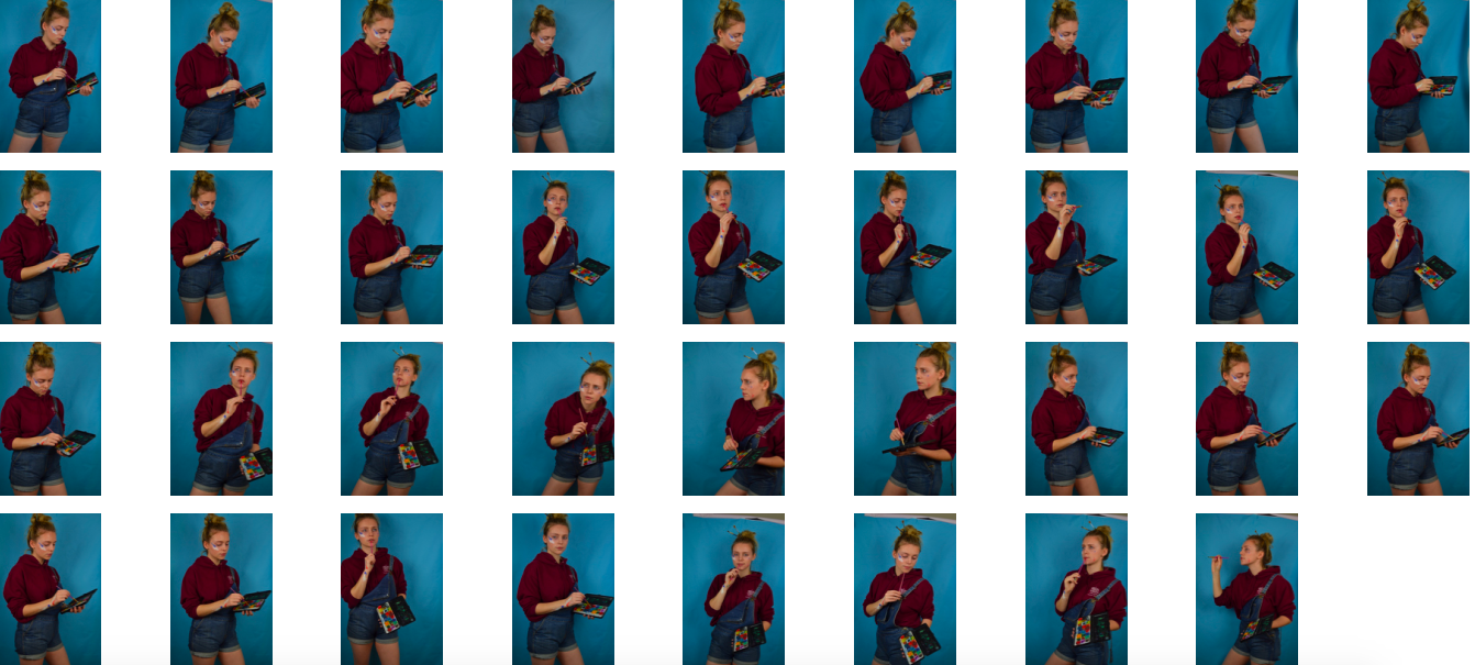
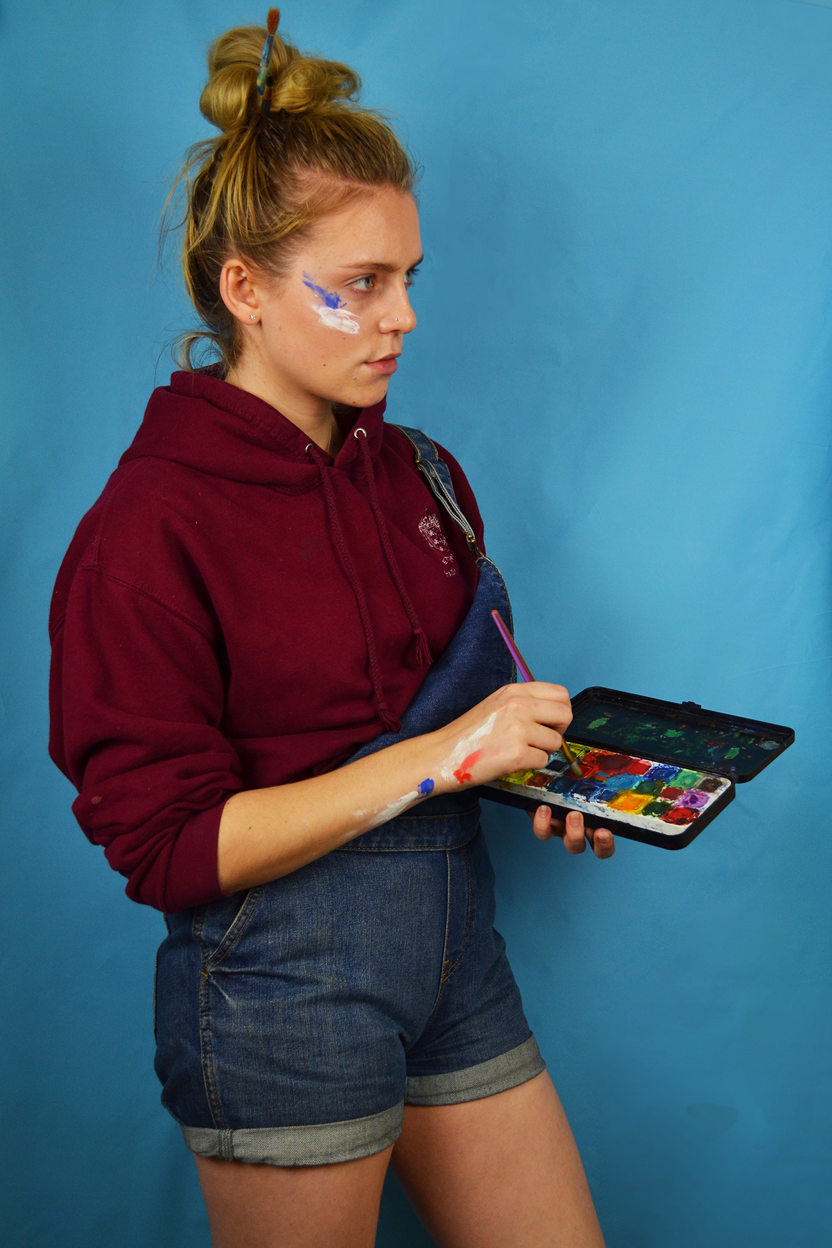
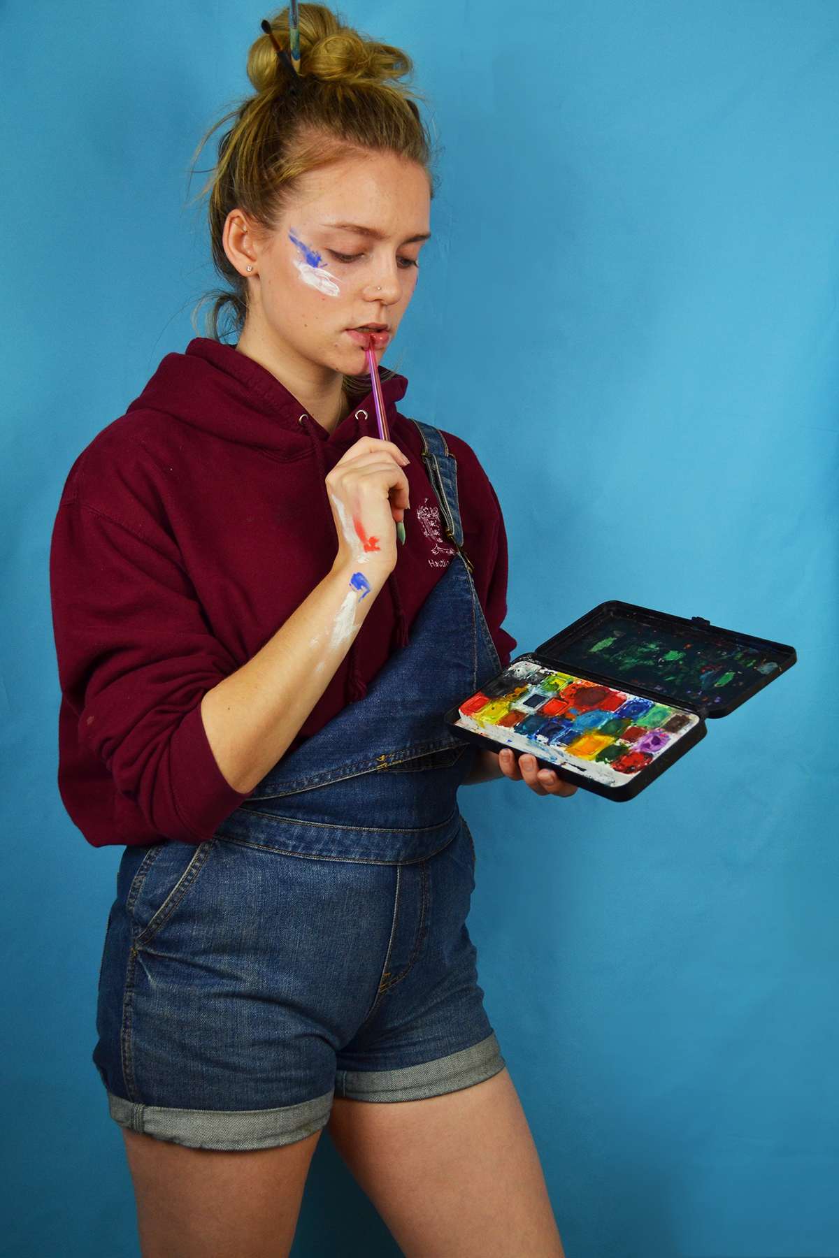
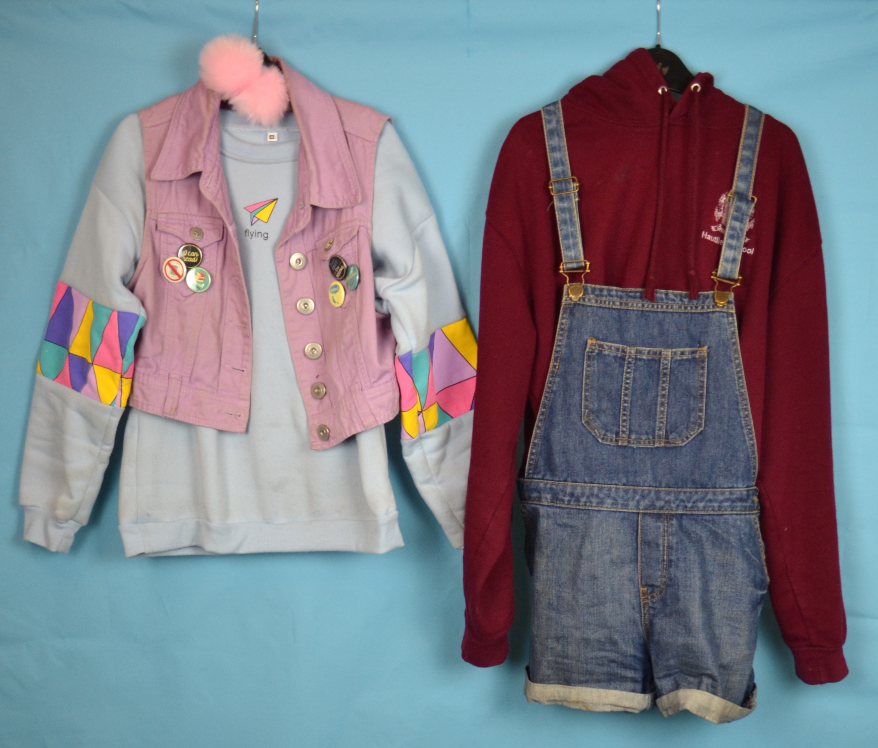
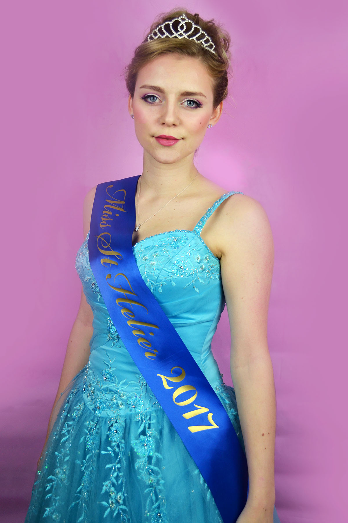
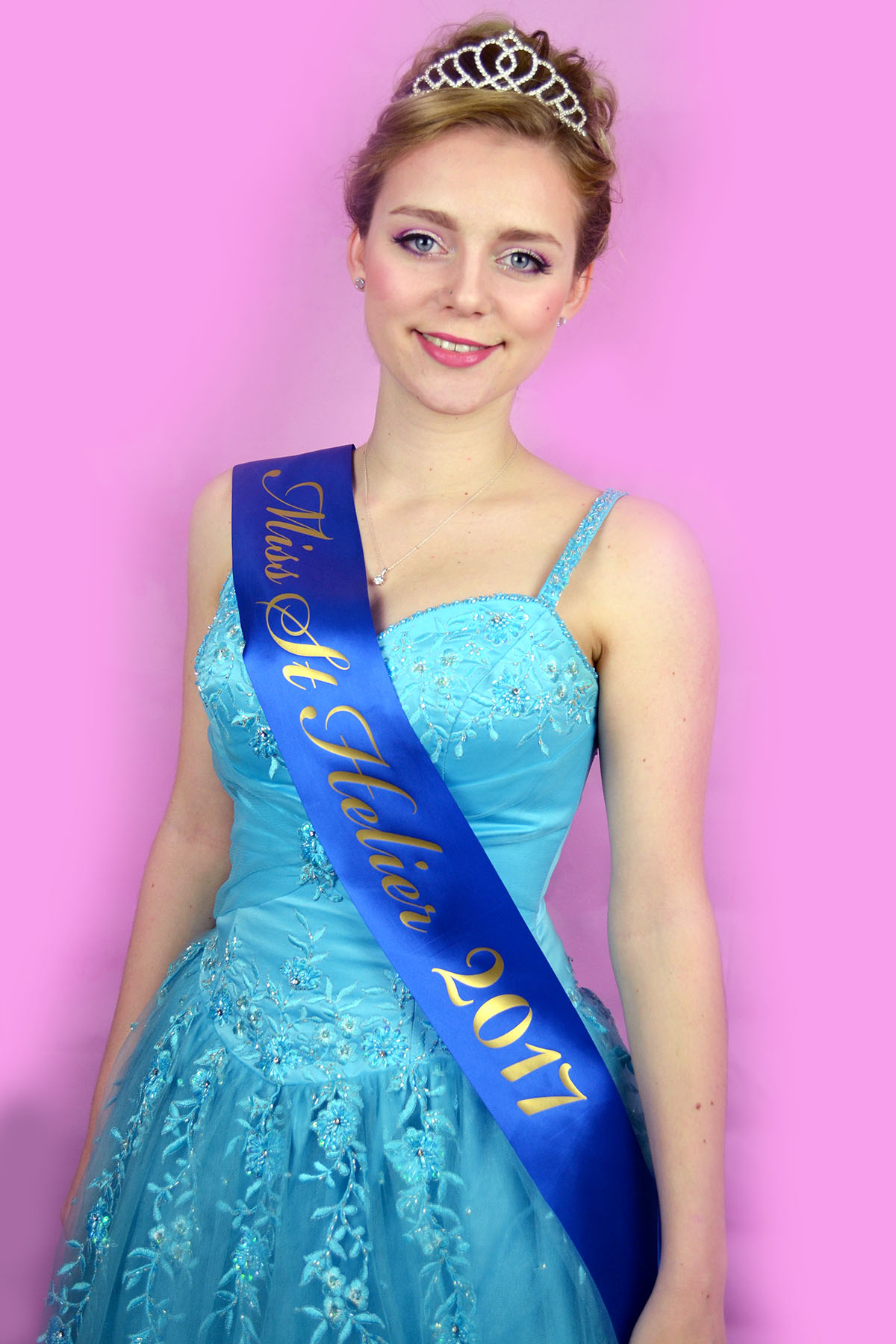
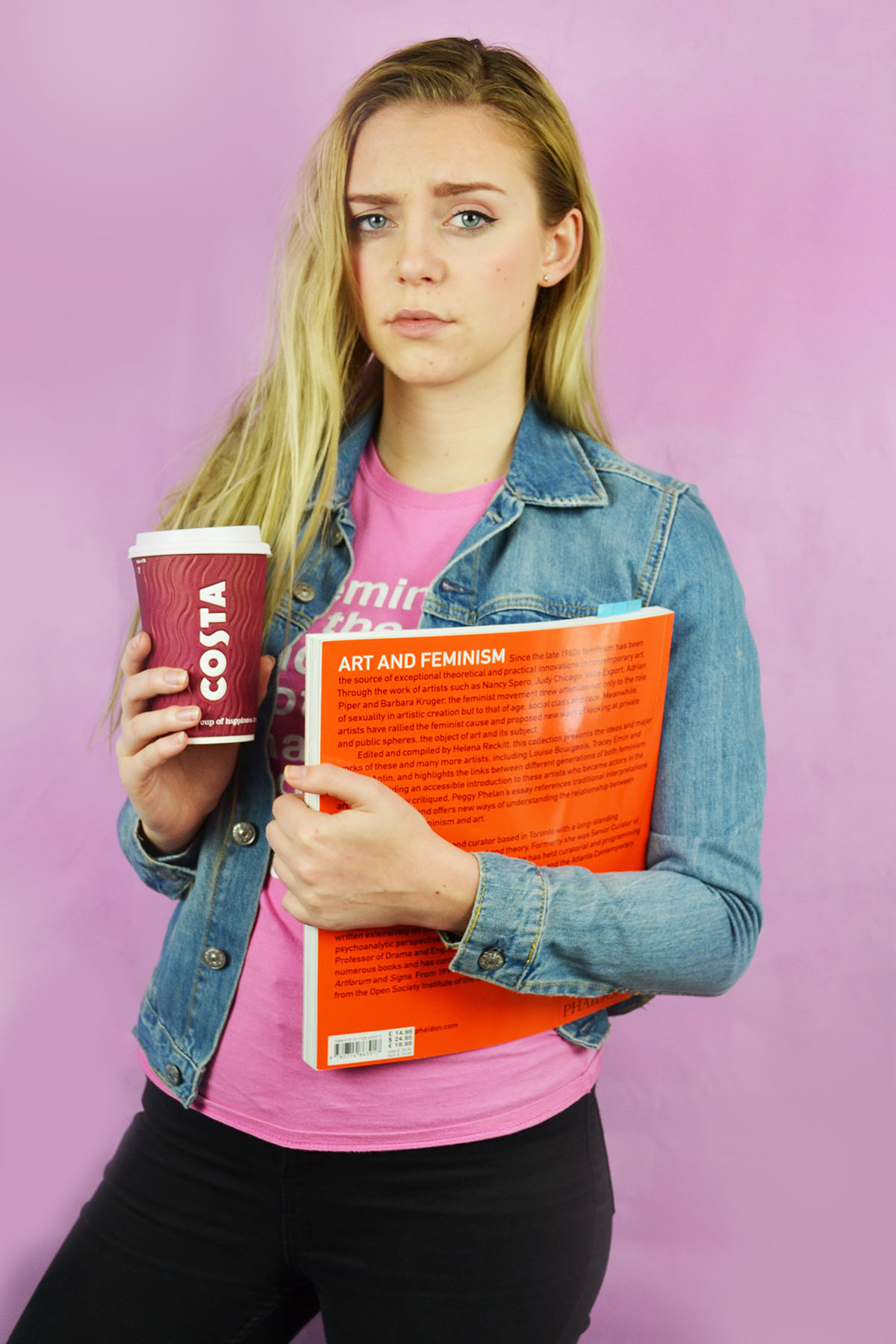
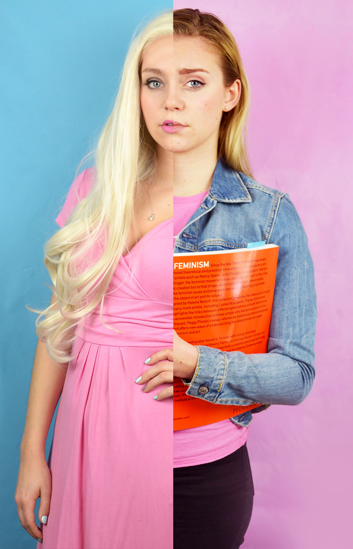
Here are my first attempts of combining my feminist and blonde stereotypes, I felt that these images would work well when combined because the different hair colours would make the split more obvious than other combinations of images. I also felt that these would work together because the blonde image features a blue background and a pink dress and the feminist image features a oink background and a blue jacket. A digitally combined these by using the quick selection selection tool and simply selected half of the corresponding image and layered it on top of the other. As you can see from the two potential images above, the image on the right worked better than the one of the left. Once the images were combined but not flattened into the same layer I altered the colour balance on the feminist side to try and make the skin tone match the other side so that the split was less jarring. I also moved the images as appropriate to make the hair lines meet as I it looked quite odd if they didn’t.

I also experimented with combining the photos in a more diptych fashion. I created this image by flipping the feminist horizontally creating a canvas in Photoshop that was long enough to take both images placed next to each other. I then selected the images in turn and placed them onto the same canvas. I then arranged them and cropped the as appropriate. Although I do like how this image looks I do think that the text that appears in the feminist image and on reflection it may have been a better idea to flip the blonde image instead.

I then experimented with combining physical prints of the the images in order to get the white ripped paper effect between the images. I actually found ripping the printed image quite tricky, I knew that I wasn’t going to get a perfectly straight line but I did find it challenging to control the direction of the tear. Despite the fact that the faces in the first manually combined image don’t match up exactly I feel that this one is the most successful. I want to experiment with these combined images further, perhaps with the addition of text.


Art Student – Presenting

Here are the final images I have selected for the art student stereotype. I selected these images to be presented as a diptych due to the masculine and feminine connotations of both the archetypes and coloured back drops. I selected the image on the left because it depicts the scruffier more laid back side of me, the state of concentration i often find myself in when I am painting. Although this image is constructed in a studio setting, it is a fairly accurate depiction of what I look like on days where I stay inside and work on my art, no makeup, hair uncrushed and covered in paint. I selected the image in the right to depict my more fashion conscious side because it displays all the colours I chose to wear as well as my novelty backpack which I think captures my fun and childlike side. Although the images are not strictly masculine and feminine, i think the two different coloured background work well to emphasise the contrast between the two images despite the subject being the same.

Art Student Shoot 2 – Editing

Above is the initial contact sheet from my second, more fashion forward art student photoshoot. As seen above I experimented with using both my pink and blue backdrop but during the editing process I decided to use the photo with the pink backdrop incase I decided to display both art student stereotypes as a diptych. If I did decided to do this I felt that there would be a greater sense of contrast if the images had different background colours and the different coloured backgrounds connote ideas of masculinity and femininity, the first scruffy art student is more masculine and the second more fashion conscious art student is more feminine. When shortlisting the photos I also decided against using photos from the second outfit I used because I liked that the blue of the fluffy monster’s inc backpack would work well with the blue background of another images if I decide to use it as part of a diptych.

Here are the shortlisted photos from my fashion forward art student photoshoot. I selected these images because I felt that they captured the bubbly nature of the instagram active, stylish art student. As stated in my planning post I experimented with miming taking selfies and I shortlisted one of these images (above, centre). I edited these photos by cropping them as appropriate, increasing the brightness and contrast and slightly adjusting the levels. I also used the spot healing tool to remove any distracting blemishes and using the brush tool to smooth out the background as my pink backdrop was very wrinkled, even after ironing it as I couldn’t use the iron on too higher setting as I was at risk of melting the vinyl.

Art Student shoot 1- Editing

Above is the initial contact shoot from my first art student shoot. I made the decision before conducting the shoot to only use my blue backdrop because I felt that the maroon colour of my hoodie would clash with the pink background. I also felt that the masculine connotations of the colour blue would work better with my scruffy artist look. I also decided to wear no makeup for this shoot despite including an image of dark lipstick in my mood board because I felt that this was more realistic as I don’t really wear makeup on the days when I am home just doing art. I experimented in the shoot with different poses although they are relative predicable and similar, I am assessing a hypothetic piece of art, mixing paint and miming making brush strokes.

I shortlisted these images for my scruffy art student shoot because I felt that these three images depicted three different moments and feelings I experience when painting or working on a piece of art. The first image depicts a sense of contentment and flow, I sometimes experience this when I really get into the flow of a piece, although this doesn’t happen very often. The second image depicts a sense of concentration which is definitely something I experience often, when working at home my family often make fun of my frowning concentration face. The last image depicts a moment of pause where I appear to be considering what colour to use of what action to take next, this image really shows of the colours in my water colour palette nicely. In the editing process I cropped the images as a appropriate and adjusted the brightness, contrast and levels. I also used the spot healing tool to remove a large blemish on my chin.

Art Student – Planning

A stereotype that I certainly currently conform to is the archetype of a female art student. This stereotype can be broken down into various sub groups but the on running theme is that the modern day, young, female art student is middle class and a little pretentious. When exploring this stereotype I want to look at two different subgroups of the art student stereotype that I believe I conform to, these being the messy, scruffy, slightly edgy, doc marten wearing practical student and the more style conscious, fashionable, club kid/ Harajuku inspired, heavily-active-on-instagram type student. I feel that on somedays I can dress stylishly, put on some fun makeup and look very well put together and on other days I wear comfy clothes, throw my hair up in a bun and get covered in charcoal and paint. There is rarely an in-between.

The above moodboard depicts the more relaxed, scruffy art student for this shoot I plan to wear my comfy maroon jumper from my school trip to China in 2016. I often wear this jumper when I’m lounging around the house, doing art or just want to feel comfy. I wear this jumper so often that my mum has to tear it off my body in order to wash it. I also want to wear a pair of denim dungarees, I don’t usually wear these when painting because they are not particularly comfortable but I feel that it will complete the art student aesthetic. I also want to play off the idea of what people think an artist at work looks like, so I plan to wipe some paint of my face and arms as well as tucking some paint brushes into my bun.

Above is my second mood board for my more fashion forward, heavily active on Instagram, art student as well as some photos from my personal Instagram page. I want to create a harajuku fashion inspired look with pastel colours and fluffy hair accessories (pictured below) and my fun monster’s inc backpack. In terms of poses for this shoot I want to try some cutesy, bubbly smiley poses and perhaps some images that include taking selfies for instagram as the case of my iPod in bubblegum pink and cat shared which would fit in with the pastel them I want to create. For the first shoot I plan to use my blue back drop as the maroon jumper I plan to wear will almost certainly clash with the pink. However for the second shoot I plan to use both the pink and blue background because the outfit that I have selected (pictured below) will work well with both colours.

Beauty Queen – Presenting

Here is the final image for my beauty queen archetype, after experimenting with dignified, smiley and exaggerated, pantomimic expressions I decided on a this confident, assured an flattering portrait. In my role as a young female ambassador for my parish this portrait captures the way I want to present and carry my self when acting as a role model for young women. I made stylistic choices to appear mature, formal and at the same time very feminine and beautiful and I feel that the elements came together nicely in this portrait.

Beauty Queen – Editing

Above is the contact sheet from my beauty queen photoshoot. I experimented with different poses and expressions although they were all rather similar so it would fit with the format of an official title holder photoshoot that I discussed in my planning post for this shoot. The hand on hips poses with the big smile were an attempt to capture the all-american beauty queen persona but the images just came out looking silly and pantomimic so I decided not to use them, after all the project was about trying to capture a slightly exaggerated version of myself rather than someone else altogether. I found the process of this shoot really enjoyable although walking to and from the camera to check the images as set off the shutter in a full length ballgown with many petticoats proved both difficult and time consuming.

Here are my shortlisted photos from this shoot. I selected these images because they both capture a flattering, exaggerated version of me without being garish or pantomimic. I edited these photos by cropping them in a way that framed the figure nicely as well as showing off the volume of the skirt an my full title printed on the sash. I also increased the contrast, brightness, colour saturation and levels. I used the spit healing tool to remove any blemishes as my skin was not very good on the day that I conducted this shoot. I smoothed out the back drop as there were still some wrinkles even after attempting to iron the vinyl. I personally think that I will use the image on the right because I felt that it is both flattering, serious and dignified which was something I wanted to capture in this portrait.


Beauty Queen – Planning

As previously I think that there are many pre-conceptions about women who enter beauty pageants, they are often perceived as vain, high maintenance and full of self importance. I personally think that these seemingly negative qualities are inaccurate and what people are picking up on is high self confidence. To a certain extent these sort of competitions are superficial as generally speaking, it is attractive, conventionally beautiful women who enter. However, these women also need to be well spoken and articulate as they are ambassadors for their country, state, county, province, town or village. On Saturday 11th March I was crowned Miss Saint Helier 2017. My experience was very positive as I felt that the focus was definitely on the public speaking skills than the beauty aspect of the competition. I want to explore and research the ideas and history behind beauty pageants further before producing a response to my experience in the beauty pageant world as i was also a runner up for Miss Jersey Battle of Flowers 2016.

I want to create an idealised photo inspired by the official portraits taken of big beauty pageant winners. Above is the sash and tiara that I received from winning the Miss Saint Helier competition  and below is the dress that I plan to wear fro this shoot and also the Miss Jersey Battle of Flowers competition in June this year. I plan to use my pink backdrop for this shoot because I feel that the blue background with the blue dress and blue will simply be too much blue. Also the female connotations of the pink backdrop will work well with the image as well as providing contrast to offset the extravagant dress.

Angry Feminist – Presenting

Here are my two final contrasting images displaying the stereotype of the angry new wave feminist that I supposedly conform to. The image on the right was inspired by the topless protests of the radical feminist group FEMEN and was intended to depict a snapshot of a similar protest. I selected the words “my body my choice”  to paint onto my torso because I felt that it was a slight nod to the shock factor associated with the nudity of the original FEMEN protests. I decided to use the blue backdrop for this image because of the masculine connotations of the colour blue, this side of the stereotype goes against what most people would consider to be “lady-like” as exposing your breast in public is not socially acceptable in western culture. I feel that the image captures a sense of anger, desperation, power and beauty.

The image on the left depicts a more socially acceptable side of the stereotype. A white, middle class female student who has read a few books on feminism and feels the need to lecture anyone who conform or reinforce gender stereotypes or denies the existence of the wage gap. I created a sense of self importance by the disapproving expression and the casual inclusion of a coffee cup as a prop to give a more “young student” vibe. I decided to a pink backdrop for this image to contrast the one on the left with the blue background. Pink also has feminine connotations and this side of the stereotype is certainly more social acceptable and “lady-like” than the previous.

Angry Feminst Shoot 2 – Editing

Above is the contact sheet from my second angry feminist shoot. As you can see, similarly to the previous shoot I experimented with both blue and pink backdrops. And again, similarly to the previous shoot I decided to use the pink backdrop because this element of the feminist stereotype is slightly more “lady-like” and socially acceptable than the previous and the pink background connotes this. I used two of my favourite books on feminism, “Art and Feminism” and “The Art of Reflection” I also wore my graphic tee which has the quote “Feminism is the radical notion that women are people.” printed on it. I also used a empty costa cup to achieve a sort of college student hipster vibe.

I experimented with different facial expression and poses to give an sense of “being done with your misogynistic bull” vibe. I tried many over the top, “in the middle of a heated debate” looks but I felt that some of the more subtle aloof eyeballs or disapproving side glances were more effective and less pantomimic.  Bellow are the two image I shortlisted for final from this shoot. I selected the image on the right because I felt that the raised eyebrow and 3/4 angle of the face gave a sense of being knowledgable and aloof. I selected the image on the right because the expression paired with the titled head gives a reasonable air of being annoyed and frustrated without being over the top.

I edited these photo by cropping them as appropriate, at the top of the thigh to match with my previous outcomes. I increased the brightness and contrast as well as the colour saturation. I used the brush tool on photoshop to get rid of some distracting blemishes as my skin was not very clear on the day of the shoot. I slightly smoothed out the background, similarly to the editing process of the first feminist shoot.