All posts by Christianna Knight

Filters

Author:
Category:

Final Outcomes

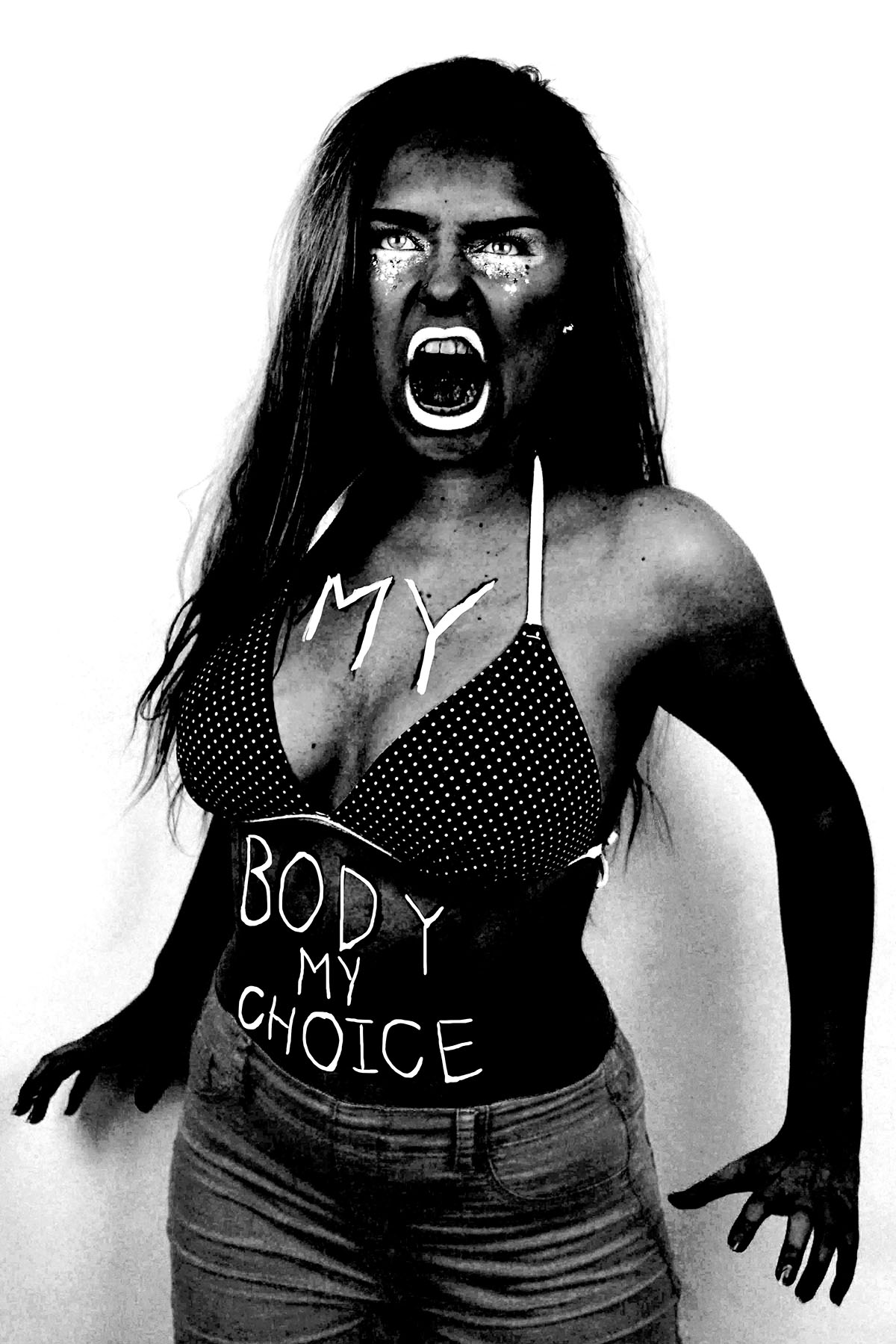
These are three images I selected out of the original, only slightly retouched images (without any heavy photoshop of the addition of text) I decided to present these image as a sort of triptych. I plan to separately mount these images on white window mounts but display them in a row of three as above. I chose these three because the two more feminine images with the pink back drop act as the bread in my angry feminist (image with the blue backdrop) sandwich. The colour of the images work well together because the images with the pink backgrounds have a large are of blue to tie them with the image in the centre, the beauty queen photograph has the blue of the dress which is mirrored quite nicely a similar blue of the fluffy backpack in the art student photo. I also decided to place the feminine images on the outside because I am more outwardly feminine than I am masculine, but that does in no way diminish the fact that I am a feminist, which is why the dramatic angry feminist portrait is placed in the middle. These images were mainly inspired by studio self-portraits of Yasumasa Morimura.

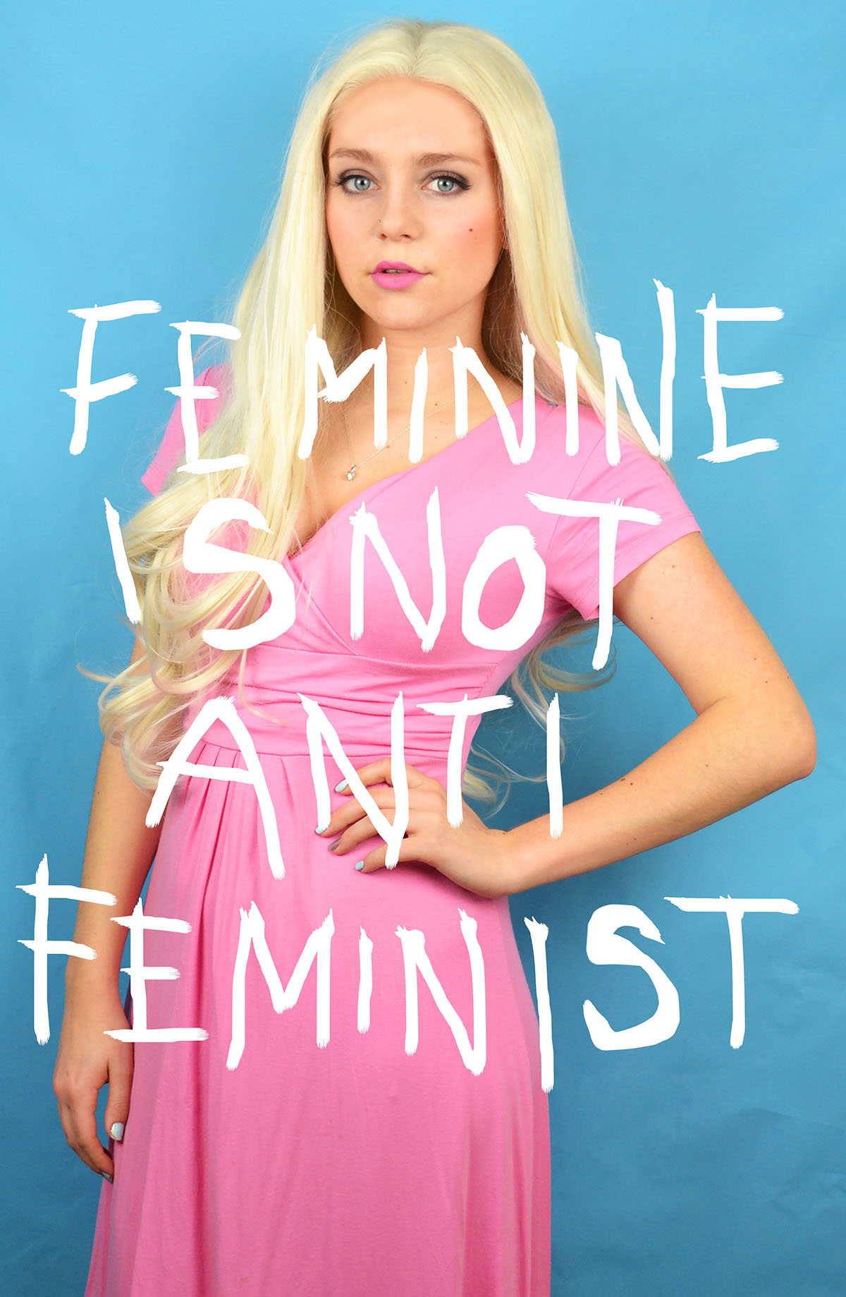
I selected these images to be presented together as a triptych in a white window mount. I chose these images to act as part of a triptych because they all had blue backgrounds and the text included in the images stems from the theme of feminism and stereotypes. Similarly to the three images above at the top of the post, I placed my two more masculine stereotypes on the outsides of the triptych and my more feminine stereotype in the centre. My single feminine figure in this triptych is also supported by the phrase “feminine is not anti-feminist” breaking the stereotype that feminist cannot present themselves as stereotypically feminine or conform to traditional gender roles. My art student image features the phrase “Her work critic, and yet her best advocate” which is a phrase that is personal to me as I can be both overly confident and overly critical about my own work. The text also ties in with the stereotype of a pretentious art student who is constantly at war with whether their work is worthless or genius. The text in my angry feminist image, “We tried being polite, but men only respond to violence” is a phrase that combats the negative connotations of the angry feminist stereotype. As, historically speaking, asking nicely to be freed or given equal rights as a oppressed group of people doesn’t work. These images were inspired by Gillian Wearing photographic project “Signs that Say What You Want Them To Say and Not Signs that Say What Someone Else Wants You To Say” as I feel that these are often phrases that are unspoken and the phrase included in the art student portrait is something that I have struggled to put into words. If Wearing had included me as one of her subjects in the project, I’m sure that my sign would have said something of that nature.


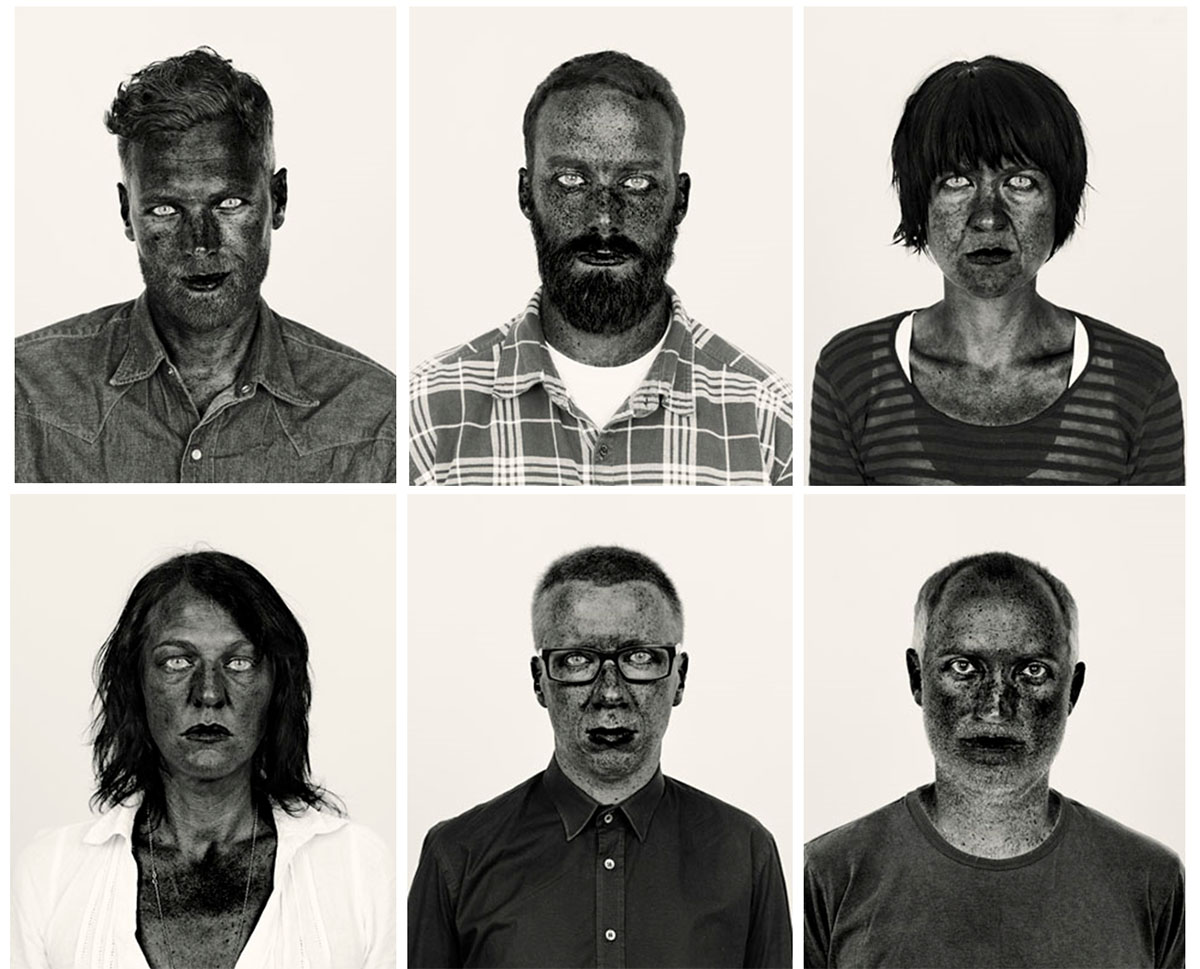
I chose to present these high contrast images as a triptych because I felt that they were more powerful when presented as a group. I plan to mount these on black window mount to create even more contrast between the black of the window mount and the white of the print. I chose to place the images in the order that I have shown above because the centre image has a strip of lighter hair and has a nice curve in terms of its overall pose and composition. With these images I wanted to create a sense of drama and intensity, so the viewer feels as if the figures could jump out of the window mount and attack at any moment. These images were inspired by Pieter Hugo photographic series, “There’s a place in hell for me and my friends” I found the concept of hyper pigmentation in all skin tones and within many races and ethnicities very intriguing. However, I simply took inspiration from the aesthetic nature rather than the political undertones of Hugo’s work.

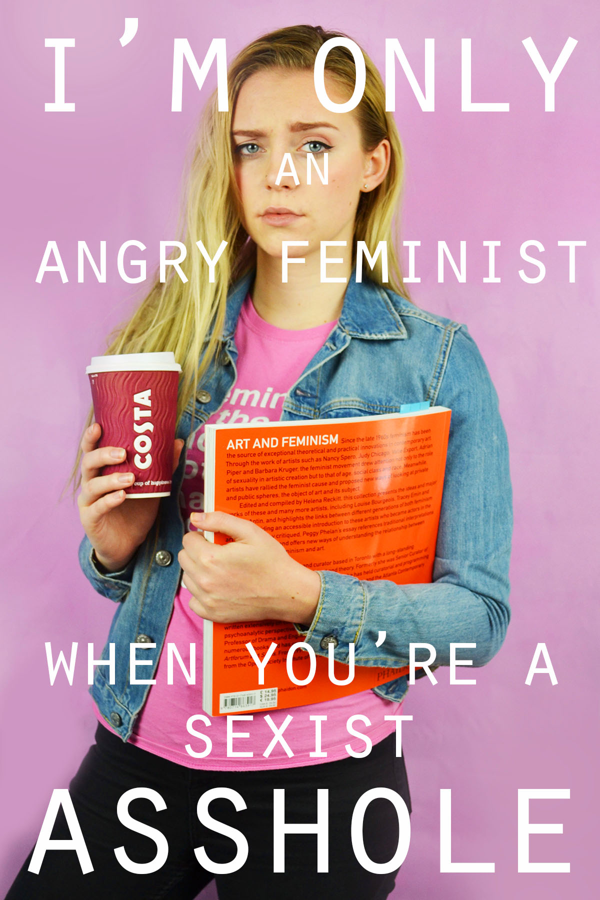
I selected this image as a final because I feel that my continuation with an analog approach was very successful. I plan to mount this print on black sugar paper, leaving a small border of white from the original print. I will then  see how the image looks but I think I will mount it in a black window mount to give the piece a polished and finished look. I included this image even though there are some others that are similar because I feel that the colour relationship between the pink and blue and black and white is very apparent and successful with this composition. The word “beauty” which has positive connotations is presented in black text with a dominant white background and the word “bitch” which has negative connotations is presented in white text with a dominant black background. There is also a very strong sense of divide between the two stereotypes due to them being separate bodies also separated by the rip between the prints. This image was inspired by the research I did on ripped movie posters such as “The Shining”, the burn book from “Mean Girls” and the typical Hollywood ransom notes.

I selected this image as a final, although it is rather similar to the final above because in this image the two figure have become one, the physical prints are combined. I think that there is a greater sense of integrity in this image because everything has been done manually and by hand. The text in this image alternates between white letters with black background and black letters with white backgrounds. This image has already been mounted on to black sugar paper but I also plan to place it in a black window mount. This image was also inspired by film posters, ransom notes and the burn book from “Mean Girls” I feel that this image displays all of my inspirations in a stylized and sophisticated way.

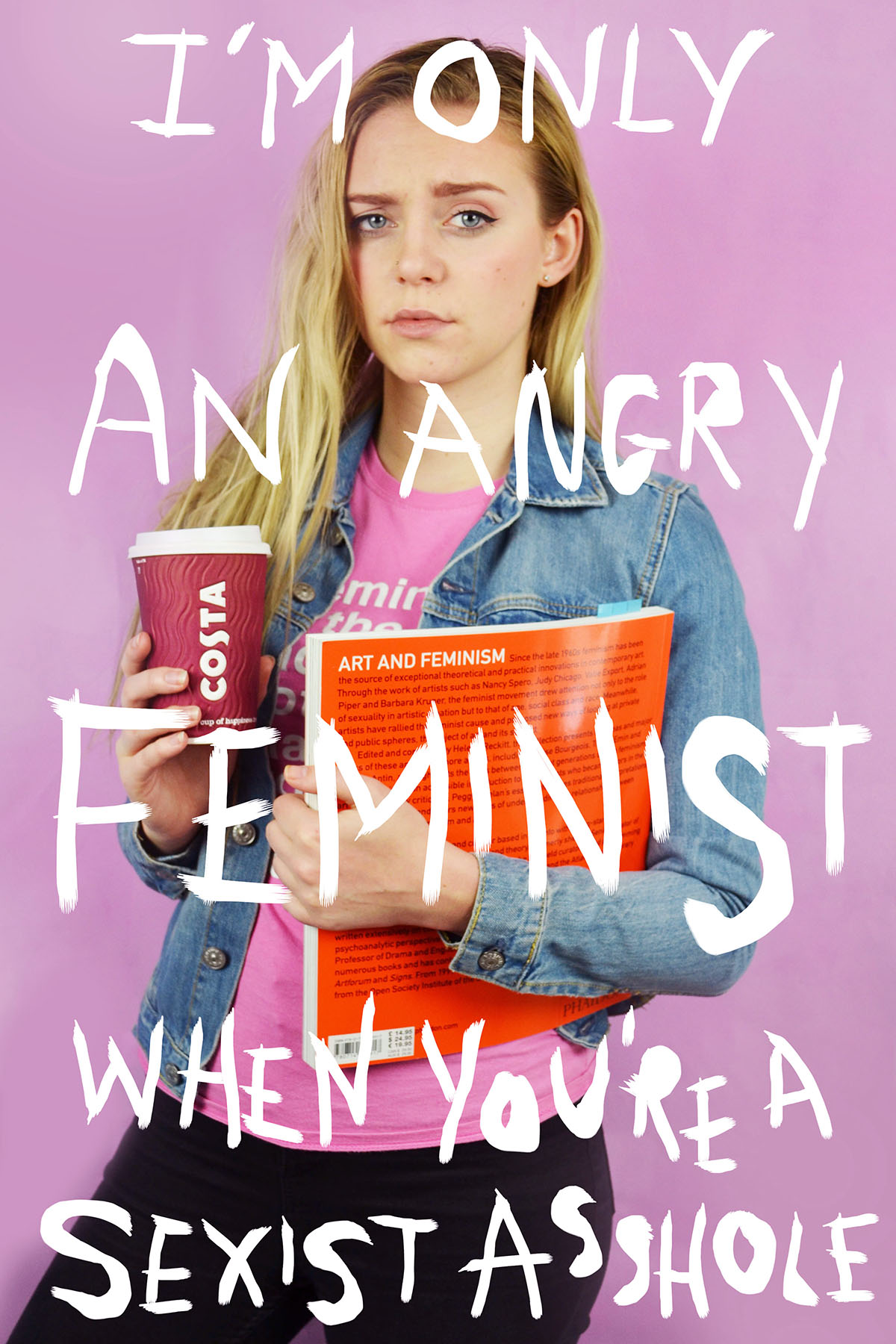
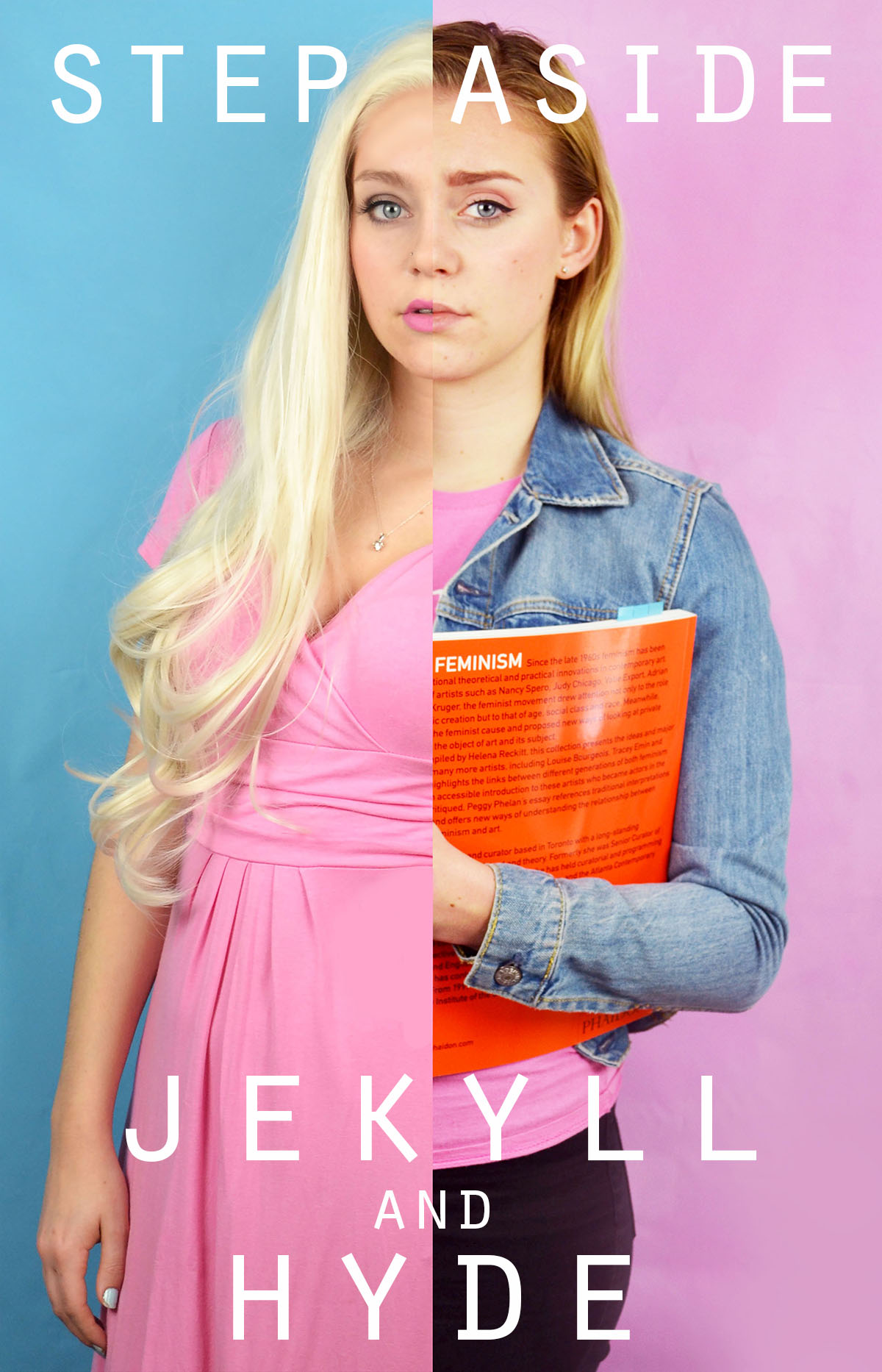
I selected this image as a final outcome, although similar to the previous two because I think that the digital combination of the two images and text is more polished. I the digital combination of the images I was able to edit out the fingers of the second hand in the blonde photograph, which looked strange in the very centre of the image. I was also able to match up the faces more accurately and adjust the brightness, contrast and colour channels to make the skin tones more similar for a more seamless split. For the text in this image I took inspiration from the work of Barbara Kruger and kept the full words intact rather than separating them into individual letters. I placed the text onto label like backgrounds of the opposite colour, white on black and vice versa. I also placed the words at jaunty angles, which is a common feature of Kruger’s work. I also decided to keep the word Feminism on my “Art and Feminism” book between the additional “and” and “the” as a not so subtle subtext. I originally planned to edit the word out, but after consideration I decided to keep it.

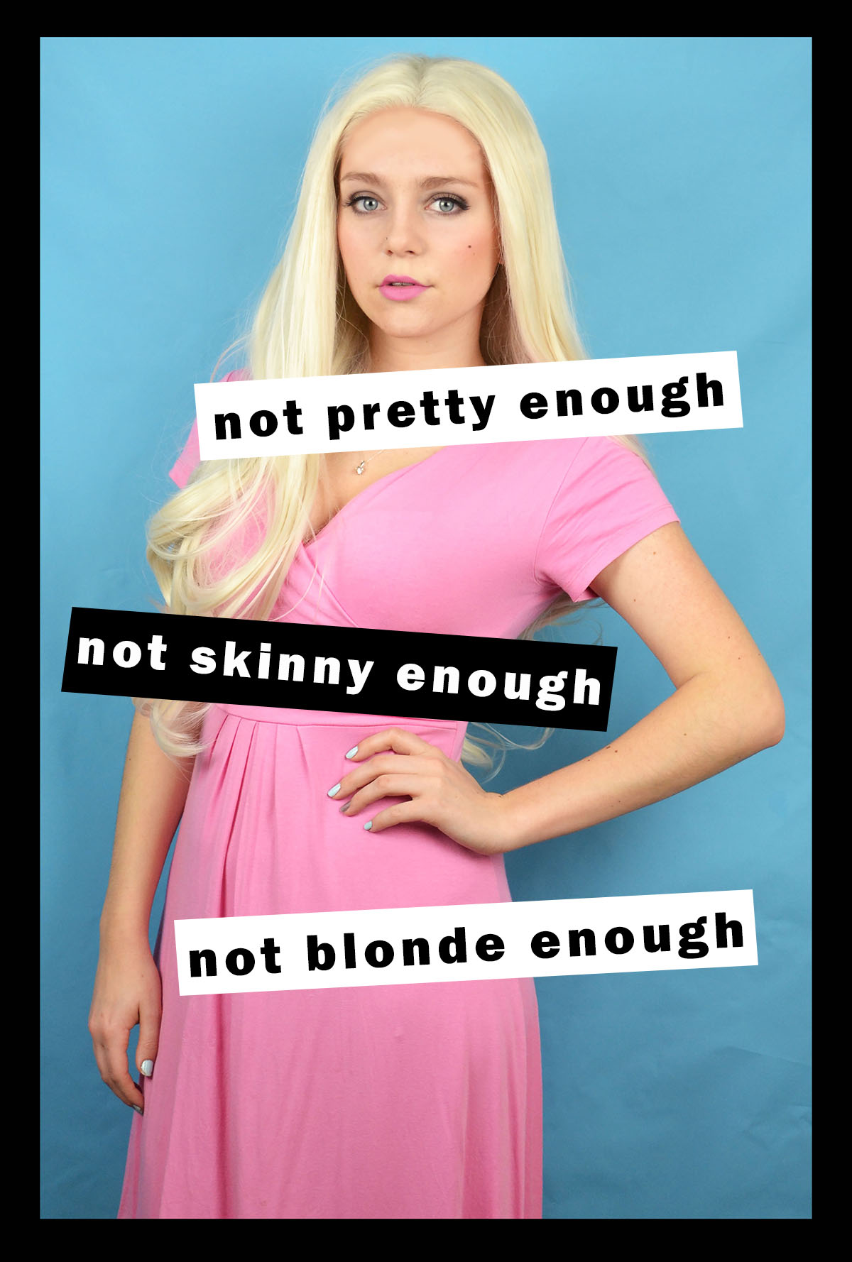
I selected this image as a final because I feel that it comments of the beauty standards in western society that women are held to. The text also comments on how beautiful who appear outwardly confident are often just as insecure as everyone else on the inside. When I was blonde I also felt that I was held to higher standards in terms of appearance because when one has blonde hair and wears  no make up and comfy clothes they often look very unpolished. If I had worn the same wig with the outfit I wore in my art student portrait with no makeup I would have looked very odd. I plan to present this image individually in a black window mount as I feel that it is strong enough to stand alone. This image was inspired by the work of Barbara Kruger, I adopted her monochrome colour palette with her signature cherry red as a pop of colour. I was particularly inspired by her collection of images that featured various pop icons such as Marilyn Monroe and Andy Warhol with the phrase “not —– enough” with an different adjective for each person.

Further Reading – Helena Reckitt and Peggy Phelan – Art and Feminism

Art and photography are creative mediums that I have always been passionate about and feminism is a topic that I am incredibly interested in as a self identified feminist. As a result of these interests I received a number of books for Christmas last year, including “The Art of Reflection” which is about how female artist have presented their bodies in self portraiture and “Art and Feminism” which is an incredibly interesting book that encompasses many topics surrounding the link between feminism and art, with many honourable mentions of influential feminist artist and different critics insights on how their work, often particular pieces link in with feminism.

The book includes essays, quotations and various texts from a number of female  artists, art critics and feminist scholars. The preface and editing of the book was completed by Helena Reckitt, a feminist curator and researcher and the survey was written by the incredibly influential feminist scholar and former chair of New York University’s Department of Performance Studies.

The pre-face of the book was written by Helena Reckitt, even in those first initial pages some very interesting and thought provoking thoughts are made. Reckitt writes that “the trap of heroine worship,” is that “the achievements of women are uncritically celebrated in an understandable but counterproductive effort to compensate for year of neglect.” I think that this statement in certain circumstances is correct. A lot of women who are in male dominated professions such as doctors or scientists are often celebrated for simply choosing to take their chosen career path. I think that such achievements are commendable as girls and young women are often discouraged from choosing to study certain subjects or take certain jobs. However, when this celebration, or “worship” as Reckitt suggests, takes away from their actually achievements within their field (when compared to men as well as women) this  “worship” can be harmful. For example if a public speaker who made an  well planned, well presented, thought provoking speech on a serious topic was not a native English speaker and all anybody could talk was how well they spoke English, it devalues the content of the speech. On the other hand, however, this statement is untrue, in the art world self identified feminist artist’s (or occasionally simply female artists’) work is looked at incredibly critically. Critics and viewers alike automatically search for some kind of feminist reading or political subtext within artworks.

Peggy Phelan (left), Helena Reckitt (right)

Reckitt also goes on to say later in the pre-face that stems from the same idea that some female artist find “the feminist label restrictive, threatening to overshadow other elements of their work.” Louise Bourgeois, one of the most influential feminist artist of  the 20th Century has in the past denied being a feminist, this may be because she feels that if she labels herself and thus, her work as feminist it may diminish the many other strong themes in her work. Other female artist of colour, have in the past and present denied being “feminist artist” because they feel that the feminism movement for the greater part of history has been about the rights and freedom of middle class white women with a complete disregard for the rights of women of colour. I think that this is a fair point, if you feel that your rights have been ignored and you relate this discrimination to a particular label, you are completely within your right to not identify with the movement. However, I feel that within the current movement of third wave feminism, the importance of inclusion for all women, including women of the LGBT community and women from all races and cultural backgrounds is growing.

Peggy Phelan states later in the survey that “Writing about art has traditionally been concerned with that which is interior to the frame, whereas feminism has focused primarily on what lies outside he frame of patriarchal logic, representation, history and justice.” I believe that this is a very intriguing analogy as it raises questions as to whether or not feminist art is appreciated enough for its aesthetic nature and perhaps too much for its social and political allegory. At the same time, it suggests that the social and political nature of artworks that are not typically considered feminist have traditionally not been looked at as critically as maybe they should have been at the time of production. Many non- feminist artworks from history are now looked at through a critical lens, although critics views are now in retrospective and cannot reflect on current events of the time. The critical viewpoint that Phelan describes suggests taking a step when critically analyzing art, viewing it within it’s social, political and historical context.

I found this book very interesting, but at times difficult to read, I often had to take a break and allow myself to process the essays and make connections before continuing. I also found myself having to read over things again to understand them better. I was very glad that I was gifted this book as opposed to borrowing from a library as I was able to highlight certain quotes and passages that I found interesting or didn’t completely understand as well as marking pages that contained artwork that I was inspired by or found particularly intriguing.


Analog combination of images and text

After manually tearing the images I had printed out early I decided to take the experimentation further and continue with an analog approach. I was able to use these prints for experimentation because I forgot to edit out the hand of the blonde side of the photo and the image looked rather strange with only a small portion of the hand from each photo, luckily I was able to use the letters and words in my experimentation to mainly obscure it from view. I have previously experimented with overlaying text on photoshop but know I want to experiment with cutting out letter and sticking them individually onto the prints. I attached the ripped photographs together by pray mounting them onto a piece of card. I used microsoft word to create the black and white letters, I created individual text boxes that I coloured as appropriate. I then made two copies of the alternating black and white letter and one copy of with each word having the same colour for all their letters. I  printed out the letters and cut them out and played around with how I wanted to display them on the prints. When sticking the individual letters onto the prints I ruined my first set of letters in my first attempt. When n i placed the letters face down onto some newspaper when spraying them with spray mount the pressure of the spray caused them to fly everywhere and got the wrong side of many of the sticky. I was able to solve this issue by using a rolled piece of masking tape. One side of the tape stuck to the newspaper and the other held the printed side of the letters still while I sprayed them.

For the above image I used black and white alternating letter and contrasting backgrounds for the words “beauty and “bitch” and block backgrounds and letters of the same colour for the words “and” and “the”. As previously stated, I wanted to try and hide the hand in this print as it is a little distracting as at first glance it appears to be a hand that works with both images but it is distorted in a way that is a little disturbing. I placed the words “and” and “the” in the centre of the image and the join, as if the two words are holding the images together, similarly to how the two words hold the phrase together. I then placed the letters for “beauty” and “bitch” is a disjointed stylistic way.

As this image combines each of the stereotypes separately and they are presented individually I decided to experiment with printing out the letters of the words in the same colours, although I still wanted a sense of alternating between white and black (because I think it works well with the alternating pink and blue of the outfits and backgrounds) so I made the text in the following colours “beauty” on white, “and” on black, “the” on white, “bitch” on black. I decided to make the background of beauty white because of the positive connotations of the colour and the word “beauty” and vice vera for the black background of the word “bitch”. Unlike the previous image I decided to place the words on opposite sides of the image rather than making them overlap, to give a greater sense of division.

I also had an already digitally combined print of the two sides, but similarly to the other images, it had the hand that was strange looking and distracting. Luckily I was able to completely cover it up in this version. For this image I took inspiration from Barbara Kruger’s work and used block backgrounds for full words rather than more ransom note inspired individual letters. I placed the words in such a way over the join of the image so it appears that the words are holding the two sides together.


Inspirations for development of combined images


I decided to develop my idea of combining images and text together by experimenting with an analog as opposed to a digital approach. I was inspired by the aesthetic nature of  Barbara Kruger’s work and how the importance of symmetry and balance is replaced with expressive angles for the text. Sometimes the unbalanced and disjunct nature of her work actually makes it more interesting to look at. I was also inspired by stereotypical ransom notes, similar to ones seen in movies and tv, that include letters cut out of magazines, each letter is a different colour and font, this makes the process of reading the text very disjointed and fragmented.

As seen above, the burn book from the film “Mean Girls” which I have referred to on multiple occasions during the course of this project, takes inspiration from the cinematic ransom notes I described. The burn book is a scrapbook created by the Regina George, the popular antagonist and her “plastic” followers, Karen Smith and Gretchen Weiners. The burn book was a single pace where each of the girl would write down their completely uncensored (and often exaggerated or untrue) opinions of various students and teachers at their high school. The book was kept safe at Regina’s house and was intended to never see the light of day. At the climax of the film the burn book pages are photocopied and hung up all over the school, which leads to scenes of absolute chaos. This leads to a workshop lead by the school where all of the girls are made to confess to all of their catty and bitchiness.  This leads to the scene ( screen capped above) where the token art student, feminist character Janis sarcastically admits to having a “big lesbian crush” on Regina, exposing the fact that all of the lies and rumours written in the burn book stem from Regina’s self obsession and her own insecurities.

I also want to take inspiration from movie posters that feature what appear to manually ripped, contrasting images that are combined to create something intriguing, like the poster above for the iconic Stanley Kubrick movie, “The Shining” and the layered ripped poster for “Eternal Sunshine of the Spotless Mind”. I included the poster for Jim Carrey’s “Me, Myself and Irene” in my mini mood board above because the split of the face representing a multiple personality disorder fit into the conceptual  nature of how I want to combine my two contrasting images of the angry feminist and the blonde (pictured above) .I feel that combining similar stereotypes from my project (Janis and Regina can be seen in my initial mood boards above from my angry feminist and blonde stereotypes) with a words inspired by both ransom notes and the burn book would be an interesting development for my project.


Barbara Kruger Digital Response

I was inspired by the work of Barbara Kruger and how she uses text to make her images stronger and make a statement. After experimenting with the addition of simple text to my images using Photoshop I decided I wanted to develop this idea further by using boxed text, similar to Barbara Kruger. I was inspired by Kruger’s images featuring pop culture icons and a phrase that ran as follows “not —– enough”, these images can be seen in the header of this blog post. I wanted to experiment with the use of both monochrome and her signature cherry red.

I chose to use my blonde and beauty queen images because I felt that these were the most timeless of my stereotypes. I experimented with making my blonde photo black and white, I adjusted the colour channels to create some contrast between the figure and the background. I tried using black and white blocks behind the text as well as the red. I also created a colour version with monochrome text, which I didn’t feel was as dramatic as the black and white and red versions. My favourite of the four images above is the black and white image with the white and red text. I selected the phrase “not pretty enough, not skinny enough, not blind enough” because of the reference to Barbara Kruger’s work as well as trying in nicely with the blonde stereotype and the standards that women are held to.

I took inspiration from another iconic Kruger piece, that being a monochrome portrait of a young (around 6 years old) American child beauty pageant winner, accompanied by the line “I don’t want to grow ugly” clearly a disturbing spin on the phrase “grow old”. The original piece draws attention to the superficial nature of beauty pageants and the effects it may have on such young competitors. My image, featuring the phrase ” She had opinions, we didn’t care as long as she smiled” is suggestive of how the public speaking nature of being a beauty pageant winner, and thus an ambassador for the region, is often overlooked or simply ignored with the superficial beauty portion of the competition receiving the most publicity. I personally believe that I was selected as Miss Saint Helier 2017 because I was the strongest speaker out of all of the competitors for the role. However, other than the competition I haven’t had a chance to do any public speaking in my role as Miss Saint Helier, so perhaps the competition was more superficial and based on appearances then I was initially lead to believe.

I also developed my “Beauty and the Bitch” image with a different font and style, more similar to the work of Kruger. I feel that this works really well with the image and the label style rectangles that the text sit on helps the words to stand out, I feel that this is really important as the words I have chosen are powerful. I want the viewer of the image to read the words accompanying the image and think about which side of the photo is the beauty, and which is the bitch. I have included both the colour and the black and white version of the image because I was unsure which of these I preferred.


The Addition of Text

I experimented with handwritten and typed text for this image. To get the uneven lines of the handwritten text I used the 48 brush tool which has long angled bristles that are sensitive to how much pressure is applied and adjusts the thickness of the brush stroke as appropriate. For the typed text I selected simple font which I added over the top of the image in varying sizes. I chose to use the phrade “I’m only an angry feminist when you’re a sexist asshole” because it appeared on a poster on my initial angry feminist mood board. I also though that the phrase was sassy and fit with pose ad expression of the figure in the image.

For this image I also experimented with handwritten and typed text. As previously stated for the handwritten text I used the 48 brush tool, when using the computer mouse to write the letter I chose to write in block capitals as they are mainly composed of straight lines, these were more effective and easier to write. This can be seen by the strange appearance of the more rounded letters such as o and s. I think that the typed text works better for this image, the somewhat balanced nature of the word “feminine” and “feminist” at the top and bottom of the image makes the overall image visually pleasing. I chose the phrase “Feminine is not anti-feminist” because it is something that I feel very strongly about. Just because a woman dress in a traditionally feminine way and subscribes to particular female gender roles does not make her any less of a feminist or an empowered and free woman.

I also wanted to reference the idea of a 00’s high school it girl so I decided to include a sassy, bitchy comment. I chose the phrase “At least it’s only my hair that’s fake, bogus bitch” because of the snappy alliteration of the phrase “bogus bitch” but also because the fact that a woman decides to colour her hair does not reflect her personality or whether or not she is a genuine person.

I had fun experimenting with different words to place on top of this image. Before adding words to this image I edited out the finger of the blonde image because In felt that they were distracting as they were right in the centre of the image. I removed them by using the colour picker tool and the airbrush brush tool to paint over the top, I achieved a crisp edge at the divide by using the flat edge brush tool and holding down shift in order to paint a completely straight line. I knew that when choosing a phrase to accompany the image in wanted to draw attention to the split personality feel of the image. I experimented with the phrase “Step aside Jekyll and Hyde” as a reference to the book and film “Strange Case of Dr Jekyll and Mr Hyde” which is about a man with a alter ego. I also tried the phrase “Beauty and the Bitch” as an obvious reference to the fairy tale “Beauty and the Beast” with the word “beauty” having positive connotation and “beast” having negative connotations which is replaced with the word “bitch” which has similar connotations. Another interesting thing about this phrase is that the viewer is able to decide which side of the image is the “beauty” and which is the “beast” as both sides of the image could arguably be both.

I also experimented with coloured images and white text as well as monochrome images with coloured text. I struggles with the balancing of the text within the first image but I knew that I wanted the words “polite” and “violence” to be in the largest font size and I felt that these were the most significant. I managed to balance the text more successfully in the second without having to obstruct the face. I also made the decision to edit out the painted words on the torso in the second colour image because I felt that they would distract from the over layed text. I edited out the original words by using the spot healing tool and then the blur tool to try and smooth out the skin.

In this image I experimented with two different phrases “Vegetarian martyr with the leather Doc Martens” and “Her worst critic and yet her best advocate” I chose the first phrase because I felt that it tied in well with the art student stereotype but also a satirical stab at myself and my own values as I am both a strict vegetarian and an owner of leather shoes. I chose the second phrase because, again, it ties in with the art student stereotypes but it is also very personal to me and I can be both overly critical and overly confident about my own work.

I tried adding words to this image and although I like the words I selected i don’t feel that the aesthetic nature of the texts adds anything to the image. I actually feel that the texts causes the image to lose some of its intensity and drama. My thinking behind the words is an extension of the phrase used on one of the previous images. It is a little satirical and in my personal opinion, humorous. However, I don’t think that the text works visually with the image.


Gillian Wearing – Artist Reference

Gillian Wearing is a British artist and photographer who was part of the Young British Artist movement. She produced groundbreaking work at a similar time to artists such as Tracey Emin and Damien Hirst and won the turner prize in 1997. I was draw to Wearing’s work because her use of masks and the concept of masquerade ties in with the work that I have produced in this project. The above photograph is entitled “Self-portrait at 17 years old” Wearing is wearing a wax mask and wig to try an recreate a photograph taken of herself taken 23 years before (as this portrait was made in 2003, whereas the photo is was based on was taken in 1980 when wearing was 17) When discussing this portrait Wearing stated that she remembers being  “very self-conscious” when the original image was produced ” but also very aware of my image.” Wearing goes onto say that she remembers posing for the photo, dropped her shoulders to make her neck appear longer, opening her eyes to make them appear bigger. When creating my self portraits I was also self conscious, I was very aware of how I was posed and the facial expression I was making. As stated in my previous posts, I find some shoots easier to pose for than others because what I do in front of the camera is a performance and sometimes I find it challenging to get into character. In my course work project I struggled to get into my 1960’s supermodel character and after looking at the photos I decided to do a re-shoot because I wasn’t accurately conveying the character.

Above are two images from one of Wearing’s projects where she cast the face of supermodel Lily Cole and made several wax masks of her face. She then produced studio portraits of Cole wearing the mask of her own face as well as posing as photographing herself wearing the same masks. When looking at the two images above it is incredible how different Cole and Wearing look despite having the same “face”, it really shows how the eyes, hair and costume can completely change the appearance of a subject. In the portrait above on the right, Cole’s already doll like appearance is accentuated by the lace blouse and perfectly curled hair. The mask, although of her own face, gives a porcelain doll effect and due to the cut out eye holes her eyes appear sunken into the head, not much unlike a real doll with glass eyes. Wearing appears rather child-like with Cole’s face, as Lily Cole is an impressive 5″10, her face looks too large on Wearing’s small frame, giving her the appearance of a child. The hairline of the wig that she is wearing also makes the face appear small and round. It is also quite apparent in the portrait that Wearing has a warmer and darker skin tone to Cole and the flesh that is shown through the cut out eye holes draws attention to the eyes. Many of Wearing projects have involved masks and all of them feature similar eye holes that allow some of Wearing’s identity to show through.

Another one of Gillian Wearing’s projects that I found particularly interesting was her photograph series entitled “Signs that Say What You Want Them To Say and Not Signs that Say What Someone Else Wants You To Say” Which was produced in the years 1992-1993. This series of portraits depicts people Wearing encountered in South London, she would stop various people and request that they write in black pen on a large white piece of paper, what they wanted to say and not what other people wanted them to say. Some of the portraits produced in this project where incredibly powerful, my favorite portrait is the one in the top left hand corner of the grid above. I love the honest and raw nature of the statement and how this man that Wearing encountered was secure enough in his masculinity to admit that he was sensitive and insecure. I think these sign were probably very liberating and very empowering and i think that everyone can probably relate to at least one sign within this photographic series.

I want to take inspiration from Wearing’s work by including text in my images. I so however, want to carefully consider the words I select and think about how they relate to the image, myself and the wider world of western society and feminism. The words of Wearing’s ” Signs that Say What You Want Them To Say and Not Signs that Say What Someone Else Wants You To Say” are powerful and I want to make also want to make a statement with my images.


Barbara Kruger – Artist Reference

Barbara Kruger is a female american artist who is best known for her visual art featuring magazine clipping style art where striking text is layered over images. Most of Kruger’s work consists of monochrome images with black and white or red text. Her work tackles subjects such as capitalism, consumerism and feminism.

Kruger’s pro-choice commissioned billboard for the Wexner Centre for the Arts next to a pro-life billboard erected just 12 hours after.

One of her most famous images was used as a poster for the 1989 women’s march in protest of legal and safe abortion. The image (pictured below) features a split photograph of a woman’s face, one side being a black and white version and the other the negative of, one can only assume, the same photo. There are three red rectangles that separate the image, one and the very top, one and the bottom and a smaller one in the centre. The rectangles have white, slightly italic text played over the top reading “Your body is a battleground”  The same slogan was used for a commissioned billboard for Wexner Centre for the Arts (pictured above), 12 hours after the pro- choice billboard was erected an opposing pro-life billboard was placed directly next to it, depicting an 8 week old foetus. Although Kruger’s work supports feminist ideals and Kruger personally identifies as a feminist, her work also deals with superficiality which ties in with the theme of consumerism and how women are presented and choose to be presented in the media.

The image on the left featuring the phrase “Adorn your prison” particularly spoke to me as someone who enjoys makeup and getting dressed up from time to time. The combination of the text and image is a little different from most of Kruger’s work, the word “adorn” appears in it’s own rectangle and the words “your” and prison” appear in the same incredibly long rectangle that spreads across the entire width of the image, the spacing between the words is notably large which gives as disjunct feeling to the reader. The disjunct feeling is also mirror in the bottom heavy nature of the image with the there being no red or text in the top half of the image. The piece also has a strong sense of intrigue, this is provided by the use of the mirror as the back of the subject’s head, as well as her reflection. My interpretation of the phrase “adorn your prison” is that women are seen as objects and they are seen this way because of their sexual bodies, they cannot escape their own bodies so they may as well make the most of it and put some makeup on. Give the people what they want.

I want to take inspiration from Kruger’s work by adding text to my images to give them another dimension and a wider sense of interest. I also think that the addition of text will help my images more overtly tie in with the idea of feminism and self reflection.

Pieter Hugo Inspired Photo Manipulation


Here are three images (and their originals) from my angry feminist activist photo shoot that I manipulated in way that was inspired by the photo series “There’s a place in hell for me and my friends” by Pieter Hugo. I created these images  by placing a black and white filter over the images and adjusted the colour channels. I made the reds much darker, which made the red tones in my skin appear darker and more intense. I slightly adjusted the yellows to be darker to make the yellow tones in my skin darker, I didn’t make them as dark as the reds because i still wanted the high points of my face to be light to get a sense of depth and contrast. I didn’t adjust the greens because it didn’t make any different to the image due to the lack of green tones in the raw images. I made the cyan’s much lighter to make the background of the image white, which created a dramatic outline and sense of contrast to the figure. I also increased the brightness of the blues and magentas to make the pink makeup under the eyes, the straps of the bikini top and the lipstick white to make the eyes and the mouth, thus the facial expression more intense. The white straps of the bikini top also draw the eye up towards the face.

I also experimented with painting over the writing on the raw photo with white, as most of the text was lost when the yellow and red tones of the skin were darkened. I initially used the regular brush tool to write over the top of the text but for some reason, the airbrush edges didn’t look right. I then used the brush tool with the solid edges but I couldn’t get the flow of the accuracy needed to make the text look right. I then tired using the 48 brush which is an angled brush with long flexible bristles that are sensitive to how much pressure is applied in the stroke. This tool helped me get the rough, uneven lines I was aiming for. 

I then experimented with combining the images together, to create a small group of angry feminists. I think these images are strong as when the images are displayed together there is a primal sense of anger and intensity. The combination of the different stances and expressions make it appear as it they are ready to attack. I combined these images by using the lasso tool and dragging each figure onto the same canvas, I used the lasso tool as opposed to the quick selection tool as I wanted to make the figures relatively close together and I didn’t want the white edges of the original images to overlap. I made two version of all three images together, I also experimented with cropping the images to focus on the faces, I had to move the images closer together so that their bodies overlapped to create the intensity needed for the cropped image.

I then used the same 48 angled brush tool that I used to paint over the text in white in one of the images over to add some text to the cropped image of just the faces. I tried to make the writing both raw and rough, as if written with a sense of anger as well as legible, which is why I decided to use block capitals like the text written on the torso of the original photographs. I then used the lasso tool to more the words and sometimes individual letters into place as the white background allowed me to do this easily. I then decided to try adding some texture to the image to give it a different effect that connoted ideas of violence and anger. I experimented with a scratched texture that I blended with the image on photo shop.

Pieter Hugo – Artist Reference

Pieter Hugo is a white Johannesburg born South African photographer. One of his first bodies of work entitled “Looking Aside” Produced in 2006 consisted of a series of studio portraits of people with striking appearance that cause people to avert their gaze for various reasons. This often included people with albinism, birthmarks or visible signs of blindness.  Hugo described his subjects as people who  “whose appearance makes us look aside” these portraits are conducted in a formal studio setting, they are simply composed, similar to a passport photo. The lighting (in the first three images below) is not particularly harsh or soft, but somewhere in between. I think these images have been seen as controversial because there is a question as to whether or not Hugo exploited these people who may be self conscious about their conditions for the purpose of producing intriguing photographs. His photographs could also however, be considered empowering because he photographs his subjects in a way that makes them appear unconventionally beautiful as well as bringing light to people who have conditions that affect their outward appearance.


The collection of photos of Hugo’s was his image series which was made into a photo book entitled “There’s a place in hell for me and my friends” (images from which are pictured in a 2×3 grid below) This photo series of black and white photos are highly contrasted and the colour channels within the black and white filters have been digitally altered. This exaggerates the melanin  in the complexion of his subjects, making their freckles and imperfections more visible and act as a stylistic feature of the portrait. Many critics have described this form of photo manipulation as opposing response to their heavily airbrushed images of people in the media. The subjects within this project are of a variety of different races and ethnicities although the colour of their skin does not seem to vary too much when the same manipulation process is applied to the portraits, perhaps suggesting that the colour of human’s skin is really not that different in terms of the biological makeup. Aaron Schuman stated in response to this photo series that “although at first glance we may look ‘black’ or ‘white’, the components that remain ‘active’ beneath the surface consist of a much broader spectrum. What superficially appears to divide us is in fact something that we all share, and like these photographs, we are not merely black and white – we are red, yellow, brown, and so on; we are all, in fact, coloured.”

The image above is Pieter Hugo’s self portrait which was included as part of his “There’s a place in hell for me and my friends” collection. This photograph is incredibly striking due to it’s high contrast and despite its very simple composition. All of the portraits from the previously stated collection were cropped in the same way, a simple head and shoulder shot, similar to a passport photo. I feel that this was a creative decision to draw attention to the face of the sitter, this is also supported by the incredibly plain background. In the image above the background is a very light grey colour, the whites of the eyes and the white of the shirt are much brighter than the background and this helps to bring the figure forward. The most striking element of the image is the contrast between the eyes (both the white and the very pale irises) and the skin. The skin is given a very interesting texture as the way that the photo is manipulated brings all the ares of pigmentation to attention. The texture of the beard is also very interesting as the fewer lighter coloured (perhaps grey) hairs stand out against the rest of the darker hairs.

I was drawn to Hugo’s work because of the dramatic, intense and captivating nature of his portraits in his “There’s a place in hell for me and my friends”. I also liked the fact that Hugo does not worry about flattering his sitters in this series and he also includes himself in his work. I want to take inspiration from his high contrast portraits as I feel that my angry feminist photos would work well with the intensity of this style of photo manipulation.