I have chosen 11 finals to print out as well as my book. I have chosen these because i think they represent my project well and represent my skills as a photographer as well. The first set of finals are my experimentation finals which i created on photoshop using a combination of my studio portraits and photos which i got from google of pollution particles to merge them together. I have chosen 5 of the merges to be my finals as they are a strong point in my project as they show a hidden part of pollution which we cannot see, they show a sinister hidden danger which we do not think about every time we step outside. Overall my images have turned out really well and are very dramatic but they could of been improved by finding better quality images from google as it may make the images pixelated when printed which is something that i hate but it could add something different to my project which i have mentioned before of humanities blurred vision about pollution. Each image has a different meaning and each image of particles is a symbol of something different.
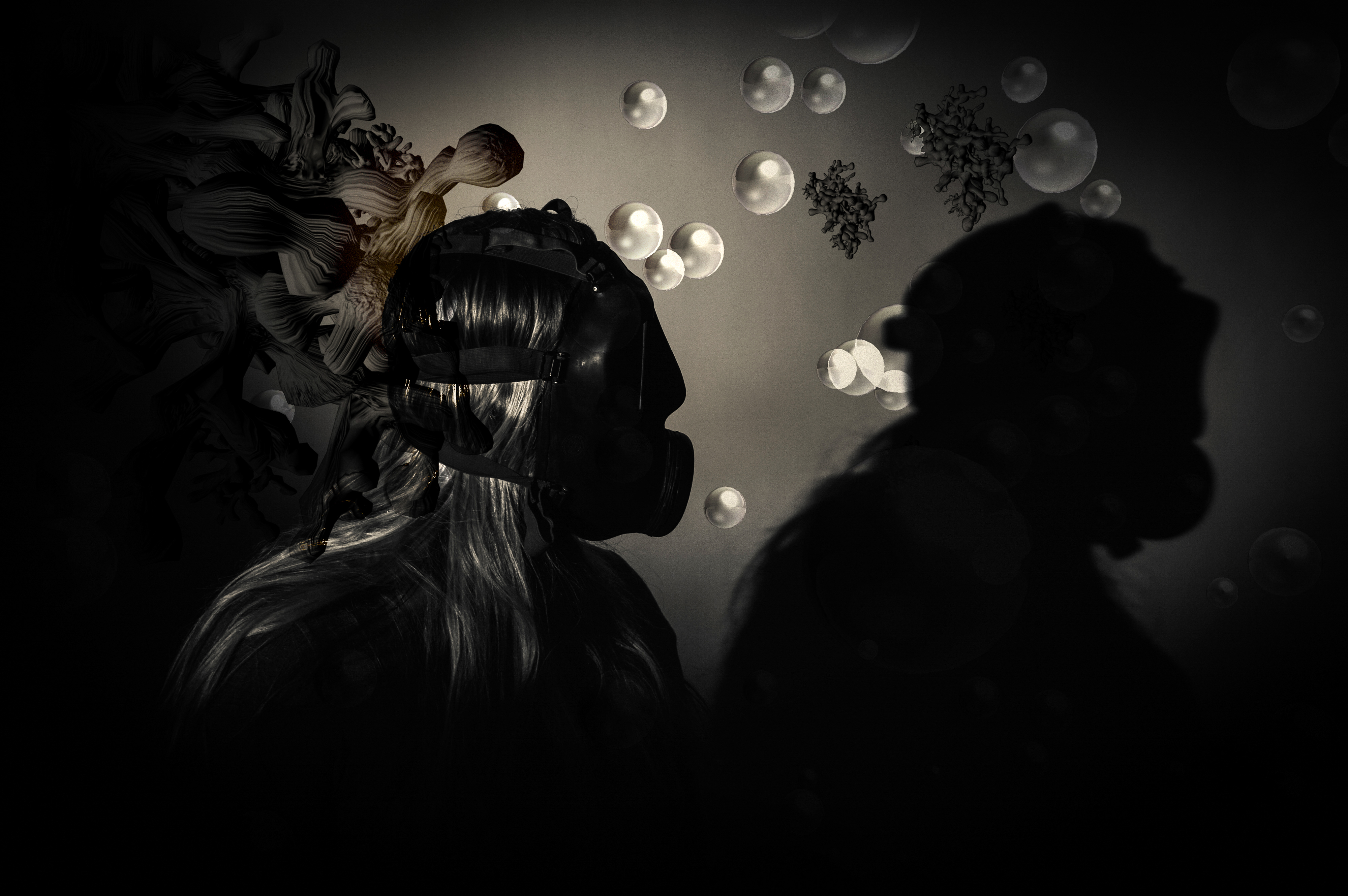
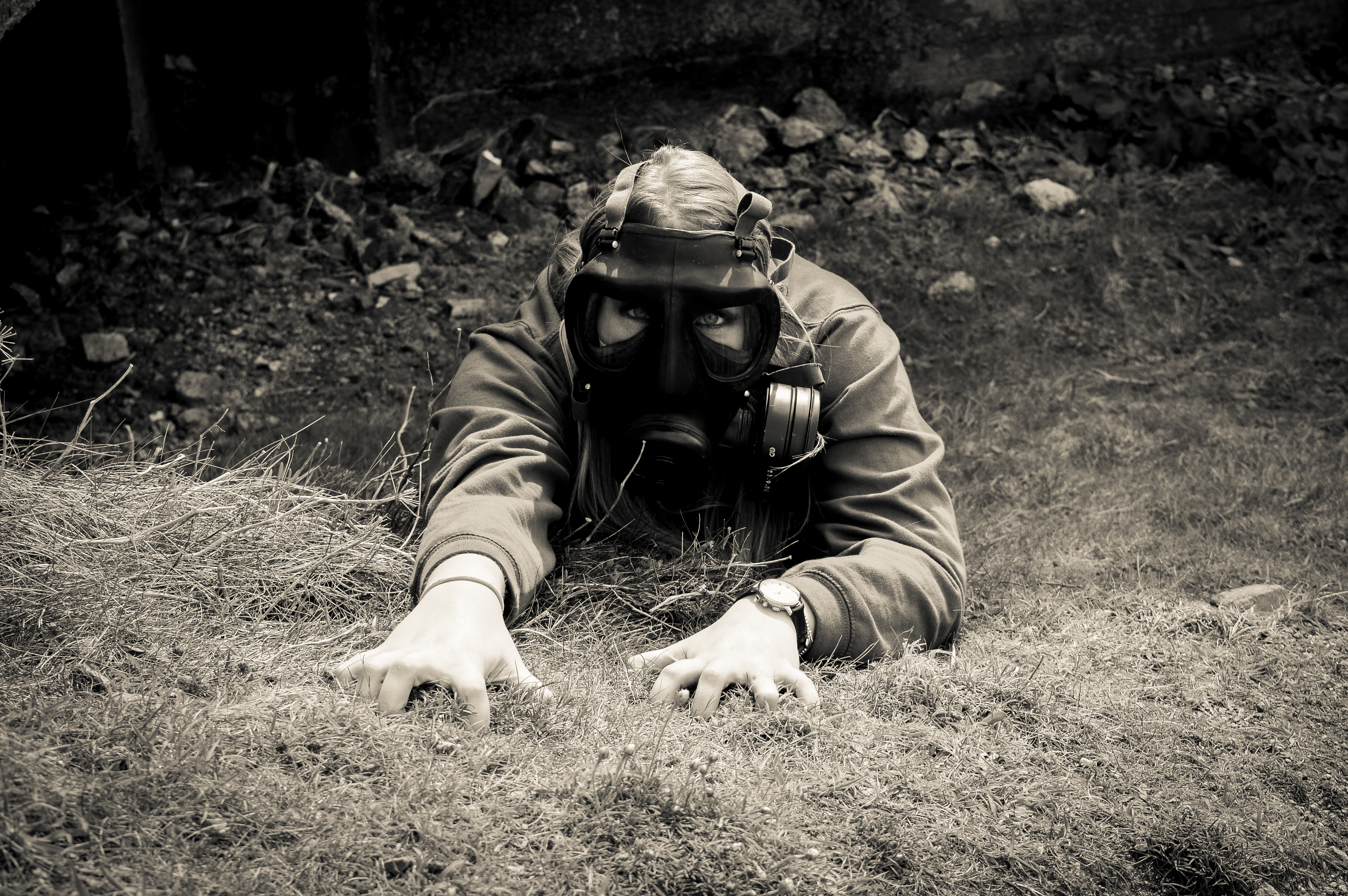
This image was taken in the studio with my model facing slightly to the right as before this i was using a flash setup. The spotlight was angled so that it only lit her shoulders and her head. I asked my model to turn to the right and partially look at her shadow to represent her acknowledging that she needs to change. Before this image was merged with the particles, it was edited in lightroom with the same filter which i have used for all my photos. Next was merging the image of the particles, i did this by flipped the image horizontally and zooming into to make it like the large particle is looming behind my model and she does not know it. This image of particles symbolizes the looming danger which is in the air which no one notices because it is apparently small but under a microscope they seem very large.
The original photo of my model was taken in the studio using a flash setup in which a flash was facing a white background and another flash was to the right of the model, This created a bright background which lit up the features of my models hair and face. The image of particles which i used on this photo made it a vintage tone but the particles weren’t as visible if it was put into more black and white colour.
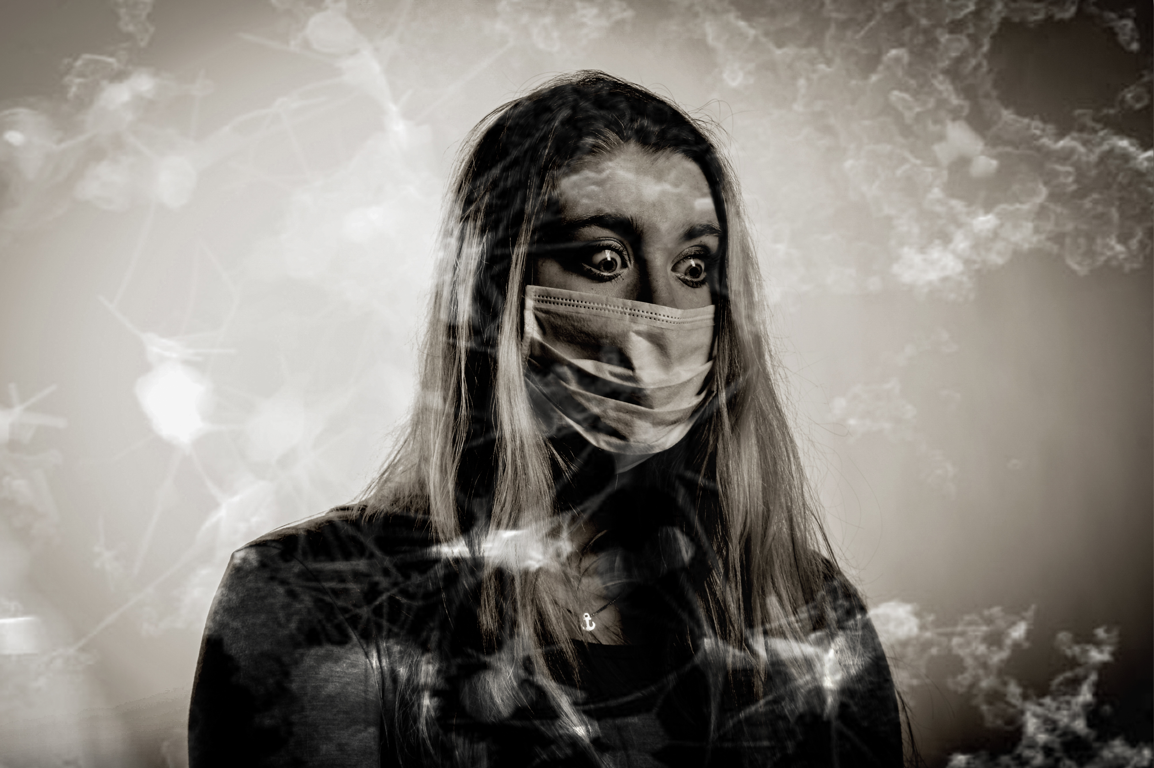
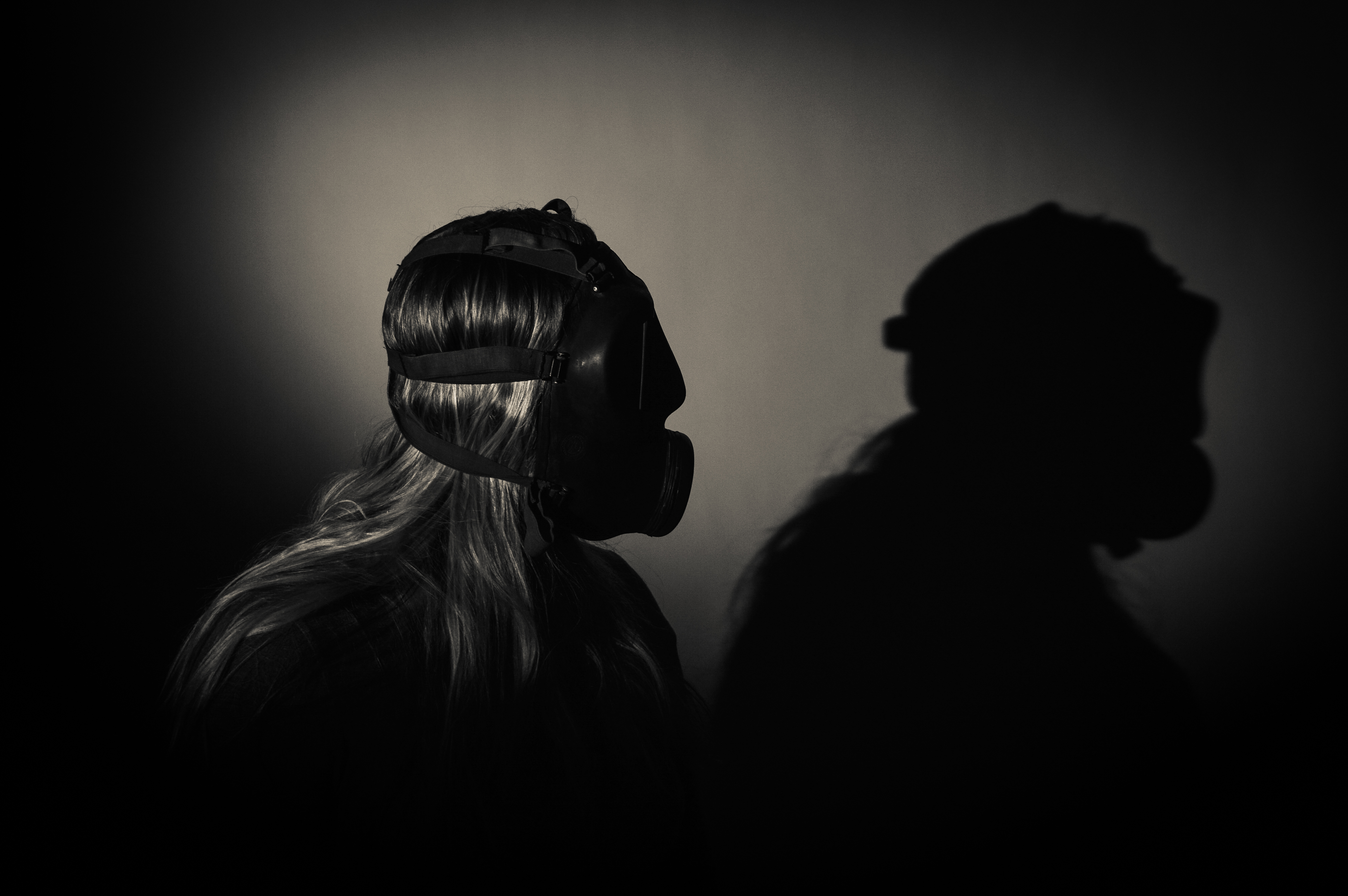
This image is very strong mostly because of her eyes as she is showing lots of emotion which is why this image stands out in my book. I put it as a double spread because i think it is worth that and because this image is in landscape. This image has more of a vintage colour than the rest but it i had changed it to the standard black and white filter, the particles would not be as visible.
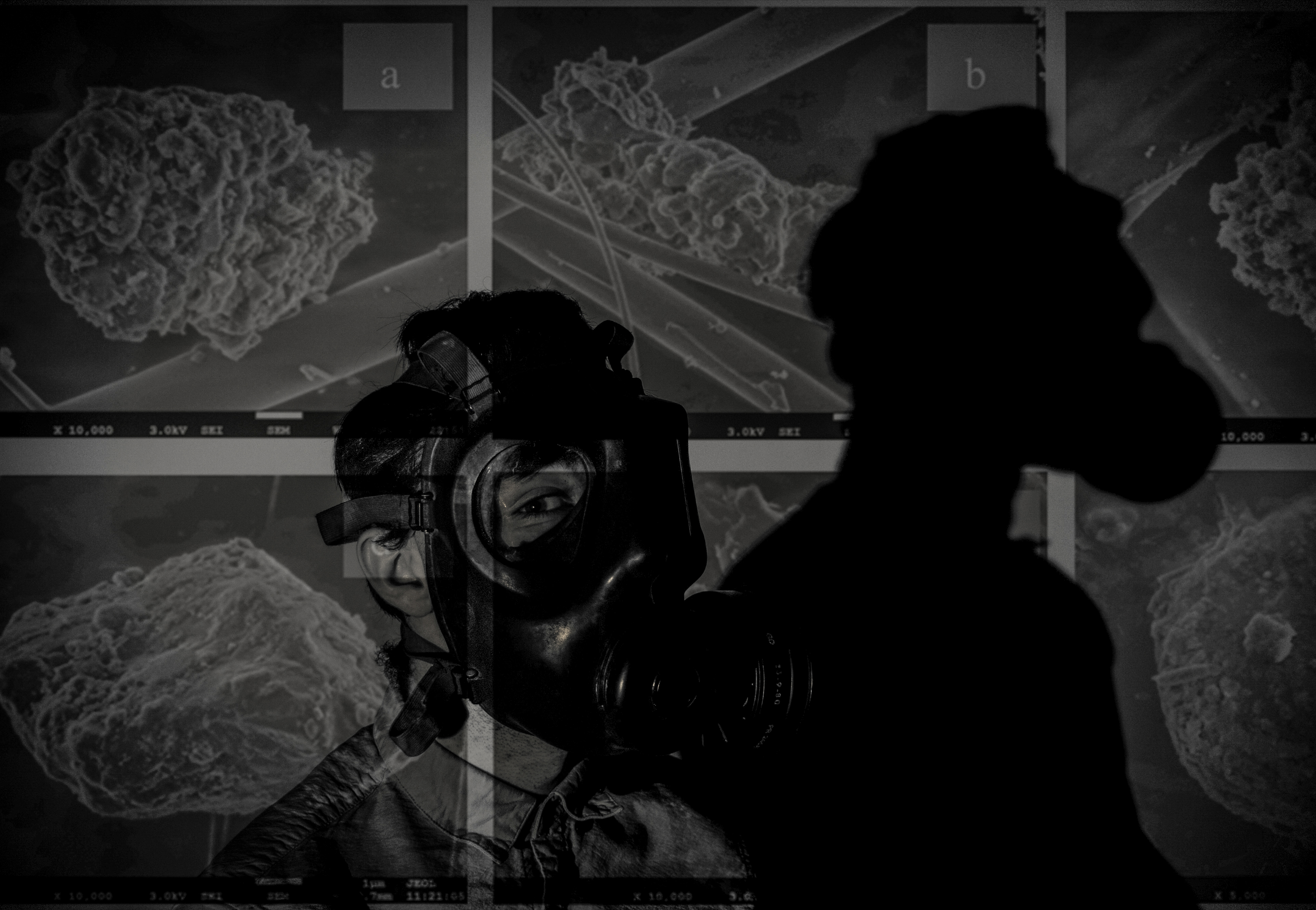
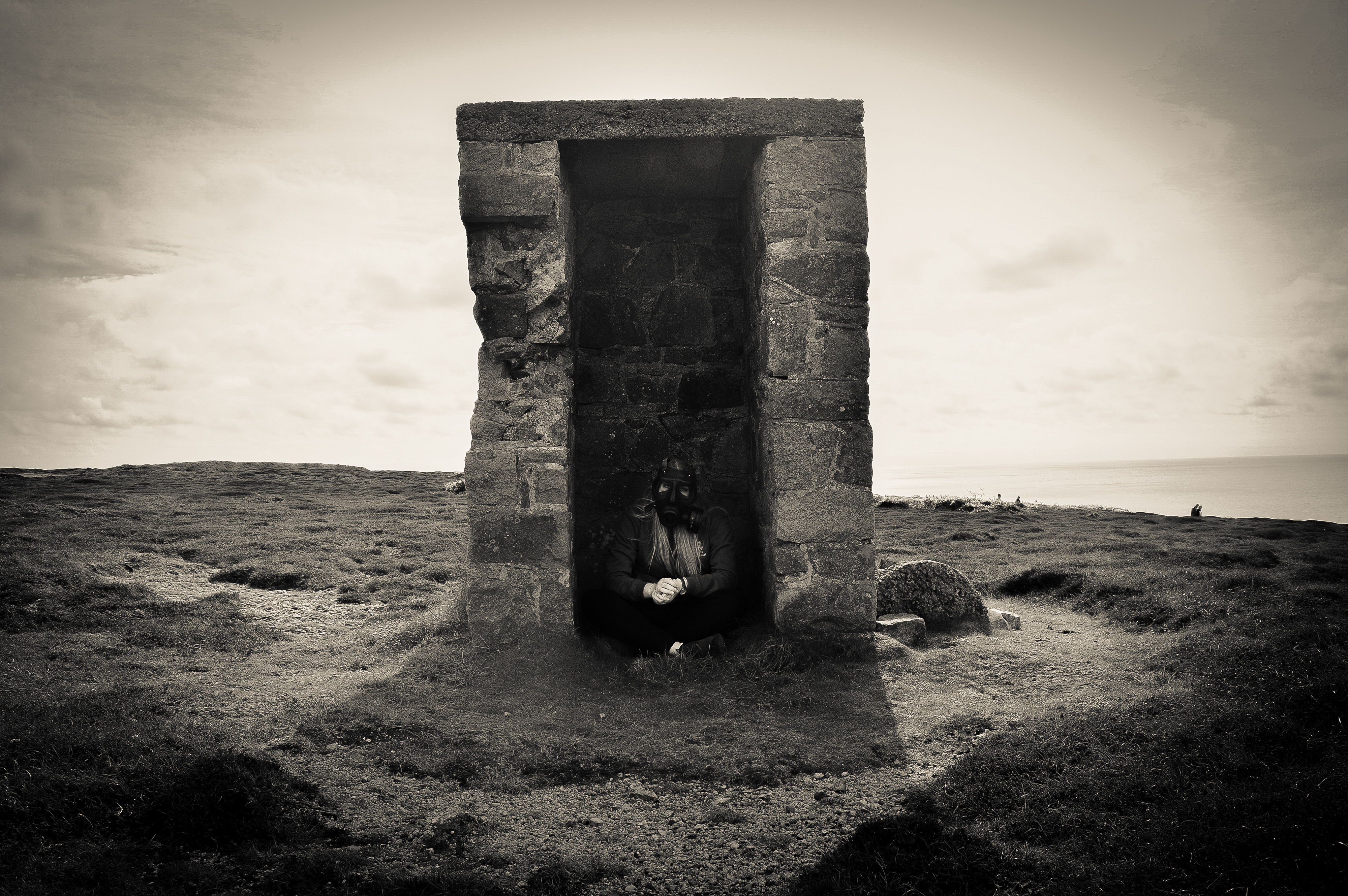
This image looks like it is being projected with particles but it is actually merged. This image worked really well as a double page spread in my book. However, i slightly wish that the image was not so dark because it does not match the brightness of the other images.
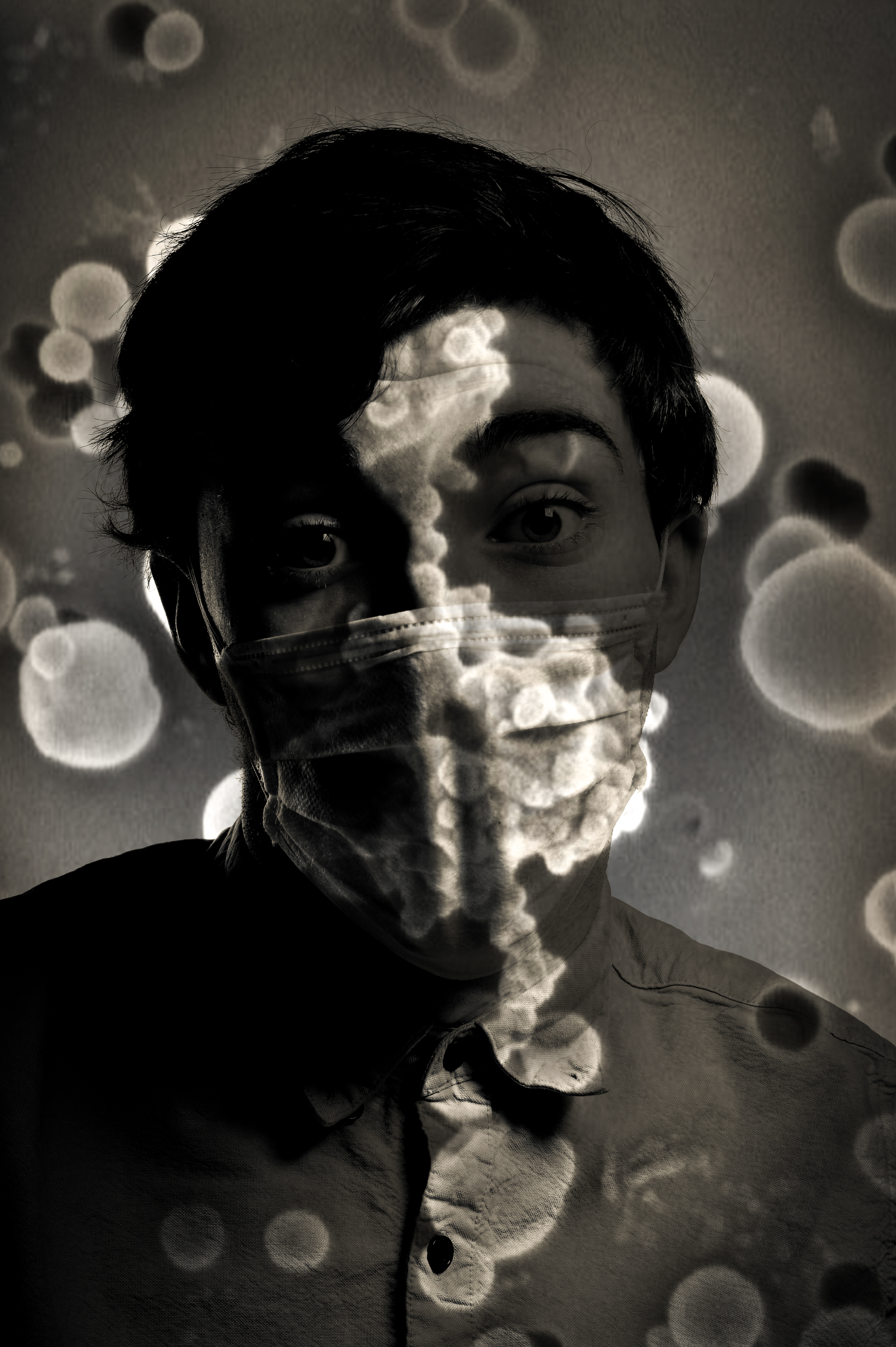
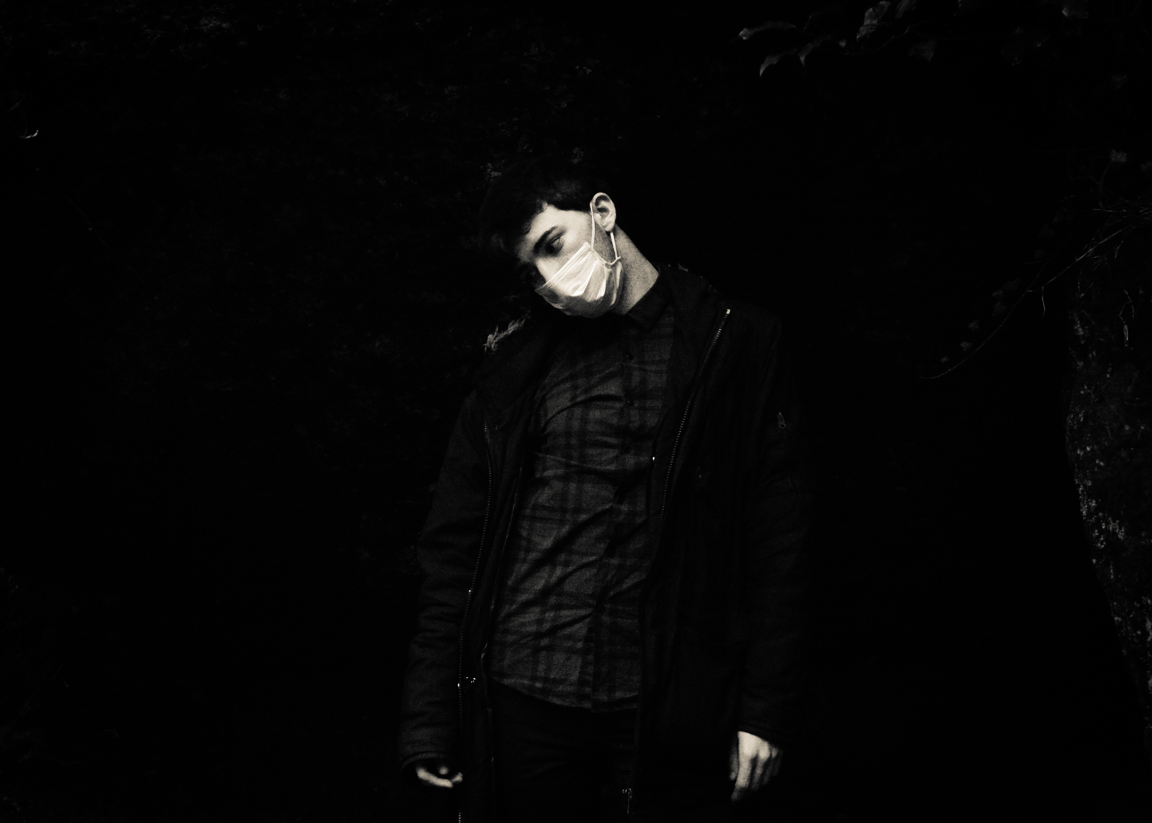
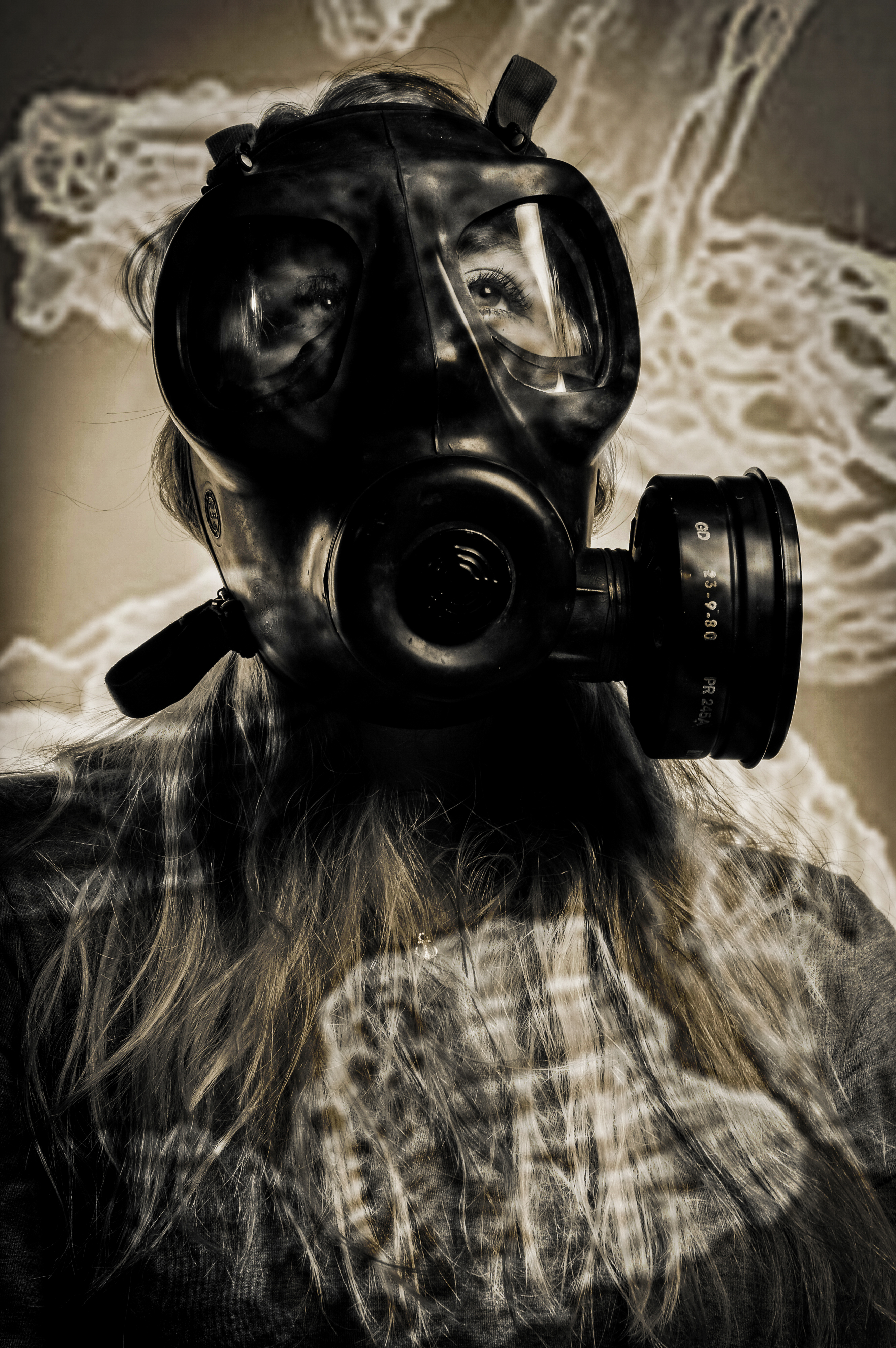
This image is the best because it shows how invisible pollution particles are everywhere. How scary it is that it attaches to our mouth and faces. I like also how the particles are much brighter than the rest of the images which makes everything stand out but the sharpness of the image behind has stayed.