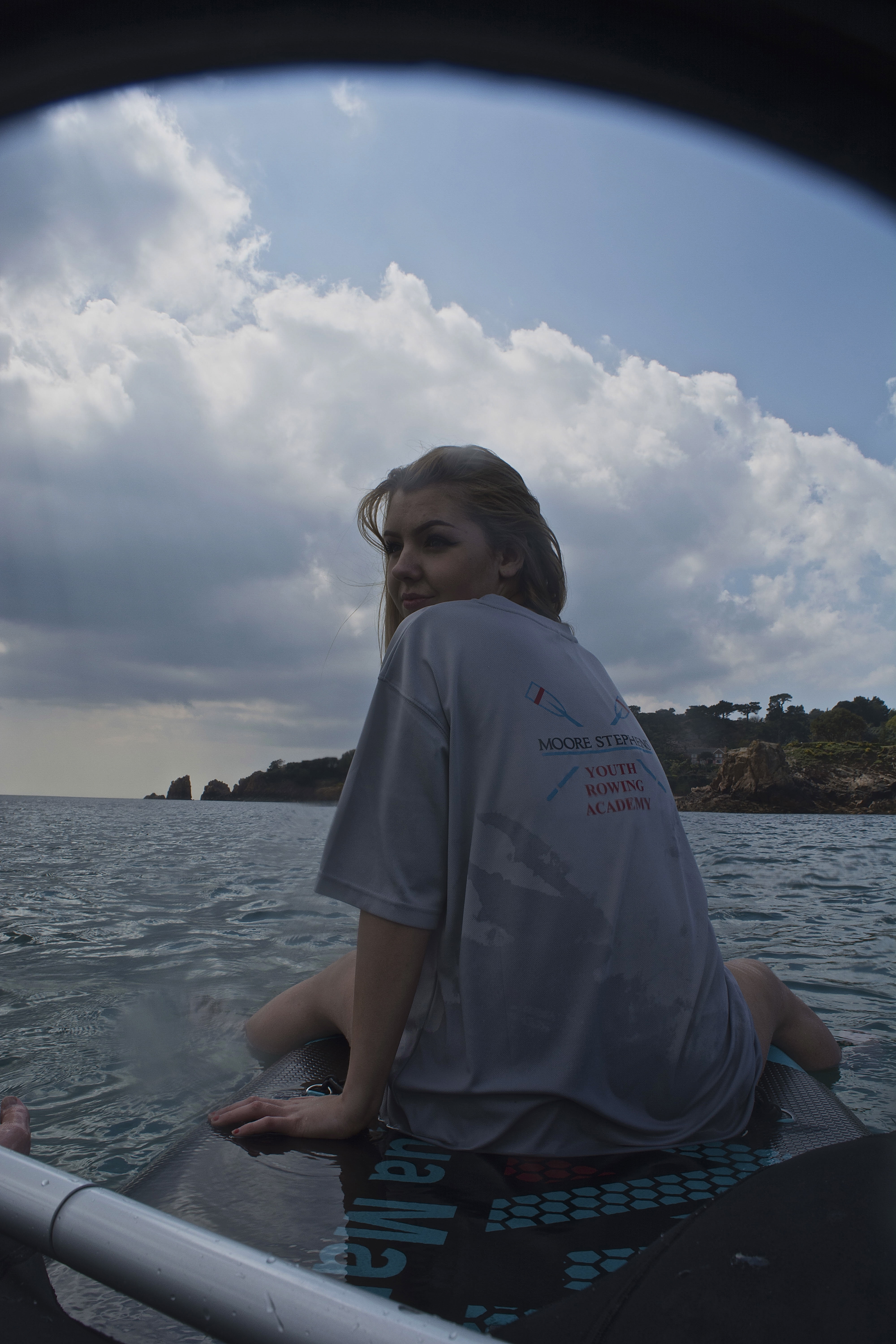
This shoot was more difficult then I expected, due to me being deep in the water myself, it was hard to get a good balance and make sure the photos were focused.
This shoot worked well, as because neither of the models are wearing wetsuits, it made it look less cold than it actually was, giving it more of a tropical feel. Unfortunately the weather wasn’t the best for this particular shoot, as the bright lighting coming from the clouds made the lighting harsh on the models faces. Although, the benefit to the lighting was that it allowed enough lighting to create interesting textures in the sky and on the sea.
This is my favorite image from the shoot, as the lighting is perfect on his face, as it makes his features and emotions stand out, but are not harsh on his face. The fact he’s wearing a white T-shirt and is in the middle-ground works nicely as it draws your eye to him immediately, then after looking at him your eyes go towards the buildings in the background which makes you look at the paddle boarder, which is important for feeling the mood of the photograph. The thing I like about this image is that it looks like I’ve just taken a photograph of a young boy who’s far out and sea, which gives it more character.


Unfortunately, with this photograph the waterproof case got in the way, and made it have a black line over the top. This ruins the photograph as if i was to crop the image it wouldn’t be an even balance, although the black takes away from the photograph as well. Also, this image has been taken when there’s lots of raindrops on the lens and therefore making some parts of the image slightly out of focus, as shown on her chin area, which makes it look worse in the way it would look good if it was all detailed, however at the same time adds character to the image. My favorite aspect to this image is the smile on her face, and the way the hair is blowing in the wind as she looks over her shoulder at the camera.


This photograph works well, as it looks as if there is a tropical island in the background. I also like the the different textures, of the clouds, the sea and the rock combined. The downfall to this image is that the exposure on the models face is too dark and one can’t see her features properly. This is due to the model facing towards the sun, therefore making her become a silhouette, which I’ve brightened up in Photoshop.

