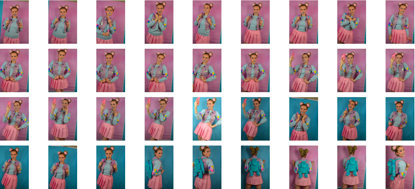


Above is the initial contact sheet from my second, more fashion forward art student photoshoot. As seen above I experimented with using both my pink and blue backdrop but during the editing process I decided to use the photo with the pink backdrop incase I decided to display both art student stereotypes as a diptych. If I did decided to do this I felt that there would be a greater sense of contrast if the images had different background colours and the different coloured backgrounds connote ideas of masculinity and femininity, the first scruffy art student is more masculine and the second more fashion conscious art student is more feminine. When shortlisting the photos I also decided against using photos from the second outfit I used because I liked that the blue of the fluffy monster’s inc backpack would work well with the blue background of another images if I decide to use it as part of a diptych.
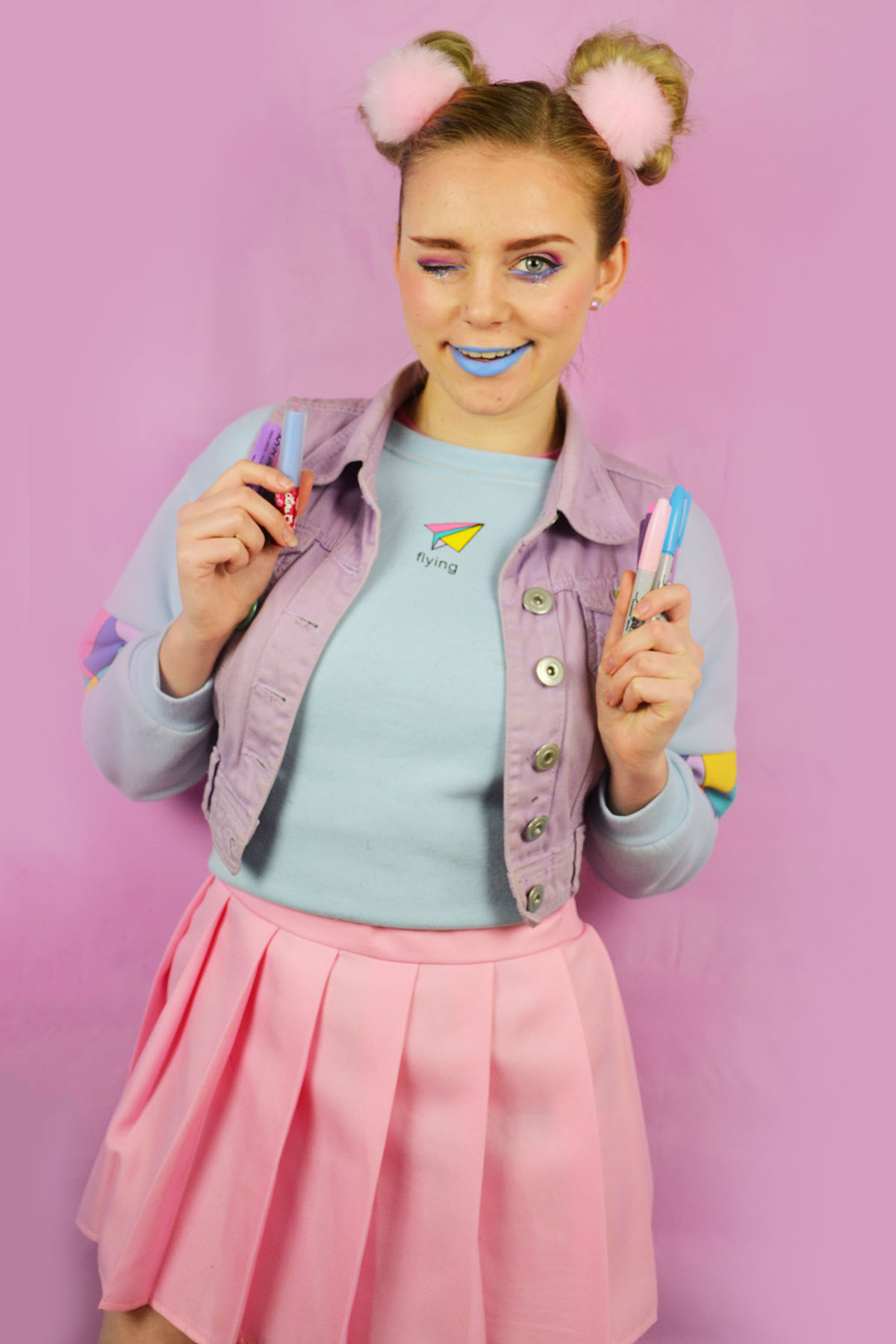
Here are the shortlisted photos from my fashion forward art student photoshoot. I selected these images because I felt that they captured the bubbly nature of the instagram active, stylish art student. As stated in my planning post I experimented with miming taking selfies and I shortlisted one of these images (above, centre). I edited these photos by cropping them as appropriate, increasing the brightness and contrast and slightly adjusting the levels. I also used the spot healing tool to remove any distracting blemishes and using the brush tool to smooth out the background as my pink backdrop was very wrinkled, even after ironing it as I couldn’t use the iron on too higher setting as I was at risk of melting the vinyl.


