Photoshop Task 1
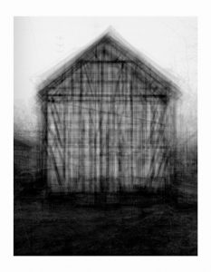
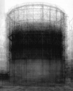
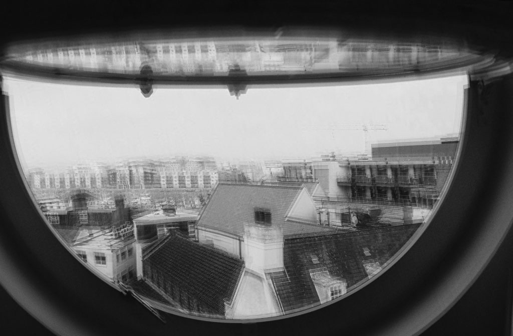
We were set the task of creating an image inspired by Idris Khan’s work with layering and shifting photographs. He does this by taking multiple images of a single object at slightly different positions and then layering them in Photoshop to create these abstract scenes of seemingly inanimate objects. Often photographing industrial buildings like oil or natural gas containers with wire frames when shifted they have a ghost like appearance to them. Incredibly dramatic they explore the environment in the abstract and unusual. it is an odd method but it works well and creates interest within the images that really helps to get viewers to look more in-depth at the images to try to work out what is gong on.
To try and emulate this to make my own image like this I used a digital technique that produces similar results and only requires one photograph to be taken. The method involves:
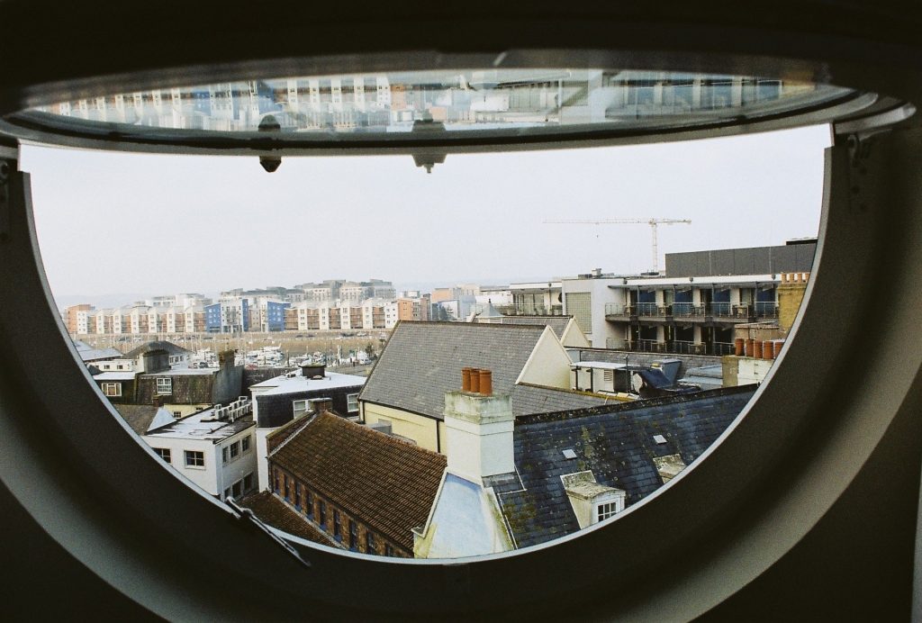
- Opening the selected image in Photoshop. For my attempt I used a photograph that I had taken on 35mm film so the quality is not too great.
- Copying the image a number of times. For my attempt I used 10 additional image layers and a black and white layer later.
- Once all of the layers are in, each one should be shifted slightly.
- Now different blending options can be used to change the visibility of the different layers. For me this mostly involved changing the opacity but some of the images were brightened and I even made some not visible at all because I did not think that they added anything to the image.
- I then changed the position of some layers individually to give the image a more “shifted” look.
- the last process that I used was to crop the image so that there was a solid edge around the image.
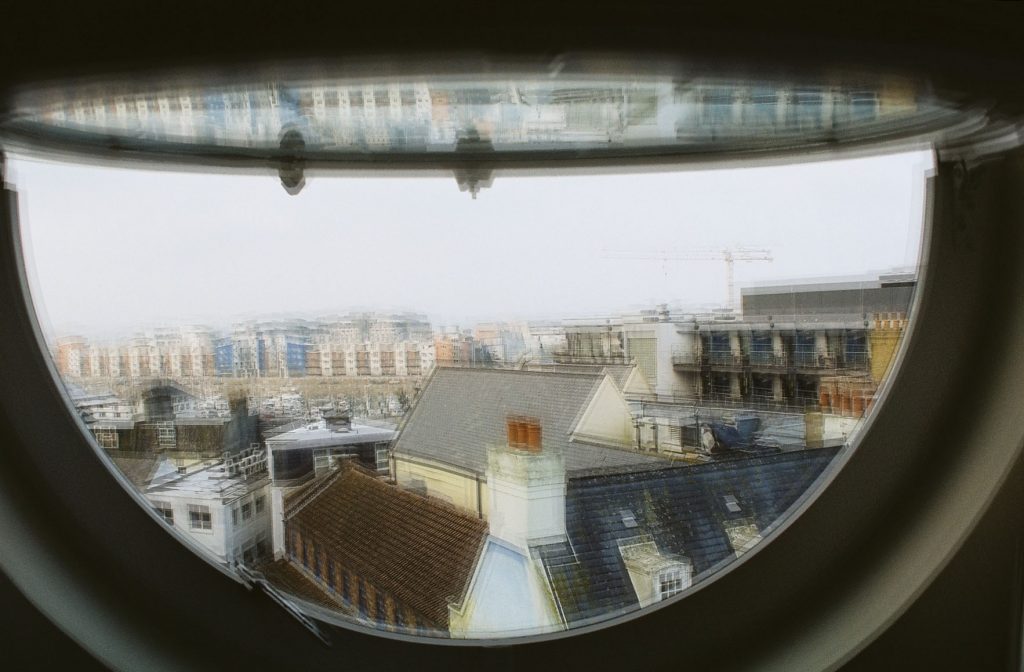
The first edit was the result of following that list of processes, it has the obvious shifting that has been done to it and the different angles also really help to give this its shaken effect. The second edit was done to try to better emulate Khan’s work, I simply added a black and white layer to the image, again in Photoshop. This gave the image a much more desirable look to it, it feels more gothic and more reminiscent of Khan’s work. Although it does not have the same feel because it does not have a framework to shift around it certainly looks similar and has the same general feel to it.

This screen shot shows the different layers and how I went through and adjusted them all individually. In this you can see the B&W layer that has not been set visible until I had the image looking good first. Although the images does not have too much distortion or ghosting to it and so is still more visible than Khan’s work I still like the way that it turned out quite a lot.


