
// FI N A L P R E S E N T A T I O N //
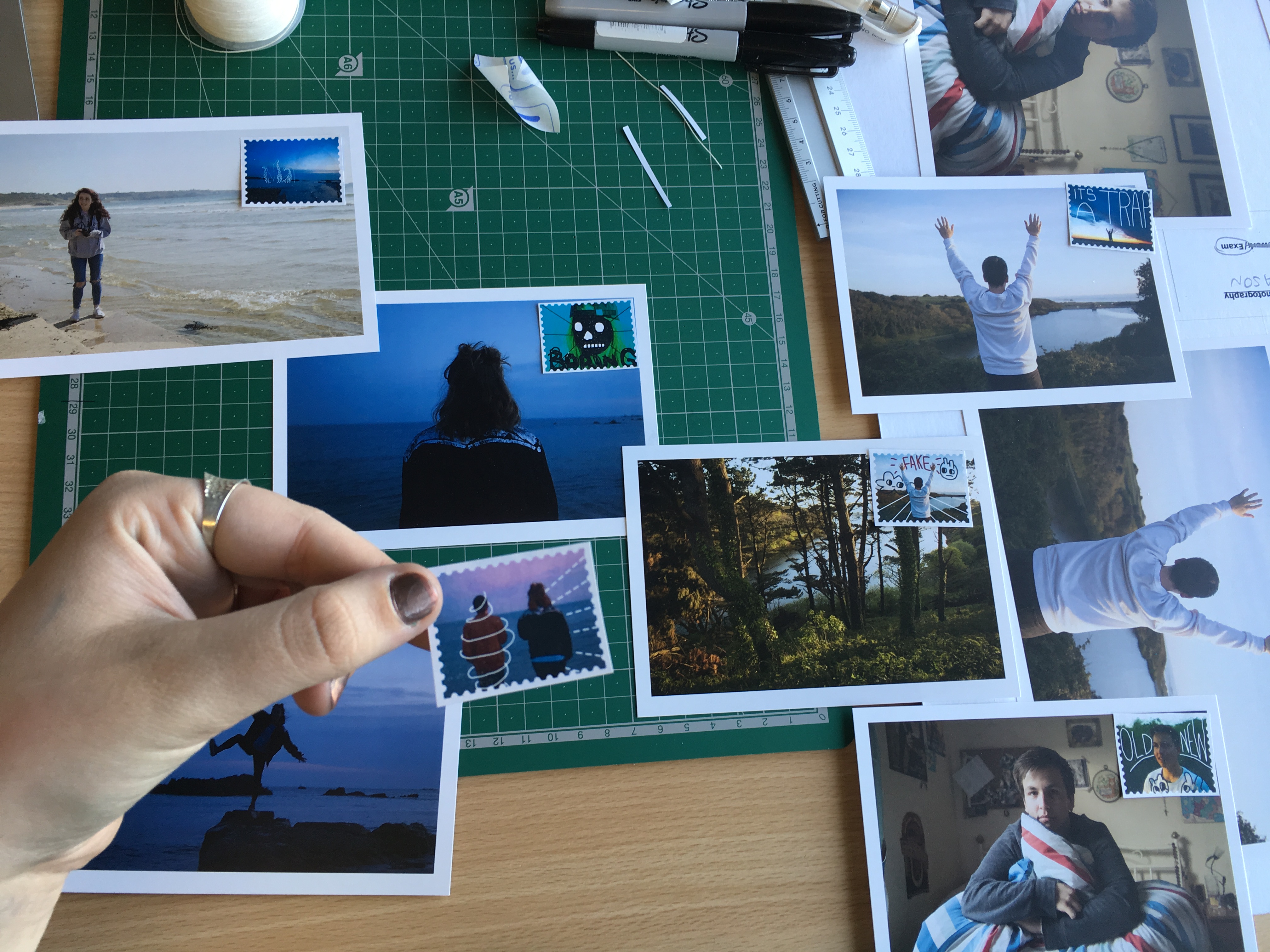
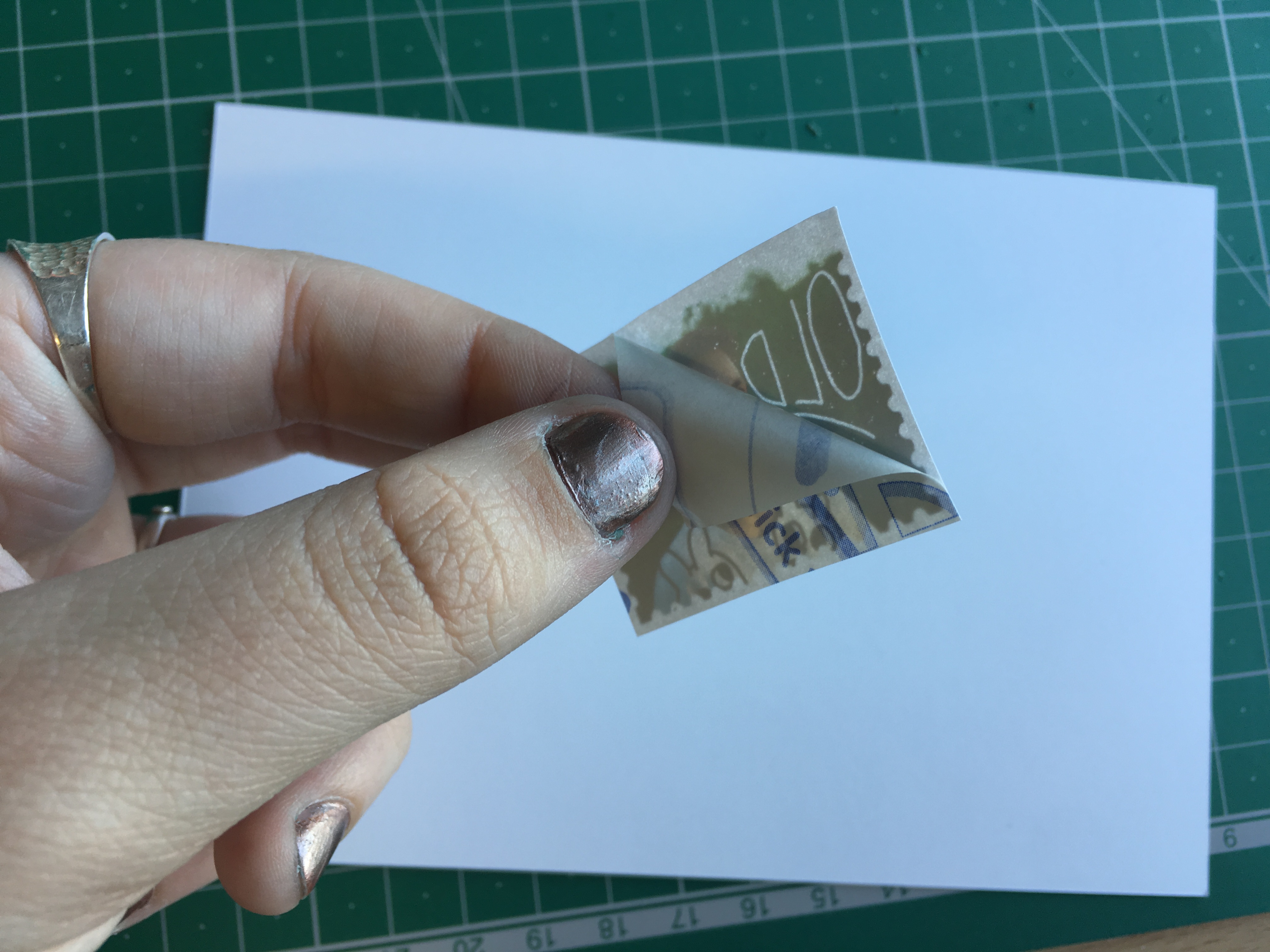
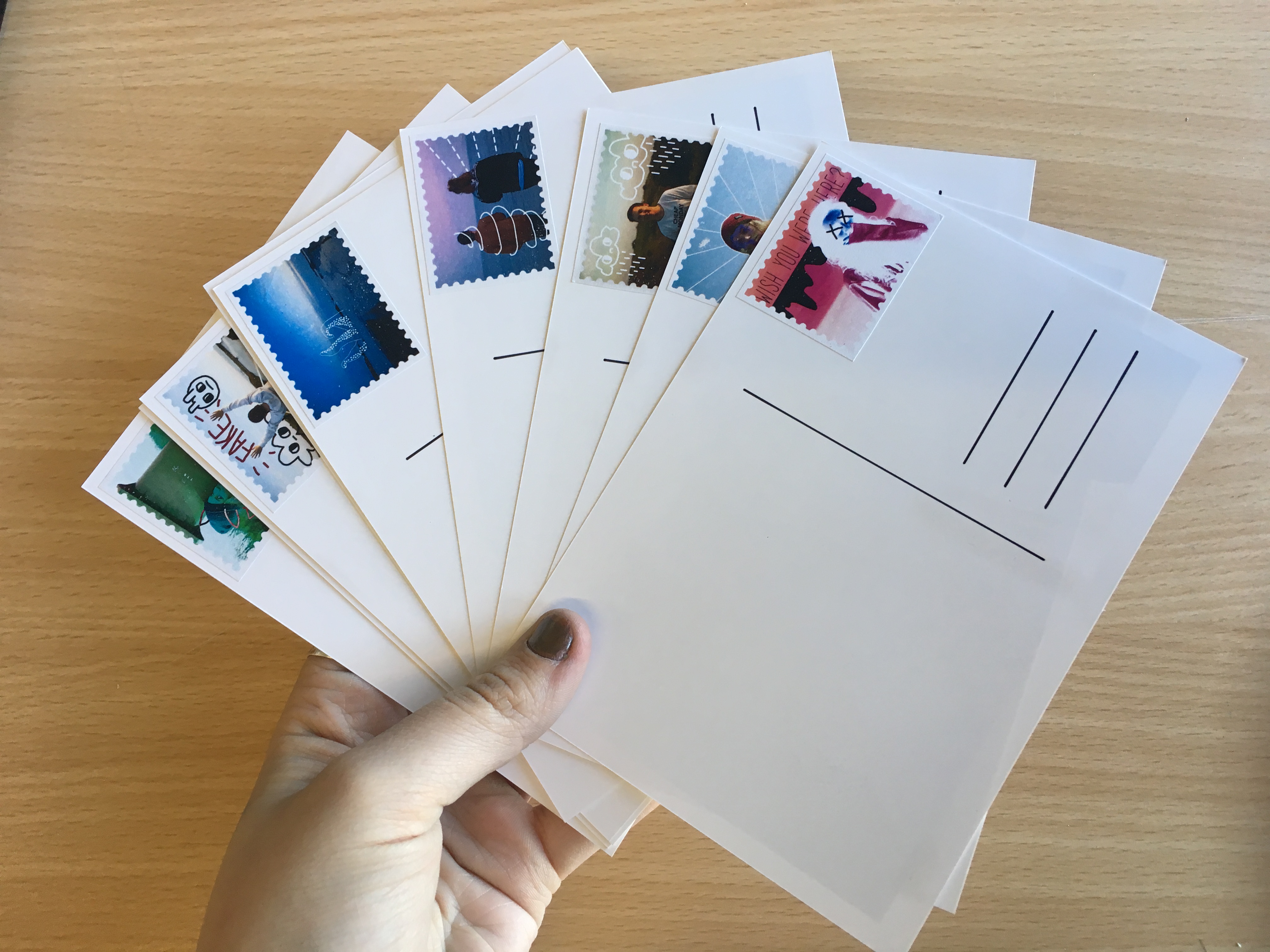
Using inspiration from Harriet Plaskitt’s post card illustrations (two of which are shown below), I handmade the backings for my final postcards. These were printed as A6 images onto high quality photo paper. The backings were drawn with permanent ink pens and the stamps applied by hand after being printed onto high quality sticker paper. All together, I have 12 final postcards and a set of 12 matching stamps. On top of this, I have also created a set of four images which have been printed at A5 size and framed in a white window mount. Below are captioned process shots for the manufacture process and final pieces.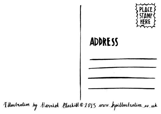
P O S T C A R D S
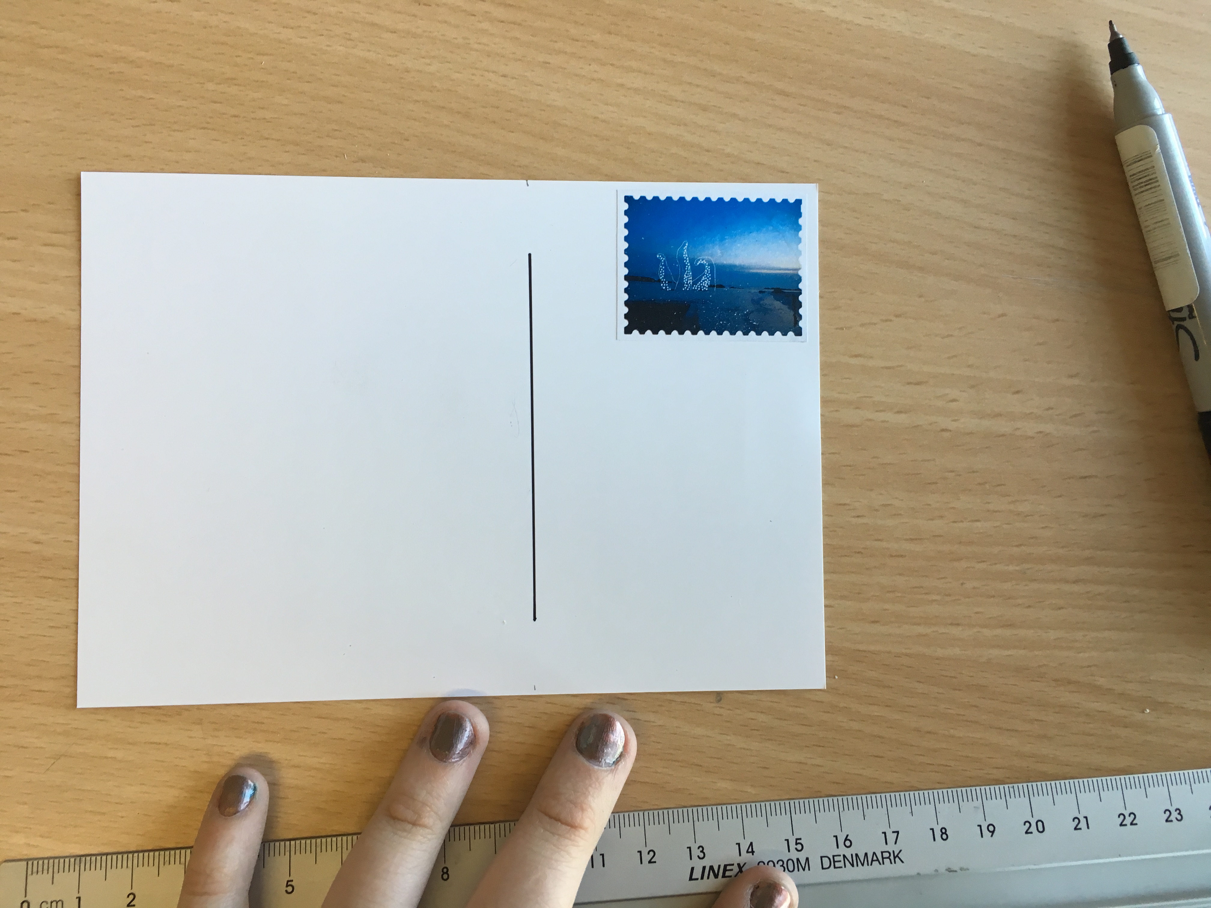
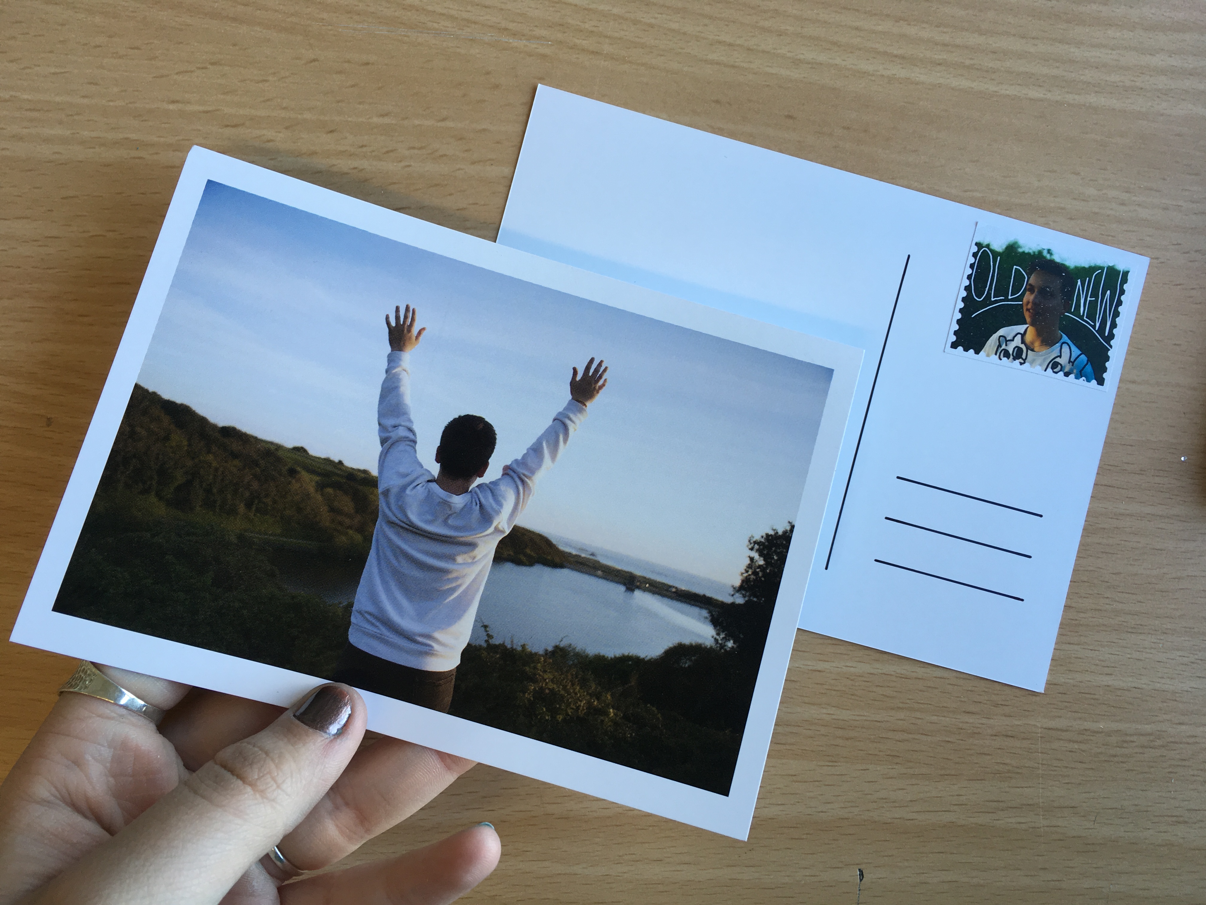
The post cards in this project made up the main body of work for the series. The set includes 12 images showing four characters and their relationship with the island of Jersey. The central focus for this work was to form a body of work that would reflect people’s love for the island and the way people interact with landscapes and environments of significance to them as individuals. Below are a series of images showing how the post cards were made once they had been printed – in particular with reference to the back design of the post cards and the addition of the graphic stamps.
L E P O R E L L O
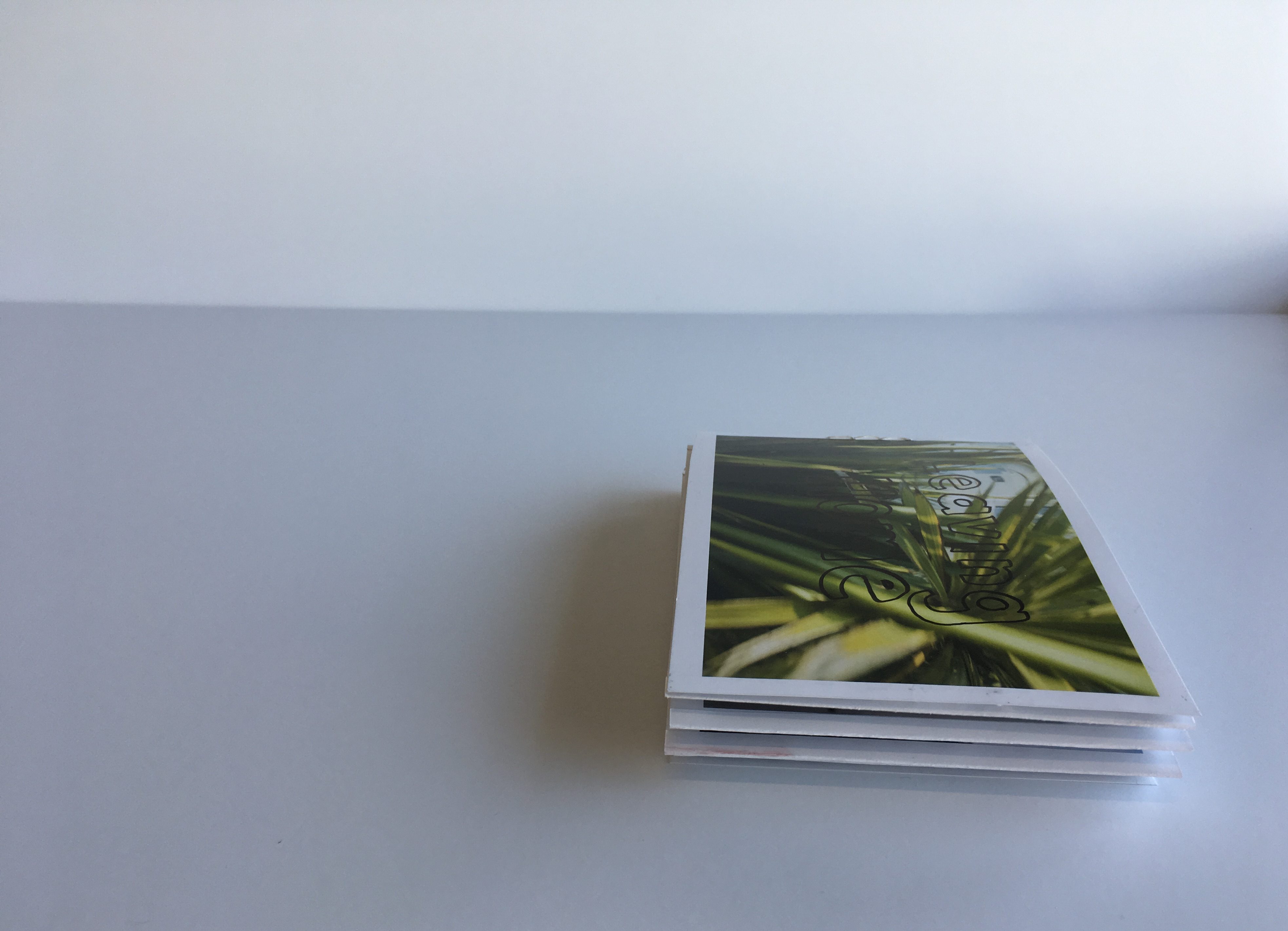
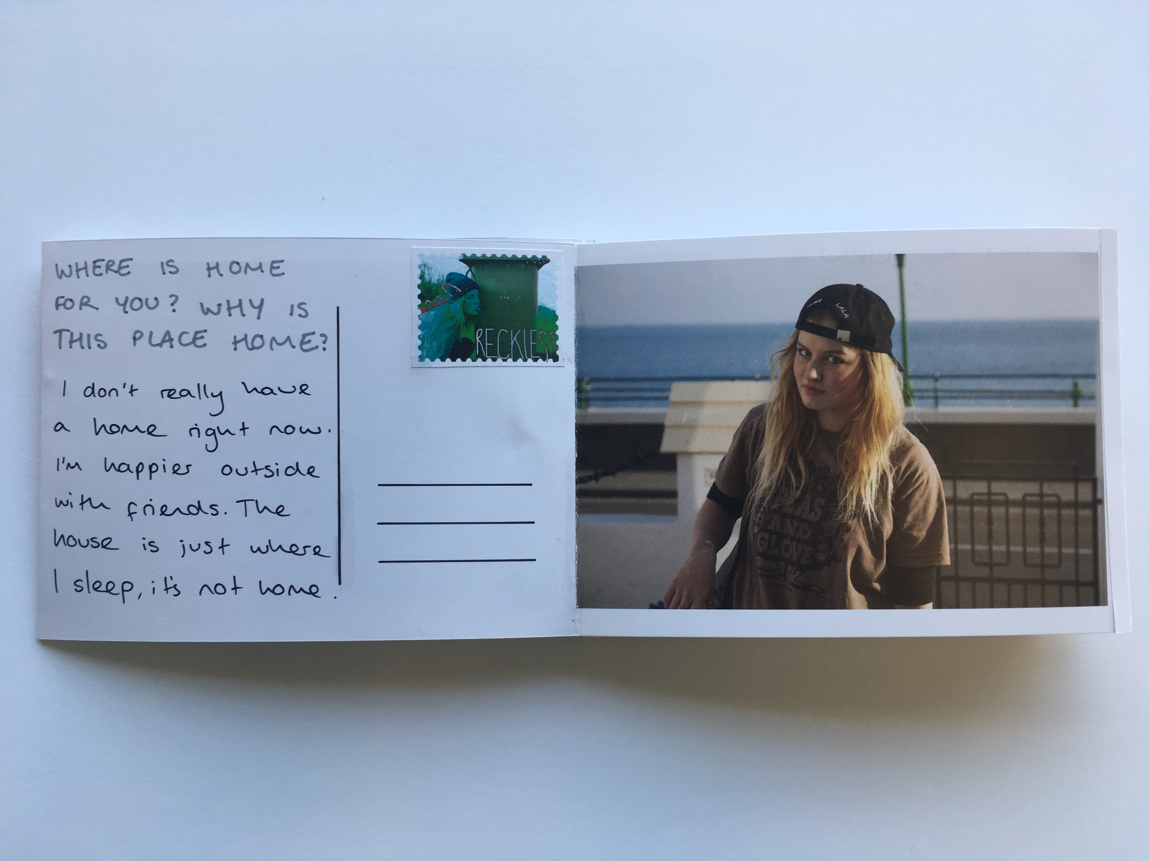
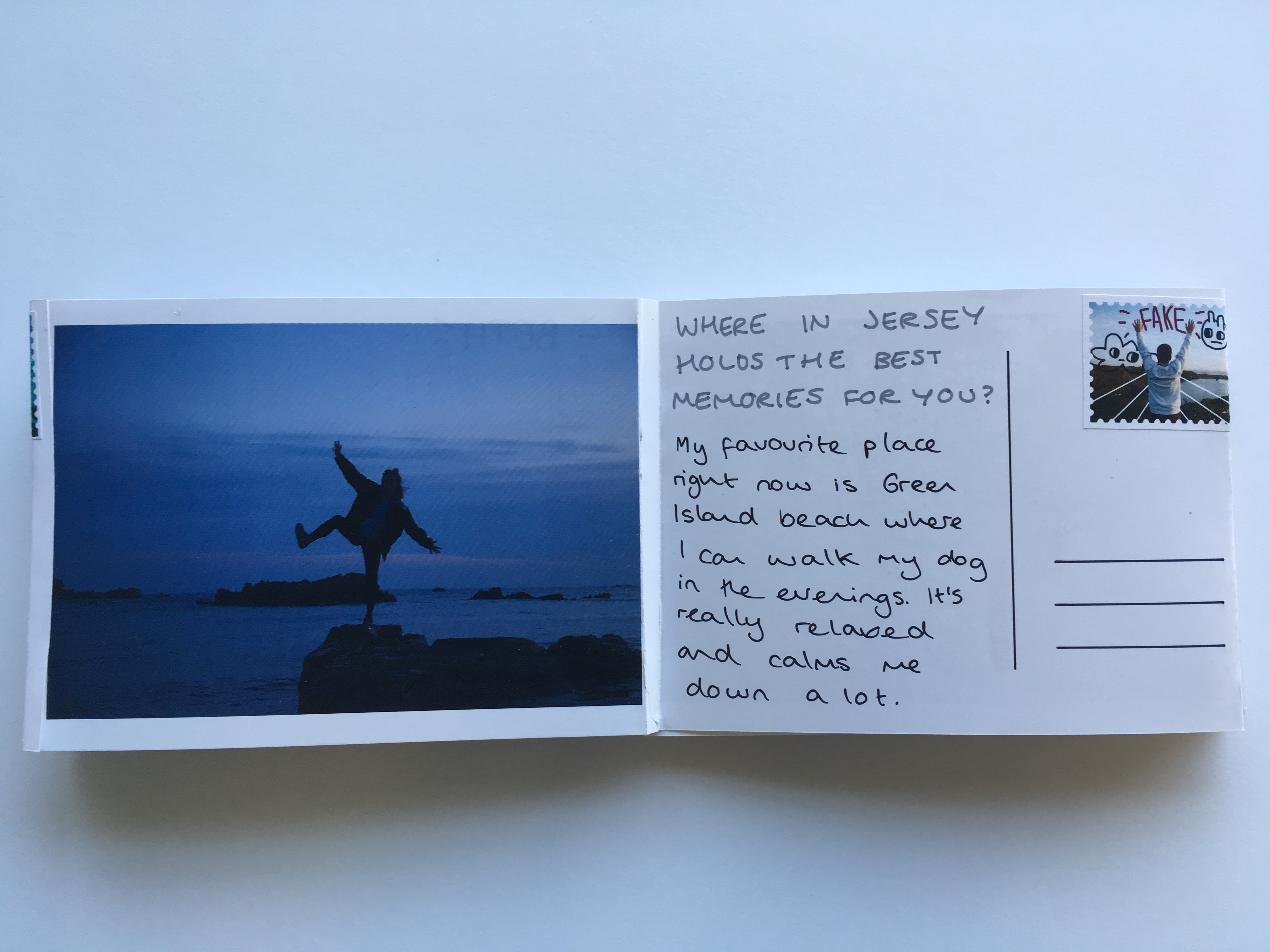
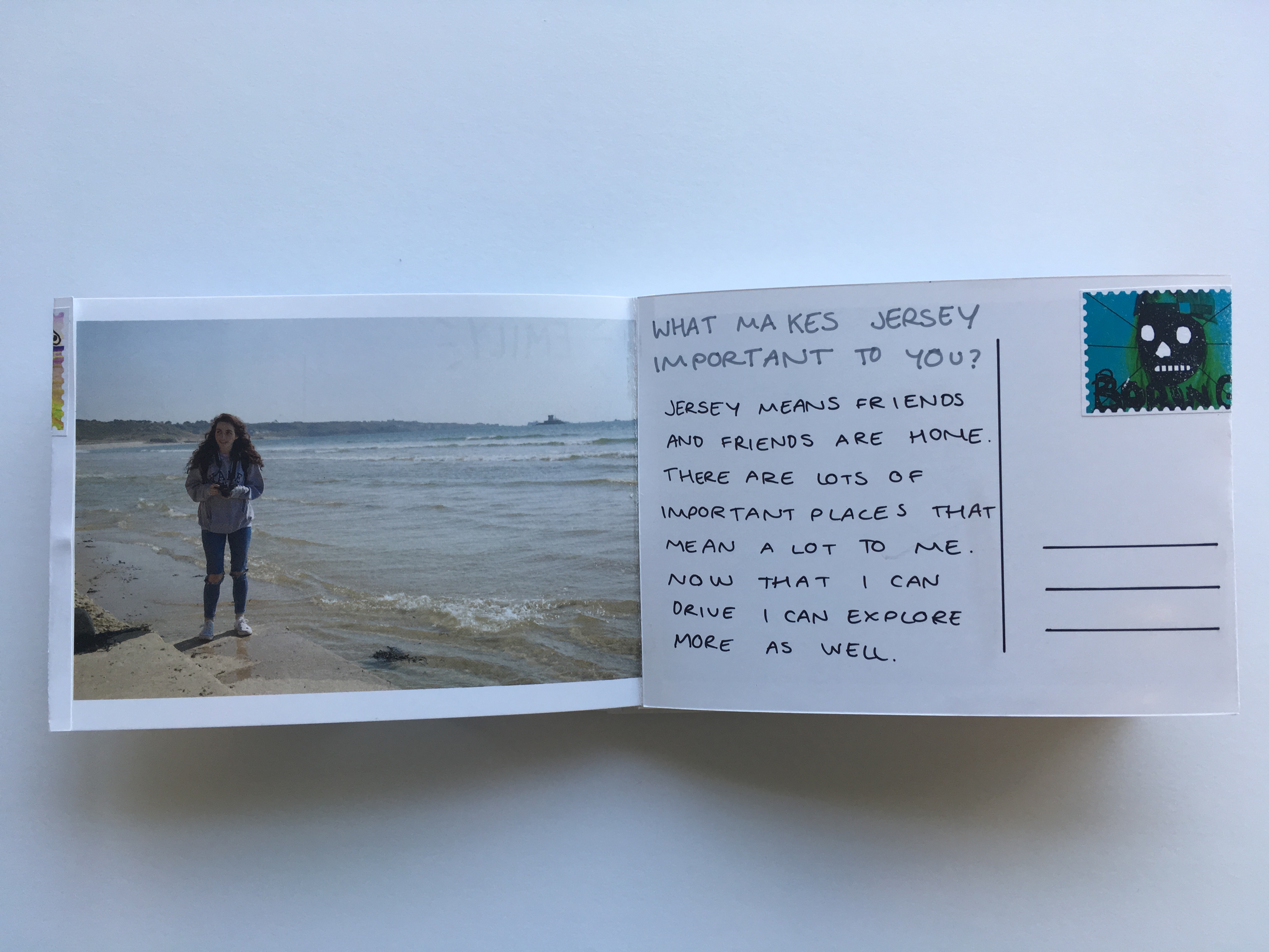
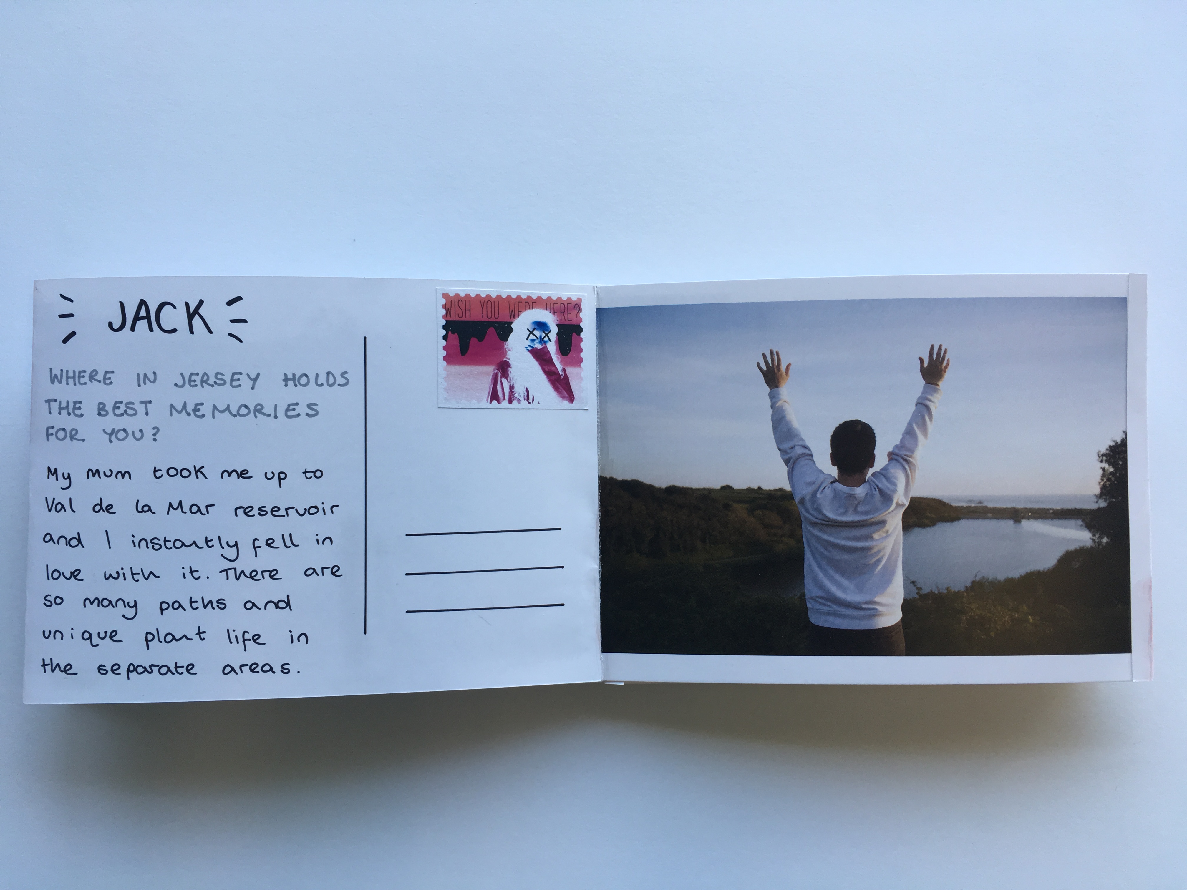
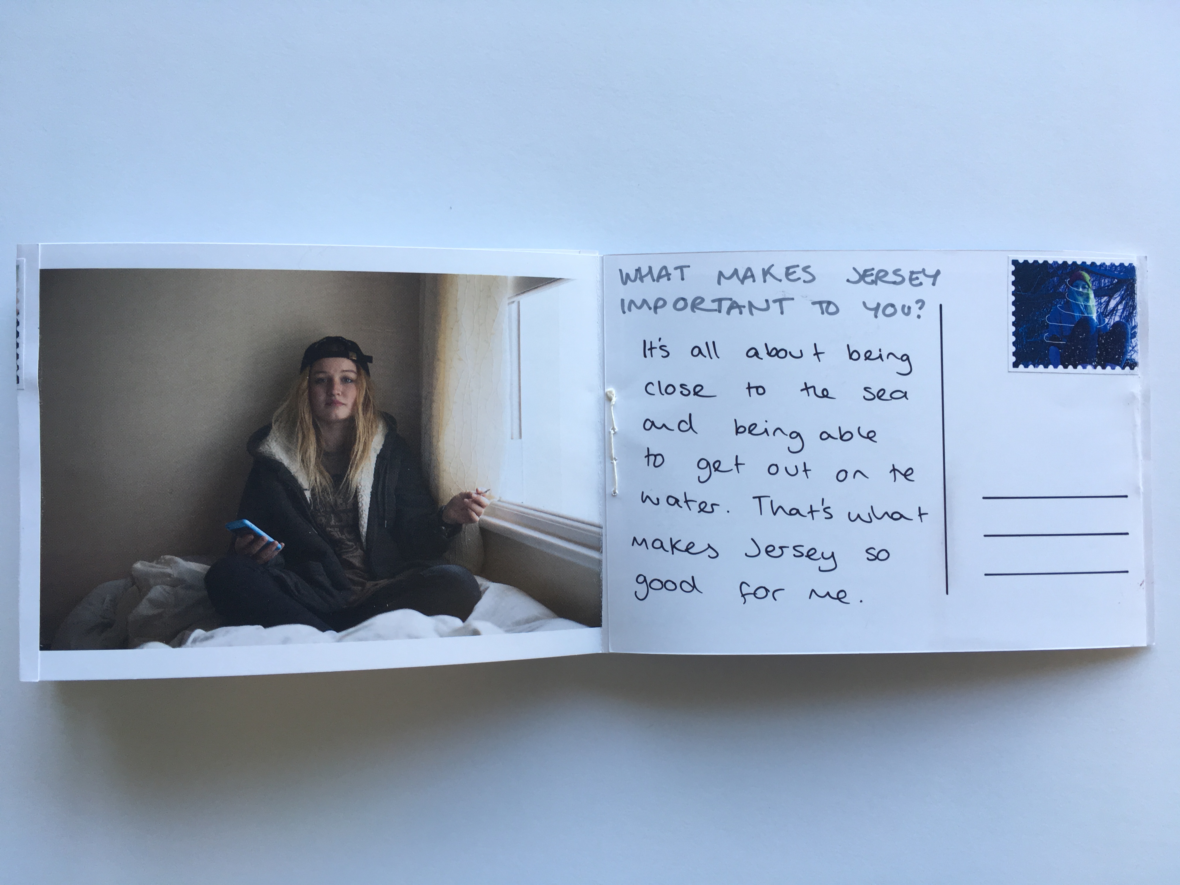
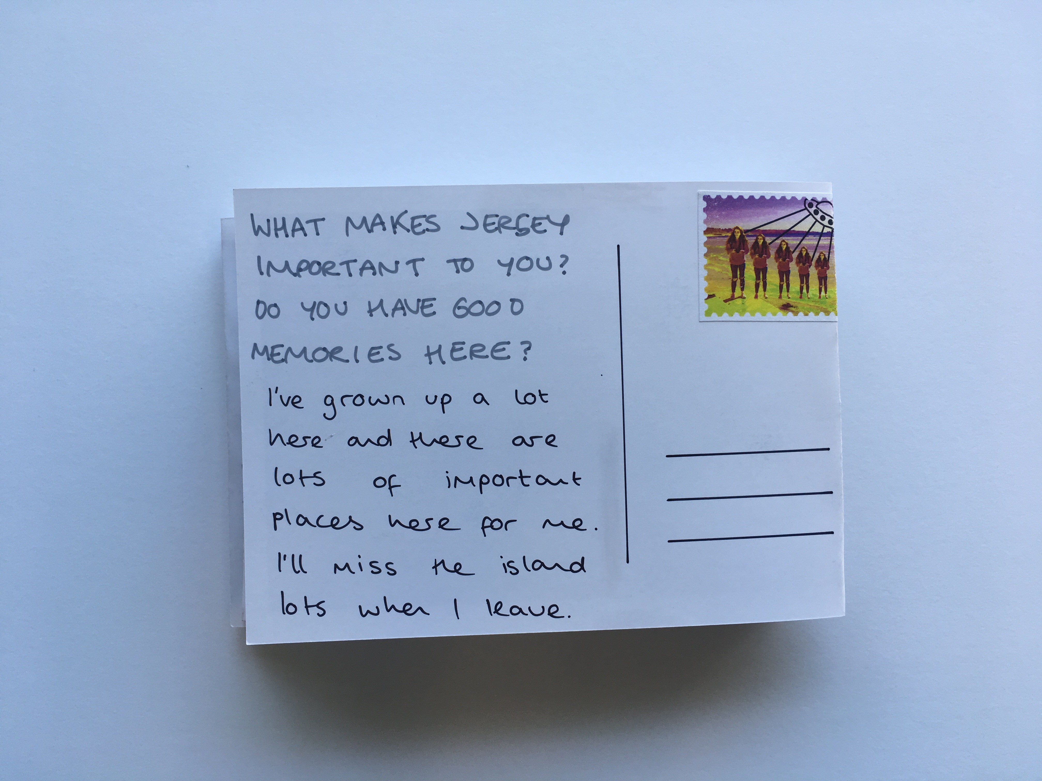
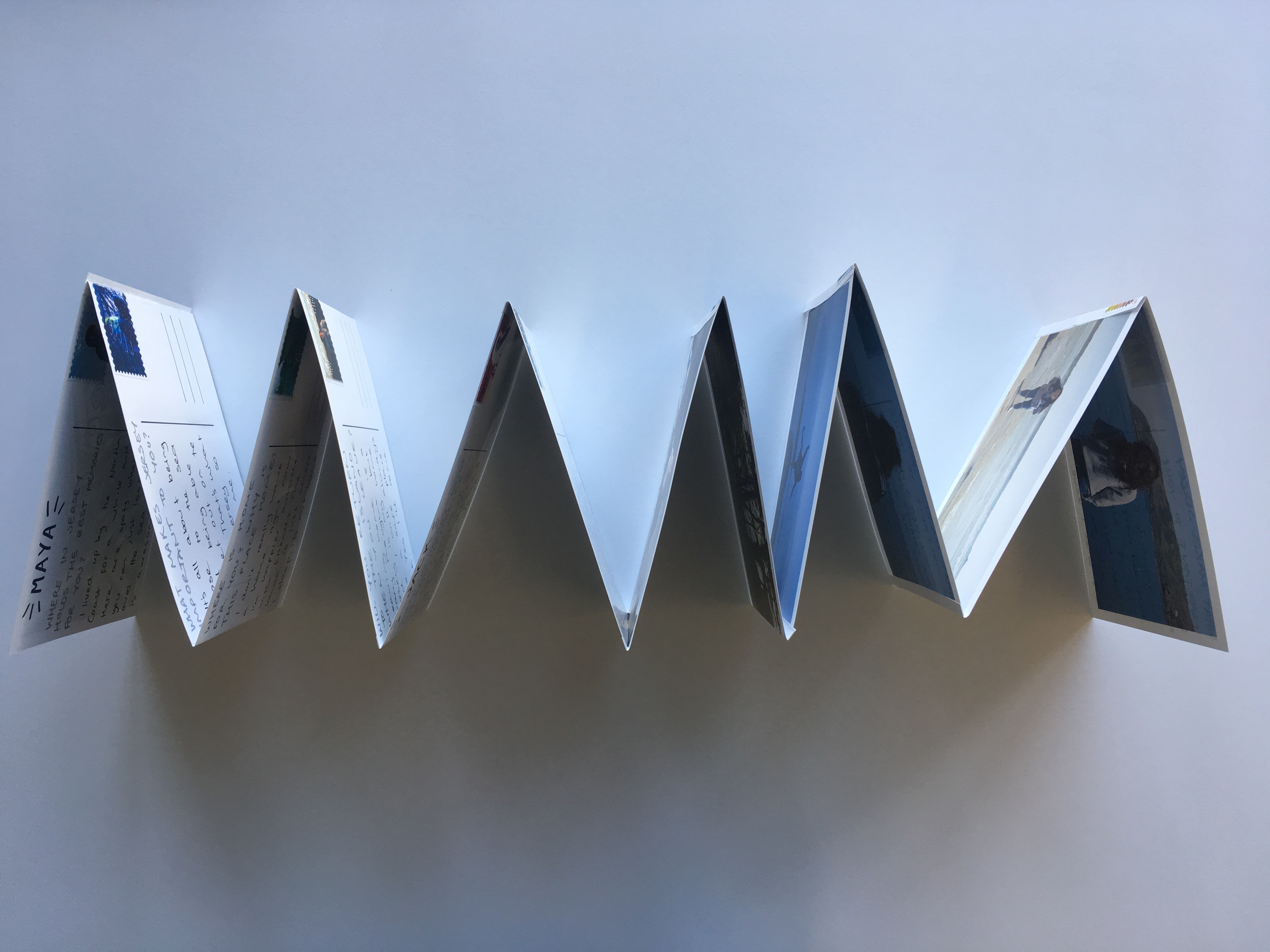
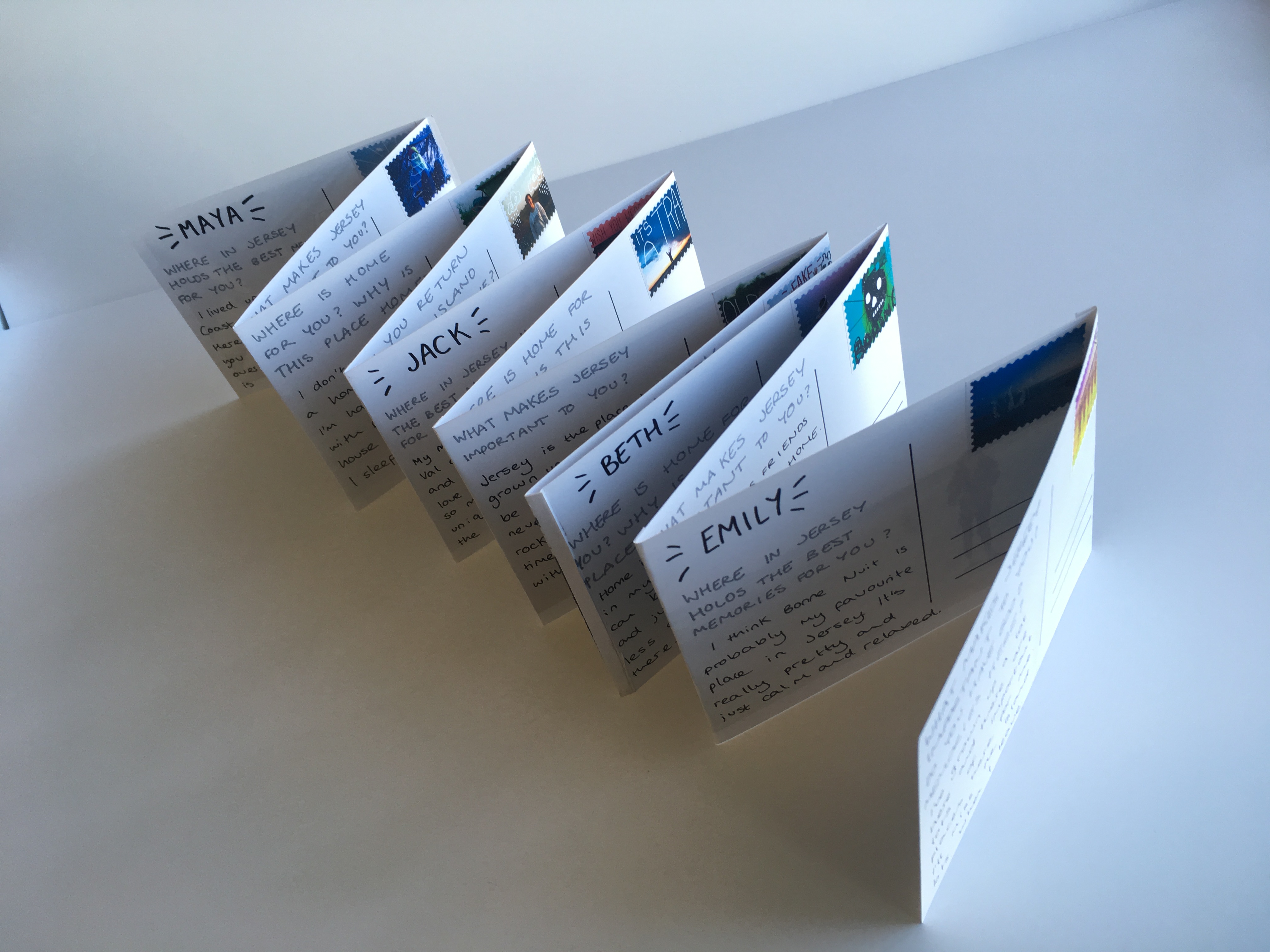
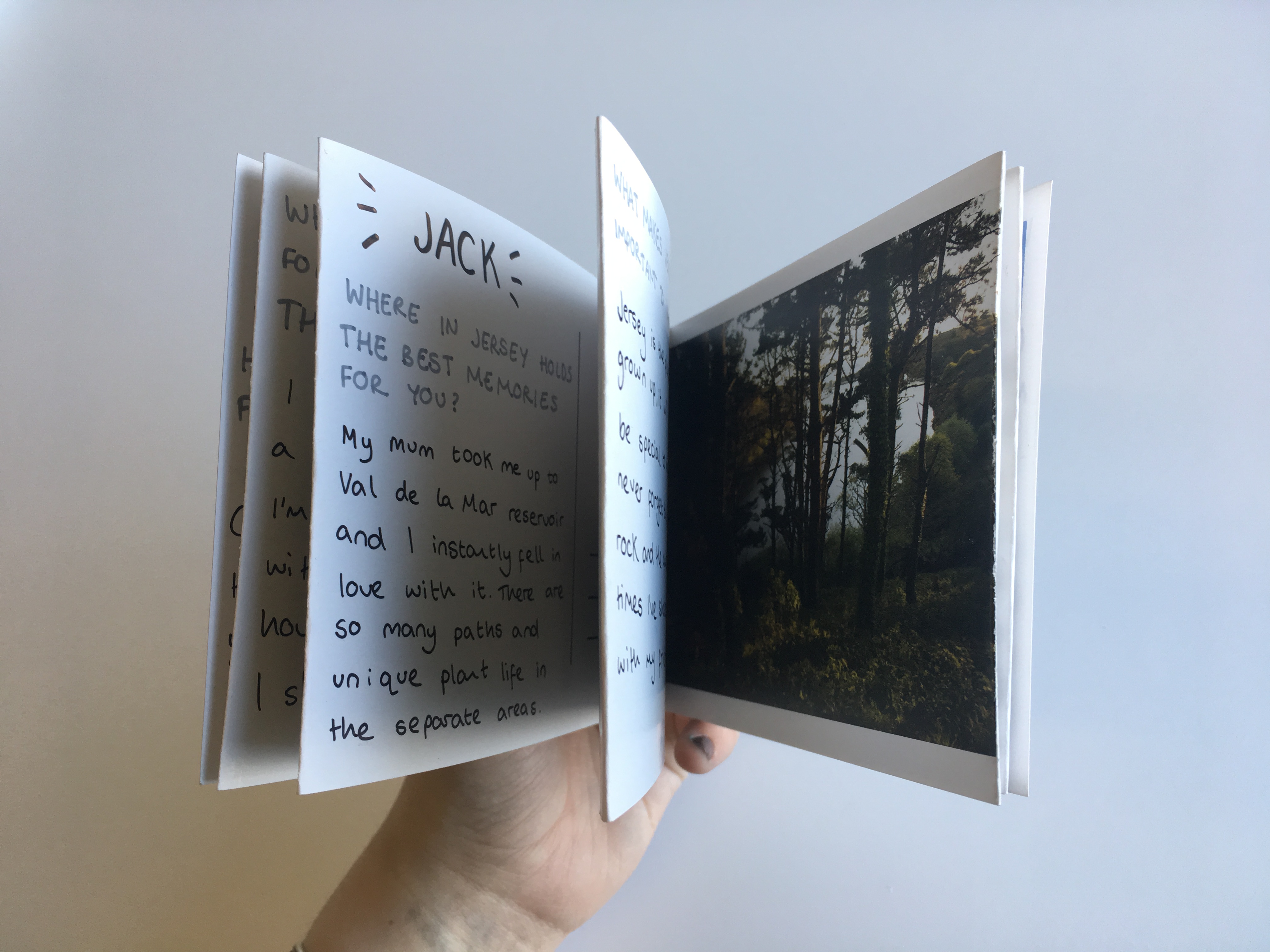
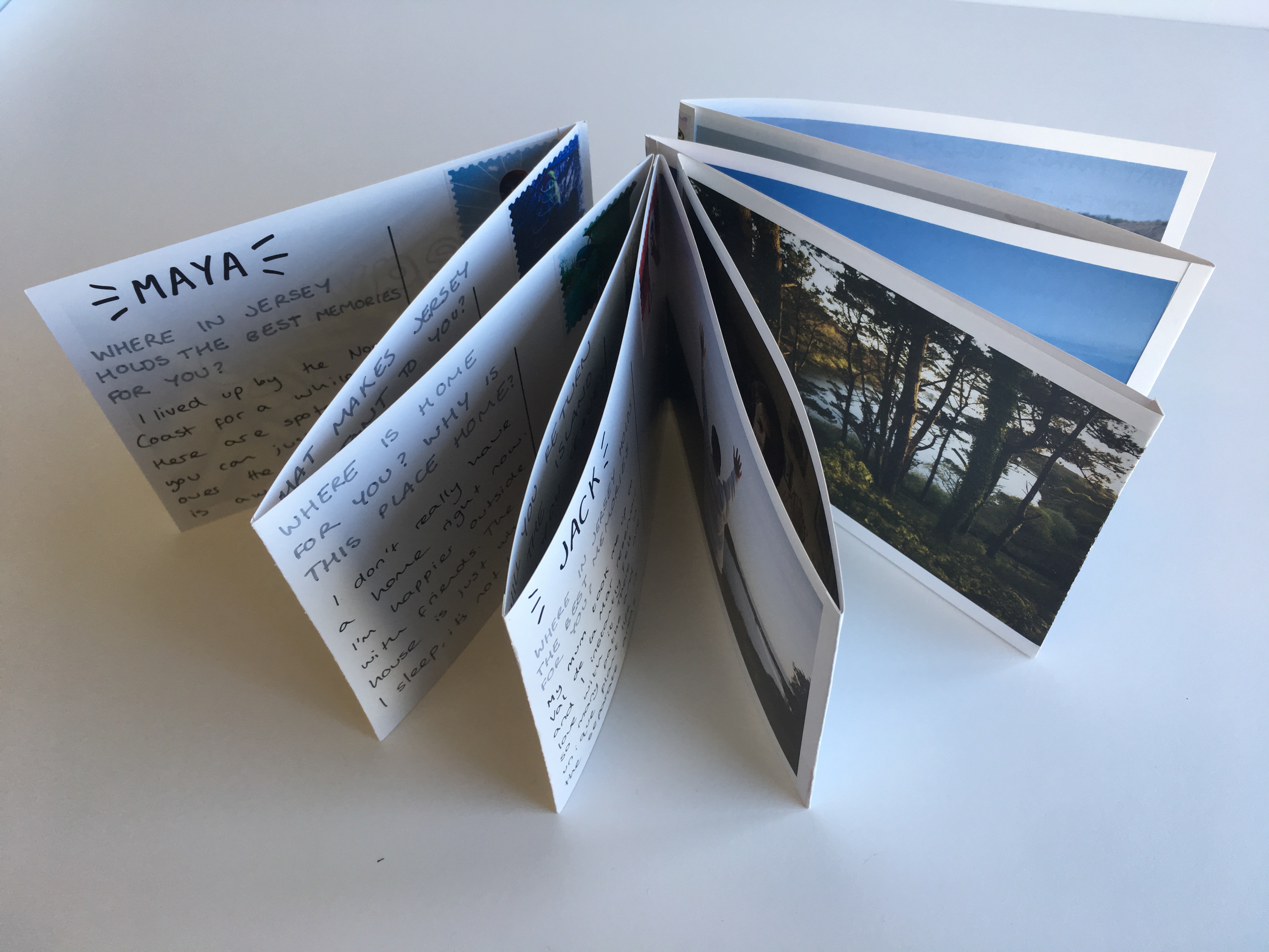
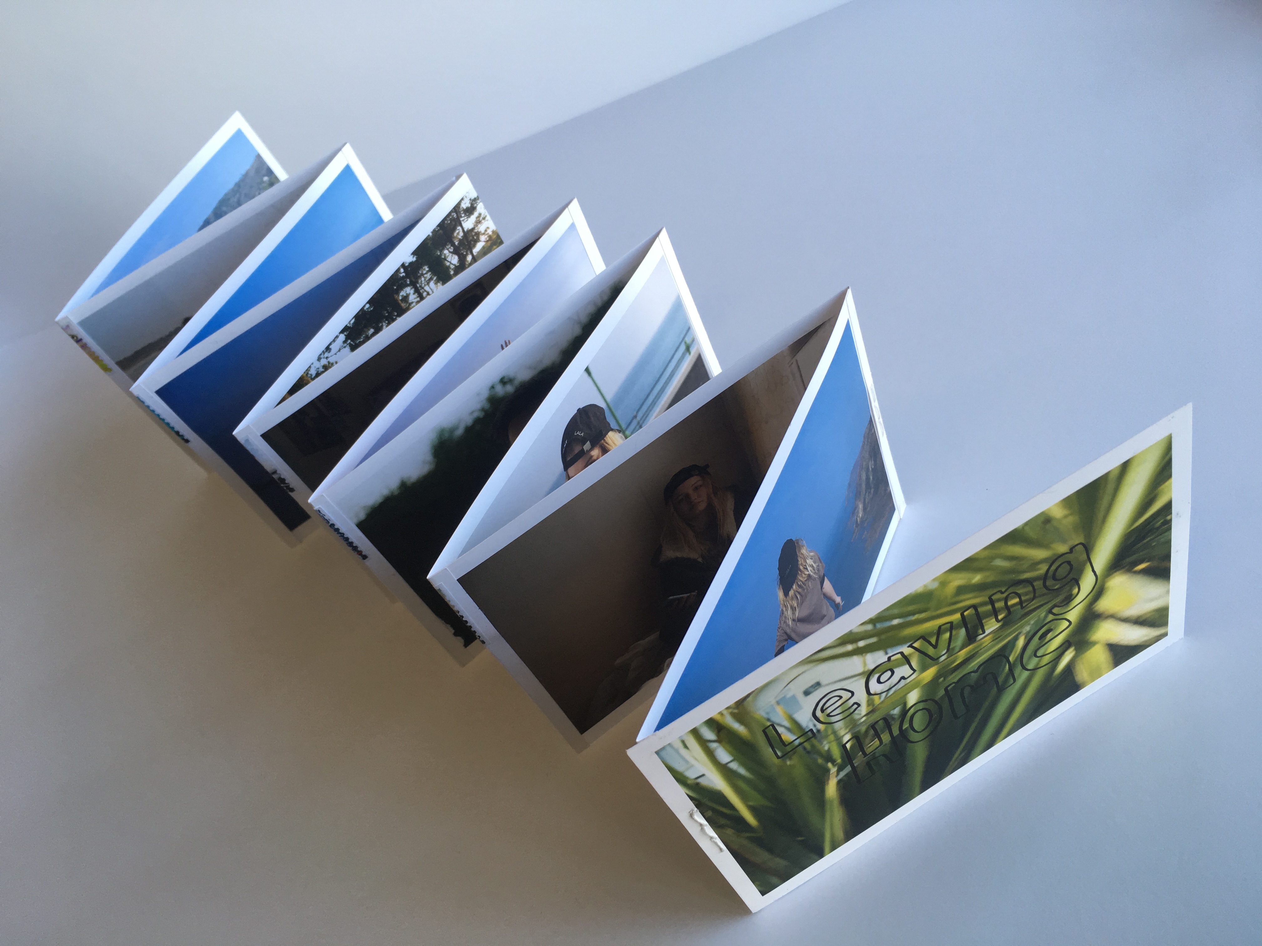
The main presentation of my final images was as a post-card themed leporello design which is shown below. The leporello can be manipulated in the hand and moved into a variety of positions and shapes displaying different sections of informations. This piece is A6 in size and is made up of postcards stitched together to form a fold-out book. On the reverse of each post card there is a stamp, a question and a corresponding answer given by the character on the front of the card. These questions were from my original survey about leaving home, homesickness and Jersey as a place of significance in different people’s lives.
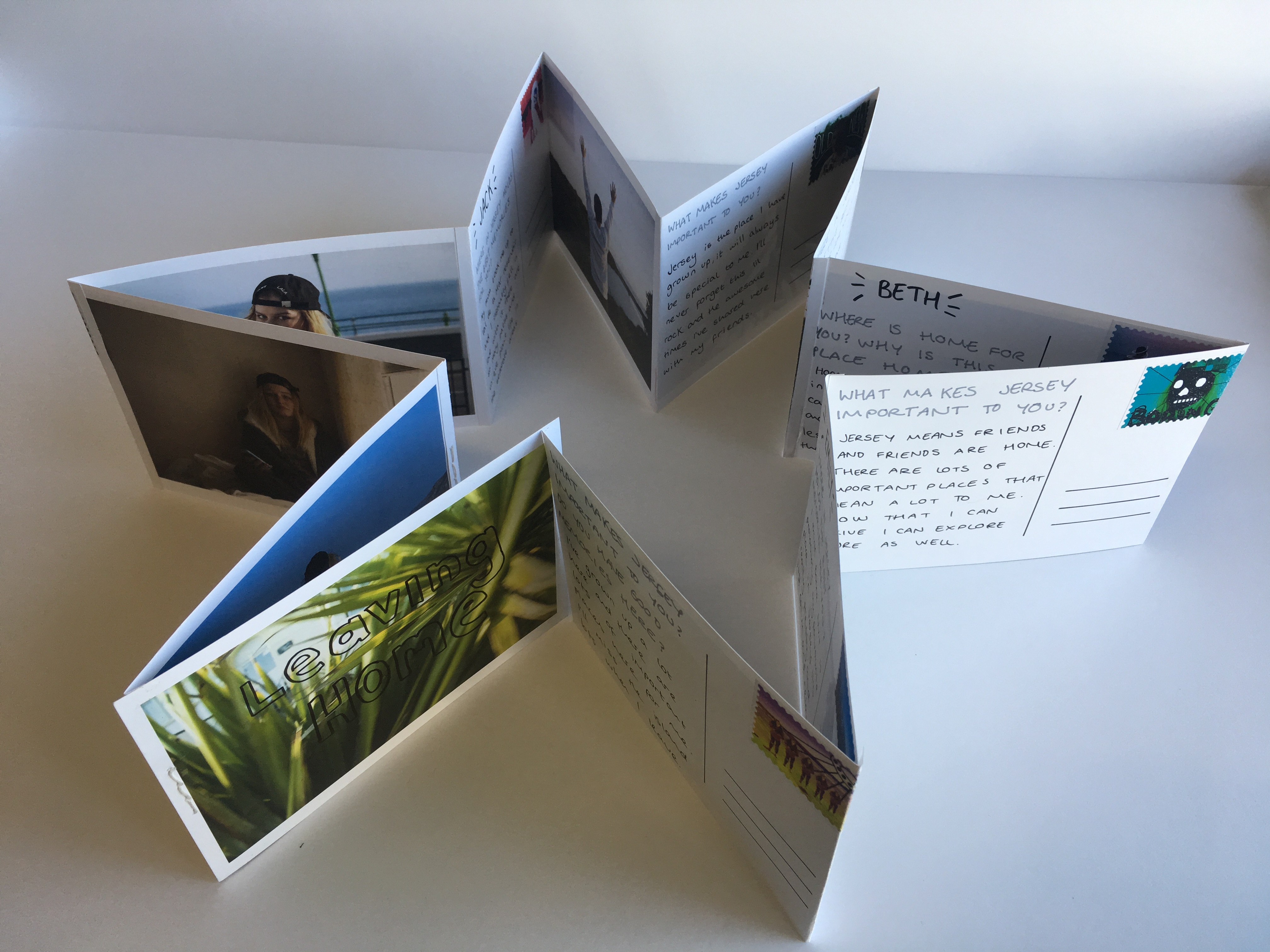
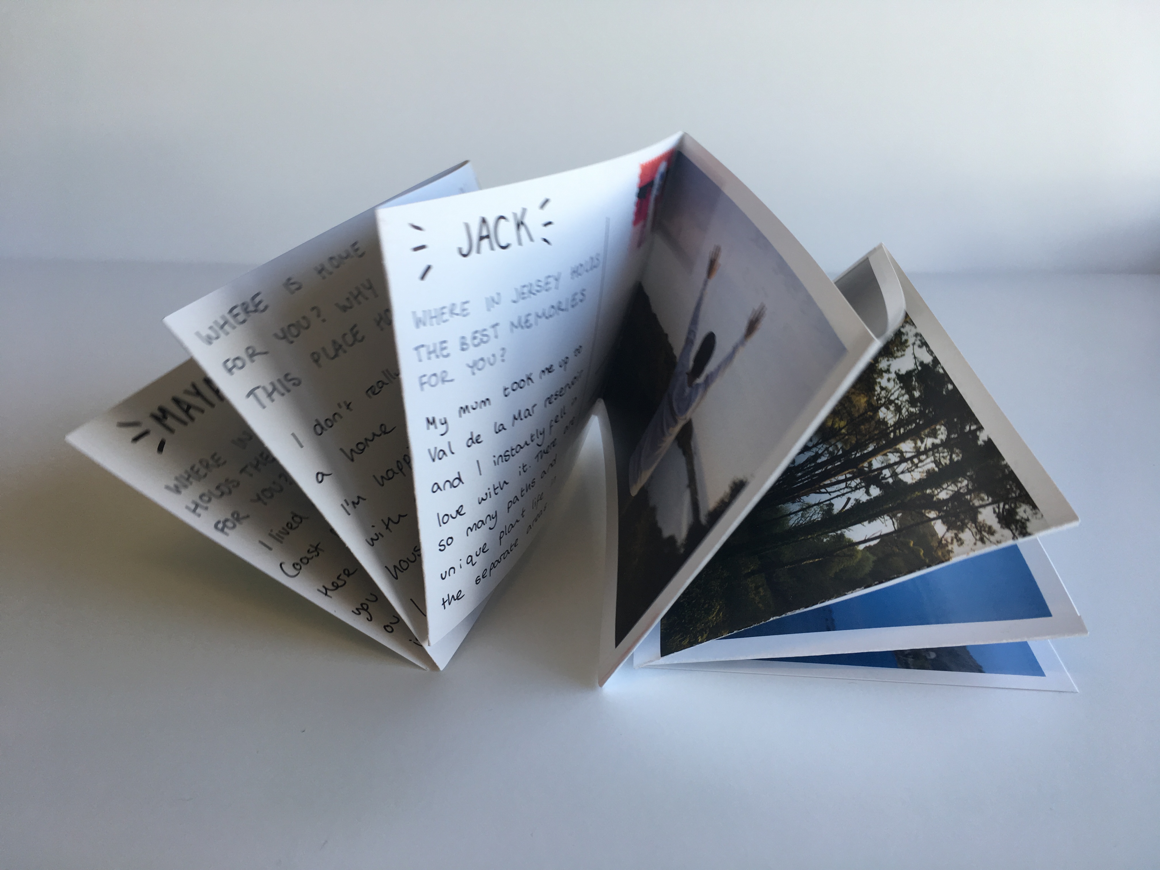
Below are a series of images showing the Leporello laid out in a book format. there are twelve pages on each side making twenty four all together including the cover page. This series is made up of 12 post cards, 12 images and 12 stamps. The significance of the letters and their matching to each image shows a journey and a connection between each character and their own experience with the island. The leporello design allowed this journey to be shown as a time-line and display different shapes as part of its final presentation, much like the changeable nature of the island and people’s opinions of it.
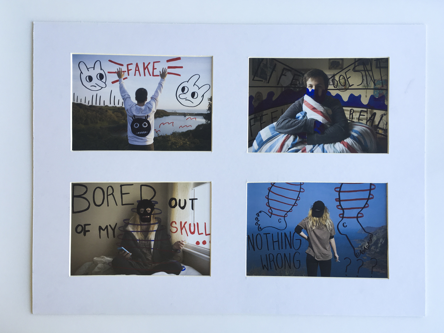
W I N D O W M O U N T
The window mount was created to hold four of my final images printed to an A5 size. These images were of two main characters who featured in this project and were all manually manipulated with ink pens post printing. The layout shows each character in their home environment contrasted with their chosen external environment on the island. The main point of this part of my final piece was to return back to the idea of home and the contrasts between people’s interpretations of the island. For many, Jersey is a small and isolated place however for some this can be seen as a direct opposite. The characters chosen for this project are all leaving their island homes soon and were selected to talk and be photographed around the idea of moving away and in particular home sickness. I was keen to capture memories for them interacting with the places that they would miss the most which is a big part of these final outcomes below.
E V A L U A T I O N
The aim for this project was to create a series of images that would help people leaving the island relate and remember the environments that meant the most to them while they lived here. I have explored the concept of home and family as well as expanding this mindset to look at homes outside of the physical house. The leporello design is arguably my most successful outcome and shows a narrative timeline that follows a journey around the island. The window mount displays a series of experiments and manual manipulation with my images and the way – in a similar style to the stamps – that illustration can be used to enhance an image.