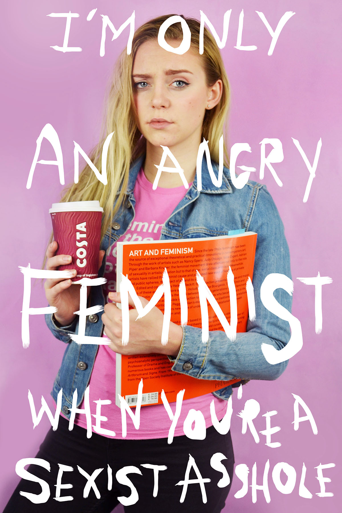
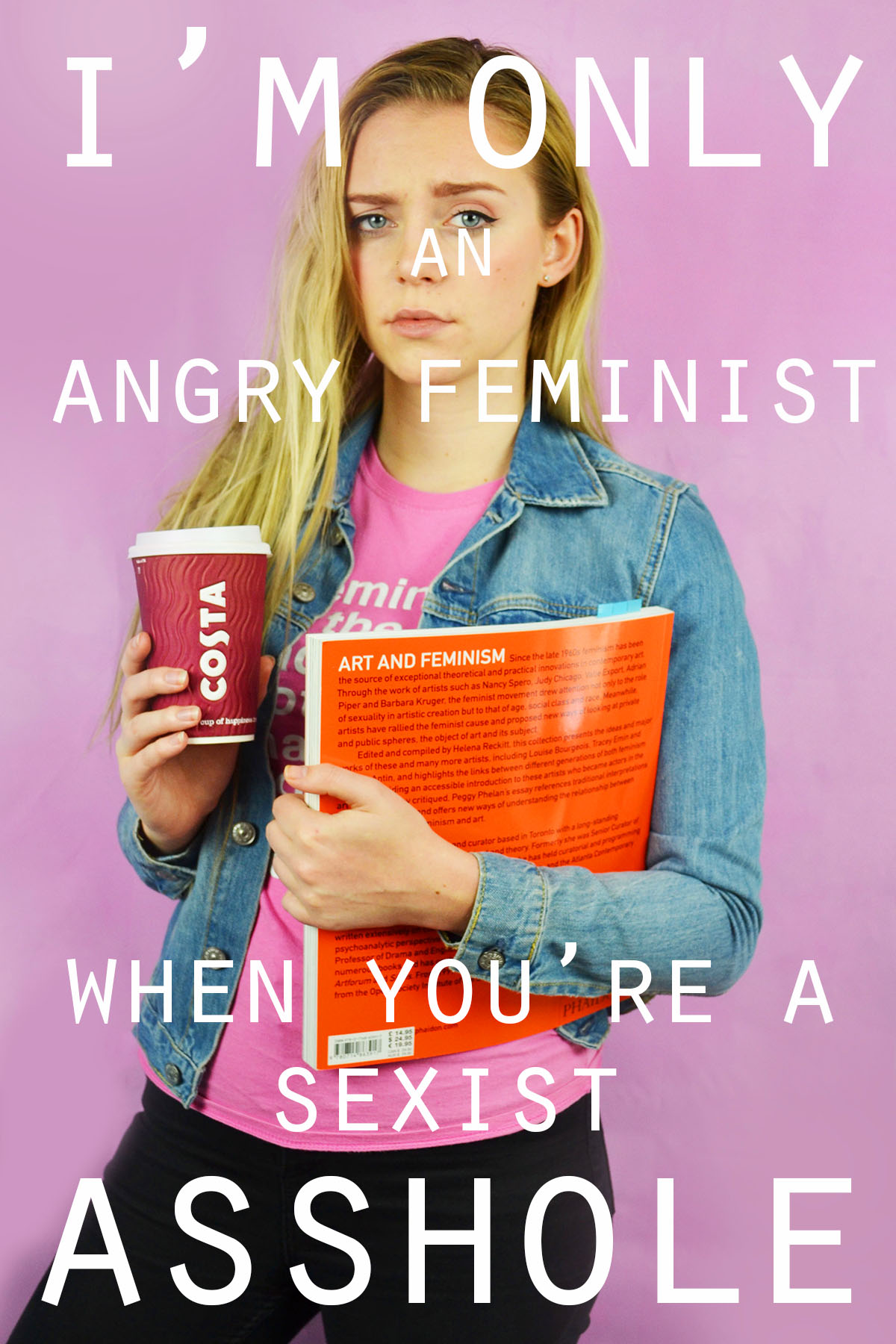
I experimented with handwritten and typed text for this image. To get the uneven lines of the handwritten text I used the 48 brush tool which has long angled bristles that are sensitive to how much pressure is applied and adjusts the thickness of the brush stroke as appropriate. For the typed text I selected simple font which I added over the top of the image in varying sizes. I chose to use the phrade “I’m only an angry feminist when you’re a sexist asshole” because it appeared on a poster on my initial angry feminist mood board. I also though that the phrase was sassy and fit with pose ad expression of the figure in the image.
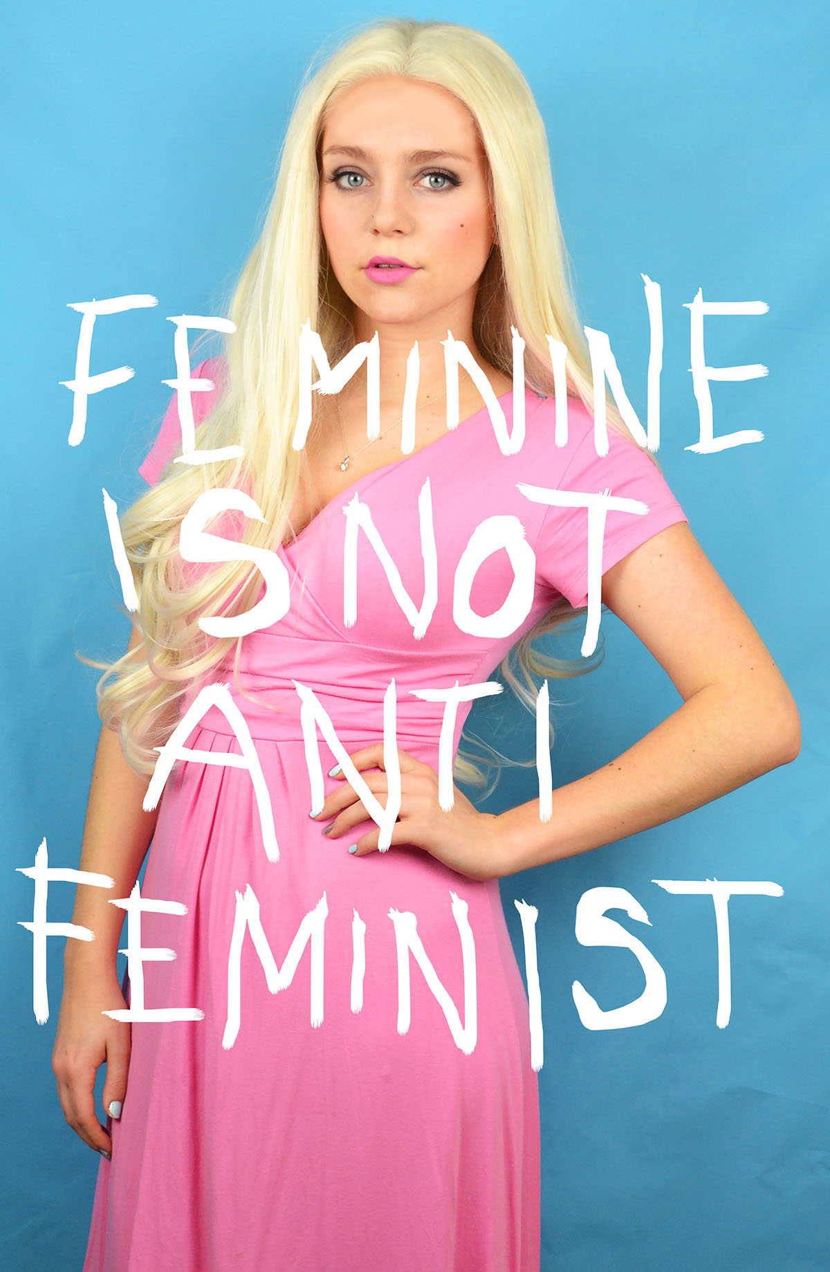
For this image I also experimented with handwritten and typed text. As previously stated for the handwritten text I used the 48 brush tool, when using the computer mouse to write the letter I chose to write in block capitals as they are mainly composed of straight lines, these were more effective and easier to write. This can be seen by the strange appearance of the more rounded letters such as o and s. I think that the typed text works better for this image, the somewhat balanced nature of the word “feminine” and “feminist” at the top and bottom of the image makes the overall image visually pleasing. I chose the phrase “Feminine is not anti-feminist” because it is something that I feel very strongly about. Just because a woman dress in a traditionally feminine way and subscribes to particular female gender roles does not make her any less of a feminist or an empowered and free woman.
I also wanted to reference the idea of a 00’s high school it girl so I decided to include a sassy, bitchy comment. I chose the phrase “At least it’s only my hair that’s fake, bogus bitch” because of the snappy alliteration of the phrase “bogus bitch” but also because the fact that a woman decides to colour her hair does not reflect her personality or whether or not she is a genuine person.
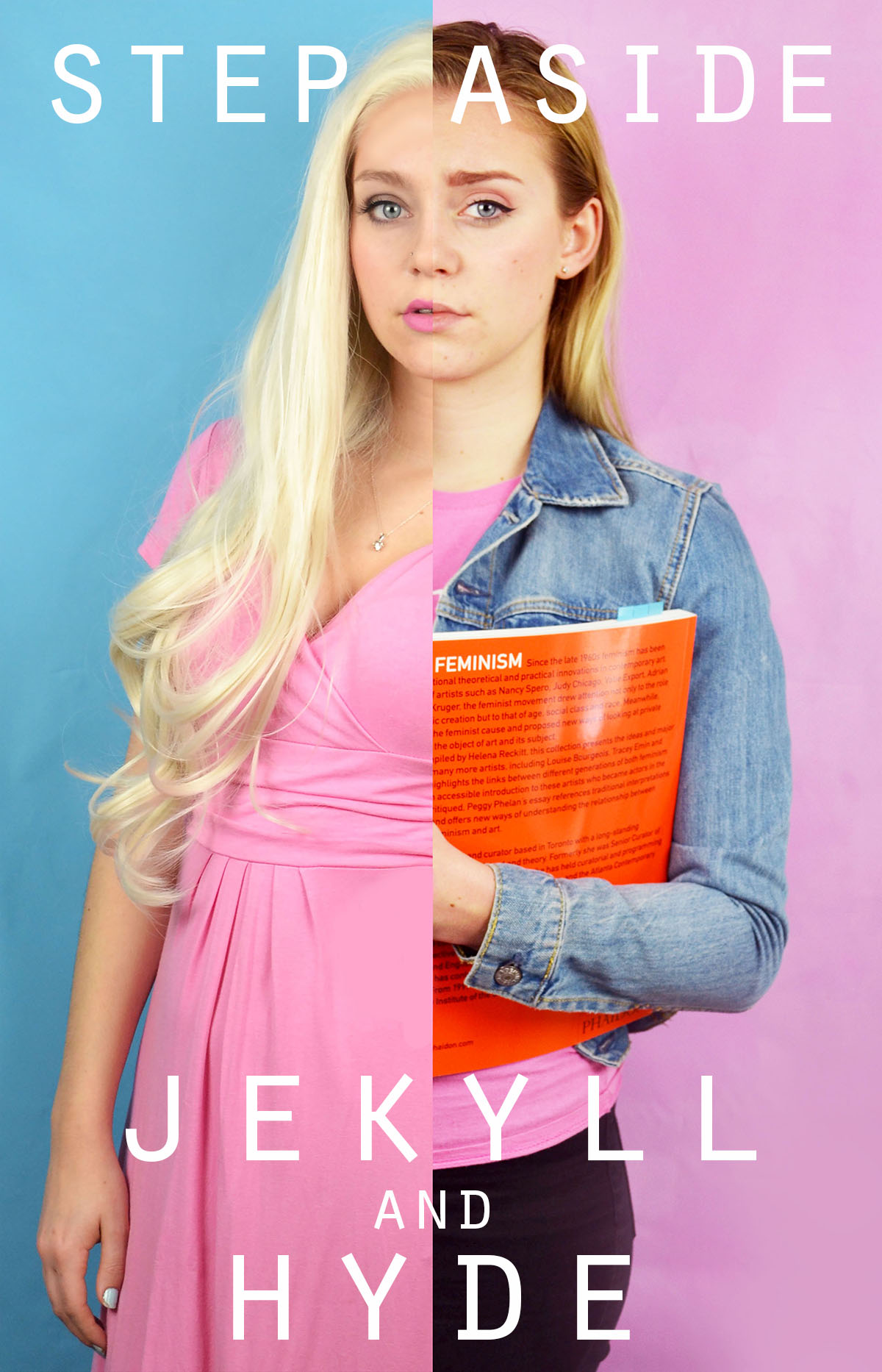
I had fun experimenting with different words to place on top of this image. Before adding words to this image I edited out the finger of the blonde image because In felt that they were distracting as they were right in the centre of the image. I removed them by using the colour picker tool and the airbrush brush tool to paint over the top, I achieved a crisp edge at the divide by using the flat edge brush tool and holding down shift in order to paint a completely straight line. I knew that when choosing a phrase to accompany the image in wanted to draw attention to the split personality feel of the image. I experimented with the phrase “Step aside Jekyll and Hyde” as a reference to the book and film “Strange Case of Dr Jekyll and Mr Hyde” which is about a man with a alter ego. I also tried the phrase “Beauty and the Bitch” as an obvious reference to the fairy tale “Beauty and the Beast” with the word “beauty” having positive connotation and “beast” having negative connotations which is replaced with the word “bitch” which has similar connotations. Another interesting thing about this phrase is that the viewer is able to decide which side of the image is the “beauty” and which is the “beast” as both sides of the image could arguably be both.
I also experimented with coloured images and white text as well as monochrome images with coloured text. I struggles with the balancing of the text within the first image but I knew that I wanted the words “polite” and “violence” to be in the largest font size and I felt that these were the most significant. I managed to balance the text more successfully in the second without having to obstruct the face. I also made the decision to edit out the painted words on the torso in the second colour image because I felt that they would distract from the over layed text. I edited out the original words by using the spot healing tool and then the blur tool to try and smooth out the skin.
In this image I experimented with two different phrases “Vegetarian martyr with the leather Doc Martens” and “Her worst critic and yet her best advocate” I chose the first phrase because I felt that it tied in well with the art student stereotype but also a satirical stab at myself and my own values as I am both a strict vegetarian and an owner of leather shoes. I chose the second phrase because, again, it ties in with the art student stereotypes but it is also very personal to me and I can be both overly critical and overly confident about my own work.

I tried adding words to this image and although I like the words I selected i don’t feel that the aesthetic nature of the texts adds anything to the image. I actually feel that the texts causes the image to lose some of its intensity and drama. My thinking behind the words is an extension of the phrase used on one of the previous images. It is a little satirical and in my personal opinion, humorous. However, I don’t think that the text works visually with the image.


