For the first shoot of my travels, I visited Monaco. Monaco is a sovereign city-state and microstate, located on the French Riviera in Western Europe. France borders the country on three sides while the other side borders the Mediterranean Sea. A magnet for high-rollers and hedonists since the early 20th century, it’s also one of the world’s most notorious tax havens as residents pay no income tax. It’s also famous for its annual Formula 1 Grand Prix, held every year in May since 1929. Visually, Monaco is almost entirely concrete and glass, dominated by high-rise hotels and apartment blocks that rise into the hills like ranks of dominoes. This is the second smallest independent state in the world and is almost entirely urban.
I think Monaco was a very interesting place and I thoroughly enjoyed visiting. Visually the city center is incredibly clean and crisp and everything is precisely organised. The city is very light, almost all buildings painted white or bright creamy tones. As a result, all the sunlight is reflected generating a positive atmosphere. You can identify the wealth and money existing in this country just through the people and environment present. Buildings are made from shiny marble and car dealerships and expensive jewelry shops are on almost every corner. Decorative elements including balconies, multi-coloured ceramics and courtyards create a picturesque fantasy of pleasure and luxury, and an alluring expression of how Monaco sought, and still seeks, to portray itself. Not to mention that, from my perspective, the population consisted almost entirely of adults and elders. I did not see any children nor teenagers. The city was very much mature and civilized, almost completely quiet at some moments. My goal on this shoot was to try and capture the brightness and cleanliness of the environment. I wanted to focus on lighting, capturing shadows in order to emphasize the brightness and crisp, geometric aesthetic of the architecture. Nevertheless, I still had to maintain my overall goal, which is to additionally incorporate digital illustrations. With this in mind, I had to avoid complex and detailed compositions as these would be too crowded paired with drawings. The photographs must be somewhat basic in content. I tried to keep an eye out for shapes that can be transformed with ease into every-day objects. Below I have included my favorite photographs from the shoot.
— Its important to note that these images have been selected with the intention to develop with illustrations. They are not individually the best photographs from the shoot, but provide the best opportunities for overlaid drawings. —
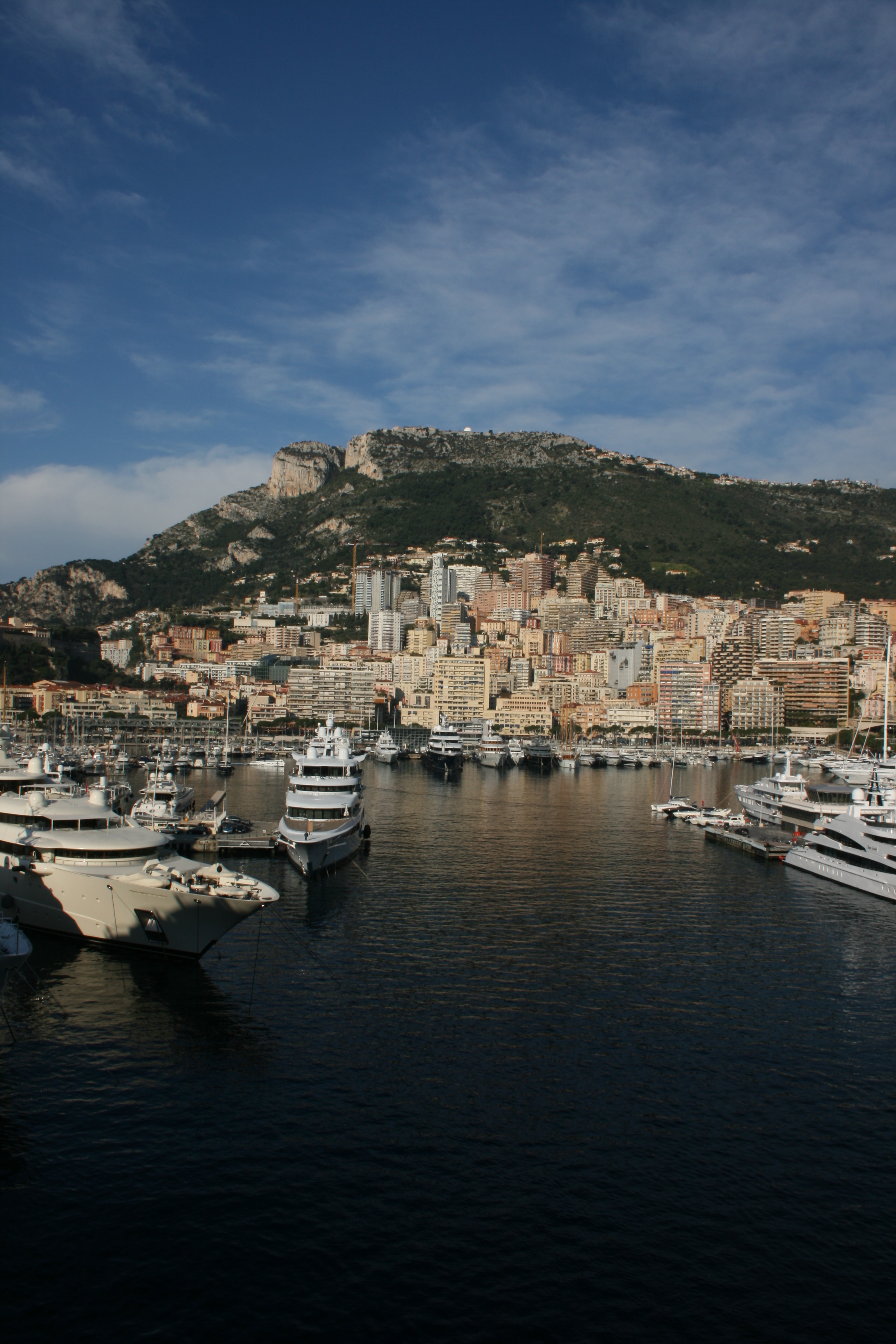
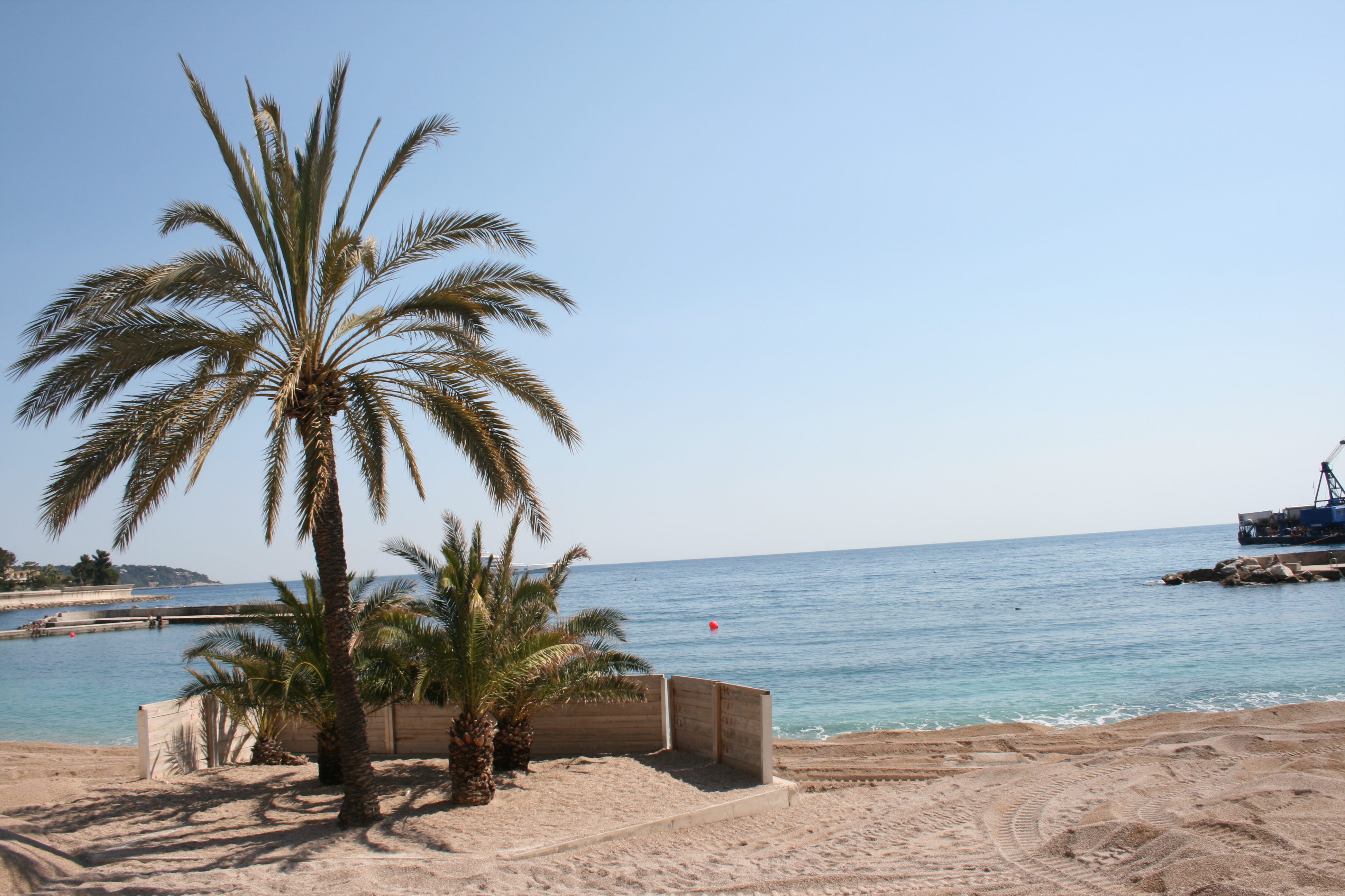
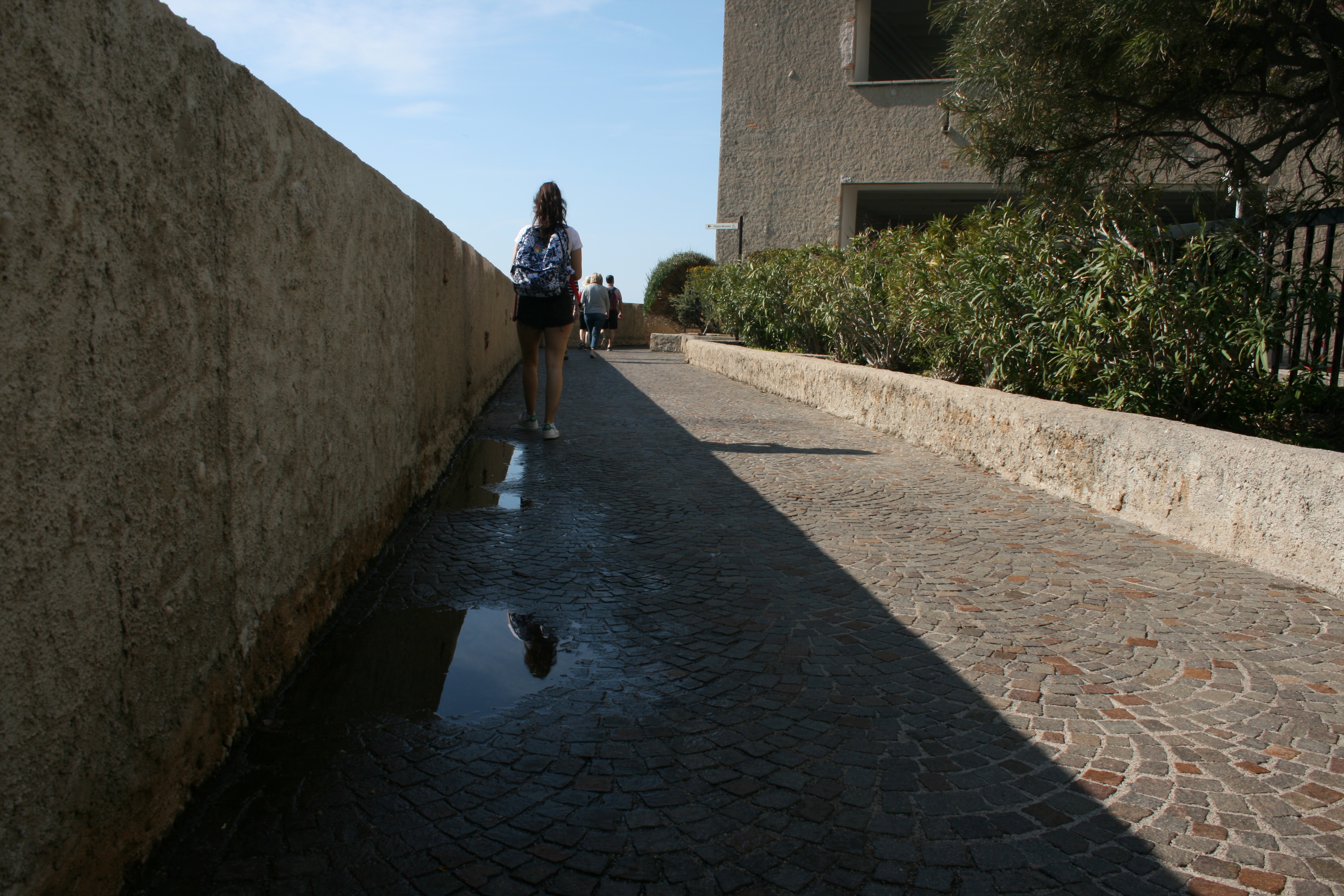
These three photos work effectively as a set because they all provide a overview of the scene. We are supplied with a wide- perspective of the environment and specific areas of the city. The first photograph was taken from the balcony of my cruise and features a full view of the city, hills and port. This photograph is simple but I think it works very effectively. It enables the audience to see the whole location and gather a general concept of the aesthetic it possesses. I like the way that the photograph is split into four segments. In the lower quarter you have the ocean and harbor which holds a hugely significant role in Monaco lifestyle and culture.There are two ports in Monaco, Hercules and Port Fontvieille. The one I have captured within this photograph is Port Hercules. The port has been in use since ancient times. It was used as a trading port by the Greeks and Romans but had the disadvantage of being poorly sheltered from the easterly winds. This prompted the erection of two piers in the early twentieth century which went some way to providing better protection.The modern port was completed in 1926, and underwent substantial improvements in the 1970s. In the central quarters of the photo you have the landscape and urban city. And then finally, the upper third features a rich blue sky, a typical representation of Southern France. I like how each segment imposes a different colour palette, almost creating layers to the photo composition, like the inside of a cake. In the bottom layer, you can identify the deep blues and green of the ocean that serve as the darkest part of the image. This is juxtaposed with the creams and pale oranges of the city landscape which also introduces a sporadic, blocky texture. The next layer is a fresh combination of rich greens and browns. This segment consists of cliffs and vegetation that towers above the city. And then finally, the top quarter of sky and clouds features a lighter shade of blue. As a complete image, this presents a ultimate colour palette for the country of Monaco, summarizing the way it looks visually. In the second photograph, I have directed my camera out to sea, capturing the sandy shore and some palm trees. This photo evokes a very tropical, summery feel due to the connotations attached to these kind of components. I like this image as it is very different from the urban landscapes recorded in the remaining shoot. Nevertheless, this photo requires some adjusting in the editing stage in order to make it more professional. The horizon line must be straightened and I think the pier towards the right side of the frame should be cropped out for a cleaner image. The final photograph is very simple, but takes advantage of the powerful lighting present. The puddles sat upon the cobbled pathway reflect the light nicely, and our eye if lead through the photograph utilizing perspective.
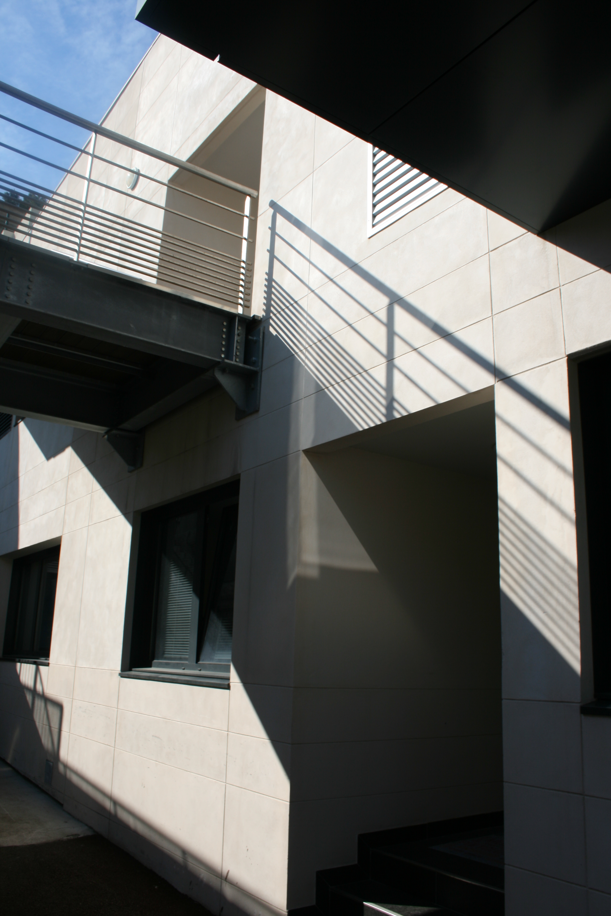
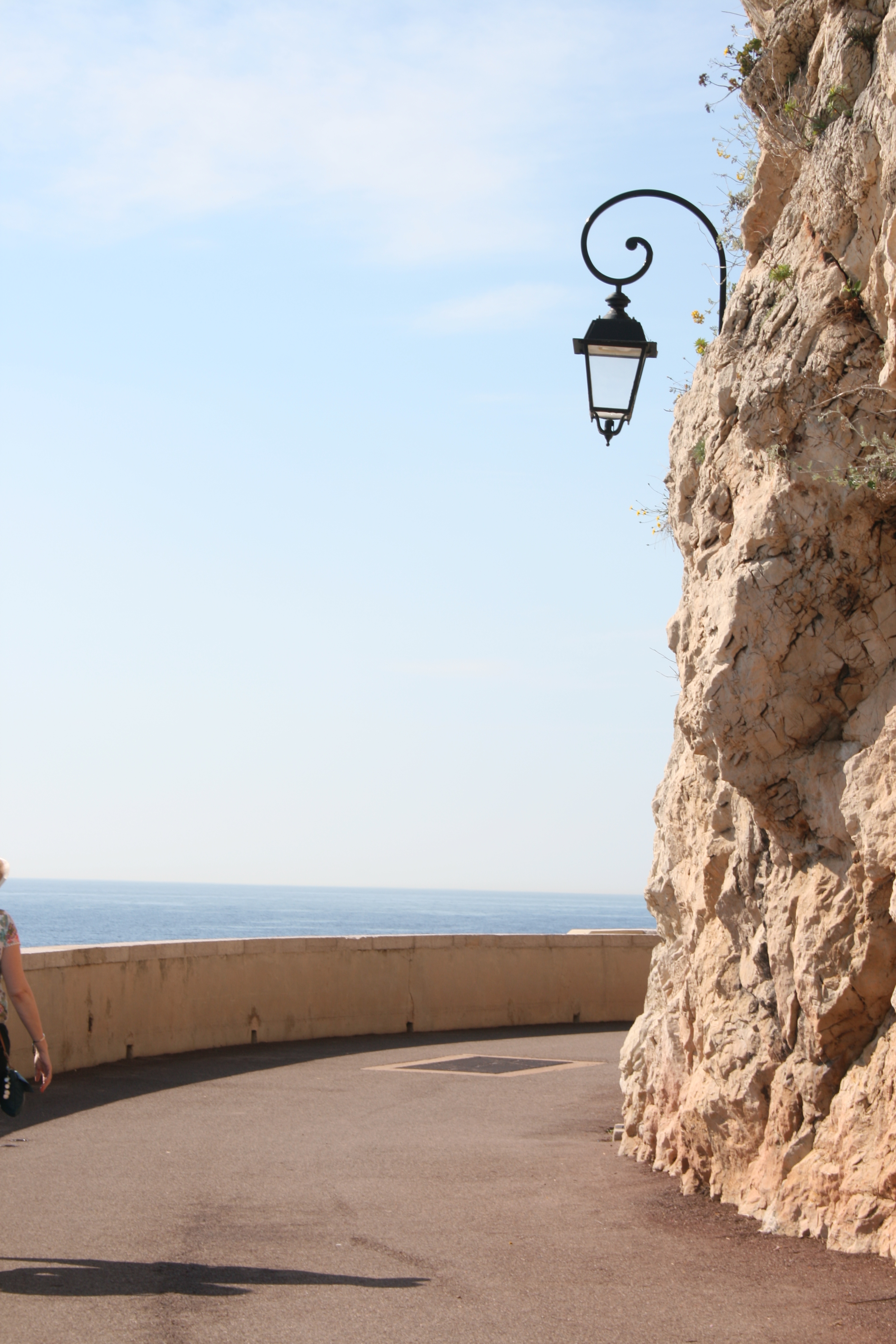
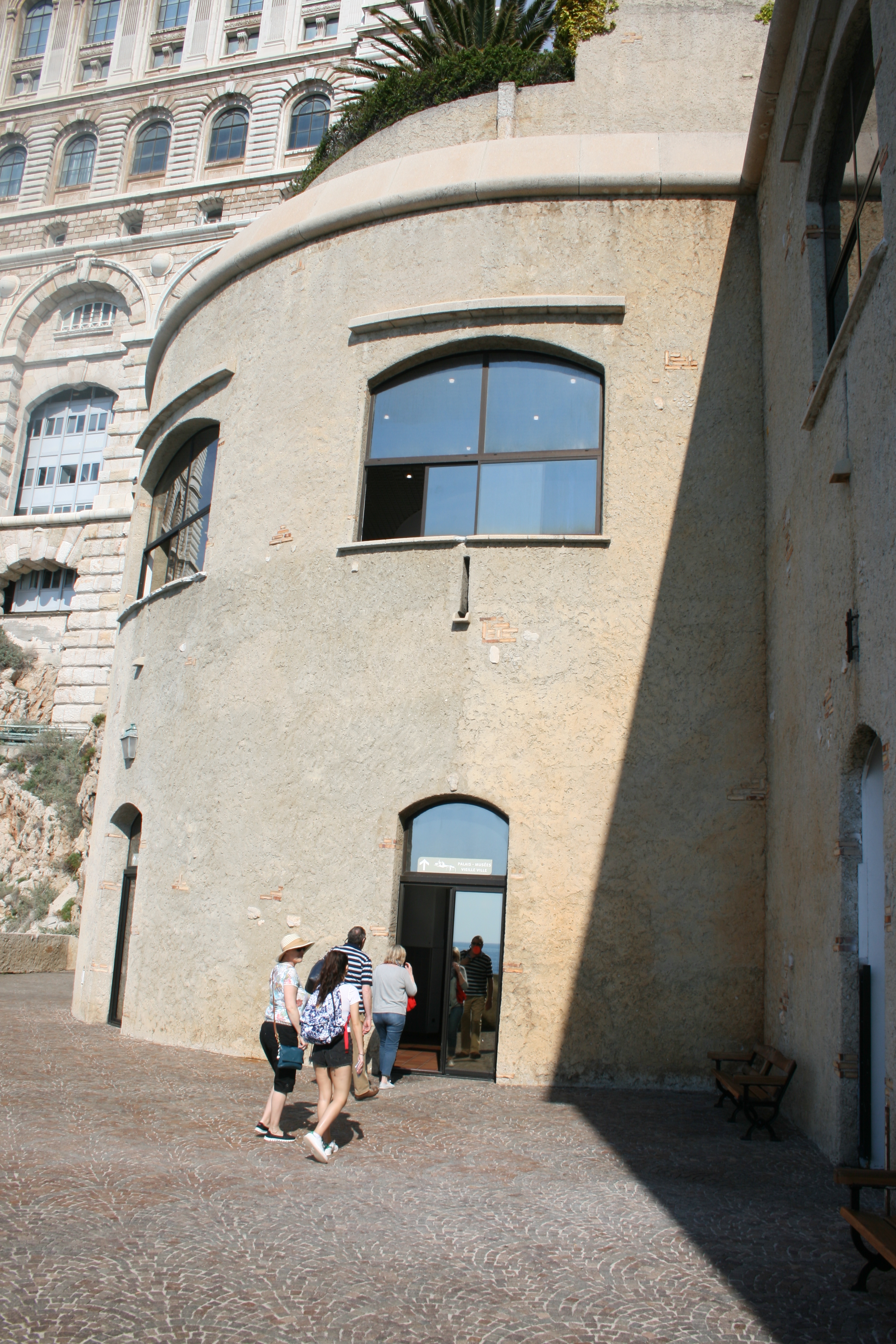
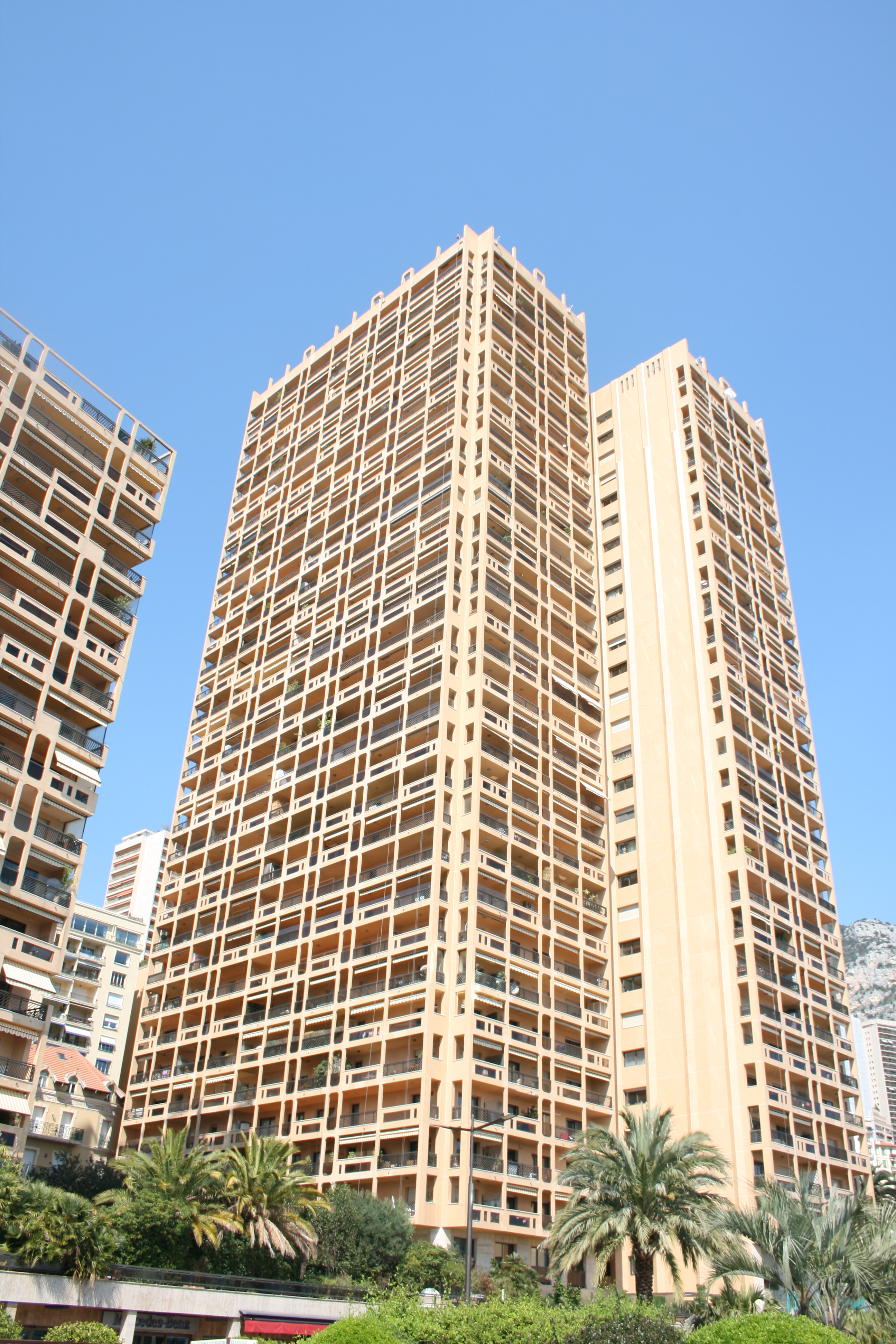
These four photographs were all taken right next to the coast of Monaco. I think all these photographs are somewhat more abstract, attention being payed to lighting, shape and form rather than content. The first photograph is probably my favorite from the collection due to the lighting. The shadows being casted are uniform and organised as correlated with the architecture of the building. The railing at the top of the image creates a crisp, lined shadow that disperses down to the bottom of the composition. I like the blocky, box form of the photograph as almost all shapes are made from sharp connecting lines. For this image, I will perhaps transform it into black and white in order to ensure focus on lighting rather than colour. Additionally, I would like to draw someone peeping out of the door in the foreground. The second and third photos were taken along a coastal pathway, adjacent to the Monaco cliffs. These rocky surfaces can be seen within the second photo as they intercept the pathway. In this image, I have tried to draw attention to the lamp attached to the cliff face. I thought this was an interesting contrast, a juxtaposition between man-made and the natural environment. The photo also requires some cropping as the arm of the woman on the left side ruins the minimalism of the composition. The following image, is basic and not particularly special but I do like the shape of the shadow that diagonally intersects the entrance to the circular building. The window above reflects the light nicely and I think the image possesses potential for further illustrations. The final photograph displays a tall flat building on the coast. The greenery and vegetation at the bottom of the photo illustrates a contrast in colour and environment. The reason behind selecting this photo was the tall, rectangular shape of the flat building. I immediately visualized transforming this building into a half-opened chocolate bar through drawing on top. This is something I would like to experiment with and therefore decided to select this photo.
