My Book Layout

Finally, after doing artist research and choosing my favorite selection from my shoots, I was able to produce my own book for my project ‘Environments’. After designing my book I definitely knew it was the right way to present my shoots, as it allowed all of my photographs to flow.

Here is a link to my photobook: Nomadic Soul

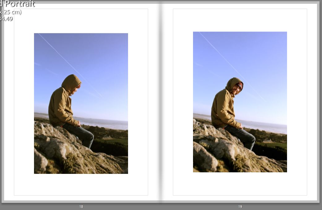
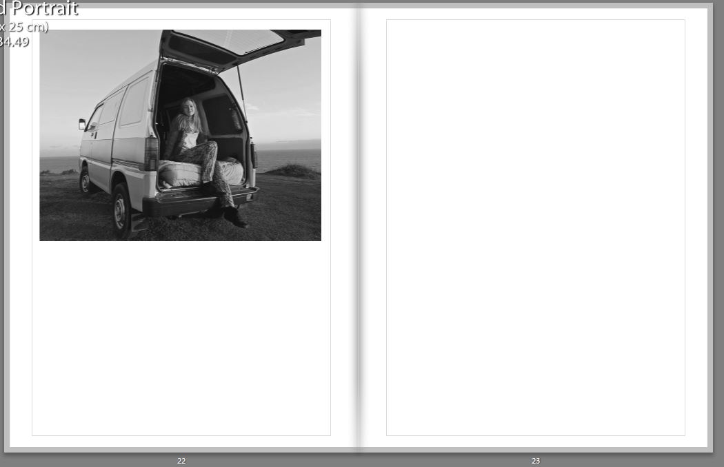
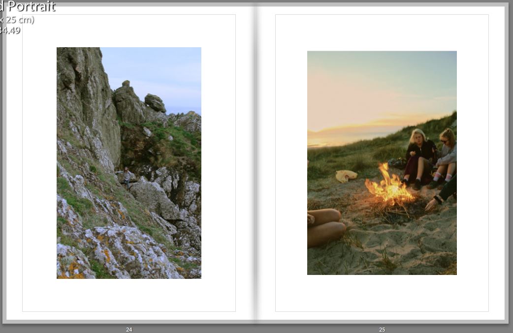
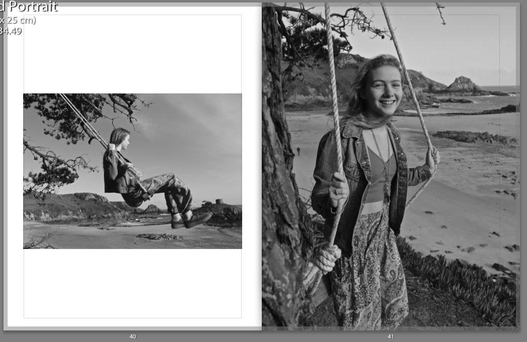
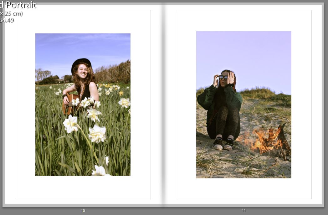
Thumbnail of book layout; 

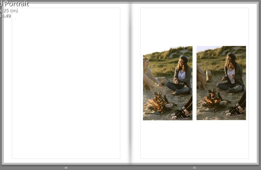
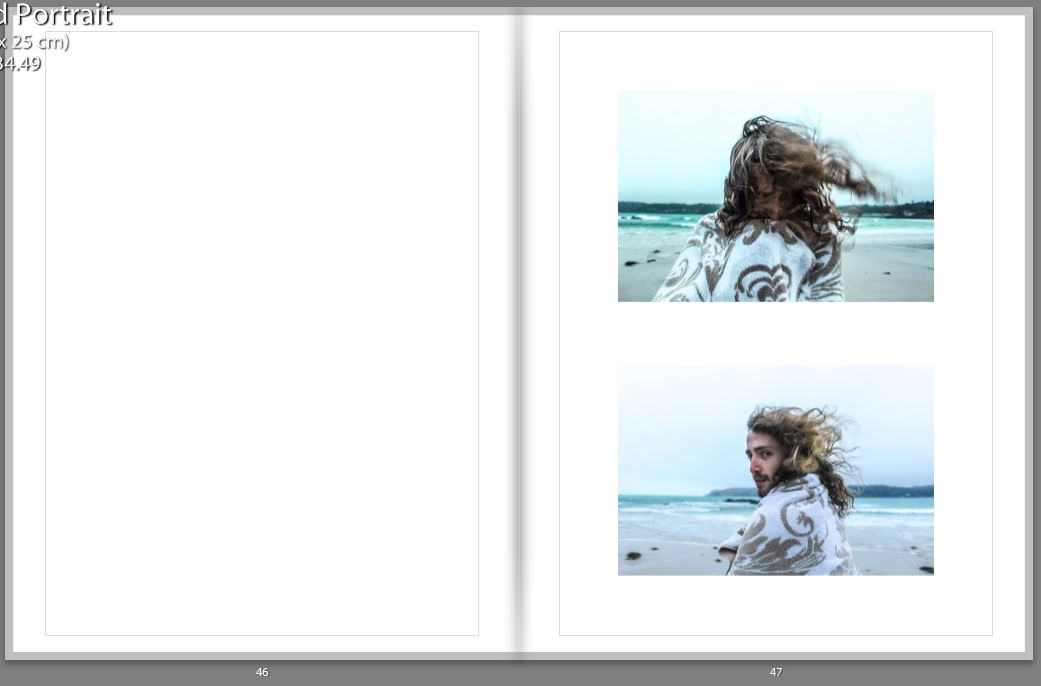
The reason for print-screening the book in a thumbnail version was because its more visually easy to see why I choose my certain layout. When designing the book I had to think about spreading out the double spread pages, the black and white images, and certain layouts. I had to make sure all images on the page next to each other worked well together. Another important thing when editing is if a page has a similar layout to another one, they have to have the same padding etc, so it looks organised and neat.

Digital version of my book; 

I believe the title of the book is very important aspect. Titles should convey not only a sense of the book’s subject, but also a feeling. The title you choose for your photo book sets the tone, hints at the genre or style of book, and draws the reader in. It’s your very first opportunity to “market” your book and make someone want to read it. I finally came up with the name ‘Nomadic Soul’ this was due to the word nomadic meaning living the life of a nomad; wandering, and a soul is an emotional or intellectual energy or intensity, especially as revealed in a work of art or an artistic performance. I found this title was perfect for what I was trying to represent as I wanted to represent a lot of energy and intensity of a traveler.

 My front cover was inspired by Theo Gosselins, as he had an oil spill which links to the fact he’s on a road trip, and it doesn’t have the book title on it. Therefore, mine is similar in the perspective neither of the front covers show a person, and don’t have the title featuring on it. The reason I choose this image for my front cover is because all my photographs are taken nearby to the sea, and a majority of them have a bit of the sea showing. The use of the waves also represents the energy and movement which will be in the book.
Back Cover;                                                      Front Cover; 

Unlike the artists such as Juergen Teller, Corinne Day and Theo Gosselin, who’s photo books I decided to analyse I  decided to put the title and my name on the first page. This is due to me wanting my first image to be a double page spread, and this wasn’t possible without having a first blank page, so I thought I would just make the most of this page, and immediately tell the reader what I was going to show them in my book. This was due to the title being on the first page working well with the rest of the layout.

It is crucial to use the perfect first image, as it makes or breaks whether the reader is going to carry on reading it or not. The reason for the choice of this image is because the book is representing a journey, and there is no better way to represent this than by a photograph inside a car, which isn’t stationary.

Every 4-6 pages I choose to have a double page spread, as it would break up the smaller images, and is almost like having different chapters in written books. It gives it a stronger structure and shows principal images. The images I’ve chosen for double page spreads also tend to be some of my favorite images, as they have so much detail and interesting aspects to them. The difficult thing about selecting my double page spreads was the fact most of my images had someone featuring in them, and usually tended to be central of the image, which made it difficult for designing the book, as I didn’t want the people to end up being split by the binding of the book.

When selecting two images from different shoots on opposite pages, I would make the images link in a certain way, for example below one can see that the girl on the right page looks as if she’s looking up at the girl on the left page, this is shown again two images below. Therefore I had to think about the composition of the images before putting them in a certain layout.
For my final image shown in my book, I choose a similar one to the first image as they both represent the journey. By having this as the last image, it looks as if even though the journey for the reader has finished, the journey for the people featuring in the book hasn’t finished.

Shoot 3 Specification – Car

I spend a lot of time travelling  around jersey in my car. Despite the island’s small size me and my friends still manage to do a lot of miles, and so I want to represent this by using motion in my photos. I have wanted to experiment with more creative photography and due to the topic of the shoot I thought that this would be a fitting choice to try. Capturing motion can be achieved by experimenting with different, slower shutter speeds to capture whole movements. I could also capture motion with lights in or outside my car, by moving either lights of my camera whilst the frame is over my car.

Environment – New Idea – Digital Illustration Experimentation

Now that I have completed my travels and have collected my images, I am tasked with creating some original final images. On this post, I am going to be documenting and experimenting with an idea I had whilst on my travels. As discussed in a previous post, I felt the urge to incorporate some external art within my photography, in order to avoid generic tourist responses.The genre of Travel Photography is now very crowded due to its accessibility and ease of involvement and there is little originality in documenting the landscapes and atmospheres of foreign locations as it can essentially be done by anyone. I left on my vacation having looked at Carlos Spottorno,  planting concepts in my head surrounding illustration, but no solid ideas that could be experimented with. Nevertheless, I began investigating contemporary illustration given that this is my chosen course at my future university. I looked at the work of Michael Craig Martin, studying crisp, clean line work and if I could perhaps implement this within my work. After experimenting in Photoshop, I finally found an idea that has the potential to produce distinctive results. Here, I will be outlining the process of creation and my thoughts on the prospects of the concept. 

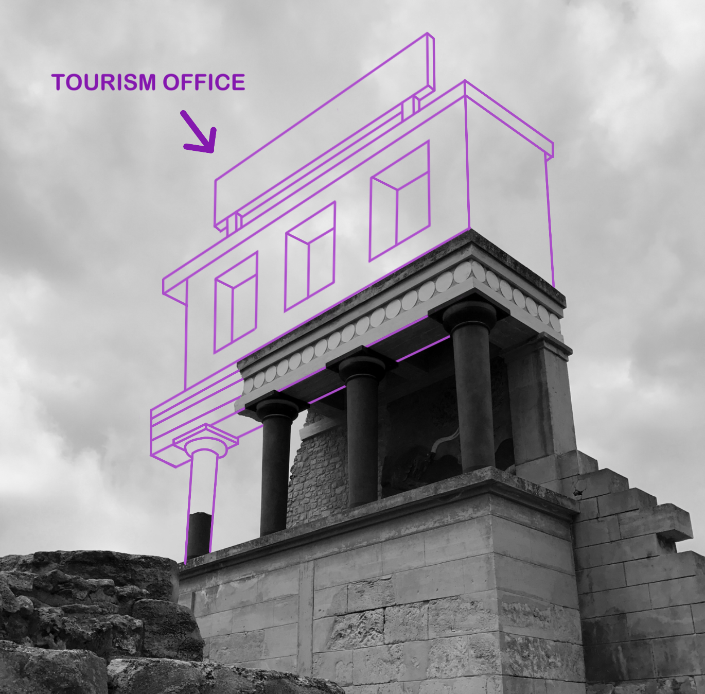
I start by selecting an image that is very open for further adjustment and reconstruction. I wanted something basic and simple in order to avoid complex compositions that will crowd the photographs. This photograph that I took in Knossos, Greece seemed appropriate. A large portion of the image is cloudy sky, which provides a blank canvas for digital drawing. In addition to this, I was attracted to the way in which that the building is partially destroyed, which will enable me to reconstruct the structure that is missing. I am essentially re-building this ancient temple in the way that I please. Its important to note the way this all links back to the exam brief of ‘environment’. In this case, I am manually manipulating this landscape, adapting and changing the environment into something different. The first thing I do, is import the image into Photoshop and make it black and white. For the piece I am planning, the linework created is going to be colourful. With a desaturated background, these colours will be perceived a lot more vividly, popping into the foreground. With a blue-grey sky, the tones begin to combine and merge together which ruins the crisp, clean aesthetic I am searching for. I turn the contrast up a bit, ensuring some dark shadows that will serve as effective backdrop.

With the image prepped, I now select the Pen tool. The Pen is an excellent tool that allows me to draw lines in a very controlled and manual manner. The key feature of the Pen is its adaptability. Click once to add a single point and create an angle to the next, or alternatively click, hold and drag to create a curve. It enables me to create any shape I want, straight or rounded. In addition to this, every point is completely editable after you’ve finished the shape, and you can add new points if you want to add an extra curve into the shape. This means I can come back to my illustrations at any point and make further adjustments to improve the piece. In the image above, you can see that I have started reconstructing the base of the building, drawing in the collapsed pillar and first floor. On the top tool bar, you can also spot an array of options that are available regarding the visuals of the lines being created. For example, I can change the weight of the line for thicker strokes and manually select a colour of my choice. For this piece, I have selected a mid-tonal purple. It works effectively due to its ability to stand out upon both shadows and highlights.

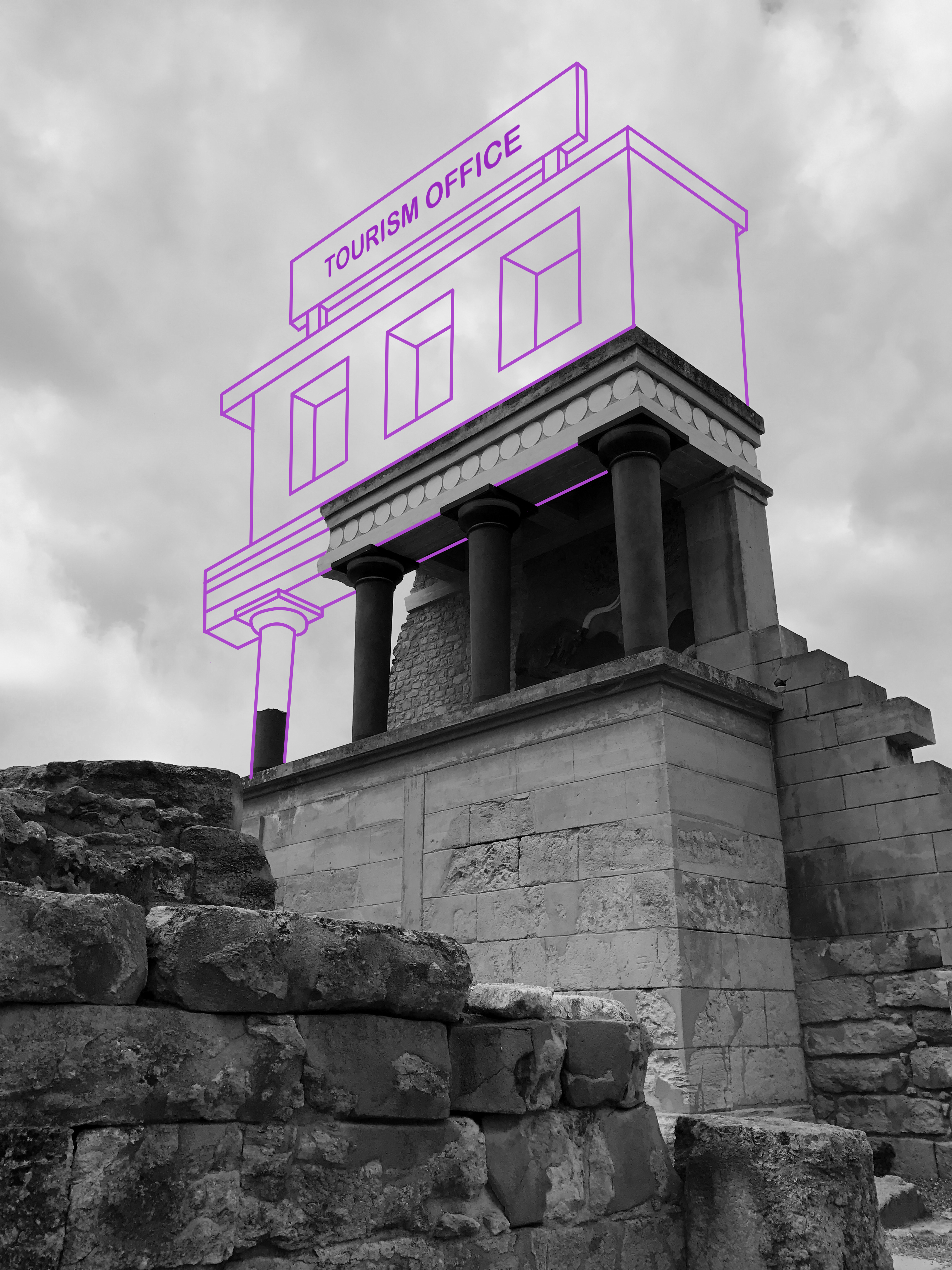
With the building complete, I decided to implement a large sign upon the roof. Currently, the illustration lacks personality and individuality. I would like to incorporate a sense of fun within the piece in order to rectify the bland visuals. As you can see above, I wanted to create a sign that labels the building as ‘ Tourism Office’. I thought this was a witty way of enforcing a theme of visual satire, almost mocking this ancient city and essentially labelling it as just a tourist attraction. It forces the audience to think which creates discussion. Nonetheless, I cannot simply rotate the text and slot it within the sign margins. The piece sustains a sense of perspective, as the construction gets smaller as it moves further away from the audience. Consequently, the text must share the same qualities. I select a font that enforces this fun, satirical attitude as suggested by the rounded edges and capital letters. In order to make proportional adjustments to this piece of text, I must convert it into a pixels as oppose to a text layer. With this complete, all I have to do is Transform the layer and select ‘Perspective’. This option permits me to manually adjust the positioning and perspective of the text, meaning I can make it larger in the foreground and smaller in the back. The final result can be seen below.

I think this is an idea worth pursuing as it demonstrates a form of originality that is currently missing from my work. Illustration is something that I am passionate about, and I think I possess the keen eye required to impose imaginative ideas upon standard environmental photographs. With this experimentation complete, I will continue to produce more responses.


Barbara Kruger – Artist Reference

Barbara Kruger is a female american artist who is best known for her visual art featuring magazine clipping style art where striking text is layered over images. Most of Kruger’s work consists of monochrome images with black and white or red text. Her work tackles subjects such as capitalism, consumerism and feminism.

Kruger’s pro-choice commissioned billboard for the Wexner Centre for the Arts next to a pro-life billboard erected just 12 hours after.

One of her most famous images was used as a poster for the 1989 women’s march in protest of legal and safe abortion. The image (pictured below) features a split photograph of a woman’s face, one side being a black and white version and the other the negative of, one can only assume, the same photo. There are three red rectangles that separate the image, one and the very top, one and the bottom and a smaller one in the centre. The rectangles have white, slightly italic text played over the top reading “Your body is a battleground”  The same slogan was used for a commissioned billboard for Wexner Centre for the Arts (pictured above), 12 hours after the pro- choice billboard was erected an opposing pro-life billboard was placed directly next to it, depicting an 8 week old foetus. Although Kruger’s work supports feminist ideals and Kruger personally identifies as a feminist, her work also deals with superficiality which ties in with the theme of consumerism and how women are presented and choose to be presented in the media.

The image on the left featuring the phrase “Adorn your prison” particularly spoke to me as someone who enjoys makeup and getting dressed up from time to time. The combination of the text and image is a little different from most of Kruger’s work, the word “adorn” appears in it’s own rectangle and the words “your” and prison” appear in the same incredibly long rectangle that spreads across the entire width of the image, the spacing between the words is notably large which gives as disjunct feeling to the reader. The disjunct feeling is also mirror in the bottom heavy nature of the image with the there being no red or text in the top half of the image. The piece also has a strong sense of intrigue, this is provided by the use of the mirror as the back of the subject’s head, as well as her reflection. My interpretation of the phrase “adorn your prison” is that women are seen as objects and they are seen this way because of their sexual bodies, they cannot escape their own bodies so they may as well make the most of it and put some makeup on. Give the people what they want.

I want to take inspiration from Kruger’s work by adding text to my images to give them another dimension and a wider sense of interest. I also think that the addition of text will help my images more overtly tie in with the idea of feminism and self reflection.

Environment – Artist Reference 2 – Michael Craig Martin

Sir Michael Craig-Martin is an Irish-British contemporary conceptual artist and painter. His early work drew together a variety of objects and materials and questioned the nature of art and representation. In the late 1970s he began to make line drawings of ordinary objects, creating over the years an ever-expanding vocabulary of images which form the foundation of his work to this day. His more recent work, which includes painting, printmaking, installations projections and drawing, continues to depict common place objects. During the 1990s the focus of his work shifted decisively to painting, with the same range of boldly outlined motifs and vivid color schemes applied both to works on canvas, and to increasingly complex installations of wall paintings. This is a visual style that I would love to apply to my own photography.  I think that Martin provides a possible link between both traditional art and photography, uniting the two mediums. This is perfect for me, given my passion for drawing and taking photographs. By undertaking this project, not only can I link two of my school subjects ( Art and Photography) but I can produce work with enjoyment. I love drawing and taking Photographs so merging the process together should be a fun challenge.

Below I have included a collection of Martin’s work for analysis. I truly love this work and I think it is something that I am passionate enough about, to pursue for my project. This is assuming I incorporate a sense of individuality upon the idea and find a way to apply it to travel photography and environment.

As demonstrated in the artwork above, Martin is very intelligent in the way he creates his imagery. Martin creates brightly coloured and minimally drawn paintings of everyday objects. There is nothing special or interesting about the objects that Martin selects to study. They are mundane, regular items that we frequently encounter in everyday life, but never pay attention to. It is therefore quite, thought-provoking and intriguing when you begin to produce huge exhibitions focusing on them. Its triggers questions surrounding what makes real art. I really like the minimalistic visual style employed by Martin as well. He creates simple line drawings with no shading, indicating shape and form. He then incorporates an array of vivid and powerful colour tones throughout the piece that frequently clash with one another. This works effectively as we begin to question our familiarity with these everyday objects. Michael Craig Martin uses bold colours and lines to enhance his work, he also adds bold backgrounds that complement his art. As demonstrated above, he frequently places the object right in the middle of the picture to create a strong sense that nothing is more important than the other.

Applying to my Project

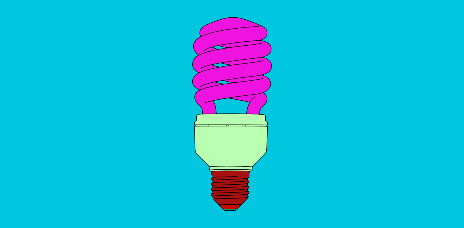
So they question is, how does this work apply to my photography? Inspired by the work of Martin, I would like to create my own digital illustrations that merge and combine with my photographs. Picture one of Martin’s individual object pieces, except the coloured background has been replaced with a photograph. This develops some concepts and imagery that has potential to look good. But we are left questioning the relevance between photograph and drawing. A drawing of a lightbulb upon an image of field looks confusing, random and out of place. This where my own individual thinking and style will be forced into action. Although I would to still like to maintain Martin’s ‘everyday’ way of thinking within my project, I would like to organise these objects so that they work in co-operation with the photographs. Although Martin’s digital illustration was the initial stem of inspiration for this concept, upon further research, I discovered some of his sculpture work that comes close to demonstrating my visual plan. I have included some images of this above. 

These images are all taken from Michael Craig Martins exhibition at Chatsworth. This is a major display of contemporary sculpture in the garden with new works made specifically for this exhibition. Installed in the Gardens of the Chatsworth house, home of the Duke and Duchess of Devonshire, Martin created twelve heavy, steel ‘line drawing’ sculptures including vibrant umbrellas, huge garden implements and a giant pink shoe. While the objects themselves may be ordinary, their form and scale are anything but. When captured on camera, the resulting image represents something similar to my intentions with this project. The main difference is that, I will not be erecting any sculptures, but digitally drawing these objects upon my travel photography. This will experimental and largely improvisational as I select objects that I feel would be appropriate to the landscape and environment. With digital drawing, I also have a lot less restrictions than Martin did with his sculptures, meaning I can test out unusual visual effects and compositions. This idea provides me with the opportunity to provide messages and thoughts surrounding the cities I am visiting. For example, in Rome, I can illustrate Roman gladiators over a photograph of the Colosseum, as if to impose history and heritage over modern day imagery. Although Martin’s work has served as excellent inspiration for me, I am certain now that my work will be very different. Whilst I love Martins exhibition at Chatsworth, his sculptures a very random and pitch little relevance to the environment present. My work will be a lot more focused and directed, paying attention to the landscape and working off of these visual cues. 

Organisation

// I M A G E S //

A little bit of a tidy up before the exam dates start. I have a selection of images ready to print and experiment with from my external shoots featuring Maya, Emily, Beth and Jack with internal shoots complete for Maya and Jack only. These remaining shoots will be taken over the next few days in preparation for the exam time. They can then be printed and experimented with in order to create the final presentation of post cards. This may also make use of a display board with printed images being mounted next to each other with supporting images (i’m thinking from Maya’s shoots in particular here). The stamp element is something else which should be taken into consideration but is heavily time dependent. If the postcards are successful within the physical experimentation and printing then I will have time to create, print and experiment with my internal images and how they could make stamps which reflect home. The surveys are complete and can be either hand written or printed on the reverse of each card. I have also included the visual development of images which have been edited as a before and after setup.

Maya – ORIGINAL IMAGE
Maya – The North Coast

This image has been digitally enhanced in Adobe Photoshop and was shot in RAW allowing for a large amount of editing to take place. The main adjustments I have made are colour enhancements and shading variations – especially with the use of contrast.

Emily – Bonne Nuit
Beth – Green Island
Jack – Val De Le Mar

Seeing the two finished sets of images together below shows the clear similarities and differences with the sets of images. Visually, there are obvious aspects of appeal across the two sets – especially in terms of colours and pallets. The internal shots are both heavily determined and characterised by the muted colourings that suggests a theme of boredom and importantly, limitations. The external shoots however are there to show freedom and a love for the outdoors. The colours are vivid and excitable. Bright shades and big open spaces, shown often in block colours which is visible in Maya’s portrait. The pink-ish hues of the bedrooms are heavily contrasted with the rich blues and greens of the plants, sky and ocean which plays such an important part in the lives of people moving away.

Handmade Book Planning

I have decided to make a small handmade book as an additional final outcome for this project. Ideally I’d like to make the book myself using the skills I have learnt from the book-binding workshops that I have attended but due to the limited amount of time I don’t think this will be a possibility. Alternatively I will buy a book to work with so that I can spend more time on presenting the images within it. The content of the book is going to focus on my portraiture and performance photographs. I chose to make a handmade book rather than a Blurb book because I wanted to have more freedom to explore different design techniques, for example I am planning on incorporating some small mirrors and reflective material to further explore the idea of reflections. This way the book will also be more personal and is partly inspired by my research into Duane Michals and the way he presents his series of images and combines them with handwritten notes to create a new layer of meaning. I am also planning to include some handwritten notes such as lines of poetry which will add interest and create questions for the viewer to think about. I have created a mood-board of ideas for the presentation of this book, taking inspiration from the style of photo-albums and simple scrap-books.

I have also looked briefly into the work of professional photographers who have created handmade photo-books which relate to the theme of ‘Environment’.  For example I looked at the photography of Jean Pagliuso who is an American photographer who explores places of ritual and endangered environments. She realised that she wanted to share more from the ancient religious landmarks that she was photographing other than conventional black-and-white prints. She began experimenting with the alternative printing processes, “I wanted to make my images look like ‘rubbings’ made from stone carvings,” she said. “Like the kits they sell to transfer rock etchings onto paper”. She developed a method of printing the images on rice paper, by coating it with silver gelatin and laying it on an aluminium plate to dry.  She first presented her images this way in an exhibition and then published them in book form using the same technique. She said “I went to a book designer,but traditional bookmaking didn’t seem to be the right approach. I wanted the book to reflect the amazing hands-on work required to make one of these prints. I also wanted to use the same paper for the book pages that I used in the darkroom”. She has also explained that it is difficult to set a price for a handmade book and “Any photographer considering a handmade book project should have a higher purpose in mind than just money”.

I also looked at Martin Parr’s limited edition version of ‘Life’s a beach’. This project explores the British tradition of photography by the seaside. Parr has been photographing this subject for many decades, documenting all aspects of the tradition often in a satirical way. It includes photographs of people from other places in the world on the beach to explore cultural differences and similarities. The book has a cardboard slipcase and the appearance of an old-fashioned photo album. Each image is placed under photo corner slits and hand-labelled with the location. Between each page is a tissue sheet protecting the images.

Lastly I was inspired by Irene Imfeld’s books inspired by Earth. She is a  graphic artist who studied photography in college. Her landscape and nature-based photographs draw on aesthetic traditions from realism to minimalism and her work is personal and spiritual. She says “I’ve always been inspired by landscapes—painting and photography”. Imfeld picked up bookmaking skills while working in the publishing industry and by attending workshops. “I make my books from scratch,” she says, “The covers of Landscape Fragments are wood, cut out of hardwood and finished by a furniture maker. I simply glued a thick piece of museum board on the inside to keep the wood away from the prints.” The 24 triptych images are printed on individual pieces of paper and they are not bound together, but stacked between the covers in the style of a Tibetan book.

How well have I responded to Artist Research

For all my artist reference, I based my shoots on some of my favorite photographs taken by the photographers. Therefore, In this blog post I have wrote and represented visually the similarities and difference, of my work to the artists I researched.

Response to Theo Gosselin;

I personally feel as if Theo was the main artist I was inspired by for this project of ‘Environments’ as I loved his style, locations and adventures I went on to capture photographs like his.

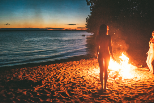
With most of Gosselins shoots I would take the principal idea and then just alter them into my own style. As seen below, the top image is Gosselins and the bottom image is mine, the difference are fairly blatant, as the time of the day we took the photos differs, he took his just after sunset and mine was taken just before, therefore creating different lighting effects on the models. Gosselins photograph also features to girls completely nude, whereas all four of my models are are fully dressed this was due to school restrictions not allowing full nudity in my images. The similarities are there are more vertical objects on the right side of his image and the girl standing up in my image is on the right. Then obviously there’s the fact it’s only females who surround the fire in both images, and both of the fires are on a sandy location, nearby to the sea.

The image above which is taken by Theo Gosselin is similar to mine below because both are featuring blue vans, and both have their door open, allowing the viewer to briefly see the inside. Also, both images are taken in a car park which is located next to an area with a large mass of water, for example in my photograph one can see the sea, and in his it’s either the sea or a lake. The difference between the two images is that he’s made the van be in the mid-ground of the image, whereas mine is located in the foreground of the image.

Response to Juergen Teller;

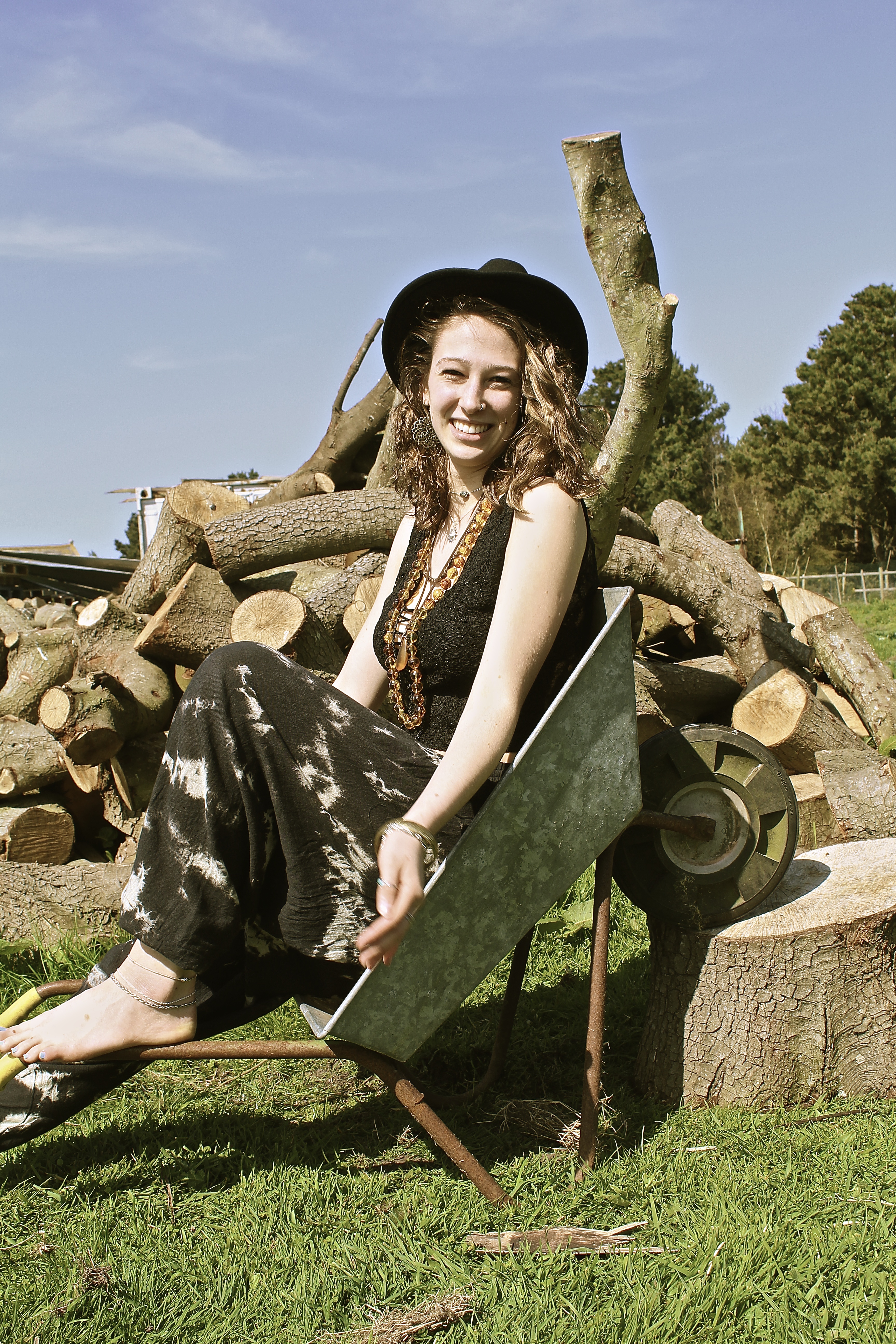
The main difference between the two images below is the persona of the model, Juergen Teller has shot Kate Moss looking moody in the photograph below. Whereas I have captured my model looking happy and smiling. The other significant difference is the fact that his image is horizontal whereas mine is portrait, due to the way the model is posing, Kate Moss is lying in the wheelbarrow whereas my model is sat inside. The similarities are the rustic wheelbarrow used as a prop in the two images, and due to the background of both images one can see that they’re both in natural environments. In both images similar color schemes are used, both using a lot of brown, blue and green, all very natural and pure colors. However Teller creates more vibrant colors in hers by the use of jewelry and the container in the background.

Response to Corinne Day;

The main difference to these photographs is Corinne Day(below) has more negative space in her image than I do, this is due to me contrasting my images more and making there be more definition, therefore creating more detail in the background than Days photograph. Whereas the way she’s taken the image has a high exposure and more sharpness in her image, than to mine. The main similarity is the way the model is positioned, for example they both look a bit shy with their body and are smiling nervously infront of the camera, they’re both titling their heads facing to the left of the image, and use their shoulders both shrugged with a bent left arm. Both of the models are very slim as well, with messy hair, blowing in the wind.

Response to Jacob Sobol;

These two images I find our very similar, as both models are trying to kiss the photographer, therefore conveying the same message and emotions behind the image. Both images are out of focus and taken in black and white and are slightly over exposed, the models both have their eyes slightly closed and hair scrapped back. The main difference is the photograph above by Sobol is taken of a women, whereas mine is taken of a man. Also Sabine, the model for Sobol is looking up at the camera. Whereas in my photograph he’s looking down at the camera. Therefore creating a slightly different composition. In my photograph I feel the model isn’t being as serious as Sabine as he looks like he’s jokingly try to kiss me, whereas Sabine looks more serious. This is perhaps because of the location both images were taken at, Sabine is in a bedroom so it’s more personal whereas me and the man in the photograph were on the beach, where it’s a public place.

Response to Ivan Troyanovsk;

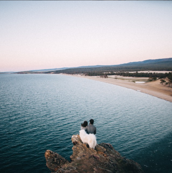
Mine and Troyanovsk photograph are similar yet very different. They are similar in the perspective that the photographer is looking down at the model, and are above the sea, with the coati coming from the right across to the left hand-side. Therefore, they both have a similar composition, they both also have V shape in the rock, almost like the top of a heart on the left of the photograph. The differences are, there are two models in the image of Troyanovsks, with their backs facing the viewer. Whereas in my photograph the modelling is turning facing the camera, and is alone. Another huge difference is the fact the models, in the above image taken by Troyanovsk, are standing on a rock which isn’t as visible as the one my model is standing on. The environments are also different, for example my environment had a lot more rock and the waves were a lot more choppy than the image by Ivan Troyanovsk.

In conclusion, I feel I have responded well to my artist references, as every single shot was somehow influenced by a photographer. Although, no shoots were directly copied, I would take an idea and then alter it to make it my own.

Final Results: All Project Outcomes – Selections

Since going through all my final outcomes presented in my last few posts, I have now been able to narrow down my favourite images into 3 genres depicting environmental awareness: symbolism, abstraction and documentary photography. For this project, as I planned in my ‘Final Piece – initial idea’ post, I will be producing a number of different prints presented in interesting ways as well as a potential photo-book to display all my work. Below I have displayed my 25 favourite and most relevant images taken during this project, separated and analysed based on their genre of photographic technique. Before this, however, I have added a contact sheet consisting of my 42 final outcomes that I have narrowed down from my original 66. These images will be used to produce my photo-book, telling a very interesting and visually stimulating story about our Island’s pollution and common environmental issues…By viewing my best images from all 10 shoots together in this contact sheet above I can start to get an idea of what my potential photo-book may look like. As well as this I am now able to see how many of each symbolic, abstract and documentary photographs I have comparatively and how each section could possibly work together or be separated. Overall I am quite pleased with the variety of techniques I have managed to portray within one project as well as the quality and symbolic strength of my final images. Below are my favourite 25 photographs that may well be presented as prints, split up into 3 sections and evaluated…
Symbolism: The seven images depicted above are my favourite final outcomes taken from three out of five of my completed symbolic shoots. The reason I have chosen the least outcomes from my symbolism shoots is because I had to create each scene instead of just picking them out of the environment around me. After comparing all my outcomes I have decided against including any of my ‘plastic symbolism portraiture’ for printing and presentation simply because the symbolism isn’t as strong. As well as this I much prefer the successful and more surreal symbolic images above that depict my carefully crafted use of props and a lot of thought behind their message. For my first representation portraying the issue of smoking waste (presented on the top row) I have chosen two of my ‘man vs nature’ photographs and one ‘connecting mankind to this problem’. I have chosen these images one, for their clear message to the audience and two, for my soft lighting techniques and dramatic studio effect. On the bottom row are my four different symbolic representations of ocean pollution crafted from waste I sourced from Jersey’s coastline. I love the emphasised meaning behind these carefully created photographs and think their vibrant and intriguing subject matter will contribute nicely to my overall project.

Abstraction: Next are my nine favourite abstract outcomes that were all taken simply as the opportunity arose during four out of five of my documentary shoots. Although I have also created a few abstract photographs in my cut out sections (depicting my beach cleans and the recycling centre) they are nowhere near as vibrant and interesting as the ones I have presented above. The first three chosen outcomes of the top row depict a few close-up detailed shots of specific parts of Jersey’s extensive ‘Energy to Waste’ setup. The reason I am keen to present them is I love the simplicity of these images as I feel they display a very strong and beautiful topographic style. The next two abstract pieces below show my vibrant and textured results documenting the issue of agricultural waste in Jersey from up-close. Although abstract, the meaning behind these images is dramatic and they perfectly depict a type of large-scale plastic going to waste – directly related to where we live. Lastly, on the bottom row, I have chosen to add my abstract pieces that portray something with devastating repercussions in a beautiful way, thus potentially intriguing my viewers and subtly informing them of the reality of ocean pollution.

Documentary:Lastly, depicted above are my very important documentary images cut down to eight photographs from three out of five of my original shoots. As with my abstraction outcomes, I have decided to exclude my sections presenting my three beach cleans and my visit to La Collette Recycling Centre. This is because although they have a lot of educational value they would not intrigue my viewers when printed out and presented on their own.  My first chosen finals on the top row can portray how much agricultural plastic is used in the potato farming industry, plastered over Jersey fields every year. The reason I have chosen these images as final prints is the obvious connection of this issue to our island as well as the beautiful way they work together to tell the story. The next row depicts a clear view of the waste I found on Faldouet beach that would later be washed into the sea at high tide. Finally, the bottom row of this contact sheet depicts three finals portraying the narrative of what ends up happening to Jersey’s un-recycled waste. The reason I have chosen these images is one, because of the contrasting natural light and shadows and two,  their dramatic intensity and ability to give my viewers an idea of how much we produce.
Shoot 2 Edits

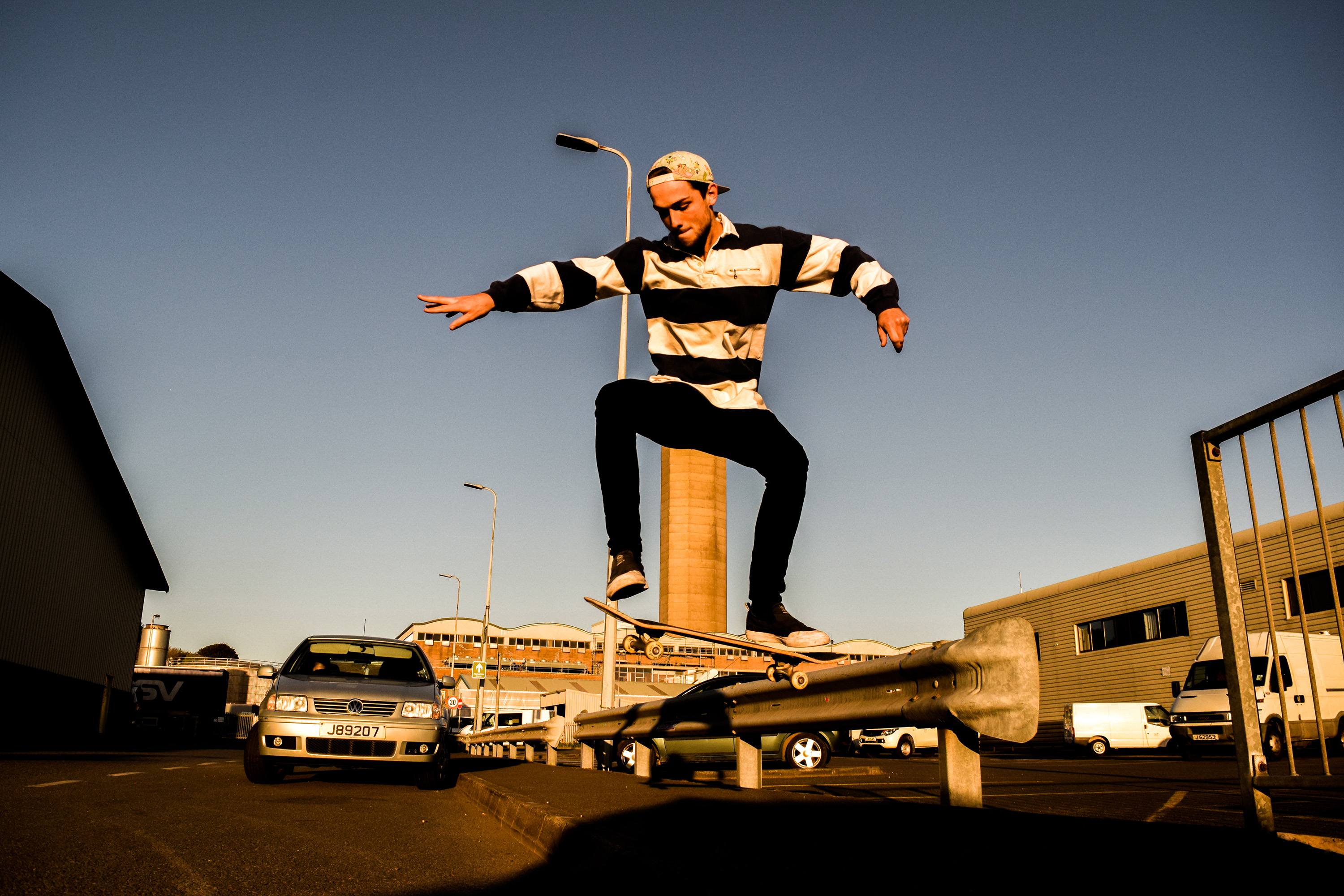
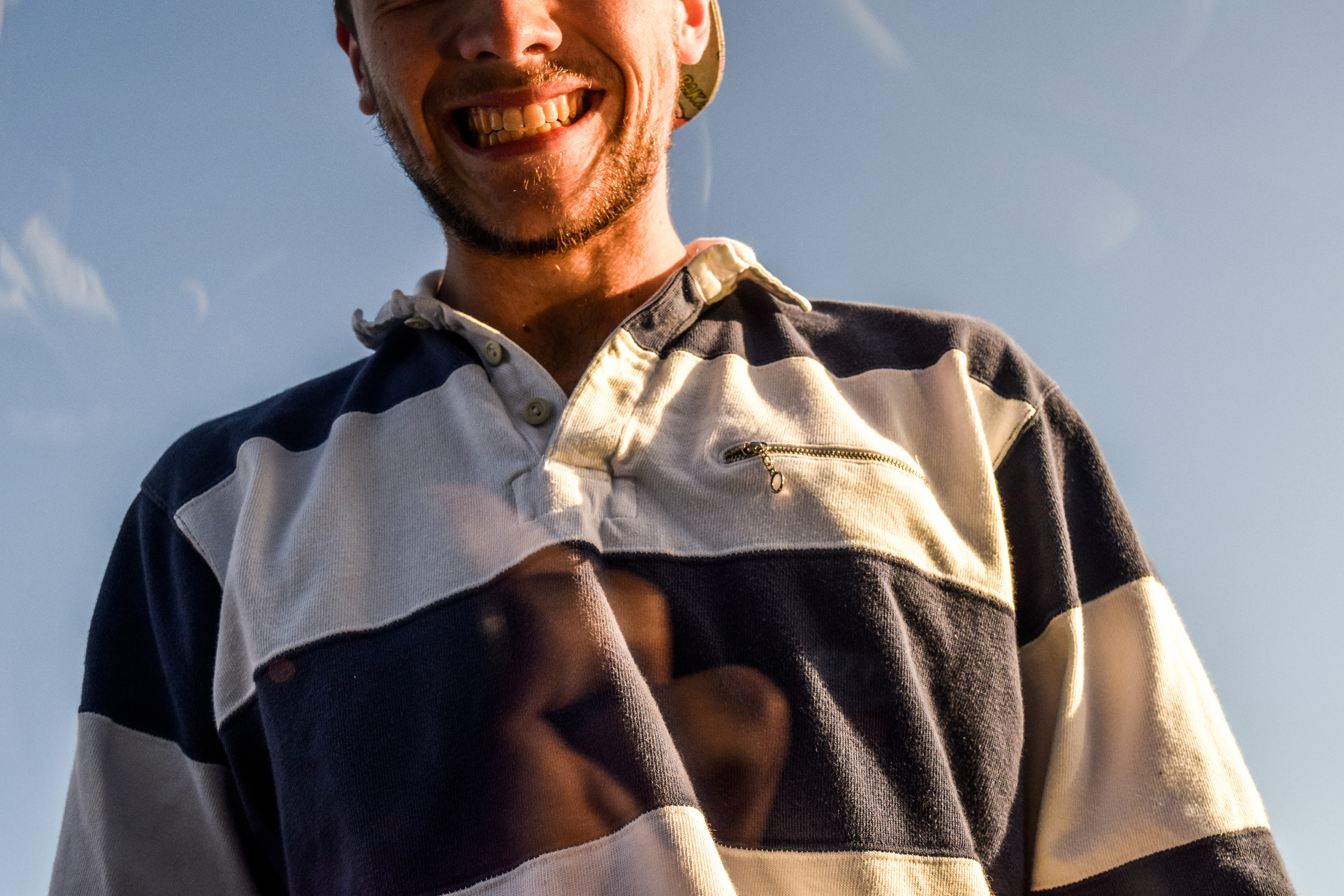
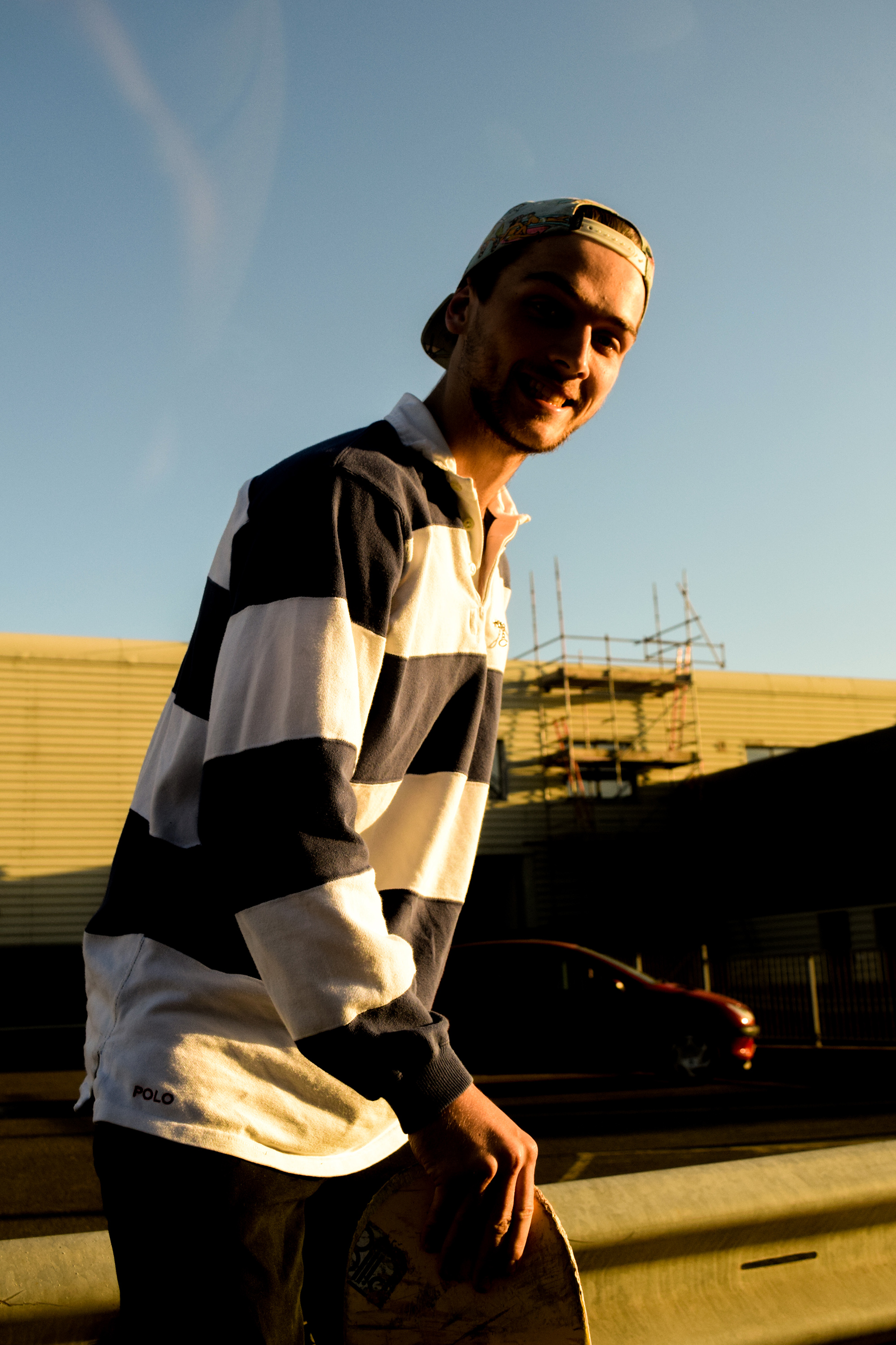
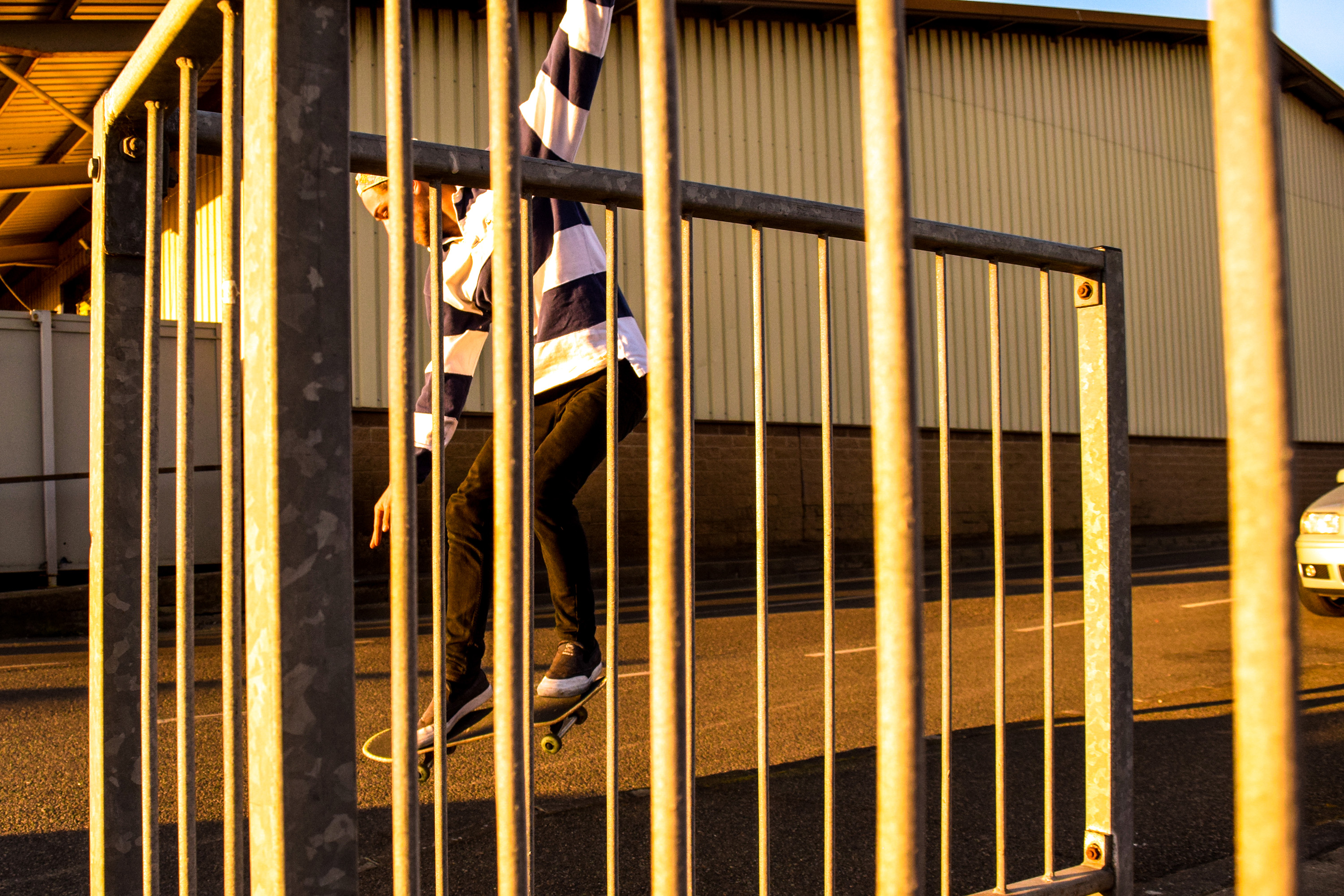
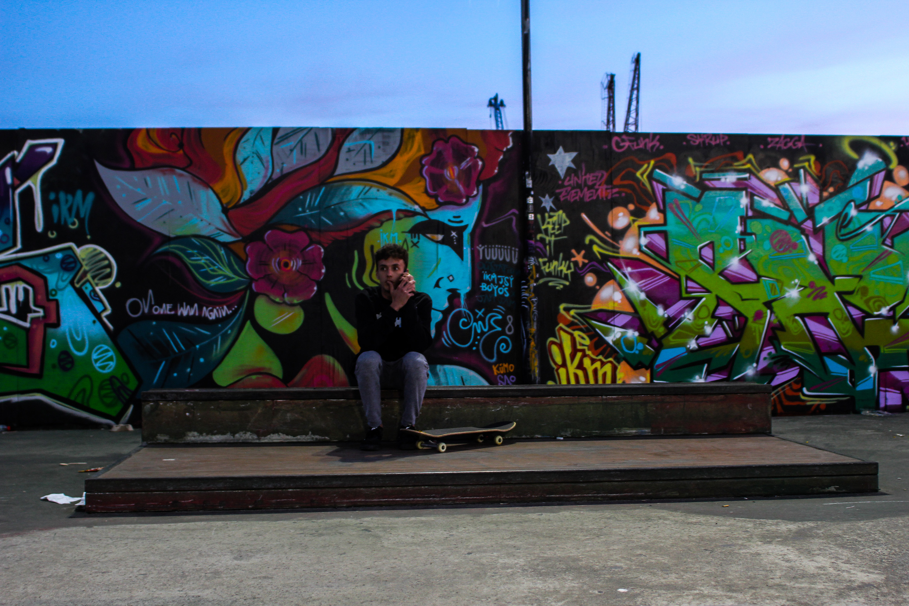
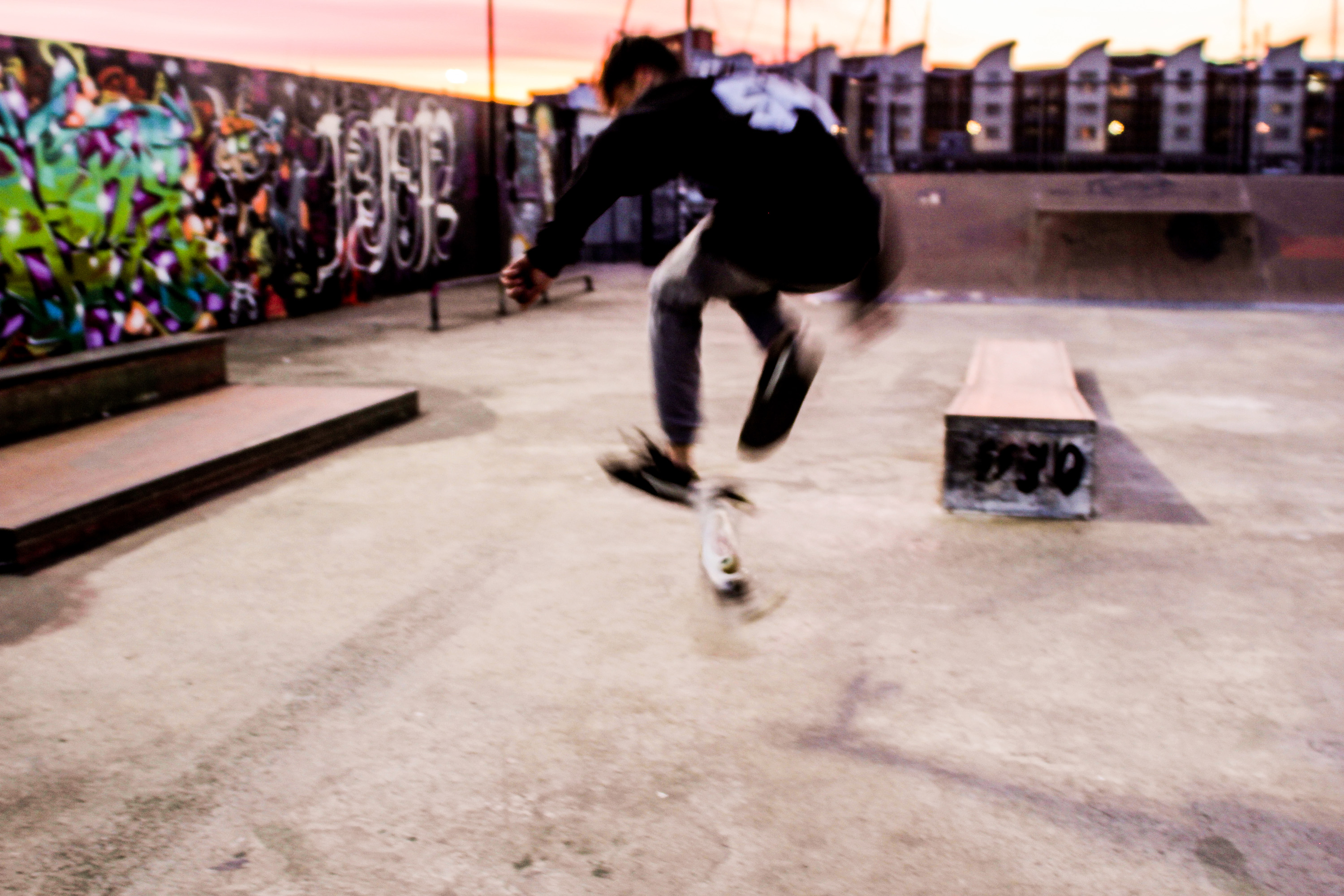
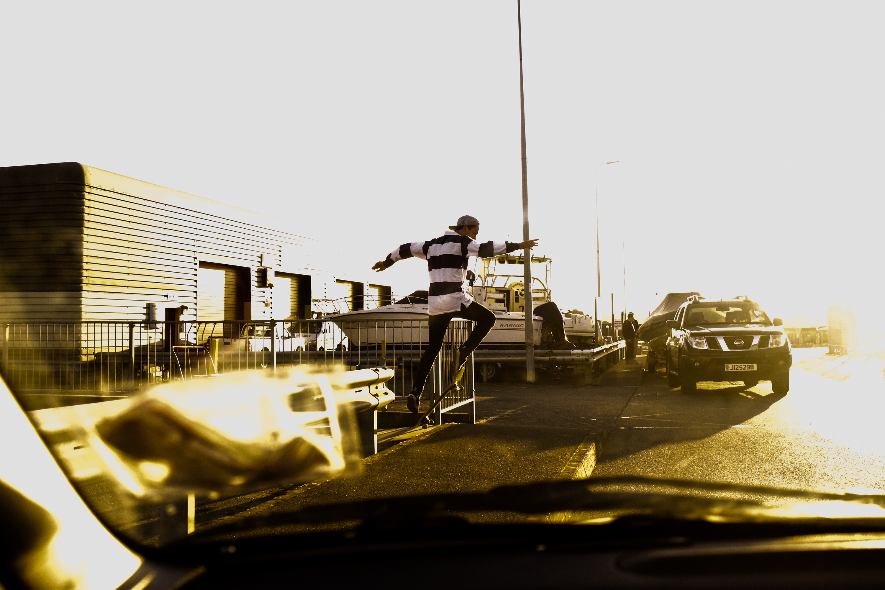
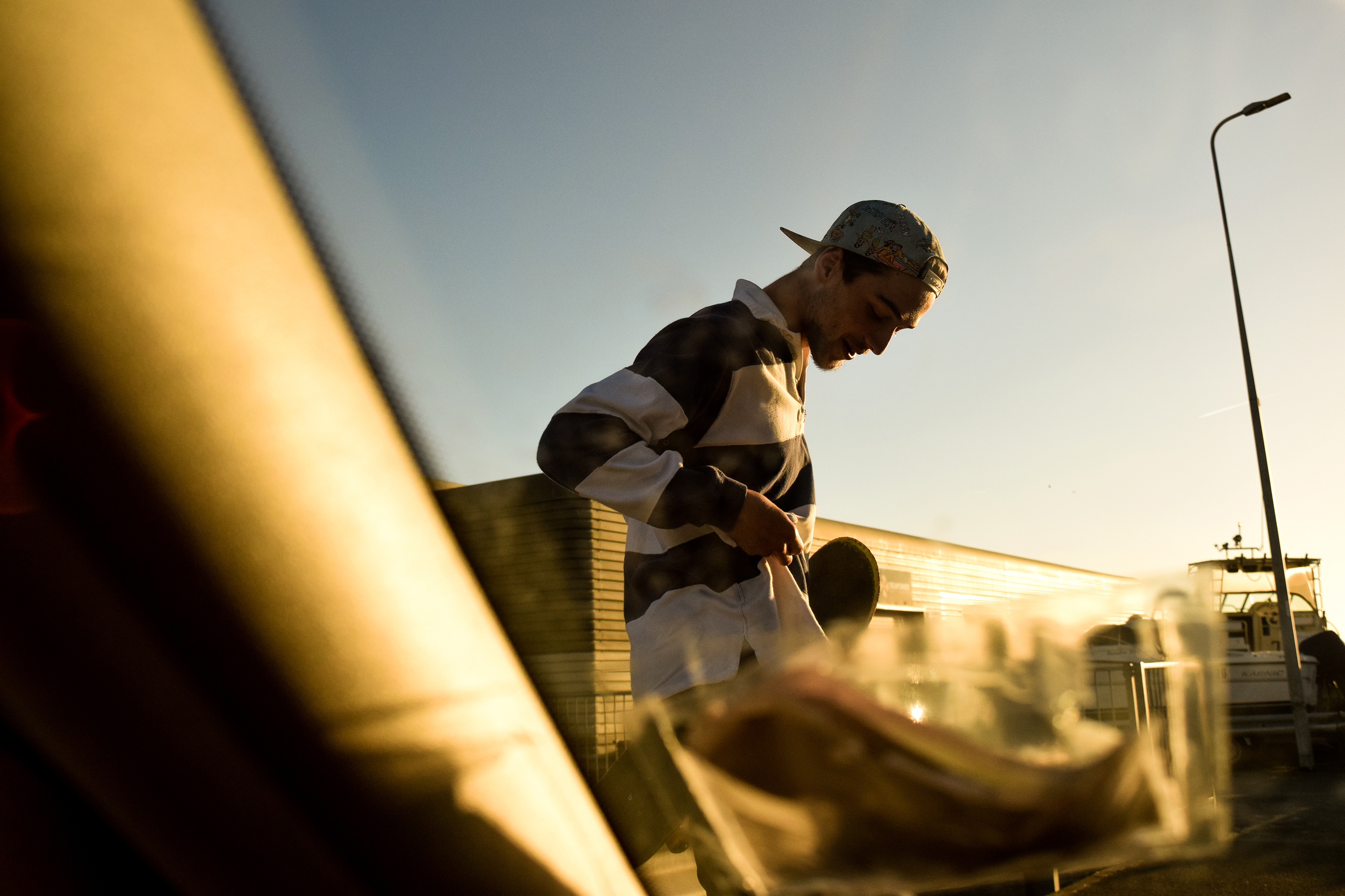
The following images are edited influenced by Theo Gosselin’s cinematic style, as well as traditional skateboard documentation. I experimented with shutter speed, shooting angle, and I tried to capture motion full images of skateboarding, as well as sharp portraits with interesting compositions. I am fairly happy with the outcome of the shoot, however

I edited this image to look fairly cinematic. I increased the whites in particular with this photograph to create a very bright, sky has become hard to make out from other areas of the image, forcing us to focus more on Zac. I tried to use the windscreen of the car to compose the image interestingly. Whilst using a larger aperture and shorter shutter speed I managed to blur the windscreen again focusing us on Zac far more.

Similar to the first, I used a short depth of field to blur the windscreen I purposefully added into the frame for interesting composition. This time, the image is a portrait of Zac looking at something, but the space of interest to him is covered by my blurry insurance disc and windscreen frame. I really like this composition as the way my insurance disk and windscreen frame cover from the top left down and round to the right side works very well against Zacs torso and the open space in the top right.

With this image I wanted to create a heavy contrast to attemot the cinematic look again. I raised the whites and brought down the black, and also but down the shadow toggle the have a large contrast of light and dark. This made the image look more ‘epic’ due to the strong sunlight, the shadow cast behind Zac running towards the sunlight away from the dark.

This image shows an example of my angle experimentation. Zac repeatedly did a trick over a pavement until I got a good angled photograph. I wanted to get really low to further capture the height of Zac on his skateboard, so I lay down as close to the ground as possible and angled my camera up. I also turned my shutter speed up slightly, and turned my aperture down to give a larger depth of field so I was able to definitely capture Zac moving in the air sharply.

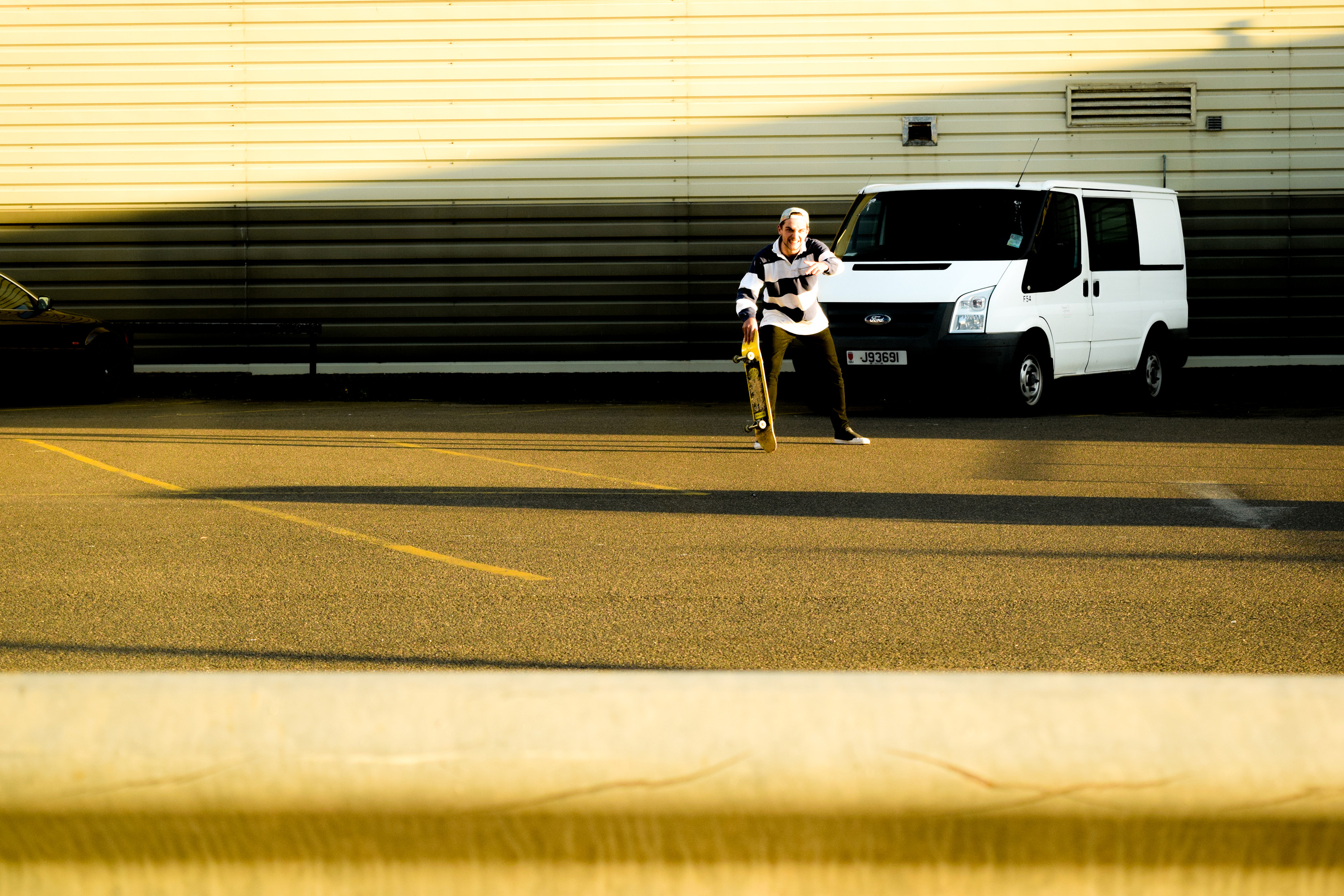
This image is an example of my portrait experimentation. I saw Zac standinghere and thought it may be interesting to capture an image of this wall with him at the very center. The size and repetition of the wall is very interesting against Zac breaking this pattern up in the centre. His horizontal striped shirt makes a hard break from the background, and the colour difference also makes him stand out so greatly. Overall I really like this image due how the background and model work off eachother. 

This image shows an example of shutter speed experimentation. I set my camera up on a low shutter speed and took an image of a skateboarder doing a trick. The result was an interesting blur of motion that I feel works nicely, and represents qualities almost similar to a painting. I wanted to experiment with some layering, almost similar to the way Idris Khan brings images of similar subjects from different moments in time together into one photo. However, I only wanted to blend two images together. in which I used the last photo and an image I took of some grafiti at the skatepark. The outcome looks even moreso like an urban influenced painting.